


Exploring the Power of Color in Interior Design
I recently came across this beautiful living space that perfectly showcases how color can transform a room. The vibrant blue sofa and matching rug add a lively touch, while the yellow chair introduces a cheerful pop of color, creating a balanced and inviting atmosphere. The mix of bold and neutral tones enhances the overall aesthetic, demonstrating how thoughtful use of color can elevate interior design.
What are your favorite color combinations in home decor? Share your ideas or show us your colorful spaces!
#ColorInInteriorDesign #HomeDecor #InteriorDesign #ColorfulLiving #DesignInspiration #LivingRoomDecor #HomeStyling #Color
26 mai 2025
0 commentaire au total
Vous aimerez aussi

Color Psychology Meets Interior Design🎨

The Psychology of Color in Your Home Office 💡

Beyond Beige: Algorithmic Palettes for Your Chic Home 🎨

The Art of Mid-Century Color Palettes 🎨

Color Theory 2.0: Dynamic Hues That Respond to Your Environment 🌈

The Power of Undertones: Mastering Complex Neutrals 🎨

Crimson Red: The Color of Passion, Power, and Historical Grandeur ❤️

The Evolution of Emerald Green: From Royalty to Rejuvenation 💚

💡 The Impact of Light on Color Perception in Interior Design

The Deep Dive into Deep Purple: Royalty, Mystery, and Modern Luxury 💜

The Timeless Appeal of Indigo Blue: From Ancient Dyes to Modern Homes 💙

Art Deco's Signature Color Palette: Bold & Beautiful 🎨

Transform Your Home with the Power of the Seasons 🏠✨

Curated Color Palettes for a Playful Home 🌈🎨

Unlocking Serenity: A Guide to Mindful Color Palettes 🎨

Color Psychology in Decor: Using Hues to Boost Your Mood! 🌈😊

Color as Architecture: Bold Hues as Structural Elements 🧱

5 Bold Color Combos for a Vibrant Living Room! 🎨✨

Unlocking the Psychology of Sage Green 🌿: A Color Trend Deep Dive

Bold Palettes for a Dramatic Study Space 📚


Color Psychology Meets Interior Design🎨
Let's dive into color psychology today!
Blue and orange have opposing yet complementary properties. Blue exudes calm, perfect for bedrooms or meditation spaces. Orange, on the other hand, energizes and stimulates appetite – ideal for kitchens or dining areas!
The peacock color palette, blending vibrant blues with hints of orange, creates a dynamic yet harmonious atmosphere. It's bold, luxurious, and can transform any room! And let's not forget the subtle elegance of off-white paired with white. This combination adds depth and sophistication without overwhelming the senses. Perfect for creating a clean, airy space.
Experiment with these color pairings to elevate your interior design game! 🌟
#InteriorDesignColorSchemes #ColorPsychology #BlueOrangeContrast #PeacockInspiration #OffWhiteMagic #DesignTrends #HomeDecorGoal


Color Theory 2.0: Dynamic Hues That Respond to Your Environment 🌈
Tired of static wall colors? Let's talk about the future: dynamic hues that respond to your environment and mood! 🌈 Imagine walls that subtly shift color based on ambient light, time of day, or even your chosen playlist. We're looking at smart pigments and responsive materials that can create truly immersive atmospheres. This isn't just about aesthetics; it's about actively enhancing your living experience through adaptive color. Picture a living room that glows with calming blues in the morning and vibrant corals in the evening. What color shift would enhance your space? Save this for a spectrum of design possibilities! ✨ #dynamiccolor #responsematerials #colorpsychology #interiorcolor #futureofdesign #innovativedesign #adaptiveinteriors #designtechnology #homeambiance #cuttingedgeinteriors


💡 The Impact of Light on Color Perception in Interior Design
Did you know the same paint color can look dramatically different depending on the light it’s in? Understanding light’s effect on color is crucial for perfect interiors. 🎨
Here’s how light plays a role:
* **Natural Light:** True colors are best revealed under bright, natural daylight.
* **Warm Artificial Light:** Tends to enhance reds, yellows, and oranges, making colors feel richer and cozier.
* **Cool Artificial Light:** Can make colors appear bluer or more subdued, often enhancing grays and whites.
* **Dim Lighting:** Colors can lose vibrancy and appear muted.
Always test paint colors in the actual lighting of your room! Save this for your color-choosing wisdom. ✨
#LightAndColorIdeas #ColorPerception #InteriorDesignColor #PaintColors #LightingInDesign #ColorTheory #HomeDecorTips #DesignSecrets #AccurateColor #LightingImpact

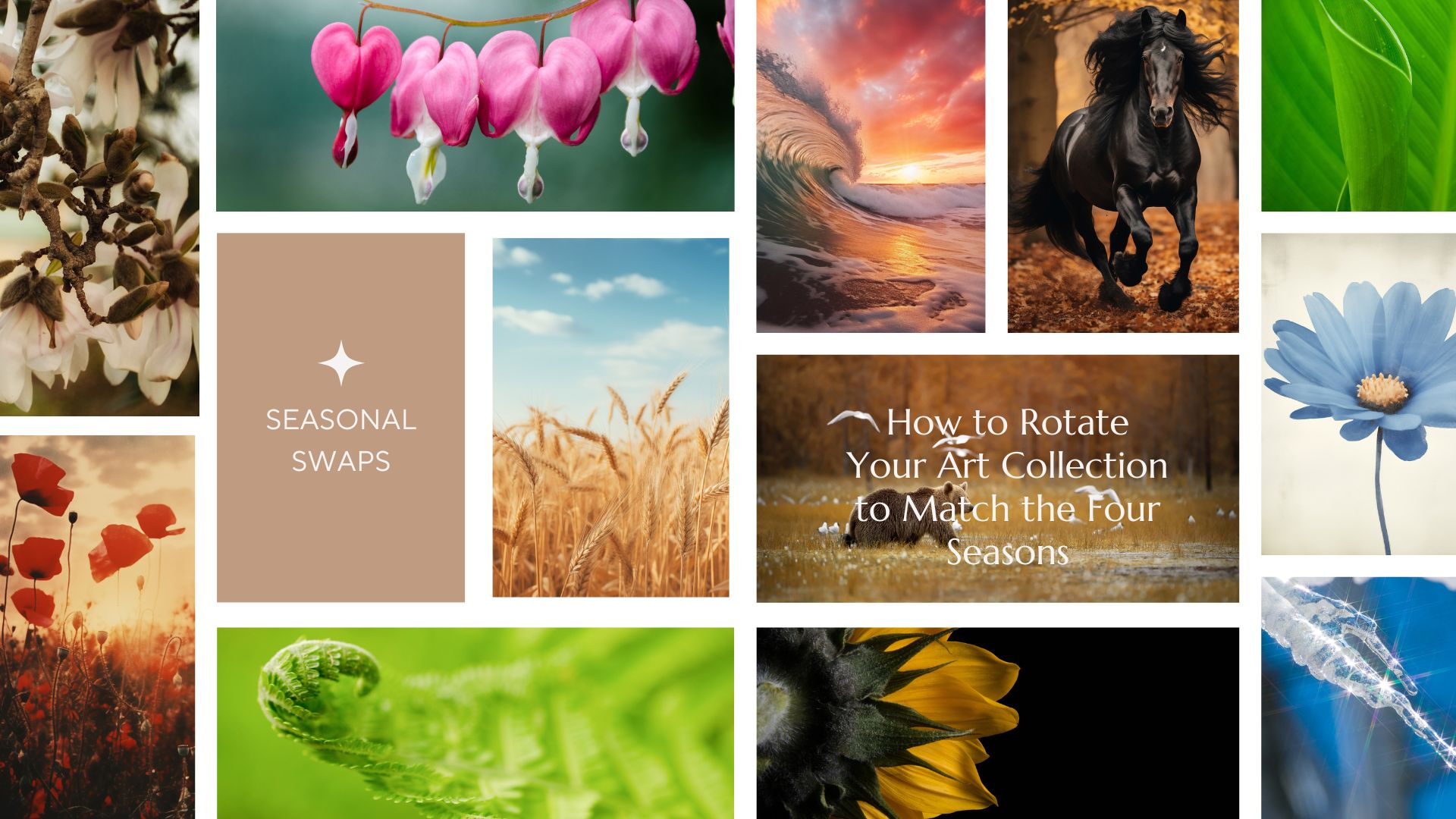
Transform Your Home with the Power of the Seasons 🏠✨
The most beautiful homes are those that live in harmony with the natural world. Instead of a total renovation, try the "Seasonal Art Swap." By rotating your gallery wall four times a year, you refresh the energy of your rooms and appreciate your collection on a deeper level.
Get our expert tips on curating your home for Spring, Summer, Autumn, and Winter. Seasonal Art Swaps: How to Rotate Your Home Art Collection – PIPA Fine Art
#IdealHouse #HomeStyling #InteriorInspiration #ArtGallery #decoratingideas #decoratingtipsideas #decoratingwithcolor #decorating #decoratingideasforlivingroom

1


Color as Architecture: Bold Hues as Structural Elements 🧱
In avant-garde design, color isn't just an addition; it can be a defining architectural element. I love using bold, saturated hues to define zones, accentuate structural features, or create a sense of enclosure. Imagine a vibrant color block acting as a bold partition, or a deeply saturated accent wall that acts as a 'canvas' for the entire room. 💡 This approach is about harnessing the power of color to shape perception and emotion, transforming spaces with daring impact. Ready to paint with purpose? Save this for architectural color inspiration! ✨ #AvantGardeInteriors #ColorAsArchitecture #BoldColor #ArchitecturalColor #ColorBlocking #AvantGardeSpaces #VibrantInteriors #DesignImpact #HueDrivenDesign #ColorBlockIdeas


Curated Color Palettes for a Playful Home 🌈🎨
Tired of beige? Let's inject some fun into your home's color story! 🌟 Think beyond the ordinary. Embrace palettes that reflect your personality. Pair unexpected hues like coral and teal, or mustard yellow and deep plum. Want to go whimsical? Consider soft pastels with metallic accents. For a bold statement, experiment with vibrant jewel tones. The key is balance and intentionality. Don't be afraid to let color tell your unique story and create spaces that spark joy and wonder! ✨
Save this for your next paint project! #ColorPaletteIdeas #PlayfulColorIdeas #WhimsicalColorPalette #HomeColorTrends #InteriorColorInspo #DecorPalette #CreativeColor #ColorInDesign #RoomMakeoverIdeas #DesignInspiration


5 Bold Color Combos for a Vibrant Living Room! 🎨✨
Tired of beige? Let's dive into some joyful color palettes that will make your living room sing! 💖 Experimenting with bold colors can create such an expressive and personal space. Think of these as starting points for your own colorful journey!
Here are 5 ideas to get you inspired:
* **Teal & Coral:** A tropical dream, lively and refreshing.
* **Mustard Yellow & Deep Navy:** Cozy yet sophisticated, with a touch of retro charm.
* **Emerald Green & Dusty Rose:** Luxurious and balanced, like a hidden garden.
* **Terracotta & Sky Blue:** Earthy and airy, reminiscent of a Mediterranean villa.
* **Fuchsia & Chartreuse:** Playful and electric, for the truly daring!
Don't be afraid to mix and match! Save this for your next living room refresh! 💫 #ColorStoryDesignsIdeas #BoldColorIdeas #LivingroomIdeas #VibrantHomeIdeas #InteriorDesignIdeas #ColorInspo #HomeDecor #ExpressiveInteriors #DesignInspiration #ColorfulHome


The Psychology of Color in Your Home Office 💡
Your home office colors can profoundly impact your productivity and mood! As a color psychologist, I love creating spaces that support focus and creativity. Here’s how:
💙 **Blues:** Known for calmness and focus. Think soft blues or muted teals to promote concentration and reduce stress. Ideal for long work sessions.
💚 **Greens:** Also calming and associated with balance and growth. Sage or mint greens can foster a sense of well-being and renewal.
💛 **Yellows (Muted):** Small touches of soft, sunny yellow can stimulate creativity and positivity without being overwhelming.
☁️ **Neutrals:** Off-whites, light greys, and warm beiges create a clean, uncluttered environment that supports clarity.
Which color inspires your workday? Save for your home office refresh! 🌈 #homeofficeideas #colorpsychology #workfromhome #productivitytips #colorpalette #interiordesign #officedecor #designinspiration #colortherapy #homedecorideas


The Deep Dive into Deep Purple: Royalty, Mystery, and Modern Luxury 💜
Let's explore the enigmatic allure of deep purple! 👑 Historically, purple was a color of immense luxury and royalty due to the rarity and expense of its original dye. It evokes mystery, creativity, and spiritual depth. In modern interiors, deep purple brings a sophisticated, almost regal, feel. It pairs beautifully with contrasting golds, or with soft greys for a more subdued elegance.
✨ Bookmark this for a touch of mysterious, opulent inspiration! ✨ #deeppurple #colorhistory #interiorcolor #designinspiration #royalcolors #mysterioushues #luxurydesign #purpleinteriors #creativeinteriors #colorevolution


The Power of Undertones: Mastering Complex Neutrals 🎨
Understanding undertones is crucial for a truly cohesive monochromatic design. Even 'neutrals' have subtle undertones – a grey might lean blue, green, or even purple; a beige can have pink or yellow notes. 🎨 By choosing variations within the same undertone family, you create a layered and sophisticated look that feels intentional and harmonious. It’s the nuance that elevates a palette from flat to fabulous. Pay attention to the subtle shifts! Save this for your color theory journey! ✨ #ColorTheoryTips #NeutralUndertones #MonochromaticDesign #SophisticatedPalettes #InteriorDesignStrategy #ColorInspiration #DesignSecrets #HomeStylingIdeas #ComplexNeutrals #PaletteMastery


Unlocking Serenity: A Guide to Mindful Color Palettes 🎨
Ever feel overwhelmed by too much visual 'noise' at home? The secret to a truly tranquil space lies in intentional color. ✨ I'm obsessed with how specific hues can shift our mood and perception. Think soft, muted tones for relaxation and grounding earth colors for connection. 🌿 Let's explore creating calming environments that invite peace. Start by choosing one or two dominant colors that resonate with you, then layer in neutrals to allow them to truly sing. Save this for your next design refresh! 💖 #ColorPaletteIdeas #HomeDecorIdeas #InteriorDesignInspo #MindfulLiving #CalmSpaces #ColorTherapy #InteriorStyling #DesignTips #HomeInspiration #DecorInspo


Beyond Beige: Algorithmic Palettes for Your Chic Home 🎨
Tired of predictable color schemes? Algorithmic design offers a new way to think about palettes – generating harmonious and unexpected color combinations inspired by nature, data, and artistic sequences. This approach brings a unique, sophisticated dimension to any interior, moving beyond the expected.
✅ Explore unique color pairings.
✅ Infuse your space with unexpected harmony.
✅ See how math can inspire beauty.
It’s about creating a visual rhythm that feels both natural and thoughtfully curated.
Save this for your next color refresh! #colorpalette #interiordesign #homedecor #design #colorinspiration #algorithmicart #designinspiration #colortherapy #creativeinteriors #paletteideas


Unlocking the Psychology of Sage Green 🌿: A Color Trend Deep Dive
Sage green isn't just a trend, it's a feeling! 💚 This nuanced hue has a rich history, often associated with healing, wisdom, and nature's calming embrace. Historically, it symbolized renewal and fertility. Today, it's the ultimate choice for creating serene and grounded living spaces. Think natural wood tones and creamy whites to amplify its tranquil effect. Ready to bring this historically significant color into your home?
✨ Saves for your next mindful decor project! ✨ #colortrends #sagegreen #interiordesignideas #colorpsychology #historicaldesign #decorinspo #greendecor #calmspaces #designhistory #colorhistorian


Crimson Red: The Color of Passion, Power, and Historical Grandeur ❤️
Let's dive into the power of crimson! 🔥 This rich, deep red has historically signified passion, courage, and noble status. From ancient Roman robes to royal banners, crimson was a color of prestige and impact. Today, it brings a sense of energy, warmth, and drama to any space. Use it as a bold accent or for a full enveloping experience. It pairs magnificently with deep wood tones and antique gold.
✨ Save this for a touch of bold, historical drama in your home! ✨ #crimsonred #historicalcolors #colorpsychology #interiorcolor #designinspiration #reddecor #boldinteriors #powerfulhues #vintageinspired #designhistory


The Timeless Appeal of Indigo Blue: From Ancient Dyes to Modern Homes 💙
Let's talk about the regal beauty of indigo! 👑 This deep, captivating blue has been treasured for centuries, from ancient Egyptian dyes to the vibrant textiles of India. Historically, indigo symbolized royalty, strength, and spirituality. In today's homes, it brings a sense of depth, sophistication, and tranquility. Imagine it paired with warm brass accents or natural linen for an effortlessly elegant vibe.
✨ Bookmark this for your next sophisticated design scheme! ✨ #indigodecor #colorhistory #interiorcolor #designinspiration #blueinteriors #luxurydesign #timelessdesign #decorativehistory #interiorstylingideas #thecolorhistorian


The Art of Mid-Century Color Palettes 🎨
Mid-Century Modern is renowned for its distinctive and timeless color palettes. Learn how to use color to define your MCM space! 🌈
Embrace these signature hues:
• **Earthy Neutrals:** Warm whites, beiges, greys, and subtle creams form the perfect backdrop.
• **Bold & Saturated:** Pops of mustard yellow, avocado green, teal, and burnt orange add personality.
• **Natural Wood Tones:** Walnut, teak, and mahogany provide rich, grounding warmth.
• **Retro Accents:** Dusty rose, turquoise, and muted blues evoke a nostalgic feel.
Combine these strategically for a balanced and sophisticated look. ✨ #MidCenturyColorIdeas #MCMpalette #ColorInspiration #InteriorColor #DesignTrends #HomeDecorTips #RetroColor #TimelessDecor #ColorTheory #DecoratingIdeas


Color Psychology in Decor: Using Hues to Boost Your Mood! 🌈😊
Did you know colors can actually affect your mood? 🌈 It's true! For a mood boost, I love incorporating sunny yellows, cheerful oranges, and vibrant pinks into my spaces. These colors are known for their energizing and uplifting properties! ☀️ Think accent pillows, vibrant artwork, or even a colorful vase. You can achieve a joyful atmosphere without a complete overhaul. What color makes you feel happiest at home? Save this for a mood-boosting decor update! 💖 #ColorPsychologyIdeas #MoodBoostingDecorIdeas #VibrantHomeIdeas #HappyHomeIdeas #InteriorColorIdeas #DecorTips #HomeVibes #PositiveDecor #ColorInspiration #ChromaAndCharm


The Evolution of Emerald Green: From Royalty to Rejuvenation 💚
Emerald green, a color steeped in luxury and vitality! 👑 For centuries, it's been associated with royalty, wealth, and ambition. Ancient civilizations believed it possessed magical properties. Today, this lush hue brings a touch of opulence and a connection to nature's rejuvenating power. It's perfect for adding a dramatic yet elegant statement to your living room or study. Pair it with rich textures like velvet or sleek marble for maximum impact.
✨ Pin this for a touch of luxurious green inspo! ✨ #emeraldgreen #designhistory #luxuryinteriors #colorpsychology #interiortrend #greenideas #richcolors #historicalaesthetics #velvetdecor #colorexploration


Bold Palettes for a Dramatic Study Space 📚
Who says a study needs to be boring? Let's inject some drama with bold color choices! 🖤
Move beyond the predictable. Think rich jewel tones like emerald green, sapphire blue, or deep amethyst for accent walls or statement furniture. These hues create an enveloping, inspiring atmosphere perfect for deep focus.
Pair these bold colors with contrasting textures and metallic accents. A plush velvet armchair in a deep emerald against a dark, matte charcoal wall. Add touches of brushed gold or brass for sophistication.
Consider a curated art collection with striking colors and forms. This space should energize and inspire. Save this if you're ready to make a statement! ✨ #studyideas #boldcolorideas #homedesignideas #decorideas #interiorpaintingideas #dramaticdesign #colorinspiration #homeofficeideas #luxuryinteriors #designstatement


Art Deco's Signature Color Palette: Bold & Beautiful 🎨
The Art Deco era wasn't shy with color! Its iconic palette is as daring and glamorous as the style itself. Mixing rich hues with metallics creates unparalleled opulence. ✨
Embrace these signature color combinations:
* **Deep Jewel Tones:** Emerald green, sapphire blue, ruby red, amethyst purple.
* **Classic Neutrals:** Black, cream, ivory, and deep charcoal grey.
* **Glistening Metallics:** Generous use of gold, brass, chrome, and silver.
* **Rich Earth Tones:** Deep browns, ochres, and burnished oranges for warmth.
* **Bold Contrasts:** High-contrast pairings for maximum impact.
Use these colors to make a dramatic statement in your home. Save this for your next color inspiration! 💫 #ArtDecoColors #ColorPalette #InteriorDesignColors #LuxuryDecor #VintageStyle #HomeDecorIdeas #ColorInspiration #DecoDecor #GlamourHome #InteriorStyling
