1/12
What Colors Go With Orange? 10 Harmonious Hues to Pair With This Zesty Shade
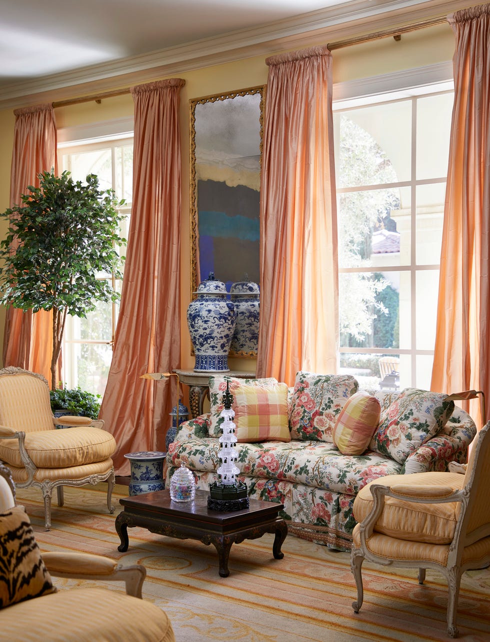
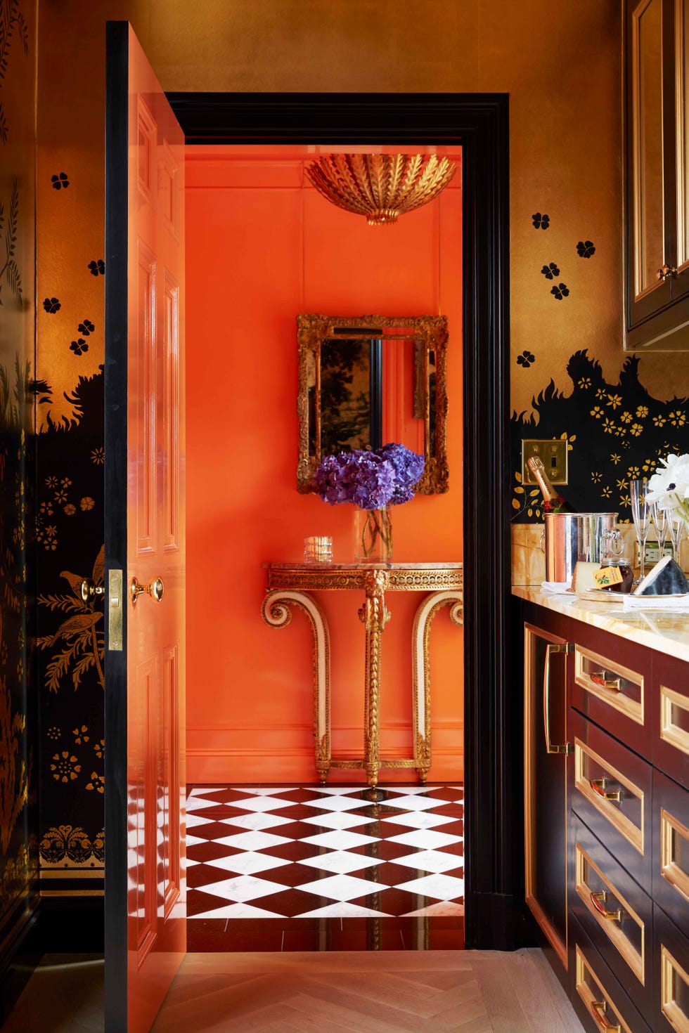
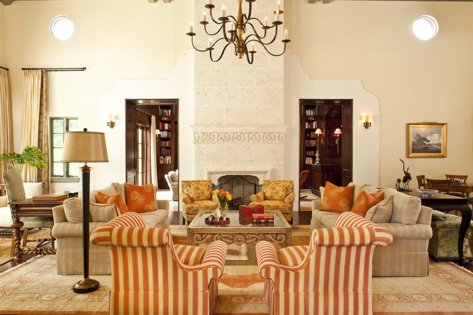
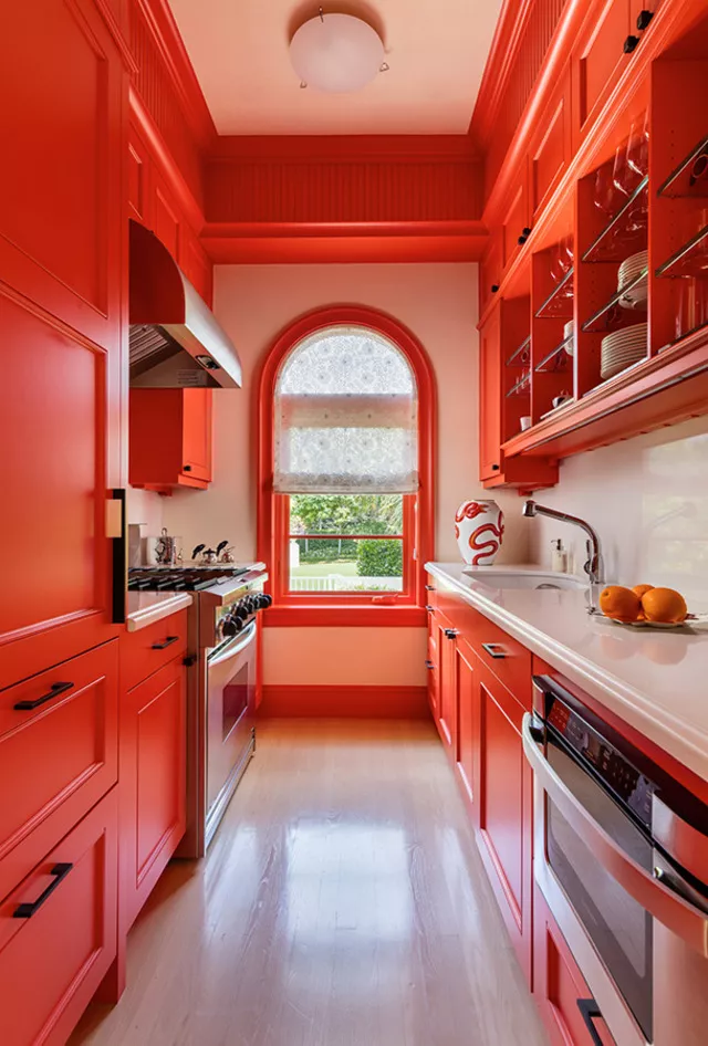
Orange, a color known for its vibrant and attention-grabbing nature, can be effectively integrated into interior design when paired with complementary hues. While its bold character is undeniable, orange also possesses a warming quality, making it suitable for various spaces, from sunlit rooms to cozy living areas. This versatility allows orange to harmonize with a wide spectrum of colors, including pastels, earthy neutrals, and other vibrant shades. Whether used as a dominant color in a sunset-inspired palette or as a subtle accent, orange can revitalize interior aesthetics.
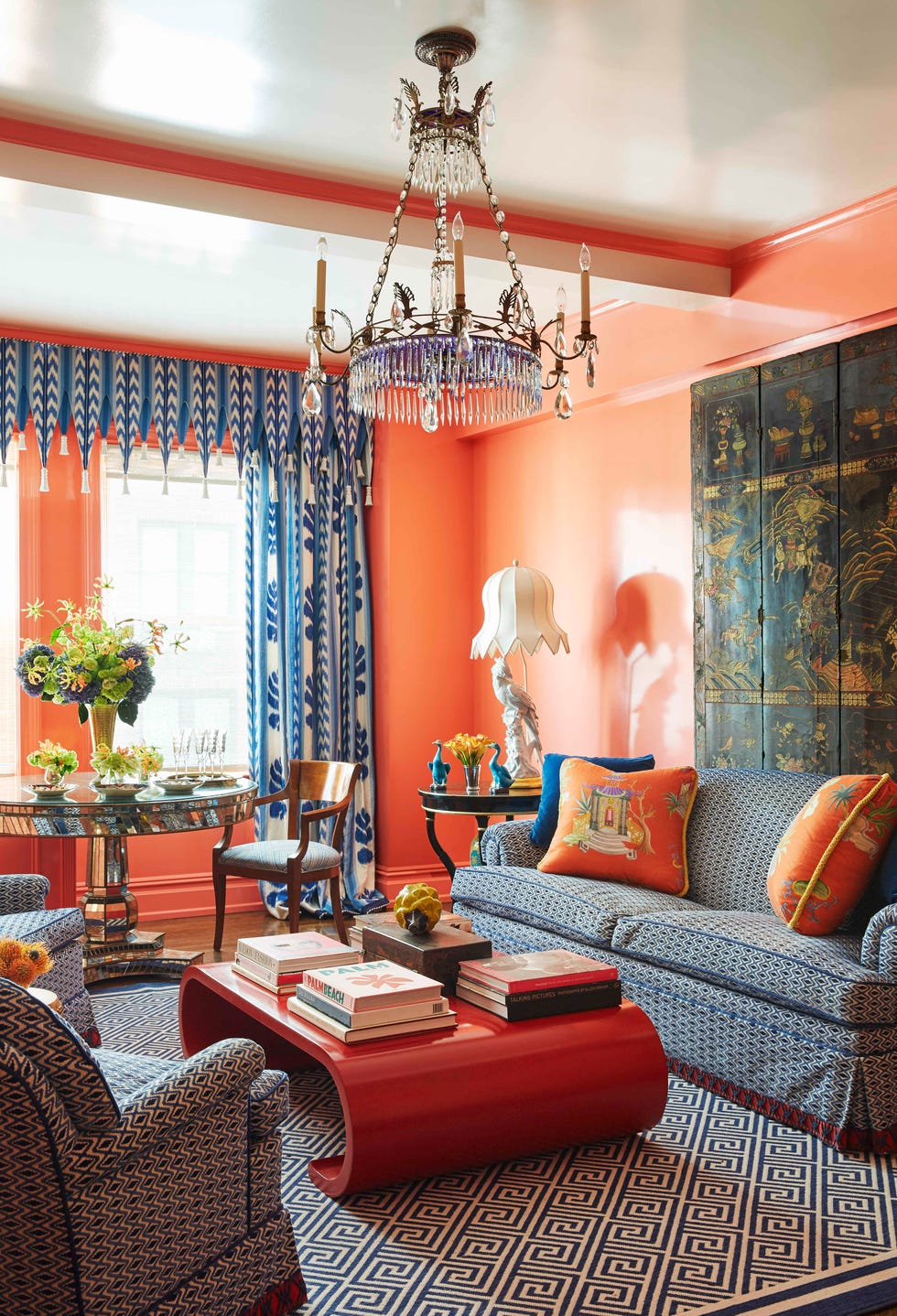
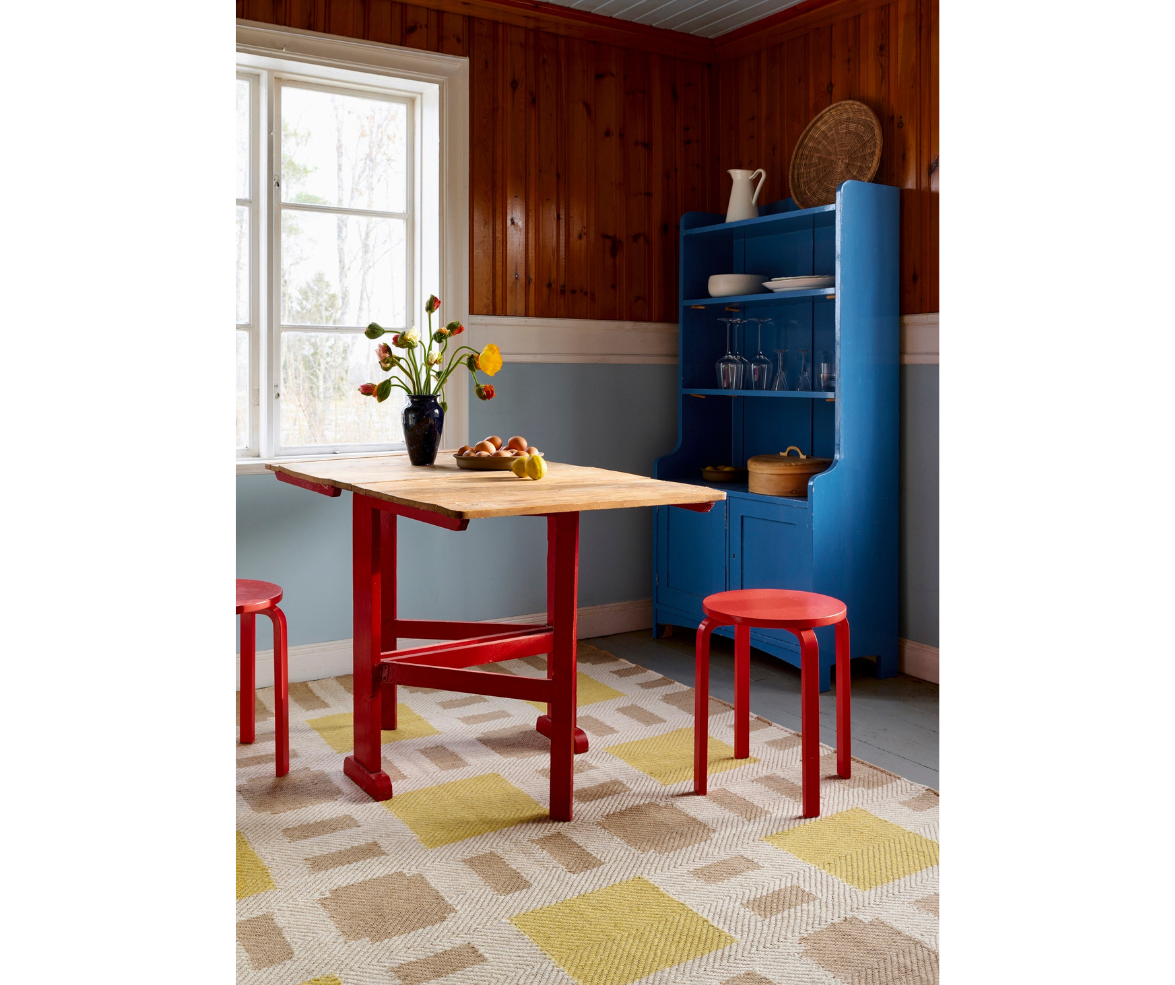
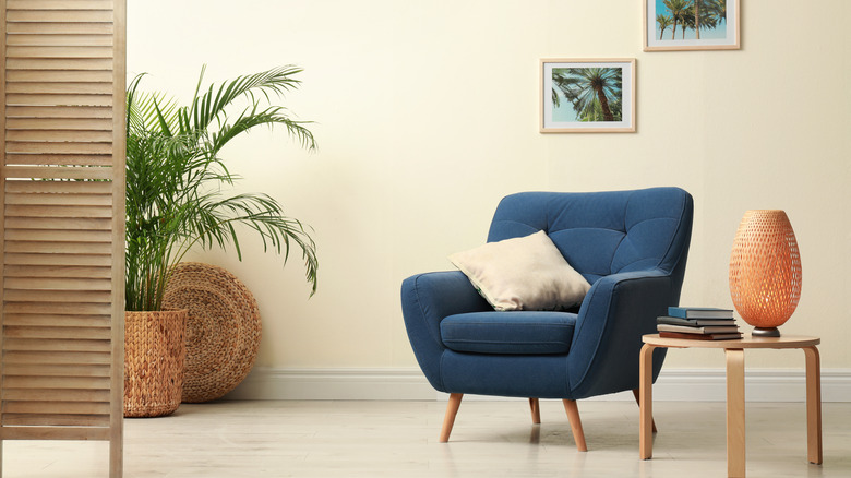
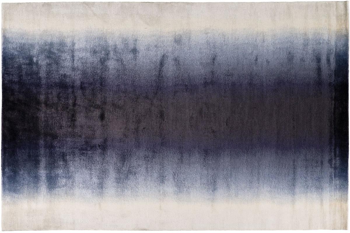
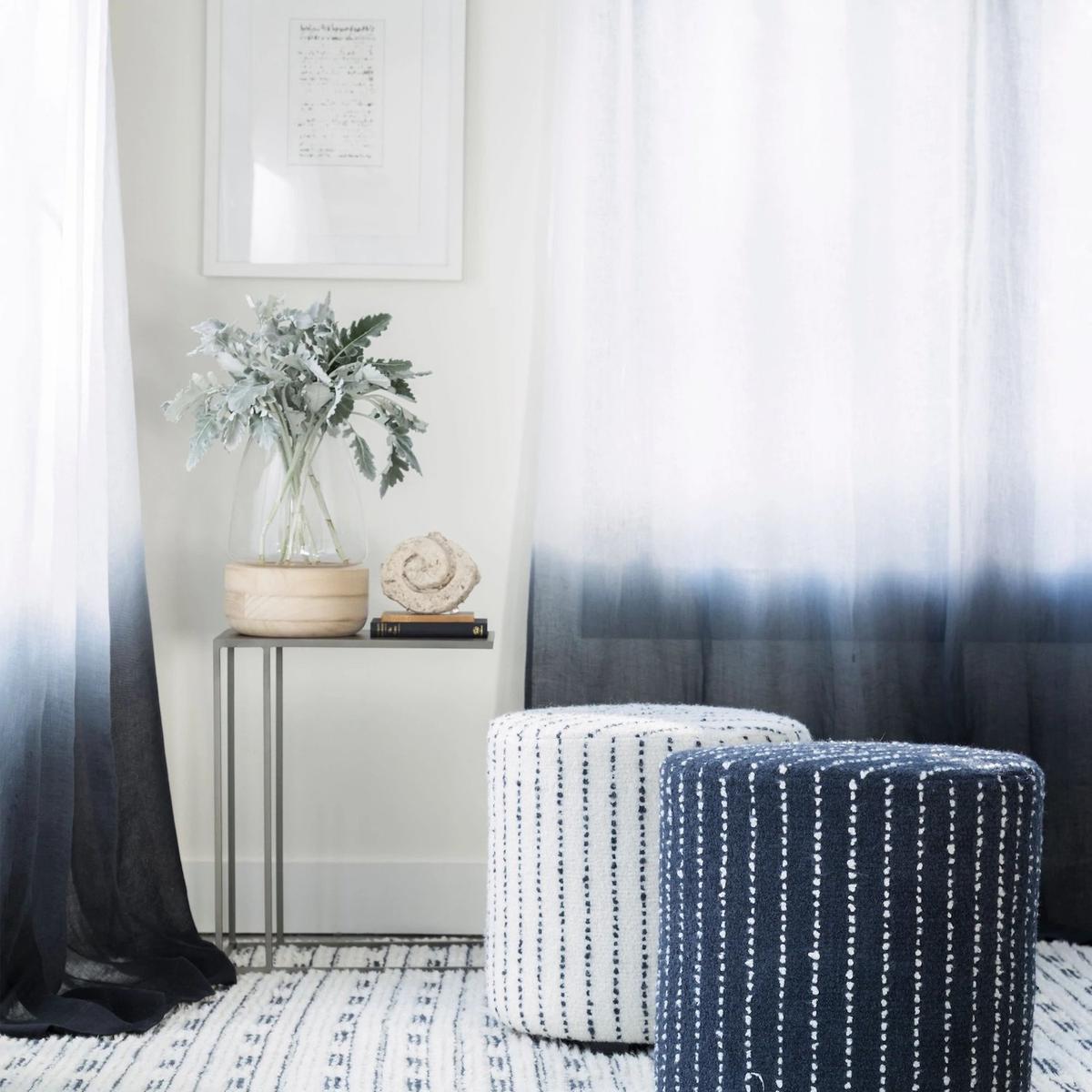
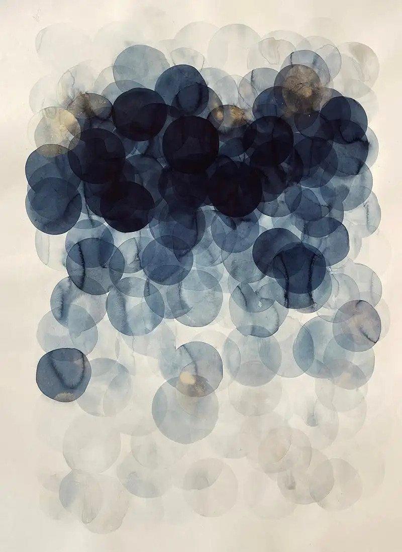
Experts suggest several color combinations to achieve a balanced and visually appealing scheme. Navy blue, for instance, offers a sophisticated contrast to orange. While black and orange can be jarring, navy blue's regal depth softens orange's intensity, creating a harmonious balance of warmth and sophistication. This pairing is often recommended for living rooms or dining areas, where navy can serve as a primary wall color or for larger furniture, accented by orange in cushions, throws, or artwork. A two-tone wall treatment with navy on the lower half and a light neutral on top can further enhance this grounded look.
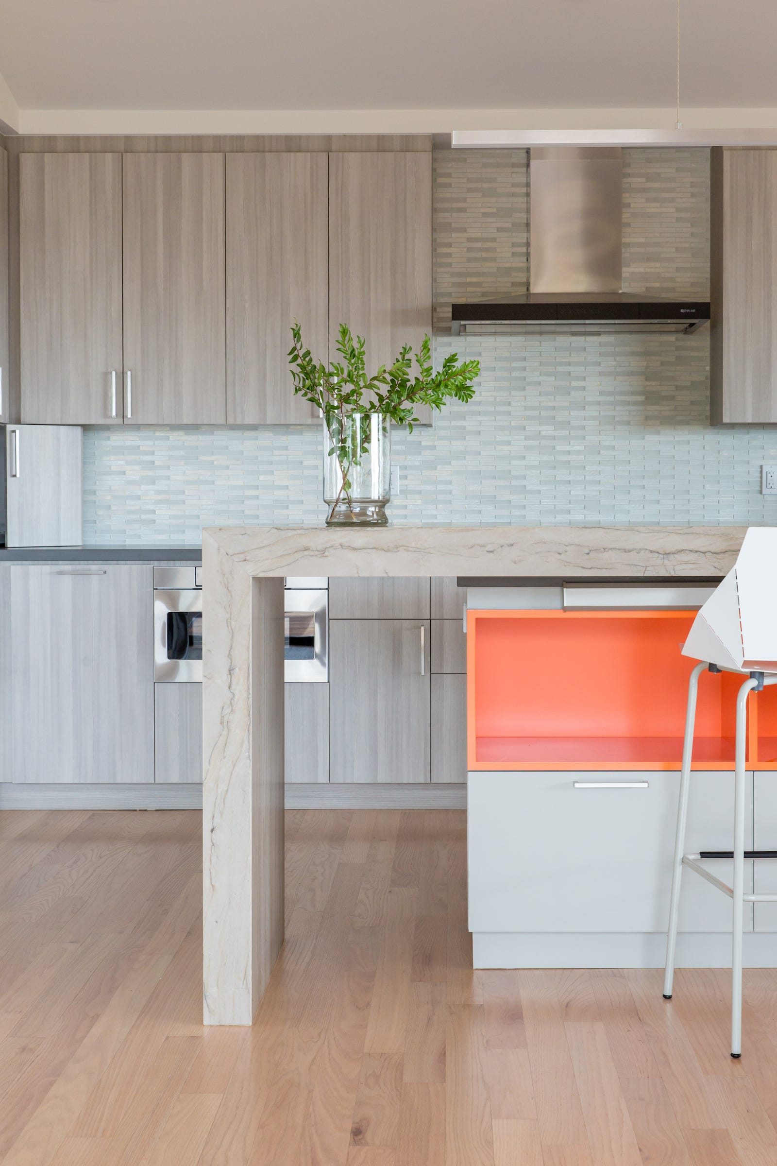
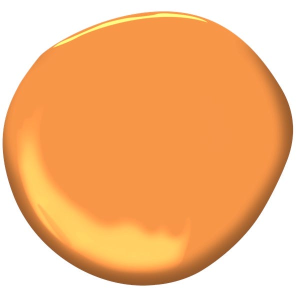

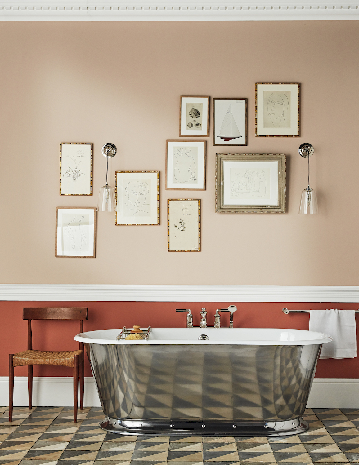
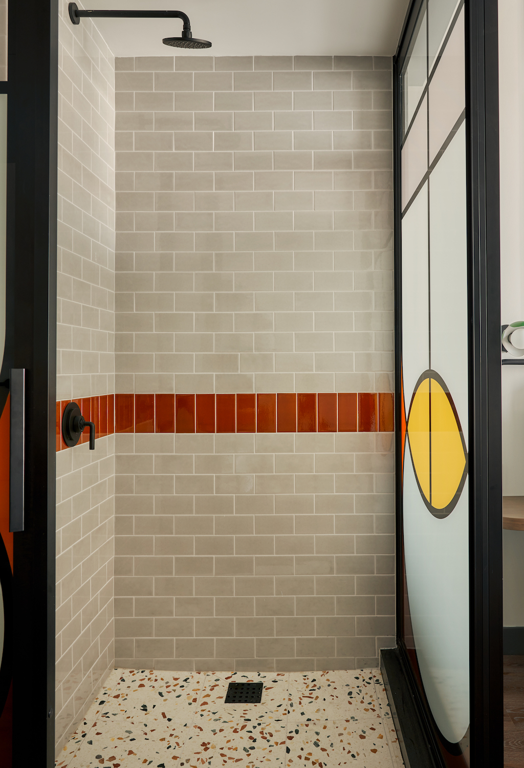
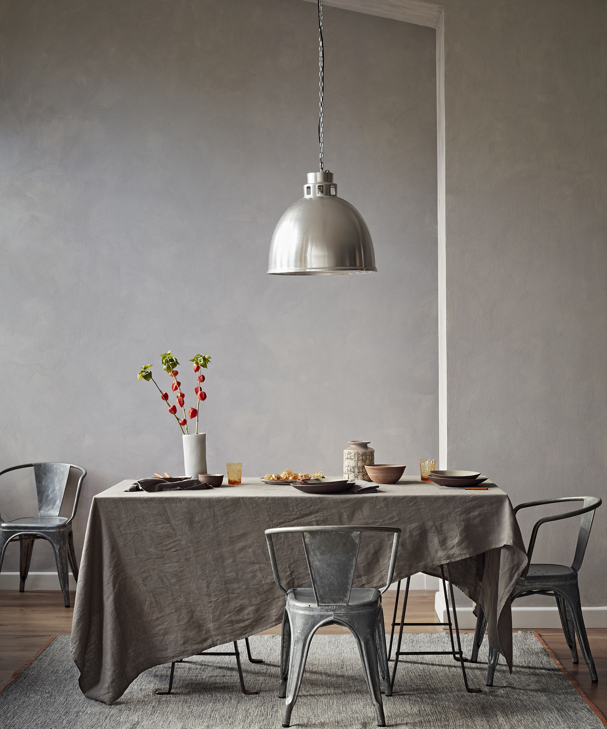
Gray also provides a compelling backdrop for orange, especially slate gray, which can create a dramatic effect. This combination is particularly effective in kitchens or bathrooms, where gray cabinetry or countertops can be paired with terracotta walls to introduce warmth. To prevent over-saturation, an accent wall can be used. Warm oranges, such as 'Marigold,' complement both mid-tone and cooler grays, with warm white offering additional contrast.
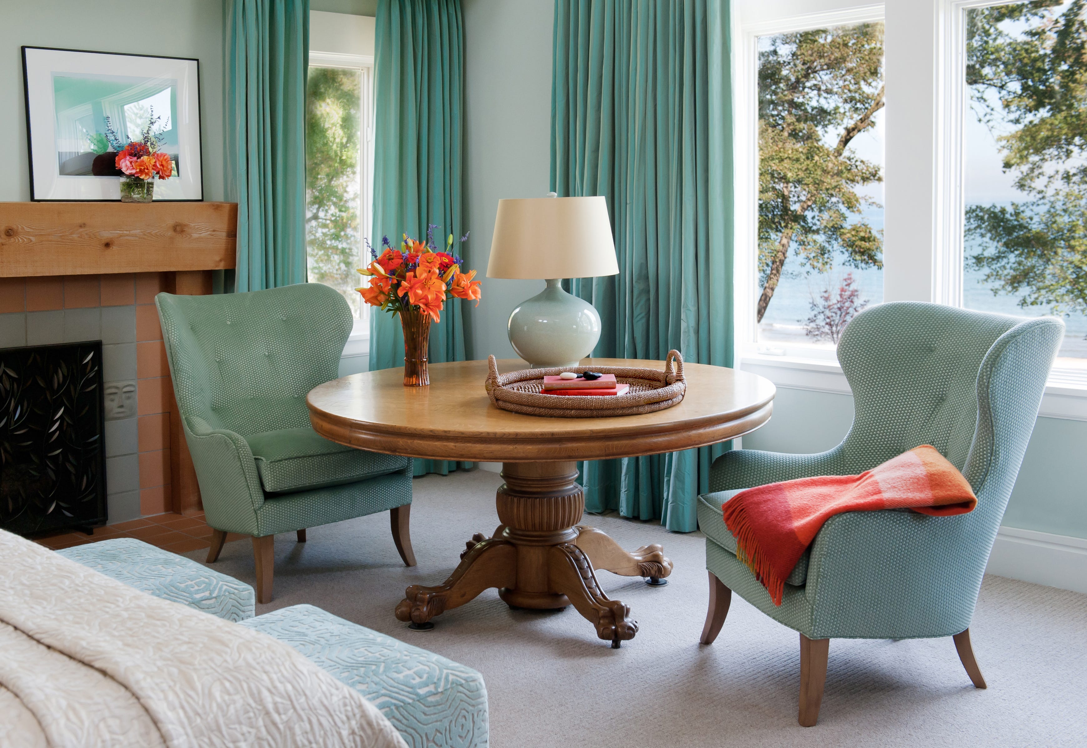
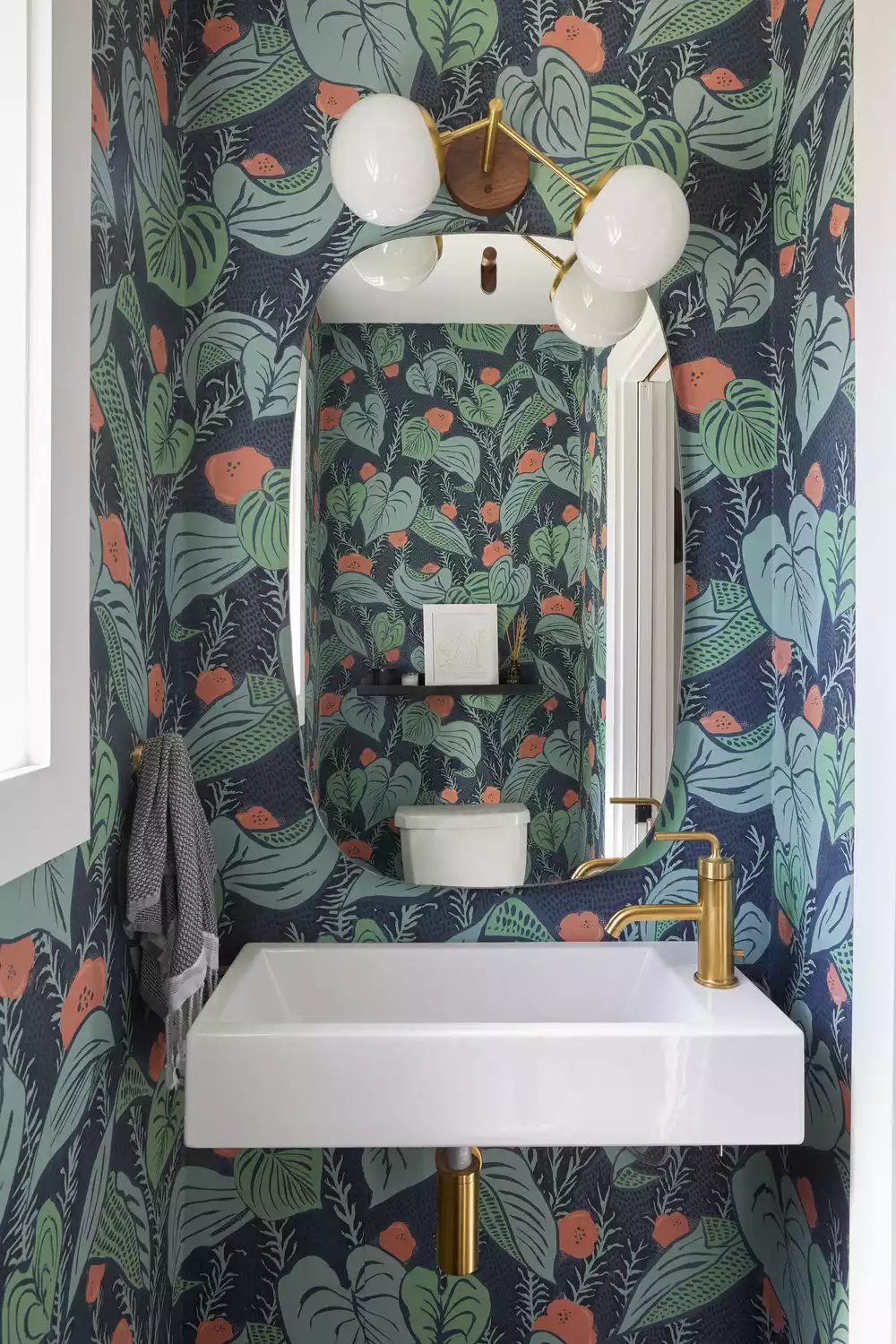
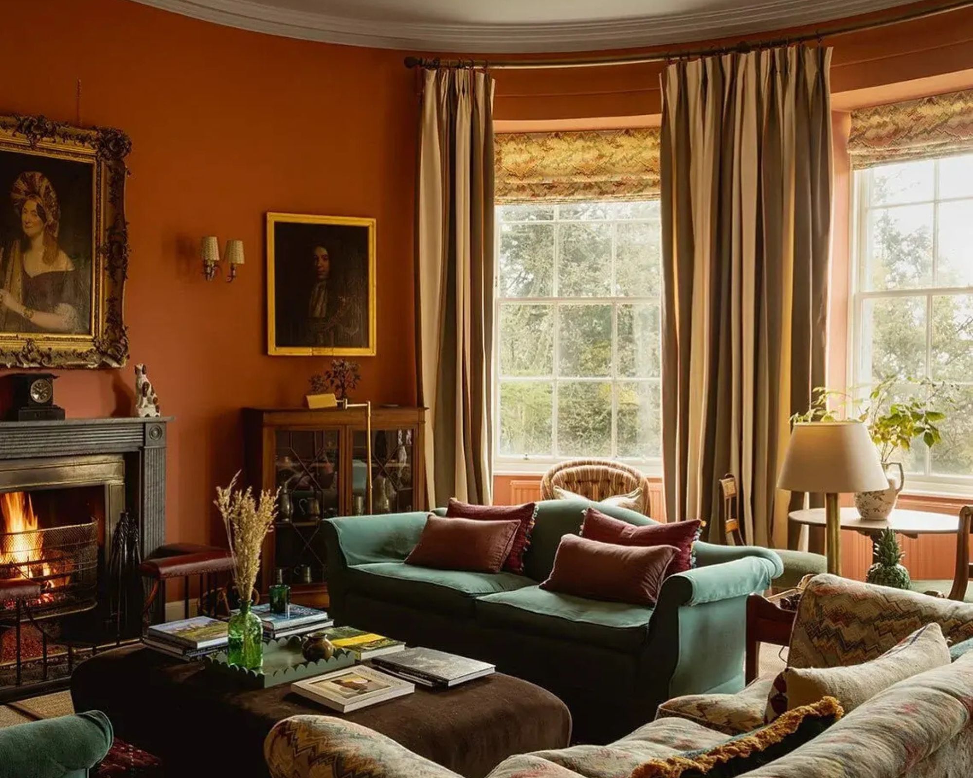
Teal, a blend of blue and green, is another excellent partner for orange, offering a striking contrast that suits maximalist design. Teal's cool tones offset orange's warmth, resulting in a vibrant yet harmonious ambiance. This combination can be implemented by using teal for large elements like sofas or accent walls, with orange introduced through artwork and accessories. Geometric patterns incorporating both colors can add a modern flair, and metallic accents like gold or silver can further refine the scheme.
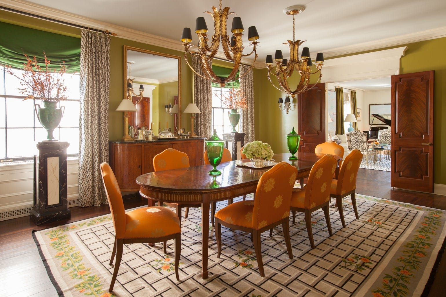
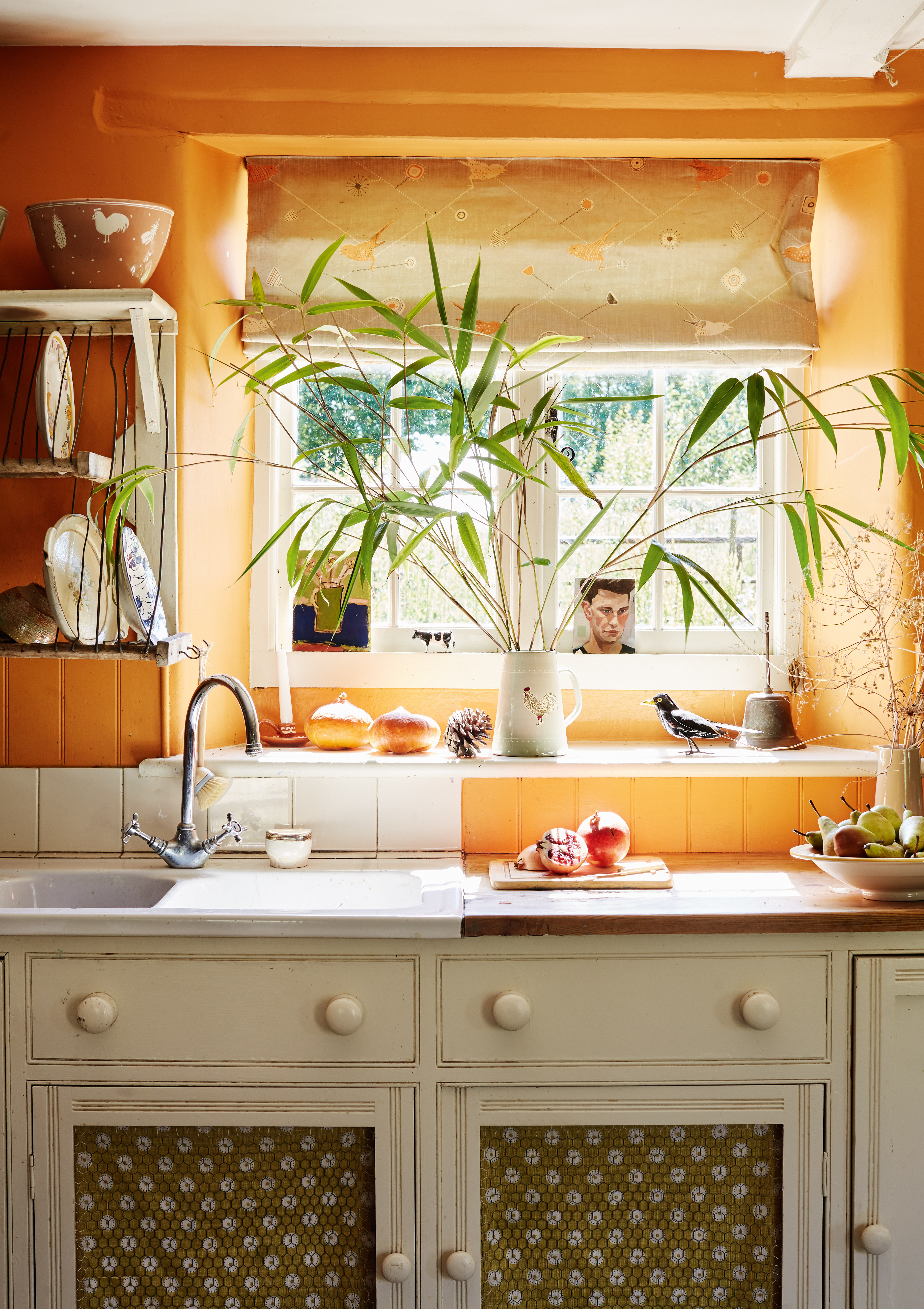
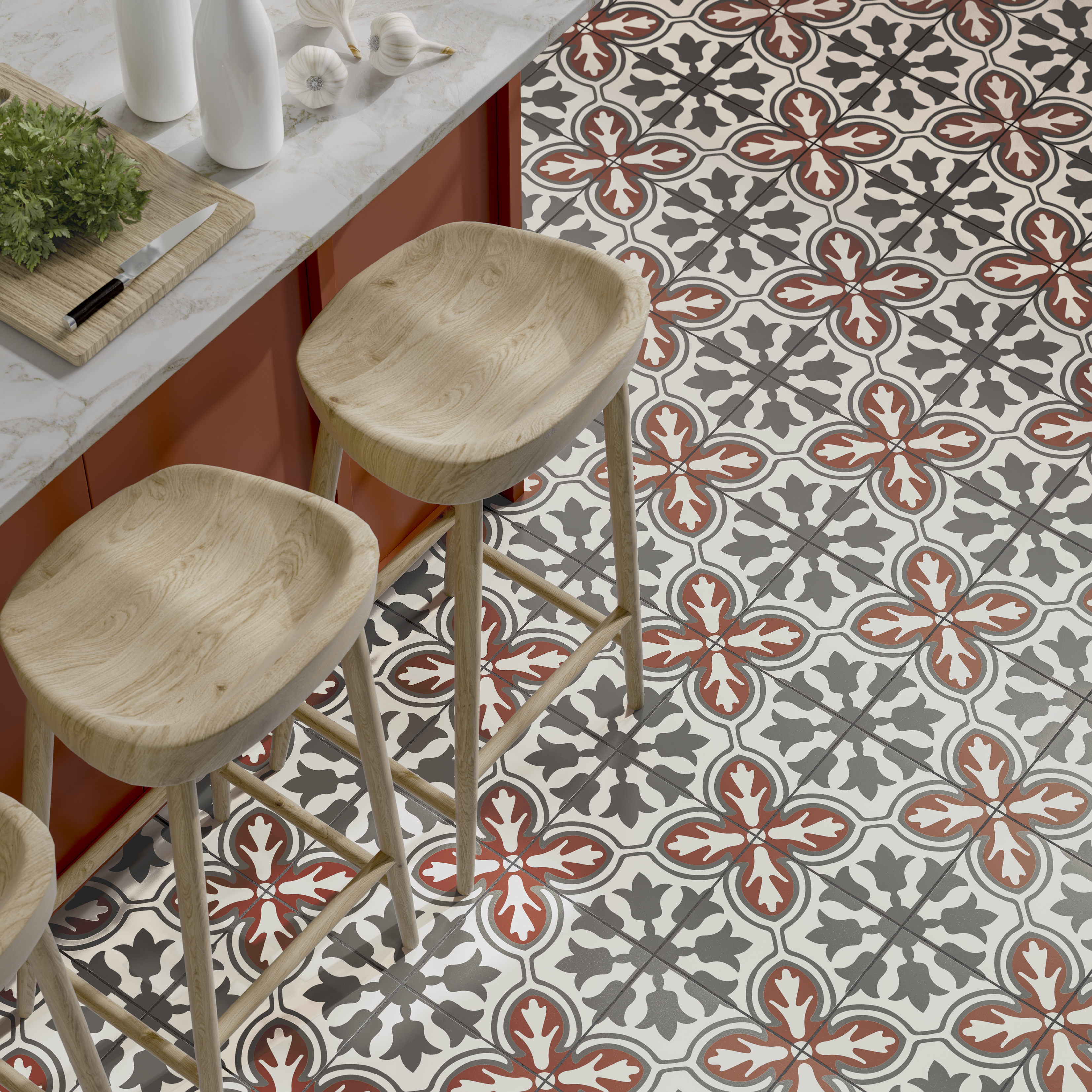
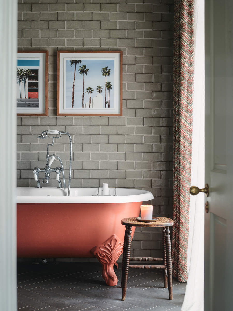
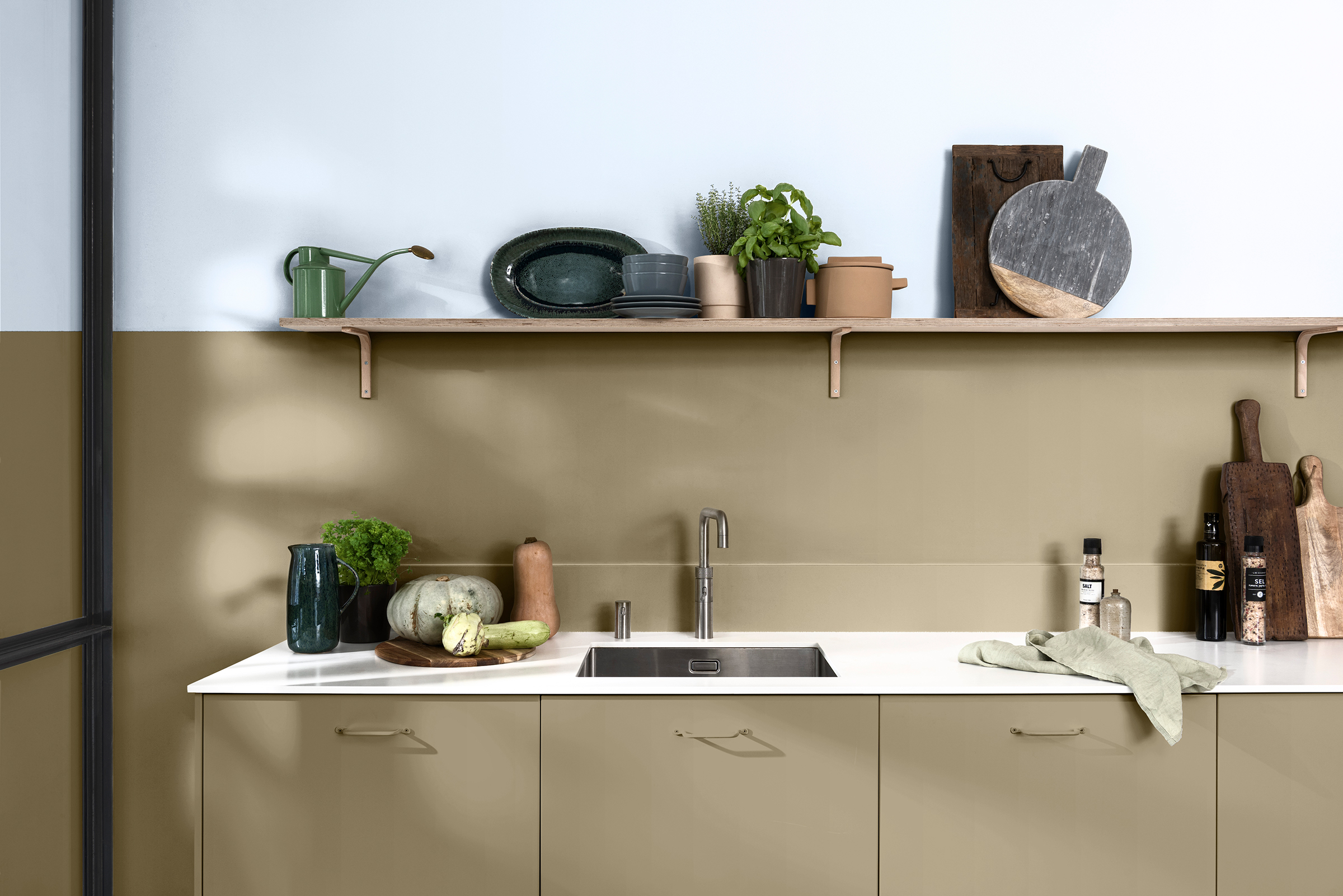
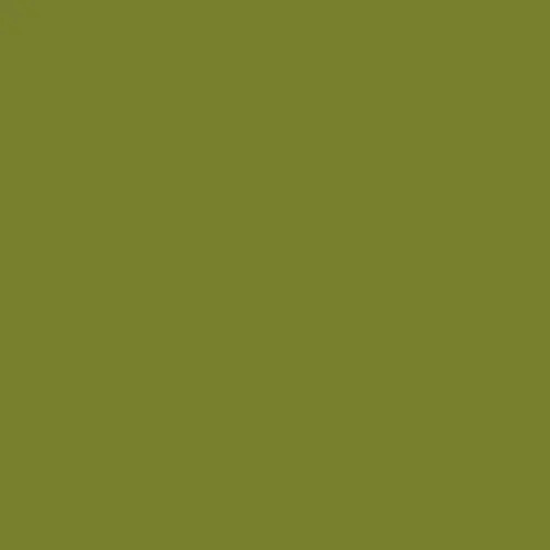
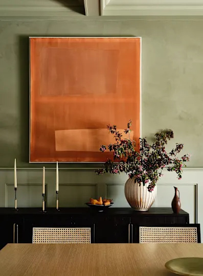
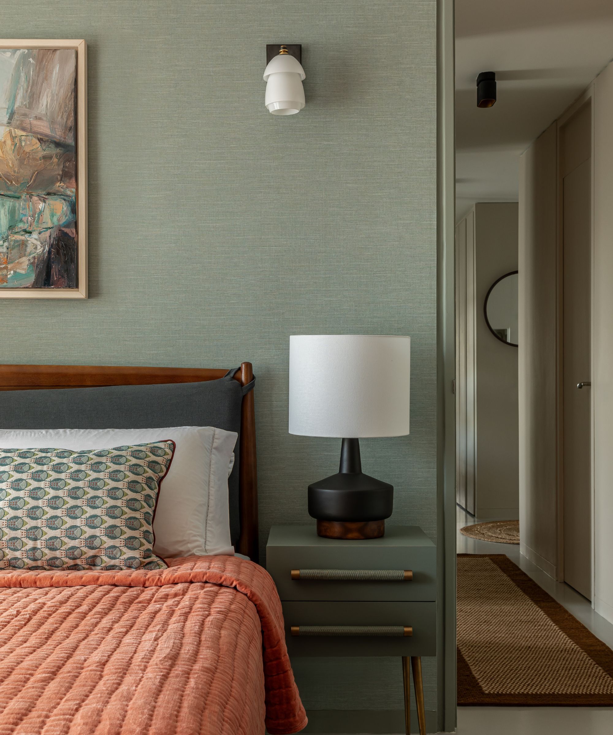
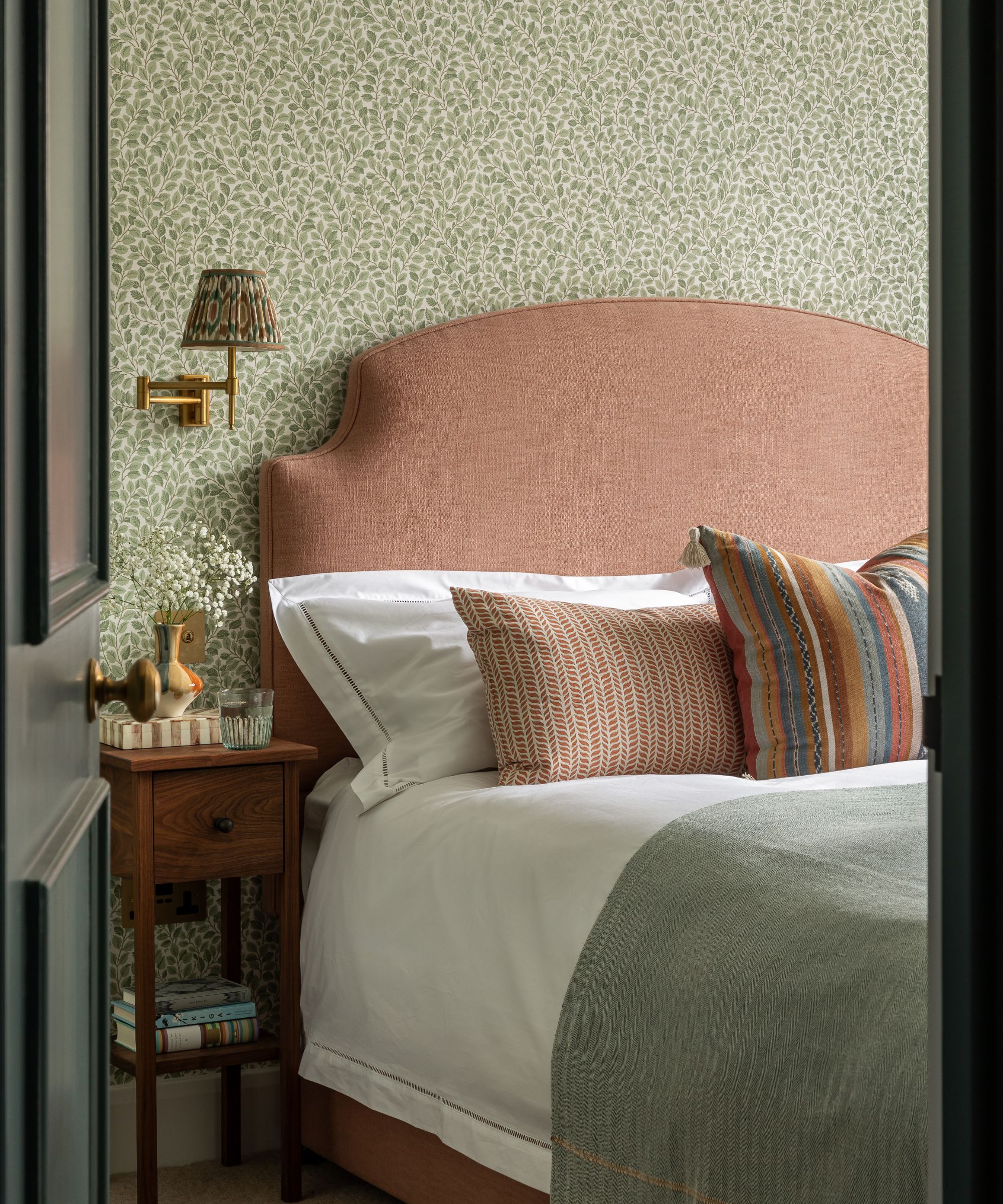
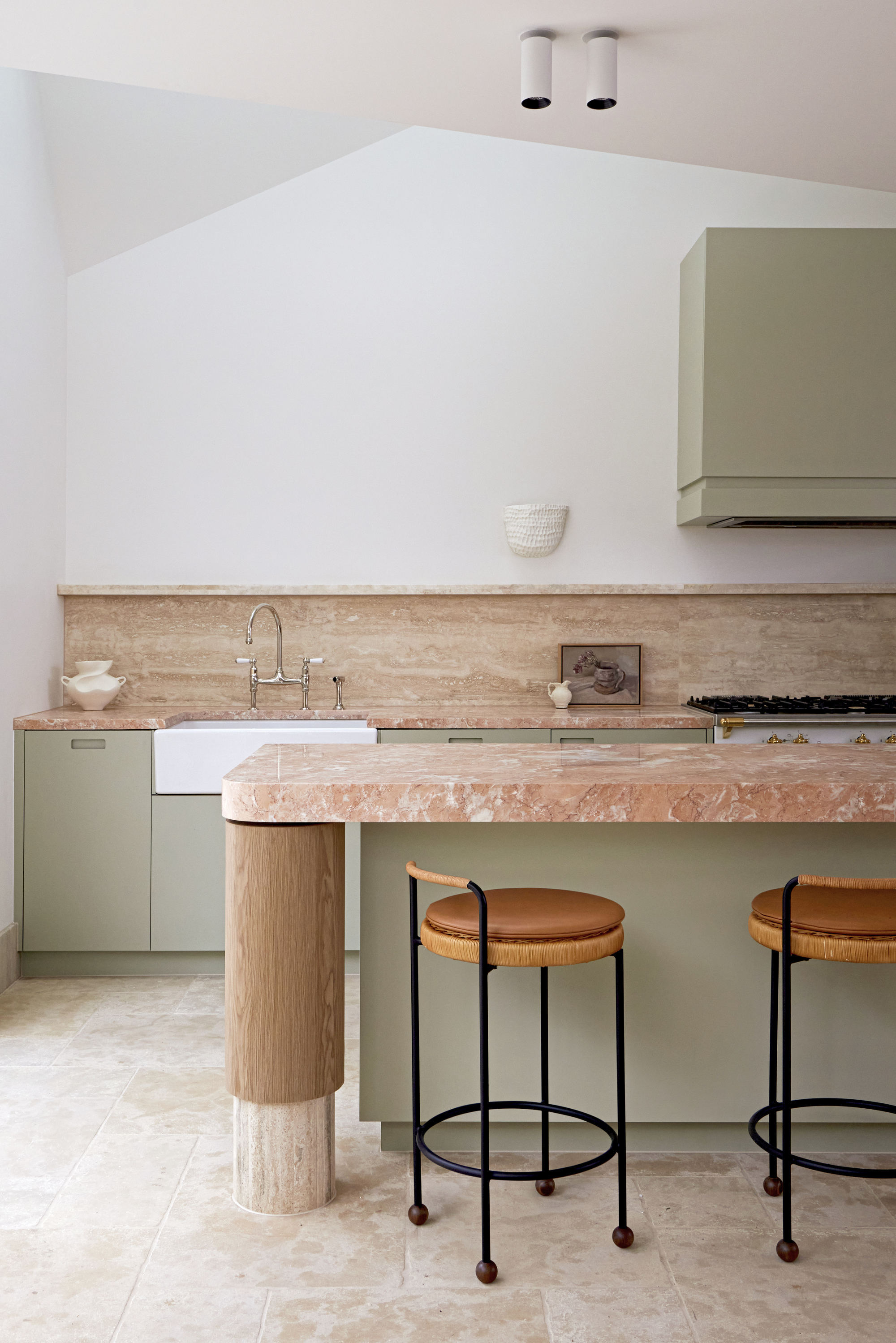
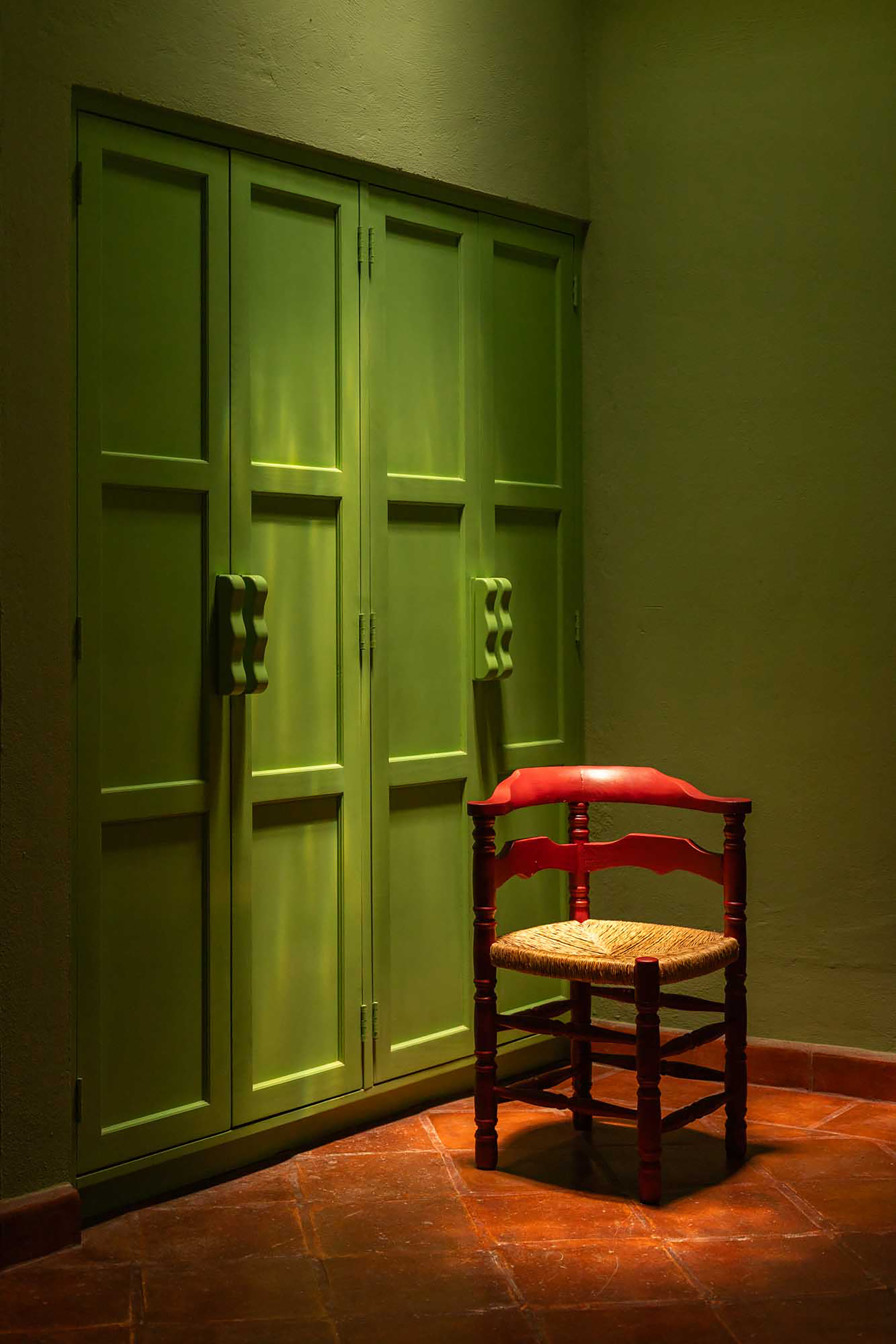
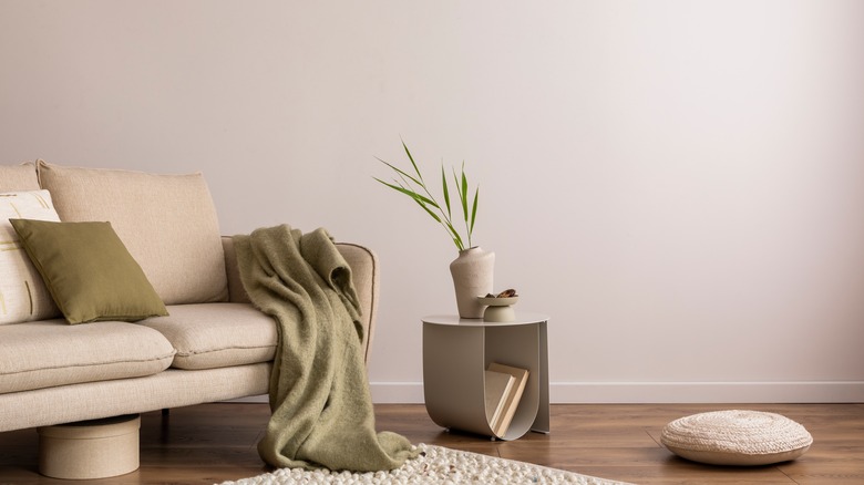
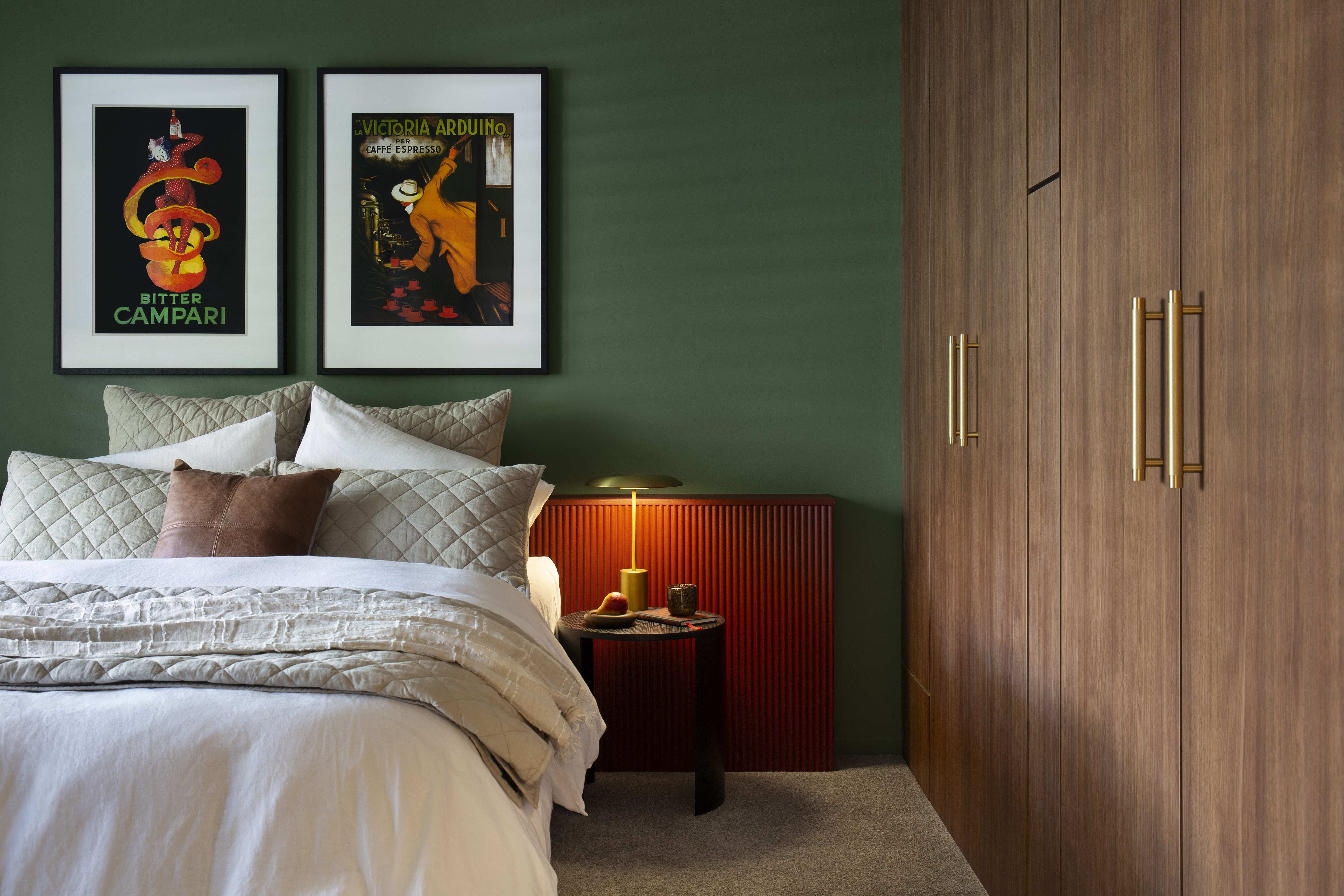
For an earthy, Mediterranean feel, orange pairs well with various shades of green, from olive to forest green. This can be achieved through paint, artisanal tiles, or abundant houseplants. Green acts as a cool, calming element, balancing orange's vibrancy to create a cohesive and curated palette. The specific shades of orange and green can be adjusted to suit the desired mood, such as deep olive with rust tones for a unified living room or lighter terracotta with sage green for an airy bathroom or bedroom.

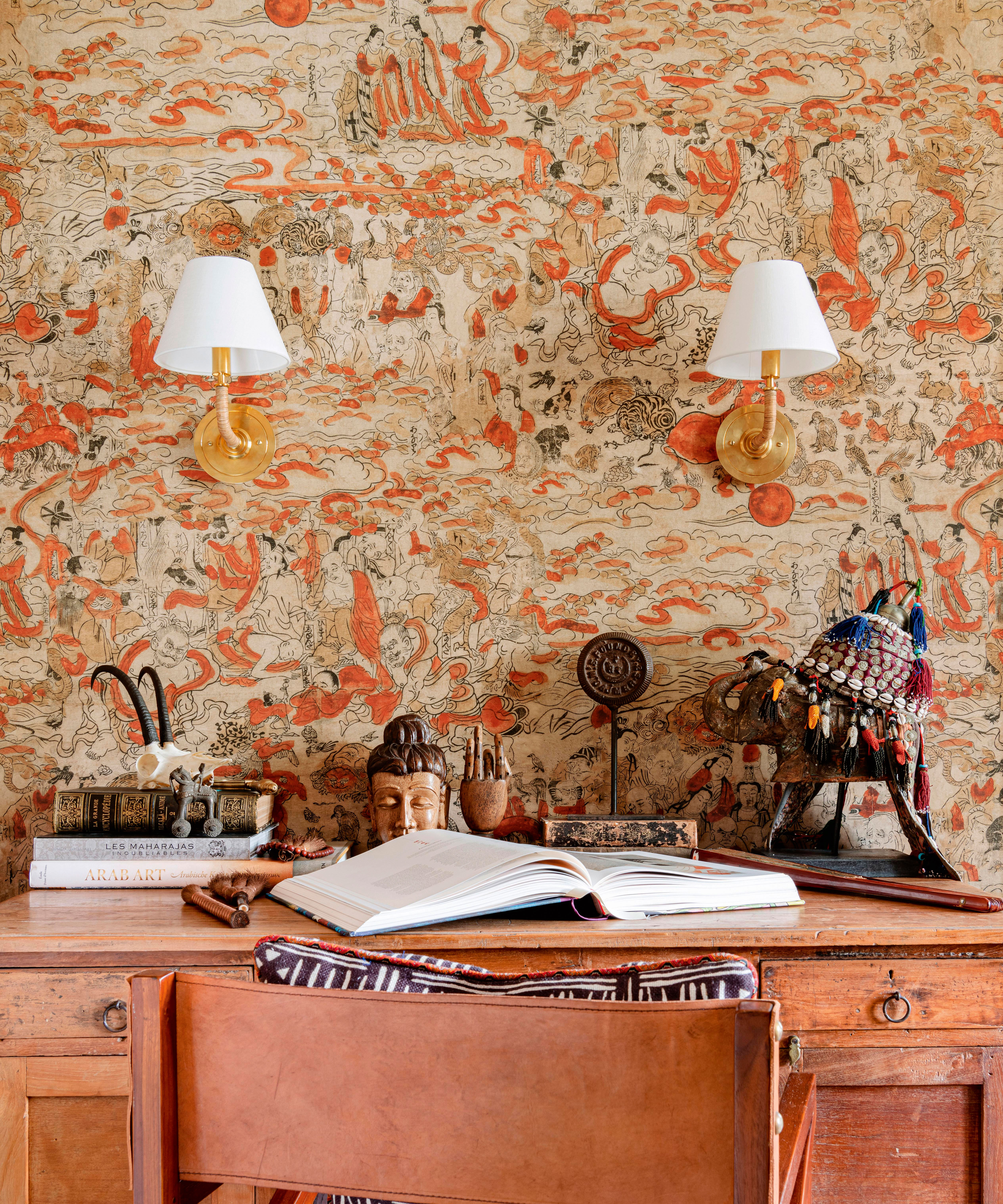
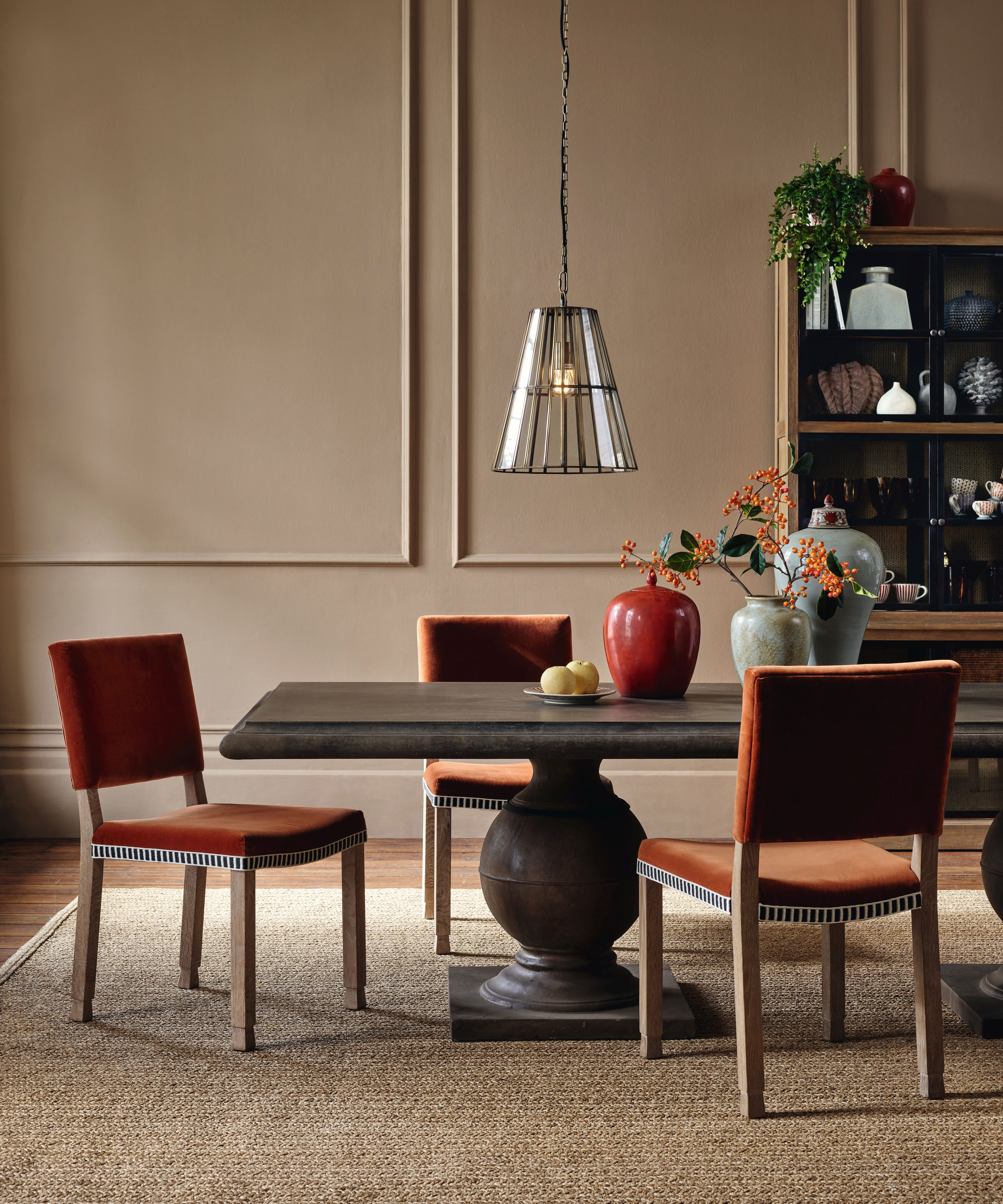
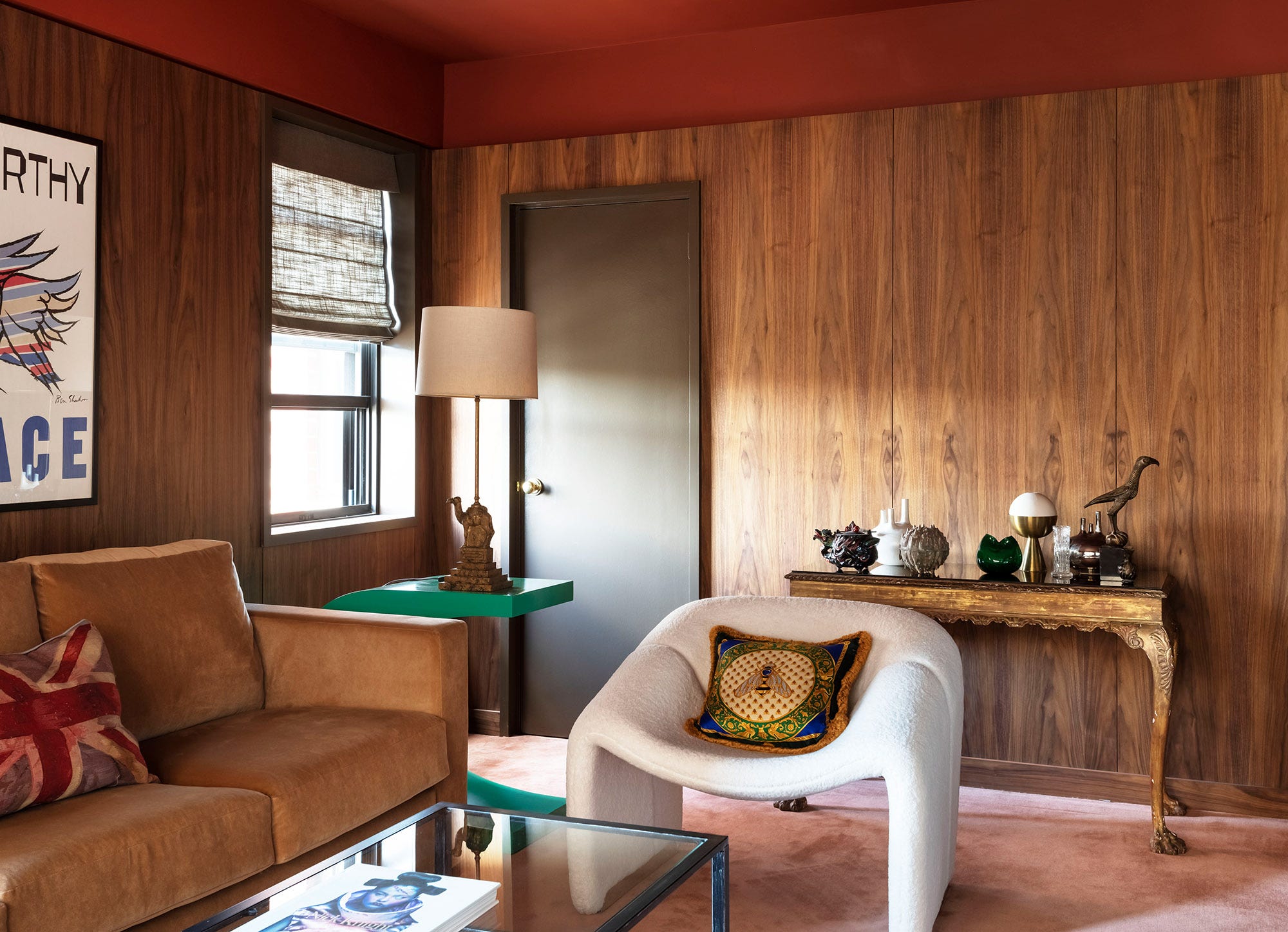
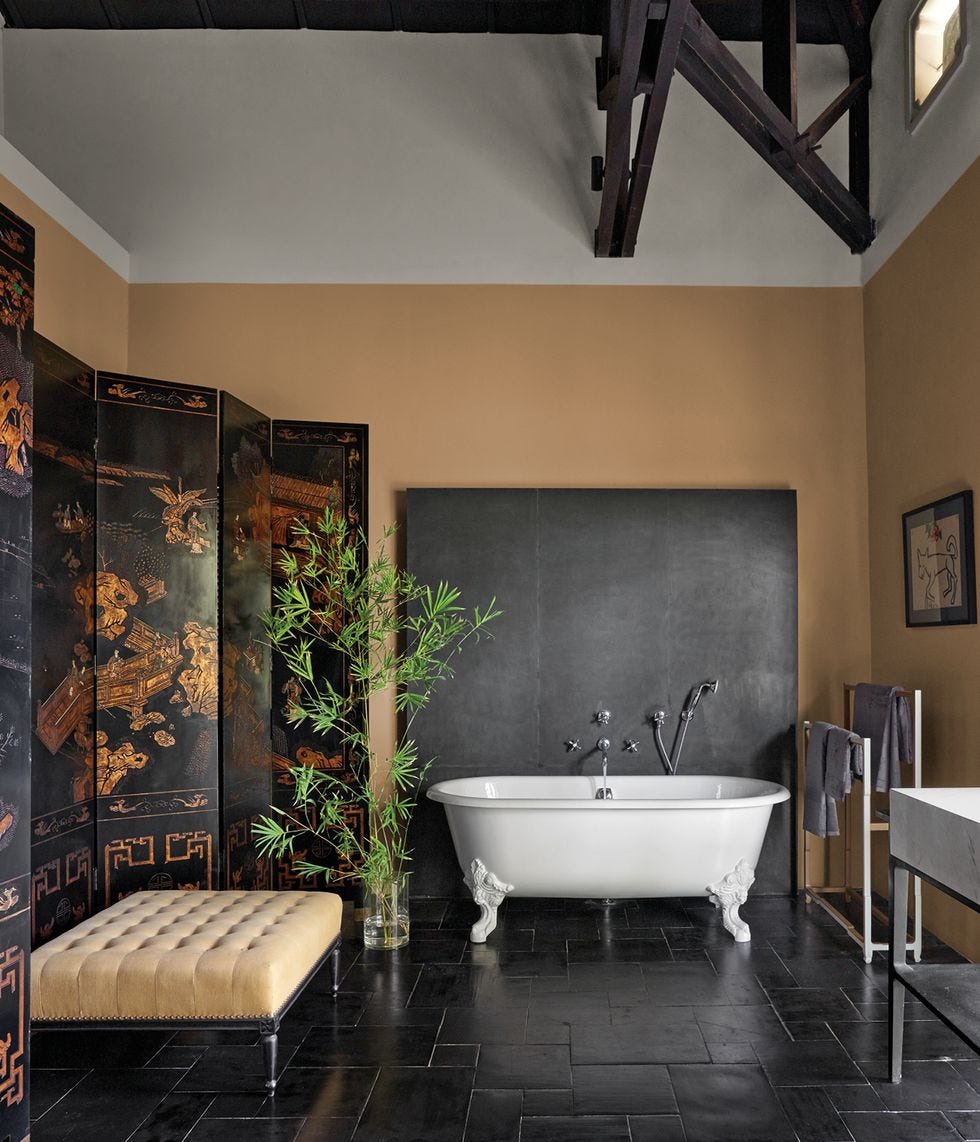
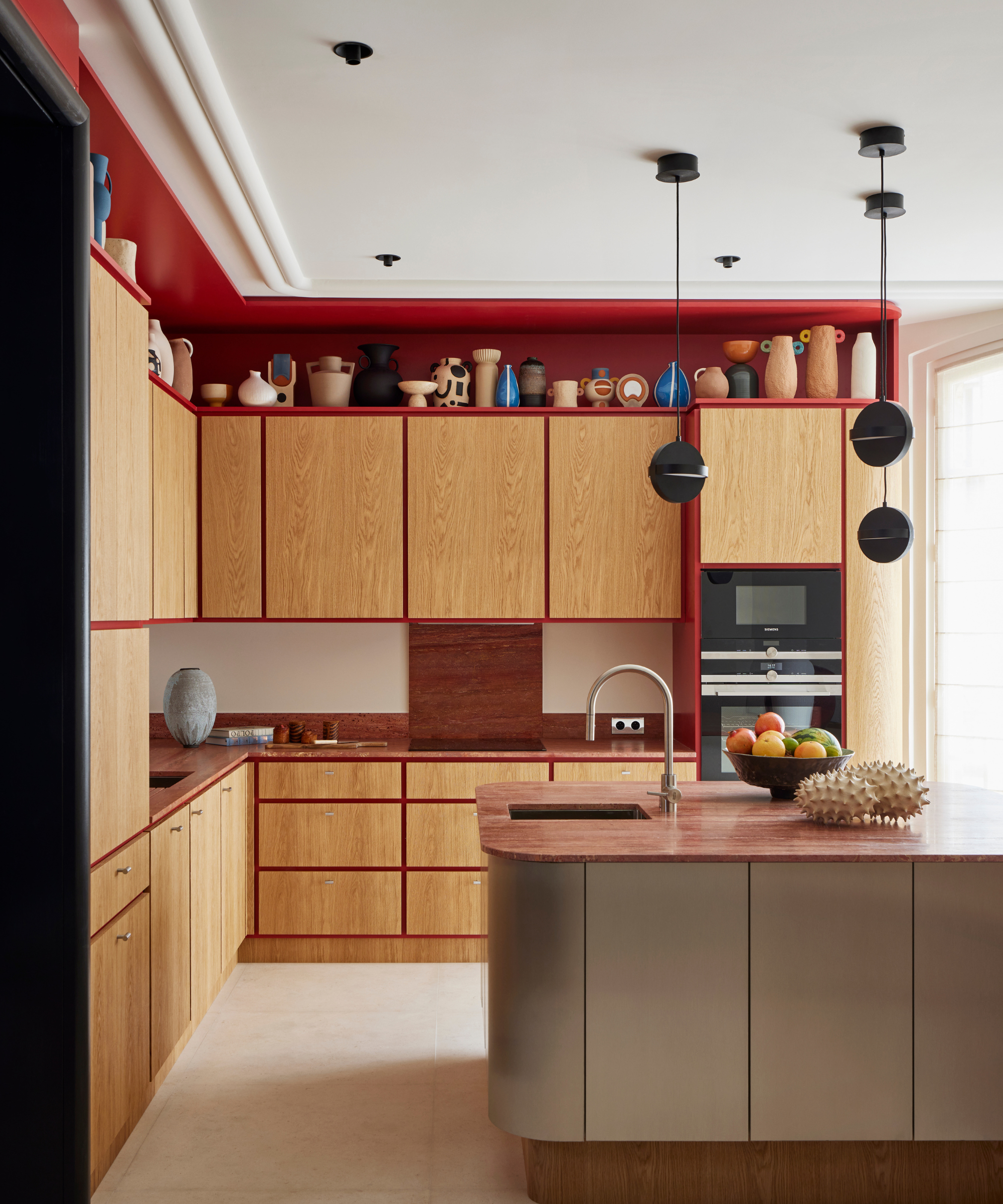
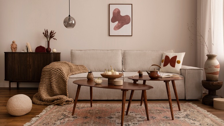
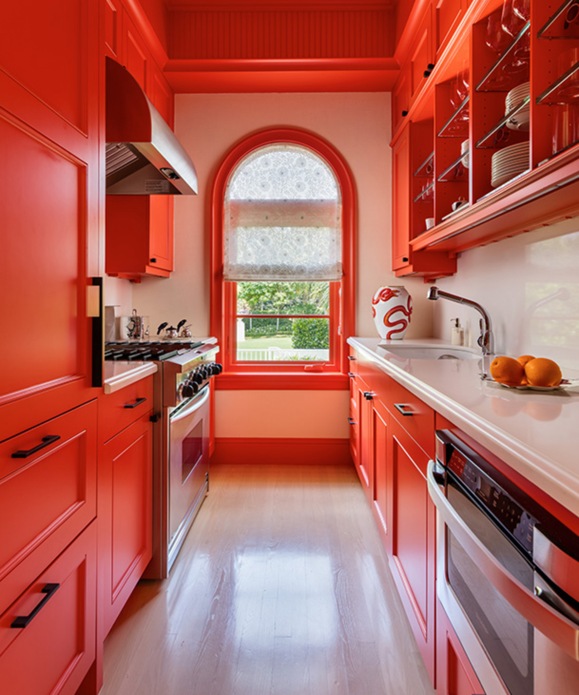
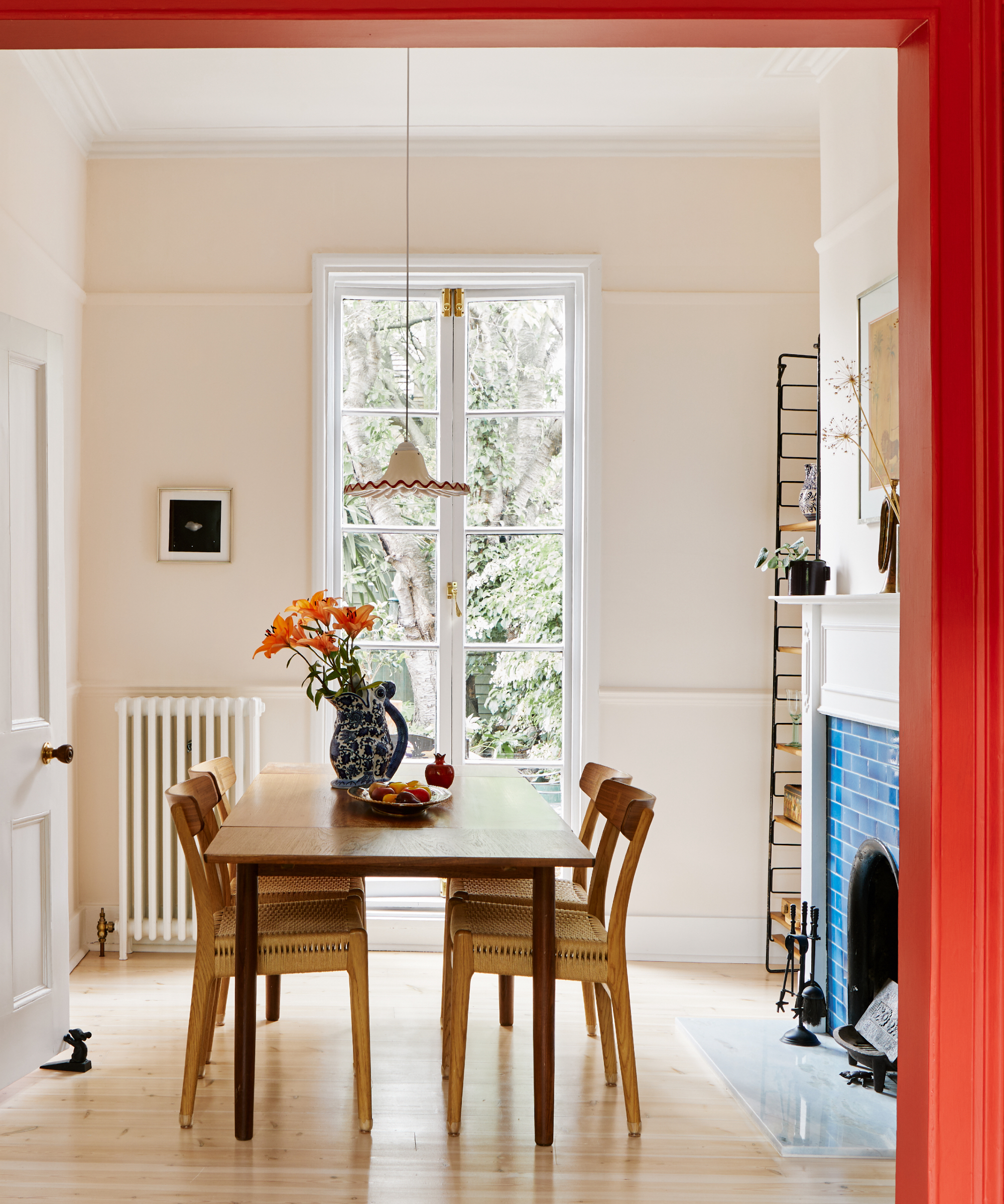
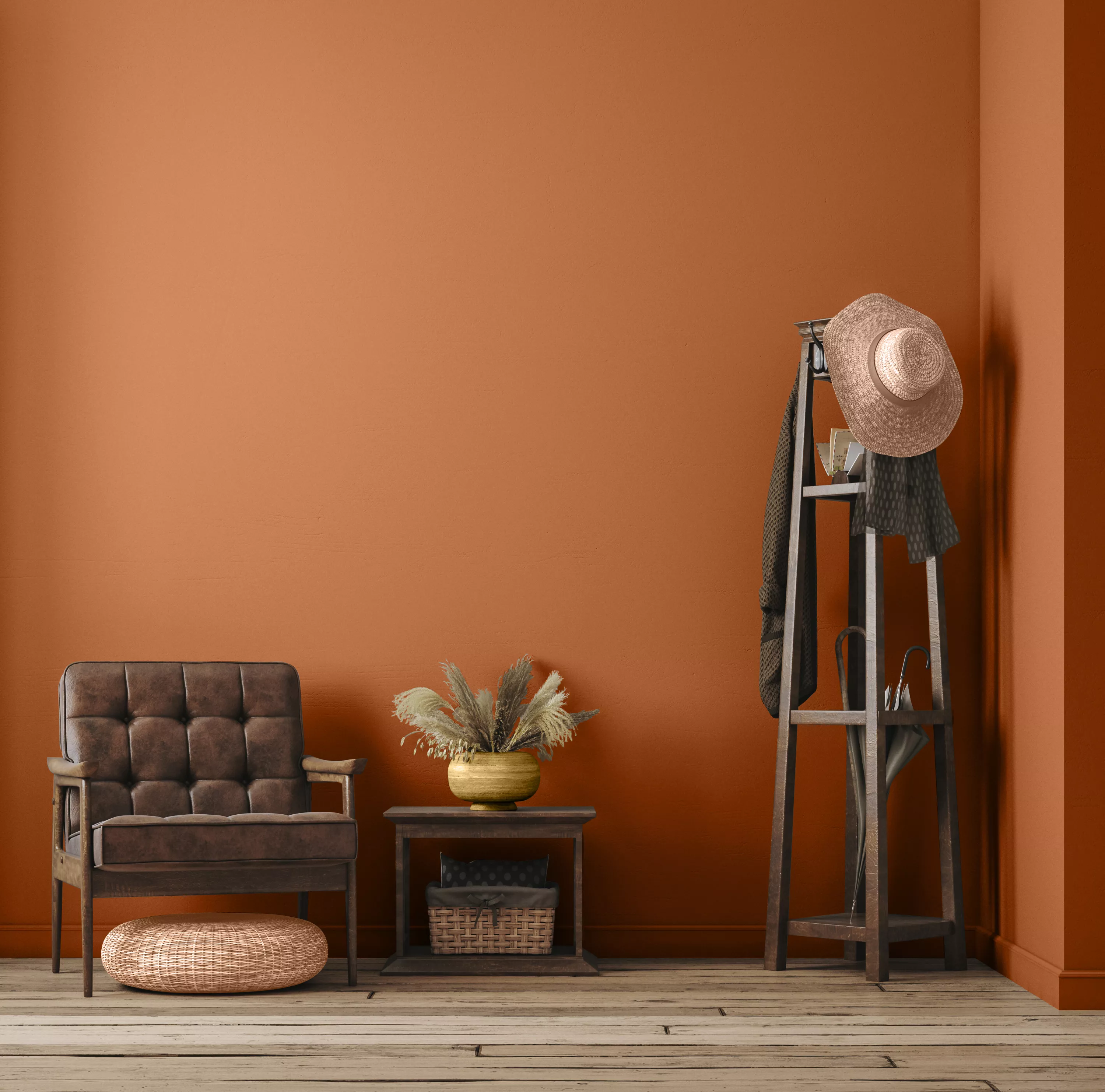
White serves as a neutral canvas that allows orange to truly stand out. When selecting a white, consider whether a warmer or cooler tone will best enhance the chosen orange hue. This pairing is ideal for spaces where orange is introduced through furniture, kitchenware, or accents. Striped walls with alternating orange and white can also add a playful touch. Brown, particularly muddy browns, dark olives, and umber, provides an organic and less harsh complement to orange, especially burnt orange or terracotta. Incorporating natural wood accents, such as reclaimed furniture or exposed beams, can further enrich this earthy scheme.
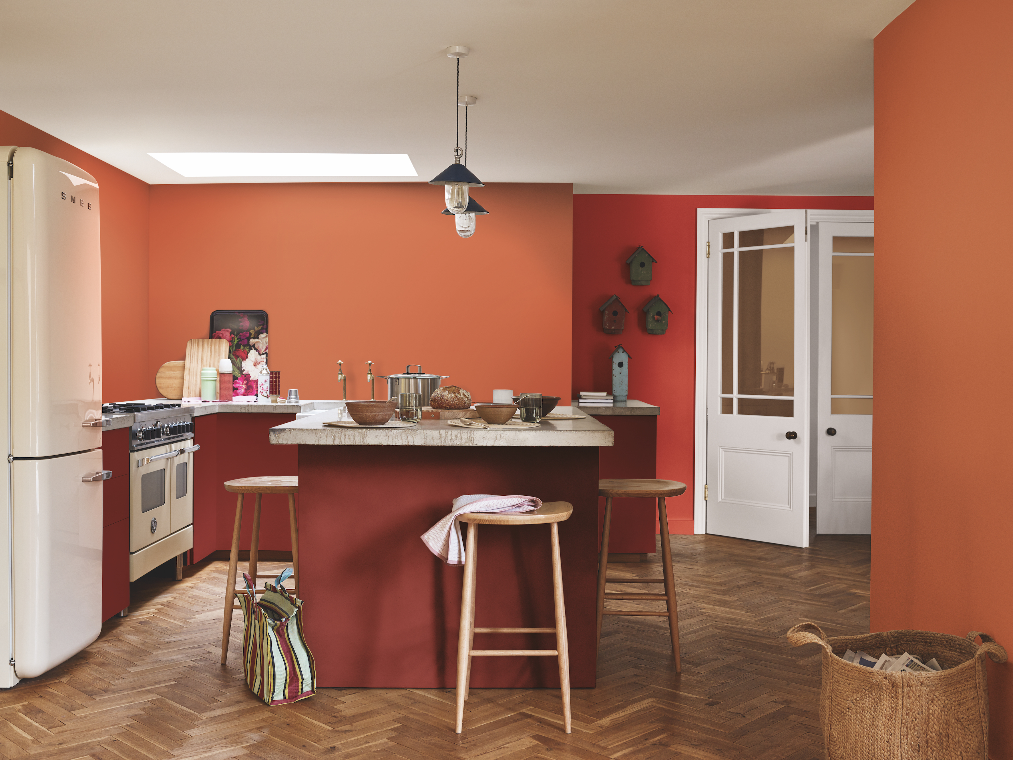
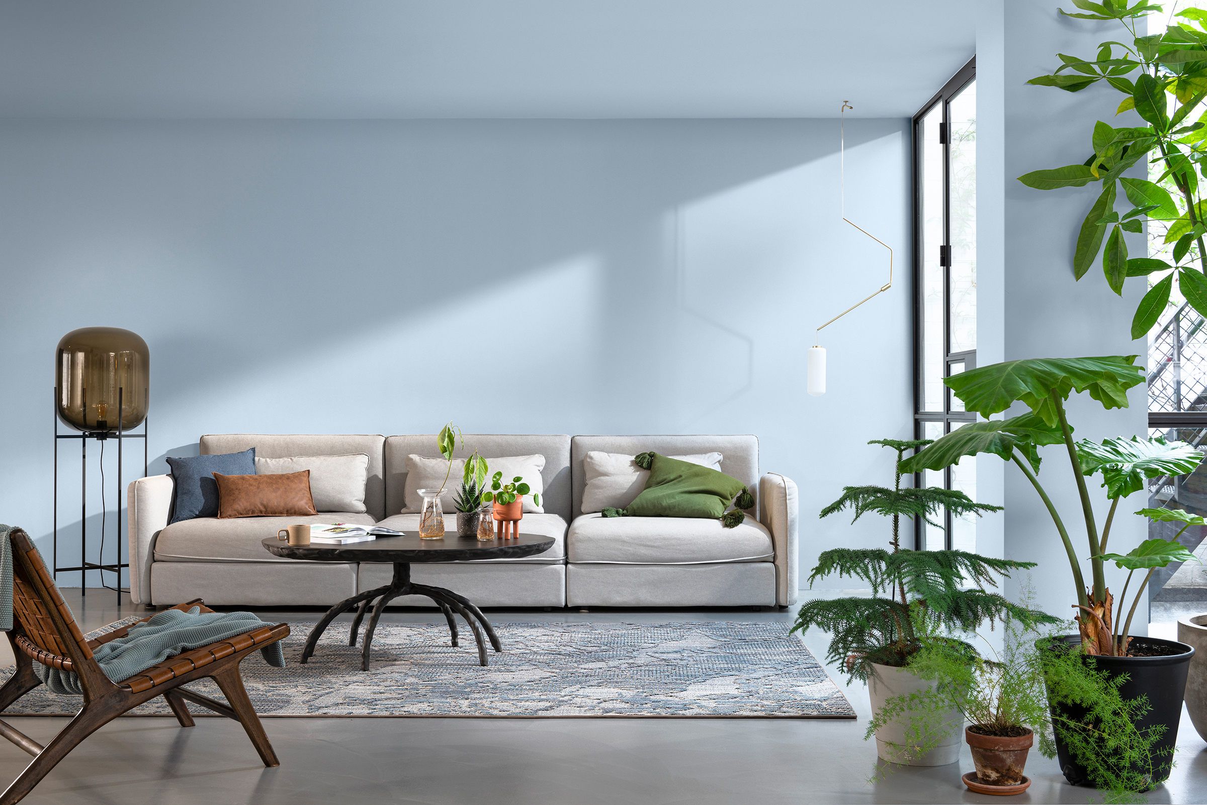
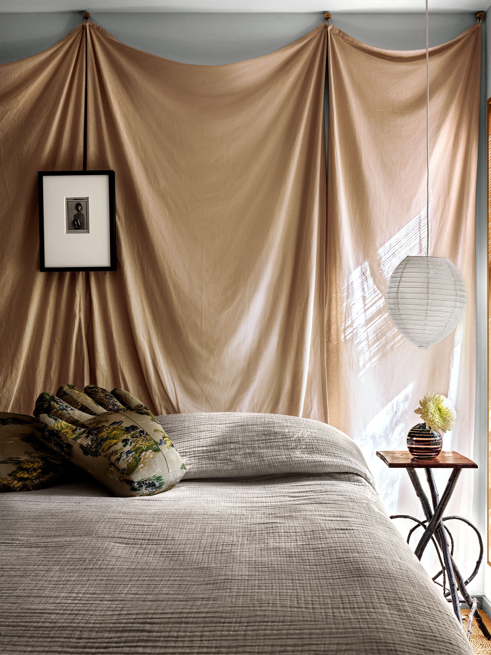
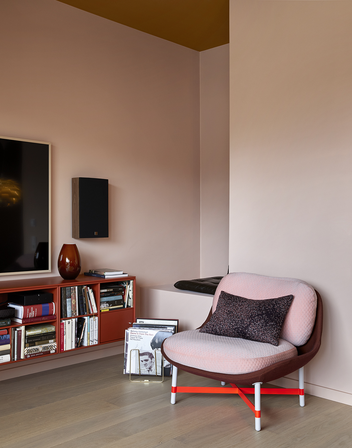
Steely blue, a pale and cool blue, also complements orange due to their complementary positions on the color wheel. A deep blue can ground a bright orange, while a paler hue creates a sense of openness. Layering orange with its root colors, such as reds and burgundies, can create a powerful and earthy scheme, evoking natural associations. Rob Whitaker of Claybrook Studio notes that orange's links to spices and natural cycles make it a popular choice for interiors, reflecting renewal and adventure. Pink, especially nuanced oranges like sienna, harmonizes with various pinks, from pastels to fuchsias, making it easy to layer into different schemes. Umber-based oranges are particularly recommended for their comfort and ability to host art and objects. Yellow, being adjacent to orange on the color wheel, is a safe choice, particularly pale yellows or mustard shades, which create a warm and natural feel without the chaos that bright yellow might introduce when paired with saturated orange.
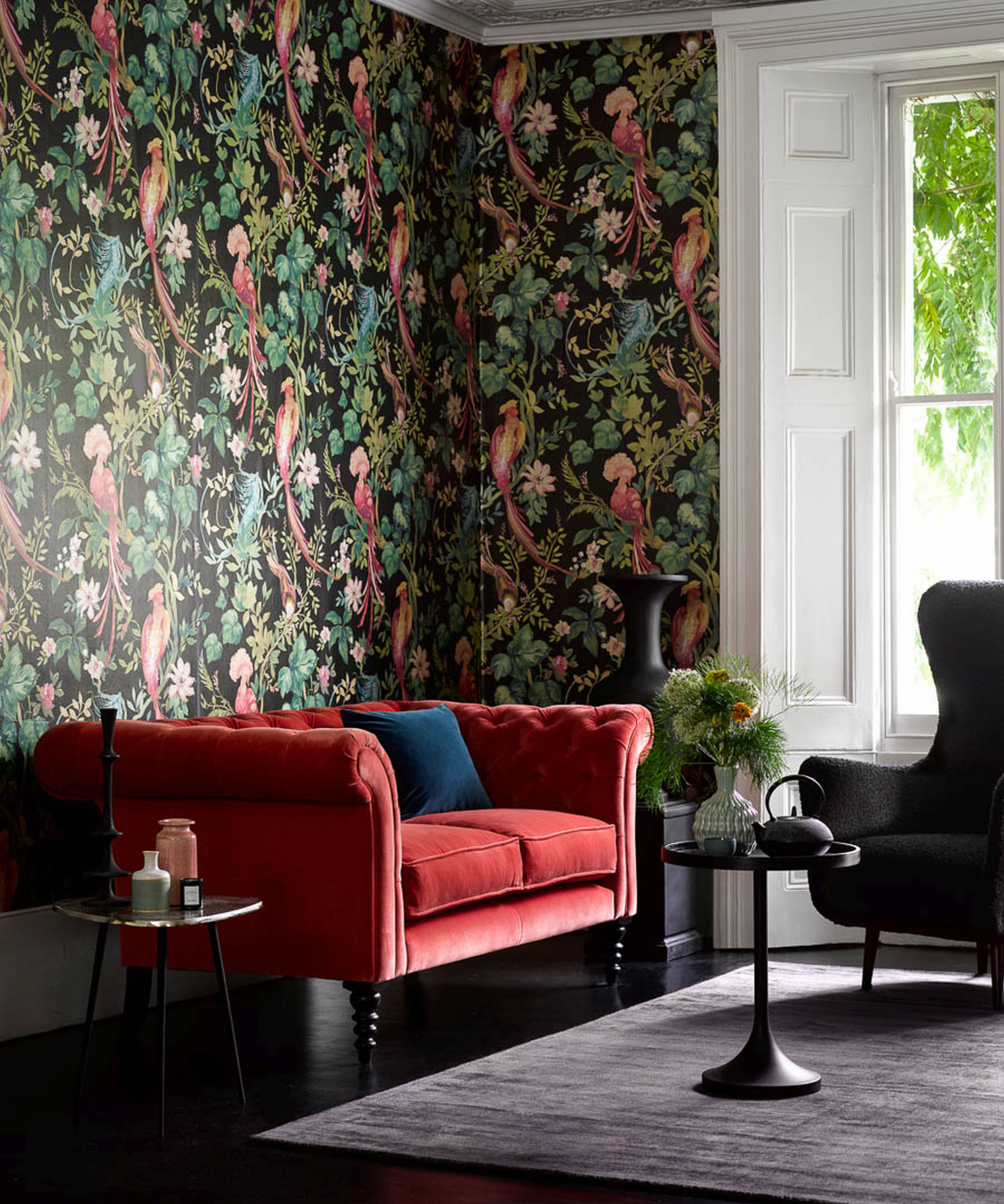
When considering orange for upholstery, its versatility shines through. Bright orange can bring energy to a room, while more muted, rusty shades act as a neutral base. Pairing orange upholstery with olive greens, browns, and russet reds creates a calm and grounded flow. Conversely, certain colors should be approached with caution when paired with orange. Bright or garish shades that compete with orange, such as equally vibrant colors, can lead to an oversaturated palette. Pairing orange with black can create a 'Halloween' aesthetic, and while purple or lilac might work in high fashion, they are challenging to translate into a successful interior. For safe experimentation, burnt orange, apricot, or terracotta are recommended as base palettes, allowing for more subtle integration of orange into home decor.
#OrangeColorPairings #InteriorDesign #ColorTheory #HomeDecor #PaintColors #DecoratingWithOrange #ModernInteriors #ColorCombinations #DesignTrends #OrangeColorPairings #InteriorDesign #ColorTheory #HomeDecor #PaintColors #DecoratingWithOrange #ModernInteriors #ColorCombinations #DesignTrends
0 commentaire au total
 Aucun commentaire pour le moment
Vous aimerez aussi

20+ Ideas for Styling with Orange as an Accent

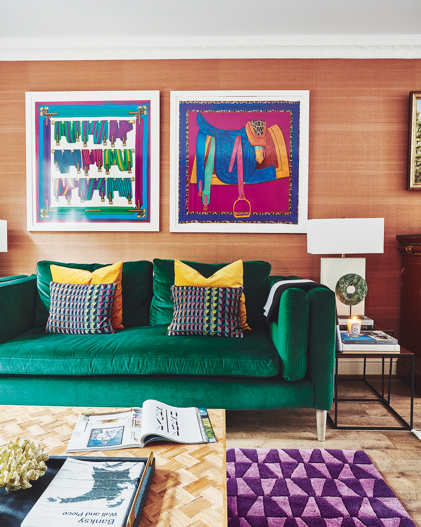
20 orange room design ideas

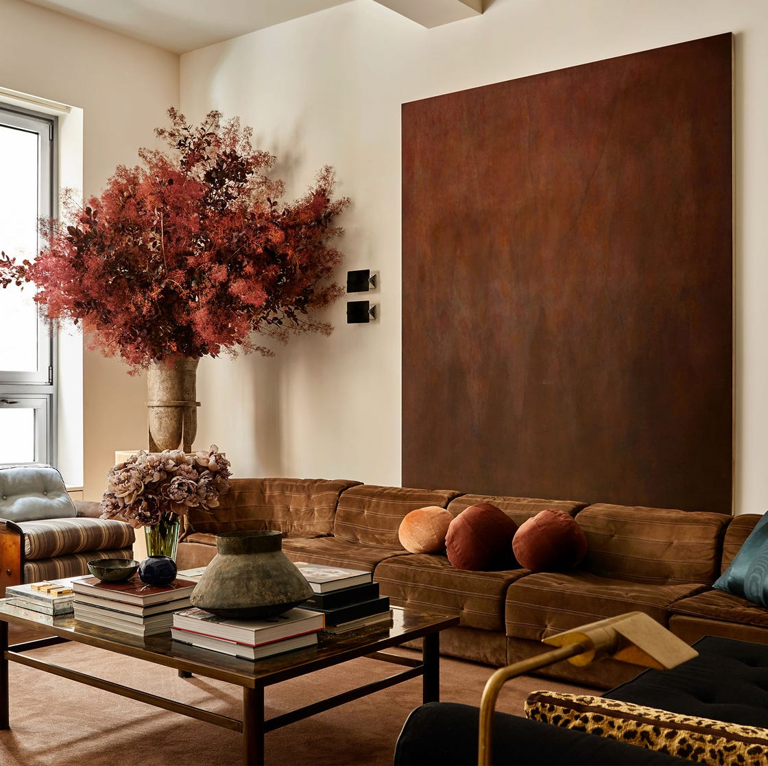
What Colors Go with Brown? Here Are 15 Complementary Shades to Try Now
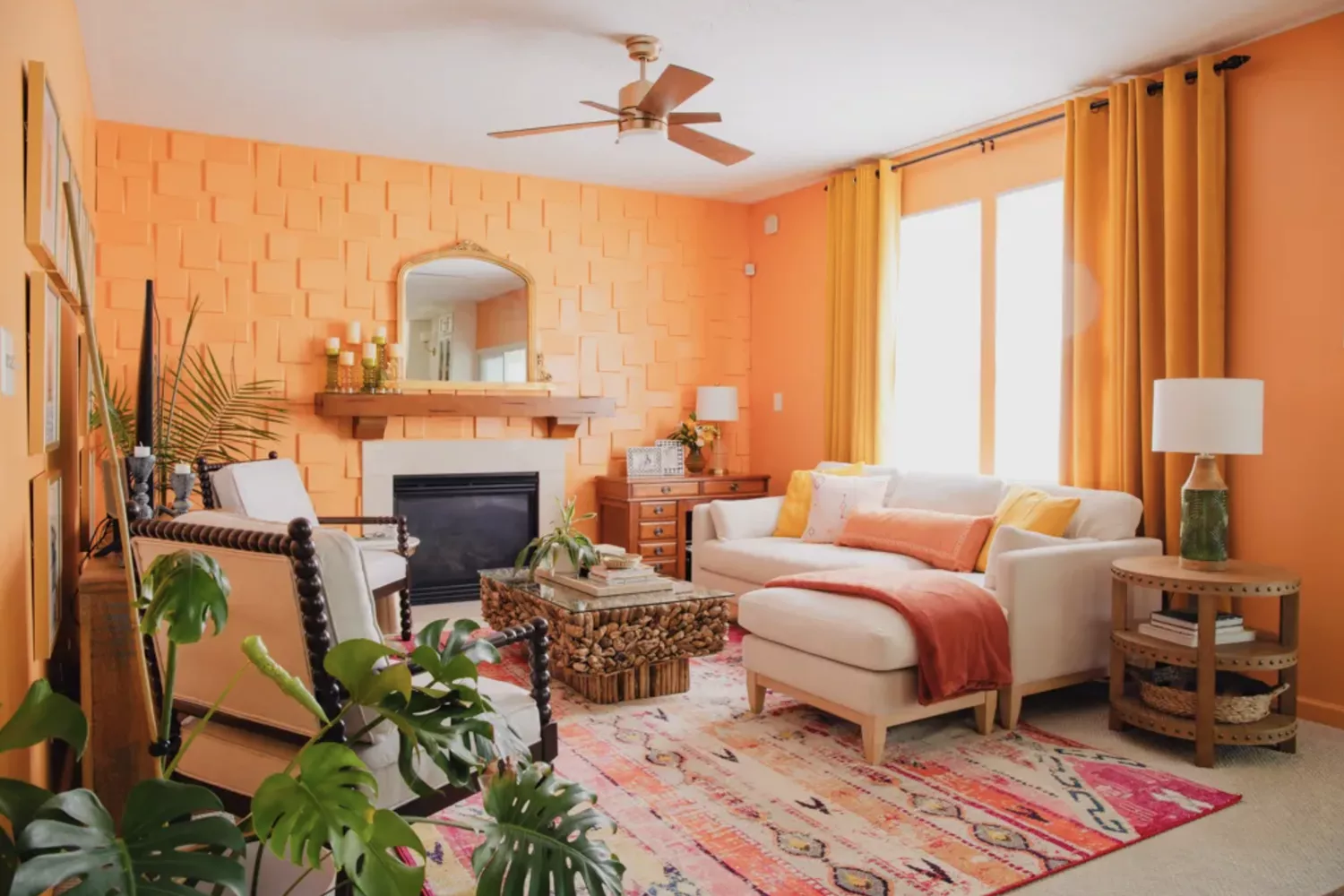
Cheer Up Any Space With These Designer-Approved Orange Paint Colors

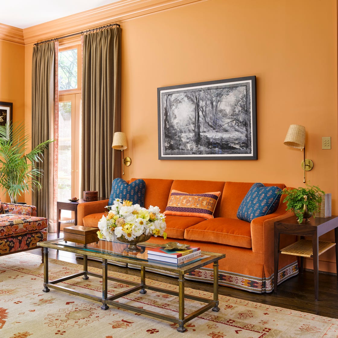
Orange Deserves a Spot in Your Home—Here's How Designers Use It

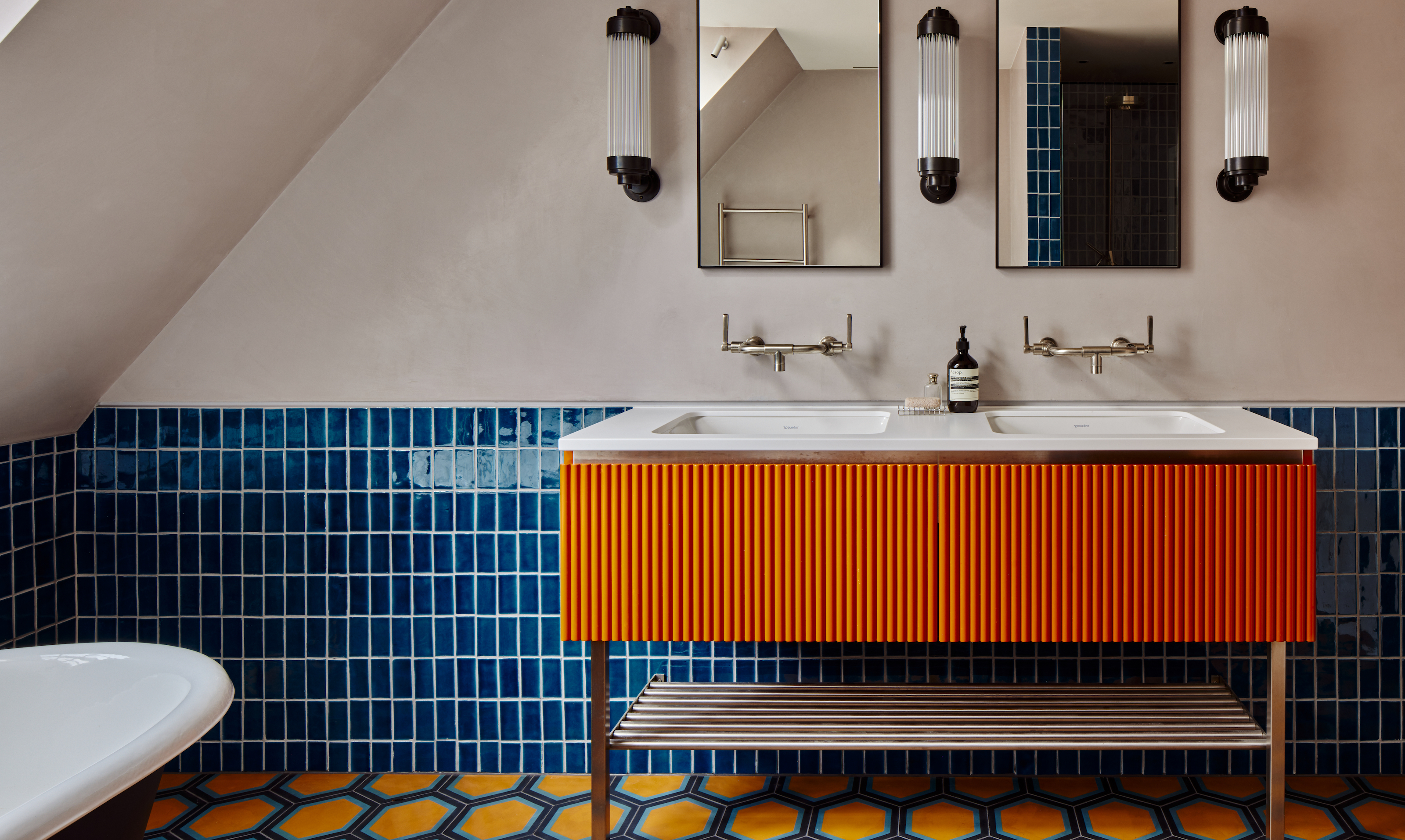
Orange bathrooms are trending - these 10 show how to use this color to create a perfect sanctuary
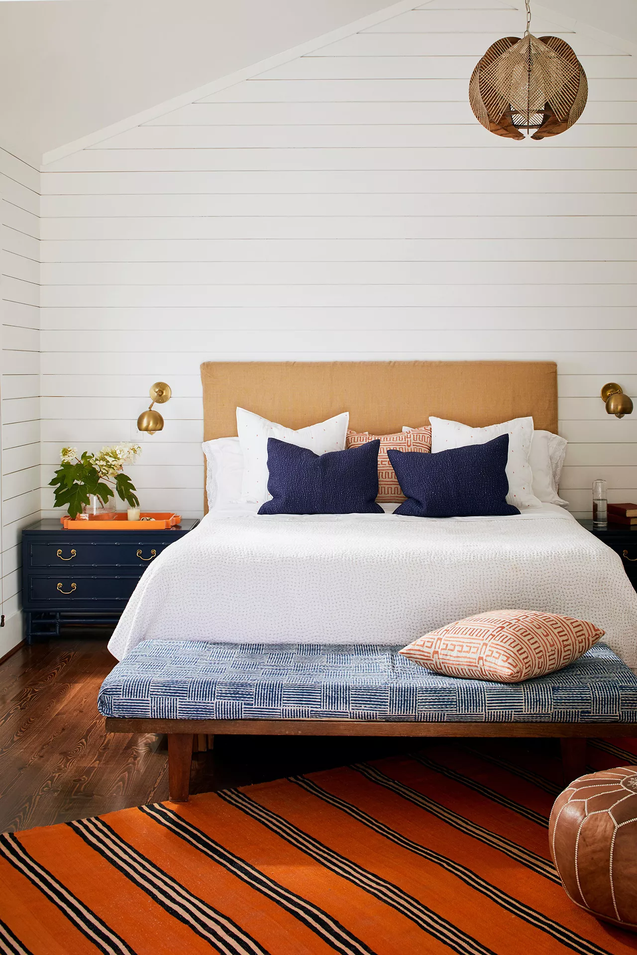
30 Bright, Bold Combinations of Colors That Pair with Orange

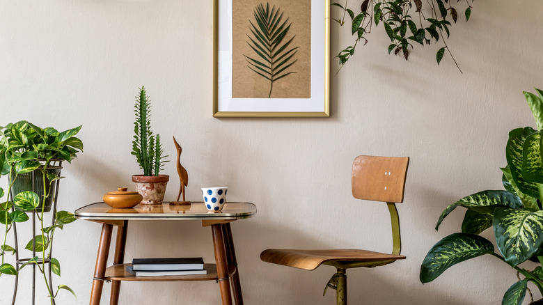
10 Colors That Will Perfectly Accent A Tan Room
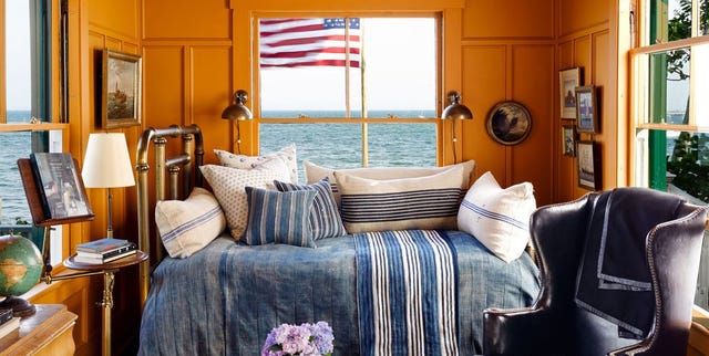
15 Energizing Orange Paint and Decor Ideas
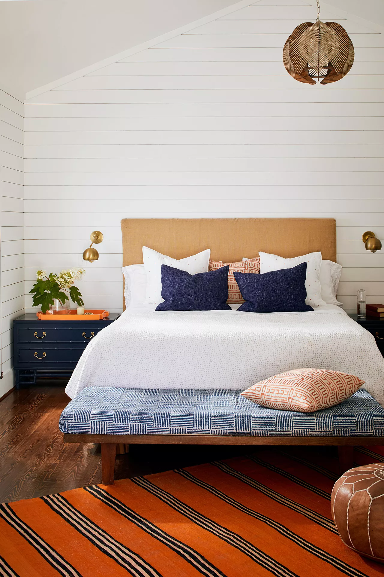
30 Bright, Bold Colors That Go with Orange
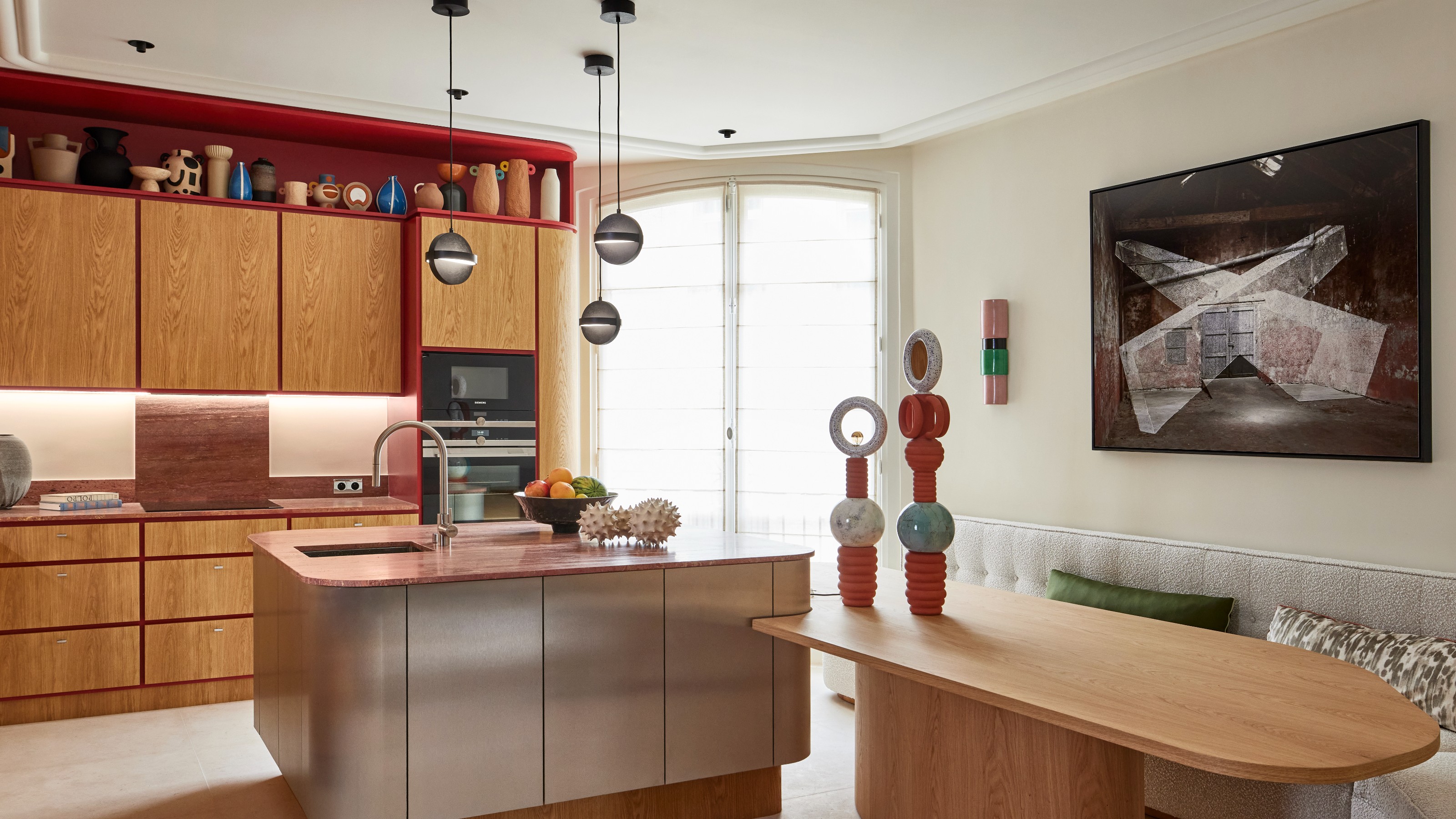
What Colors Go With Red? 10 Colors That Hold Their Own Alongside This Fiery Hue

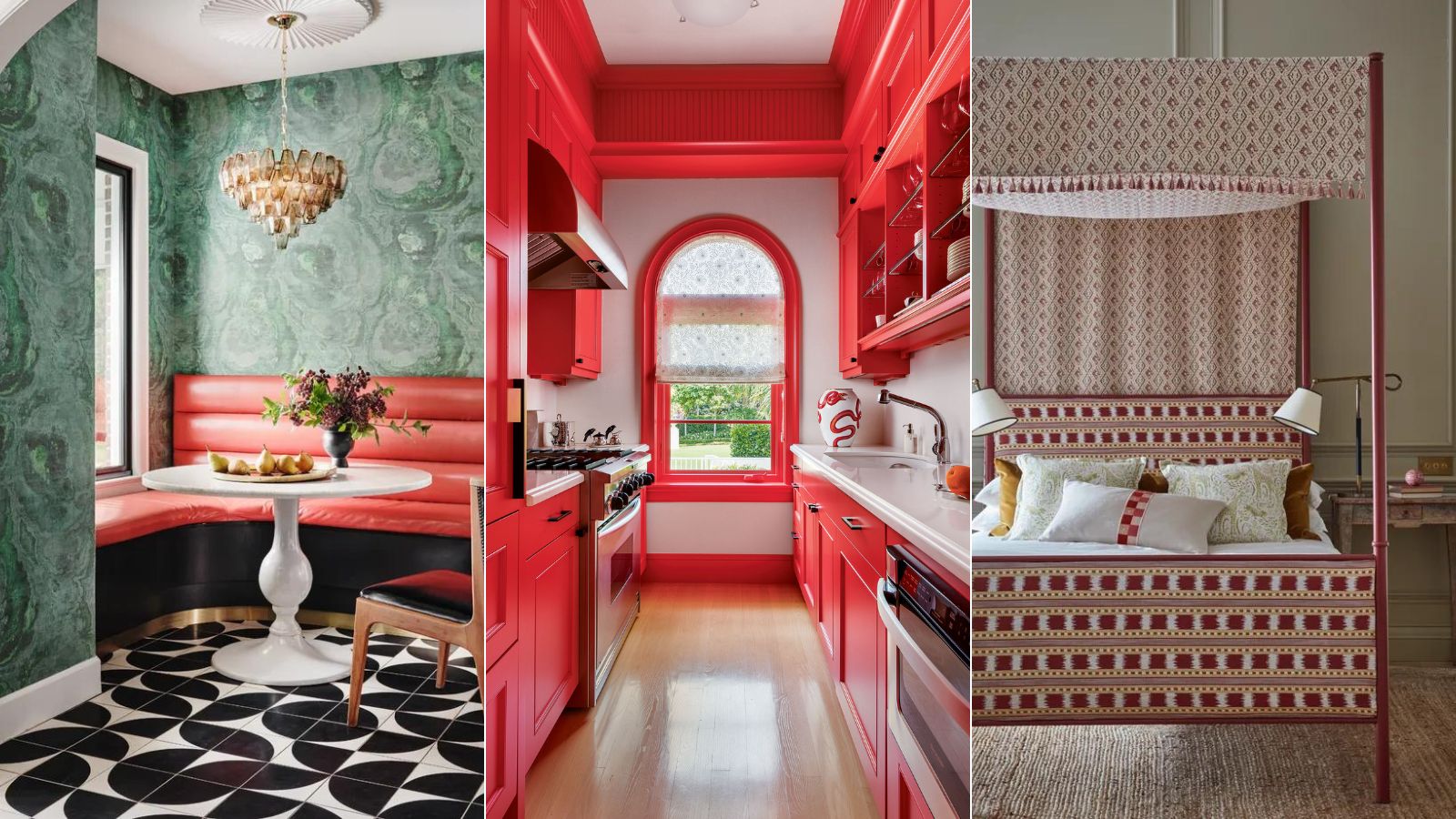
9 colors that go with red – the best pairings for this bold shade

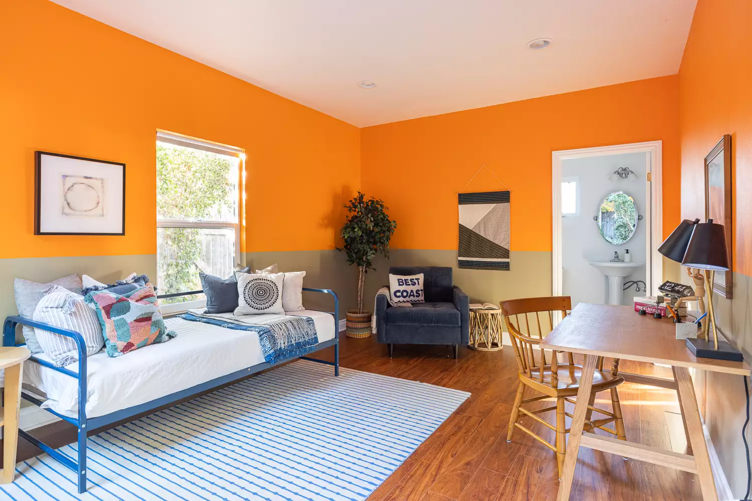
30 Best Colors That Go With Orange

10 fall color schemes that aren't all about orange

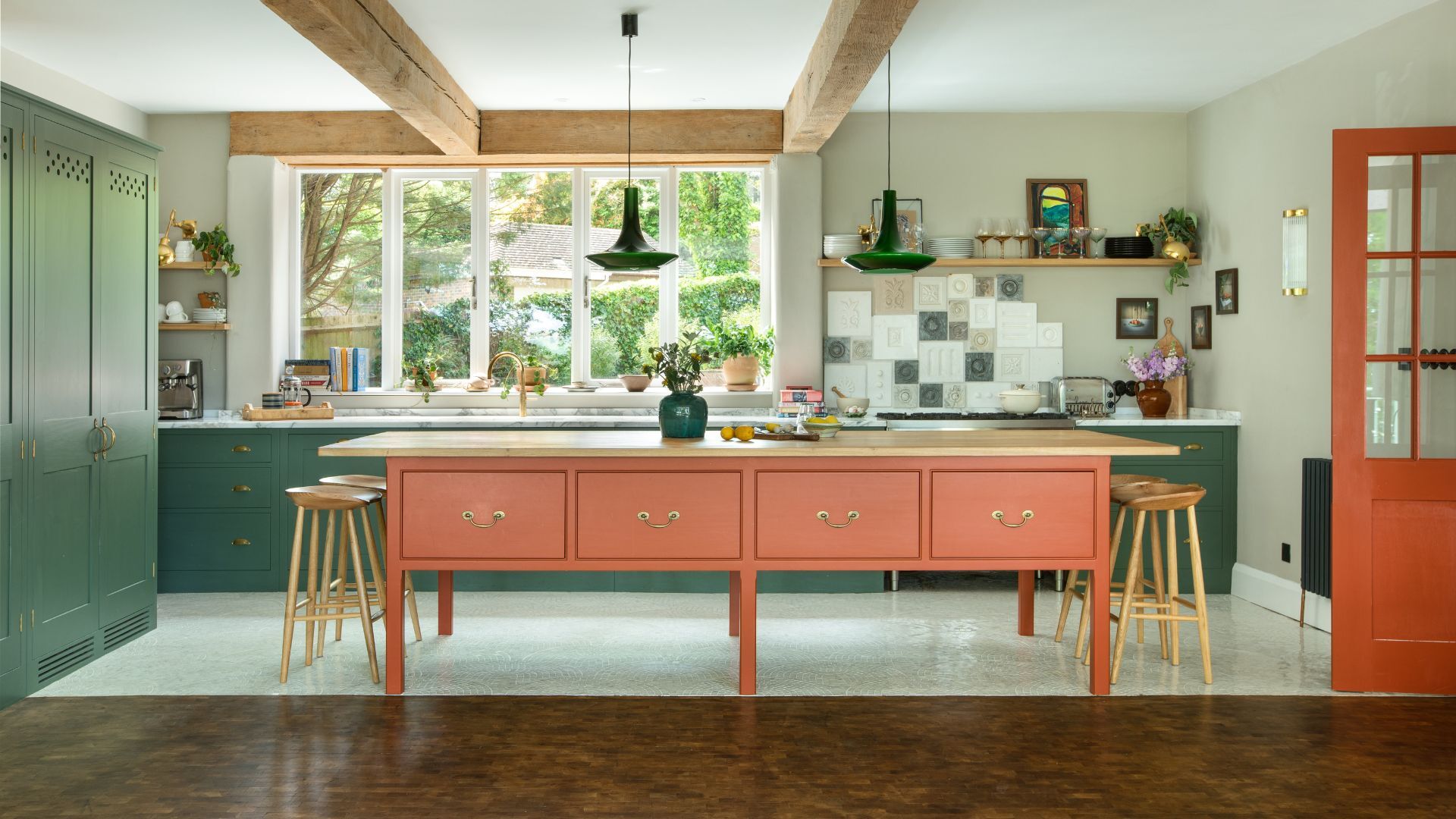
Orange and green is the bold color pairing quietly transforming homes in 2025 – here's 4 reasons why

9 ombre designs for a soft splash of color

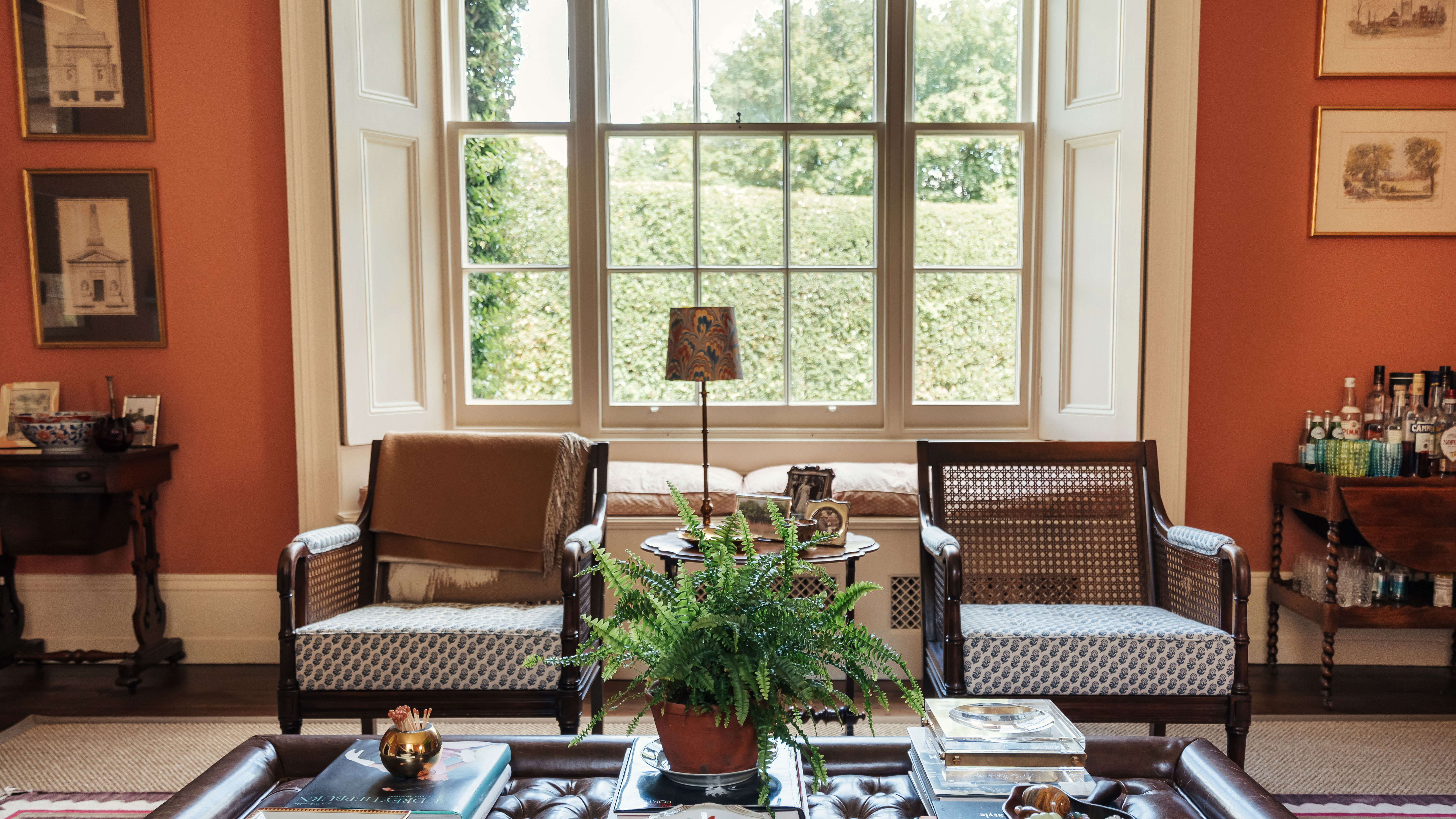
Decorating with orange – how best to use this vibrant and versatile color in interior schemes
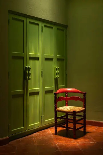
How to Make Orange and Green Work Together — It Can Be "Dynamic and Joyful", but Only If You Get It Right

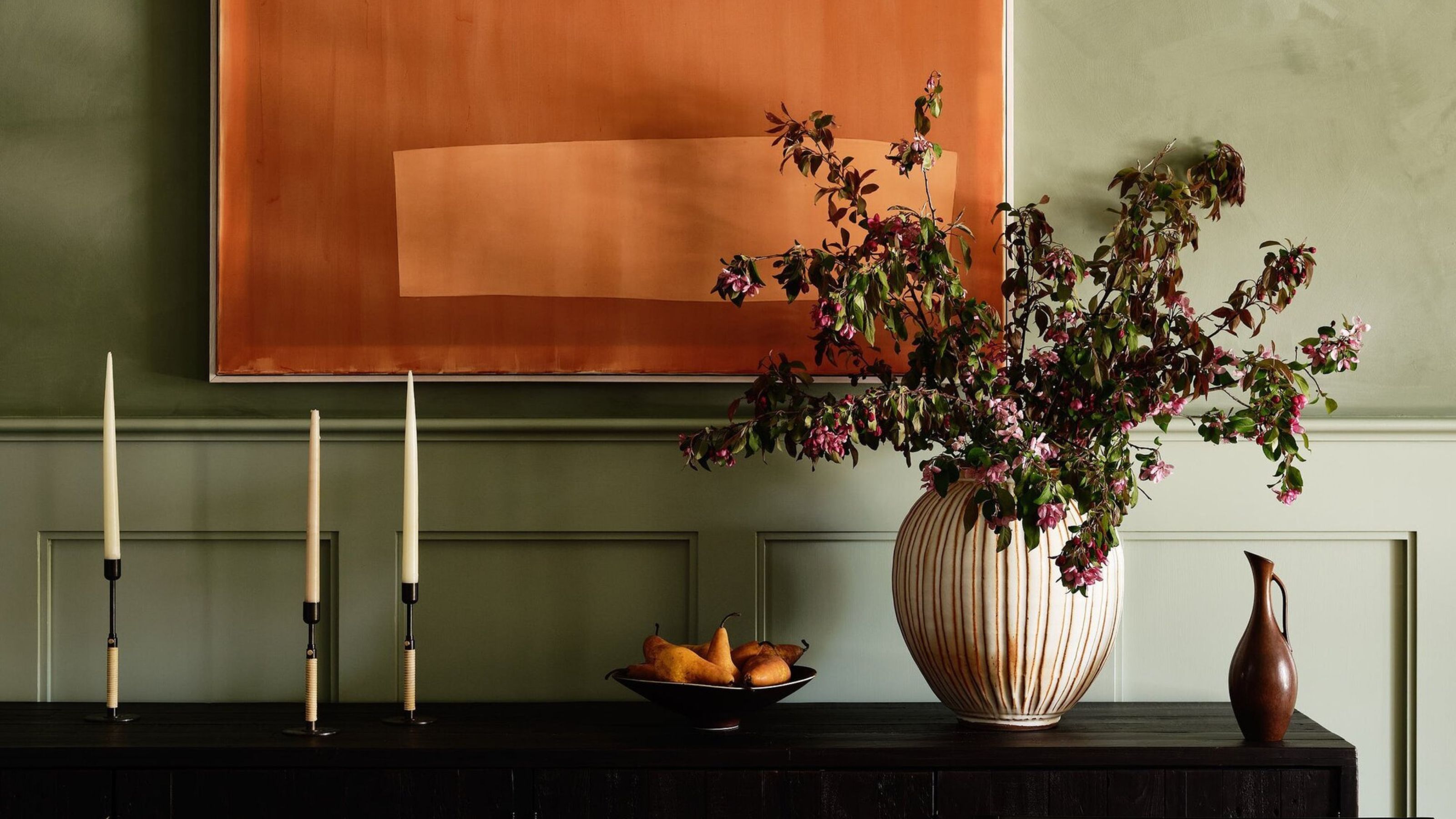
How to Make Orange and Green Work Together — It Can Be "Dynamic and Joyful", but Only If You Get It Right
9 Best Orange Paint Colors for a Vibrant Home