1/5
Office Envy: An Interior Designer's Jewel-Box Studio Makes A Solid Case For Color
Charleston, South Carolina-based interior designer Angie Hranowsky, known for her vibrant use of color, showcases her distinctive approach in her own design studio. For Hranowsky, color serves as a primary source of inspiration and creativity, a philosophy evident across her diverse projects, from residential spaces to commercial installations. Her design signature is marked by the incorporation of saturated brights, applied through various elements such as paint, upholstery, large-scale art, and especially wall treatments.
An example of her bold style is her Charleston home, which features a magenta living room sofa paired with Roman shades in a similar vibrant pink. Another instance is her installation at the design emporium Fritz Porter, where pale peony walls are accented with angular turquoise sconces and emerald green silk drapery. When designing her own studio, which functions as a showcase, a brainstorming hub for her team, and a client meeting space, Hranowsky deliberately opted for a bold aesthetic.
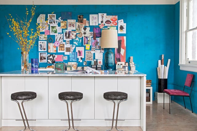
She chose turquoise as the dominant color for her office, situated in a 1920s brick building in downtown Charleston. Hranowsky views turquoise as a color that reflects earth, sky, and water, providing constant inspiration. To achieve the desired depth and texture, she enlisted decorative painter Suzanne Allen, who applied layers of pigmented plaster to the walls. This labor-intensive process resulted in a multifaceted, earthy variance in texture and tone, transforming the turquoise from a simple color into an artistic element.
Hranowsky made a conscious decision to not paint the entire height of the walls, leaving the upper sections and ceiling white. This choice was strategic, as it created an airy feel and provided a necessary contrast to the rich turquoise below. In decorating a room already featuring such a strong foundational color, Hranowsky employed a formula of adding more color. She strategically introduced fuchsia and golden yellow, hues she considers to have equal value in terms of their dense saturation and jewel-like richness. These colors serve as perfect accents to the turquoise.
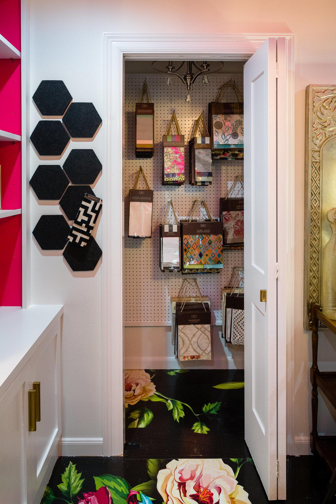
Her selection of a groovy desk chair and an angular accent chair in complementary colors exemplifies her skill in creating contrasting yet harmonious elements. Additional touches of golden warmth are incorporated through brass light fixtures, yellow-flecked abstract artwork, and fresh Forsythia branches. To maintain visual order, Hranowsky organizes her extensive collection of design resources, including swatches, samples, and strike-offs, by hue. These are neatly stored in assigned drawers within a custom quartzite-topped island, readily accessible when developing new schemes.
The only concessions Hranowsky made to a more neutral palette were for the countertop and floors. This choice was deliberate and effective, allowing textiles placed on the island or spread on the floor to stand out without distraction. Although she is her own most adventurous client, the studio is fundamentally designed as a workspace to foster her creativity, ultimately benefiting the homeowners with whom she collaborates.
#AngieHranowsky #InteriorDesign #ColorTheory #DesignStudio #CharlestonDesign #WallTreatments #TurquoiseDecor #HomeDecor #ColorfulInteriors #AngieHranowsky #InteriorDesign #ColorTheory #DesignStudio #CharlestonDesign #WallTreatments #TurquoiseDecor #HomeDecor #ColorfulInteriors
0 Kommentare insgesamt
 Noch keine Kommentare
Das könnte Ihnen auch gefallen
Get the Look of This Colorful and Chic Home Office

Can’t Concentrate? Decorating Your Space With These Colors Can Sharpen Your Focus
Why This Hue Is Suddenly Dominating Every Designer's Wishlist—Plus, How to Style It

Interior Designers NEVER Overlook This Surprising Space

Home office is interior designer’s bold portfolio sample in itself

Creative, Captivating Use of Color Helps This Home Redesign Shine
How To Recreate Our Favorite Office Spaces
The One Lighting Trick This Designer Uses in a Home Office

Color Blocking Defines This Gaming Office’s Long Floor Plan
The Shiny Finish Taking Over Our Style Editor’s Apartment

Creating a comfortable and luxury home office in 2024: From design to maintenance

Studio Doherty knows how to innovative with colour: these are their decorating tips

A Dark Study Is Reborn as a Home Office Oasis

This interior decorator's color-drenched apartment will make you want to throw anything gray out the window

Interior Designers Grow Company Talent with Living Green Wall Branding and Biophilia
At This Accessories Designer’s NYC Home, Design Rules Go Out the High-Gloss Purple Window
5 best colors to paint a small office — expert advice for a productive, stress-free space
Black Kite’s London office is a riot of colour and geometry

The subtle design tricks that help – and harm – creativity

'It feels really seamless' – this Studio McGee home office is a masterclass on embracing dark, moody paint colors in small rooms