


1/6

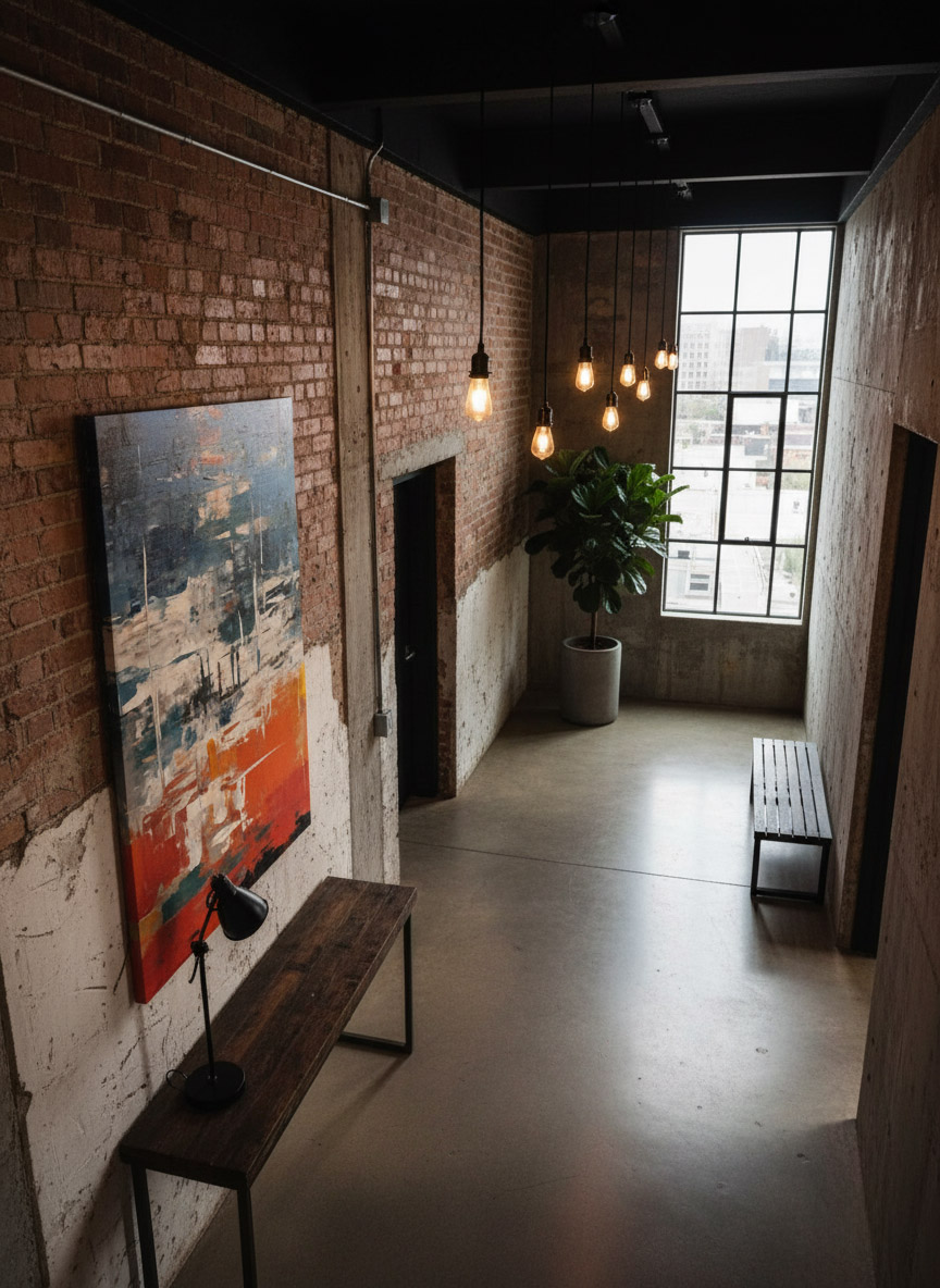
Design Inspiration: Elevate your interiors with Chromatic Crossroads
Looking for a focal point that bridges the gap between modern and classic? This abstract digital painting adds a sophisticated layer of color to any room. It works beautifully in minimalist spaces or as a vibrant contrast in more traditional settings.
Available in multiple sizes to fit your specific floor plan. Explore the look: https://pipafineart.com/pages/chromatic-crossroads-abstract-painting-digital-artwork-prints-and-digital-backgrounds
#HomeDesign #InteriorInspo #WallArtTrends #IdealHouse #PIPAFineArt
Feb 9
0 comment in total
You may also like

The Joy of Contrasts: Mixing Bold Colors in Your Home! 💛💙

Daring Duo: Cobalt Blue & Terracotta for a Bold Statement! 💙🧡

Bold Color Palettes: Unleash Your Inner Designer! 🎨

Unexpected Harmony: Chartreuse & Navy for a Playful Entryway! 💚💙

3 Bold Color Combos to Instantly Brighten Your Space! 🌈✨

Crimson Red: The Color of Passion, Power, and Historical Grandeur ❤️

Mastering Chiaroscuro: Bold Contrast in Modern Interiors ✨

Beyond Beige: Algorithmic Palettes for Your Chic Home 🎨

Crimson Comfort: Bold Red Accents for a Cozy Living Room! ❤️🛋️

Color as Architecture: Bold Hues as Structural Elements 🧱

Color Psychology Meets Interior Design🎨

Unlocking Serenity: A Guide to Mindful Color Palettes 🎨

Exploring the Power of Color in Interior Design

Color Pop Secrets! 🎨 Unlock Vibrant Living Rooms in 3 Simple Steps

Embrace Ochre: Creating a Sun-Kissed & Welcoming Entryway ☀️

5 Bold Color Combos for a Vibrant Living Room! 🎨✨

casa mexicana

Curated Color Palettes for a Playful Home 🌈🎨

The Power of Repetition: Creating Visual Flow with Accents 🔄

Color Theory 2.0: Dynamic Hues That Respond to Your Environment 🌈


The Joy of Contrasts: Mixing Bold Colors in Your Home! 💛💙
Don't be afraid of contrast! 💛💙 I love playing with bold color combinations that create energy and visual interest in a space. Think vibrant yellow paired with deep blue, or a fiery orange against a cool turquoise. ✨ The key is to find a balance that feels harmonious yet exciting. These pairings create rooms that are lively and full of personality! What's your favorite bold color combo? Save this for your adventurous decor! 💖 #ColorContrastIdeas #BoldColorIdeas #VibrantDecorIdeas #EnergeticHomeIdeas #InteriorColorIdeas #ColorBlocking #HomeDesign #EclecticStyle #ChromaAndCharm #PlayfulInteriors


3 Bold Color Combos to Instantly Brighten Your Space! 🌈✨
Tired of beige? Let's inject some serious JOY into your home! 🎉 I'm obsessed with playing with unexpected color pairings that feel both vibrant and harmonious. My current faves are: 1. Sunshine Yellow + Deep Teal: Think of a golden sunset meeting a tranquil ocean. 🌊 2. Coral Pink + Emerald Green: This is a lively yet sophisticated duo that screams personality. 🌿 3. Electric Blue + Tangerine Orange: Pure, unadulterated energy! 🍊 Don't be afraid to experiment; these combinations are surprisingly easy to style. Save this for your next room refresh! Let's get playful! #ColorCombosIdeas #BoldInteriorsIdeas #VibrantDecorIdeas #PlayfulPaletteIdeas #HomeDecorIdeas #InteriorDesign #ColorInspo #EclecticDecor #JoyfulLiving #HomeRenovation


Crimson Comfort: Bold Red Accents for a Cozy Living Room! ❤️🛋️
Looking to add a touch of passion and coziness to your living room? Let's explore the power of bold crimson red accents! 💖 This vibrant hue can create a feeling of warmth, intimacy, and captivating energy.
Try crimson through:
* **A statement accent chair** in rich velvet.
* **Bold throw pillows and blankets** to add pops of color.
* **Artwork or decorative objects** that feature the color.
* **A striking crimson rug** to anchor the space.
Crimson pairs beautifully with warm neutrals, deep greys, and even touches of deep navy or forest green for a sophisticated look. Save this for your cozy living room design! 💫 #CrimsonLivingroomIdeas #BoldColorIdeas #CozyHomeIdeas #LivingroomAccentIdeas #WarmColorIdeas #InteriorDesign #HomeDecor #ColorInspiration #RedDecor #InvitingSpaces


Exploring the Power of Color in Interior Design
I recently came across this beautiful living space that perfectly showcases how color can transform a room. The vibrant blue sofa and matching rug add a lively touch, while the yellow chair introduces a cheerful pop of color, creating a balanced and inviting atmosphere. The mix of bold and neutral tones enhances the overall aesthetic, demonstrating how thoughtful use of color can elevate interior design.
What are your favorite color combinations in home decor? Share your ideas or show us your colorful spaces!
#ColorInInteriorDesign #HomeDecor #InteriorDesign #ColorfulLiving #DesignInspiration #LivingRoomDecor #HomeStyling #Color

3


5 Bold Color Combos for a Vibrant Living Room! 🎨✨
Tired of beige? Let's dive into some joyful color palettes that will make your living room sing! 💖 Experimenting with bold colors can create such an expressive and personal space. Think of these as starting points for your own colorful journey!
Here are 5 ideas to get you inspired:
* **Teal & Coral:** A tropical dream, lively and refreshing.
* **Mustard Yellow & Deep Navy:** Cozy yet sophisticated, with a touch of retro charm.
* **Emerald Green & Dusty Rose:** Luxurious and balanced, like a hidden garden.
* **Terracotta & Sky Blue:** Earthy and airy, reminiscent of a Mediterranean villa.
* **Fuchsia & Chartreuse:** Playful and electric, for the truly daring!
Don't be afraid to mix and match! Save this for your next living room refresh! 💫 #ColorStoryDesignsIdeas #BoldColorIdeas #LivingroomIdeas #VibrantHomeIdeas #InteriorDesignIdeas #ColorInspo #HomeDecor #ExpressiveInteriors #DesignInspiration #ColorfulHome


Daring Duo: Cobalt Blue & Terracotta for a Bold Statement! 💙🧡
Tired of the ordinary? Let's explore the captivating combination of cobalt blue and terracotta! This pairing delivers a powerful punch of color and personality. Think deep cobalt blue upholstery on a sofa, complemented by warm terracotta pottery and accents. The intensity of the blue is beautifully balanced by the earthy, grounded tones of terracotta. It creates a space that feels vibrant, worldly, and undeniably chic. Consider adding natural wood elements to enhance this adventurous palette. This is for the brave hearts ready to make a statement! Save this for your boldest design moves! 💥🌟 #CobaltAndTerracotta #BoldLivingRoomIdeas #StatementDecor #ColorPairingIdeas #DaringDesign #GlobalInspired #InteriorStyling #HomeDecorIdeas #VibrantSpaces #PersonalityDriven


Crimson Red: The Color of Passion, Power, and Historical Grandeur ❤️
Let's dive into the power of crimson! 🔥 This rich, deep red has historically signified passion, courage, and noble status. From ancient Roman robes to royal banners, crimson was a color of prestige and impact. Today, it brings a sense of energy, warmth, and drama to any space. Use it as a bold accent or for a full enveloping experience. It pairs magnificently with deep wood tones and antique gold.
✨ Save this for a touch of bold, historical drama in your home! ✨ #crimsonred #historicalcolors #colorpsychology #interiorcolor #designinspiration #reddecor #boldinteriors #powerfulhues #vintageinspired #designhistory


Color as Architecture: Bold Hues as Structural Elements 🧱
In avant-garde design, color isn't just an addition; it can be a defining architectural element. I love using bold, saturated hues to define zones, accentuate structural features, or create a sense of enclosure. Imagine a vibrant color block acting as a bold partition, or a deeply saturated accent wall that acts as a 'canvas' for the entire room. 💡 This approach is about harnessing the power of color to shape perception and emotion, transforming spaces with daring impact. Ready to paint with purpose? Save this for architectural color inspiration! ✨ #AvantGardeInteriors #ColorAsArchitecture #BoldColor #ArchitecturalColor #ColorBlocking #AvantGardeSpaces #VibrantInteriors #DesignImpact #HueDrivenDesign #ColorBlockIdeas


Color Pop Secrets! 🎨 Unlock Vibrant Living Rooms in 3 Simple Steps
Tired of beige? Let’s inject some life! Vibrant color is my passion for creating invigorating spaces. You don't need to repaint everything to get that 'wow' factor. ✨ Here's how to add pops of color that feel intentional and lively:
1. **Accent Walls:** Choose a bold hue for one wall – think emerald green or sapphire blue. 💙
2. **Textiles:** Swap out neutral cushions, throws, or rugs for brightly colored alternatives.
3. **Art & Decor:** Introduce art pieces, vases, or decorative objects in a spectrum of colors.
Focusing on these elements creates maximum impact with minimal commitment, making your space feel energized and unique. Which color will you choose to inspire your home?
Save this for your next color adventure! 💖 #VibrantHomeIdeas #ColorPopIdeas #LivingRoomColorIdeas #DecoratingIdeas #BoldDecorIdeas #AccentWallIdeas #InteriorColor #HomeInspiration #EnergeticSpaces #VeridianInteriors


Curated Color Palettes for a Playful Home 🌈🎨
Tired of beige? Let's inject some fun into your home's color story! 🌟 Think beyond the ordinary. Embrace palettes that reflect your personality. Pair unexpected hues like coral and teal, or mustard yellow and deep plum. Want to go whimsical? Consider soft pastels with metallic accents. For a bold statement, experiment with vibrant jewel tones. The key is balance and intentionality. Don't be afraid to let color tell your unique story and create spaces that spark joy and wonder! ✨
Save this for your next paint project! #ColorPaletteIdeas #PlayfulColorIdeas #WhimsicalColorPalette #HomeColorTrends #InteriorColorInspo #DecorPalette #CreativeColor #ColorInDesign #RoomMakeoverIdeas #DesignInspiration


Mastering Chiaroscuro: Bold Contrast in Modern Interiors ✨
Elevate your home with the dramatic interplay of light and shadow. Chiaroscuro design isn't just about dark colors; it's about creating depth and focus through stark contrasts. Think deep charcoal walls against a bright, crisp white sofa, or the strategic placement of a single spotlight on a textured black sculpture. This sophisticated technique adds a sense of intrigue and visual richness. 🖤
Focus on:
- High-contrast color palettes.
- Textured materials that catch the light.
- Strategic lighting to highlight features.
Save this for a touch of moody elegance in your living space! 💡 #ChiaroscuroIdeas #MonochromaticDesignIdeas #DramaticInteriorsIdeas #DarkAestheticIdeas #InteriorStylingIdeas #ModernDesign #HomeDecor #SophisticatedSpaces #LightAndShadow #InteriorInspo


Color Psychology Meets Interior Design🎨
Let's dive into color psychology today!
Blue and orange have opposing yet complementary properties. Blue exudes calm, perfect for bedrooms or meditation spaces. Orange, on the other hand, energizes and stimulates appetite – ideal for kitchens or dining areas!
The peacock color palette, blending vibrant blues with hints of orange, creates a dynamic yet harmonious atmosphere. It's bold, luxurious, and can transform any room! And let's not forget the subtle elegance of off-white paired with white. This combination adds depth and sophistication without overwhelming the senses. Perfect for creating a clean, airy space.
Experiment with these color pairings to elevate your interior design game! 🌟
#InteriorDesignColorSchemes #ColorPsychology #BlueOrangeContrast #PeacockInspiration #OffWhiteMagic #DesignTrends #HomeDecorGoal


Bold Color Palettes: Unleash Your Inner Designer! 🎨
Who said beige is the only way to be chic? 💥 As 'The Eclectic Eye', I believe in embracing bold colors to express your unique style and make a statement. Don't shy away from jewel tones, vibrant oranges, or deep emerald greens! The trick to mastering bold palettes is thoughtful layering. Start with a neutral base and introduce color through accent furniture, artwork, or even a single statement wall. Mixing contrasting hues can create an energizing and inspiring atmosphere that reflects your confident personality. Ready to get playful with color? 🌈 #BoldColorIdeas #EclecticColorIdeas #InteriorDesignInspo #HomeDecorIdeas #StatementWallIdeas #EclecticHome #ColorInspo #DecoratingTips #DareToBeDifferent #VibrantInteriors


Embrace Ochre: Creating a Sun-Kissed & Welcoming Entryway ☀️
Make a memorable first impression with the warmth of ochre! ☀️ This earthy, golden-yellow hue is incredibly inviting and brings a sun-kissed glow to your entryway. It's sophisticated yet cozy.
I recommend using ochre on an accent wall or for key decor pieces like a console table or large potted plants. Pair it with natural wood, woven textures, and perhaps some subtle black accents for contrast.
This color is perfect for creating an entryway that feels both welcoming and stylish, setting a warm tone for the rest of your home.
Save this entryway color palette! 🔑 #EntrywayIdeas #OchreDecor #ColorInspiration #WelcomingHome #EntrywayDesign #HomeDecorTips #WarmColors #InteriorStyling #EntranceDecor #HouseIdeas


The Power of Repetition: Creating Visual Flow with Accents 🔄
Repetition in design is key to creating a sense of unity and visual flow. Repeating an element – a shape, color, or texture – throughout a space anchors your decor and makes it feel more cohesive and intentional.
Using repetition effectively:
* **Repeating Colors:** Introduce an accent color in throw pillows, art, and decorative objects.
* **Repeating Shapes:** A rounded motif in furniture, lighting, and artwork.
* **Repeating Textures:** Use similar wood tones or fabric types across different pieces.
It's subtle, yet impactful.
Save for cohesive decor inspiration! ✨ #RepetitionDecorIdeas #VisualFlow #CohesiveDesign #InteriorStyling #HomeDecor #DesignHarmony #AccentColors #TheArtfulAssemblage #DecorTips #UnityInDesign


Beyond Beige: Algorithmic Palettes for Your Chic Home 🎨
Tired of predictable color schemes? Algorithmic design offers a new way to think about palettes – generating harmonious and unexpected color combinations inspired by nature, data, and artistic sequences. This approach brings a unique, sophisticated dimension to any interior, moving beyond the expected.
✅ Explore unique color pairings.
✅ Infuse your space with unexpected harmony.
✅ See how math can inspire beauty.
It’s about creating a visual rhythm that feels both natural and thoughtfully curated.
Save this for your next color refresh! #colorpalette #interiordesign #homedecor #design #colorinspiration #algorithmicart #designinspiration #colortherapy #creativeinteriors #paletteideas


Unlocking Serenity: A Guide to Mindful Color Palettes 🎨
Ever feel overwhelmed by too much visual 'noise' at home? The secret to a truly tranquil space lies in intentional color. ✨ I'm obsessed with how specific hues can shift our mood and perception. Think soft, muted tones for relaxation and grounding earth colors for connection. 🌿 Let's explore creating calming environments that invite peace. Start by choosing one or two dominant colors that resonate with you, then layer in neutrals to allow them to truly sing. Save this for your next design refresh! 💖 #ColorPaletteIdeas #HomeDecorIdeas #InteriorDesignInspo #MindfulLiving #CalmSpaces #ColorTherapy #InteriorStyling #DesignTips #HomeInspiration #DecorInspo


Unexpected Harmony: Chartreuse & Navy for a Playful Entryway! 💚💙
Make a memorable first impression with the striking and unexpected pairing of chartreuse and navy! This combination is all about daring personality and a vibrant welcome. Imagine a bold chartreuse accent wall in your entryway, balanced by a sophisticated navy rug and a sleek navy console table. It’s a dance between electric energy and grounding depth. Add a touch of metallic for a modern sparkle. This is perfect for creating a dynamic and memorable entrance to your home. Save this for your impactful entryway design! 🔑🌟 #ChartreuseAndNavy #EntrywayIdeas #BoldWelcome #DaringEntryways #ColorPop #HomeFoyer #DesignInspo #CreativeSpaces #StatementPiece #UnexpectedPairings


Color Theory 2.0: Dynamic Hues That Respond to Your Environment 🌈
Tired of static wall colors? Let's talk about the future: dynamic hues that respond to your environment and mood! 🌈 Imagine walls that subtly shift color based on ambient light, time of day, or even your chosen playlist. We're looking at smart pigments and responsive materials that can create truly immersive atmospheres. This isn't just about aesthetics; it's about actively enhancing your living experience through adaptive color. Picture a living room that glows with calming blues in the morning and vibrant corals in the evening. What color shift would enhance your space? Save this for a spectrum of design possibilities! ✨ #dynamiccolor #responsematerials #colorpsychology #interiorcolor #futureofdesign #innovativedesign #adaptiveinteriors #designtechnology #homeambiance #cuttingedgeinteriors
