
1/3
Unlocking Red’s Best Color Pals for Your Space 🎨
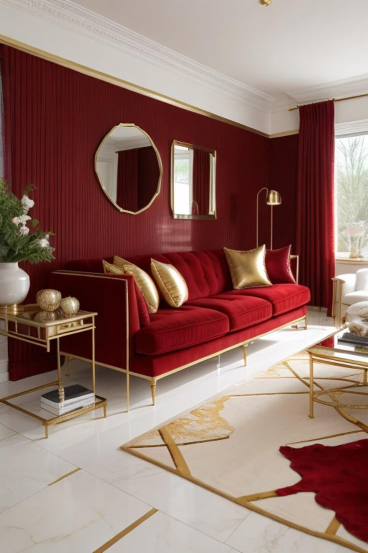
Red screams confidence! But nailing its sidekicks? That’s the magic. ✨ Try gold accents for luxe vibes (think gilded mirrors + burgundy walls) or cream textiles to soften fiery accents. Navy blue? A timeless duo—like denim + a red lip! 💄
For earthy feels, pair terracotta reds with sage greens 🍃—hello, cozy nooks! Or dare with 2025’s breakout star: "unexpected yellow" (buttercream sofa against oxblood pillows? YES).
Pro tip: Balance red’s energy with 60% neutrals (beige/grey), 30% red, 10% metallics or pastels. North-facing room? Skip grey—add warmth with wood tones! 🌞
#RedRoomDesign #ColorTheoryMadeEasy #InteriorHacks #HomeDecorInspo #UnexpectedYellow #PaintColorCombos #WarmColorPalette
Jul 1, 2025
0 comment in total
No comments yetYou may also like
Crimson Comfort: Bold Red Accents for a Cozy Living Room! ❤️🛋️
Looking to add a touch of passion and coziness to your living room? Let's explore the power of bold crimson red accents! 💖 This vibrant hue can create a feeling of warmth, intimacy, and captivating energy.
Try crimson through:
* **A statement accent chair** in rich velvet.
* **Bold throw pillows and blankets** to add pops of color.
* **Artwork or decorative objects** that feature the color.
* **A striking crimson rug** to anchor the space.
Crimson pairs beautifully with warm neutrals, deep greys, and even touches of deep navy or forest green for a sophisticated look. Save this for your cozy living room design! 💫 #CrimsonLivingroomIdeas #BoldColorIdeas #CozyHomeIdeas #LivingroomAccentIdeas #WarmColorIdeas #InteriorDesign #HomeDecor #ColorInspiration #RedDecor #InvitingSpaces
The Richness of Ruby Red: A Decadent Hue for Bold Spaces ❤️
Embrace the passion and power of ruby red! This sumptuous hue is perfect for creating decadent and attention-grabbing interiors. 🌹 Think of ruby red velvet seating that becomes the soul of your room, or bold ruby accents like drapery and rugs. It pairs stunningly with gold, deep woods, and rich jewel tones, creating an atmosphere of unparalleled luxury and drama. Ruby red signifies passion, sophistication, and pure opulence. Ready to infuse your space with this captivating color? 💜 #rubyred #jeweltones #boldcolors #decadentdecor #velvetfurniture #opulentinteriors #statementcolor #interiordesign #luxuryhome #reddecor #richinteriors
3 Bold Color Combos to Instantly Brighten Your Space! 🌈✨
Tired of beige? Let's inject some serious JOY into your home! 🎉 I'm obsessed with playing with unexpected color pairings that feel both vibrant and harmonious. My current faves are: 1. Sunshine Yellow + Deep Teal: Think of a golden sunset meeting a tranquil ocean. 🌊 2. Coral Pink + Emerald Green: This is a lively yet sophisticated duo that screams personality. 🌿 3. Electric Blue + Tangerine Orange: Pure, unadulterated energy! 🍊 Don't be afraid to experiment; these combinations are surprisingly easy to style. Save this for your next room refresh! Let's get playful! #ColorCombosIdeas #BoldInteriorsIdeas #VibrantDecorIdeas #PlayfulPaletteIdeas #HomeDecorIdeas #InteriorDesign #ColorInspo #EclecticDecor #JoyfulLiving #HomeRenovation
Curated Color Palettes for a Playful Home 🌈🎨
Tired of beige? Let's inject some fun into your home's color story! 🌟 Think beyond the ordinary. Embrace palettes that reflect your personality. Pair unexpected hues like coral and teal, or mustard yellow and deep plum. Want to go whimsical? Consider soft pastels with metallic accents. For a bold statement, experiment with vibrant jewel tones. The key is balance and intentionality. Don't be afraid to let color tell your unique story and create spaces that spark joy and wonder! ✨
Save this for your next paint project! #ColorPaletteIdeas #PlayfulColorIdeas #WhimsicalColorPalette #HomeColorTrends #InteriorColorInspo #DecorPalette #CreativeColor #ColorInDesign #RoomMakeoverIdeas #DesignInspiration
Fiery Accents: Red & Orange Decor for Energetic Spaces! 🔥
Ready to inject some serious energy and passion into your home? Let's talk about the captivating power of red and orange! 🌶️ These warm hues are perfect for creating vibrant and exciting spaces that radiate warmth and confidence. As your Color Pop Curator, I'll show you how to incorporate these bold colors strategically – from statement cushions and unique artwork to eye-catching furniture pieces. This is for anyone looking to add a spark of life! Save for your energetic room refresh! ✨ #energeticdecorideas #reddecorideas #orangedecorideas #boldcolorideas #interiordecorating #designinspiration #homestyle #accentwallideas #vibrantliving #colorpopcurator
Cozy Reading Nook: Mastering Warm & Inviting Color Palettes 📚
The perfect reading nook is an escape! It's all about comfort, tranquility, and of course, a color palette that wraps you in warmth. Ready to create your literary sanctuary?
🍂 **Amber & Ochre:** Think deep golden yellows, warm oranges, and earthy browns. This combo feels like a hug!
🍷 **Burgundy & Cream:** Rich, deep reds paired with soft creams and cozy textures create a sophisticated, intimate feel.
🌲 **Forest Green & Walnut:** Deep, calming greens and rich walnut wood evoke a sense of groundedness and natural serenity.
☁️ **Soft Grey & Blush:** A gentle pairing for a lighter, airy feel that still maintains coziness.
Which cozy colors inspire your escape? Save this post for your ultimate reading retreat! 🛋️ #readingnook #cozyhomeideas #readingnookideas #colorinspiration #warmcolorpalette #interiordesignideas #hyggehome #bedroomdecor #livingroomideas #decorating


Red Plants:Injecting Vitality and Color into Space
Red plants offer a vibrant and lively element to interior design. Their striking colors can instantly energize a room and add a touch of natural beauty. Incorporating red - leaved plants like the Red Ti Plant or the Red Aglaonema can create focal points in your living space.
They can be placed in corners to add color contrast against neutral walls or used to brighten up darker areas of a room. Red plants also pair well with other colored plants, allowing you to create a diverse and visually appealing plant collection. When selecting pots for red plants, consider colors and materials that complement their bold foliage, such as simple white pots to make the red leaves stand out or terracotta pots for a natural, earthy look.
Red plants can bring vitality to any room, from modern minimalist spaces to eclectic designs. They are a wonderful way to introduce color and life into your
home.
#BotanicalWarfare #Chromatography #LivingArt #DefiantGreenery #RedPlants

1
Bold Color Palettes: Injecting Personality into Your Home Office! 🌈💼
Who says your home office has to be boring? Embrace bold color palettes to boost creativity and productivity! Art and vibrant accents can make all the difference.
Think about a dynamic abstract piece with energetic colors, or even a brightly painted mural on an accent wall. Don't shy away from color in your furniture or accessories either! It's about creating a space that inspires.
• **Color Psychology:** Use colors that boost focus or calm.
• **Accents:** Start small with pillows or a rug.
• **Balance:** Mix bold with neutrals.
Make your workspace a masterpiece! Save these bold color ideas for your office redesign. #homeoffice #workspaceinspo #colorinspiration #bolddecor #officeideas #interiorstyling #artworkforhome #creativeworkspace #paintinspiration #decorideas
Crimson Red: The Color of Passion, Power, and Historical Grandeur ❤️
Let's dive into the power of crimson! 🔥 This rich, deep red has historically signified passion, courage, and noble status. From ancient Roman robes to royal banners, crimson was a color of prestige and impact. Today, it brings a sense of energy, warmth, and drama to any space. Use it as a bold accent or for a full enveloping experience. It pairs magnificently with deep wood tones and antique gold.
✨ Save this for a touch of bold, historical drama in your home! ✨ #crimsonred #historicalcolors #colorpsychology #interiorcolor #designinspiration #reddecor #boldinteriors #powerfulhues #vintageinspired #designhistory
Unleash Your Inner Maximalist: Bold Color Palettes for a Joyful Home! 🌈✨
Tired of beige? It's time to embrace COLOR! 🎉 As Spectrum Style, I believe your home should be a vibrant reflection of YOU. Forget boring neutrals; let's dive into daring hues and playful patterns to create spaces that spark joy and express personality.
This trend is all about intentionality:
* **Unexpected Pairings:** Think teal with coral, or deep magenta with mustard yellow.
* **Pattern Play:** Mix florals, geometrics, and abstract designs fearlessly.
* **Balance is Key:** Use pops of bold color against a grounding neutral backdrop or use saturated tones in smaller doses like accent walls or vibrant decor.
Ready to transform your space into a dynamic masterpiece? Save this for your next colorful home refresh! 💖 #ColorPaletteIdeas #MaximalistDecorIdeas #BoldColorsHomeIdeas #InteriorDesignIdeas #SpectrumStyleHome #JoyfulLivingSpaces #PatternMixing #EclecticHome #VibrantInteriors #HomeDecorInspo


Reddy Purple: Royal and Mystical Vibes for Home
Reddy purple is a color that combines the boldness of red with the mystery of purple, creating a royal and sophisticated atmosphere in interior design. This rich hue can elevate any room it's applied to, making it feel more luxurious and dramatic.
In a living room, reddy purple walls can serve as a stunning backdrop for artwork and decorative pieces, drawing attention and sparking conversations. It's also a great choice for home offices or study areas, where the deep color can inspire creativity and focus. When using reddy purple, balance is key. Pair it with neutral colors like cream or light gray to prevent the space from feeling too intense.
Incorporating reddy purple through upholstery, such as a plush armchair or a velvet sofa, can add texture and depth to the room. Accessories like cushions, rugs, and curtains in reddy purple can also enhance the overall design without requiring a full commitment to painting walls.
Embrace the reddy purple color to create a space that feels both regal and intriguing.
#PurplePassion #DeepHues #OpulentDesign #SpectralColor #DramaticInteriors #RubyPurple

The Psychology of Color in Your Home Office 💡
Your home office colors can profoundly impact your productivity and mood! As a color psychologist, I love creating spaces that support focus and creativity. Here’s how:
💙 **Blues:** Known for calmness and focus. Think soft blues or muted teals to promote concentration and reduce stress. Ideal for long work sessions.
💚 **Greens:** Also calming and associated with balance and growth. Sage or mint greens can foster a sense of well-being and renewal.
💛 **Yellows (Muted):** Small touches of soft, sunny yellow can stimulate creativity and positivity without being overwhelming.
☁️ **Neutrals:** Off-whites, light greys, and warm beiges create a clean, uncluttered environment that supports clarity.
Which color inspires your workday? Save for your home office refresh! 🌈 #homeofficeideas #colorpsychology #workfromhome #productivitytips #colorpalette #interiordesign #officedecor #designinspiration #colortherapy #homedecorideas
Color Palette Perfection: MCM Hues for Your Home 🎨🌈
Mid-Century Modern design is known for its distinctive color palettes that are both timeless and inviting. Let's explore the iconic hues that define MCM style! ✨
Embrace these MCM color combinations:
* **Earthy Neutrals:** Think warm creams, deep browns, and subtle greys.
* **Bold Accents:** Mustard yellow, teal, avocado green, and burnt orange bring vibrancy.
* **Pops of Color:** Use these vibrant shades strategically in cushions, art, or accent furniture.
* **Wood Tones:** Always anchor your palette with rich walnut and teak.
* **Subtle Pastels:** Mint green or pale blue can also add a touch of vintage charm.
Add a splash of MCM color to your space. Save this for your next paint project! 💖 #midcenturymodern #mcmdecor #colorpalette #mcmcolorideas #interiordesign #homedecor #paintcolors #designinspiration #walnutfurniture #vintagecolors
Color Your World: Mastering Bold Hues in Eclectic Home Design 🎨
Bored of bland? Let's talk about bringing bold colors into your eclectic design! It’s not about overwhelming, but about strategic pops that ignite personality. Think a vibrant emerald accent wall against a more neutral backdrop, or jewel-toned furniture pieces. 💎 Mix and match contrasting colors for an energizing vibe. Your home should be a reflection of your spirit! ✨ What's your favorite bold color to use? Save this for your colorful design journey! 🌈 #BoldColorDecorIdeas #EclecticColorIdeas #MaximalistColorIdeas #VibrantHomeIdeas #AccentWallIdeas #InteriorDesign #HomeDecor #ColorInspiration #DecoratingWithColor #BohemianPalette

Exploring the Power of Color in Interior Design
I recently came across this beautiful living space that perfectly showcases how color can transform a room. The vibrant blue sofa and matching rug add a lively touch, while the yellow chair introduces a cheerful pop of color, creating a balanced and inviting atmosphere. The mix of bold and neutral tones enhances the overall aesthetic, demonstrating how thoughtful use of color can elevate interior design.
What are your favorite color combinations in home decor? Share your ideas or show us your colorful spaces!
#ColorInInteriorDesign #HomeDecor #InteriorDesign #ColorfulLiving #DesignInspiration #LivingRoomDecor #HomeStyling #Color

3


+2
Design Inspiration: Elevate your interiors with Chromatic Crossroads
Looking for a focal point that bridges the gap between modern and classic? This abstract digital painting adds a sophisticated layer of color to any room. It works beautifully in minimalist spaces or as a vibrant contrast in more traditional settings.
Available in multiple sizes to fit your specific floor plan. Explore the look: https://pipafineart.com/pages/chromatic-crossroads-abstract-painting-digital-artwork-prints-and-digital-backgrounds
#HomeDesign #InteriorInspo #WallArtTrends #IdealHouse #PIPAFineArt

1
Unexpected Pairings: Bold Color Combos That Work! 🎨
Who says colors can't be friends? 😉 I love creating bold, unexpected color combinations that surprise and delight. Think turquoise and orange, mustard yellow and deep plum, or hot pink and emerald green! It’s about embracing vibrancy and not being afraid to experiment. These pairings add an incredible energy to any space! What's your favorite daring color combo? Share below! 👇 Save this for a vibrant design palette! ✨ #boldcolorcombos #colorpaletteideas #maximalistinteriors #vibrantdecor #uniquepairings #designwithcolor #creativepalette #homedecorinspo #paintcolorideas #statementcolors
🎁 Gift of Glow: Red & Blush Tones for a Romantic Christmas 💖
This Christmas, let's play with warmth and intimacy through color! ❤️ As a color enthusiast, I'm adoring the romantic possibilities of pairing rich reds with soft blushes this season. This unexpected duo brings a sophisticated and deeply cozy feel, moving away from stark traditionalism towards a more personal, heartfelt holiday spirit.
Think about weaving in:
* **Crimson Red:** For a touch of festive boldness.
* **Dusty Rose & Soft Peach:** To soften the intensity and add warmth.
* **Champagne Gold Accents:** For subtle, elegant shimmer.
This palette is perfect for creating intimate nooks or a statement dining area. Save this for your romantic Christmas decor ideas! ✨ #RomanticChristmasIdeas #ChristmasColorPalette #RedAndBlushDecor #HolidayDecorInspo #CozyHomeIdeas #FestiveVibes #ChristmasDesign #ColorLover #HomeInspiration #ElegantChristmas


