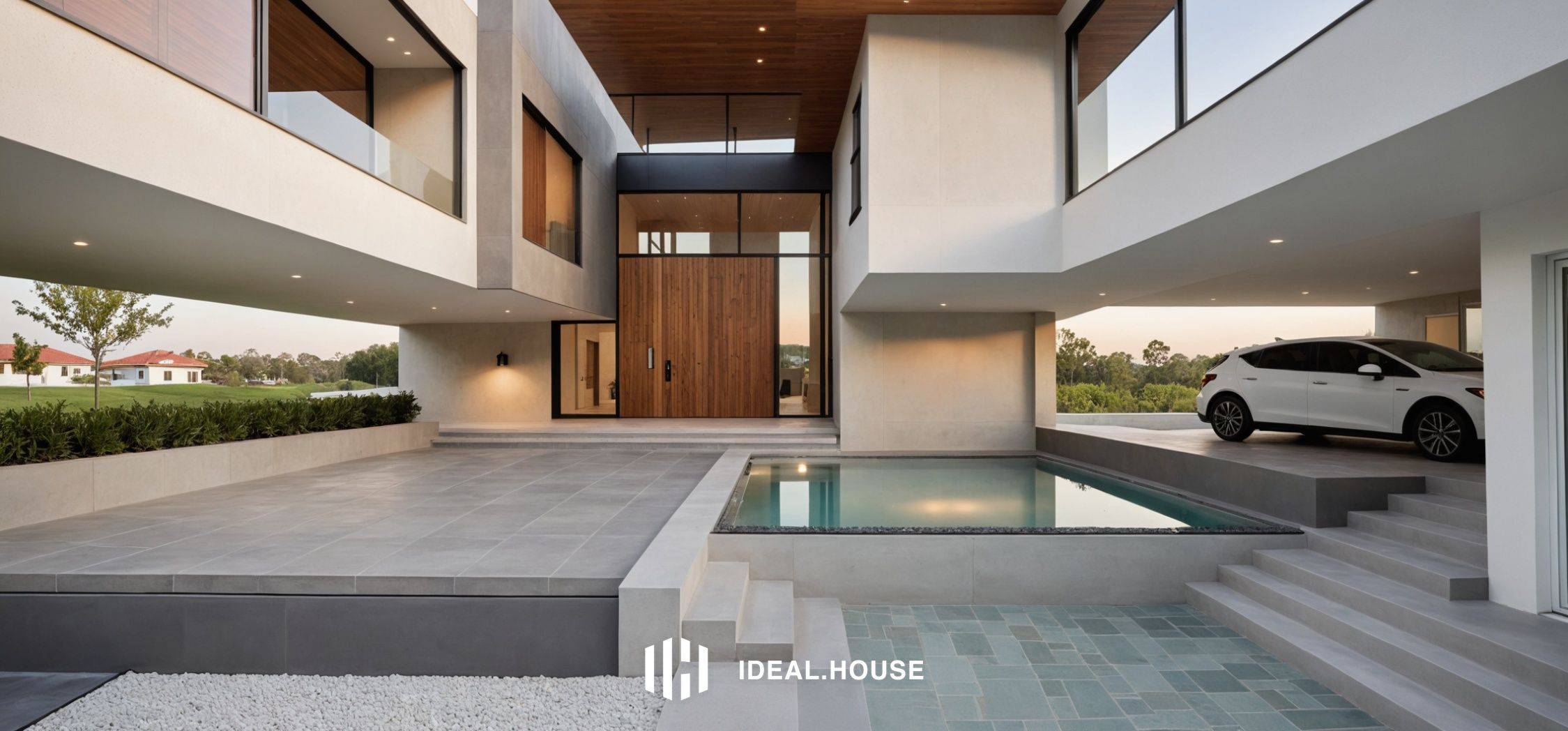

CASA COLOR CREMA
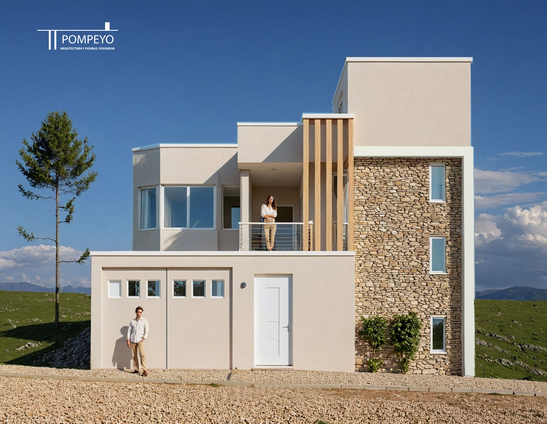
CASA MINIMALISTA
Jun 30, 2025
1 comment in total
Reno Rover
Los colores tierra se ven muy armoniosos
Jul 1, 2025
0
0
You may also like

Adding a Pop of Coral: Vibrant & Cheerful Dining Room Hues 🍊

color

Light Summer Color Palette for a Fresh Home Look

Muted Christmas Color Palette for Your Beach House 🐚🎄

Coral & Comfort: Warmth for Cozy Living Spaces 💖

Curated Color Palettes for a Playful Home 🌈🎨

🌊 Mastering the Mix: Coastal Colors for Your Home

My home

Crimson Comfort: Bold Red Accents for a Cozy Living Room! ❤️🛋️

Yellow Alchemy: How to Bottle Sunshine at Home ☀️✨

Coral Crush! Bold & Cheerful Bathroom Color Inspiration 💖🌸

casa K


Colors house

Coastal Kitchen Color Palette: Refreshingly Serene 💙🤍

house


Spice Tones: Bringing Cozy Heat to Your Kitchen 🌶️

Coral Crush: Adding Warmth & Vibrancy to Your Dining Room 🧡

Aqua & Coral Pop: A Refreshing Kitchen Color Combo! 🌊🧡

Exploring the Power of Color in Interior Design

Color Palette Perfection: MCM Hues for Your Home 🎨🌈


Adding a Pop of Coral: Vibrant & Cheerful Dining Room Hues 🍊
Inject some playful energy into your dining room with a pop of coral! 🍊 This warm, vibrant hue instantly energizes the space and creates a cheerful atmosphere perfect for hosting. It's a beautiful balance of pink and orange, feeling both sophisticated and fun.
I love using coral as an accent – think coral dining chairs, statement artwork, or even bold placemats. Pair it with softer neutrals like creamy whites and natural wood to prevent it from feeling overwhelming.
This color choice is fantastic for creating a welcoming space that sparks conversation and joy around the table.
Save this cheerful color inspo! 🍽️ #DiningRoomIdeas #CoralDecor #ColorInspo #VibrantInteriors #DiningRoomDesign #HomeDecorIdeas #AccentColors #CheerfulHome #InteriorStyling #DiningSpace


Coral & Comfort: Warmth for Cozy Living Spaces 💖
Let's talk about the undeniable warmth and vibrancy that coral brings to a space! This uplifting hue, ranging from soft peach to rich terracotta, is perfect for creating inviting and comforting environments. It’s about adding a touch of sunny optimism without being overpowering. ☀️
I love using coral as an accent color. Think of coral throw pillows on a neutral sofa, a statement vase, or even a piece of art. It pairs beautifully with natural materials like rattan, light wood, and linen, creating a relaxed yet chic atmosphere. It's also a fantastic way to inject personality into smaller spaces.
What do you think of coral in interiors? Save this post for some cozy living inspiration! ✨ #CoralIdeas #CozyHomeIdeas #LivingRoomIdeas #InteriorDesign #HomeDecor #WarmColours #AccentColours #DecorInspiration #ColourPalette #NurseryDecor


Crimson Comfort: Bold Red Accents for a Cozy Living Room! ❤️🛋️
Looking to add a touch of passion and coziness to your living room? Let's explore the power of bold crimson red accents! 💖 This vibrant hue can create a feeling of warmth, intimacy, and captivating energy.
Try crimson through:
* **A statement accent chair** in rich velvet.
* **Bold throw pillows and blankets** to add pops of color.
* **Artwork or decorative objects** that feature the color.
* **A striking crimson rug** to anchor the space.
Crimson pairs beautifully with warm neutrals, deep greys, and even touches of deep navy or forest green for a sophisticated look. Save this for your cozy living room design! 💫 #CrimsonLivingroomIdeas #BoldColorIdeas #CozyHomeIdeas #LivingroomAccentIdeas #WarmColorIdeas #InteriorDesign #HomeDecor #ColorInspiration #RedDecor #InvitingSpaces


Coral Crush: Adding Warmth & Vibrancy to Your Dining Room 🧡
Bring sunshine and joy to your dining space with the vibrant warmth of coral! This beautiful hue, a perfect blend of pink and orange, adds an instant pop of energy and personality. It’s incredibly versatile, creating a lively atmosphere for gatherings or a cheerful ambiance for everyday meals.
Coral design tips:
* **Table Setting:** Use coral-colored placemats or napkins.
* **Accent Pieces:** A coral vase filled with flowers or coral artwork.
* **Subtle Drizzle:** Paint the inside of cabinets or a chair accent.
Dine in delight! 🥂 Save this for your vibrant dining room inspo! ✨ #CoralDiningRoomIdeas #VibrantColorIdeas #WarmHomeDecor #EnergeticSpaces #CoralDecor #DiningRoomInspo #ColorPop #HomeDesign #EntertainingSpaces #InteriorStyle


Curated Color Palettes for a Playful Home 🌈🎨
Tired of beige? Let's inject some fun into your home's color story! 🌟 Think beyond the ordinary. Embrace palettes that reflect your personality. Pair unexpected hues like coral and teal, or mustard yellow and deep plum. Want to go whimsical? Consider soft pastels with metallic accents. For a bold statement, experiment with vibrant jewel tones. The key is balance and intentionality. Don't be afraid to let color tell your unique story and create spaces that spark joy and wonder! ✨
Save this for your next paint project! #ColorPaletteIdeas #PlayfulColorIdeas #WhimsicalColorPalette #HomeColorTrends #InteriorColorInspo #DecorPalette #CreativeColor #ColorInDesign #RoomMakeoverIdeas #DesignInspiration


Aqua & Coral Pop: A Refreshing Kitchen Color Combo! 🌊🧡
Ready for a kitchen that feels like a breath of fresh sea air with a tropical twist? Aqua and coral are your go-to! 🏝️ This vibrant pairing brings a lively, optimistic energy to the heart of your home. As your Color Pop Curator, I love how these colors create a cheerful and inspiring cooking and dining experience. Discover how to integrate them through cabinet colors, backsplashes, textiles, or decorative accents for a uniquely refreshing space. Save this for your cheerful kitchen makeover! ✨ #kitchenideas #aquadecorideas #coraldecorideas #refreshingkitchenideas #colorfulkitchenideas #kitchendesignideas #decorinspiration #vibranthome #happycooking #colorcombo


+2
Yellow Alchemy: How to Bottle Sunshine at Home ☀️✨
1️⃣ Golden Bedroom Glow (Pic1&6)
Floral murals + crystal chandeliers = waking up inside a honey jar 🍯
2️⃣ Sun-Kissed Kitchen (Pic2)
Lemonade cabinets ✖️ teal backsplash = brunch vibes 24/7 🍊🌻
3️⃣ Retro Bathroom Bliss (Pic3-5)
Sunflower tiles + jungle plants = mood-boosting soak sessions 🌼🛁
Pro Tip: Throw in black accents (window frames/towel racks) to keep the cheer from going saccharine.
Poll Time:
Which yellow zone would YOU steal?
🍯 Bedroom Honey Pot
🍋 Kitchen Citrus Mood
🛁 Bathroom Sunshine Tank
#YellowAlchemy #SunshineHome #ColorTherapy #interior #colorbalance #yellow

3


Coastal Kitchen Color Palette: Refreshingly Serene 💙🤍
Let the calming colors of the coast infuse your kitchen with serenity! 🌊 This refreshing palette is perfect for creating a bright and airy culinary space.
Start with a base of crisp whites for cabinets and walls to maximize light. Introduce soft blues – think robin's egg, sky blue, or even a touch of muted teal – through backsplashes, accessories, or even cabinet accents. Incorporate natural wood tones for countertops, open shelving, or a kitchen island to add warmth and organic texture. Touches of sandy beige or natural stone can further ground the look. This combination creates a feeling of peaceful spaciousness.
Save for your kitchen color inspo! ✨ #coastalkitchencolorideas #kitchencolorideas #kitchenpalette #coastaldecor #kitcheninspiration #homedecor #interiordesign #bluewhitekitchen #refreshinginteriors #seasidestyle


🌊 Mastering the Mix: Coastal Colors for Your Home
Choosing the right color palette is key to unlocking that serene coastal feeling! ⚓ At Nautical Nook, we believe in colors that evoke the peace and beauty of the ocean. Here's how we mix and match for a harmonious, breezy home.
💙 **Core Neutrals:** Think soft whites, sandy beiges, and warm grays. These are your foundational hues.
🐚 **Ocean Blues:** From deep navy to soft sky blue, these are essential for that seaside feel.
**Aqua & Teal:** Introduce these for a touch of vibrant energy, like shallow waters.
**Coral & Blush:** Use these as subtle accents for warmth, reminiscent of sunsets.
**Wood Tones:** Natural wood adds organic texture and depth.
Let these colors guide your next room refresh! Save this for your color inspo. ⚓ #CoastalColorPaletteIdeas #HomeColorIdeas #NauticalColorIdeas #InteriorColorIdeas #DecorInspoIdeas #HomeDecor #InteriorDesign #ColorInspiration #CoastalStyle #PaintColors


Exploring the Power of Color in Interior Design
I recently came across this beautiful living space that perfectly showcases how color can transform a room. The vibrant blue sofa and matching rug add a lively touch, while the yellow chair introduces a cheerful pop of color, creating a balanced and inviting atmosphere. The mix of bold and neutral tones enhances the overall aesthetic, demonstrating how thoughtful use of color can elevate interior design.
What are your favorite color combinations in home decor? Share your ideas or show us your colorful spaces!
#ColorInInteriorDesign #HomeDecor #InteriorDesign #ColorfulLiving #DesignInspiration #LivingRoomDecor #HomeStyling #Color

3


+7
Light Summer Color Palette for a Fresh Home Look
Ready to refresh your home for the sunny season? ☀️ Let’s talk about the light summer color palette—a dreamy way to bring soft, airy vibes into every room! If you’re new to color palettes, here’s the scoop: the light summer color palette is a blend of gentle, cool, and muted shades inspired by early summer mornings and breezy coastal days. Think powdery blues, gentle lavenders, soft blushes, and misty greys.
Using a light summer color palette in your home makes spaces feel open, calm, and sophisticated. I love pairing a soft summer color palette with natural textures like linen, rattan, and light wood for that California-cool look. Try a true summer color palette in your living room—think misty blue walls with pale pink cushions and silvery grey throws for an instant lift.
Want to lean into cooler shades? A cool summer color palette is perfect for bedrooms and bathrooms—just layer in icy blues, mint greens, and gentle purples for a restful, chill vibe. If you’re looking for inspiration for a more personalized touch, the light summer color palette asian style mixes these light shades with subtle patterns, bamboo, and simple, elegant décor for a tranquil retreat.
Pro tip: Stick to 2-3 main colors from the light summer color palette and add touches of white to keep things fresh. Use art, vases, and textiles to pull the look together. The result? A home that feels light, inviting, and oh-so-summery!
Embrace the light summer color palette and let your home glow with soft, cool elegance all season long. 🌿
#SummerColorPalette #HomeDecor #LightSummerPalette #InteriorInspo #FreshHome
Which color from the light summer color palette would you use first—powder blue, blush pink, or soft grey? Drop your pick below!


Coral Crush! Bold & Cheerful Bathroom Color Inspiration 💖🌸
Ready to inject some vibrant energy into your bathroom? Let’s talk about the uplifting power of coral! 💖 This energetic hue adds a playful, optimistic, and undeniably cheerful touch to any bathroom space.
Coral can shine through:
* **Bold tile choices** for a dramatic statement.
* **Accent walls** in a softer coral tone.
* **Towels and bath accessories** for a delightful pop.
* **Artwork or decorative accents** to complete the look.
Pair coral with crisp whites for a fresh feel, or with deep blues and greens for a more tropical vibe. Save this for your bold bathroom design! 💫 #CoralBathroomIdeas #BoldColorIdeas #BathroomDesignIdeas #CheerfulDecorIdeas #VibrantHomeIdeas #InteriorDesign #HomeDecor #ColorInspiration #BathroomInspo #PopOfColor
1


Spice Tones: Bringing Cozy Heat to Your Kitchen 🌶️
Ready to spice up your kitchen? 🔥 Embrace the warmth and inviting nature of spice-toned colors! Think rich paprika, warm cinnamon, burnt orange, and deep saffron yellow. These hues evoke comfort, conviviality, and a sense of deliciousness. 🧡 They're perfect for adding personality and a cozy vibe to the heart of your home. I love using them for accent cabinets, tiling, or even kitchenware. They pair beautifully with natural wood and brass finishes. Save this for your heartwarming kitchen inspo! 🥣 #SpiceToneIdeas #KitchenInspo #WarmKitchen #HomeDecorIdeas #InteriorDesign #PaprikaDecor #CinnamonHues #CozyHome #ColorPalette #HomeStyling


Muted Christmas Color Palette for Your Beach House 🐚🎄
Elevate your holiday decor with a calming, coastal-inspired Christmas color palette! Forget the bold reds and greens, and embrace the serenity of nature's winter hues. 🌊 At #CoastalSerenityStudio, we're all about soft, muted tones that enhance the airy feel of your seaside escape. Think warm ivories, sandy beiges, muted blues, and touches of deep evergreen. ✨ This approach creates a sophisticated yet inviting atmosphere, perfect for relaxed holiday gatherings. Swipe for inspiration and let's make your home a peaceful winter wonderland. Save this post for your next festive decor project! 💙 #CoastalChristmasIdeas #ChristmasColorPalette #BeachHouseChristmas #HolidayDecorIdeas #SereneChristmas #MutedDecor #CoastalLiving #WinterDecor #FestiveHome #NauticalChristmas

1


Color Palette Perfection: MCM Hues for Your Home 🎨🌈
Mid-Century Modern design is known for its distinctive color palettes that are both timeless and inviting. Let's explore the iconic hues that define MCM style! ✨
Embrace these MCM color combinations:
* **Earthy Neutrals:** Think warm creams, deep browns, and subtle greys.
* **Bold Accents:** Mustard yellow, teal, avocado green, and burnt orange bring vibrancy.
* **Pops of Color:** Use these vibrant shades strategically in cushions, art, or accent furniture.
* **Wood Tones:** Always anchor your palette with rich walnut and teak.
* **Subtle Pastels:** Mint green or pale blue can also add a touch of vintage charm.
Add a splash of MCM color to your space. Save this for your next paint project! 💖 #midcenturymodern #mcmdecor #colorpalette #mcmcolorideas #interiordesign #homedecor #paintcolors #designinspiration #walnutfurniture #vintagecolors