1/3

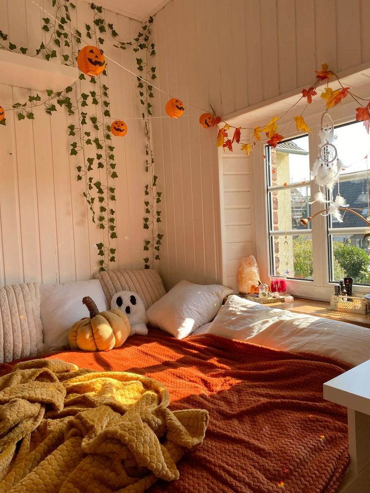
Pumpkin & Everything Nice: Cozy Color Combos 🍂
Thinking of adding warmth to your space? 🍁 Pairing pumpkin orange with rich browns and earthy greens creates a cozy, autumn-inspired vibe that's timeless yet trendy.
These hues not only evoke comfort but also bring depth and character to any room. Whether it's a burnt orange accent wall or olive green throw pillows, the possibilities are endless! Need inspiration?
Check out our latest mood boards and see how these colors can transform your interiors.
#InteriorDesign #ColorPalette #PumpkinSpiceVibes #HomeDecor #FallColors #DesignInspiration #CozyInteriors #WarmTones #AutumnDecor #ColorCombos
May 27, 2025
0 comment in total
You may also like

Ready for a Deep Autumn Color Palette Makeover?

Cozy Nooks: Integrating Cobalt Blue & Clay Textiles ☕️🧶

Nature's Palette: Calming Colors for Your Home 🌿

रेड ब्लु यलो कलर

Embrace the Holiday Glow: Cozy Christmas Color Palettes You'll Adore! 🎄✨

Burnt Orange Accents: Autumnal Warmth and Vibrancy 🍂

Cozy Reading Nook: Mastering Warm & Inviting Color Palettes 📚

color

Color Palettes Inspired by Nature: Muted Tones for Calm Spaces 🍂

🎄 Festive & Cozy: Embrace Christmas Colors with Warm Palette Ideas! 💖

Peach & Teal Harmony: A Serene Color Story! 🍑💙

Unexpected Pairings: Bold Color Combos That Work! 🎨

I just cannot wait

Autumn Harvest: Russet Oranges, Deep Reds & Mustard Yellows for a Welcoming Kitchen 🍁

A Burst of Color for Your Home and Garden🌹

Aqua & Coral Pop: A Refreshing Kitchen Color Combo! 🌊🧡

Curated Color Palettes for a Playful Home 🌈🎨

Facade magasin

The Joy of Contrasts: Mixing Bold Colors in Your Home! 💛💙

Golden Hues: Adding Warmth & Sunlight to Your Home ☀️


+2
Ready for a Deep Autumn Color Palette Makeover?
🍁 Thinking about giving your home a cozy update? Let’s talk about the deep autumn color palette! As a California homeowner, I wanted to create a warm, inviting vibe—perfect for our cooler months. But what exactly is a deep autumn color palette? It’s a collection of rich, earthy hues like burnt orange, olive green, deep teal, and spicy russet that echo the changing leaves and golden sunlight of autumn.
Unlike the soft autumn color palette (think muted, gentle shades), the deep autumn color palette is bold and saturated. It’s warmer than the deep winter color palette, which usually has cooler, more dramatic tones. If you love the true autumn color palette—full of pure, harvest-inspired colors—you’ll adore how deep autumn adds extra depth and coziness. You can even blend in touches from the warm autumn color palette for a sun-soaked look, or the dark autumn color palette for more drama.
💡 Decor Tips:
Try painting an accent wall in a deep forest green or rusty red.
Layer in throw pillows and blankets in mustard, auburn, and chocolate brown.
Update your entryway with a vintage rug in deep autumn color palette shades.
Mix and match textures: leather, linen, and chunky knits look amazing in autumn hues.
Bring in natural elements like wood, terracotta, and dried florals to enhance that autumn color palette vibe.
The great thing about the deep autumn color palette is its versatility—it works with both modern and traditional styles. Whether you go full-on dark autumn color palette or mix in a bit of soft autumn, your space will feel instantly more inviting!
#DeepAutumnPalette #AutumnDecor #HomeMakeover #CozyInteriors #CaliforniaHomes
🍂 What’s your favorite deep autumn color to decorate with? Drop your top pick below!

1


Embrace the Holiday Glow: Cozy Christmas Color Palettes You'll Adore! 🎄✨
Dreaming of a warm and inviting Christmas? Let's dive into the emotional power of color to create your most cherished holiday haven! 💜 Forget overwhelming red and green; we're exploring subtle, sophisticated palettes that bring pure joy and cozy vibes.
This season, I'm obsessed with rich jewel tones like deep emerald, sapphire blue, and amethyst, beautifully balanced with creamy whites and warm metallics like antique gold. Think velvety textures, natural wood accents, and the gentle flicker of candlelight.
Whether you prefer a modern minimalist feel or a more opulent traditional look, embracing specific color stories will transform your space into a true sanctuary. Save this for your most colorful Christmas yet! 🎁 #ChristmasColorIdeas #HolidayDecorIdeas #CozyChristmasIdeas #InteriorDesignIdeas #ChristmasInspo #HomeDecor #HolidayVibes #ColorInDesign #FestiveHome #ElegantChristmas


Color Palettes Inspired by Nature: Muted Tones for Calm Spaces 🍂
Drawing inspiration from the natural world offers an endless palette of soothing and sophisticated colors. Muted, earthy tones create a serene and grounding atmosphere, perfect for a home that feels like a tranquil escape.
Nature-inspired palettes:
* **Forest Floor:** Deep greens, mossy browns, and soft stone greys.
* **Desert Dusk:** Warm sands, muted terracotta, and dusky purples.
* **Coastal Fog:** Soft blues, driftwood greys, and off-white hues.
Let's use these to create depth and serenity.
Save for your next color scheme! 🎨 #NatureInspiredColors #MutedTones #CalmColorPalettes #InteriorDesign #HomeDecorInspo #EarthyTones #ColorInspiration #SereneSpaces #TheArtfulAssemblage #DecorIdeas

I just cannot wait
cannot wait to design my Halloween Room✨
This is gonna be so spooky and iconic. My inspo board is already popping off! 👻✨Okay, but help me decide! 🎃 Pumpkin patch theme or full-on haunted house? 🖤 My wallet is ready for Target & Spirit Halloween. 😂💸
#halloween #homedecor #roomdesign #halloweendecor #fallcolors #warmcolorpalette #bedroomdecor

2


Curated Color Palettes for a Playful Home 🌈🎨
Tired of beige? Let's inject some fun into your home's color story! 🌟 Think beyond the ordinary. Embrace palettes that reflect your personality. Pair unexpected hues like coral and teal, or mustard yellow and deep plum. Want to go whimsical? Consider soft pastels with metallic accents. For a bold statement, experiment with vibrant jewel tones. The key is balance and intentionality. Don't be afraid to let color tell your unique story and create spaces that spark joy and wonder! ✨
Save this for your next paint project! #ColorPaletteIdeas #PlayfulColorIdeas #WhimsicalColorPalette #HomeColorTrends #InteriorColorInspo #DecorPalette #CreativeColor #ColorInDesign #RoomMakeoverIdeas #DesignInspiration


Burnt Orange Accents: Autumnal Warmth and Vibrancy 🍂
Let's warm up our spaces with the rich vibrancy of burnt orange! 🔥 This inviting hue is perfect for adding a touch of autumnal comfort and energetic warmth to any room.
Burnt orange is fantastic for creating cozy accents. Think of plush burnt orange throw pillows on a neutral sofa, a stylish burnt orange rug, or decorative pieces like vases and ceramics. It pairs beautifully with deep browns, creams, and natural wood tones, creating an atmosphere that is both grounding and vibrant. It’s ideal for spaces that feel welcoming and full of life.
What do you think of warm, earthy tones? Save this for cozy, autumnal inspiration! ✨ #BurntOrangeIdeas #AutumnDecor #HomeDecorIdeas #InteriorDesign #WarmAccents #EarthyTones #ColourInspiration #CozyHome #LivingRoomDecor #DecorInspo


🎄 Festive & Cozy: Embrace Christmas Colors with Warm Palette Ideas! 💖
Ready to deck the halls with dazzling color? ✨ This Christmas, let's dive into a world of festive palettes that scream cozy holiday spirit! Think beyond the usual red and green. We're exploring warm, inviting combinations that make your home feel like a winter wonderland hug. Imagine rich emerald greens paired with deep burgundy, accented by touches of antique gold and creamy ivory. Or how about a Scandinavian-inspired palette of soft blush pinks, icy blues, and natural wood tones? 🎨 These palettes create an atmosphere of joy and warmth, perfect for gathering loved ones. Which color story will you choose for your holiday home? #ChristmasDecorIdeas #HolidayPaletteIdeas #FestiveColorSchemes #CozyChristmasIdeas #ChristmasHomeIdeas #InteriorColorInspo #HolidayHomeDesign #SeasonalDecor #WarmAndCozy #HomeDecorTips

1


Autumn Harvest: Russet Oranges, Deep Reds & Mustard Yellows for a Welcoming Kitchen 🍁
Embrace the warm, comforting embrace of autumn in your kitchen! 🍁 The rich palette of russet oranges, deep reds, and mustard yellows is perfect for creating a welcoming and cozy atmosphere. Think warm wooden cabinetry, terracotta accents, and splashes of vibrant autumn hues in your textiles and decor. This color scheme radiates warmth, harvest abundance, and inviting hospitality. Add natural elements like gourds or woven baskets for an authentic feel. Your kitchen will be the heart of cozy gatherings! 🧡 Let's cook up some warmth! 🍄 #kitchenredesign #autumnvibes #russetorange #deepred #mustardyellow #welcomingkitchen #harvestdecor #homedecorideas #kitchenideas #cozykitchen


Cozy Nooks: Integrating Cobalt Blue & Clay Textiles ☕️🧶
Creating cozy corners is our specialty, and the combination of cobalt blue and earthy clay tones is perfect for it! Imagine a deep armchair in a warm clay-toned boucle fabric. 🛋️ Layer on a throw blanket that artfully blends both hues – think a soft weave with chunky stripes of cobalt and cream, or a patchwork of smaller textured squares. Add a lumbar pillow featuring a hand-block print of a cobalt blue floral motif on a natural linen background. These artisanal touches invite you to curl up and relax. Save this for your ultimate cozy nook inspiration! #CobaltNookIdeas #ClayNookIdeas #CozyCornerIdeas #TextileDecorIdeas #HandmadeBlanketIdeas #ThrowPillowInspo #HomeDecor #RelaxationStation #BohoDecor #ArtisanTextiles


Cozy Reading Nook: Mastering Warm & Inviting Color Palettes 📚
The perfect reading nook is an escape! It's all about comfort, tranquility, and of course, a color palette that wraps you in warmth. Ready to create your literary sanctuary?
🍂 **Amber & Ochre:** Think deep golden yellows, warm oranges, and earthy browns. This combo feels like a hug!
🍷 **Burgundy & Cream:** Rich, deep reds paired with soft creams and cozy textures create a sophisticated, intimate feel.
🌲 **Forest Green & Walnut:** Deep, calming greens and rich walnut wood evoke a sense of groundedness and natural serenity.
☁️ **Soft Grey & Blush:** A gentle pairing for a lighter, airy feel that still maintains coziness.
Which cozy colors inspire your escape? Save this post for your ultimate reading retreat! 🛋️ #readingnook #cozyhomeideas #readingnookideas #colorinspiration #warmcolorpalette #interiordesignideas #hyggehome #bedroomdecor #livingroomideas #decorating

A Burst of Color for Your Home and Garden🌹
Red geraniums are a vibrant and versatile addition to both outdoor gardens and indoor spaces. Their bright red flowers can instantly liven up any area, from window boxes and balcony planters to indoor shelves and tables.
Geraniums are known for their hardiness and ability to thrive in various conditions, making them a low - maintenance yet high - impact choice for adding color to your environment. They prefer sunny spots but can tolerate some shade, and with regular deadheading, they'll continue to bloom throughout the season.
Whether you're looking to brighten your outdoor patio or bring some natural color indoors, red geraniums are a fantastic choice that will reward you with their cheerful presence.
#RedGeranium #ContainerGardening #CottageCore #PollinatorGarden #BoldBlooms

1


Nature's Palette: Calming Colors for Your Home 🌿
Bring the tranquility of nature indoors with the right color choices! ☯️ Think of the calming hues found in Zen gardens: soft greens, earthy browns, muted greys, and serene beiges. 🌿 These colors evoke a sense of peace and grounding. Avoid overly bright or saturated tones. Instead, layer various shades of these natural colors to create depth and warmth. This mindful approach to color palettes will transform your home into a restful sanctuary. Save this for your natural color inspo! #colorideas #naturalliving #calmcolors #zenhome #homedecor #interiordesign #earthytoneideas #japandicolor #serenemind #designpalette


The Joy of Contrasts: Mixing Bold Colors in Your Home! 💛💙
Don't be afraid of contrast! 💛💙 I love playing with bold color combinations that create energy and visual interest in a space. Think vibrant yellow paired with deep blue, or a fiery orange against a cool turquoise. ✨ The key is to find a balance that feels harmonious yet exciting. These pairings create rooms that are lively and full of personality! What's your favorite bold color combo? Save this for your adventurous decor! 💖 #ColorContrastIdeas #BoldColorIdeas #VibrantDecorIdeas #EnergeticHomeIdeas #InteriorColorIdeas #ColorBlocking #HomeDesign #EclecticStyle #ChromaAndCharm #PlayfulInteriors


Peach & Teal Harmony: A Serene Color Story! 🍑💙
Looking for a color palette that's both soothing and vibrant? Try the delightful pairing of soft peach and cool teal! 🌸 It’s unexpected yet incredibly harmonious.
Peach brings warmth, optimism, and a gentle touch, while teal adds depth, tranquility, and a hint of sophisticated drama. Together, they create a beautifully balanced and inviting atmosphere.
Use them in a living room, bedroom, or even a home office for a refreshing and modern feel. They work wonders on walls, furniture, or in accent decor pieces!
#peachandteal #colorpalette #serenehome #interiordesign #homedecor #colorideas #peachandtealdecor #harmoniouscolors #calminginteriors #modernpalette #vividdecorcollective #refreshinghome #interiorcolorstory


Unexpected Pairings: Bold Color Combos That Work! 🎨
Who says colors can't be friends? 😉 I love creating bold, unexpected color combinations that surprise and delight. Think turquoise and orange, mustard yellow and deep plum, or hot pink and emerald green! It’s about embracing vibrancy and not being afraid to experiment. These pairings add an incredible energy to any space! What's your favorite daring color combo? Share below! 👇 Save this for a vibrant design palette! ✨ #boldcolorcombos #colorpaletteideas #maximalistinteriors #vibrantdecor #uniquepairings #designwithcolor #creativepalette #homedecorinspo #paintcolorideas #statementcolors


Aqua & Coral Pop: A Refreshing Kitchen Color Combo! 🌊🧡
Ready for a kitchen that feels like a breath of fresh sea air with a tropical twist? Aqua and coral are your go-to! 🏝️ This vibrant pairing brings a lively, optimistic energy to the heart of your home. As your Color Pop Curator, I love how these colors create a cheerful and inspiring cooking and dining experience. Discover how to integrate them through cabinet colors, backsplashes, textiles, or decorative accents for a uniquely refreshing space. Save this for your cheerful kitchen makeover! ✨ #kitchenideas #aquadecorideas #coraldecorideas #refreshingkitchenideas #colorfulkitchenideas #kitchendesignideas #decorinspiration #vibranthome #happycooking #colorcombo


Golden Hues: Adding Warmth & Sunlight to Your Home ☀️
Want to bring the feeling of sunshine indoors? Embrace golden hues! 💛 Think warm mustard yellows, rich ochre, and buttery creams. These colors instantly add a dose of warmth, energy, and optimism to any space. They have a magical ability to make a room feel more inviting and cheerful. 💫 I love incorporating them through accent chairs, throw pillows, or even a statement lamp. They pair beautifully with natural wood and warm neutrals for a harmonious glow. Save this for your sunny space inspo! ✨ #GoldenHuesIdeas #WarmHome #SunnySpaces #HomeDecorInspo #InteriorDesignIdeas #MustardYellowDecor #OchreLiving #ColorPop #CheerfulHome #DesignInspiration