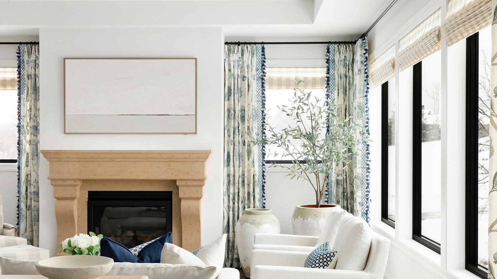
1/12
How to decorate with Alabaster by Sherwin-Williams
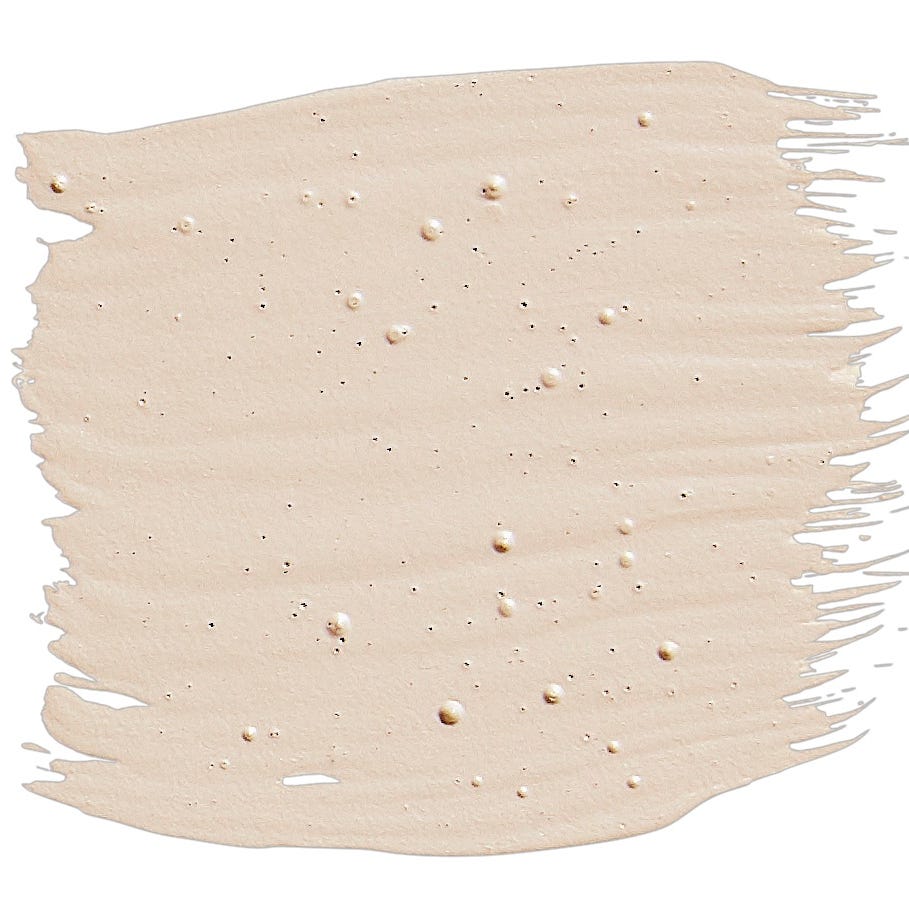
Alabaster by Sherwin-Williams is a highly favored off-white paint color among interior designers, renowned for its ability to create sophisticated and inviting spaces. Despite decorating with neutrals sometimes being considered unoriginal, Alabaster's timeless appeal makes it a classic choice. It was even named the brand's Color of the Year in 2016, highlighting its enduring popularity. This particular hue strikes an ideal balance of style and warmth, distinguishing itself from typical bright whites with gray undertones by leaning towards the yellow end of the spectrum, yet avoiding a creamy appearance. This makes Alabaster a versatile and enduring shade that transcends fleeting color trends.
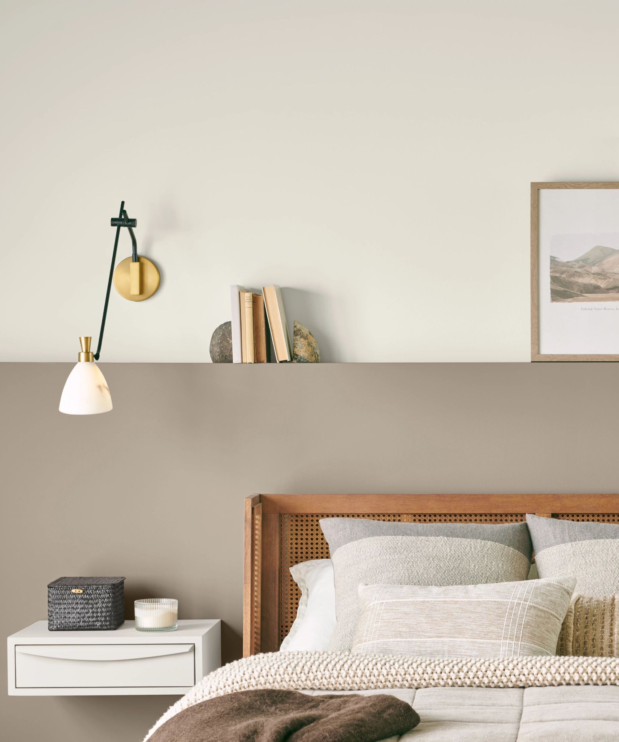
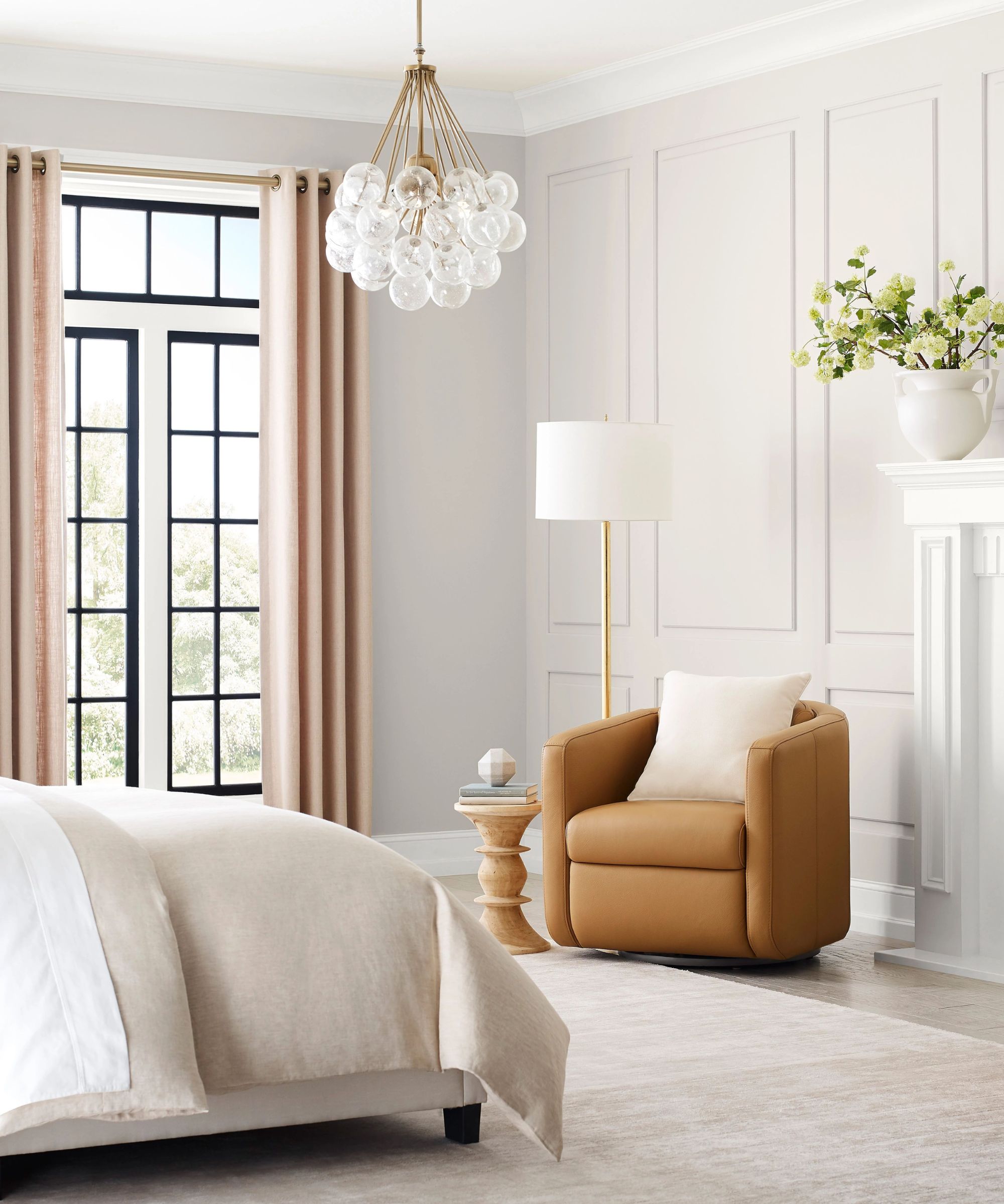
Sue Wadden, Director of Color Marketing at Sherwin-Williams, describes Alabaster SW 7008 as a shade that masterfully balances the brightness of white with a warm and cozy feel. Its versatility allows it to serve as a backdrop for various design styles, from modern to minimalist. Named after the milky-white stone, Alabaster possesses delicate, soft qualities with just the right amount of greige undertones, making it neither too warm nor too cool. Wadden suggests its use on bedroom walls for a peaceful atmosphere or in communal rooms like dining areas, paired with pastel trims and modern fixtures, to achieve an organic modern aesthetic. Jennifer Davis of Davis Interiors echoes this sentiment, noting Alabaster's creamy and soft hue provides an elegant touch for walls, millwork, and cabinets. She emphasizes its reflective properties, which create a warm ambiance, especially when enhanced by natural light. Davis prefers Alabaster for its ability to maintain a clean, warm tone without adopting unwanted undertones, making it an excellent foundation for both minimalist and eclectic decor.
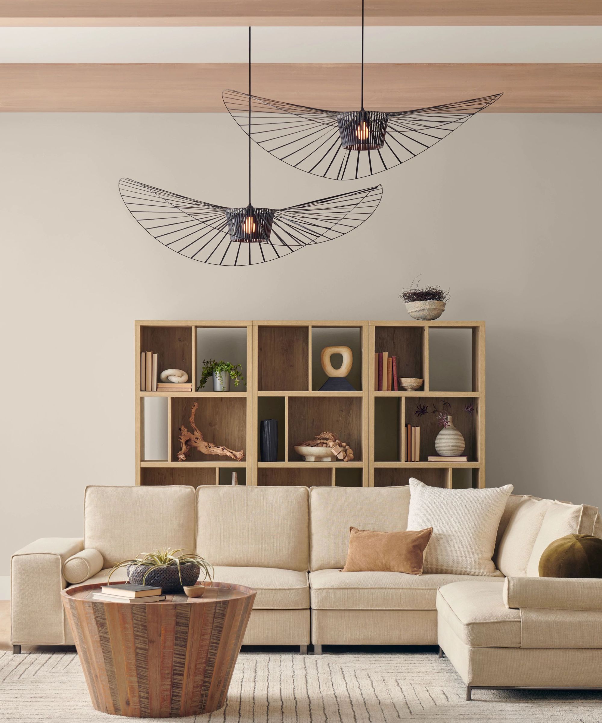
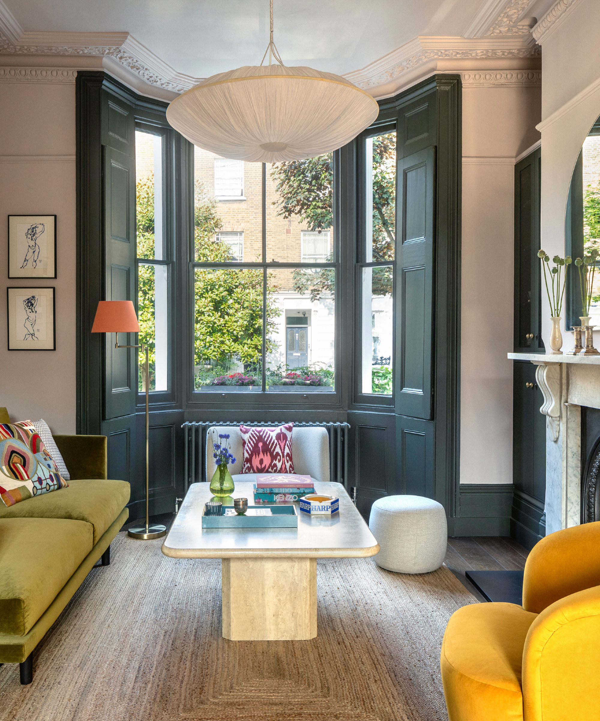
Interior designers offer several strategies for decorating with Alabaster. One effective method involves pairing it with natural wood tones, leather, or linen to create dynamic and visually appealing spaces. Artem Kropovinsky of Arsight advises introducing diffused contrasts using darker or more vibrant accessories such as throw pillows, plants, or richly colored artwork. Jennifer Davis supports this, suggesting that pairing Alabaster walls with darker millwork creates striking depth and makes spaces feel larger, while also providing a neutral canvas for seasonal decor changes. The consistency of Alabaster across different millwork elements also ensures a cohesive look.
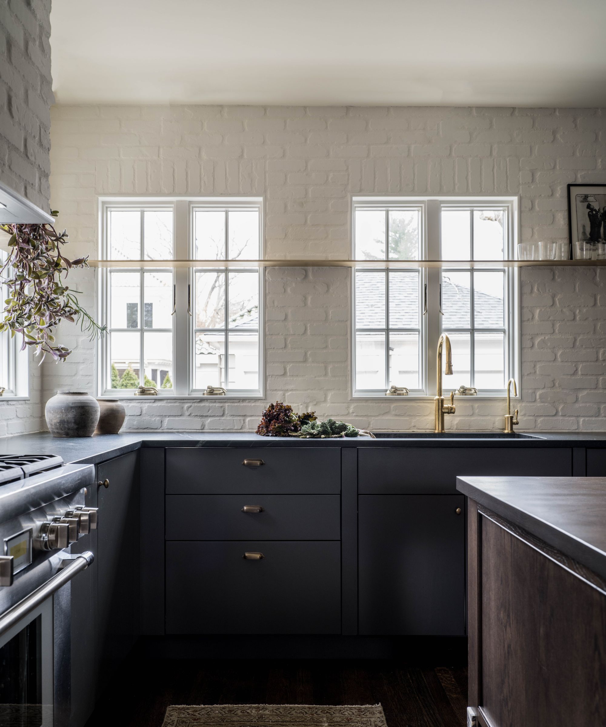
Alabaster is also highly effective in brightening small spaces, particularly those lacking ample natural sunlight, such as pantries, boot rooms, or small entryways. Kathy Kuo, an interior designer, highlights its ability to bring brightness without appearing stark, making smaller rooms feel more expansive. She notes its suitability for various design styles, including coastal beach, French country, and modern farmhouse. To maximize its luminosity, placing mirrors strategically can help bounce light around the room. For built-in cabinetry, such as kitchen cabinets, home office units, and bookshelves, Alabaster provides a fresh and bright appearance. Carola Pimentel of Assure Interiors recommends layering textures through tactile materials for a laidback and refined scheme suitable for functional family spaces. Kropovinsky adds that Alabaster serves as an excellent base to highlight architectural features or as a canvas for bolder accents.
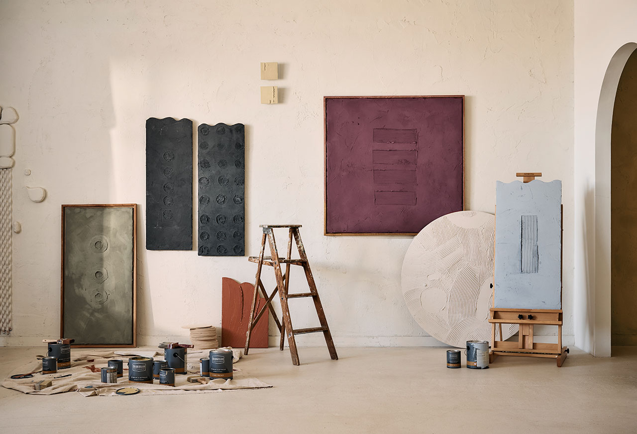
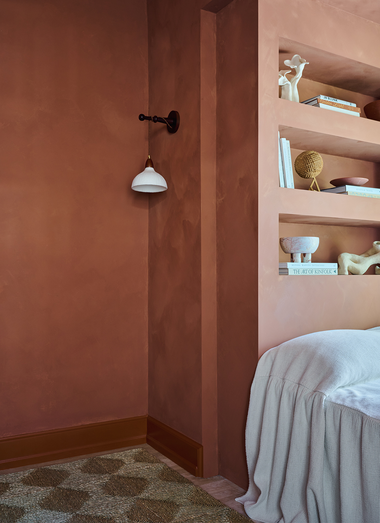
In bathrooms, Alabaster's subtle warmth fosters a cozy and inviting retreat, enhancing the serene atmosphere. Gianna Pagliarulo of Studio Itaca suggests incorporating textured finishes like limewash or plaster in Alabaster to prevent the neutral color from appearing flat, lending a contemporary feel. For an enveloping effect, particularly in bedrooms, designers recommend color drenching, applying Alabaster to walls, woodwork, and ceilings. Tama Bell of Tama Bell Design chose Alabaster for a coastal home to achieve a warm yet clean and fresh feel, ensuring comfort. Contrary to concerns about neutral rooms appearing stark, texture in flooring, finishes, and textiles can add significant depth and comfort, with color drenching even being linked to improved sleep. Lastly, Alabaster excels as a backdrop for layering prints and colors. In a living room designed by Davis Interiors, Alabaster walls, ceilings, and trims allowed for flexible decor choices, maintaining a warm and clean tone without undesirable undertones. This approach perfectly complements a coastal farmhouse style, creating a light and airy space. Sue Wadden suggests adding muted colors and natural wood tones to complete the comfortable aesthetic. Ultimately, Alabaster's adaptability, light-enhancing qualities, and compatibility with various design elements make it a reliable choice for interior design that transcends trends, with designers continuing to leverage its potential in diverse ways.
#AlabasterPaint #SherwinWilliams #InteriorDesign #DecoratingWithNeutrals #HomeDecor #WarmWhites #ColorTrends #PaintColors #DesignTips #AlabasterPaint #SherwinWilliams #InteriorDesign #DecoratingWithNeutrals #HomeDecor #WarmWhites #ColorTrends #PaintColors #DesignTips
0 comment in total
 No comments yet
You may also like
How to Decorate with Amber in Your Home

How to decorate with Sherwin Williams’ Iron Ore – a ‘sophisticated, warm and timeless gray’
Alabama Maker’s stained-glass art colors home and heaven
The 10 Best Accent Wall Colors From the Paint Experts

Best lavender paints as chosen by designers – 6 favorite varieties of this calming, pastel color

How to decorate with taupe


Sherwin-Williams Just Named Its Loneliest Color of 2025—and Everyone Should Be Using It
10 Kitchen Paint Colors You Won’t Regret in 10 Years, According to Designers
How to decorate with Sherwin-Williams' Drift of Mist – an 'airy and inviting' gray
10 Gorgeous Paint Colors for Accent Walls


Seashell Decor Is Everywhere Right Now—Here's How to Decorate With It

The 16 Best Accent Wall Colors

Top 15 Best-Selling Lowe’s Paint Colors of All Time
Escape to the Chateau's Angel Strawbridge tips for styling a bar cart to perfection
2025 Colors of the Year, and How to Use Them

6 ways to decorate with Farrow & Ball Down Pipe, a dramatic black paint

8 Favorite Paint Colors of Local Interior Designers

Color Atelier Unveils New Limewash Collection With Sarah Sherman Samuel
The ultimate guide to choosing the right shade of white for your walls

Decorating Tips and Techniques