1/10
Everybody's Still Talking About Dopamine Decor — But Now This Joyful Trend Has Evolved
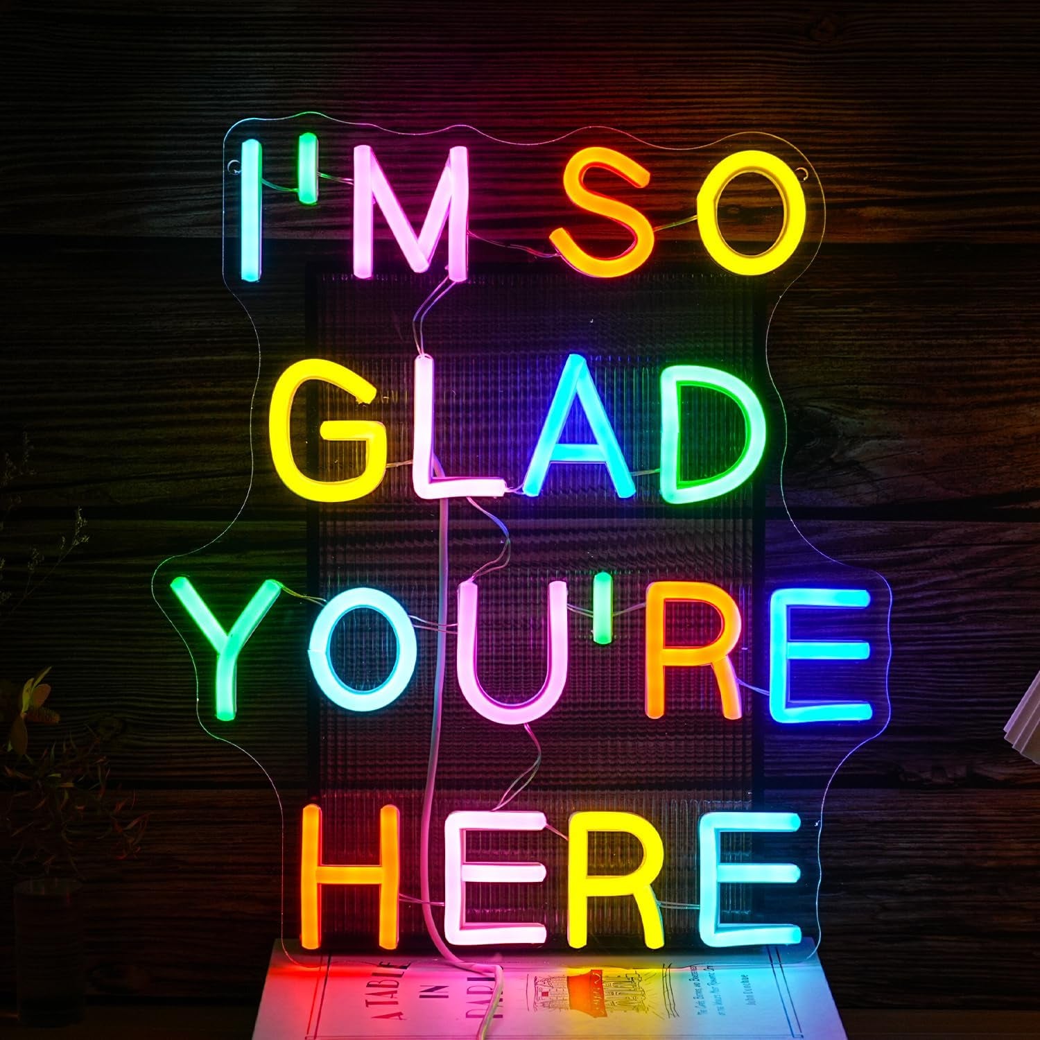
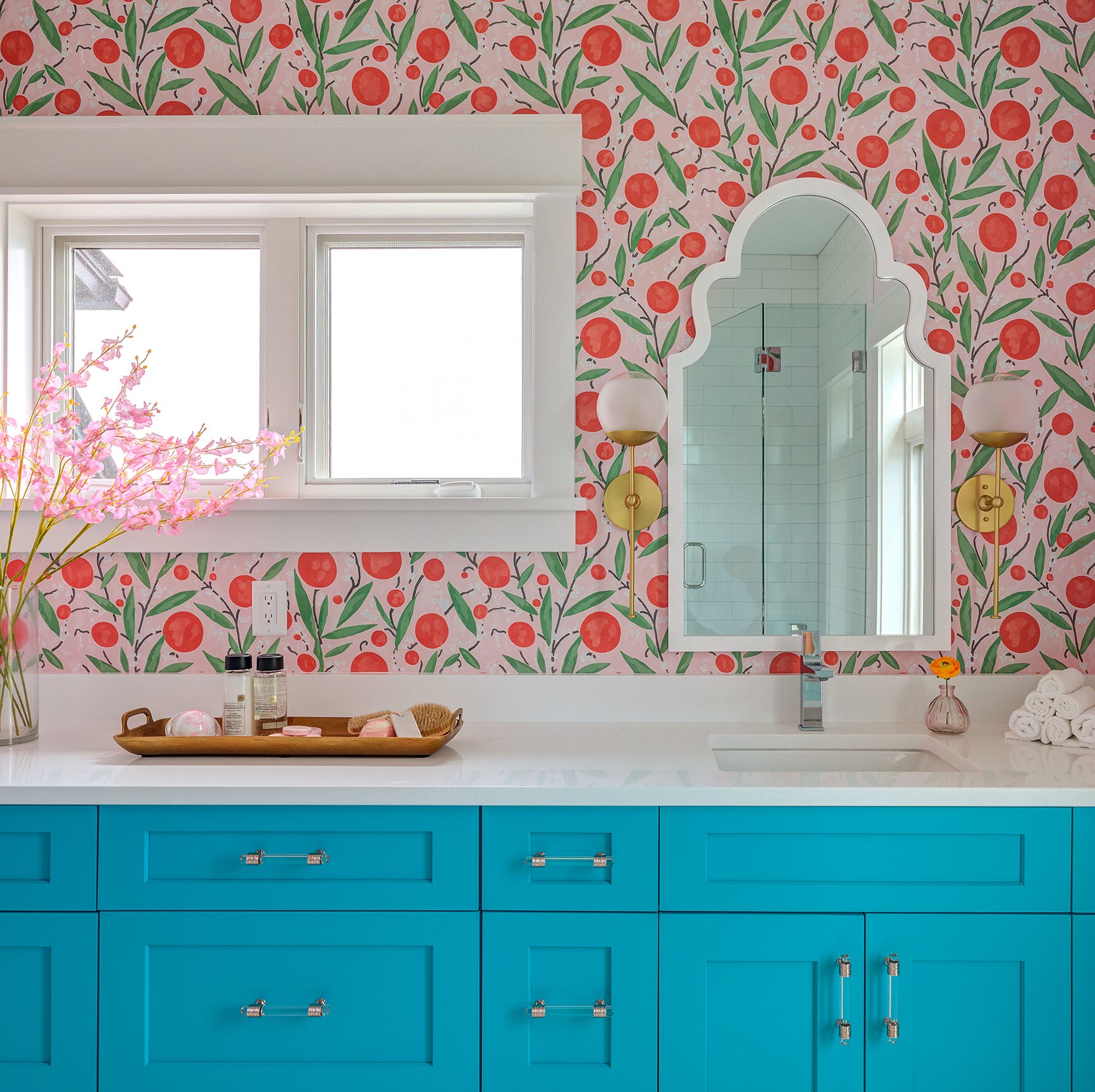
First introduced in 2022, dopamine decor, a design philosophy centered on using color to evoke joy, continues to be a relevant and evolving trend in 2025. This enduring style recognizes the profound impact of decor choices on mood and well-being, influencing how individuals seek to curate their living spaces.
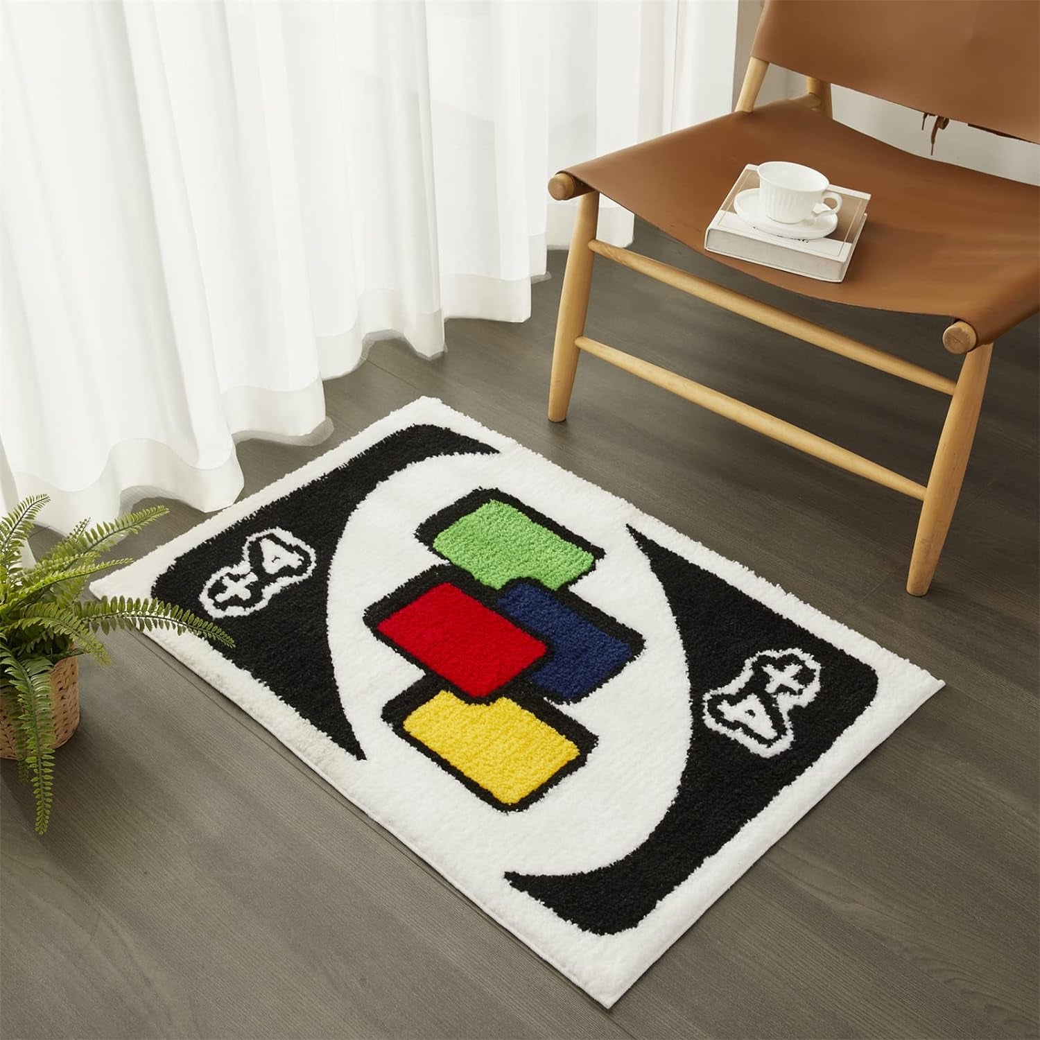
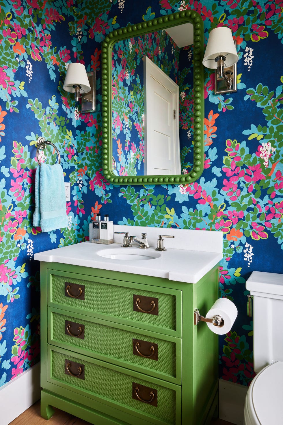
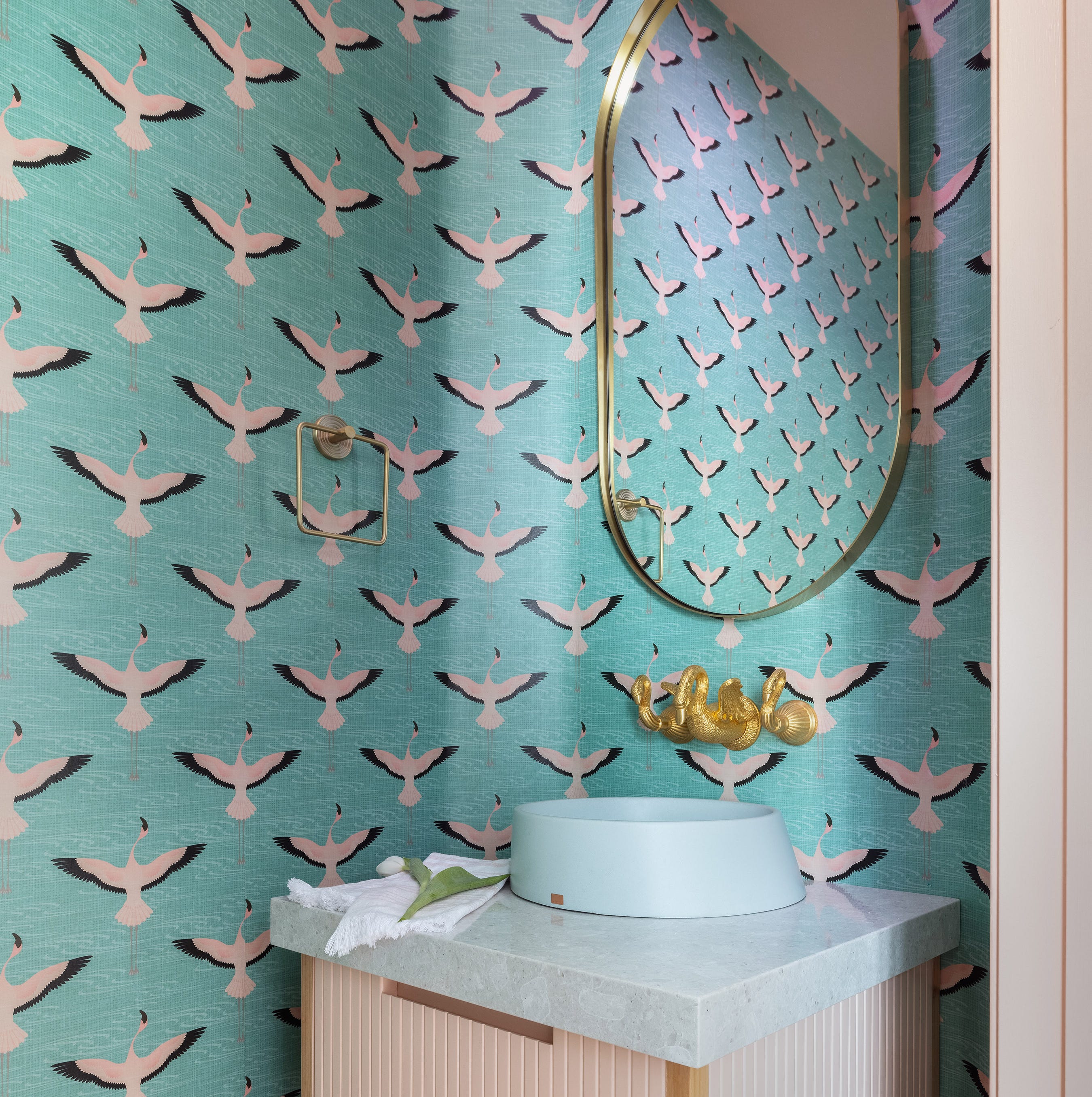
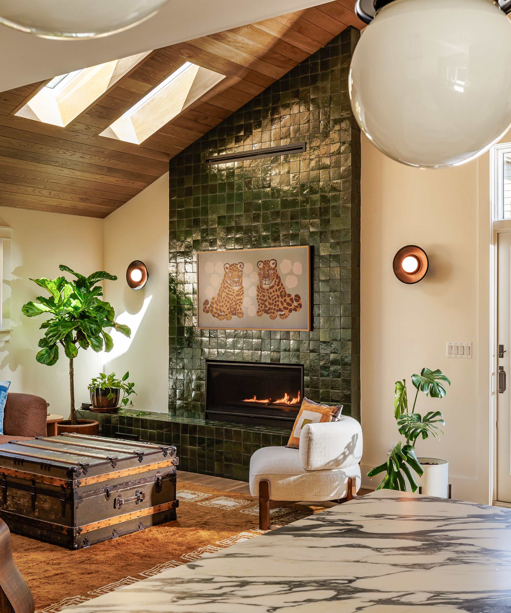
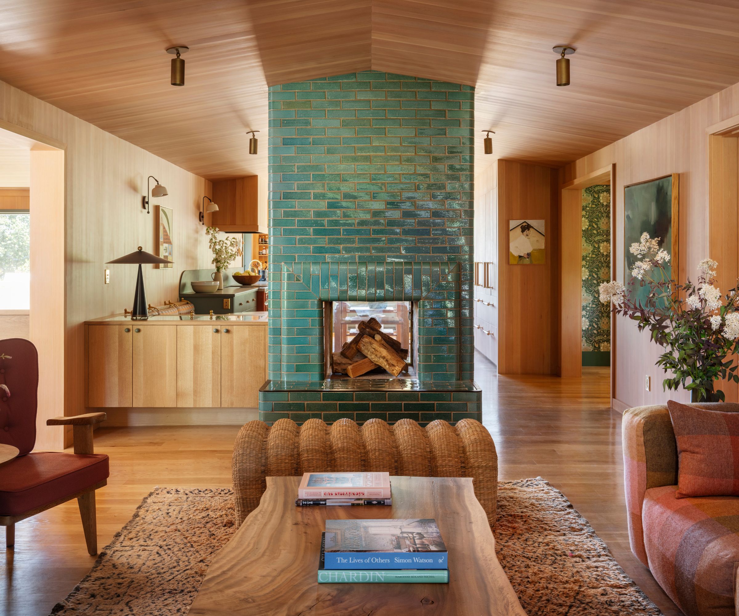
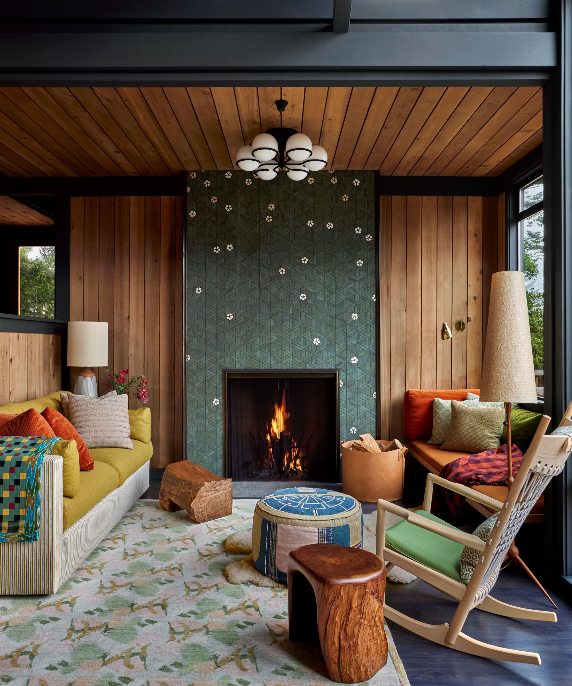
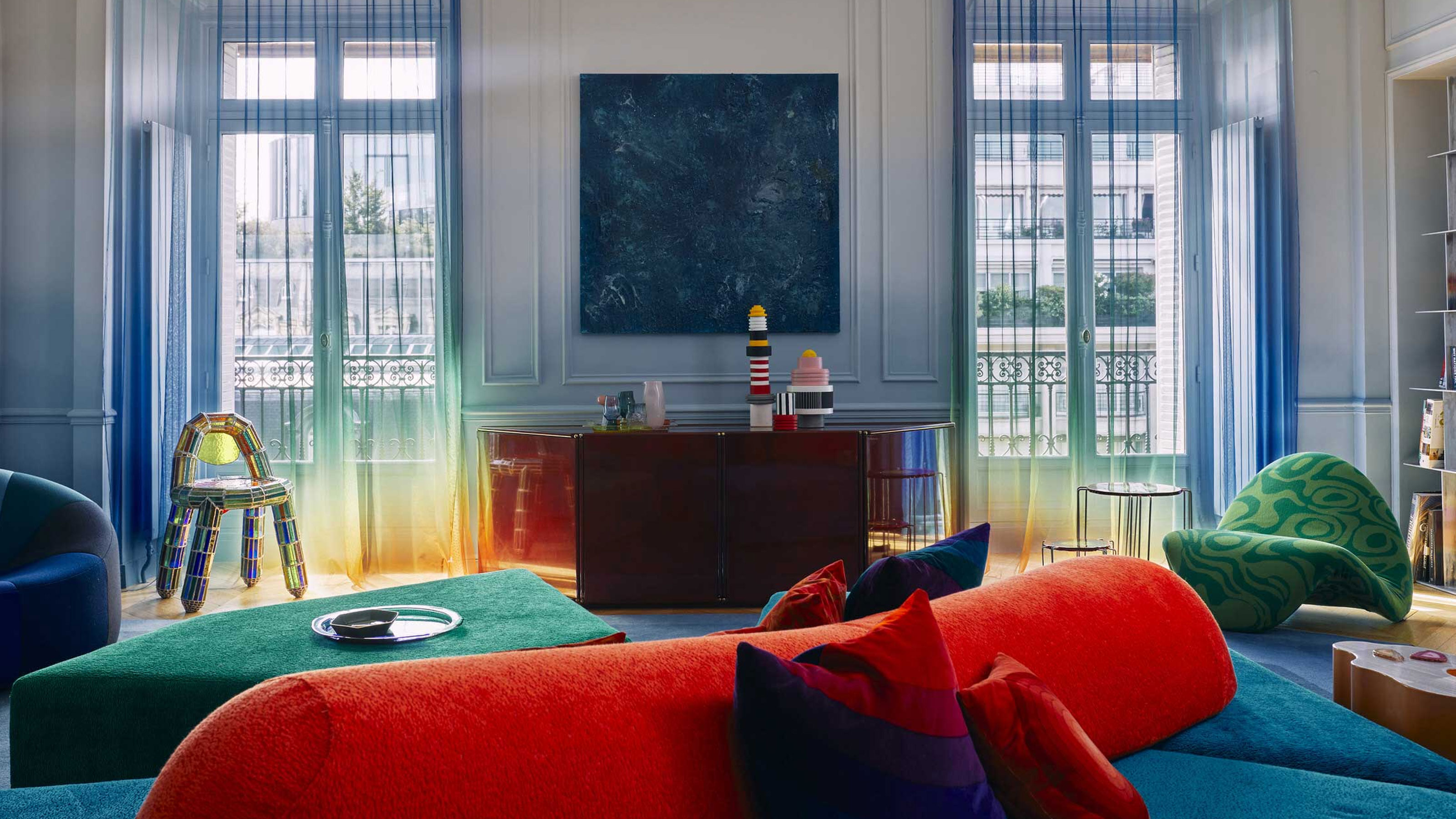
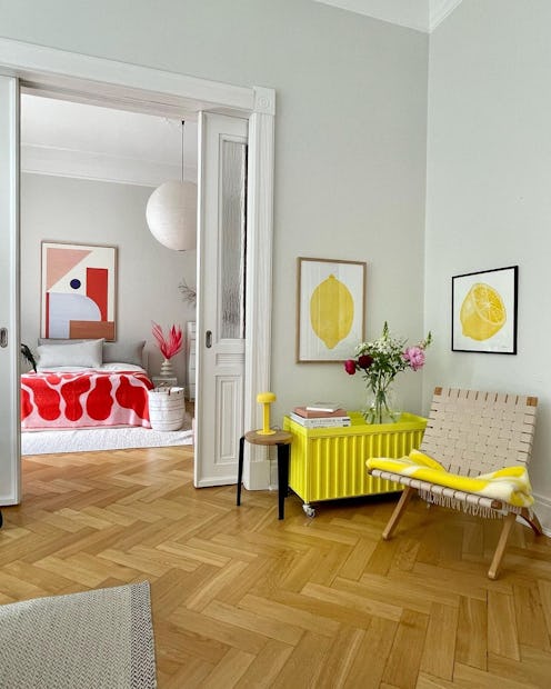
Initially characterized by bright, multicolored palettes and graphic shapes, dopamine decor has undergone a subtle yet significant evolution. While the core principle of happiness-inducing color remains, the execution has matured. Designers are now moving beyond block, vibrant colors, integrating more nuanced elements such as texture, depth, and earthy pigments to create spaces that are joyful without being overwhelming. The shift reflects a desire for more sophisticated and soothing environments.
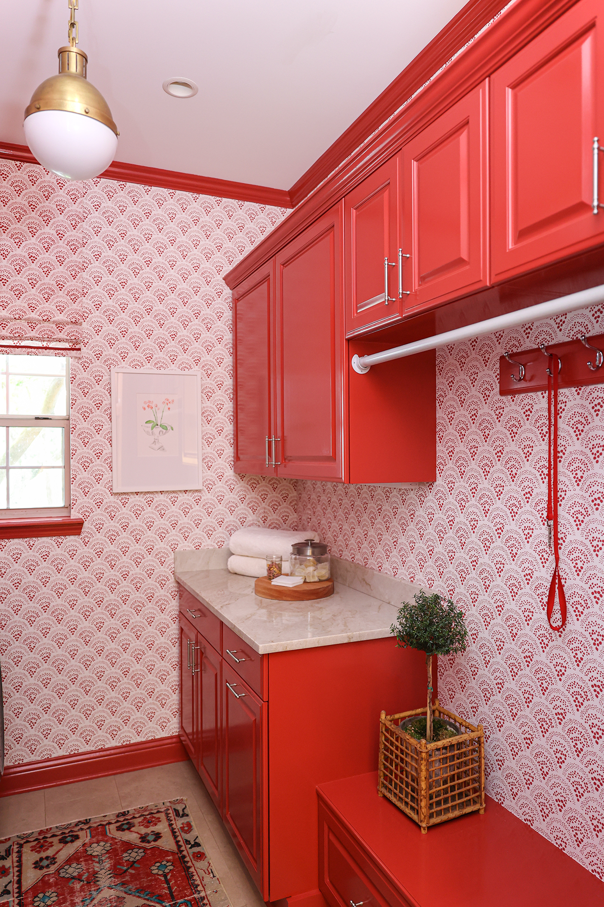
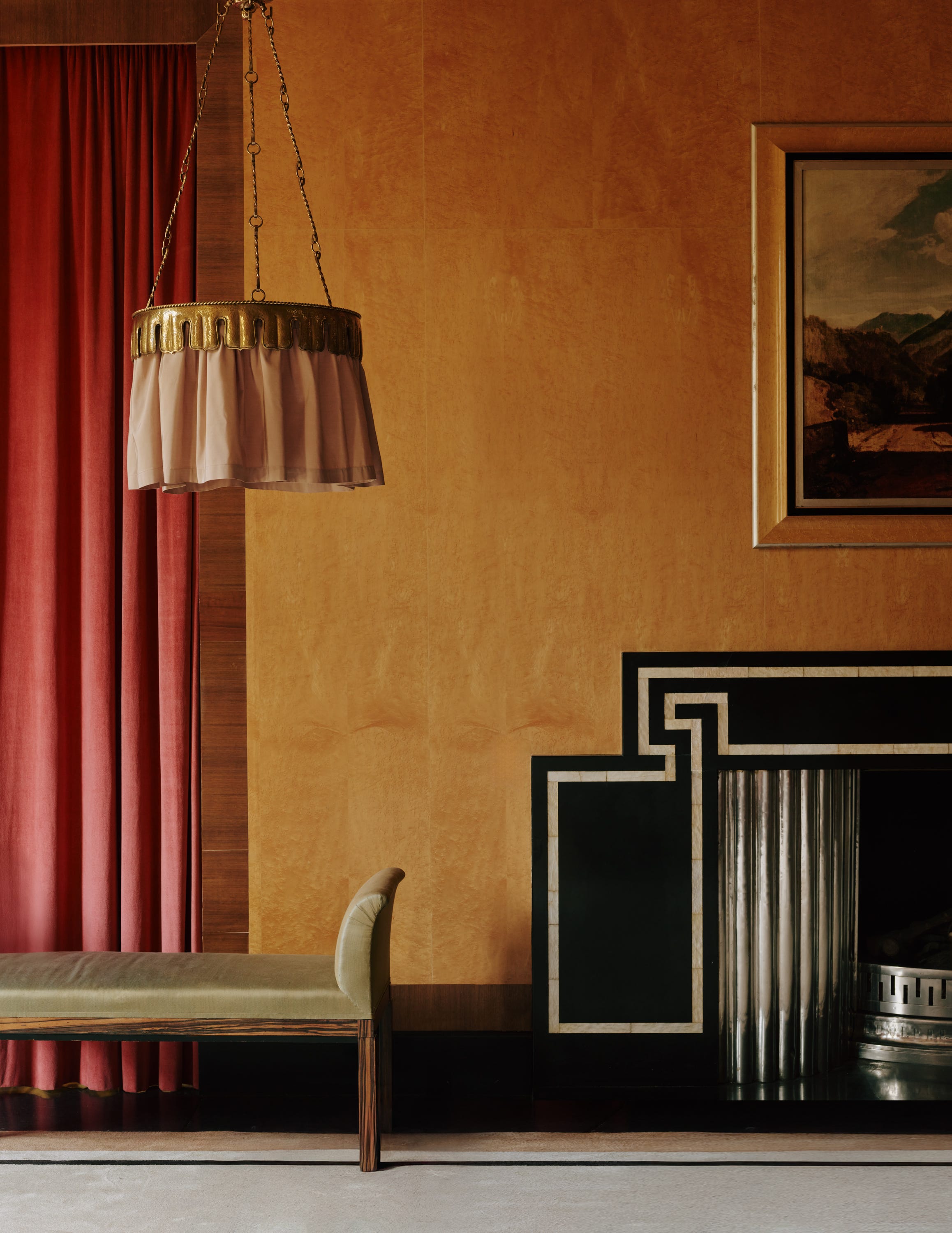
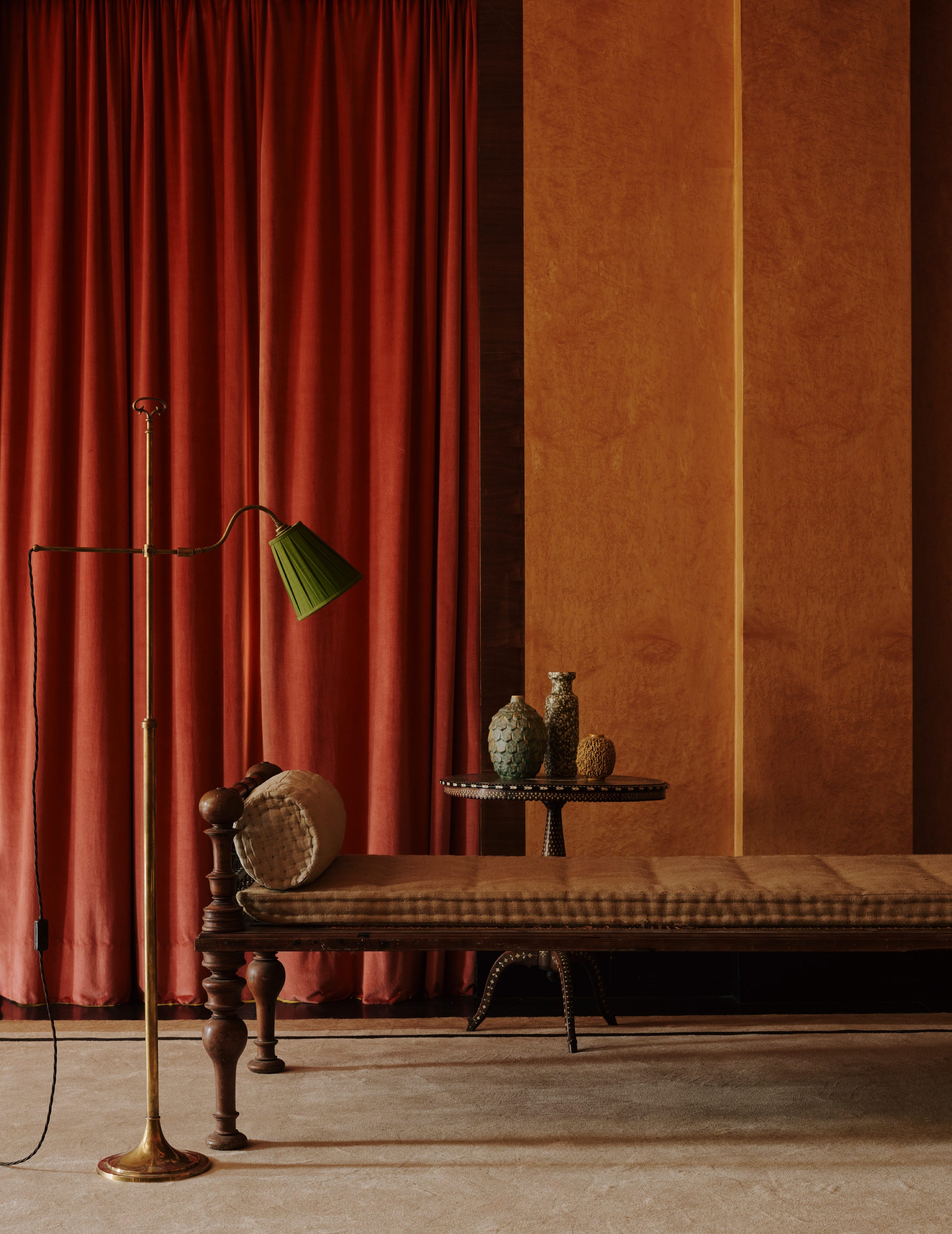
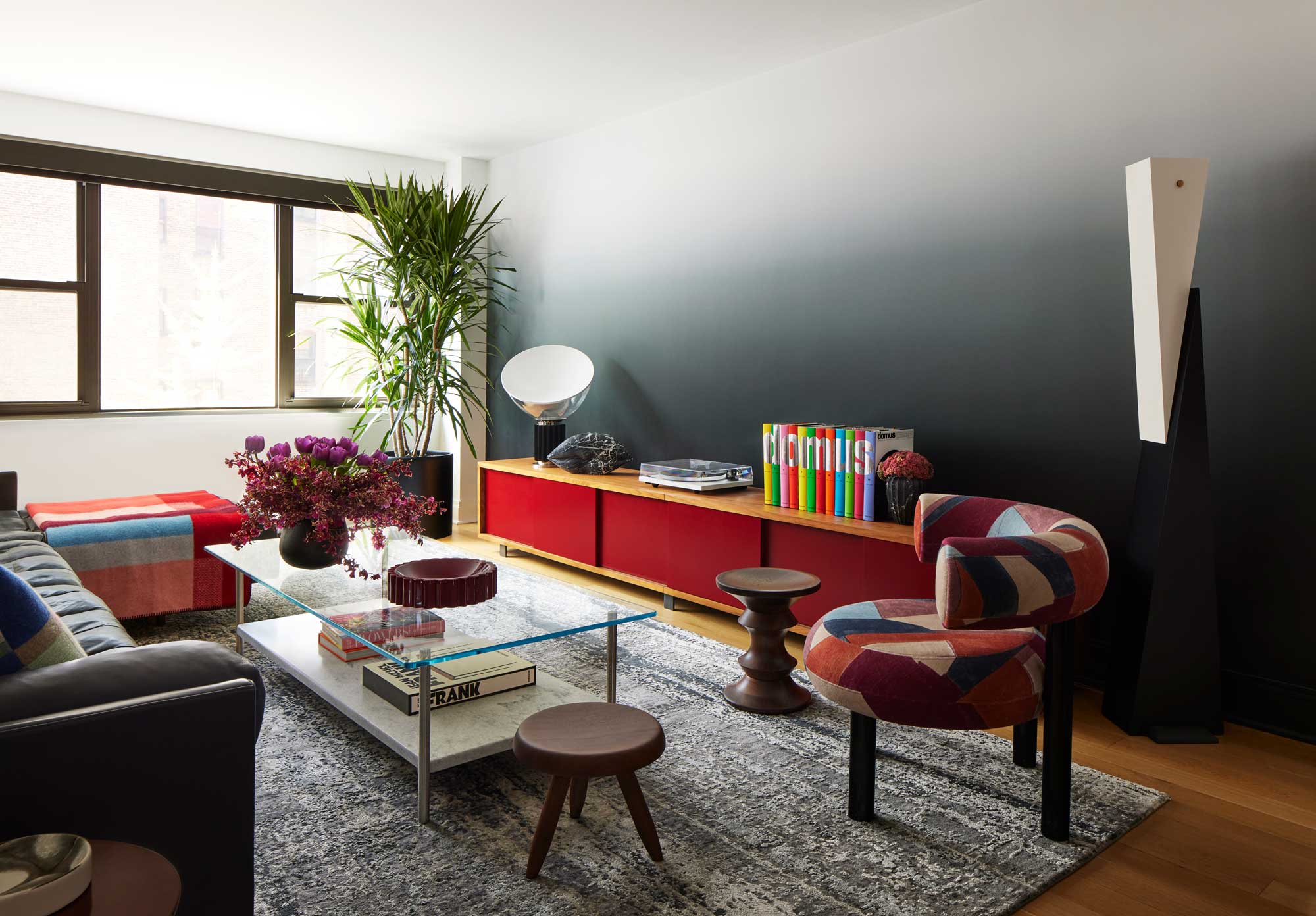
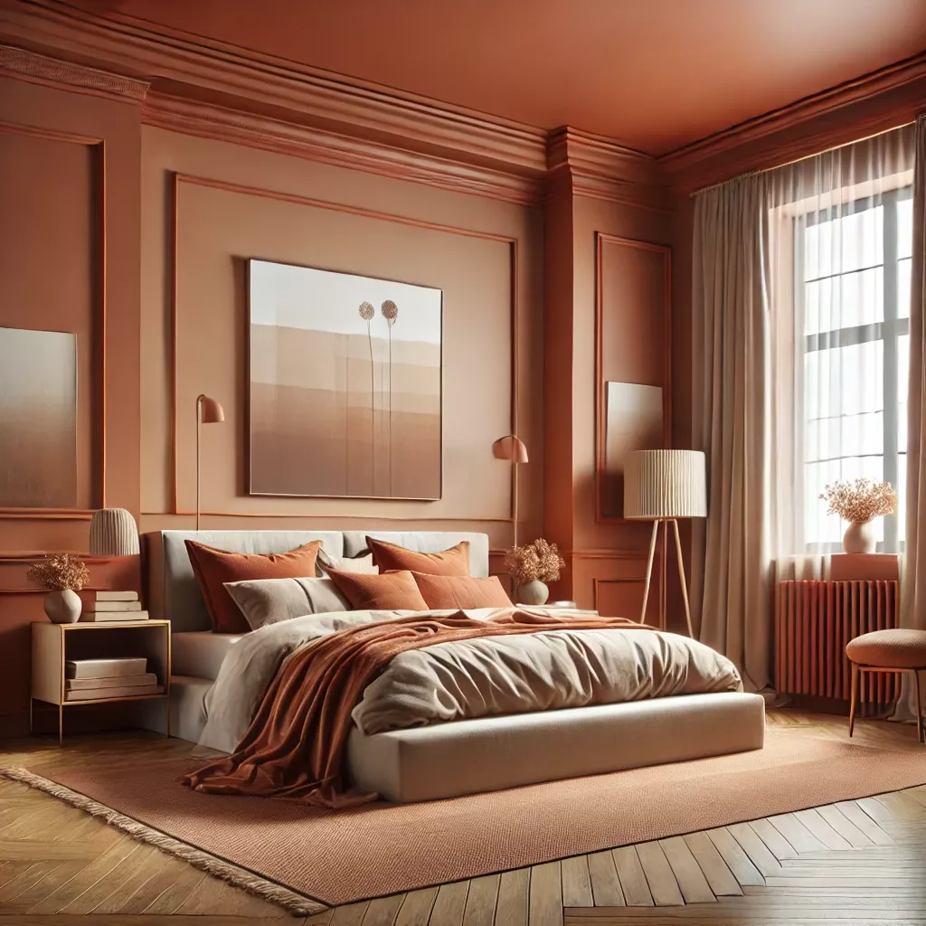
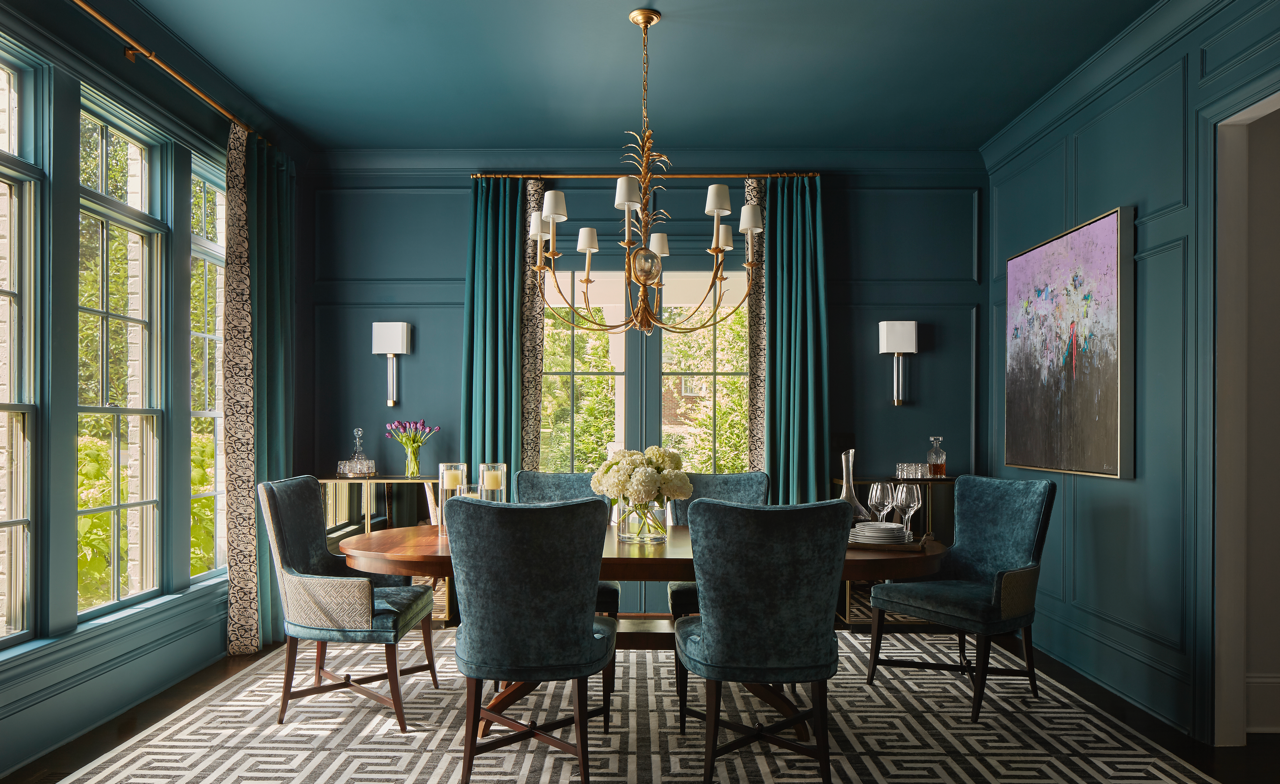
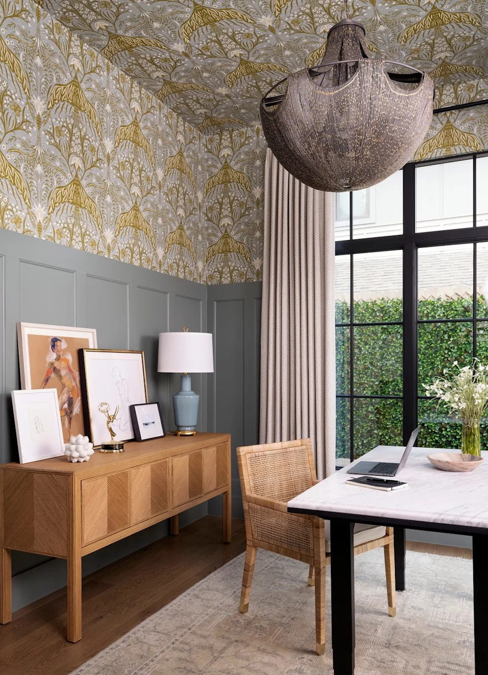
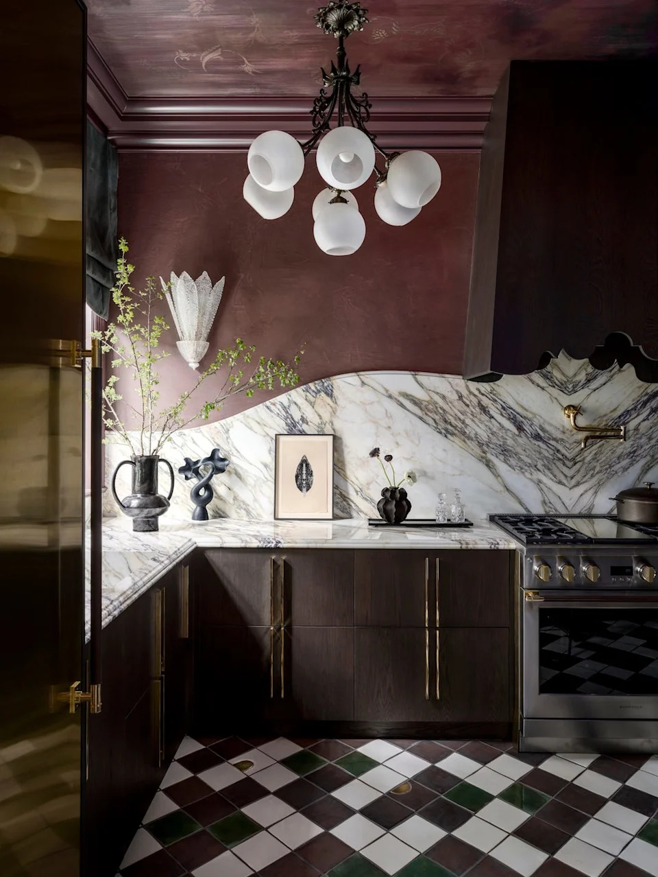
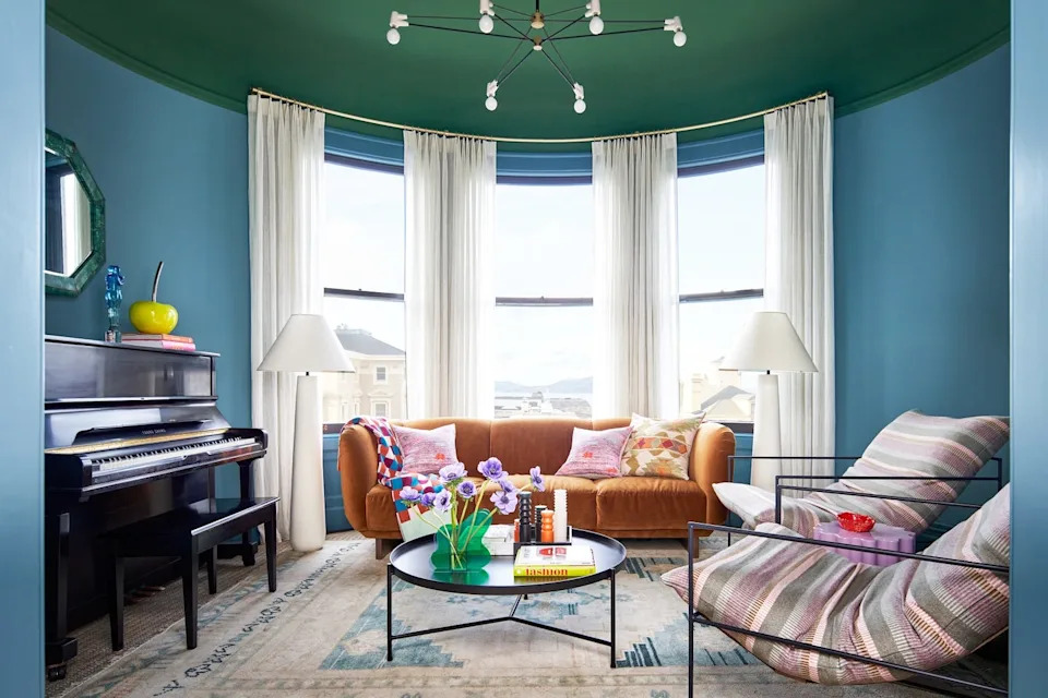
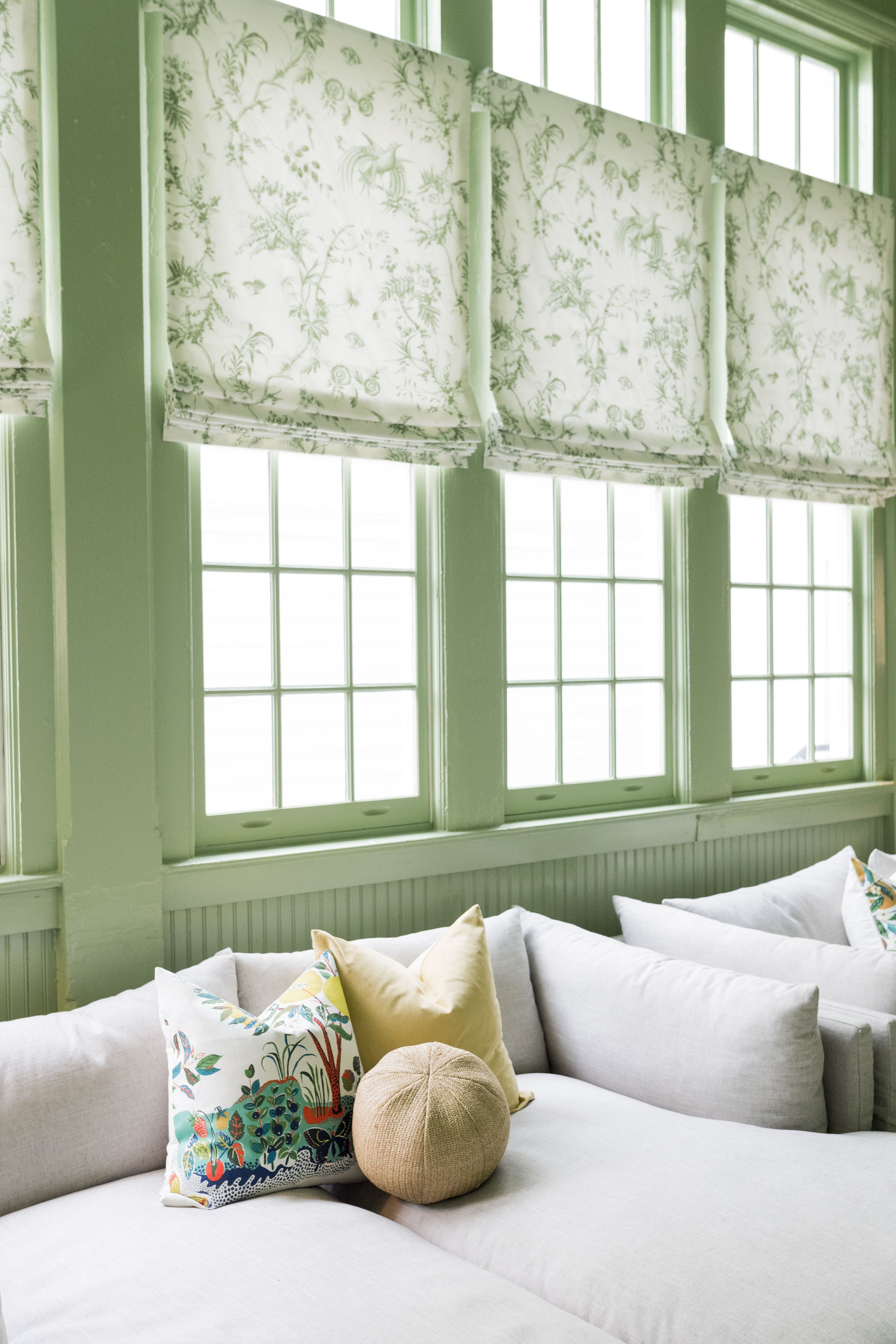
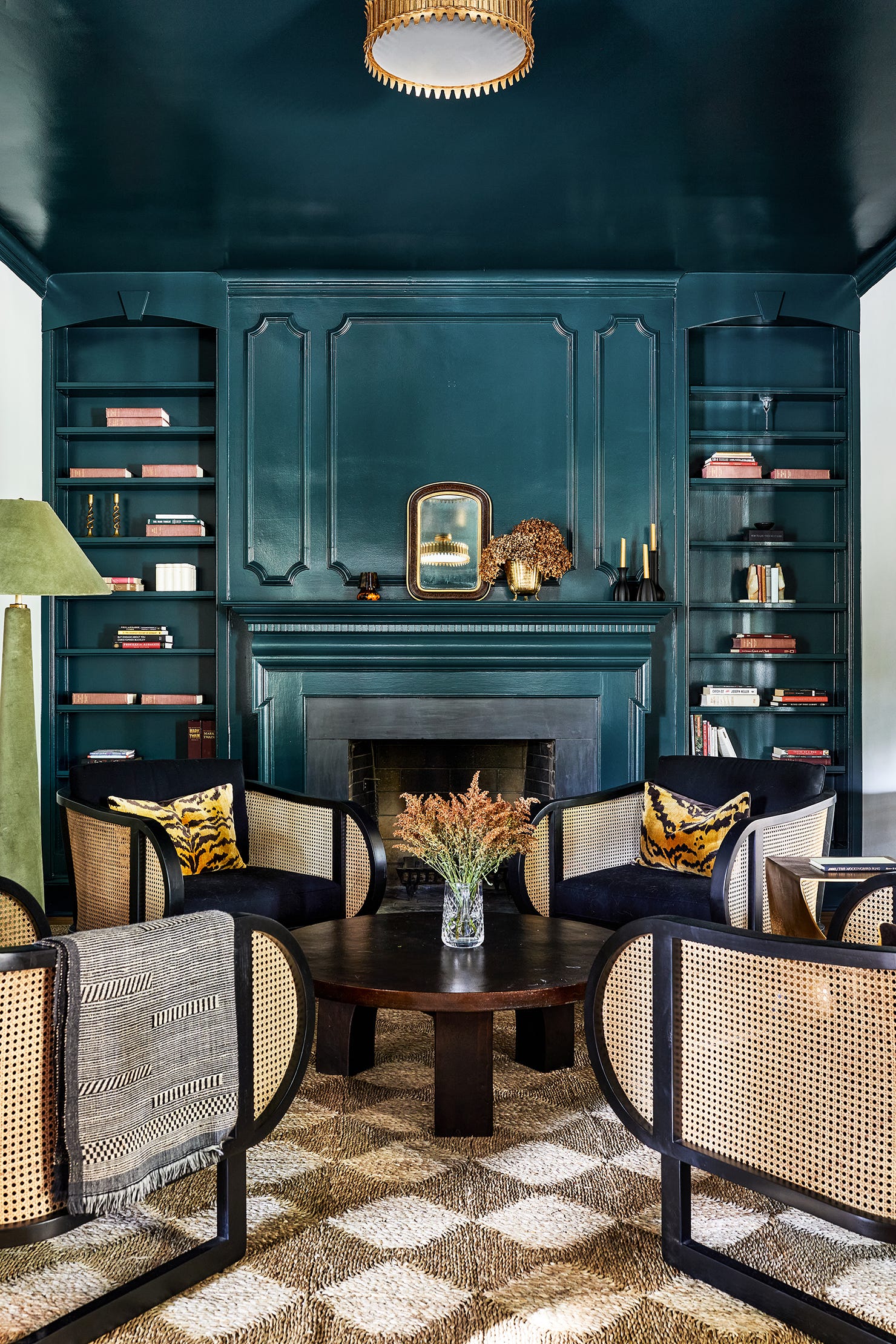
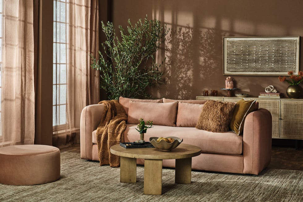
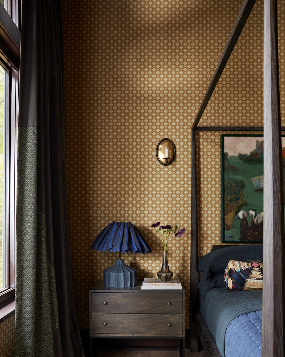
In 2025, the application of dopamine decor emphasizes uplifting, bold colors on walls, often through color drenching where a single hue extends across walls and ceilings. However, this is no longer limited to the brightest shades. The contemporary dopamine palette incorporates richer, earthier tones, such as russet reds, and avoids overly bright or 'brash' colors. The preference is for colors that feel established and comforting, with a slight muting of even bold shades to achieve deep pigments that are 'knocked back' rather than glaring.
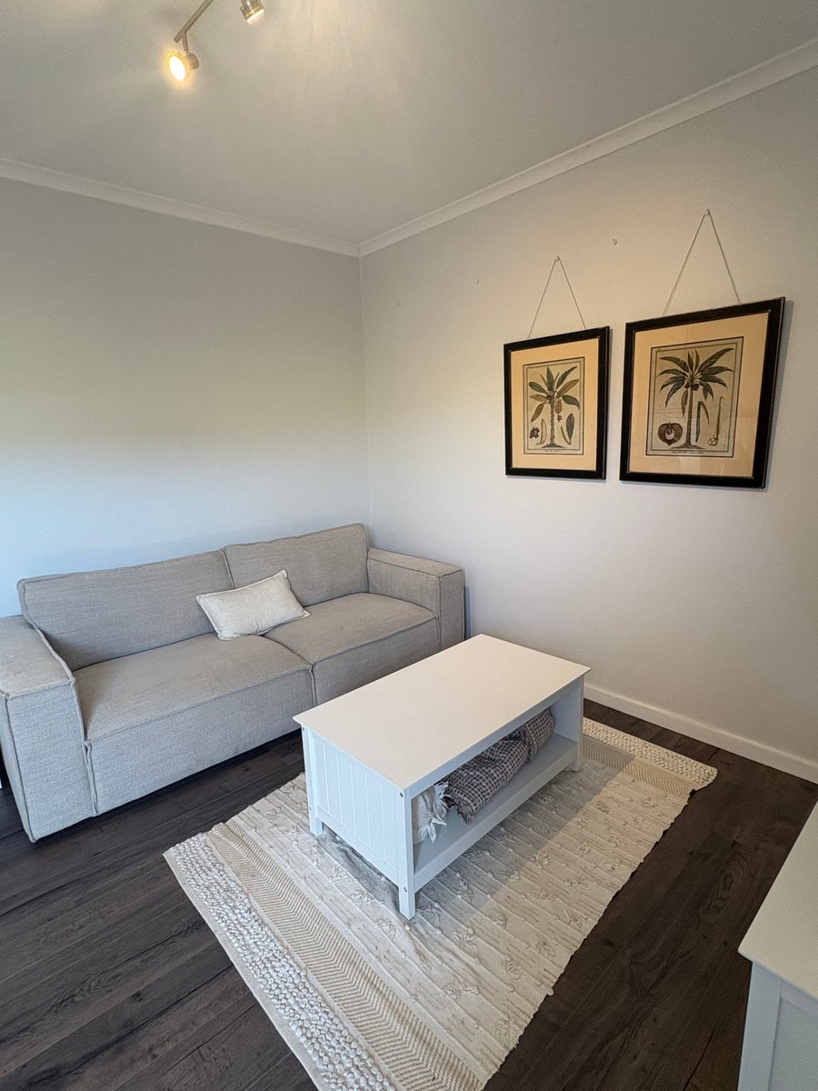
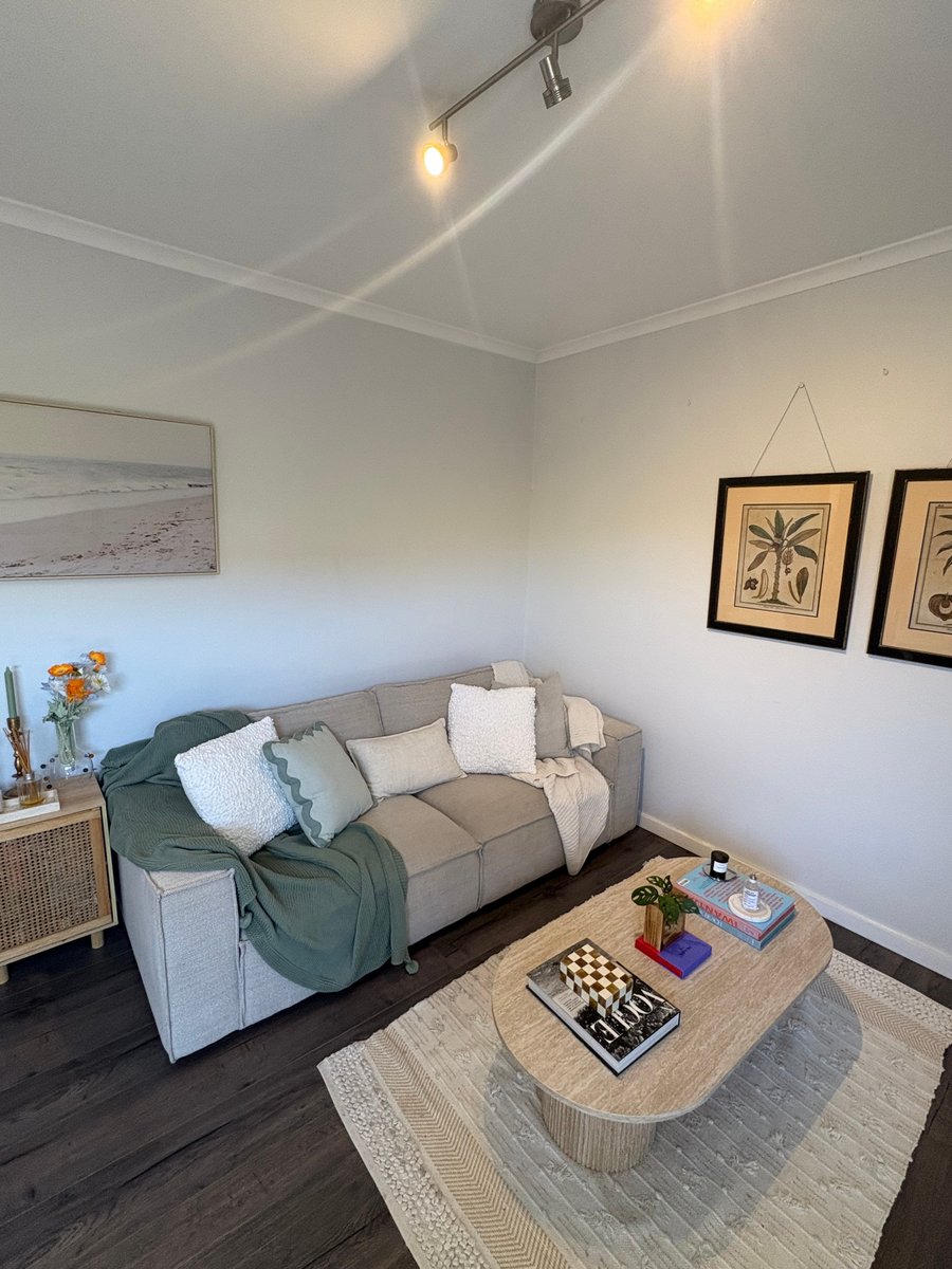
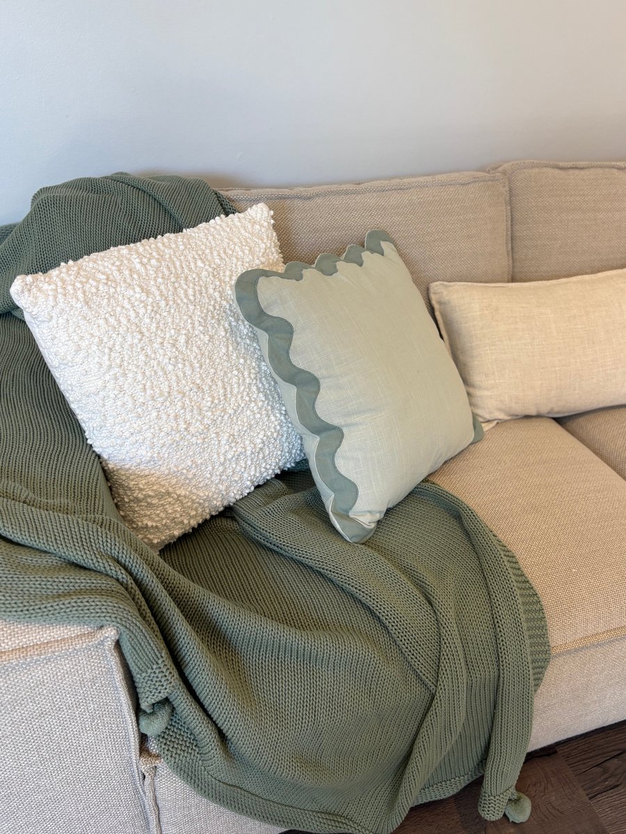
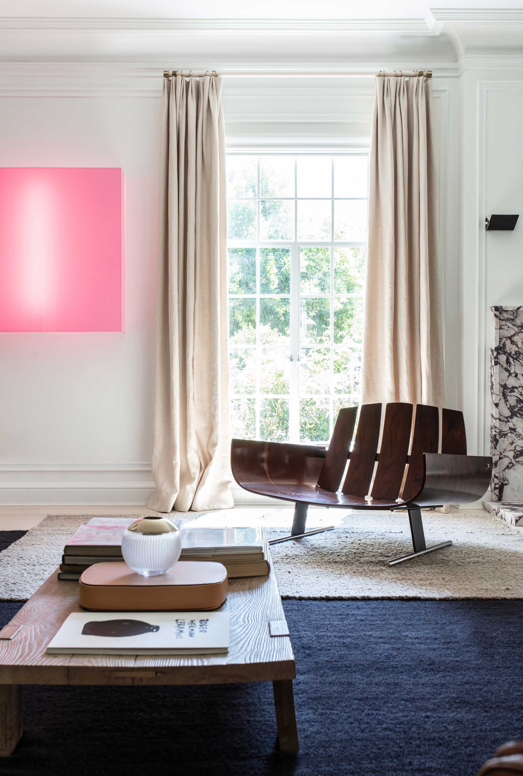
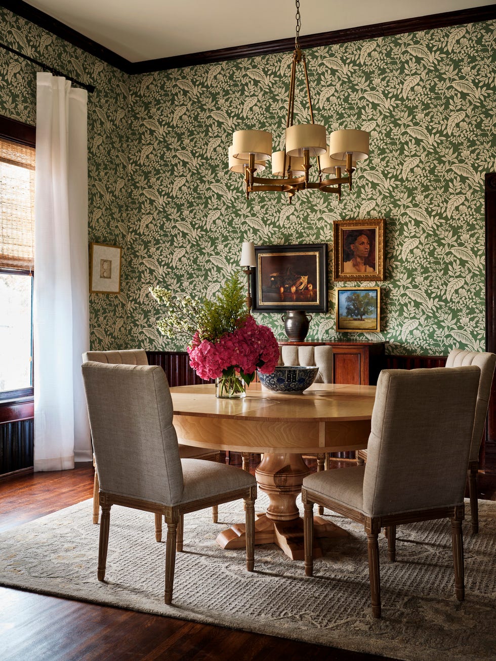
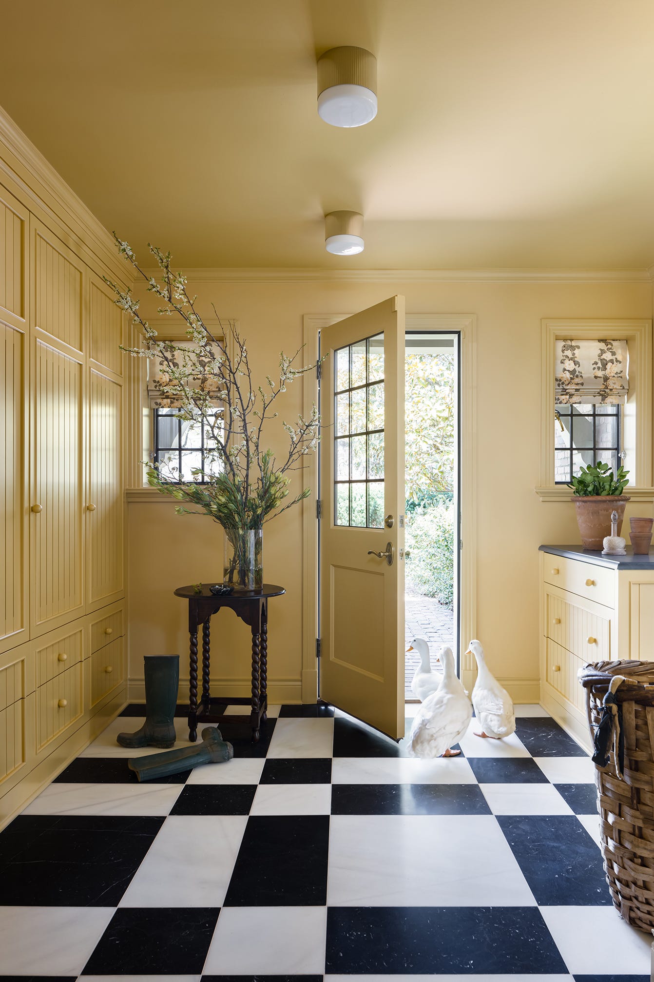
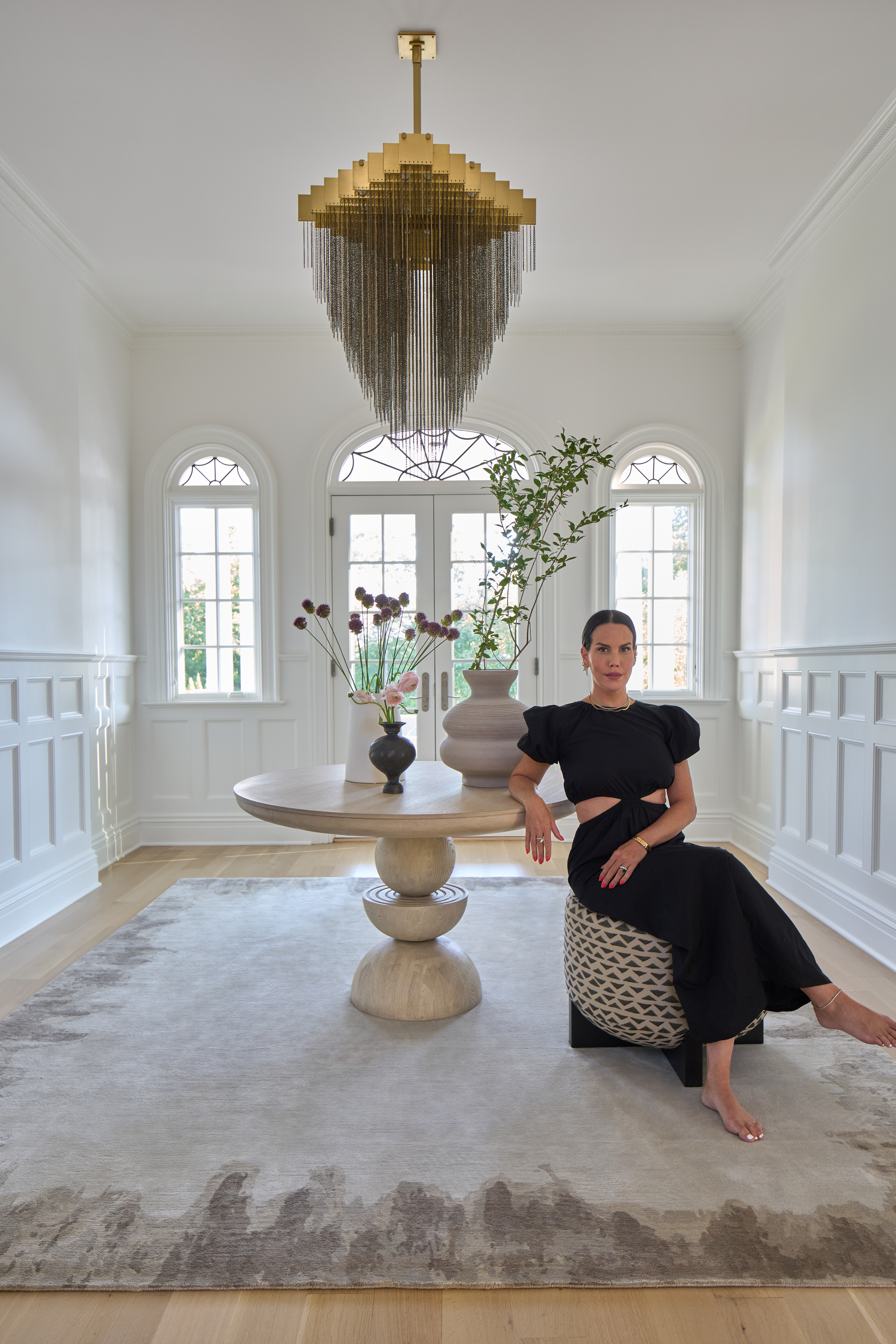
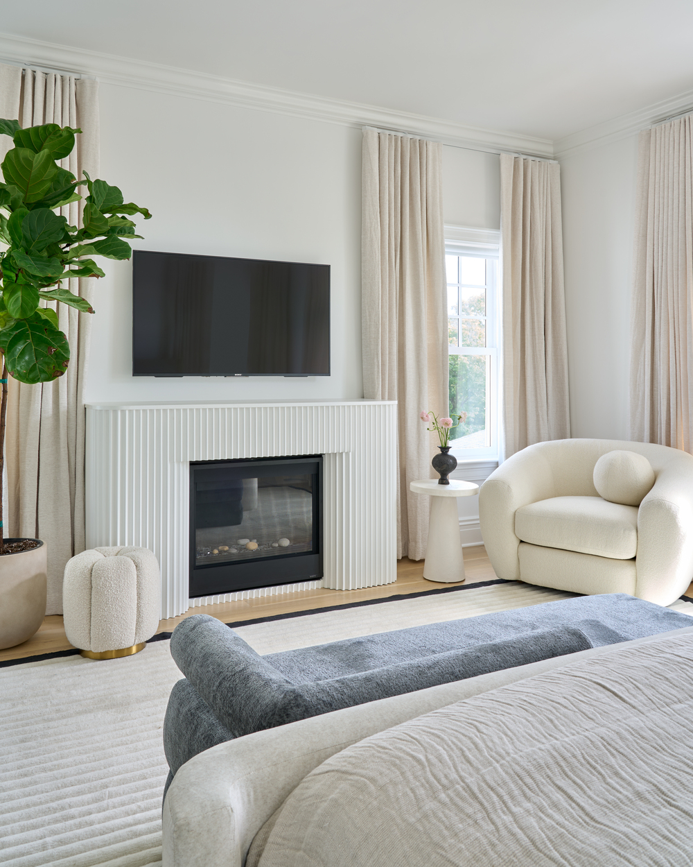
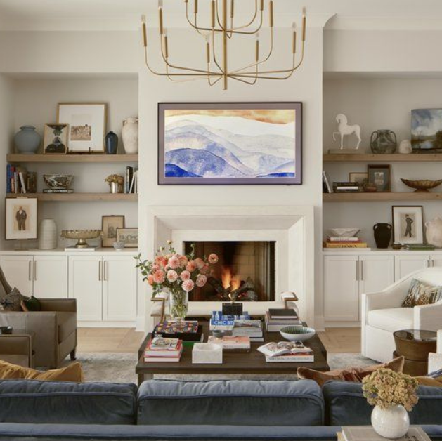
Neutral backgrounds and complementary colors play a crucial role in the evolved dopamine decor. Designers balance bold colors with softer hues, creamy whites, or earthy mustards, ensuring harmony rather than clash. This approach allows the vibrant elements to stand out against a more grounded backdrop, preventing visual overload and creating a sense of balance. The emphasis is on layered color schemes, where strong tones are paired intelligently to enhance each other.
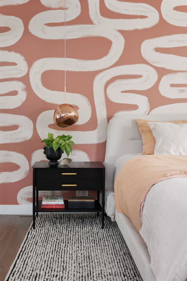
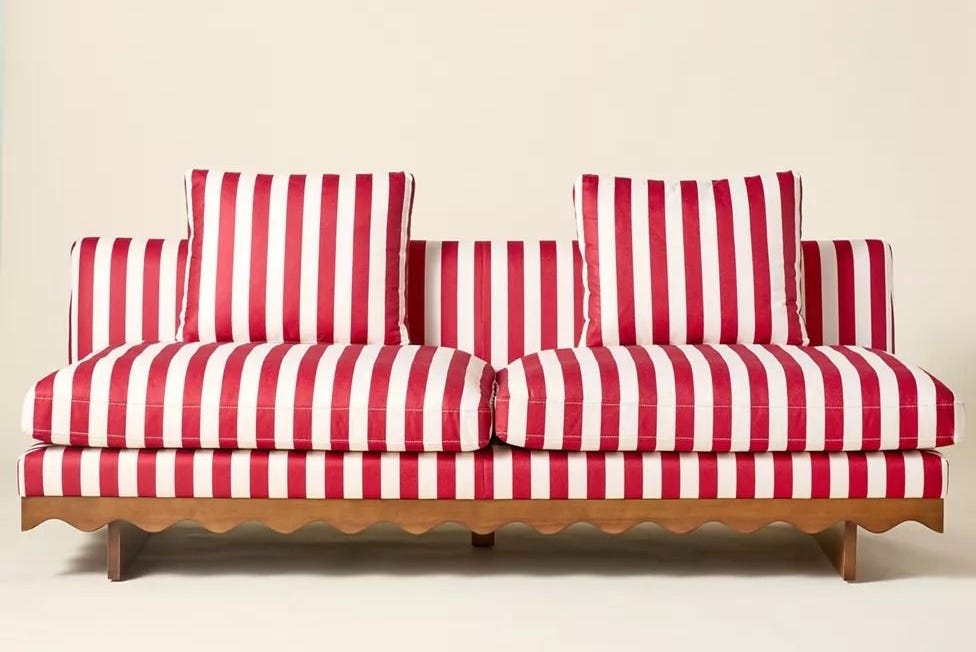
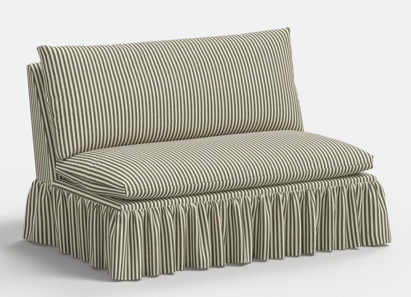
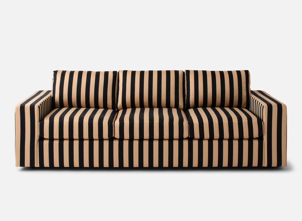
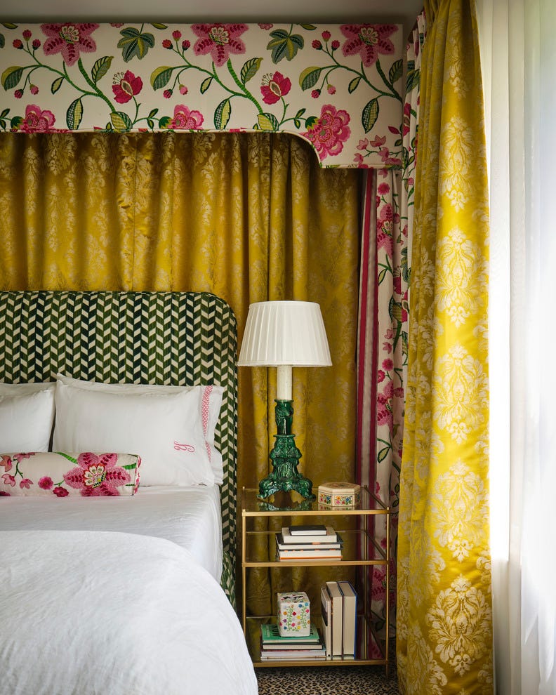
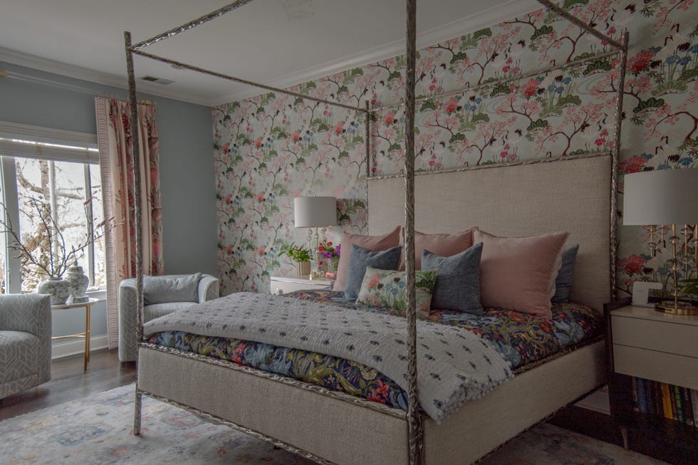
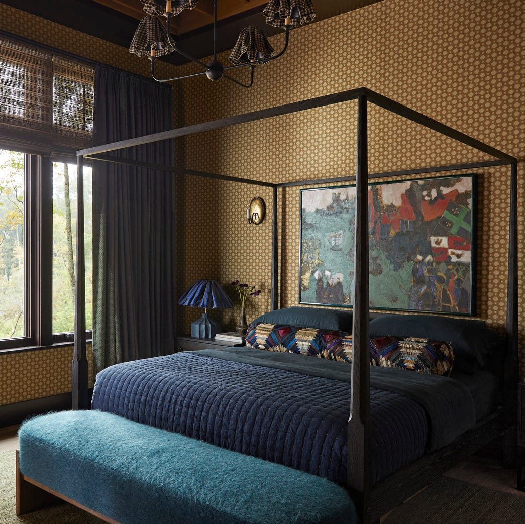
Examples of this evolved trend are evident in various rooms. In living rooms, uplifting yet soft earthy pinks might be used on walls, with bold reds, blues, and greens appearing in furnishings and details. The intention is to create a dynamic space where bright hues 'sing out' against a softer, more neutral backdrop. For bedrooms, while still designed to enliven, there's an increased focus on pattern and order. Pattern is seen as an instant mood-booster, but symmetry is also valued to promote a sense of calm and control, ensuring the space is conducive to rest while still being vibrant.
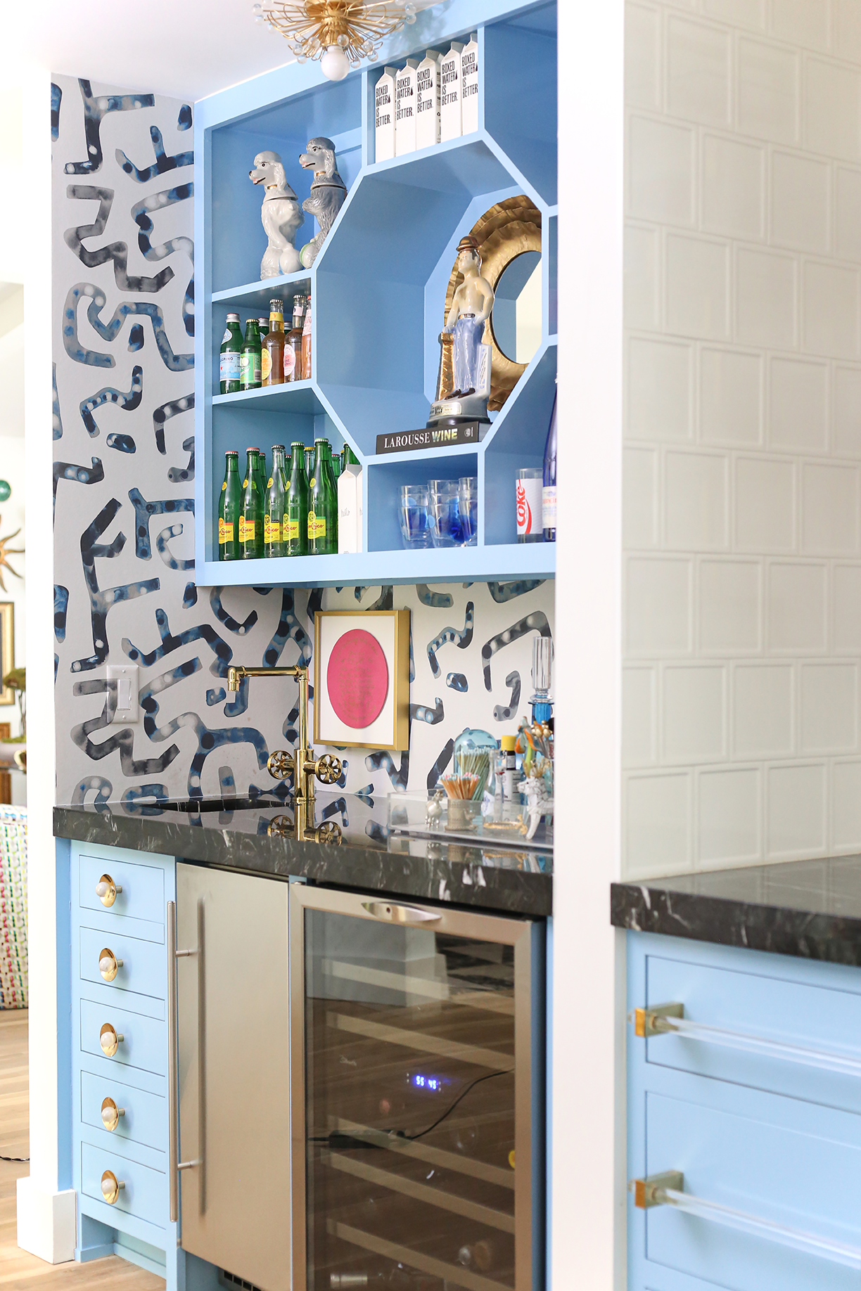
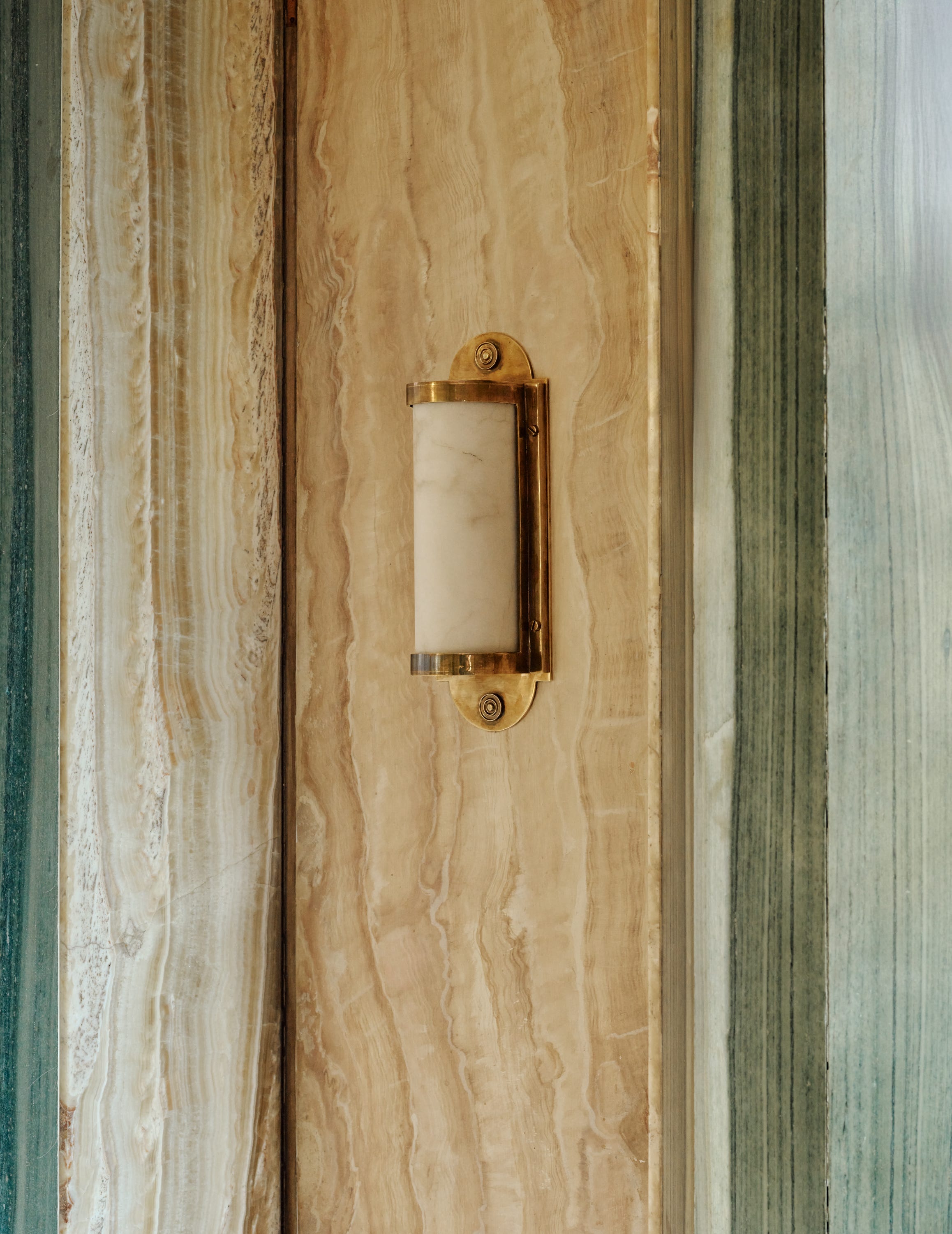
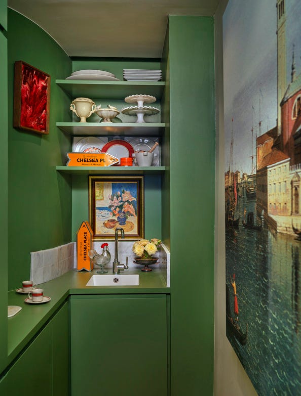
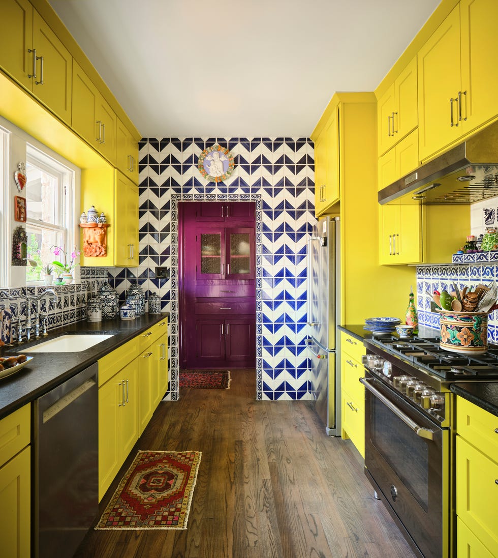
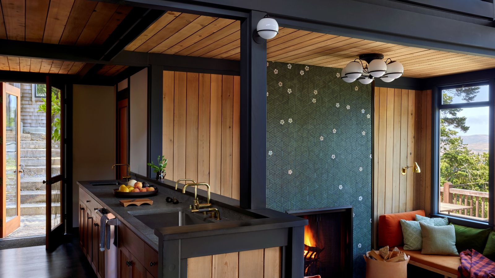
Kitchens, as functional and communal spaces, also adopt this refined approach. Rather than purely bright colors, more mature and equally bold hues like teal and red are used, tempered by natural materials such as marble and wood. These elements introduce veining and whorls, adding sophistication and preventing the color scheme from becoming too 'shouty.'
Designers leading this evolution include Natasha Lyon of The Appreciation Project, Ellen Cumber of Golden Design, Liv Waller and Cath Beckett of Yellow London, Tola Ojuolape, Lonika Chande, and Julien Sebban of Uchronia. These professionals demonstrate how to artfully combine strong colors to create fusion rather than collision, proving that a trend can evolve significantly while maintaining its core essence of promoting happiness through design. The goal remains to create homes that feel positive and bring joy, a timeless aspiration in interior design.
#DopamineDecor #InteriorDesignTrends #ColorPsychology #HomeDecoration #ModernInteriors #JoyfulLiving #EarthyTones #NeutralBackgrounds #DesignEvolution #DopamineDecor #InteriorDesignTrends #ColorPsychology #HomeDecoration #ModernInteriors #JoyfulLiving #EarthyTones #NeutralBackgrounds #DesignEvolution
0 comment in total
 No comments yet
You may also like
Yes, Your Home Decor Can Actually Make You Happier — Here's How

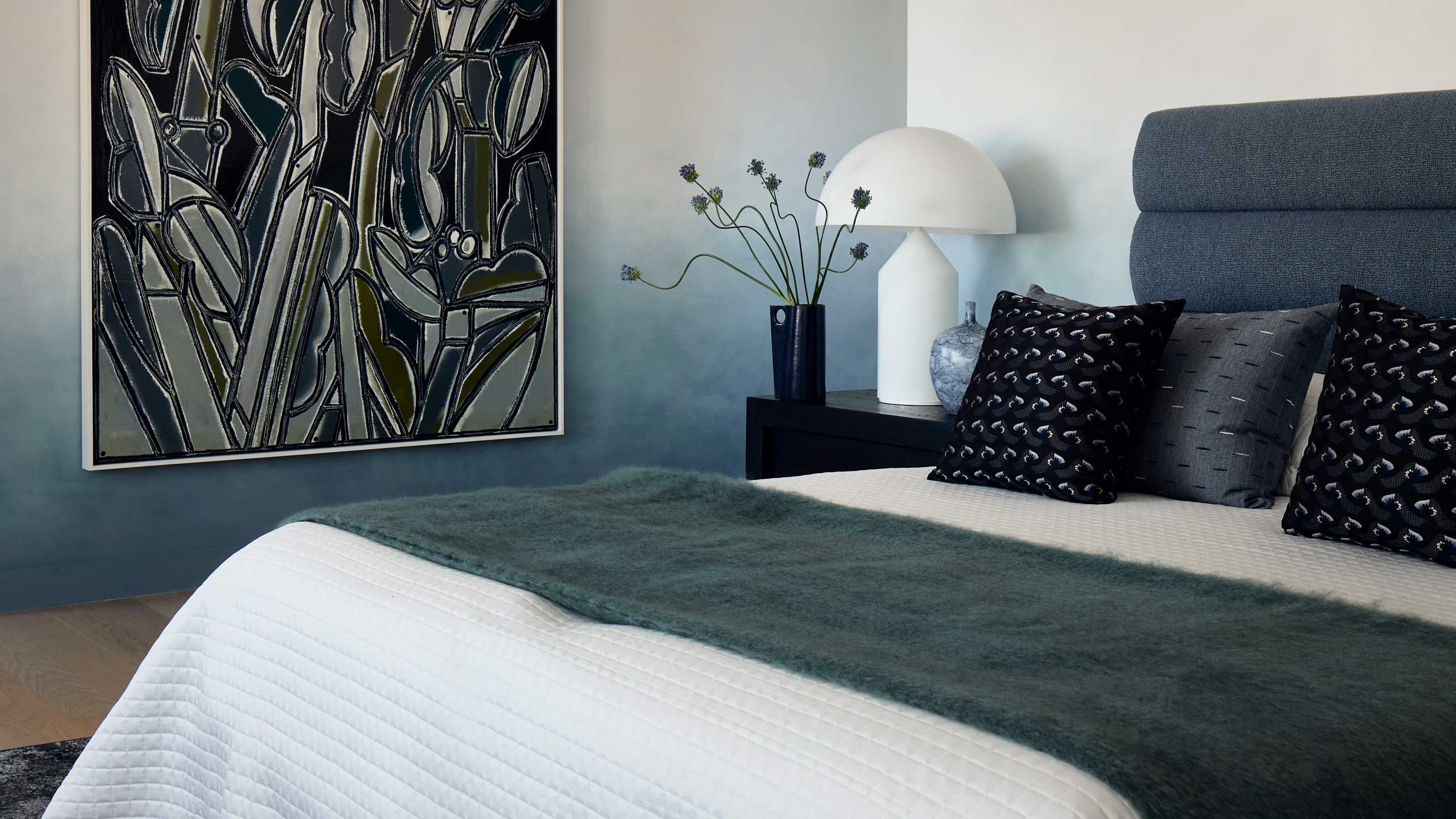
This surprising color trend is having a comeback

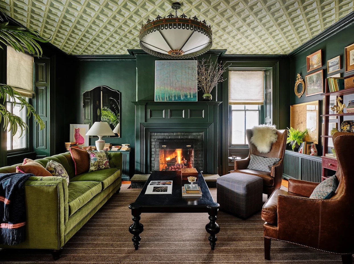
Bye-Bye, Accent Walls! Designers Say THIS Is Now the Hottest Decorating Feature

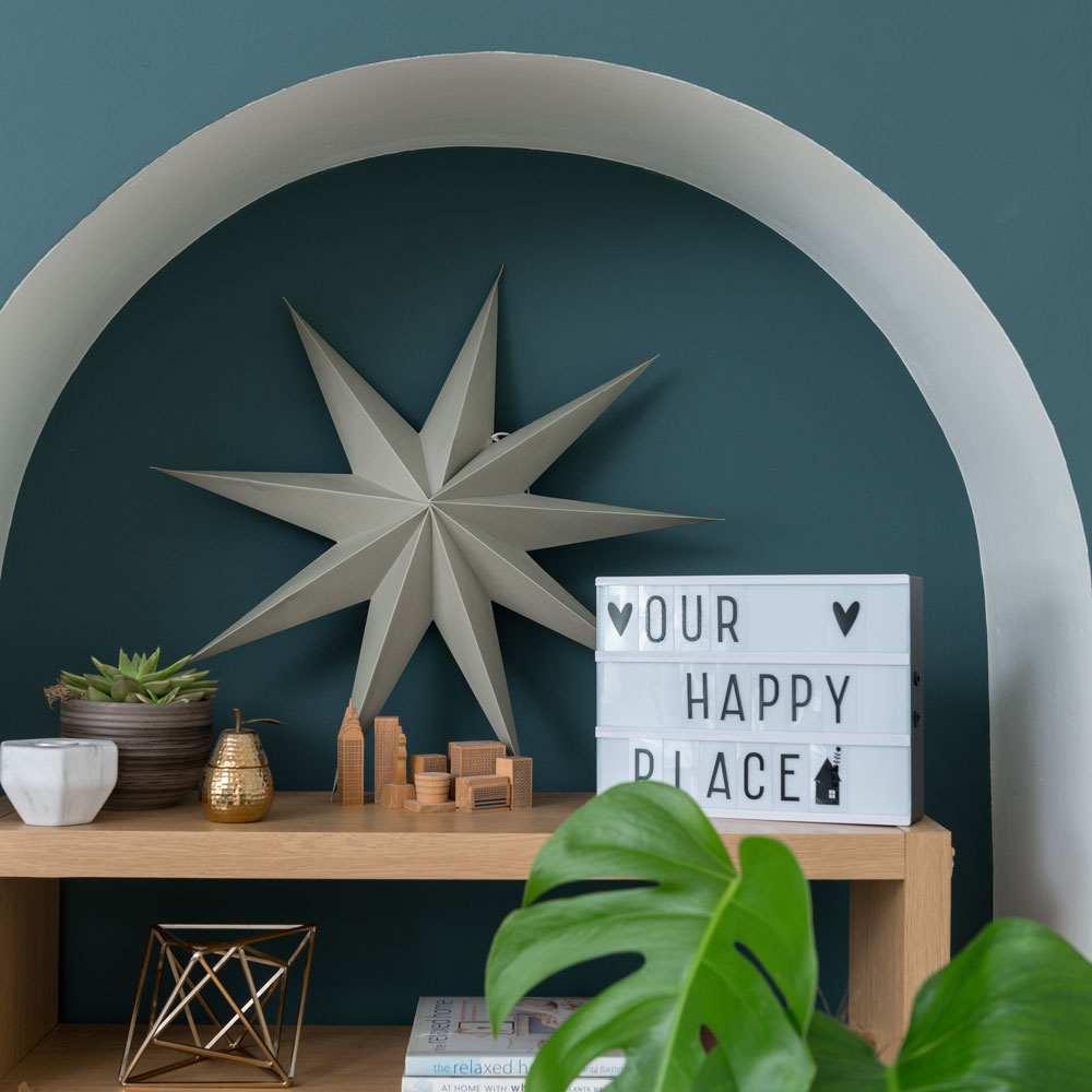
New paint trend alert! The latest decorating idea making a big impression on Instagram
If You’re Looking For Some “Dopamine Decor” That Won’t Break The Bank, Try These 31 Products
This SURPRISING Color Is About to Be Everywhere, According to Designers


The Dopamine Reset: Why Everyone Is Rewiring Their Brain in 30 Days

Viral TikTok Design Trends Designers Actually LOVE
'I transformed my sad beige home with dopamine decor. This is how.'
Colour drenching: the interior design trend everyone’s talking about
Designers Reveal the Surprising Home Trend That's Taking Over Right Now
Designers definitely approve of this statement trend that elevates a cozy room
If You Love Dopamine Dressing, Try The Mood-Boosting Technique On Your Home

This Very "Controversial" Color Is About To Be Everywhere Again

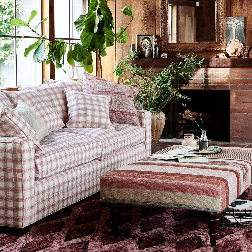
The Patterned Sofa Is the Personality Piece of the Year
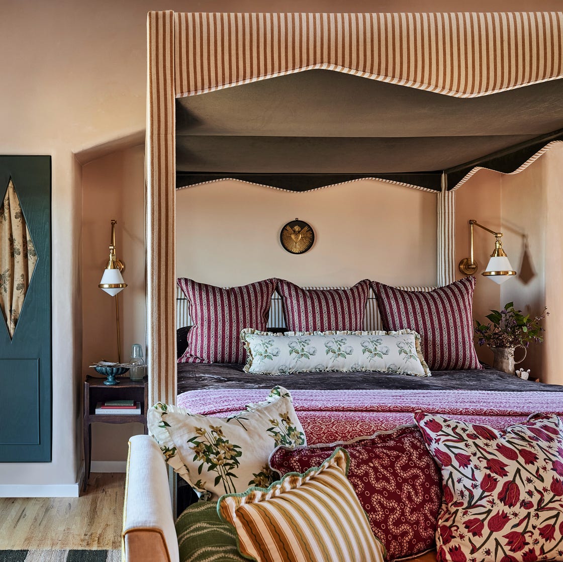
“Bedscaping” Is the VIRAL Design Trend Taking Over Your Social Feed
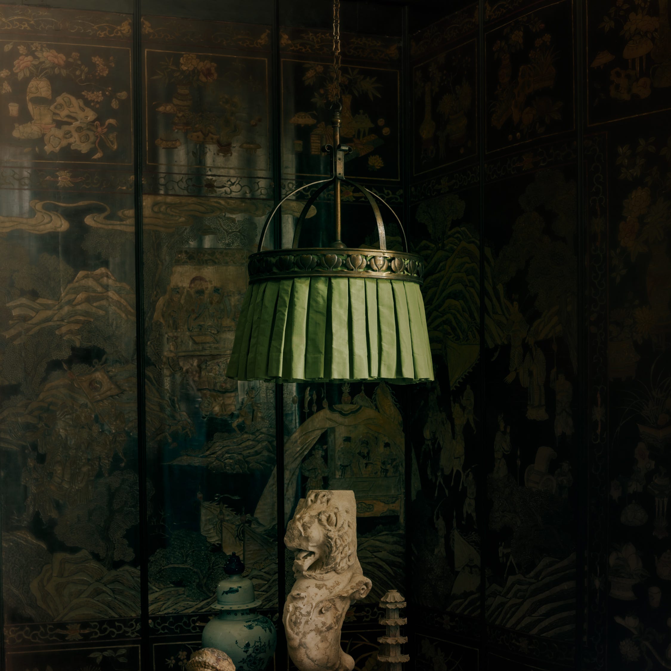
The Bold New Lighting Collection Everyone is Talking About
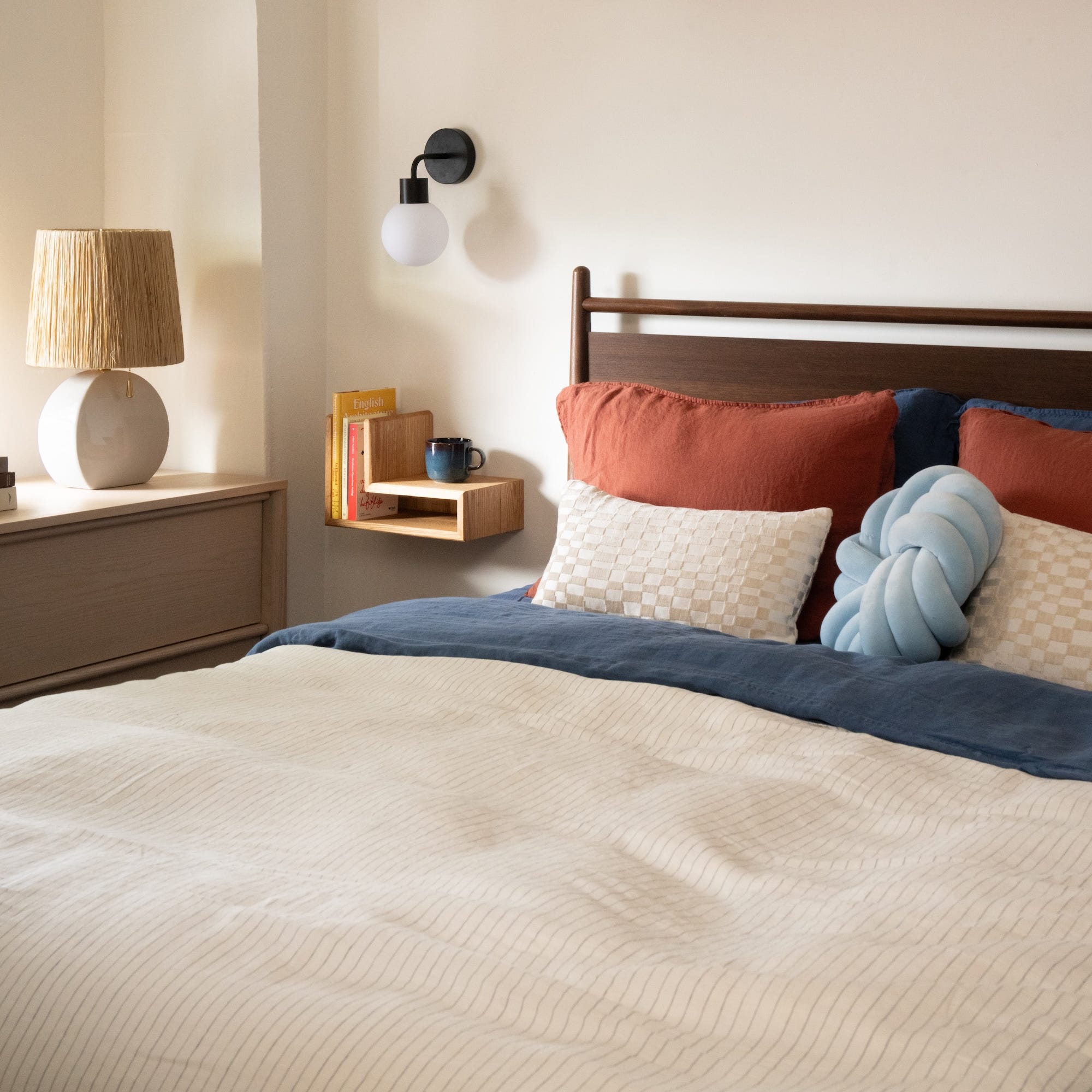
Adhesive Sconces Are Everywhere Right Now—And Designers Love These
'It makes a room soft and serene.' A designer explains a new decor trend that is better than any you've seen before
These Holiday Decor Trends Are Now Back in Style, Pros Say