1/30
"Dirty colour:" A conversation with Phoebe Nicol
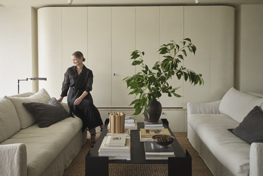
Phoebe Nicol, a Sydney-based interior designer, is known for her unique approach to creating atmospheric, painterly spaces. Her work, as seen in projects like the Clareville Residence and Darling Point Apartment, is characterized by a deliberate use of textured finishes, muted color palettes, and a technique she terms "dirty colour." This style evokes the luminous canvases of J.M.W. Turner, the 19th-century British "painter of light," through interiors that appear to be enveloped in a soft, ambient mist rather than stark brightness.
Nicol's methodology for achieving these effects centers on the concept of "dirty colour," a term she learned early in her career from a mentor. While Nicol herself is hesitant to provide a strict definition, her collaborator Lucinda Harris elaborates on it as the "depth and the refraction of light," emphasizing the layering of textures that contributes to a subtle yet discernible variance within a space. This layering allows light to bounce and refract gently, creating a nuanced visual experience. The intention is to move away from interiors that are perceived as "new and shiny," embracing instead a lived-in quality with a sense of history and patina.
A key element in Nicol's design philosophy is the strategic application of darkly toned and textural wall finishes. She advocates strongly for materials like lime wash over flat paint, noting the exponential difference these choices make in elevating a project. These finishes are not merely aesthetic; they play a functional role in light diffusion, enhancing the overall mood and depth of a space. Nicol deliberately opts for muted lighting in her project photography, a conscious decision to deviate from the prevalent "bright and light" interior photography style. This approach aims to capture the raw detail and patina of her designs, ensuring that subtle nuances are not lost in overly bright exposures. The goal is to highlight the inherent character and tactile qualities of the materials and finishes she employs.
The inspiration for her work, particularly the painterly quality, draws parallels with J.M.W. Turner's mastery of light and atmosphere. Nicol's interiors, much like Turner's paintings, convey a sense of depth and emotion through their carefully controlled light and shadow. This artistic sensibility is reflected in her preference for antique elements and materials that exhibit patina, which she believes convey history and quality. This dedication to "dirty colour" and a layered aesthetic allows her to craft spaces that feel both sophisticated and authentically aged, offering a departure from conventional, brightly lit modern interiors.
#InteriorDesign #PhoebeNicol #DirtyColour #TexturedFinishes #MutedTones #LimeWash #ResidentialInteriors #LightDiffusion #PainterlySpaces #InteriorDesign #PhoebeNicol #DirtyColour #TexturedFinishes #MutedTones #LimeWash #ResidentialInteriors #LightDiffusion #PainterlySpaces
 No comments yet
Mickalene Thomas on Black beauty, eroticism and power
Debra Newell Of Dirty John Talks Interior Design