


1/10
Explore a house in the city that was designed with the country in mind – the result is a homage rather than a pastiche
The article presents a case study of a London home designed by Howark Design, aiming to evoke a country feel within a city setting without resorting to clichés or artificial elements. The client, a young Belgian woman who is an avid equestrian, desired a relaxed home that incorporated her family's heirloom antiques while also accommodating frequent international travel and large dinner parties. The design team successfully blended country charm with modern city influences through careful layering of colors, patterns, and vintage pieces.
The project addressed several key challenges, including maximizing natural light in what was initially a dark space. This was achieved by enlarging the door between the kitchen and dining room to create a more linked ground floor layout. Additionally, a glazed partition was introduced between the front door and the sitting room, allowing for separate entrance area treatment while ensuring maximum light penetration. This partition enabled the creation of a statement entrance with bold-colored paneling and Victorian-style tiled flooring. In the front room, seating was optimized with a custom-designed sofa featuring angled sides to fit snugly into the bay window.
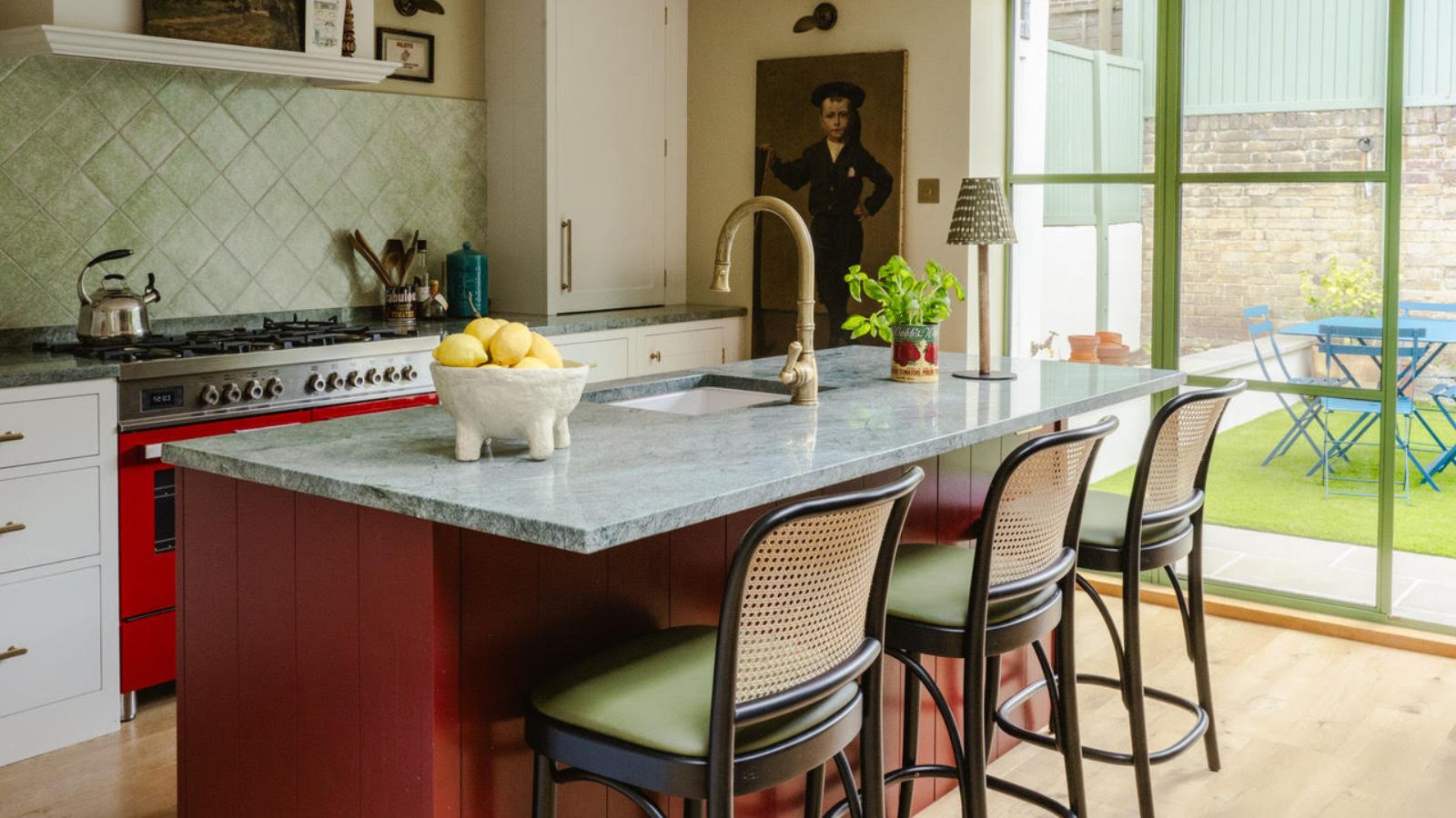
The kitchen exemplifies the successful integration of country aesthetics without being overly traditional. It boasts a lived-in feel with personality and charm, featuring collected pieces rather than an overly curated look. The color scheme plays a crucial role in balancing the country and city styles; a deep red on the kitchen island, pantry storage, and range cooker grounds the warm neutral cabinetry, adding playfulness and interest. A subtle pop of pale lime green on the door trim further distinguishes the space from a standard neutral kitchen. The design team chose this green to complement the garden view, deeming black metal too harsh.
A key functional addition to the kitchen was a pantry, despite limited space. The designers noted that incorporating this element required careful planning, but the final result was highly satisfying. The use of vibrant colors extends to the home office, where bold red bookshelves are contrasted with a traditional family portrait above a reclaimed fireplace. This deliberate juxtaposition creates a playful yet balanced aesthetic, preventing the ornate artwork from overwhelming the smaller room and ensuring a contemporary feel alongside antique elements.
In the main bedroom, a more muted color palette is employed, but interest is maintained through vintage furniture and layered patterns. The walls were kept neutral with warm undertones, allowing vibrant accessories and furniture to stand out. The successful mixing of patterns in this space is attributed to varying the scale of the prints, ensuring they harmonize rather than compete. This approach results in a subtle yet engaging visual texture. Throughout the entire project, the interplay of bold colors like red, lime green, dark blue, and mustard yellow, alongside layered prints, demonstrates how these elements can create livable spaces. The design achieves a delicate balance where colors sometimes reflect the urban setting and other times contribute to the rural ambiance, making the home a true homage to country living within the city.
#InteriorDesign #LondonHome #CountryStyle #CityLiving #HowarkDesign #HomeDecor #KitchenDesign #ColorPalette #VintageFurniture #InteriorDesign #LondonHome #CountryStyle #CityLiving #HowarkDesign #HomeDecor #KitchenDesign #ColorPalette #VintageFurniture