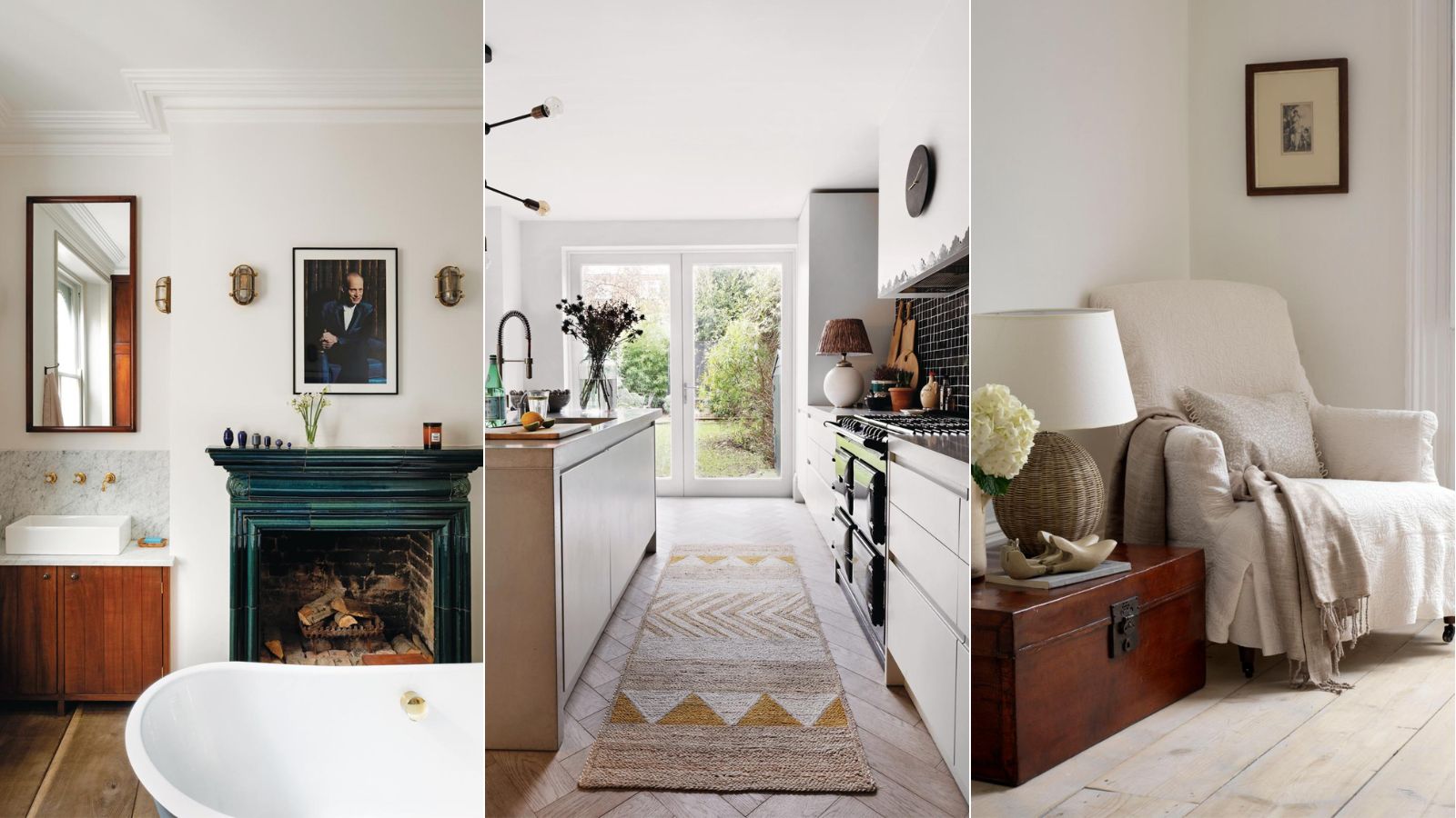
1/9
5 ways to decorate with Pale Oak, Benjamin Moore's best-selling versatile greige
The article discusses Benjamin Moore's Pale Oak, a versatile greige paint color that balances gray and beige, making it a popular choice for interior design. Neutrals remain a timeless option in home decor, providing a calming backdrop that allows other elements to stand out. Pale Oak is highlighted for its ability to avoid the starkness of some whites and the dated appearance of some beiges, fitting well with the 'quiet luxury' trend that emphasizes understated appeal.
Helen Shaw, Director of Color Marketing at Benjamin Moore, describes Pale Oak as a versatile neutral with a soft hint of warmth, making it a useable gray that complements various spaces and flooring. Interior designer Bethany Adams notes that warmer beige tones are replacing stark white as the preferred neutral, and Pale Oak offers a balanced alternative for those hesitant about full beige. Veronica Colby, owner and designer at Evergreen Design Co., considers Pale Oak a reliable choice when a commitment to a strong color is uncertain but white is not desired.
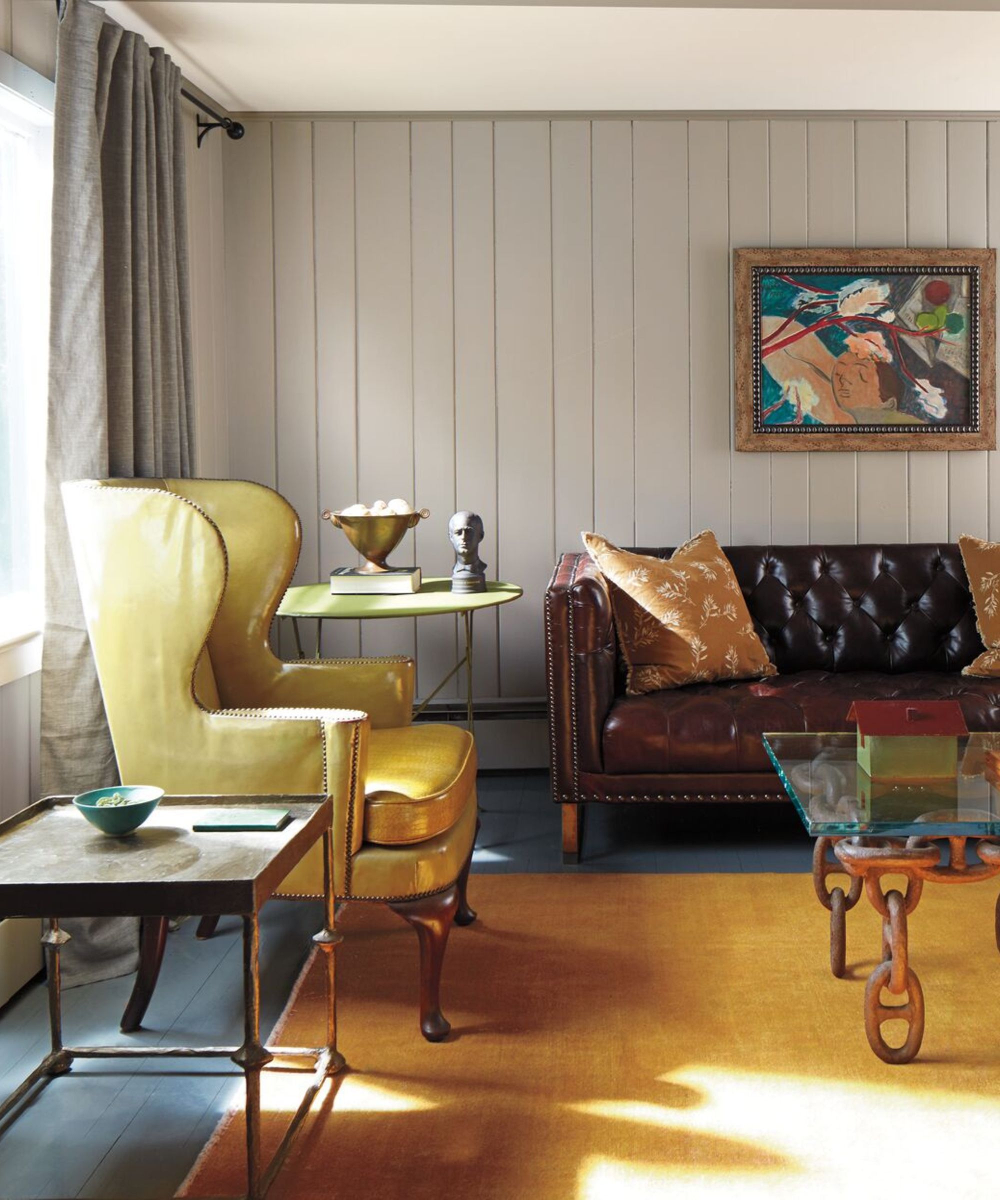
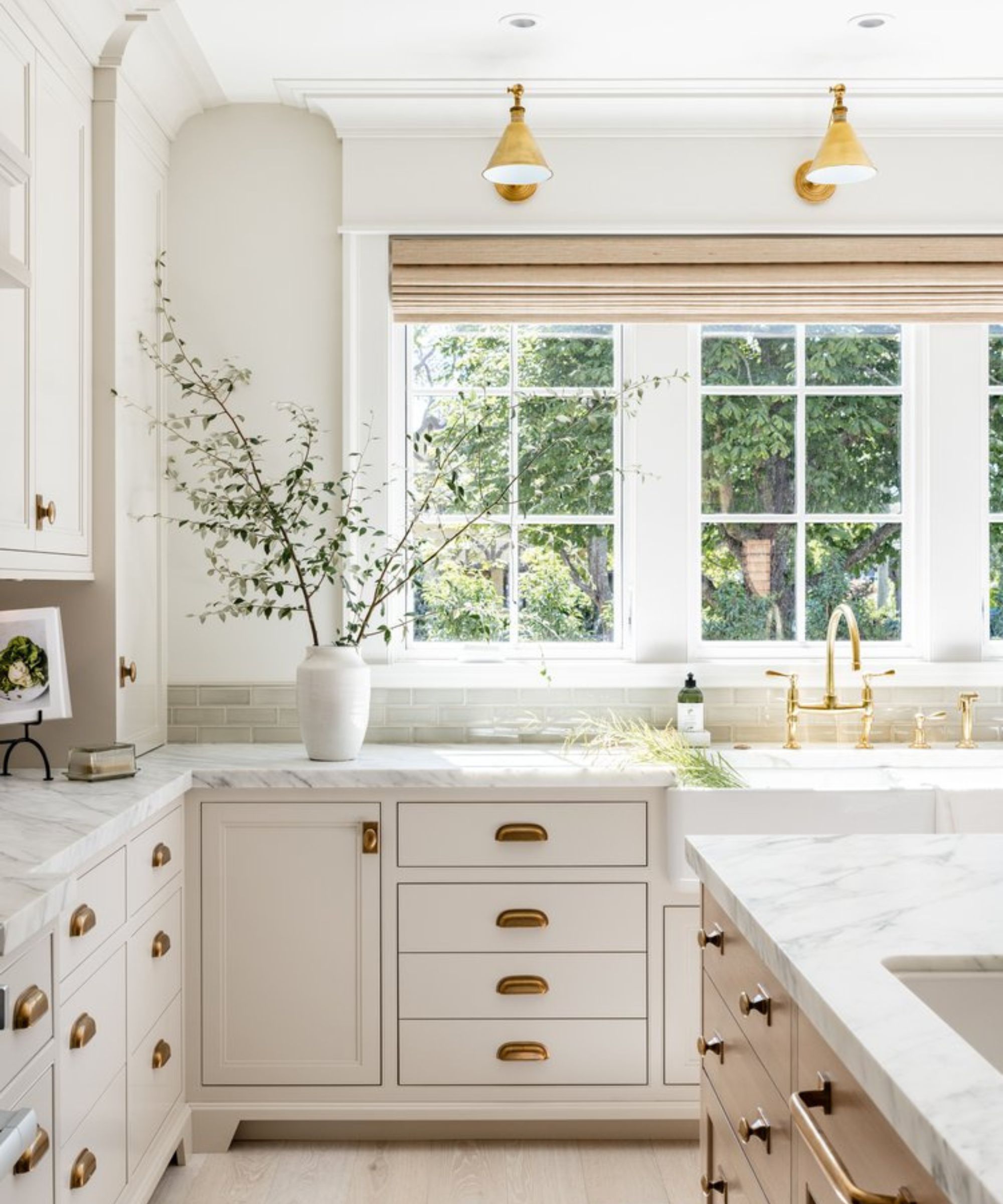
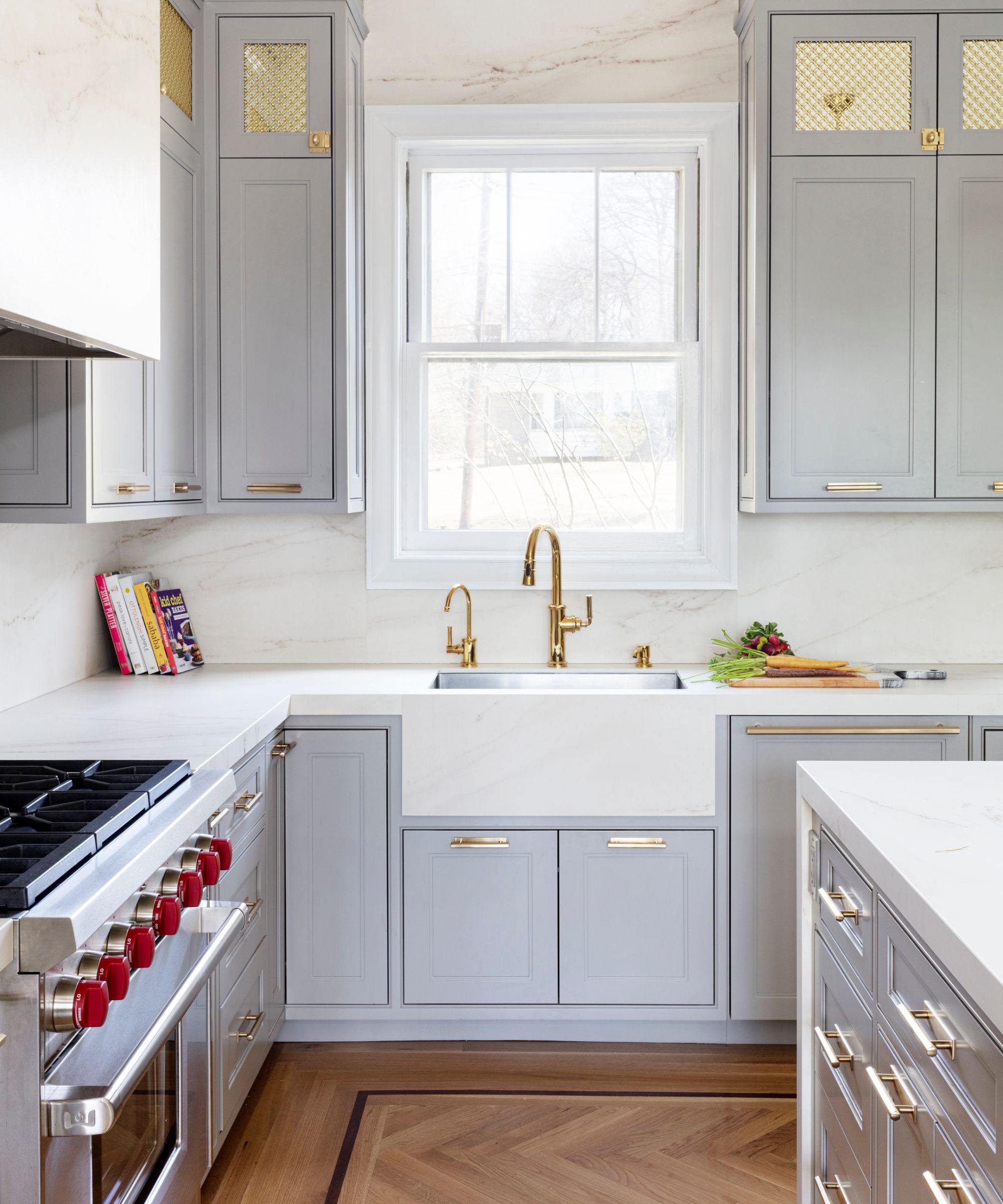
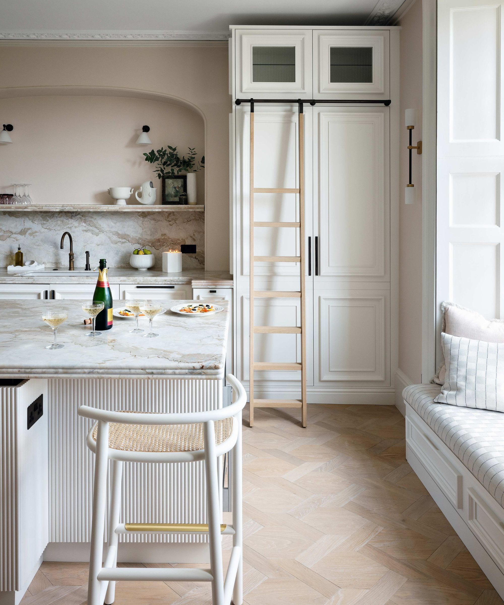
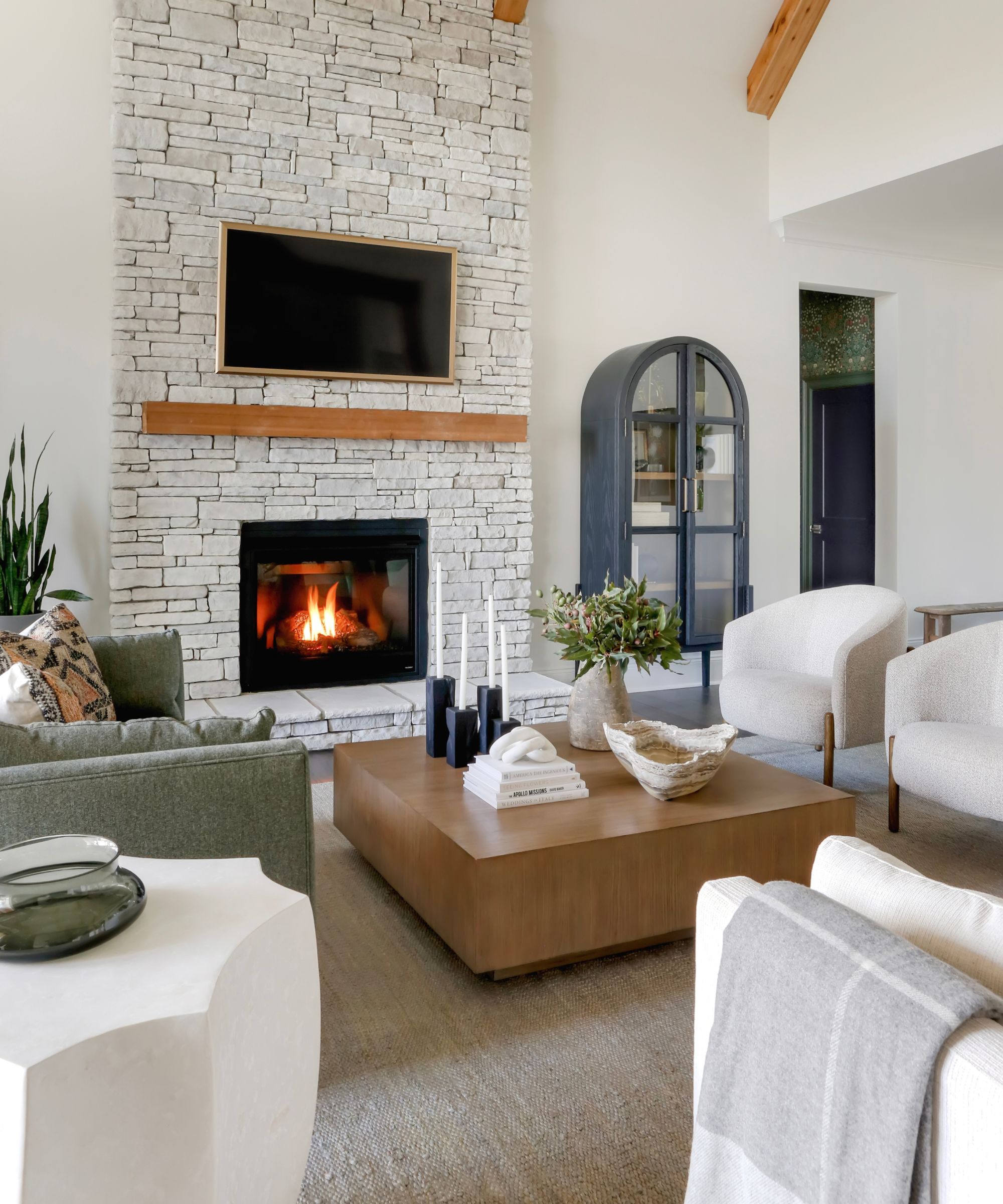
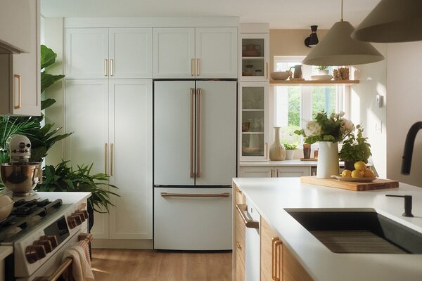
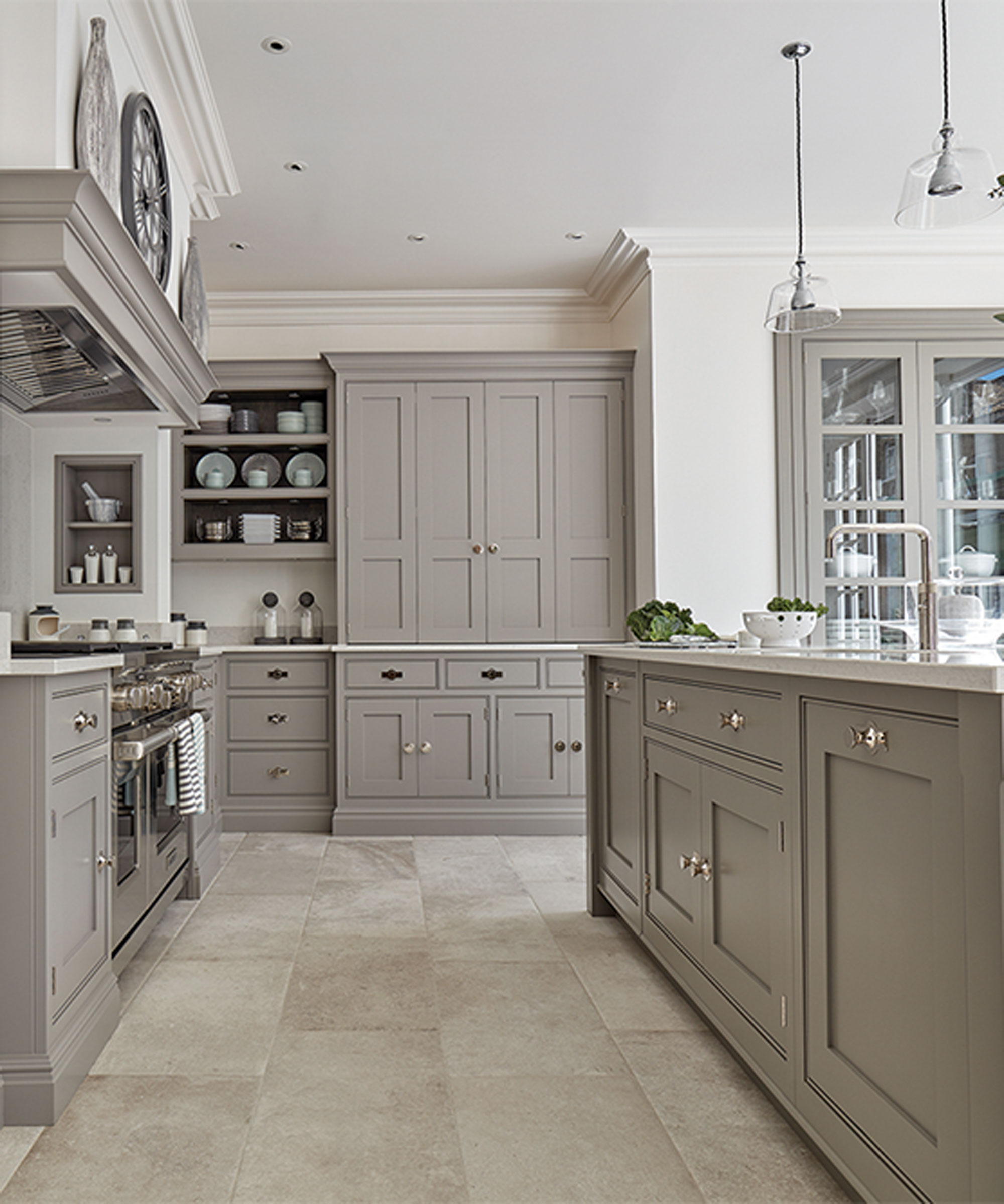
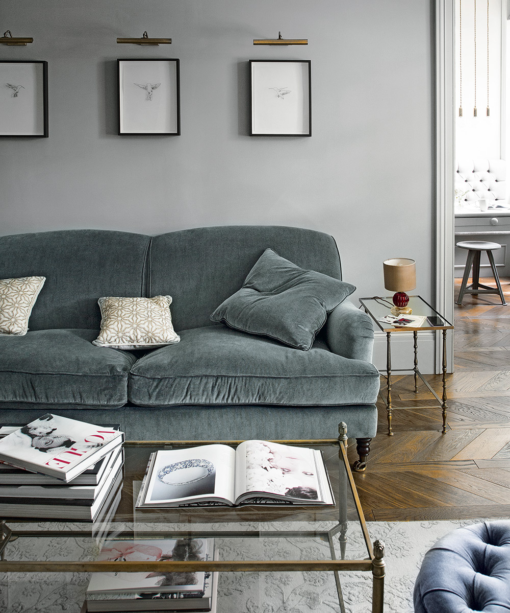
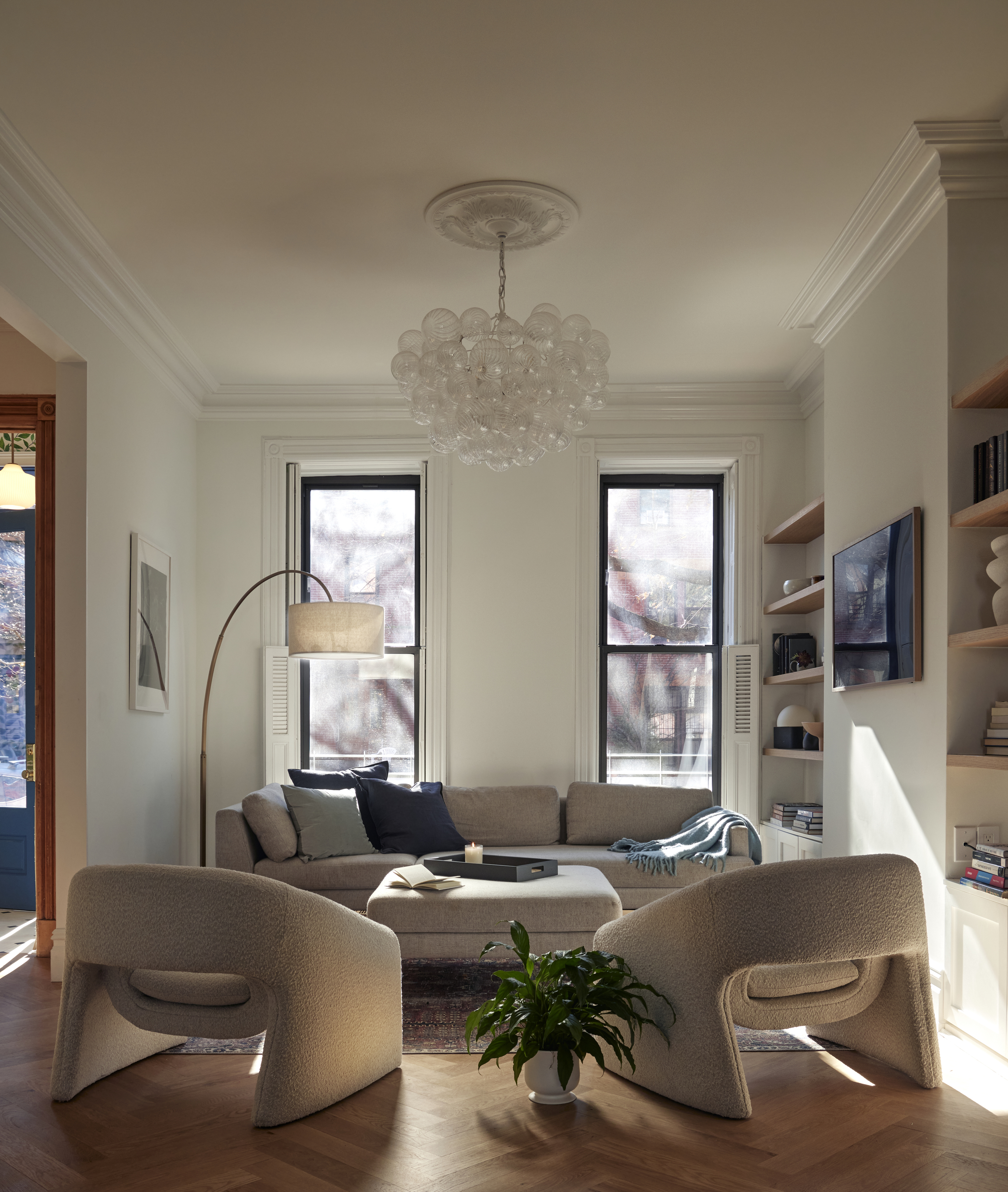
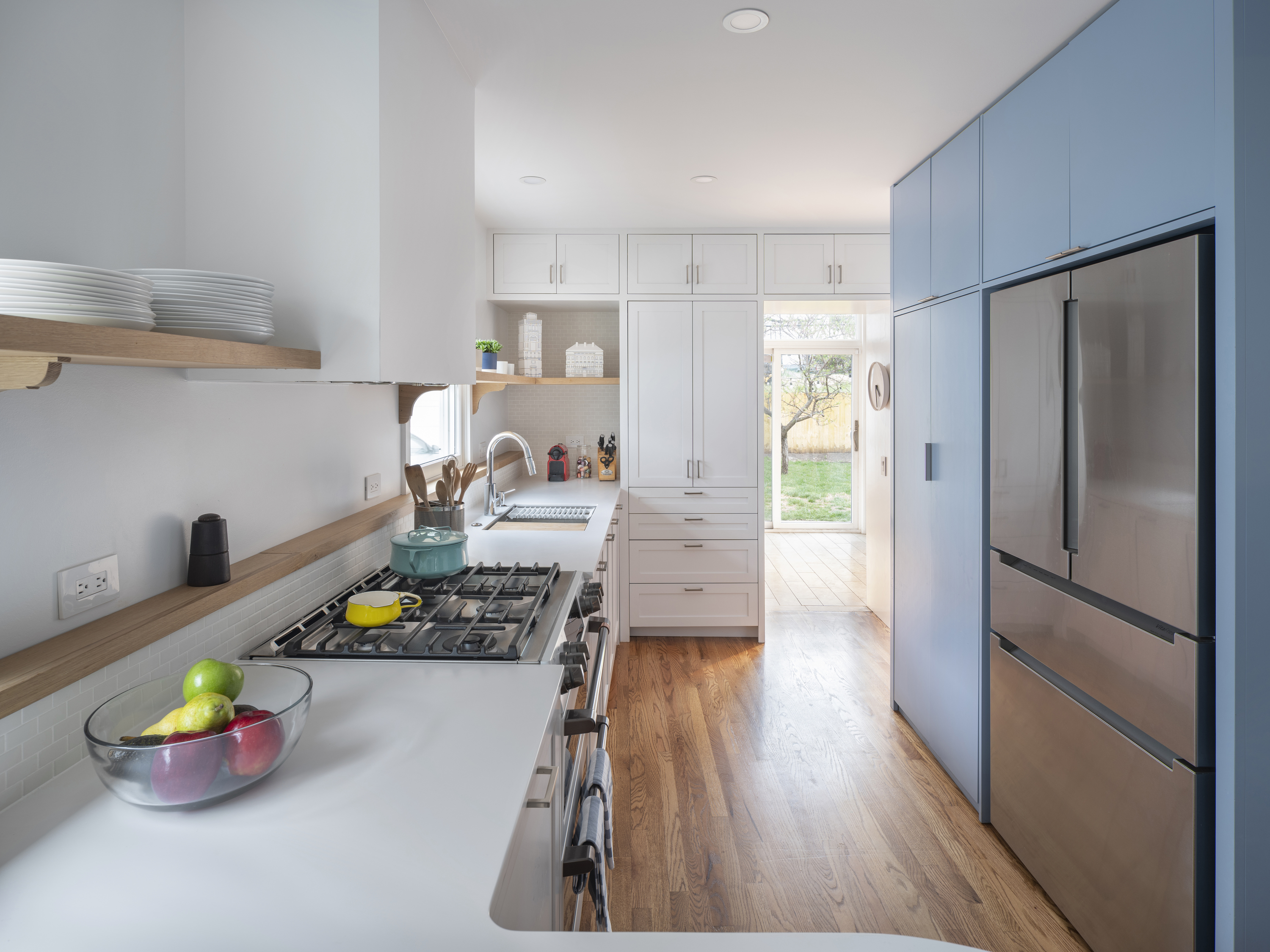
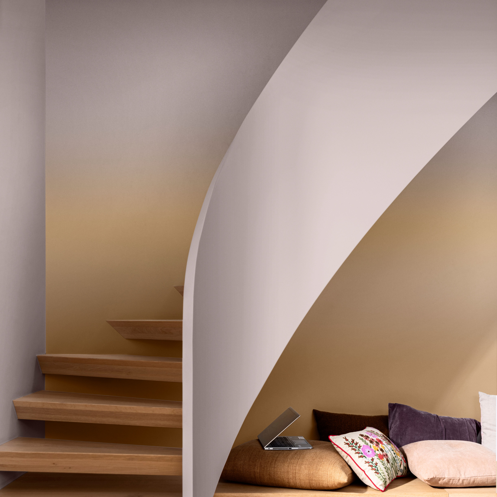
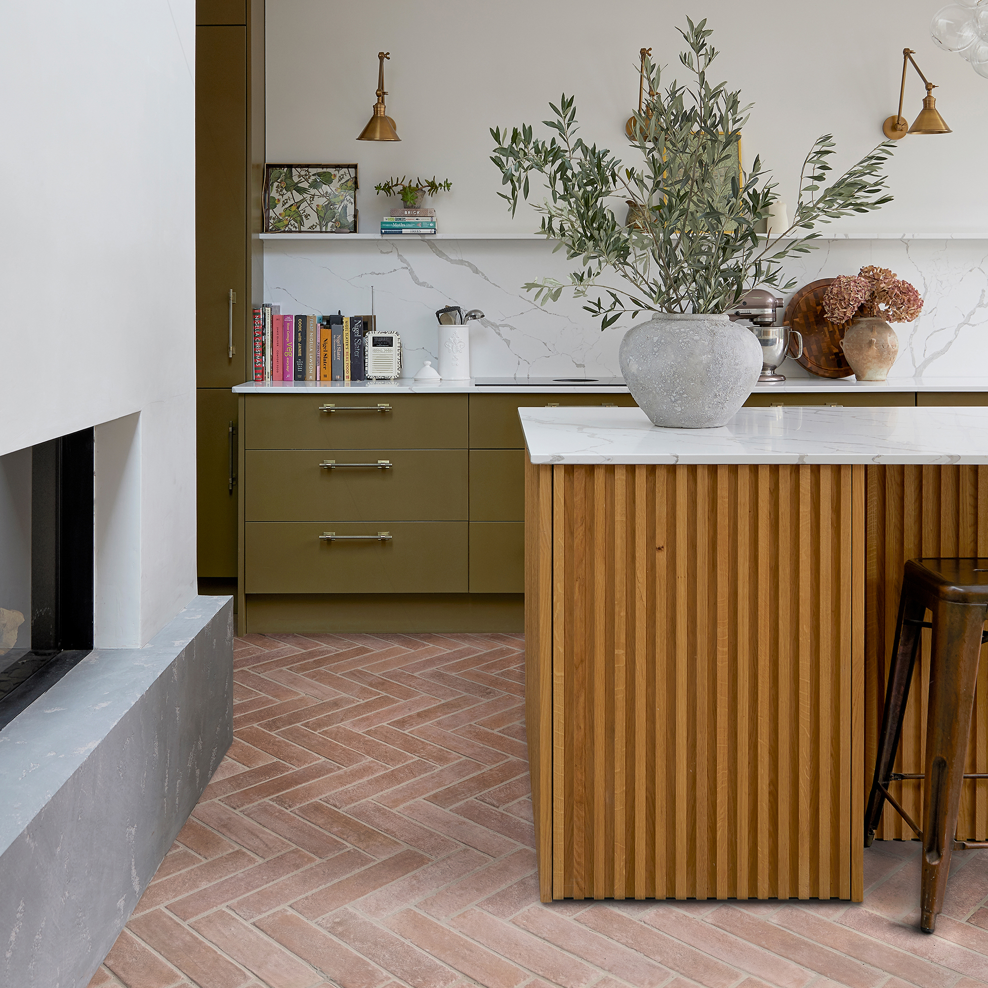
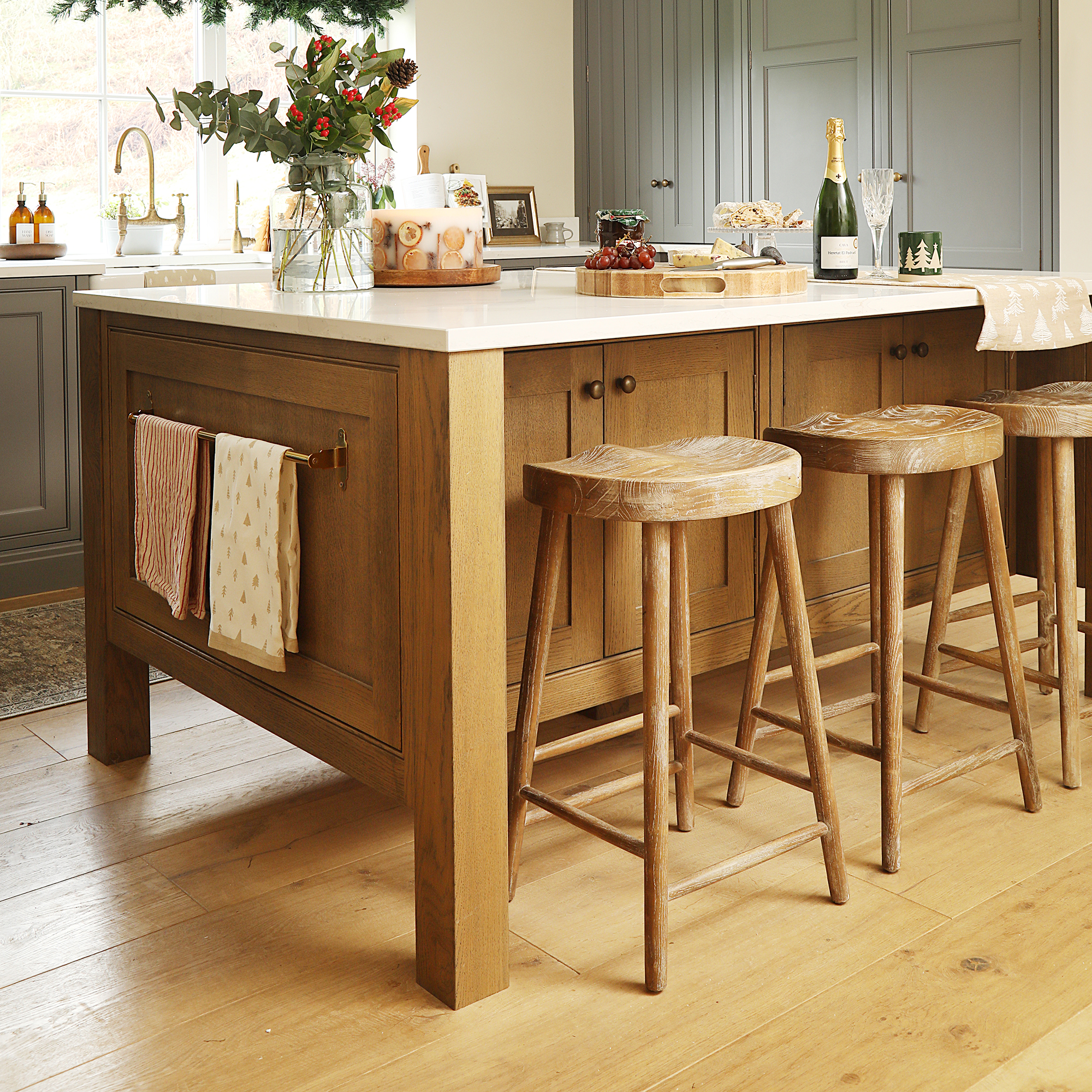
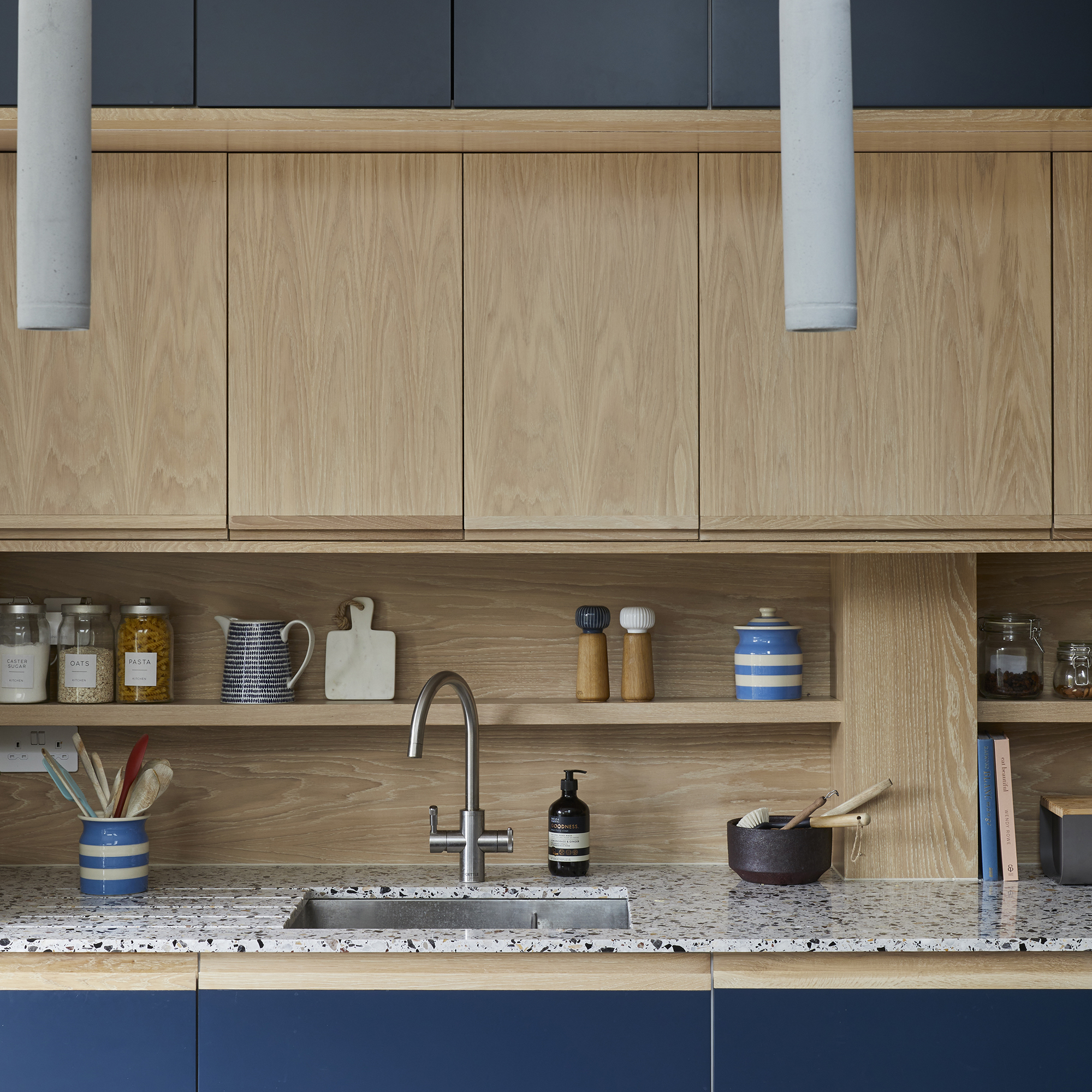

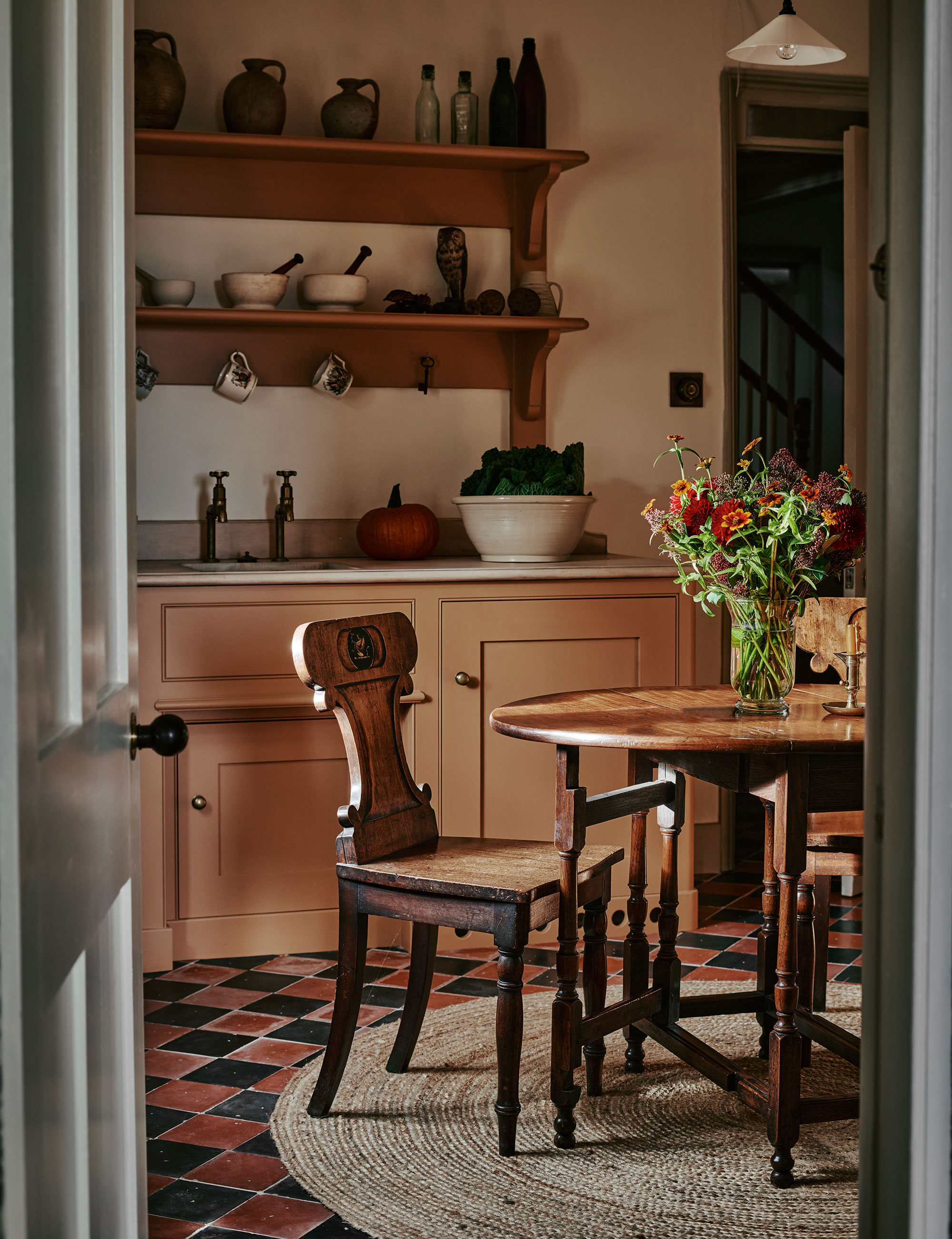
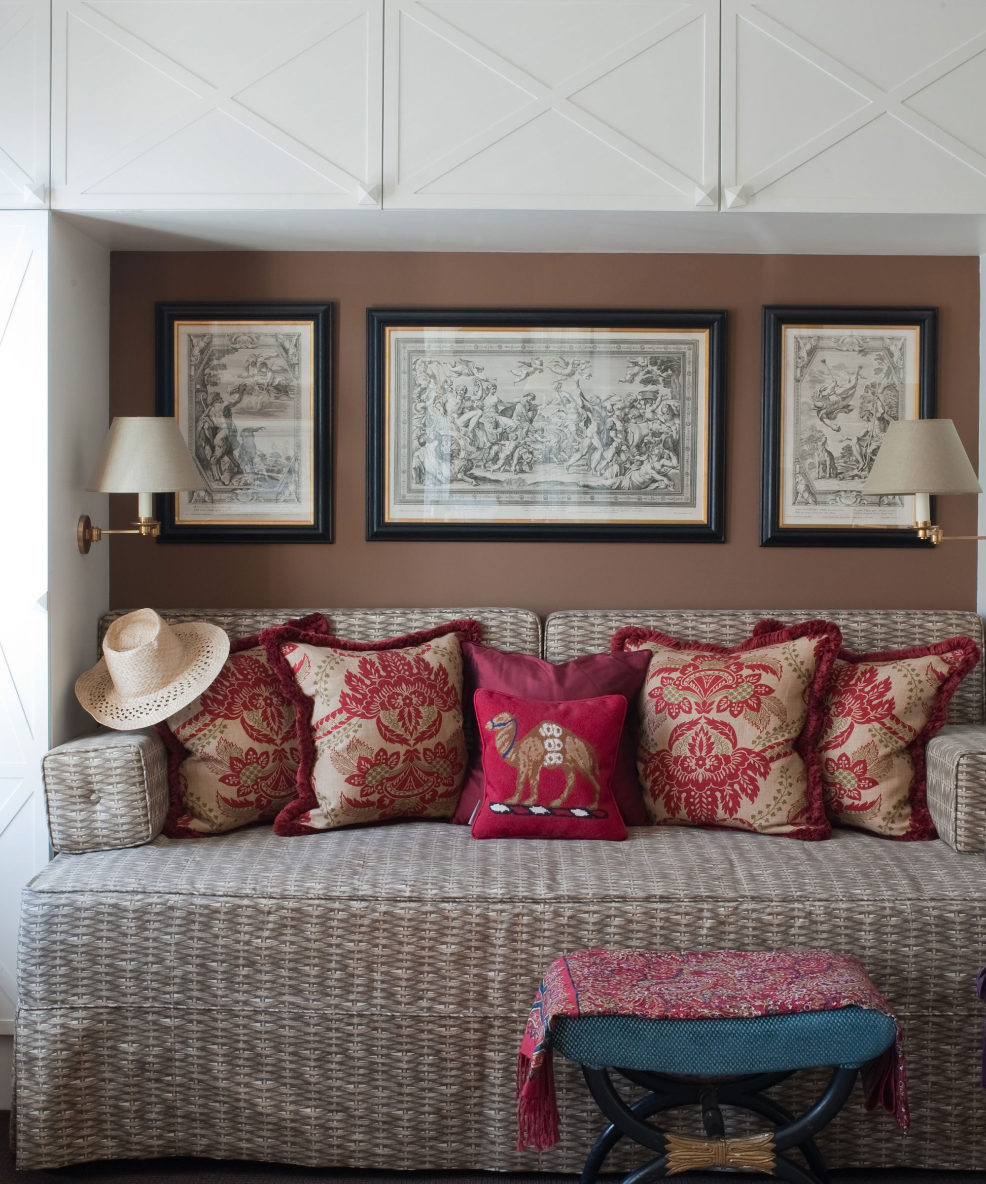
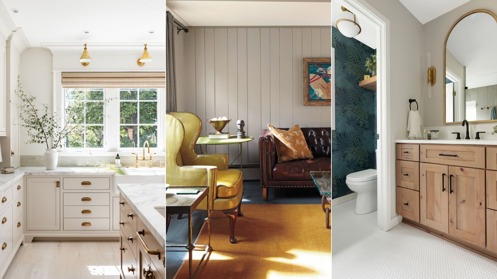
Five methods for decorating with Pale Oak are presented. First, it can serve as a backdrop in a living room, creating a timeless and understated atmosphere. It pairs effectively with other neutrals like Benjamin Moore's White Dove or Cloud White, or it can anchor bolder shades to achieve a sophisticated and inviting aesthetic. Second, Pale Oak is suitable for kitchen cabinetry. Interior designer Kate Marker observes that its appearance changes throughout the day, shifting from a greige with pink undertones to a warmer beige depending on natural light. Veronica Colby suggests extending this hue to interior trim and combining it with lighter wall colors like Benjamin Moore's Steam for a classic New England look.
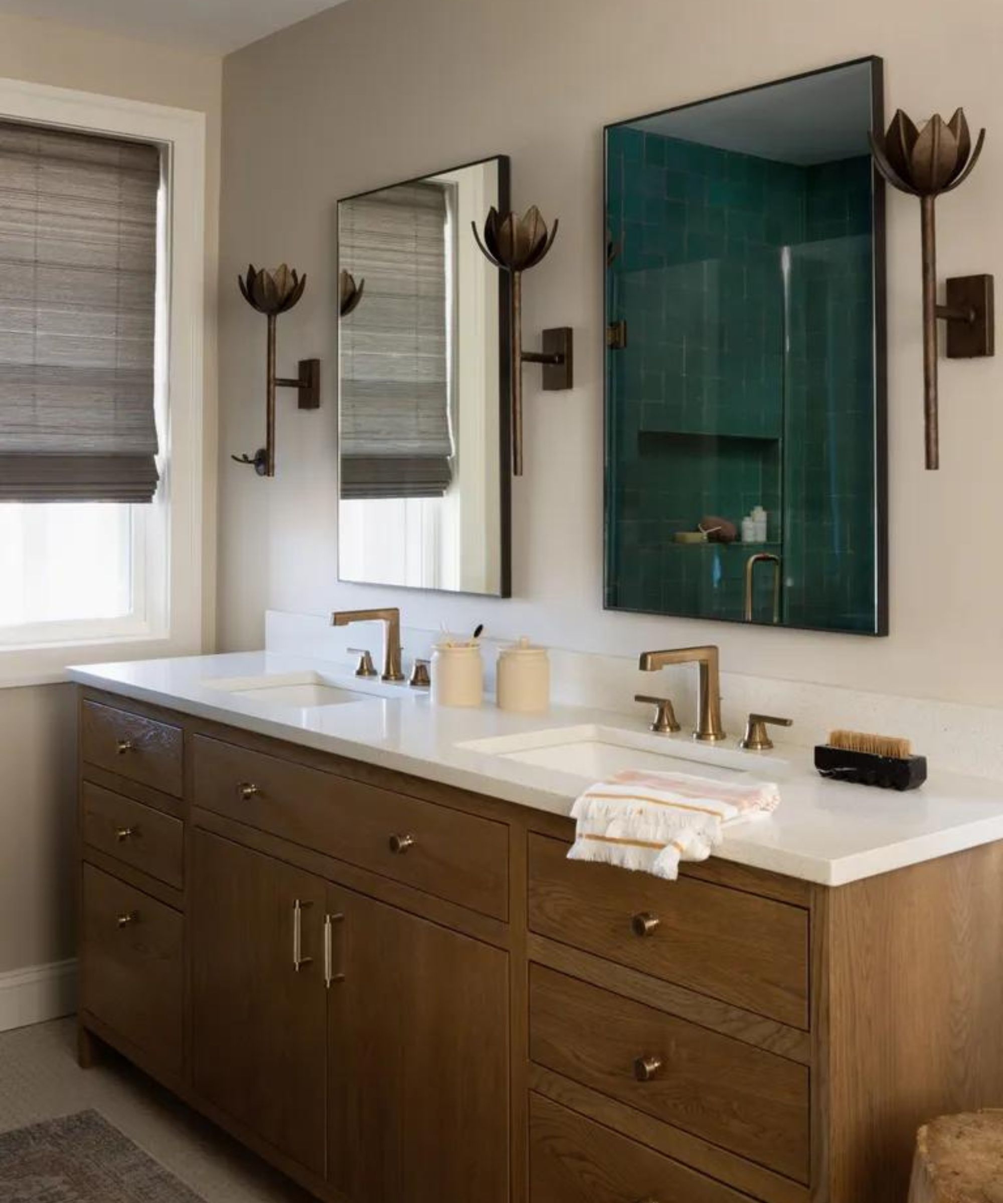
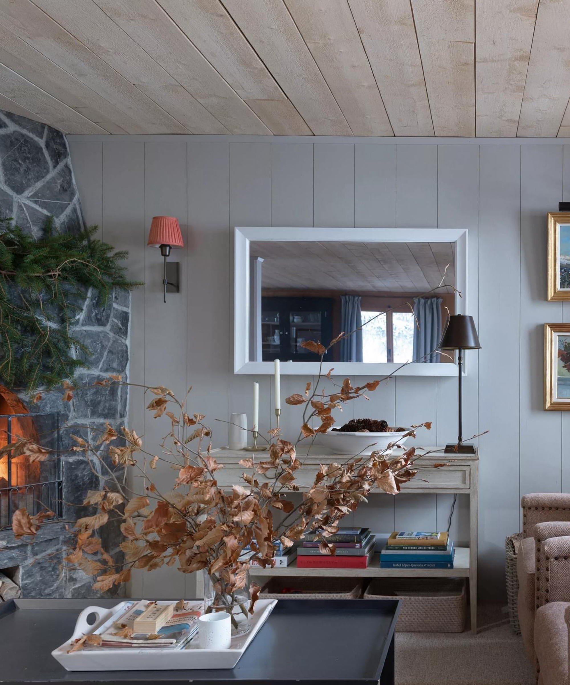
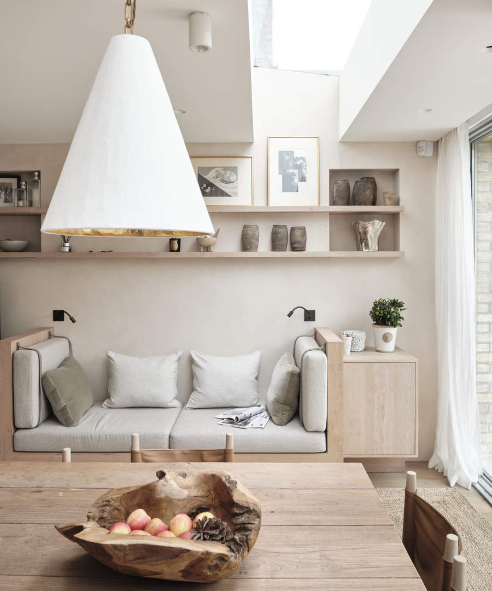
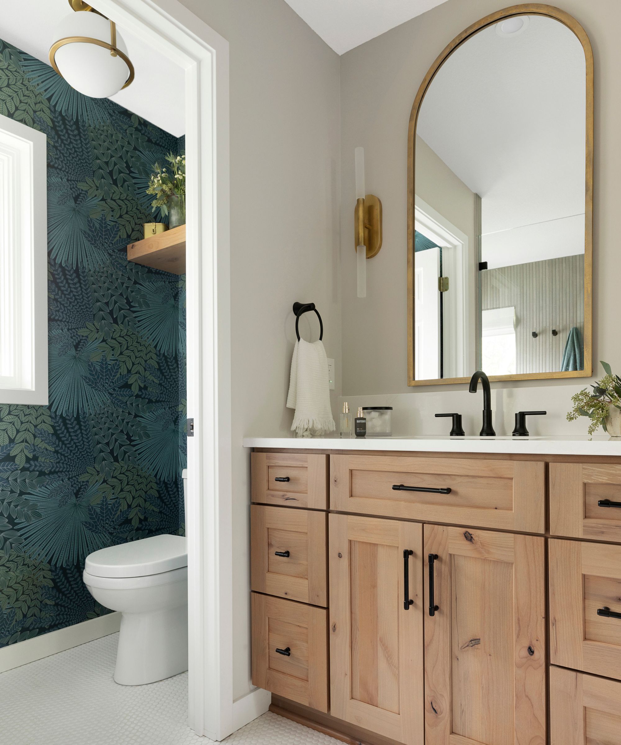
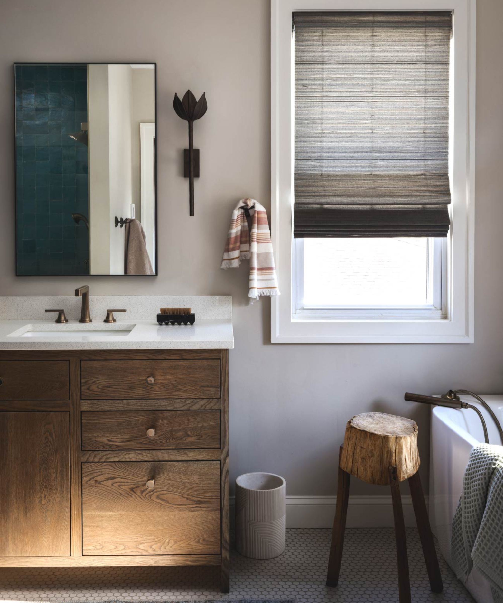
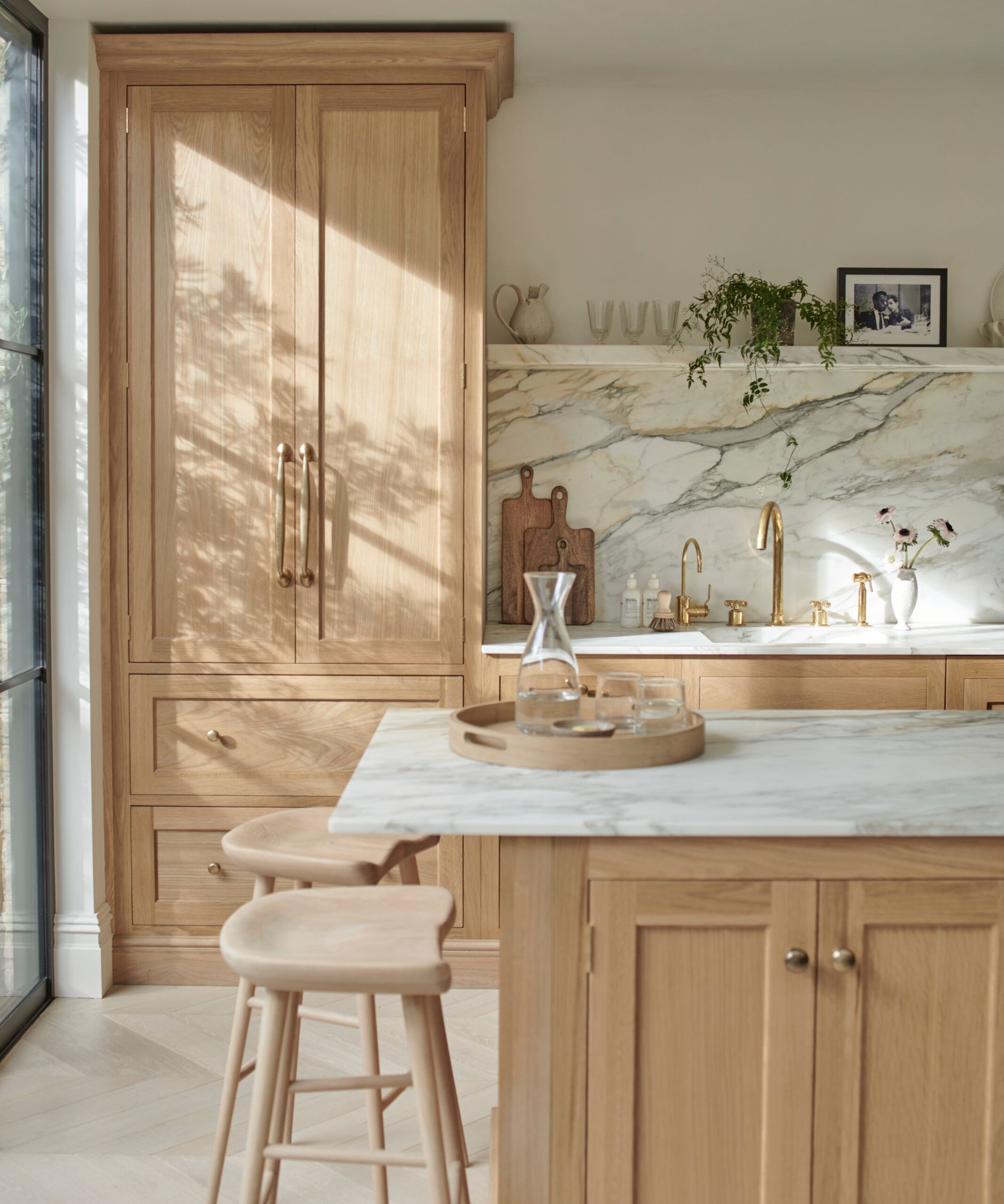
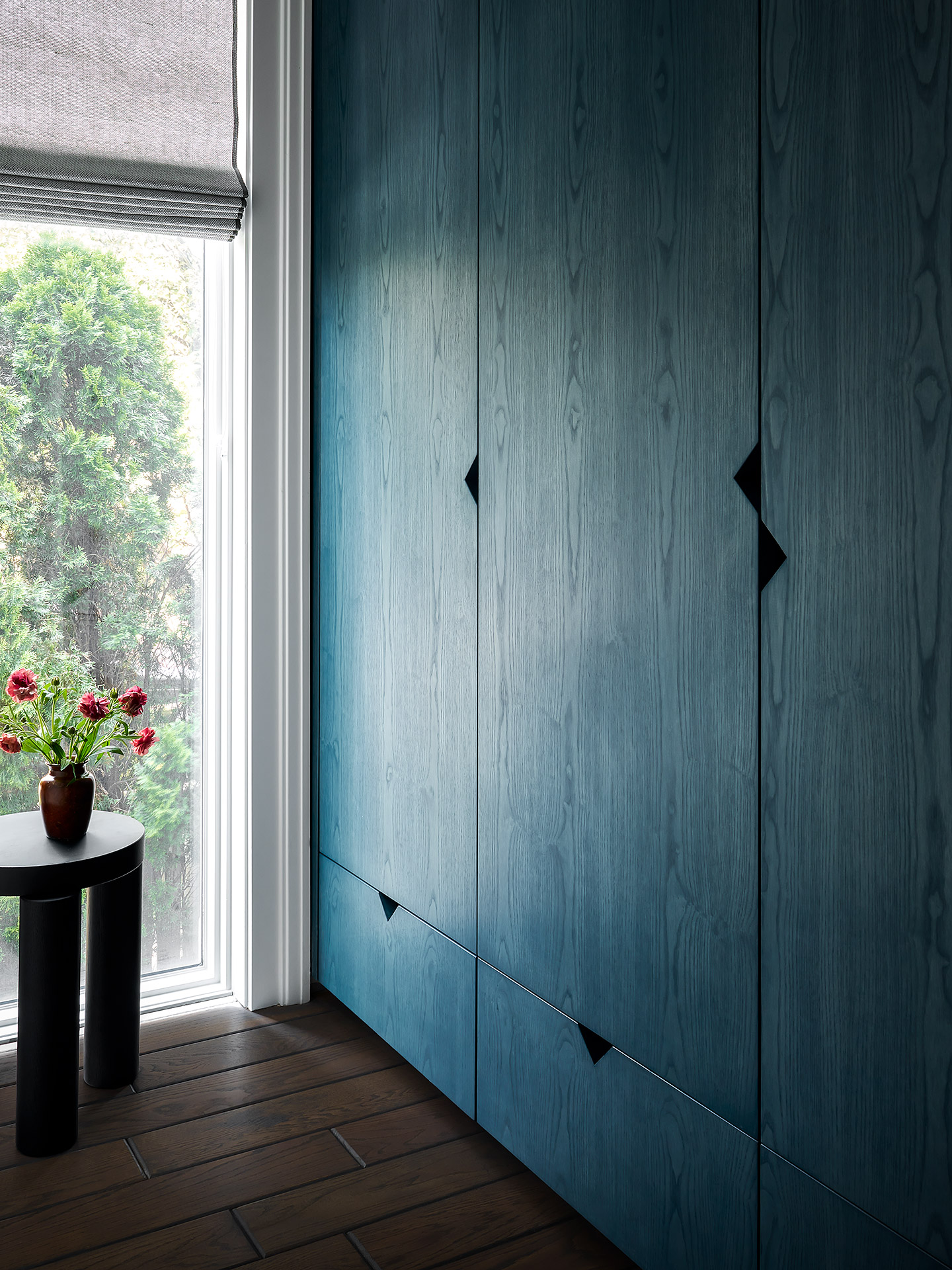
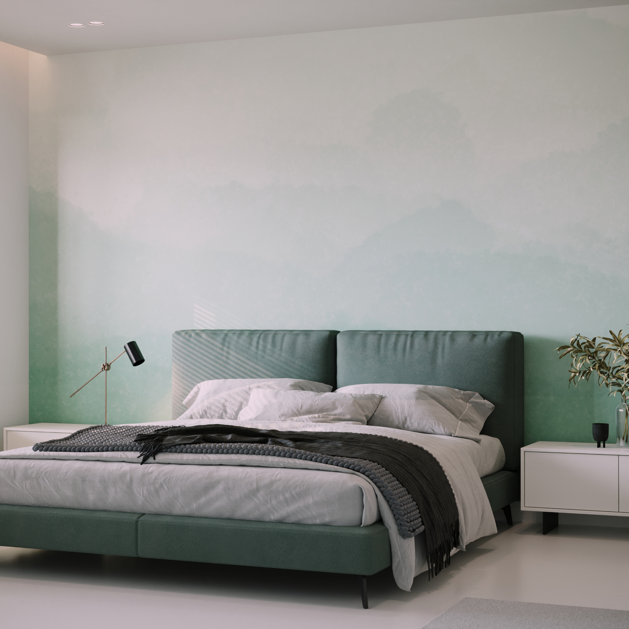
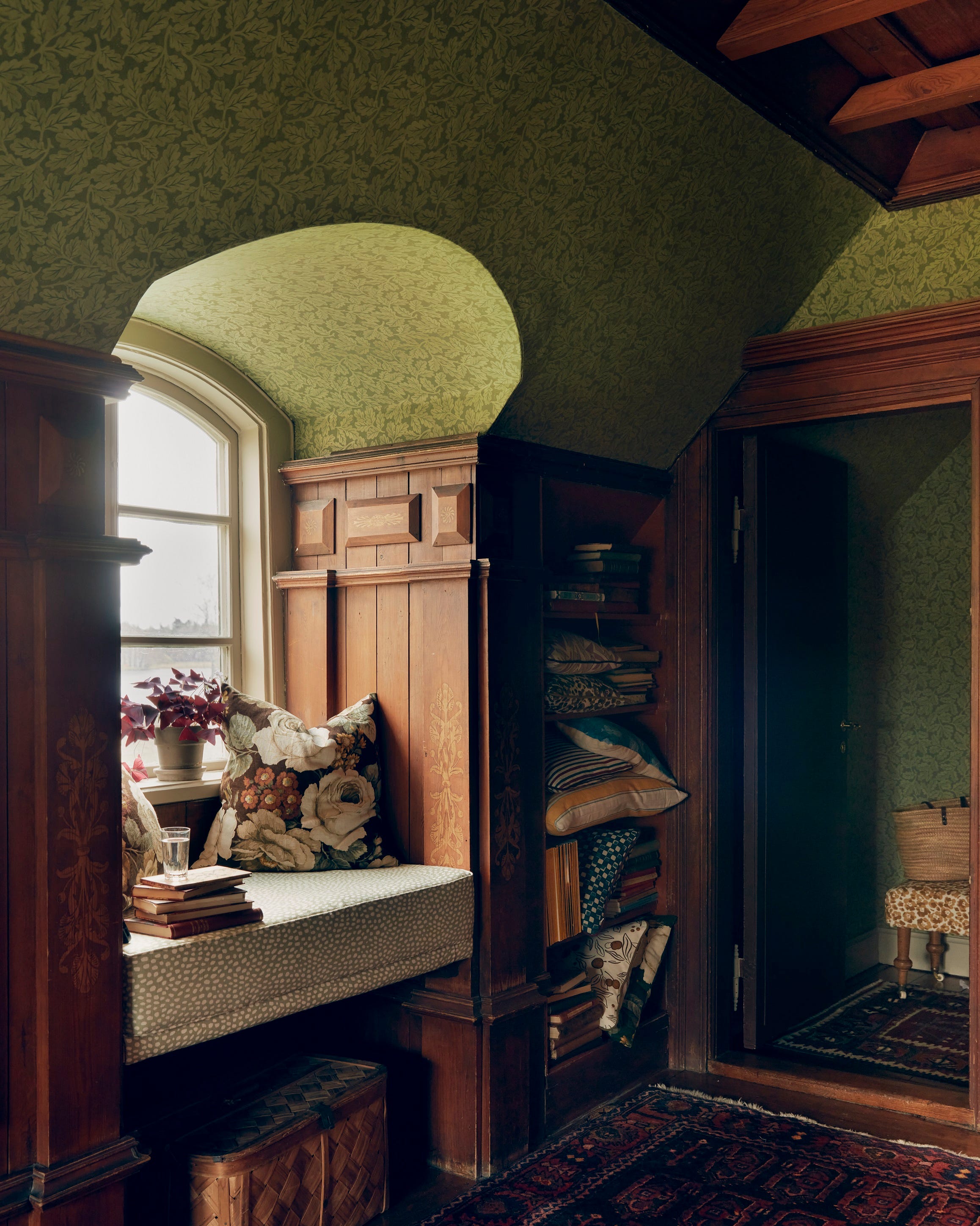
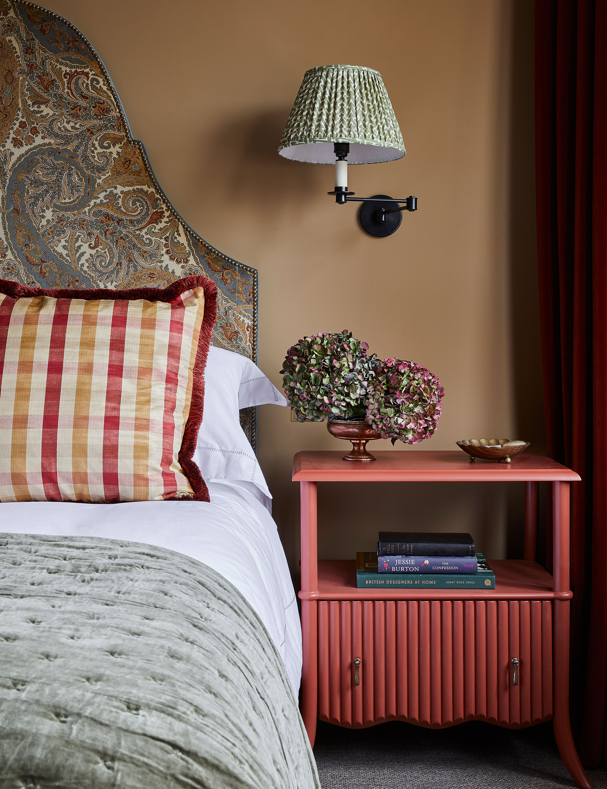
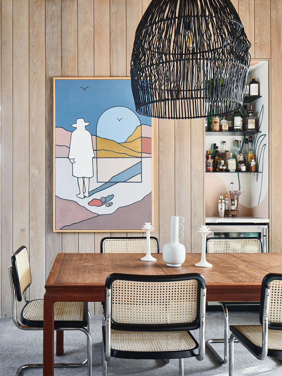
Third, Pale Oak is recommended for bathrooms to create a calming and restful environment. Nicole Cullum, designer and founder of Color Caravan, suggests using Pale Oak on bathroom walls with fluted white oak cabinets, Arabescato Cervaiole or Calcutta Gold marble, and Benjamin Moore’s Chantilly Lace for the ceiling and trim, resulting in a timeless yet luxurious modern feel. Fourth, Pale Oak integrates well with natural wood tones. The warm hues of wood complement the paint, bringing out its understated and dramatic qualities. Artem Kropovinsky, interior designer and founder of Arsight, recommends pairing Pale Oak with white trim and natural woods for a minimalist aesthetic.
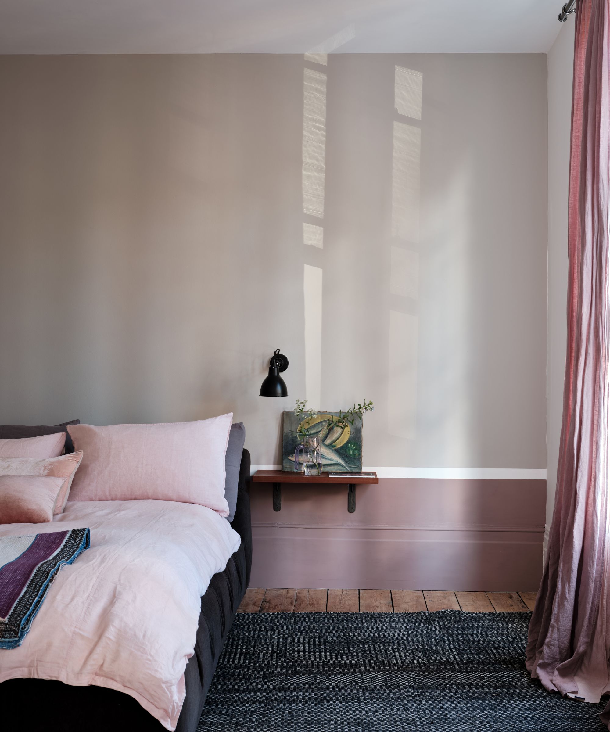
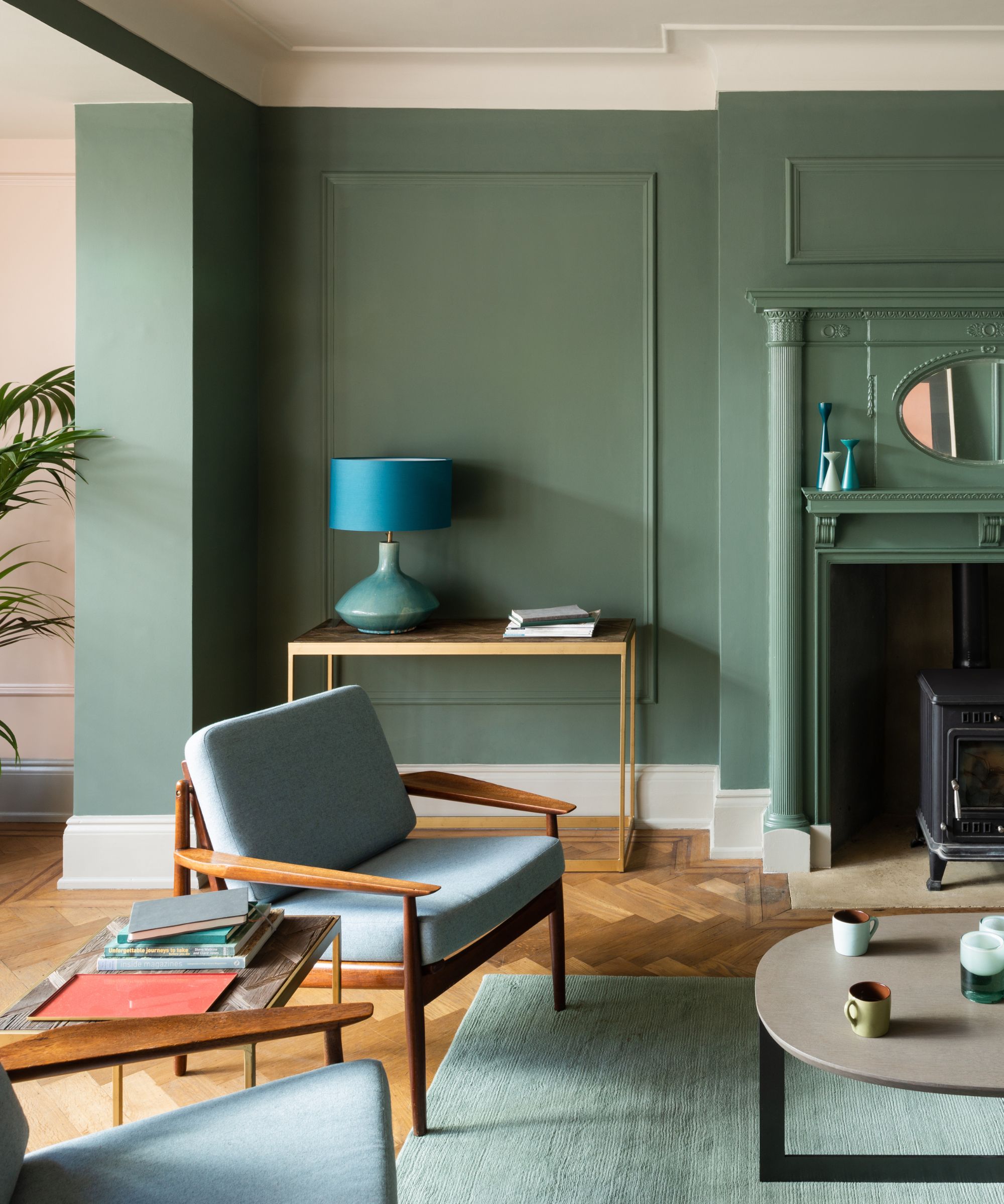
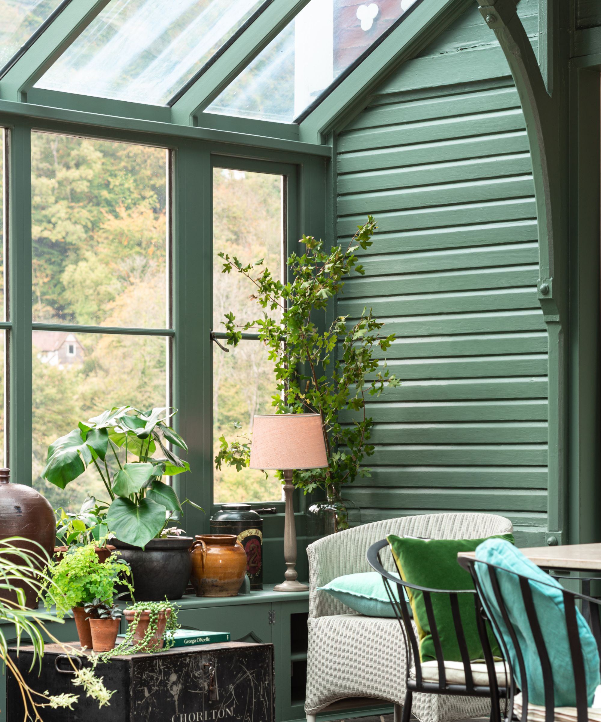
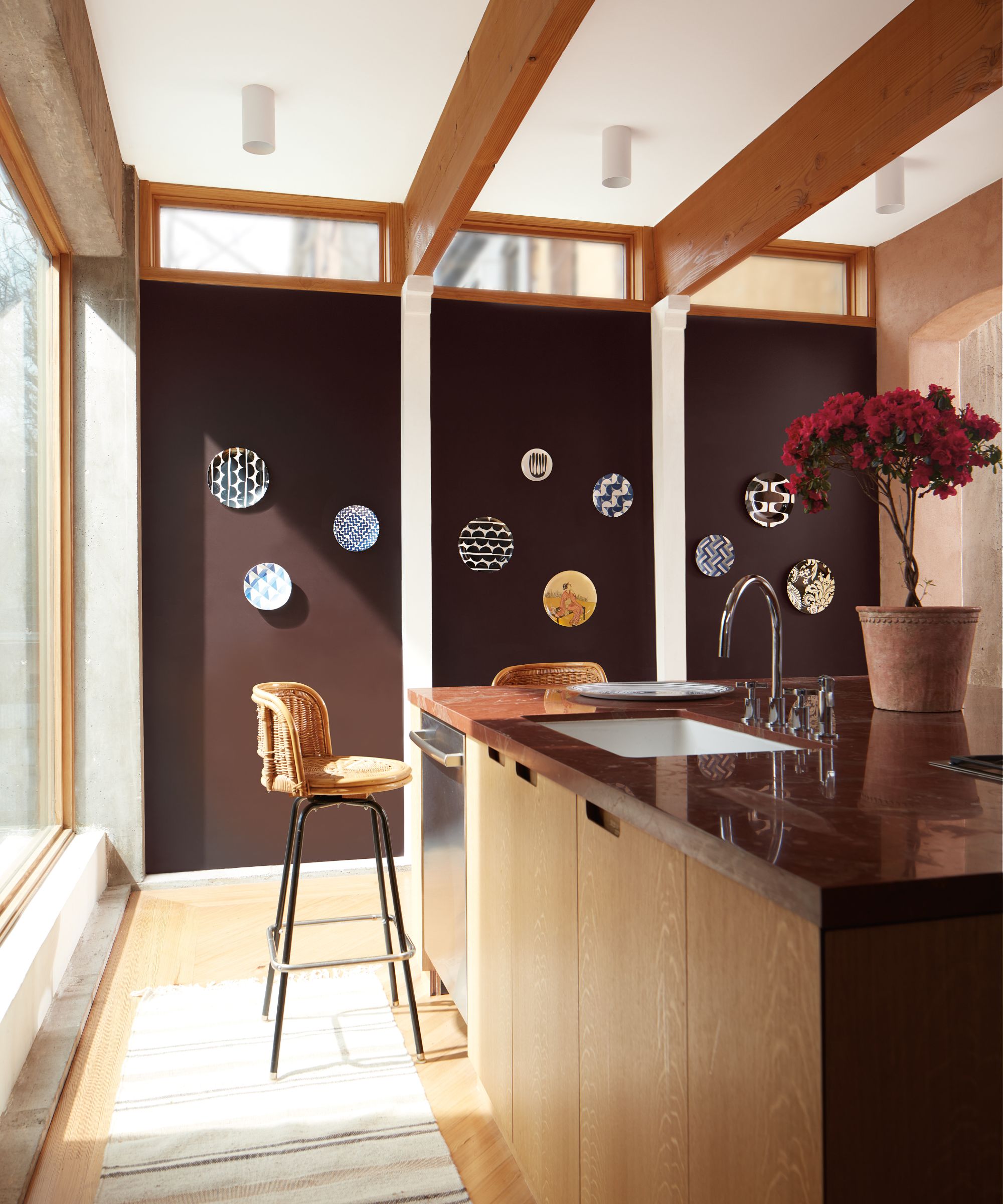
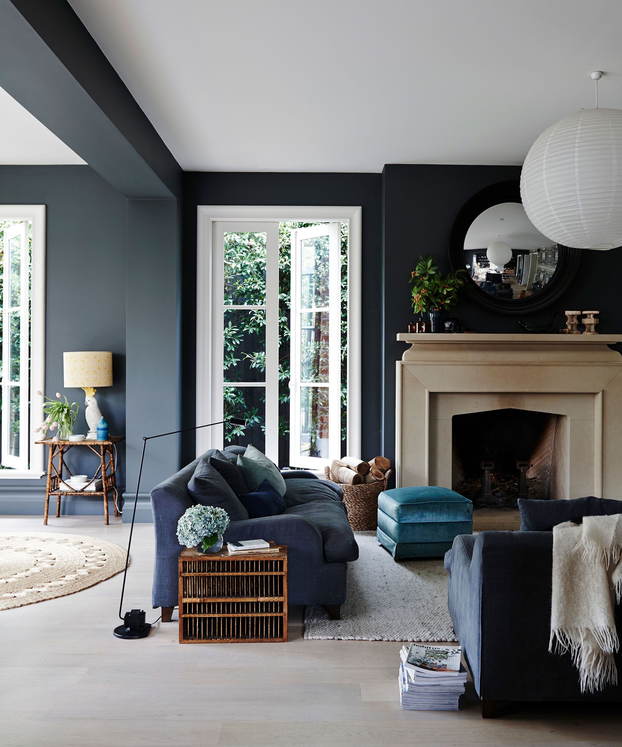
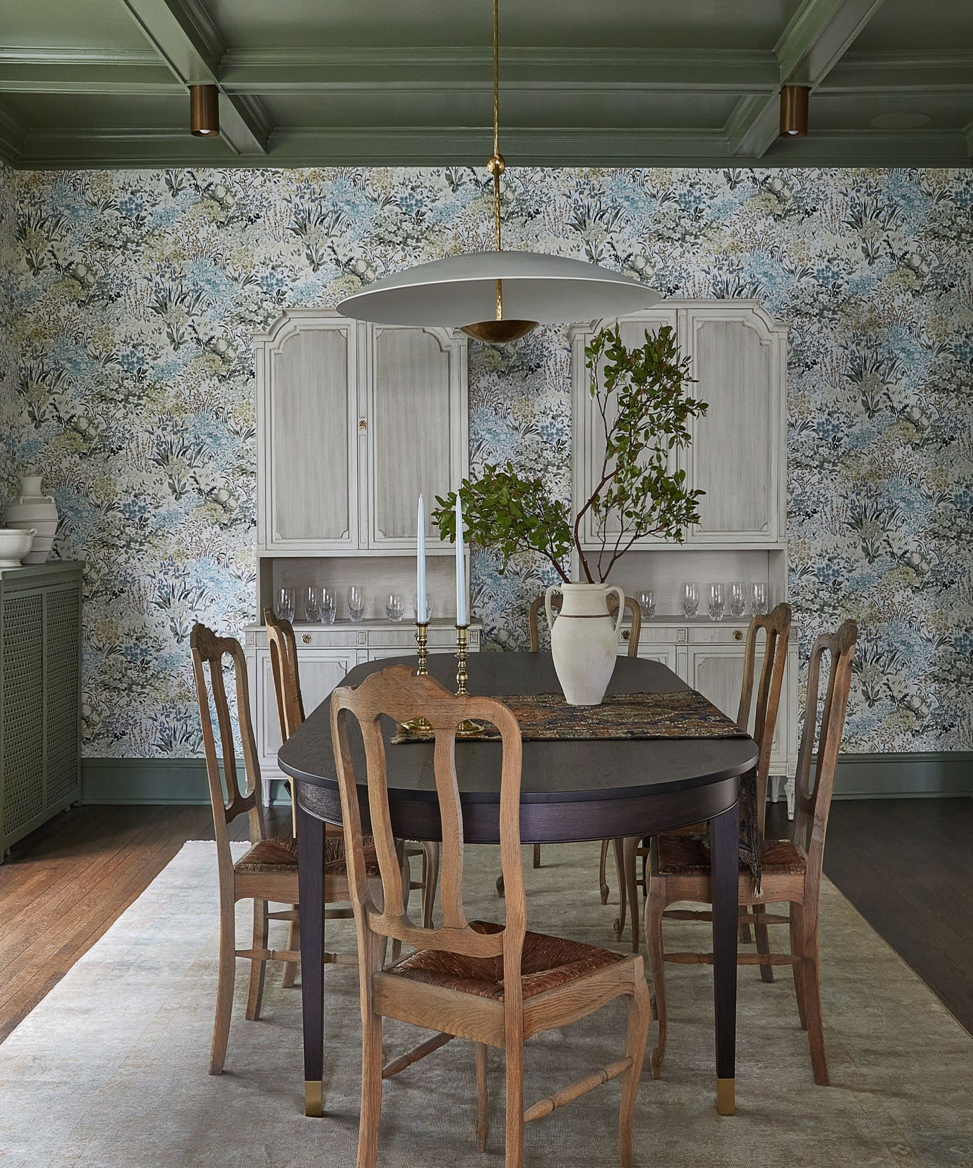
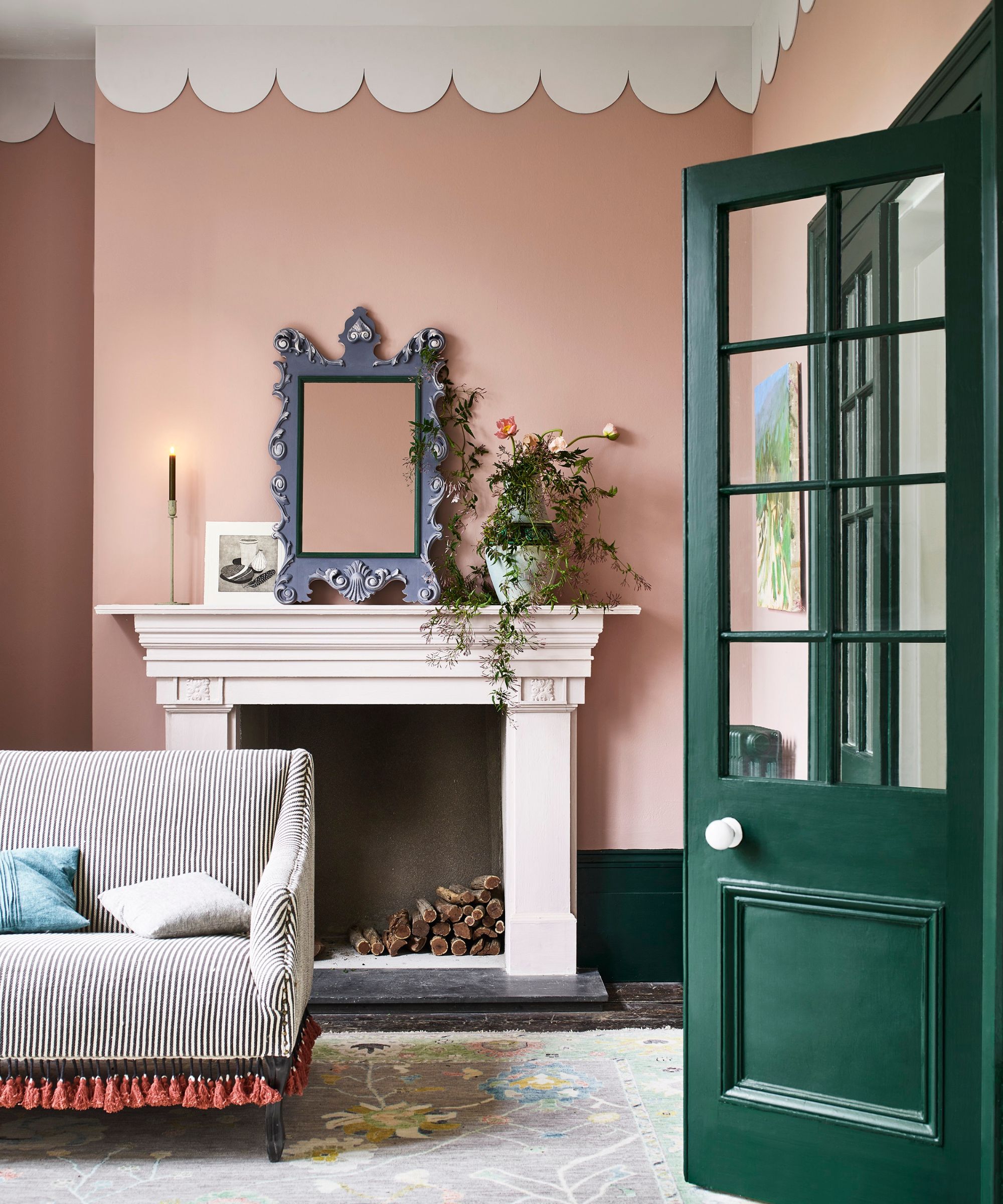
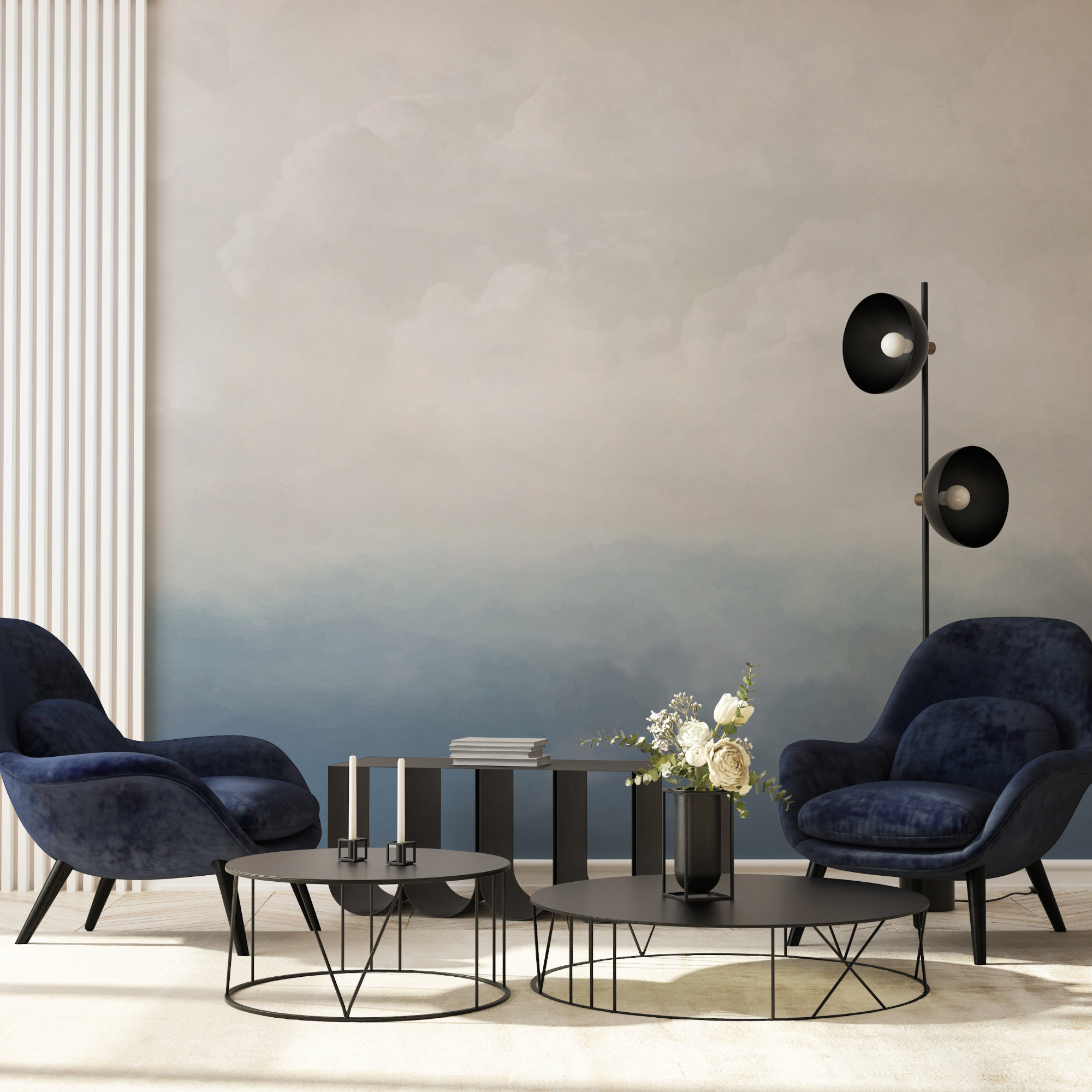
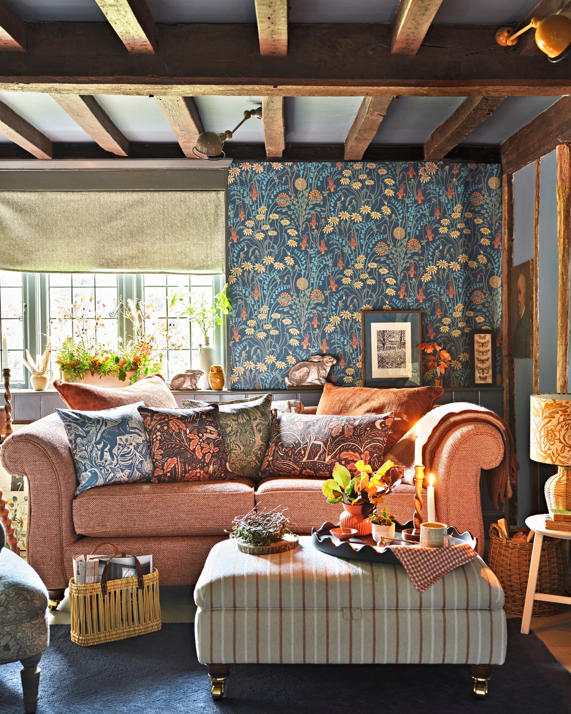
Finally, for those who prefer more maximalist decor, Pale Oak can be contrasted with brighter hues. Artem Kropovinsky suggests using deep blues and greens as bold accents. Since Pale Oak is a muted color, it allows for daring choices in accent pieces, such as furniture or art, which can be easily swapped to refresh the room's look while the base color remains consistent. The article concludes by emphasizing Pale Oak's versatility and predicting its continued popularity in 2024.
#InteriorDesign #PaintColor #BenjaminMoore #PaleOak #NeutralDecor #HomeDecorTrends #Greige #ColorPalette #InteriorDesign #PaintColor #BenjaminMoore #PaleOak #NeutralDecor #HomeDecorTrends #Greige #ColorPalette
0 comment in total
 No comments yet
You may also like
5 ways to decorate with Edgecomb Gray, Benjamin Moore's softest gray paint

5 ways to decorate with Farrow & Ball's Green Smoke – an endlessly versatile paint color
Is colorful woodwork a fresh new take on the classic feature wall?
Olive hues, wood add character to home decor

5 ways to decorate with Beacon Gray – Benjamin Moore's 'luminous' and versatile blue-gray paint
5 Ways to Use the Benjamin Moore Color of the Year

Will You Regret Painting Your Oak Trim? Designers Weigh In

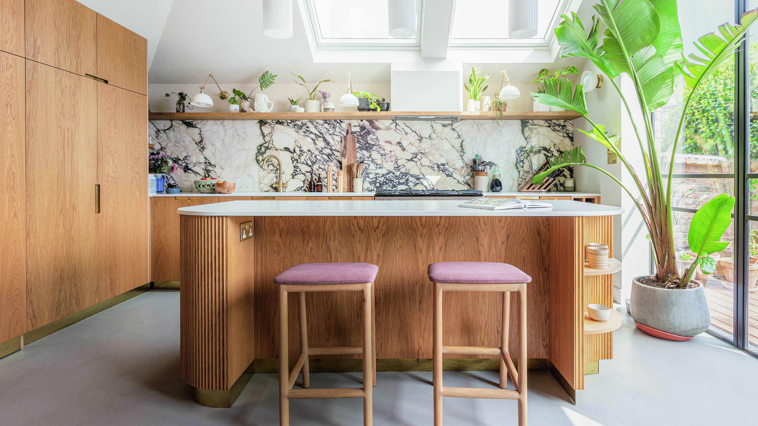
5 ways to modernise oak kitchen cabinets - bring this wood tone into 2025 with these expert-approved tips
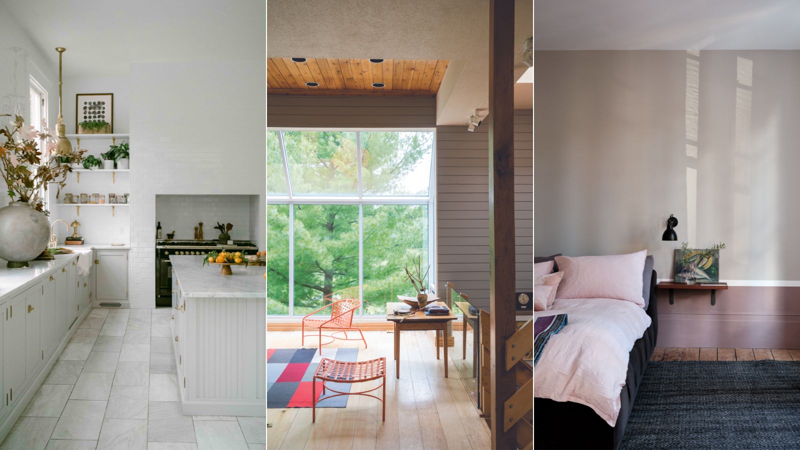
This is the most versatile shade you can bring into your home – designers share the 5 best greige paints
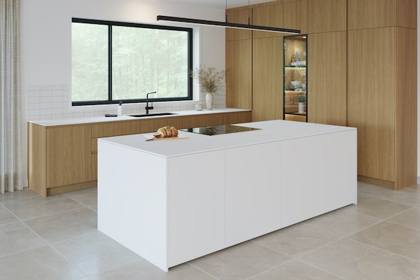
Like the look of white oak? Consider these alternatives
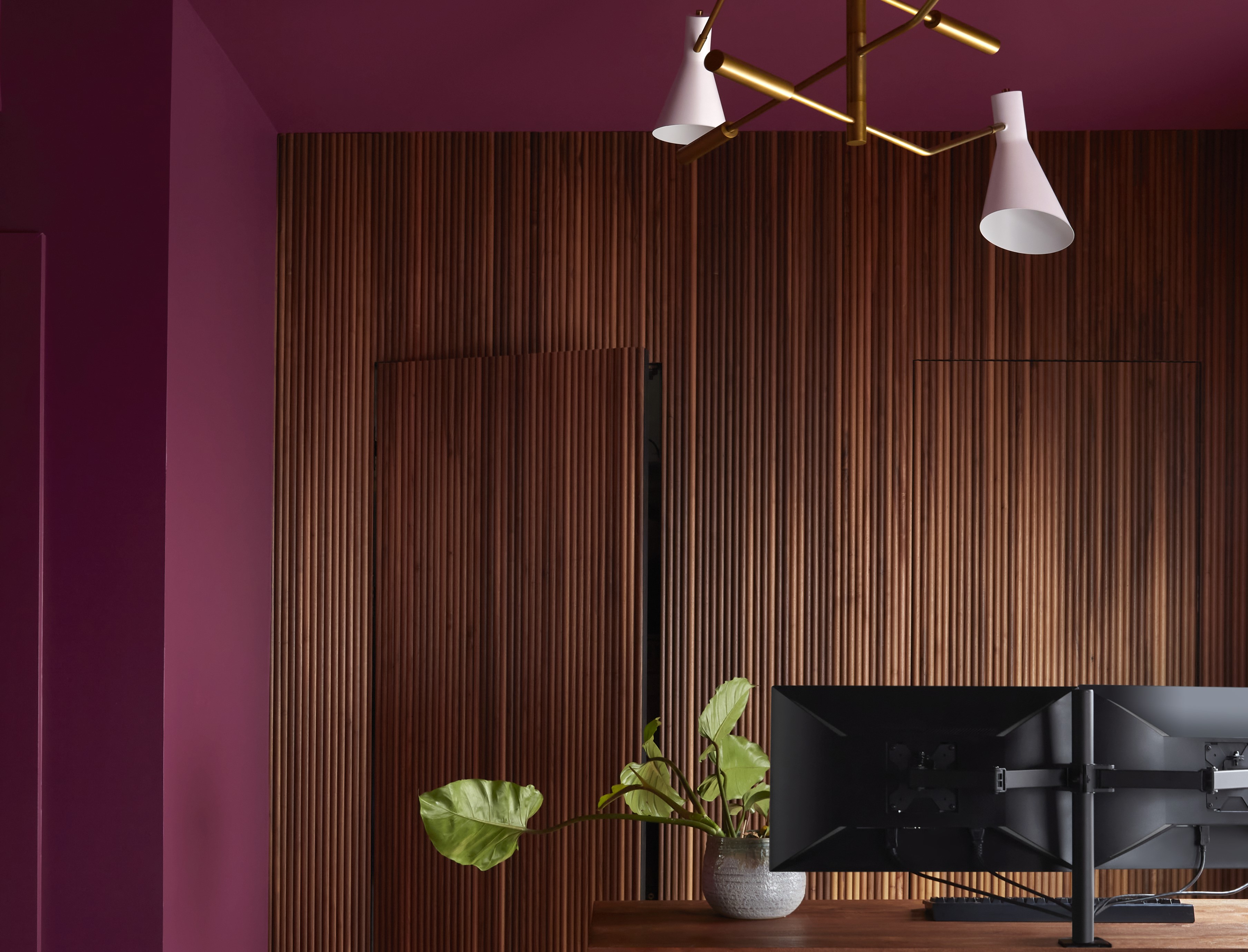
Paint Colors That Go With Natural Wood — 10 Picks That Bring Out the Beauty of This Organic Material

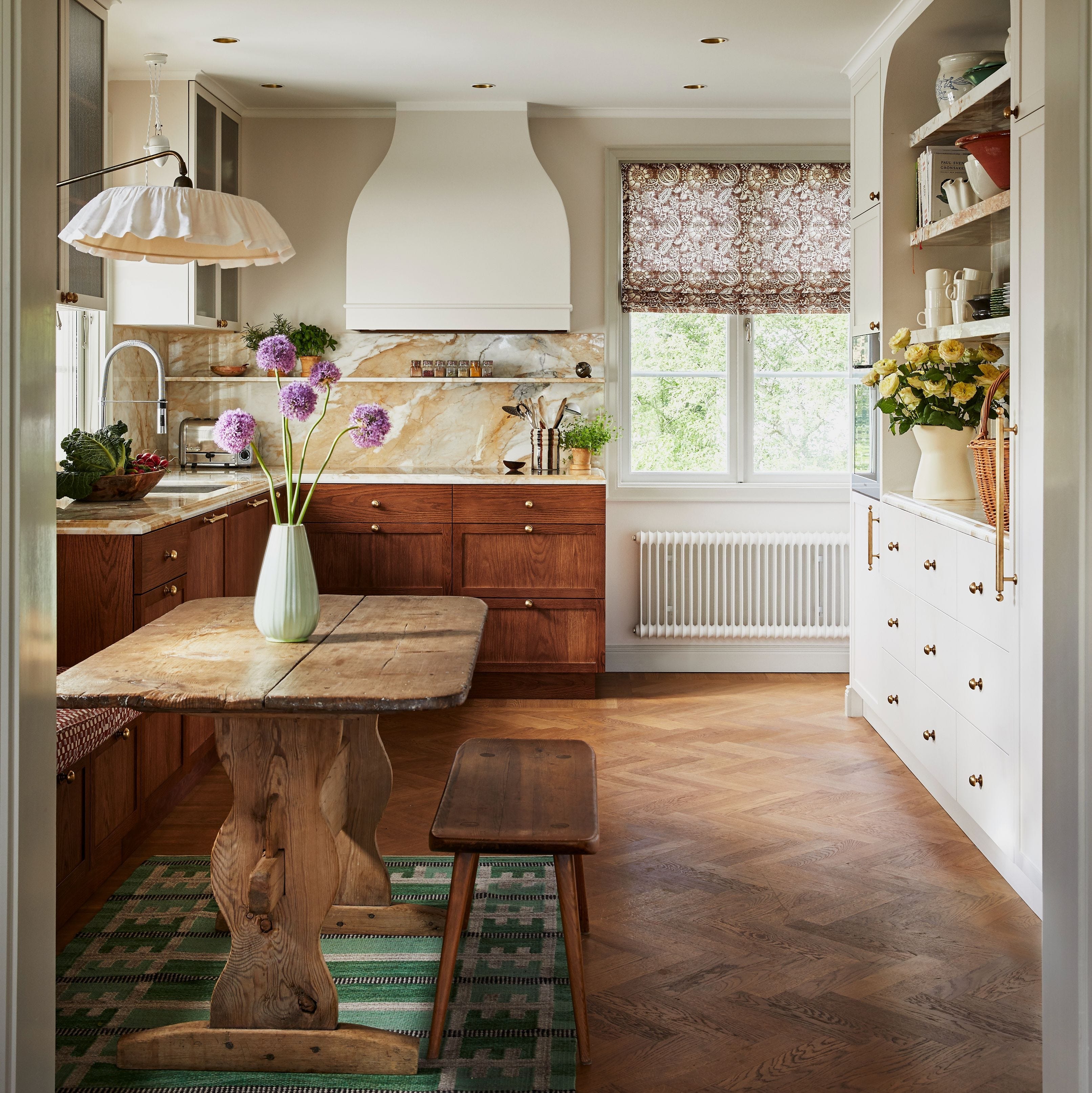
Embrace the dark wood comeback: 12 ways to use the decor trend in your home
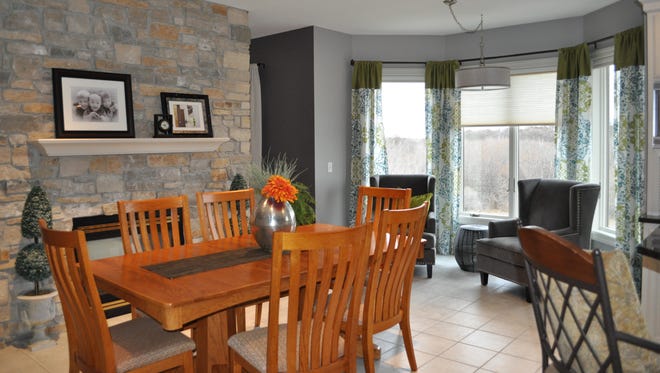
Modern Nest: Update home by putting color on old oak
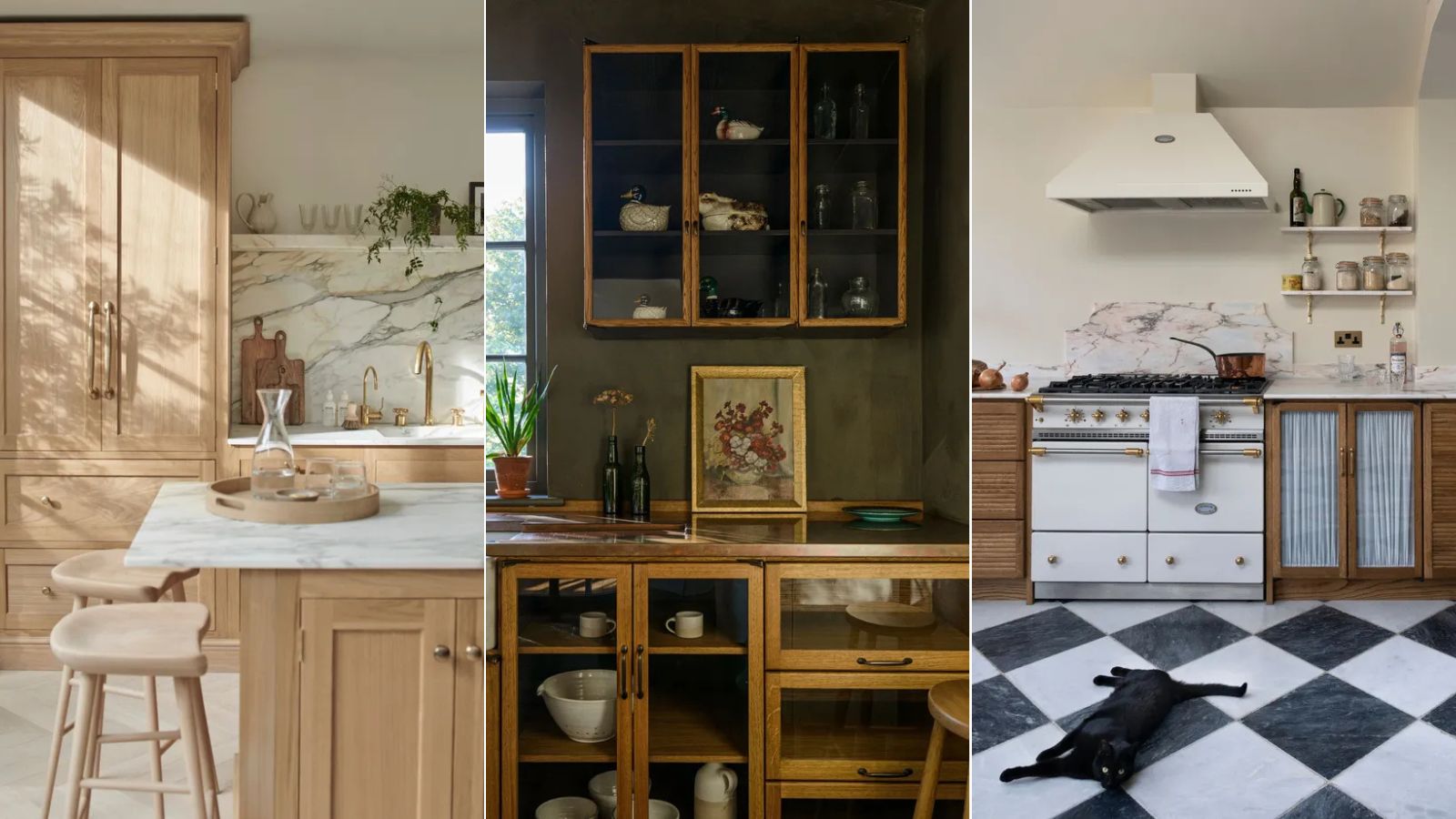
The best colors to pair with oak kitchen cabinets, according to interior designers
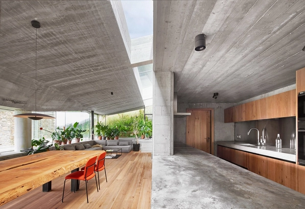
Wood Finishes in Landaburu Borda from PARKLEX PRODEMA

5 ways to decorate with a caramel color scheme – the most stylish tone of the season
6 ways to decorate with Revere Pewter, Benjamin Moore's best-selling gray paint
Grey room ideas – 12 ways to use this versatile shade
We're enchanted by this paint trend that looks like 'something we adore seeing in nature'
Designers Already Have White Oak Fatigue—Here’s Which Finish Comes Next