1/6
Sometimes You Have to Build the Book Cover in Your Living Room
This article by Nicole Caputo details the iterative and creative process behind designing the book cover for Paulina Flores's debut short story collection, *Humiliation*. The collection features nine stories set in Chilean port cities, exploring themes of disgrace, pride, and shame experienced by its characters. Initially, the design brief called for a minimal, bold, and stark cover, with an early idea to feature Chilean city imagery. Caputo and the editorial team were drawn to the provocative nature of the title, especially when paired with the word "stories."
The initial design approach explored type-driven concepts, with Caputo digitally sketching ideas that emphasized the title prominently, potentially tilted diagonally to maximize its size on the cover. A favored external designer was brought in, who developed two rounds of work, but the team's opinions were divided. The publisher then requested a smaller, stark, horizontal, and centered title. Facing a tight deadline, Caputo took the project back in-house. She immersed herself in the manuscript, deeply affected by Flores's vivid descriptions of how humiliation and shame manifest physically and emotionally in the characters, such as reddening faces, stooped backs, and hot bodies. These visceral descriptions inspired a new direction for the cover design.
Caputo decided to visually represent these physical and emotional responses typographically. She experimented with curling letterforms to symbolize a body and mind contracting under the weight of shame. To achieve this, she physically printed the letterforms, hand-cut them with scissors, and curled them around her fingers. She then arranged these curled letters diagonally to ensure the desired size and impact, photographing them in her living room to create a dramatic shadow. A gritty, blushing textured background was digitally added to complete this concept.
Alongside this innovative design, Caputo also submitted other options, including two designs with a small, stark, horizontal title on the flushed surface, and another featuring the title repeated nine times to symbolize the nine stories. Another variant used the curling letterforms but angled them differently to allow for larger text while maintaining legibility. The editor favored the design with the repeated titles for its elegant simplicity and was also drawn to the curled letters, interpreting them as a "life peeled back." The publisher and marketing director strongly supported the curling letterform design, recognizing its effectiveness in achieving the initial goals and its visual appeal.
After discussions between the author and editor across different time zones, the author enthusiastically approved the curling letterform design. For the final production, Caputo decided to use a raised gloss finish on the curled letters to enhance the illusion of three-dimensionality and the shadow effect, and a soft-touch finish to enrich the color saturation. This choice resulted in a cover that not only effectively communicated the book's themes but also visually intrigued viewers, prompting questions about its unique physical appearance.
#BookCoverDesign #NicoleCaputo #PaulinaFlores #Humiliation #LiteraryDesign #CreativeProcess #Typography #BookDesign #BookCoverDesign #NicoleCaputo #PaulinaFlores #Humiliation #LiteraryDesign #CreativeProcess #Typography #BookDesign
0 comment in total
 No comments yet
You may also like
How to use books for home decor and interior design


Home library space: a bibliophile’s dream

12 Unique Ways to Style Books — How Designers Use Reading Material to Elevate Decor


Jessica Simpson's bookshelves show us how styling is a fine art – but it's one we can master with these simple tips

Olivia Rodrigo's living room embraces 'bookshelf wealth,' 2024's most eclectic design trend

Forget Watching TV - Here are 3 Ways to Make Your Living Room Better to Read in
Hot Take: Showing Off the Pages of Your Books Makes for More Cohesive Styling


10 of the most incredible home libraries around the world
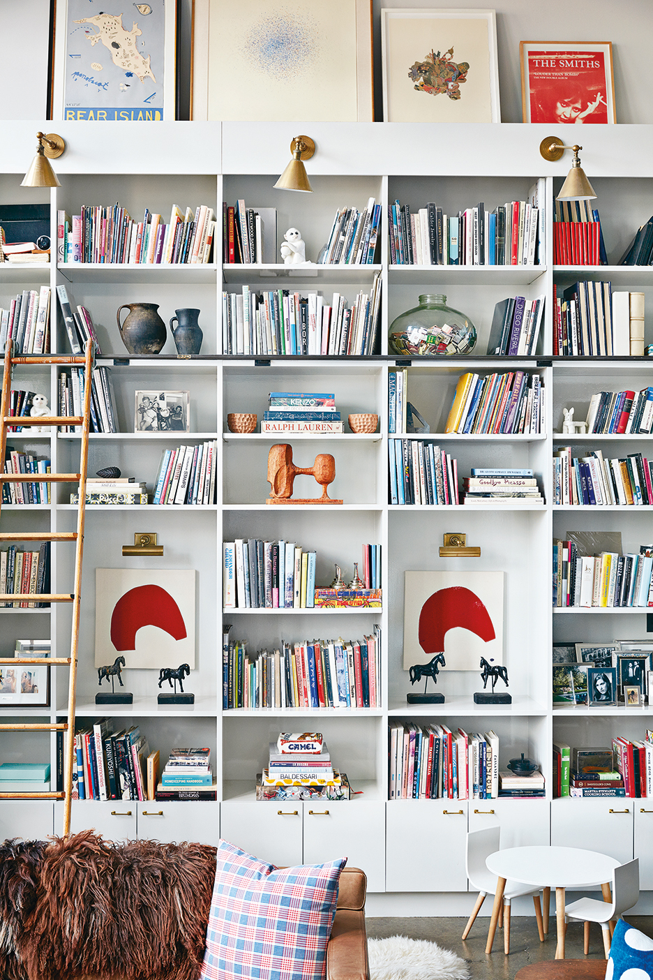
6 Styling Tricks to Try for Your Bookshelf–Turned–Zoom Background
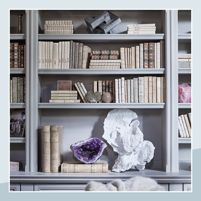
Why My Living Room Bookshelves Are the Best Part of My Home
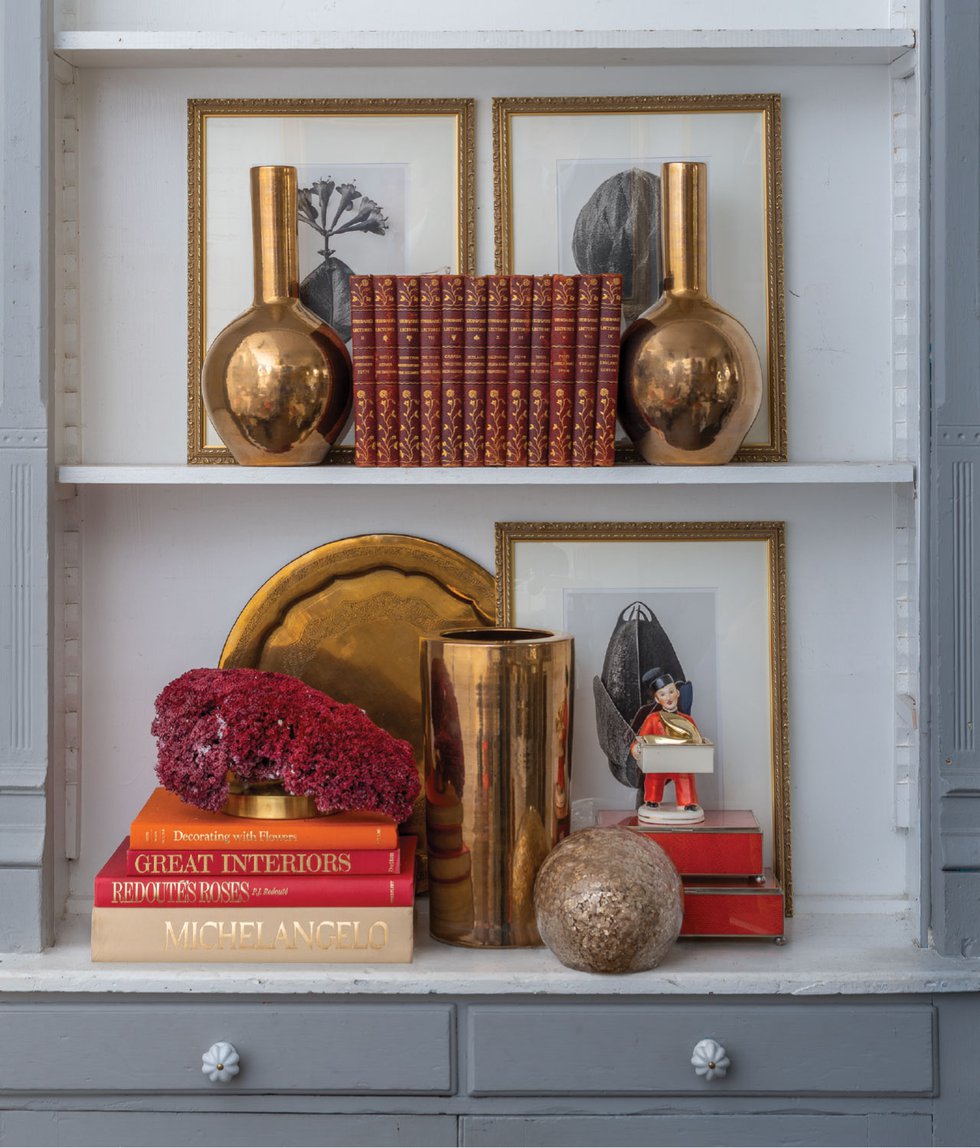
Home & Design | Shelf Talkers

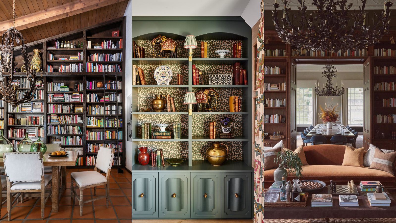
7 examples of Bookshelf Wealth that are nailing this timeless trend (and styling tips from the designers behind them)

Inside the Picture Perfect—and Highly Lucrative—Business of Book Styling

Barefoot Contessa's Ina Garten has created a feature wall that's as personal as it is practical
Make a (Pandemic) Statement. With a Coffee Table Book.
The Space People Struggle to Style the Most—And How to Master It

A Home Library Can Tell Your Life Story (Published 2024)
Ten practical home libraries that showcase their owners' book collections
How 3 Designers Would Spend $200 to Style Your Bookshelf
Can We Please Stop Acting Like Backward Books Are A Legit Trend?