1/4
Kris Jenner's living room uses a rare color scheme
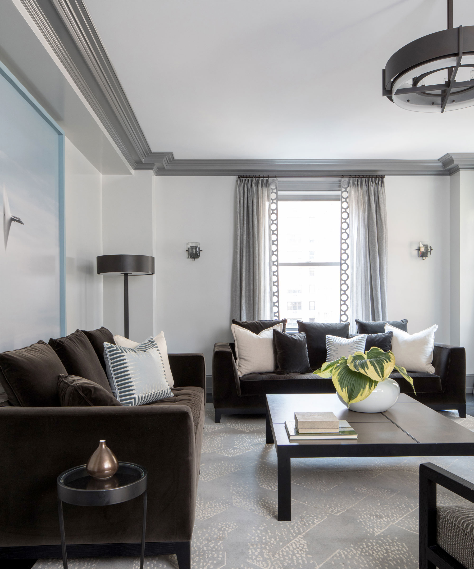
The article discusses Kris Jenner's living room, which features an unexpected but visually appealing color combination of blue, brown, and yellow. This color scheme, initially perceived as potentially unappealing, is presented as surprisingly chic and cozy, demonstrating how seemingly disparate colors can work harmoniously within a well-designed space.
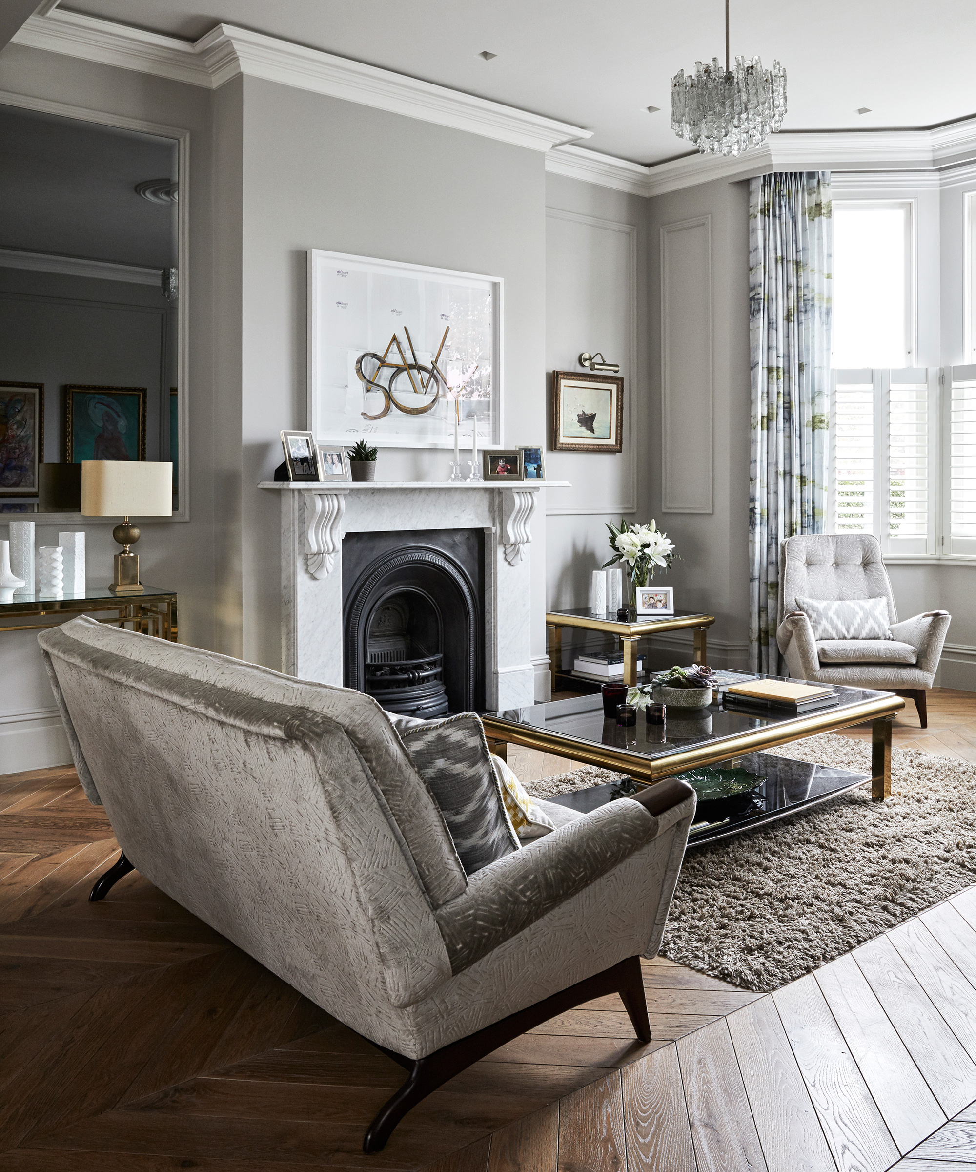
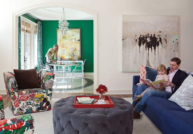
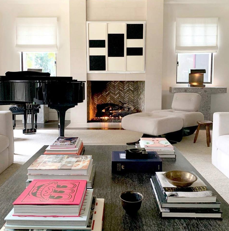
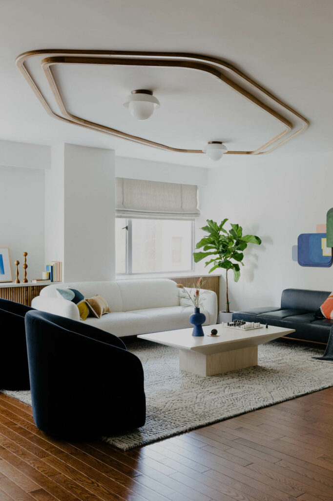
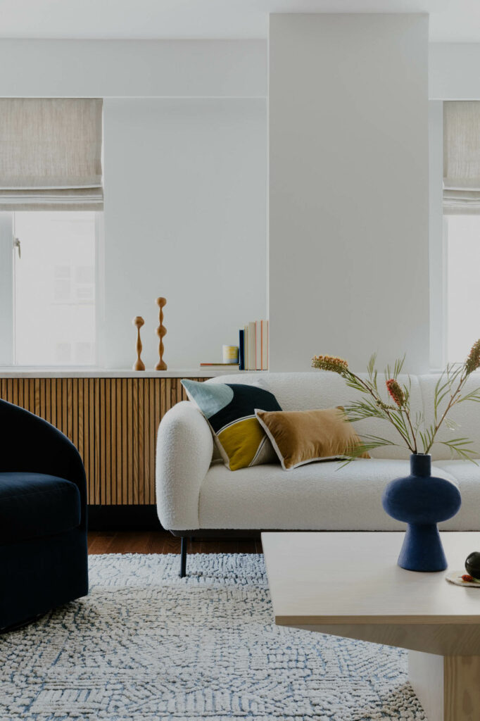
The core of the living room's design is a chocolate brown velvet sofa, accented with silver and brown cushions, creating a luxurious and tactile foundation. Taupe curtains complement the sofa and provide a neutral backdrop, preventing the space from becoming visually overwhelming. A white coffee table is strategically used to introduce brightness and contrast, and is adorned with large blue and yellow books, serving as subtle yet impactful color accents. The integration of a painting featuring yellow, blue, brown, and green hues acts as a unifying element, bringing all the colors together cohesively.
The success of this unusual color combination is attributed to several design principles. Firstly, the skillful incorporation of diverse textures plays a crucial role. The velvet sofa, metallic cushions, matte walls, and silky curtains contribute to an opulent and warm ambiance, making the space feel inviting and comfortable. This layering of textures adds depth and sophistication, allowing the colors to interact in a more nuanced way rather than clashing.
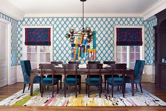
Secondly, the use of accessories is highlighted as a key factor. Instead of employing large, bold swaths of each color, which could lead to a 'clownish' appearance, Kris Jenner uses small 'pops' of color through items like coffee table books. This approach allows for artful mixing, where bright shades are introduced in controlled and deliberate ways, contributing to a planned, eclectic energy. The selection of decorative items is intentional, enhancing the overall aesthetic without overpowering the main color scheme.
Finally, the article emphasizes the importance of a largely neutral base. The cream walls and white coffee table provide essential brightness and create visual separation between the more dominant blocks of color. This neutral foundation ensures that the blue, brown, and yellow elements stand out as carefully chosen accents rather than overwhelming the space. The strategic use of neutrals prevents the living room from feeling chaotic and instead fosters a balanced and sophisticated atmosphere.
This analysis of Kris Jenner's living room demonstrates that unconventional color pairings can be highly effective when executed with careful consideration of texture, strategic use of accents, and a grounding neutral palette. The design challenges the notion that certain colors are inherently incompatible, proving that thoughtful integration can yield surprisingly chic and cozy results, encouraging readers to explore less traditional color schemes in their own homes.
#KrisJenner #LivingRoomDesign #ColorCombination #InteriorDesign #CelebrityHomes #HomeDecor #TextureMixing #NeutralPalette #AccentColors #KrisJenner #LivingRoomDesign #ColorCombination #InteriorDesign #CelebrityHomes #HomeDecor #TextureMixing #NeutralPalette #AccentColors
0 comment in total
 No comments yet
You may also like

Kylie Jenner's tonal gray family room is a lesson in layering


Jennifer Aniston bases her living room around this risky hue

Inside Kris Jenner's ultra-modern mega-mansions with boyfriend Corey Gamble


Kourtney Kardashian shows how to style oversized furniture in a small living room – designers say it’s genius
Living In Color


Kris Jenner's black-and-white kitchen reinvents minimalism with a chic, textural spin

Robert Downey Jr.'s bedroom pays homage to the world's favorite color – and it is still trending for 2024
Eclecticism rules in couple’s ochre apartment


Chrissy Teigen's open-plan living space features our favorite color trend of 2023, and designers adore its subtle simplicity

Kris Jenner's living room mixes 3 colors I never thought I'd see together – but the rare combination is shockingly chic and cozy
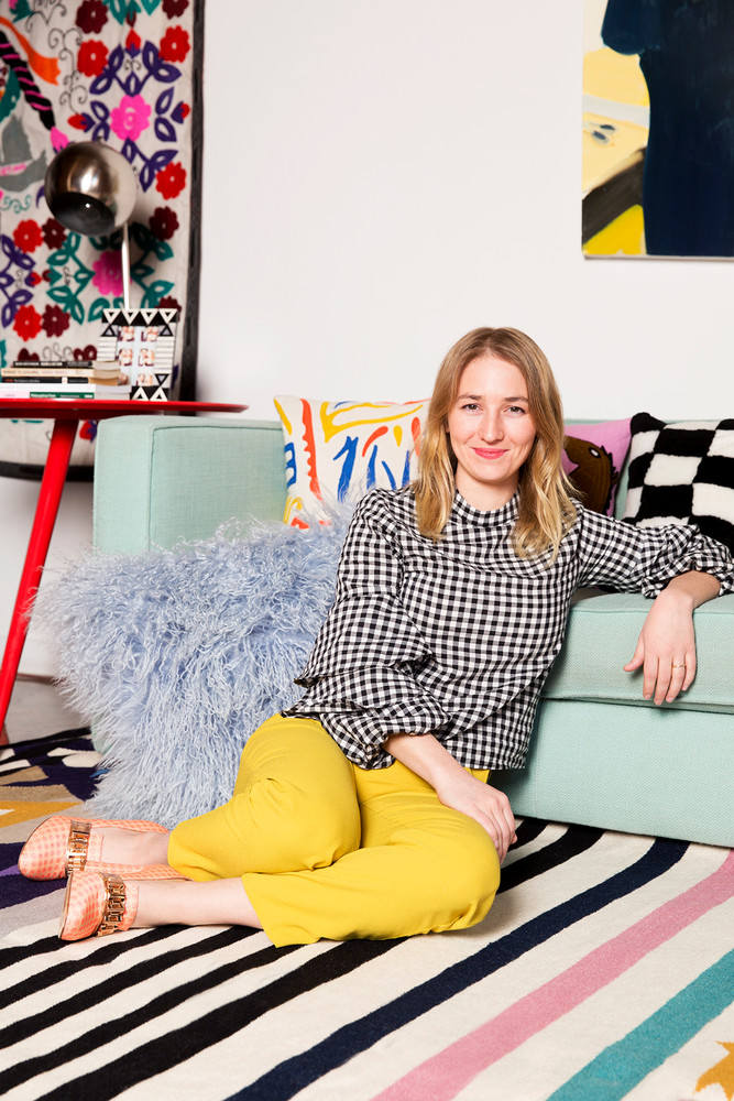
Color, Pattern, and Texture Rule in This Brooklyn Home

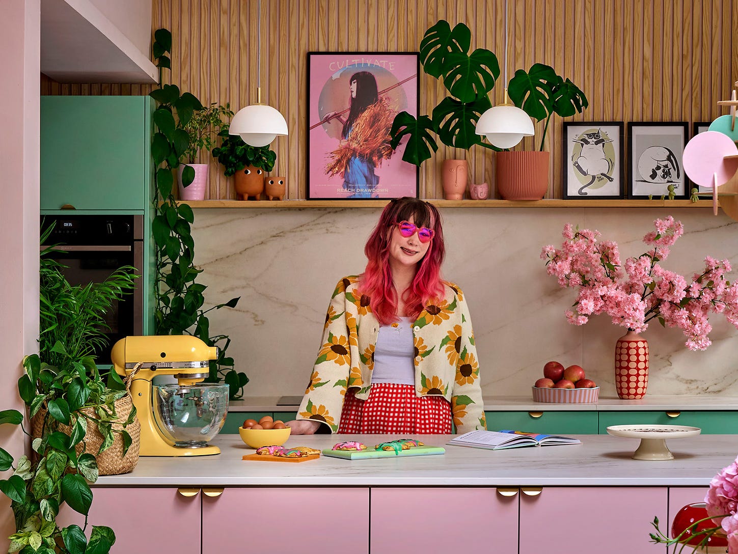
Bake Off star Kim-Joy Hewlett's vibrant Leeds home is like an edible wonderland with quirky DIY charm

Kris Jenner's living room mixes 3 colors I never thought I'd see together – but the rare combination is shockingly chic and cozy


8 reasons why Kourtney Kardashian is the most stylish home decorator
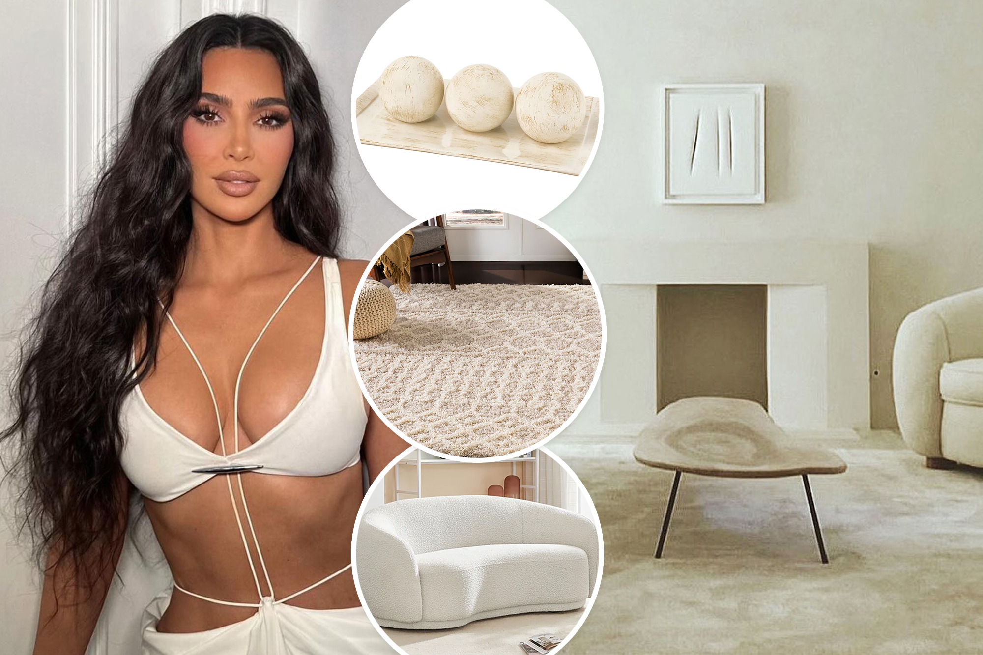
Ending tonight — These Wayfair Way Day finds fit right in at Kim Kardashian’s $60M mansion
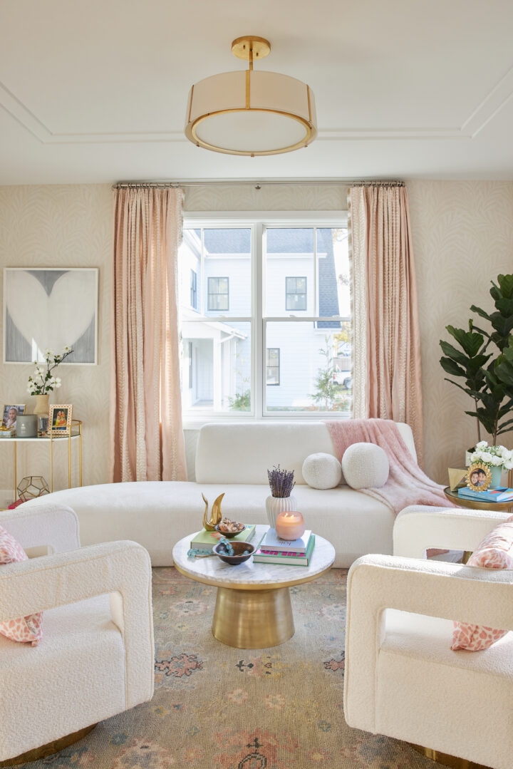
Formal Living Room Reveal
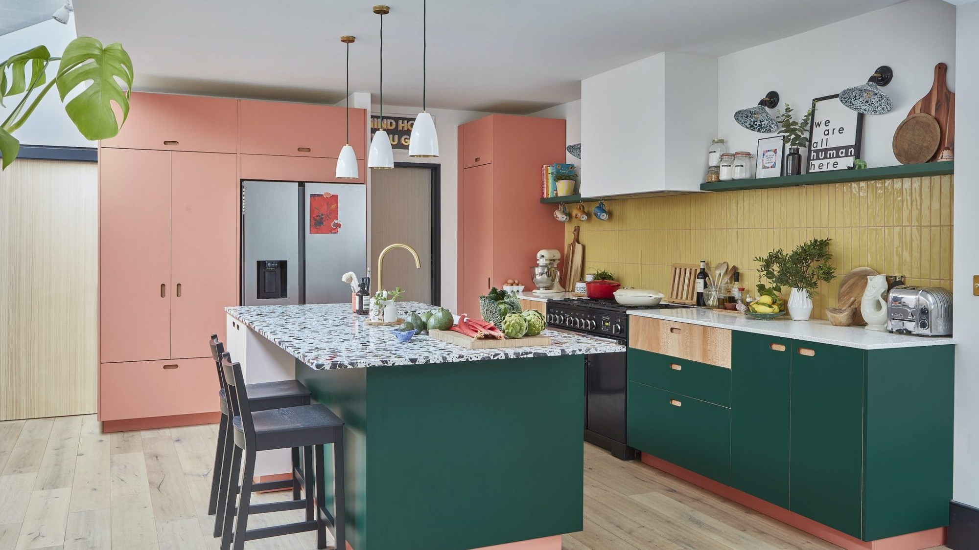
Rainbow colours have transformed a tired kitchen into a vibrant space
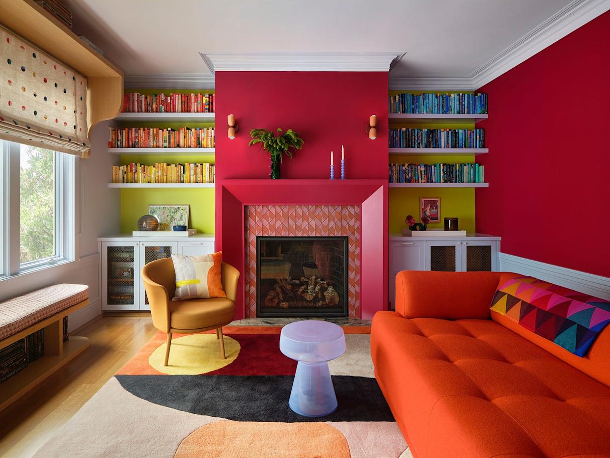
Vibrant “Personal Style” Inspired This Home’s PUNCHY Color Palette

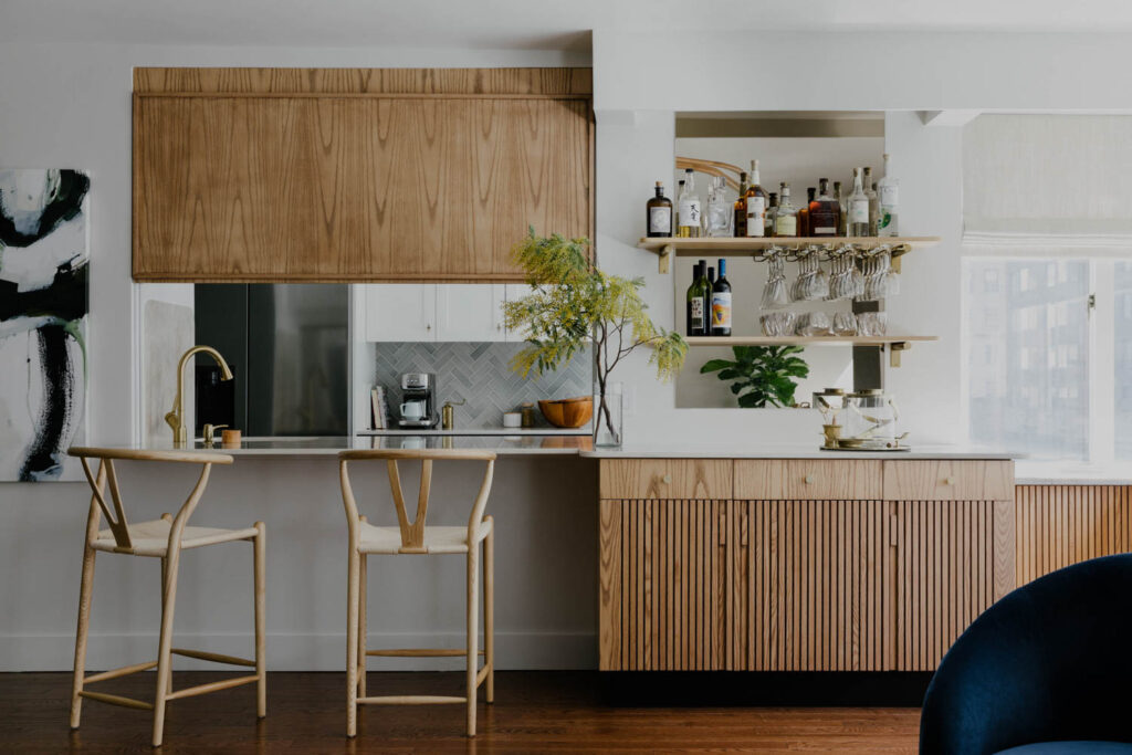
Playful Wallcoverings Enliven This Tranquil Manhattan Apartment

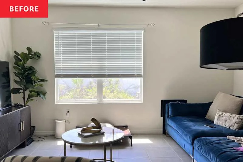
A “Builder Beige” Living Room Gets a Much More Interesting Color Story