1/4
The Bathroom Paint Color Trends of 2023 Revolve Around Contrast and Tranquility
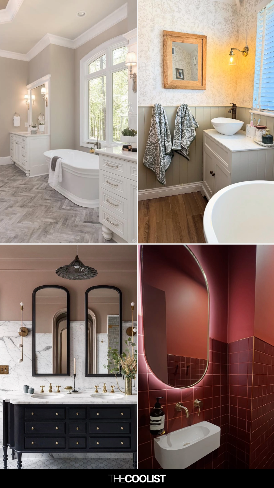
Updating a bathroom's paint is a practical and impactful way to refresh a home, offering an invigorating change without the extensive time and financial investment required for larger room renovations. Bathrooms, being smaller spaces, provide ample opportunities for personalization, allowing homeowners to experiment with bolder colors. Beyond walls, surfaces like cabinets, ceilings, and floors are suitable for incorporating new hues. Joa Studholme, color curator at Farrow & Ball, emphasizes the potential of bath panels, vanity units, and even ceilings for color integration, noting that the bathroom is a unique space where one might spend more time observing the ceiling.
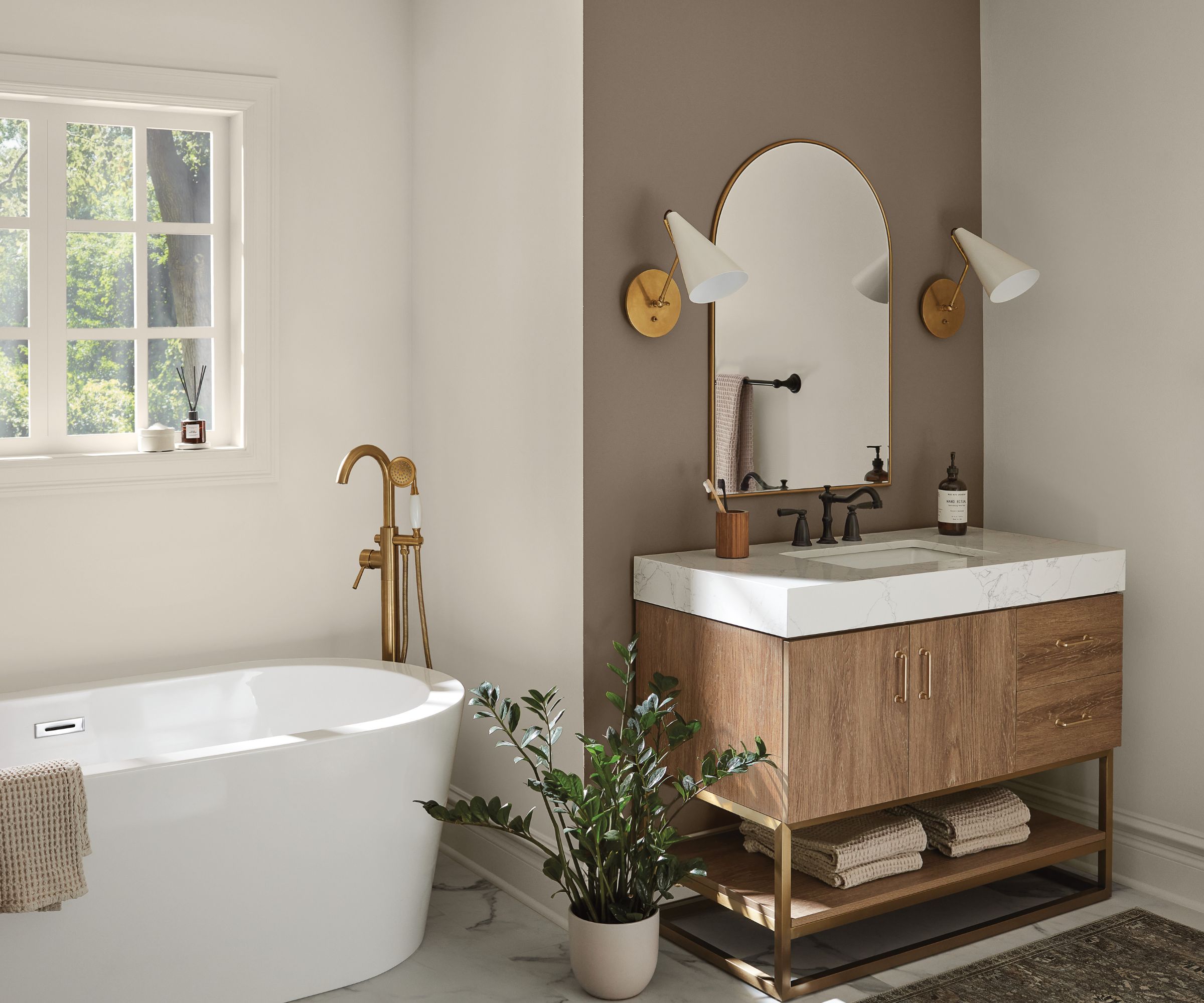
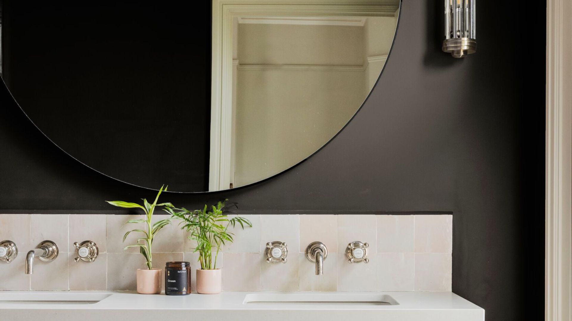
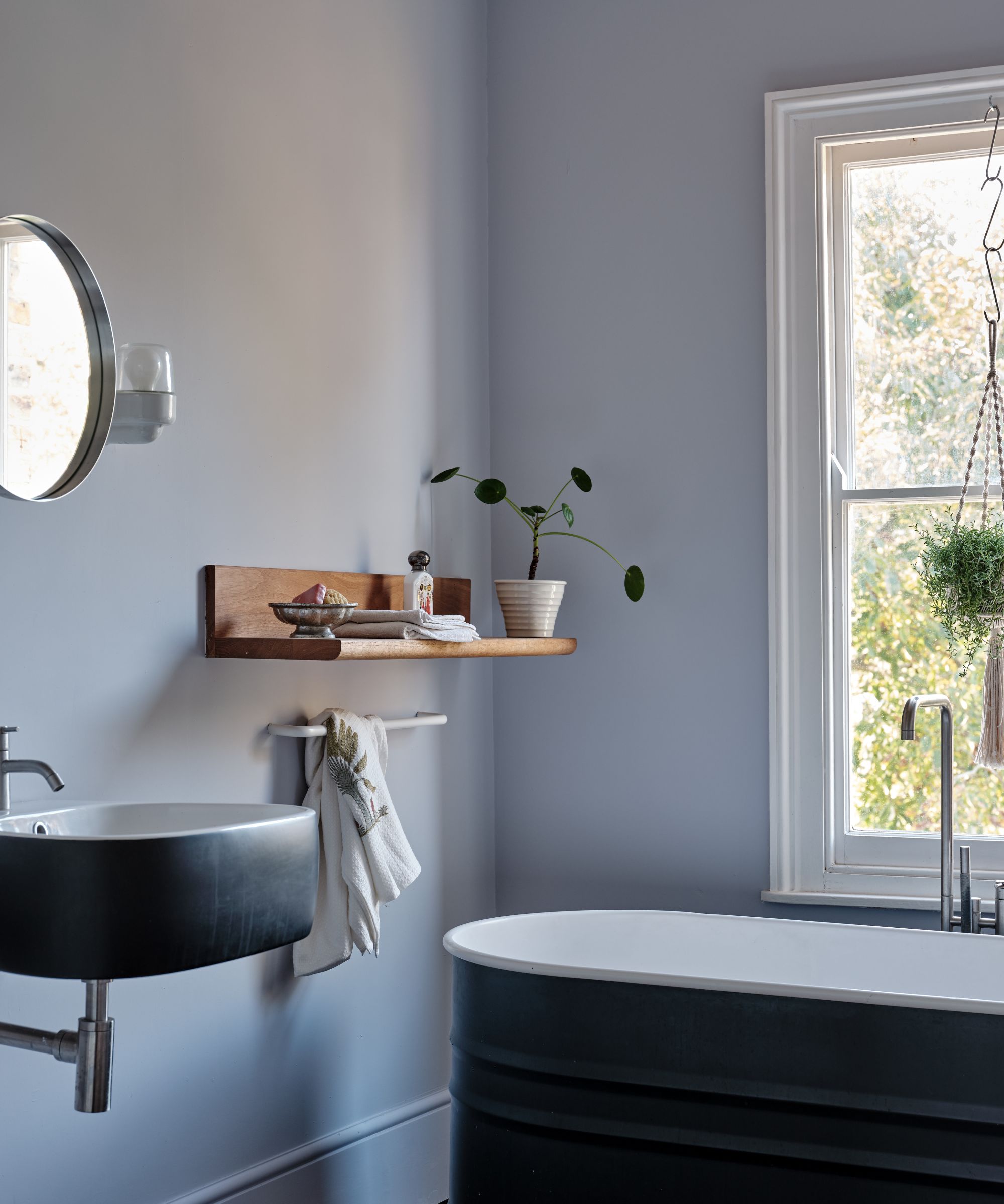
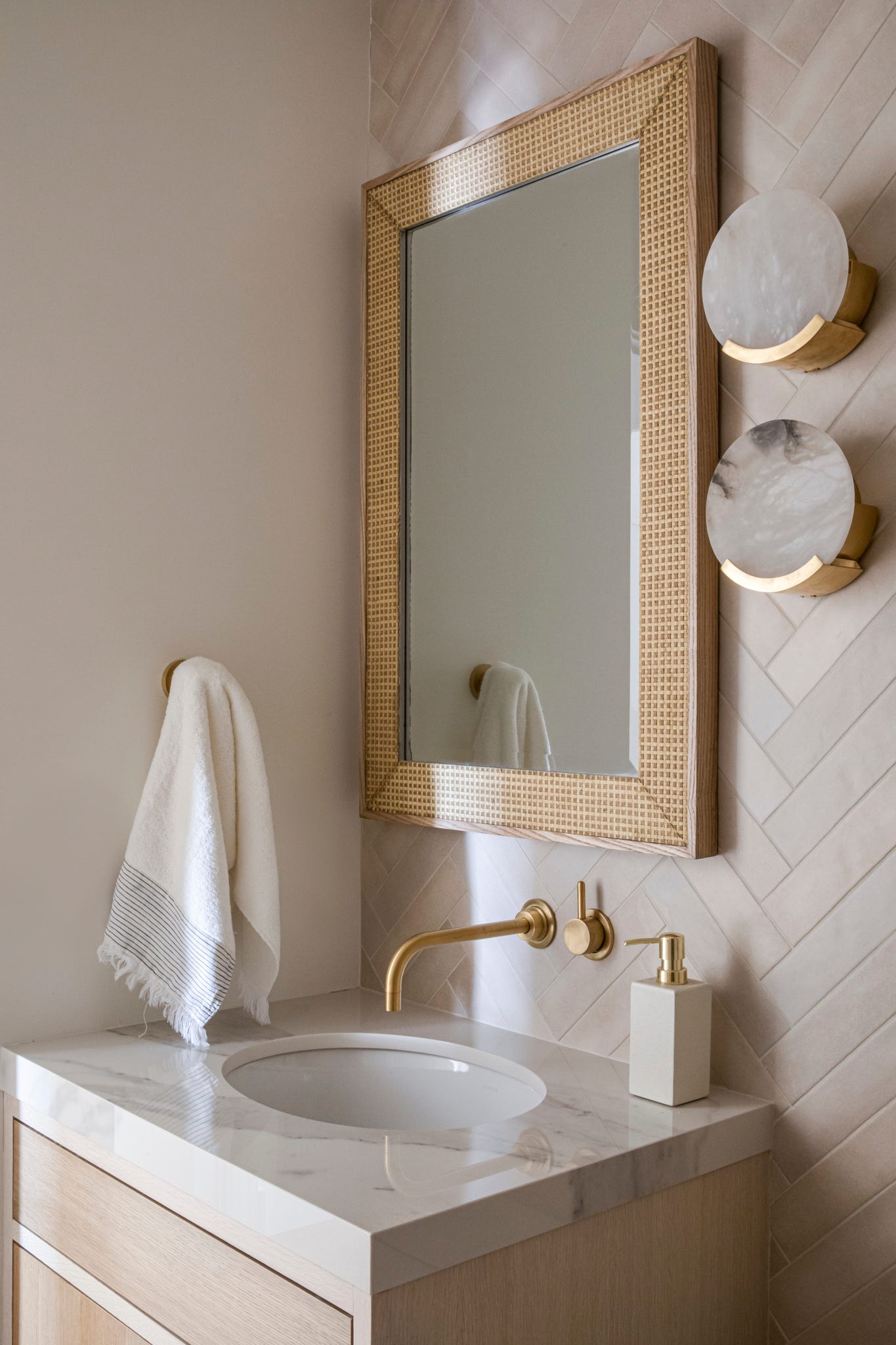
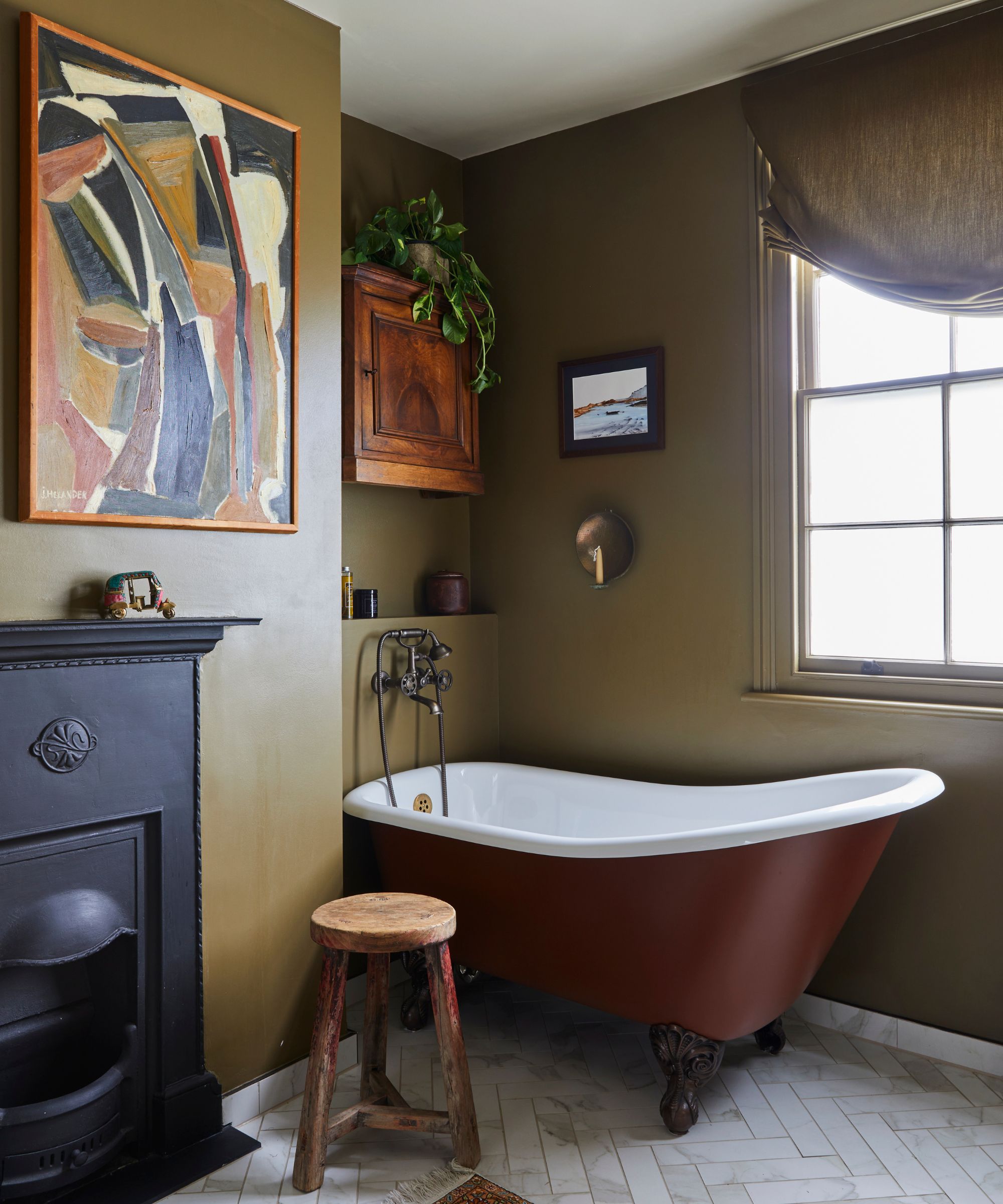
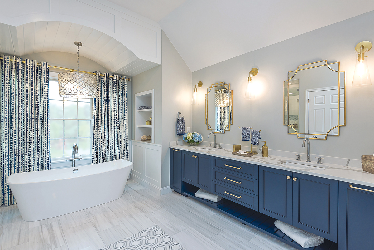
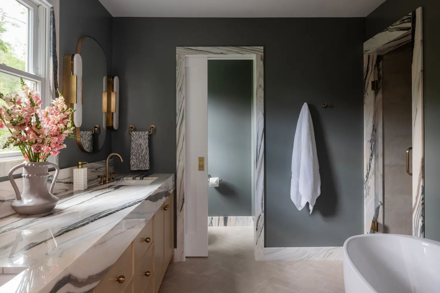
Color experts identify complex and moody blues as a significant trend for 2023. These shades, including rich midnight blue and dusky mid-range tones, are predicted to be more nuanced than past popular blues. Sue Kim, director of color marketing at Valspar, explains that blue tones encourage decompression and renewal, connecting to natural elements and highlighting water's healing properties. Specific recommendations include Valspar's Everglade Deck, a midnight blue for a restorative space, and Blue Arrow, a cooled-down blue with a yellow undertone that brings balance. To complement these moody blues, incorporating high-impact finishes like warm copper or brass accents, organic materials, and tone-on-tone palettes is suggested to achieve a simple, relaxed style.
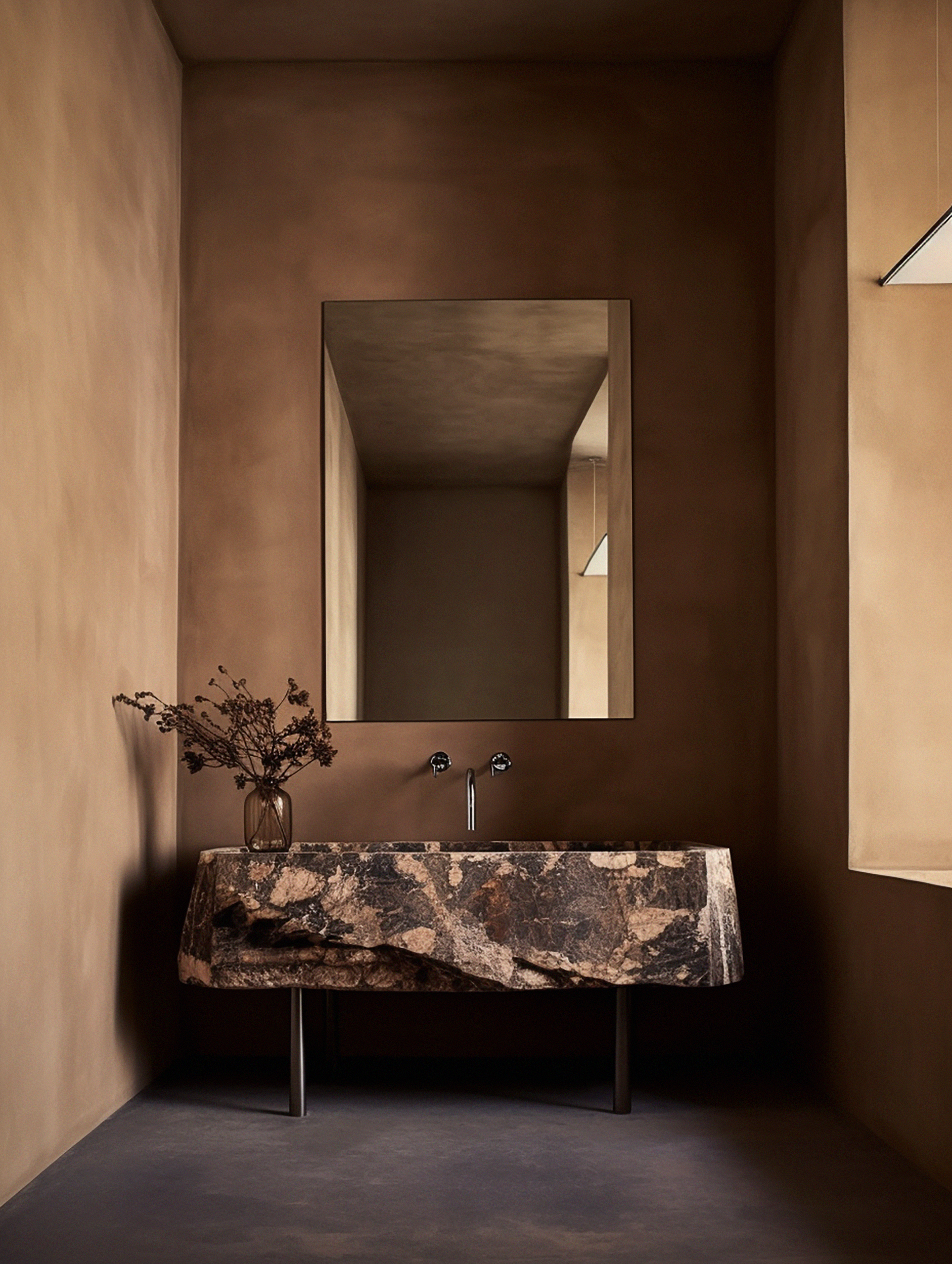
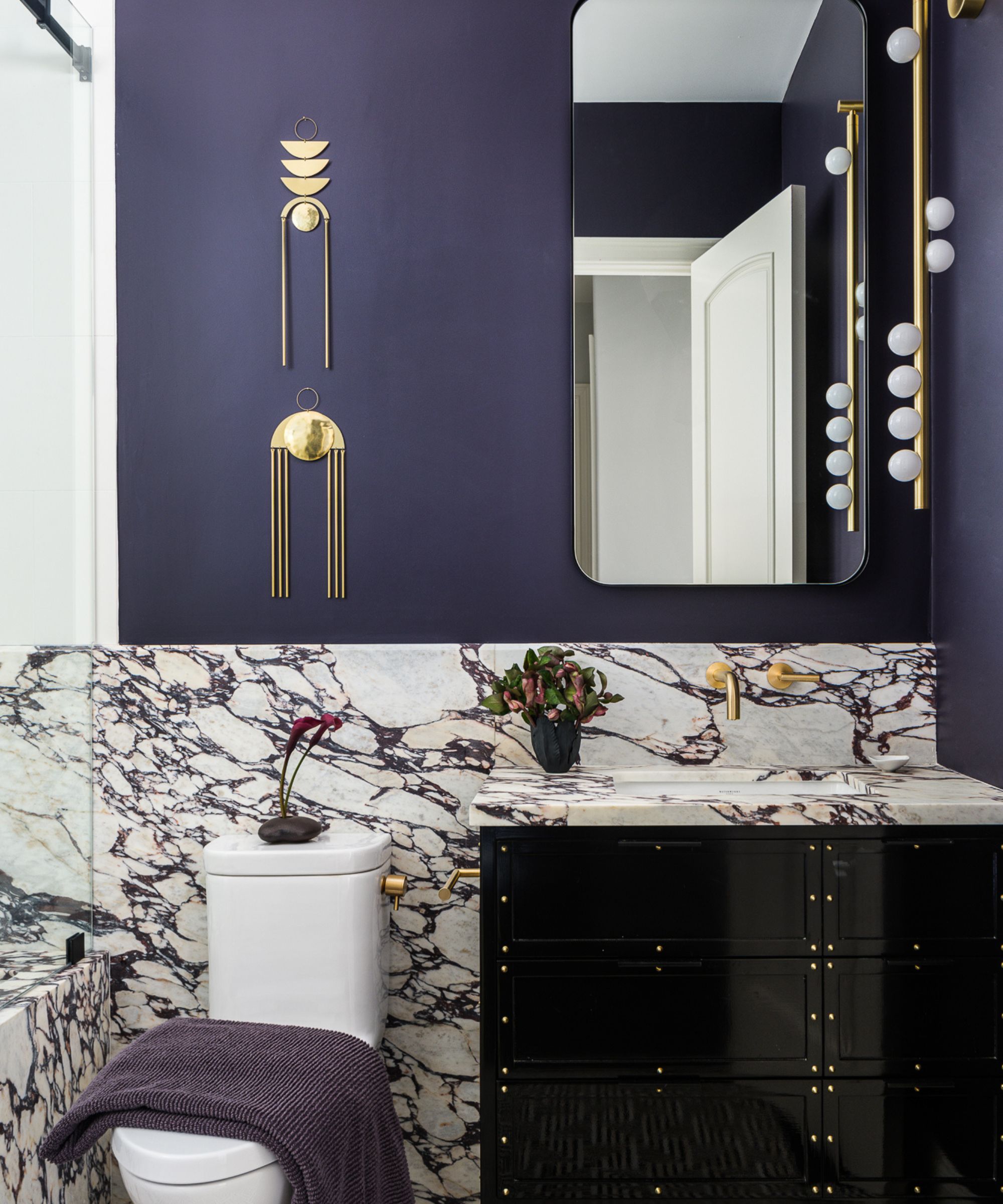
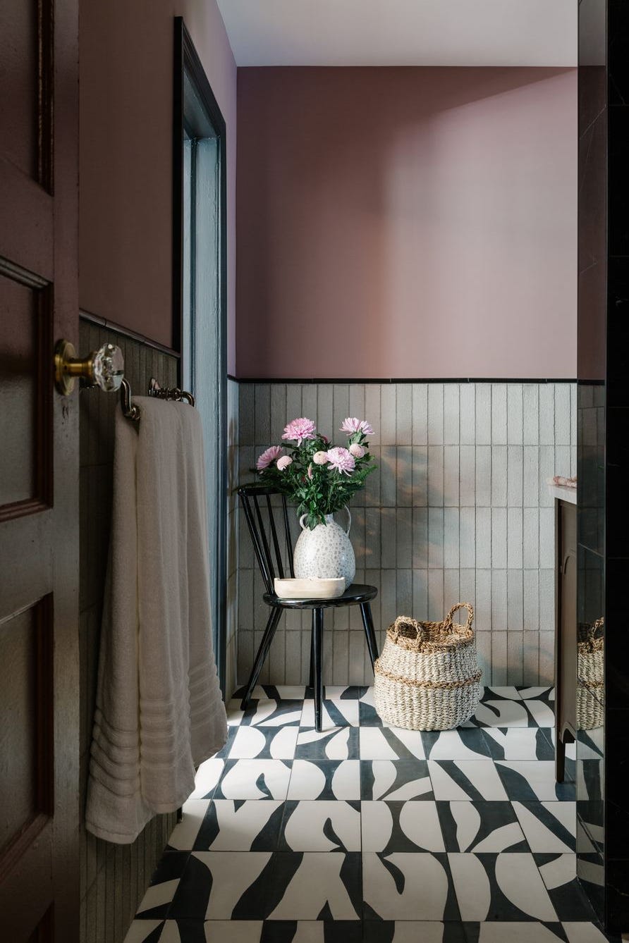
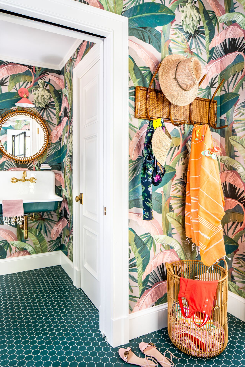
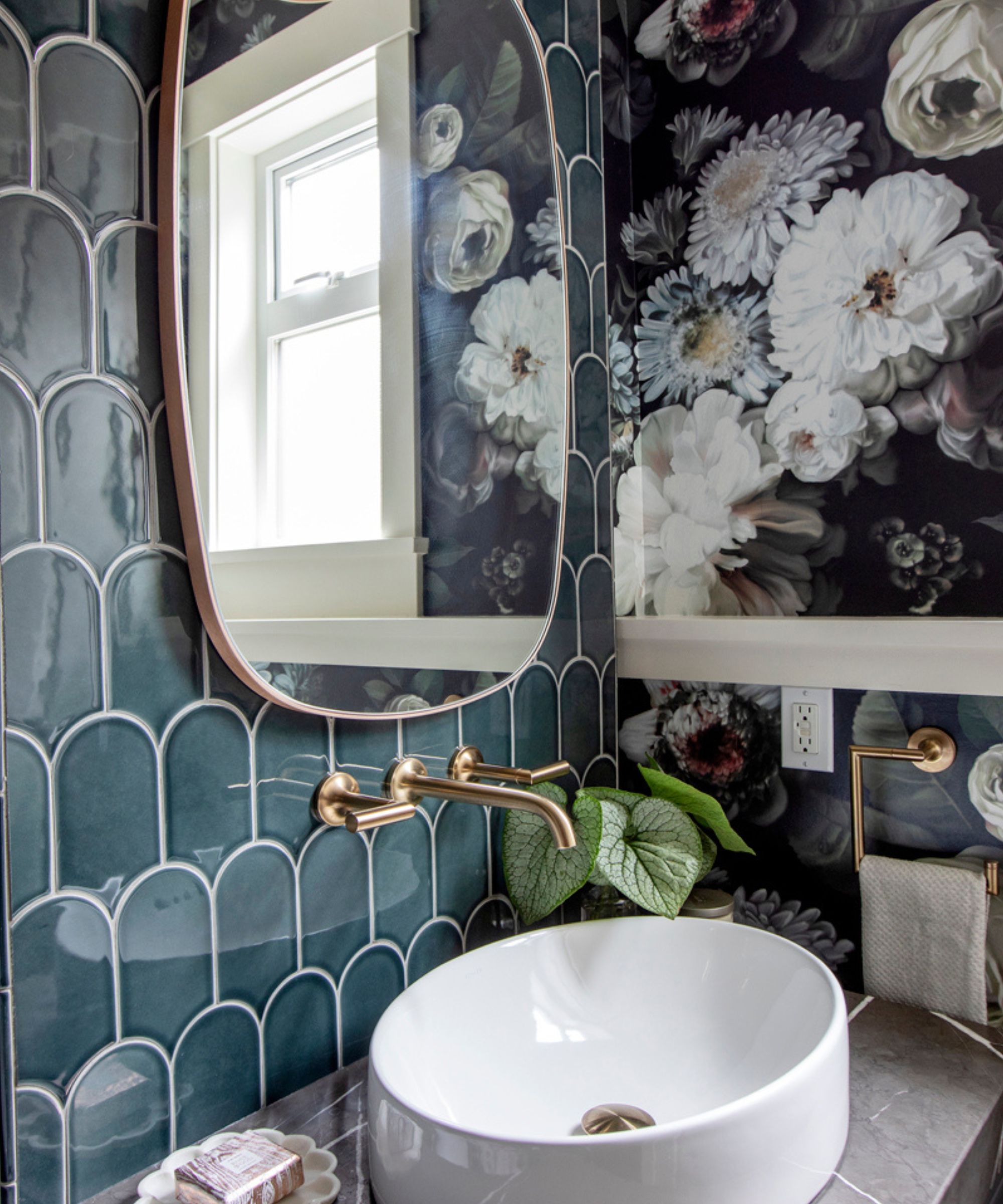
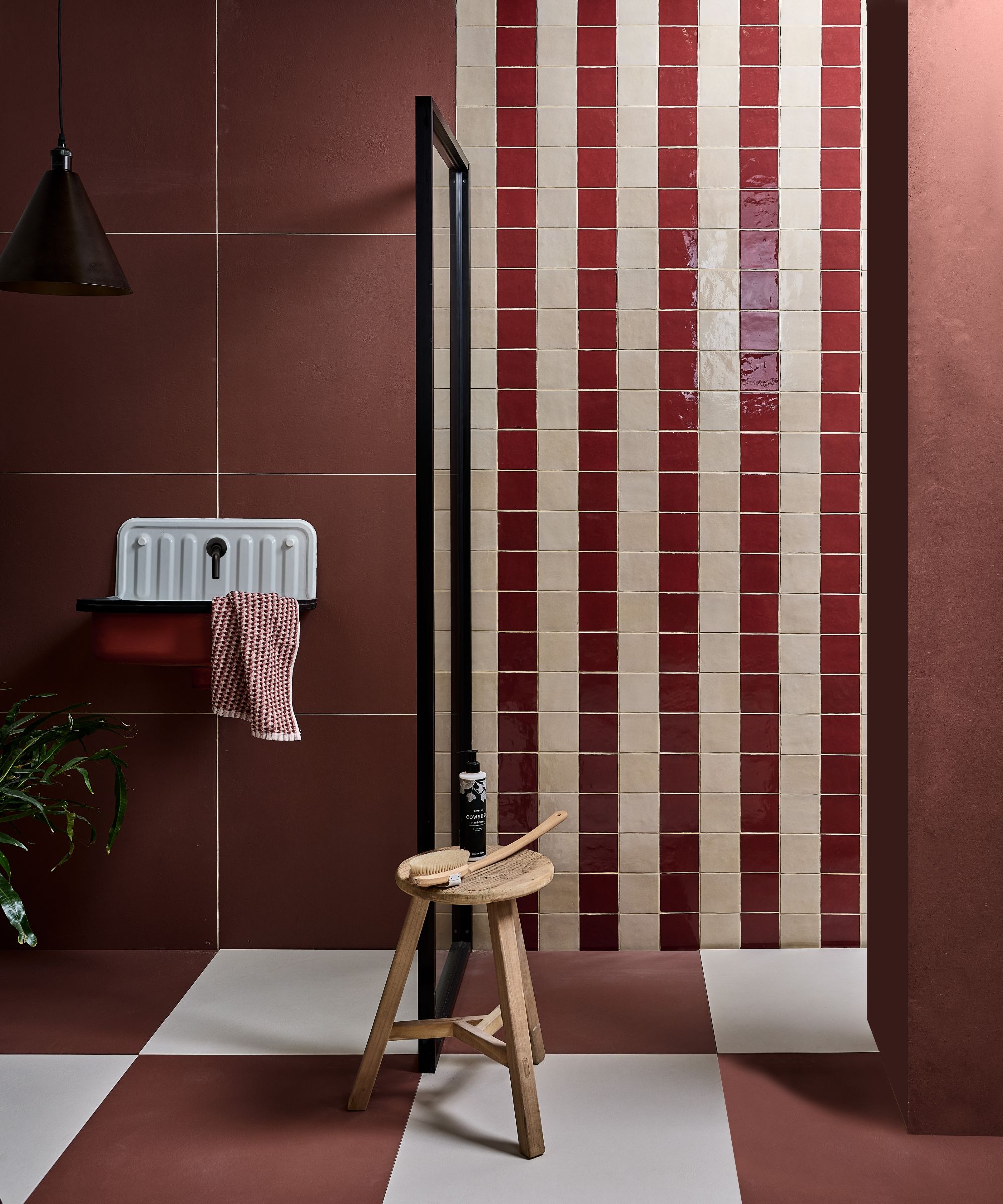
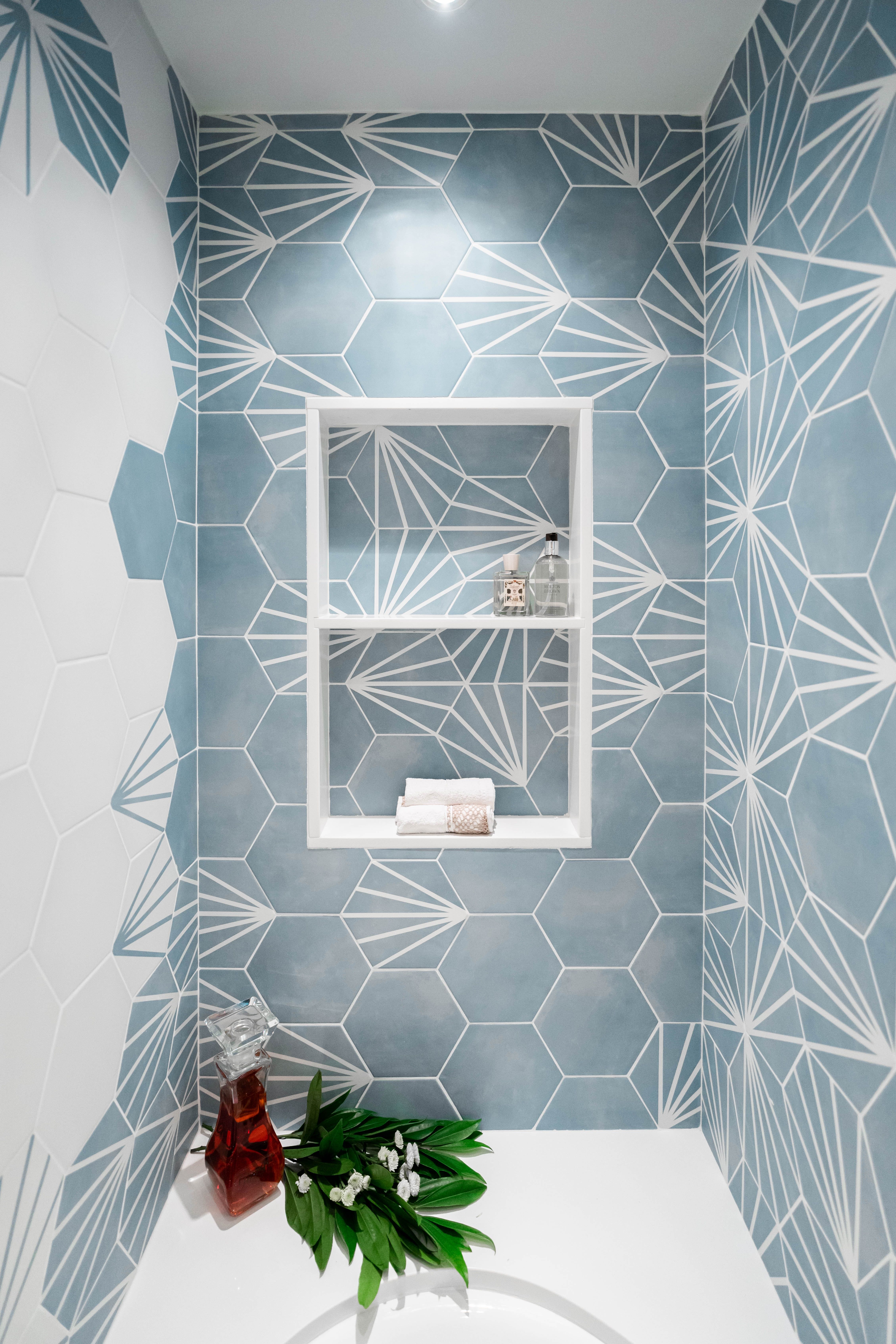
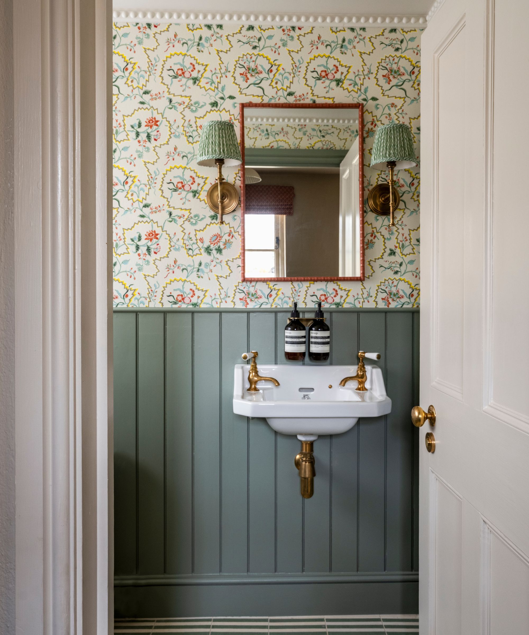
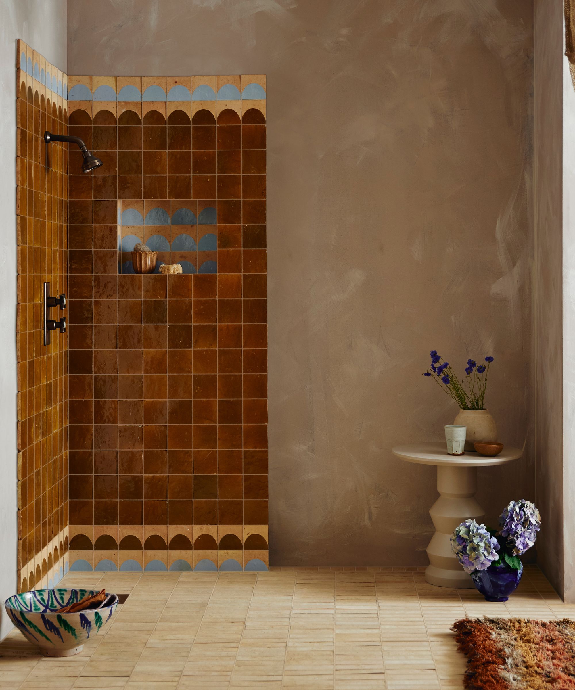
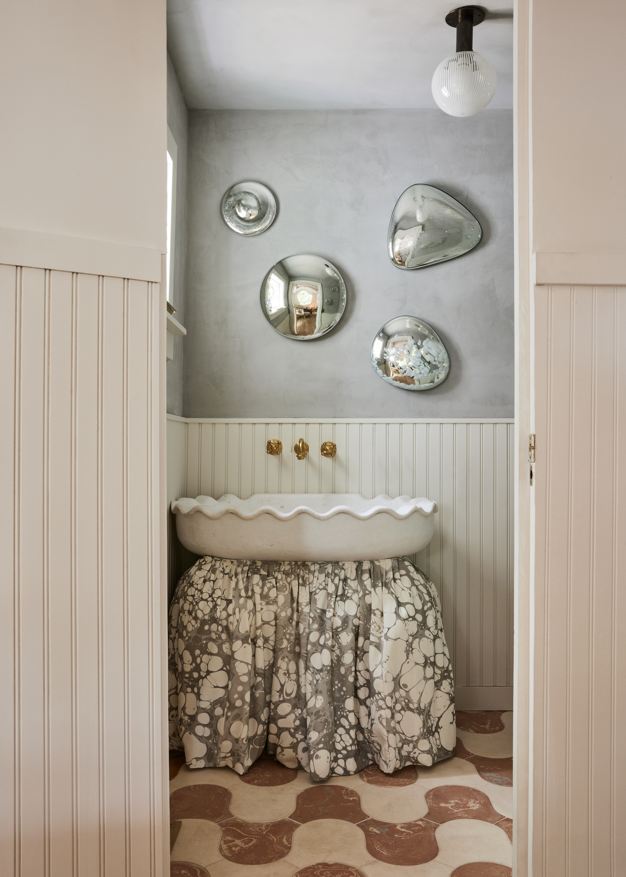
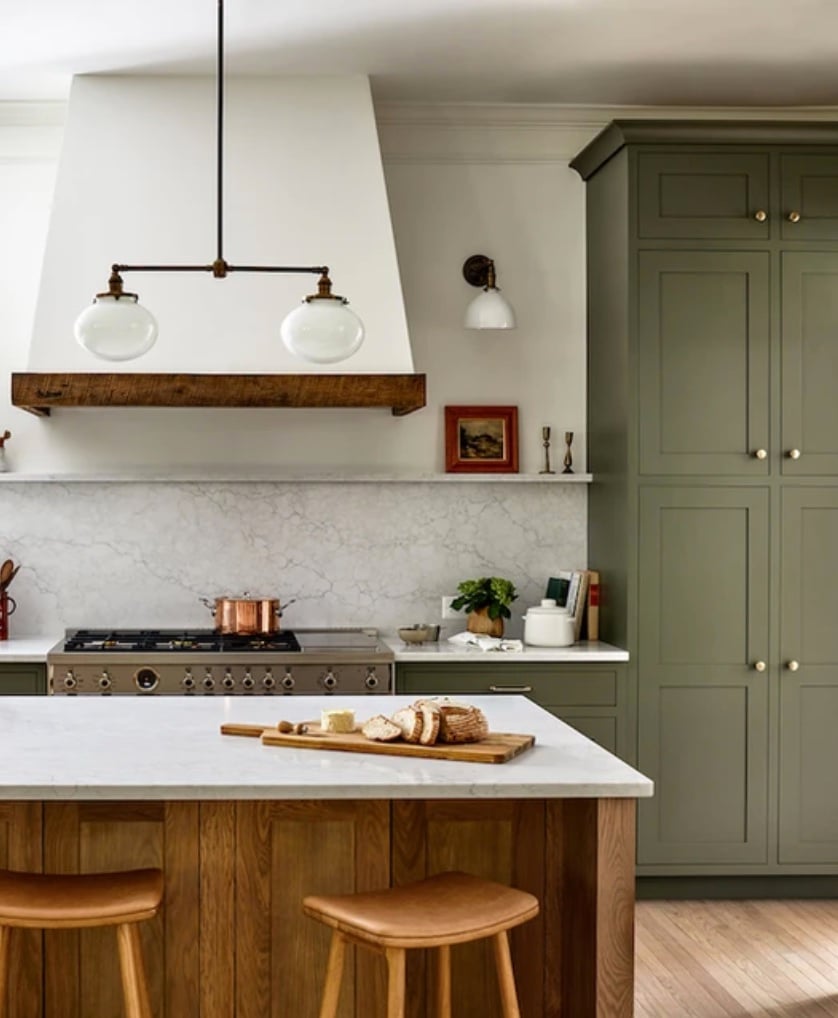
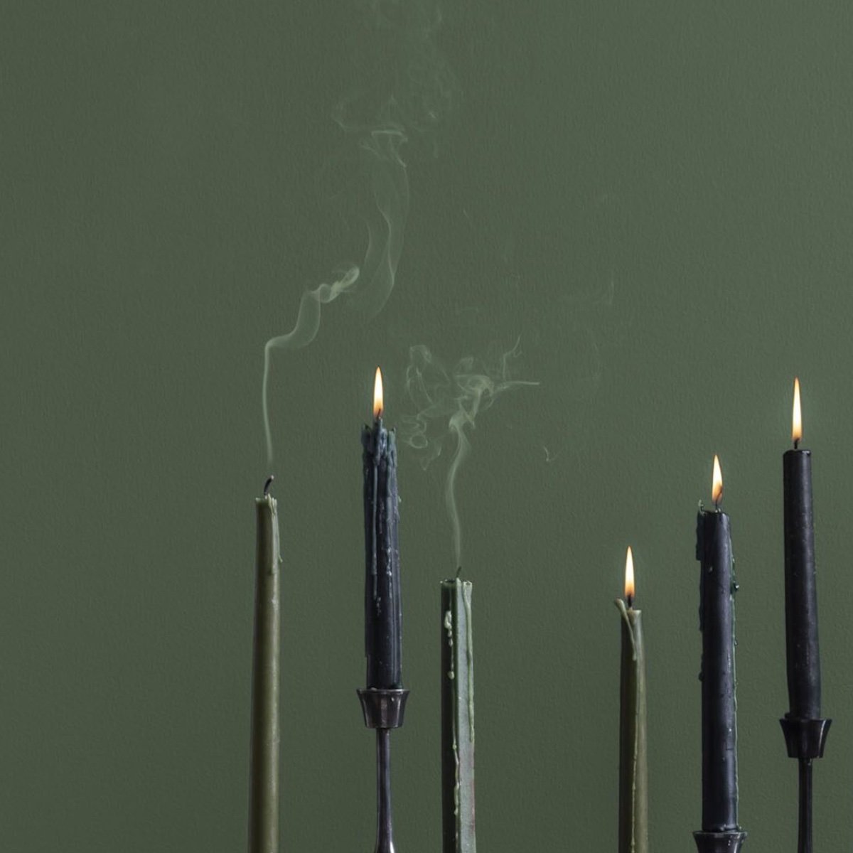
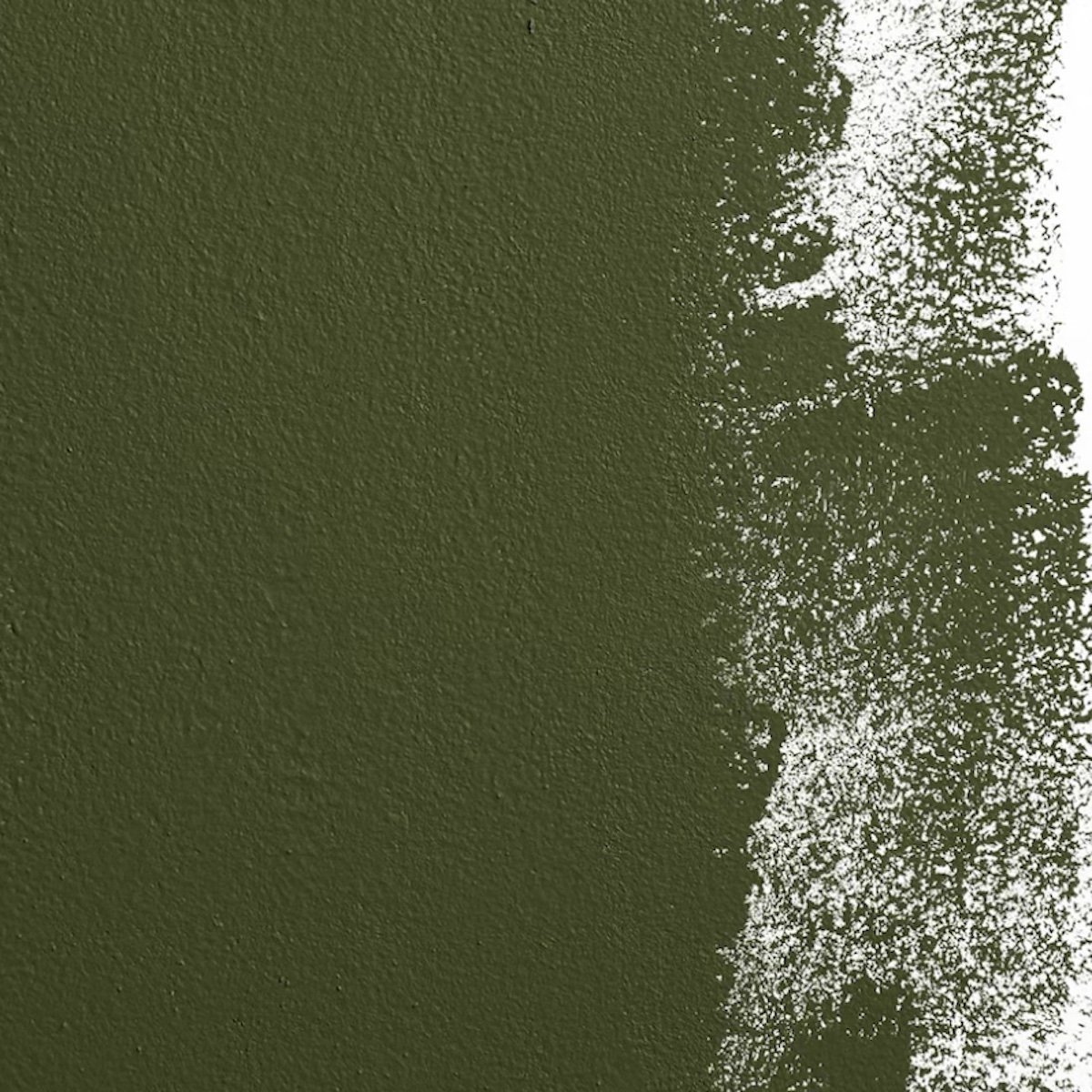
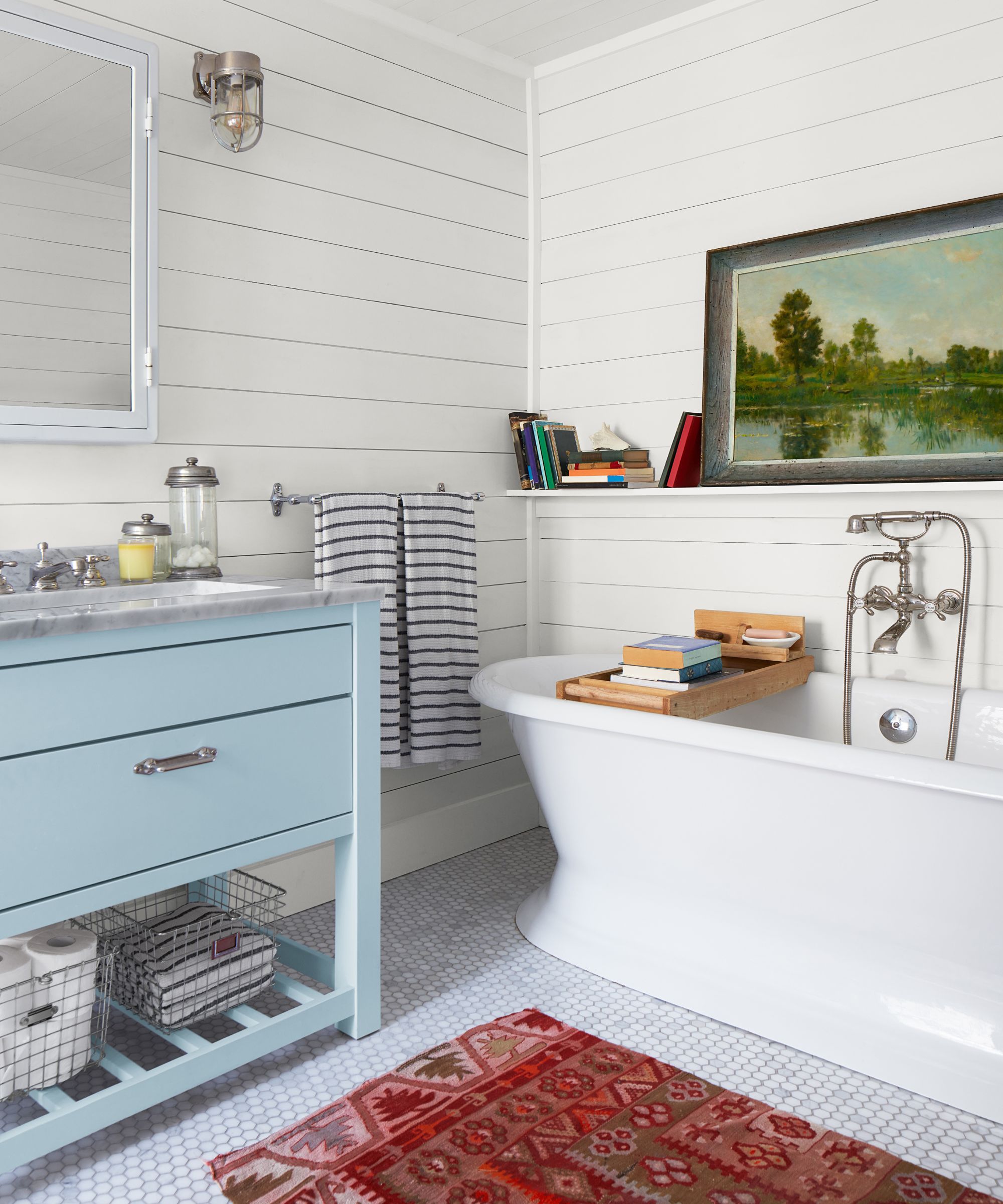
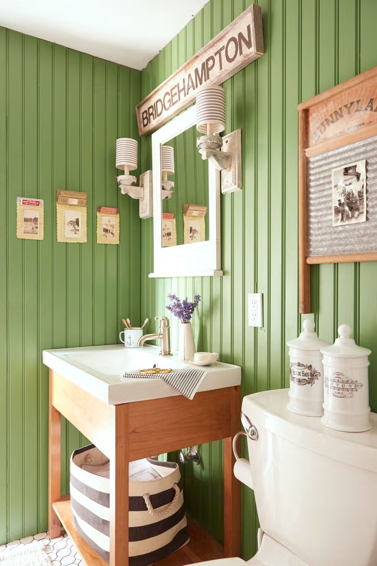
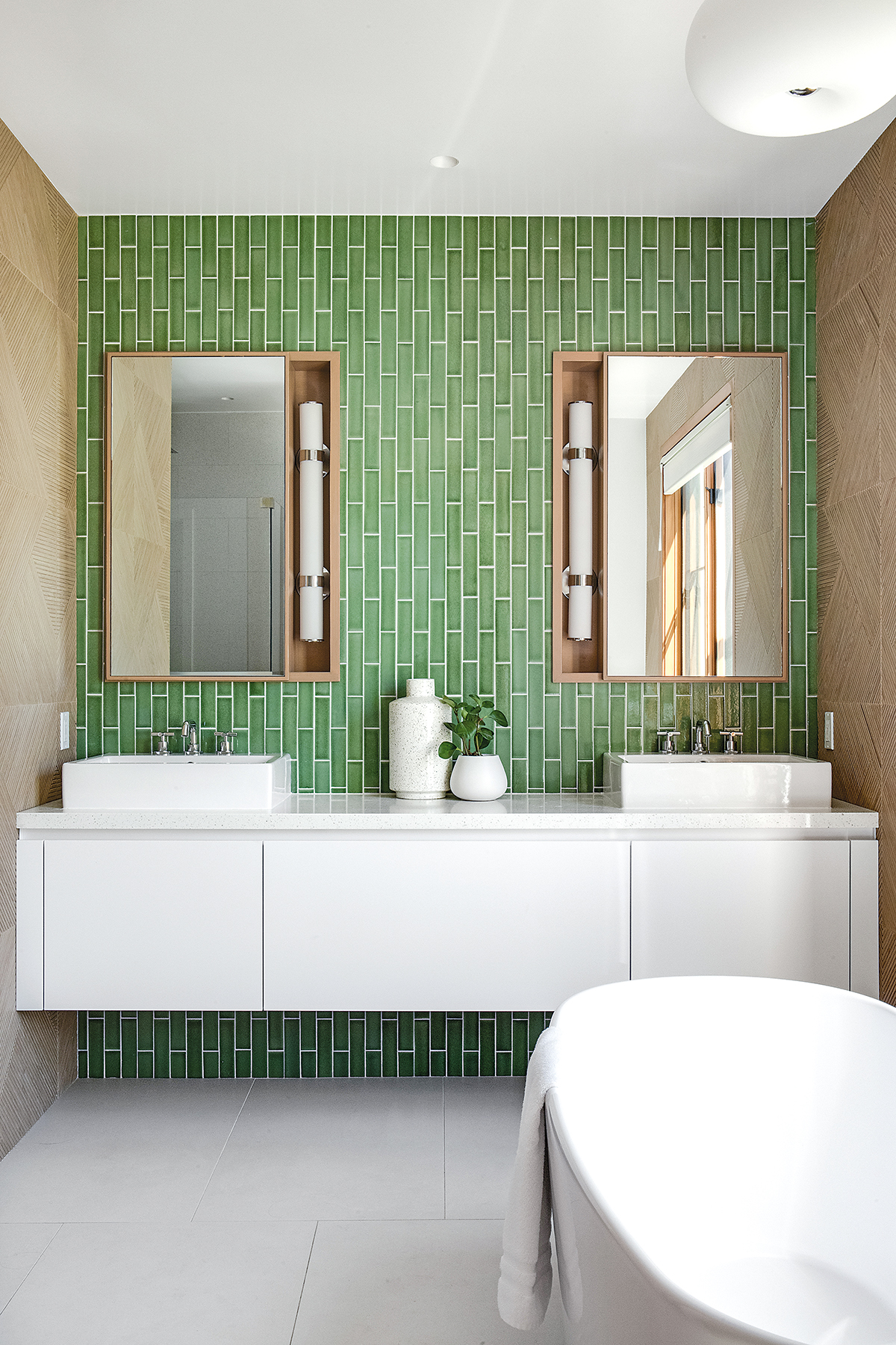
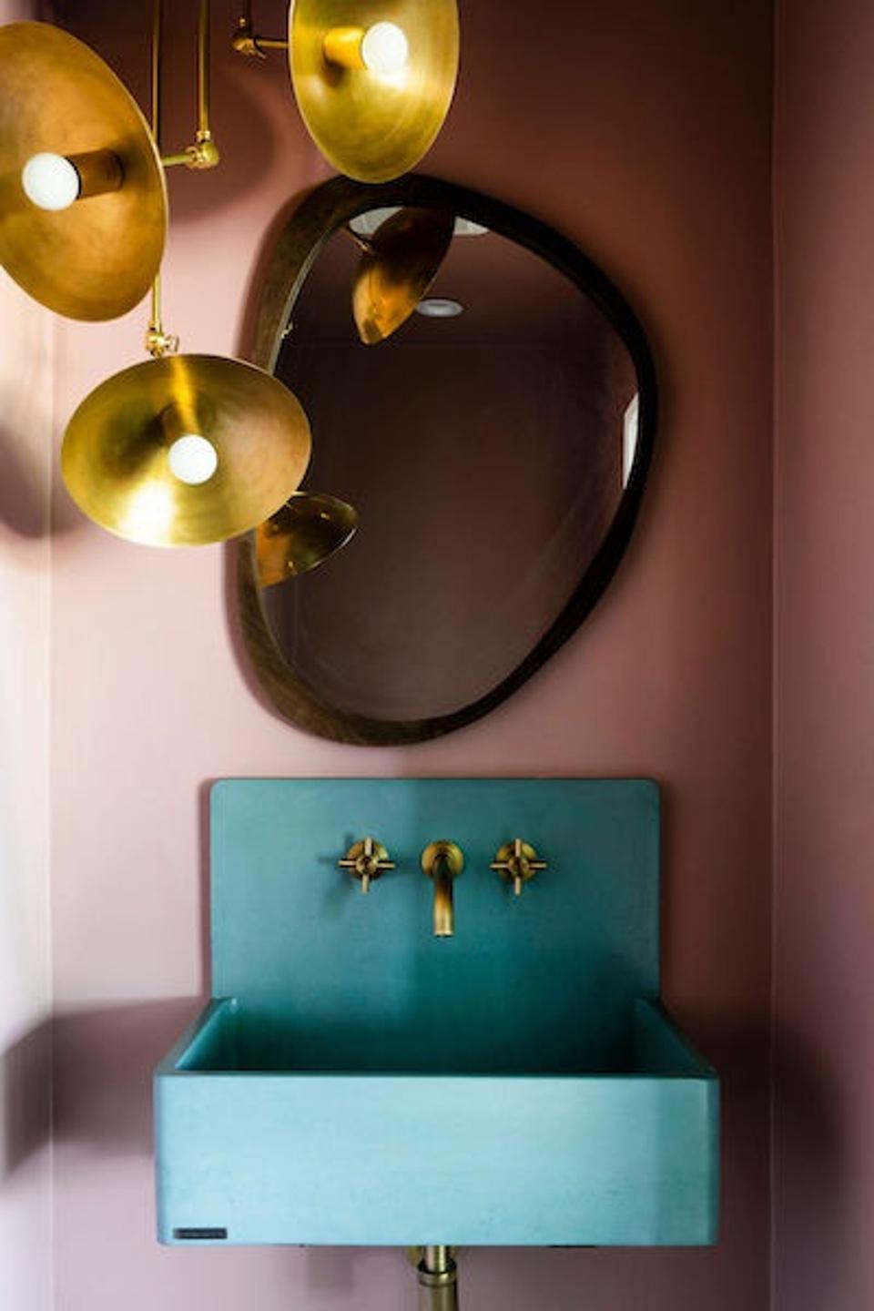
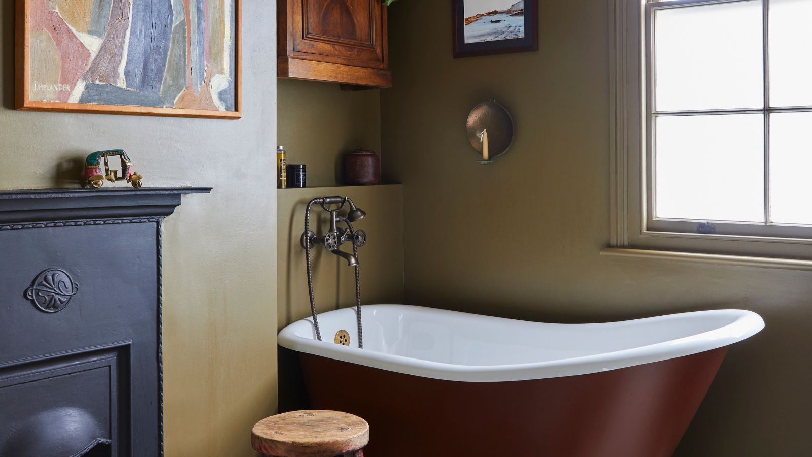
For homeowners seeking a more dramatic aesthetic in primary bathrooms or powder rooms, bold color contrasts are trending. This involves vibrant, earthy tones and eye-catching patterns. Studholme suggests combinations like the warm yellow of Babouche with the earthy Tanner's Brown for patterns on floors or bath panels. Tonal combinations, such as layering two shades of blue with a crisp neutral like beige or white, offer controlled contrast. Examples include Farrow & Ball's Kittiwake (a warm lake blue) on lower walls combined with All White and Wine Dark stripes. Rich shades are particularly effective in powder rooms, which can accommodate more adventurous aesthetics. Nicole Gibbbon, founder of Clare, points to olive-toned Dirty Martini and the rich moody green Current Mood as popular choices for these smaller, more experimental spaces.
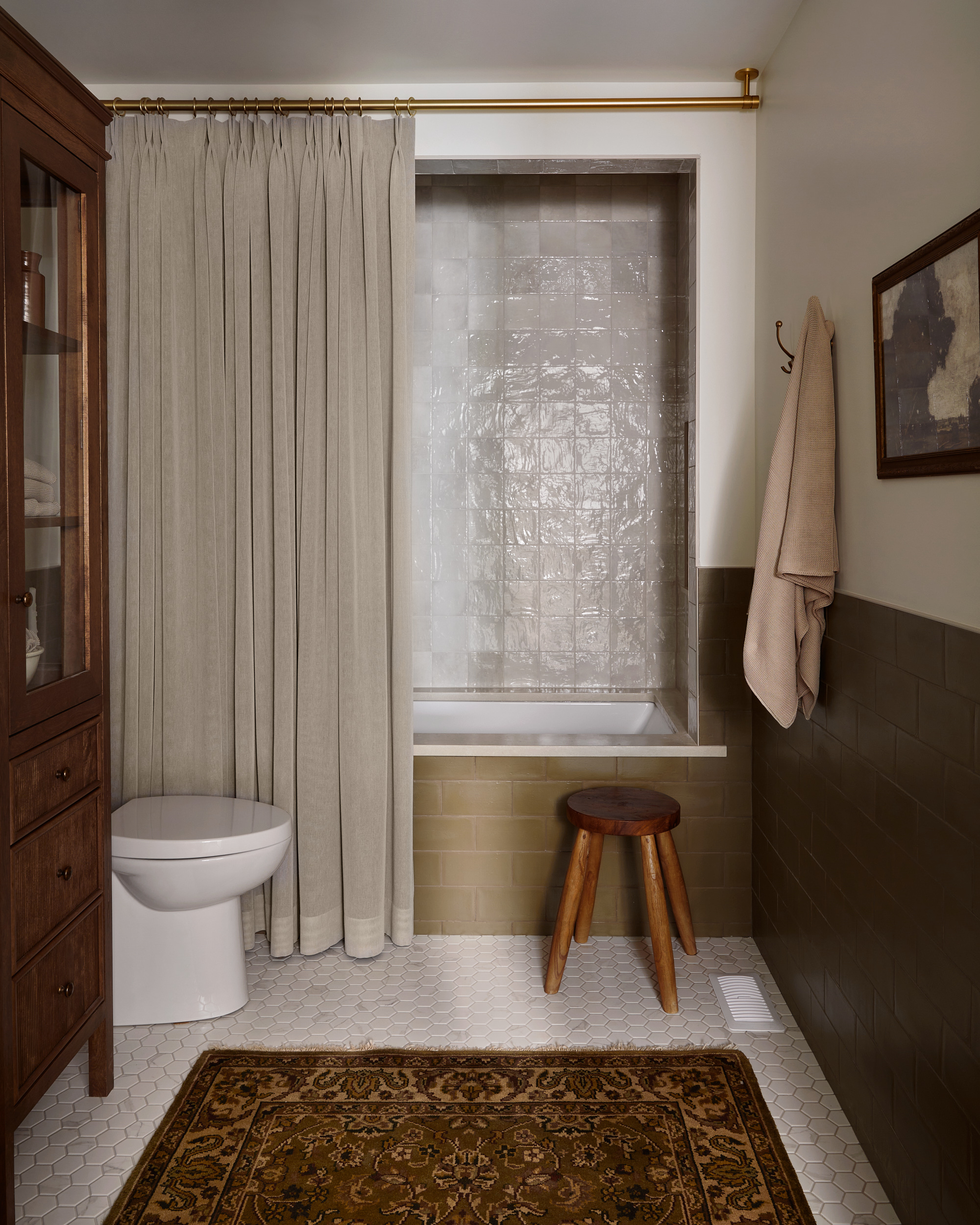
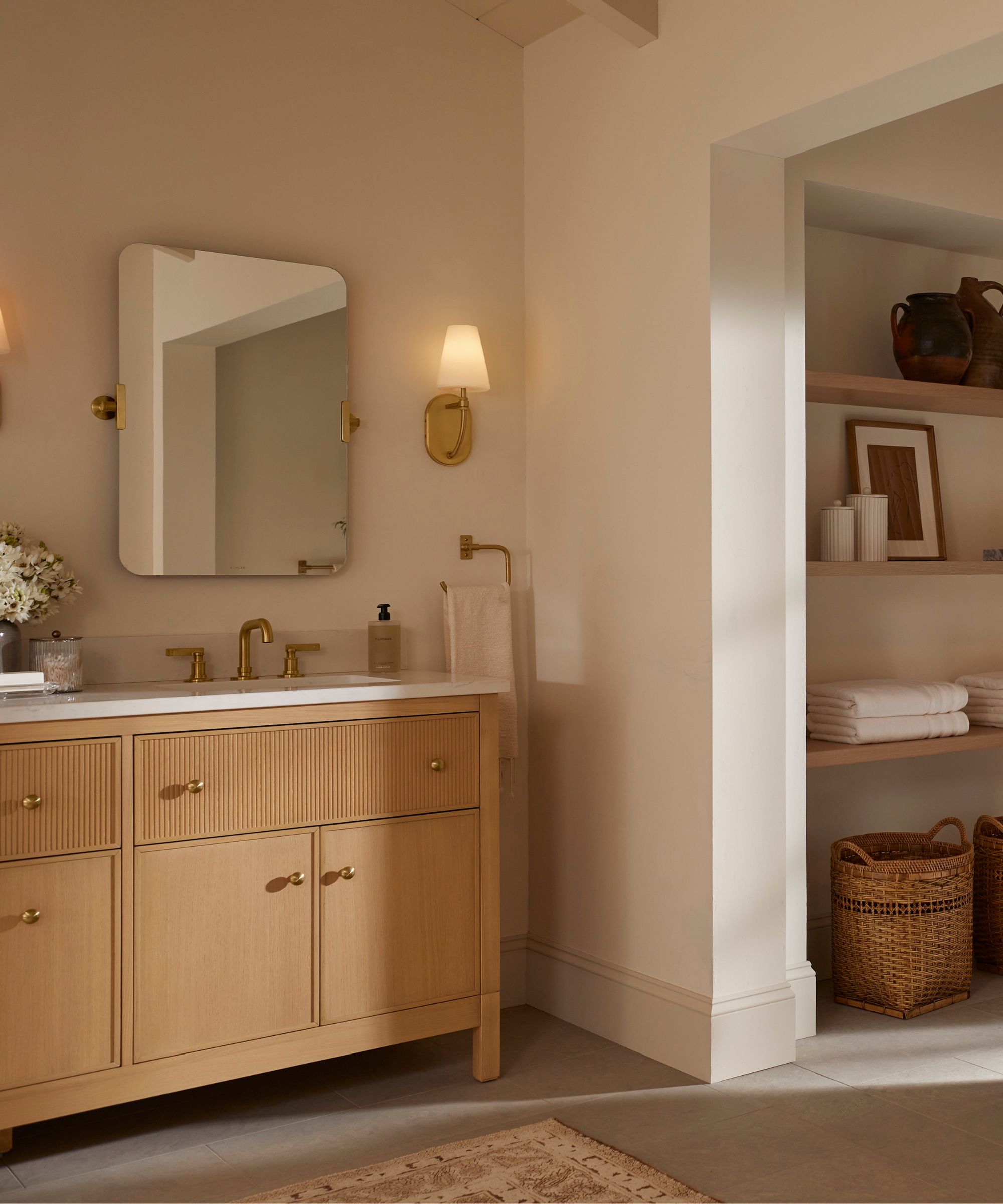
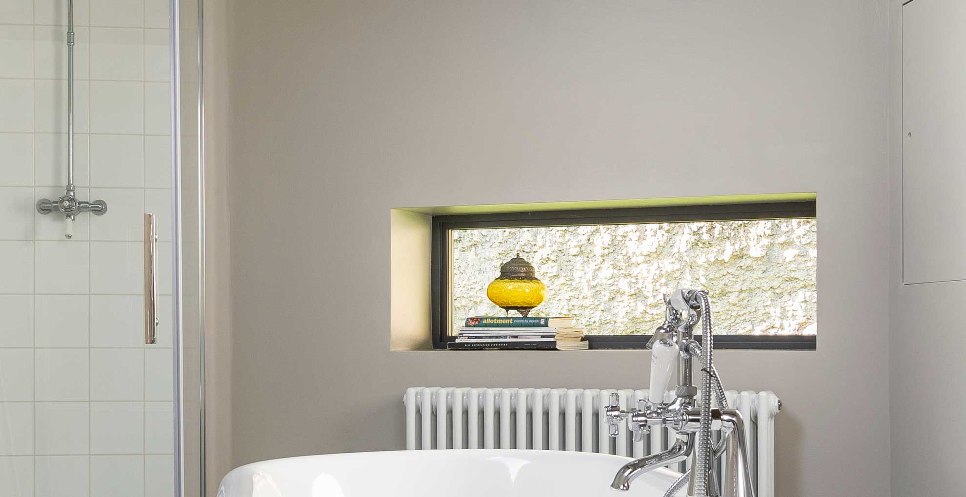
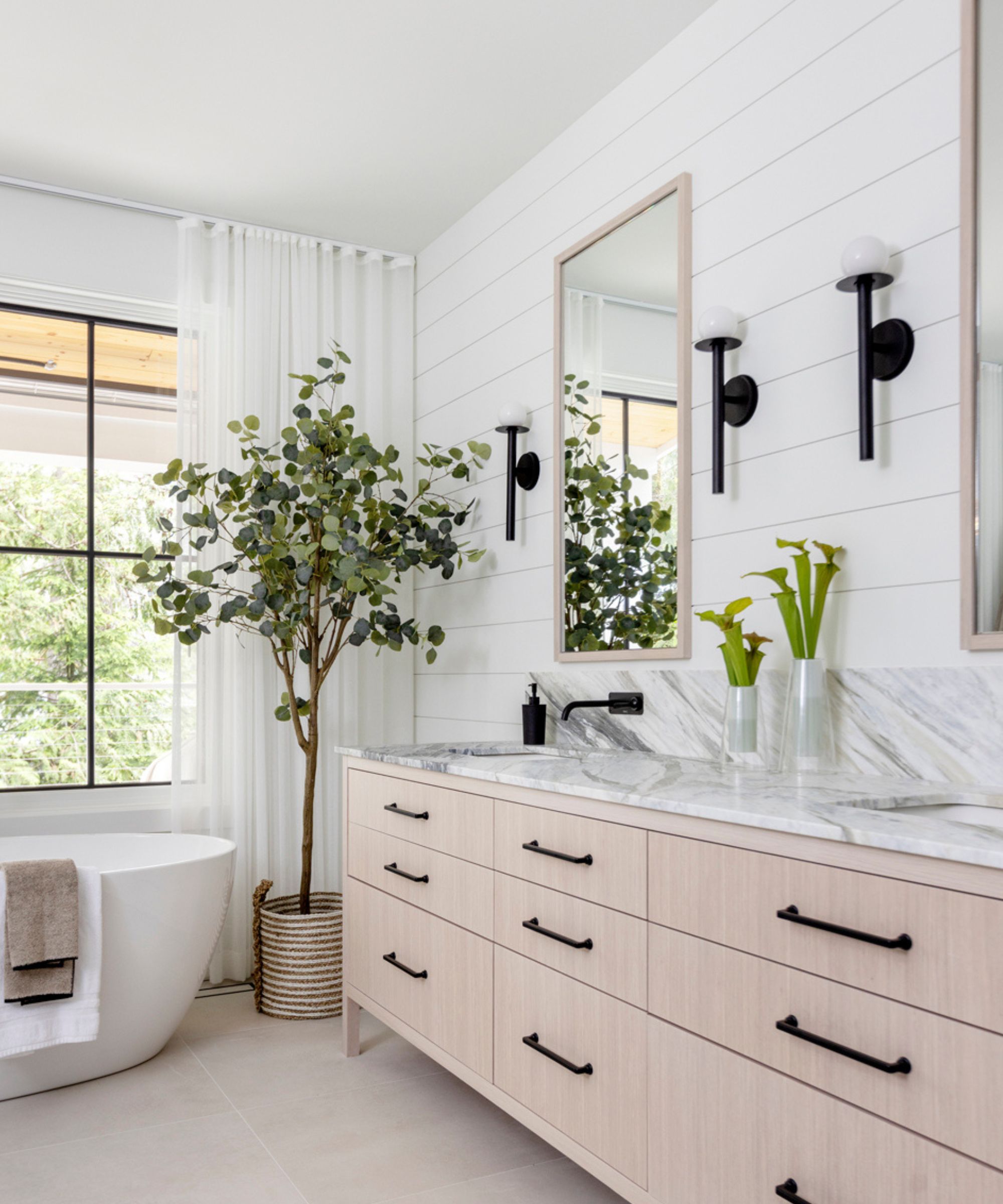
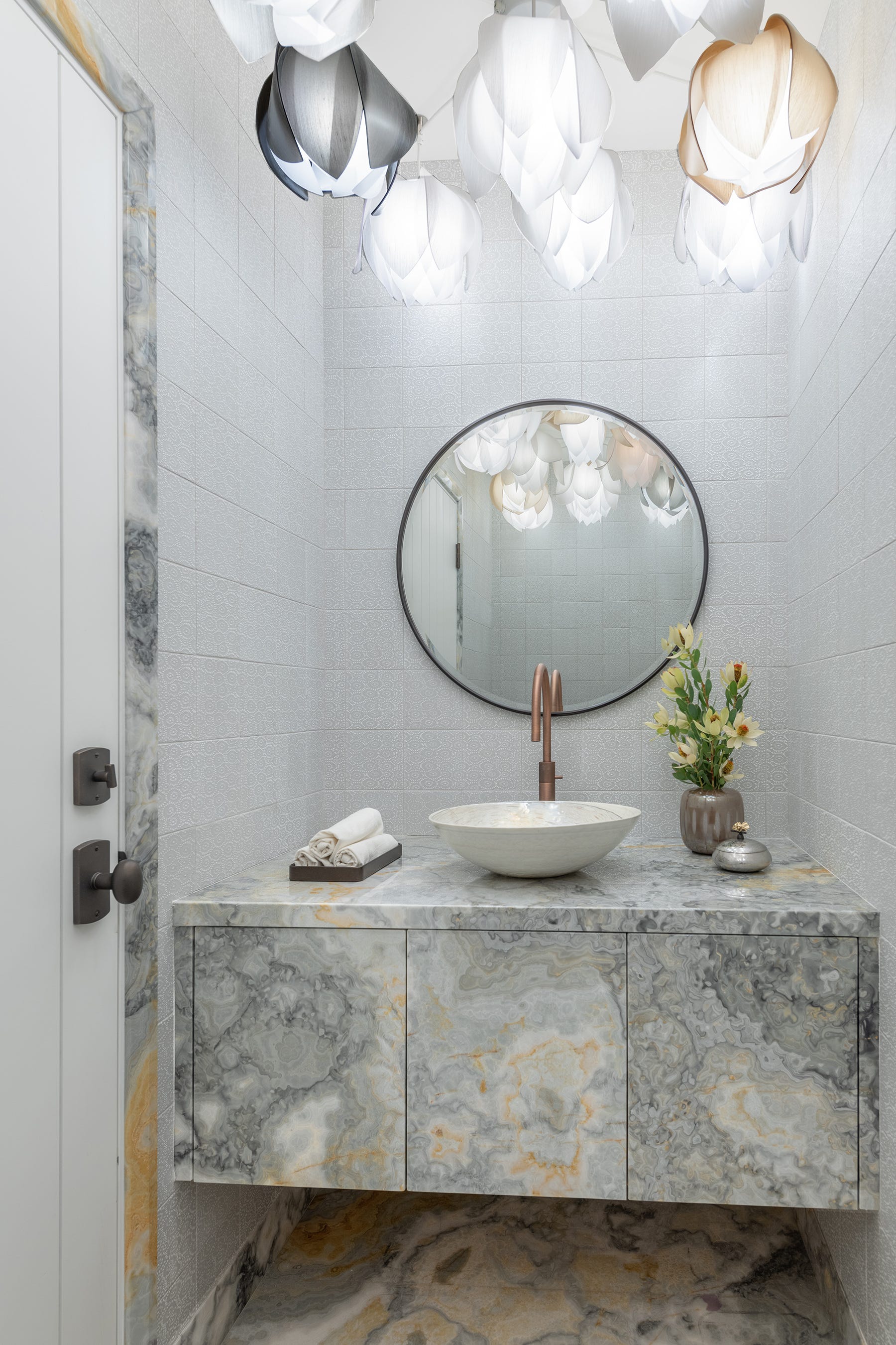
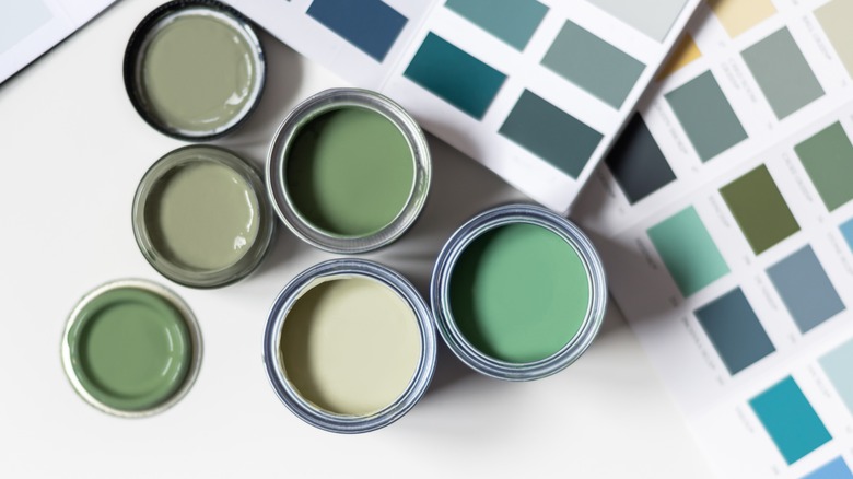
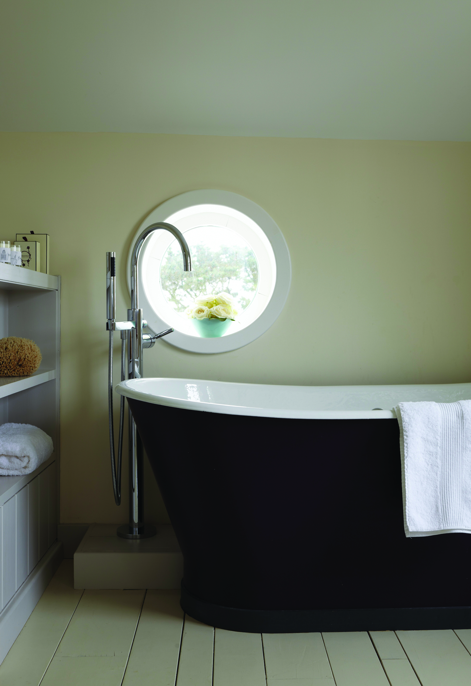
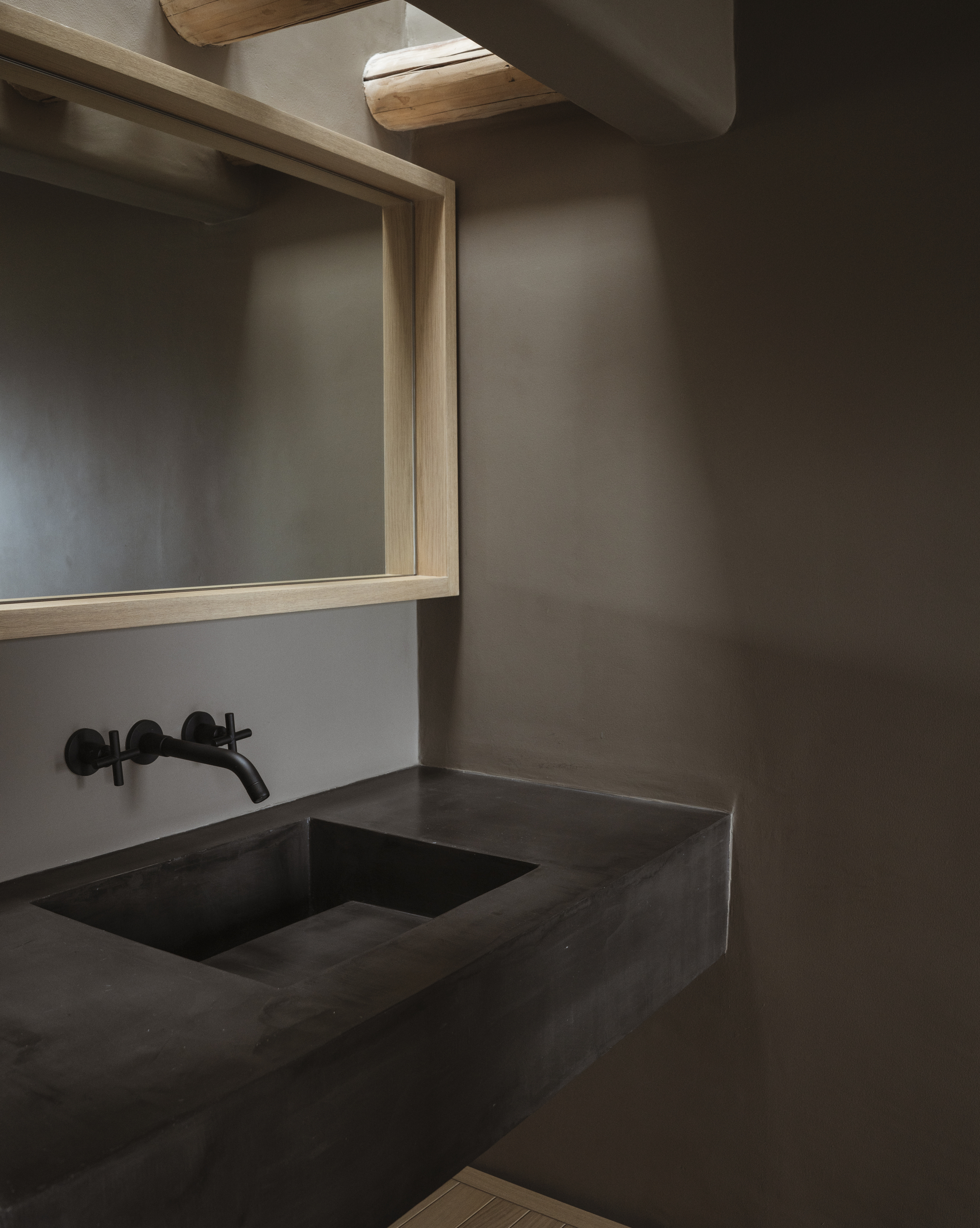
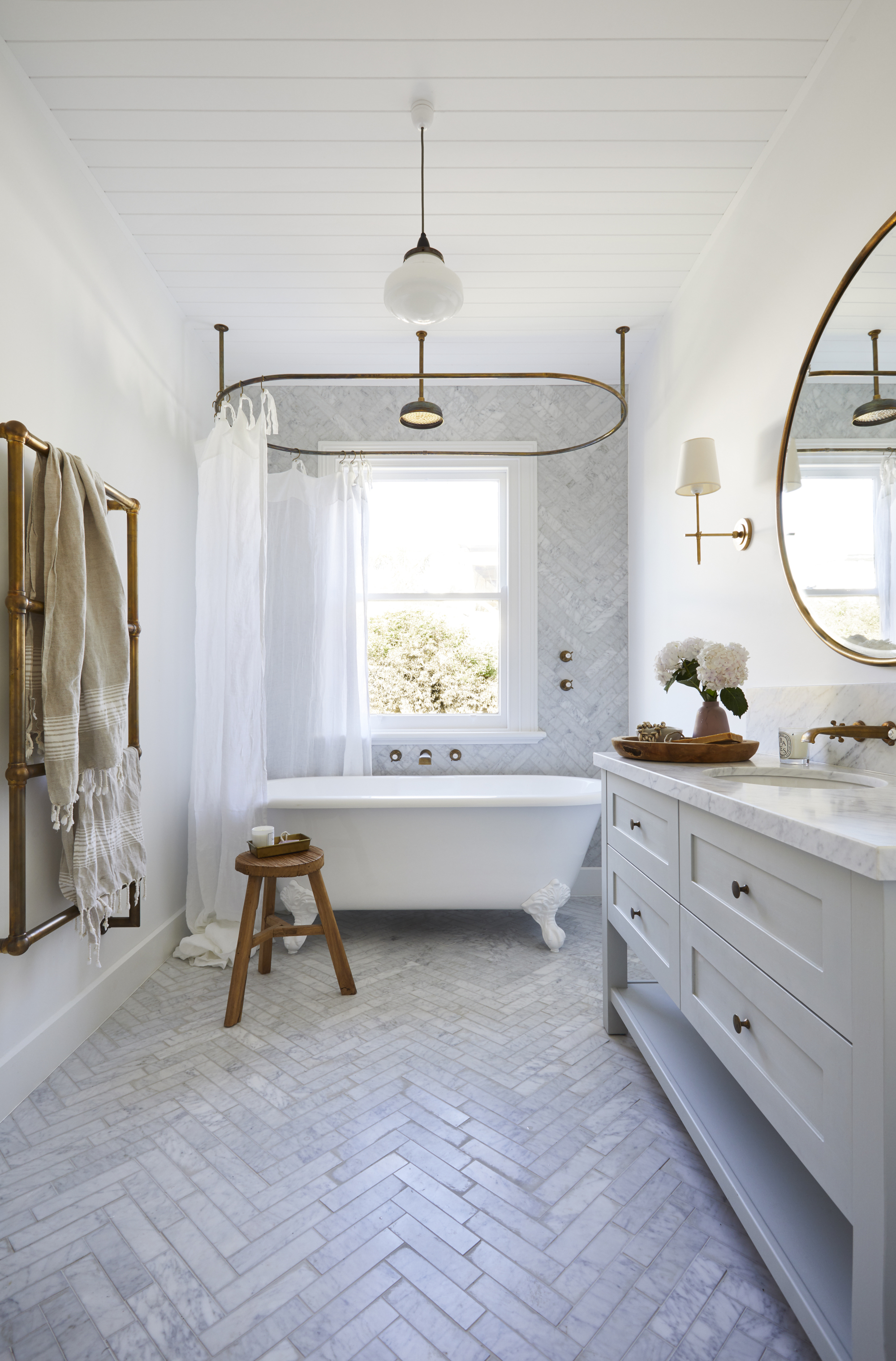
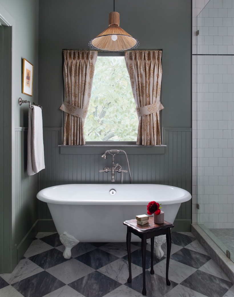
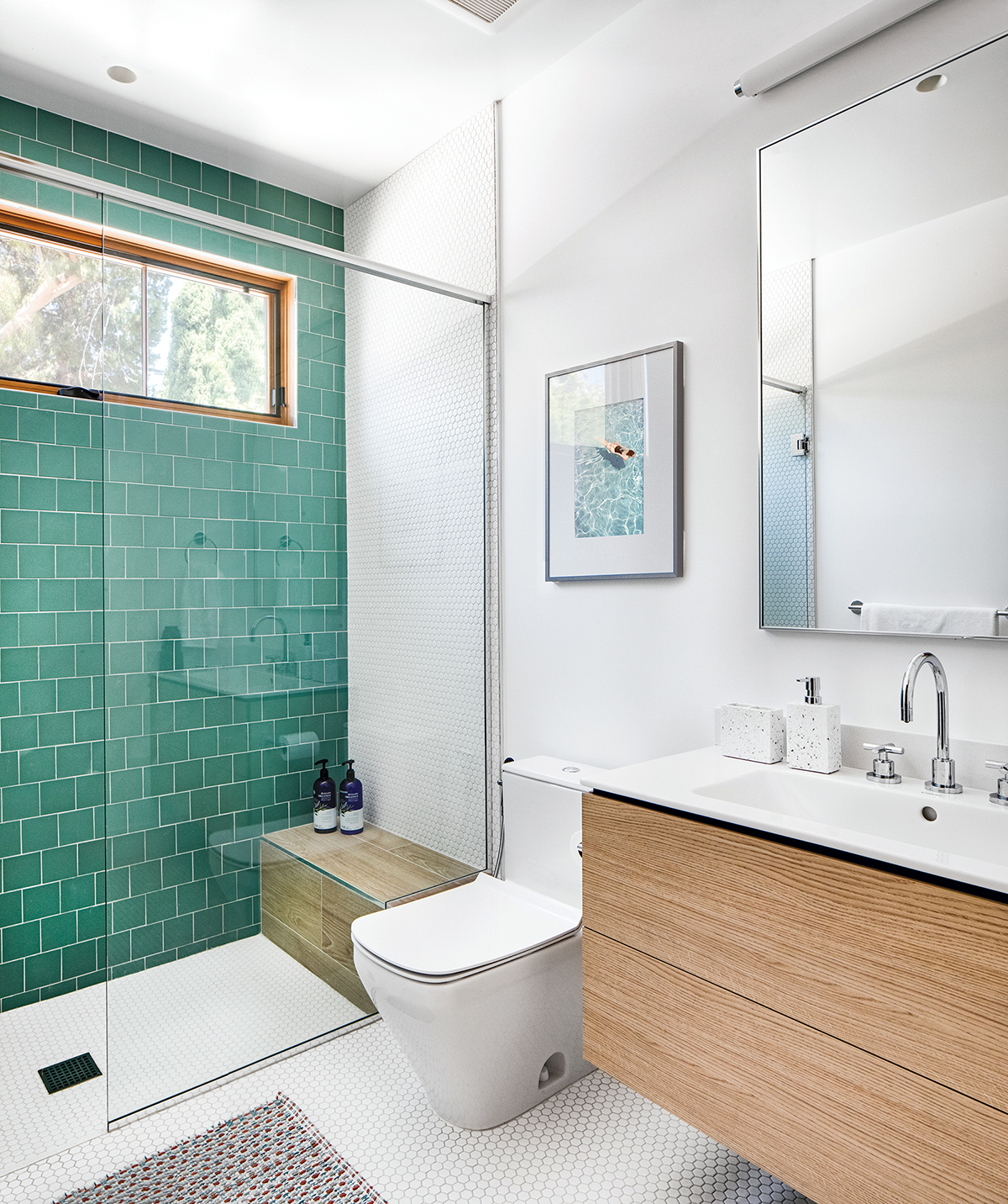
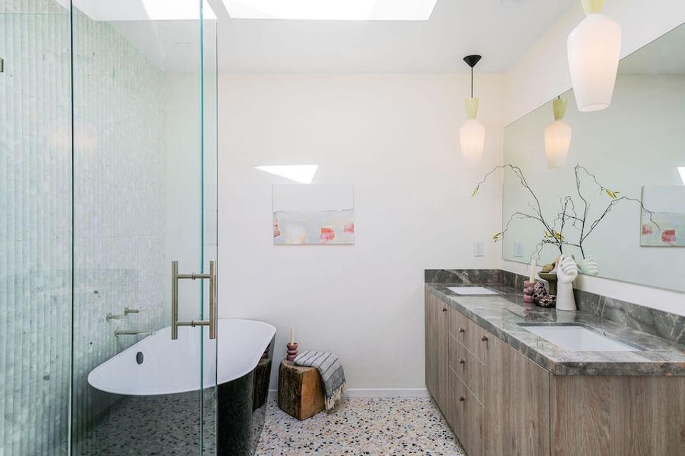
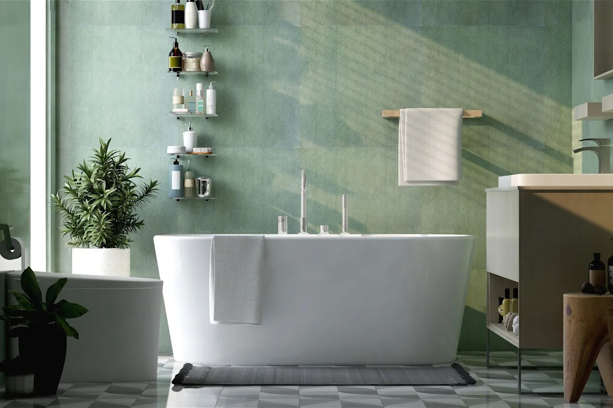
Conversely, tranquil greens, grays, and neutrals are favored for primary bathrooms, transforming daily routines into spa-inspired experiences. Gibbon notes that primary bathrooms, where daily preparation occurs, tend to feature lighter and fresher palettes, recommending Clare's Chill, an understated gray-green. Studholme concurs, highlighting the desire for bathrooms to serve as sanctuaries. She advises using calming colors and closely colored layers to create peaceful, sophisticated environments that nurture and revive.
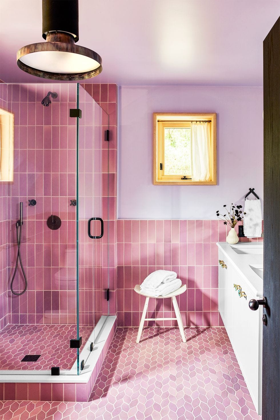
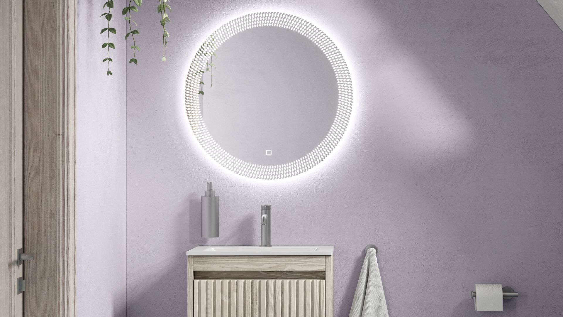
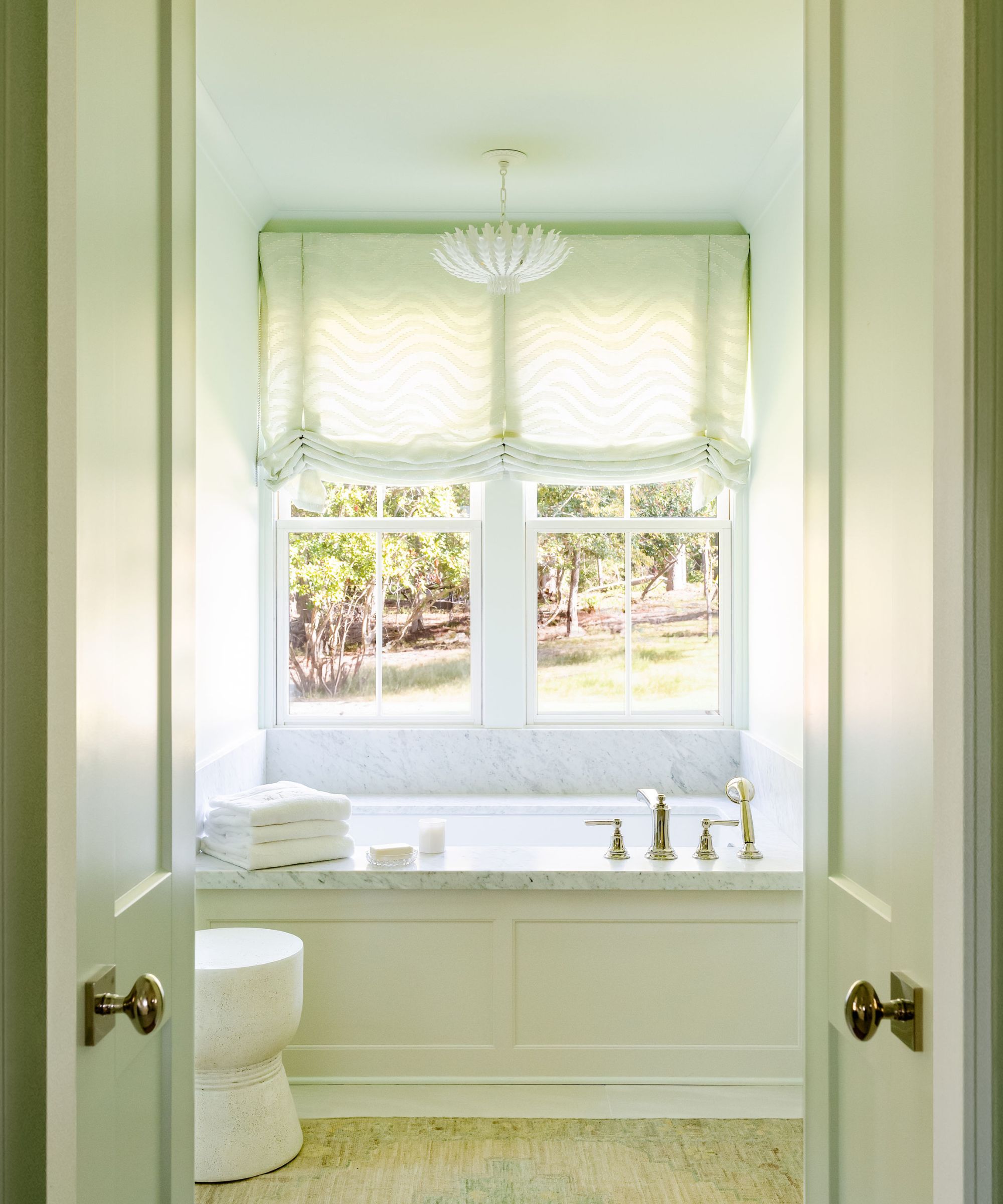
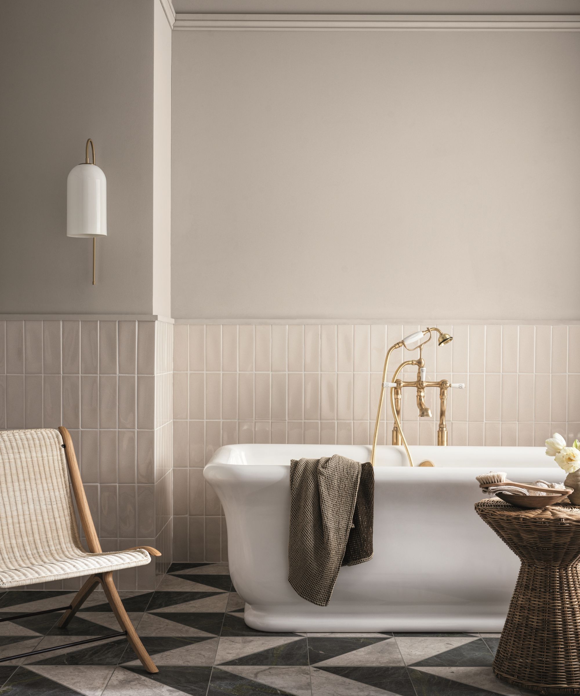
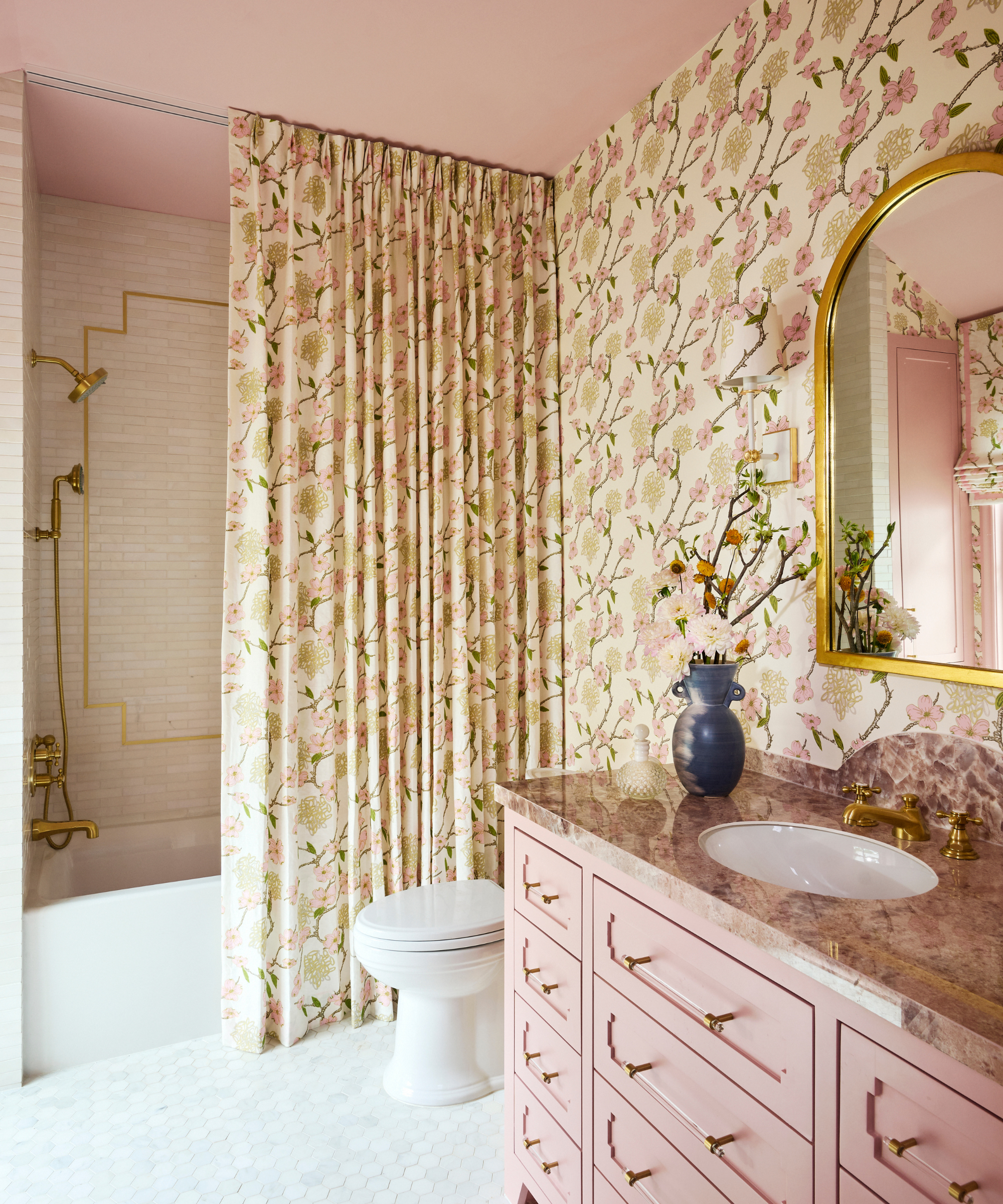
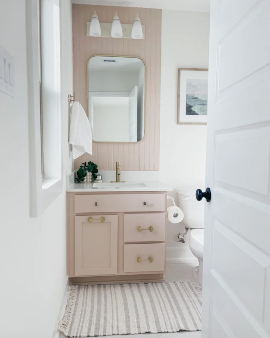
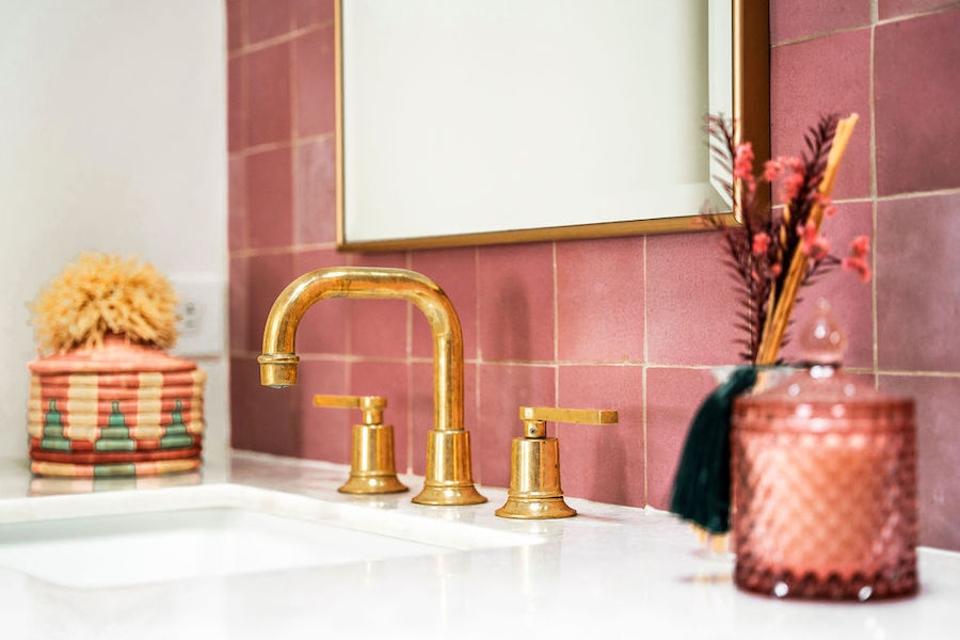
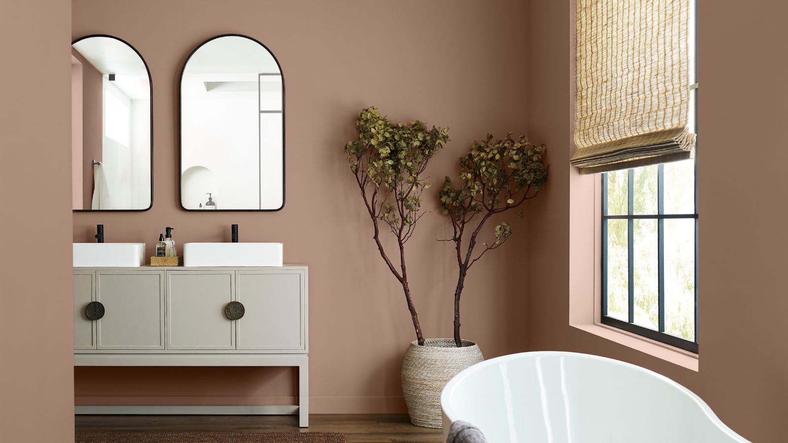
Finally, cotton-candy sky shades, including powder and pale pinks, are recommended for a serene atmosphere. Studholme suggests using silvery Light Blue on walls and ceilings, with a higher gloss on the ceiling for subtle impact. Layering pinks, such as the warm blush tones of Setting Plaster on walls with the darker Templeton Pink on woodwork, can create an oasis of calm. Using Pink Ground, from the same family, on the ceiling can make a room feel larger and create a seamless look in smaller spaces, emphasizing tranquility and an expanded feel.
#BathroomDesign #PaintColorTrends #InteriorDesign #HomeDecor #ColorPsychology #TranquilSpaces #BoldColors #NeutralPalettes #HomeRenovation #BathroomDesign #PaintColorTrends #InteriorDesign #HomeDecor #ColorPsychology #TranquilSpaces #BoldColors #NeutralPalettes #HomeRenovation
0 comment in total
 No comments yet
You may also like
4 Bathroom Colors That Are Going Out of Style in 2025 — Don't Say We Didn't Warn You

What are the most popular bathroom colors right now? Designers weigh in

What To Expect For 2023 Paint Color Trends

The Top 2023 Bathroom Trends, According to Designers

Bathroom color trends – the most stylish shades for this functional room in 2025
Bathroom colors going out of style in 2025 – and the designer-approved shades to decorate with instead
30 Bathroom Paint Colors Ideas That Will Make You Want to Repaint This Weekend
The Bathroom Paint Colors Interior Designers Swear By

These Bathroom Tile Trends Will Be Big in 2023

6 Bathroom Paint Trends You'll See in Every Home This Year, According to Designers

5 colors designers say are outdated for bathrooms - and what they're choosing instead for 2024
Cool Colors, Fab Finishes

How Bathroom Color Trends for 2026 Are Showing Up in Paint, Tile, and Fixtures
Here Are the Hottest Bathroom Trends for 2023, According to Design Pros
The Paint Color Trends of 2023 Are in—And They’re Gorgeous
10 Bathroom Design Trends We’ll See In 2023

Paint color ideas for bathrooms: expert advice for choosing the best shades

The 7 Biggest Bathroom Color Trends to Try If You Are Remodeling in 2026
What’s the best color for your bathroom vanity? Experts share their go-to hues for a sophisticated scheme
These 5 Bathroom Paint Colors Are Already Trending for 2026, Designers Say