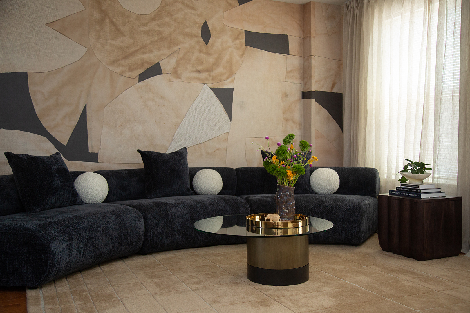
Matt Damon's chic neutral living room is never boring
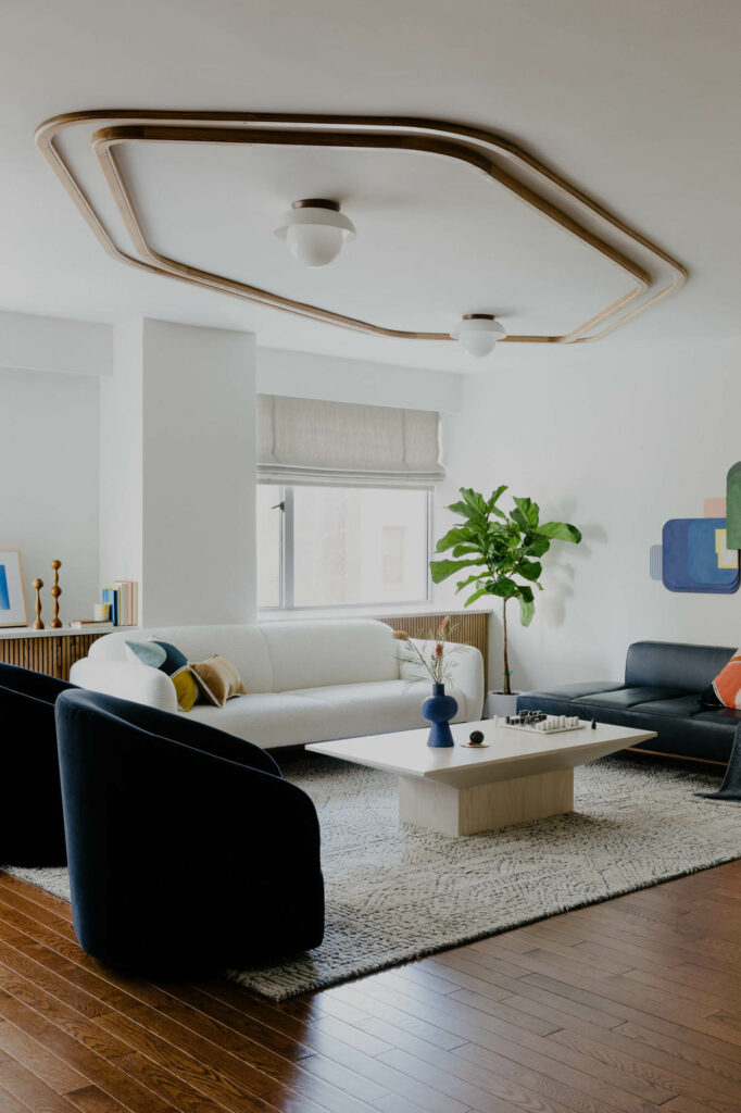
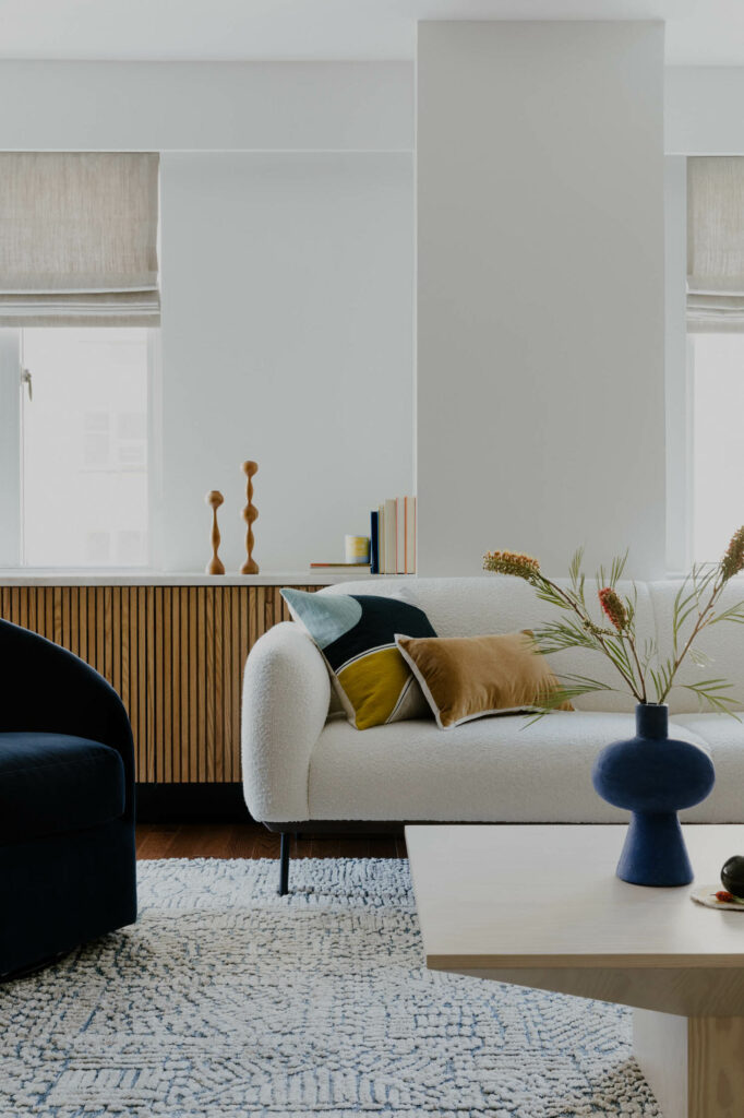
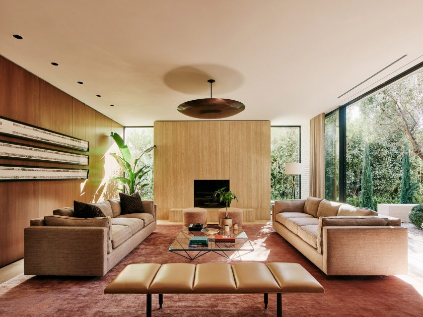
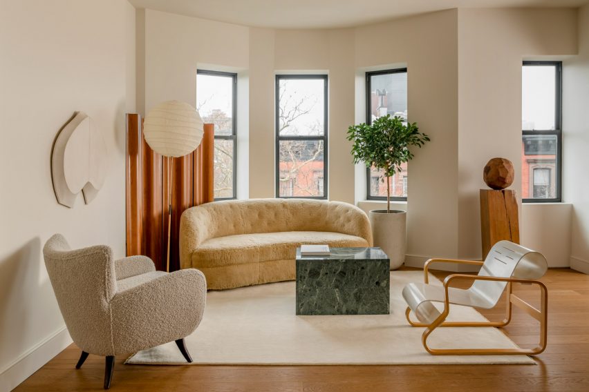
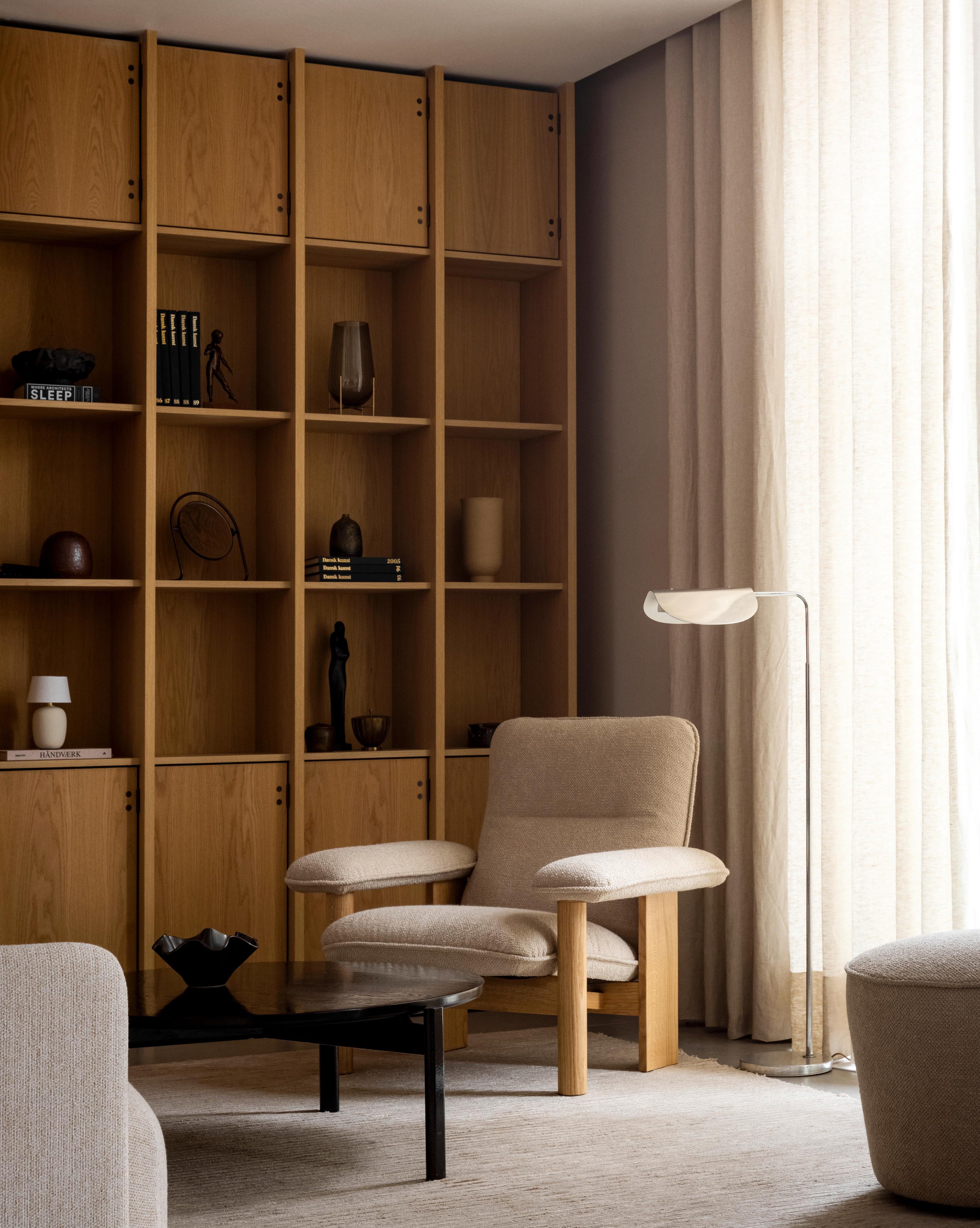
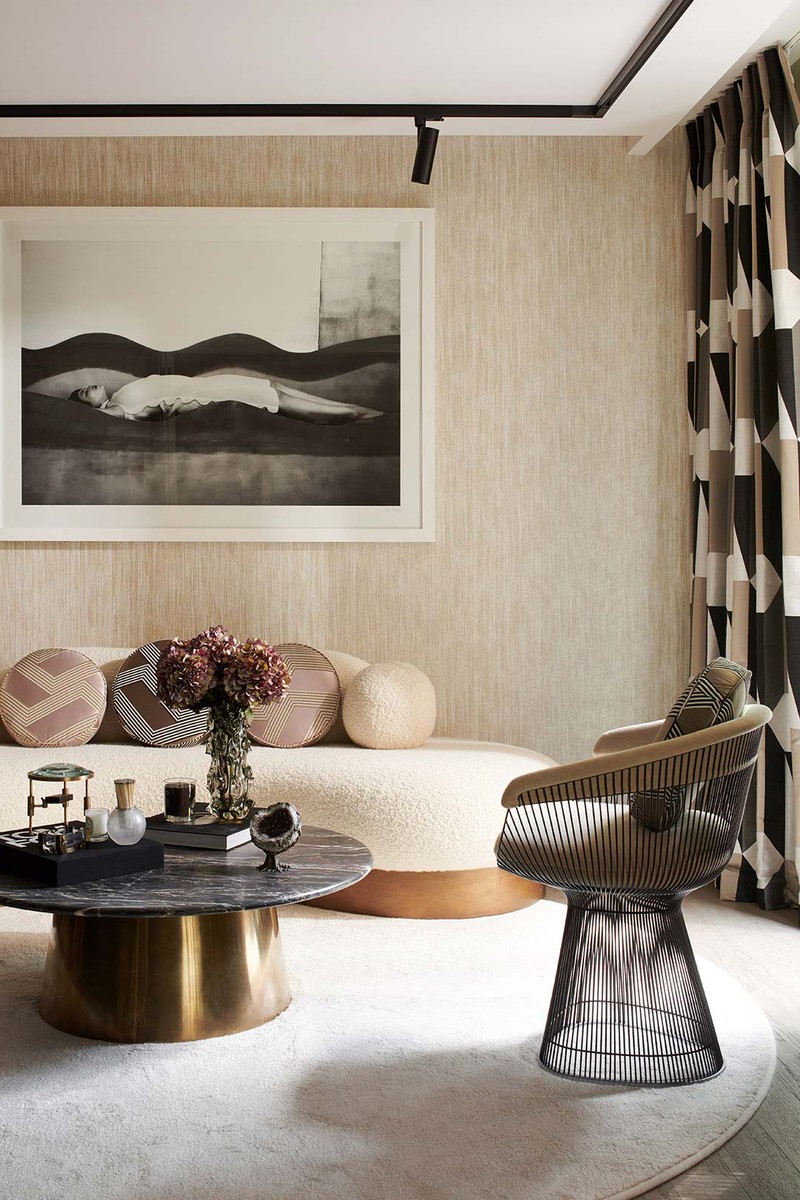
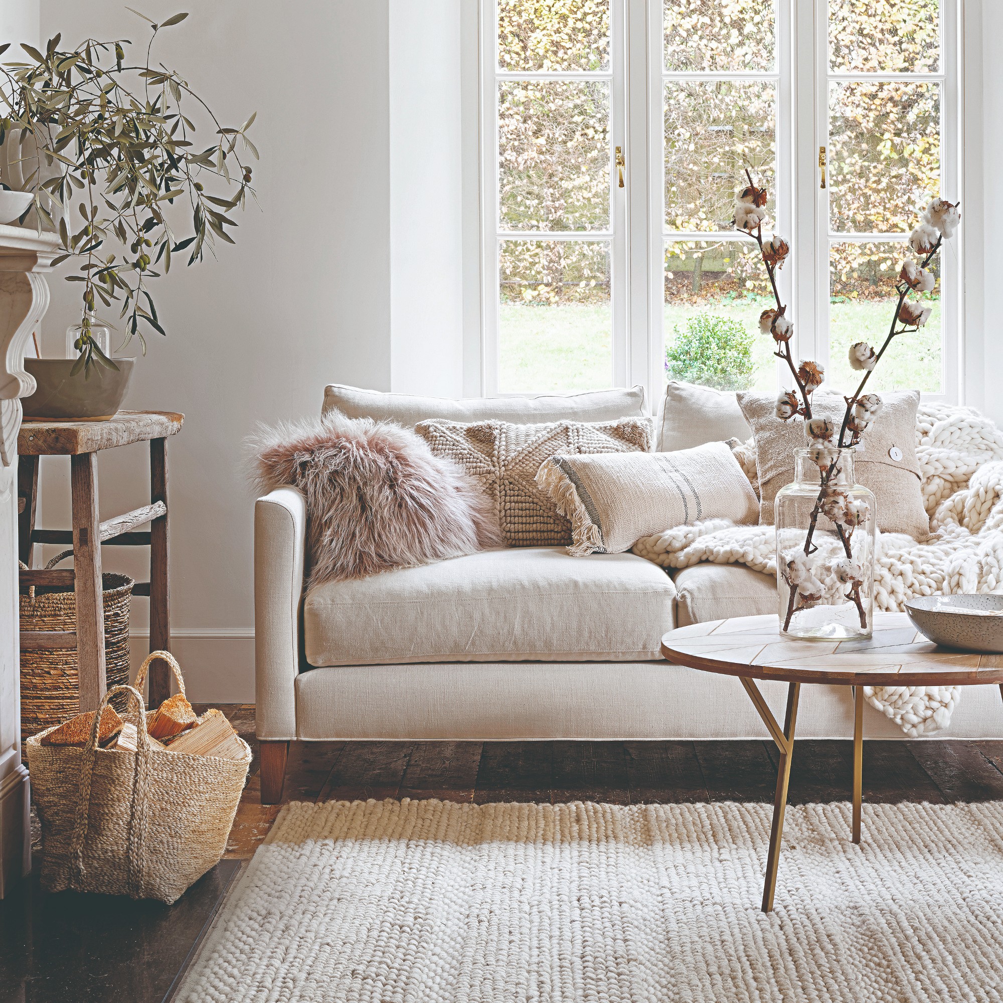
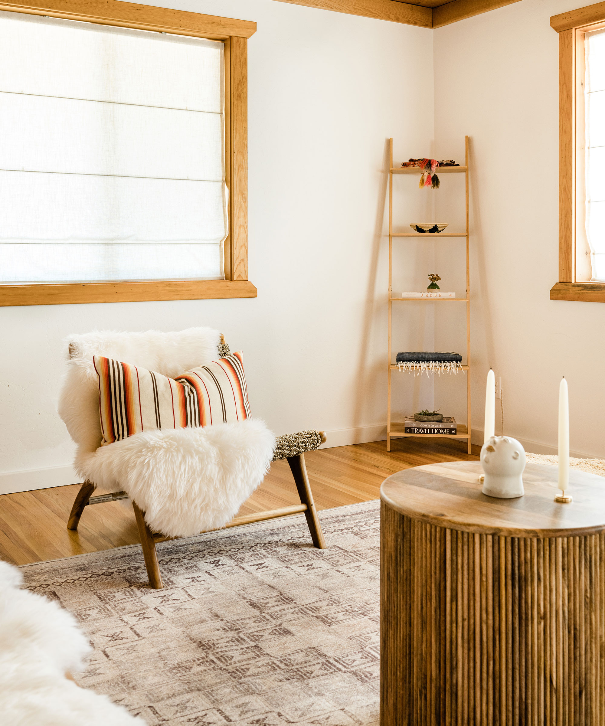
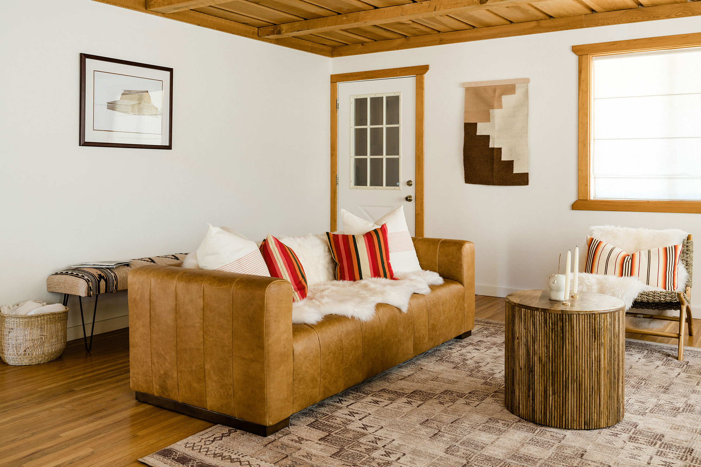
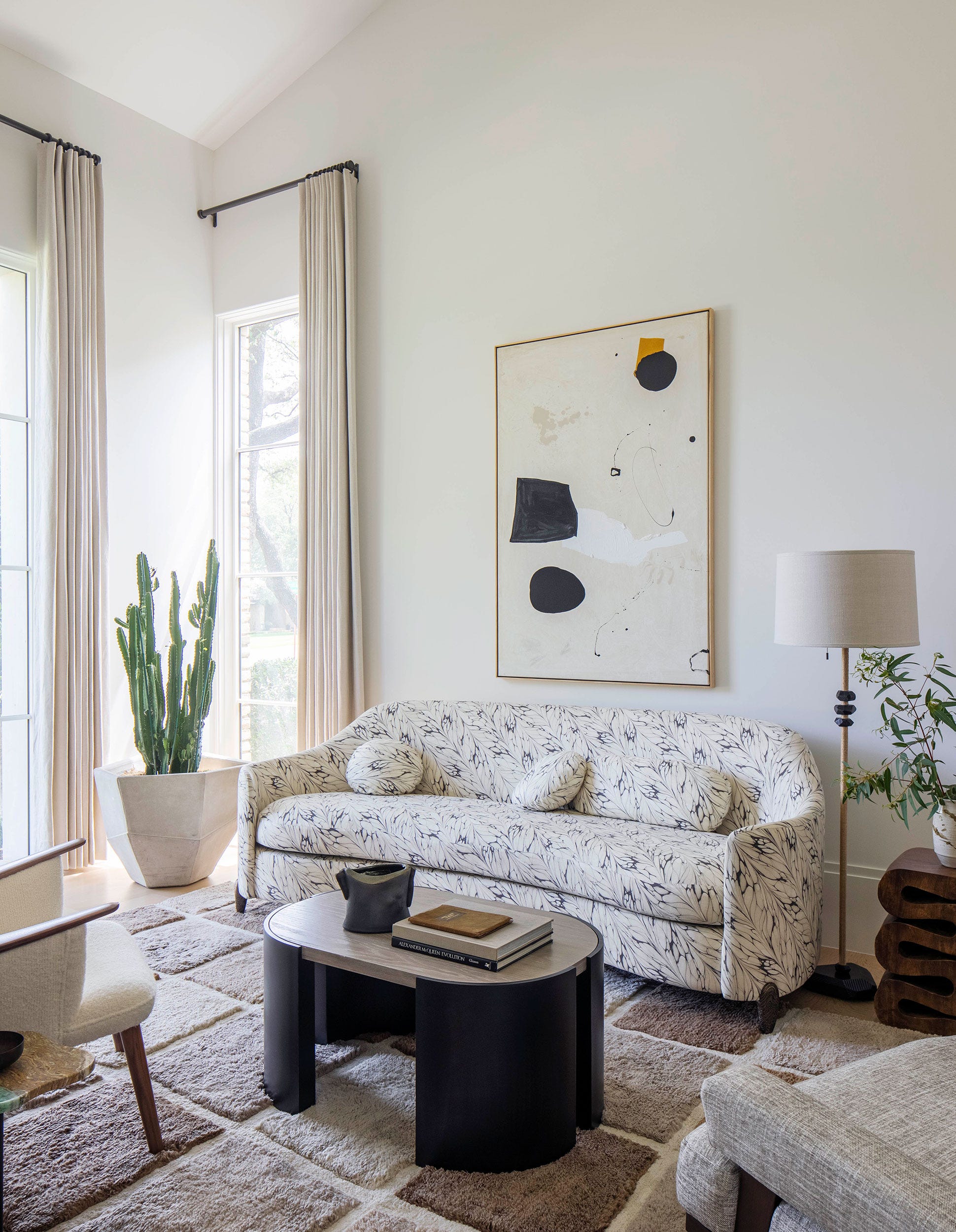

Neutral living rooms, while praised for their versatility, can often risk appearing uninspired if not styled thoughtfully. The key to successfully decorating with neutrals, as demonstrated by Matt Damon's former living room, lies in the strategic incorporation of textures. Damon's space, which adheres to a palette of white, cream, and soft wood tones, achieves a sense of being well-curated, dynamic, and sophisticated, proving that these classic hues can be as engaging as more vibrant color schemes. Furthermore, neutral designs possess an enduring quality, ensuring they remain stylish over time.
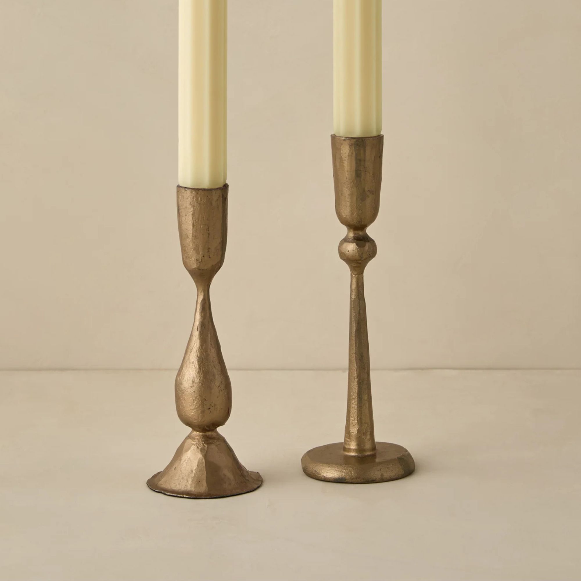
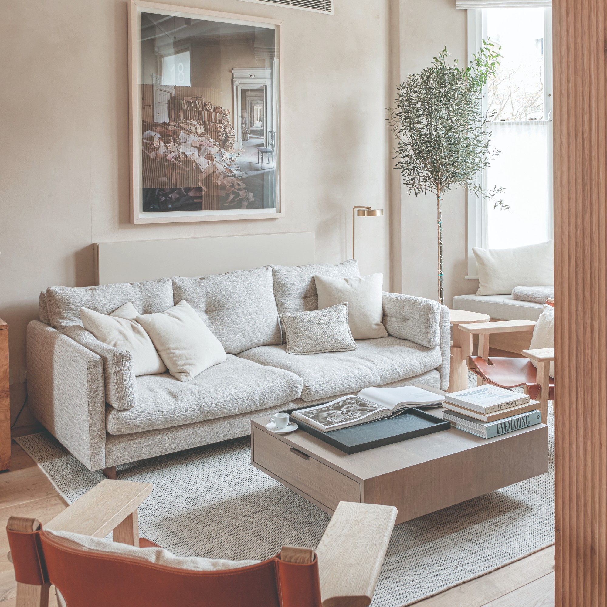
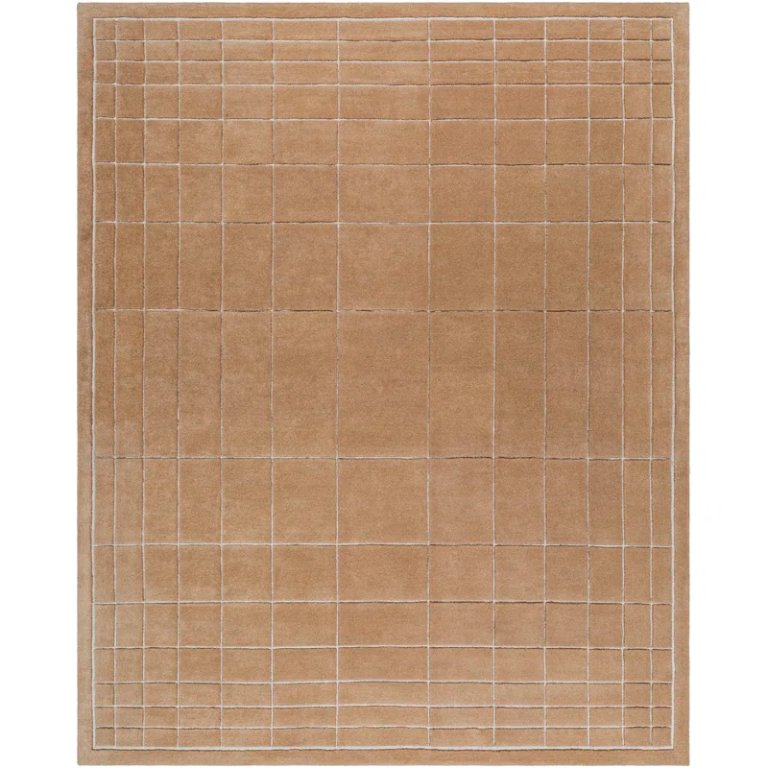
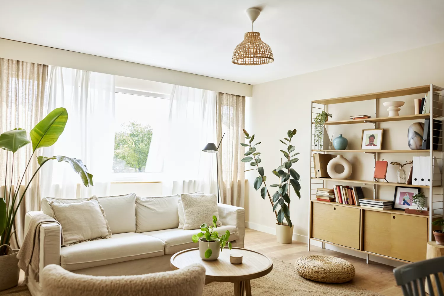
While not everyone possesses a living room on the grand scale of Matt Damon's Californian residence, the principles he employs for creating a layered and inviting space are universally applicable. His approach begins with foundational elements such as a linen sofa, complemented by throw pillows and a substantial blanket, which aligns with current fall decor trends. The room is anchored by a cream-colored area rug, and the coffee table is accessorized with books and candles, elements that are easily adaptable to any home size or style.
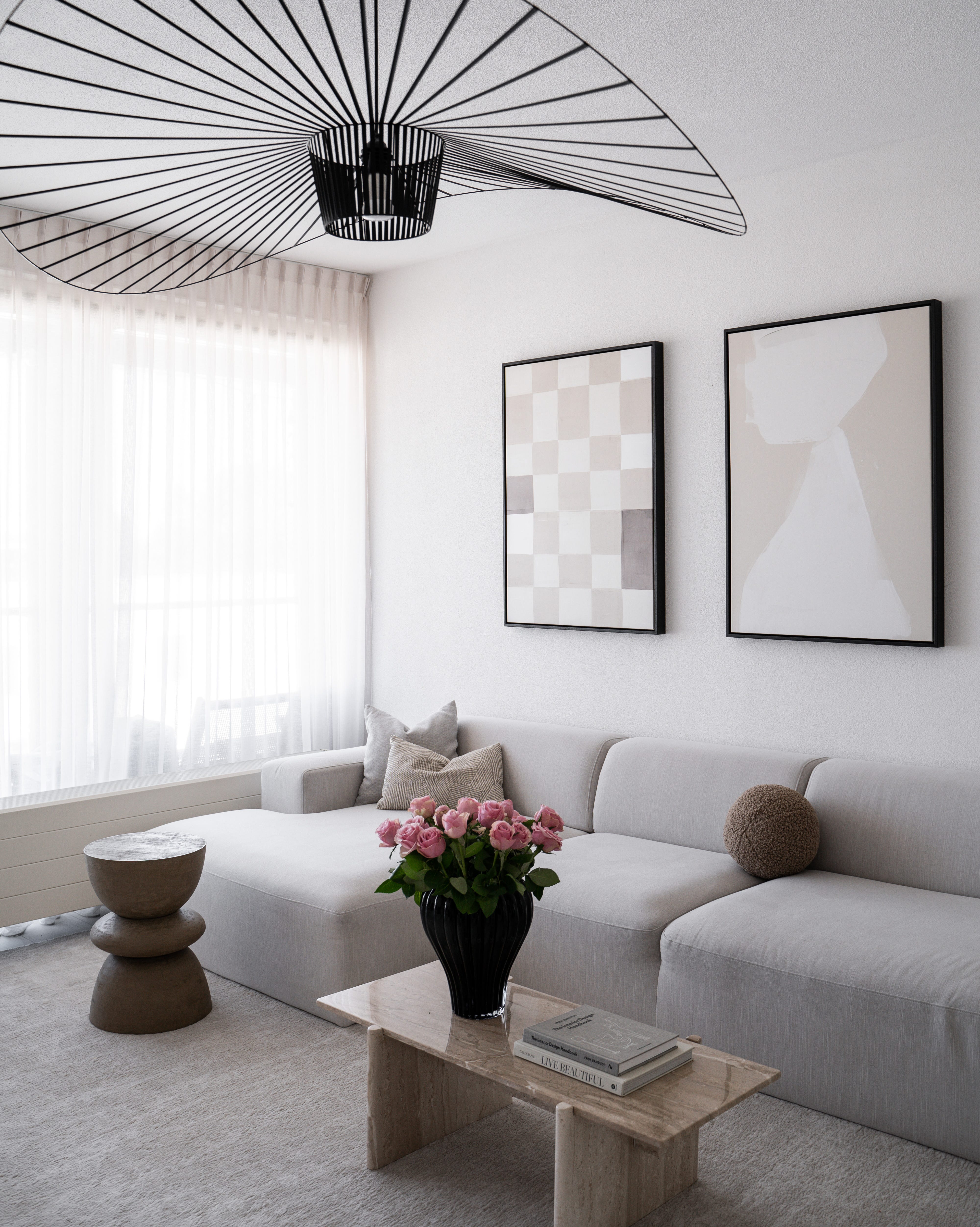
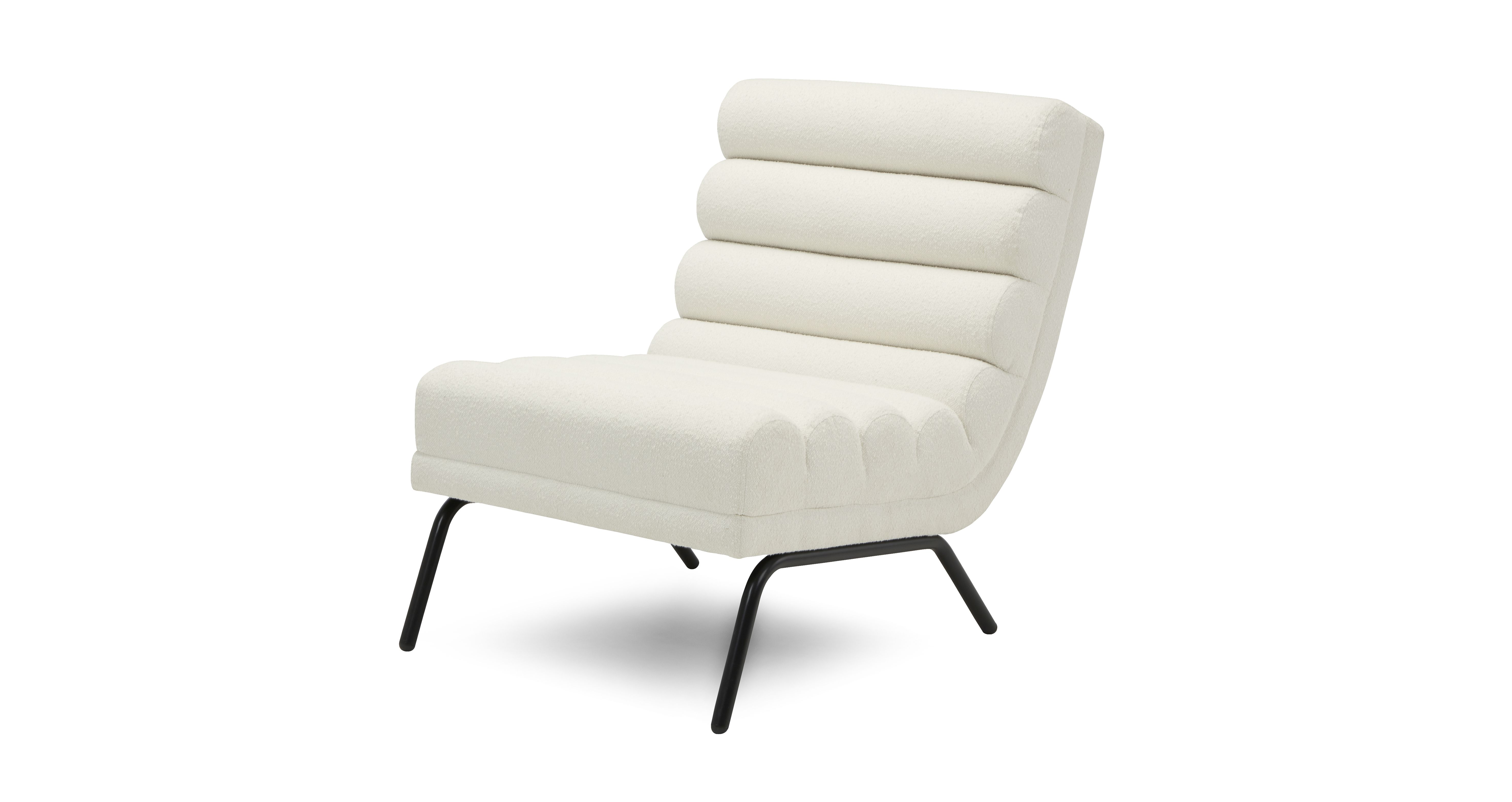
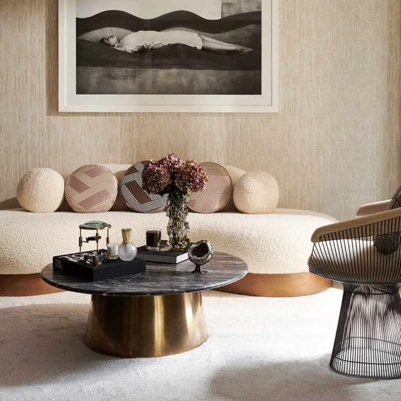
Design experts emphasize that incorporating various textures is crucial to prevent neutral living rooms from feeling flat or monotonous. Marissa Stokes of Marissa Stokes Interior Design advocates for thinking in layers, suggesting that neutrals become compelling when diverse textures are mixed. Examples include pairing a woven linen sofa with a mohair pillow, placing a sisal rug beneath a velvet ottoman, or juxtaposing plaster walls with a high-gloss lacquer table. This interplay of matte and sheen, smooth and nubby surfaces, is what generates visual depth and maintains interest within the space.
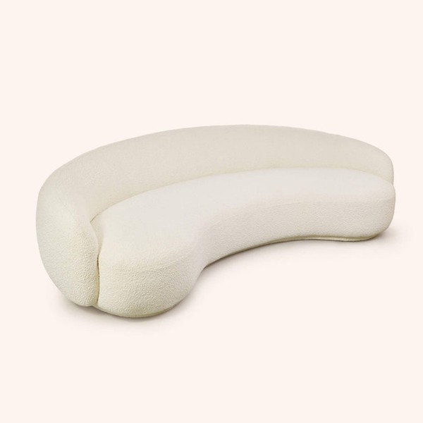
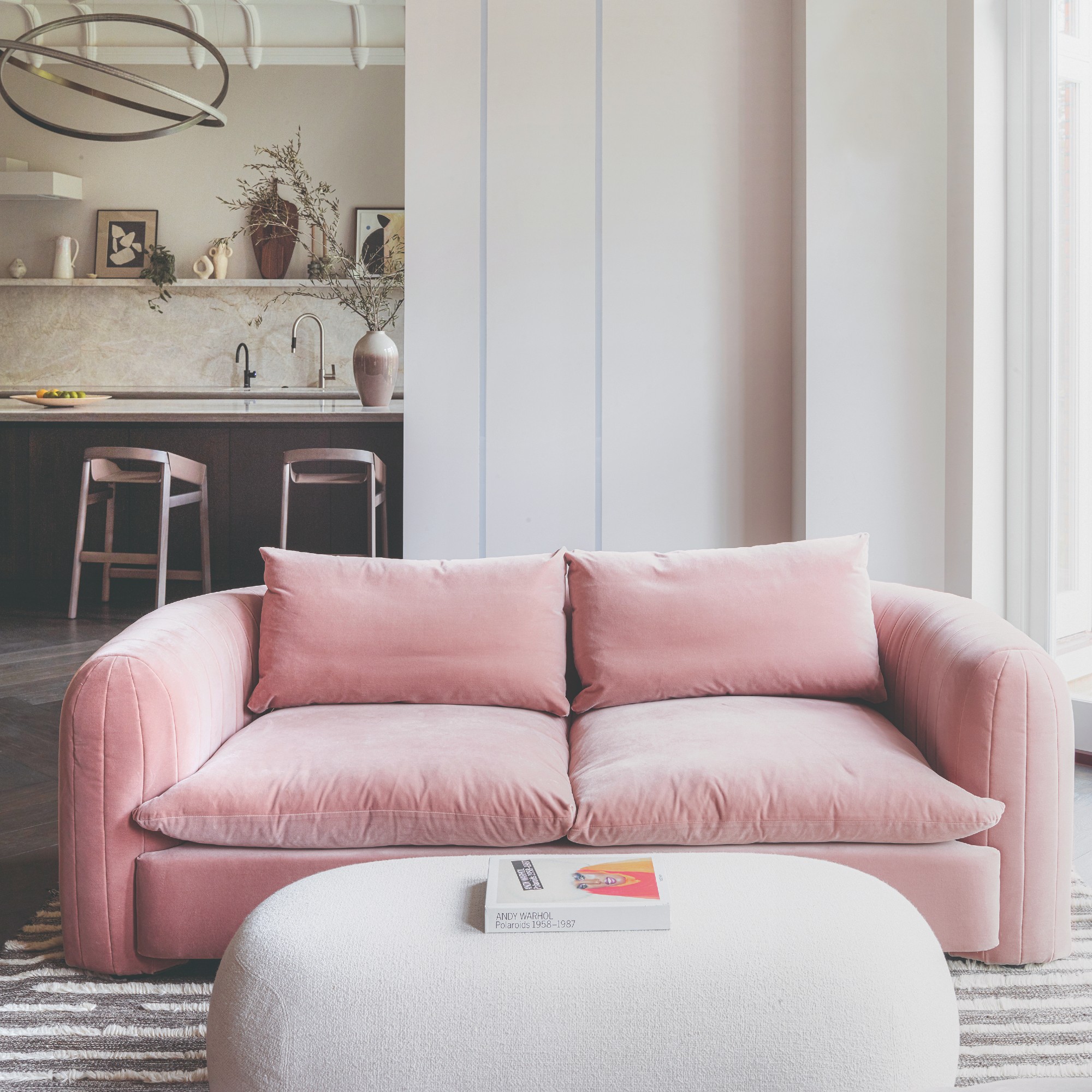
Kelly Neely of Kelly Neely Interiors echoes this sentiment, advising on the importance of varying shades of neutrals to inject vitality into a room. She explains that textures like velvet, boucle, and silks introduce movement without relying on color. Tone-on-tone patterns also contribute to visual interest within a neutral palette. Additionally, utilizing darker neutral tones helps to ground the space and add depth, providing a foundation upon which lighter colors can be layered without the room appearing stark. By thoughtfully combining a range of textures and personal accessories, it is possible to create a neutral living room that is both refined and far from boring, challenging conventional perceptions of neutral aesthetics.
#NeutralDecor #LivingRoomDesign #TextureInDesign #CelebrityStyle #InteriorDesignTrends #HomeDecor #LayeredDesign #TimelessStyle #NeutralDecor #LivingRoomDesign #TextureInDesign #CelebrityStyle #InteriorDesignTrends #HomeDecor #LayeredDesign #TimelessStyle
0 comment in total
 No comments yet
You may also like
7 Best Masculine Living Room Ideas
Ten living rooms that use warm neutrals to create a cosy ambience
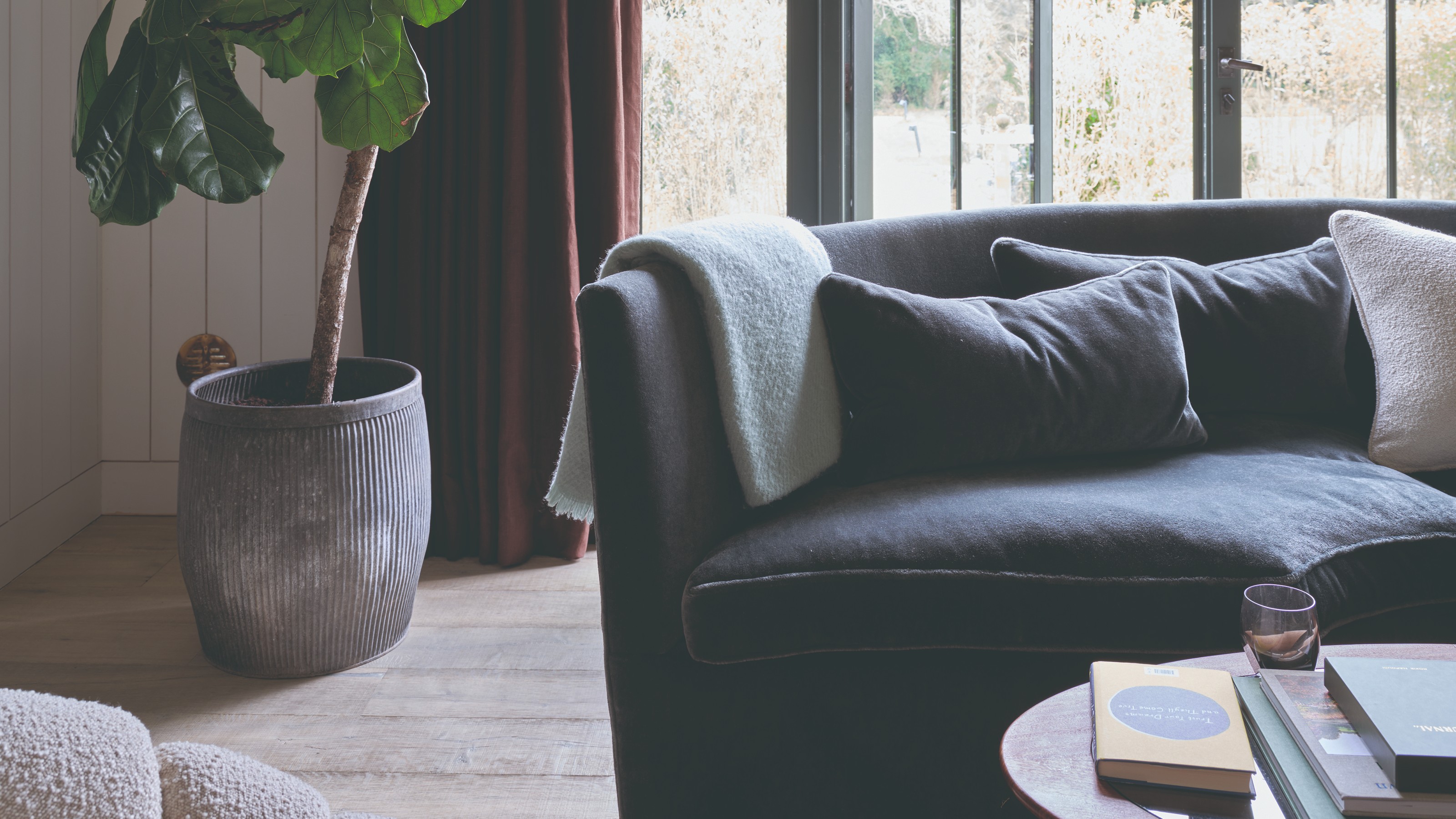
30 modern living room ideas for a clean and contemporary space that’s comfortable at the same time
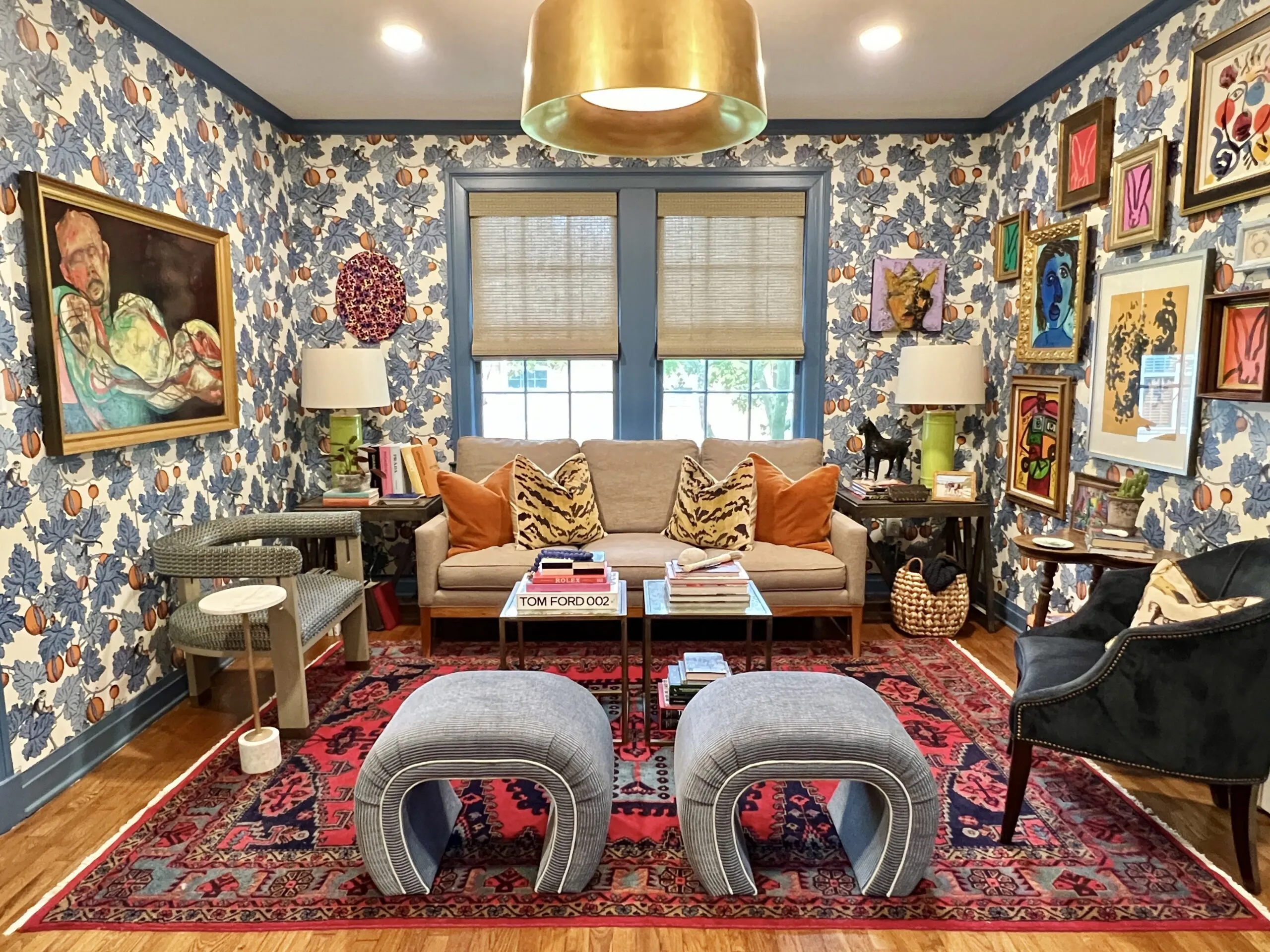
This colorful living room is making us love maximalism again

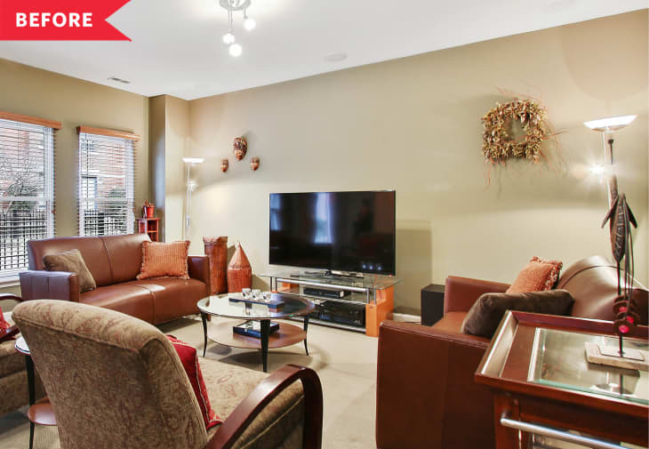
I Love the Neutral Color Palette in This Chicago Living Room Makeover
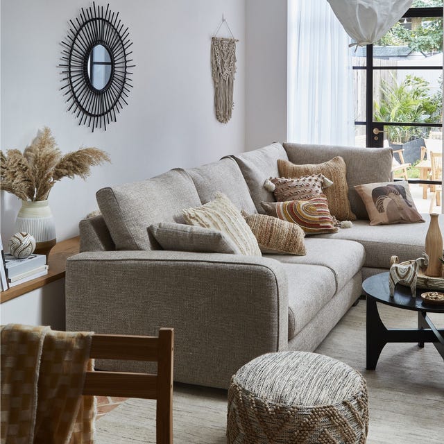
13 contemporary neutral living room ideas

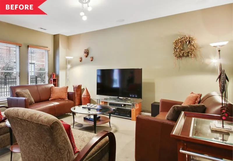
I Love the Neutral Color Palette in This Chicago Living Room Makeover

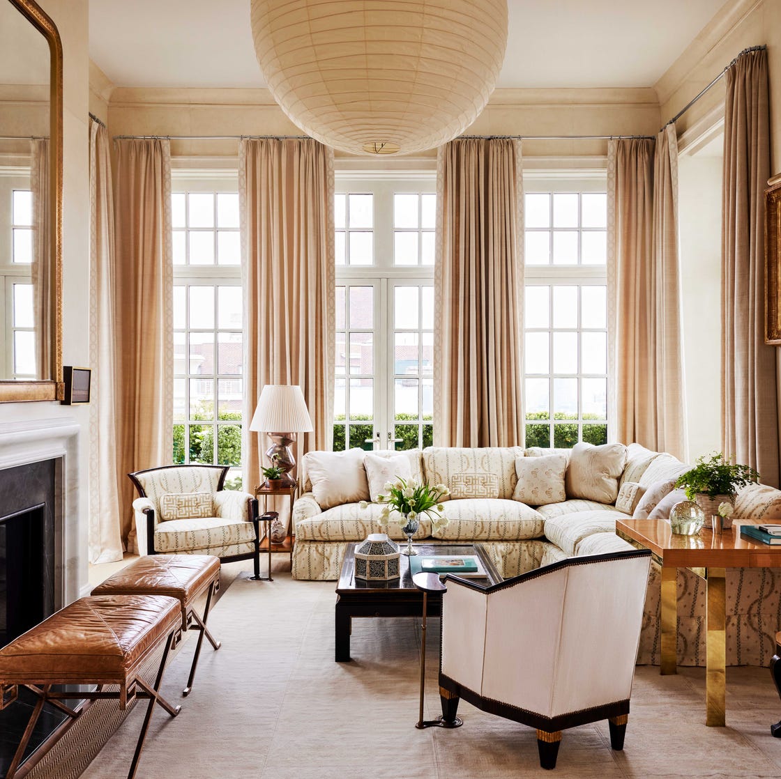
35 Neutral Living Room Ideas That Go WAY Beyond the Pale

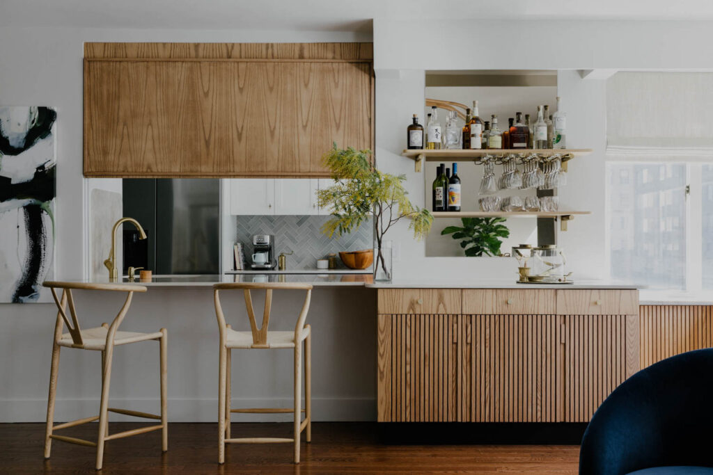
Playful Wallcoverings Enliven This Tranquil Manhattan Apartment


Dakota Johnson just decorated with the 'ugly' color replacing beige and cream for 2025 – it's warm, grounded, and easy to live with
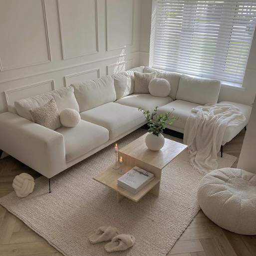
5 reasons to embrace a neutral palette
This Living Room Gets a Sophisticated and Stylish Face Lift

19 Neutral Living Room Ideas That Feel Warm, Balanced, and Beautiful

Justin Timberlake’s Quiet Luxury Living Room Remains Timeless
9 neutral small living room ideas that are truly not vanilla

After a Decade of Millennial Gray, This Living Room Looks Like New in Warm Neutrals


I thought I had my living room figured out, but Cameron Diaz’s rust sofa has me rethinking everything – it's the chicest piece I’ve seen all year
Get The Look: A Contemporary Living Room

6 ways to create a calm living space, according to the experts
We Asked Designers to Pick the Most Timeless Living Room Paint Color—and They Agreed