1/8
'It’s the perfect creamy off-white' – these designers chose this exact Farrow & Ball color to spray a townhouse's kitchen
The Brownstone Boys undertook the restoration of a 19th-century townhouse located in Bedford-Stuyvesant, Brooklyn, transforming a neglected property into a modern, light-filled family home. The primary objective was to preserve and highlight original architectural details while integrating contemporary design elements suitable for modern family living. This involved careful restoration of hardwood floors, the stair banister, plaster moldings, and stained glass, and even reintroducing period-appropriate features like marble fireplace mantels that may have been lost over time.
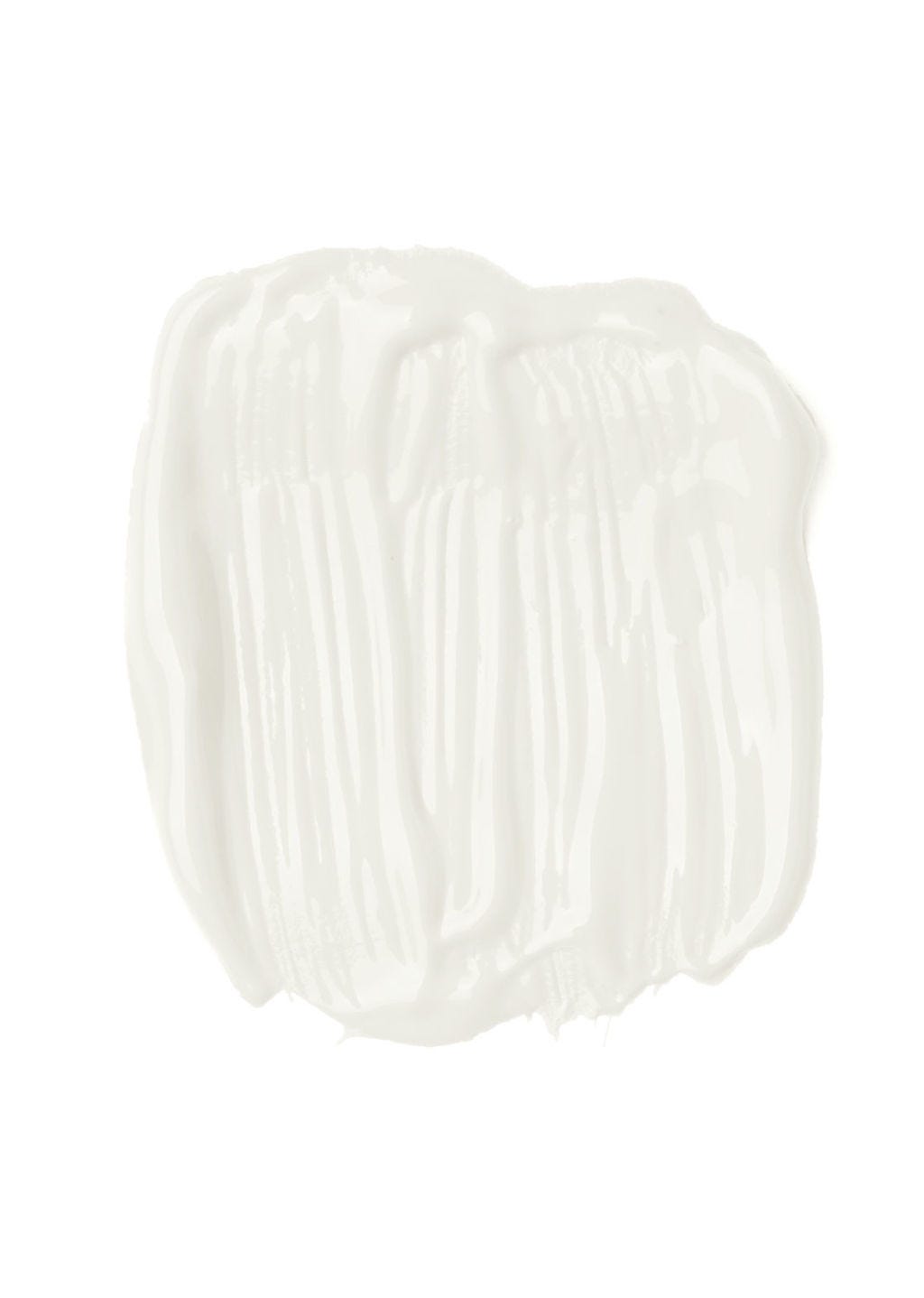
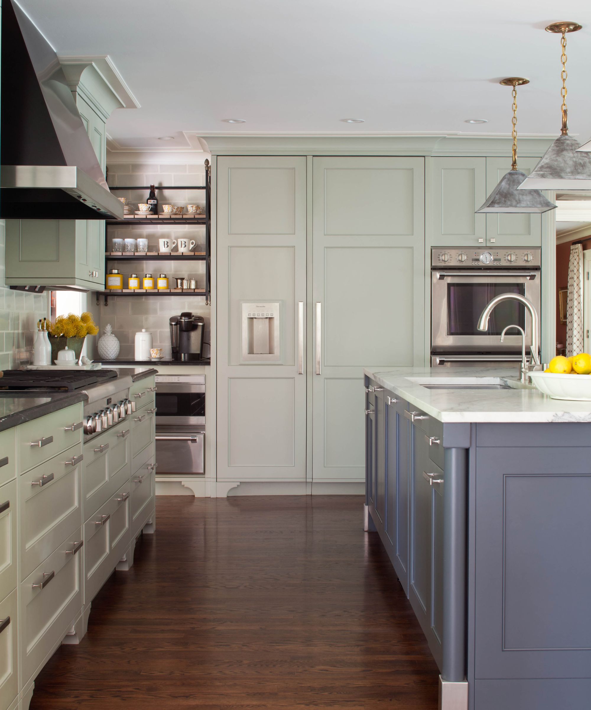
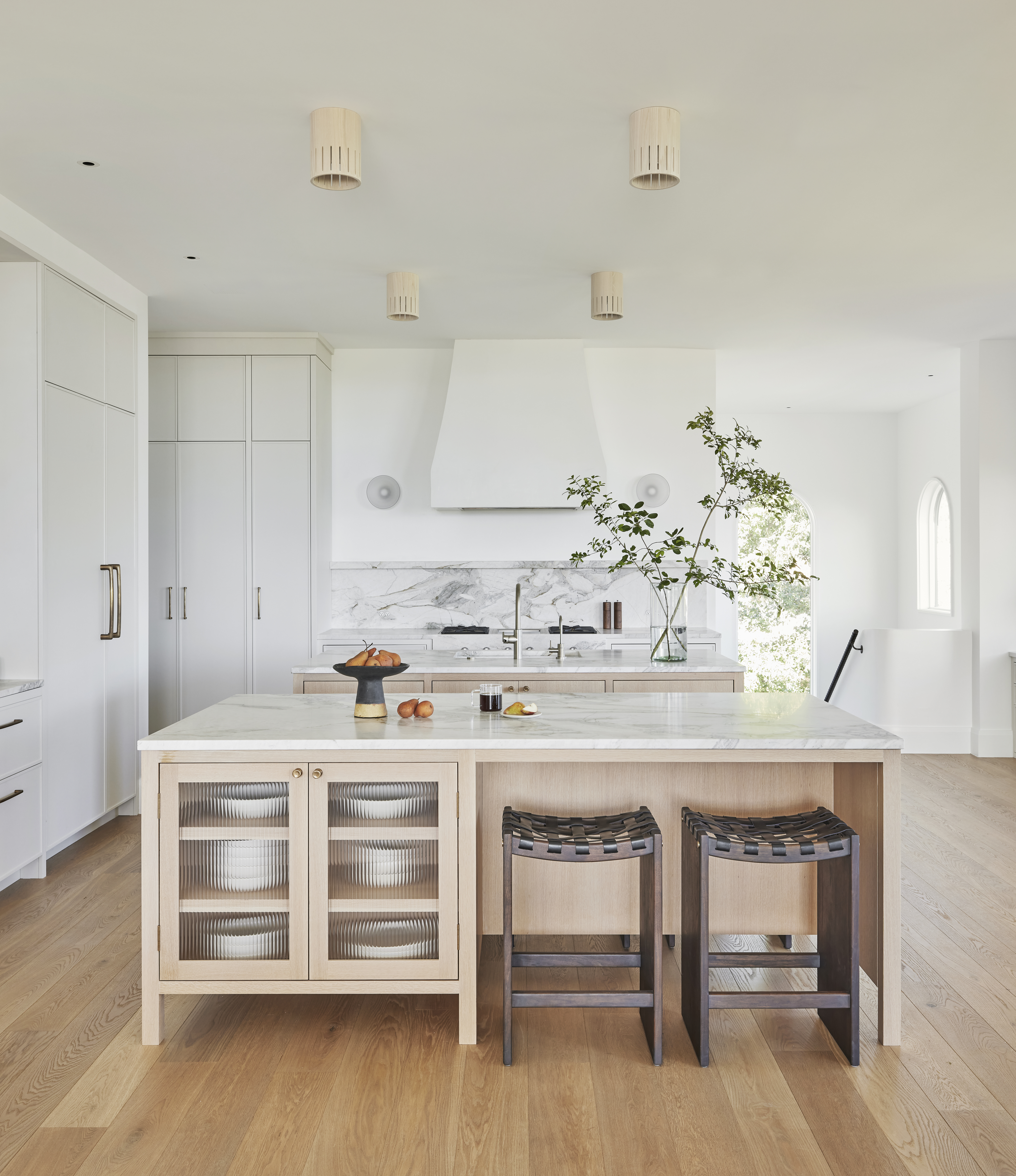
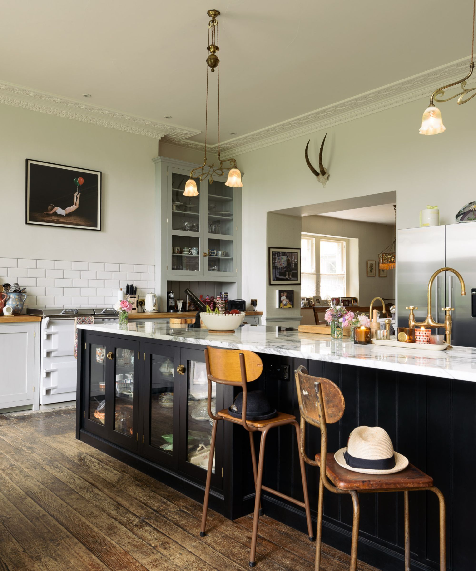
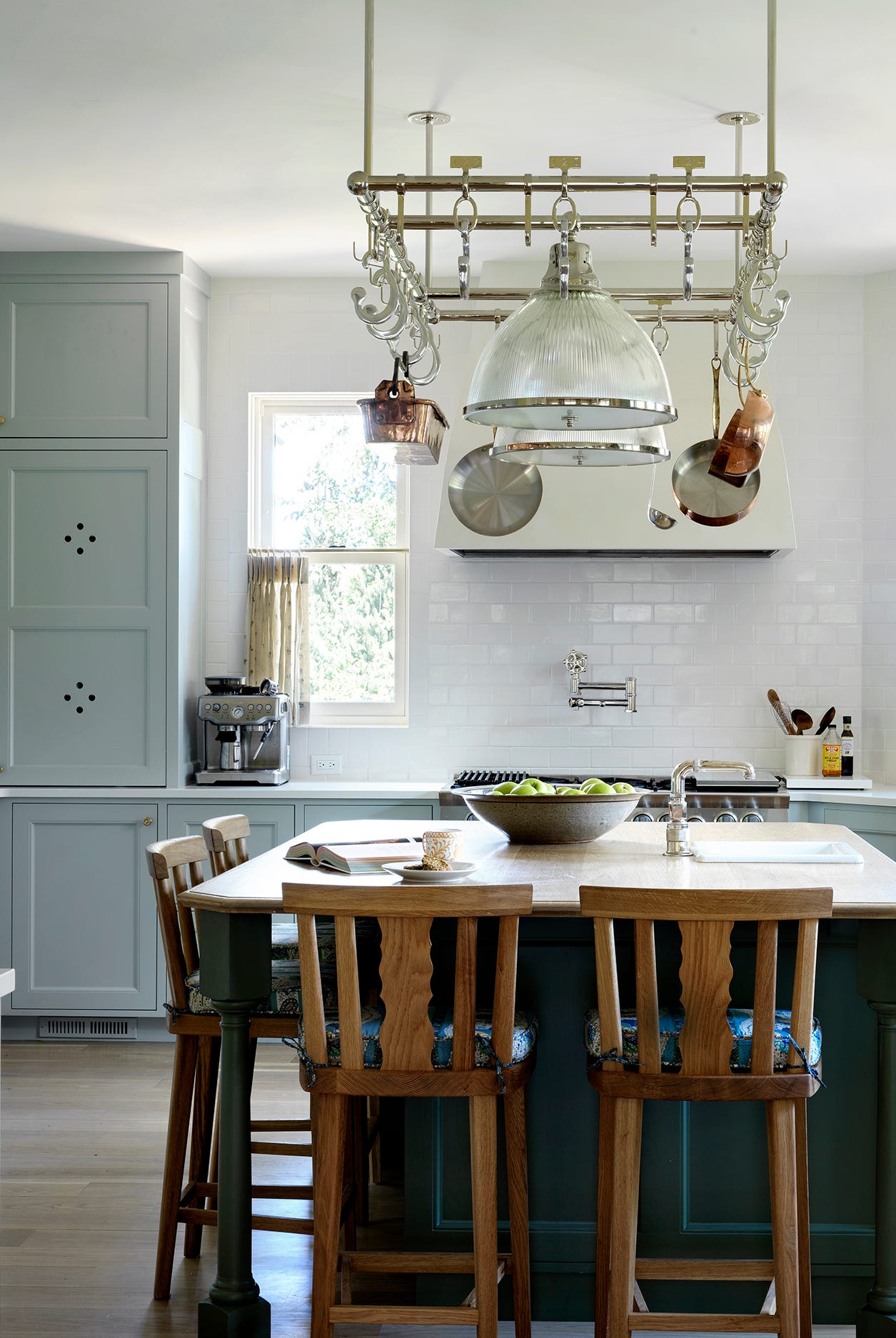
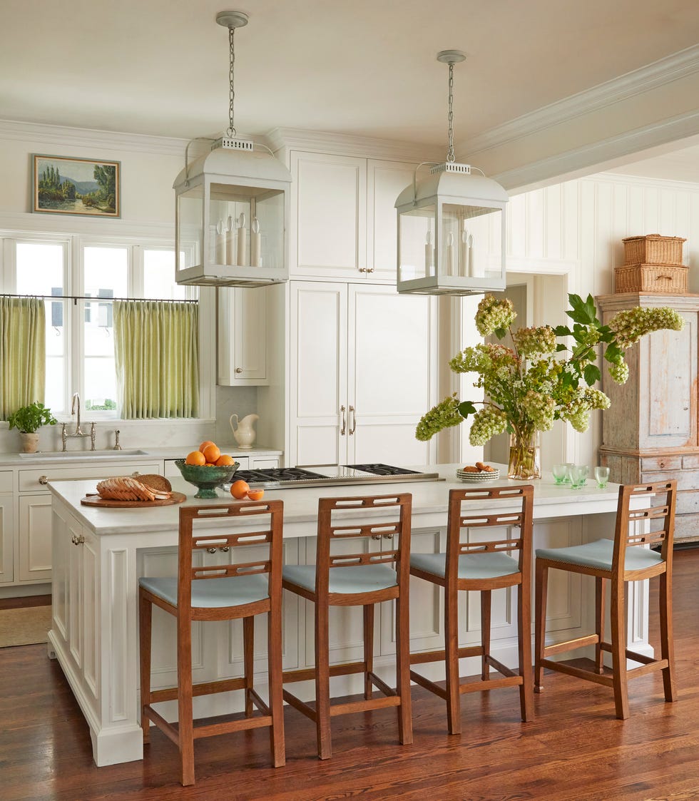
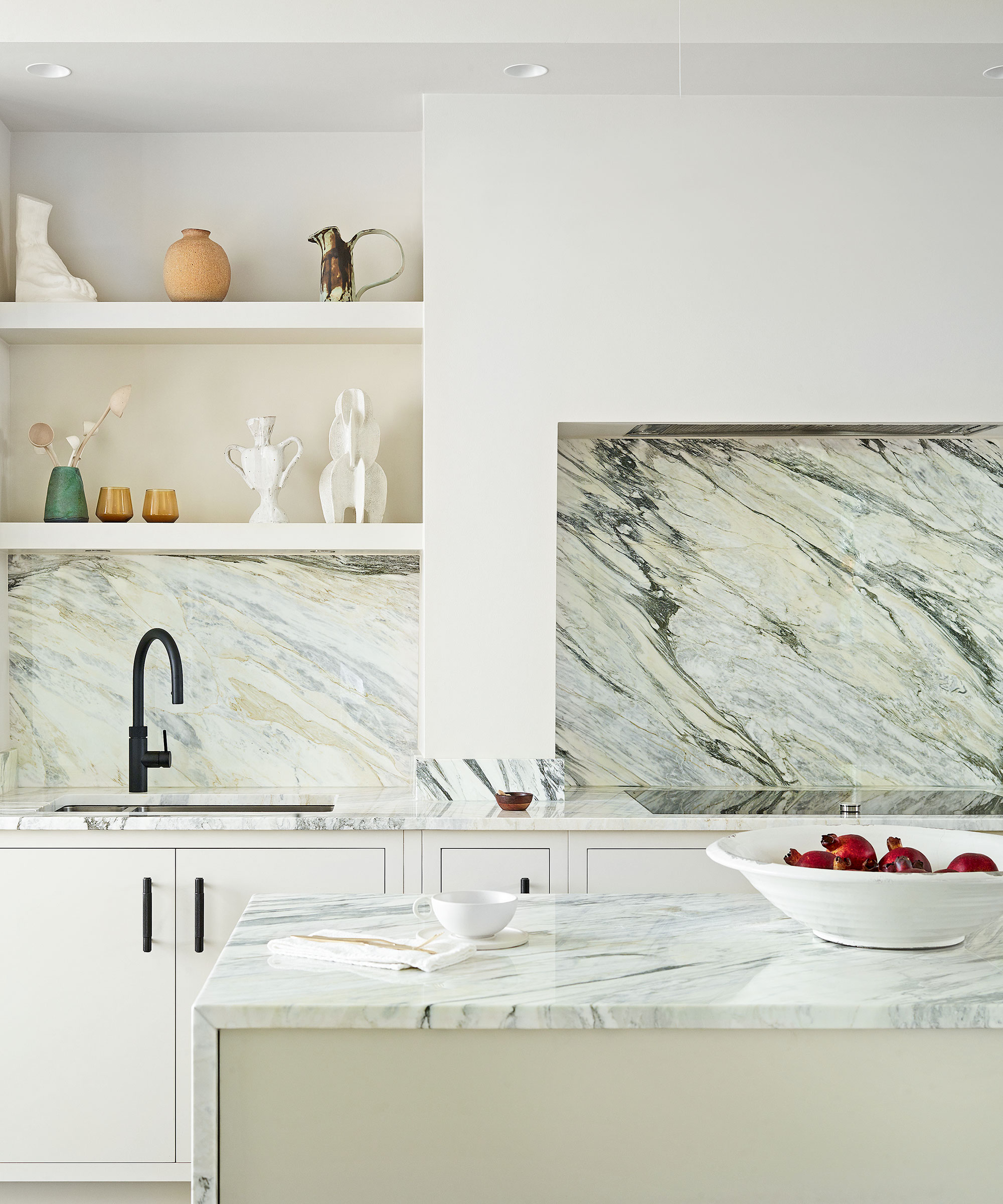
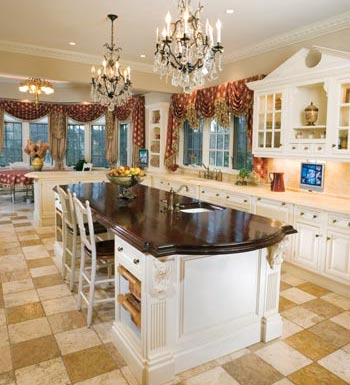
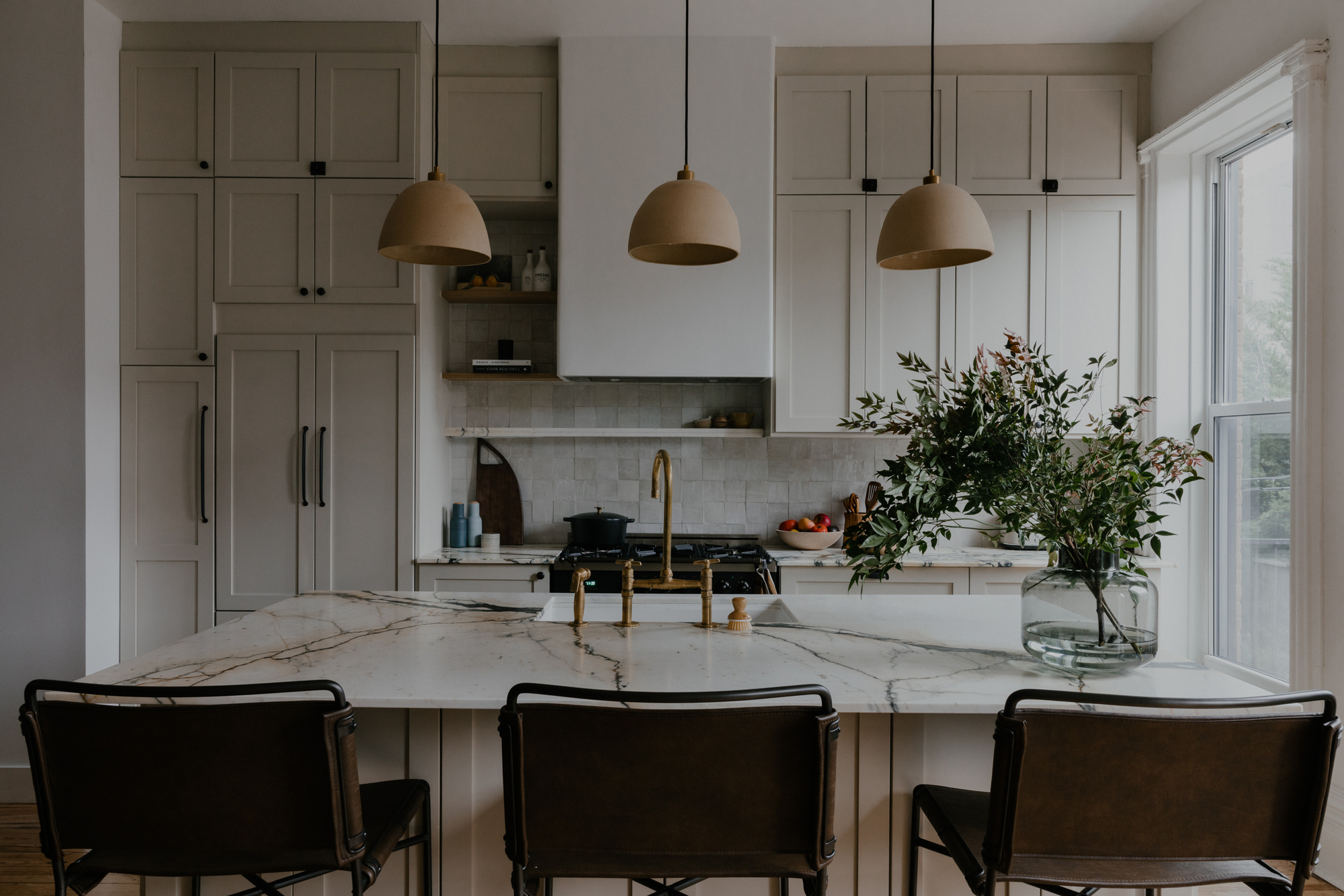
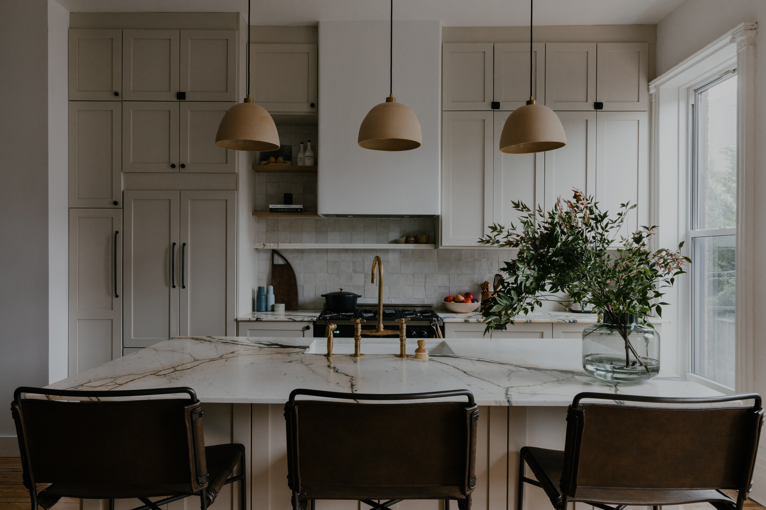
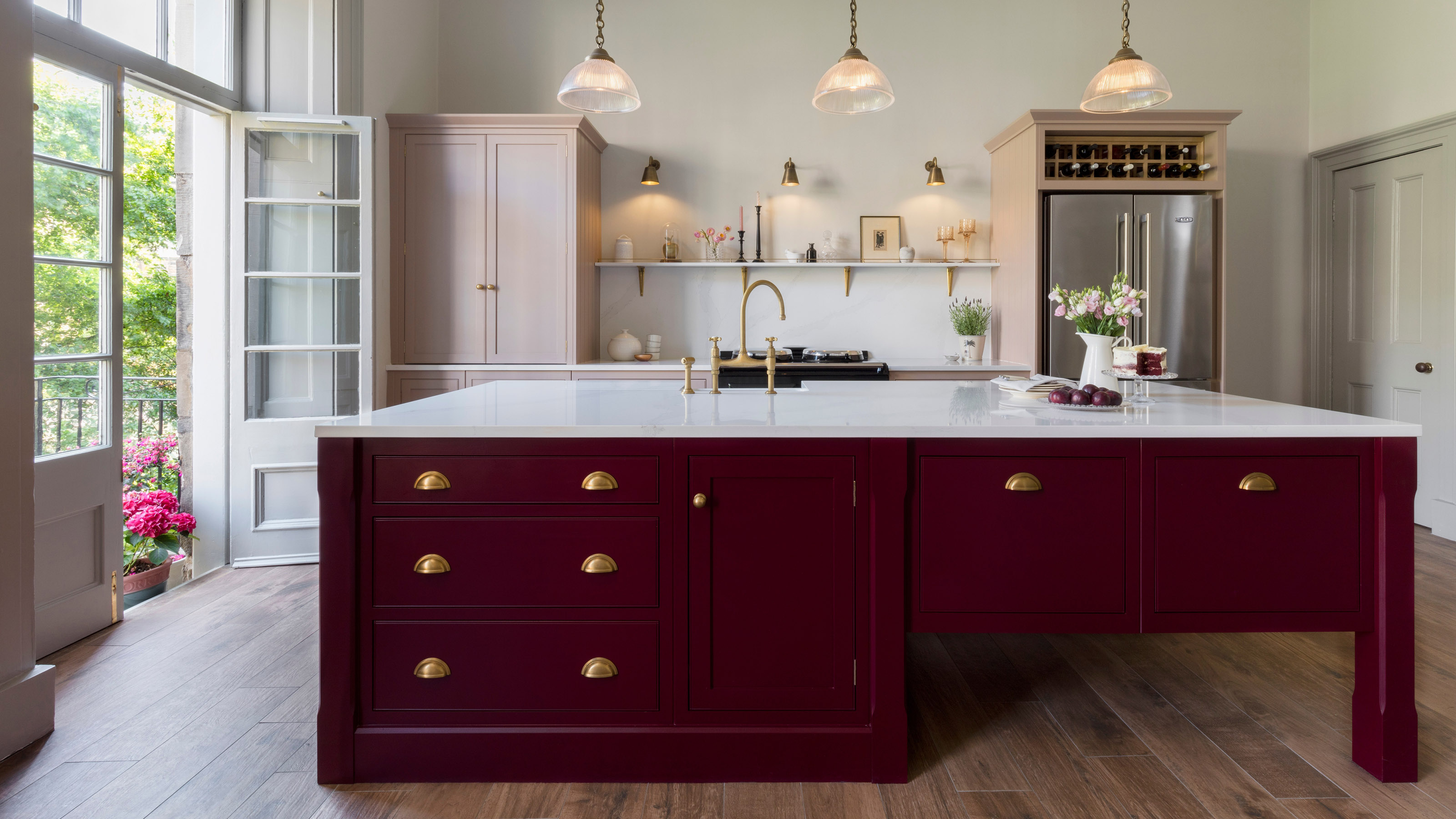
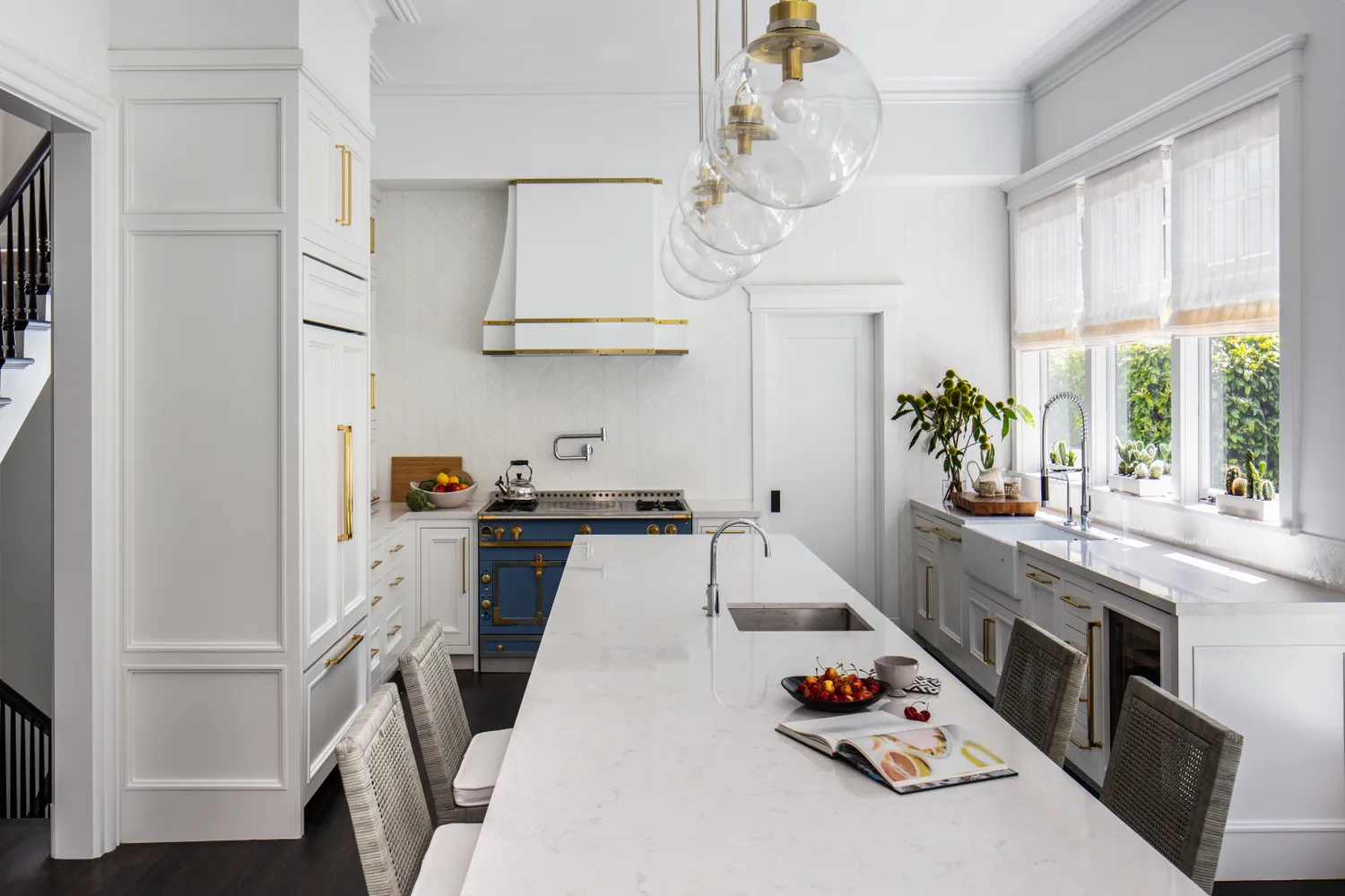
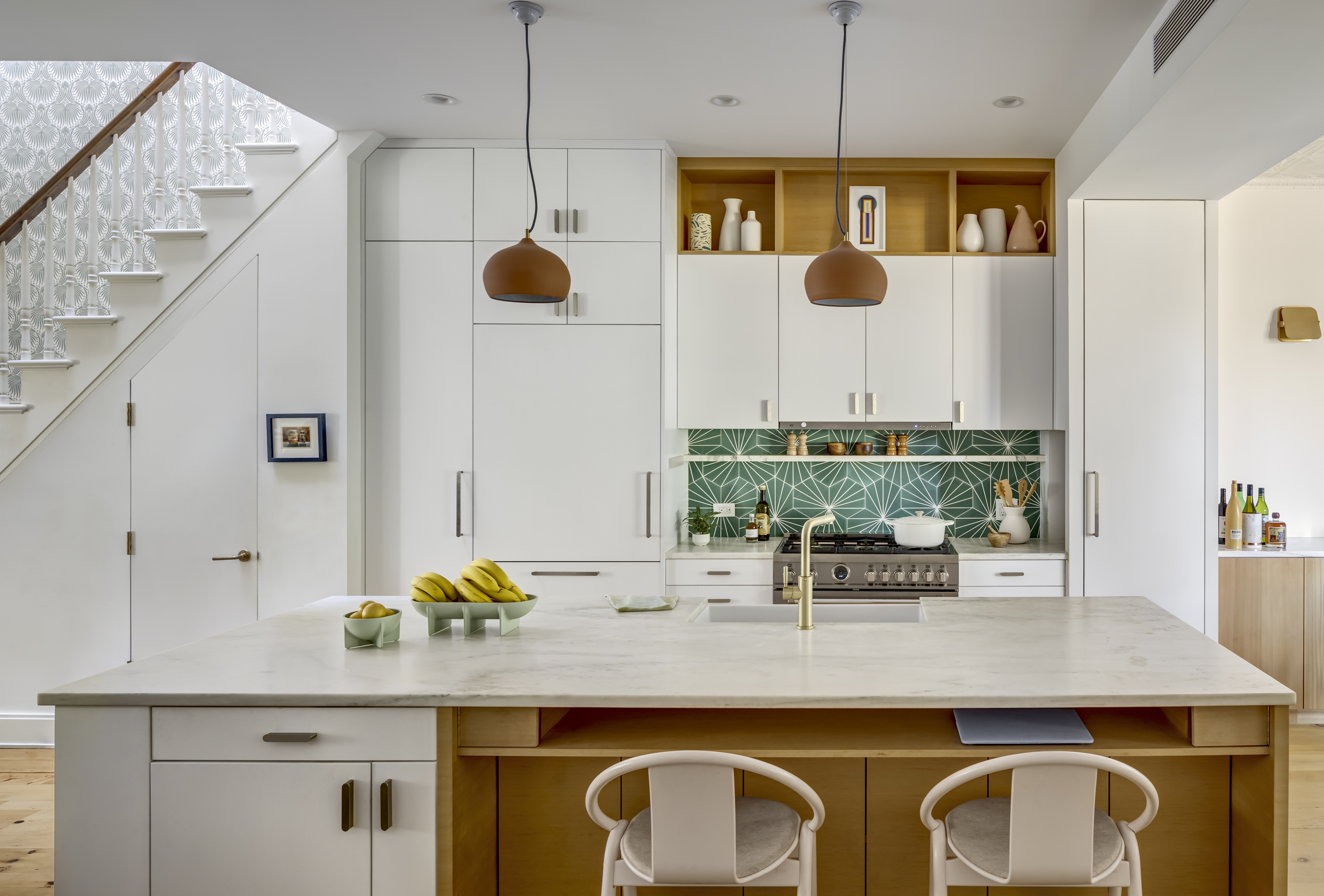
The kitchen, situated at the rear of the house, was designed to be open and airy, featuring high ceilings, original crown molding, decorative plasterwork, and large floor-to-ceiling windows. To maximize natural light flow throughout the home, the designers opted for a predominantly neutral color palette in the main living areas. The kitchen cabinetry, custom Shaker-style units, was sprayed with Farrow & Ball's 'Shaded White,' described as a creamy off-white that enhances the original architectural features without appearing stark. This neutral choice for the walls and ceilings allows the inherent richness of the historical details to take prominence. The kitchen's neutral scheme is complemented by original hardwood flooring, with three pendant lights positioned above the island adding warmth to the space.
The kitchen island, a new addition, mirrors the Shaker cabinet style and features Calacatta Paonazzo marble countertops, which introduce a dramatic element. A home bar cabinet in a dark blue shade and white oak shelves provide contrast and additional warmth, with fluted glass on the cabinet doors contributing an antique feel that aligns with the home's heritage.
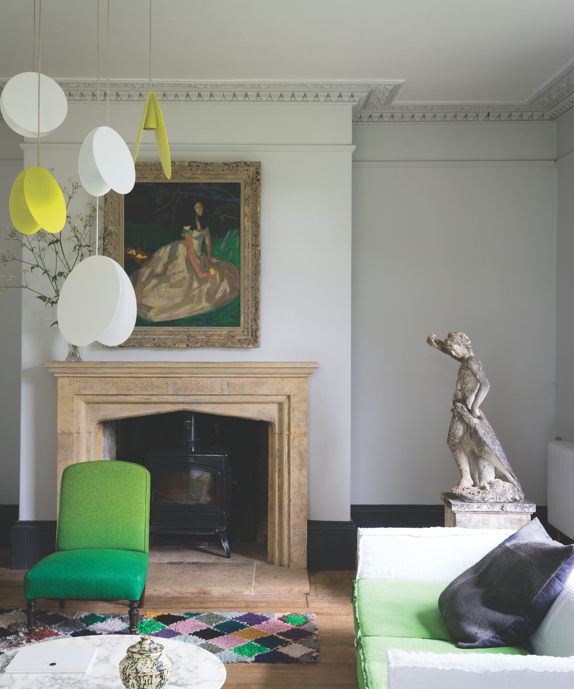
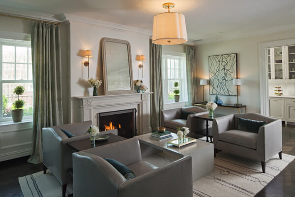
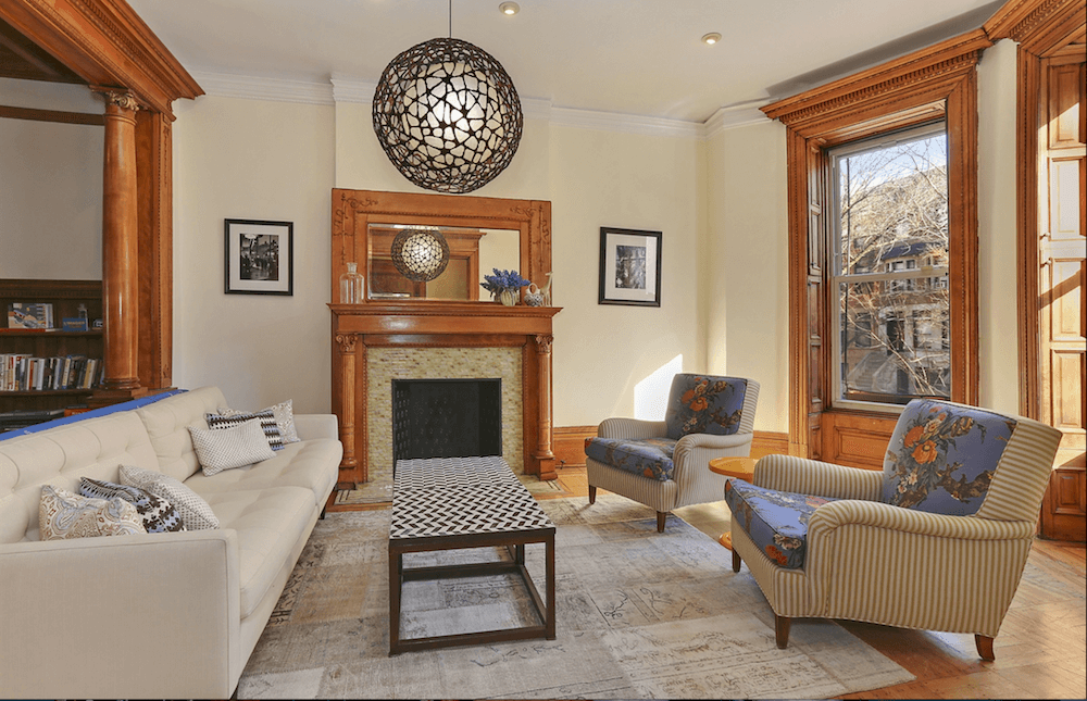
Transitioning from the kitchen, the dining area incorporates a large solid wooden table set upon a Persian rug. The designers intentionally used multiple Persian rugs throughout the home, their rich reds and pinks offering a vibrant contrast to the neutral walls and echoing the classic details of the house. The dining area seamlessly connects to the living room, where floor-to-ceiling windows continue to flood the space with natural light. A prominent marble fireplace acts as a focal point, linking the living area's design to the marble elements in the kitchen.
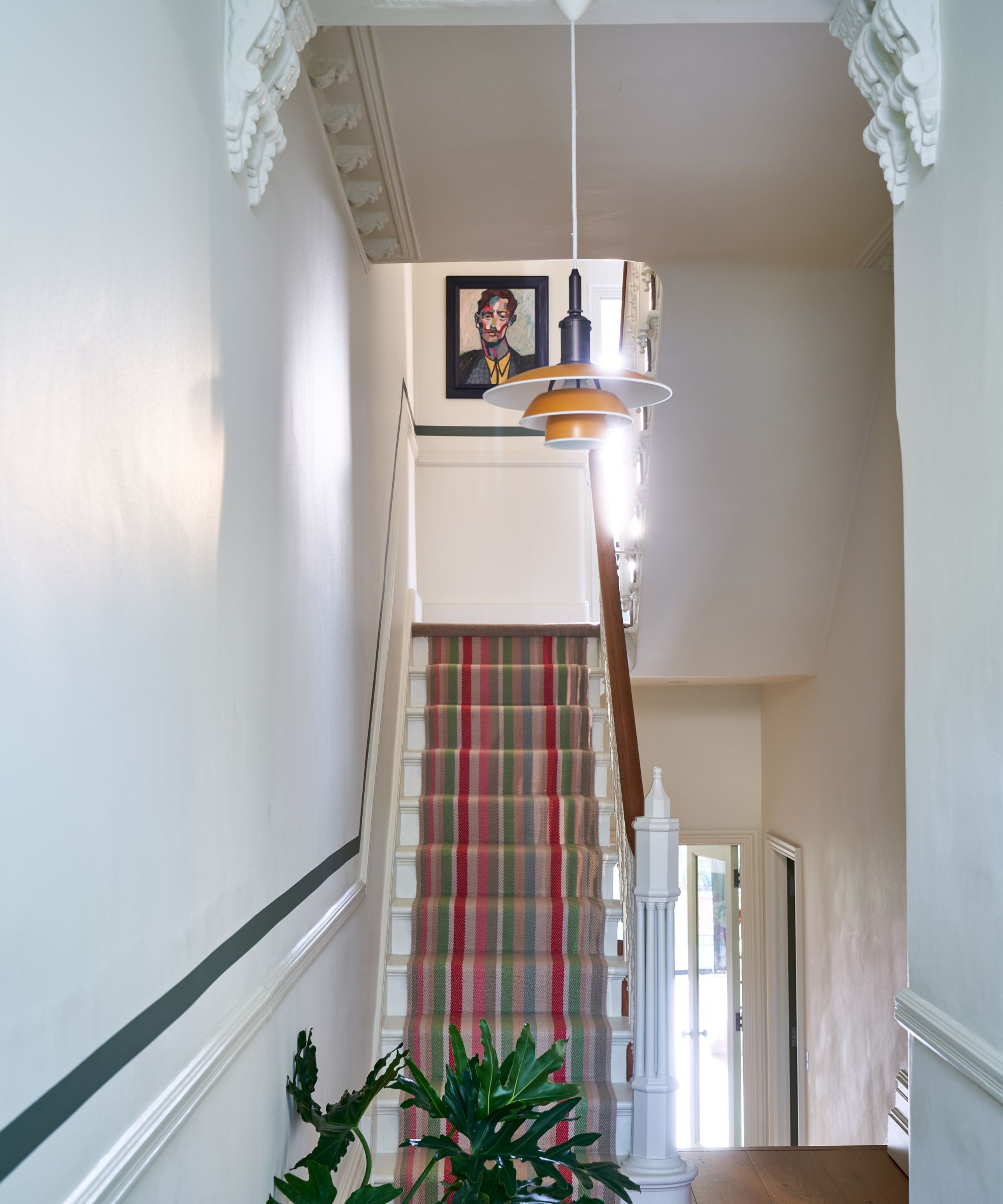

The staircase, another original feature from the late 19th century, underwent significant restoration. To establish a strong base, the stairs were painted with Sherwin Williams' 'Tricorn Black.' An innovative approach was taken for the stair runner: instead of a single piece, several smaller, vintage rugs with varied colors, patterns, and textures were stitched together, creating a unique and cherished design element.
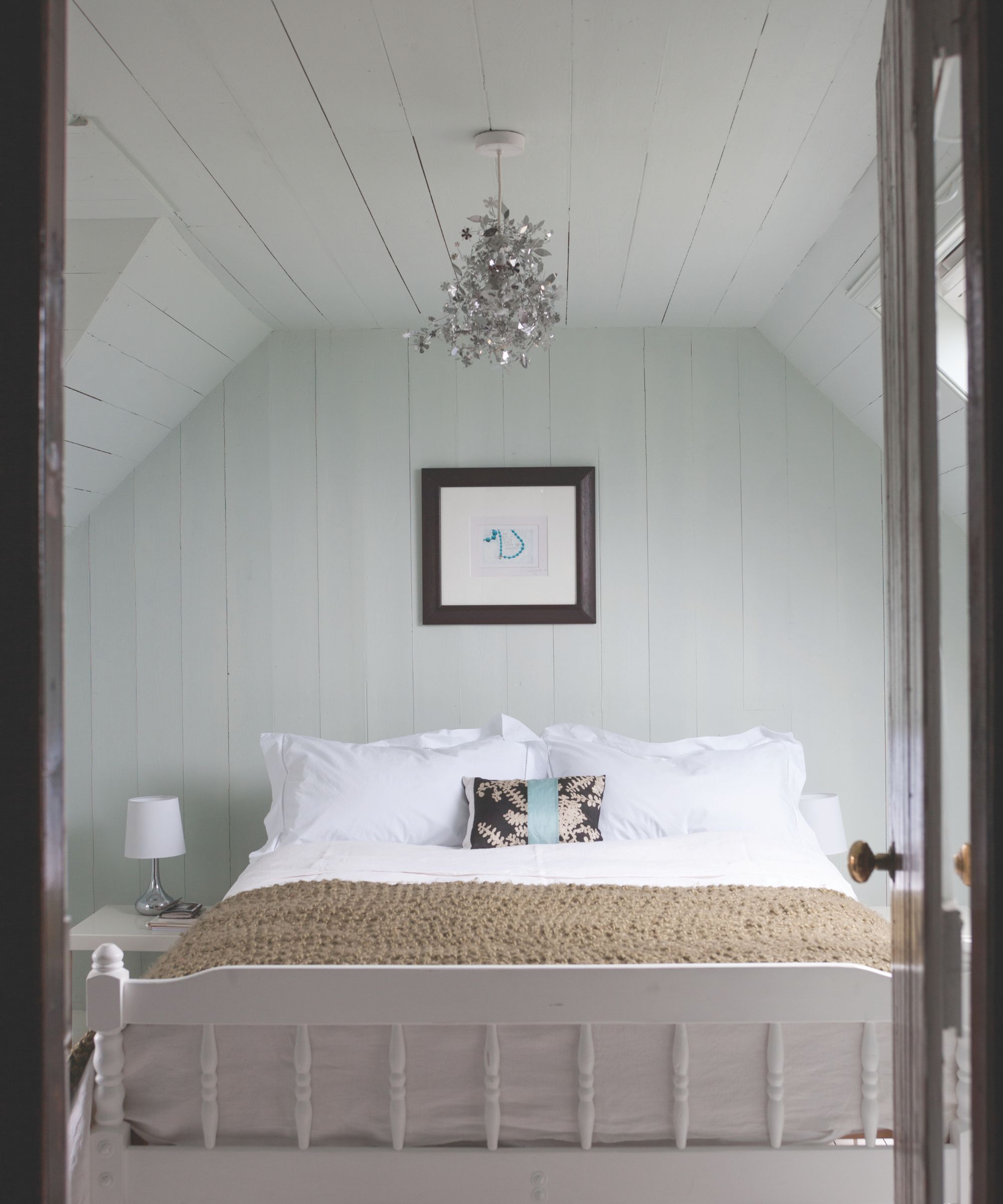
Upstairs, the main bedroom maintains continuity with the lower levels through its white walls, wooden flooring, and accents of wood, alongside bolder color pops. The design aimed to blend the homeowners' diverse backgrounds—Australia, North Carolina, and California—into a serene and restorative environment. A base of pure white on the walls provides a canvas for introducing color and texture through bedding patterns and furniture. The main ensuite bathroom features a striking Venetian plaster wall in 'Cortes' from Portola Paints, a subtle terracotta shade that emanates warmth throughout the primary suite. The surrounding walls are painted with Sherwin Williams' 'Pure White,' allowing the Venetian plaster to become a central visual element. An arched niche behind the bathtub further accentuates this focal point, creating a harmonious balance between neutral tones and sophisticated plasterwork.
The guest bedroom and its ensuite present a more vibrant use of color and texture. The guest bathroom showcases textured walls made of zellige tiles from Zia Tile. The imperfect, handcrafted nature of these tiles creates a gentle sheen and a relaxing atmosphere. The designers used two tones of zellige tile, believing blue and green to be particularly complementary, especially when combined. The varied movements within each tile piece, set on a terracotta base, contribute to a distinct ceramic feel and allow the tiles to reflect more light, enhancing the space's brightness regardless of its size.
#HomeRestoration #TownhouseDesign #NeutralColorScheme #KitchenDesign #PaintColors #InteriorDesign #ArchitecturalPreservation #ModernHome #BrownstoneBoys #HomeRestoration #TownhouseDesign #NeutralColorScheme #KitchenDesign #PaintColors #InteriorDesign #ArchitecturalPreservation #ModernHome #BrownstoneBoys
0 comment in total
 No comments yet
You may also like
5 White Kitchen Paints Designers Swear By
What colors work best in a kitchen with white appliances? Interior designers suggest the most timeless schemes

For a "Cool-Looking" Home, Designers Say Use This Finish

Transform The Area Above Your Kitchen Cabinets With These Color Tips

Interior designers' favorite Farrow & Ball paint colors
The secret to making your kitchen island look more expensive, according to design experts
13 Off-White Paint Colors That Make Any Room Feel Bigger and Brighter

6 great ways to use colour drenching in your home
'Get This Element Right, and Add The Perfect Finish to Your Kitchen,' Say Designers

Our Favorite Kitchen Wall Paint Colors
White kitchen ideas – 40 ways to use this favorite shade
50 Best Kitchen Ideas for a Beautiful Space That Looks as Good as It Cooks
The Best White Paint Colors for Kitchen Cabinets, According to Designers

The Kitchen Colors Designers Call “Forever Favorites”
White Hot

What are the best accent colors for a white kitchen? These five shades will bring life to a stark space
I promise, these 6 best white Farrow & Ball paints will end your search for the perfect shade
Are White Kitchens Officially Over? Here's What Designers Are Saying


Designers Load Up on Classic and Neutral Colors Inside Townhouses
15 White Paint Colors Interior Designers Reach for Time and Again