1/4
Jil Sander Wants You to Match Your Furniture to the Floors
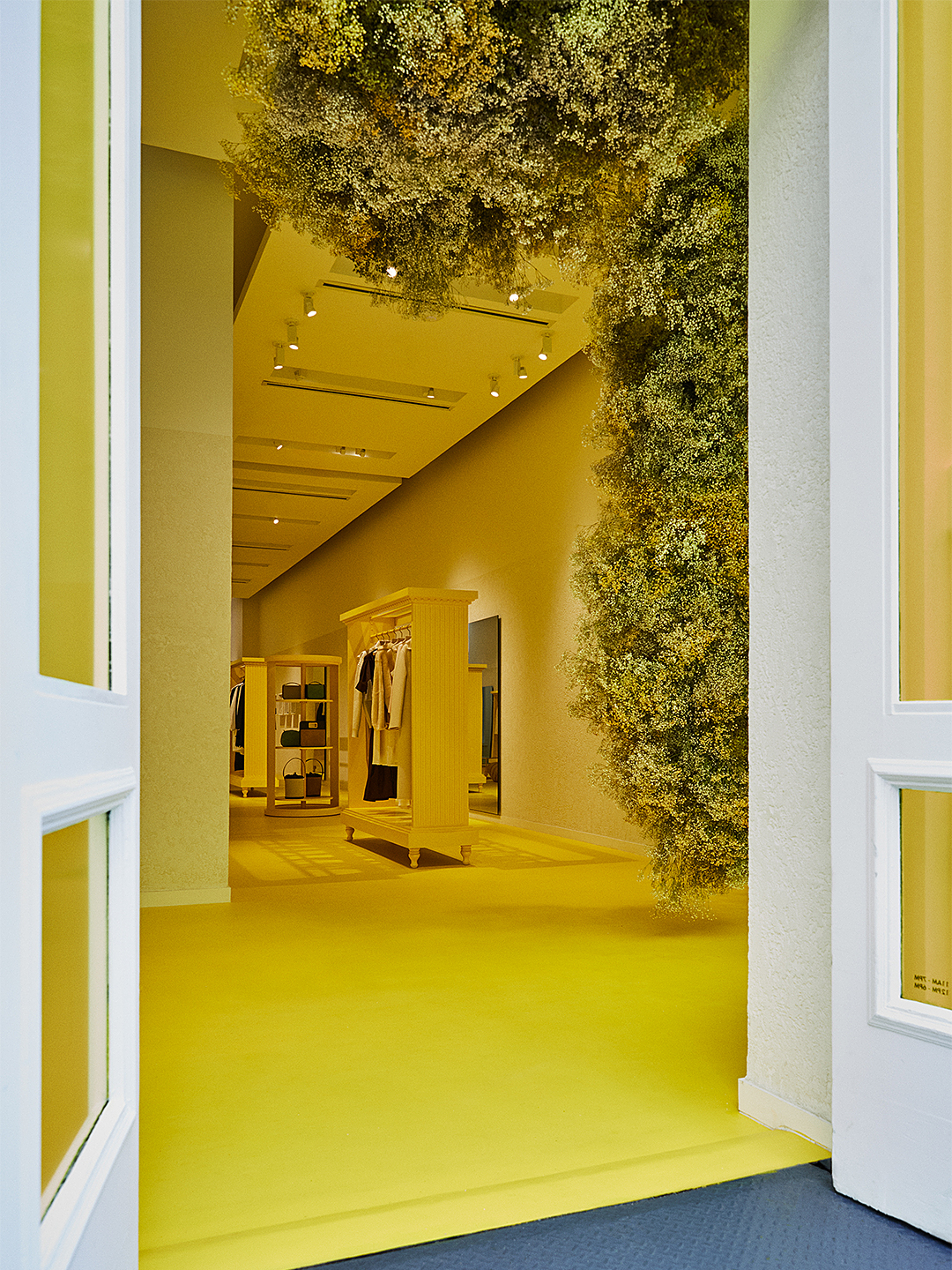
The Jil Sander brand, known for its streamlined and expertly crafted clothing, has opened a new pop-up shop in Manhattan, which showcases a distinctive design approach. Departing from the brand's usual neutral palette, the retail space is entirely enveloped in a vibrant fluorescent yellow, reminiscent of Farrow & Ball's Babouche. This bold color choice unifies the displays and serves as a key design inspiration within the shop.
The design strategy employed involves painting or coloring almost every surface below eye level, including flooring, display shelving, upholstery, and even windows, in this singular sunny hue. By concentrating the color on the lower third of the space, the visual focus is directed upward, allowing the brand's earth-toned garments to stand out prominently against the bright background. This technique demonstrates how a consistent color application on specific planes can influence perception and highlight products effectively.
To prevent the extensive use of a single, warm shade from appearing stark or monotonous, the design incorporates textural variation. The walls, for instance, are treated with plaster, which introduces a subtle yet impactful texture. This addition breaks the visual uniformity that an entirely smooth, monochromatic surface might present, adding depth and combating any potential coldness despite the warm color choice.
Another innovative design element within the pop-up shop is the use of shadow boxes. These recessed display areas are painted the same fluorescent yellow as the surrounding walls, effectively transforming displayed items, such as purses, into small works of art. This integrates the merchandise seamlessly into the overall aesthetic while elevating their perceived value. The shadow boxes demonstrate how retail display techniques can be adapted for home design to create focal points and artistic presentations of personal items.
The pop-up shop's design provides practical insights into color application, textural enhancement, and display strategies. It highlights how a single, bold color can be used comprehensively to create a unified and visually striking environment, while subtle variations in texture and creative display solutions can prevent monotony. The overall concept underscores the brand's minimalist yet impactful aesthetic, extending its design philosophy beyond fashion into interior spaces.
#JilSander #PopUpShop #RetailDesign #InteriorDesign #ColorInspiration #MonochromaticDesign #HomeDecor #DesignTrends #JilSander #PopUpShop #RetailDesign #InteriorDesign #ColorInspiration #MonochromaticDesign #HomeDecor #DesignTrends
0 comment in total
 No comments yet
You may also like

Pamela Anderson's quiet luxury kitchen signals that this classic flooring trend is going to be huge in 2024

Set the Stage With These Flooring Options

See Inside a Gorgeous, Texture-Rich Home in New York City

Jenelle Lovings’s graphic mix of fluted marble, slatted oak and terrazzo tile

Flooring

Modulyss lists carpet tiles on Dezeen Showroom

Joanna Gaines' Stylish Fixer Upper Floor Reno Is Right On Track With A New Trend
Skirted Furniture Is Really Having a Moment
This is the single biggest rug mistake you can make, says Jake Arnold – and what to do instead
How to Score Secret Deals on Floor Samples, According to Design Insiders
Designer Jake Arnold Never Leaves These Decorating Decisions Until the End

25 Celebs Who Double as Interior Designers and Decorators — Celebrity Furniture Collections


Joanna Gaines Shows Us A Genius Way To Make Basic Hardwood Floors Look More Unique
MATCHESFASHION launches designer homewares studio

Leave It to Mindy Kaling to Inspire You to Buy a New Tufted Sofa
Interior Designer Mom Is Back With the Home Decor Trends to Care About This Spring

Joan Didion's living room is a masterclass in the art of 'curated clutter' – it feels like a step into the ultra-chic writer's inner world
An interior expert reveals how to achieve the perfect living room – and the biggest mistakes made

Update your furniture with extreme texture, the biggest trend in upholstery…

This Design Mistake Could Lower The Resale Value Of Your Home