1/10
Talking Australian colour with Nexus Designs

This article features an interview with Sally Evans and Sonia Simpfendorfer, directors at Nexus Designs, discussing their studio's approach to colour in Australian interior design. It delves into the evolution of 'Australian colour' and offers advice on incorporating it into design projects.
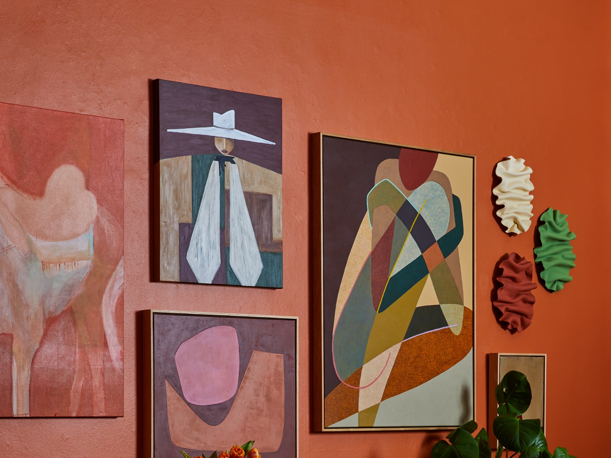
The discussion highlights that for a generation of designers in Australia, the seminal work on colour has been Nexus Designs founders Janne Faulkner and Harley Anstee’s book, _Using Australian Colour_. The unique Australian landscape, characterized by the rich terracotta of the Red Centre, the silvery green-grey of eucalyptus trees, and the deep blues of its beaches, has provided a distinctive and inspiring colour palette that continues to influence Nexus Designs.
Sally Evans explains that the Australian light and landscape are fundamental to their design approach. Every product, range, or palette they recommend is intended for use within an Australian context, whether urban, rural, or interior. The firm prioritizes how colours will perform in their intended environment, considering the interplay between light, surface finish, and viewing distance. Their objective is to create colour ranges that complement Australian environments without merely imitating them.
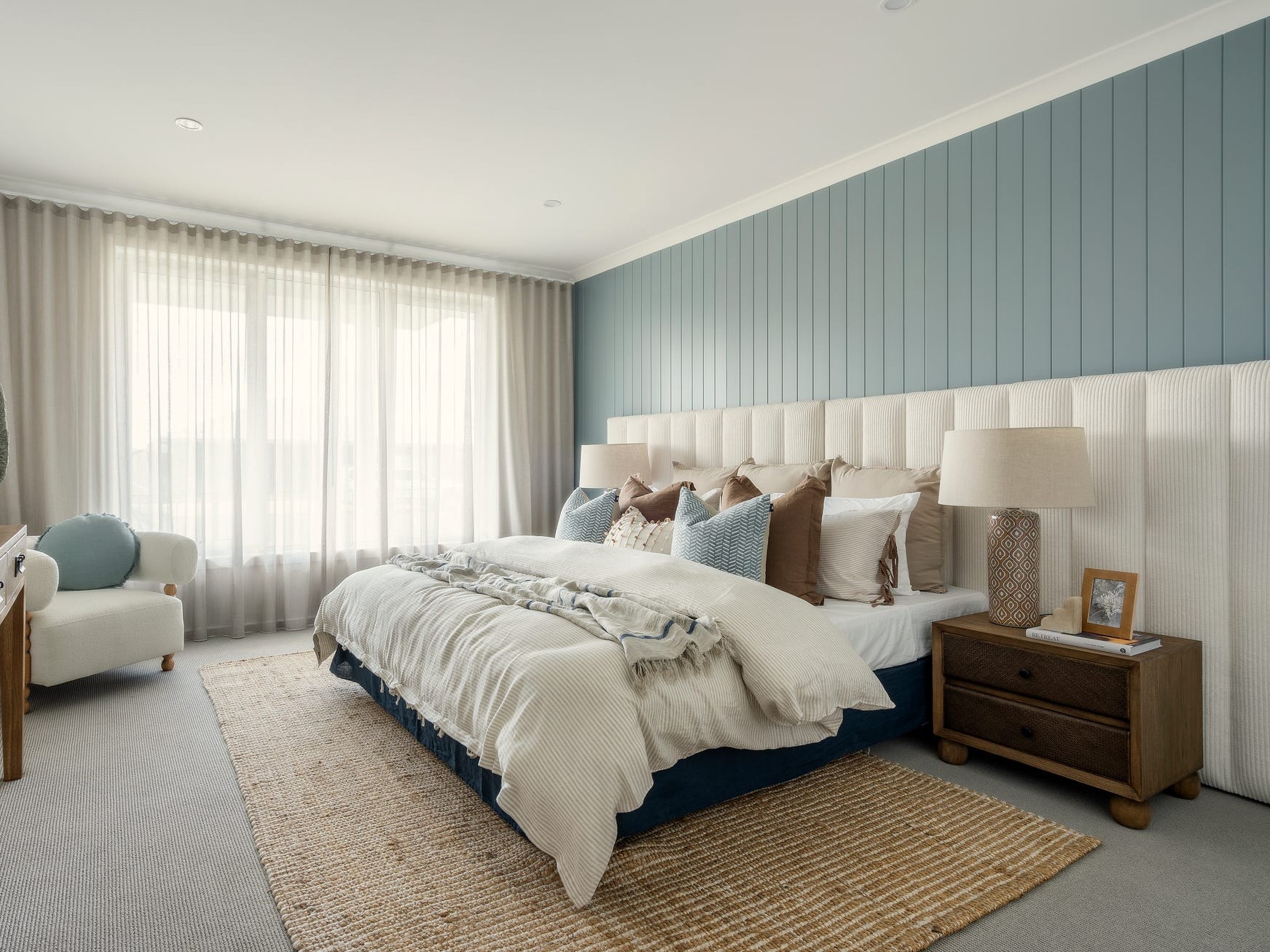
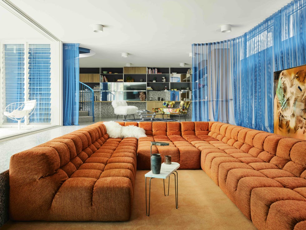
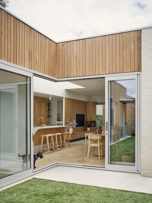
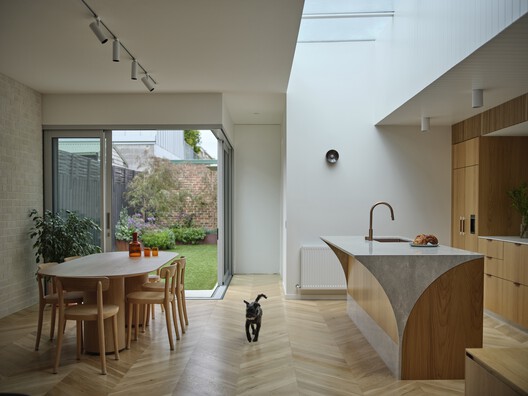
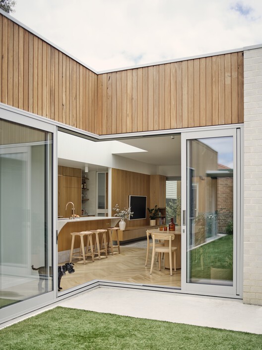
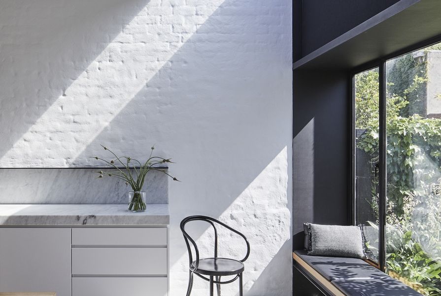
Sonia Simpfendorfer emphasizes the profound impact of Australian light on colour perception in interiors. Nexus Designs consistently seeks methods to optimize natural light, aiming to create spaces that feel intrinsically connected to their location, often achieved through open-plan living, natural materials, and seamless indoor/outdoor transitions.
The concept of 'Australian colour' has undergone significant evolution. When Janne Faulkner founded Nexus Designs in 1967, the idea of distinctly Australian colour was rarely acknowledged, except among forward-thinking architects. Faulkner established the business during a period of architectural revolution, shifting from designs that ignored the environment to those that embraced light, openness, and connection to the outdoors.
The publication of _Using Australian Colour_ by Nexus Designs was groundbreaking, captivating the public imagination with its fresh and exciting concept of uniquely Australian palettes derived from the landscape. Today, many designers and businesses champion Australian colour, which has moved beyond simple interpretations of vibrant, sunburnt hues to encompass a more nuanced palette of subtle, often 'dirty' tones that harmonize effectively with Australia's intense light.
Looking forward, Evans anticipates a growing appreciation for colours that reflect Australia's diverse landscapes. The increasing focus on sustainability and locally sourced materials is expected to influence future colour trends across all design disciplines, leading to a shift towards truly Australian palettes rooted in context and integrating Indigenous colour knowledge.
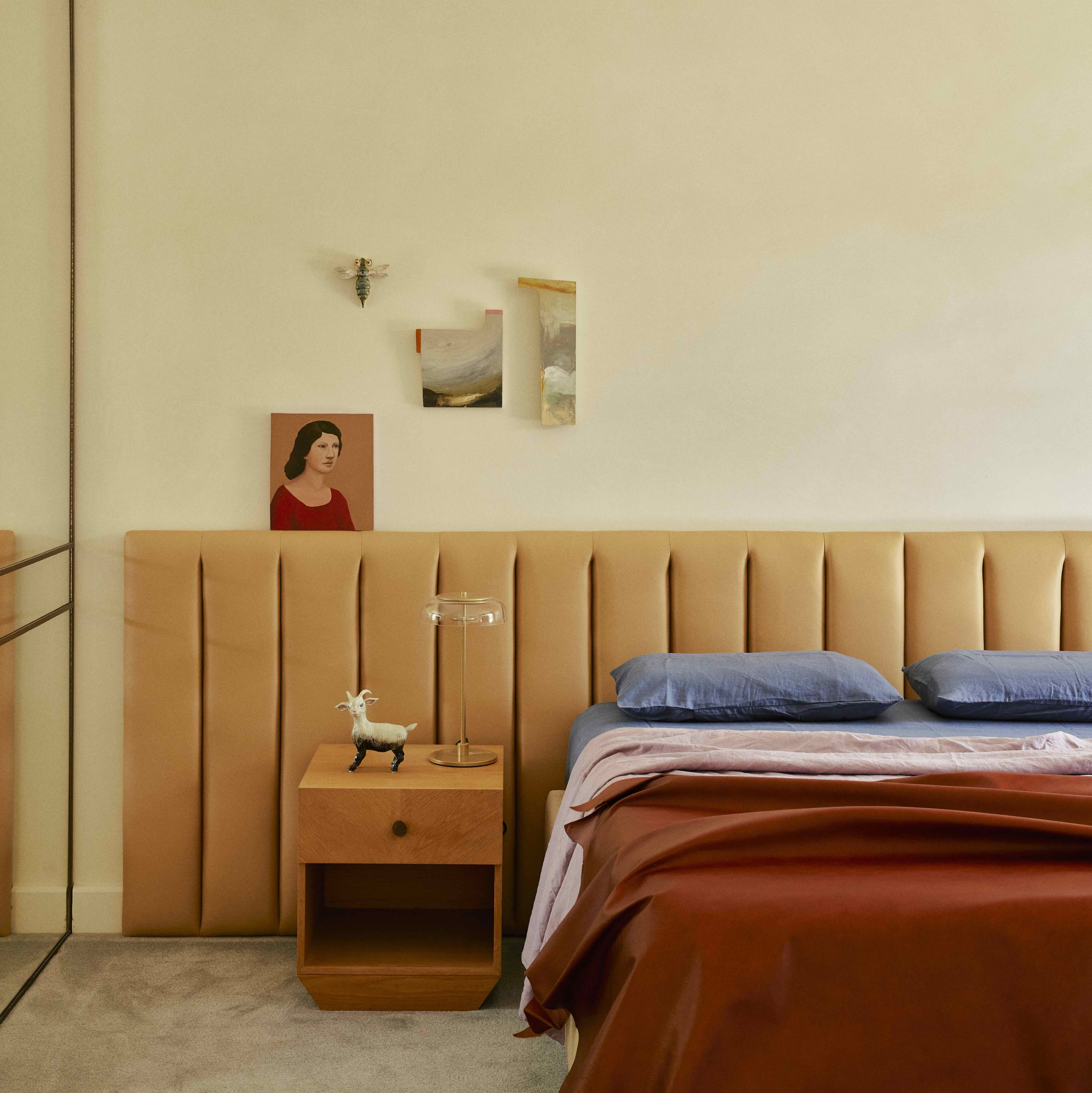
For incorporating Australian colours, Evans advises observing the immediate environment and context, considering a colour’s proportion, and how it interacts with other materials and lighting. She notes that colour is a powerful tool for creating visual narratives in environments. When selecting colours for a house, she suggests starting with the largest visible forms or shapes, understanding that materiality also plays a crucial role, and then choosing complementary items and colours that will either highlight or contrast with those larger areas.
Simpfendorfer adds that colour inspiration can come directly from nature or simply from finding colours that perform well in Australia’s unique light and context. She recommends understanding how light functions in a space throughout the day and thoroughly testing colours using samples in their intended orientation (e.g., flooring samples on the floor, wall samples held vertically). She also stresses the importance of not overlooking neutrals or whites, recognizing the wide range of shades available and the significance of understanding their undertones.
#AustralianColour #InteriorDesign #ColourPalette #NexusDesigns #SallyEvans #SoniaSimpfendorfer #ArchitecturalColour #LightAndLandscape #DesignInspiration #AustralianColour #InteriorDesign #ColourPalette #NexusDesigns #SallyEvans #SoniaSimpfendorfer #ArchitecturalColour #LightAndLandscape #DesignInspiration
0 comment in total
 No comments yet
You may also like
Talking Colour with American Design Duo The Novogratz |

From The Runway To Street Style, Chartreuse Was The Colour Crush of Afterpay Australian Fashion Week


Four designers weigh in on Pantone's Colour of the Year

Julia Sobrepeña King’s contrary curation of orange zellige tile, bright green rugs and curly gray shearlings

The Biggest Colour Trends Taking Off in 2025
What you didn’t know about colour

The return of the fashion colour consultation

Immerse in Color at SANDOW Design Group’s 2024 NeoCon Lounge

Fresh finds: stools, linen, shelving and more
Madewell Is Selling Paint Now?
Dusen Dusen’s Brooklyn Studio Is a Playground of Color

Zigzag House / Dan Gayfer Design

Brittany Ellis

Does where you live affect the colors you decorate with? According to designers, yes – massively
Rich colors and sumptuous textures are on designers' minds
Digs Design Company Brings Color to a Wellesley Cape Cod Home
Color and Creativity Combined at Livingetc's Latest Design, Directed Dinner

Studio Doherty knows how to innovative with colour: these are their decorating tips

From Quiet Luxury to the Sad Beige Baby, When Will ‘Beigification’ End?

The Best British Textile Designers