1/2
These 25 Colors Are the Perfect Match for Mint Green—Find Out How to Use Them
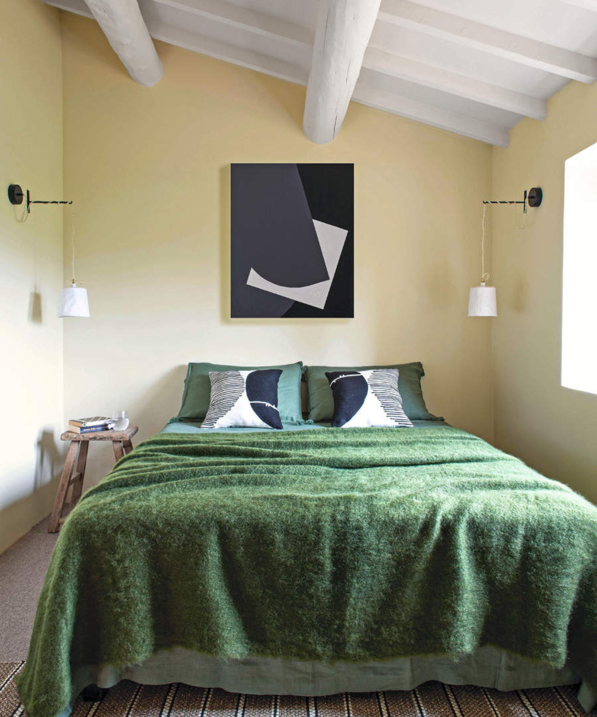
Mint green, a versatile shade with roots in Art Deco and 1950s design, offers interiors a retro charm or a soft, cheery aesthetic. When incorporating this color into a living space, selecting complementary colors is crucial. This guide provides 25 color pairings to inspire decorating projects, ensuring mint green integrates seamlessly into various design schemes.
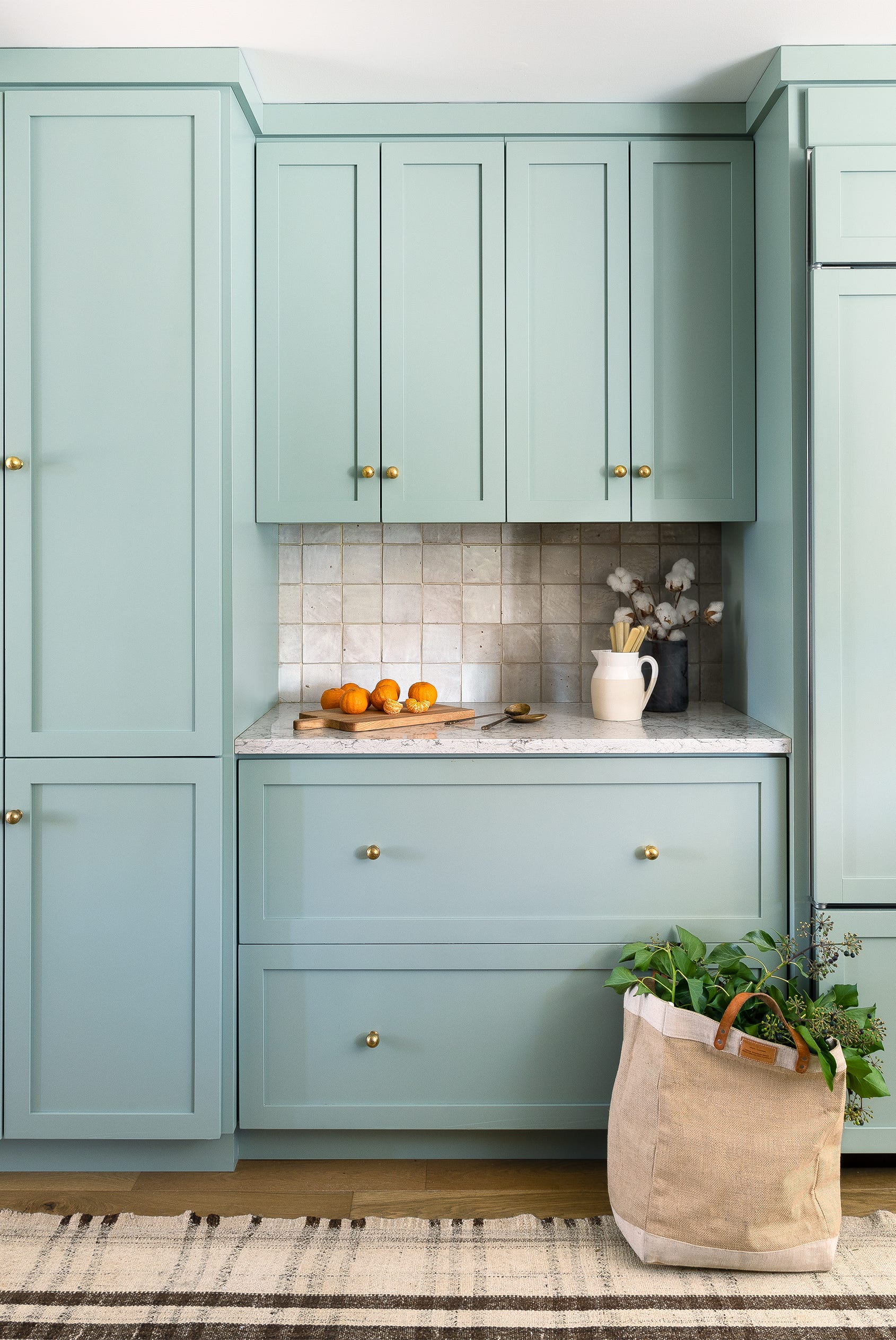
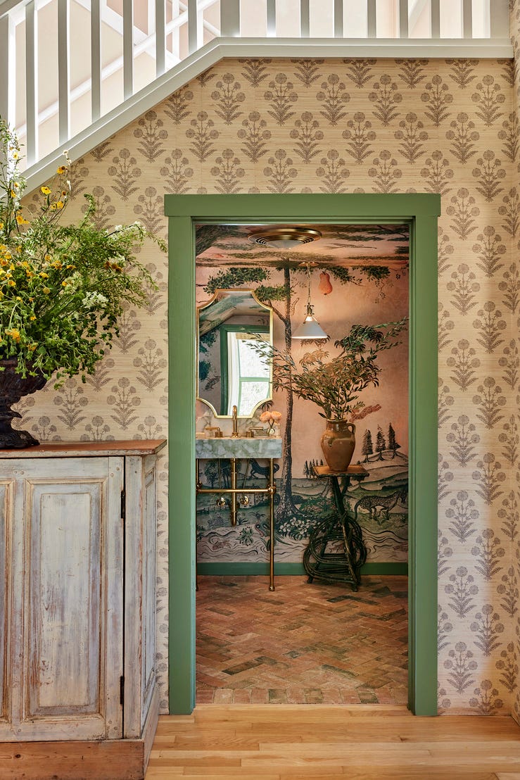
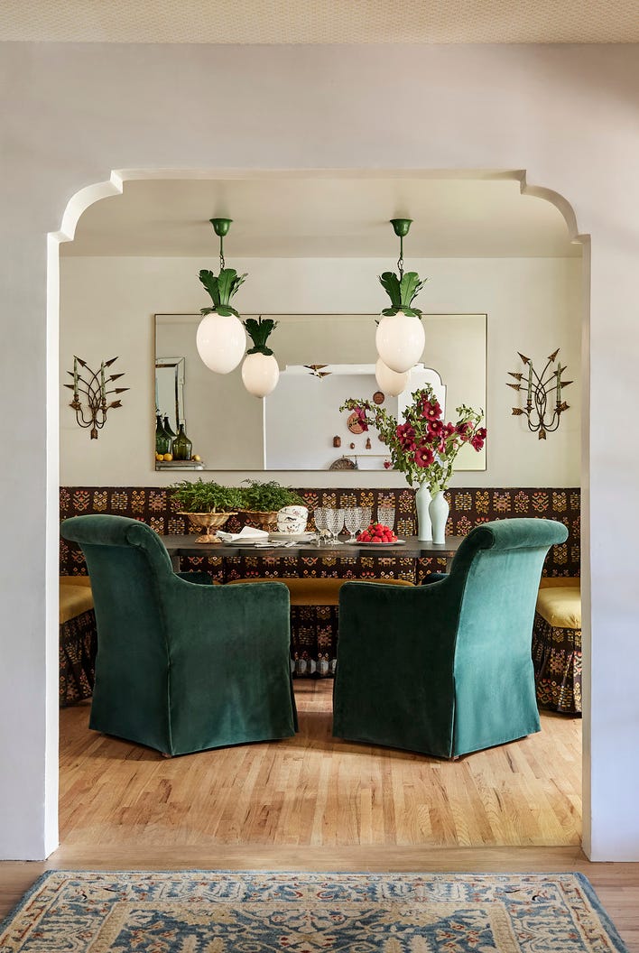
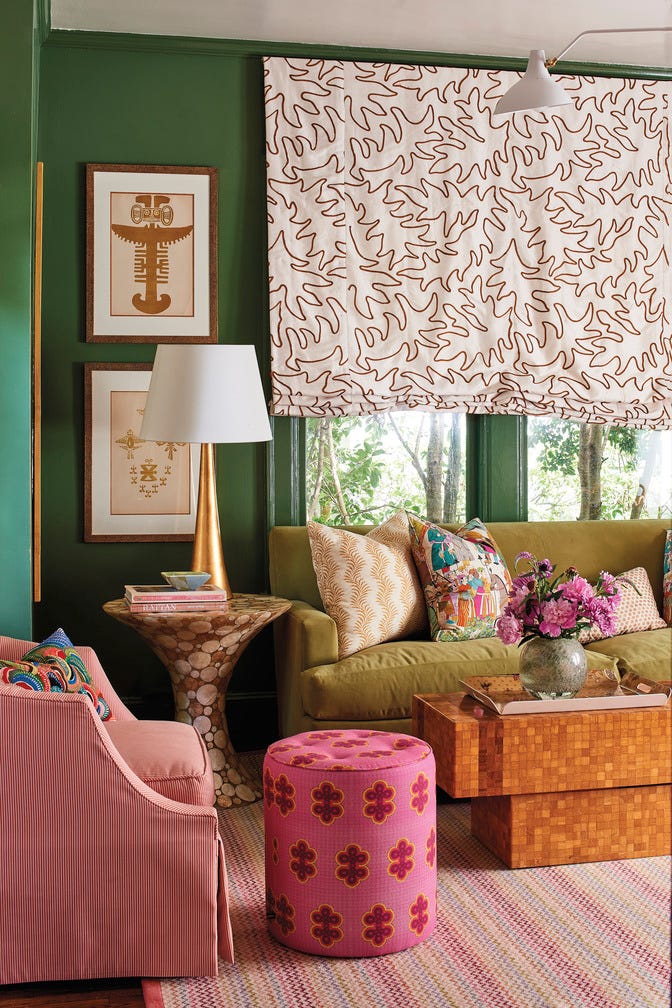
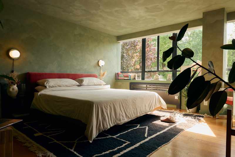
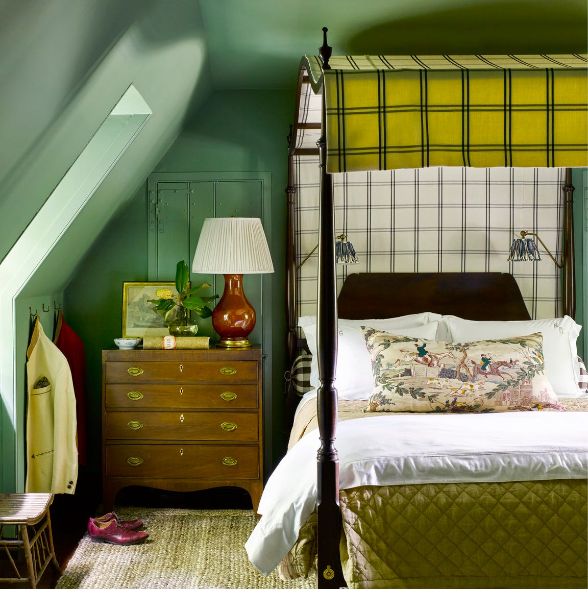
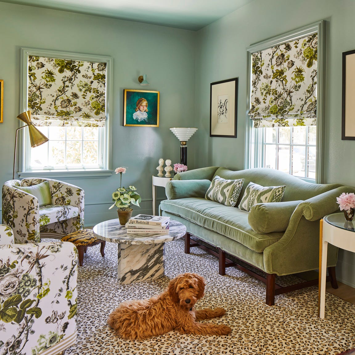
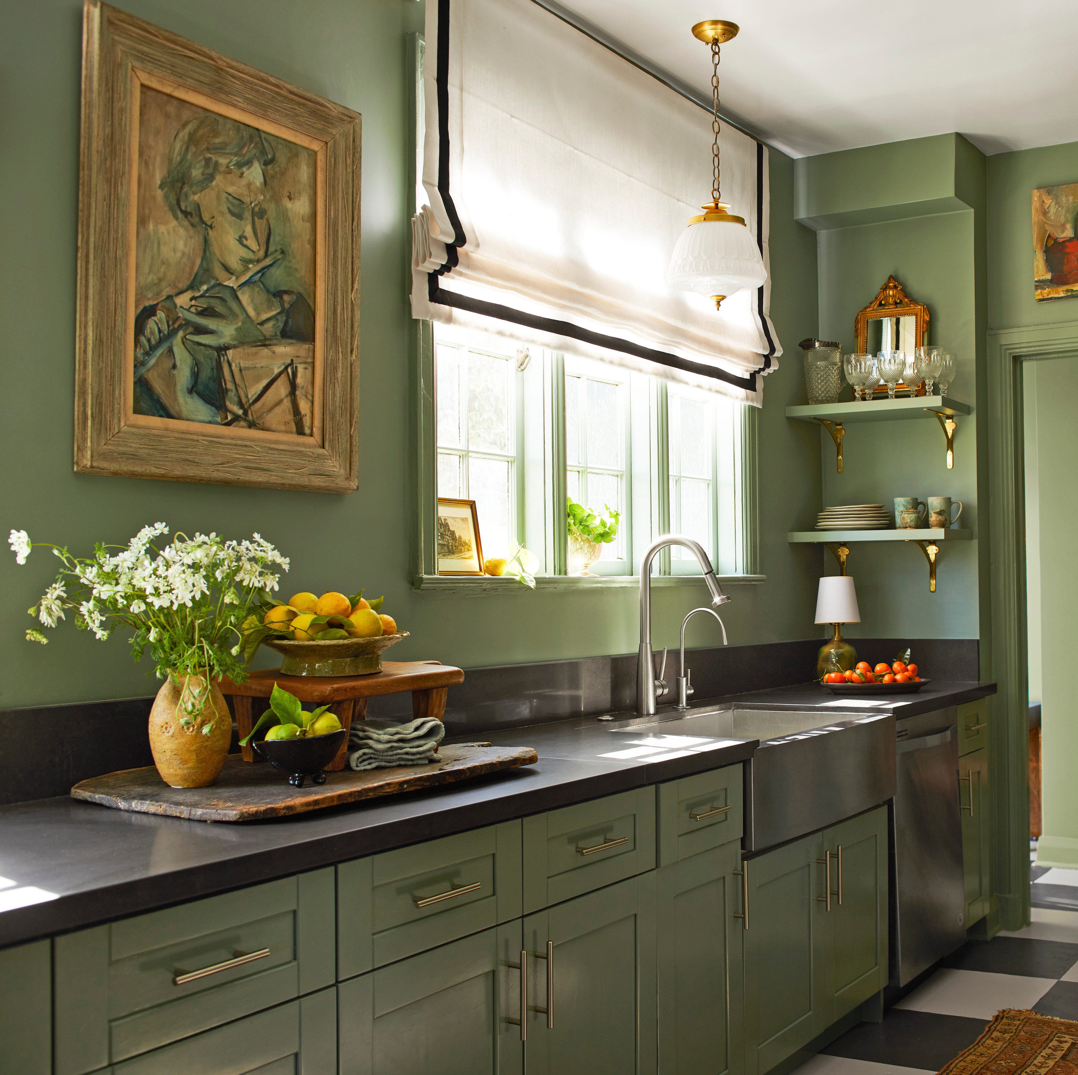
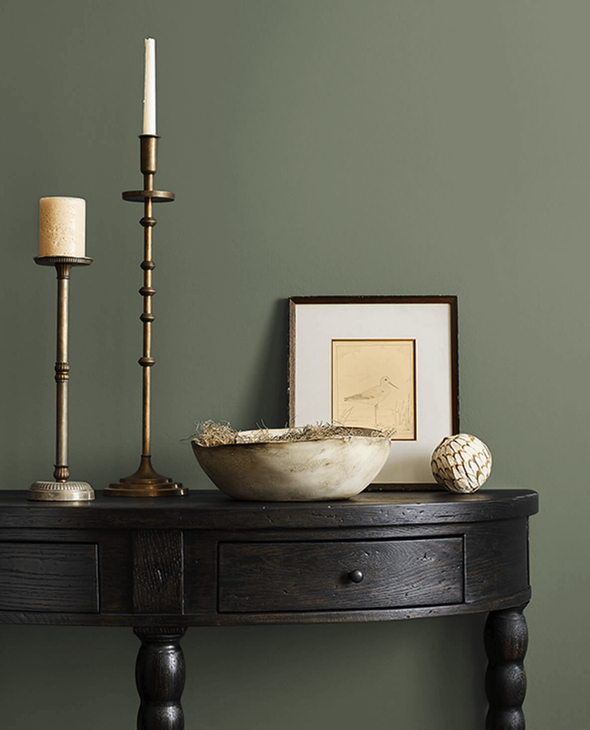
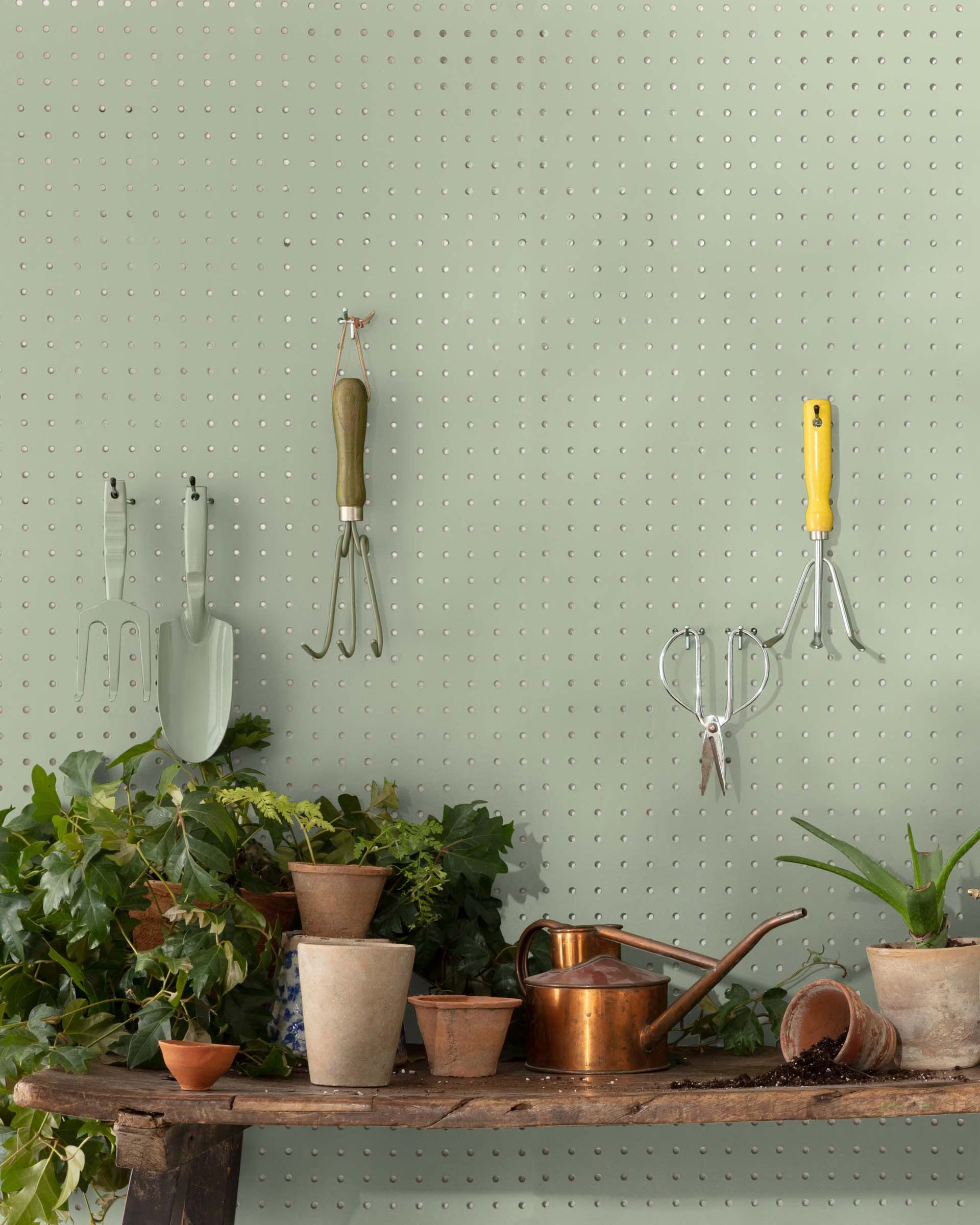
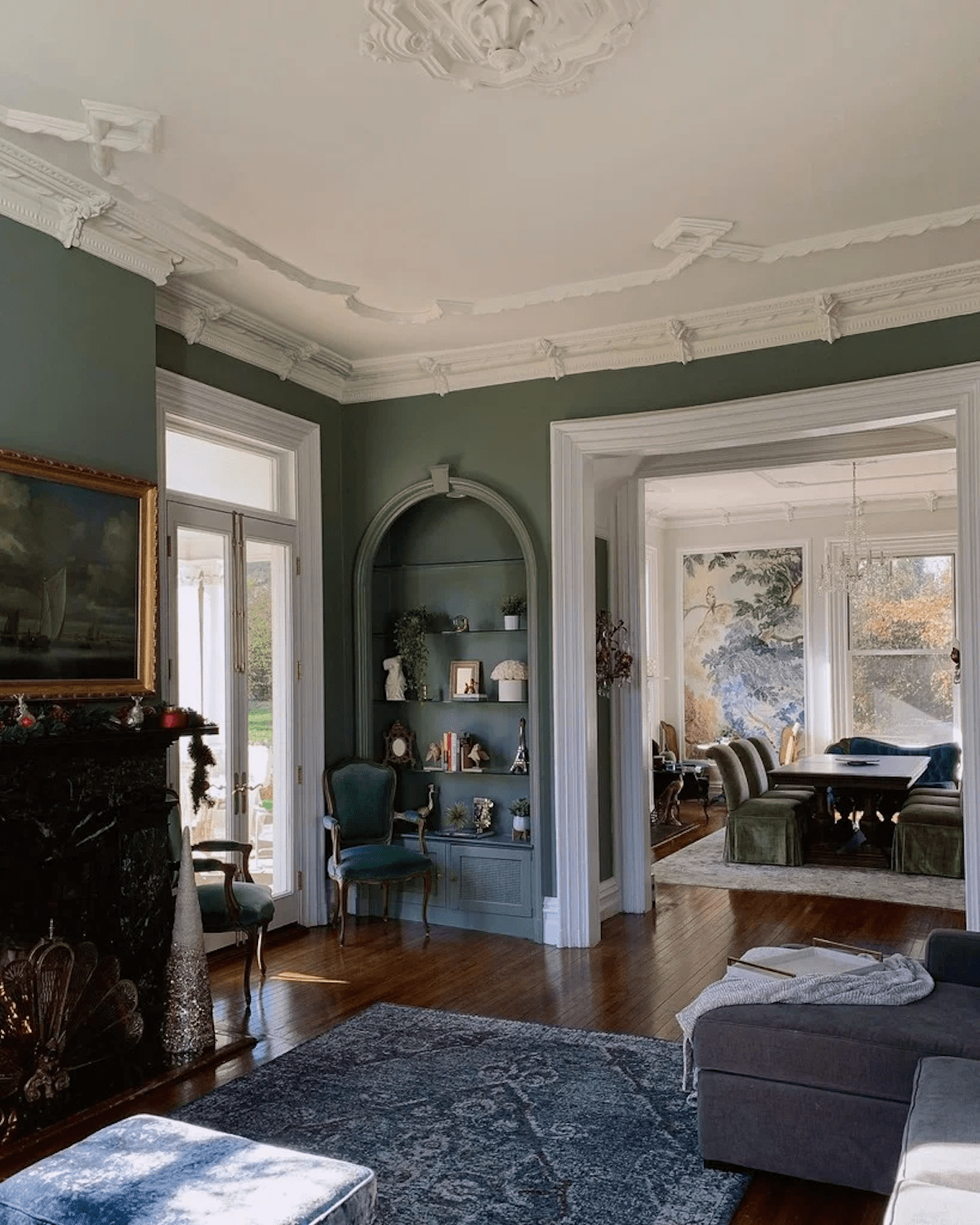
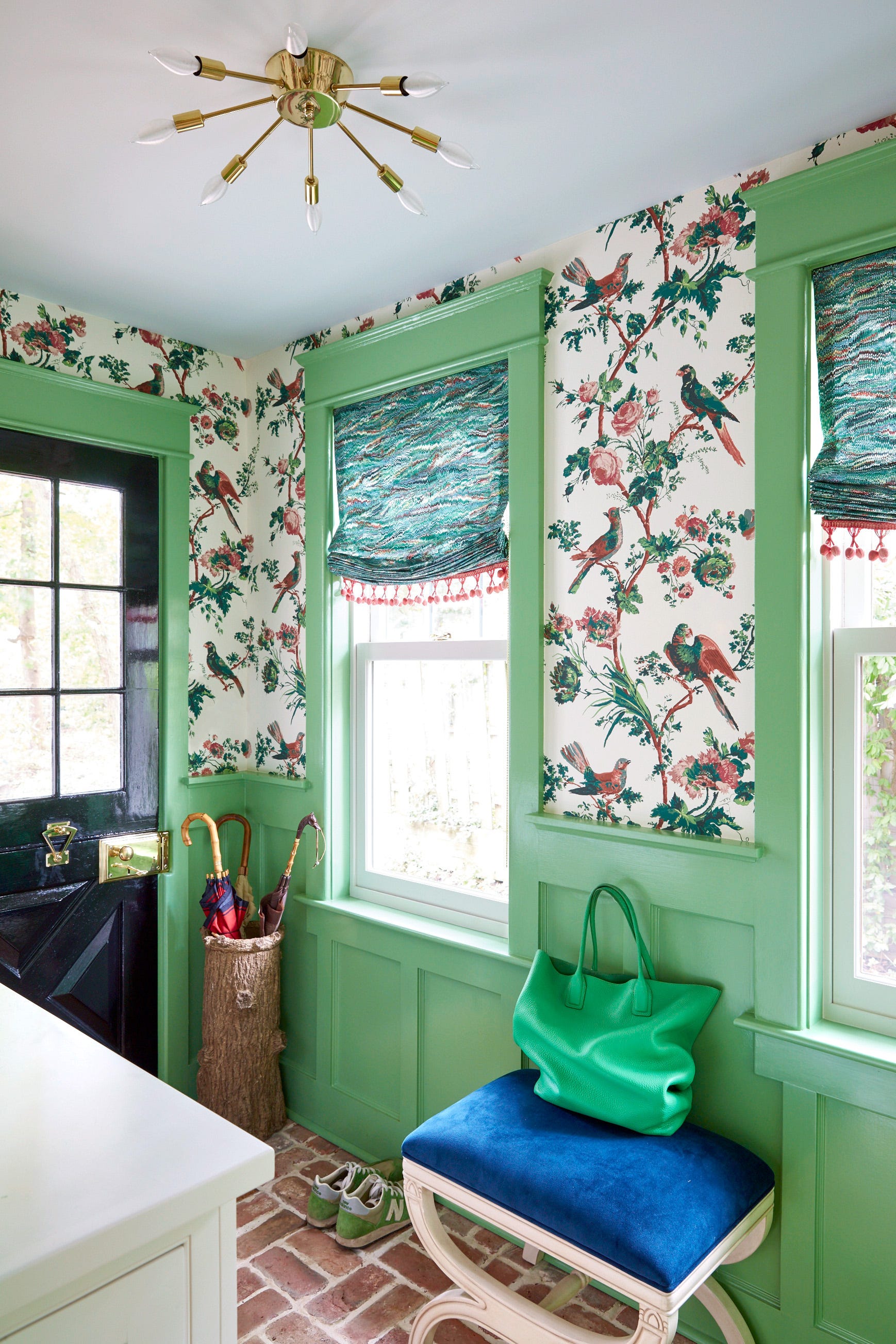
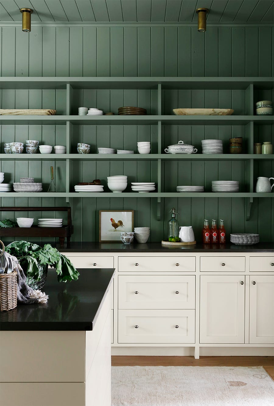
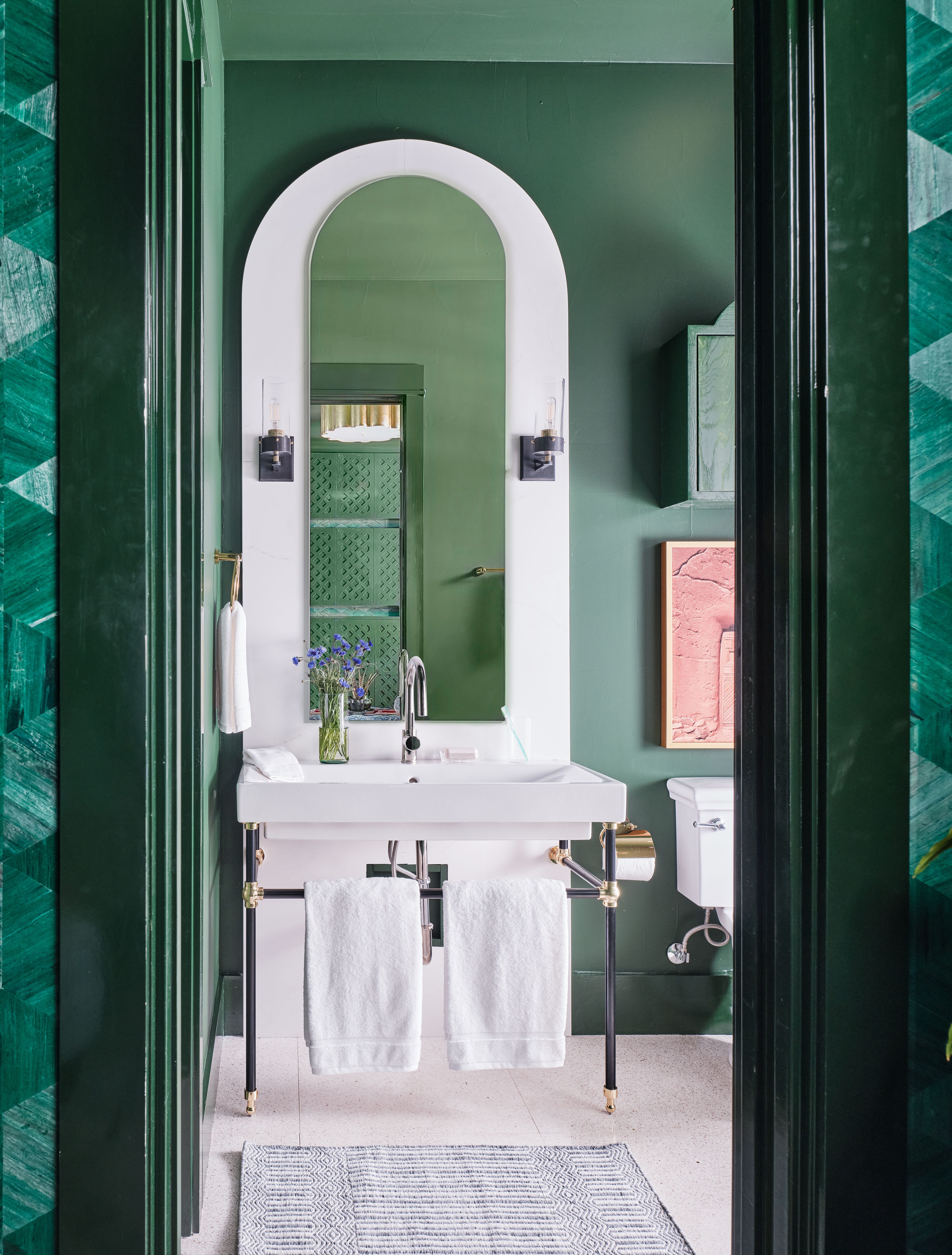
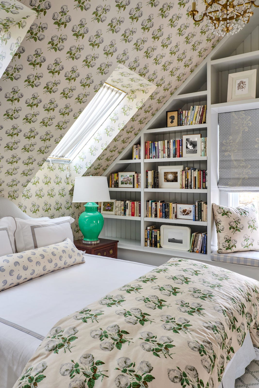
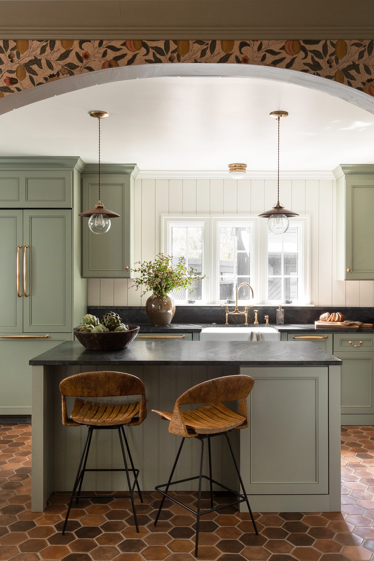
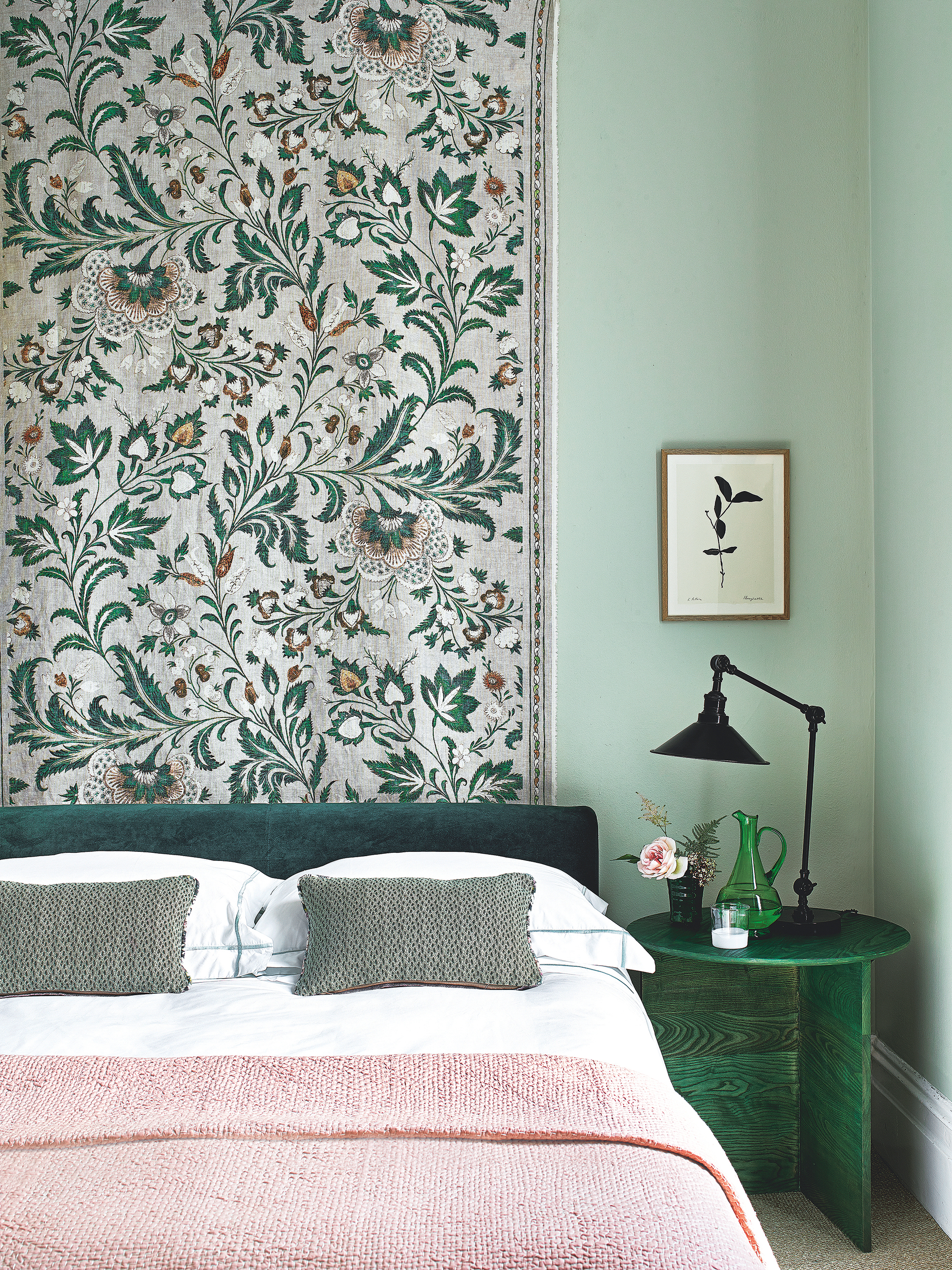
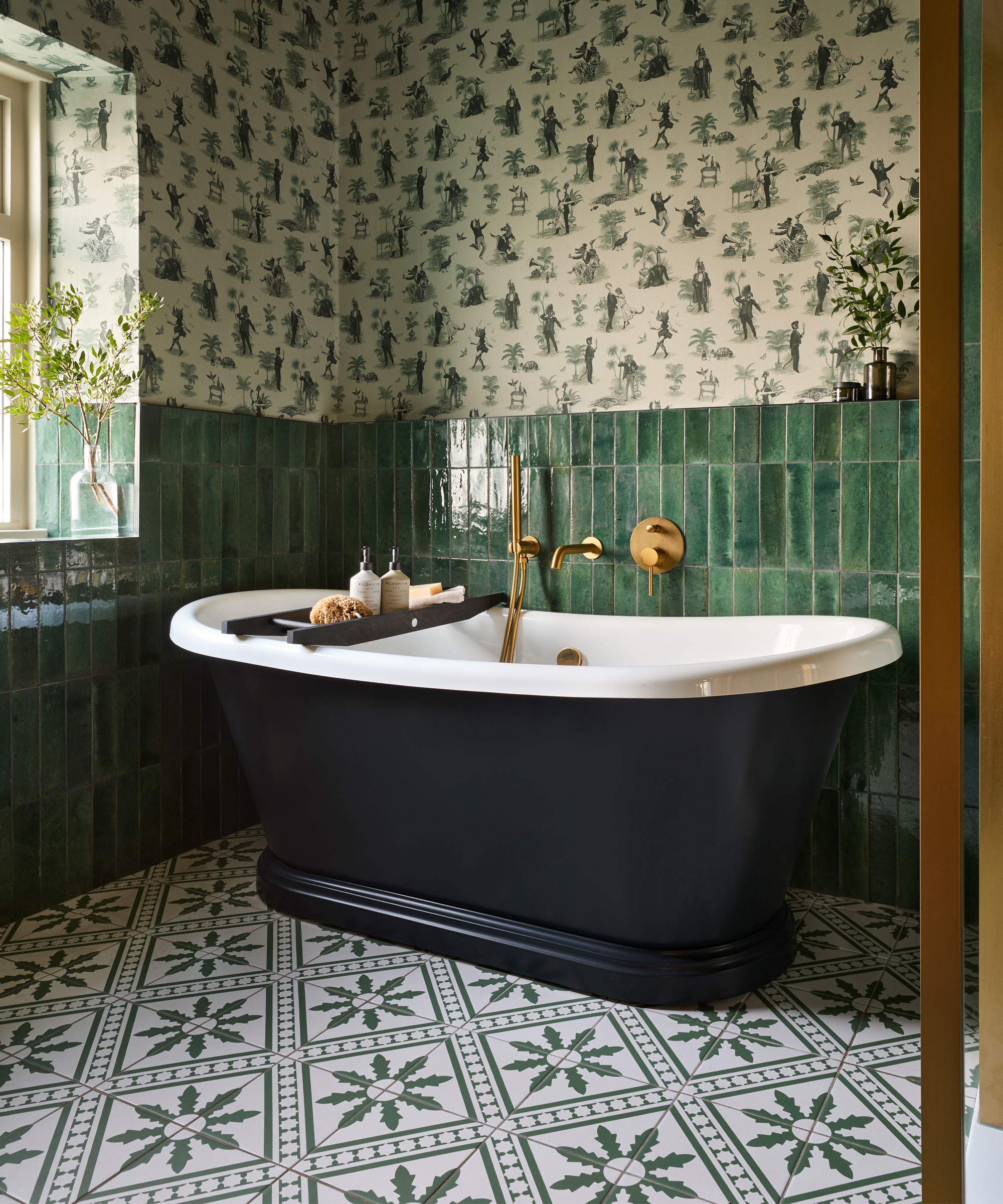
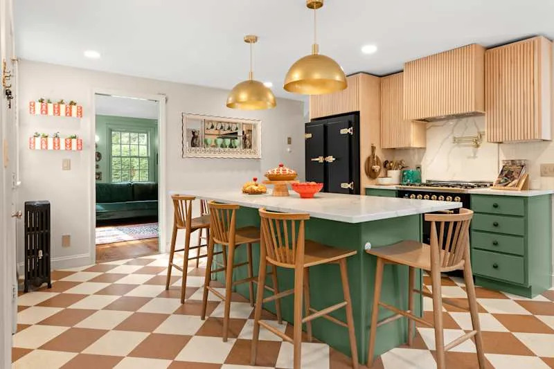
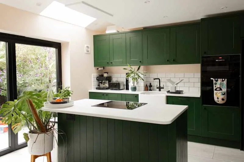
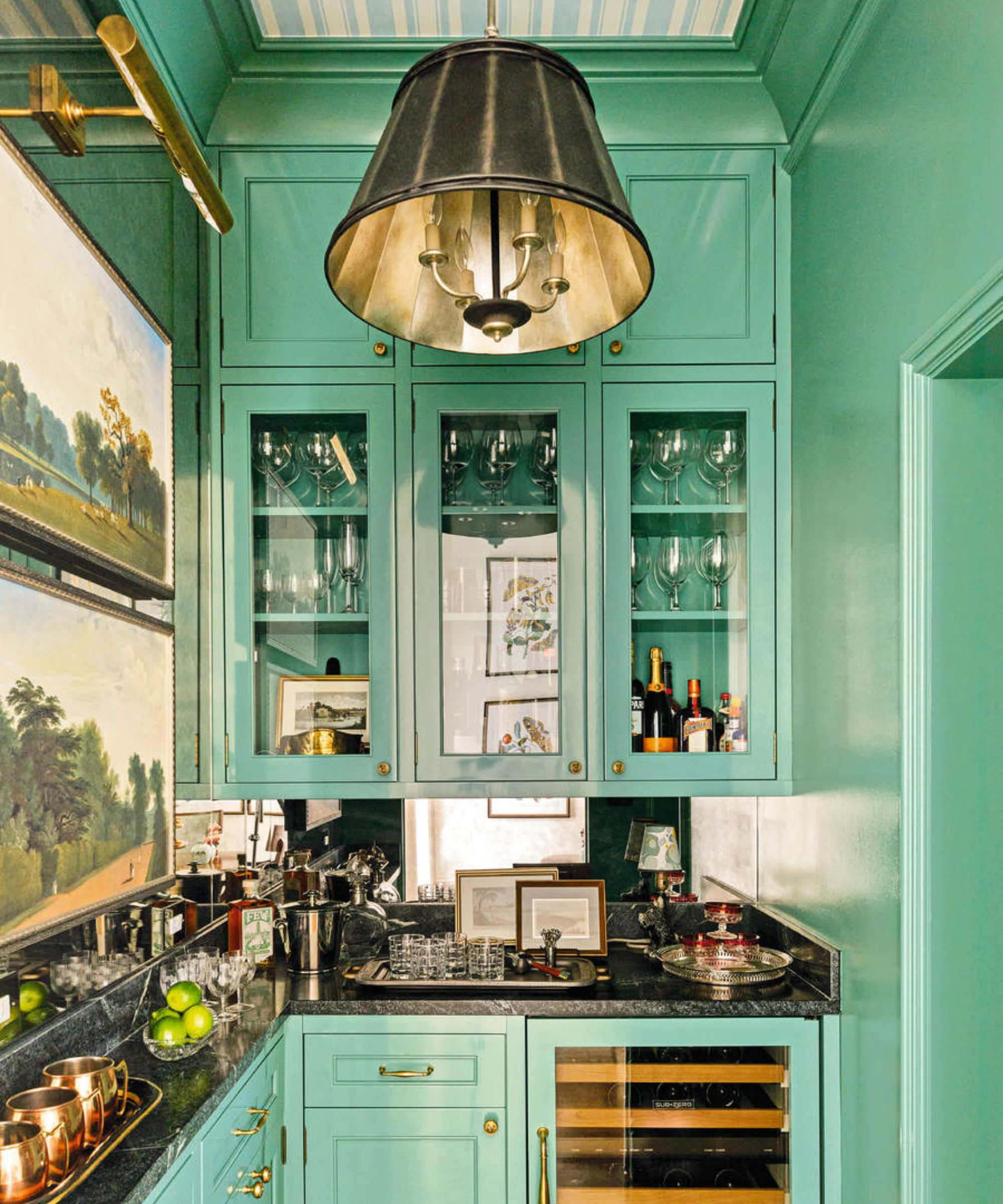
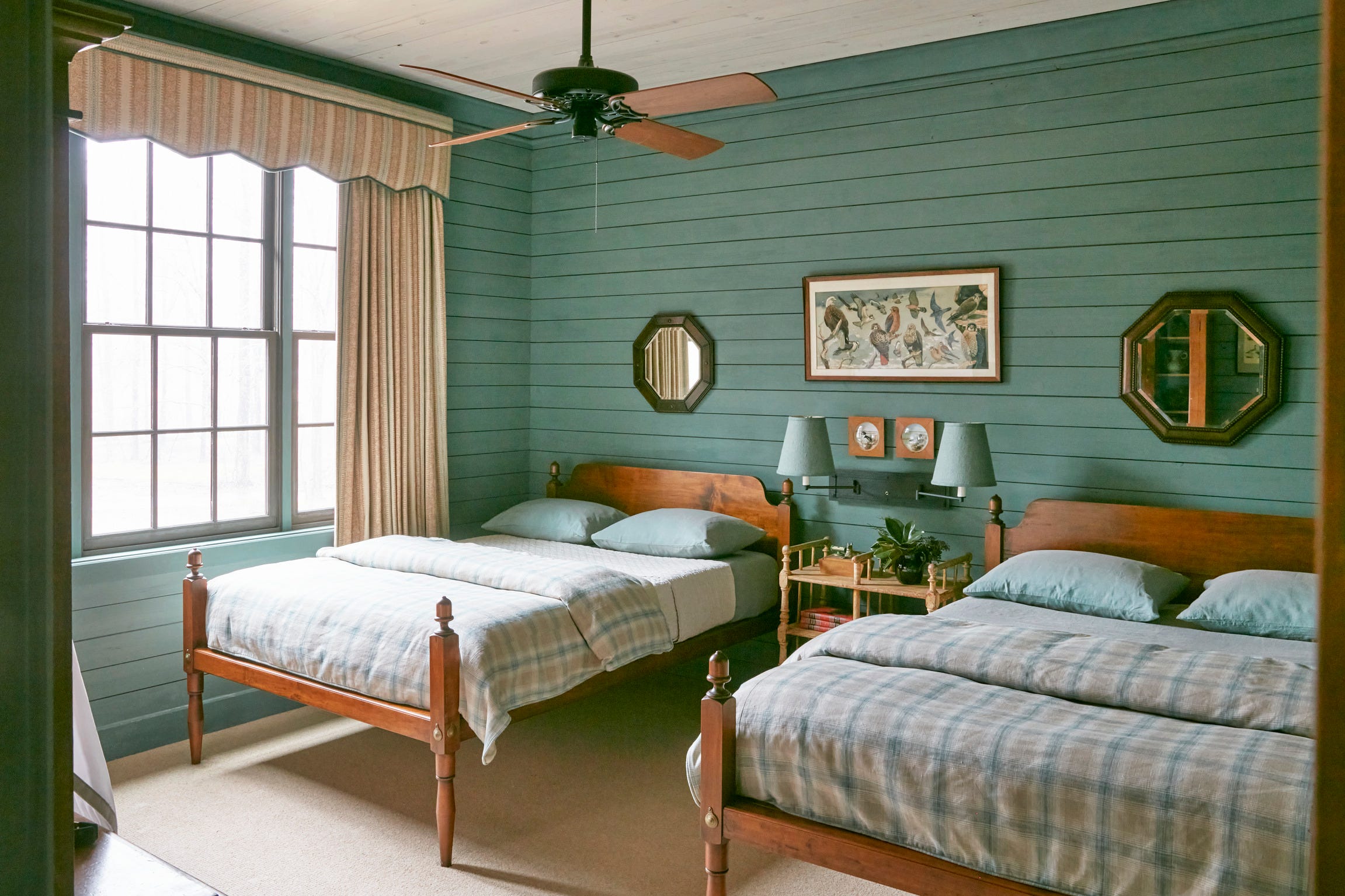
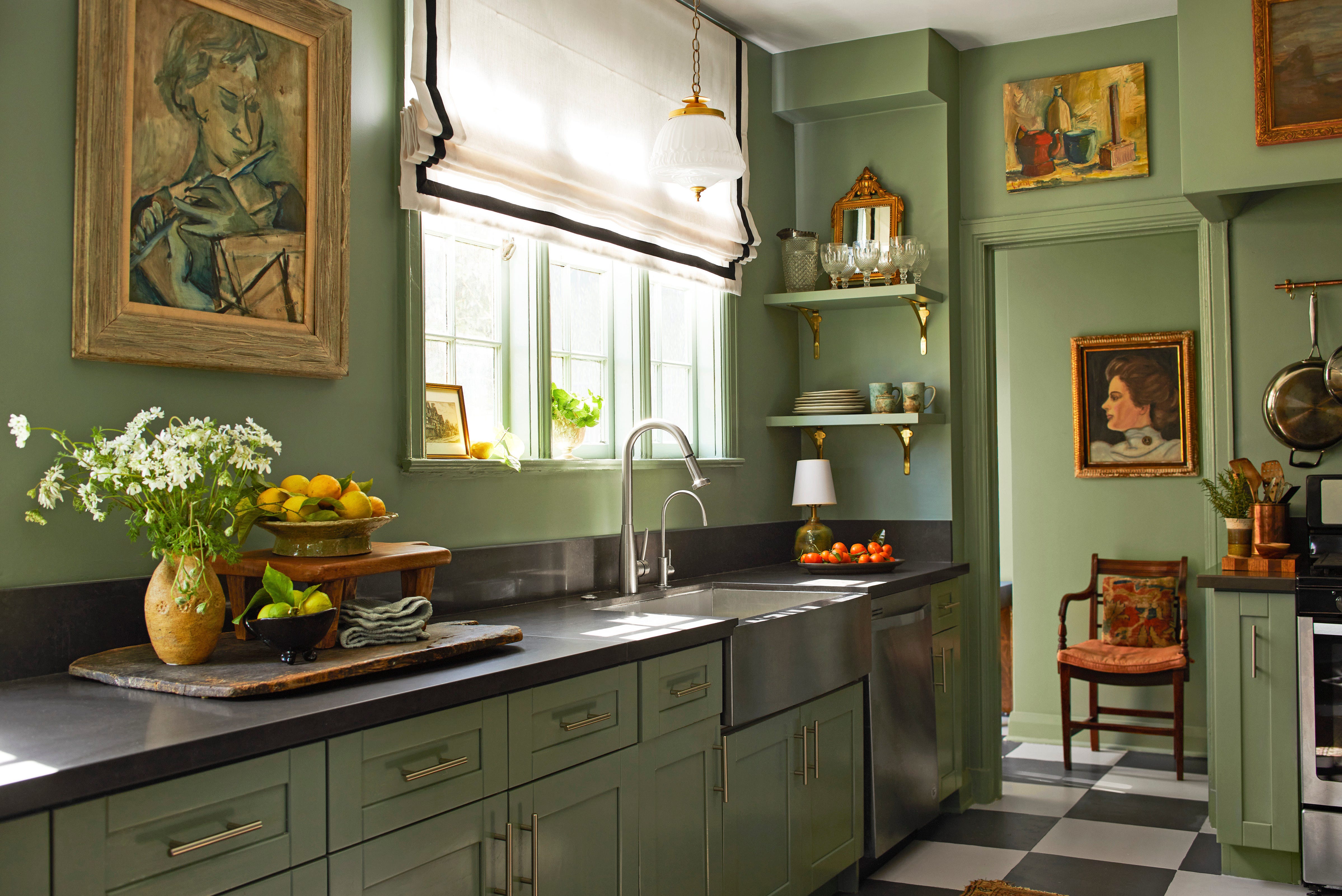
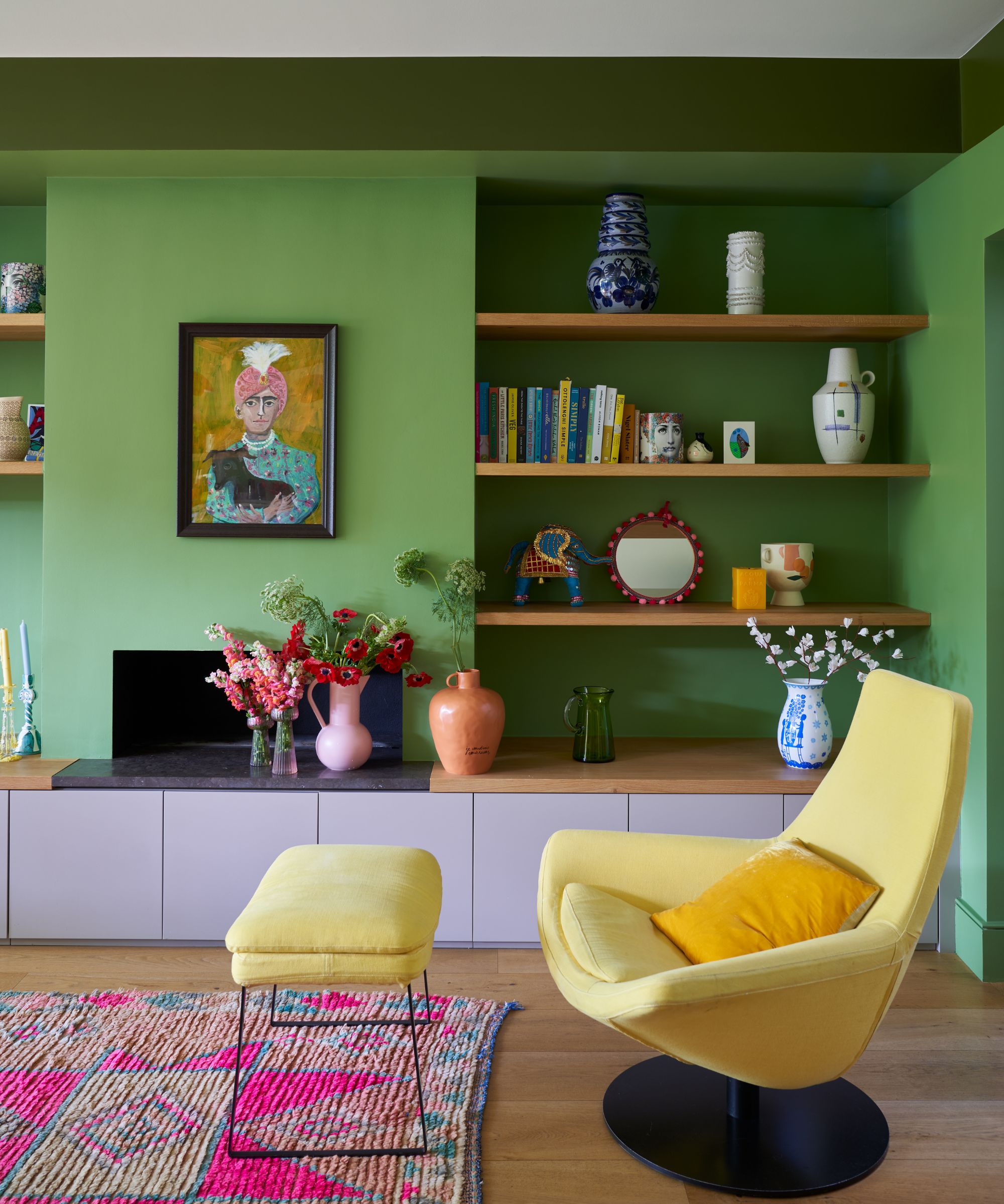
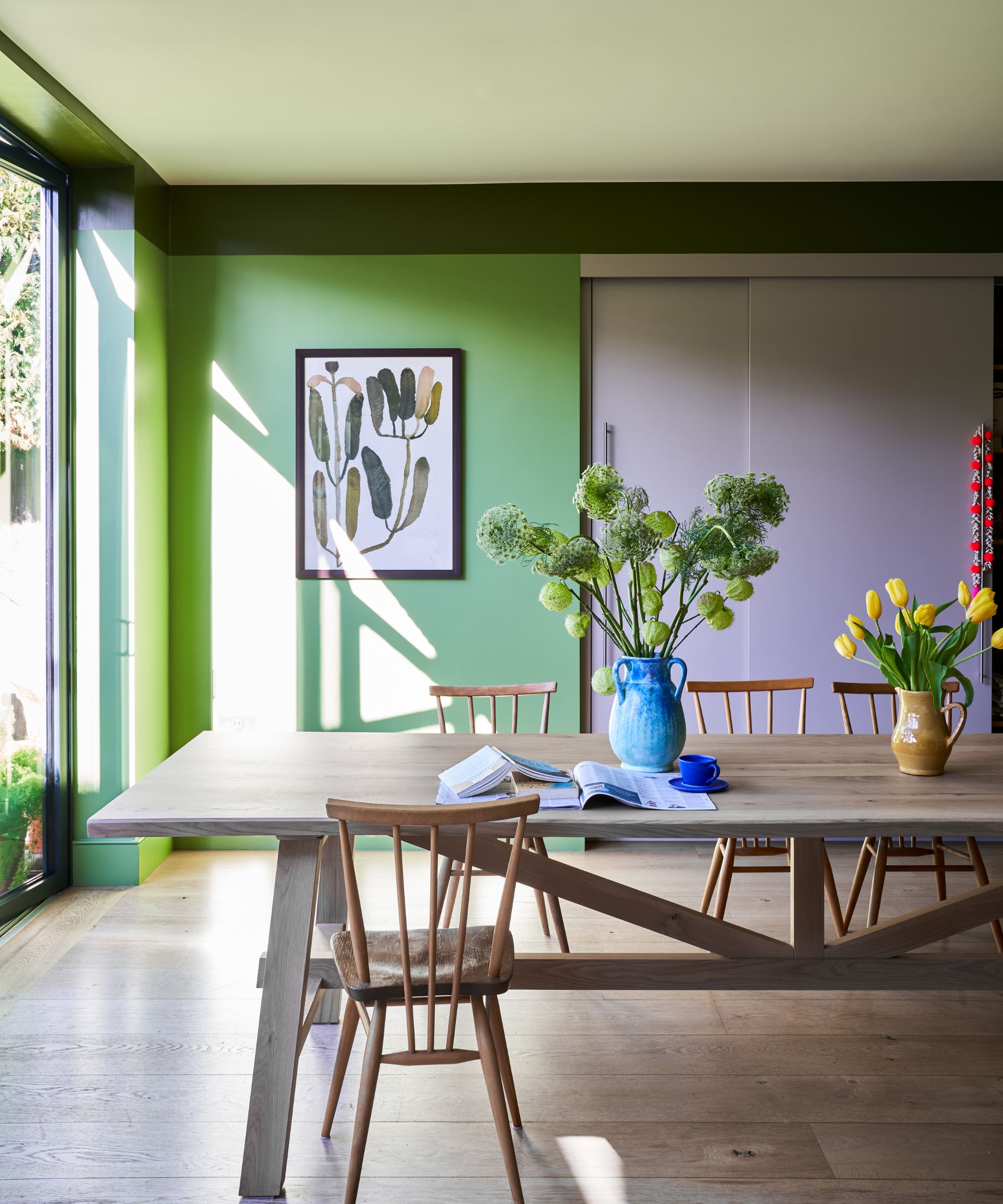
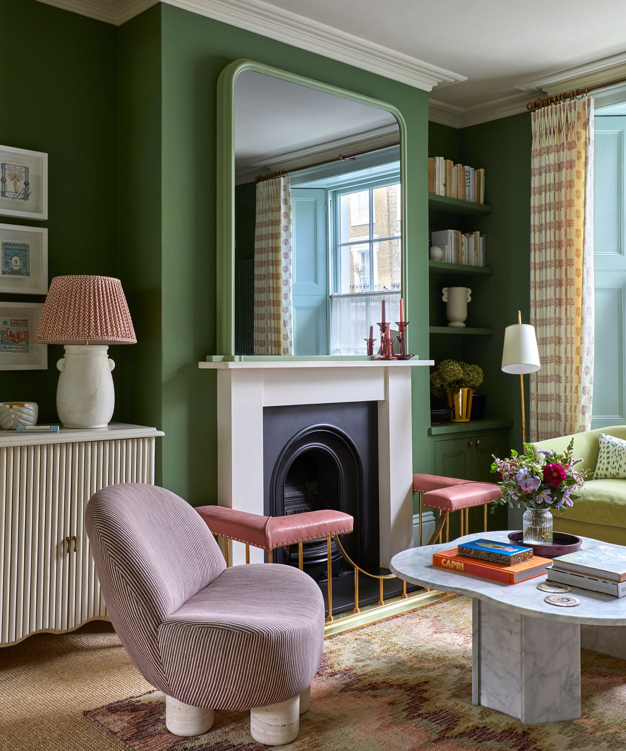
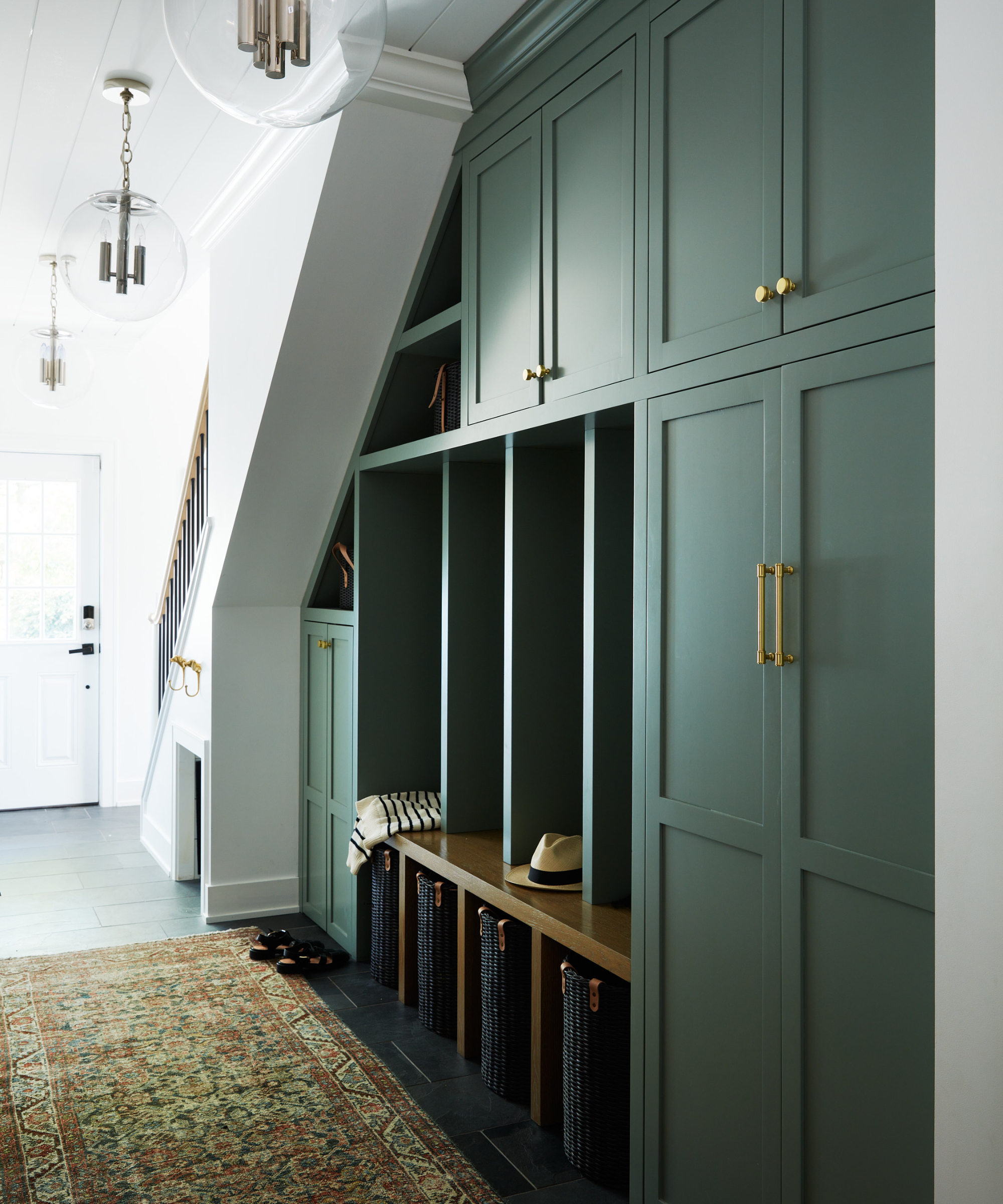
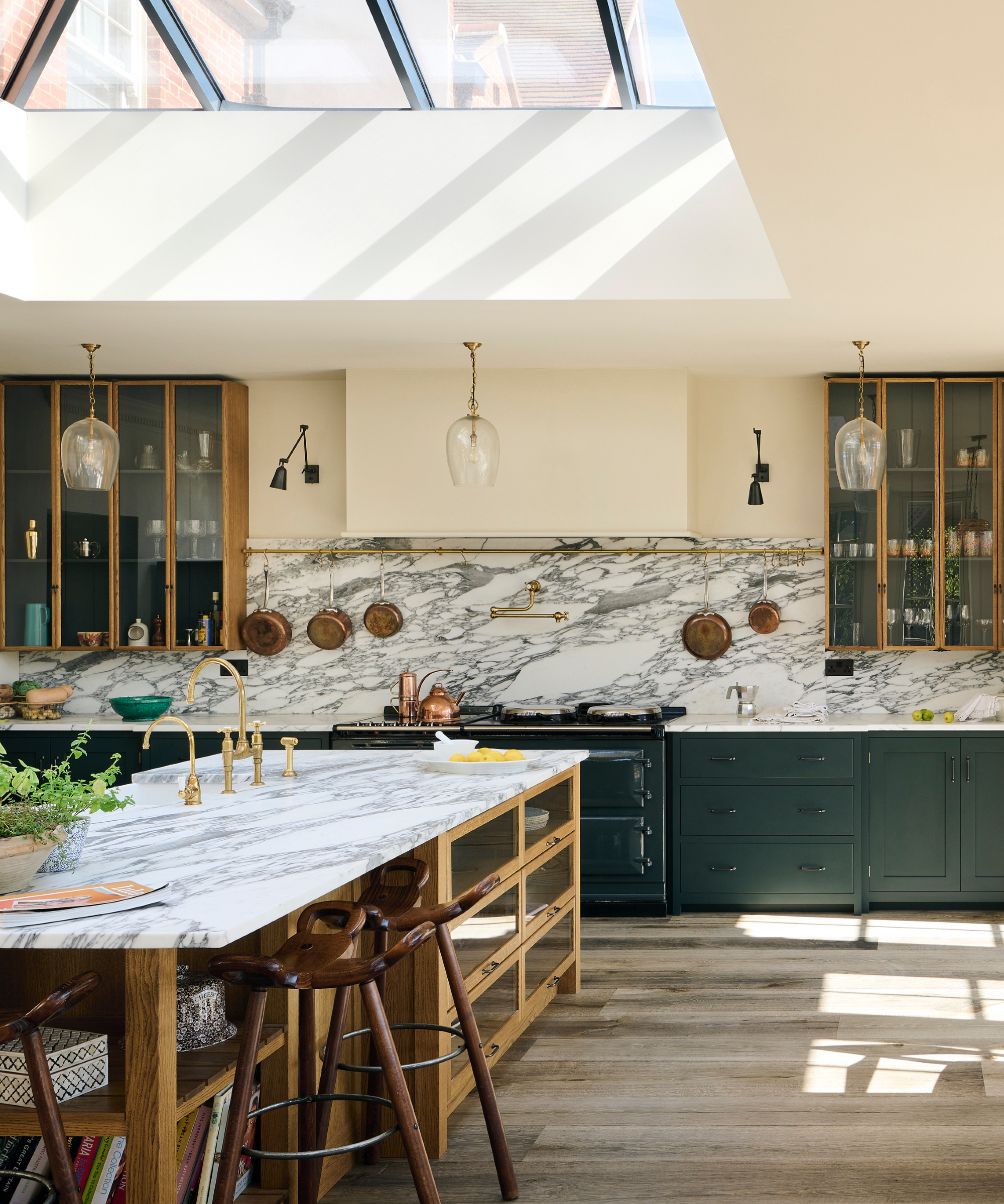
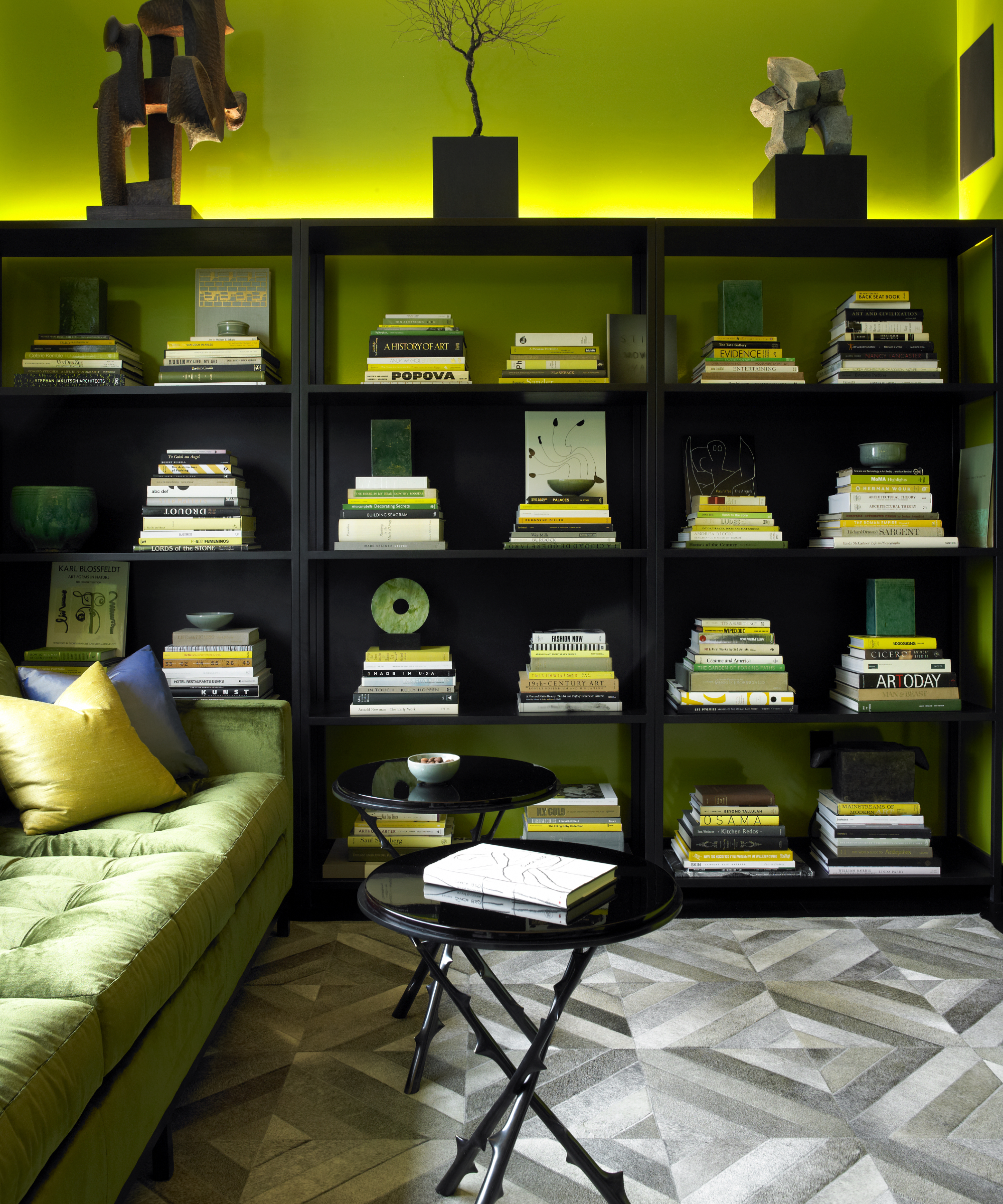
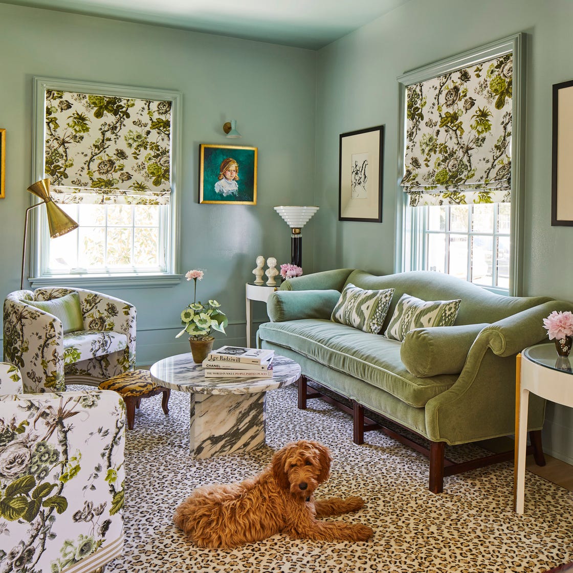
Beginning with a green-on-green approach, mint green pairs effectively with darker, earthier greens like forest green for a coordinated feel, or sage green to introduce warmth. A monochromatic scheme using different shades of mint green can add depth and character. For a touch of elegance, gold fixtures and hardware provide a timeless combination, while copper hardware and finishes create a bold, sophisticated contrast with their warm, orange tones.
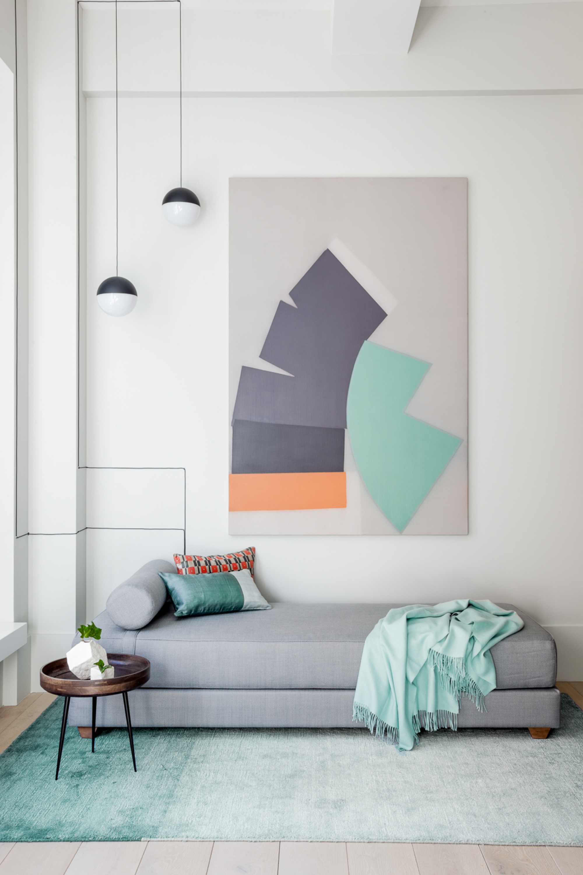
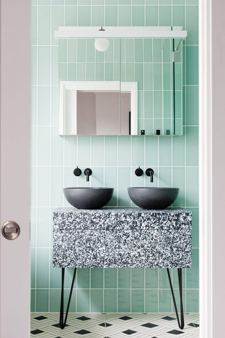
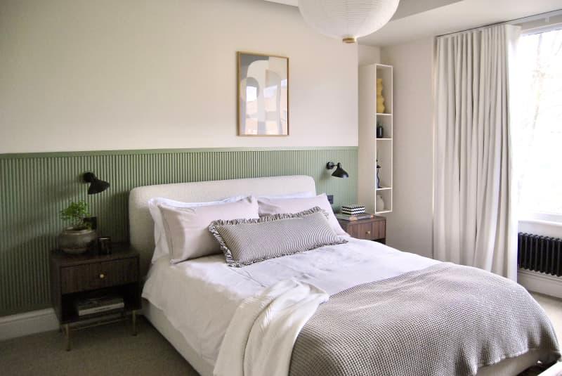
Neutral pairings are also highlighted, offering diverse moods. Tan and other subdued brown tones create an earthy, rustic look, perfect for spaces like laundry rooms. White, a classic choice, results in fresh and bright interiors, ideal for kitchens and bathrooms. Black, when combined with mint green, delivers a clean, high-contrast look with a retro twist. Gray contributes to a cool, modern aesthetic, particularly when accented with white, silver, and black. Beige and cream, on the other hand, produce soothing, spa-like environments, especially when combined with other light neutrals.
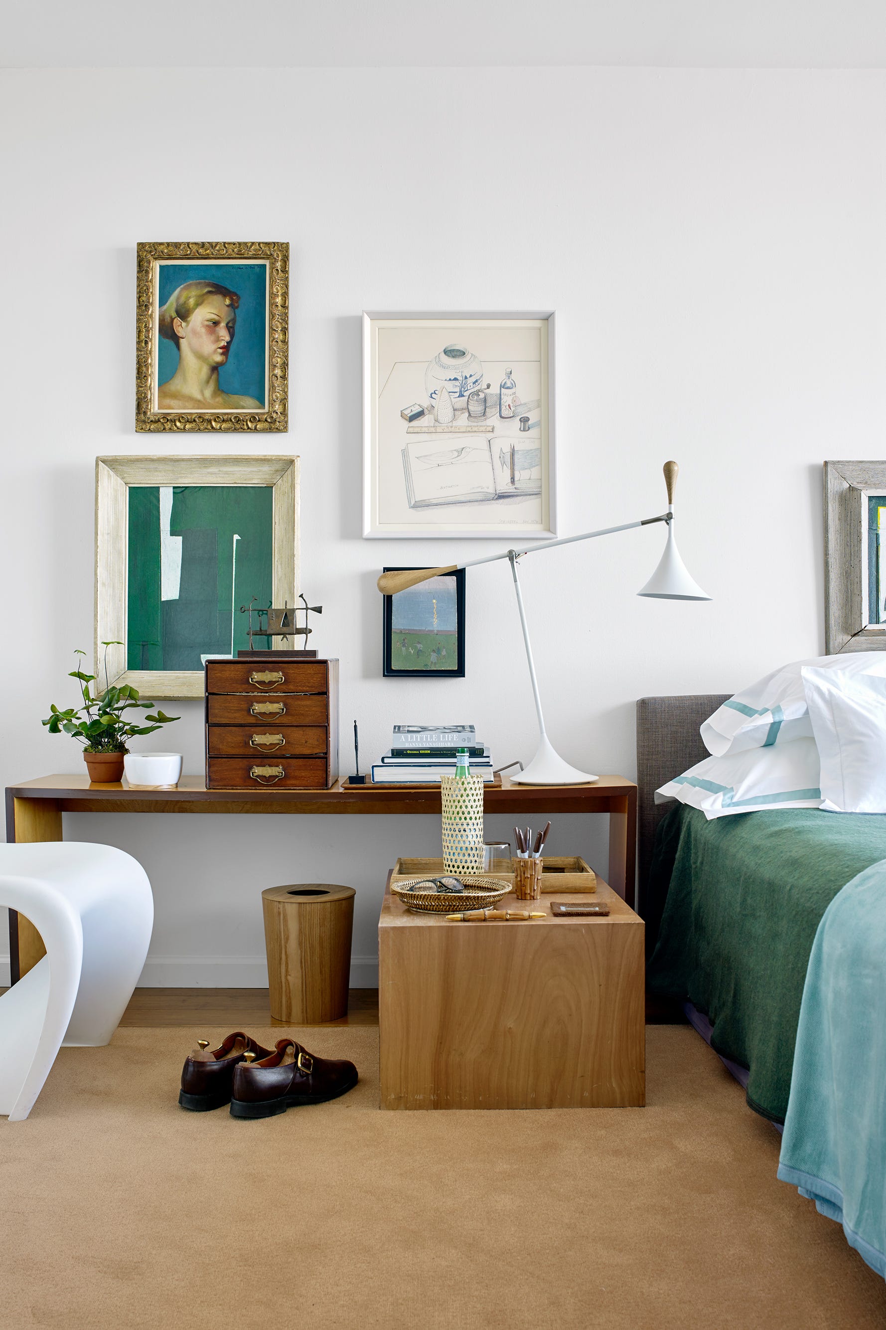
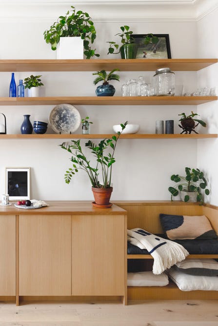
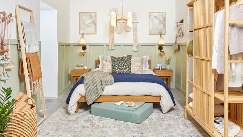
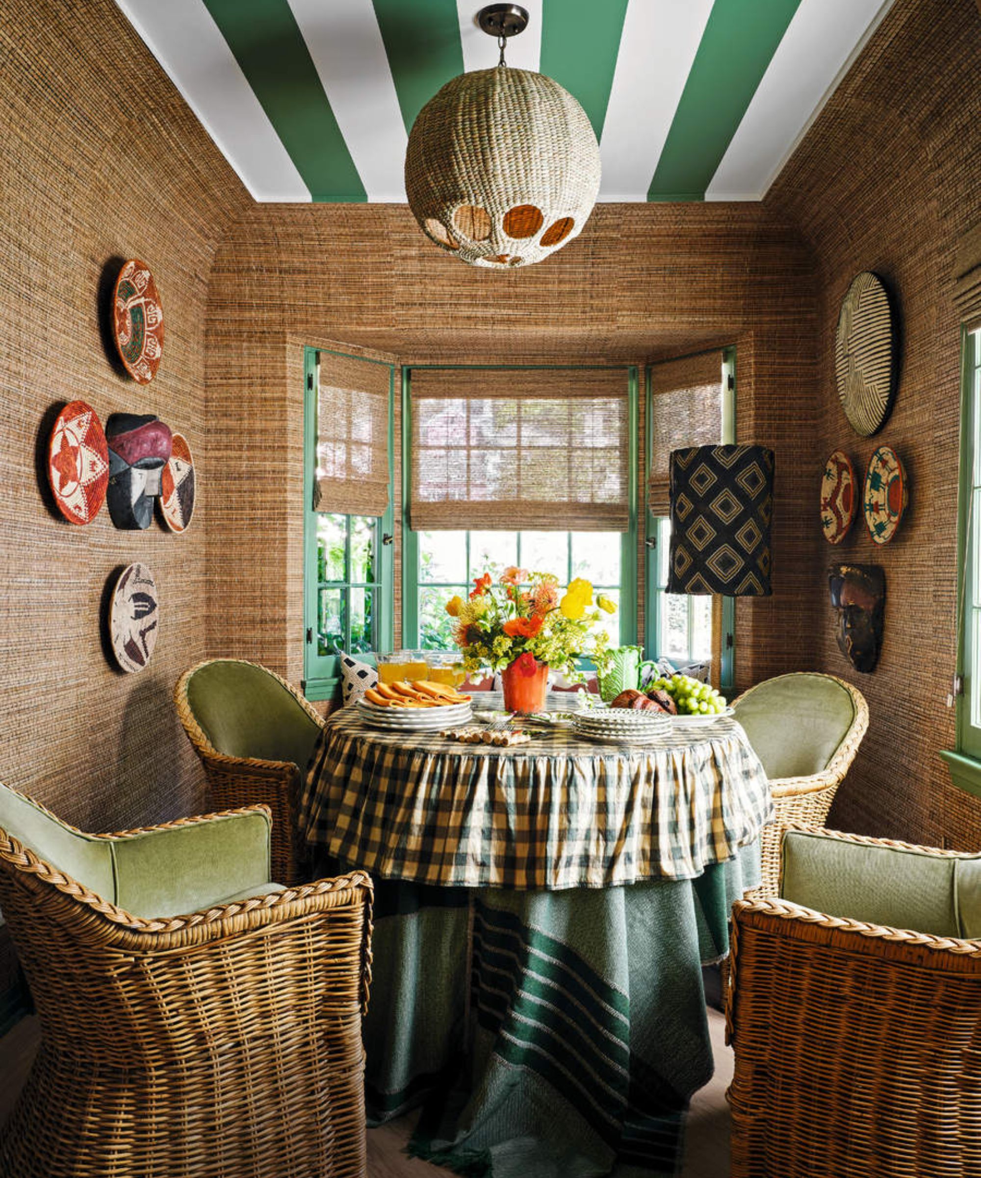
Wood tones naturally complement mint green, providing warmth and texture. Teak, with its warm hues, effectively balances cool mint green spaces. Blonde wood, similar in lightness and subtlety, combines with mint green for relaxed, neutral interiors, often enhanced by white and gold accents to achieve a boho style. Natural wood, in general, blends well with mint green, making it suitable for earthy, farmhouse, or light and airy designs, with rattan elements further carrying the natural theme.
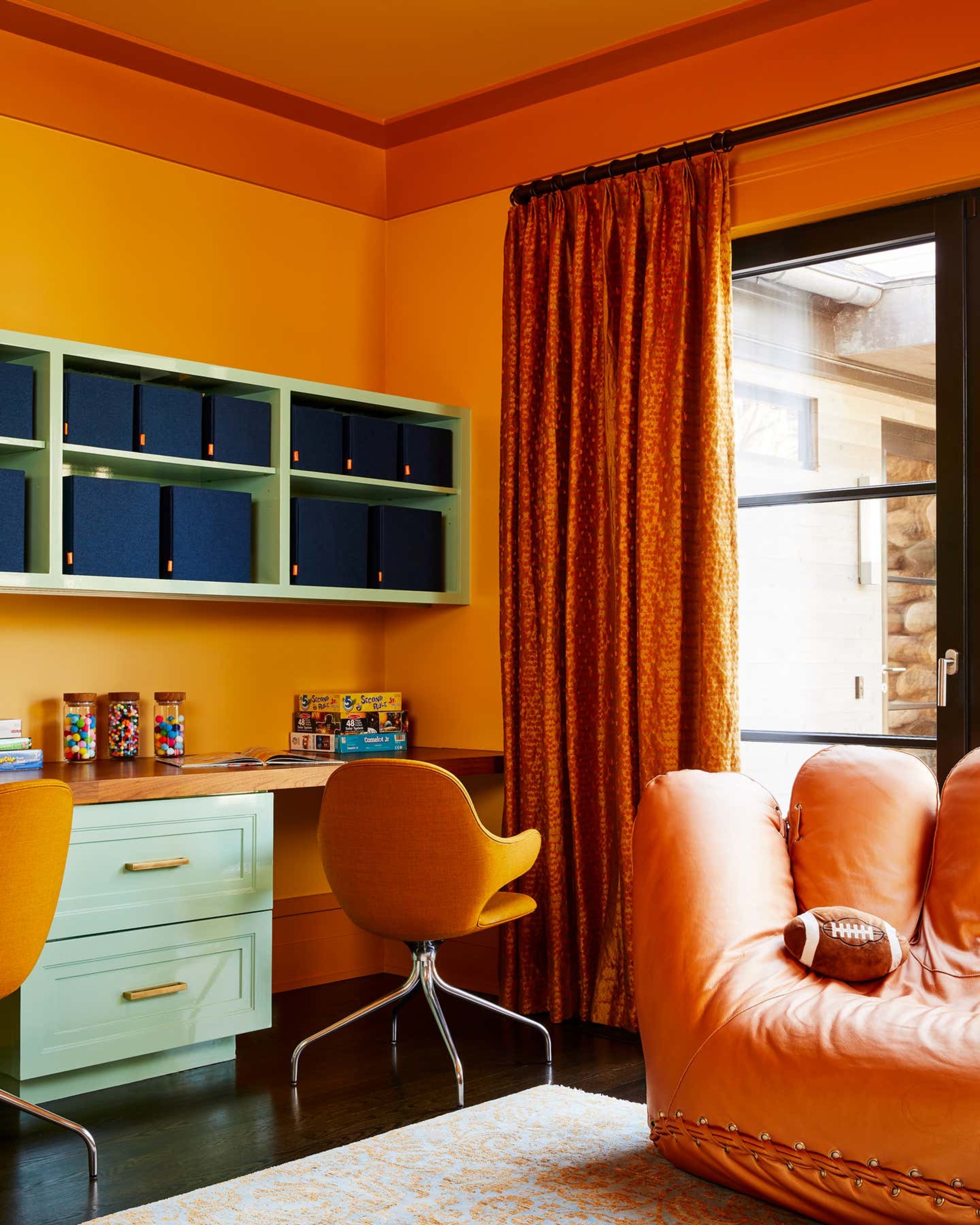
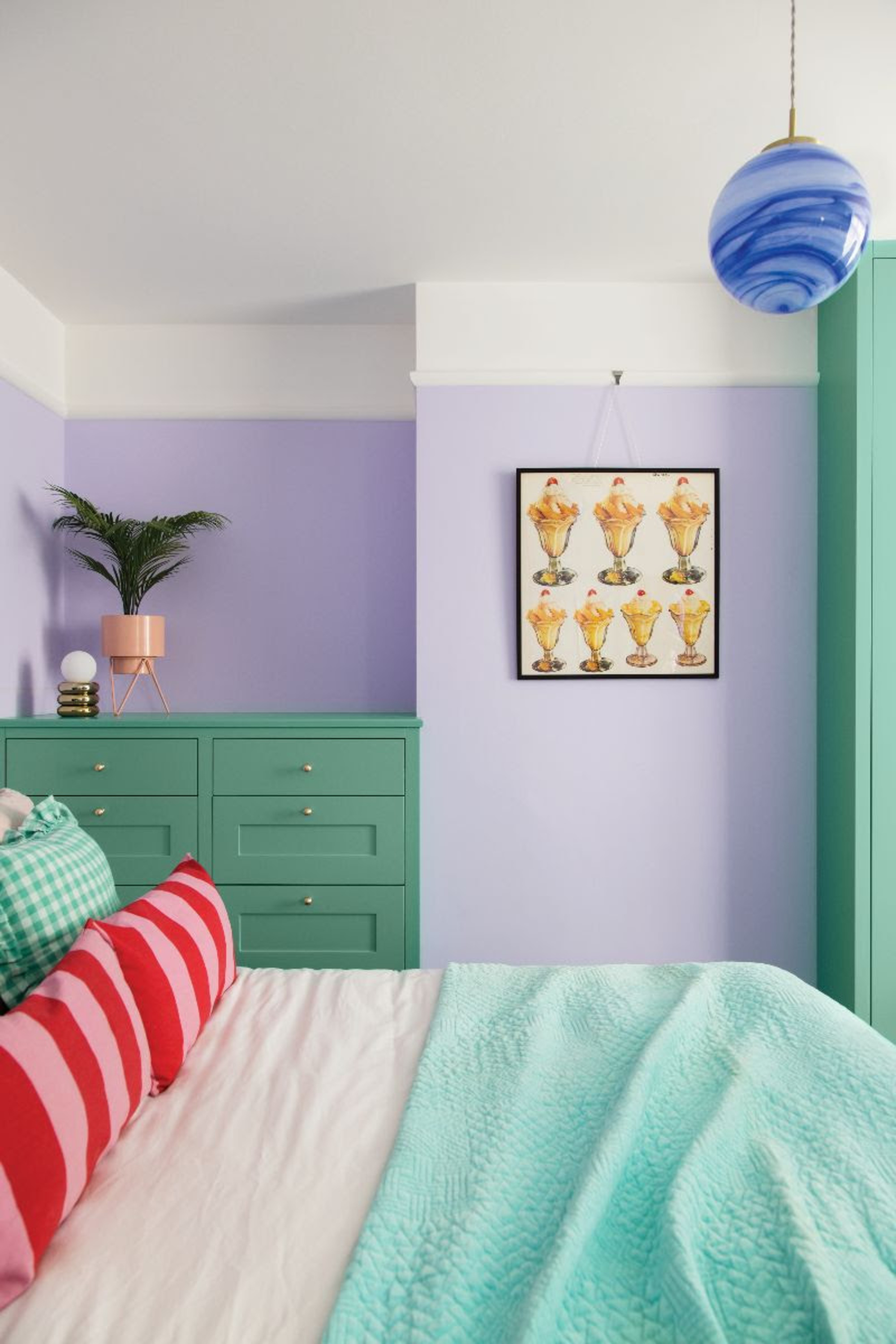
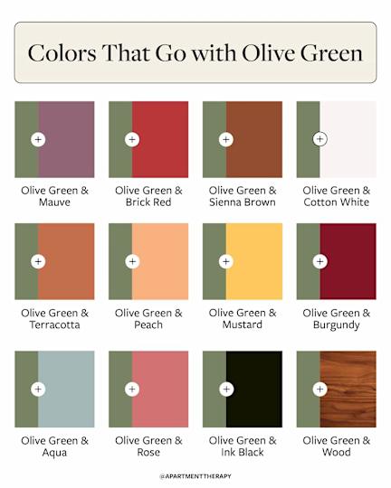
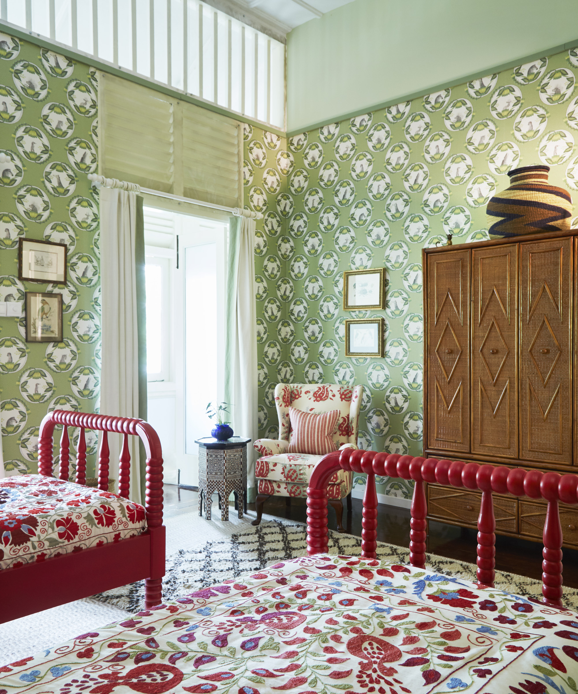
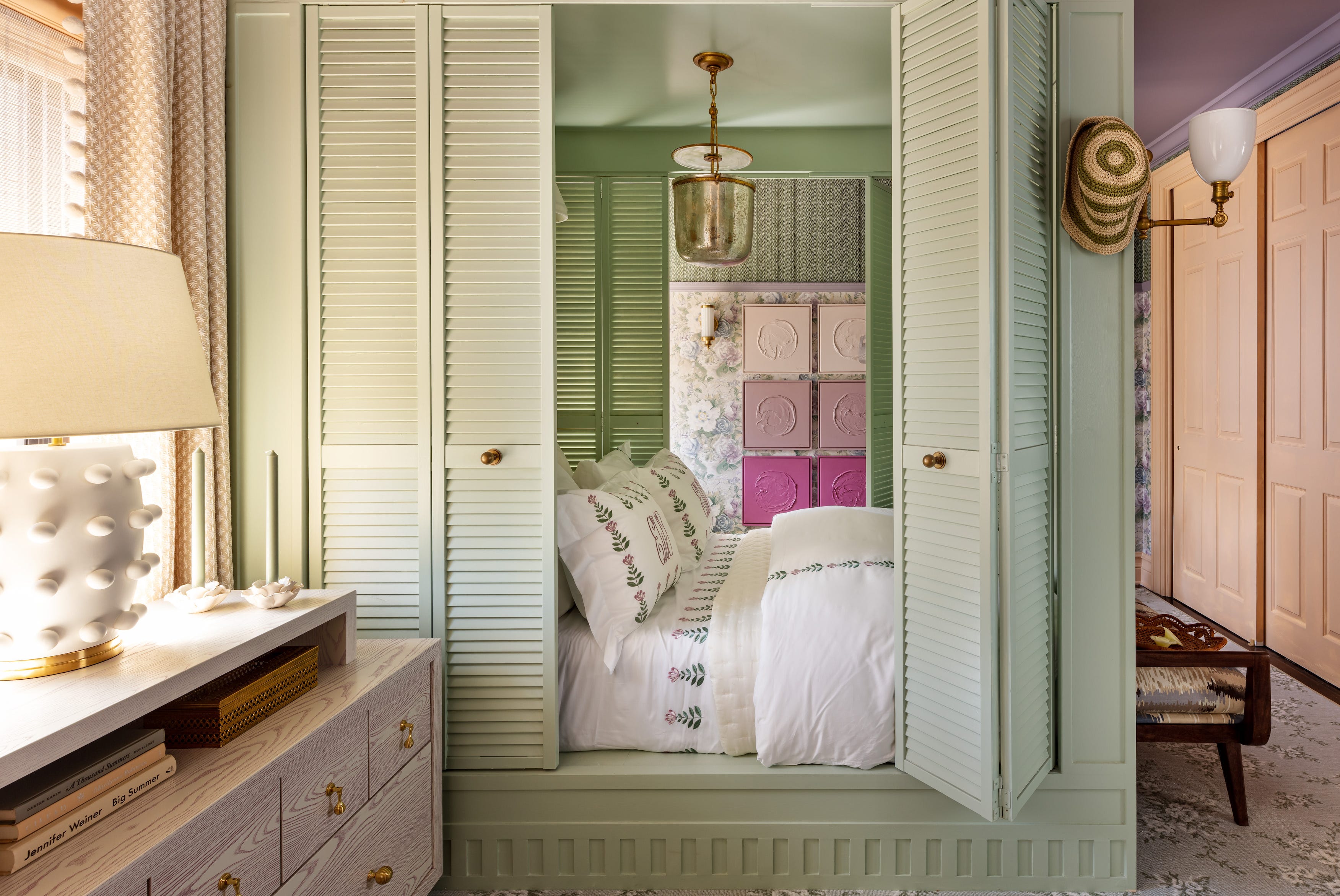
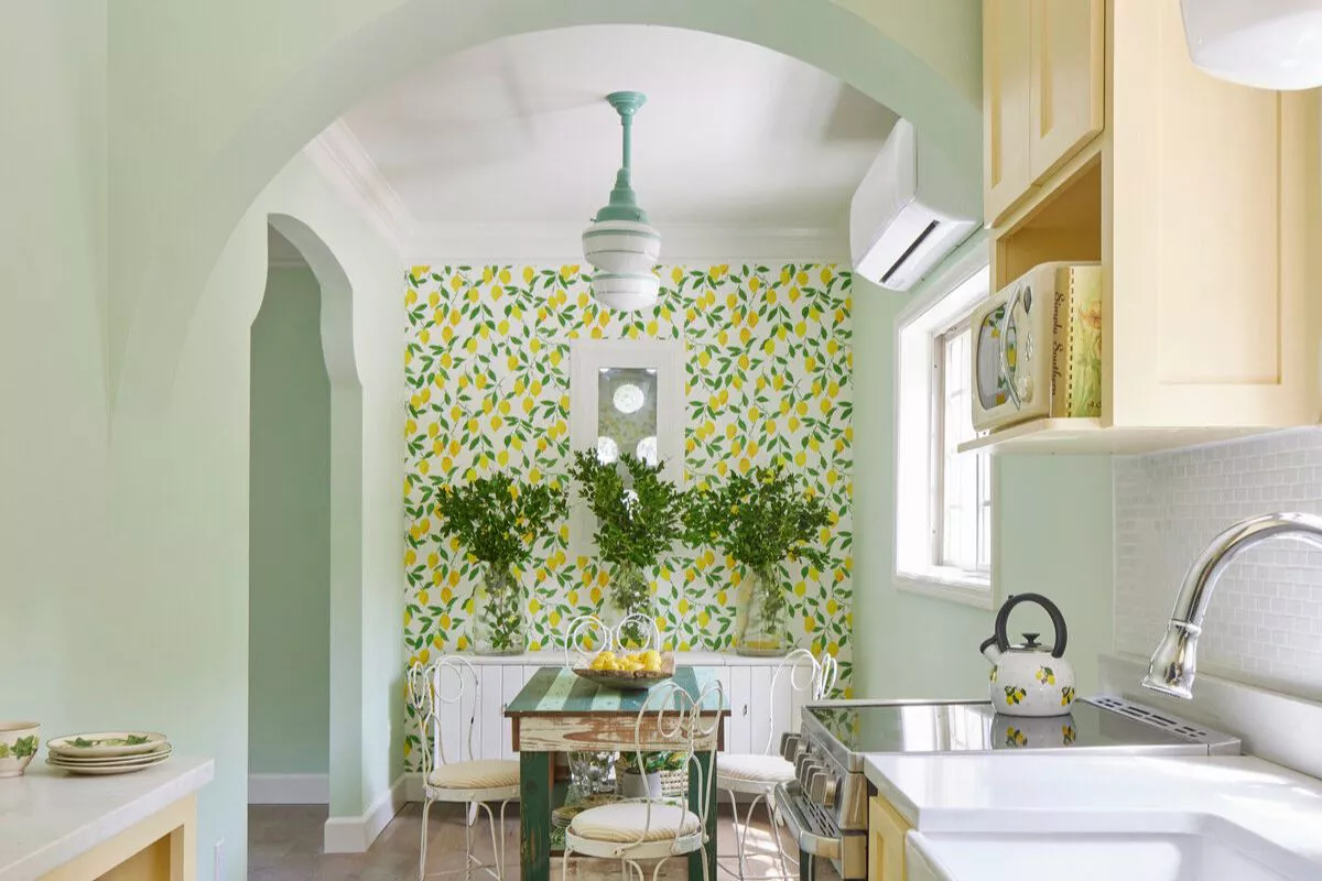
For more adventurous and eclectic palettes, mustard yellow offers a high-contrast and daring combination. Pastel yellow creates a bright and cheery atmosphere, benefiting from green and yellow's adjacent positions on the color wheel. Pink and purple undertones also feature prominently. Blush and mint green form an unexpected yet appealing duo for colorful interiors, leveraging their complementary nature. Mauve provides a more subdued pink-green option, adding subtle contrast. Fuchsia and mint green offer a high-energy, playful, and romantic combination, particularly when balanced with white. Red, as a direct complementary color, creates a high-contrast and invigorating space, moving beyond traditional holiday associations. Coral, a lively yet subdued hue, works harmoniously with mint green, resulting in a bold yet balanced pairing.
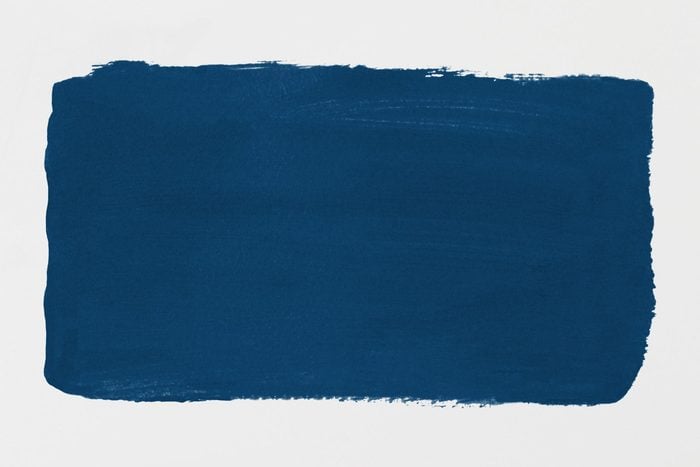
Finally, various blue and purple shades extend the versatility of mint green. Sky blue creates a soft and playful look, suitable for children's rooms or powder rooms. Navy blue, a darker shade, grounds mint green spaces, offering a classic combination. Purple, a bold and dramatic choice, adds energy, with dark purple ceilings effectively playing off mint green accents. Rose gold, with its pink and green undertones, serves as a stylish finish, enhancing living rooms with mint green furniture and metallic accents. The article also clarifies that pastel green pairs well with white, cream, beige, wood tones, and other pastels like peach, lilac, and soft blue, and identifies raspberry red as the complementary color to mint green.
#MintGreen #ColorPalette #InteriorDesign #HomeDecor #ColorCombinations #DesignInspiration #RetroStyle #ModernDesign #NeutralColors #MintGreen #ColorPalette #InteriorDesign #HomeDecor #ColorCombinations #DesignInspiration #RetroStyle #ModernDesign #NeutralColors
0 comment in total
 No comments yet
You may also like
What Colors Go With Mint Green? 9 Pretty Designer-Approved Pairings for This Trending Pastel Shade

15 Lush Green Paint Colors to Invigorate Any Space

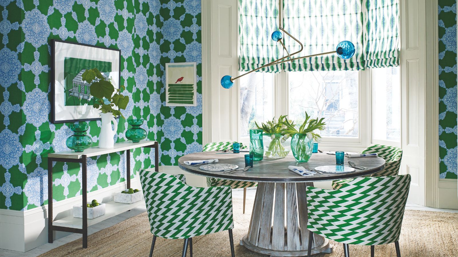
What colors go with green? Professionals propose these harmonious pairings for successful schemes

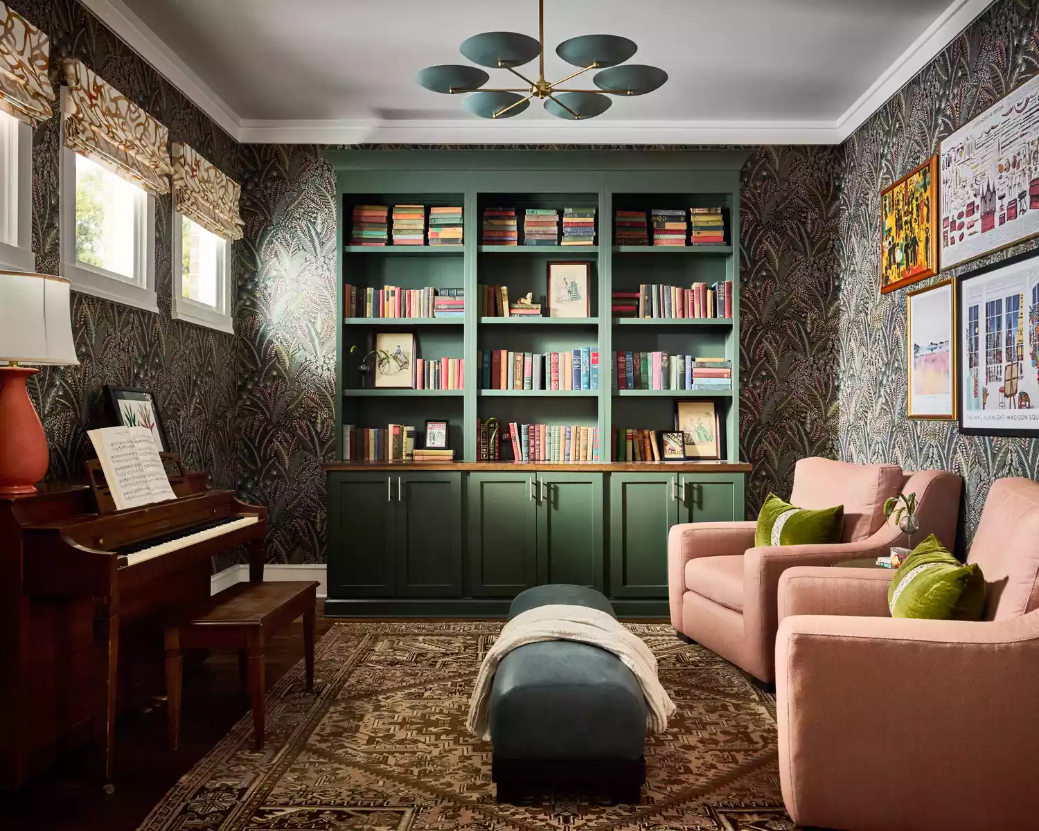
17 Green Paint Colors for Every Room, From Soothing Sage to Electric Emerald
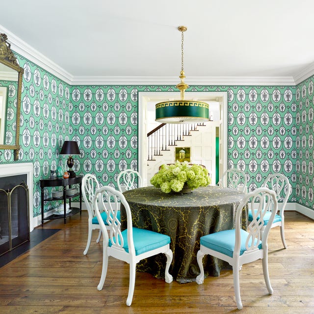
The Versatile Color That'll Cheer You and Your Home Up All Year Long

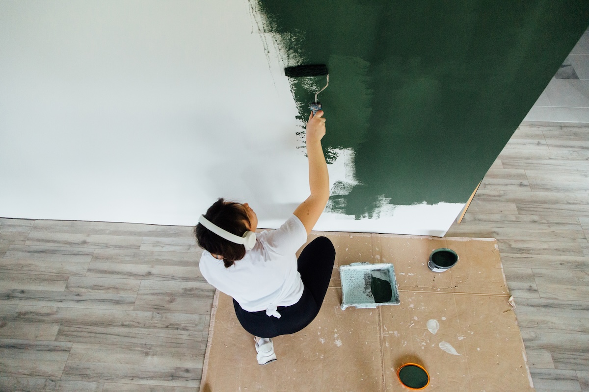
19 of the Best Green Paint Colors for Any Room in Your Home

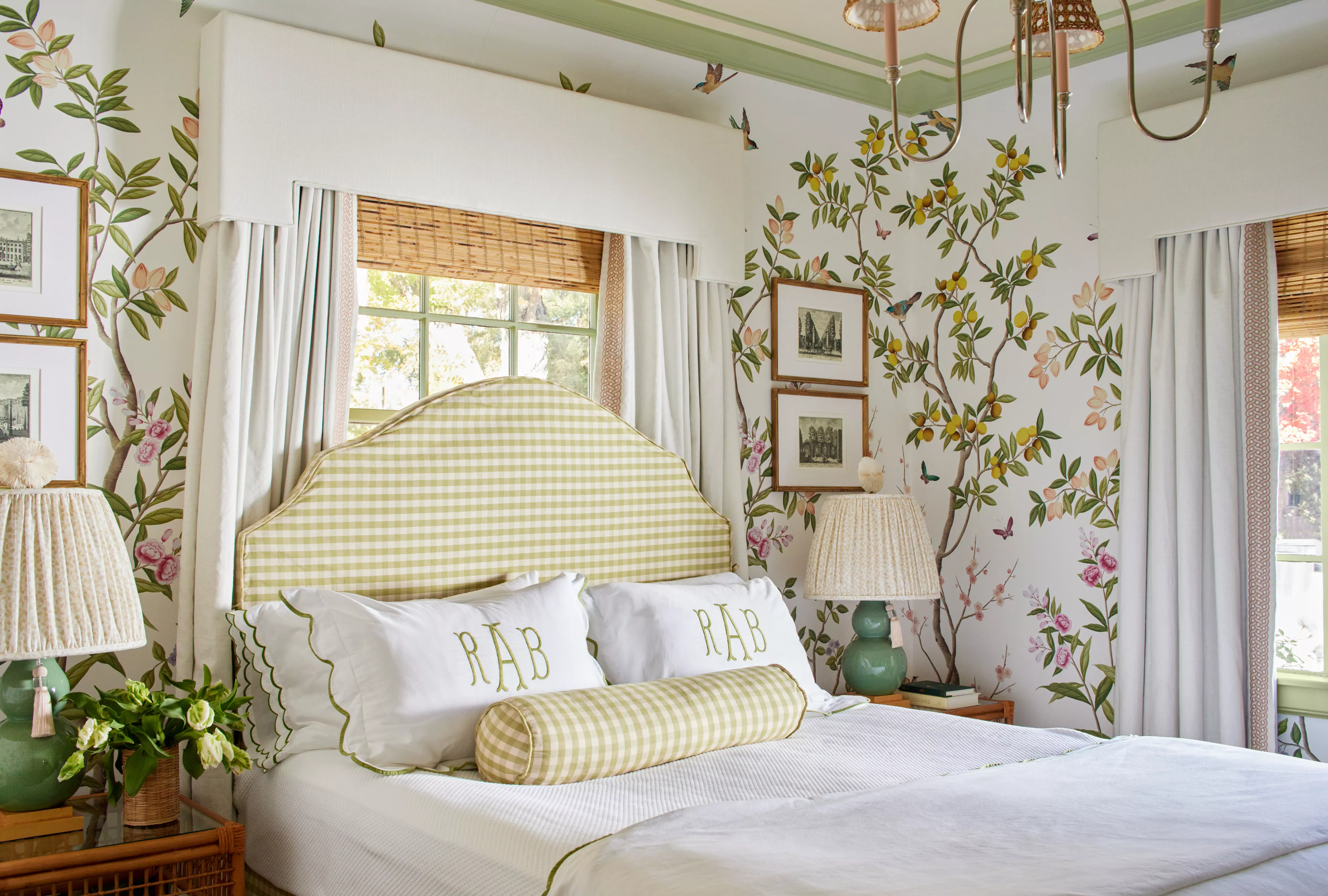
51 Green Color Schemes Perfect for Living Rooms, Bedrooms, and More

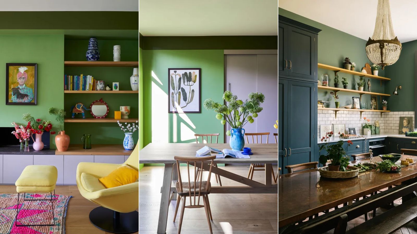
5 colors to never pair with green according to designers – and what to use instead
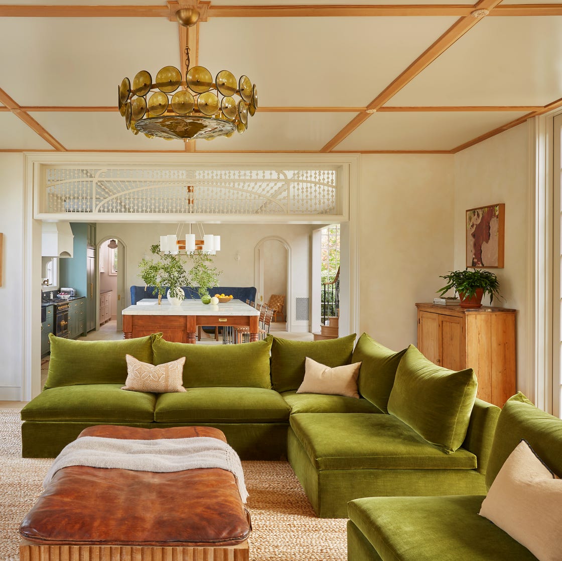
37 Unexpected Colors That Pair Perfectly With Green, According to Designers
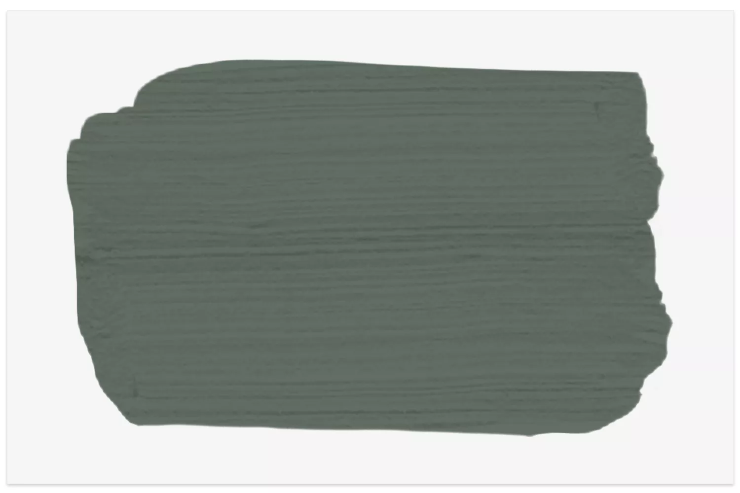
14 Best Green Paint Colors
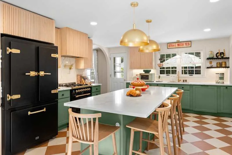
These 13 Green Paint Colors Are the Best We’ve Ever Seen

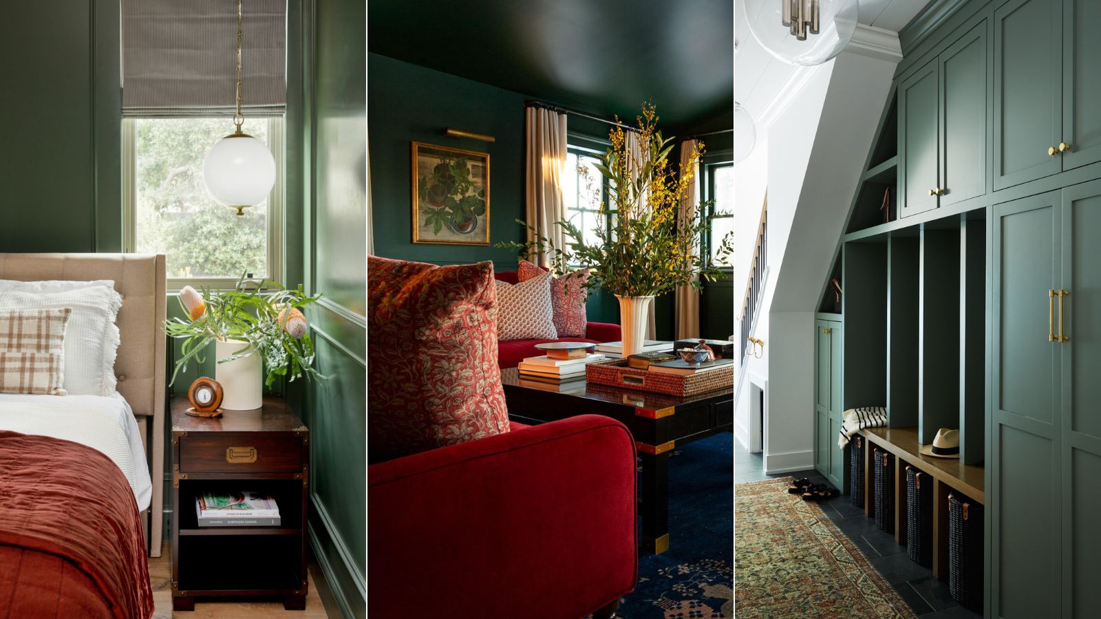
5 best green paints that will always be classics, according to interior designers
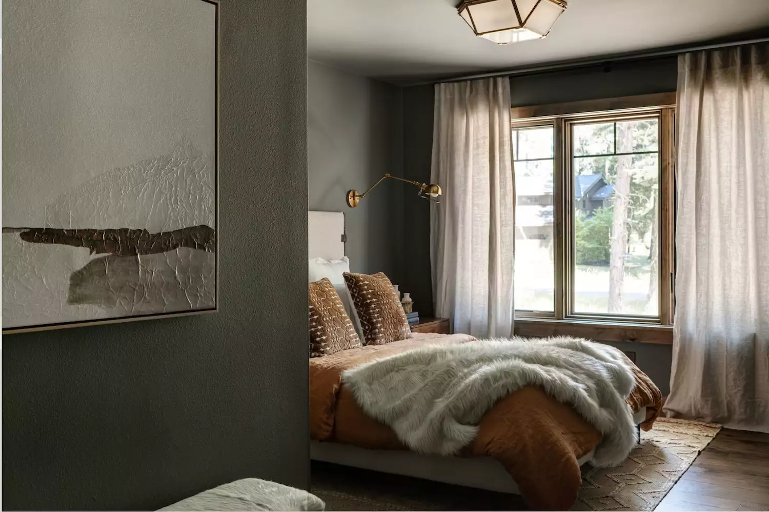
Love the Color Green? 22 Colors That Pair With It Perfectly in Any Room of the House

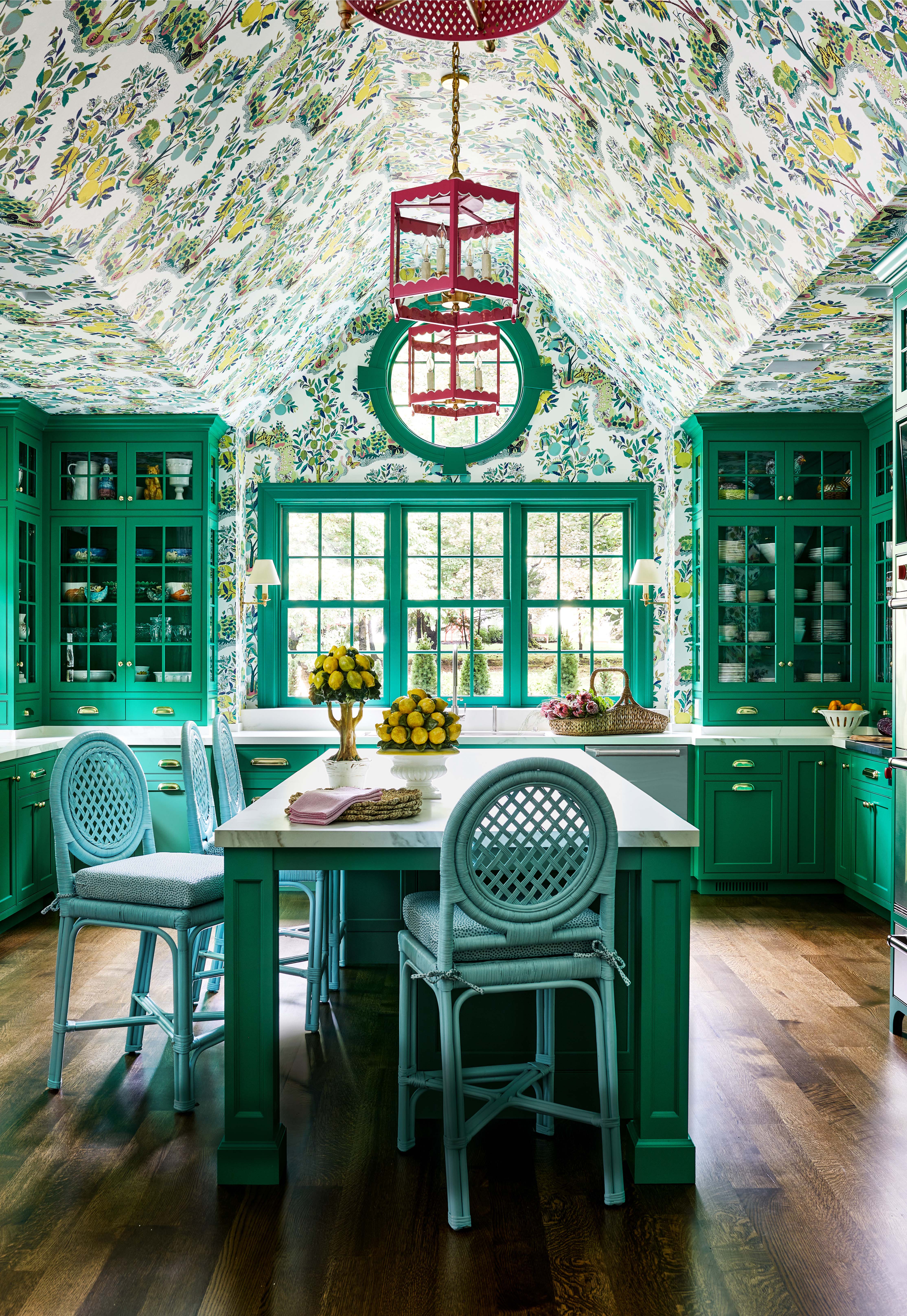
There Are Only Certain Green Paint Colors That Can Bring a Room to Life
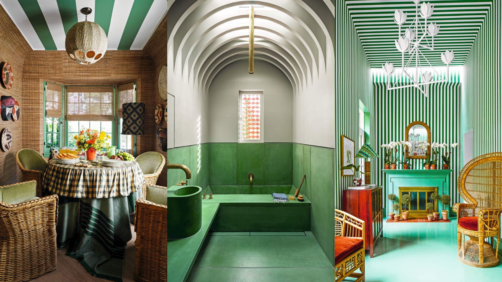
Green is the color of 2023 – these designer-approved ways to use it are bold and beautiful
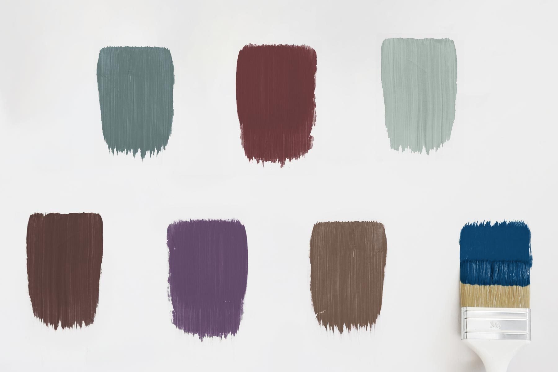
2025 Colors of the Year, and How to Use Them

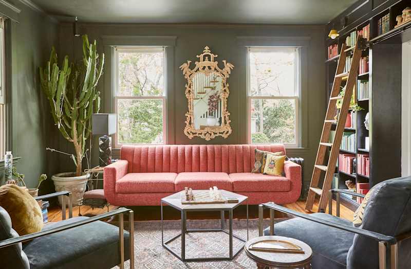
Martini Green Is 2026’s Hottest Color — Here Are 15 Palettes for Any Room
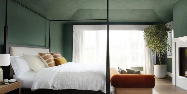
Here's How to Decorate With Green So It Actually Looks Chic
Designers Swear By These 11 Sage Green Paint Colors

8 Green Paint Colors Interior Designers Swear By for a Bold and Fresh Home