


1/2
The Vintage Paint Color That Will Never Go Out Of Style
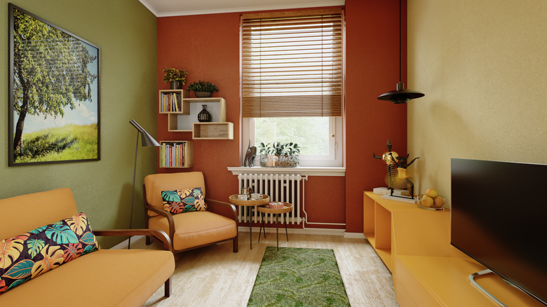
In the realm of home decor, while many trends are fleeting, certain paint colors possess an enduring appeal that transcends time. Among these, sandy and gold ochre hues are experiencing a resurgence in popularity, demonstrating their capacity to remain stylish across different eras. These colors, once prominent in mid-century modern and 1970s interiors, are now being embraced by designers for their ability to infuse spaces with playful color and a cozy character.
Opting for a sandy or golden ochre shade for a room's walls can fundamentally alter its ambiance. The inherent earthy undertones of these colors contribute to a welcoming and comfortable atmosphere, evoking a sense of history and nostalgia. Their versatility is a key factor in their sustained relevance, allowing them to integrate seamlessly into a broad spectrum of design styles. Gold ochre is particularly well-suited for various rooms; it can create an intimate setting in living or dining areas and introduce a calming serenity to bedrooms.
For those hesitant to commit to painting an entire room, these vintage shades can still be incorporated effectively. Highlighting specific architectural features, such as a bookshelf wall, with a golden ochre color provides a nuanced way to introduce this vintage charm without overwhelming the space. This approach aligns with contemporary design trends that favor feature walls over traditional accent walls.
To achieve a harmonious aesthetic, golden ochre walls pair exceptionally well with natural materials and finishes. Benjamin Moore's Summerdale Gold, a shade from its Historical Colors collection, exemplifies this trend with its honey-gold base and subtle green undertones. This color is celebrated for its autumnal warmth and its year-round calming neutrality. Similarly, Sherwin Williams' Earthy Ochre offers another option, featuring muted yellow and brown tones that create a natural feel, complementing rustic, bohemian, and mid-century modern aesthetics that emphasize natural elements.
The organic quality of golden ochre hues makes them ideal companions for textured materials such as wicker, rattan, burlap, and linen. These materials enhance the natural feel of the painted space. Furthermore, incorporating golden ochre through fabrics in cushions, curtains, or upholstered furniture can provide cohesive pops of color. For hard surfaces, natural stones like travertine or marble accentuate the earthiness of golden ochre, while its warm undertones complement rich wood tones found in dark floors and furniture. To further enrich the vintage look, integrating warm-toned metals such as copper or brass through lighting fixtures and other accents is recommended, aligning with the practice of mixing metals in home decor to achieve a sophisticated and timeless design.
#VintagePaintColors #GoldOchre #InteriorDesignTrends #MidCenturyModern #EarthyTones #HomeDecor #PaintColorInspiration #NaturalMaterials #TimelessDesign #VintagePaintColors #GoldOchre #InteriorDesignTrends #MidCenturyModern #EarthyTones #HomeDecor #PaintColorInspiration #NaturalMaterials #TimelessDesign