1/5
Is emerald the new way to do green in 2025?
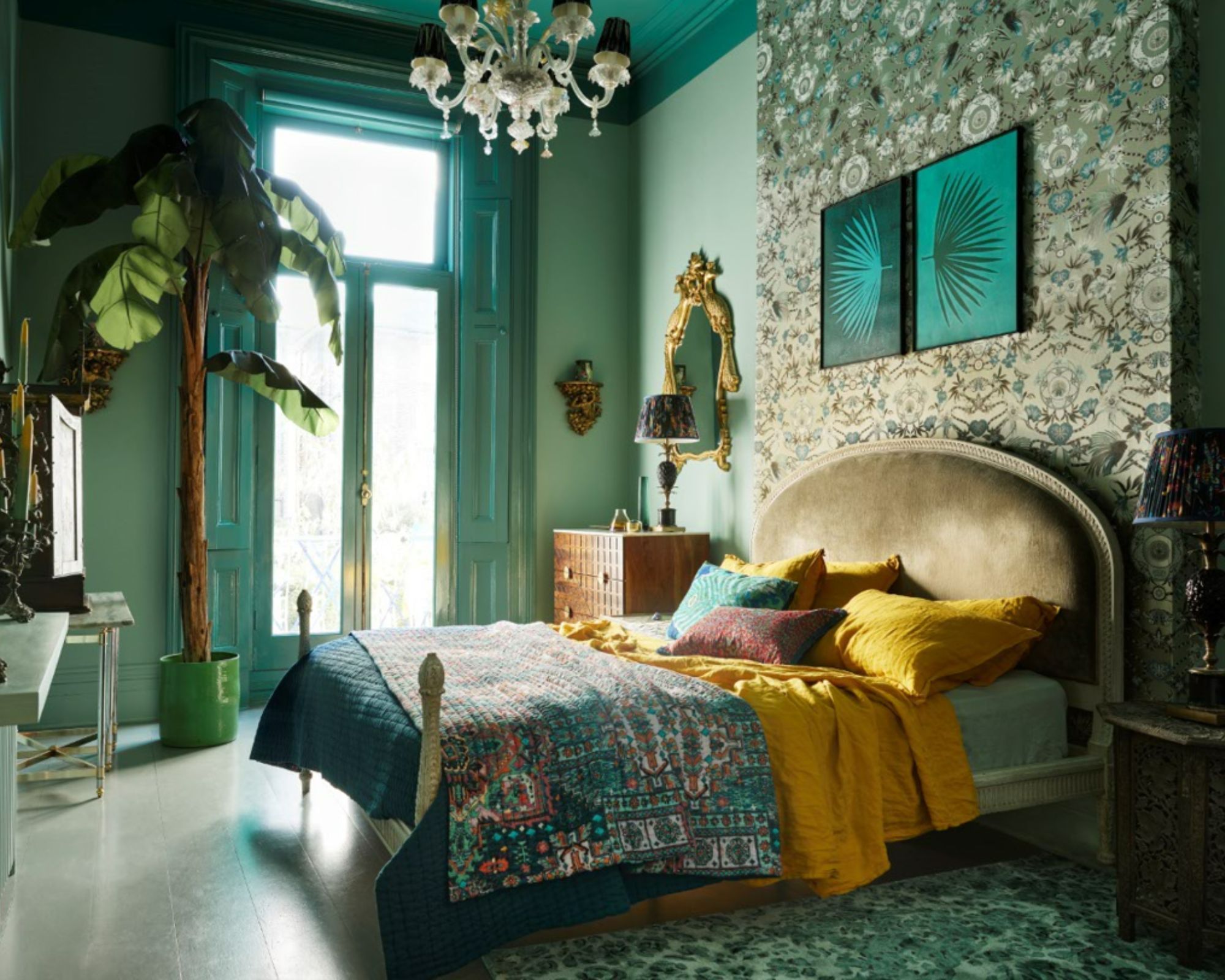
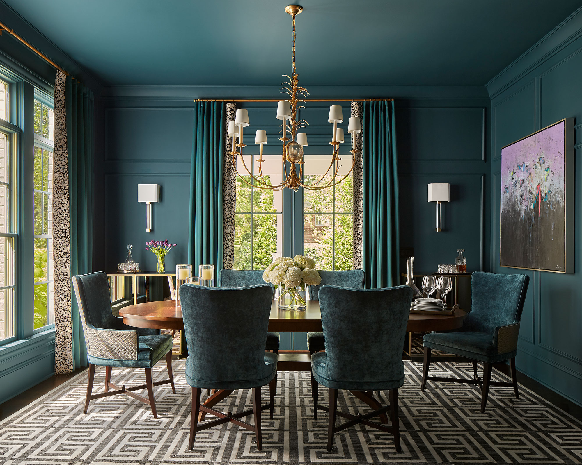
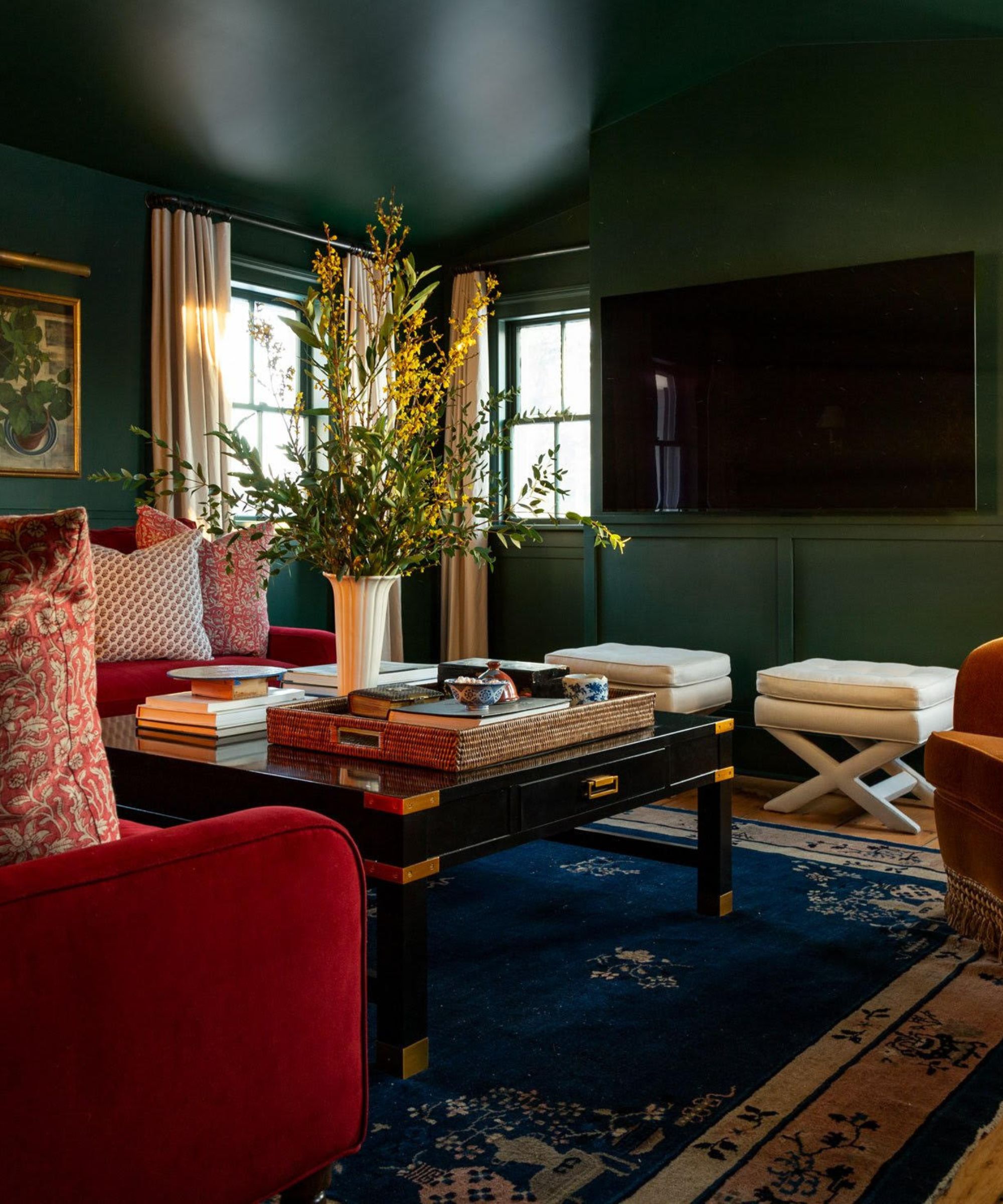
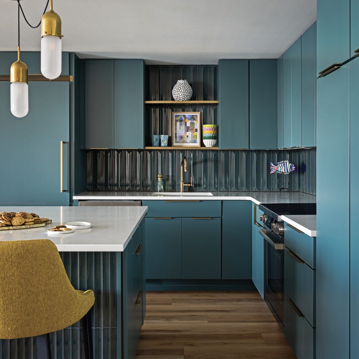
Emerald green is a prominent color trend in interior design, offering a sophisticated and vibrant alternative to softer green shades. This jewel-toned hue, reminiscent of precious stones, is considered versatile and easy to incorporate into various interior schemes. The increasing popularity of emerald green aligns with a broader preference for nature-inspired and comforting interior designs.
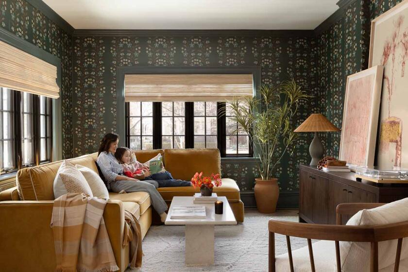
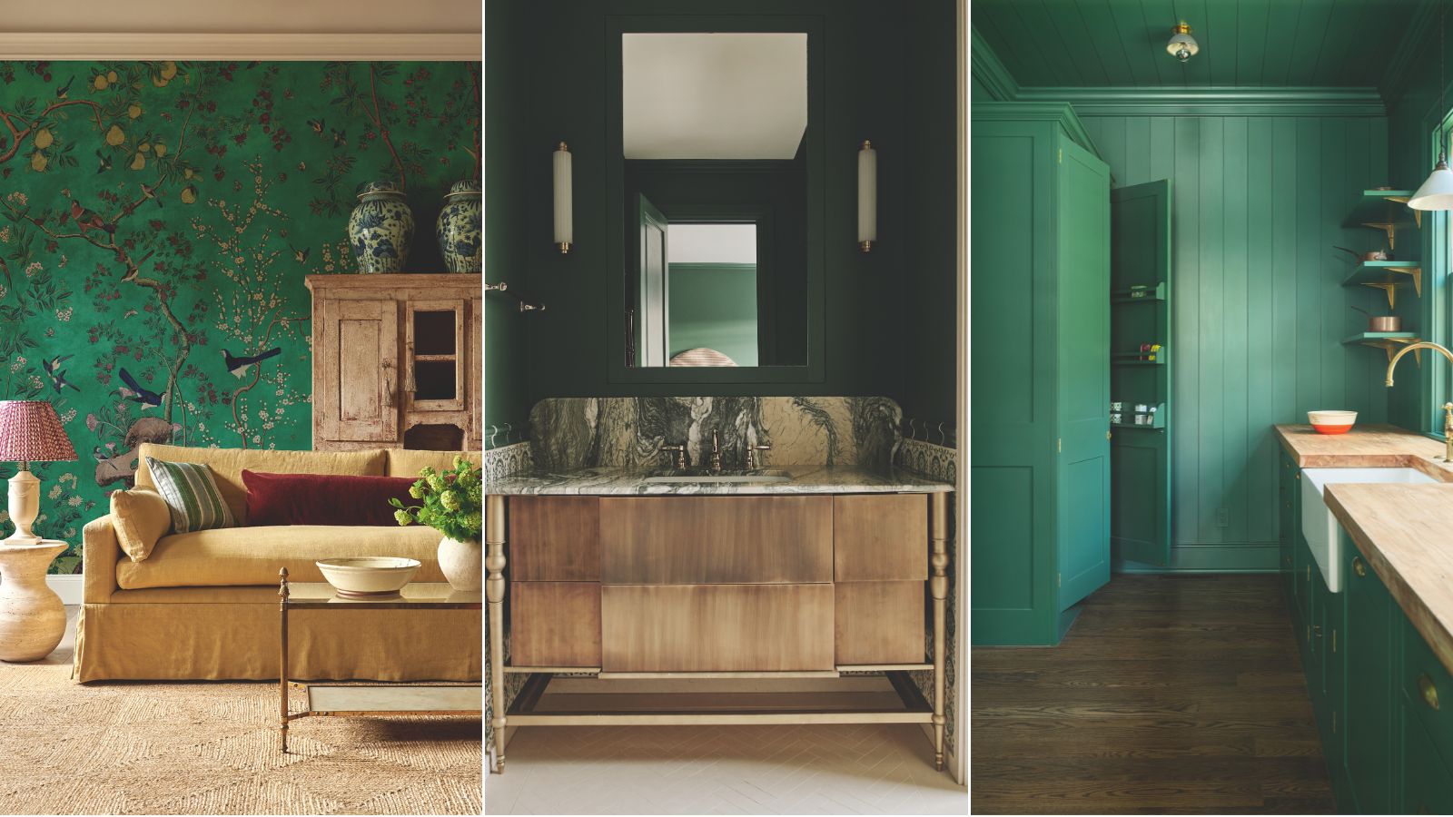
Design experts highlight several reasons for emerald green's growing appeal. Firstly, it possesses a timeless quality that allows it to evoke classical grandeur. PJ Keeling, director at wallcovering specialists Zardi & Zardi, describes their Chinoiserie Panorama wallcovering in Malachite as an elegant design that draws inspiration from grand 18th-century country estates, where rich greens were commonly used to create a cocooning effect. The design is complemented by accents of raspberry, deep violet, and lustrous blue to enhance its vibrancy.
Secondly, emerald green serves as an effective contrasting backdrop for lighter accents. Andy Greenall, creative director of Paint & Paper Library, notes that their 'Malachite' shade, derived from rare 'velvet malachite,' is sufficiently bright to introduce vibrancy while harmonizing with paler elements. He suggests pairing it with 'Nori' on windows, architraves, and skirting boards to create a striking yet cohesive scheme in living or dining rooms, where its depth can frame furniture and artwork.
Thirdly, the color can foster a sense of escapism and global style. Interior designer Lucinda Sanford utilizes rich, jewel-like colors to create environments that evoke distant places. In a bathroom project, she used Azure Green from Little Greene to achieve a Moroccan ambiance, emphasizing how the color enhanced the space's luxury and impact. This shade complemented the green veining in stone and highlighted gold hardware, treating them like jewelry.
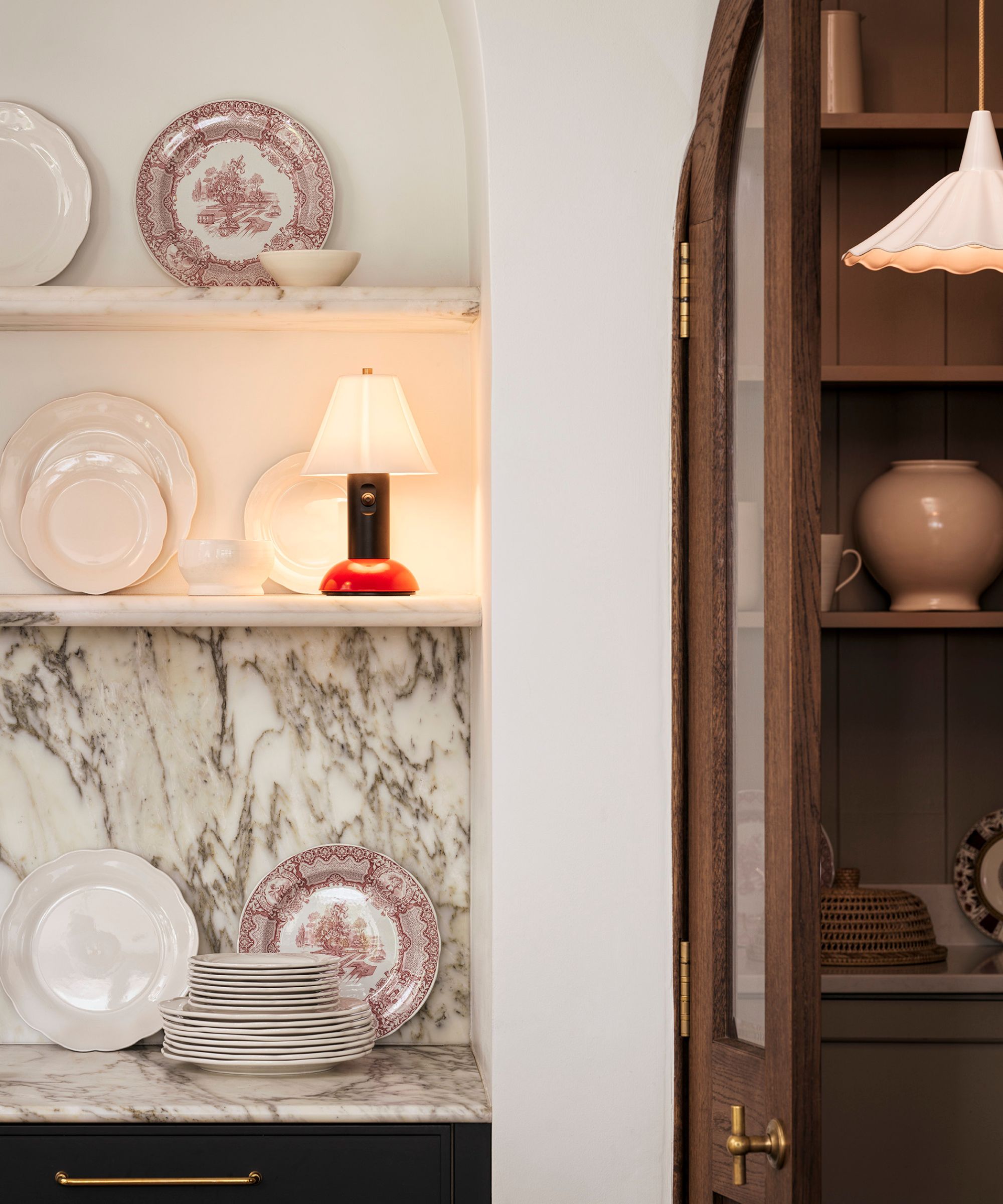
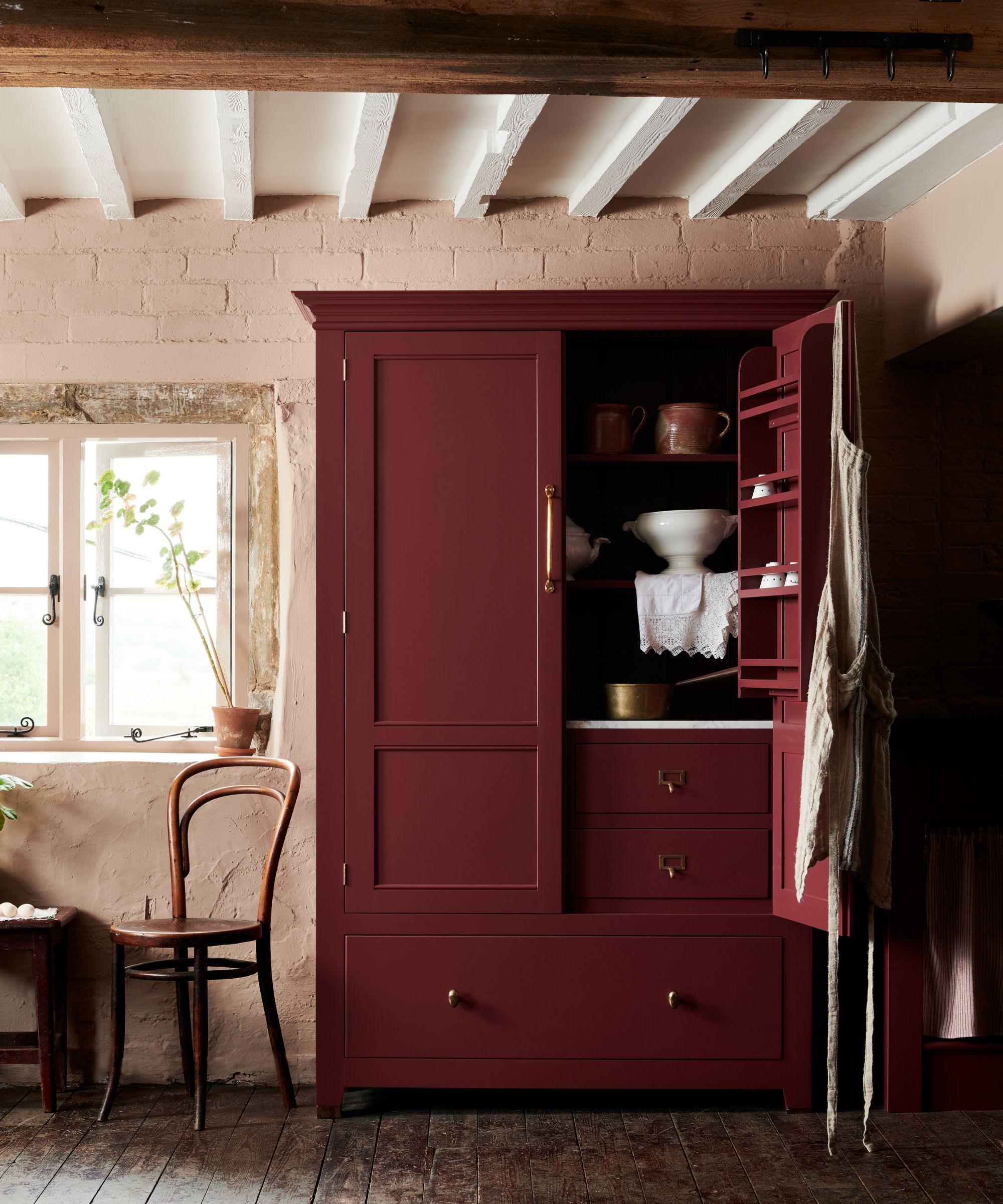
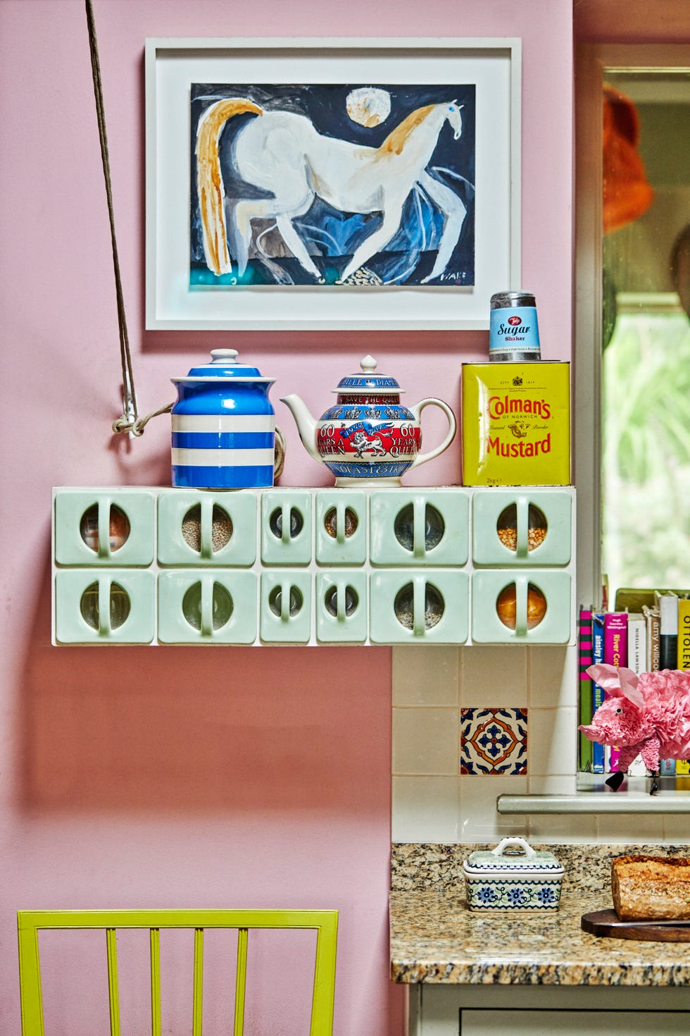
Finally, emerald green can establish harmony with outdoor views, particularly garden landscapes. Merlin Wright, design director of Plain English, collaborated with interior designer Rachel Halvorson on a kitchen project where 'Sprouts,' a rich green from their Colour Collection No. 2, was used in a butler's pantry. This choice connected the interior with the garden view, introduced playfulness, and paired effectively with warm woody accents. Wright also suggested an unexpected but natural pairing of 'Sprouts' with a muted pink called ‘Silver Polish’ and a vibrant blue called ‘Tea Caddy’, reflecting natural color combinations.
Overall, emerald green maintains its status as an elegant and enduring choice in interior design. Its ability to combine opulence with a connection to nature, along with its versatility in various settings, contributes to its sustained momentum in contemporary decorating trends.
#EmeraldGreen #InteriorDesign #ColorTrends #HomeDecor #LuxuryInteriors #ClassicalGrandeur #NatureInspired #ModernLiving #DesignExpertOpinions #EmeraldGreen #InteriorDesign #ColorTrends #HomeDecor #LuxuryInteriors #ClassicalGrandeur #NatureInspired #ModernLiving #DesignExpertOpinions
0 comment in total
 No comments yet
You may also like
Why We're Embracing Earthy Decor In 2023, According To An Expert
We’re Calling It: These Are the Official Color Trends of 2025


These Colors Will Be Everywhere in Interiors in 2025
This Serene Paint Trend Is Set To Take Over In 2022
The Biggest Colour Trends Taking Off in 2025
What's replacing sage green in 2024? 5 on-trend variations of this nature-derived hue
The Latest Color Trend You'll Be Seeing Everywhere In Fall 2025
Color Explosion: 2025 Color Trends

What’s replacing beige in 2025? Last year's go-to neutral is taking a back seat in favour of these two new earthy colours
These Sustainable Flooring Trends Will Be Everywhere In 2025

Looks Like Bold Stripes Will Have Their Moment in 2026

We Predict 2025 Will Be Our Celestial-Chic Decor Era

We're Calling It: Blues And Greens Are The New Neutrals For 2025
What's replacing the 'Unexpected Red Theory'? Here's what colors designers say will be popular in 2025
Is mahogany wood back on trend in 2025?
The colour palette for 2025 – these are the shades paint experts say we’ll see everywhere next year
Top Stone Trends in 2025: Color Revival

‘Unexpected Yellow Theory’: The Bold New Interior Trend Replacing Red in 2025

The #1 Paint Color Trend of 2025, According to Designers

Earth Tones Will Be the Most Popular Colors of 2025—Here's How to Decorate With Them