




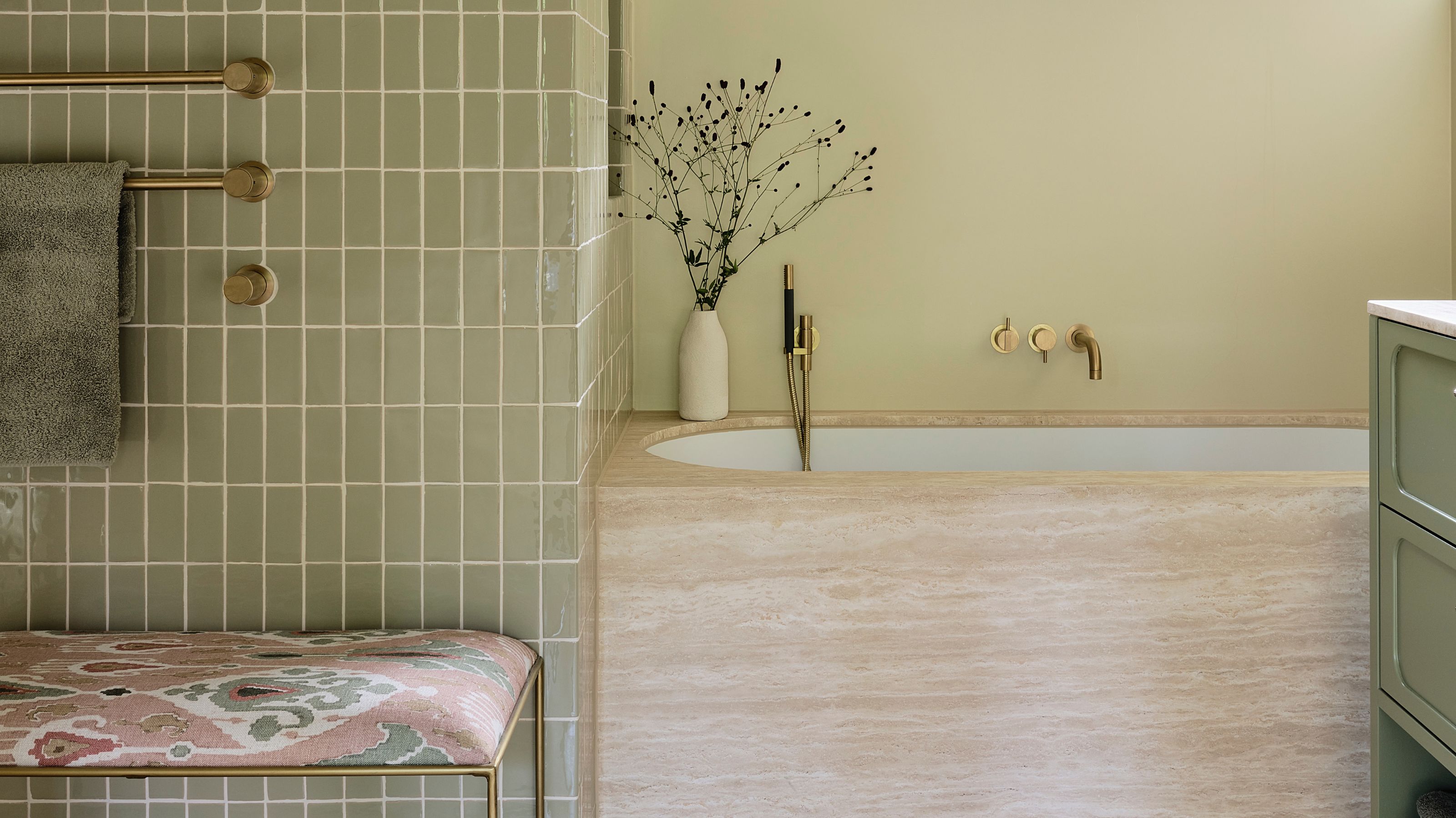
1/9
If a Color Could Be an Era, Eau de Nil Would be "Pure 1930s"
The article delves into the historical and aesthetic significance of 'Eau de Nil,' a soft, watery pale green hue named after the River Nile. This color, meaning 'water of the Nile' in French, gained prominence during the 19th and 20th centuries, particularly in the Art Deco period, symbolizing the European fascination with Egypt. Jonathan Adler's 2013 book, _Life in Color_, highlights how 'Eau de Nil' evokes the melancholy glamour of Claridge's Hotel in London, reinforcing its association with the 1930s. Ruth Mottershead, Creative Director of Little Greene paint company, emphasizes that 'Eau de Nil' is instantly recognizable as a quintessential 1930s shade, reflecting the era's trend for Egyptian motifs in art, architecture, and design.
The article describes 'Eau de Nil' as a shade that is slightly dustier than mint green and not as silky as celadon, making it difficult to precisely define. It exists in a liminal space, leaning towards green but with yellow, gray, and blue undertones, described as green turned cold, swirled with silver, and overlaid with fog. This elusive quality is presented as a key part of its allure, prompting contemporary designers to consider it a 'neutral-but-not' hue. Edward Bulmer, an interior designer and founder of Edward Bulmer Natural Paints, explains its composition as yellow ochre influenced by black with a touch of chrome yellow, highlighting its versatility and timeless elegance.
Its romantic appeal is linked to historical events, such as Nelson’s victory over Napoleon in 1798, which further cemented visions of Egypt. Bulmer notes its ability to integrate into neutral color schemes for a soft palette, but also to complement bolder shades like reds, blues, and pinks, bringing out its saturated undertones. Lena Dahnsjo, a color consultant at Edward Bulmer Natural Paints, frequently uses 'Eau de Nil' when a green is desired but should not be dominant, providing a beautiful backdrop for other colors. Designer Max Rollitt, despite his affection for the shade, acknowledges its potential to appear as a 1950s hospital green if the undertones and space are not carefully managed, yet praises its indefinable and evocative nature when correctly applied.
Ruth Mottershead of Little Greene suggests 'Eau de Nil' delivers understated elegance in dining spaces and hallways or a fresh, nostalgic feel in kitchens and bathrooms. She recommends pairing it with Little Greene’s 'Jewel Beetle' or 'Sir Lutyens Sage' for subtle contrasts, or 'Orange Aurora' for a bold statement. Its historical roots make it suitable for 1930s architecture and period-inspired interiors, but its fresh quality also lends itself to country homes and contemporary spaces. The choice of paint finish significantly impacts its appearance; a chalky matte finish like Little Greene's Absolute Matte can provide a velvety look for bedrooms and living rooms, while reflective high gloss finishes can evoke 1930s glamour. Lighting is crucial, as 'Eau de Nil' can appear cooler and more turquoise in north-facing rooms due to emphasized blue undertones, or more vibrant and zesty in south-facing rooms where yellow undertones become more apparent. Given the resurgence of Art Deco trends, 'Eau de Nil' is expected to become increasingly prevalent in interior design.
#EauDeNil #ColorTrend #ArtDeco #InteriorDesign #PaintColors #HomeDecor #DesignHistory #GreenColor #NeutralColors #EauDeNil #ColorTrend #ArtDeco #InteriorDesign #PaintColors #HomeDecor #DesignHistory #GreenColor #NeutralColors
 No comments yet