1/5
Timeless Paint Colors HGTV Stars Love Using In Kitchens
Renovating a kitchen can be a significant investment, making the selection of a timeless color scheme crucial for lasting appeal. While neutral shades offer obvious longevity, more dramatic colors can also be effectively utilized. This article explores a variety of paint colors recommended by HGTV stars for kitchen walls, trim, and cabinetry, aiming to provide inspiration for creating enduring kitchen designs.
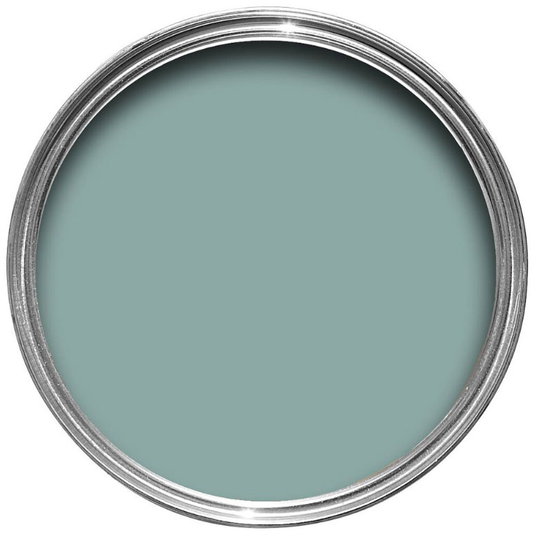
Vern Yip, known for his bold approach, created a distinctive black and white striped motif in his Atlanta kitchen. He applied chunky contrasting horizontal stripes on the walls and complemented them with patterned accessories like a zebra-print tablecloth and a striped light fixture. Yip emphasizes the timelessness of black and white, noting his unusual choice of a pale blue ceiling to visually counter summer heat. For those seeking to replicate this classic yet striking look, balancing the bold hues with softer accents, such as pastel-colored appliances or a light blue ceiling like Benjamin Moore's Dolphin's Cove, can temper the intensity.
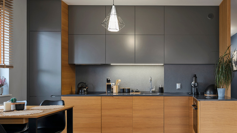
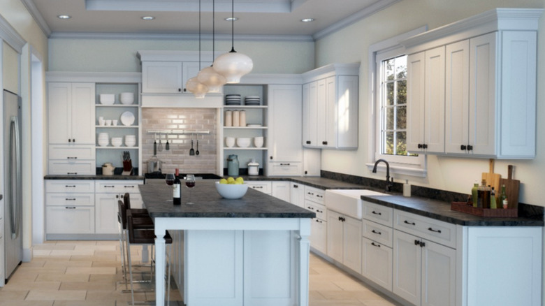
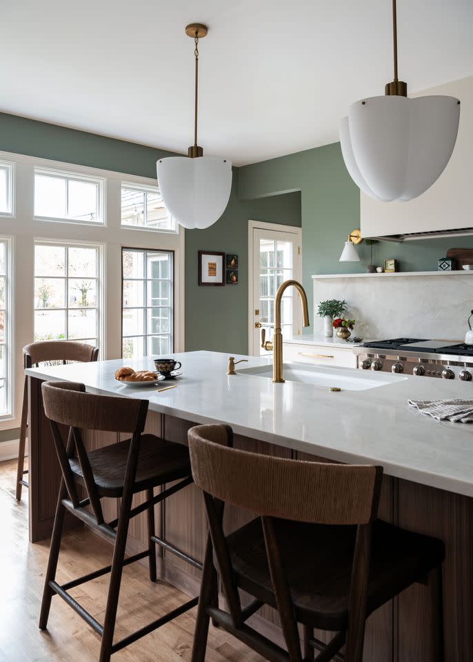
Orlando Soria, host of "Build Me Up," opted for a joyful pale gray on his kitchen walls paired with white cabinetry. He chose Clare's Chill, a paint with subtle green undertones, to achieve a fresh, light, and airy feel, complemented by warm wooden accents. Soria highlights the transformative power of paint and crown molding in his design. While gray is a popular kitchen color, selecting the right shade is important; light grays with blue or green undertones can create an airy ambiance, whereas those with beige undertones offer warmth. Dark grays might make a kitchen feel drab, particularly in spaces with limited natural light.
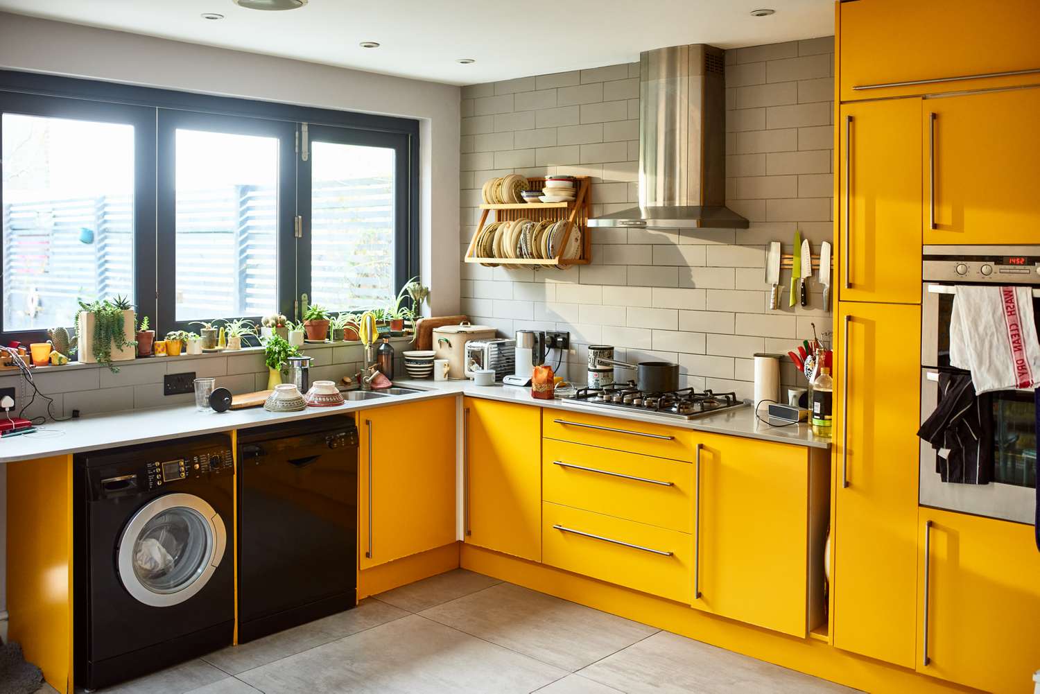
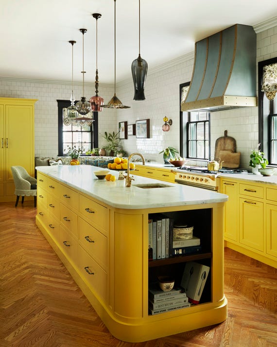
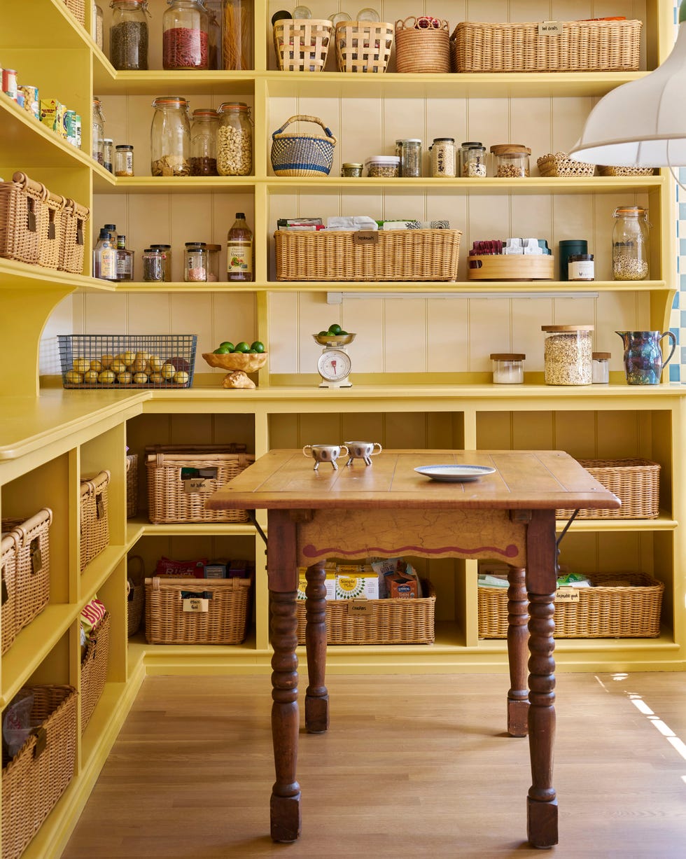
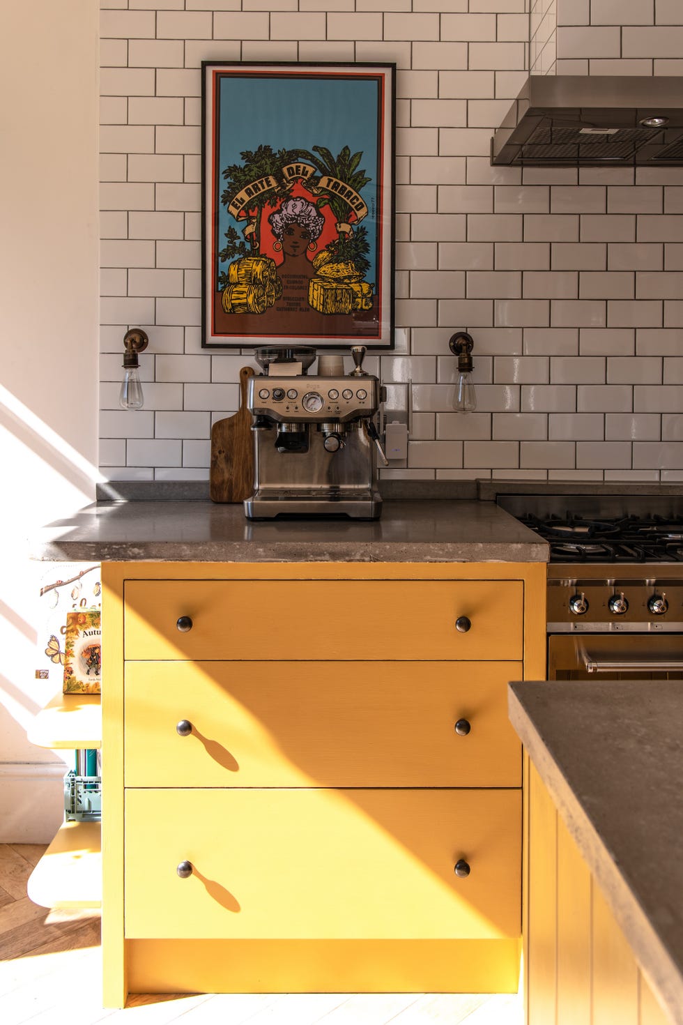
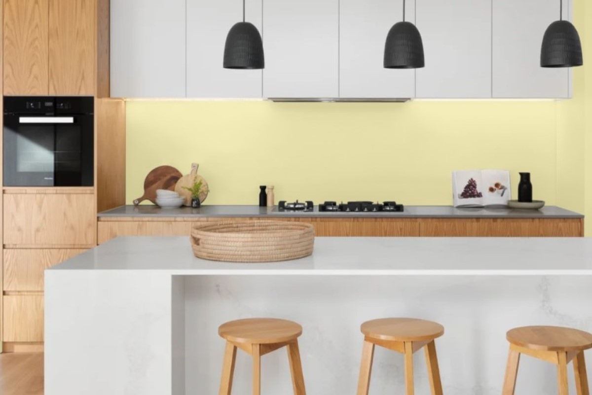
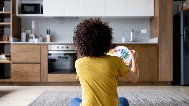
Jenny Marrs of "Fixer to Fabulous" advocates for yellow in kitchens, particularly for achieving a cheerful, country-inspired aesthetic. In a cottage project, she used a buttery yellow for wall paneling and cabinetry to evoke an English country style. Marrs acknowledges the challenge of finding the right yellow, emphasizing the need to test multiple shades to avoid a childish or overly bright appearance. She suggests Farrow and Ball's Dayroom Yellow for a creamy, subtle hue or Benjamin Moore's Stuart Gold for a modern, sophisticated yellow. The article encourages homeowners to experiment with different paint swatches to ensure the chosen yellow perfectly suits their space.
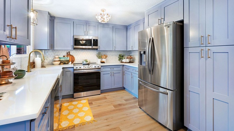
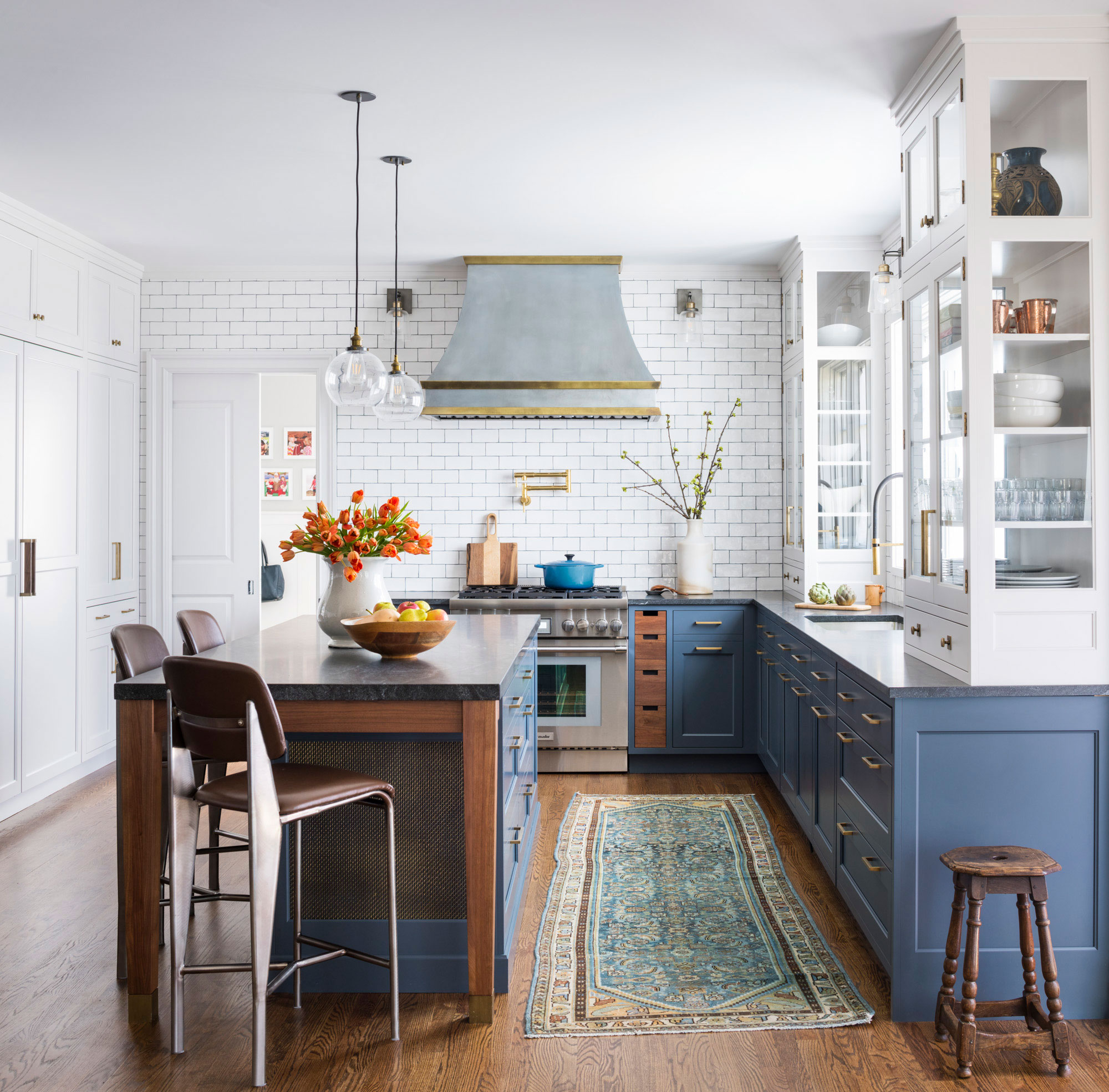
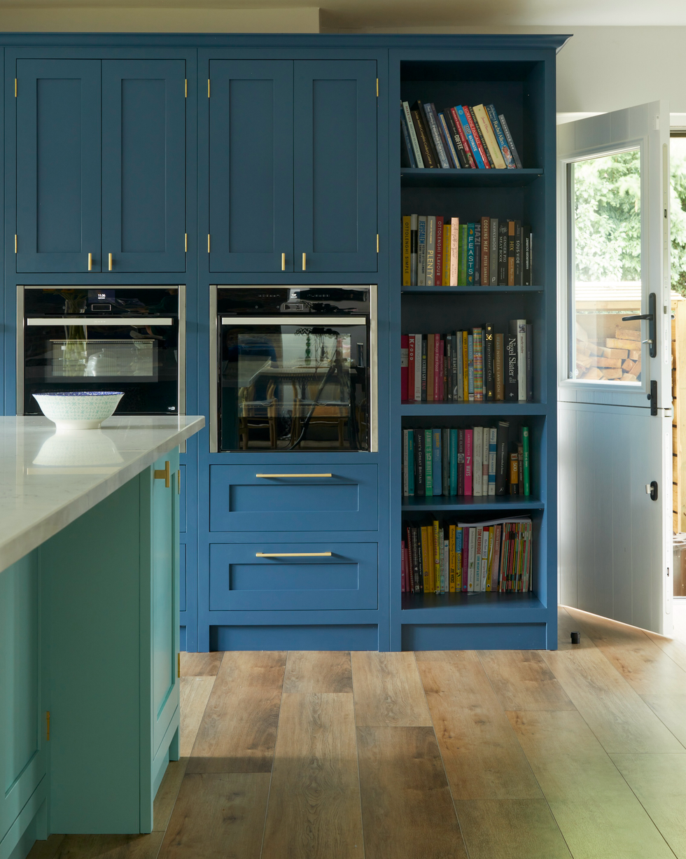
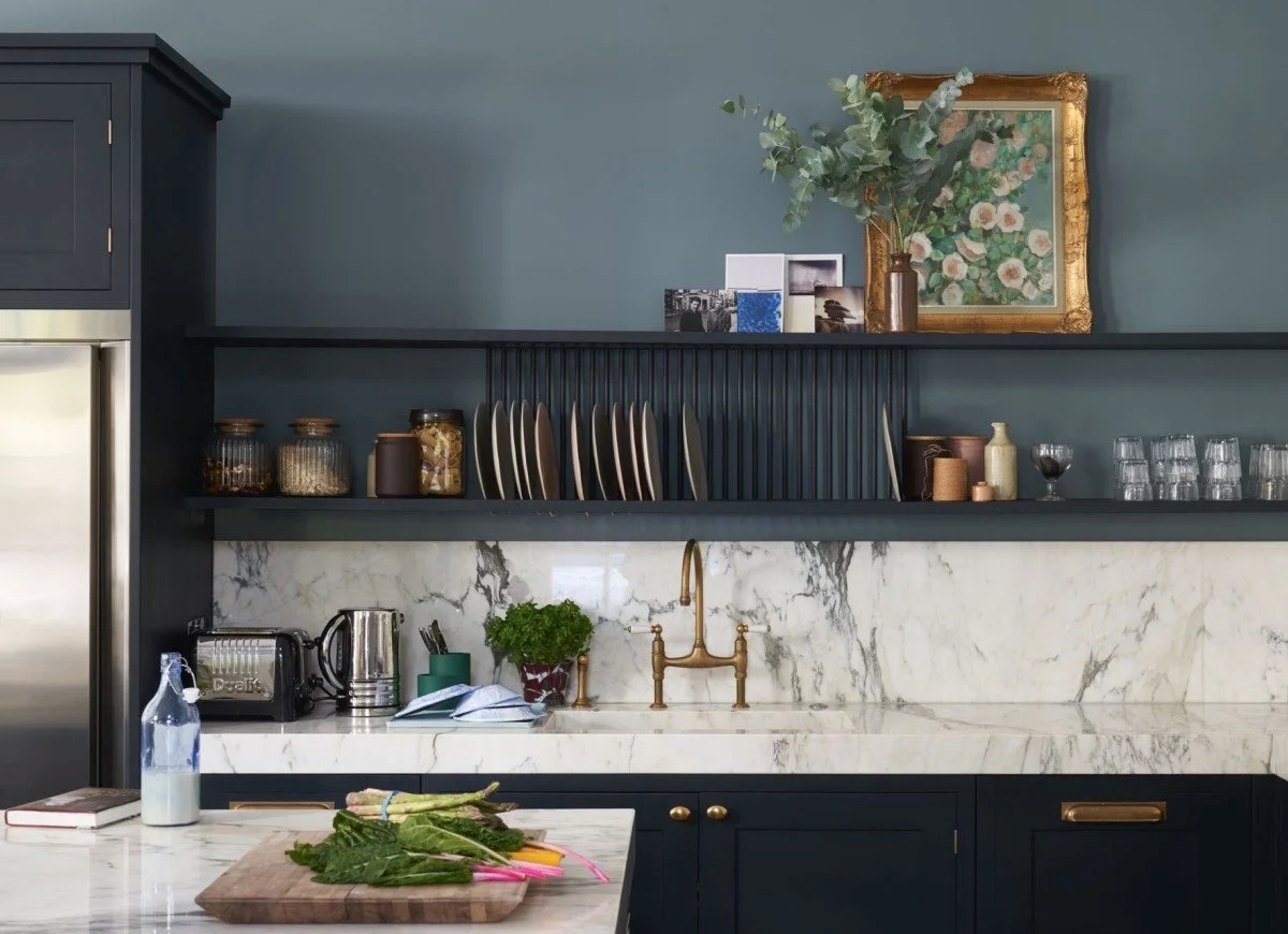
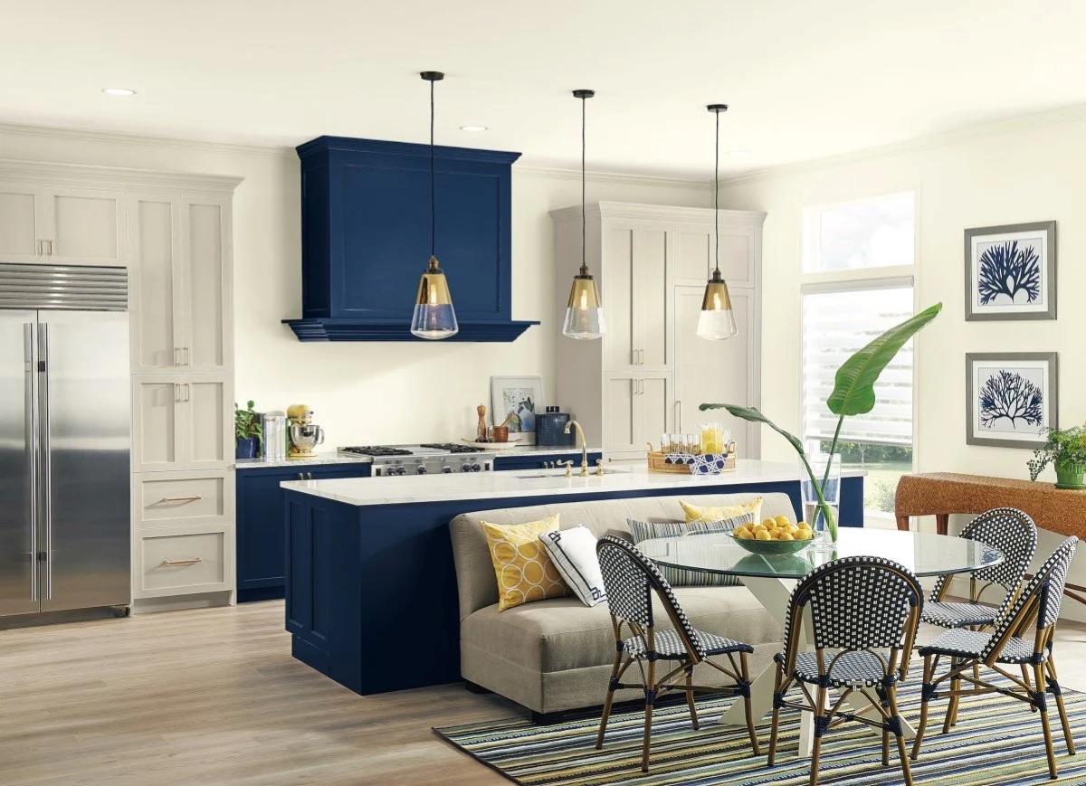
Hilary Farr, a proponent of blue kitchens, selected deep indigo blue cabinets for her own home, describing the color as chic, French, calming, and classic. She paired these cabinets with white and gray marble countertops and walls, allowing the blue to be the focal point. Gold accessories and wooden elements were incorporated to add warmth to the cool color scheme, creating a comfortable and inviting atmosphere. Farr's approach highlights cabinet painting as an accessible way to refresh a kitchen. She suggests calming blue shades such as Sherwin-Williams' Loyal Blue or Farrow and Ball's Stone Blue, emphasizing the importance of proper cabinet preparation for a professional finish.
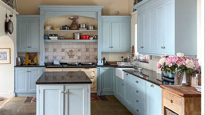
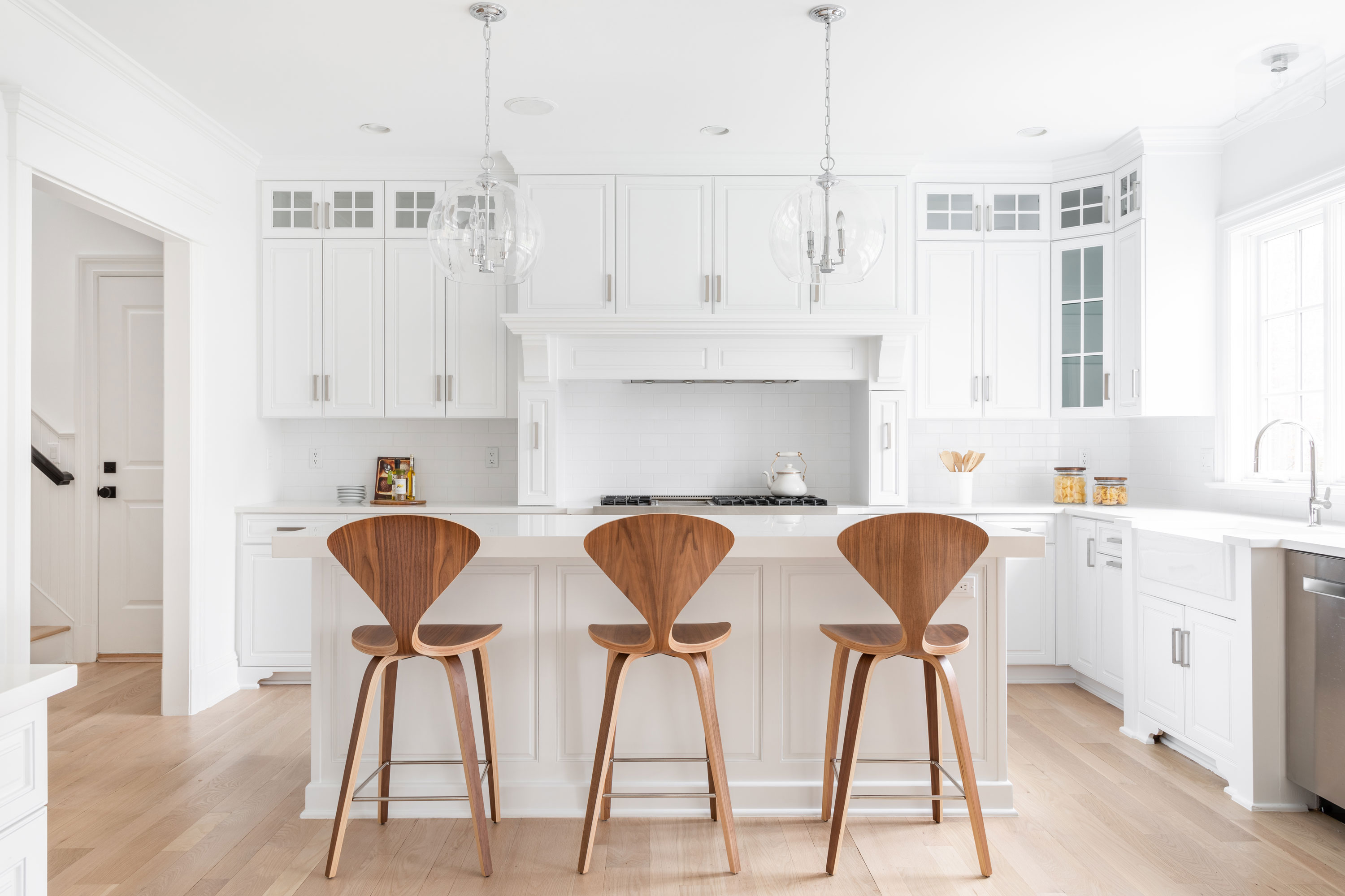
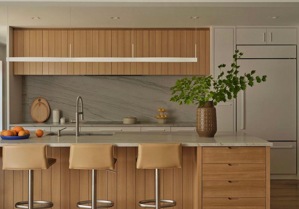
Jasmine Roth favors neutral off-white paint for kitchen walls, aiming for a laid-back, coastal vibe that remains stylish. In "Help! I Wrecked My House," she used Behr Silky White, an off-white with neutral greige undertones, to maintain brightness while ensuring warmth. Roth emphasizes that off-white provides a clean backdrop, allowing for more dynamic choices in other design elements like colorful cabinetry and flooring. The article advises using paint swatches to select the appropriate white, considering how natural light affects its appearance. Cool undertones work well in naturally lit rooms, while warm or neutral undertones are better suited for north-facing kitchens to enhance coziness. Christina Hall also employs white kitchen walls as a clean and neutral background, allowing her to introduce colored cabinetry, such as pale blue base cabinets, for a beachy aesthetic.
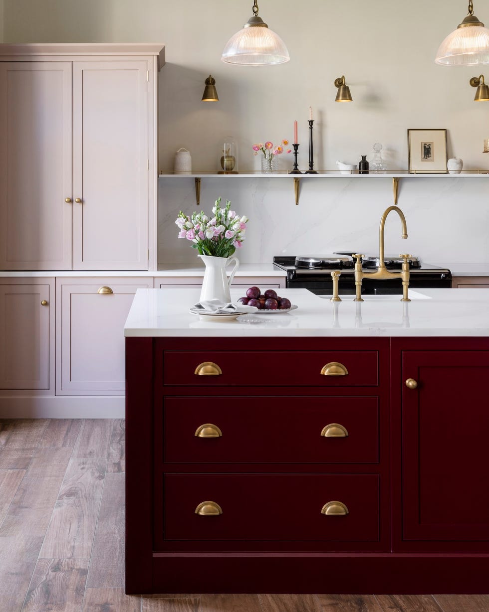
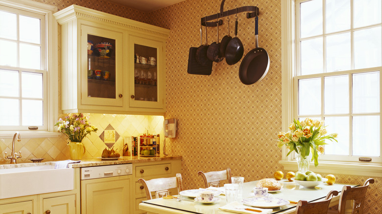
Finally, Erin Napier of "Home Town" chose a creamy golden paint shade for her kitchen, drawing inspiration from "Downton Abbey's" kitchen. She color-drenched her cabinets, walls, and trim in Sherwin-Williams' Netsuke, a creamy yellow with beige tones, to achieve a worn, buttery look. Napier's use of color-drenching, where multiple elements share the same color, promotes tranquility, comfort, and safety by enveloping the space in a single hue. This technique is recommended for creating a warm, welcoming, and wholesome kitchen environment. Jenny Marrs also identifies Farrow & Ball's Drop Cloth, a beige with gray undertones, as her favorite kitchen paint color, valued for its neutrality, beauty, and softness, which lends itself well to cabinetry in various "Fixer to Fabulous" projects. The article explains how the gray undertones prevent the beige from appearing yellowed or dated, and how pairing it with warm-toned metal accessories or white elements can create either a modern or classic country style. Alternatively, combining beige walls with black granite or charcoal cabinetry can achieve a dramatic, modern look.
#KitchenDesign #PaintColors #HGTVStars #HomeDesign #InteriorDesign #TimelessKitchens #KitchenRenovation #DesignTrends #ColorDrenching #KitchenDesign #PaintColors #HGTVStars #HomeDesign #InteriorDesign #TimelessKitchens #KitchenRenovation #DesignTrends #ColorDrenching
0 comment in total
 No comments yet
You may also like
HGTV Stars' Go-To Kitchen Cabinet Colors To Try In Your Home

The Best Kitchen Paint Colors All Have This One Thing In Common
These kitchen paint colours will be everywhere in 2025 – and there's even one for neutral lovers

These Will Be the Most Popular Kitchen Paint Colors In 2025, According to Interior Designers

Dark Paint Colors HGTV Stars Love Using In Homes
9 color-drenched kitchens that prove this paint trend is totally timeless when used in this hardworking space
5 Timeless Kitchen Cabinet Paint Colors Designers Love
It’s Official: These are the Best Kitchen Paint Colors, According to Designers
HGTV Star-Approved Kitchen Cabinet Colors To Consider Using In Your Home
5 Outdated Kitchen Paint Colors That Interior Designers Are Tired of Seeing
26 Most Popular Kitchen Paint Colors Throughout the Decades

The 14 Paint Colors Featured in Our Favorite Green Kitchens

Our Favorite Kitchen Wall Paint Colors
Five Mistakes People Make When Selecting Kitchen Cabinets—and How to Avoid Them
5 Gorgeous Paint Colors To Elevate Your Kitchen Cabinets In 2025

6 Kitchen Paint Color Trends That Are Already Taking Over Walls in 2026
The Kitchen Colors Designers Call “Forever Favorites”
The All-Time Favorite Light Neutral Paints Of HGTV Stars
29 Best Paint Colors for a Kitchen You’ll Never Want to Leave

3 Kitchen Paint Colors Experts Promise Will Never Go Out of Style