1/11
Bedroom color trends 2025 – 10 shades interior designers are using for the most stylish sleep spaces
The selection of a bedroom color scheme is a crucial step in the decorating process, as it not only impacts aesthetic appeal but also influences the overall mood and feel of the space. Designers are highlighting a diverse range of stylish hues for 2025, from calming neutrals to vibrant, saturated tones, offering inspiration for various design styles and desired atmospheres. The article presents ten top bedroom color trends, considering color psychology to help create the ideal ambiance, whether for relaxation and sleep or a more energized feel.
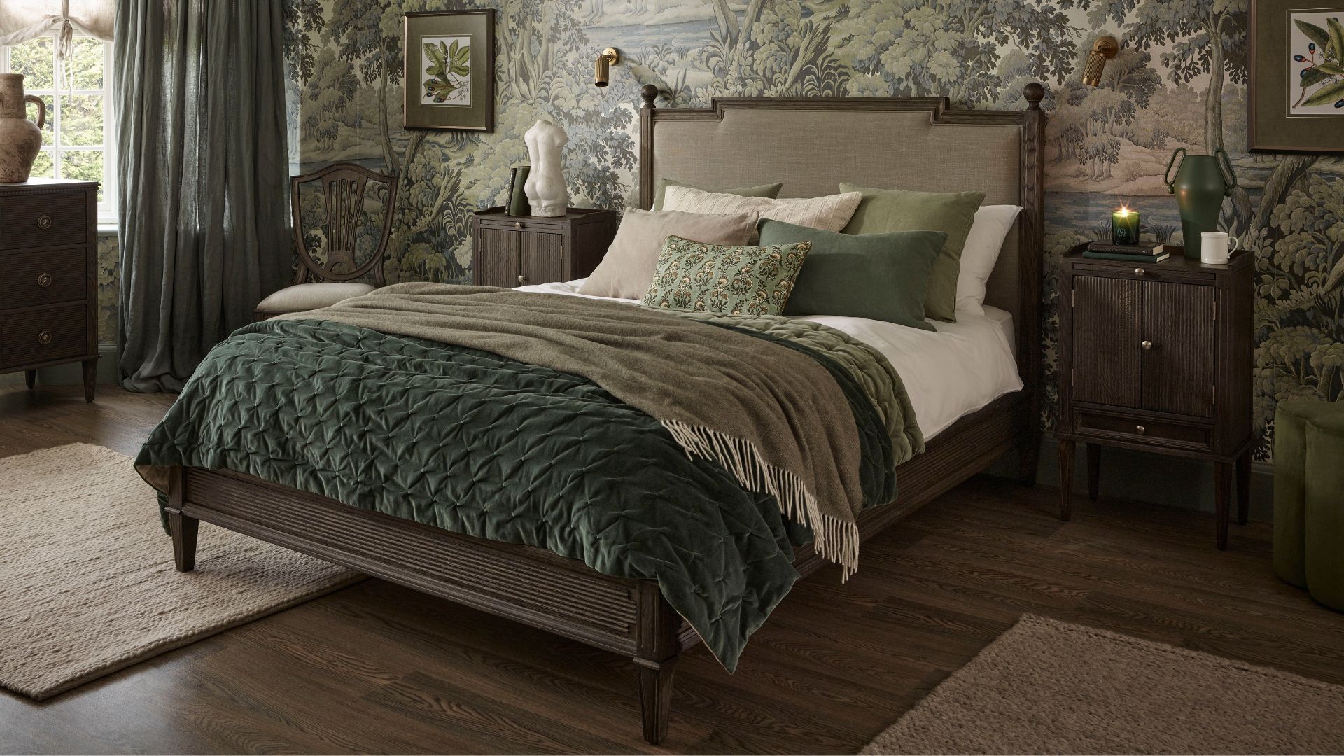
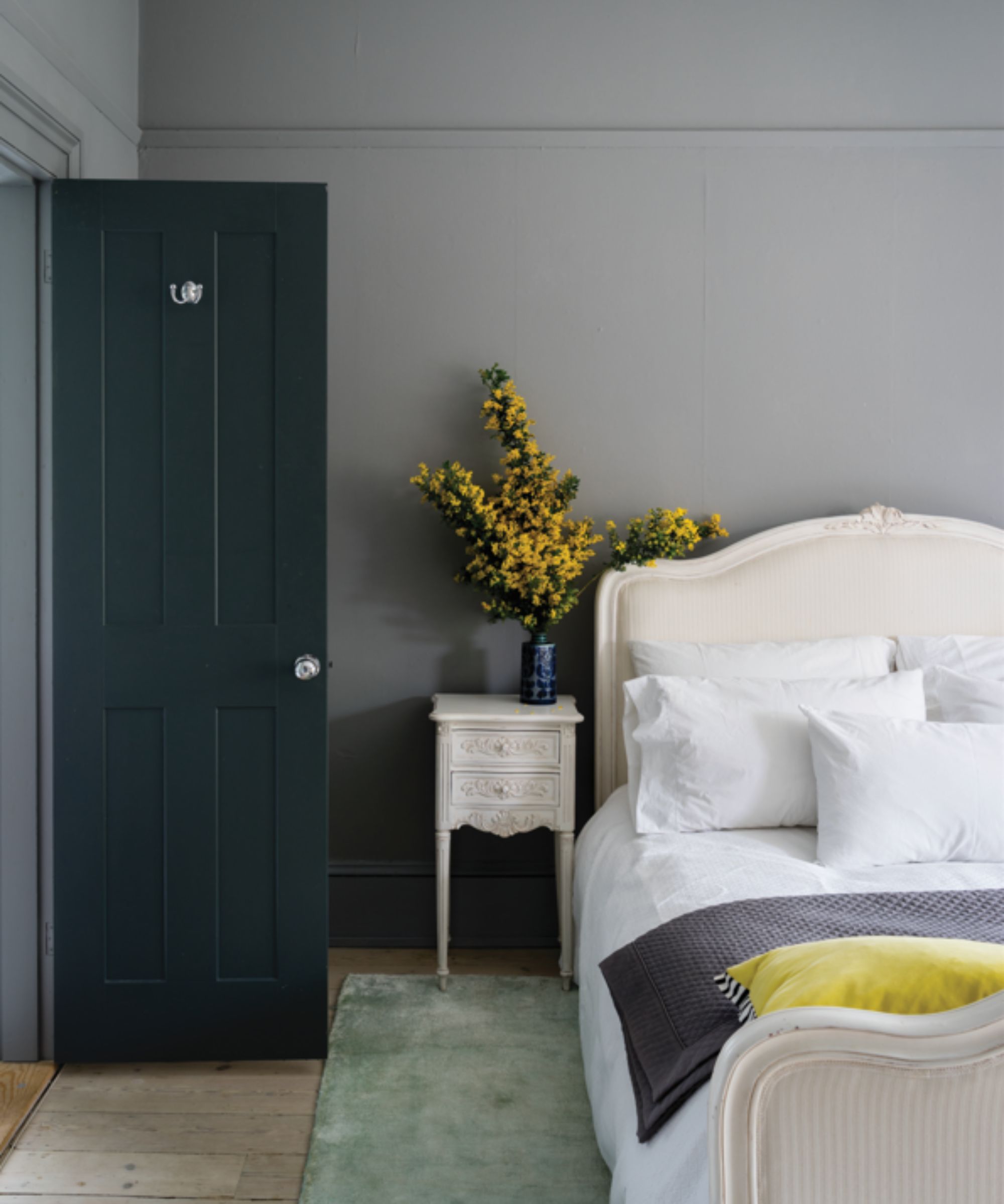
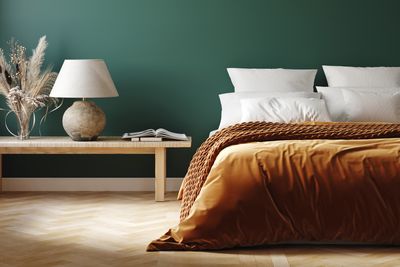
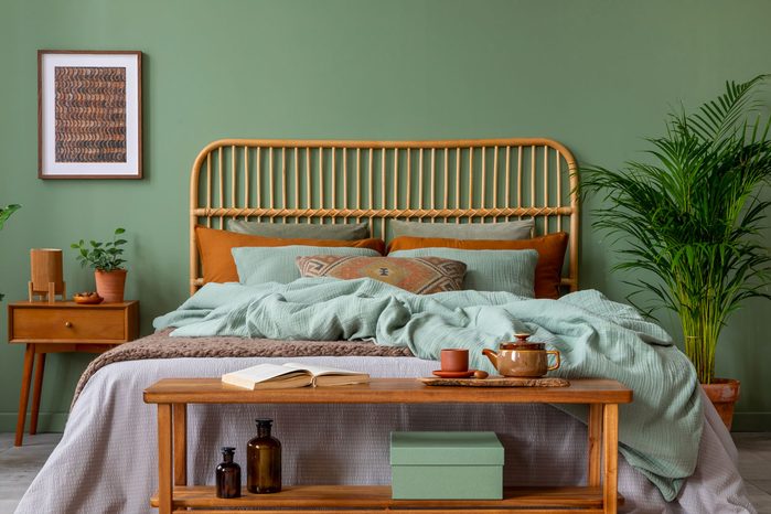
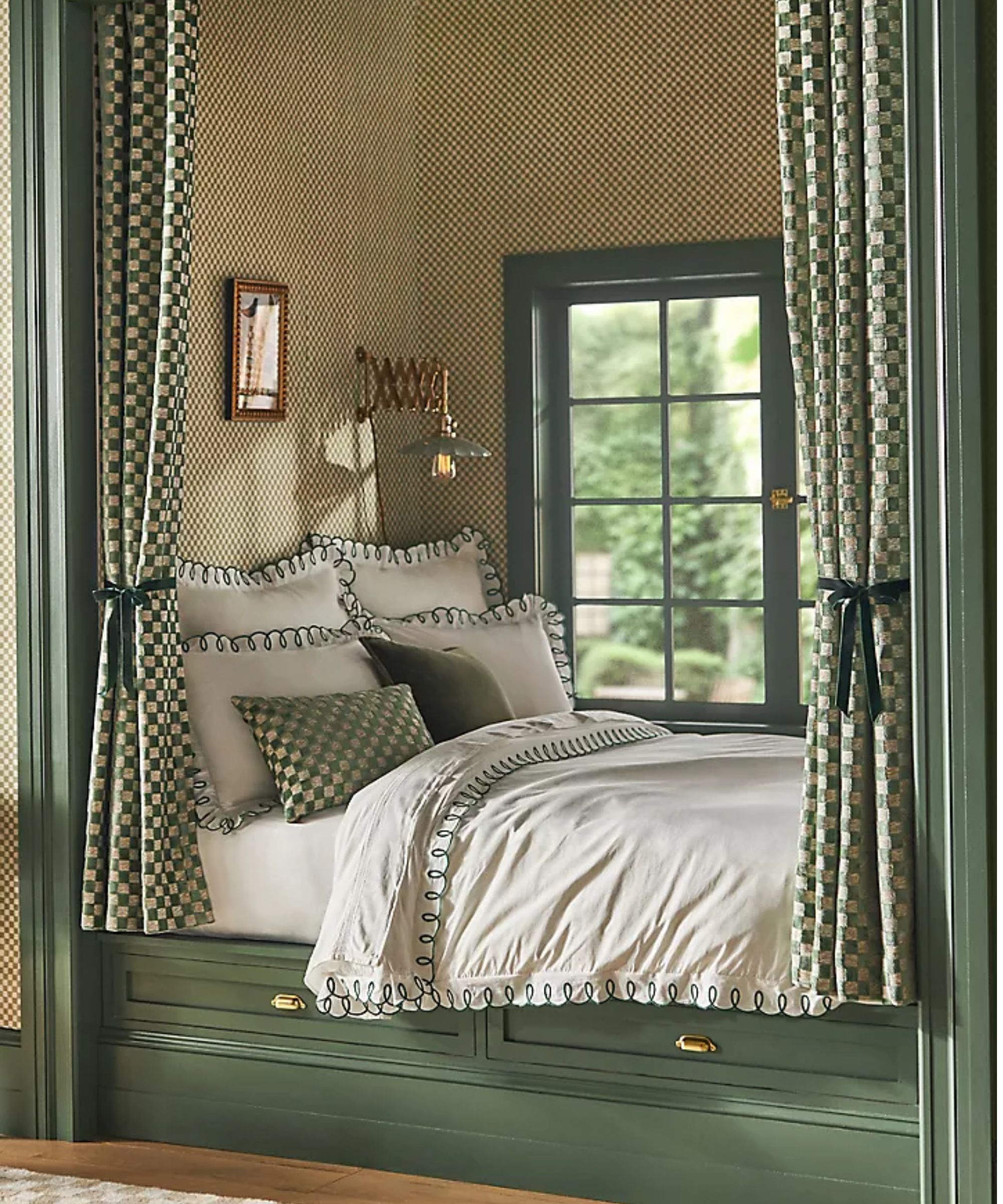
Dark green is a prominent trend, with designers recommending deep, muted shades like Benjamin Moore's Caldwell Green, Peale Green, and Tate Olive. These colors are favored for their grounding and restful qualities, creating a calm and inviting environment. They pair effectively with warm neutrals and natural textures such as linen, wood, and soft wool, offering depth without overwhelming the room. Sherwin Williams' Thunderous is another suggested dark green, noted for its earthy undertones that blend well with various colors and contribute to a cozy atmosphere. Green, in general, is considered a timeless hue adaptable to both modern and traditional styles depending on accompanying accents.
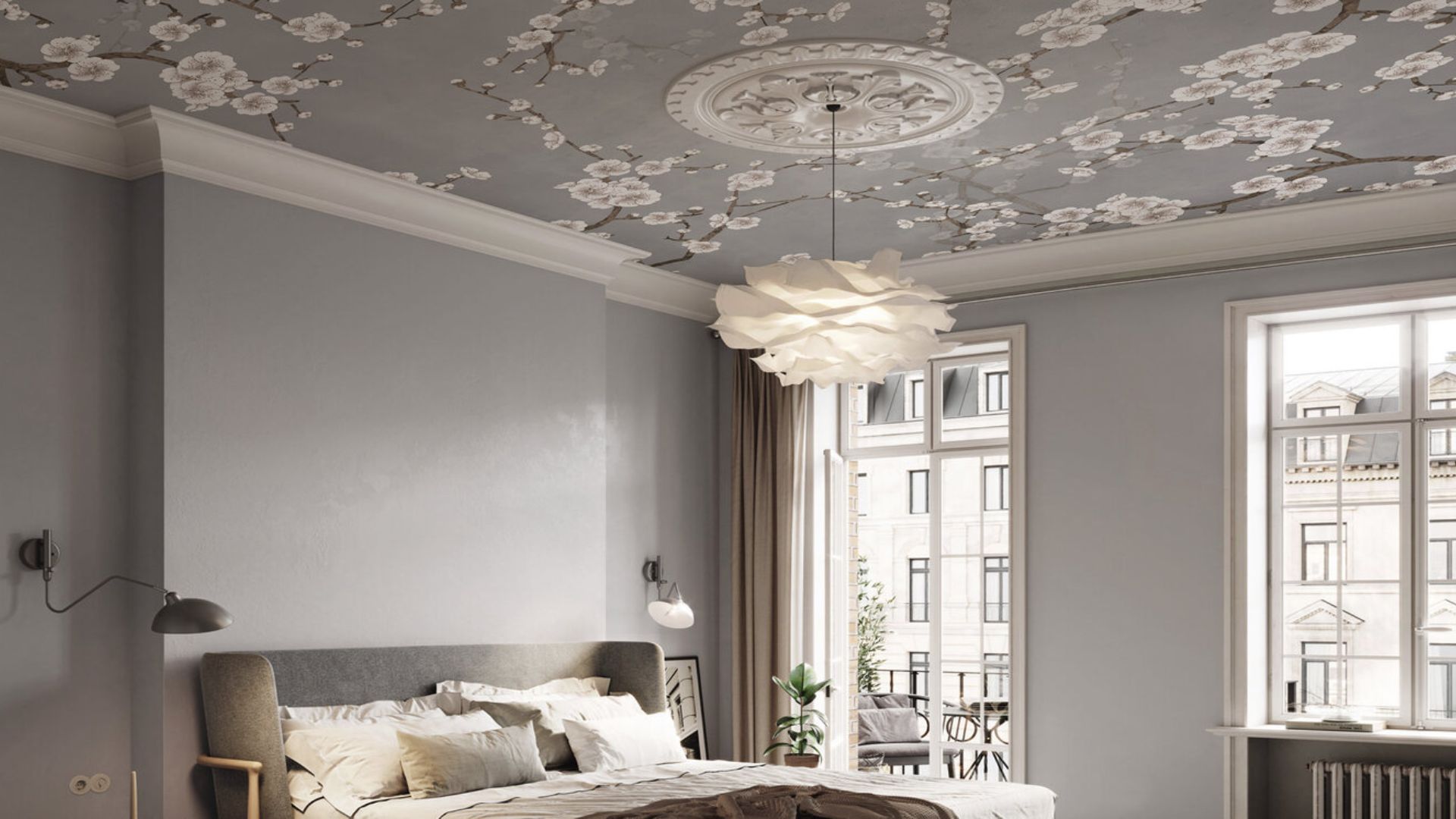
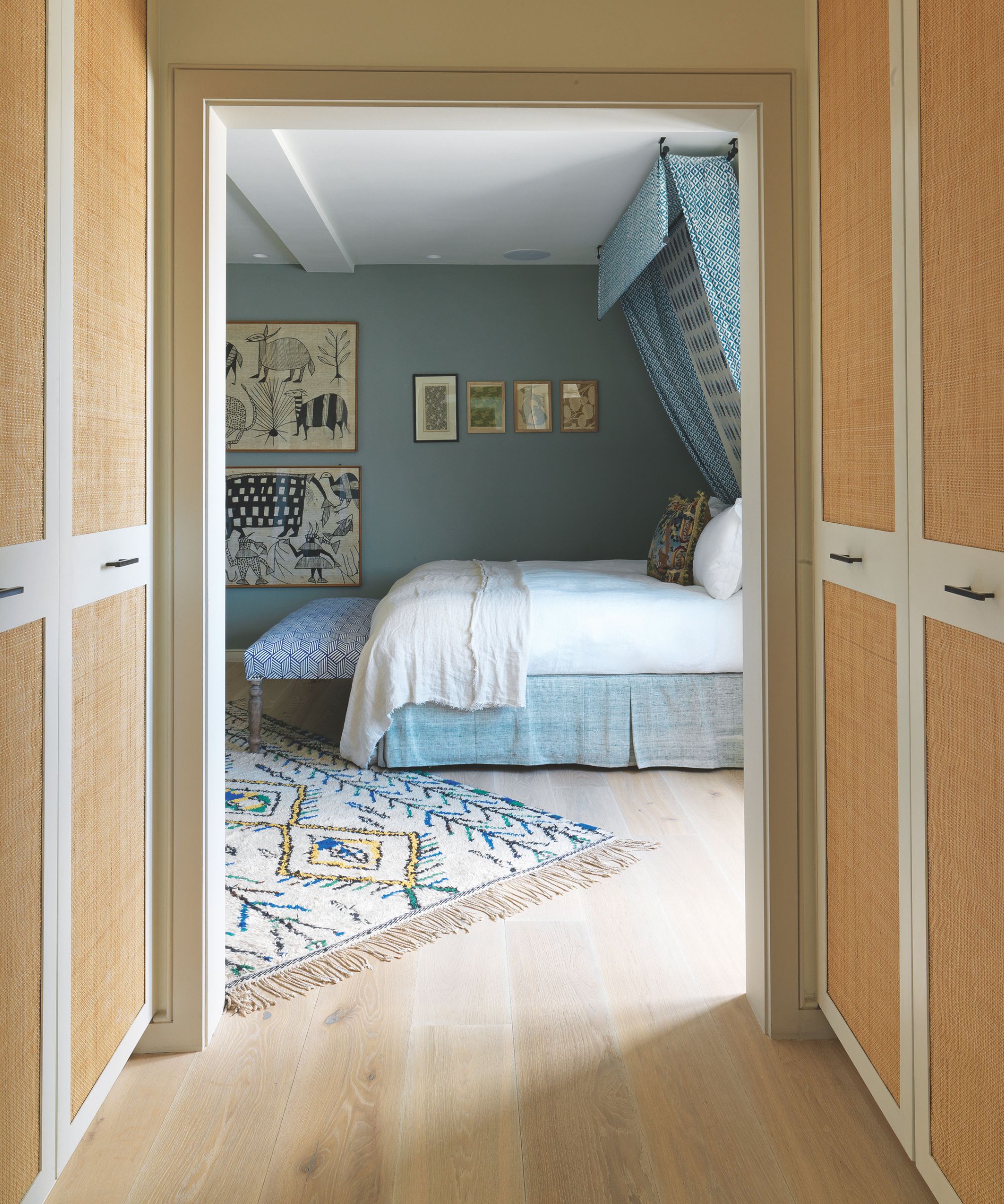
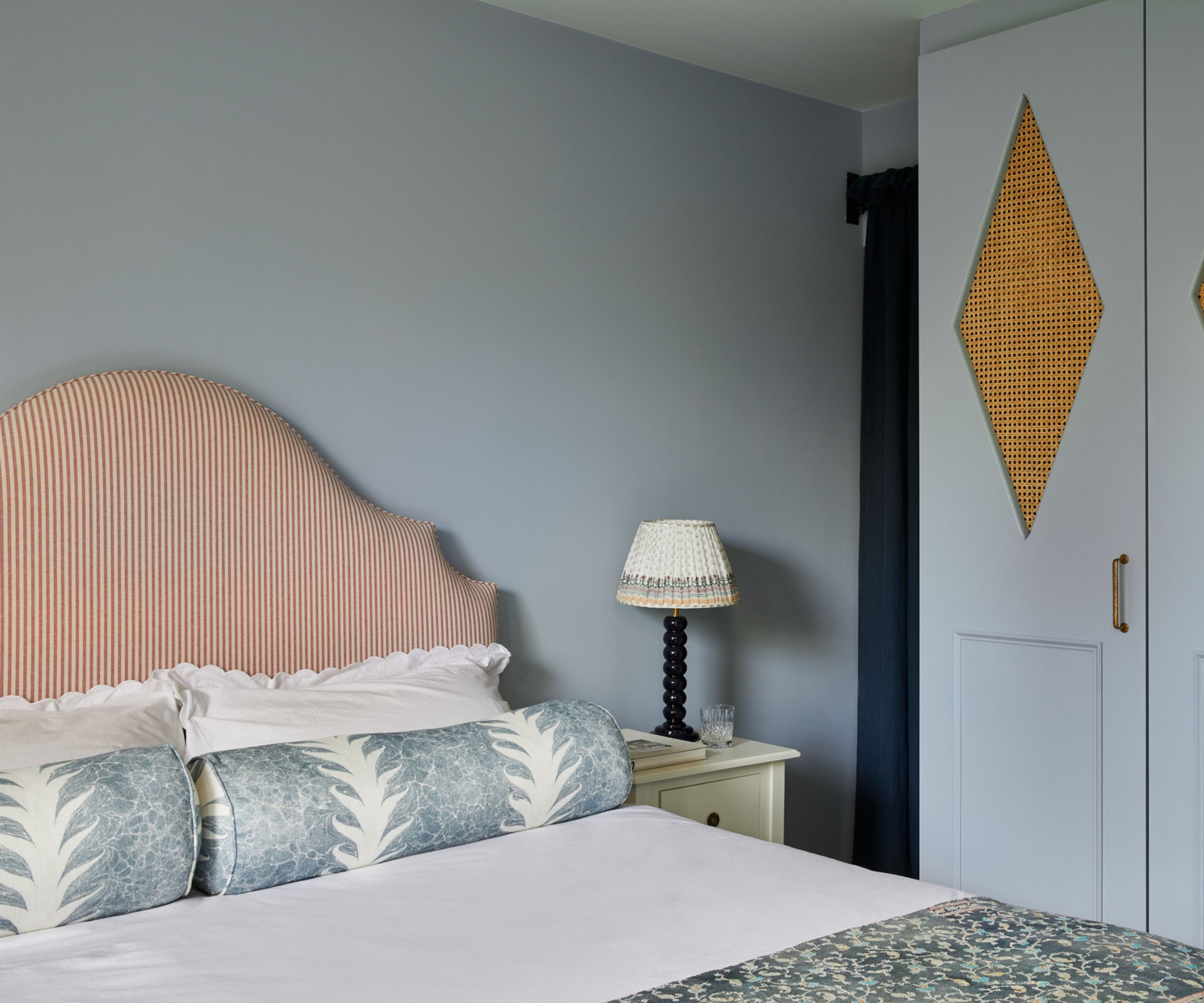
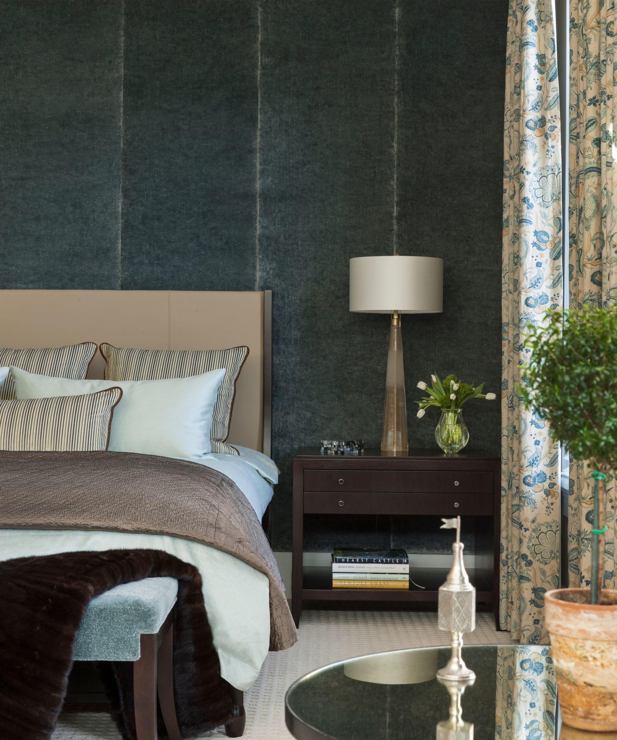
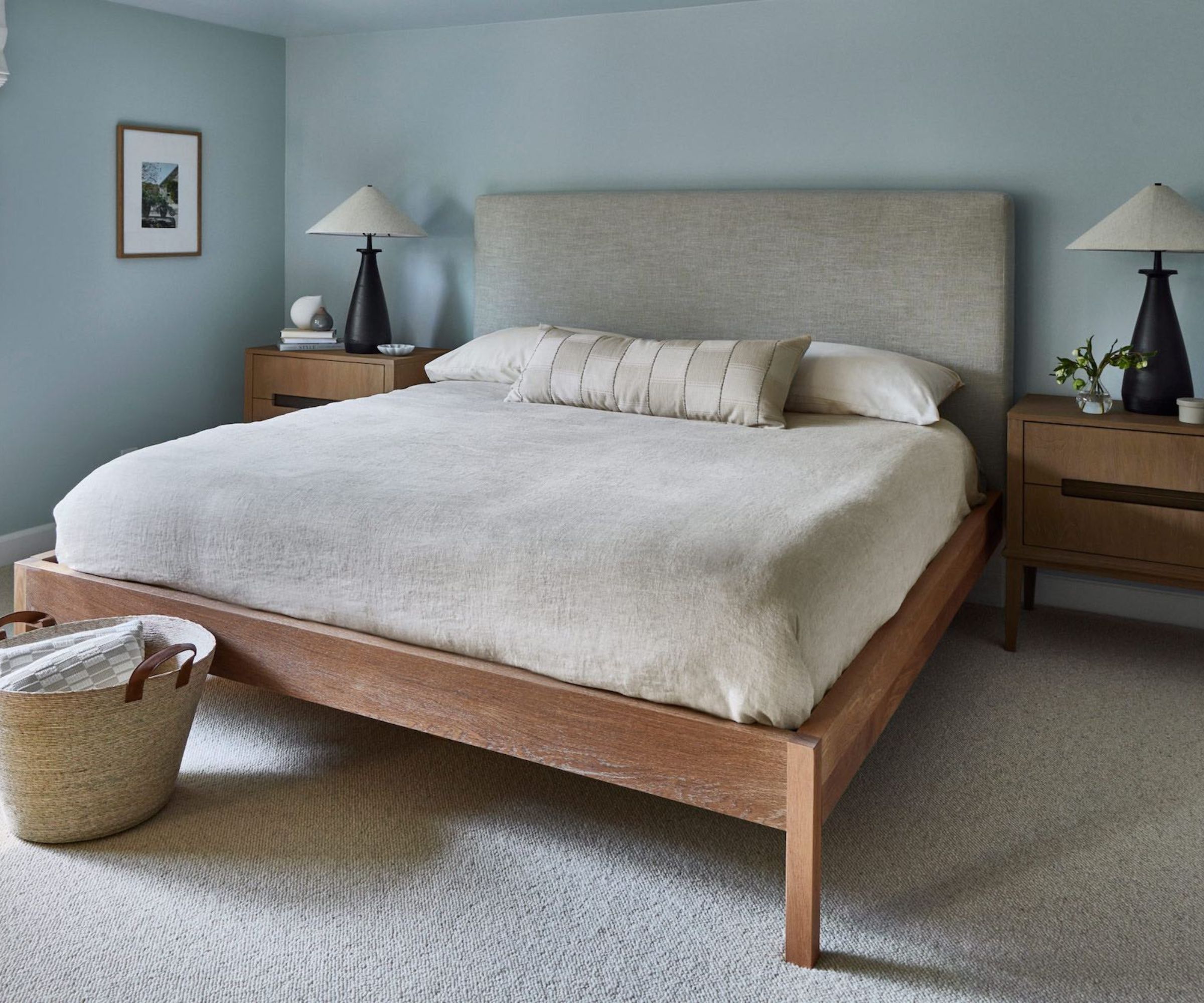
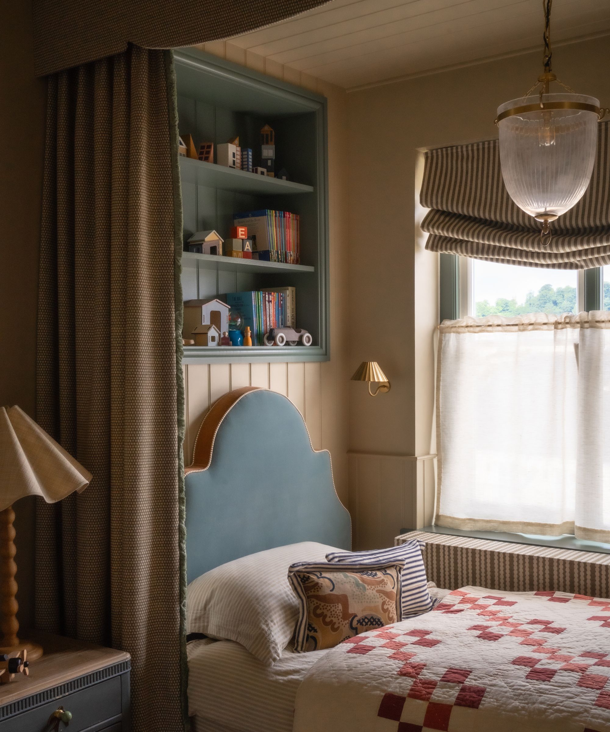
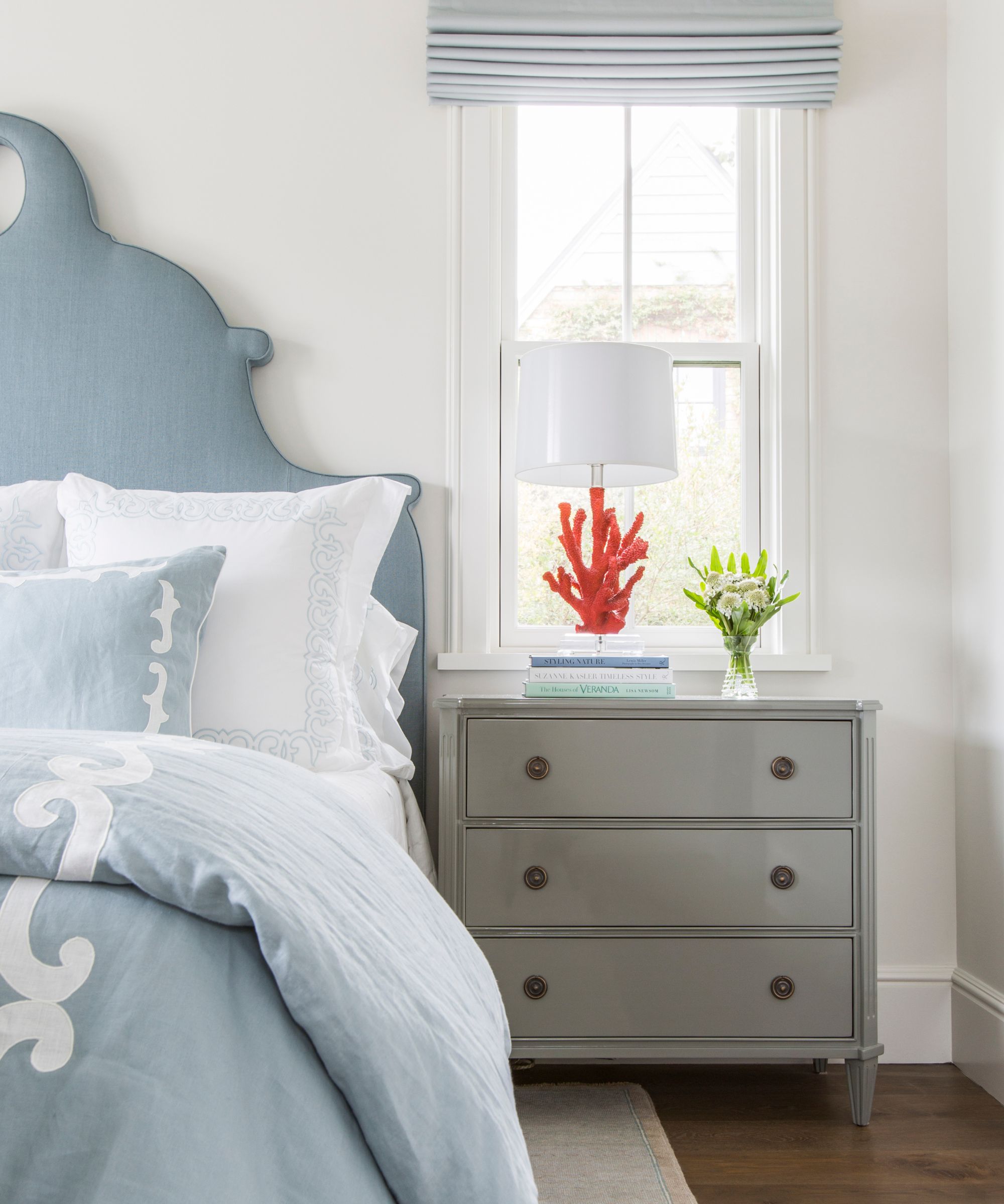
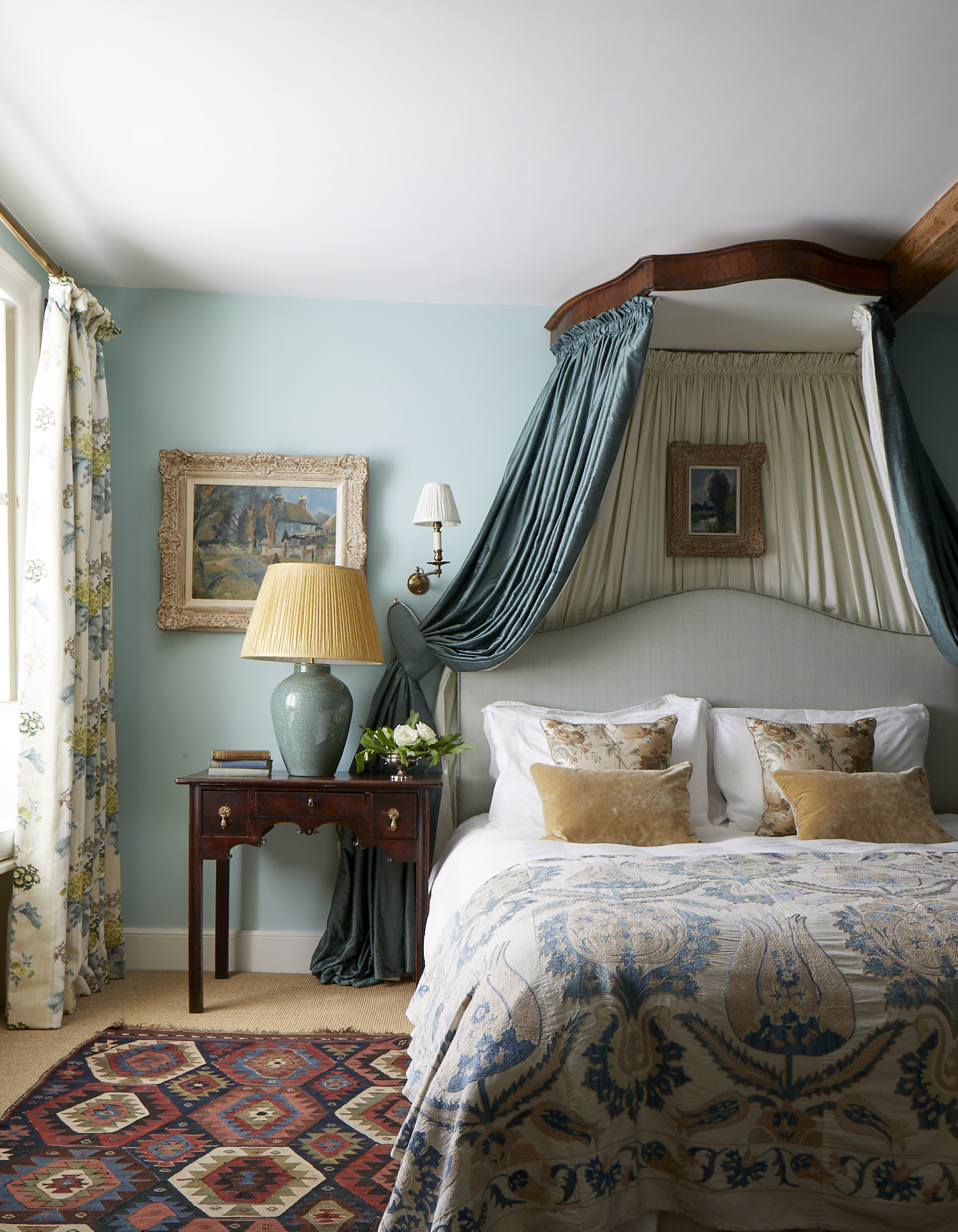
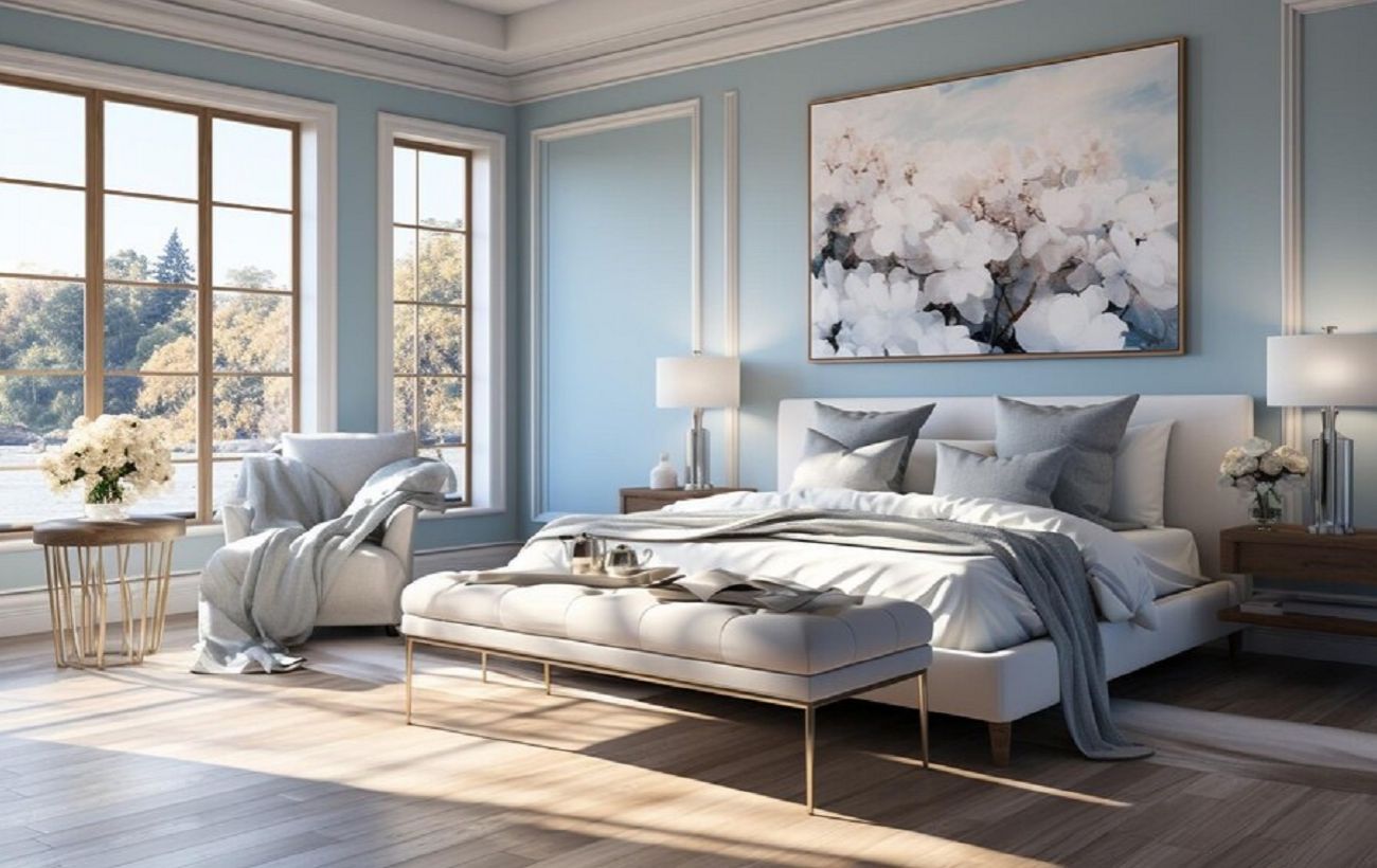
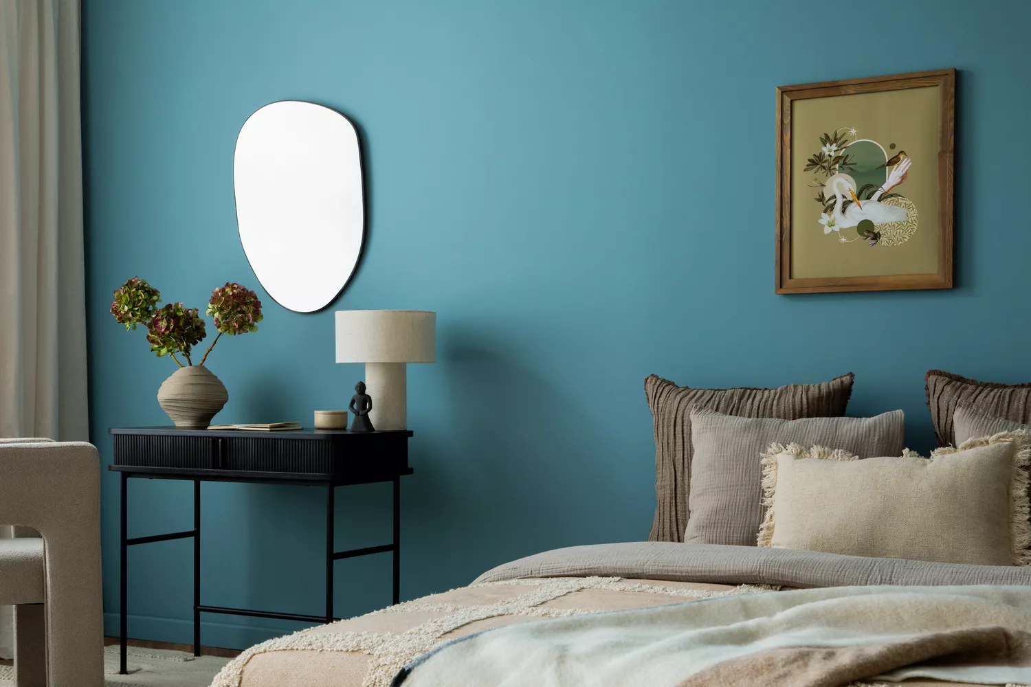
Blue-gray, an in-between hue, provides a way to incorporate color while maintaining a neutral feel. Shades of blue-gray and green-gray are seen as restful, promoting sleep and relaxation, making them ideal for bedrooms. Brynn Olson of Brynn Olson Design Group emphasizes that such a scheme can feel both cozy in winter and fresh in spring/summer. The combination of warm-toned woods and natural materials with cool blue-greys is recommended to achieve a harmonious balance and a zen-inspired retreat.
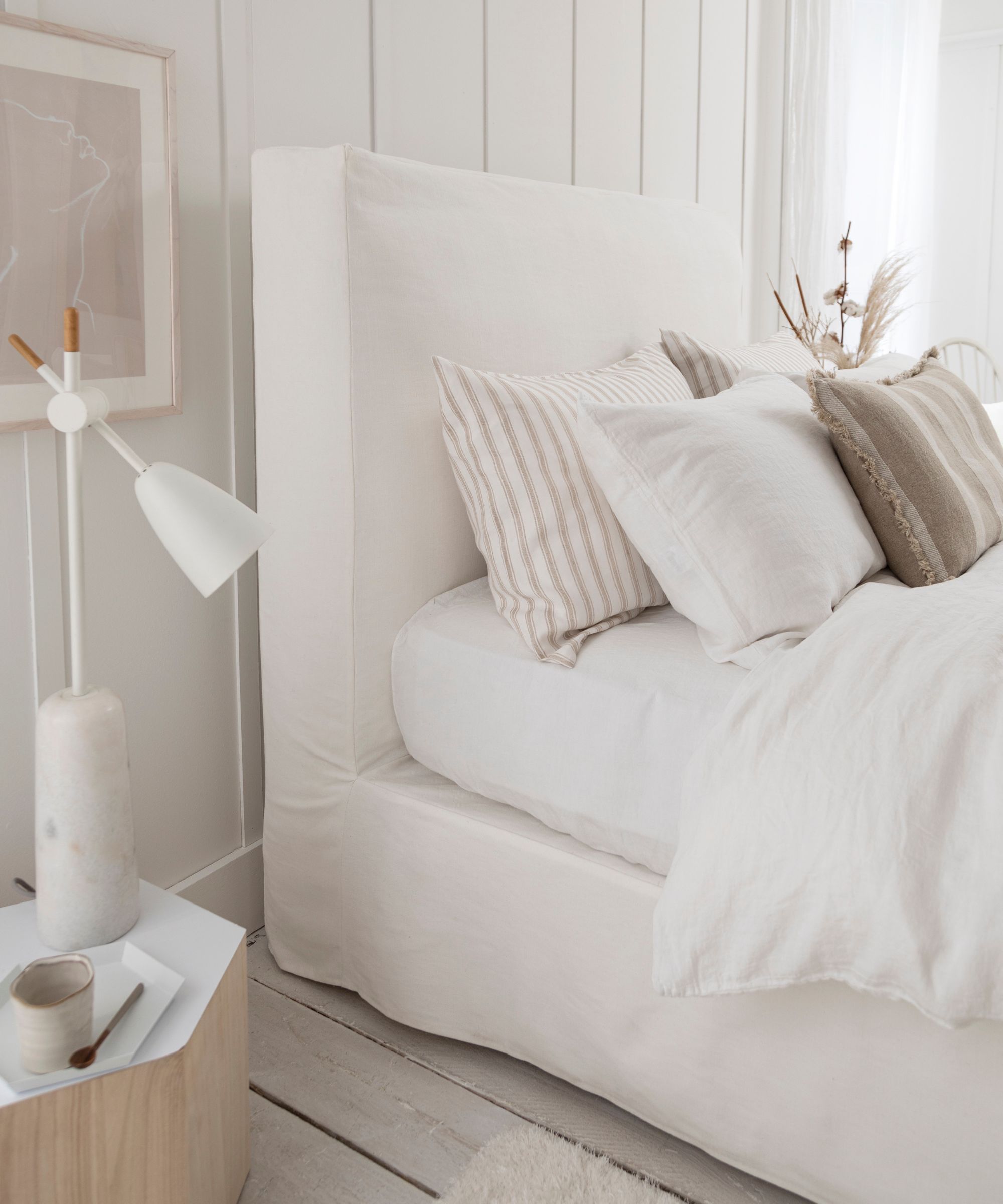
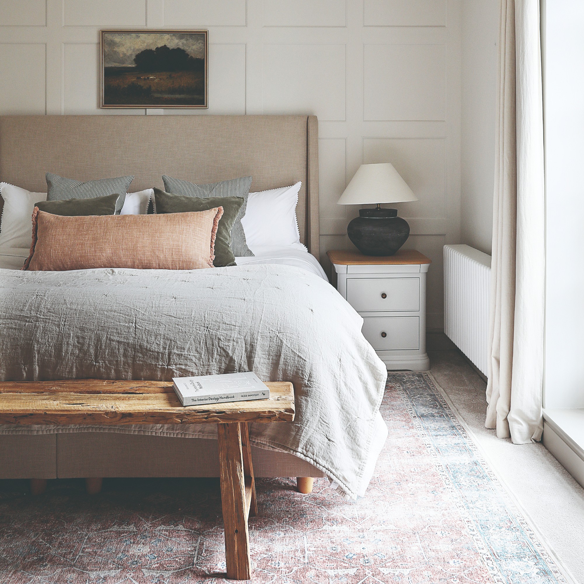
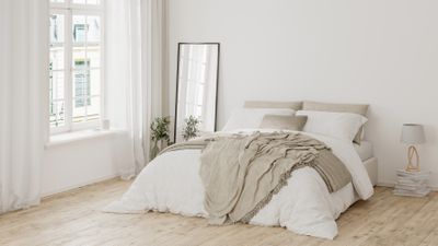
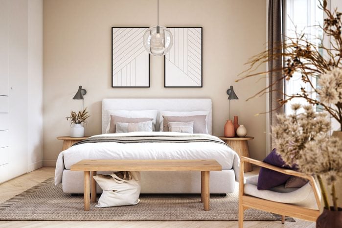
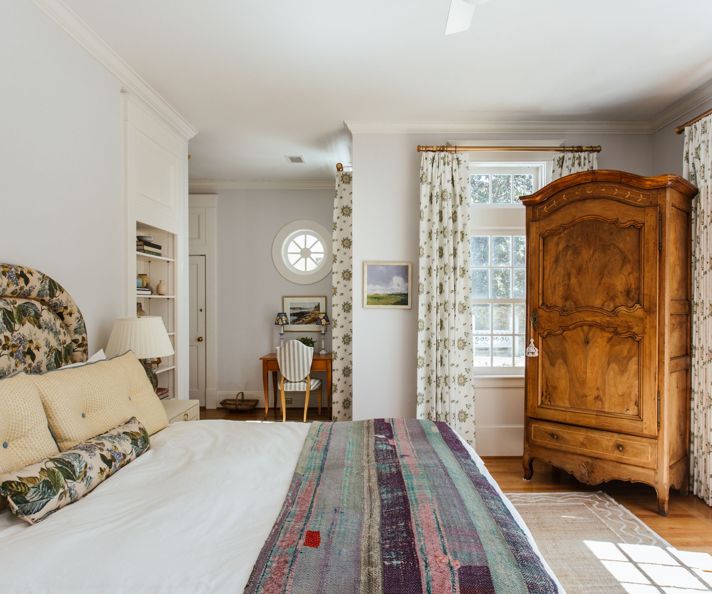
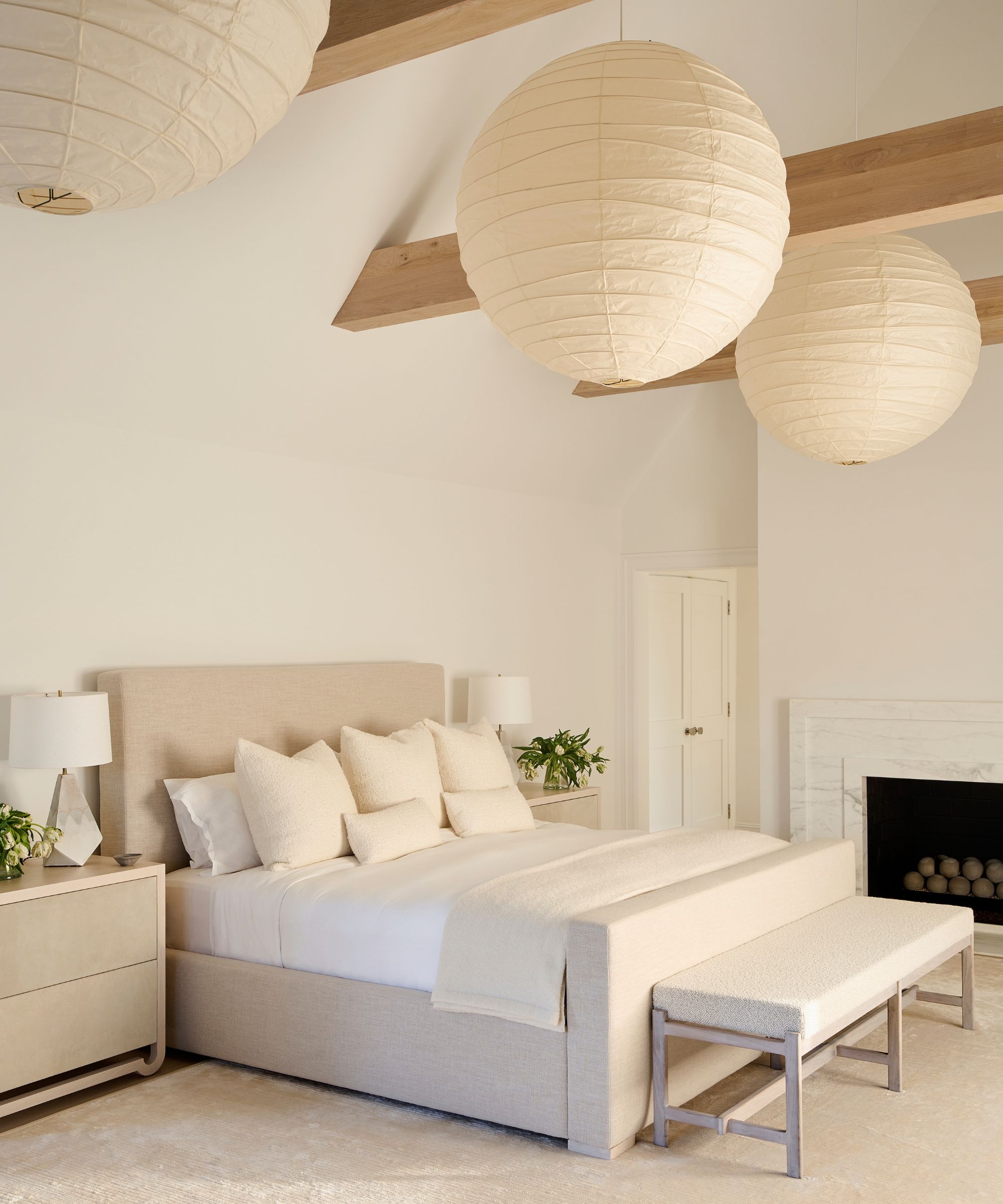
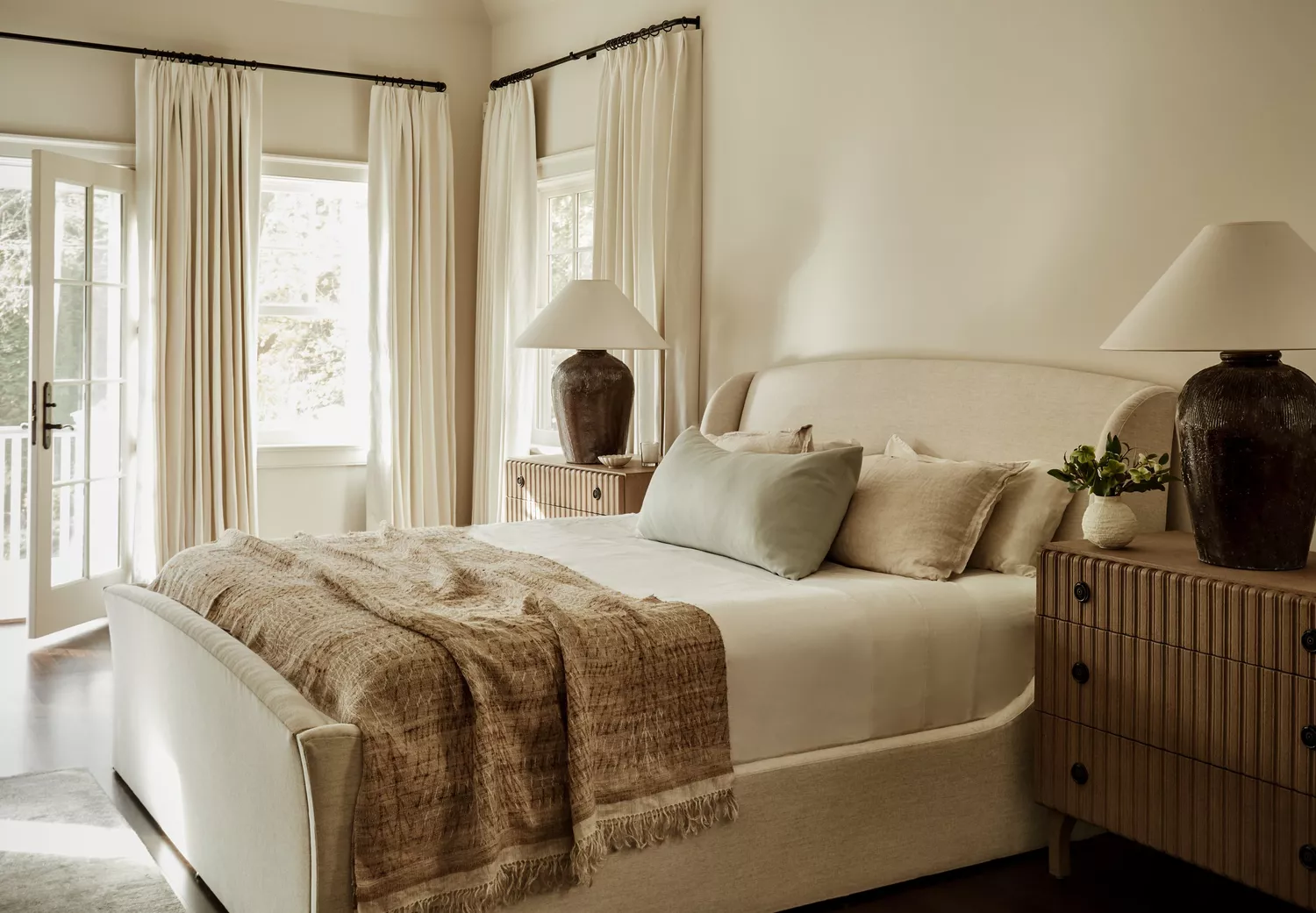
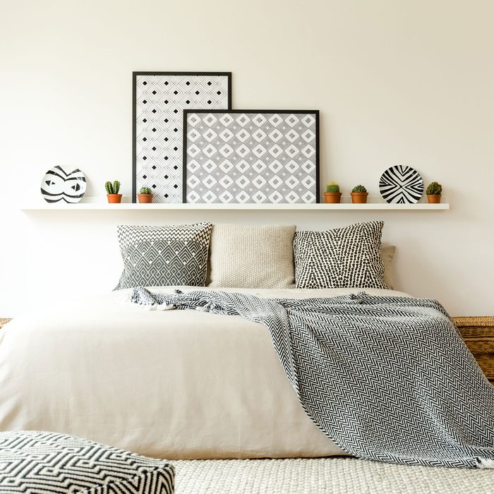
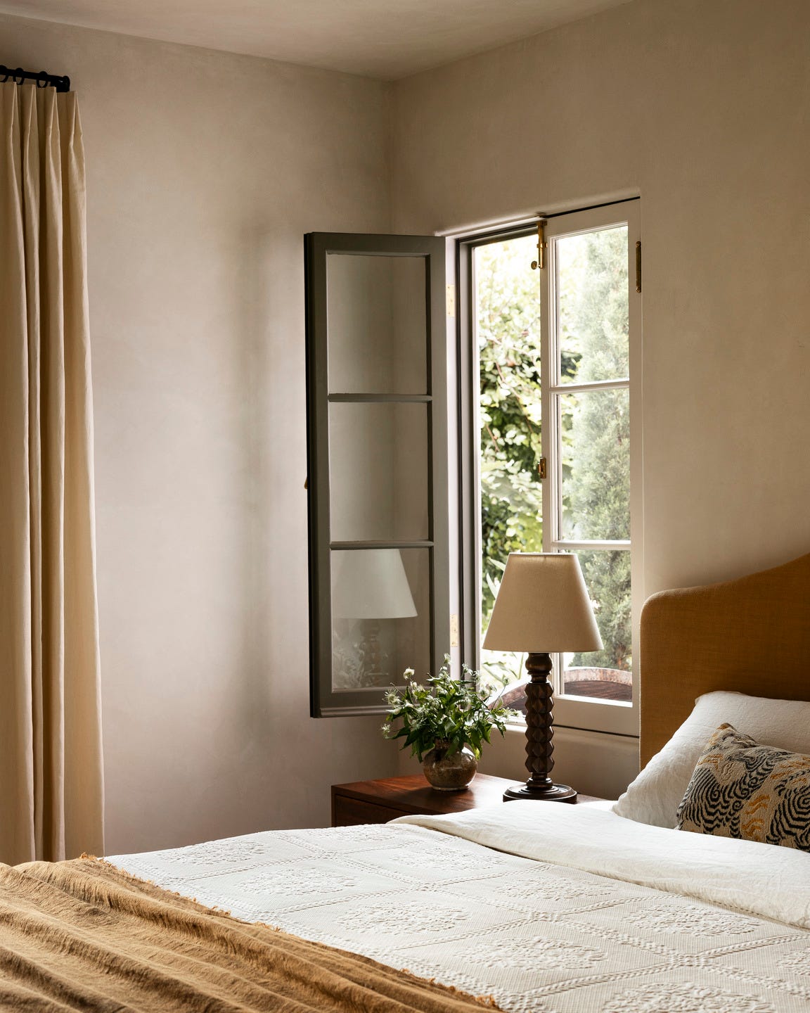
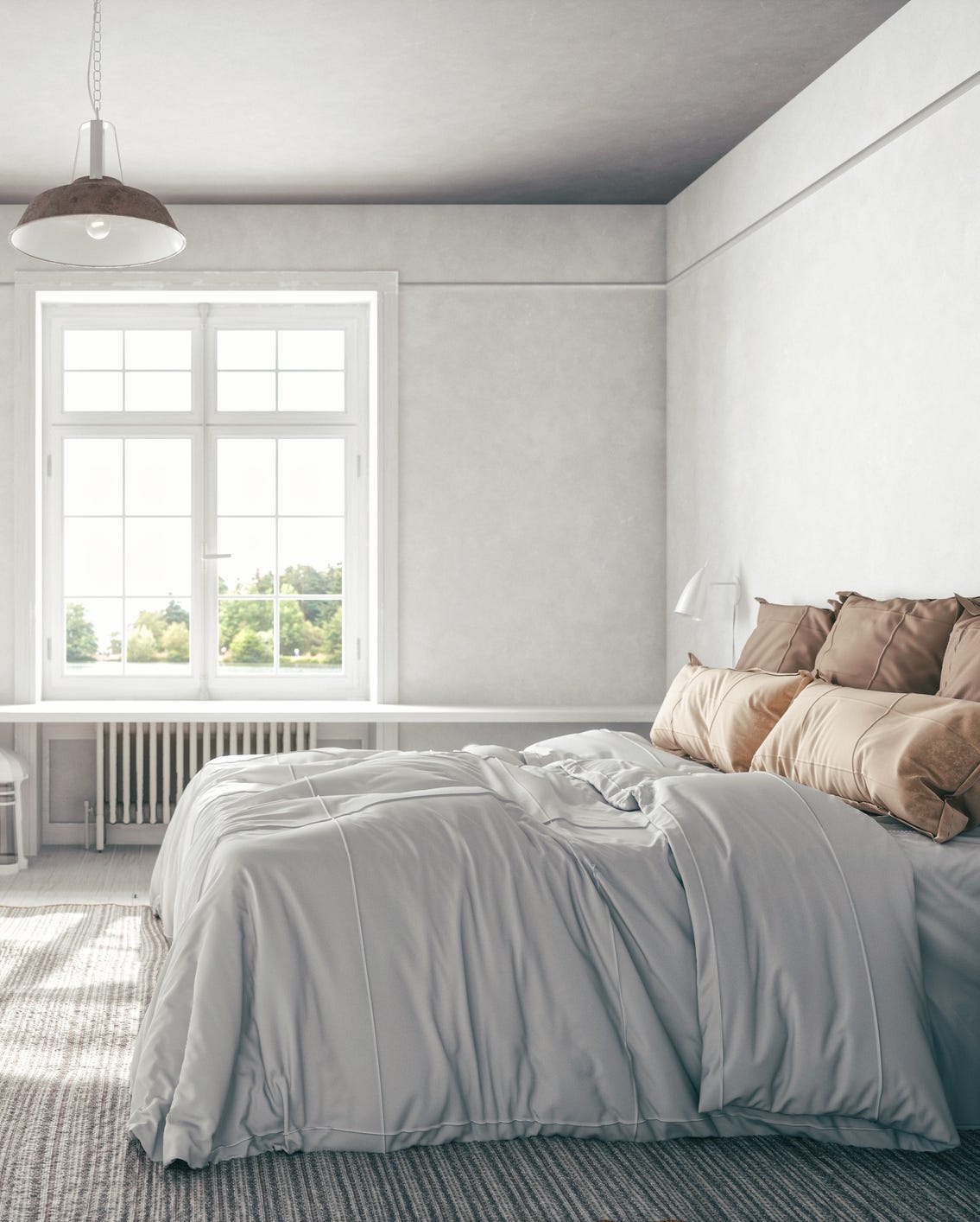
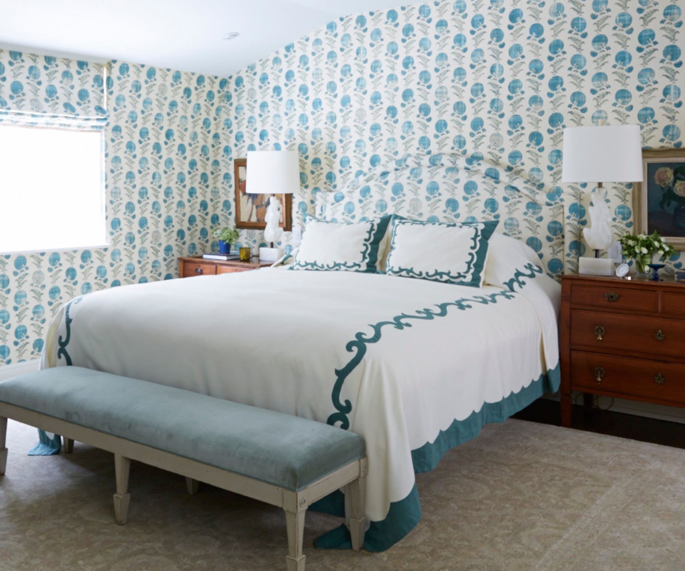
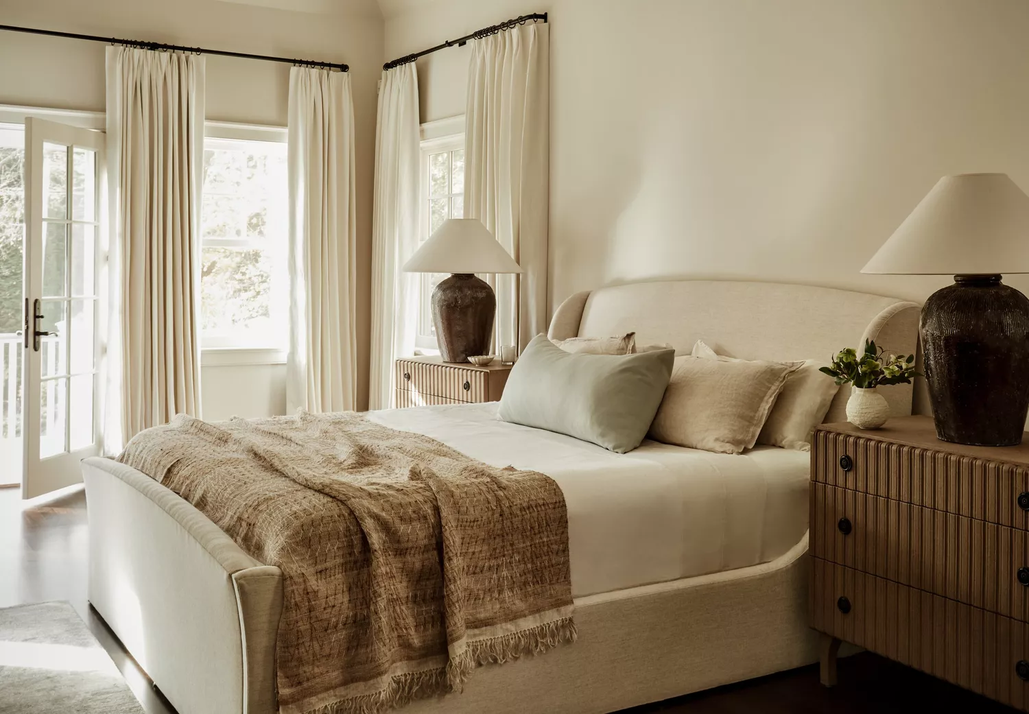
Light and airy neutrals, particularly warm whites, are highlighted as a timeless choice for a soothing foundation. While enduring, these neutrals can be accented with soft colors, such as pale blues or muted greens, to add personality without overwhelming the space. This approach allows for individuality through elements like pillows, curtain trim, lamps, or throws, which can be easily updated for a fresh look.
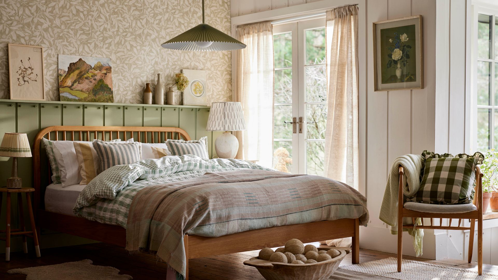
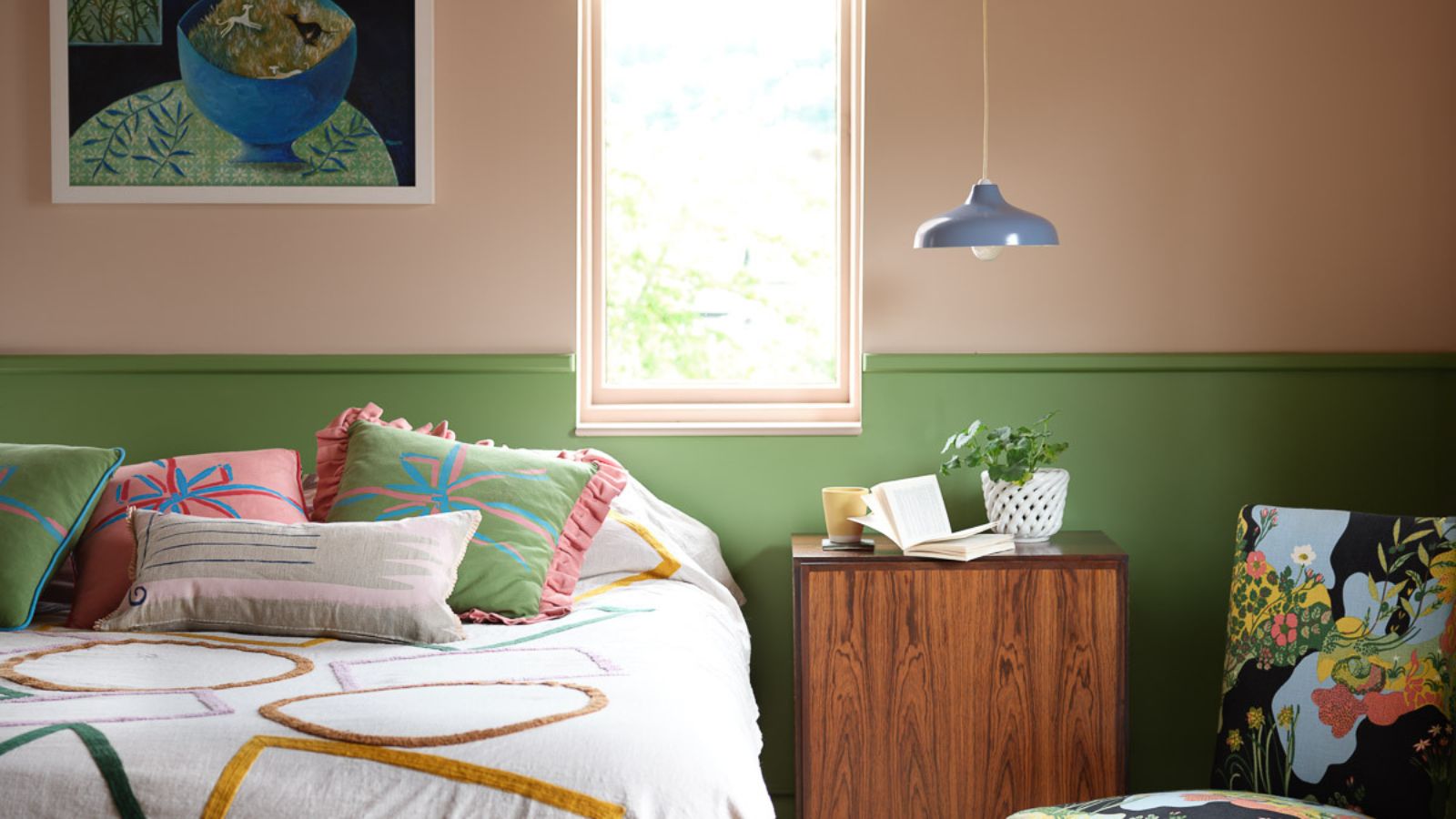
Earthy greens are also strongly featured, with softer, nature-inspired shades like Rococo Limewash from Portola Paints being versatile. These greens offer a gentle, grounding quality that creates a calm and rejuvenating atmosphere, perfect for promoting relaxation. They pair well with both warm and cool tones, allowing for flexible, layered palettes.
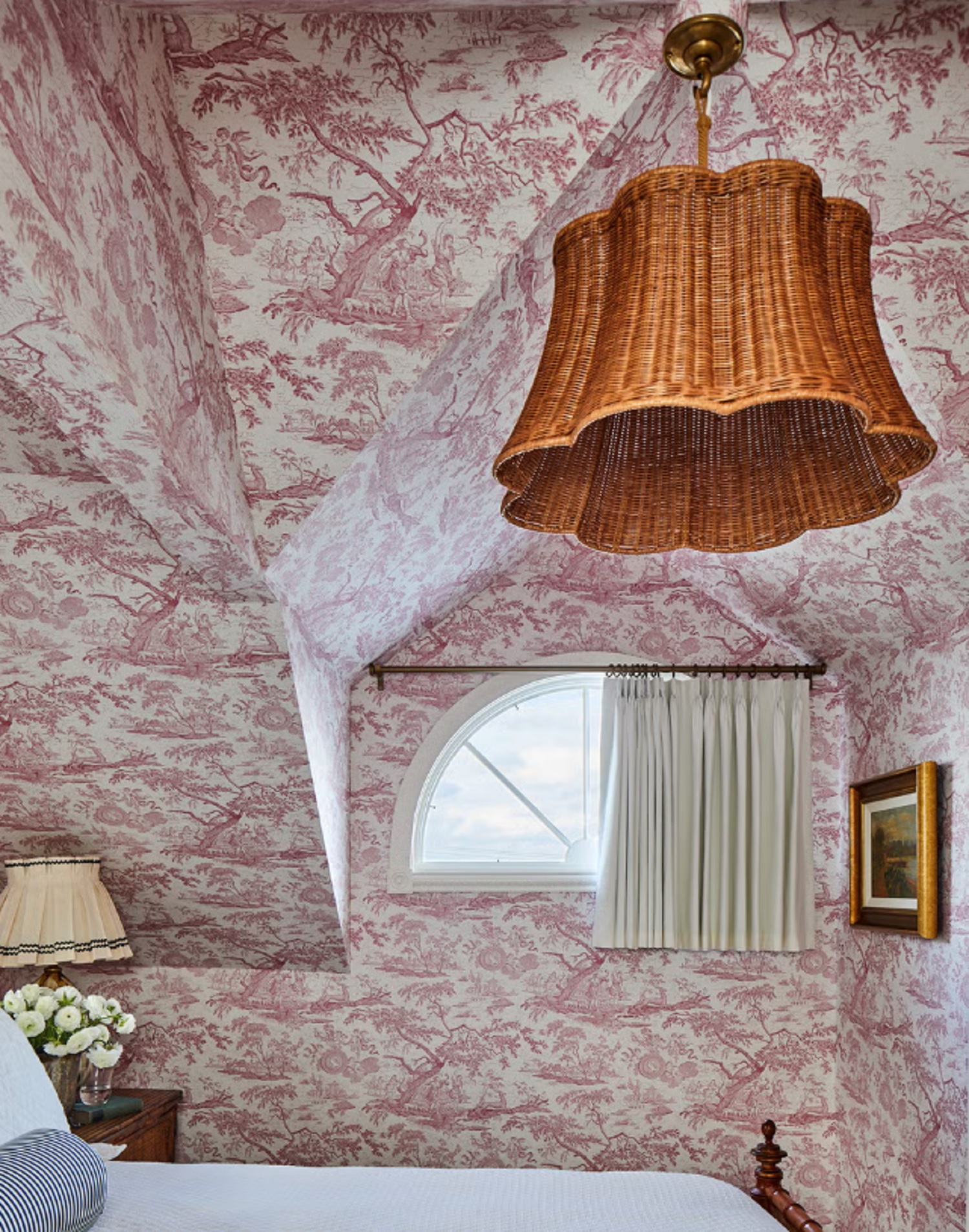
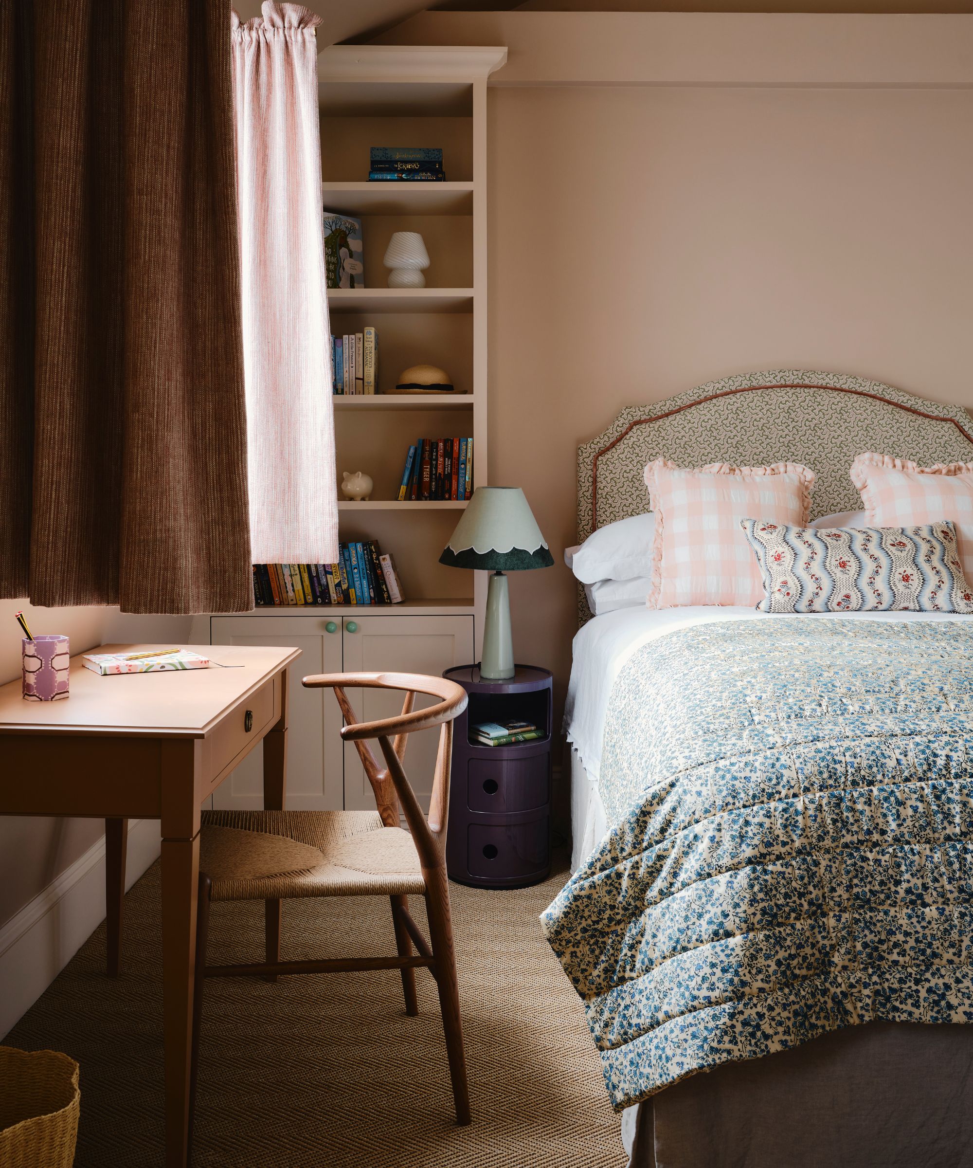
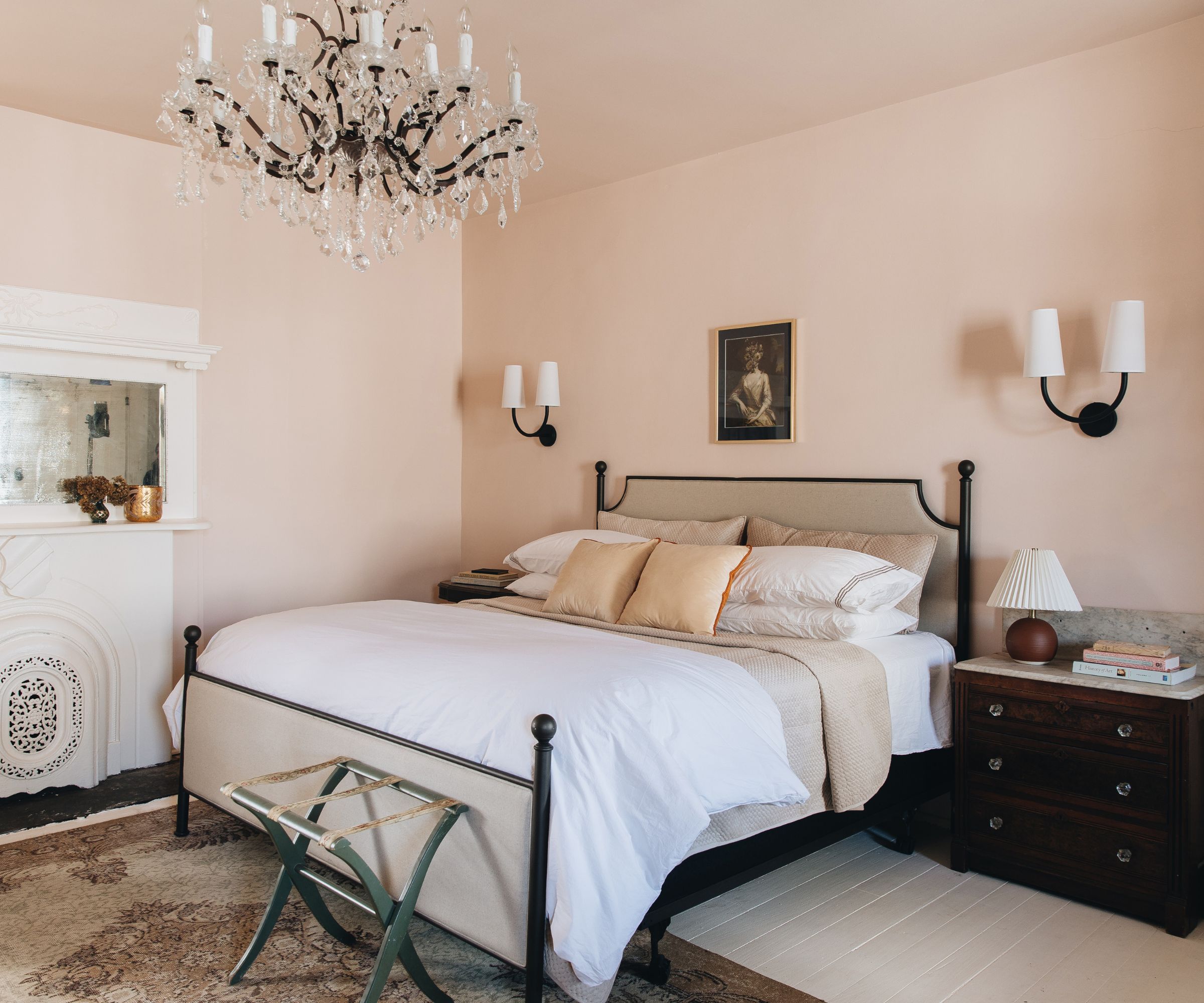
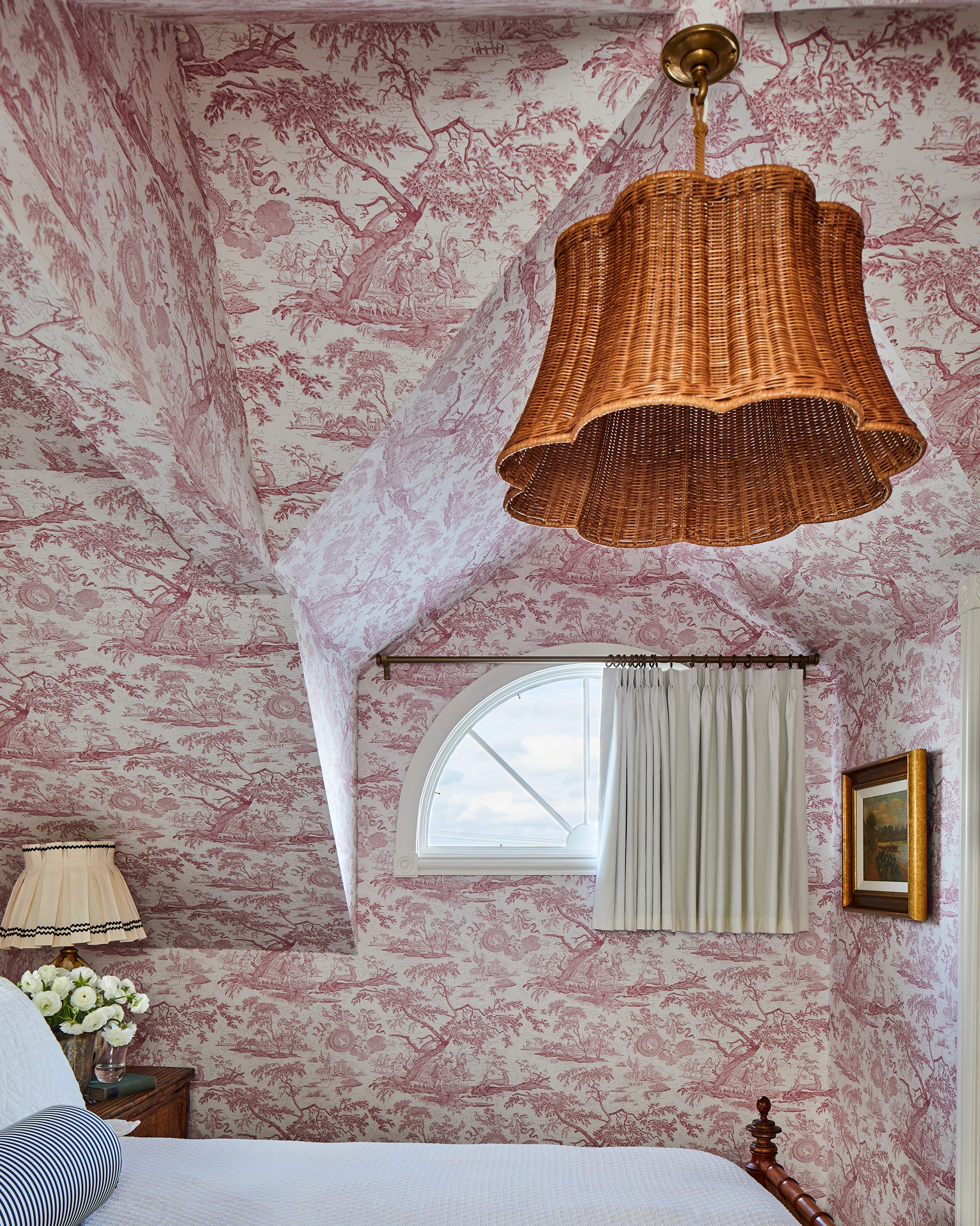
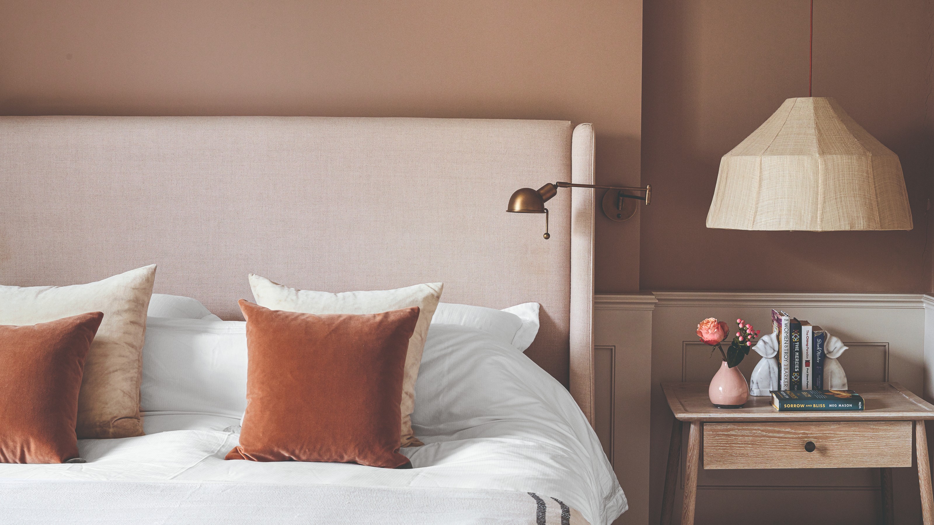
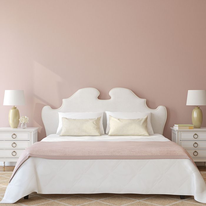
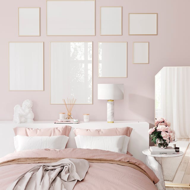
Plaster-toned pinks offer a cozier and deeper alternative to traditional neutrals, with options like Edward Bulmer’s Jonquil or Farrow & Ball’s Pink Ground. These pinks are praised for making complexions appear more beautiful in their soft light and for aiding in winding down for bedtime by countering blue light from screens. Farrow & Ball's Setting Plaster is also recommended as a soft, fleshy pink that functions as a neutral.
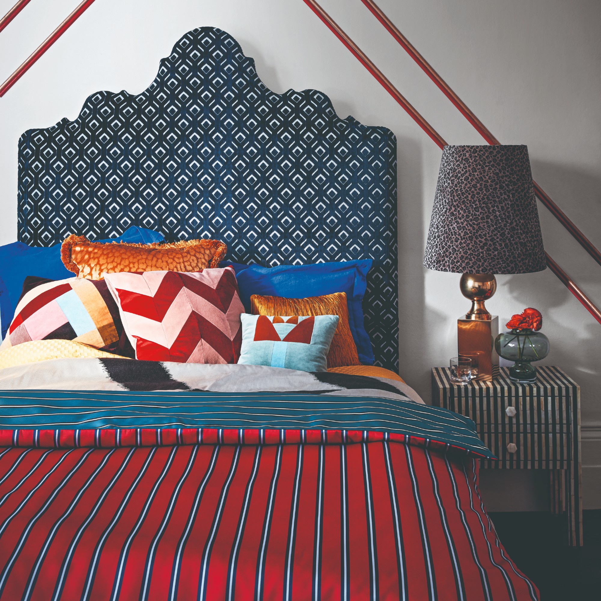
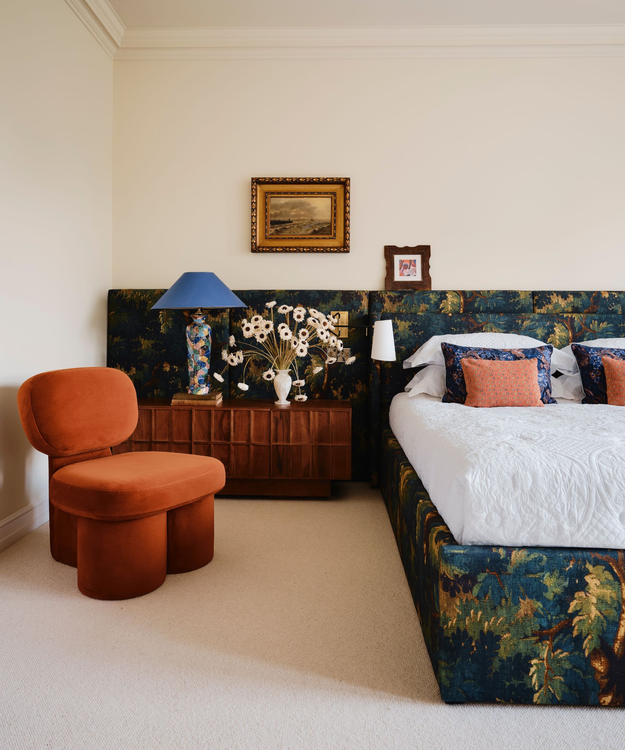
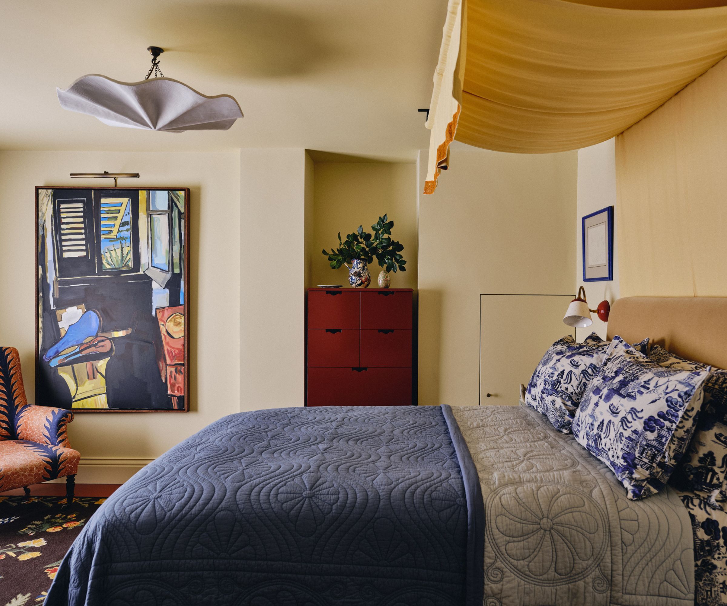
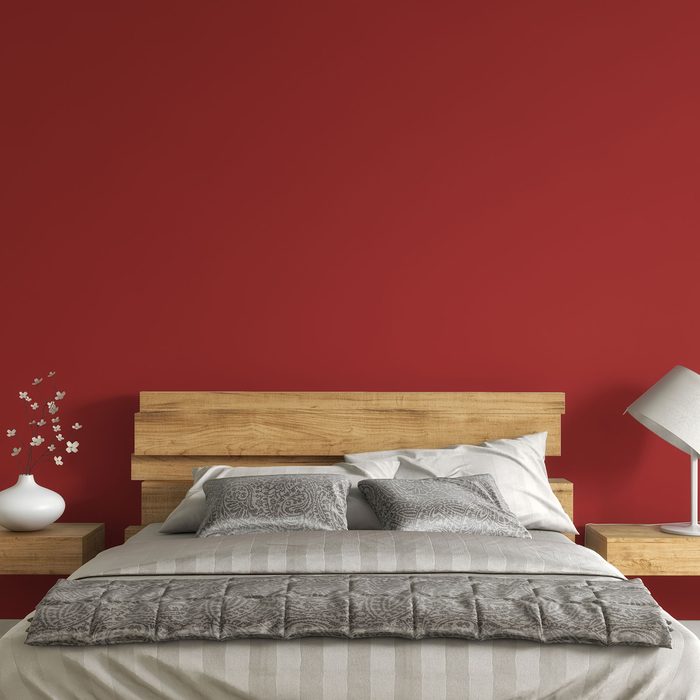
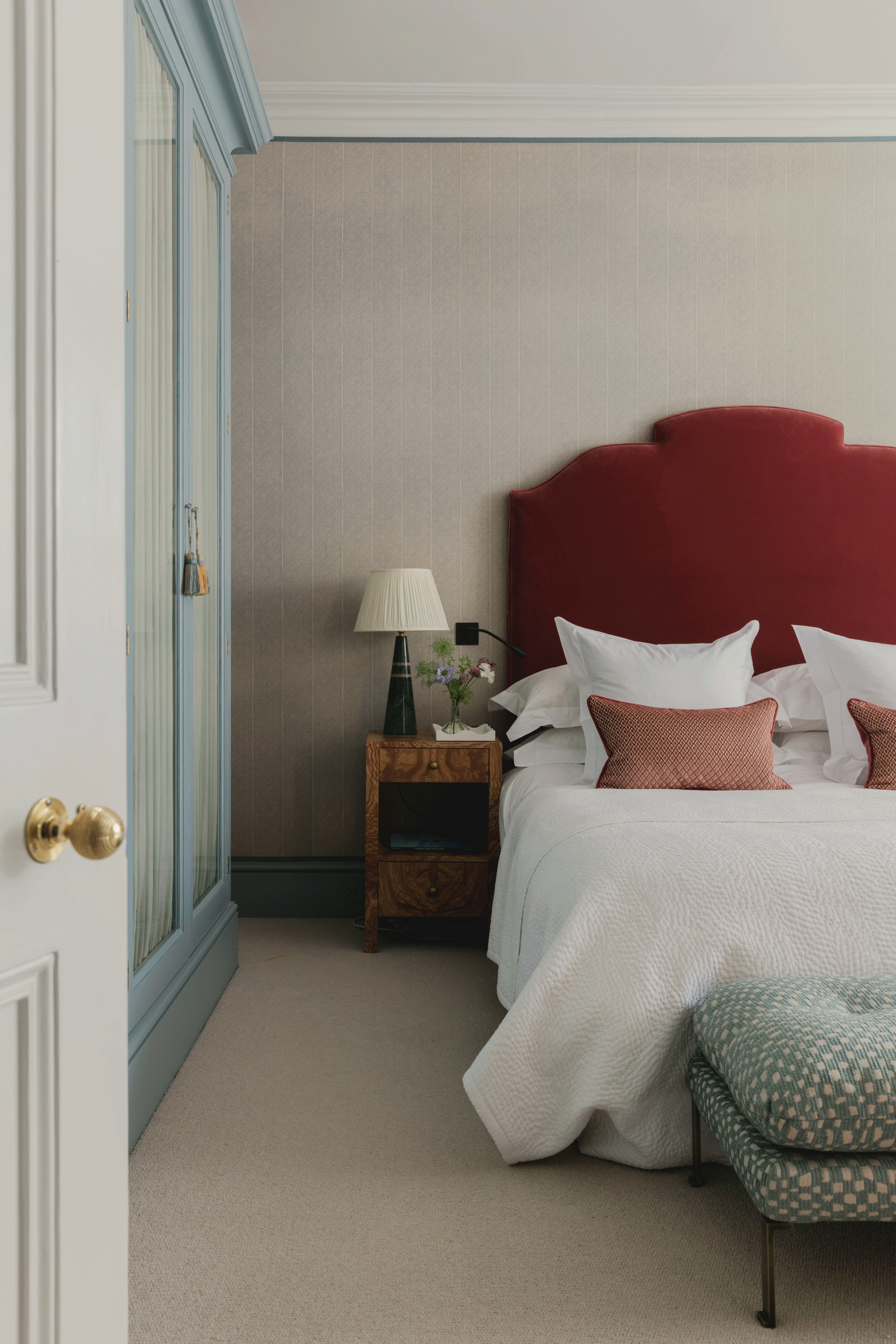
For a bolder statement, rich reds and purples are presented as on-trend dark, moody paint colors that create a cocooning, sophisticated feel. Sherwin-Williams' Carnelian, a warm, earthy hue, is suggested for its inviting quality, especially when paired with Shoji-White. This combination can be enhanced with ticking stripes and delicate floral patterns. Separately, deeper reds like Farrow & Ball’s Blazer are noted for their mood-boosting qualities and ability to transform spaces from refined to playful, with historical roots in decorating sleep sanctuaries.
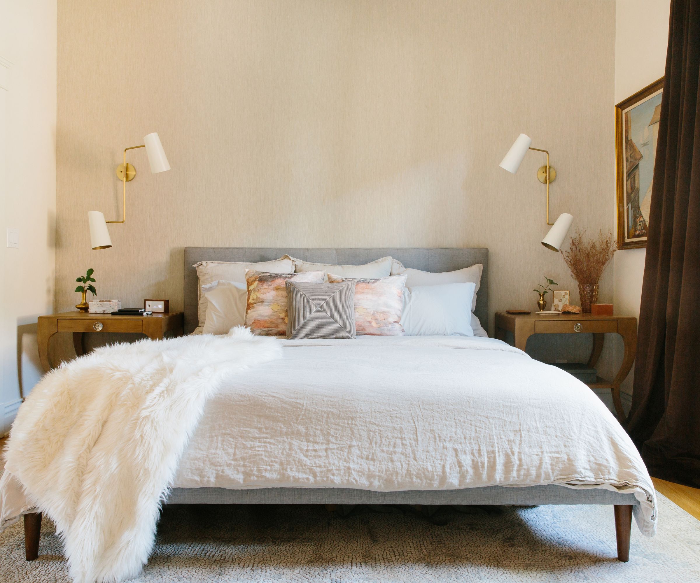
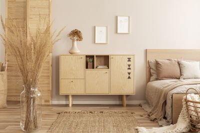
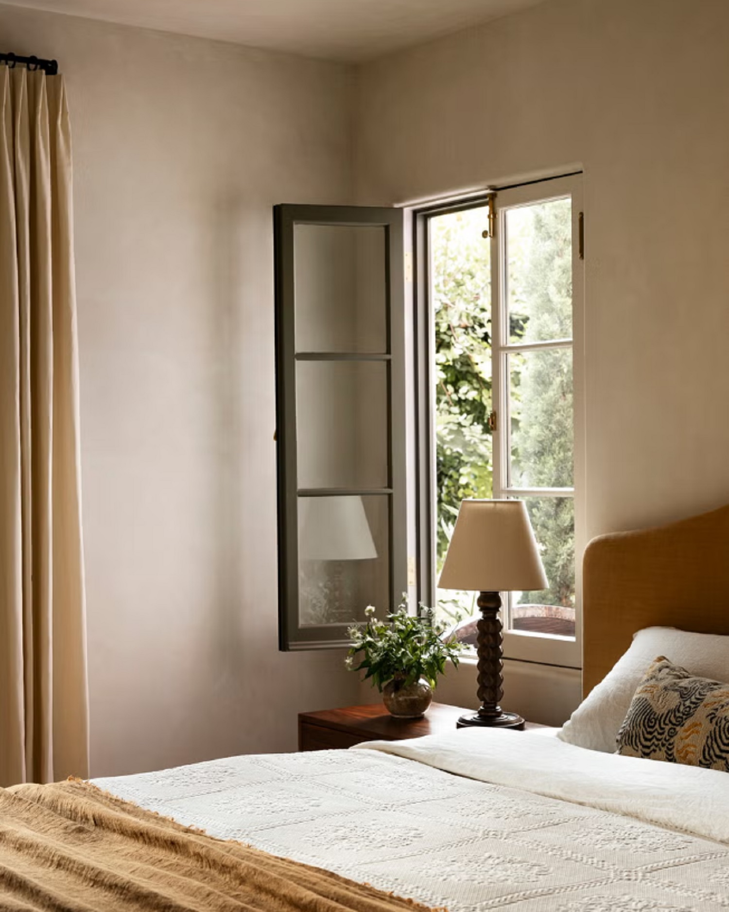
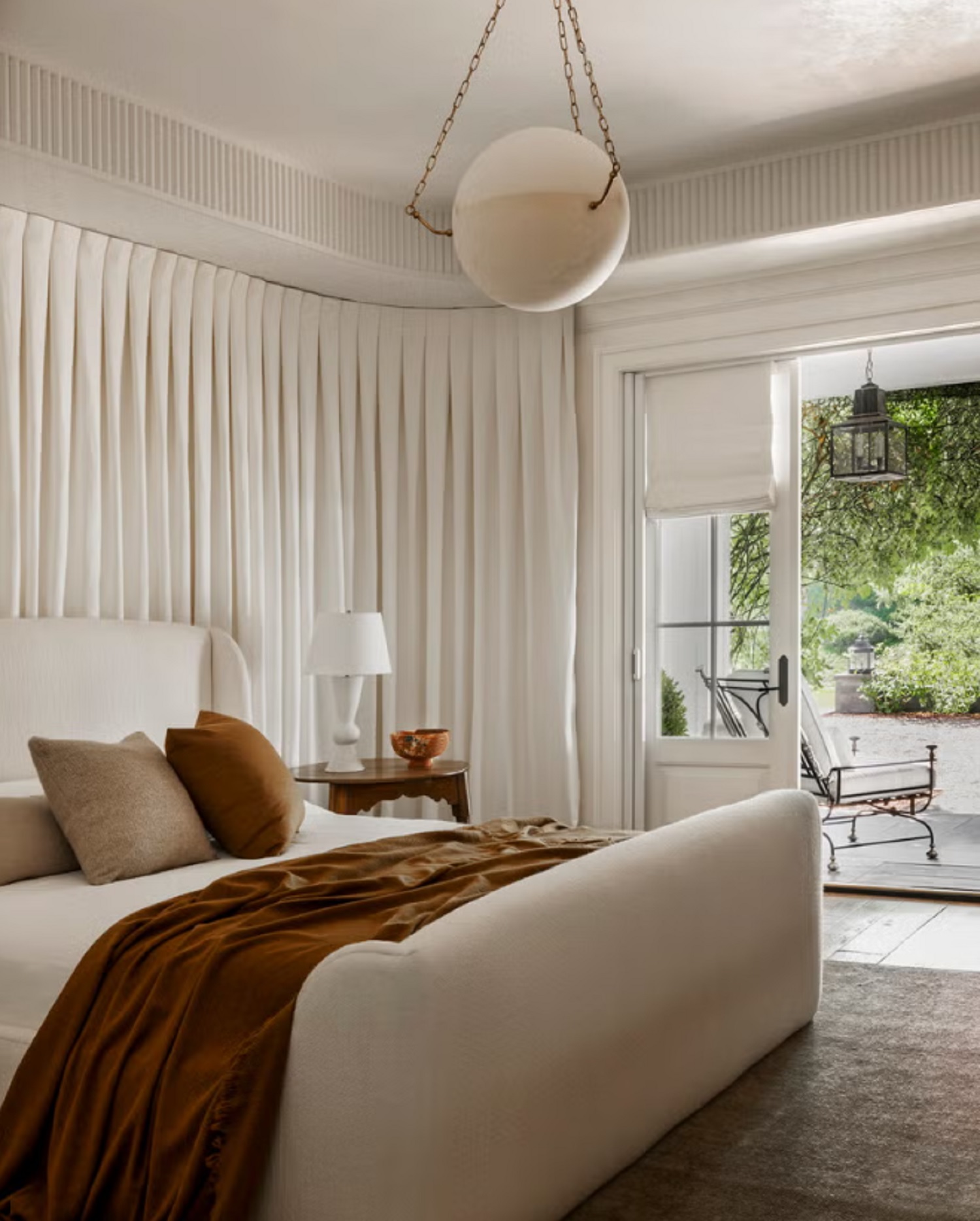
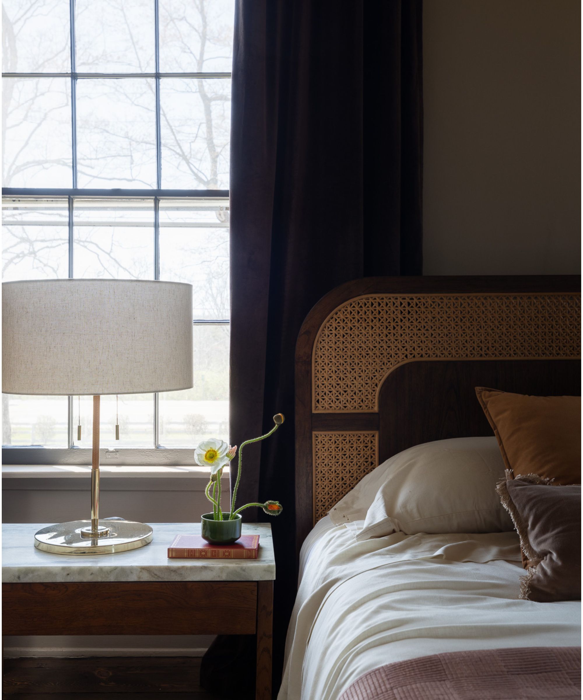
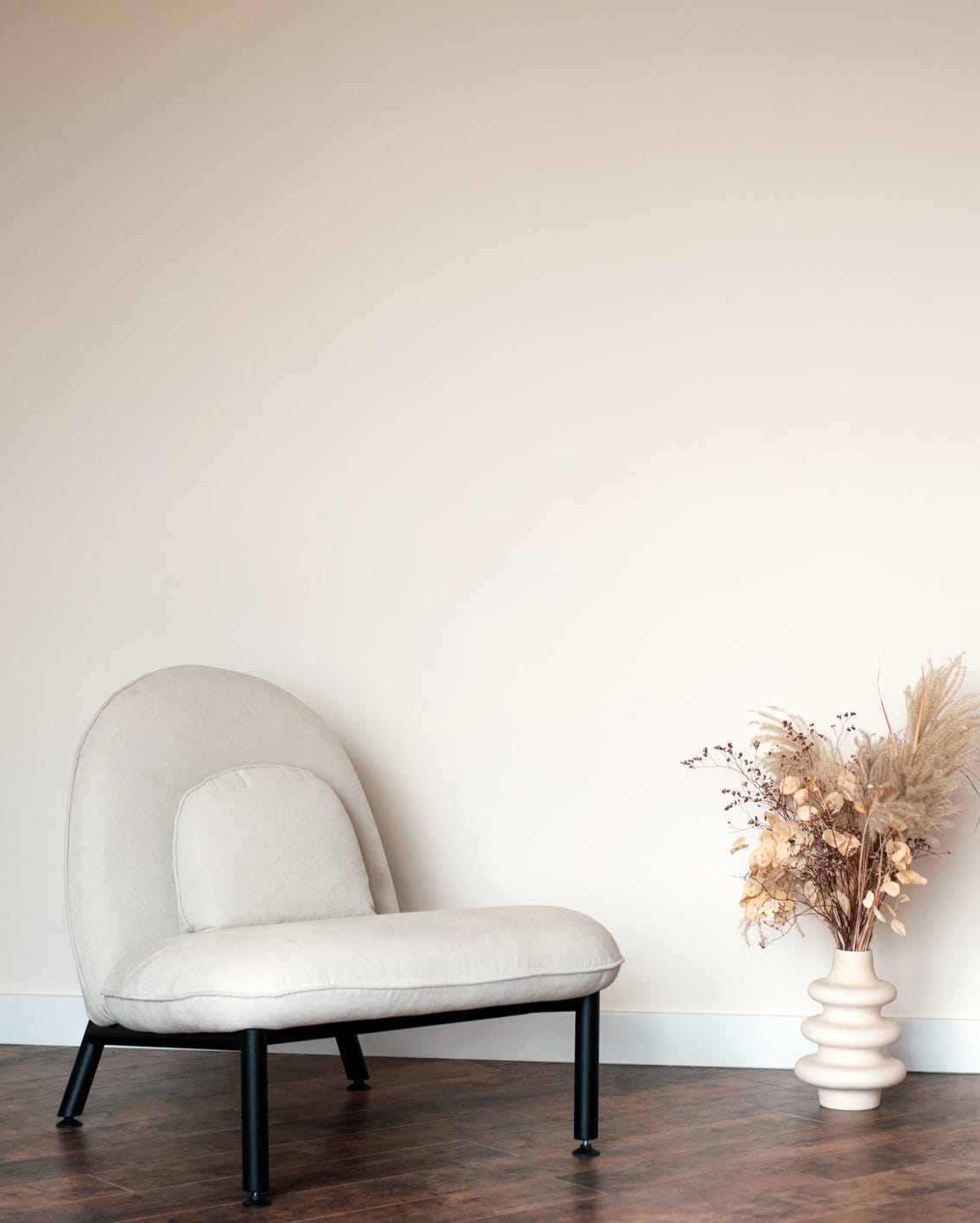
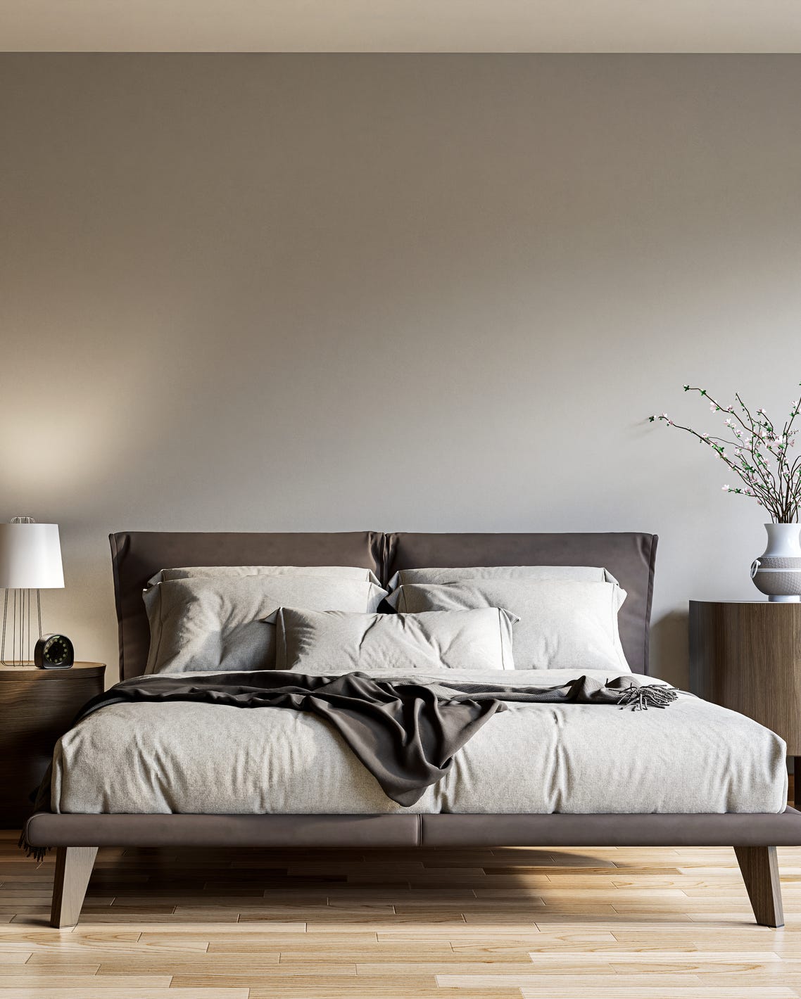
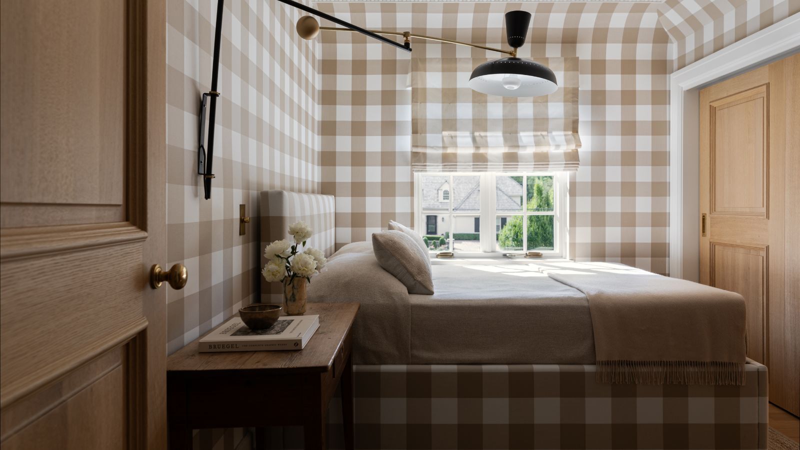
Warm, deep neutrals, including creams, caramels, and wood tones, are seen as inviting, soothing, and cozy. They promote a timeless feel and can be layered with earthy greens to ground and center a space, fostering relaxation. Incorporating natural woods, textured wall and floor coverings, textiles, and light fixtures adds hominess and softens the environment.
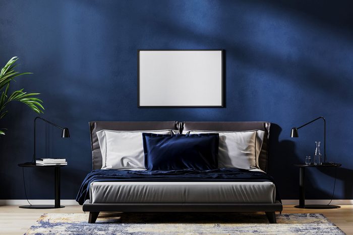
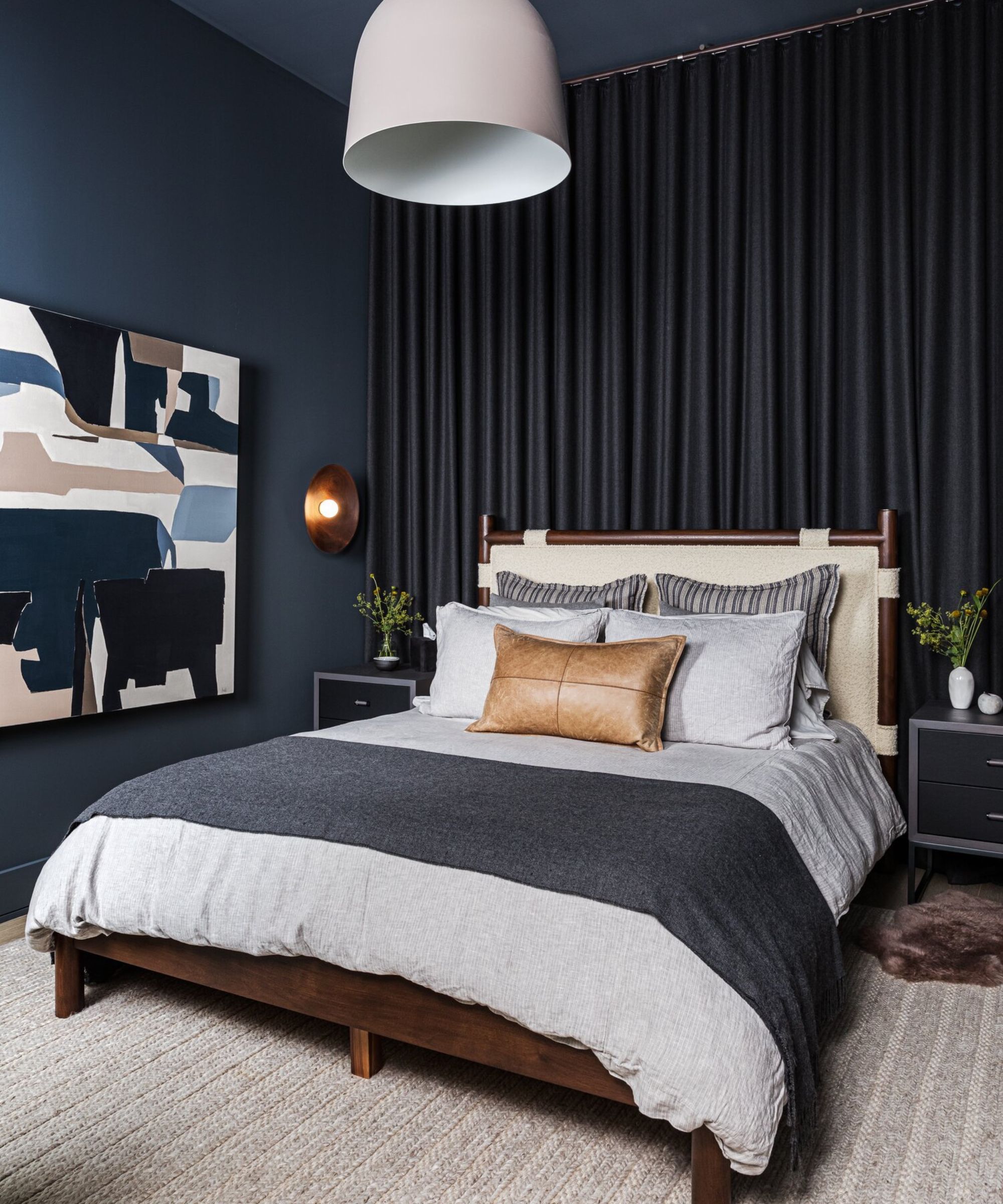
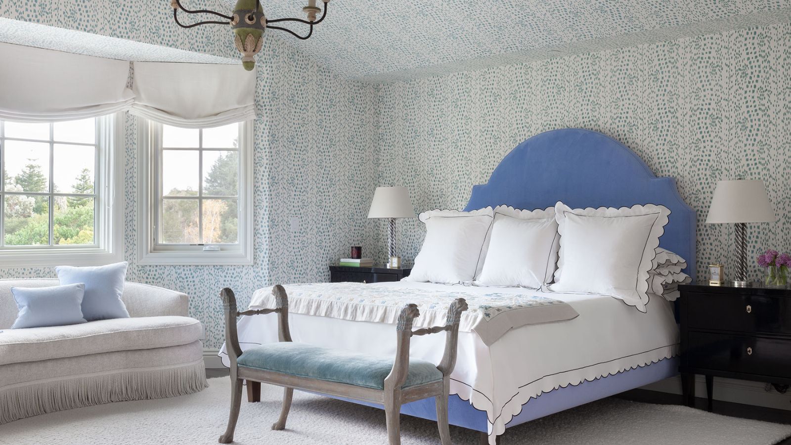
Layers of calming blue provide another option for a serene space with depth. Various shades of blue are described as incredibly soothing, classic, and timeless. Designers are embracing more saturated tones and even custom furniture to complement the blue palette. Lighter tones like Dunn-Edwards' Powder Mill can be warmed with light creams, whites, or touches of rust, browns, and blush tones.
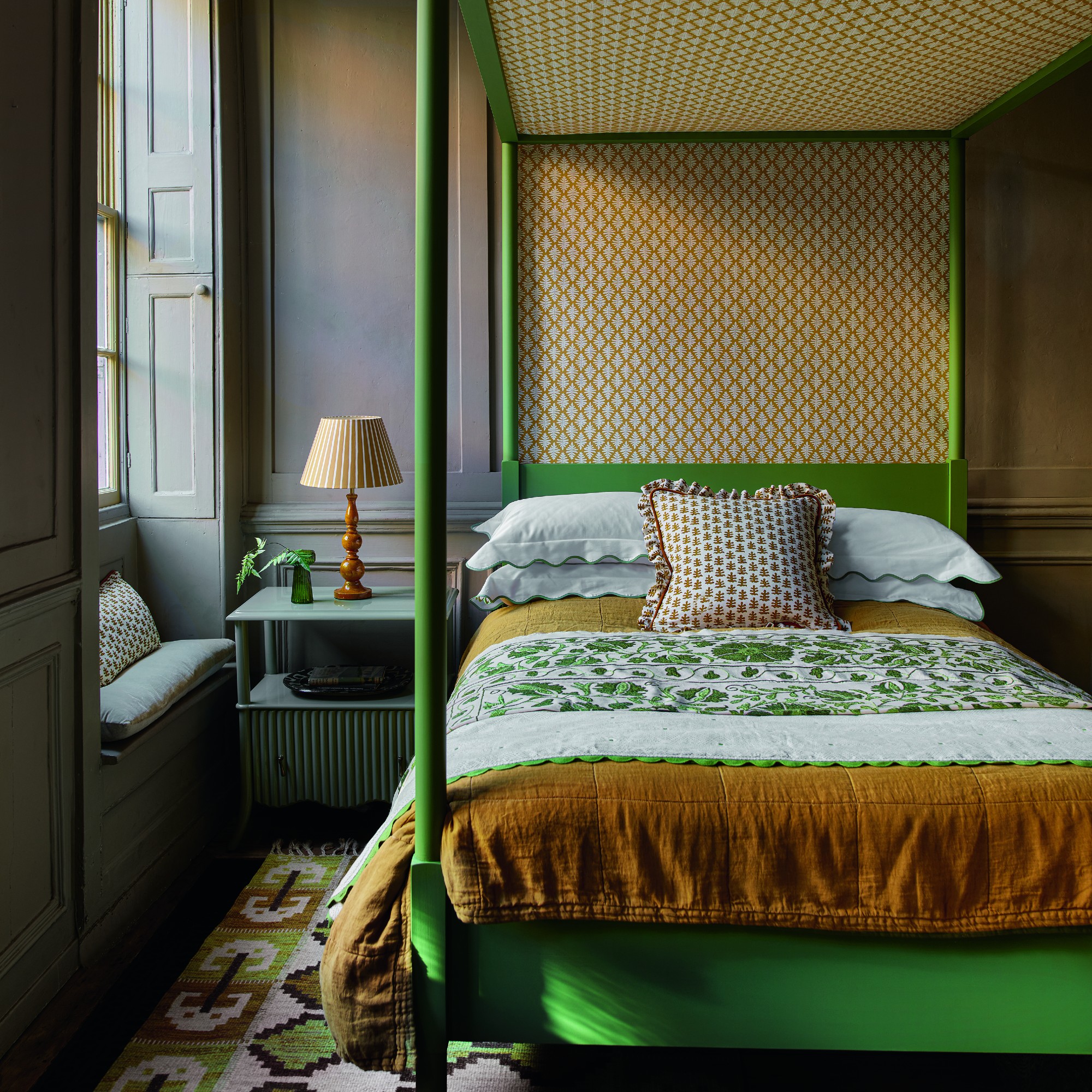
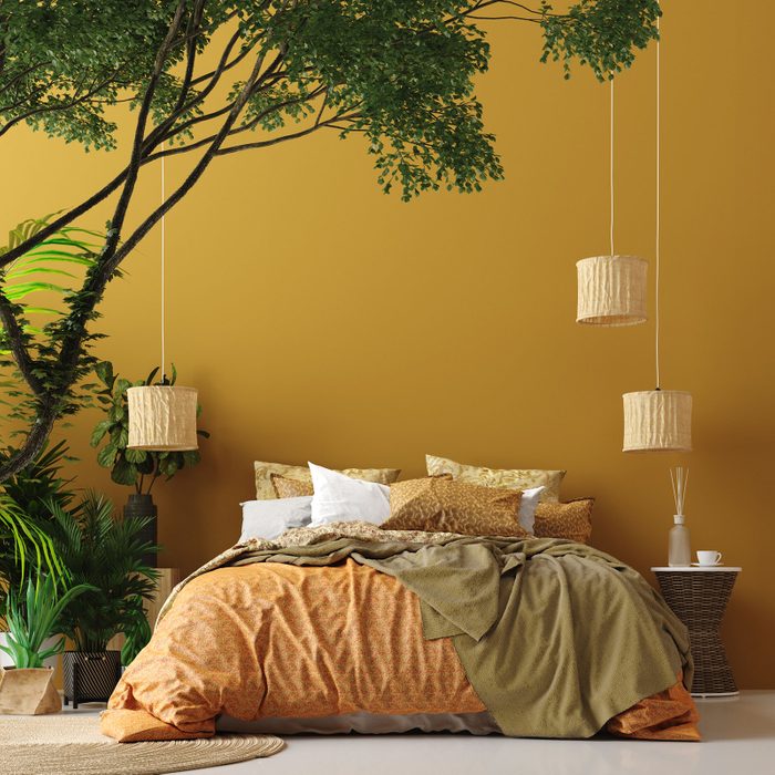
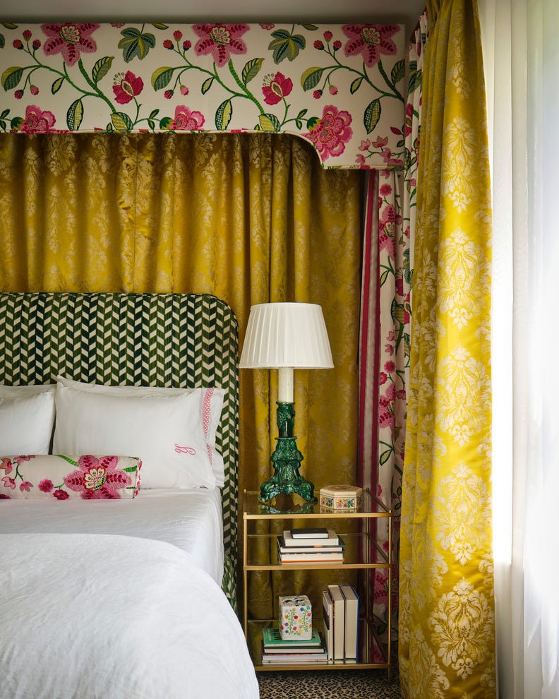
Finally, bright red, despite its surprising inclusion, is presented as a mood-boosting and sophisticated choice for early risers, offering a confident and playful aesthetic. Primary reds work well in children's rooms, while darker, more sophisticated reds create welcoming backdrops. Scarlet reds with orange undertones offer a cozy appeal. Buttery yellows are also enjoying a renaissance, imbuing rooms with optimism and positivity. These soft yellow tones are considered soothing, especially when paired with cool, calming tones like greys and pale blues, and should be treated as a neutral to enhance other colors without overpowering the scheme.
#BedroomColorTrends #InteriorDesign #HomeDecor #ColorPsychology #Neutrals #DarkGreen #BlueGray #EarthyGreens #PlasterPinks #RichReds #ButteryYellows #PaintColors #DecoratingIdeas #BedroomColorTrends #InteriorDesign #HomeDecor #ColorPsychology #Neutrals #DarkGreen #BlueGray #EarthyGreens #PlasterPinks #RichReds #ButteryYellows #PaintColors #DecoratingIdeas
0 comment in total
 No comments yet
You may also like
Bedroom trends 2025: Interior experts reveal 9 trending colours and designs

Bedroom design trends of 2025 - What designers choose
35 bedroom ideas for 2025 – these are the stylish updates designers swear by for a dreamy, elevated sleep space
6 Bedroom Paint Colors Designers Don't Want to See in 2026

5 bedroom colors going out of style in 2025 – and what designers are using instead for a stylish sleep space
5 Trending Bedroom Paint Colors for 2024

5 Bedroom Paint Color Trends You'll See Everywhere in 2025, According to Designers

These Are the Top Bedroom Trends for 2025, According to Designers

Bedroom trends 2025 – the 9 most important styles and looks of the year to decorate your sleep sanctuary with
We Asked Designers to Predict the Top Bedroom Paint Colors for 2025, Here's What They Said

These Are the Top Bedroom Colors of 2024
Here Are the Most Popular Bedroom Paint Colors for 2024

26 Bedroom Color Schemes That Interior Lovers Are Quietly Copying in 2025

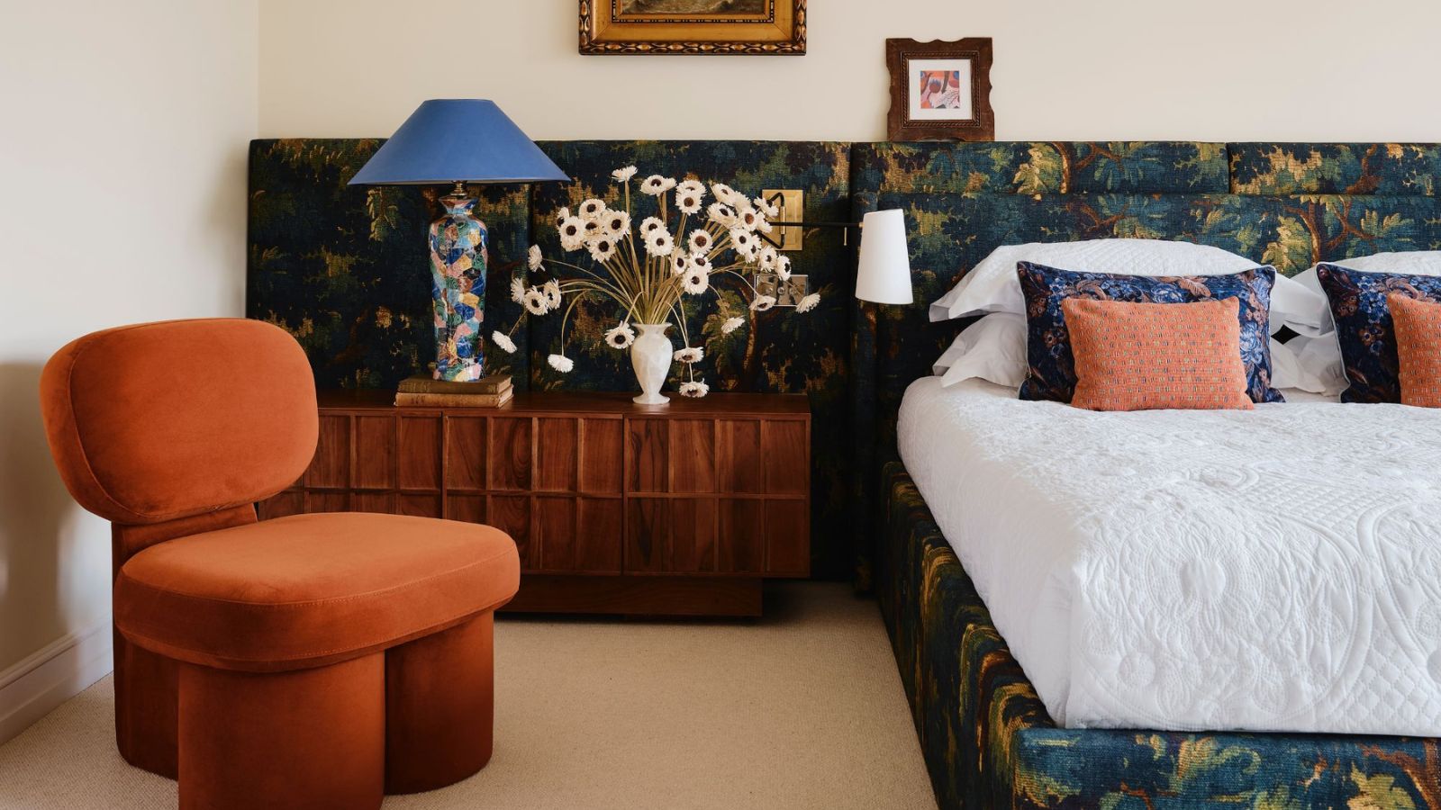
Interior designers reveal the 11 must-try bedroom lighting trends to create a better ambiance in 2025
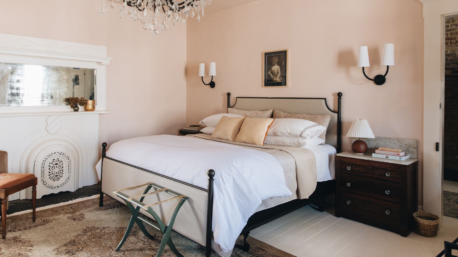
10 designers on the bedroom colors they always recommend
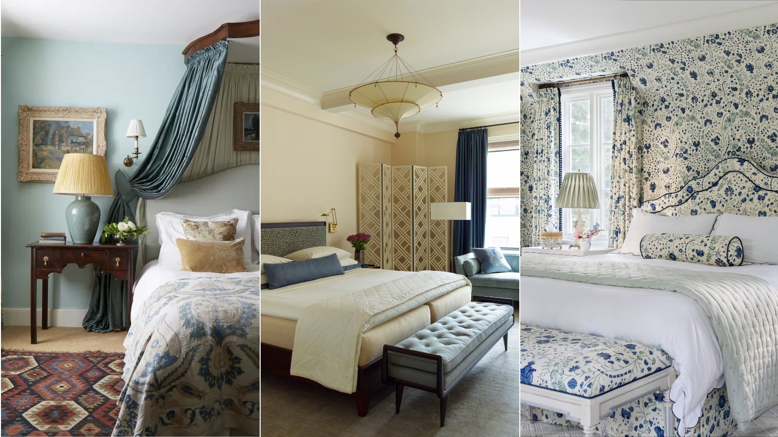
Is Blue And White The Most Classic Bedroom Color Combination? Interior Designers Weigh In
The top bedroom design trends of 2025 to inspire a dreamy makeover of your most important space


10 designer-approved bedroom furniture trends to take note of in 2025
12 bedroom trends for 2025: the best looks to follow this year
7 Bedroom Paint Color Trends That Are Going to Take Over Walls in 2026