1/18
What colours go with brown? 6 colour pairings perfect for a cosy home
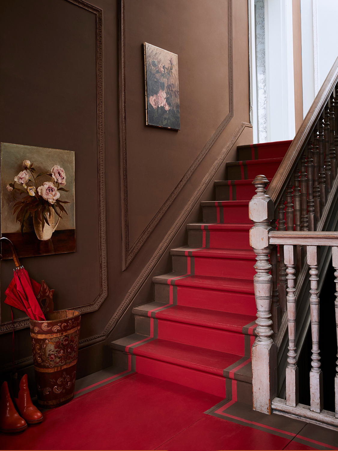
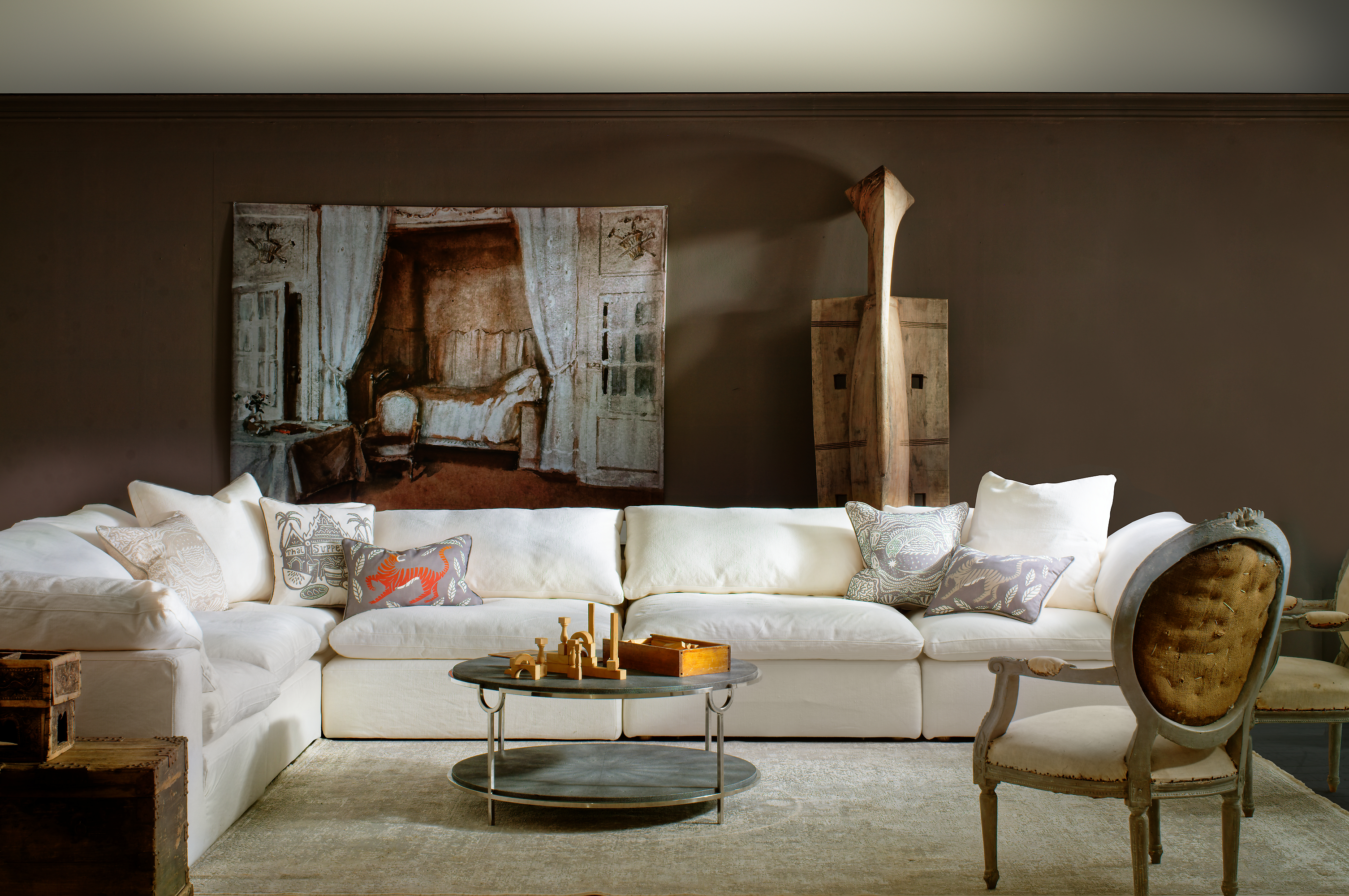
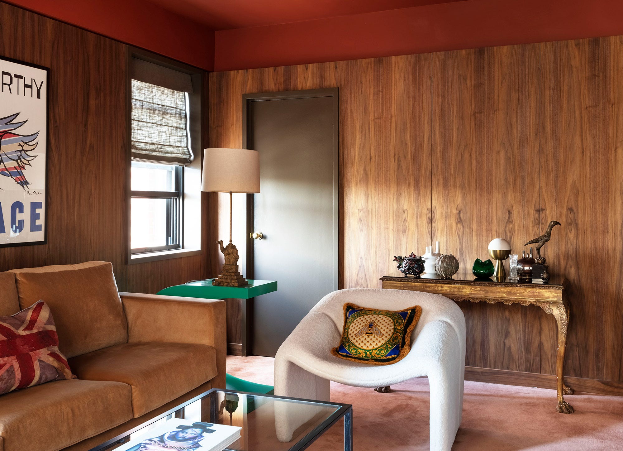
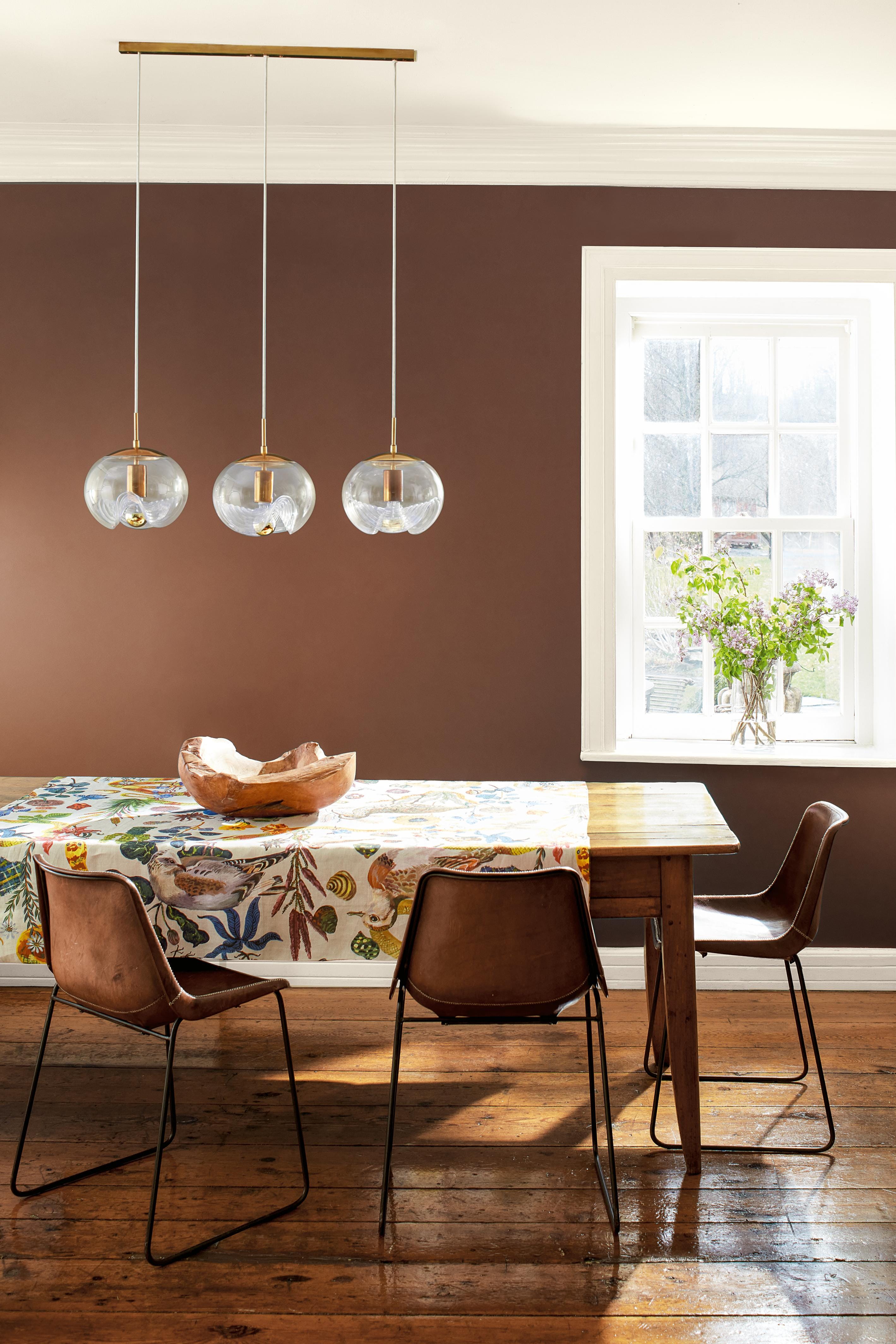
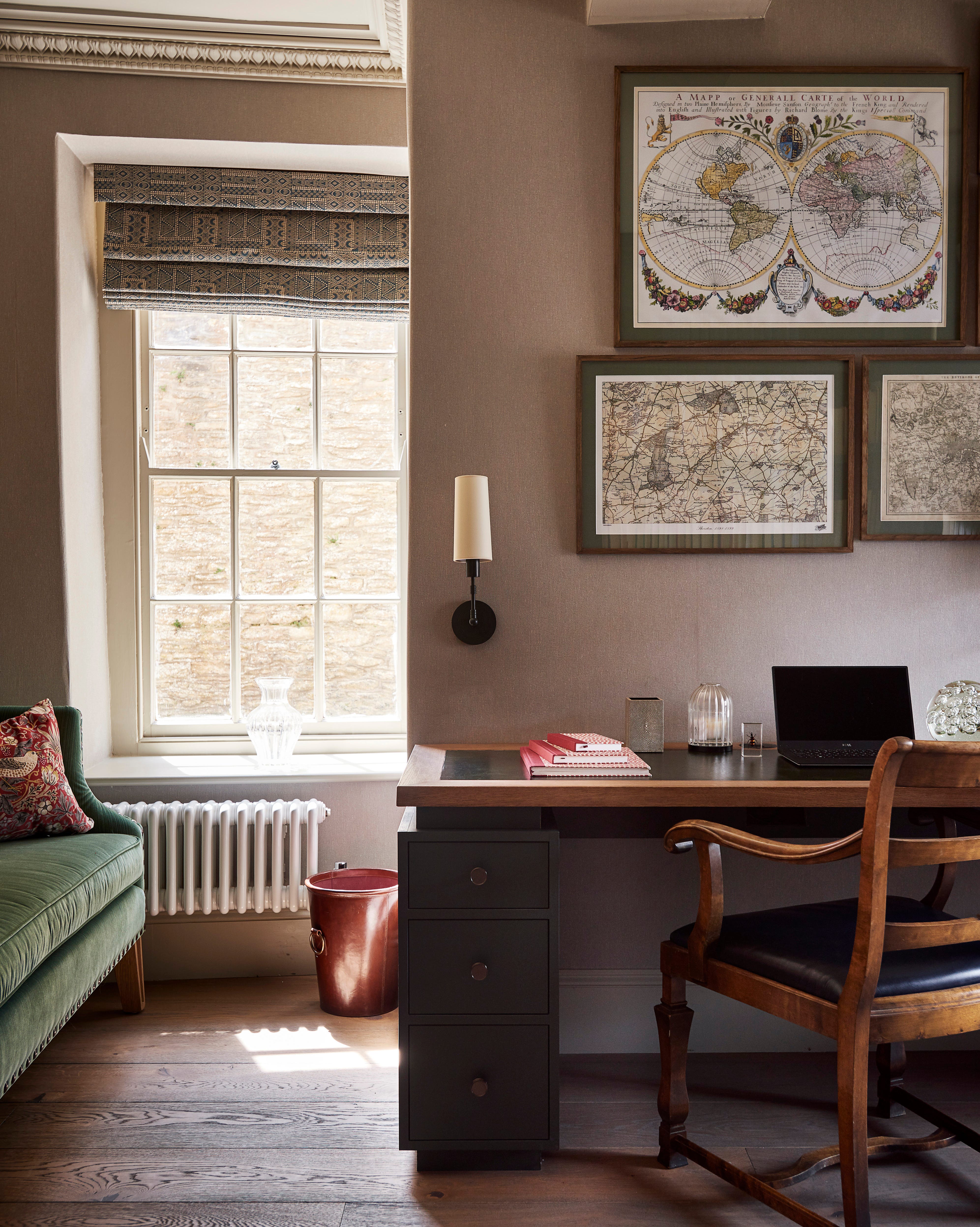
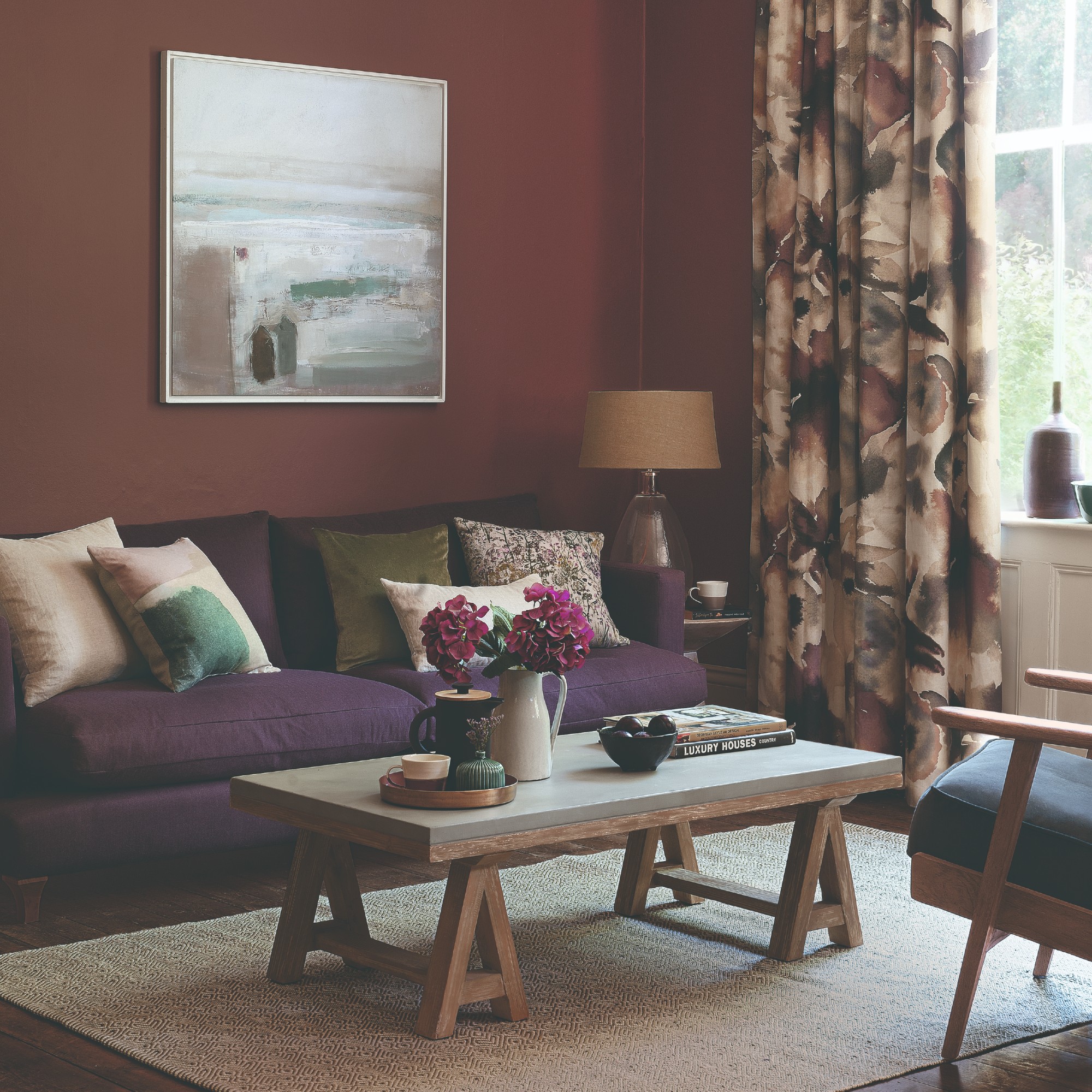
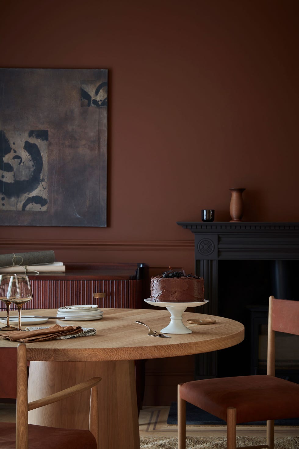
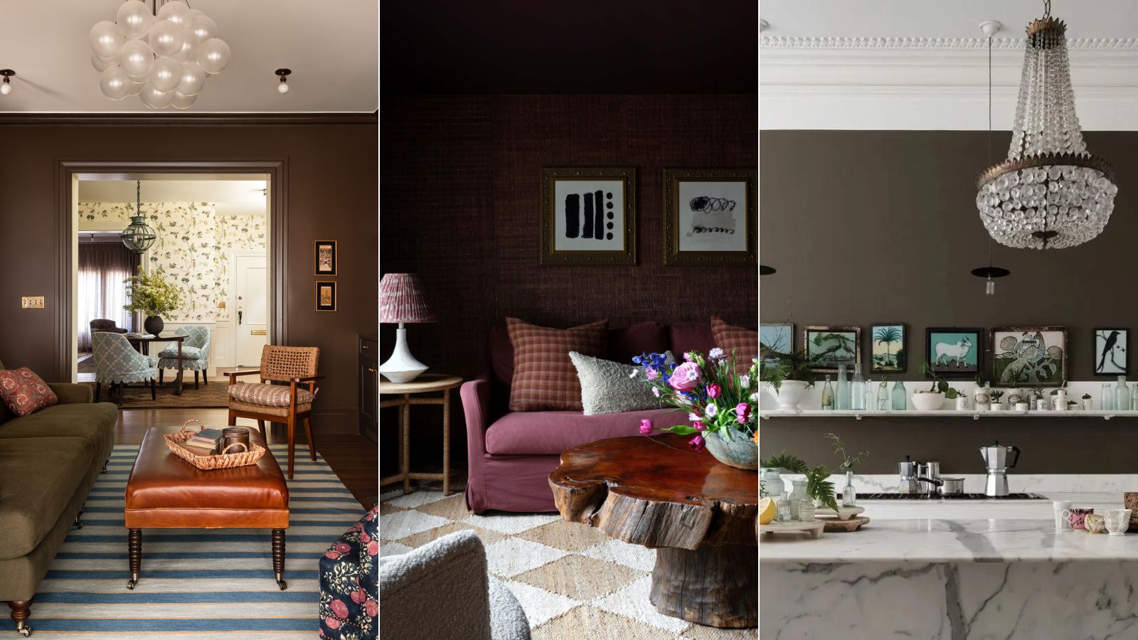
Brown is a versatile and grounding color that is expected to be prominent in interior design in 2025, with Pantone identifying Mocha Mousse as a key shade and Graham & Brown featuring Elderton. This color can create either a sensuous and indulgent atmosphere or a warm and understated feel, making it suitable for various design preferences. Interior design experts suggest that brown’s adaptability allows it to coordinate with most colors, especially nature-inspired hues, providing stability and warmth to any space. The article explores six distinct color pairings with brown, offering guidance on how to integrate this neutral shade into different home aesthetics.
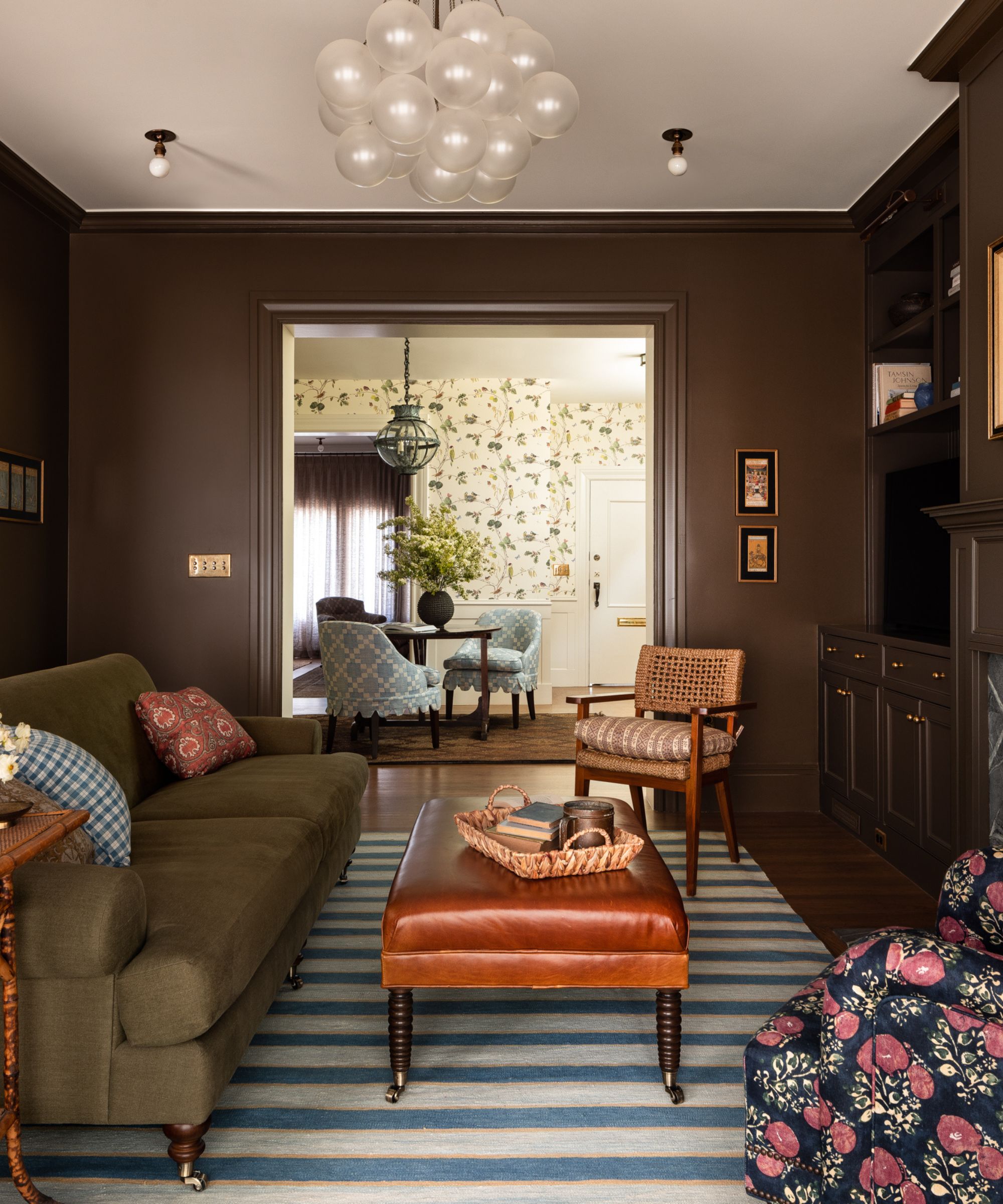
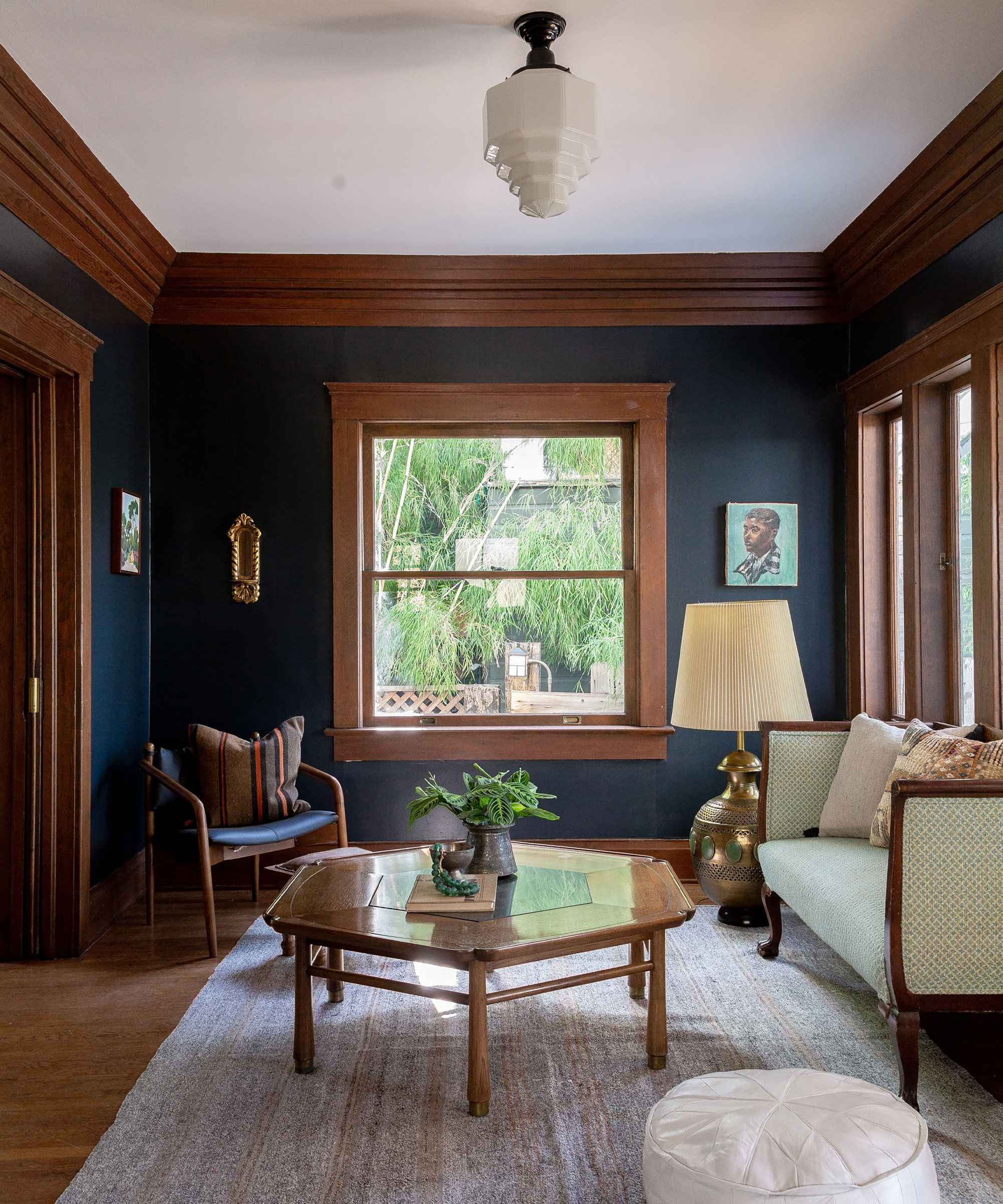
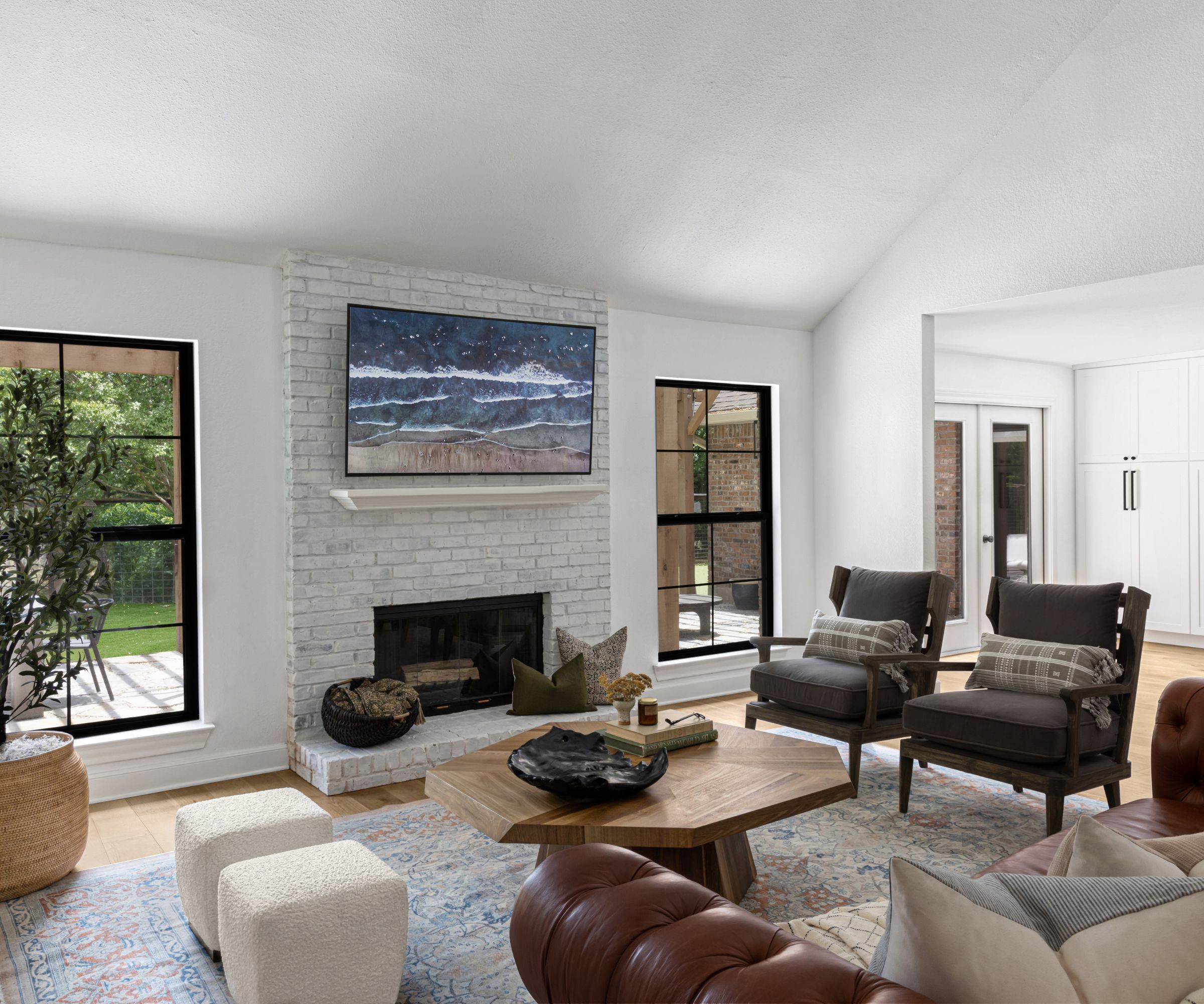
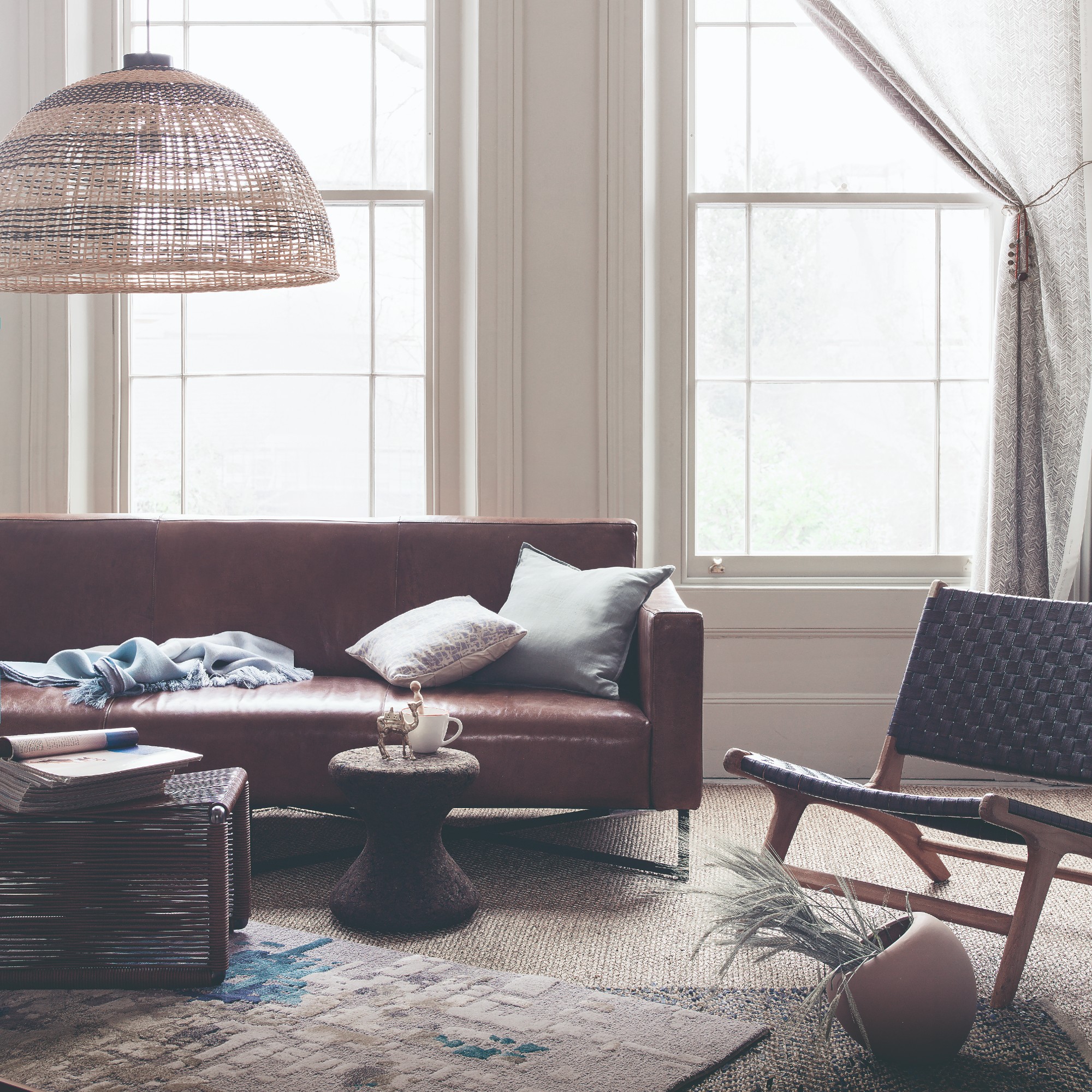
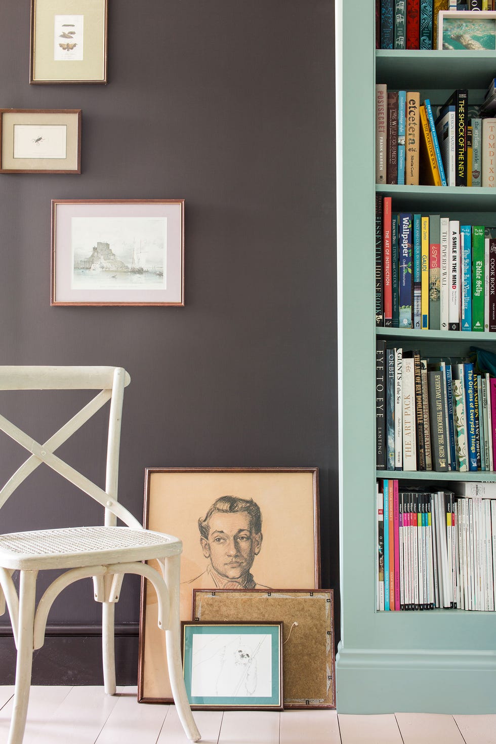
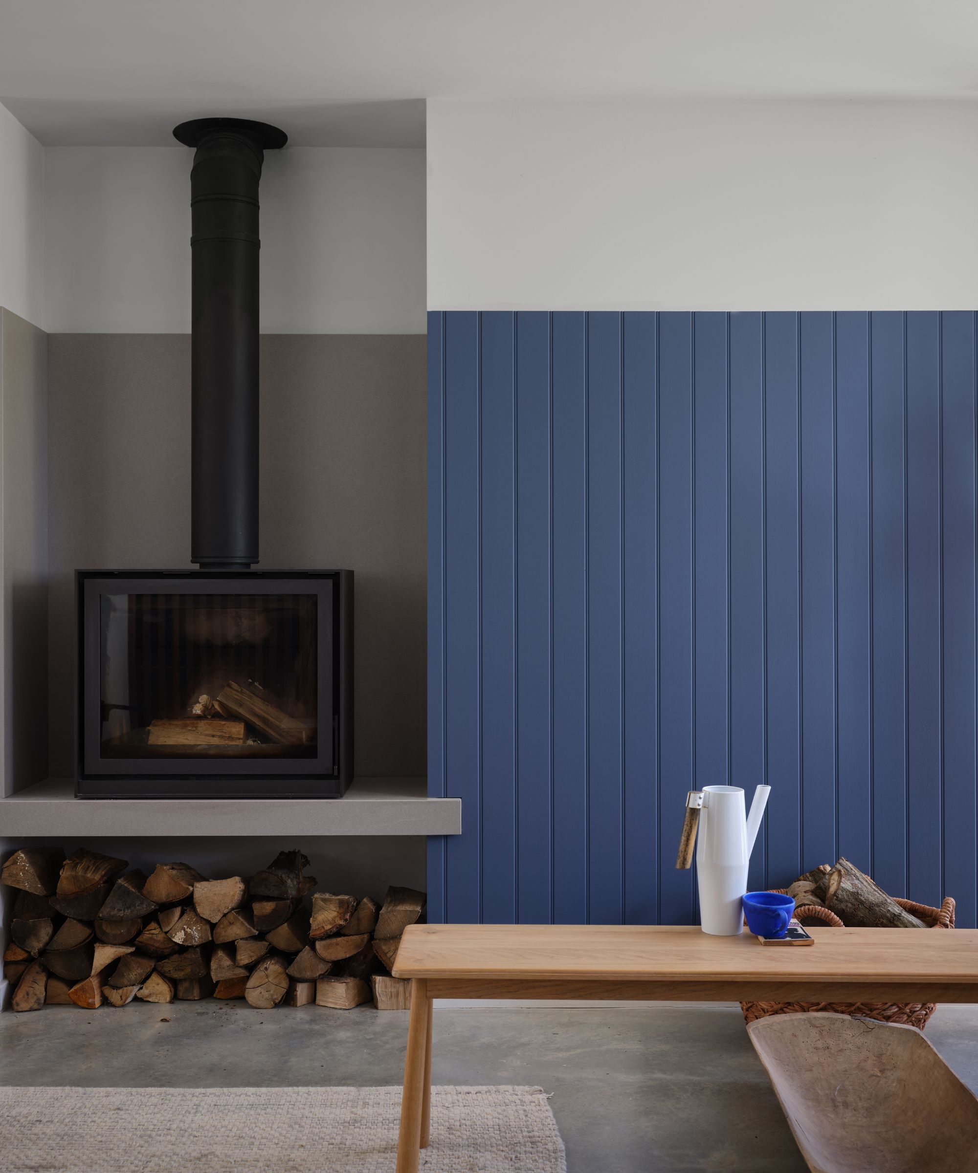
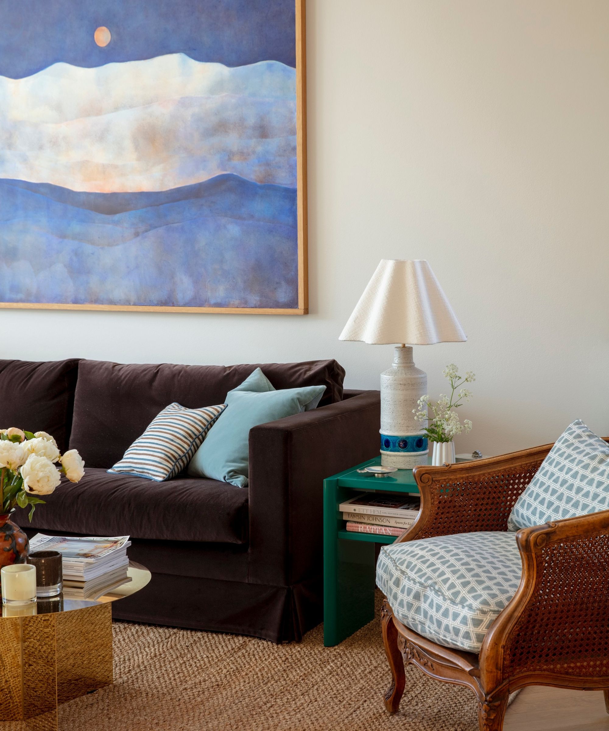
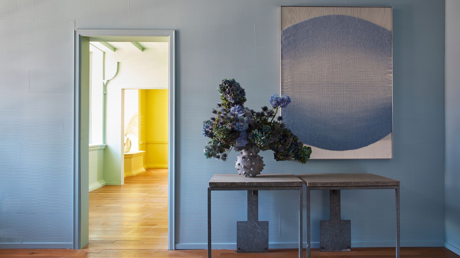
The first pairing discussed is blue and brown, which creates a calm and organic ambiance. Lighter shades of blue, such as V&CO;'s Blue/Shade 1, can make smaller rooms feel more spacious and airy, reminiscent of a beach setting. The combination of chocolate brown with soft, dusty blues is described as sophisticated and stylish, with a recommendation to minimize patterns to allow the colors to speak for themselves.
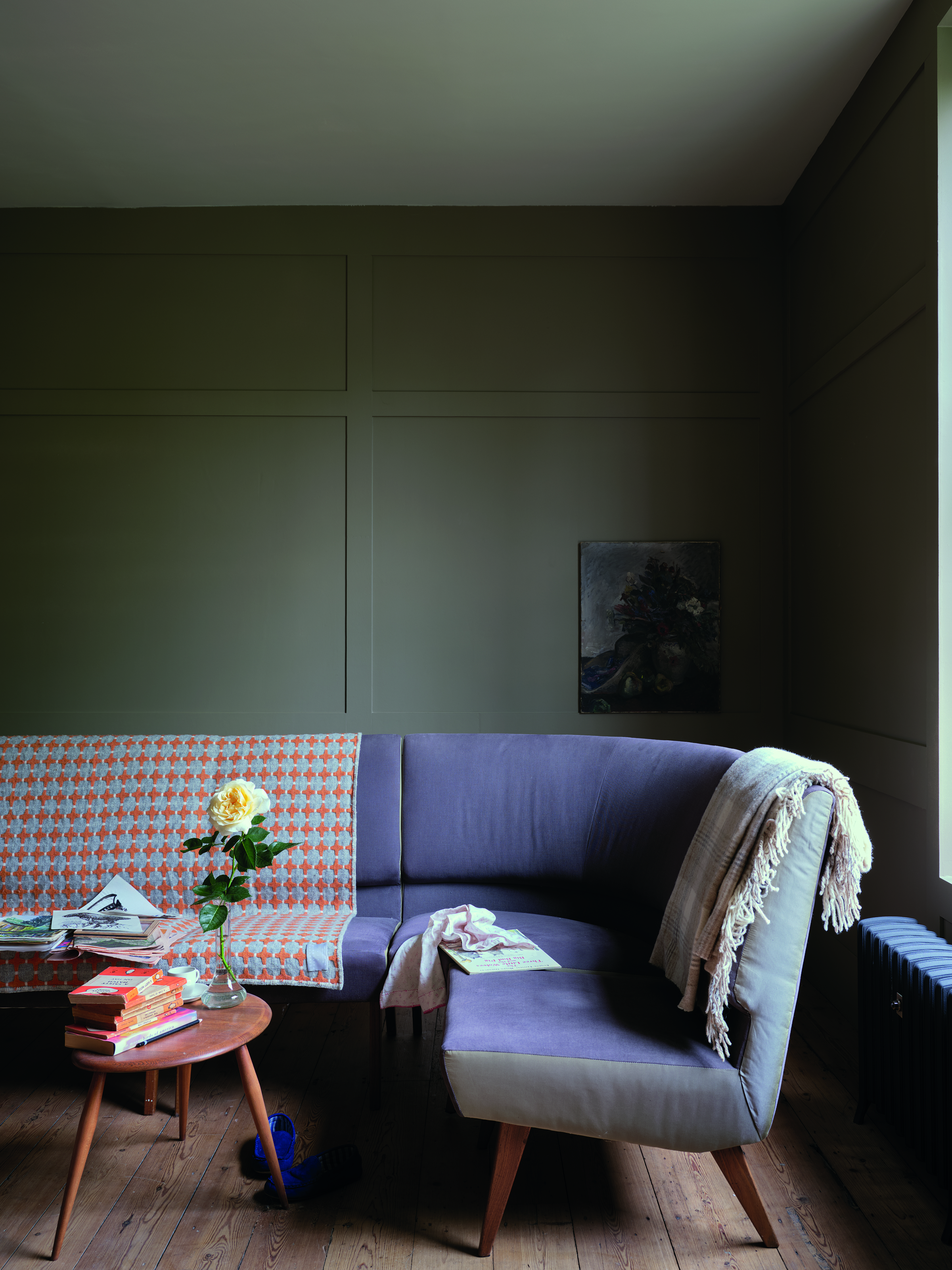
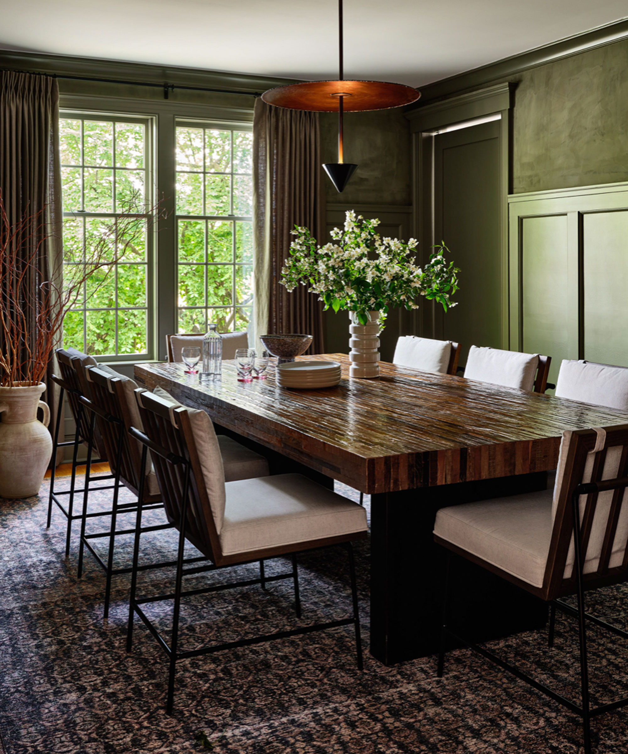
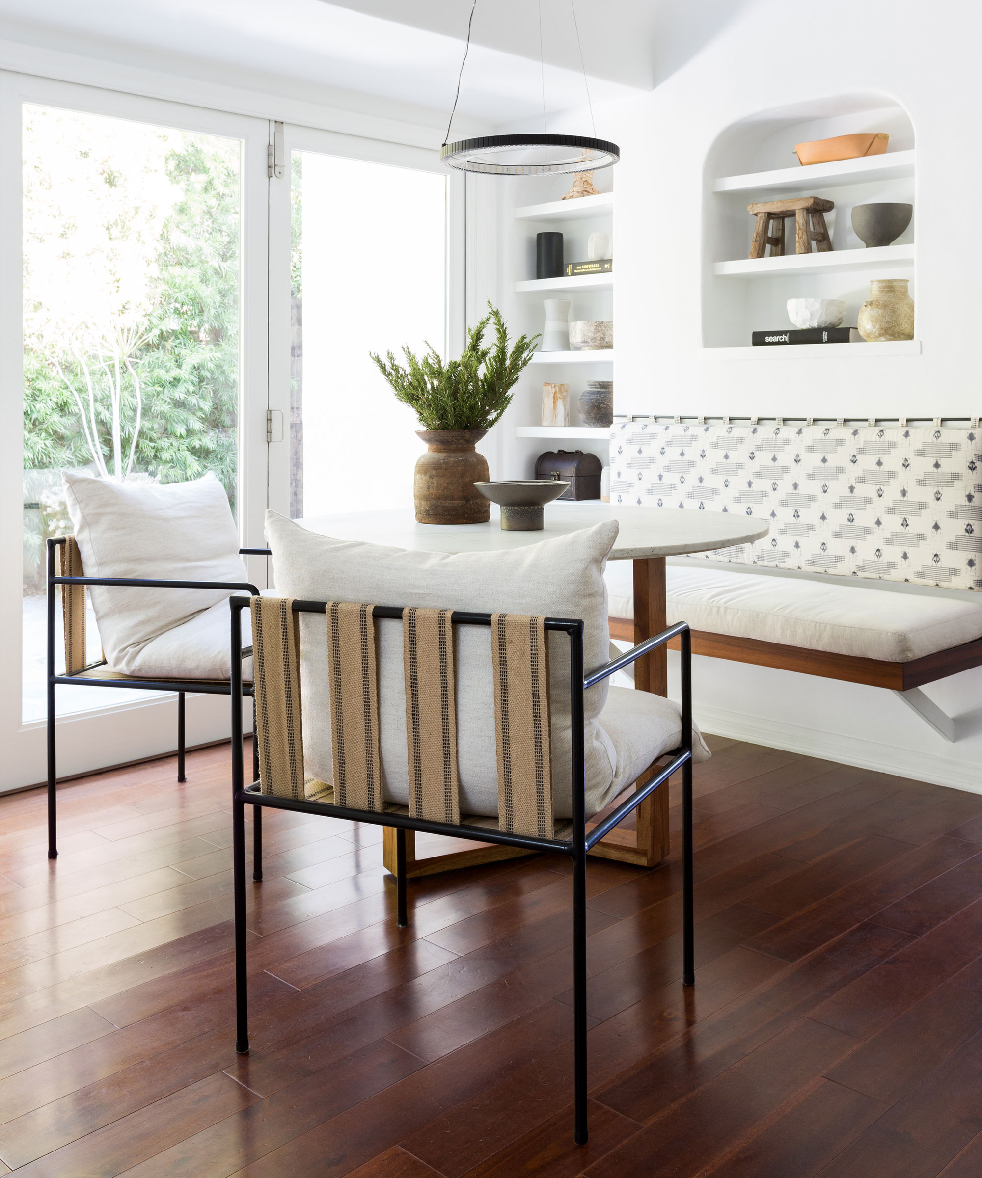
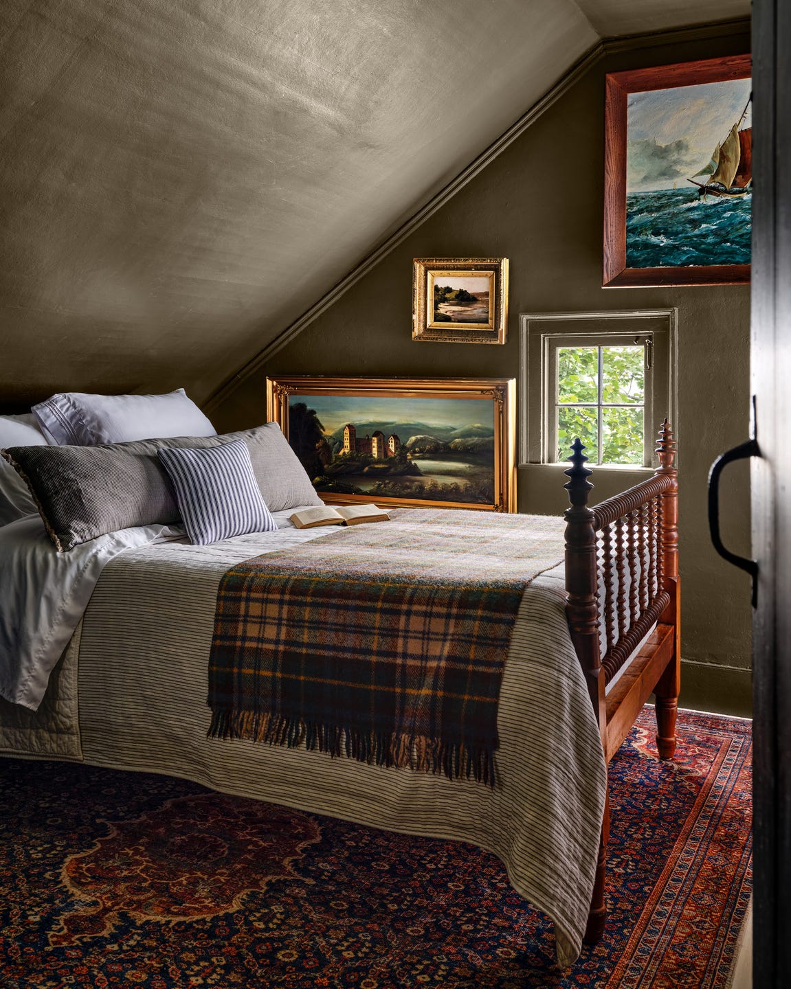
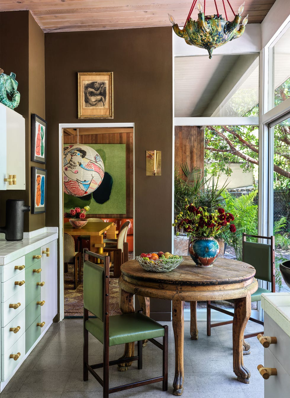
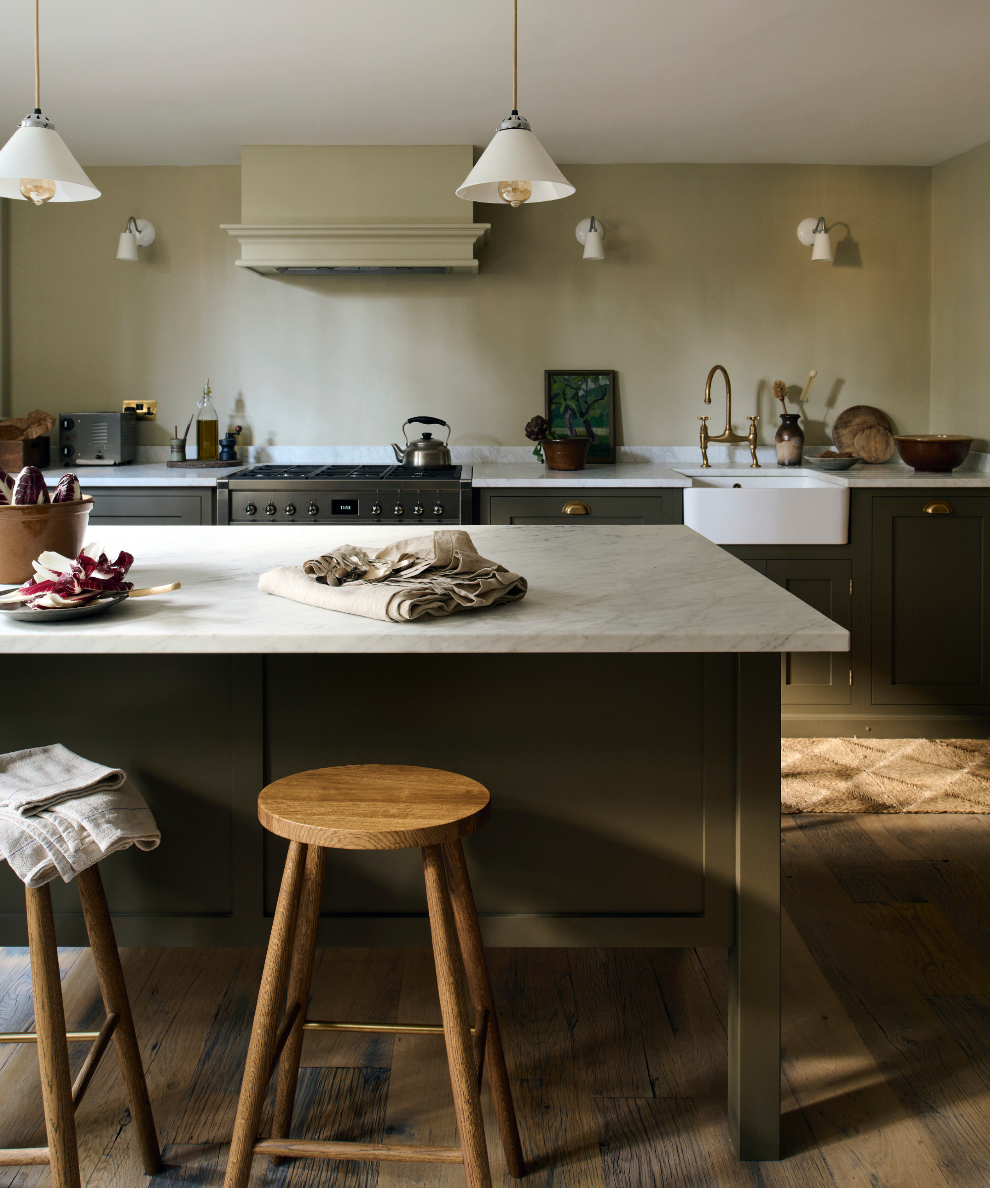
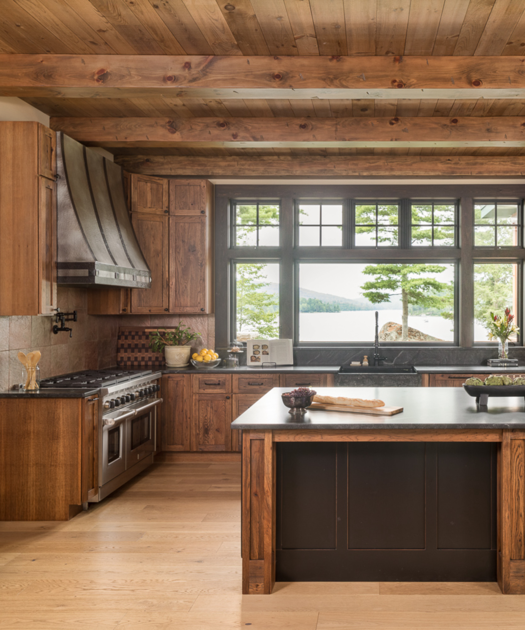
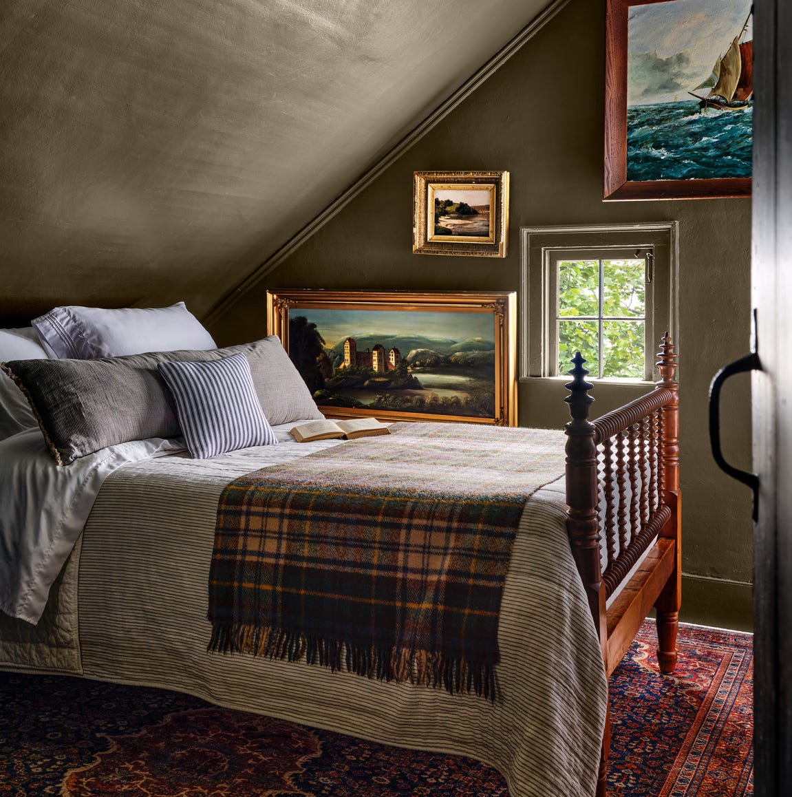
The second pairing focuses on green and brown, highlighting their natural synergy. Given brown’s earthy characteristics, it naturally complements organic interiors. Olive or sage green, particularly soft shades like V&CO;'s Green/Shade 1, contribute to a serene and peaceful environment, helping to reconnect occupants with nature. This combination can be further enhanced with natural accents such as wooden furniture or textiles.
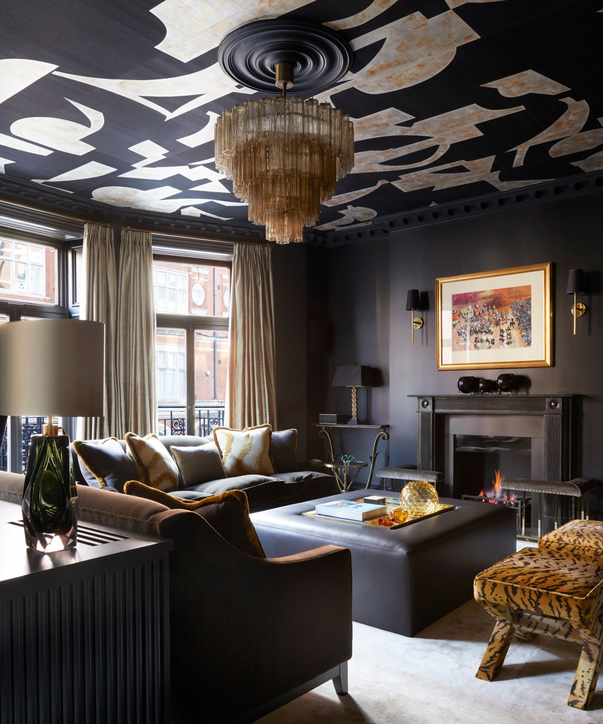
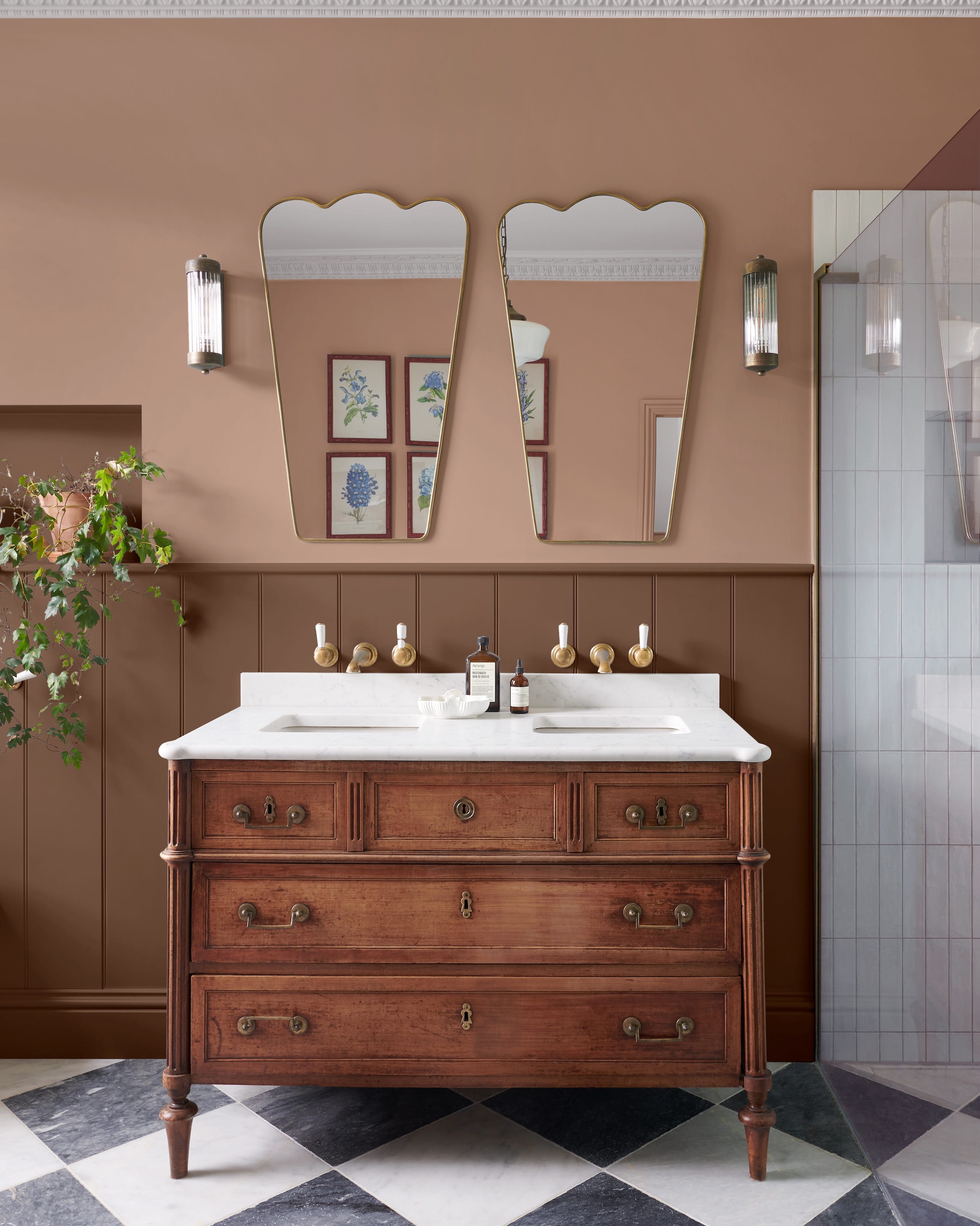
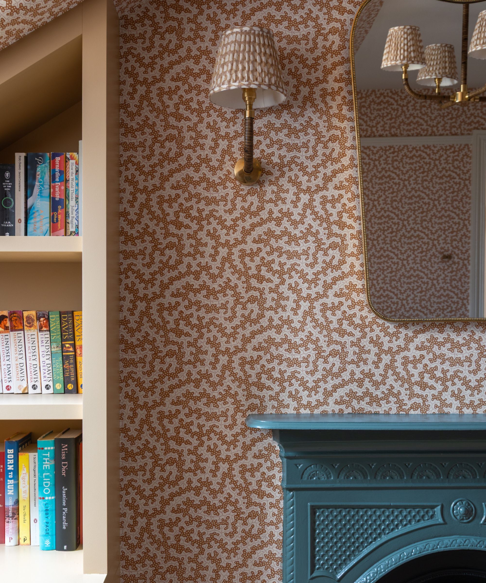
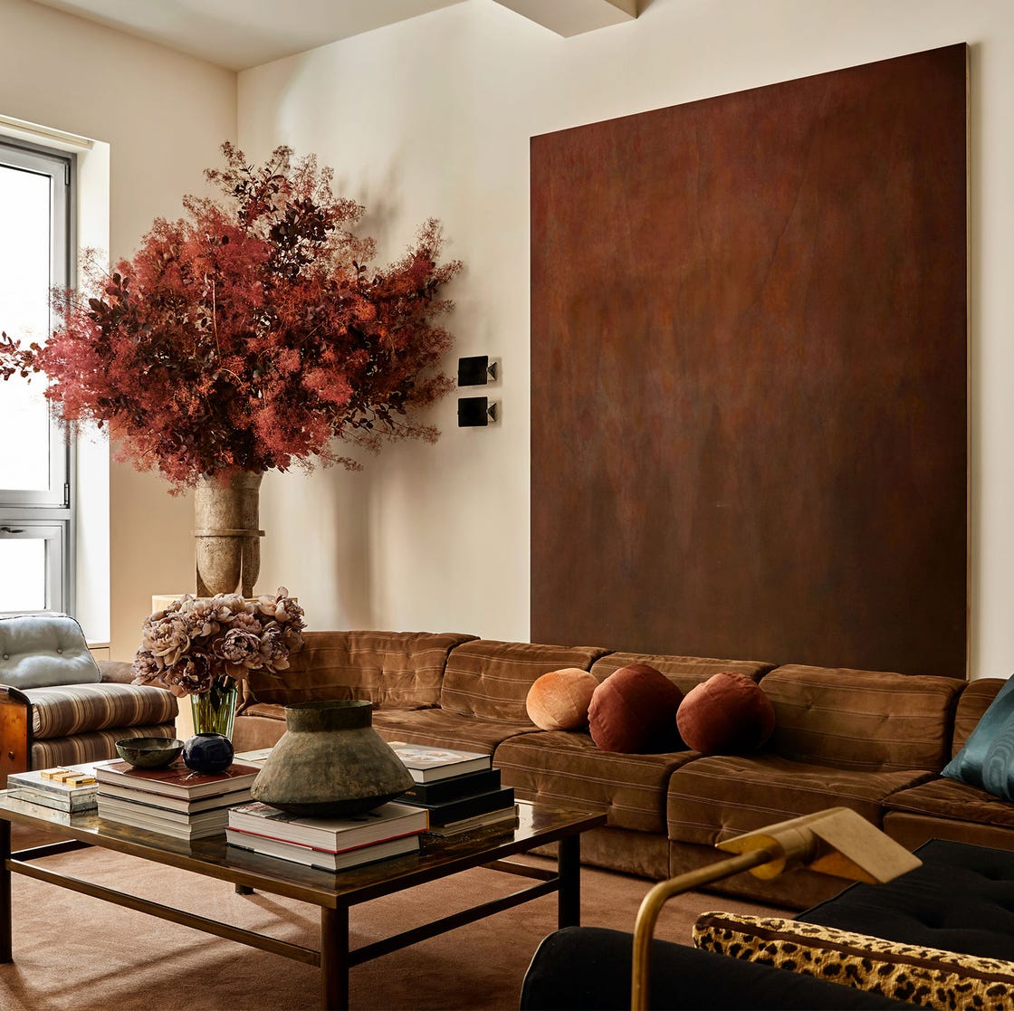
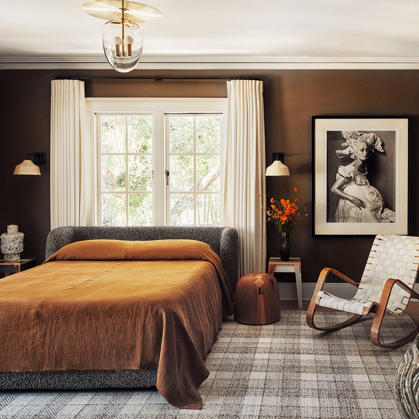
Next, the article delves into brown with metallics, suggesting that rich earth tones like Mocha Mousse are best paired with the warmth of aged metals. Antique brass or brushed gold are recommended to accentuate the natural and organic essence of brown. Metallic finishes, including bronzed light fixtures, antique gold-framed mirrors, and sculptural floor lamps, can elevate the interior and impart a modern edge to the space.
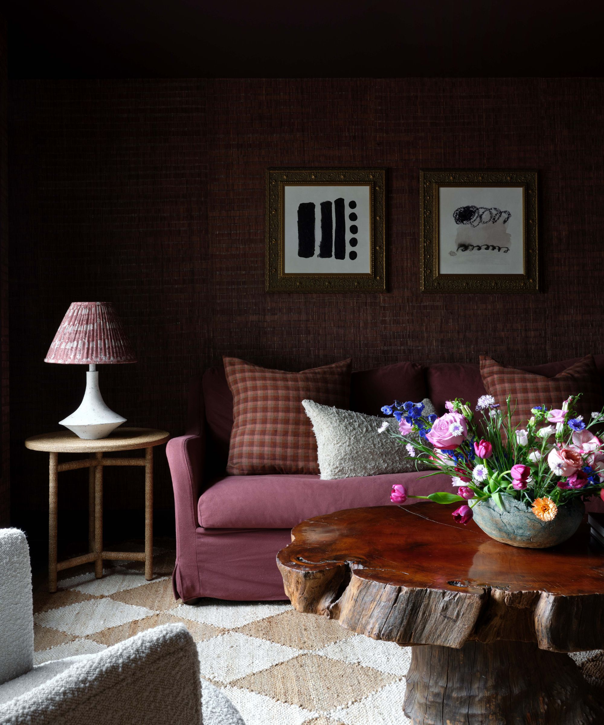
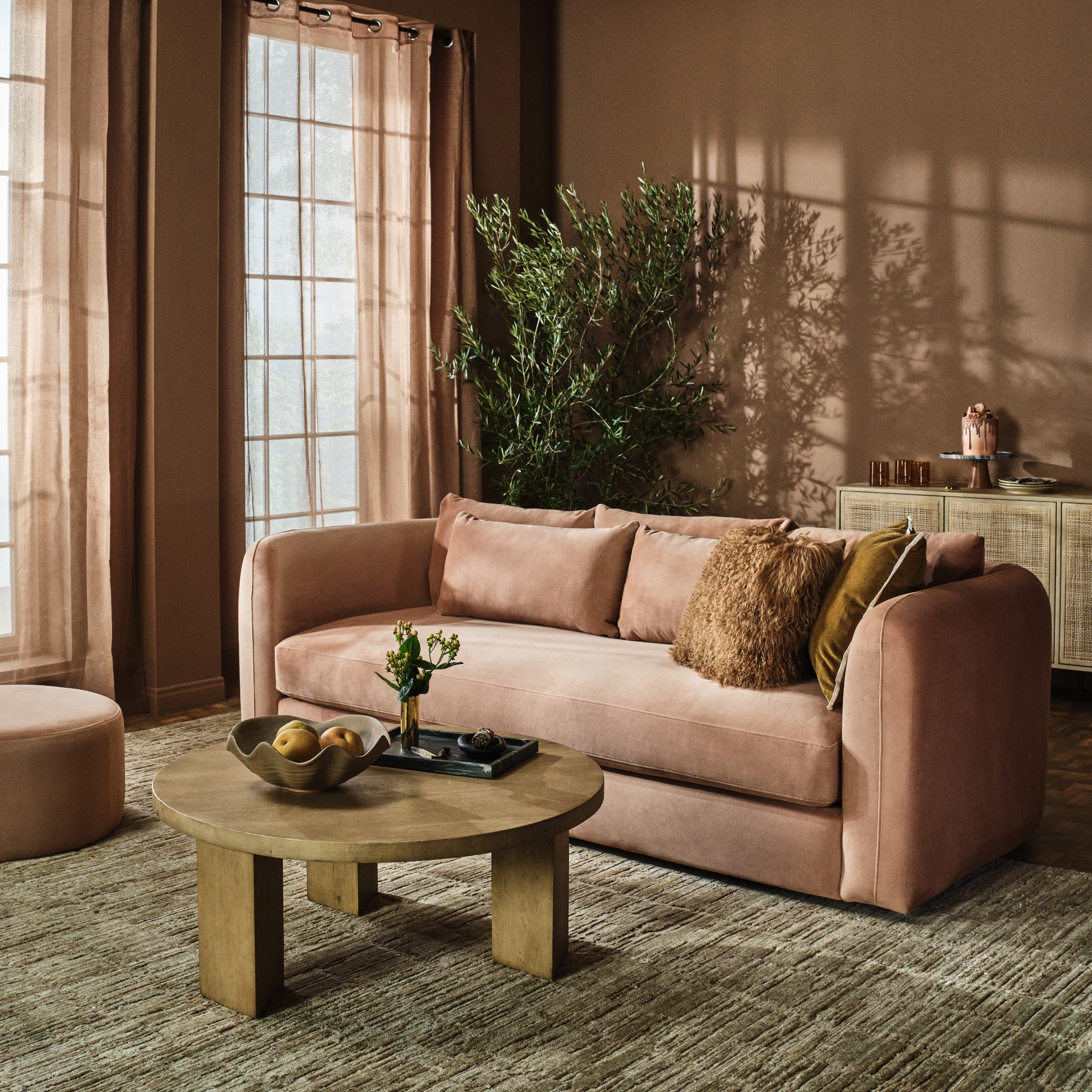
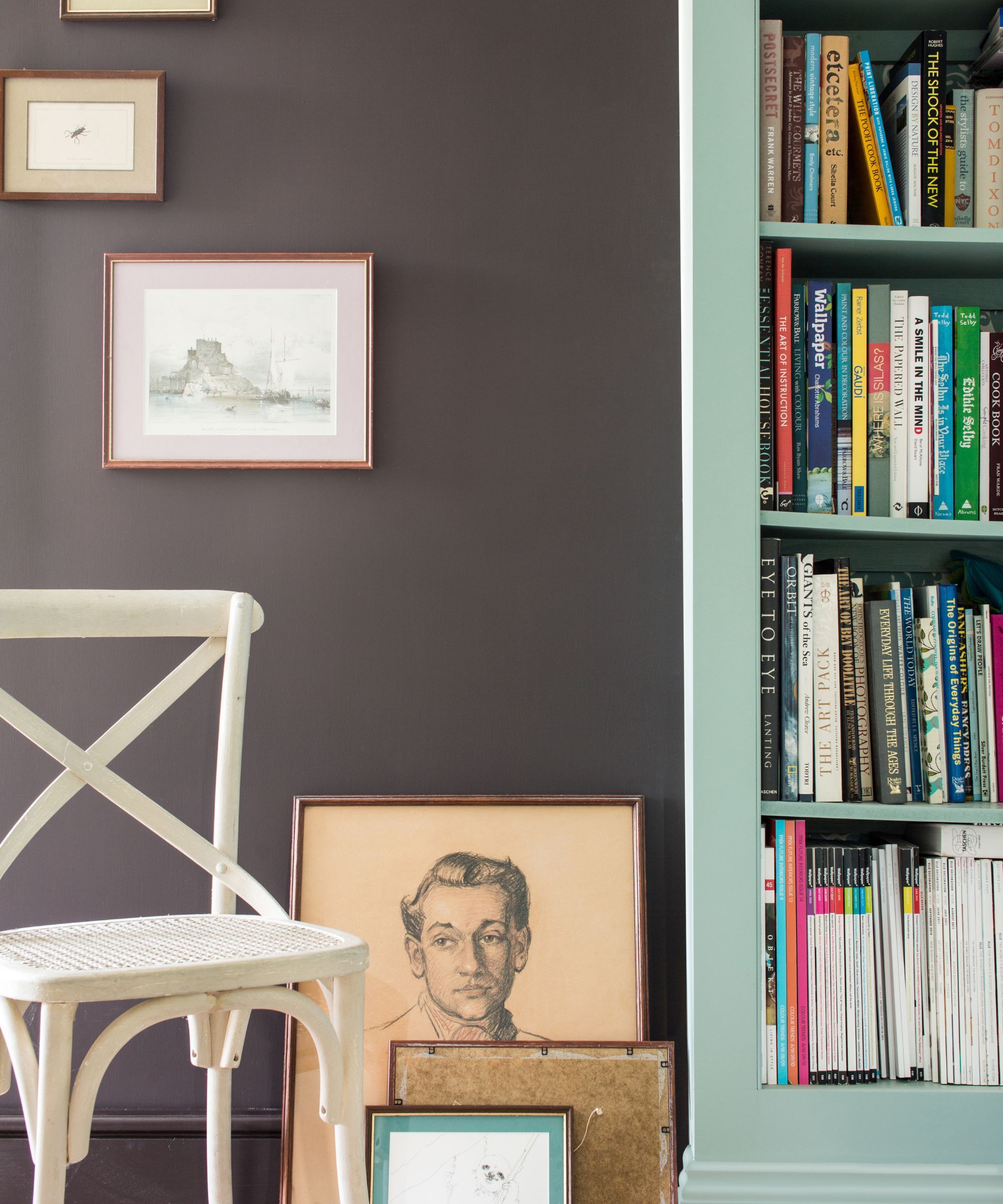
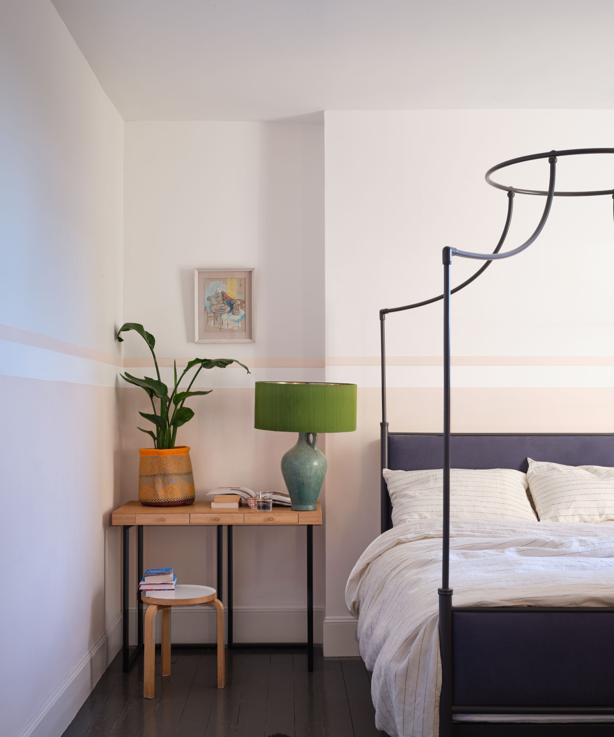
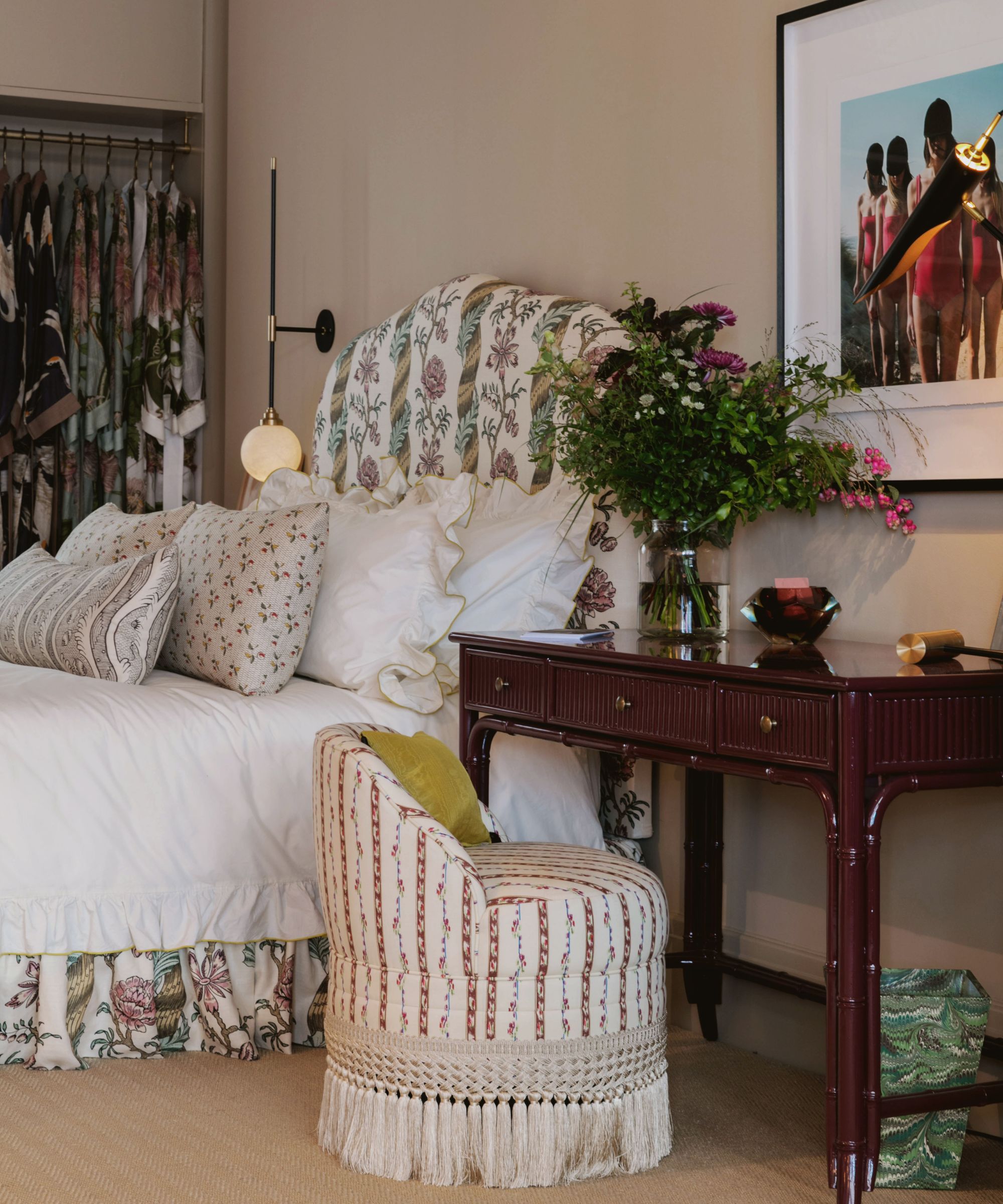
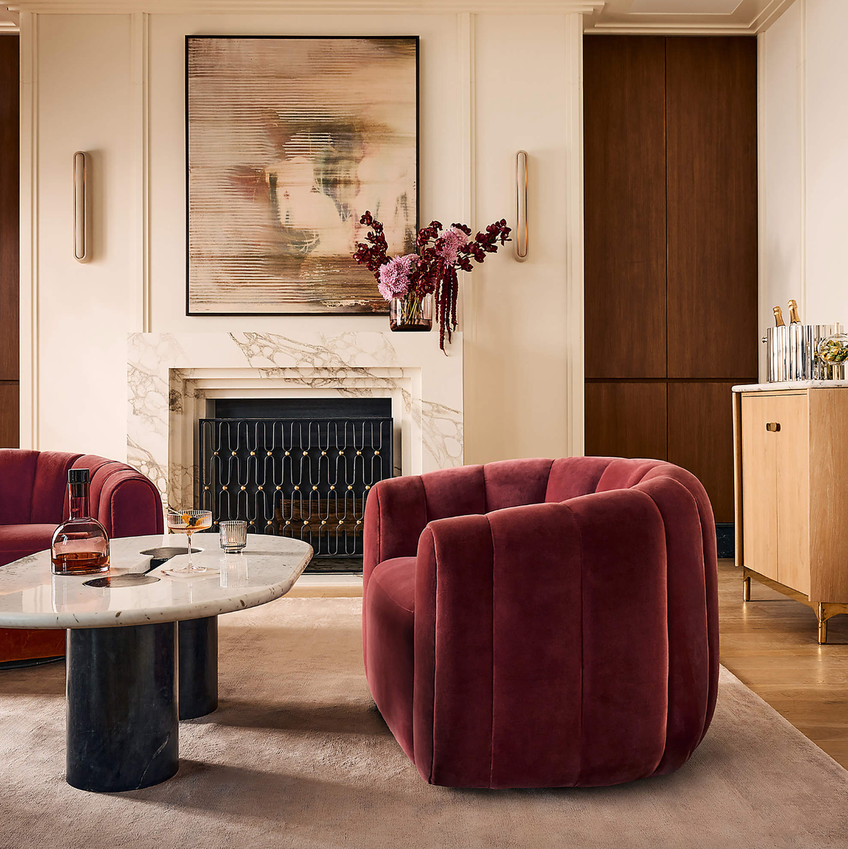
The fourth pairing involves pink and brown, which aims to create a warm and uplifting mood. Soft pinks are believed to instill feelings of love and kindness, making them suitable for welcoming spaces. A ‘dirty, muddy pink,’ similar to Benjamin Moore’s Muddy York, is suggested as an ideal complement to brown. These pink tones can be introduced through various elements such as throws, decorative objects, or artwork rather than solely through wall color.
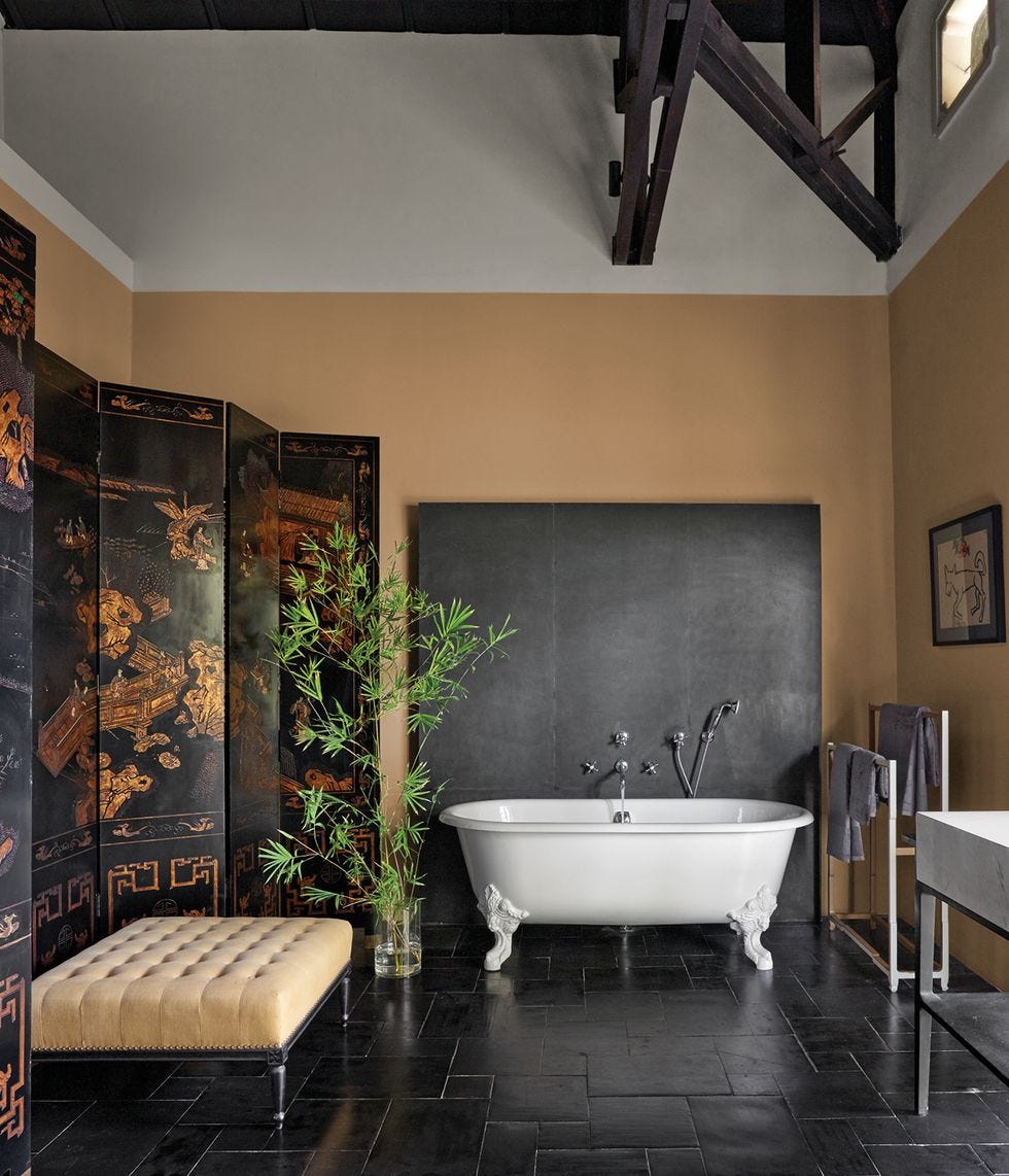
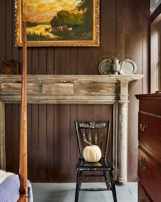
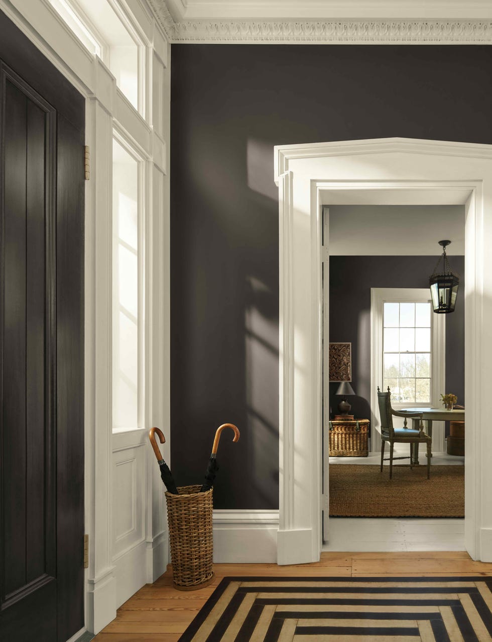
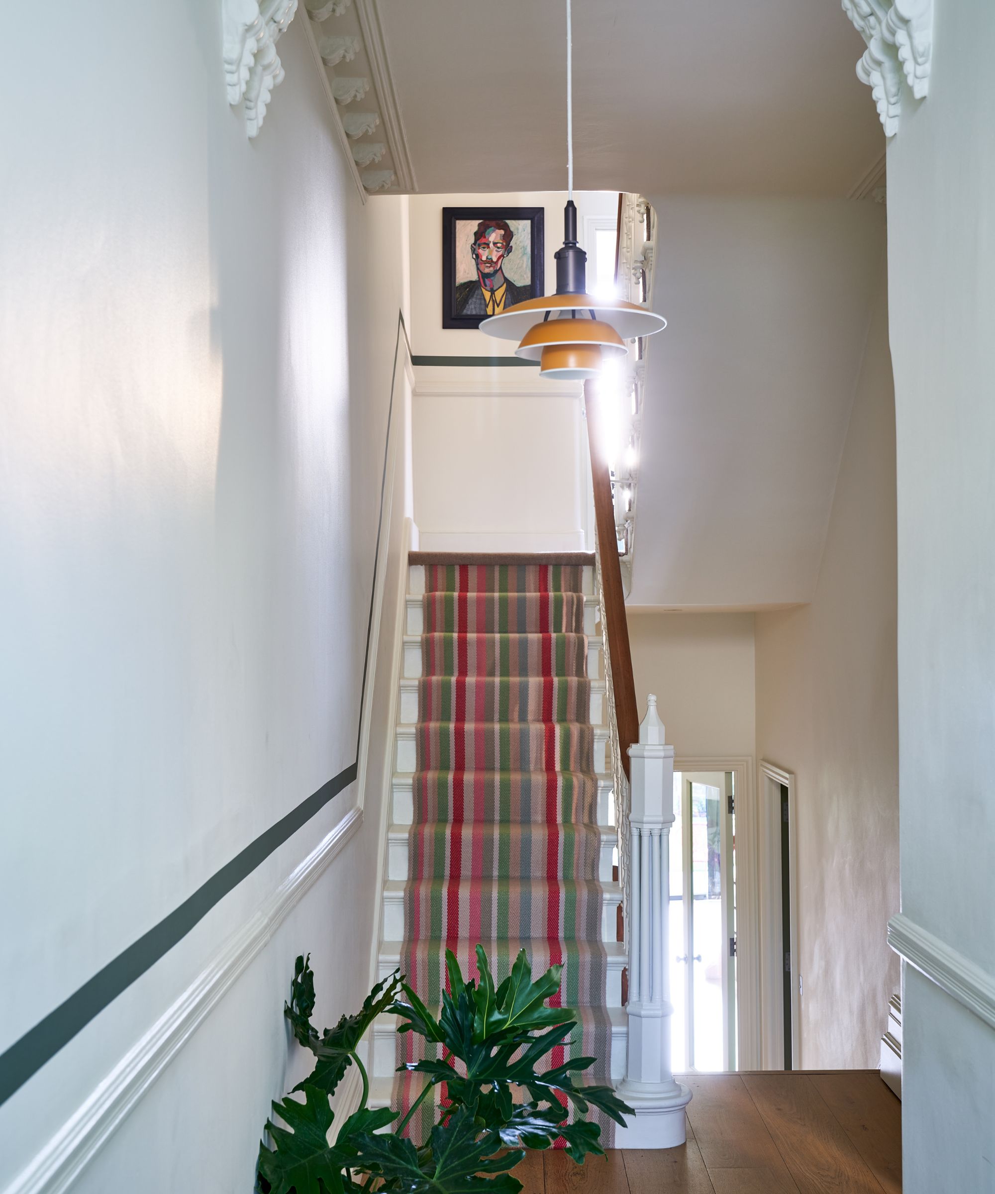
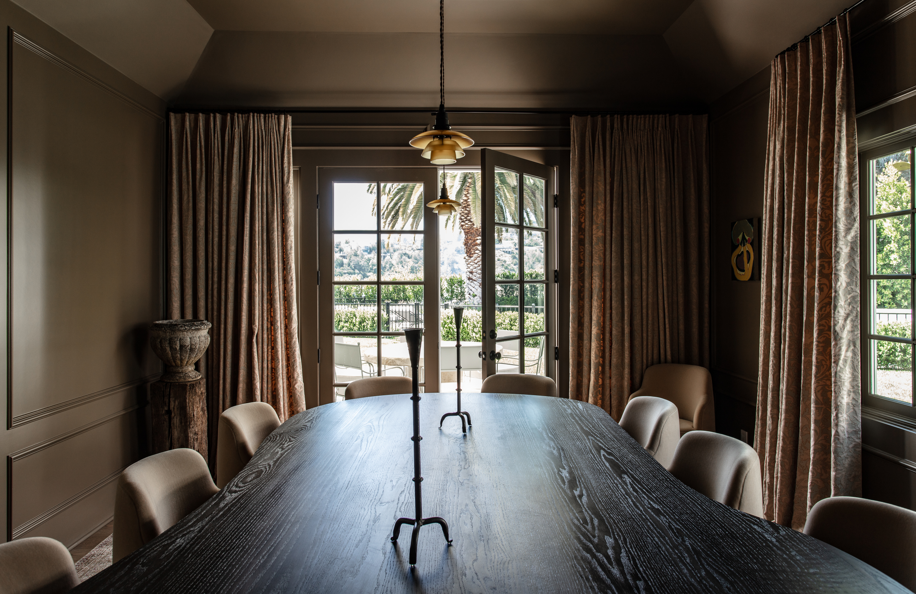
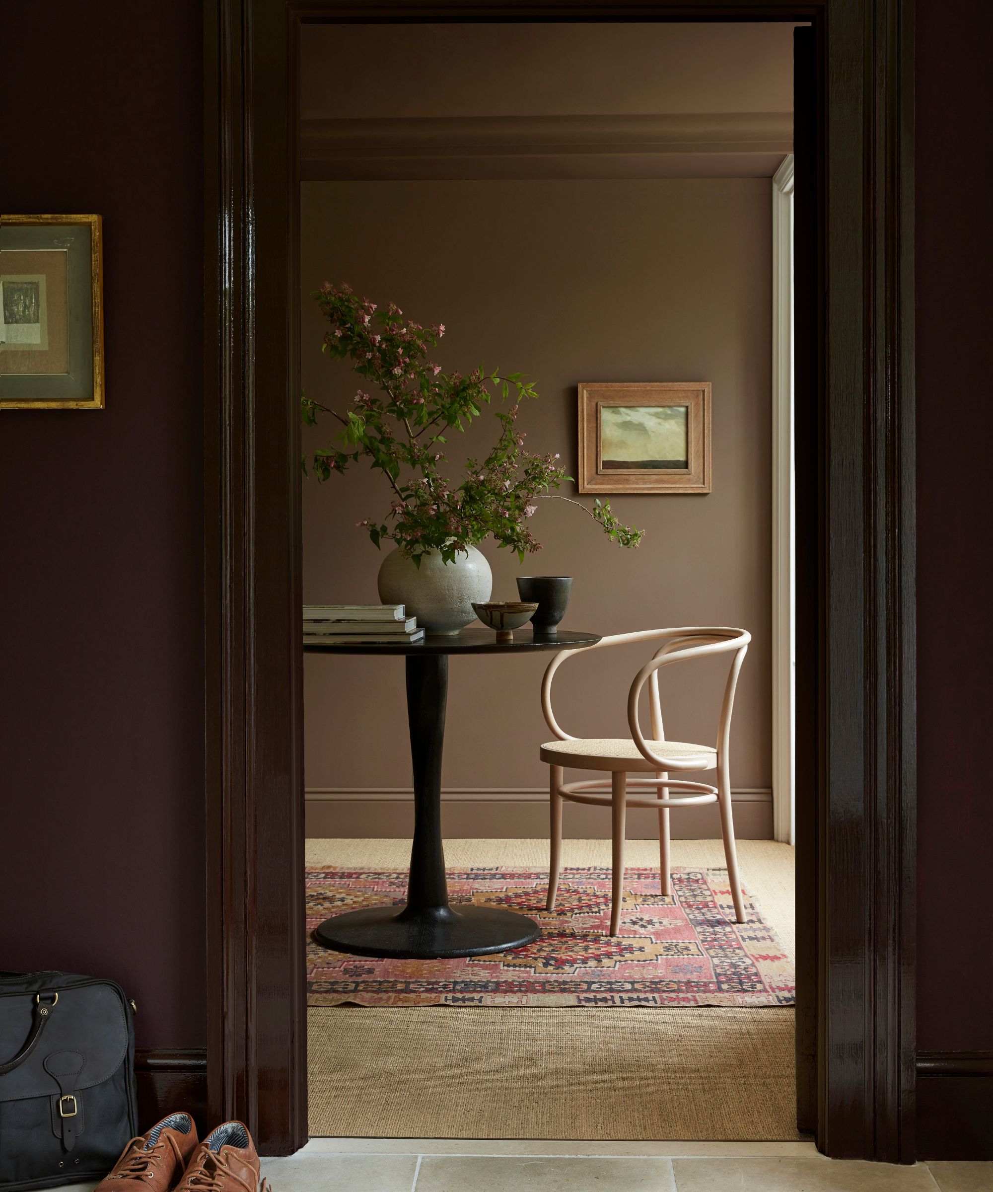
For a bold and dramatic aesthetic, the article proposes black and brown. This combination introduces depth and contrast to a room. When choosing a black, a brown-undertoned shade like Benjamin Moore Black Beauty is recommended for walls, with a tan leather chair providing a complementary focal point, creating a striking backdrop.
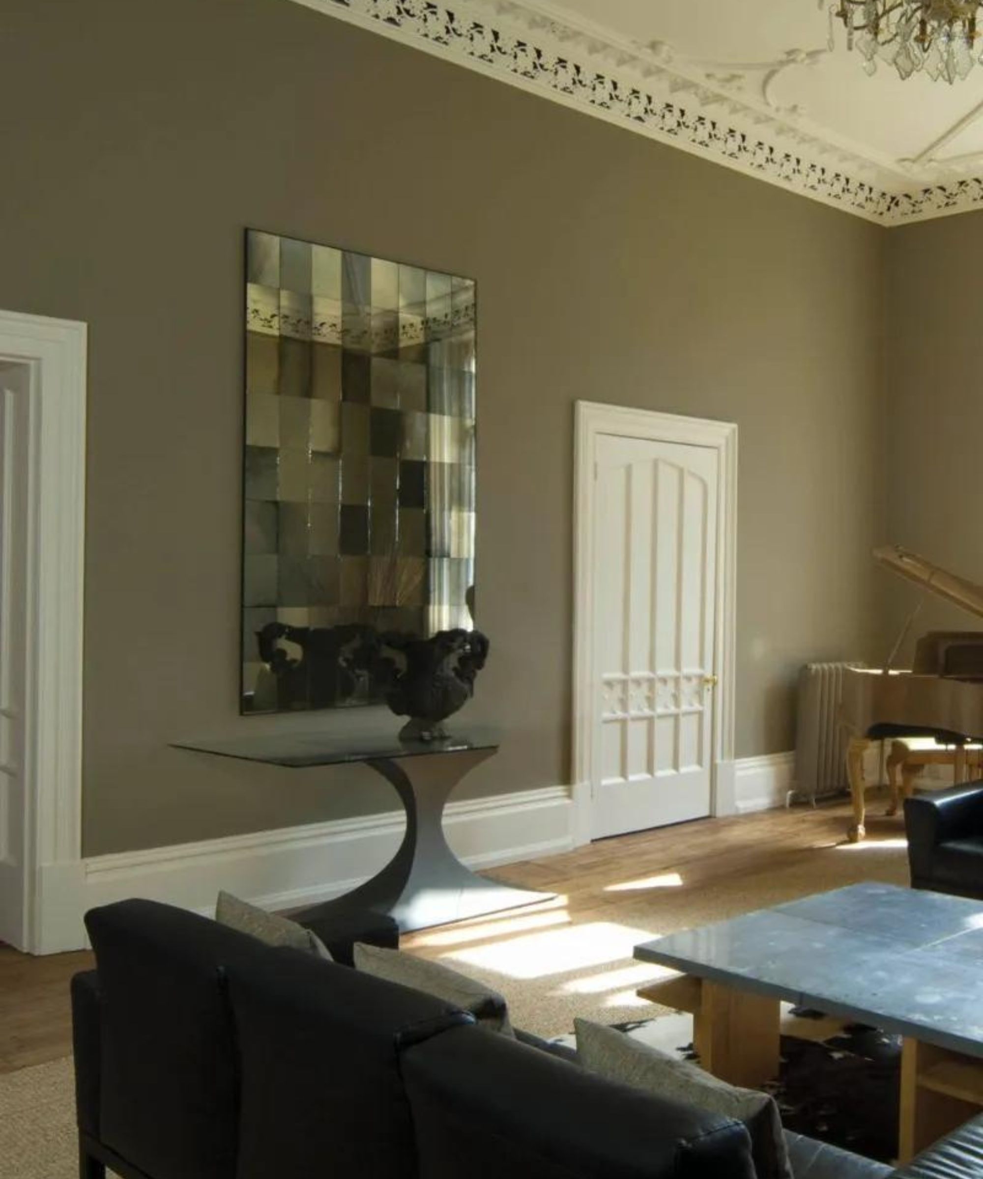
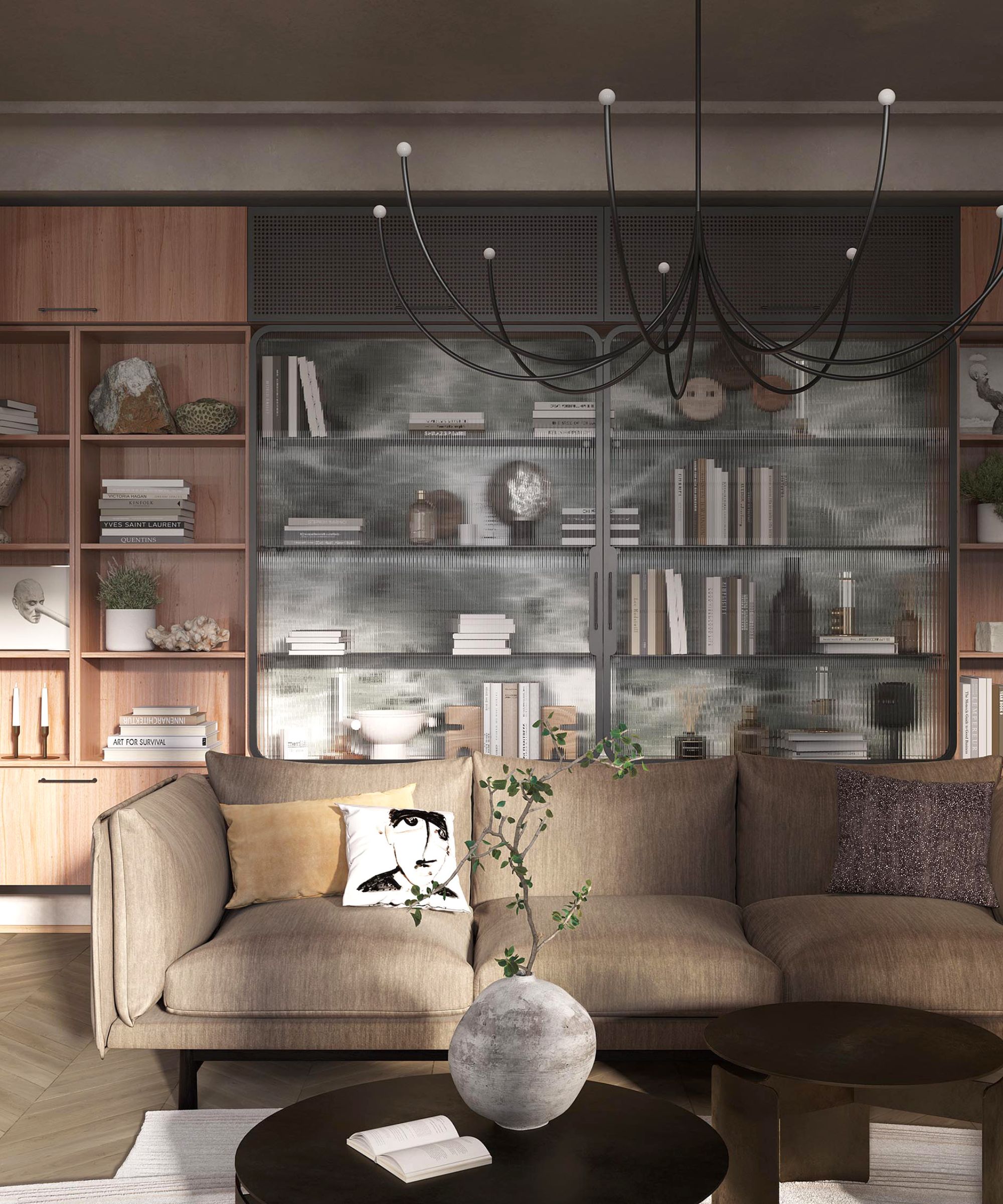
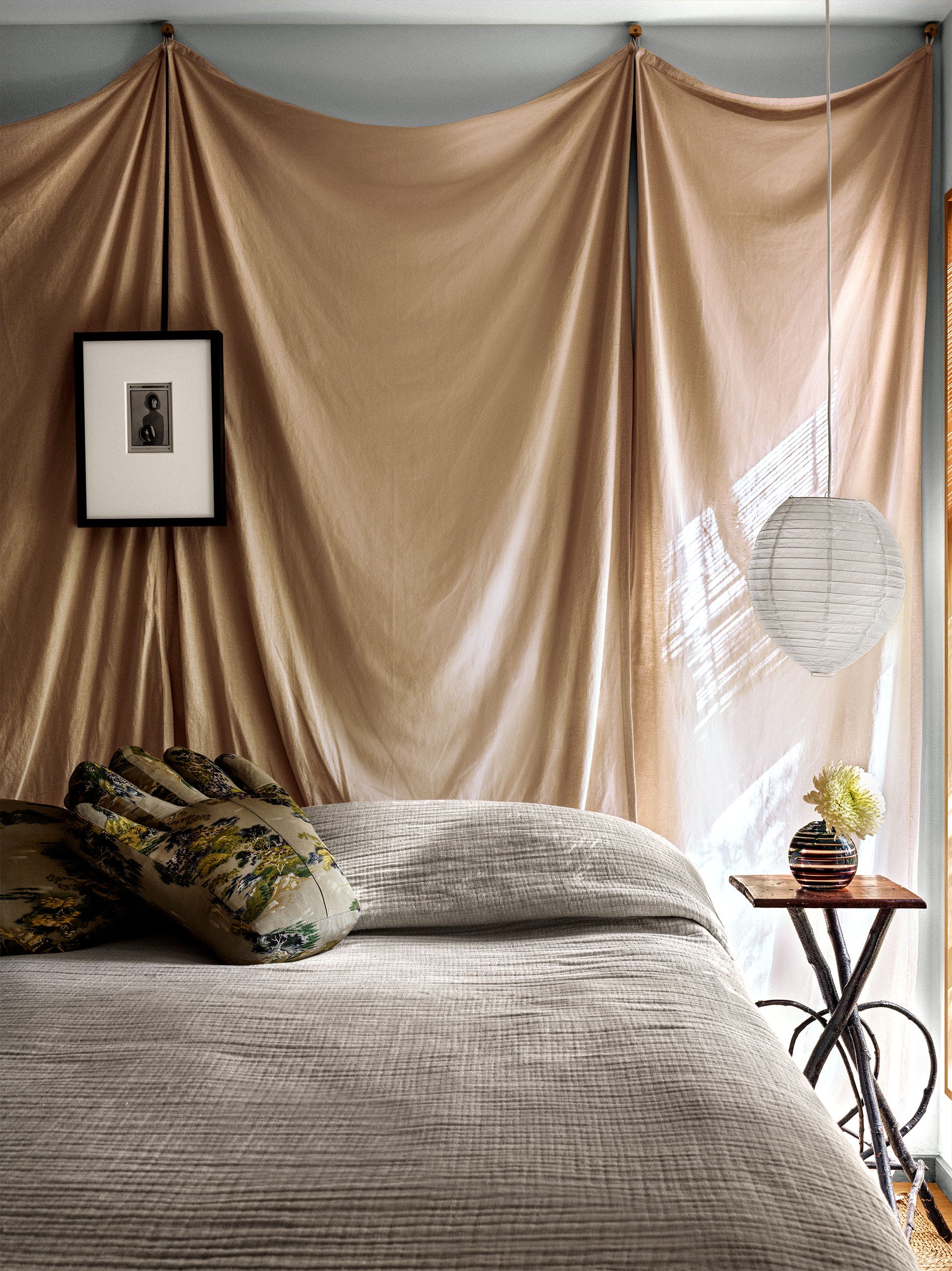
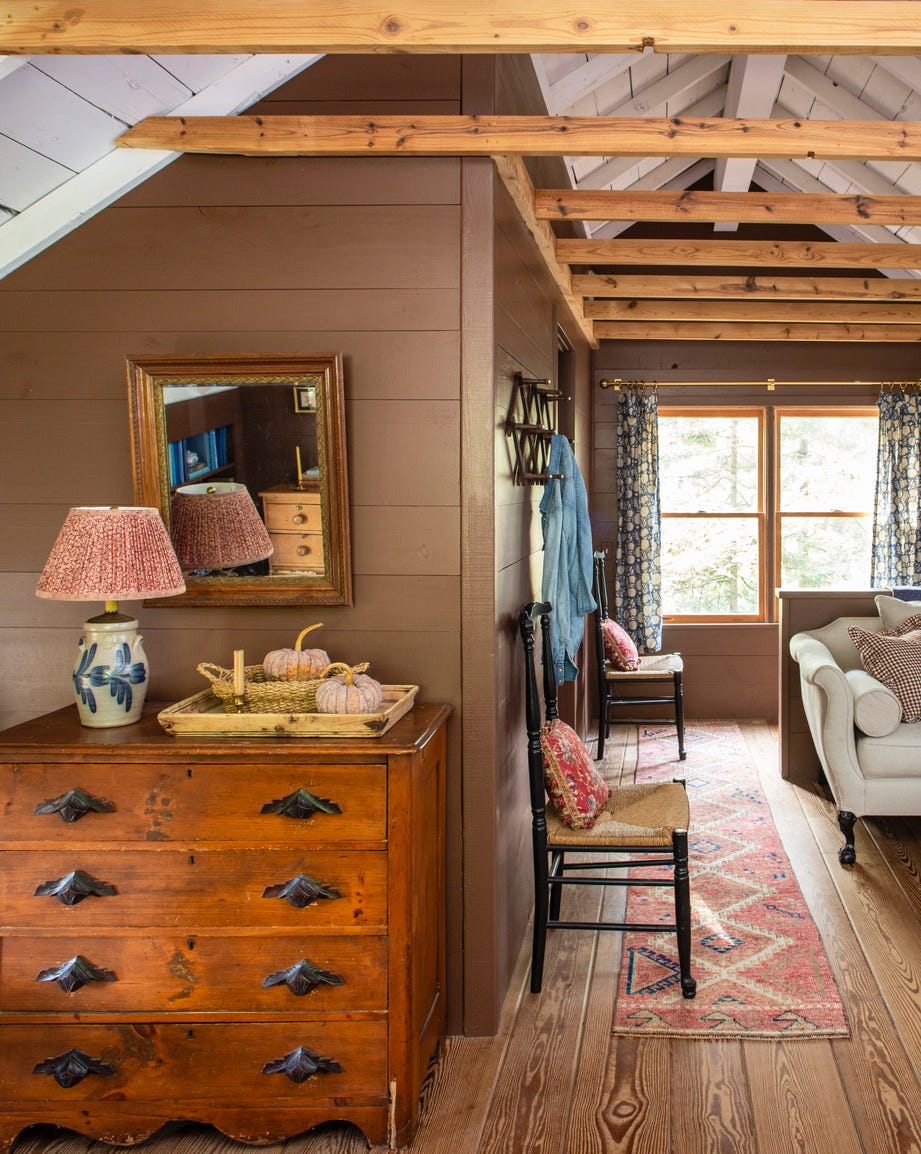
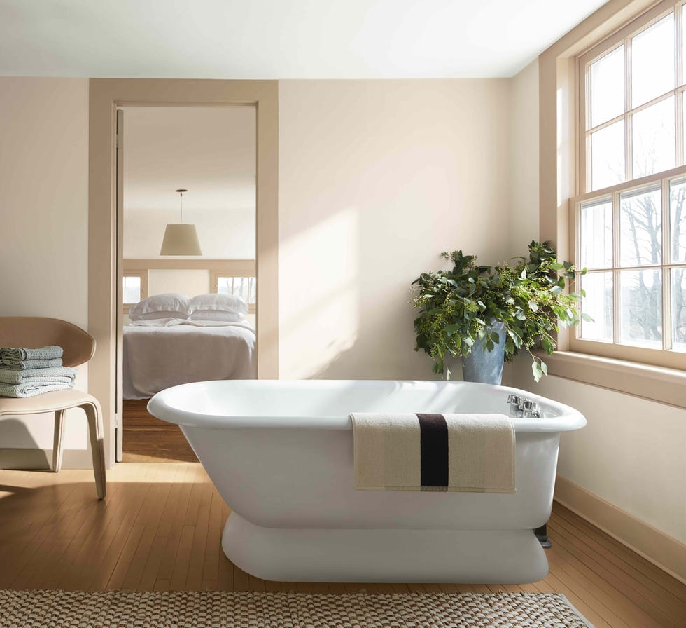
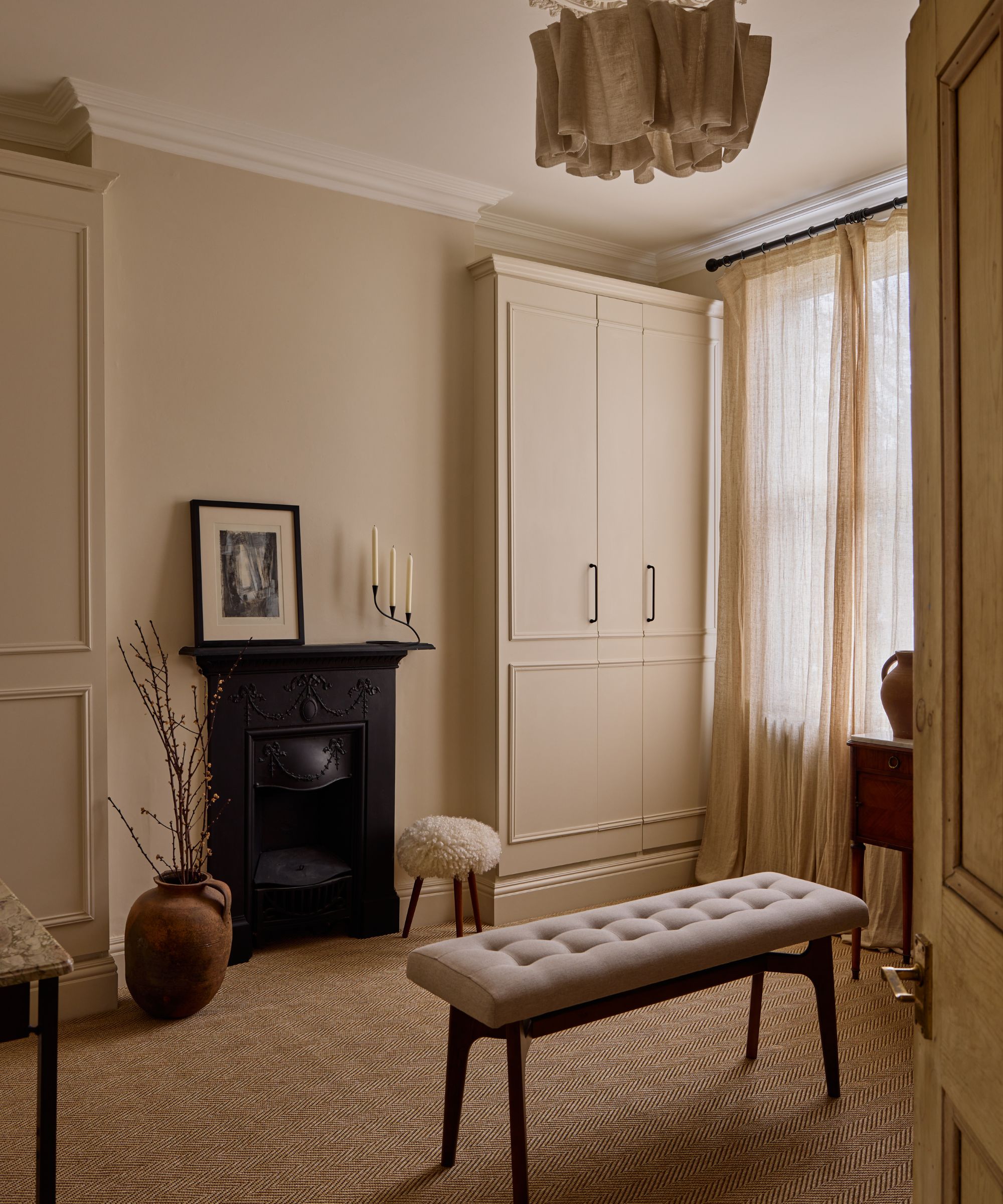
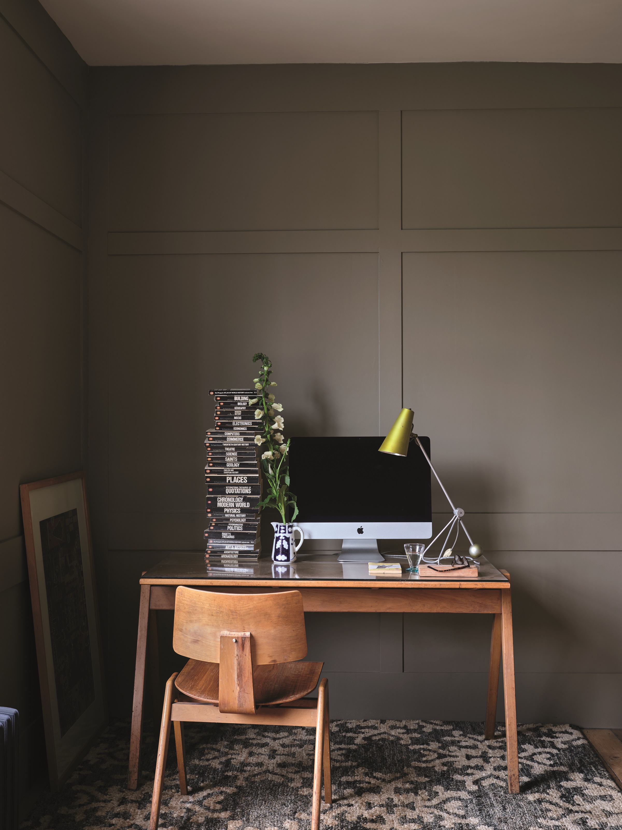
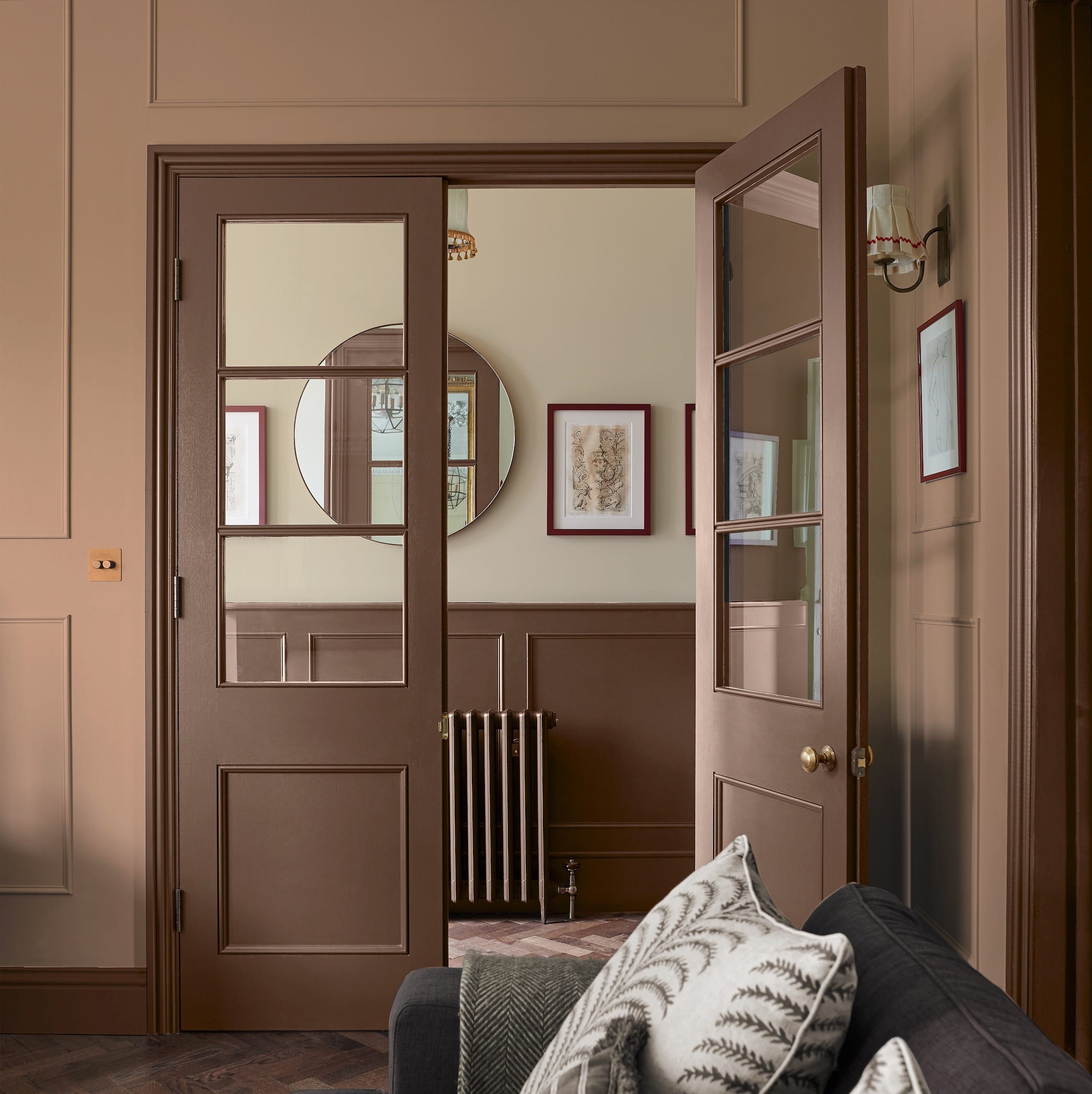
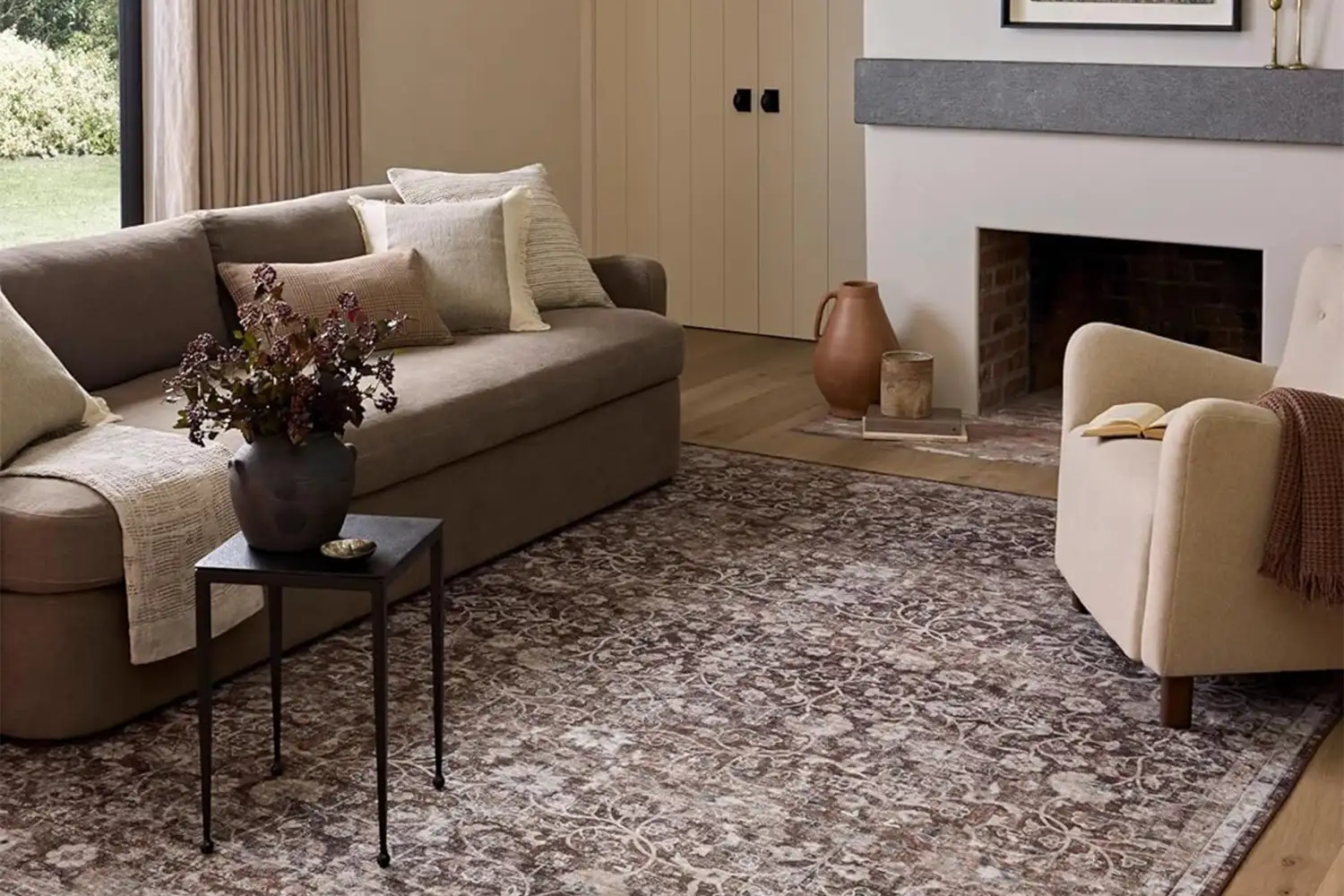
Finally, the article explores pairing brown with other neutrals, such as caramels, taupes, beiges, creams, or whites, to achieve an earthy and timeless look. This approach results in a harmonious and uncluttered living space. When utilizing neutrals, it is suggested to build a palette of four to five shades of brown, varying from light to dark. Main features like flooring, sofas, and worktops should remain neutral, with deeper brown tones introduced through furniture, wood elements, cushions, and linen curtains. Before purchasing, collecting small samples of these elements is advised to ensure cohesion and determine the desired intensity of brown within the design scheme. A selection of brown paint shades from brands like Dulux, Crown, Paint & Paper Library, Farrow & Ball, and Coat is provided to assist in implementing these ideas.
#InteriorDesign #ColorPalettes #BrownDecor #HomeDecor #PaintColors #NeutralTones #CozyHome #MetallicAccents #Pantone #InteriorDesign #ColorPalettes #BrownDecor #HomeDecor #PaintColors #NeutralTones #CozyHome #MetallicAccents #Pantone
0 comment in total
 No comments yet
You may also like
6 best brown paints to embrace the trend for this soft and moody hue
What Colors Go with Brown? Here Are 15 Complementary Shades to Try Now
Why “Quiet Luxury Brown” Is Poised to Be the Most Popular Color of 2024

Brown Is the Decor ‘It’ Color, and Here’s How Interior Designers Are Using It to Create Cozy, Grounded Spaces

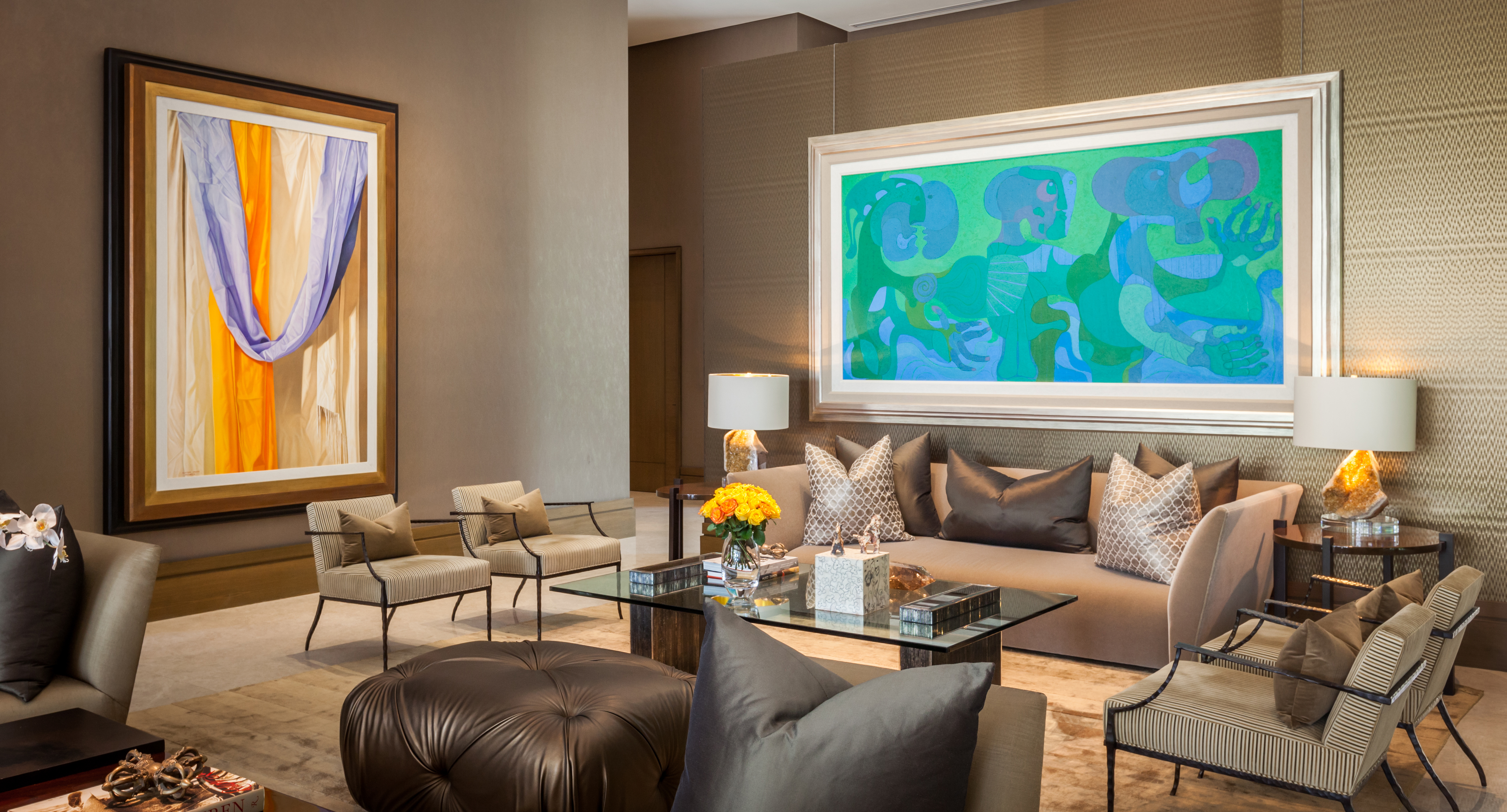
What Colors Go With Brown? 12 Complementary Pairings for This Earthy Neutral

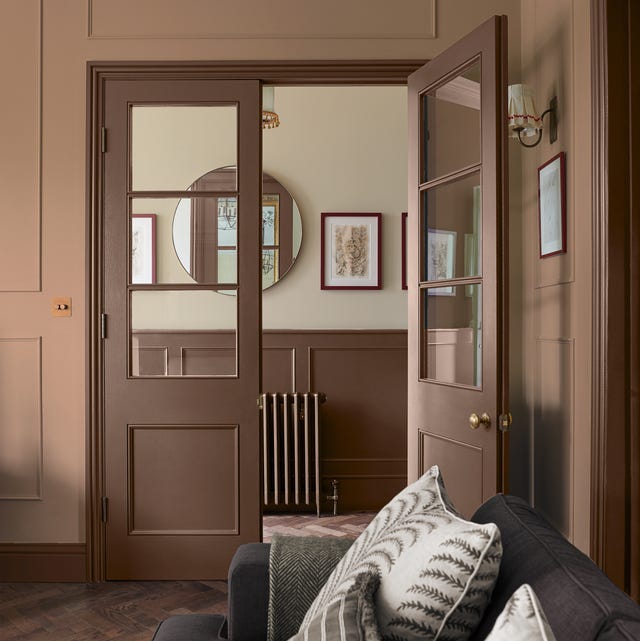
Brown is the colour of the moment — here's how to use it in your home
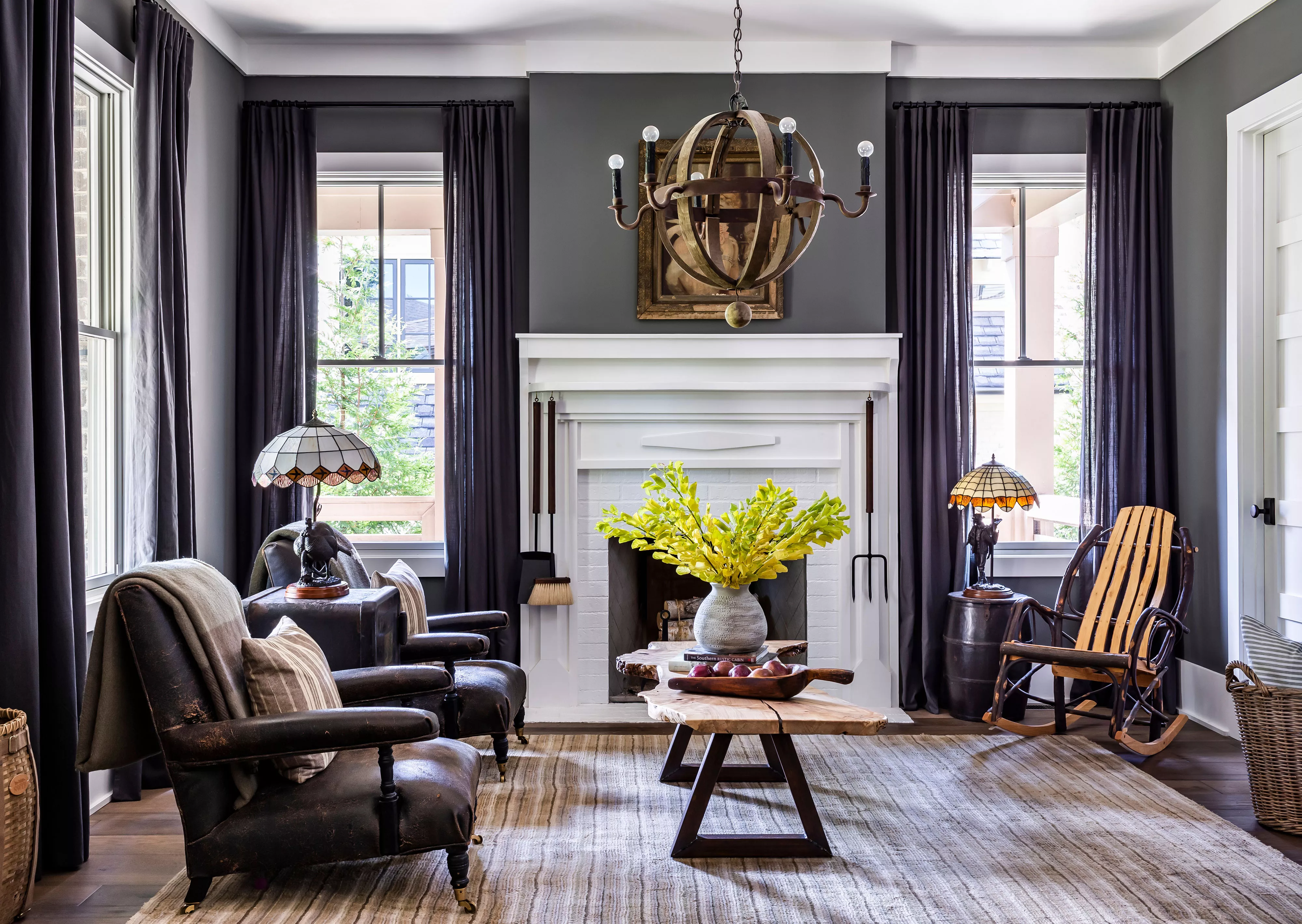
22 Sophisticated Ways to Decorate with Brown

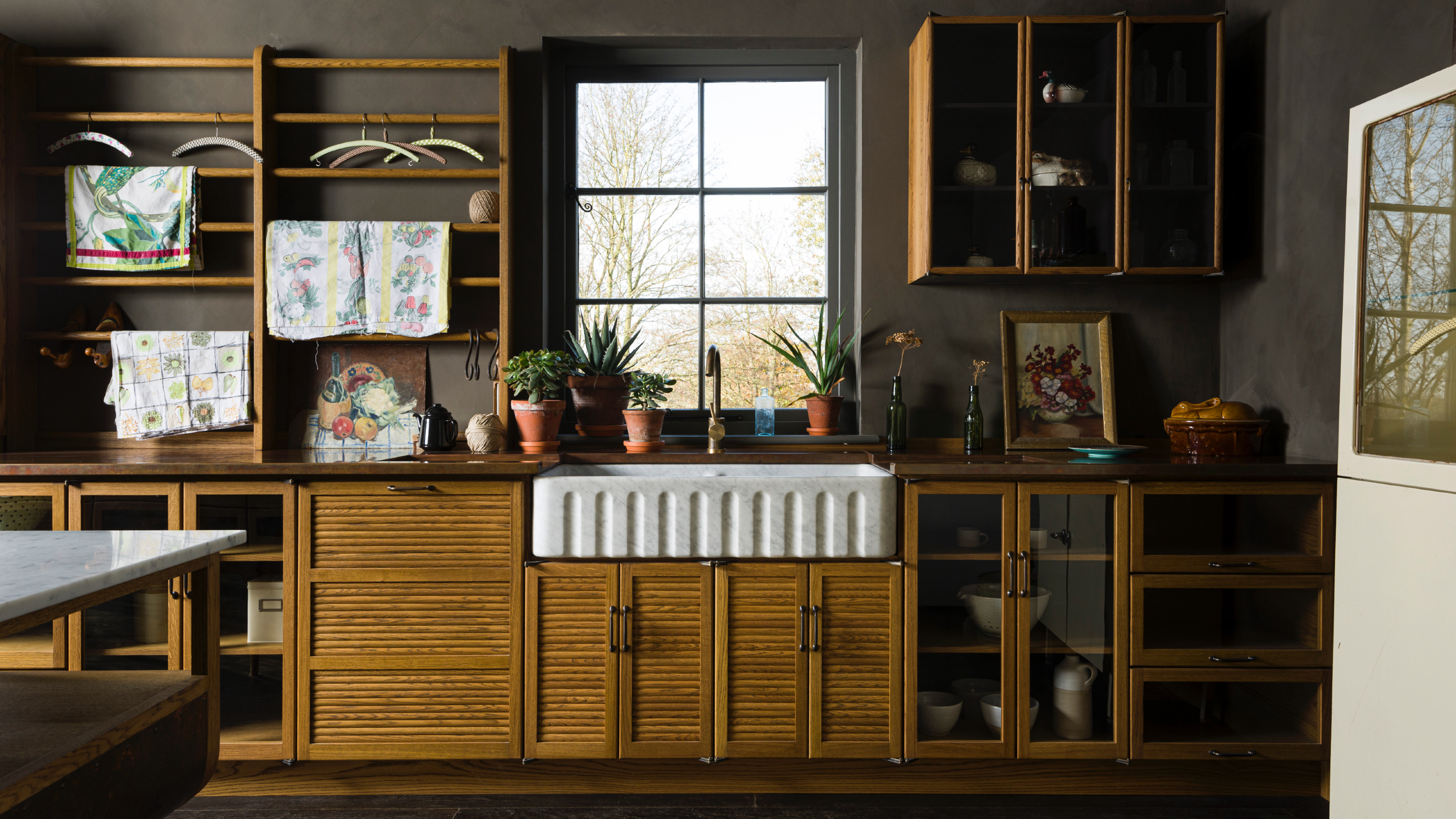
9 brown kitchen cabinet ideas that will introduce you to this versatile color

What colors go with brown? 8 perfect color pairings shared by the experts
23 Colors That Go With Brown to Help You Find the Perfect Palette for Any Room

Benjamin Moore's 2026 Color of the Year Is Brown—Here's What to Pair It With in Your Home
This Farrow & Ball paint color is trending, but it's tricky to decorate with – here's how the experts make it work
11 Elegant Brown Paint Colors for a Cozy Living Space, According to Interior Designers
Brown living room ideas – 16 ways to incorporate this year’s most on-trend colour into your living space
Blue and brown is the unexpected pairing that's more livable than you think

'It's moody, it's cozy, and it looks good with both neutrals and color' – here's why brown is replacing black in interior design
What colors go with a brown couch? 8 of the best colors to elevate this versatile, neutral tone
We’re Calling It Now: Brown is About to Have a Major Design Moment
6 calming and cozy paint colors from Farrow & Ball
6 Gorgeous Home Color Trends That Aren't Just Neutrals