1/10
8 of the Best Neutral Kitchen Cabinet Colors – Real Spaces That Prove These Shades are Timeless
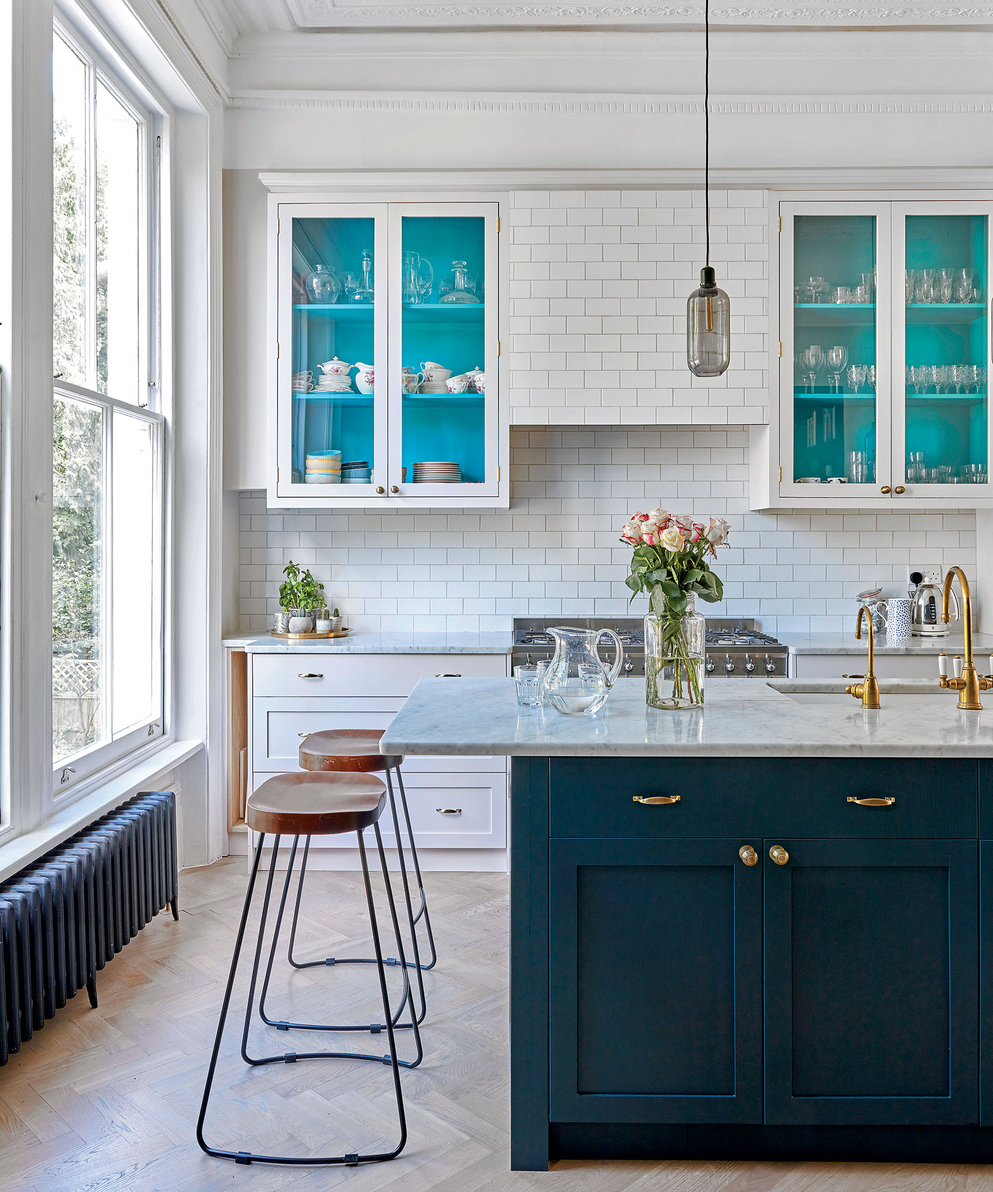
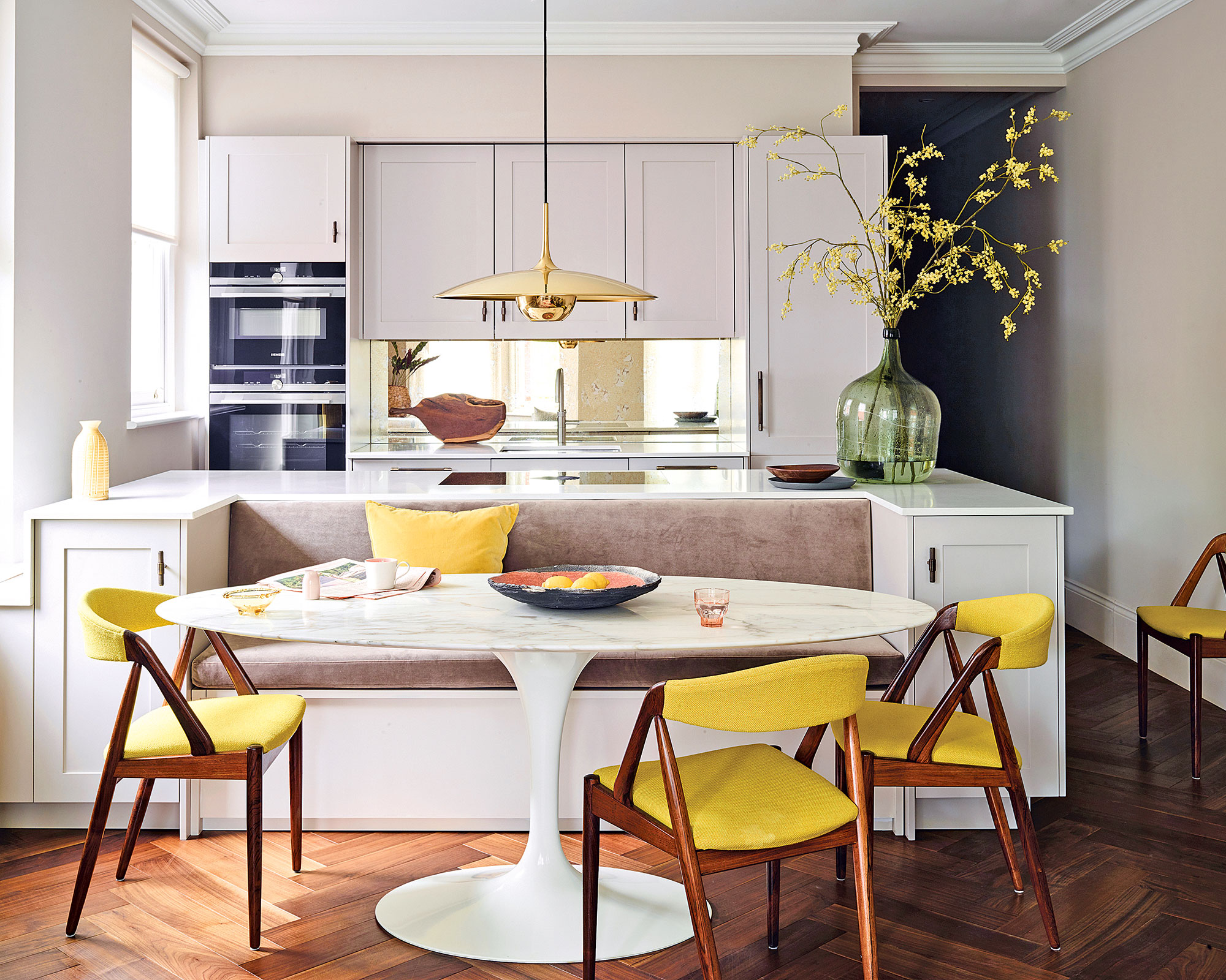
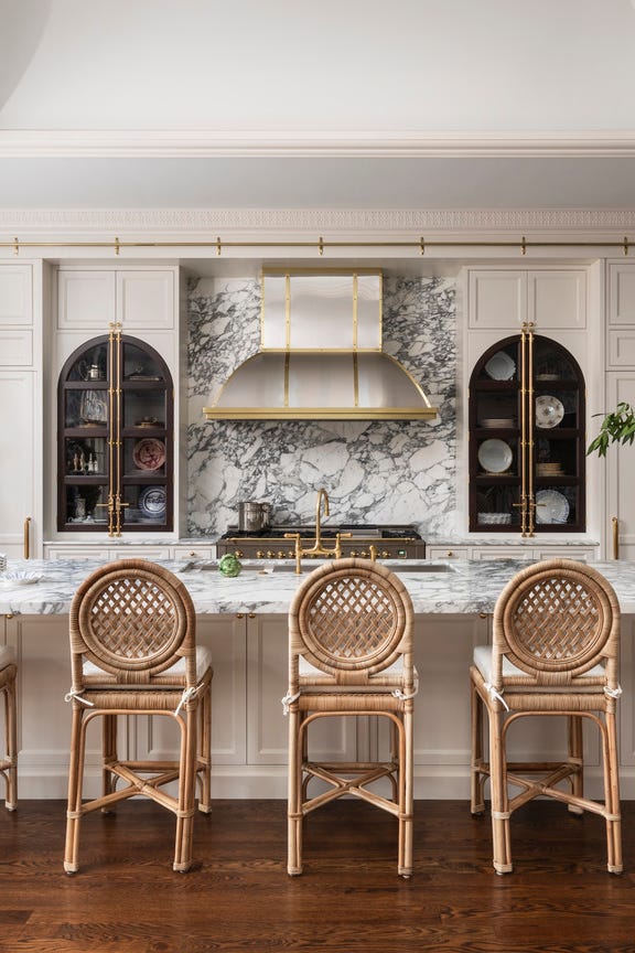
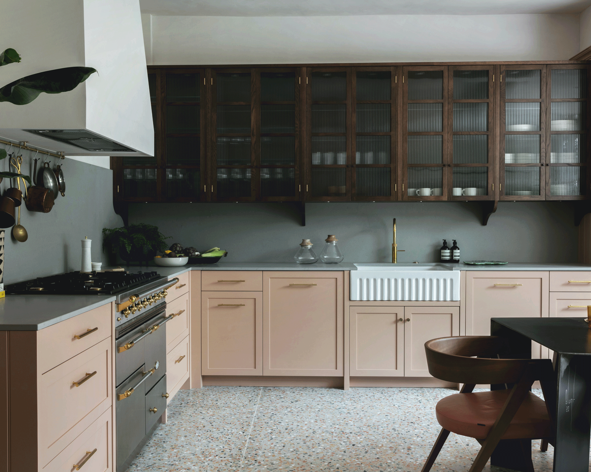
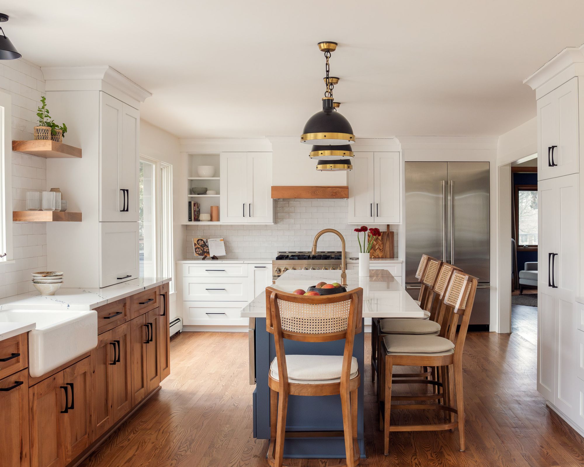
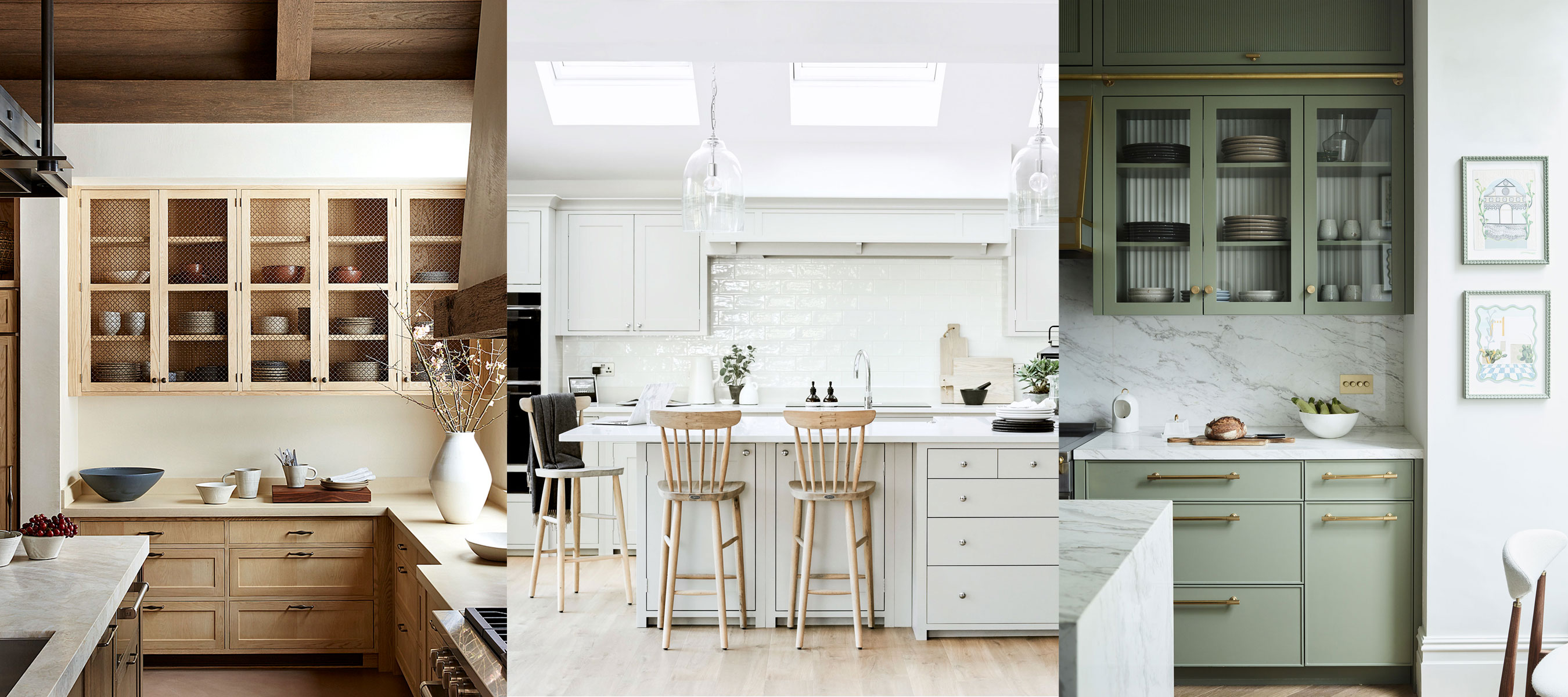
The article explores the enduring appeal and versatility of neutral colors for kitchen cabinetry, offering a counter-narrative to the current trend of strong, saturated palettes in interior design. It emphasizes that neutral shades, whether pale and peaceful or earthier, provide a timeless aesthetic, making them a practical and stylish choice for high-traffic, costly-to-redecorate areas like kitchens and bathrooms. The content delves into various interpretations of neutral kitchen design, ranging from classic white-and-wood schemes to desaturated versions of more vibrant colors, such as creamy beige with mustard undertones or grey with a subtle hint of green.
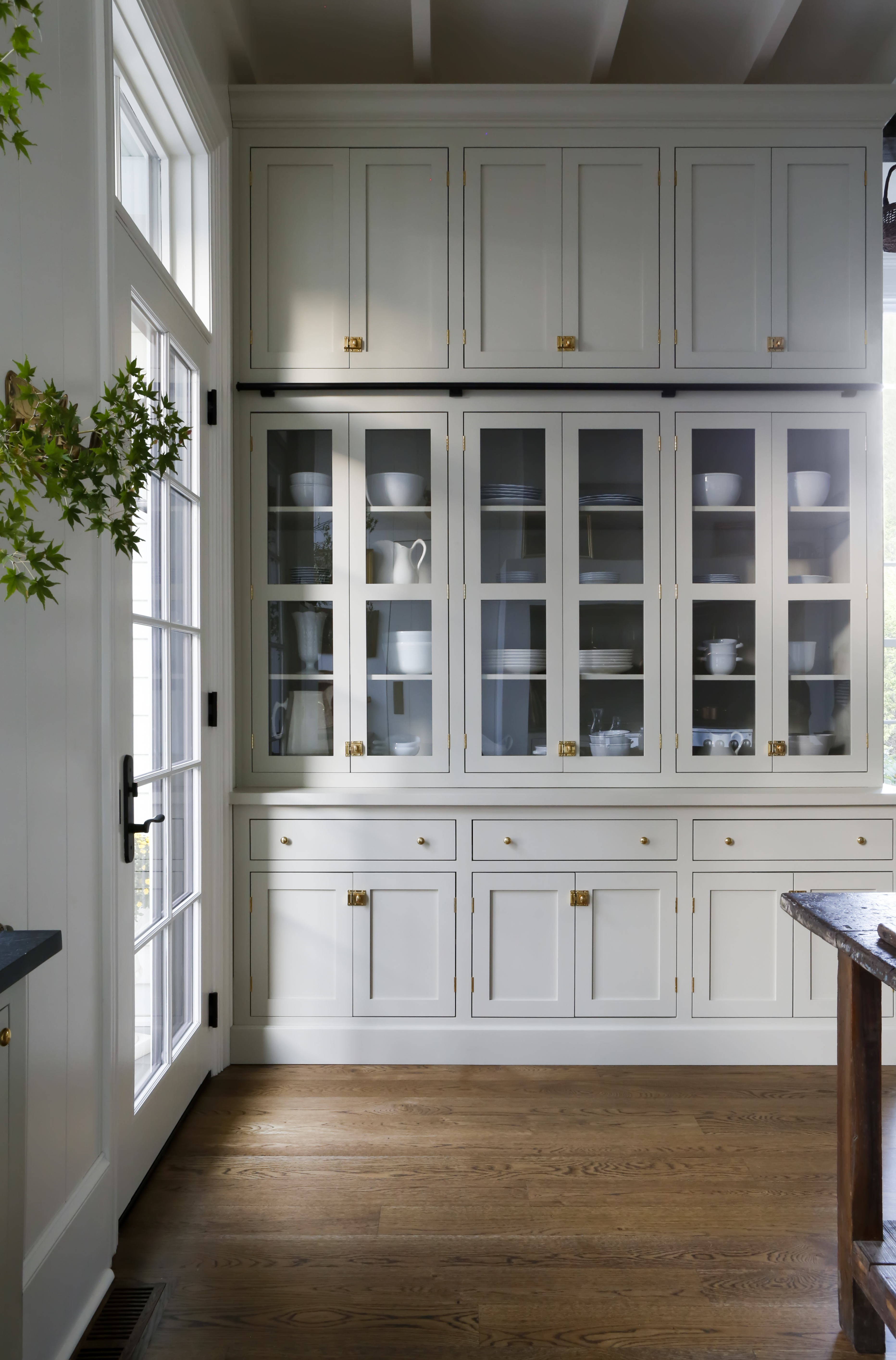
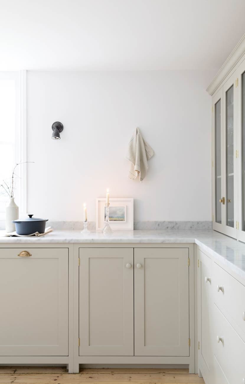
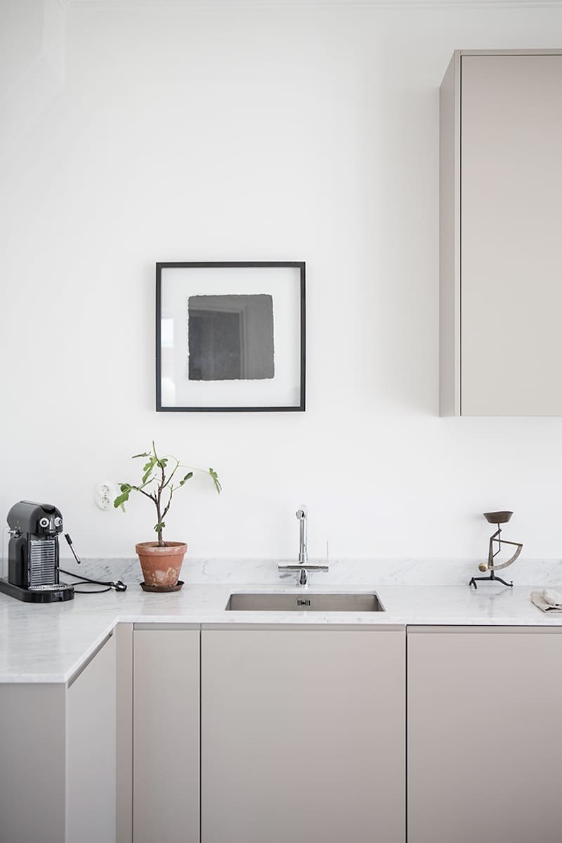
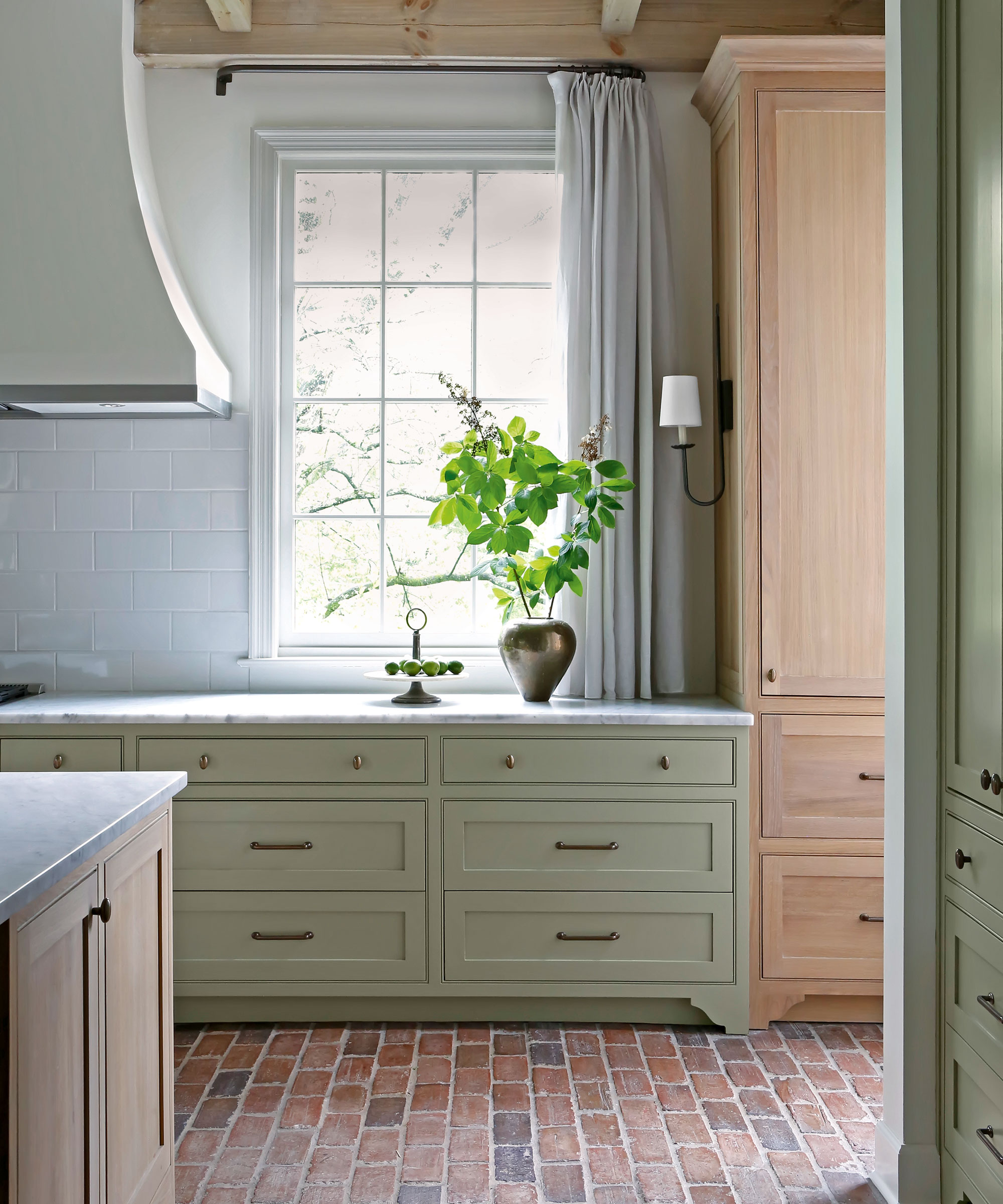
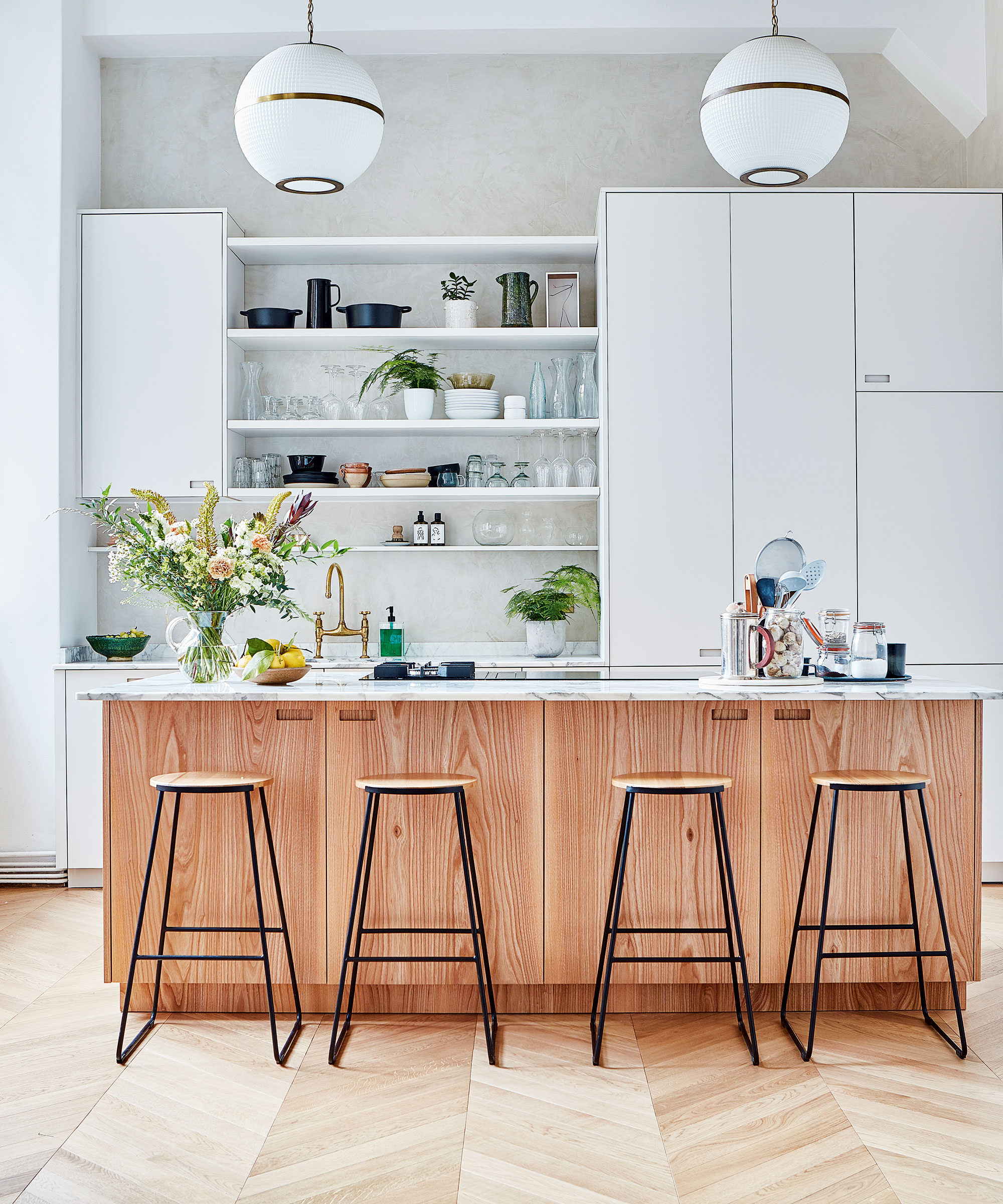
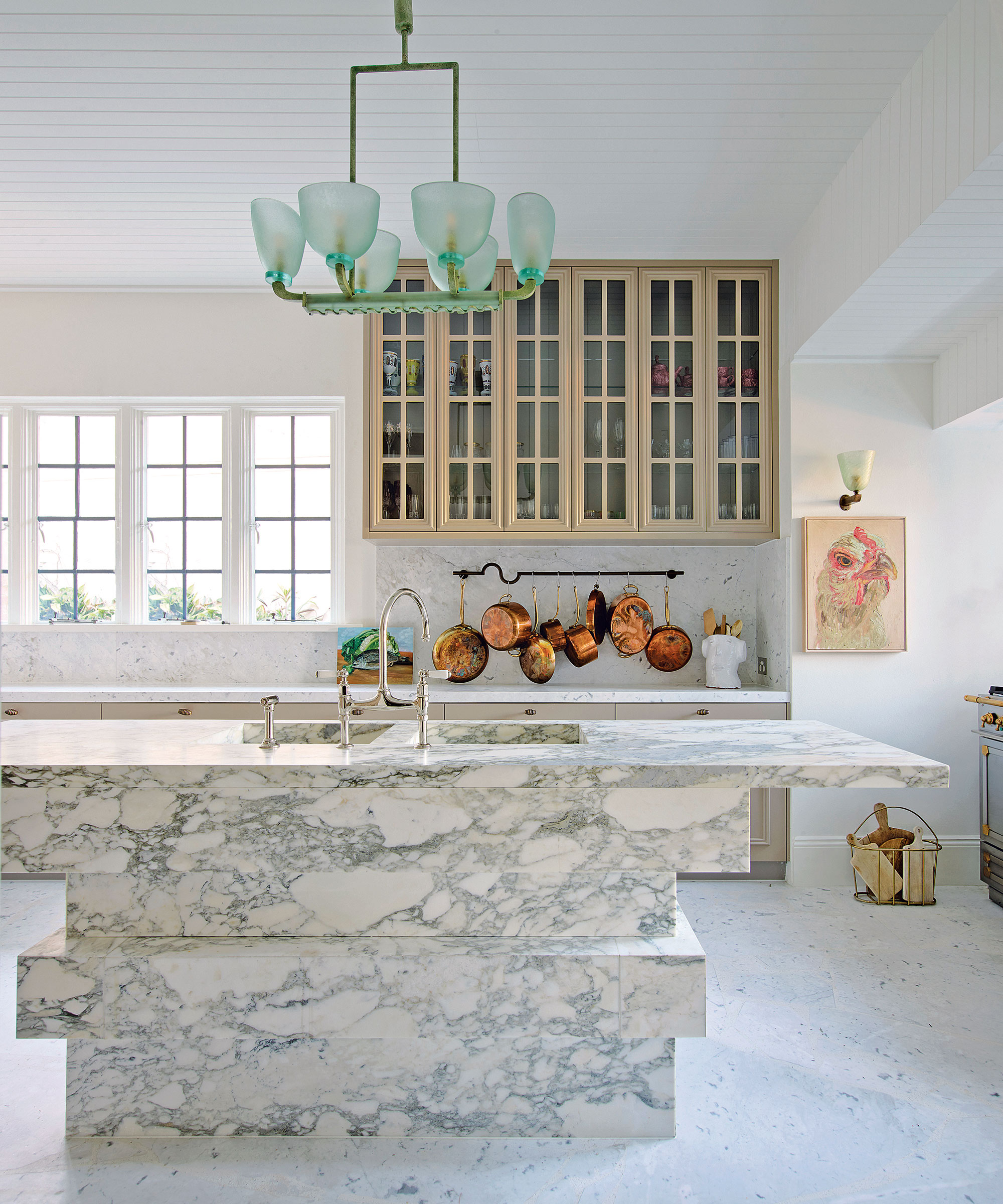
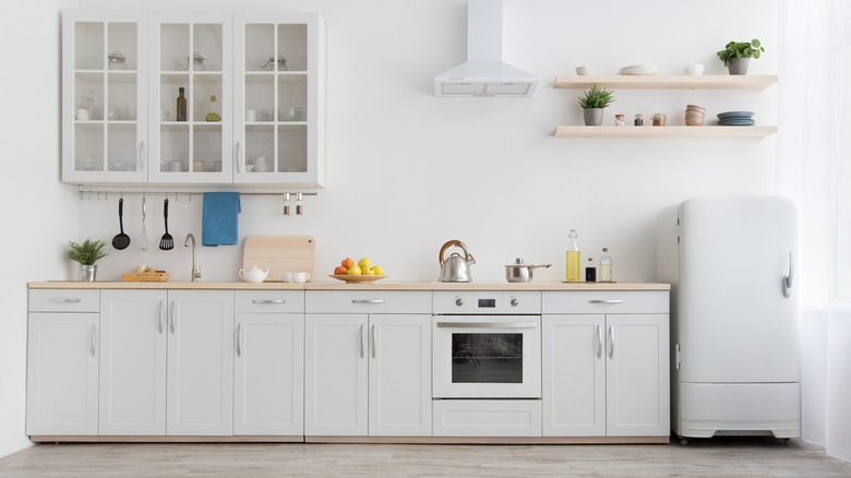
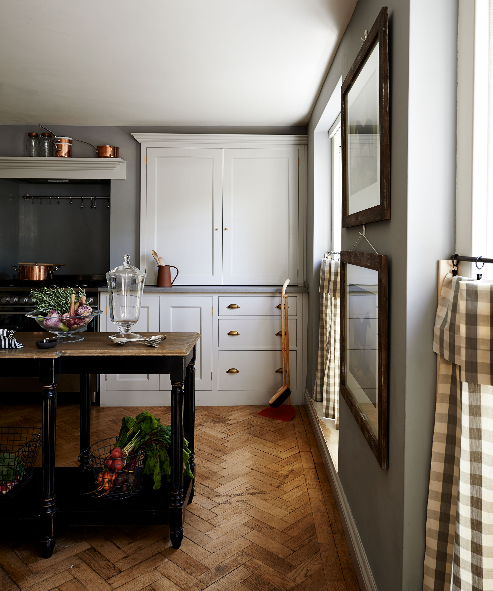
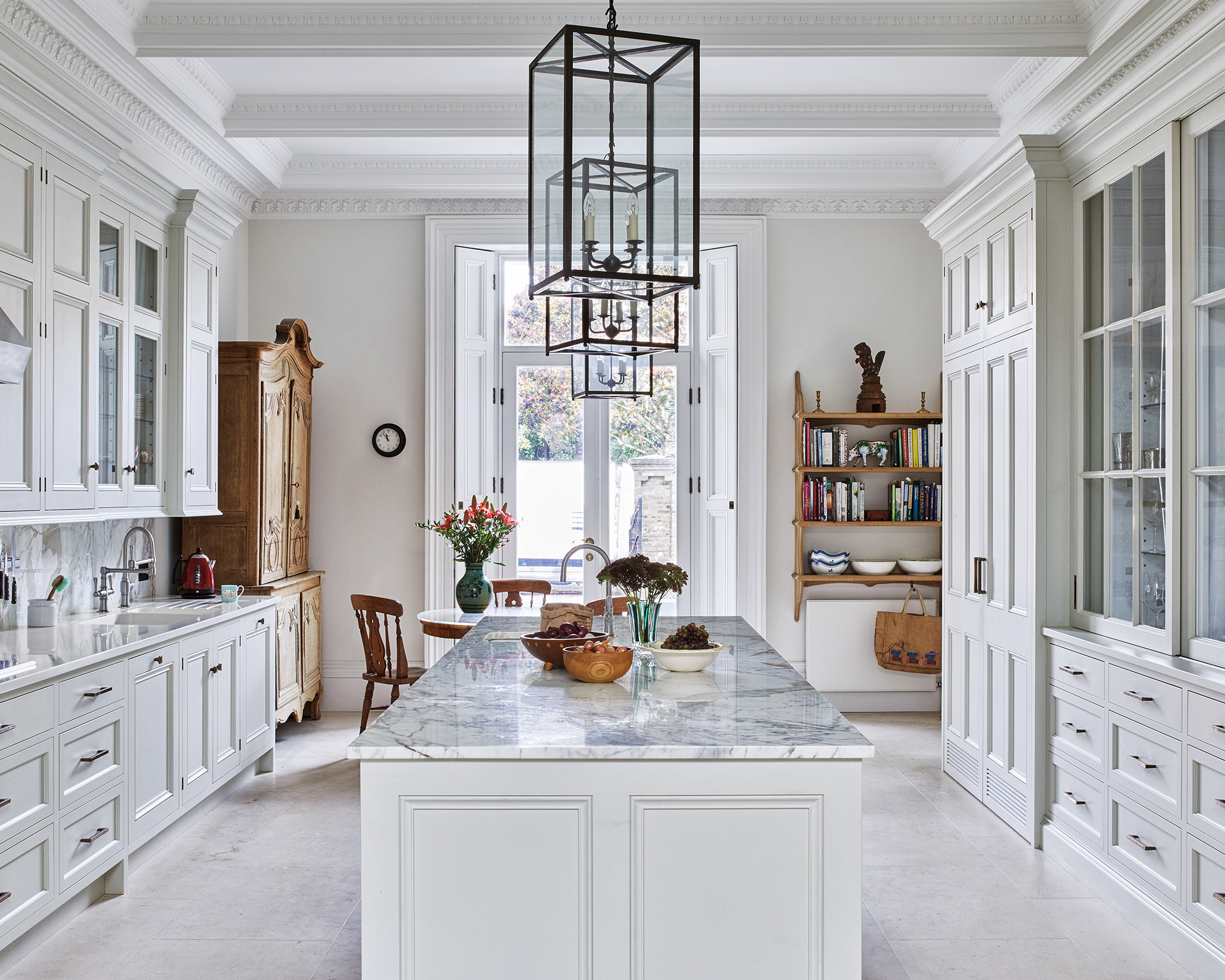
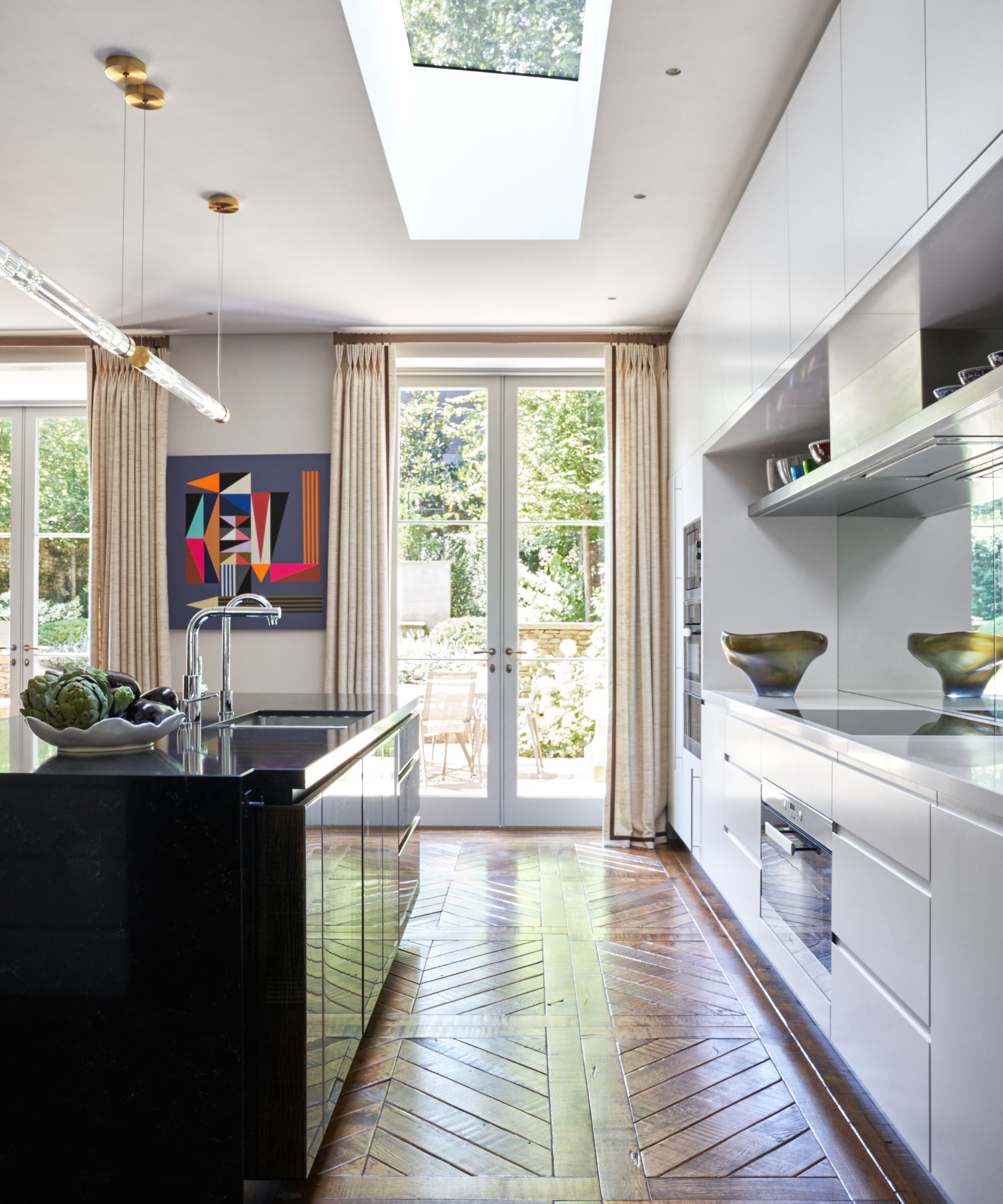
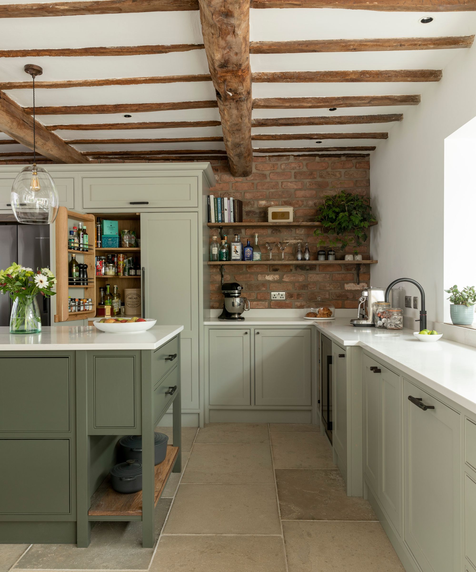

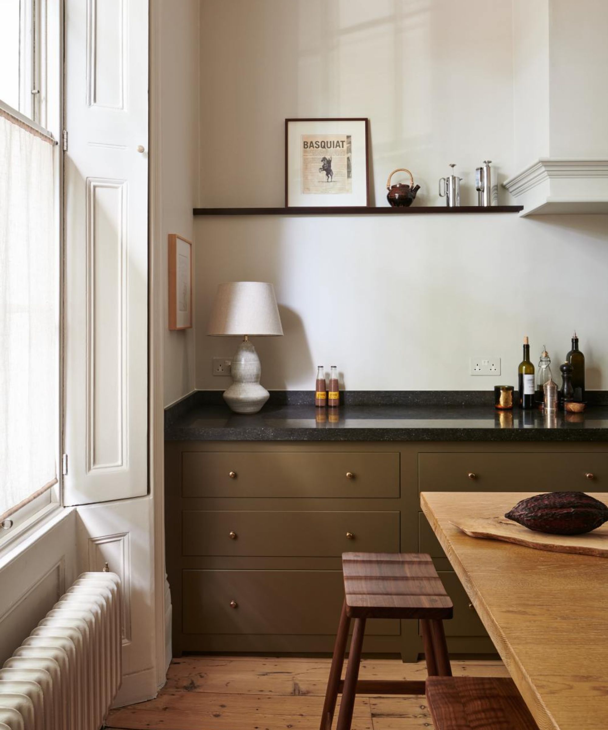
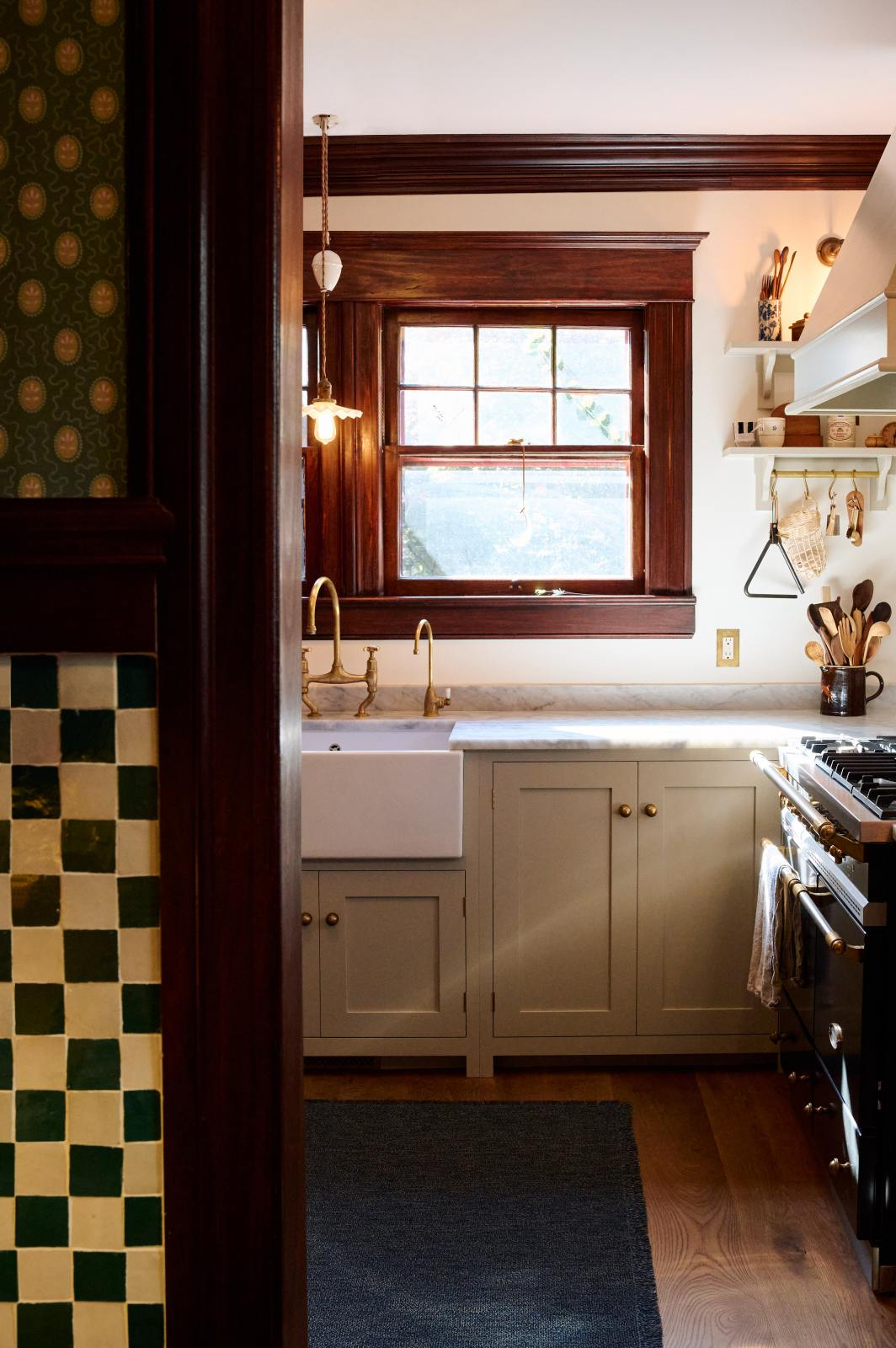
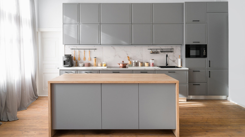
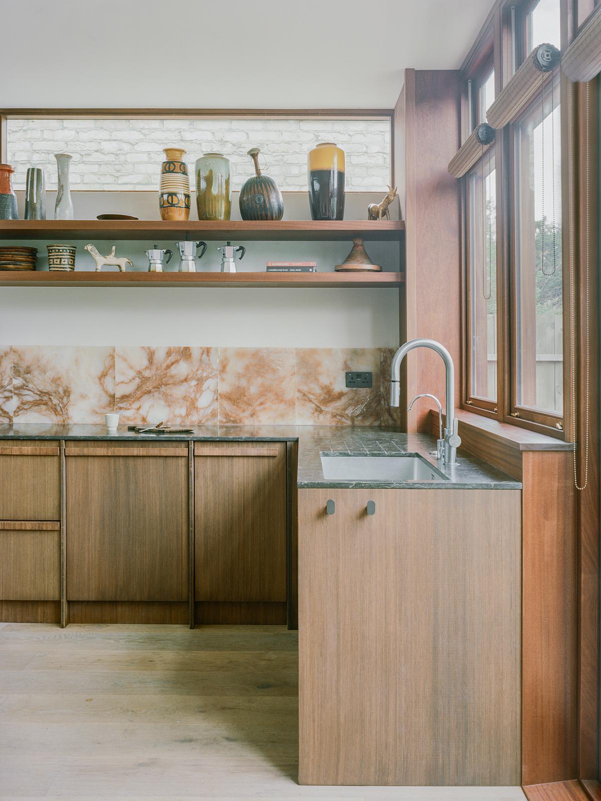
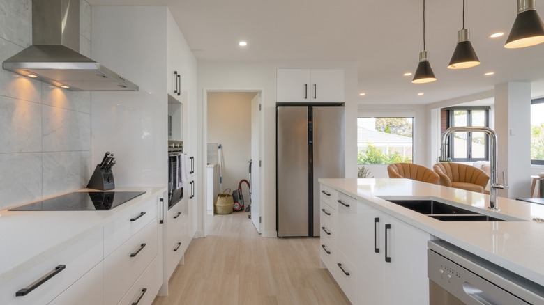
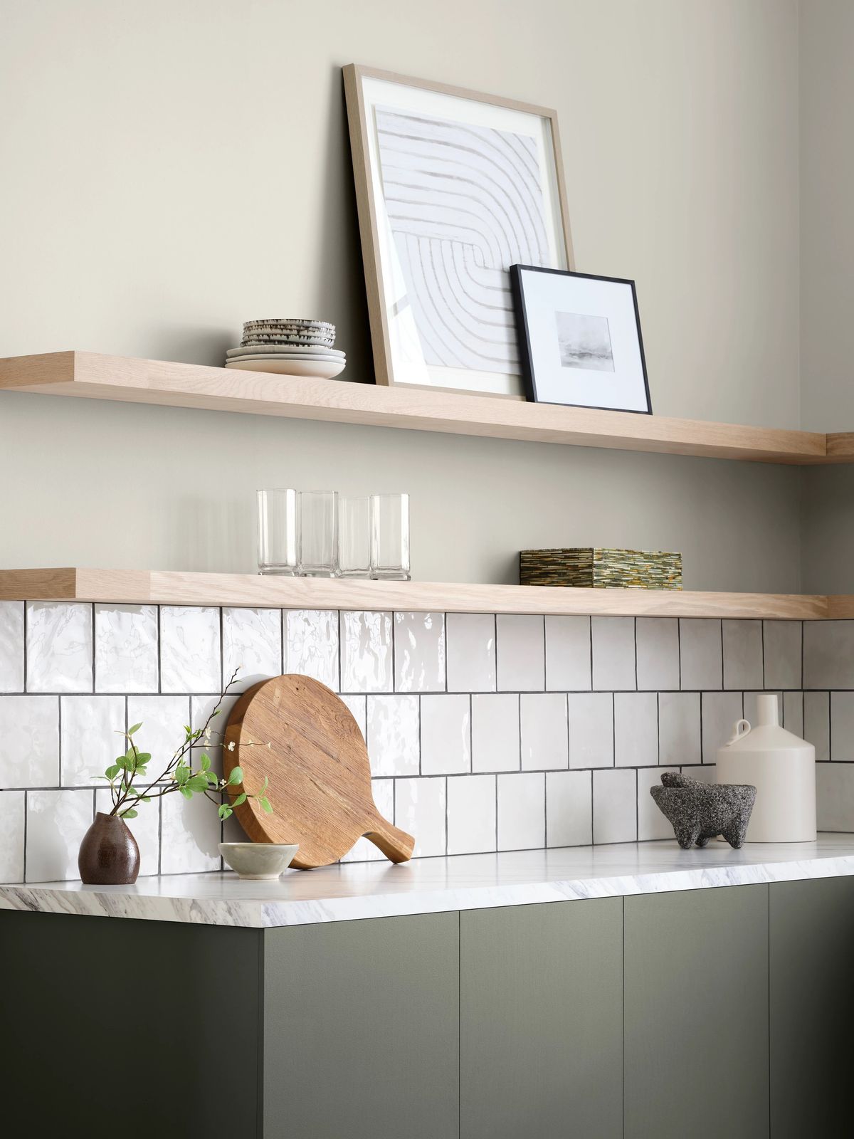
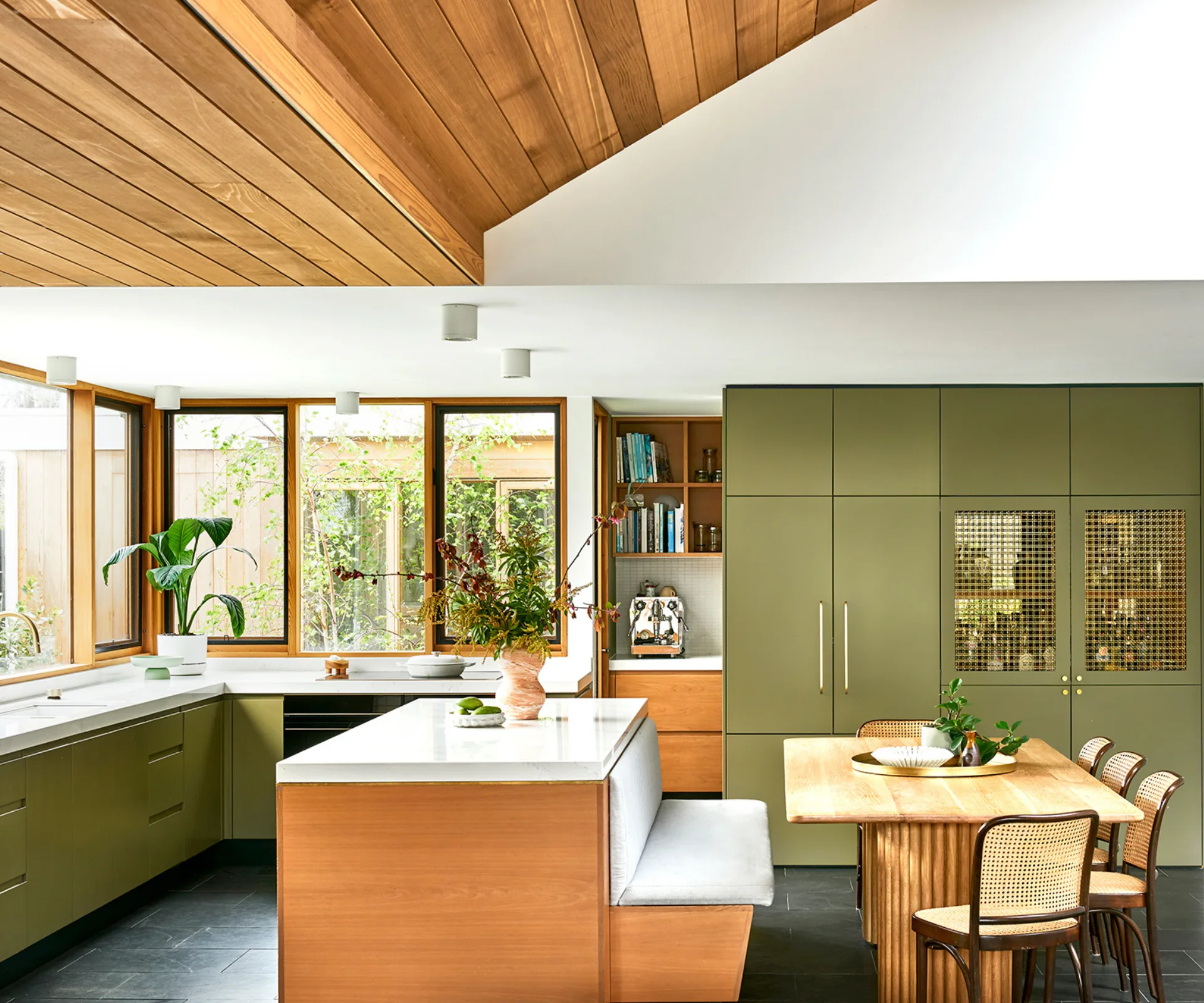
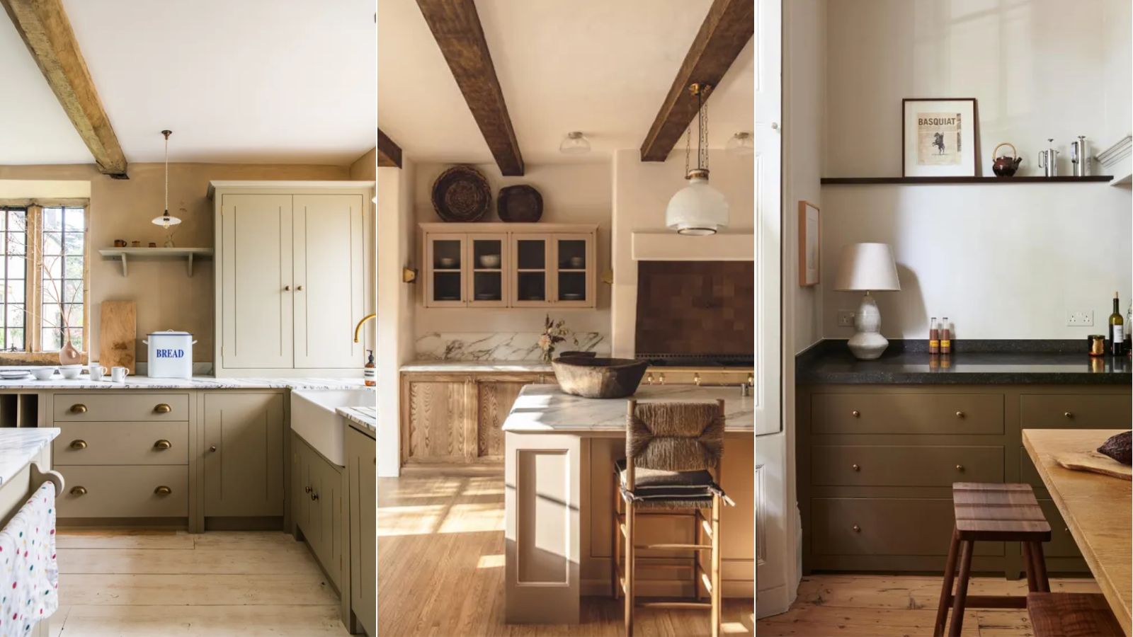
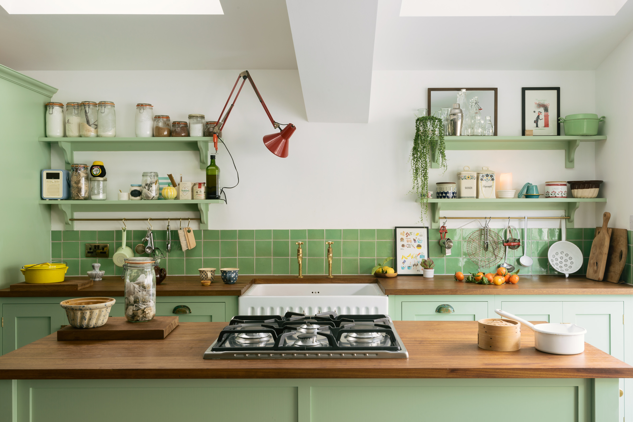
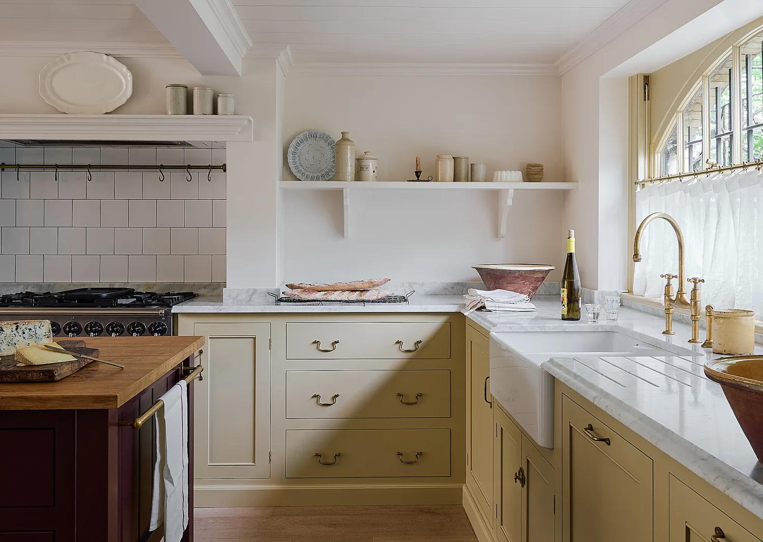
The article showcases eight specific examples of neutral kitchen cabinet colors, demonstrating how these shades can be transformative in diverse settings. The first example highlights dark khaki, illustrating how this deep, muddy greenish-brown provides a visual bridge between darker elements and off-white walls, creating a brighter interior while complementing warm wooden tones. Helen Parker, creative director at deVOL, notes that this color works well with soft-white walls. The second example features clean white, presented through a serene, minimalist kitchen designed by Pella Hedeby in collaboration with Nordiska Kök. This design uses white, minimalist doors and textural limestone worktops to achieve a calm and harmonious feel, with Johan Lundkvist of Nordiska Kök emphasizing the sleek design's compatibility with handmade Zellige tiles.
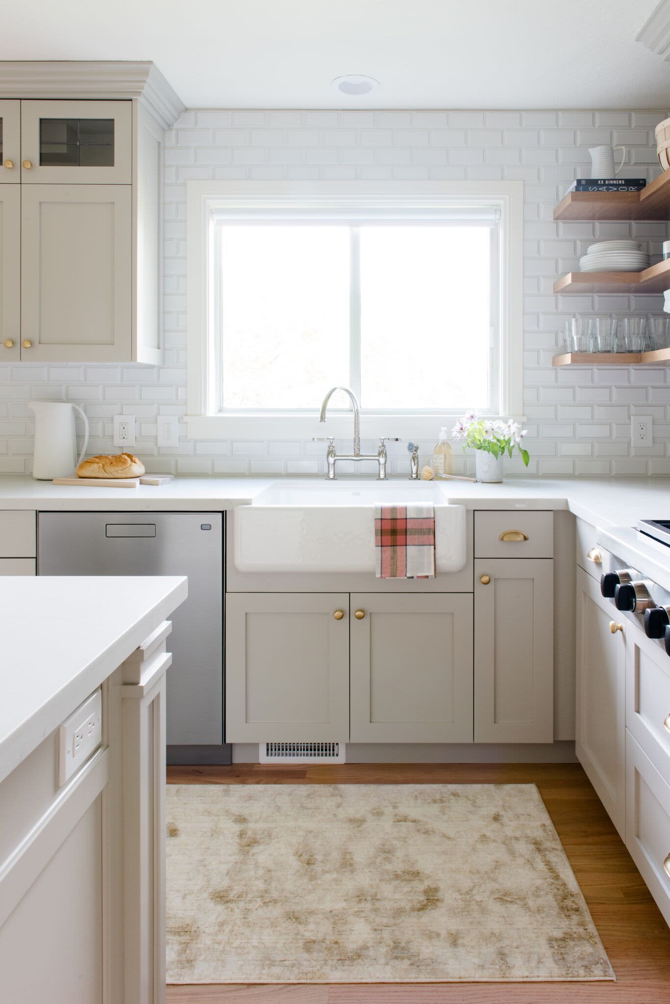
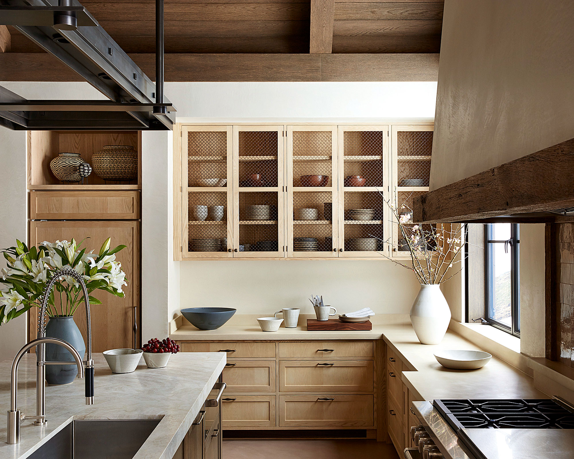
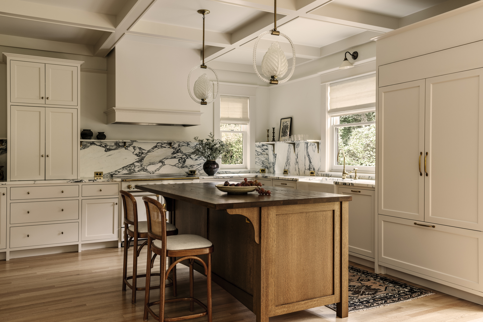
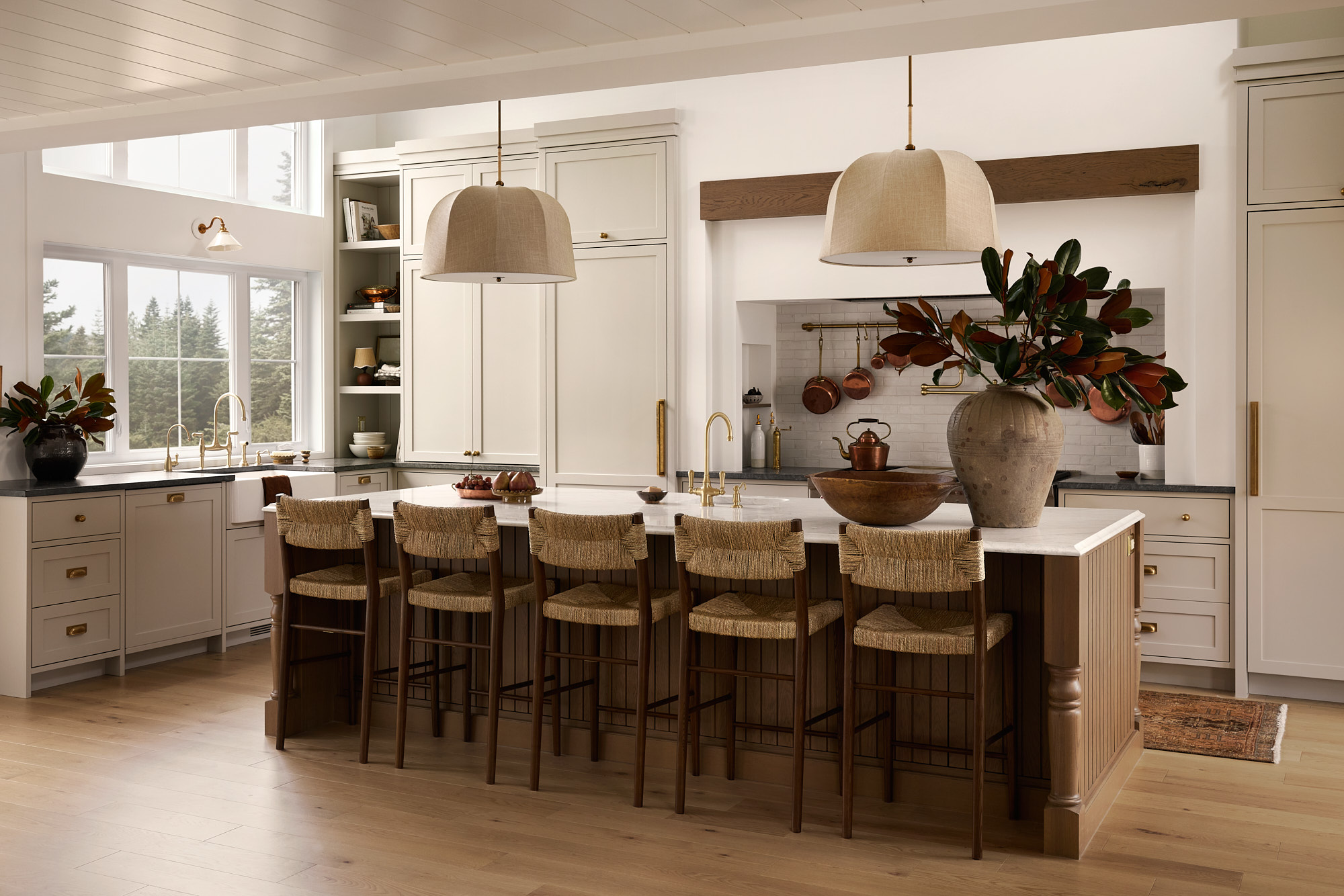
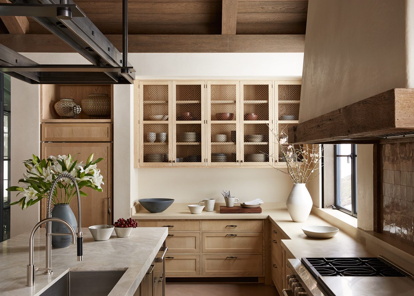
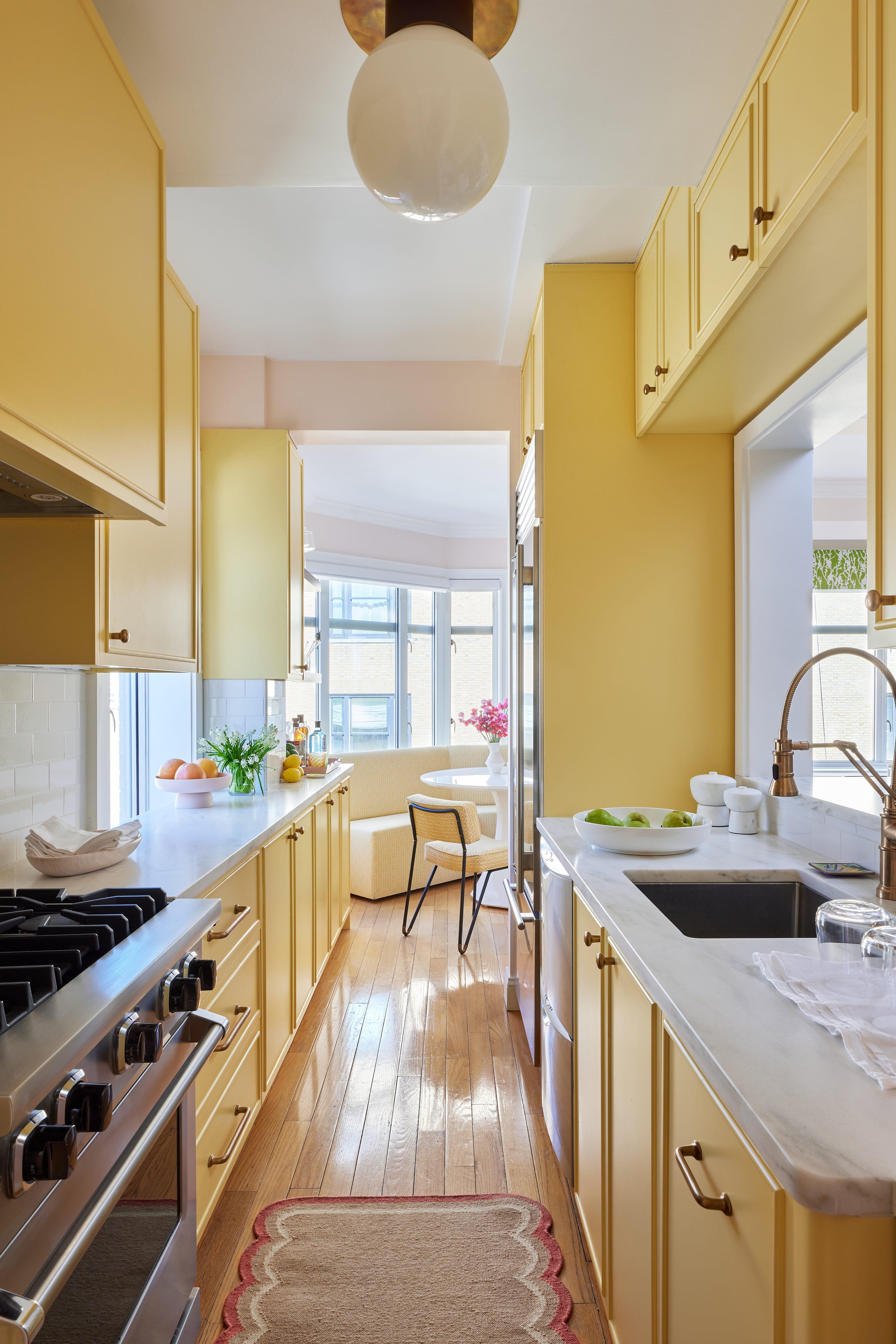
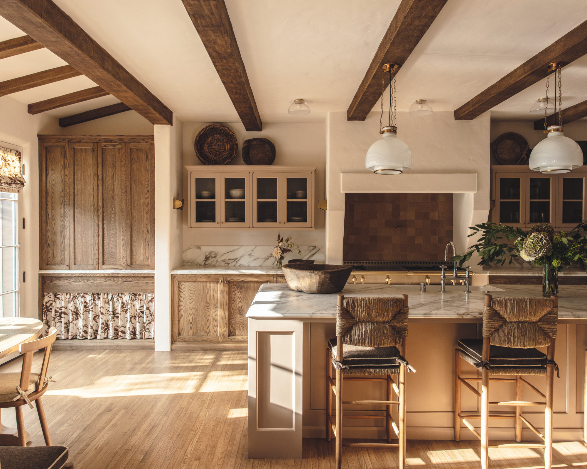
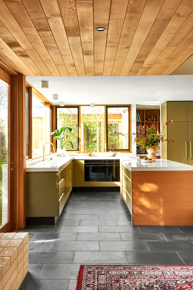
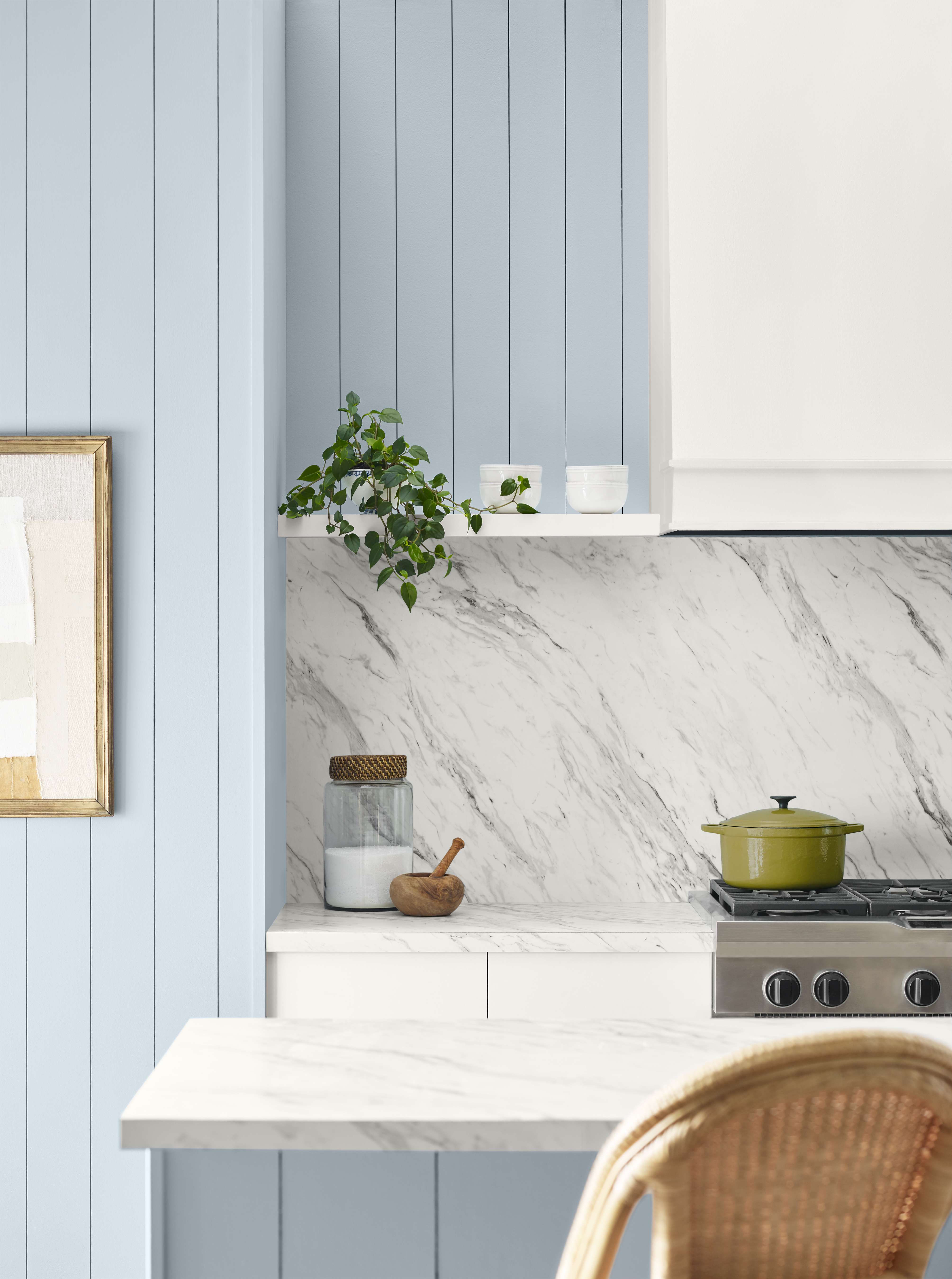
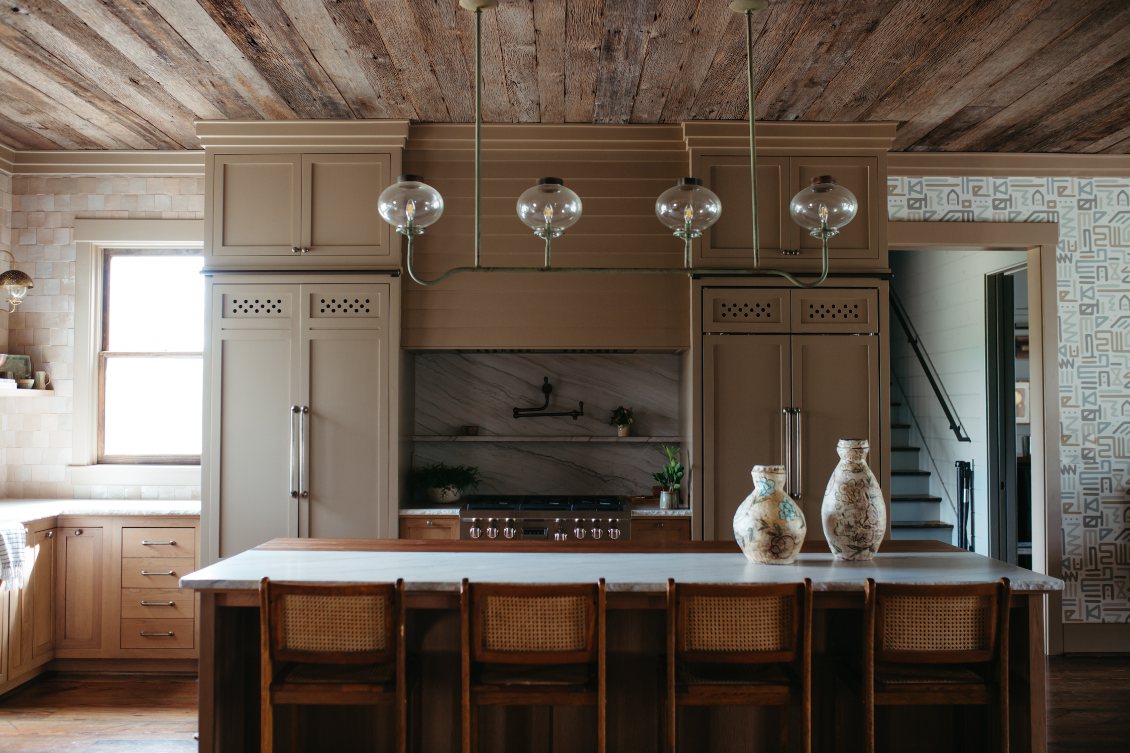
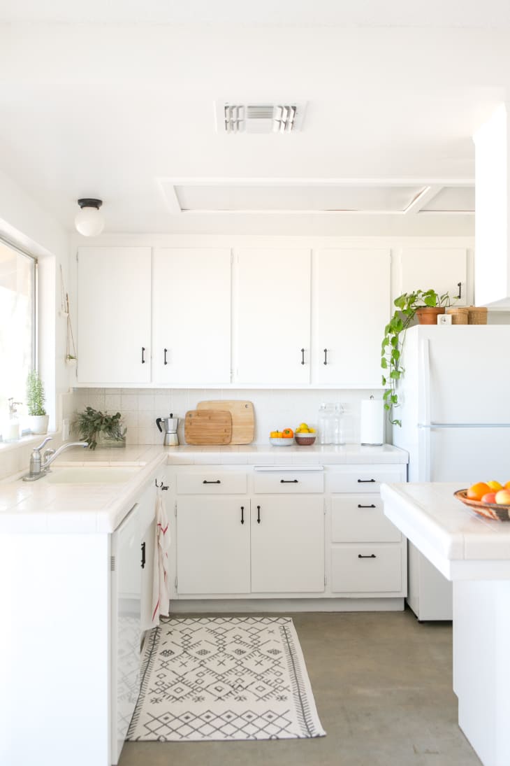
Earthy taupe is the third neutral discussed, exemplified by a modern kitchen refreshed by Avenue Design Studio. Principal Holly Marder explains the use of Mouse’s Back by Farrow and Ball, a dark neutral, alongside lime-plaster walls and exposed brick to reintroduce character into a stripped property. The fourth option, pale grey, is presented as an alternative to harsh white for those seeking a bright yet airy space. Californian interior designer Katie Monkhouse combined powdery grey cabinets with warm, dark wood in a 1930s San Francisco home, aiming to bridge the gap between white walls and dark timber. The fifth example features comforting cream, found in a painstakingly restored 1760s captain's cottage by interior designer Blair Moore. Moore chose a custom, less saturated version of a cheerful mustard, offering a richer take on a classic cream kitchen.
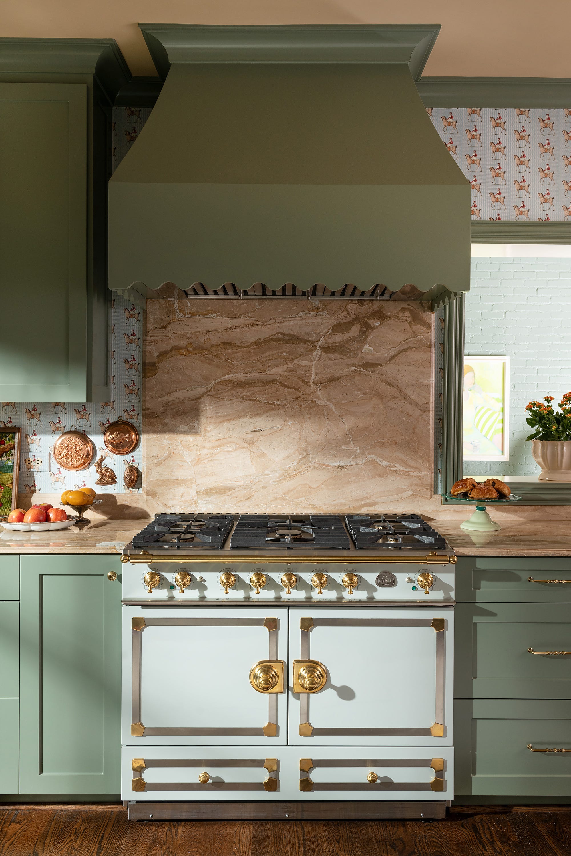

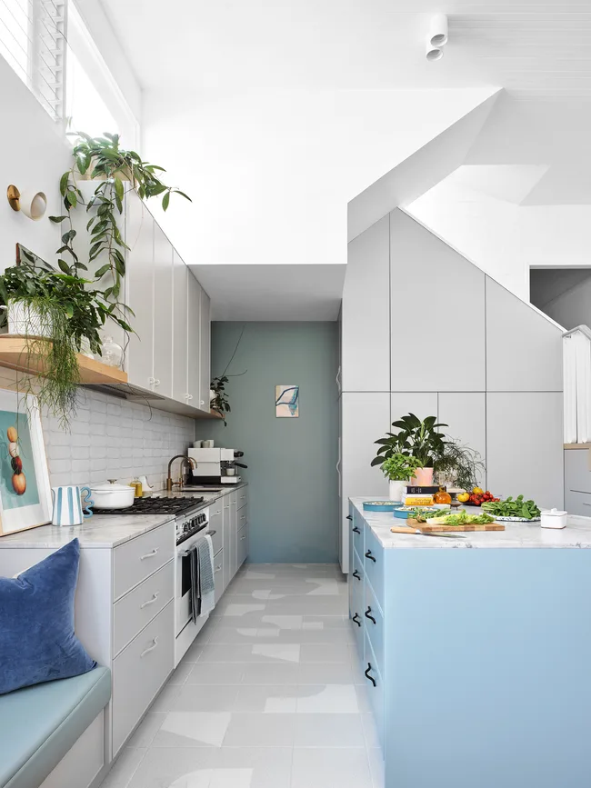
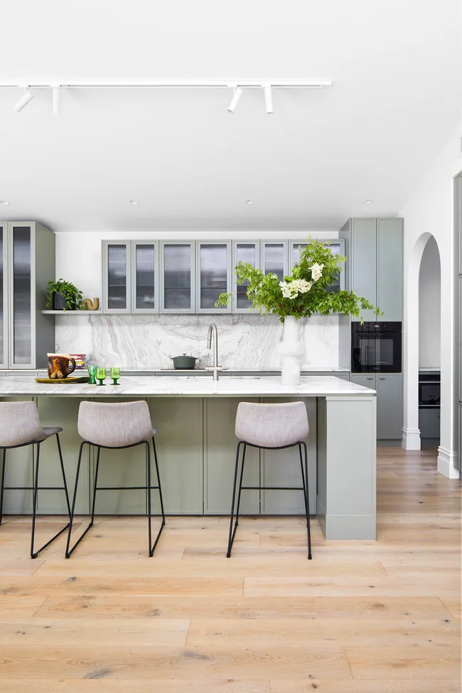
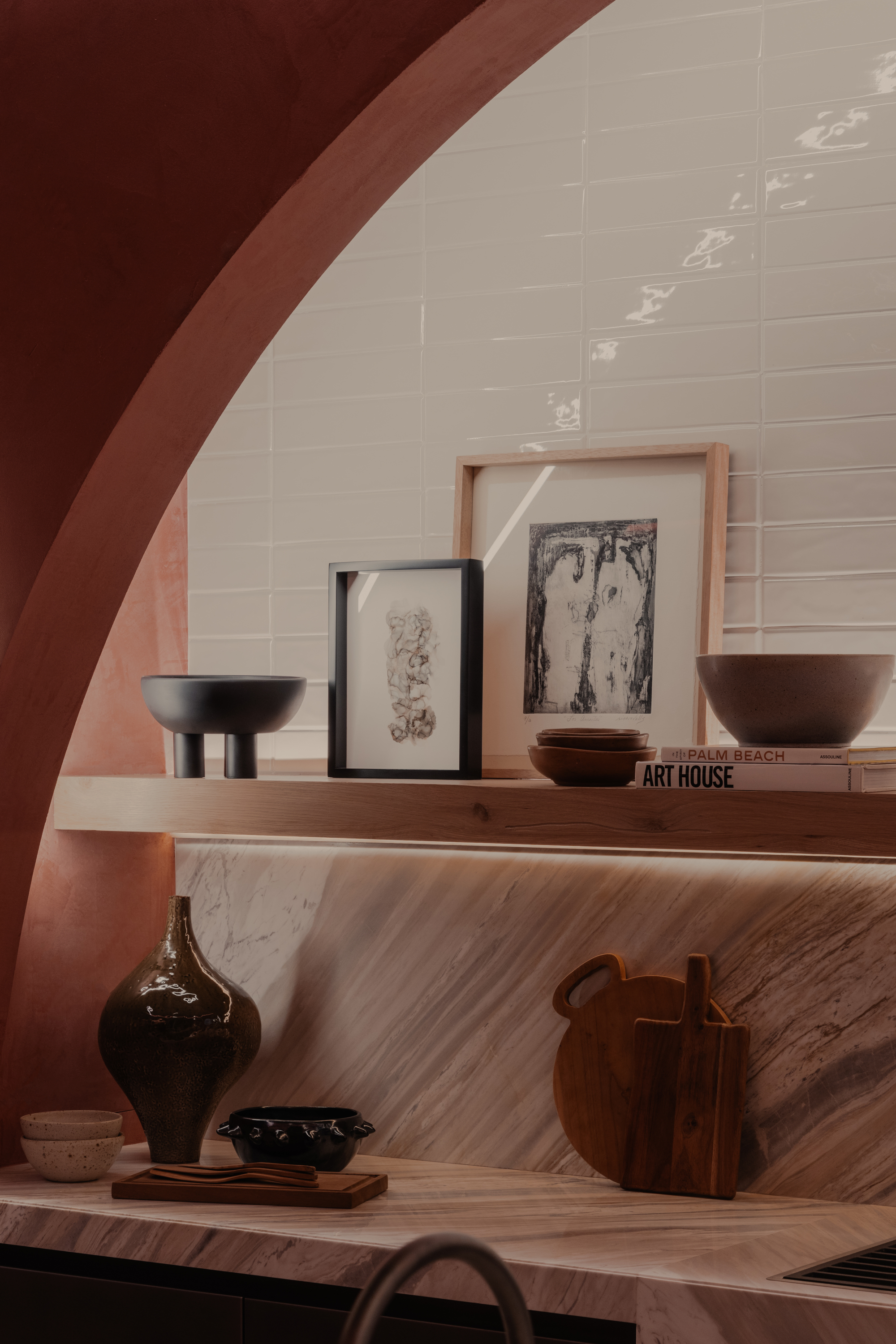
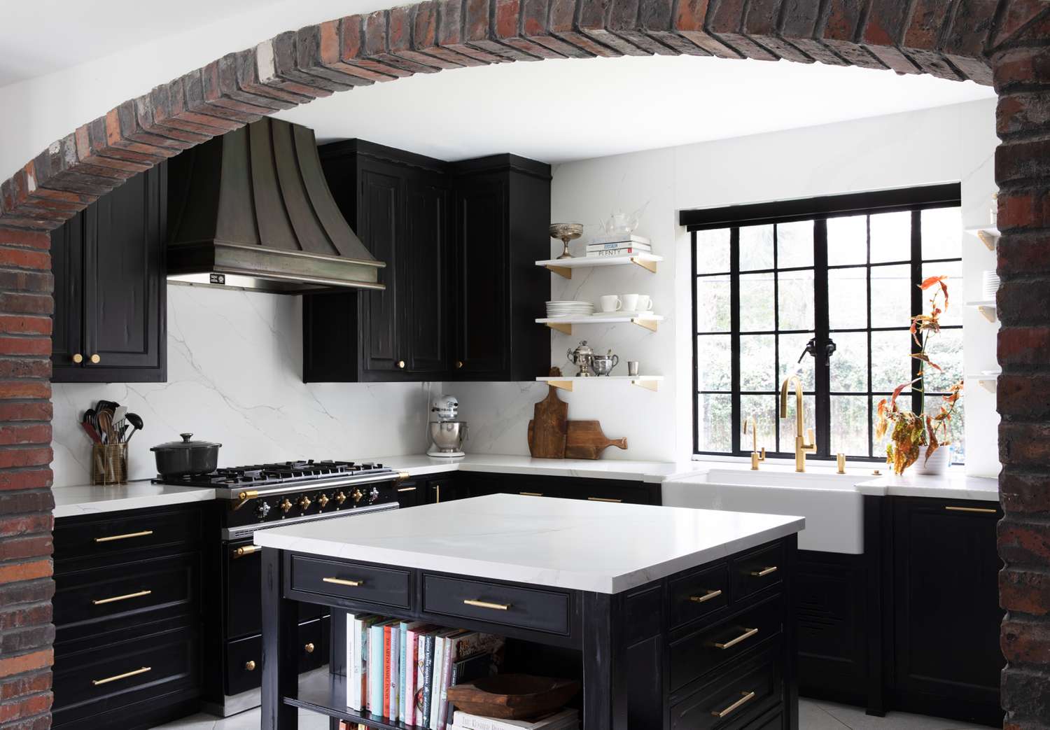
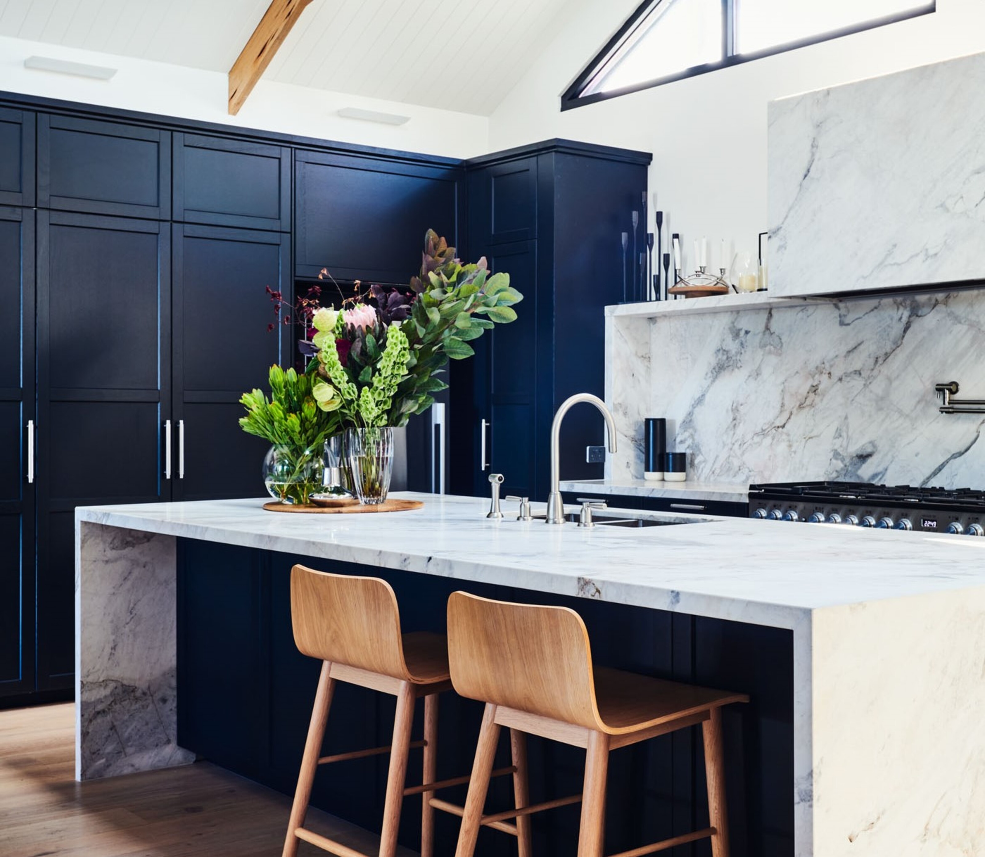
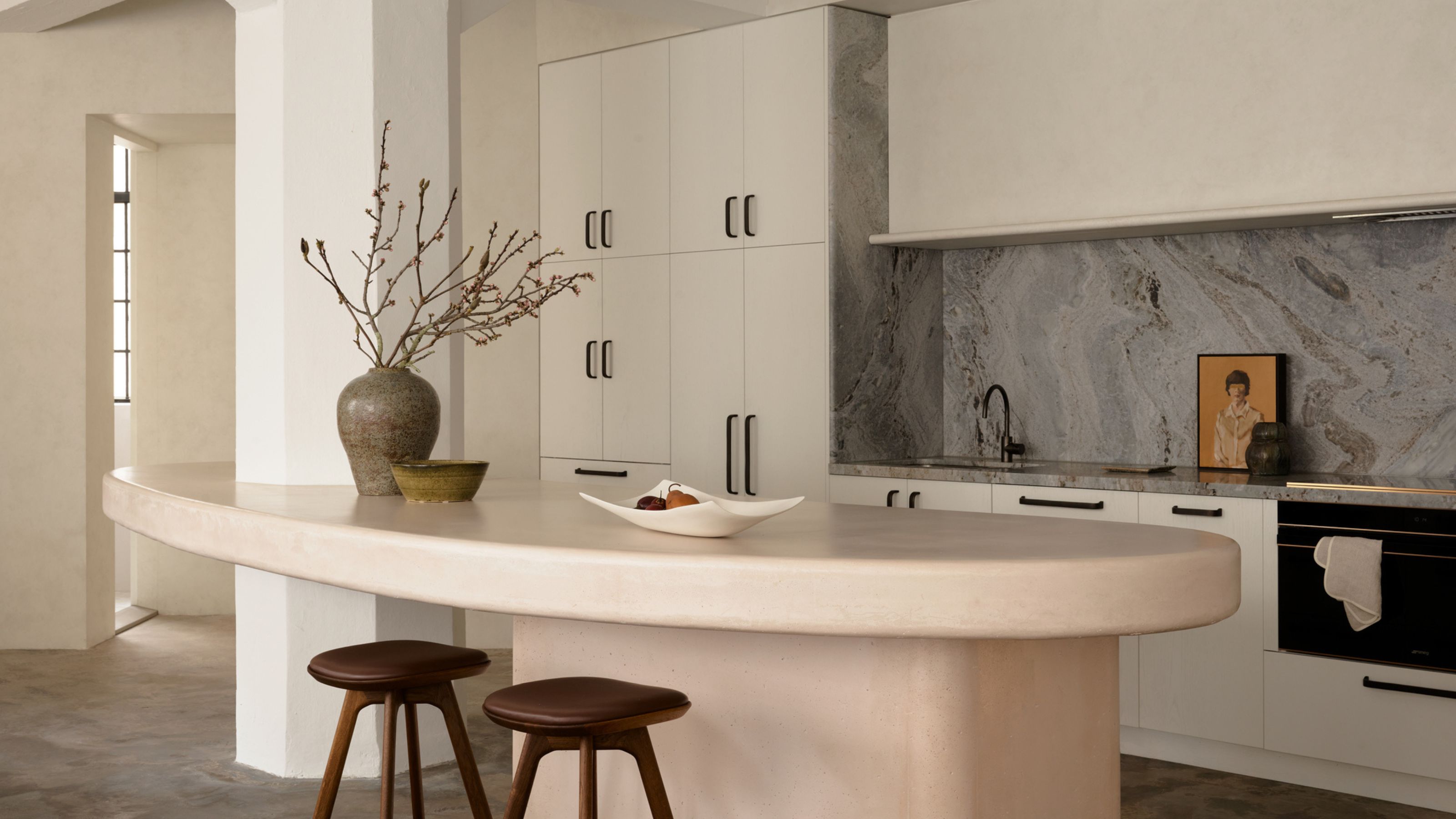
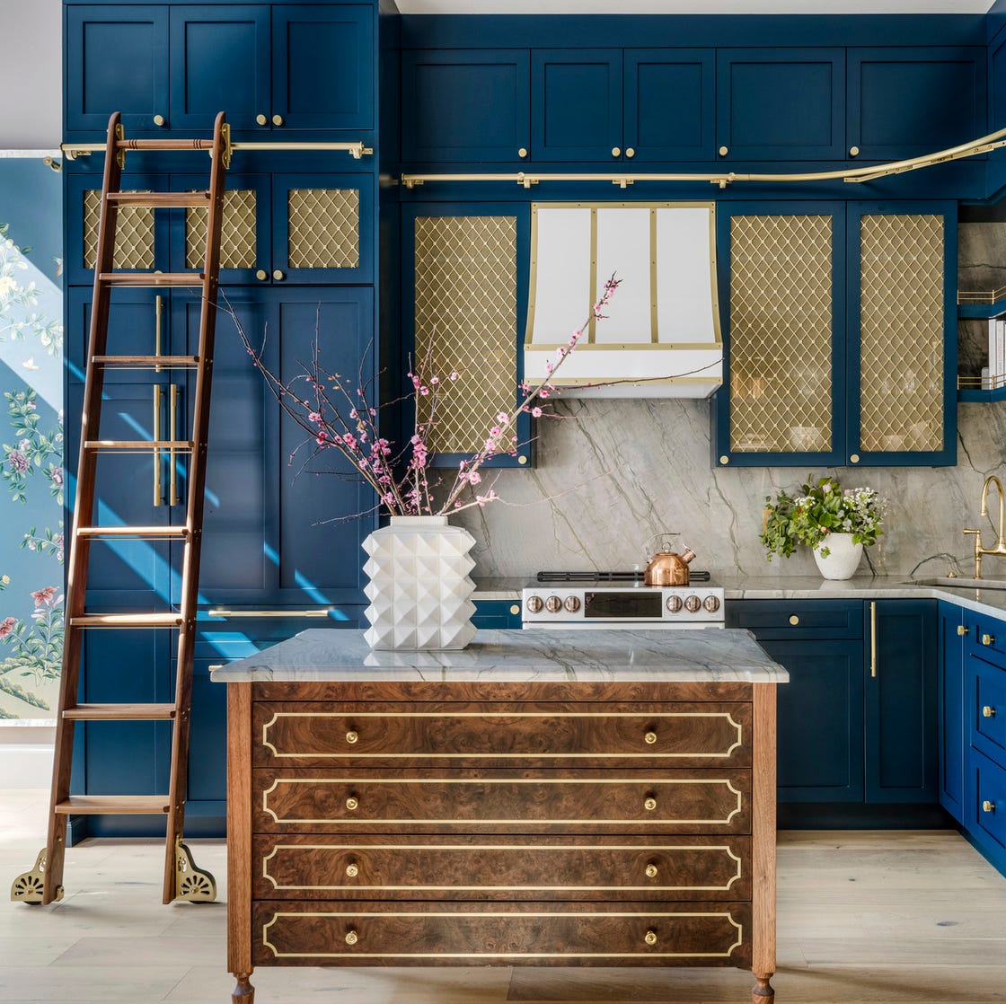
Timeless putty, a mid-grey shade, is explored in the sixth example through a collaboration between Kennedy Nolan and Laminex. This scheme demonstrates how putty-like tones can be combined with warmer, paler shades like French Cream, creating a nostalgic yet sculptural feel. Rachel Nolan of Kennedy Nolan highlights their interest in creating unique, magical elements in kitchen design. The seventh neutral is soft black, used by Shapeless Studio in a New York apartment. Andrea Fisk explains that the dark blue-black cabinets make an impactful statement without being too obvious, grounding the kitchen and making the workspace feel light and uncluttered, especially in areas far from windows. Finally, greenish grey is presented through a coastal home's kitchen featuring Plain English cabinetry. Creative director Katie Fontana notes that Joinery in French Gray by Farrow & Ball complements the faded tones of reclaimed timber, enhancing the lofty, top-lit space. The article concludes by reinforcing that neutral colors, in their varied forms, offer sophisticated and adaptable solutions for kitchen design.
#NeutralKitchenColors #KitchenCabinetry #InteriorDesignTrends #HomeDecor #TimelessDesign #KitchenRemodel #ColorSchemes #KitchenInspiration #NeutralKitchenColors #KitchenCabinetry #InteriorDesignTrends #HomeDecor #TimelessDesign #KitchenRemodel #ColorSchemes #KitchenInspiration
0 comment in total
 No comments yet
You may also like
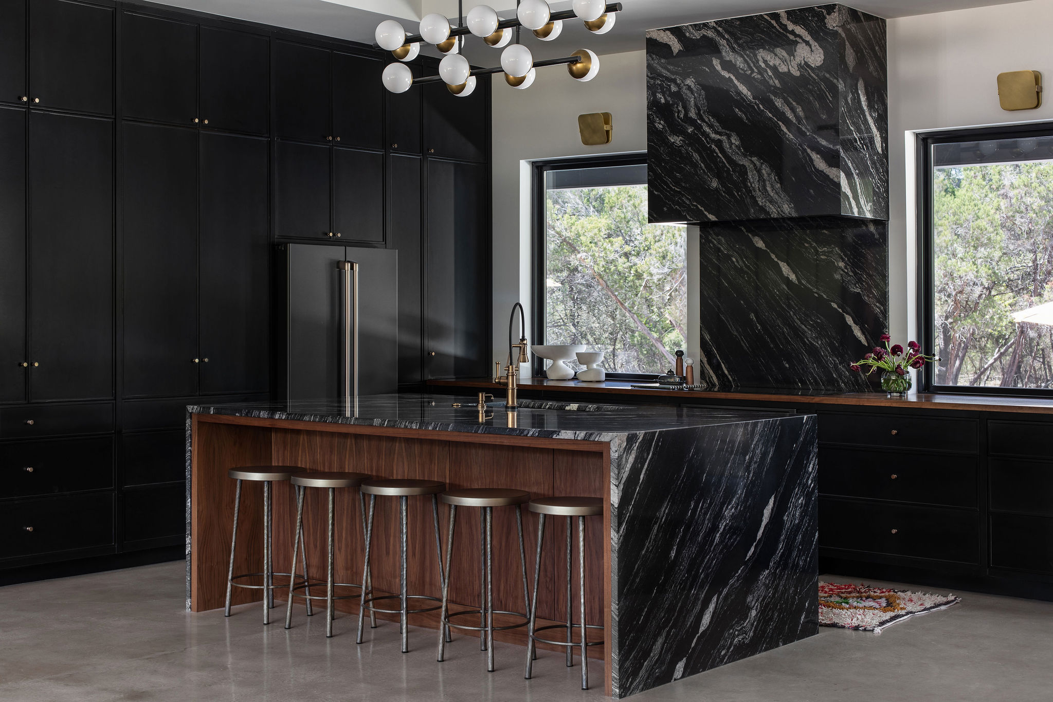
Kitchen Cabinet Colors That Will Never Go Out of Style — 10 Tones That Are a Timeless Choice
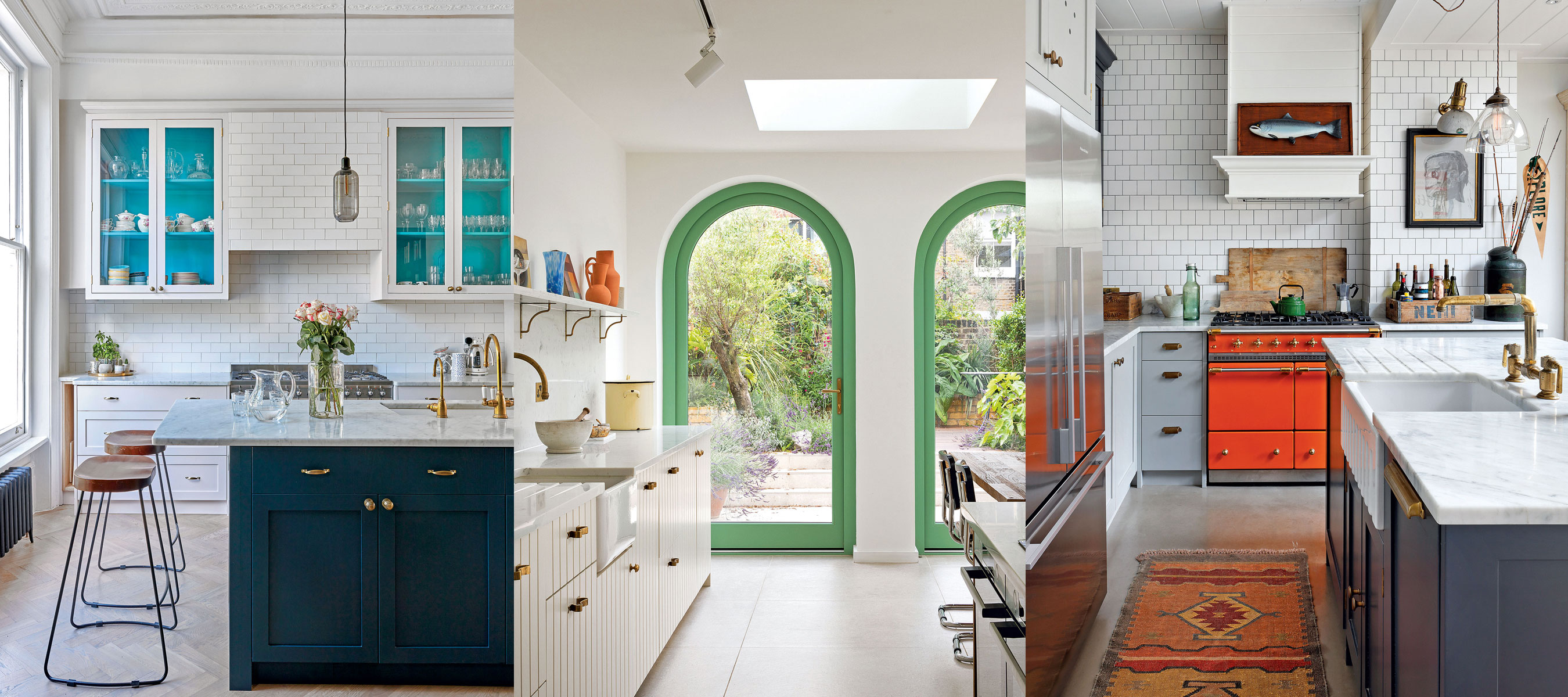
10 creative ways interior designers work color into neutral kitchens

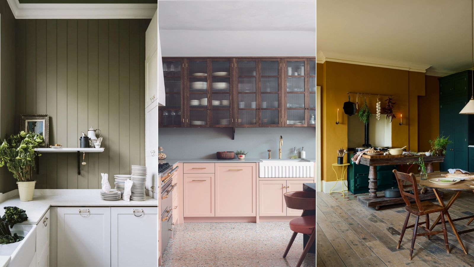
5 outdated kitchen cabinet color trends to avoid if you don't want your kitchen to look unfashionable, say designers
The Kitchen Cabinet Color Trend That Made Sense In 2015 But Now Feels Totally Overdone

Over White And Grey Kitchens? There’s a New Neutral in Town
18 Gorgeous Kitchen Cabinet Paint Colors, According To Kitchen Designers

These 7 Kitchen Cabinet Colors Are So Outdated, According to Interior Designers

17 bright kitchen cabinet colour ideas to try in your home

Neutral kitchen ideas – 10 timeless, classic designs you will love forever
5 Timeless Kitchen Cabinet Paint Colors Designers Love
5 fail-safe kitchen cabinet color combinations that always work
5 kitchen cabinet colors interior designers are avoiding for 2024 - and the shades they're picking instead

Bold and Neutral Shades for Kitchen Cabinets

6 Worst Colors To Paint Your Kitchen (And What To Choose Instead)
What's the next big kitchen cabinet color? Designers predict that this earthy take on neutrals will be huge in 2024
How To Design A Kitchen That Won't Look Dated Down The Line – An Expert Guide
10 Neutral Kitchen Ideas That Are Timeless But Feel Right for Right Now — There's One for Every Style of Home
15 Cabinet Paint Colors That Look STUNNING in Any Kitchen

5 kitchen colors going out of style for 2024 – plus the 5 shades designers are replacing them with
The 6 Most Popular Kitchen Cabinet Paint Colors for 2026, According to Designers