1/8
The 8 Rules for Dark Entryways — How Designers Perfect the Art of the Moody First Impression
The entryway serves as the initial introduction to a home's interior design, setting the tone and style for the rest of the living space. While many homeowners traditionally opt for lighter colors like beige or white to brighten small entryways, this article advocates for the use of darker tones to create a more captivating and welcoming first impression. Darker hues are presented as being more entrancing and enigmatic, capable of transforming the entryway into a warm and inviting space. Furthermore, they offer practical benefits by better concealing stains and marks in high-traffic areas, reducing the need for frequent touch-ups. The article compiles insights from interior designers and color experts, outlining eight rules for perfecting dark entryways, whether the goal is a moody and mesmerizing atmosphere or a soft yet striking look.
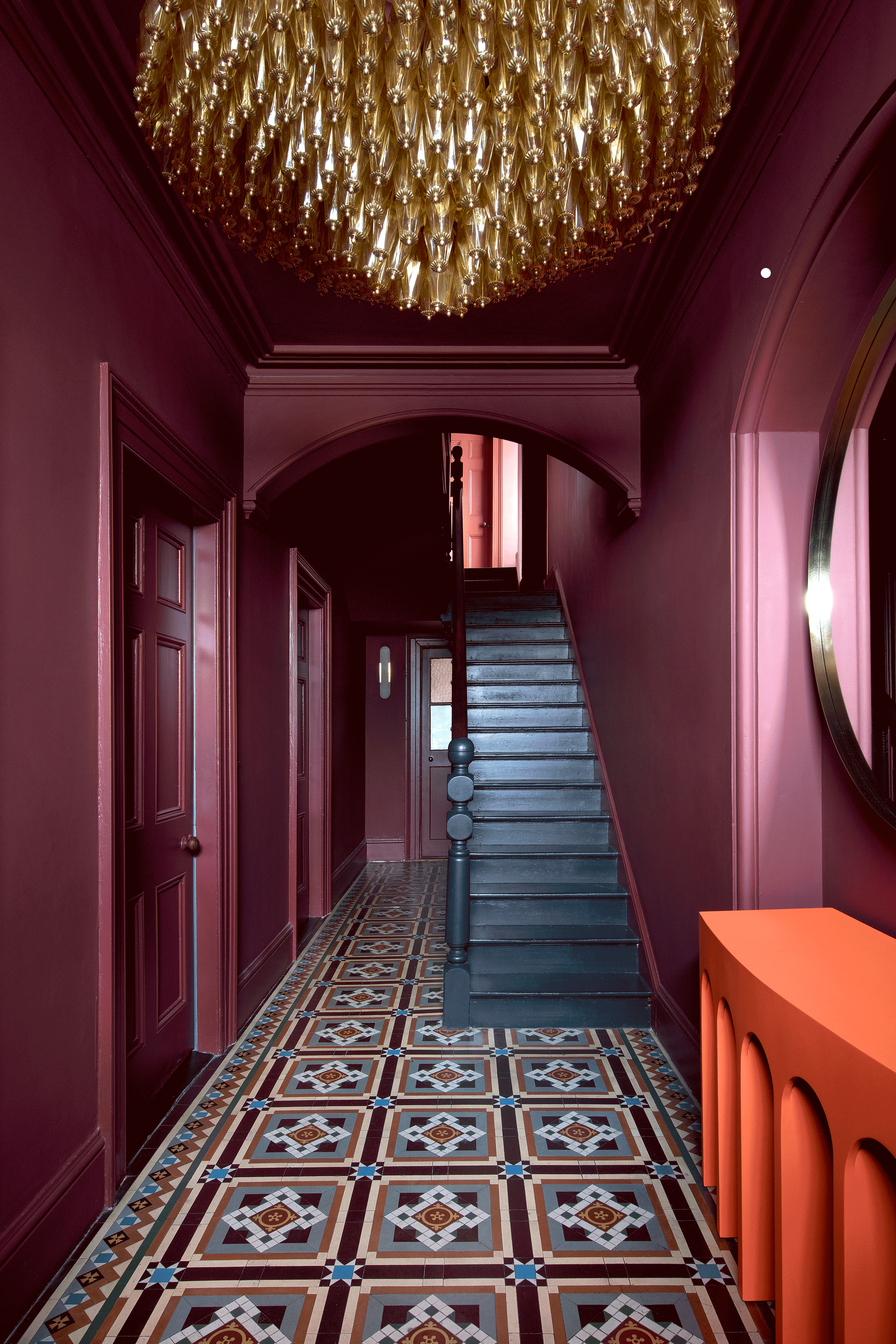
The first rule suggests incorporating a single element of pattern. An example is provided of a berry-pink entryway that uses colorful tiles and a black staircase to complement the rich, dark hue, creating a dramatic yet inviting entrance. Roisin Lafferty of Kingston Lafferty Design emphasizes how dark, moody colors can be used intentionally in spaces lacking natural light to create depth and visual interest, especially when contrasted with vibrant elements like an orange console or red artwork.
The second rule advises seeking gray tones to temper the darkness. A blue entryway with gray undertones is highlighted as an example of balancing a rich color with a solid neutral. Vlada Peterson from Make Interiors explains the deliberate use of a deep blueberry shade in the entrance that extends into the bedroom, while other areas of the house maintain lighter tones for diverse atmospheres. The importance of considering surrounding elements, such as lighter tiling, is noted to prevent excessive darkness.
Rule three focuses on adding depth and warmth with brick-red shades. Marianne Evennou, a Paris-based interior designer, discusses using rich, warm red tones that envelop the space without being overwhelming. She suggests that entryways, being transitional spaces of short duration, are ideal for theatrical and extravagant designs. Evennou recommends using a strong color on both walls and ceiling and combining it with graphic tiles for a powerful impact.
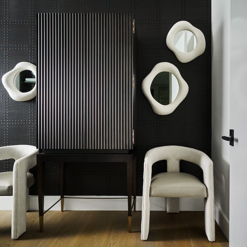
Rule four encourages taking pattern to the walls. Allison Lind Interiors' use of a charcoal wallcovering with a tile-like effect creates drama and intrigue, complementing a sculptural oak console. Lind advises considering how the entryway interacts with its exterior surroundings to create a cohesive and welcoming experience.
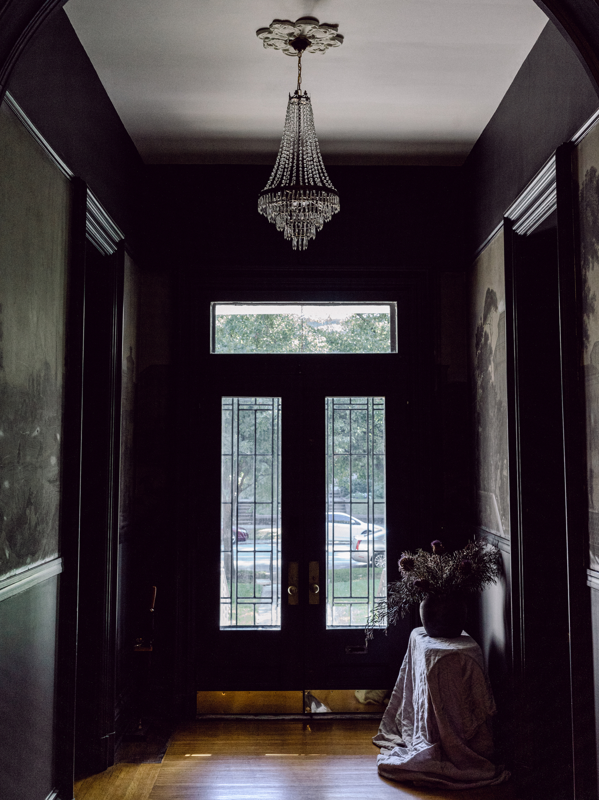
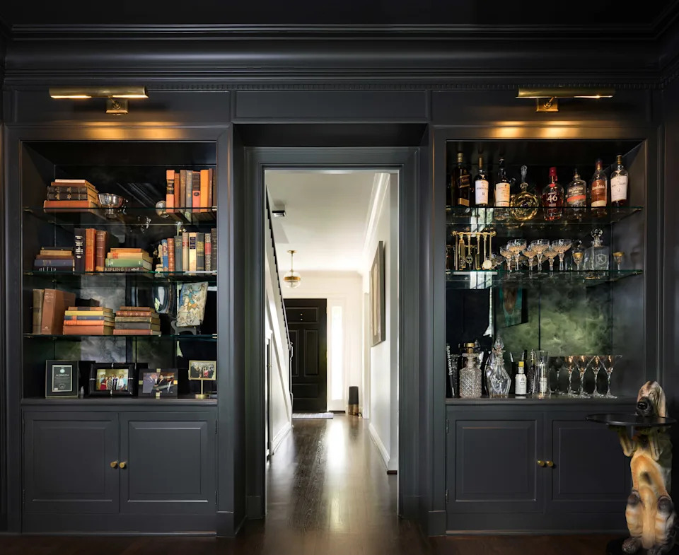
The fifth rule is to wrap the entire space in color, specifically black. Caroline Turner Interiors demonstrates how a majestic ink-black entryway, extending from floor to ceiling, can create an exciting contrast with light-emitting windows. Caroline Turner stresses that contrast is key to impactful design, and monochrome application with varied finishes can keep the space dynamic and timeless, suitable for both traditional and modern aesthetics.

Rule six recommends embracing dark blue. A Parisian apartment entryway featuring Hague Blue paint from Farrow & Ball on walls and ceiling is cited as an example of a smart and chic look. Sonia Lazowski of Virajo explains how this creates a “chiaroscuro” effect, enhancing the brightness of the adjacent living room and serving as a transitional space.
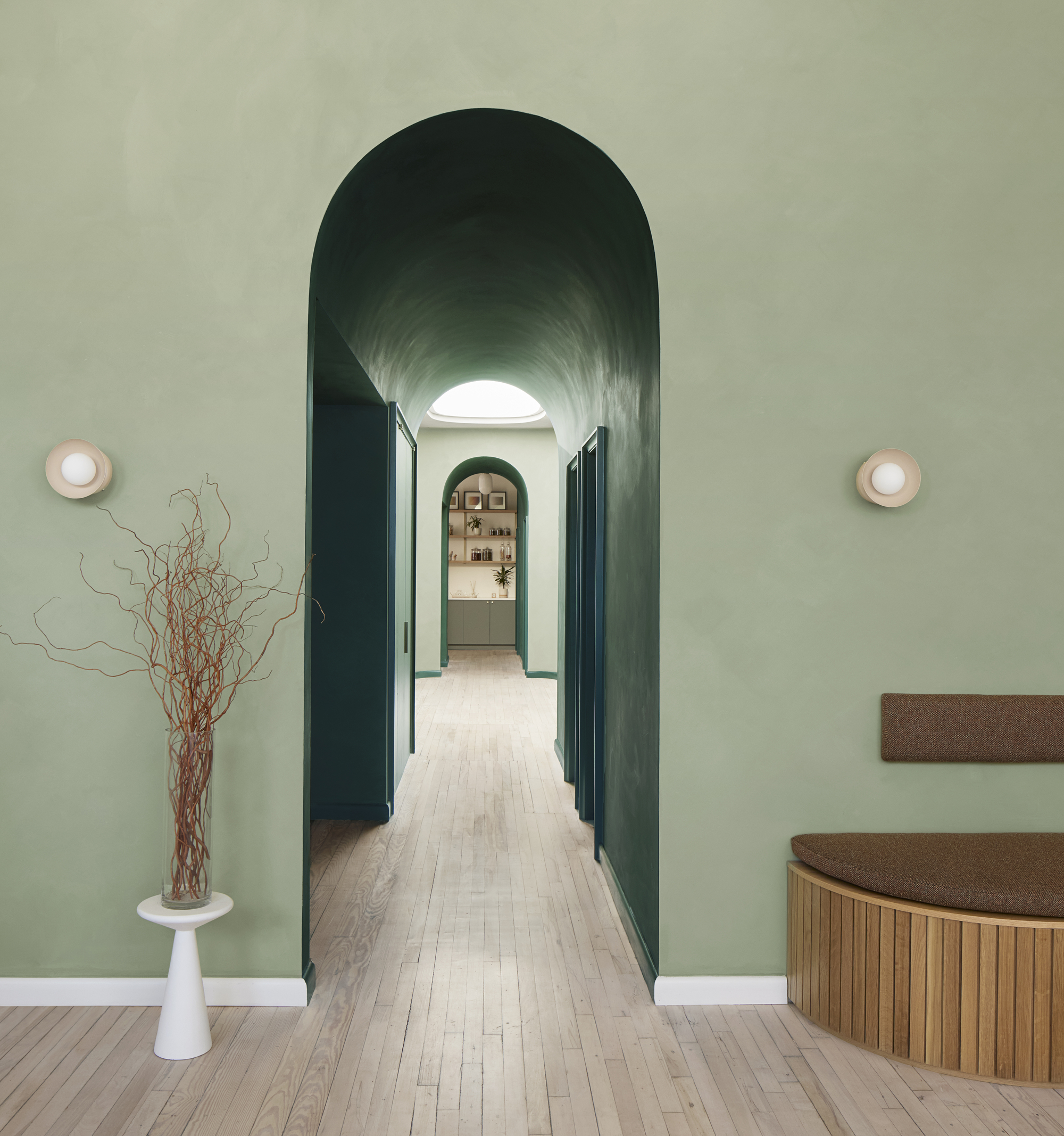
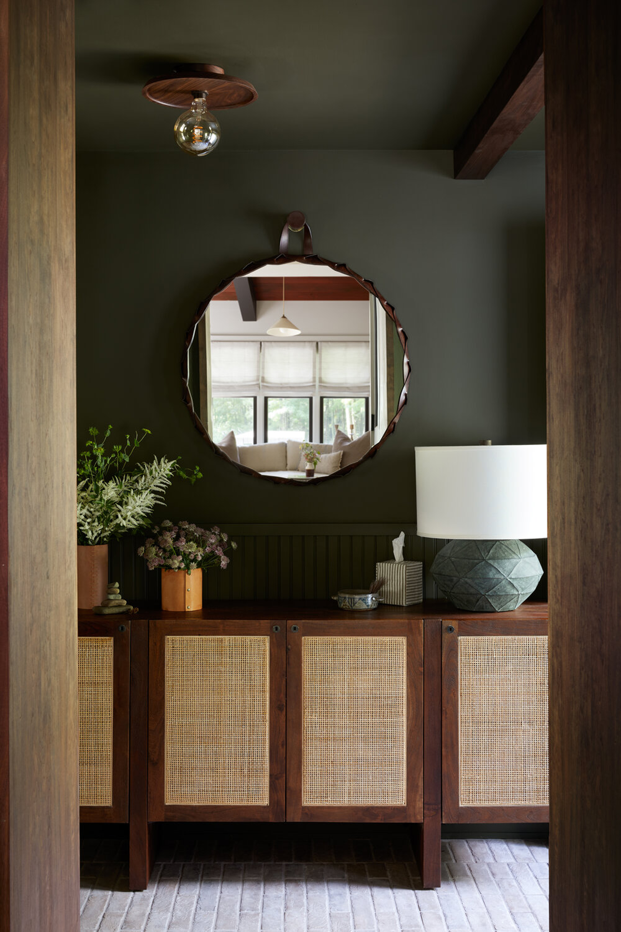
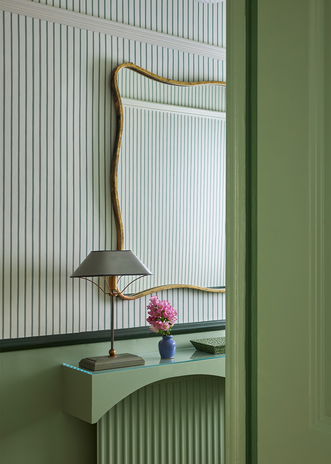
The seventh rule suggests blending contrasting shades. A peacock green entryway is featured, combining the modernity of blue with the refreshing qualities of green. Camille Hermand Architectures emphasizes the psychological aspect of a dark entryway as a transition from the outside world, making the light in subsequent rooms more appreciated. She also notes that dark walls allow for modulated and mysterious lighting ambiances.
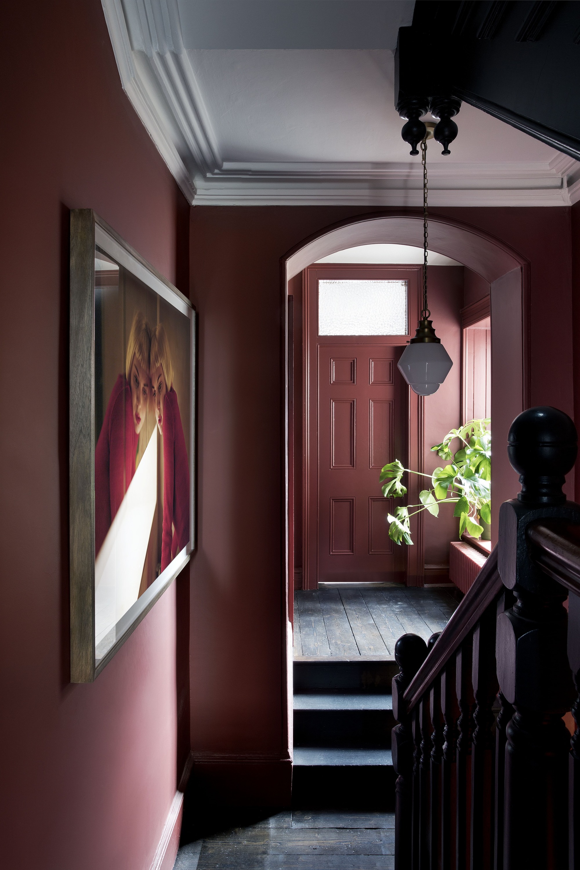
Finally, rule eight advises leaning towards warmer dark shades. A rich purple, like Farrow & Ball’s Mahogany No.36, is presented as an elegant choice. Patrick O’Donnell, Farrow & Ball Global Brand Ambassador, explains that in spaces starved of natural light, warmer, darker shades (those with red and yellow undertones) are often more effective than white, which can create a cold and gloomy atmosphere. Embracing the limitations of the space by choosing a darker color can also make adjacent rooms appear larger and lighter. These rules collectively aim to empower homeowners and designers to create striking, functional, and inviting dark entryways that leave a memorable first impression.
#DarkEntryways #InteriorDesign #HomeDecor #EntrywayIdeas #ColorPsychology #PaintColors #HomeStyling #DesignTips #FirstImpression #DarkEntryways #InteriorDesign #HomeDecor #EntrywayIdeas #ColorPsychology #PaintColors #HomeStyling #DesignTips #FirstImpression
0 comment in total
 No comments yet
You may also like
First impressions count! 8 guaranteed ways to make your entryway feel more welcoming and wonderful
Set the tone for your home with these entryway styling tips from Dallas designers

Should I paint an entryway light or dark? Here’s what the experts suggest
6 Things That Make Your Entryway Look TACKY, According to Designers


Dark colors to choose for an expensive-looking entryway - interior designers always go back to these paint shades
How do you decorate an awkward entryway? 7 designer-approved tricks for tough-to-style entrances
Interior Designers List the Worst Paint Colors for Your Entryway
What makes an entryway look cheap? 6 mistakes to immediately switch out in 2025

Dallas designers’ favorite entryways leave a lasting first impression

5 Common Entryway Mistakes That Make The Wrong First Impression
Designing an entryway – expert advice and layout tips
6 colors to avoid in an entryway – and the ones designers know make a better first impression
5 Entryway Decorating Tips Designers Always Follow for a Lasting First Impression

How do you make an entryway inviting? Expert tricks to make a home instantly welcoming
Should I paint an entryway light or dark? Here’s what the experts suggest
What colors brighten up an entryway? 5 shades that will bring light and life to your space
15 elegant entryway ideas for a stylish first impression

7 simple entryway decor ideas to make a great first impression

6 Things That Make Your Entryway Look TACKY, According to Designers

Designers Swear These 8 Staples Make Any Entryway Look Polished and Put-Together