Editor’s Letter: The Tyranny of Taupe
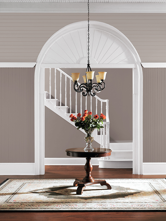
This editor's letter discusses the common design dilemma faced by homeowners regarding interior paint colors, specifically the popularity of gray walls, which a Zillow study indicates can increase a home's sale price by up to $2,512. The article acknowledges the financial pressure homeowners face in the current real estate market, making them hesitant to deviate from popular trends like gray paint for fear of devaluing their property. This sentiment is extended to renters who often lack the freedom to personalize their living spaces due to precarious lease agreements and limited protections in the U.S. The author argues against the "tyranny of a trend," suggesting that adhering strictly to popular decor styles, such as "oatmeal minimalism," "modern farmhouse kitsch," or "millennial pastels," ultimately leads to a loss of personal expression in one's home.
The piece encourages individuals to embrace their unique aesthetic preferences and to make their homes truly their own, rather than conforming to transient fads. It draws a parallel to past design trends like avocado green and wood paneling, which were once fashionable but eventually became outdated, indicating that current popular styles like gray walls will also pass. The article emphasizes that a home should reflect the personality and obsessions of its inhabitants, serving as a personal sanctuary rather than a marketable commodity dictated by fleeting trends. This perspective aims to empower readers to be bold and fearless in their decor choices.
To inspire readers, the article highlights several unconventional renovations, including a layered townhouse in Lisbon, an open-concept apartment in Kosovo, and a maximalist 19th-century house in Chicago filled with its owners' eclectic tastes. It also promotes the annual "Dwell 24" list, featuring emerging designers creating innovative furniture, lighting, and objects to help readers furnish their homes uniquely. The author concludes by advising homeowners not to apologize for their individual design choices, whether it's glass bricks, an apron sink, or wall-to-wall carpeting. While acknowledging practical considerations like preparing a home for sale, the overarching message is to prioritize personal style and comfort, asserting that everyone deserves to live in a home that truly reflects their chosen aesthetic.
#InteriorDesign #HomeDecor #RealEstateTrends #PersonalExpression #DesignFreedom #ArchitecturalStyle #RenovationIdeas #DwellMagazine #EmergingDesigners #InteriorDesign #HomeDecor #RealEstateTrends #PersonalExpression #DesignFreedom #ArchitecturalStyle #RenovationIdeas #DwellMagazine #EmergingDesigners
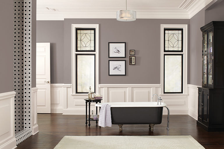
Poised Taupe Is the Sherwin-Williams Color of the Year

The Audacity of Taupe
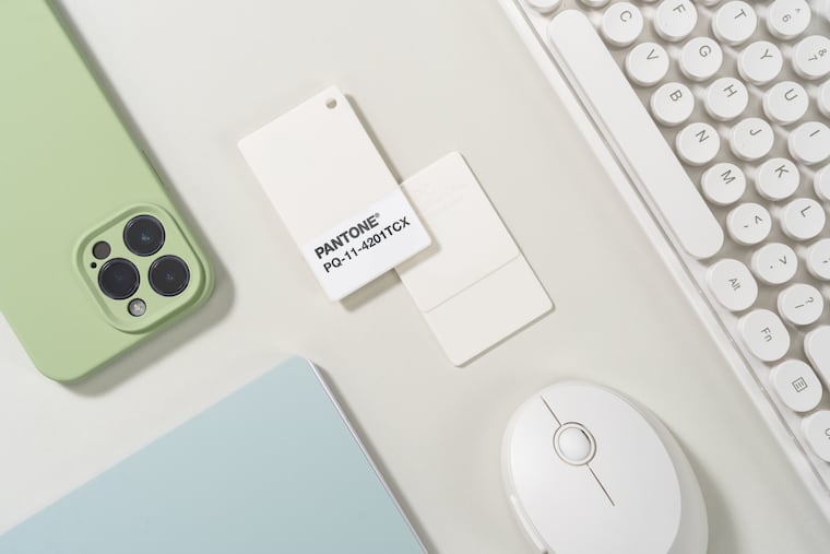
White is the 2026 Pantone Color of the Year. They say the choice isn’t political.