1/2
7 Bathroom Vanity Color Trends That Aren't Going Anywhere in 2026, Designers Say
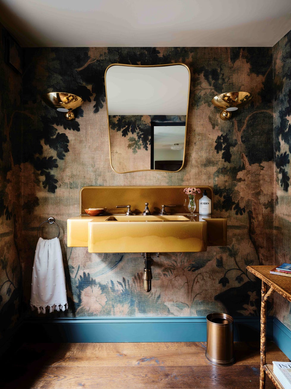
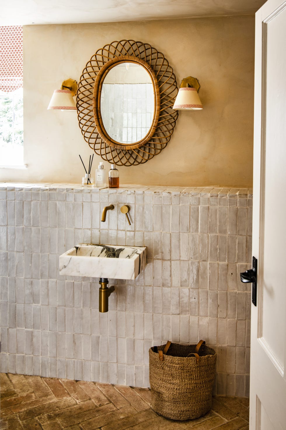
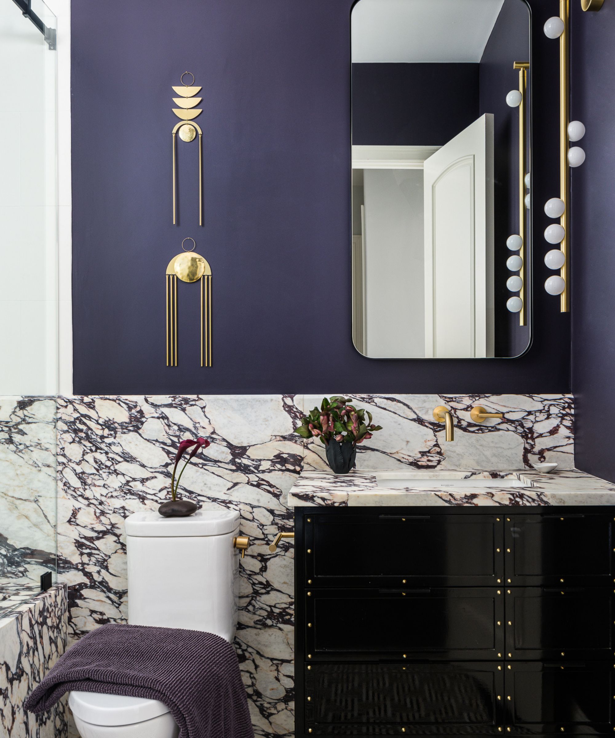
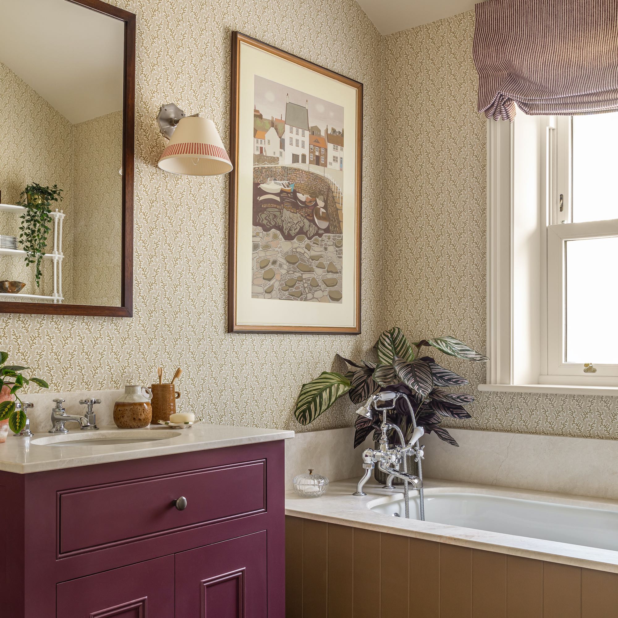
The bathroom has transitioned from a purely functional space to a significant area for personal expression and design within a home. While balancing aesthetics and utility, the bathroom vanity emerges as a pivotal design element. However, unlike easily changeable features such as wall paint, vanities are more permanent, making their color selection crucial for longevity in style. This article explores seven bathroom vanity colors that design experts anticipate will remain timeless and resist fleeting trends, ensuring lasting appeal for homeowners. Yvonne Harty, Kati Curtis, and Terri Brien, all prominent interior designers, contributed their insights and top picks for enduring vanity colors.
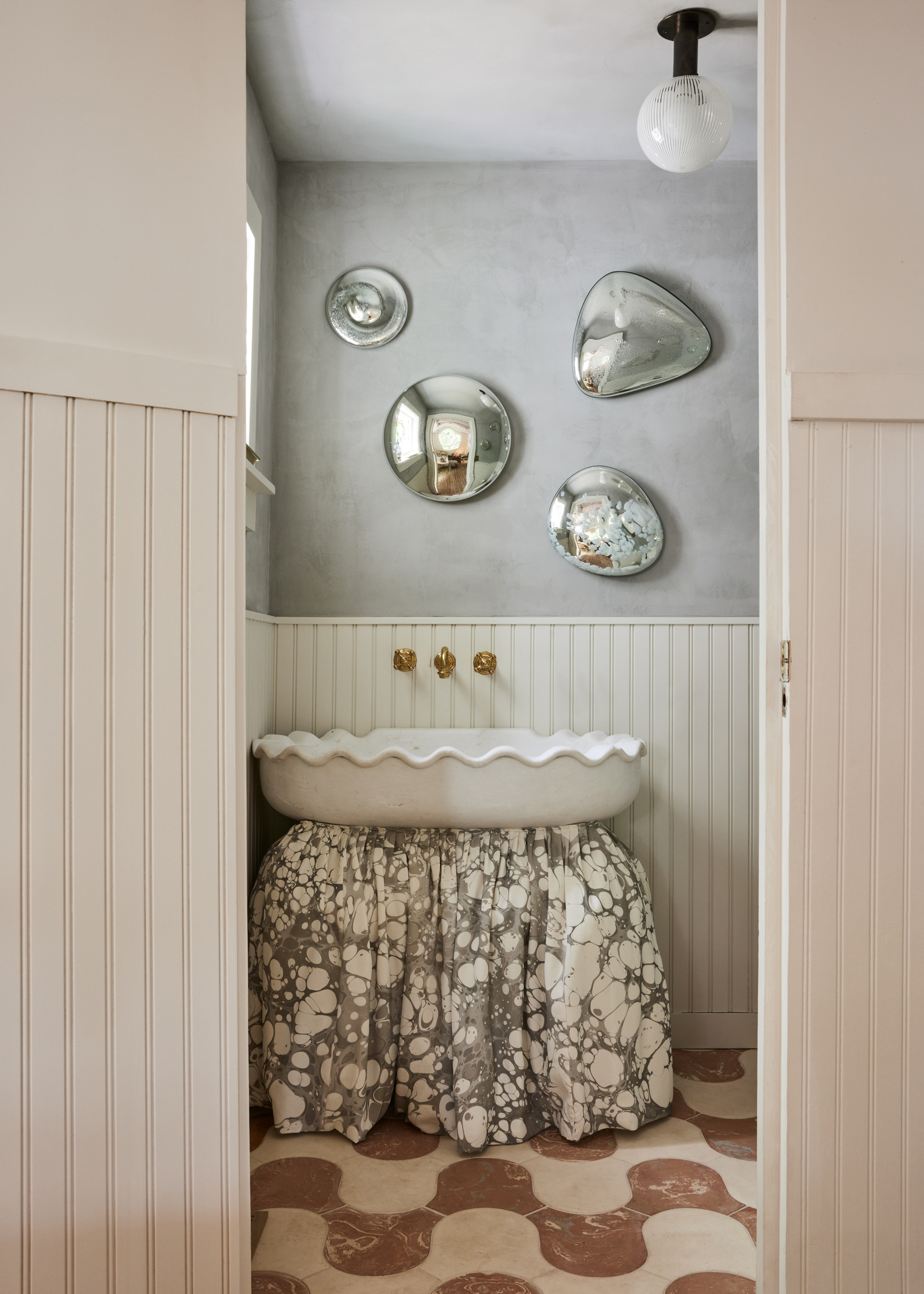
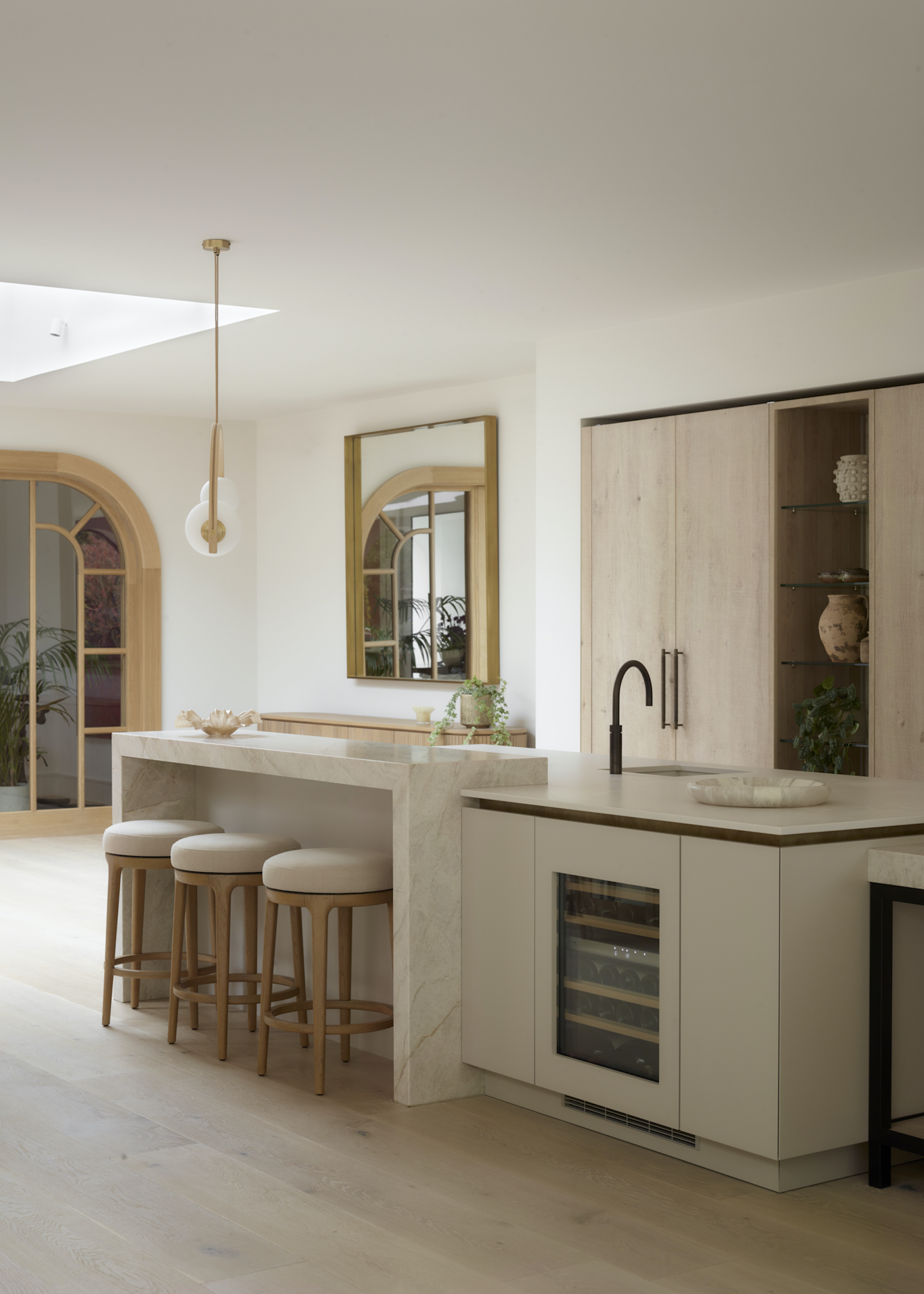
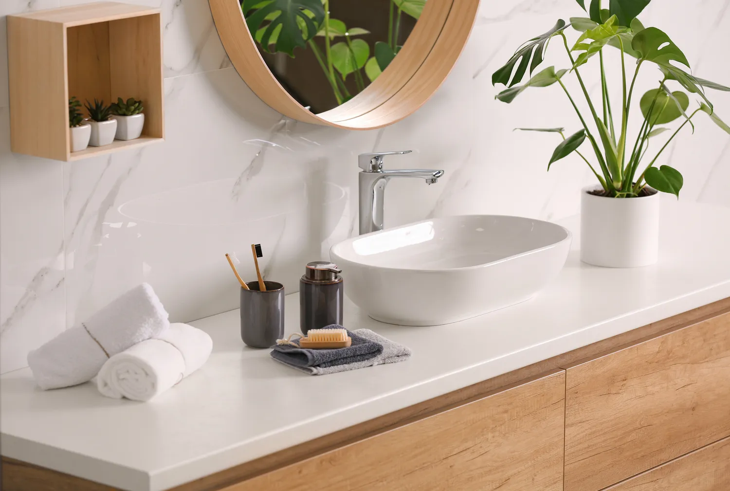
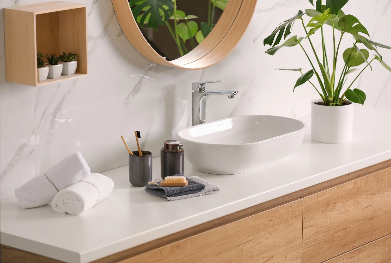
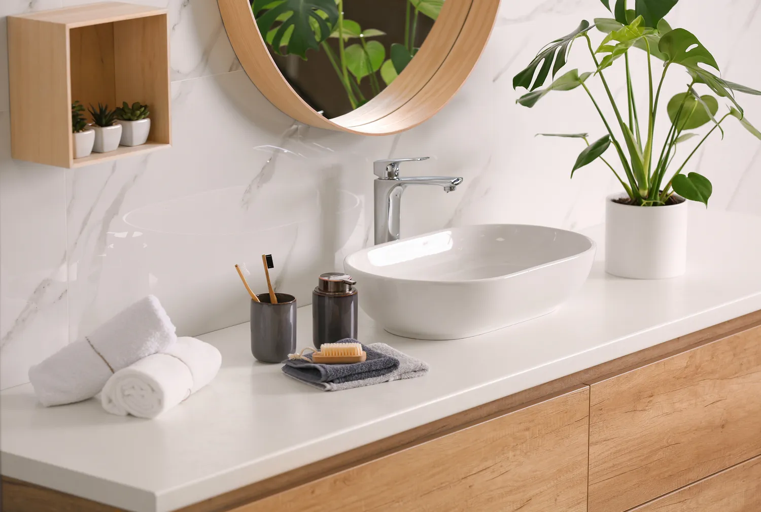
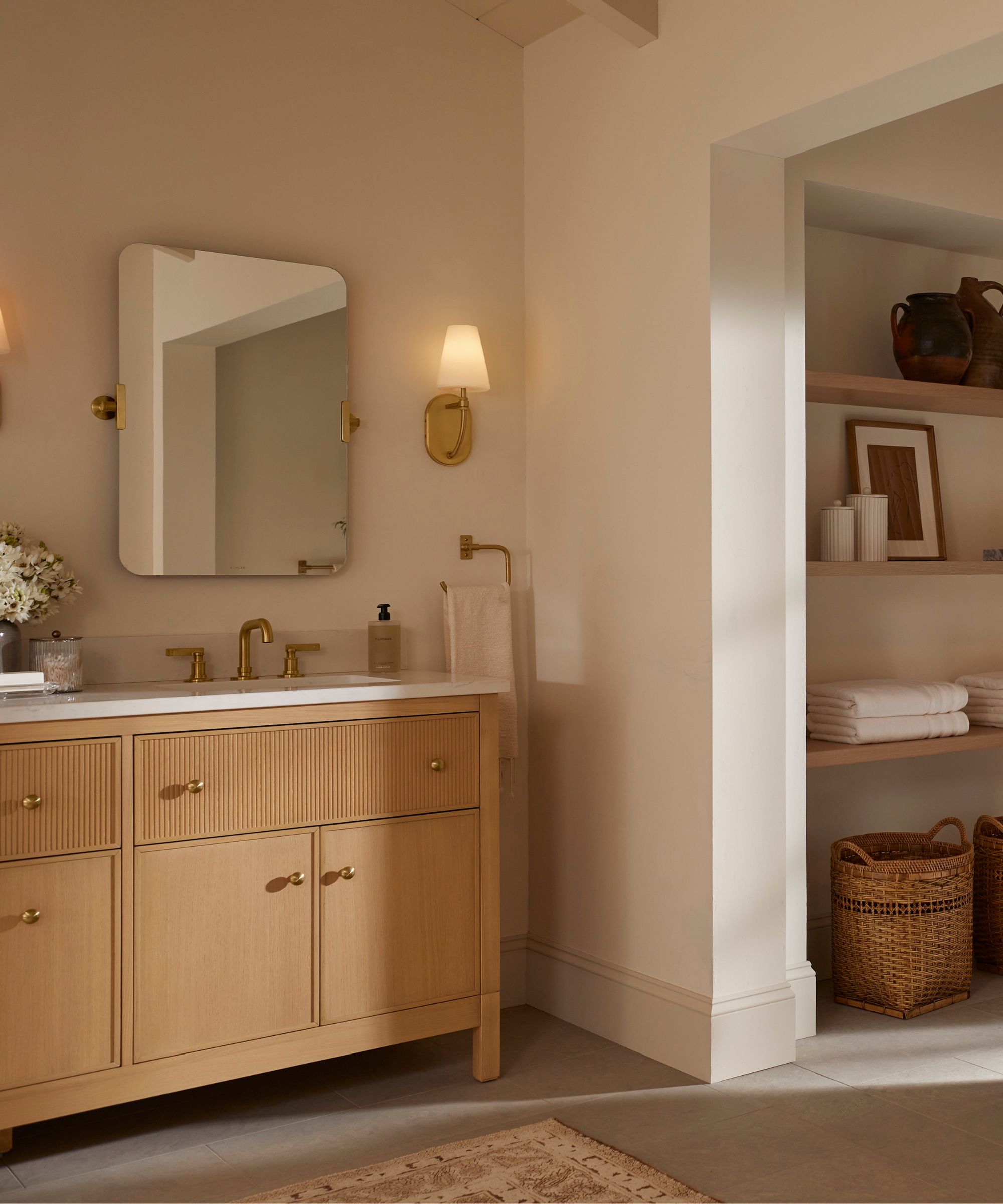
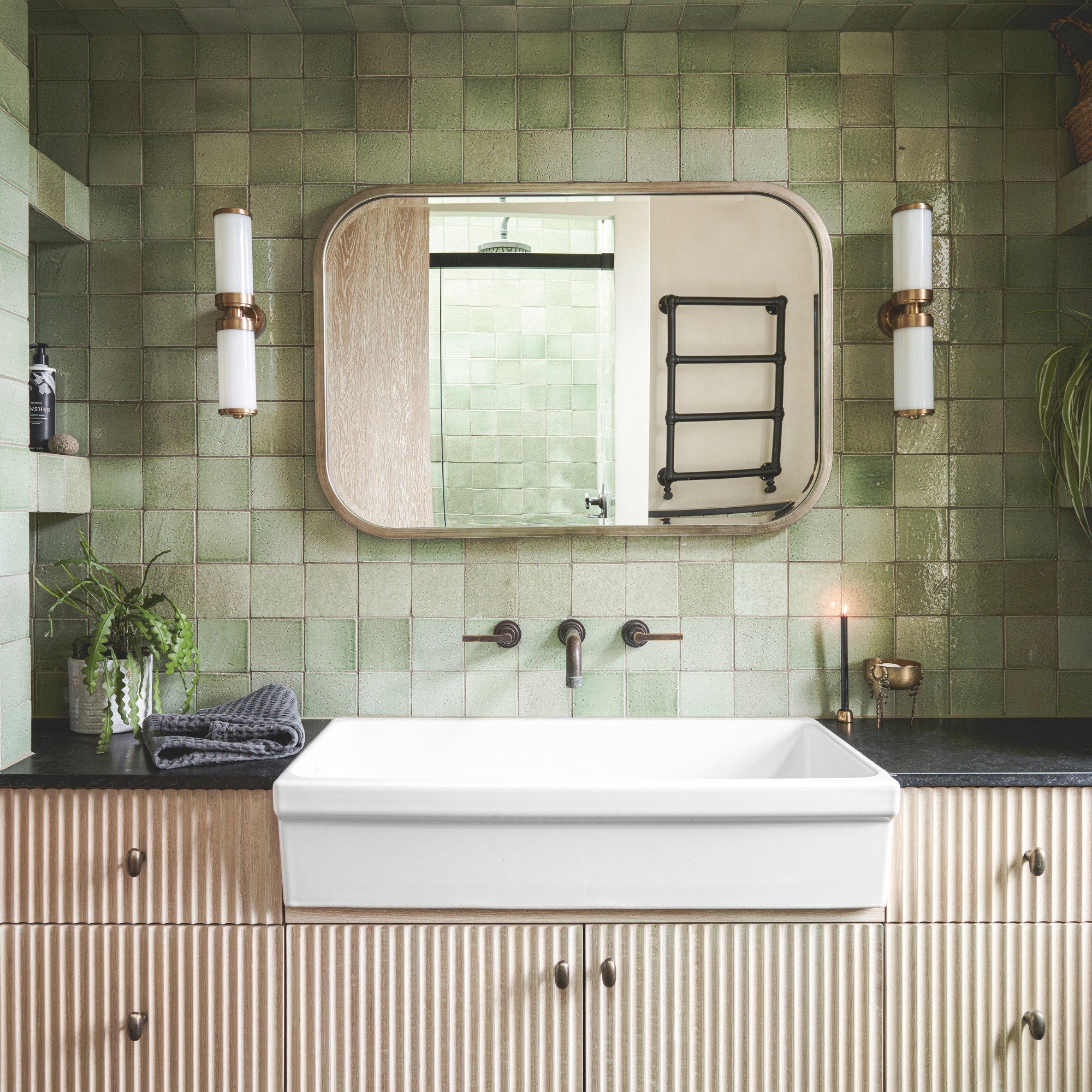
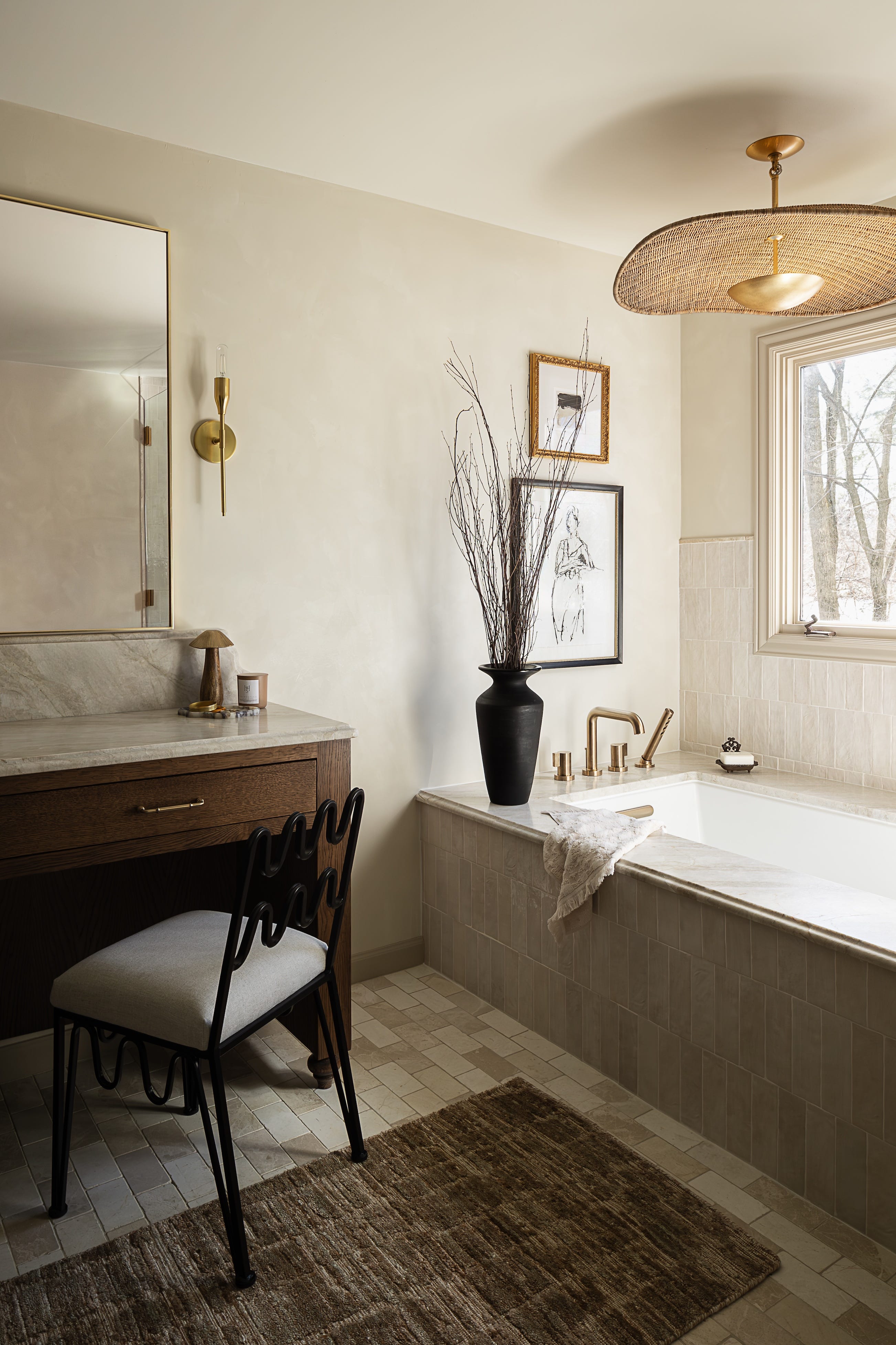
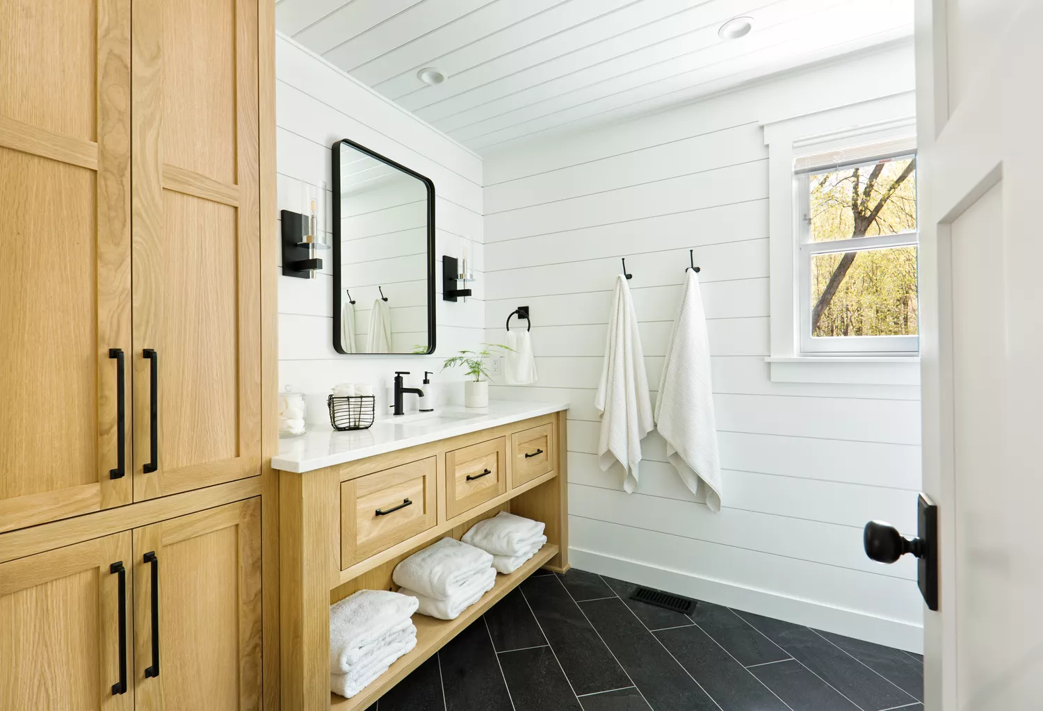
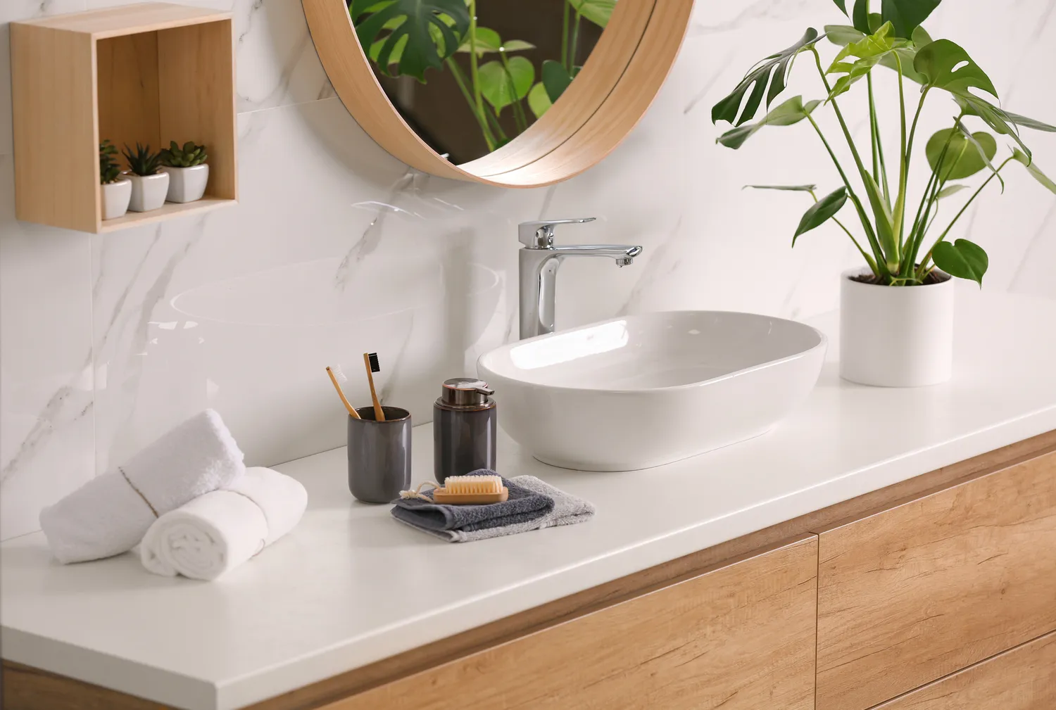
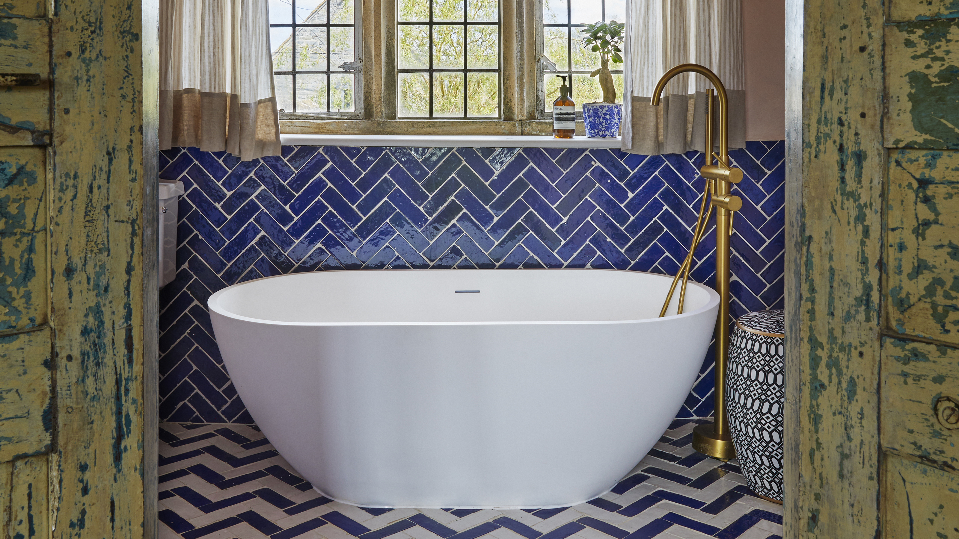
White oak is highlighted as a perennially popular choice, offering organic warmth and sophisticated coziness to any bathroom. Its light tone is versatile for both small and large spaces, and its inherent properties as a hardwood, including strength, durability, density, and moisture resistance, make it a practical and long-lasting option. Navy blue is another classic that transcends various design styles, from coastal to modern. It pairs effectively with natural materials like wood and stone, and can be accented with complementary colors such as green or light blue, or contrasting hues like pink or orange for a more dramatic effect.
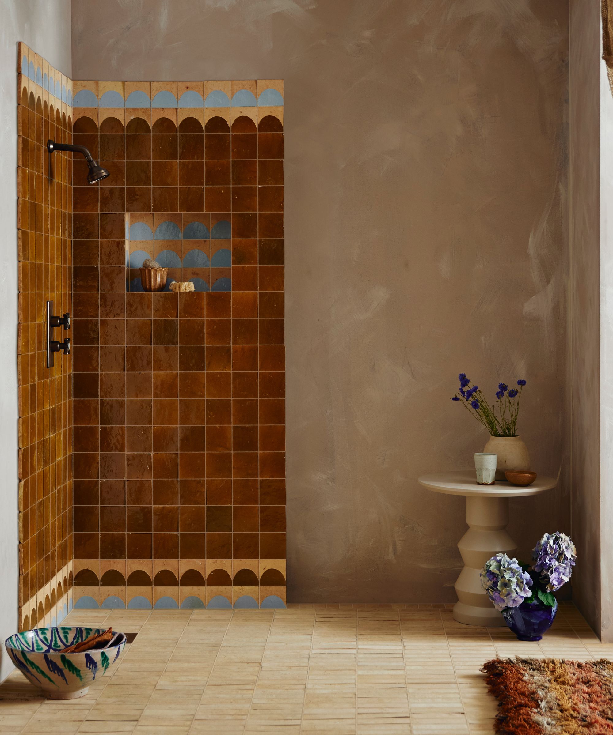
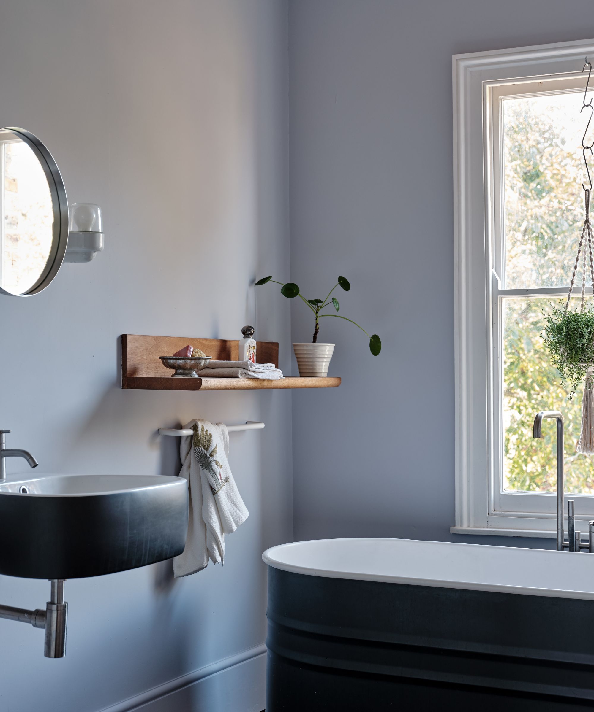
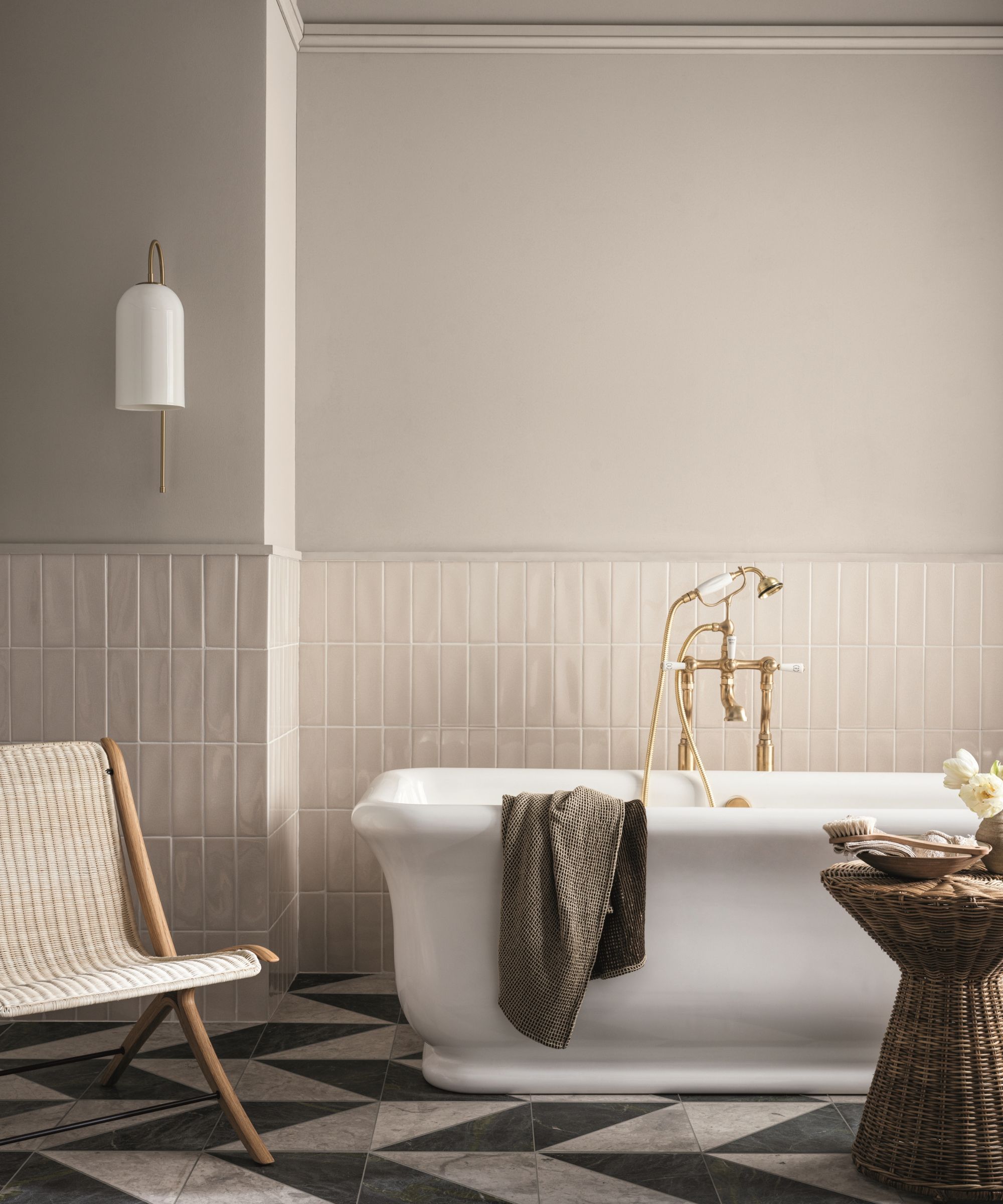
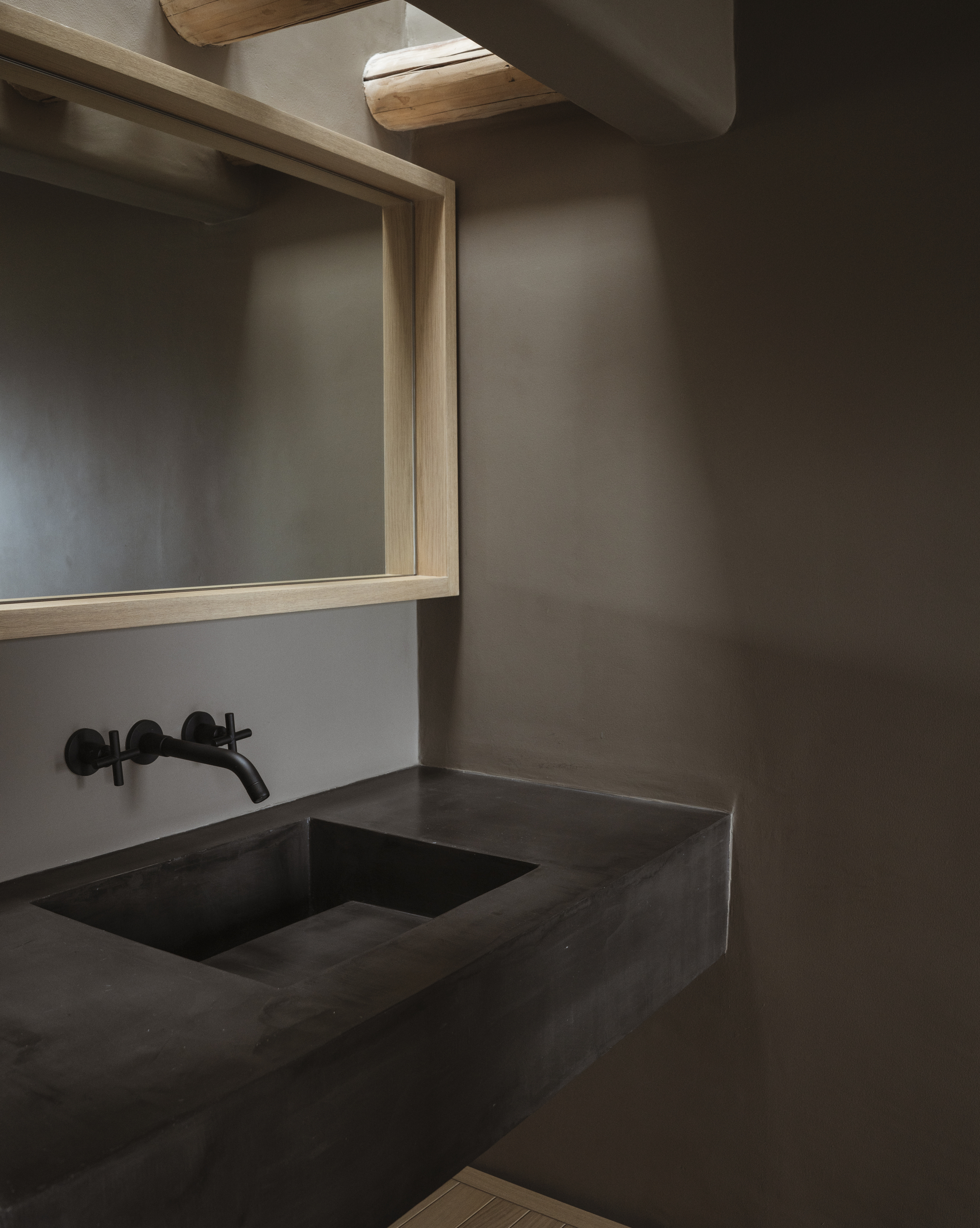
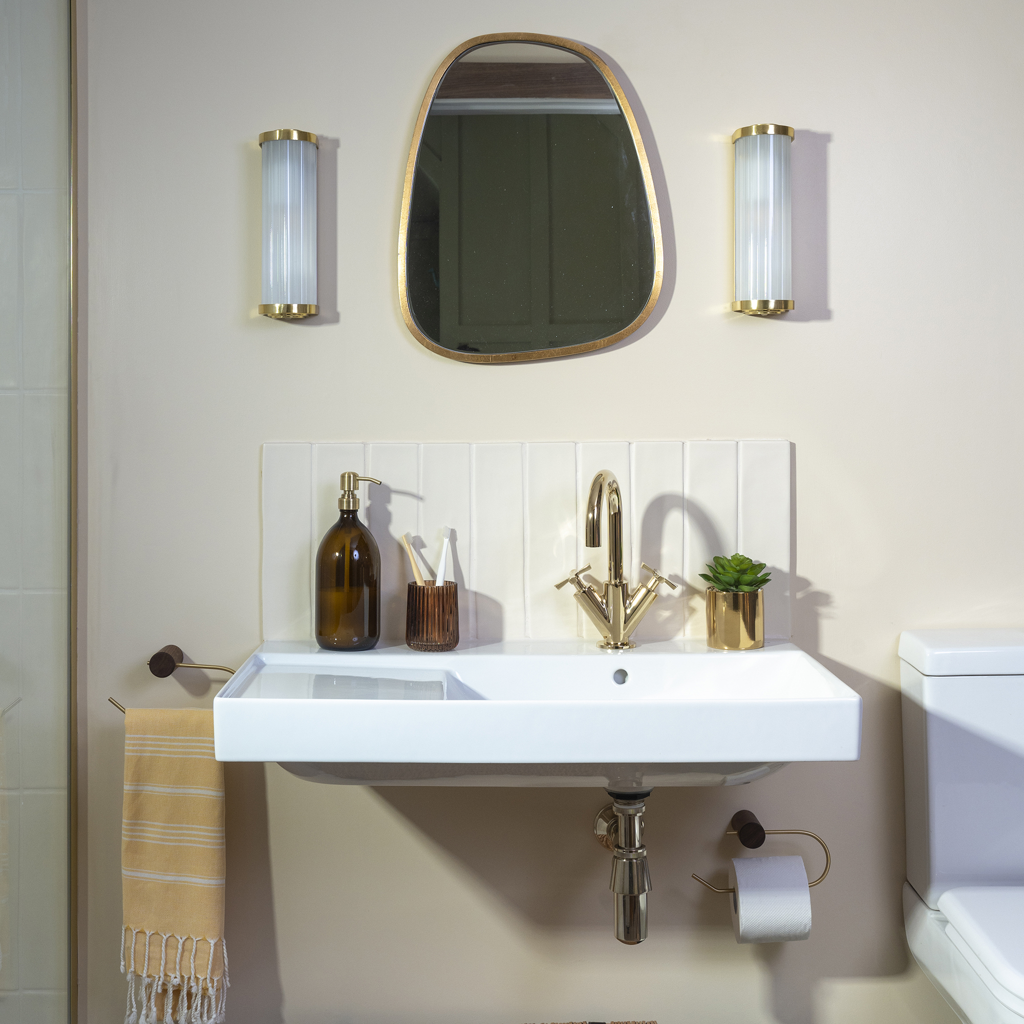
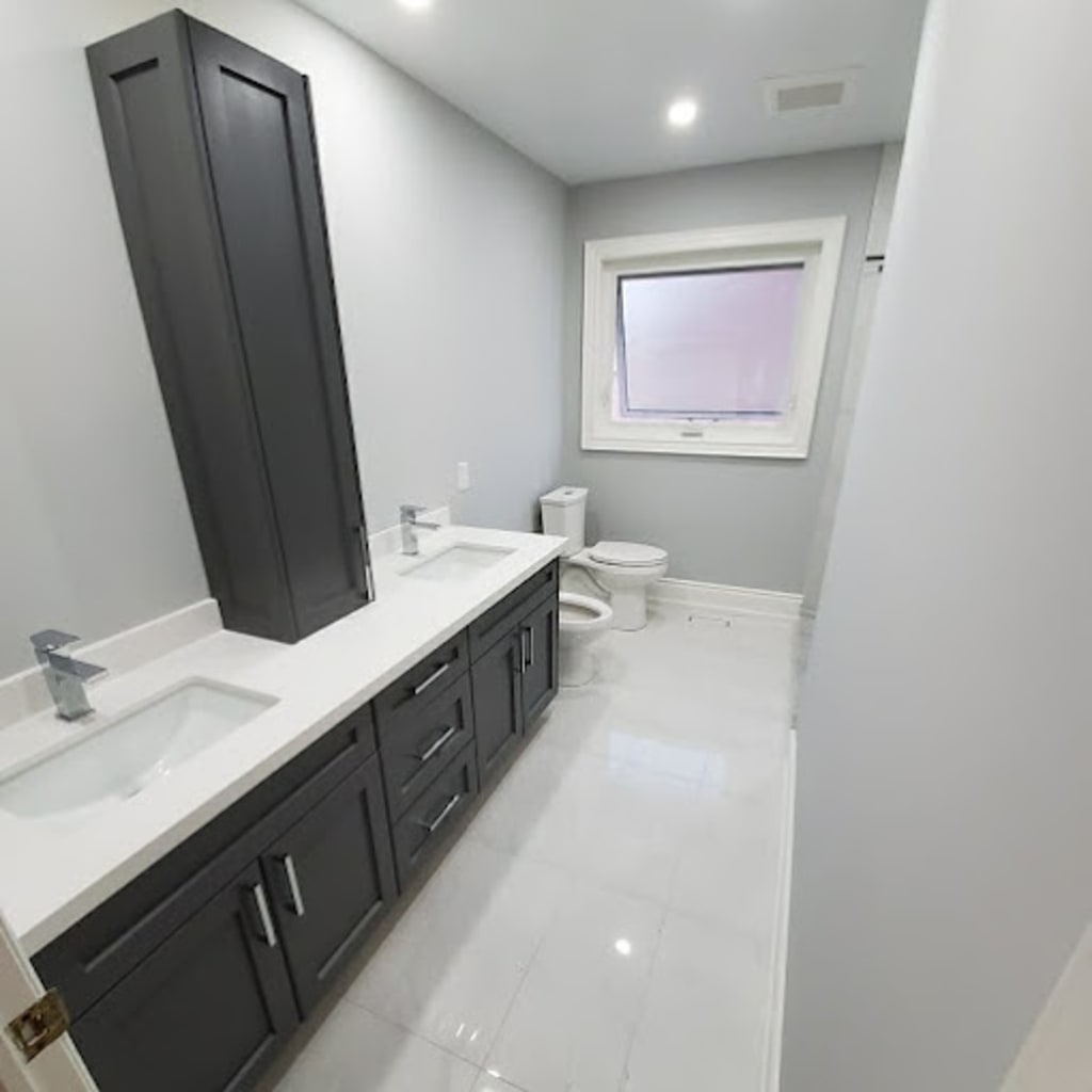
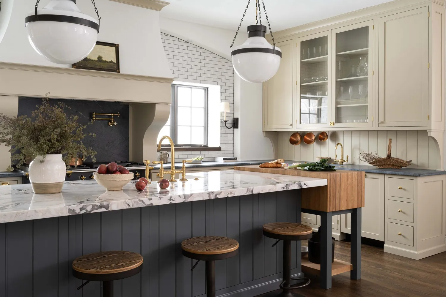
Charcoal gray provides a sophisticated balance between modern and classic aesthetics. It is a versatile neutral that harmonizes with both warm and cool materials, adding depth without overwhelming the space. This color is particularly adept at complementing different metal fixtures, including gold, silver, and matte black. Warm white, though perhaps less dominant than in previous years, remains a timeless choice when opting for natural, creamy off-white shades over artificial cool tones, and when integrated with other colors or neutrals in the space. Soft beige is presented as an alternative for those who find white too stark. Designer Terri Brien specifically champions Sherwin-Williams’ Accessible Beige for its subtle warmth, neutral undertones, and chameleon-like adaptability to various lighting and surrounding materials, such as warm metals or cool marble.
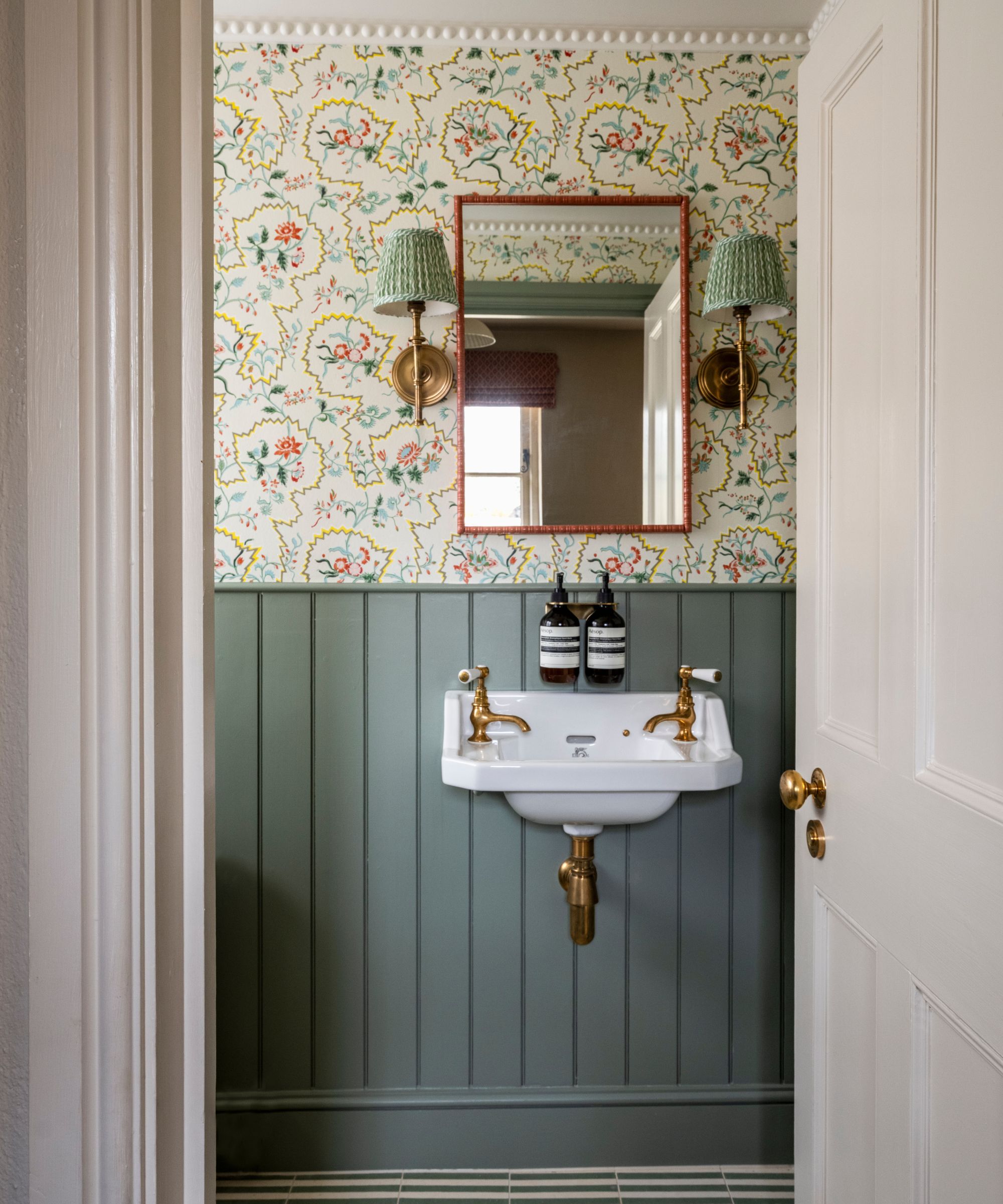
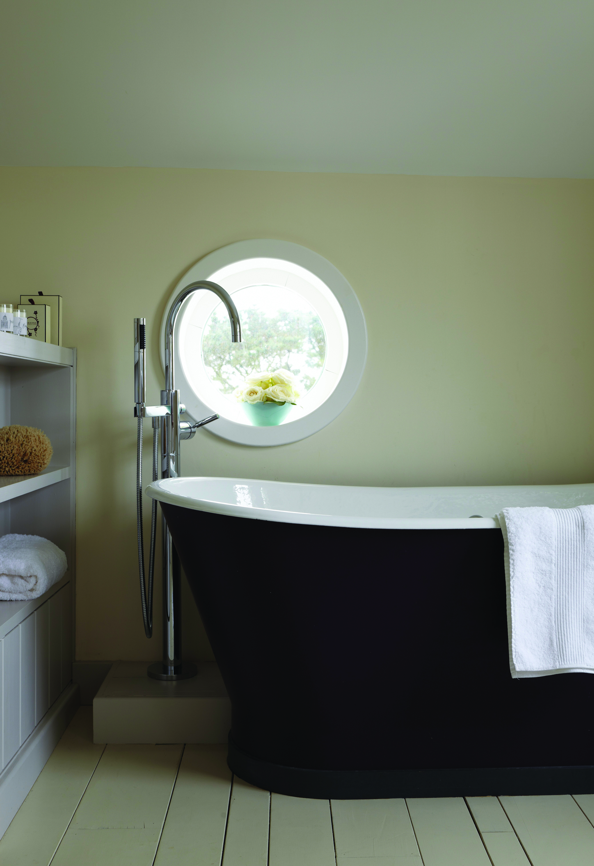
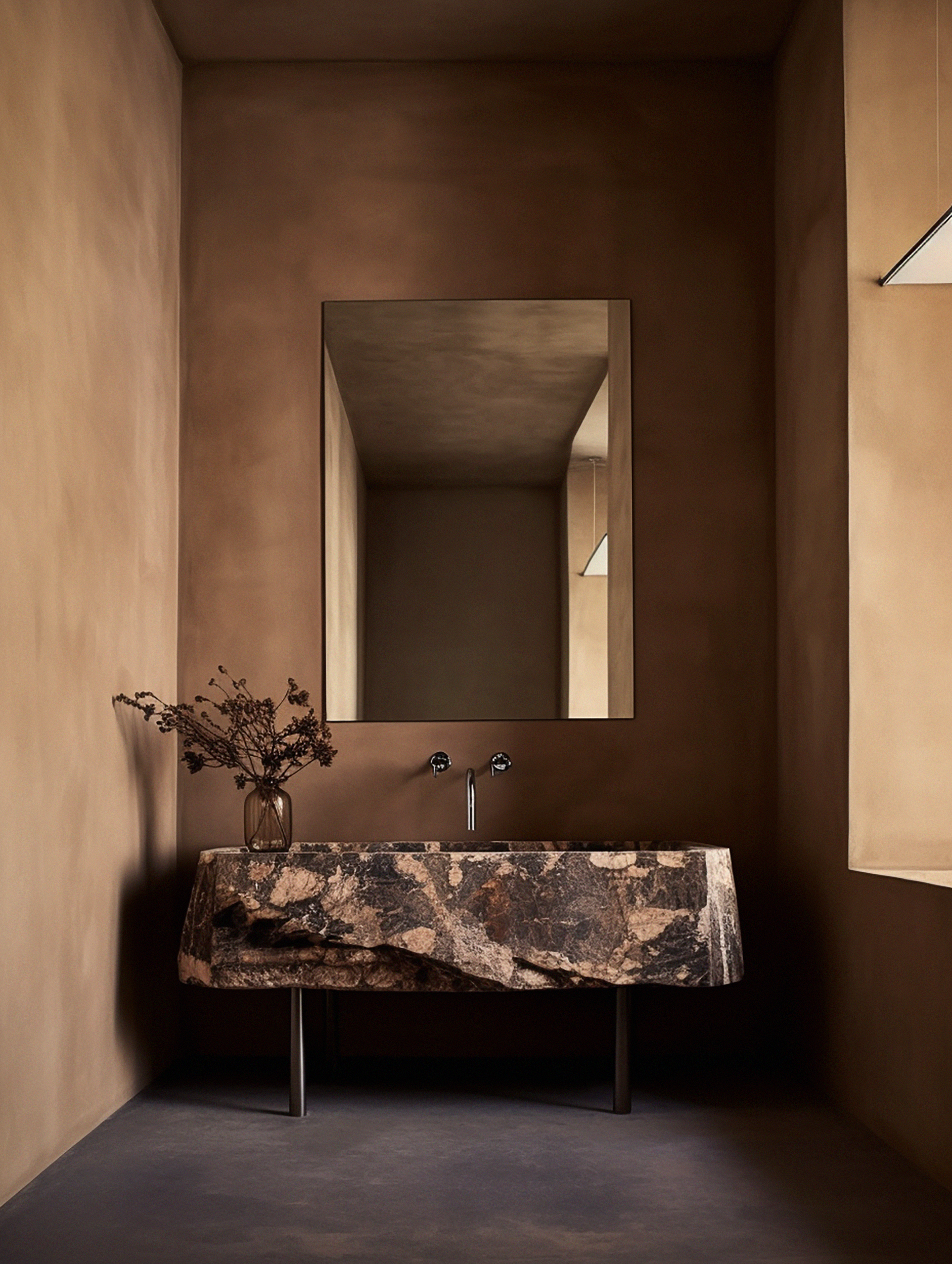
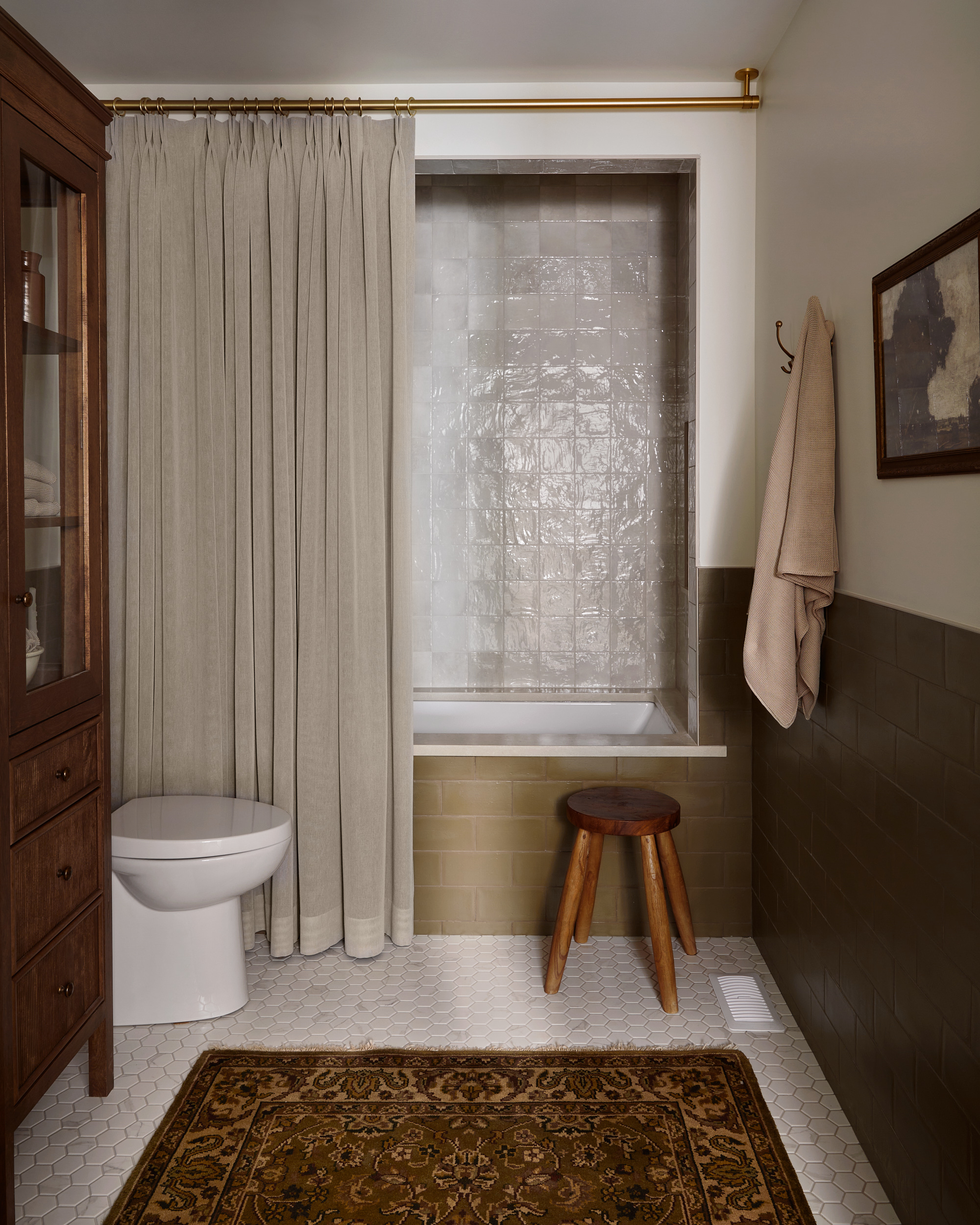
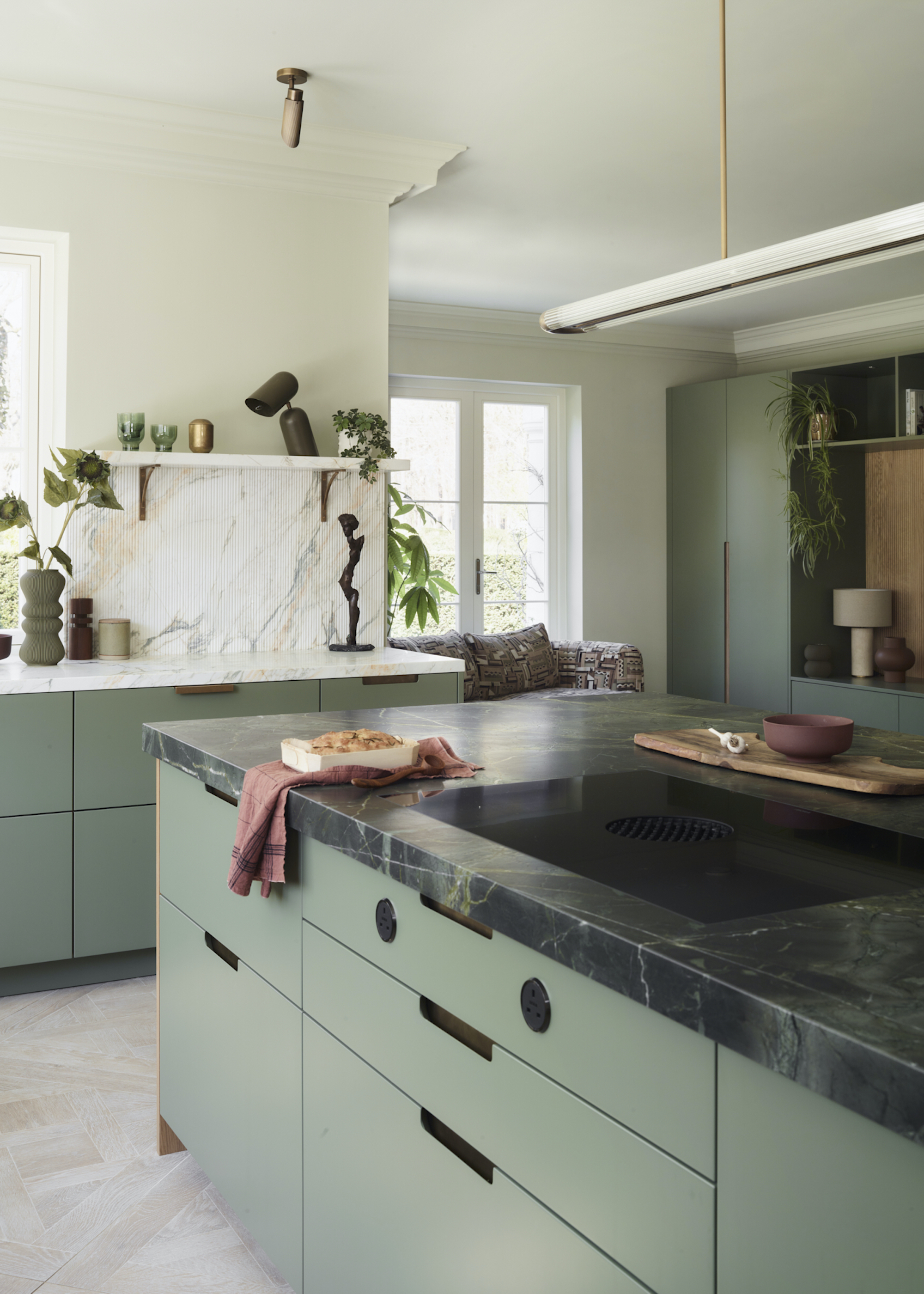
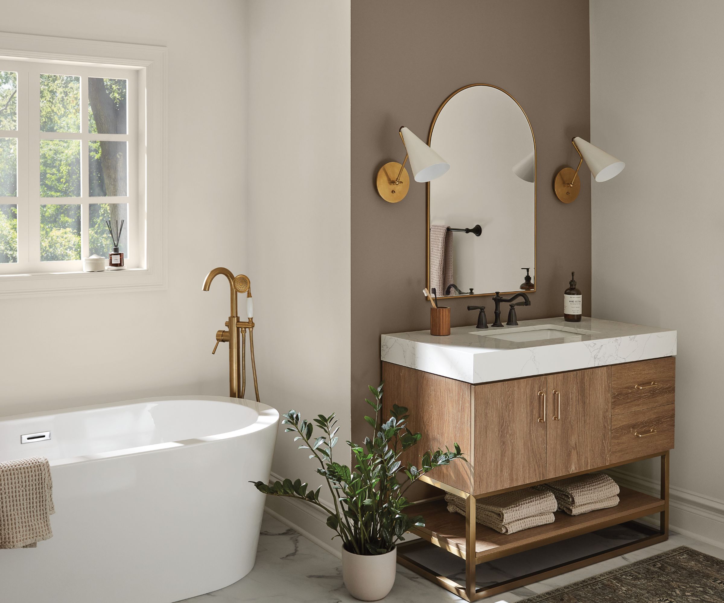
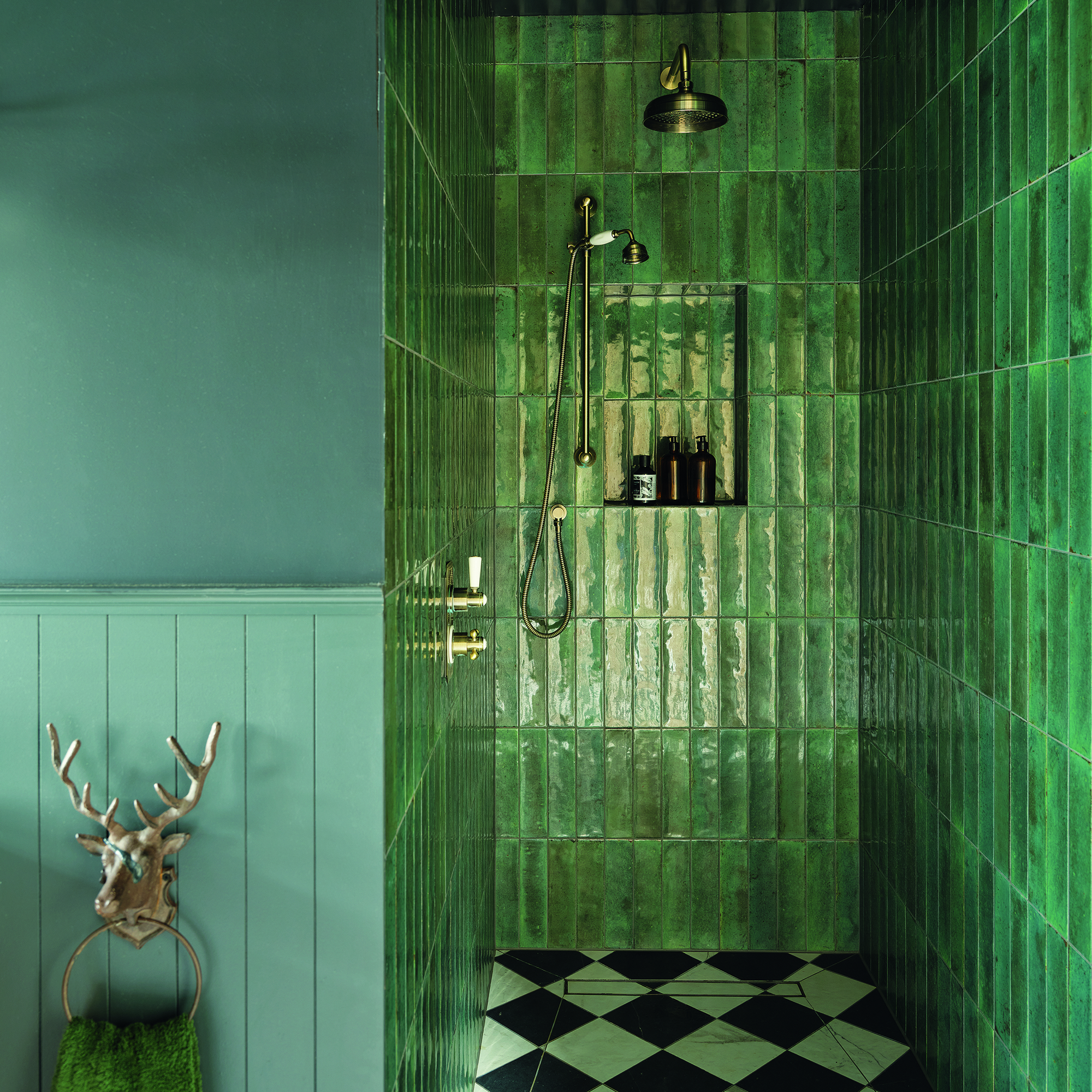
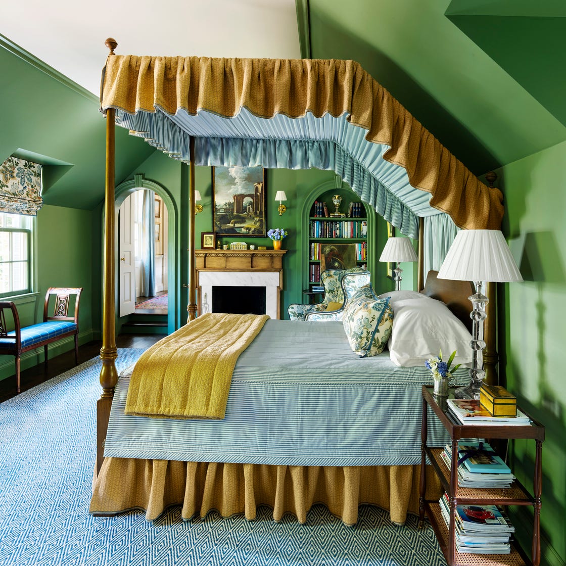
Green, an earthy and natural hue, is identified as a cross-cultural and cross-era classic. Its versatility allows it to be paired with brass for an old-world feel, marble for luxury, or black hardware for a modern touch. Designers suggest rich, olive, or mossy greens for grounding and nature-inspired aesthetics, while muted sages offer calm and serenity. The emotional resonance of green, conveying freshness and restoration, adds to its enduring appeal. Finally, taupe, a classic neutral, is presented as a mid-toned option richer than beige but softer than brown. It provides saturation and contrast without being overly dark. Benjamin Moore's Brandon Beige is cited as a favorite taupe, praised for its grounding neutrality and ability to work with both cool and subtly warm tones. The consensus among designers is that selecting natural, nature-inspired, and neutral shades with minimal undertones is key to achieving a timeless and appealing bathroom vanity.
#BathroomDesign #VanityColors #InteriorDesign #HomeDecor #TimelessTrends #ColorPalette #DesignersChoice #BathroomDesign #VanityColors #InteriorDesign #HomeDecor #TimelessTrends #ColorPalette #DesignersChoice
0 comment in total
 No comments yet
You may also like
The 7 Biggest Bathroom Color Trends to Try If You Are Remodeling in 2026

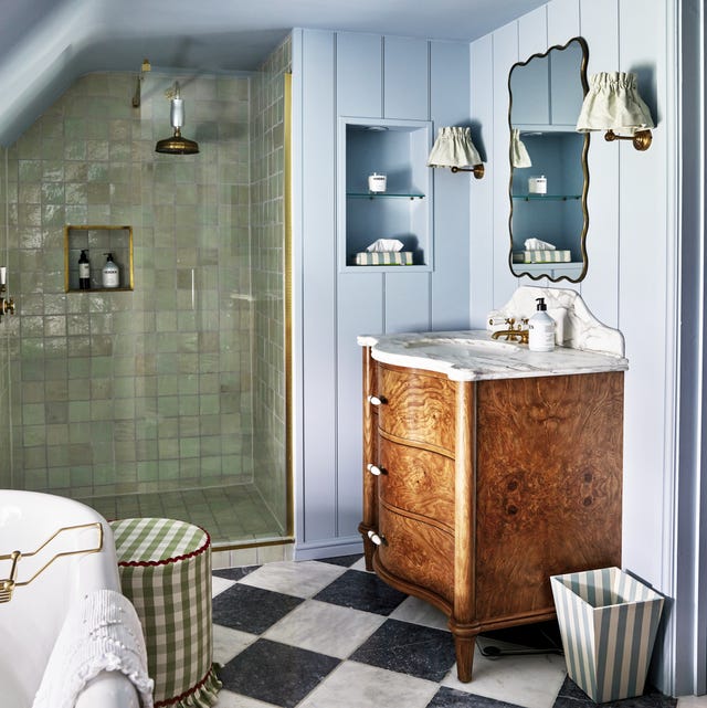
10 bathroom trends that will define 2026 – from floating vanities to pastel tones
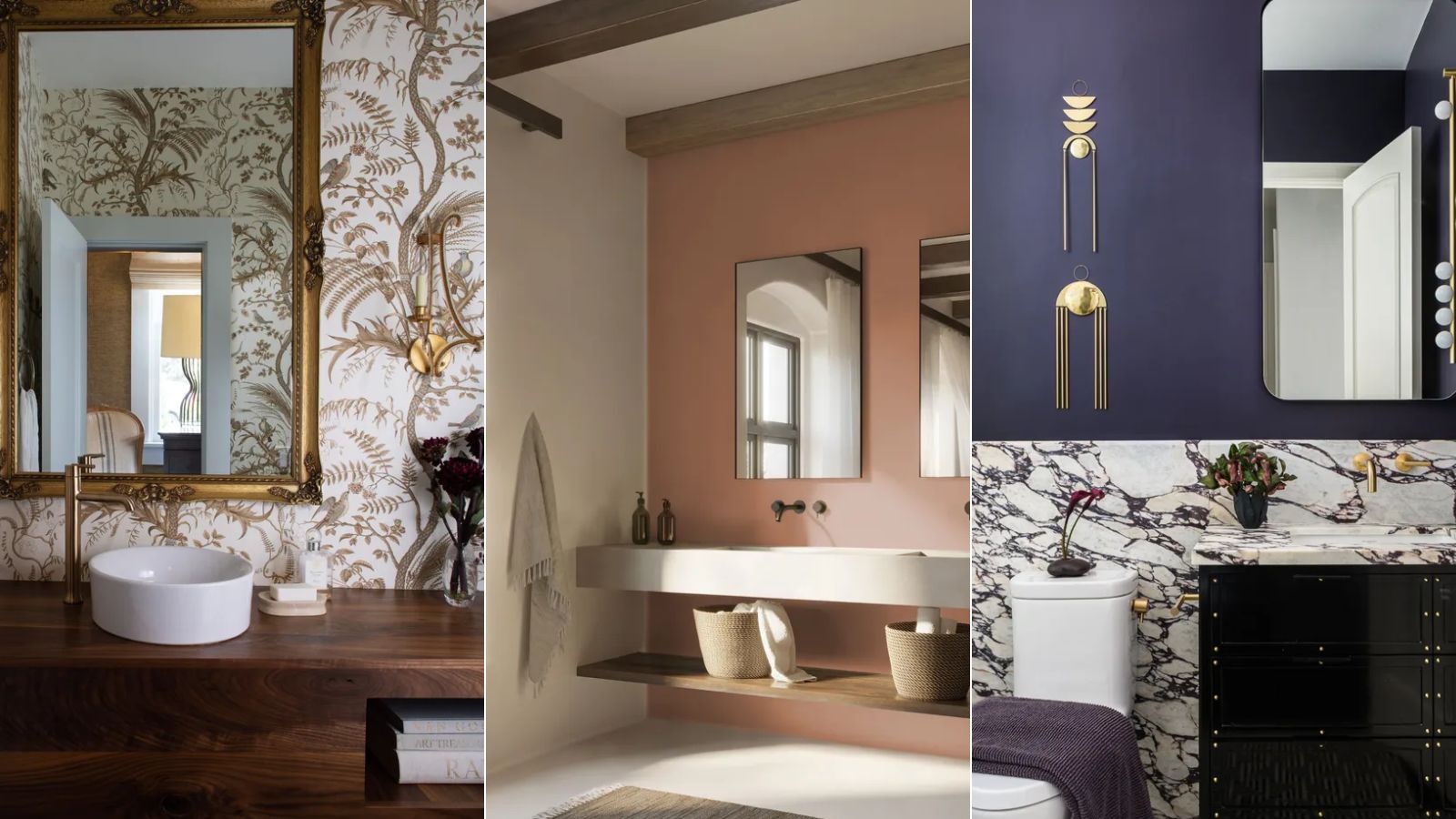
Bathroom color trends – the most stylish shades for this functional room in 2025
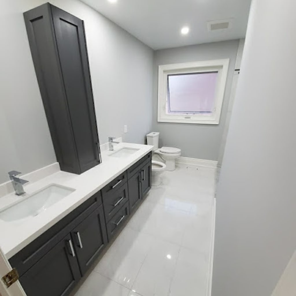
Color Trends for Bathroom Vanities and Cabinets in 2025
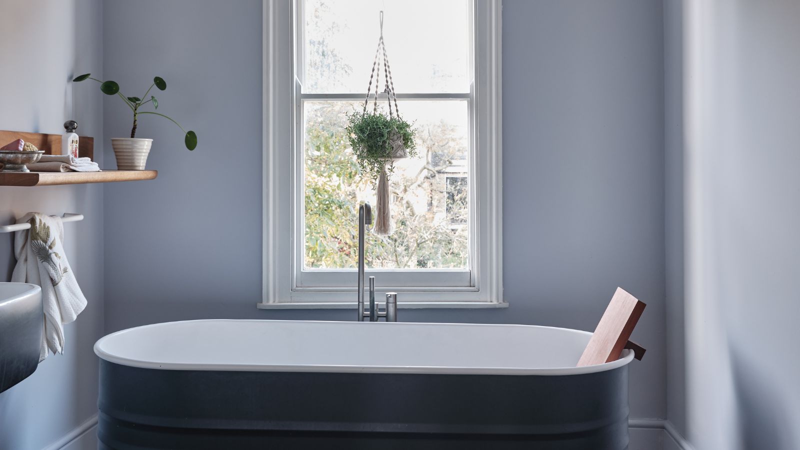
Bathroom colors going out of style in 2025 – and the designer-approved shades to decorate with instead
These 7 Colors Will Rule Interiors in 2026, According to Experts

Color Trends for Bathroom Vanities and Cabinets in 2025

5 Bathroom Design Trends Already Taking Over in 2026
5 colors designers say are outdated for bathrooms - and what they're choosing instead for 2024

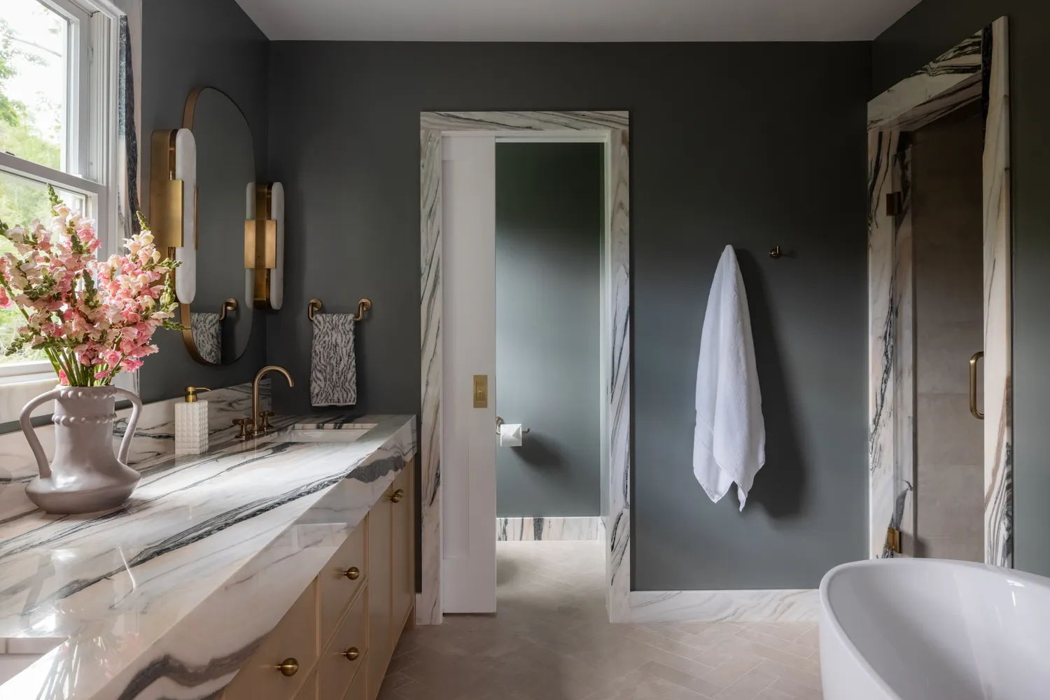
These 5 Bathroom Paint Colors Are Already Trending for 2026, Designers Say


8 Paint Color Trends You'll ACTUALLY Want to Live With in 2026, According to Designers

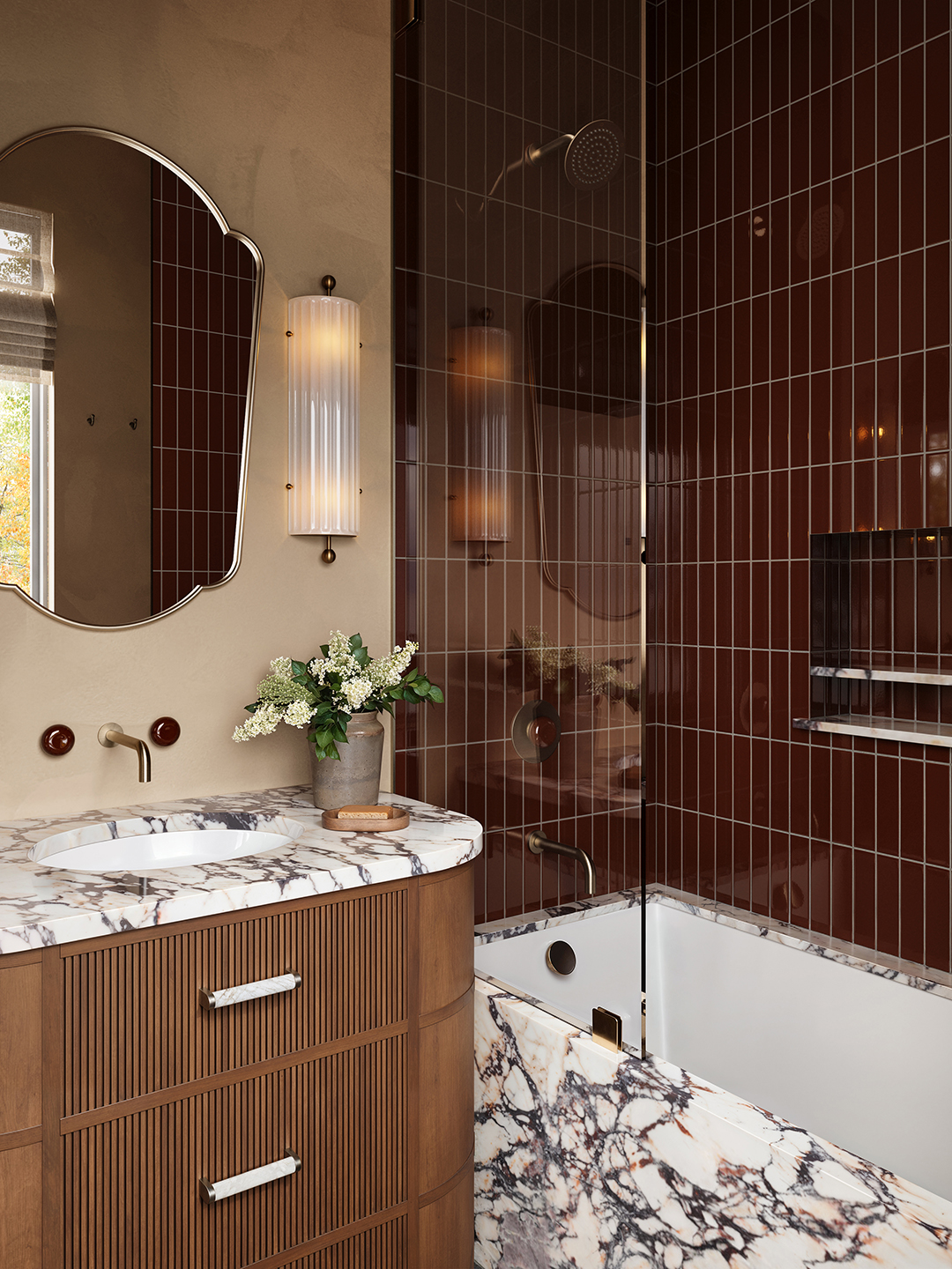
The Colorful Bathroom Reno on Our Radar for 2026

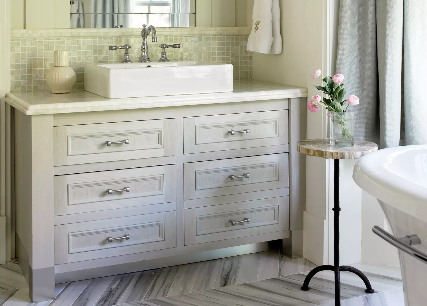
3 Bathroom Vanity Colors That Designers Are Ditching In 2025
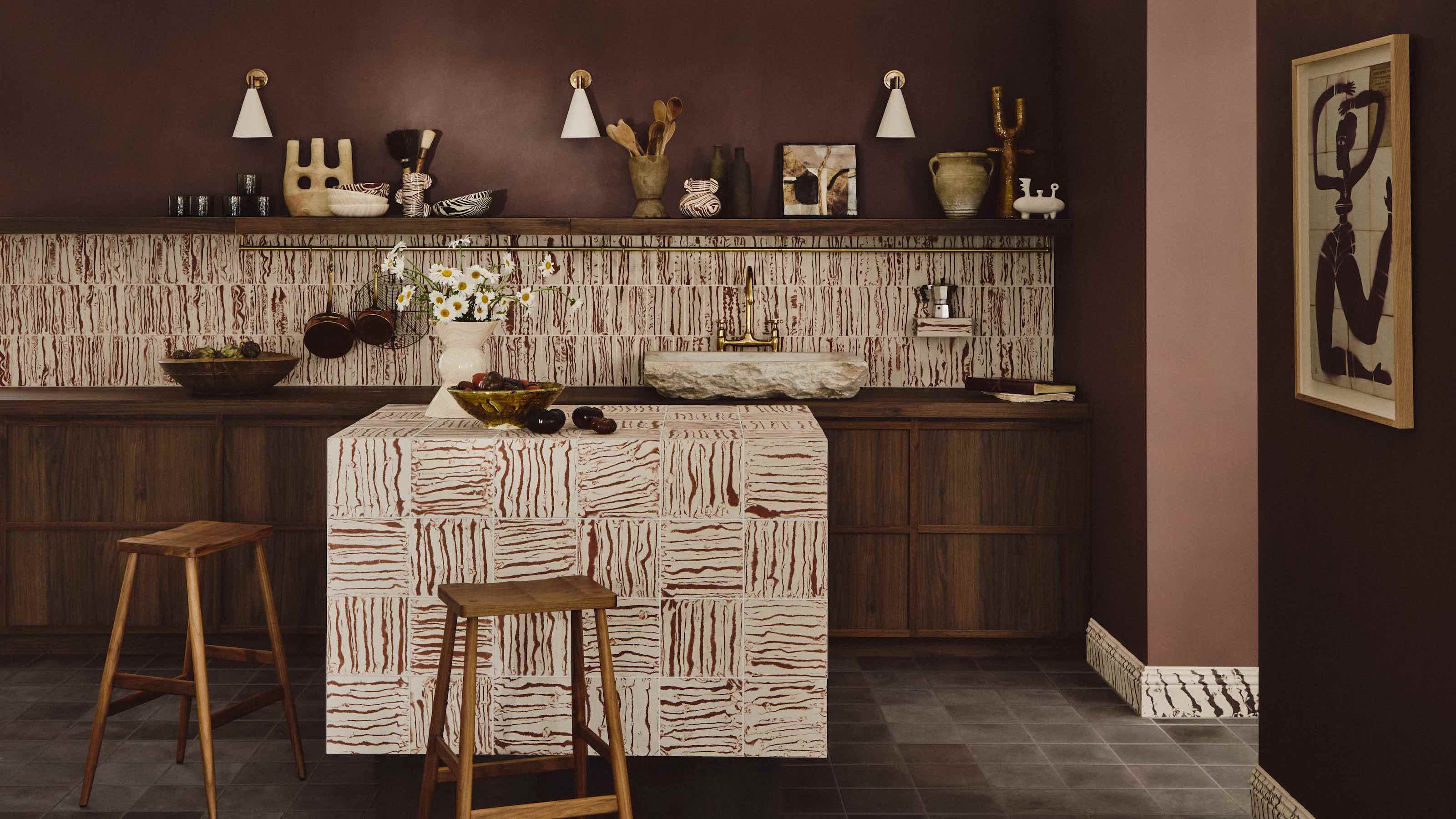
7 Kitchen Color Trends That Are Set to Take Over 2026

7 Bathroom lighting trends to illuminate a stylish space in 2025
Designers Have Spoken: Here Are the Top Bathroom Design Trends for 2026

4 Bathroom Colors That Are Going Out of Style in 2025 — Don't Say We Didn't Warn You
6 Bathroom Trends Designers Can't Wait to Say Goodbye to in 2026

Jewel box bathrooms are the anti-neutral colour trend you'll want to know about in 2025
7 Trendy Paint Colors for Every Room in 2026, According to Designers