تطبيق Ideal House
منصة تصميم الداخلية الاختيارية الخاصة بك
افتح التطبيق
IDEAL HOUSE
الرئيسية
Board
استكشاف
تسجيل الدخول
التسعير
API
المزيد
الرئيسية
Board
استكشاف
الكوكيز (Cookies)
نستخدم الكوكيز لتحسين تجربتك وتحليل البيانات. يمكنك إلغاء تنشيطها في أي وقت.
المعلومات والإعدادات
قبول الكل
رفض الكل
يُعني استخدام IdealHouse موافقتك على استخدام الكوكيز. يمكنك العثور على معلومات مفصلة حول كيفية استخدامنا للكوكيز في
سياسة الخصوصية
.
سياسة الخصوصية
إغلاق
Svetla Gorbunova
+ تابع
مشاركة
Svetla Gorbunova
+ تابع
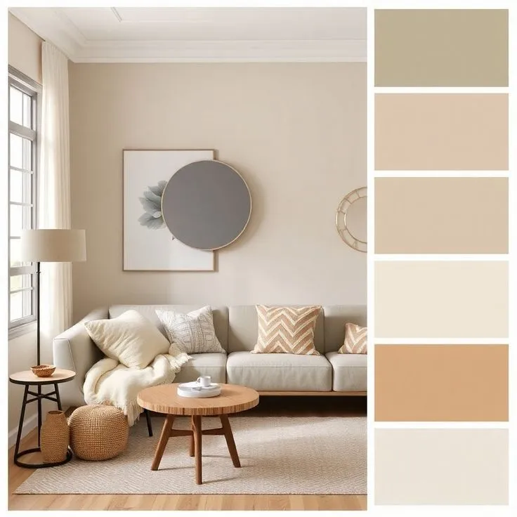
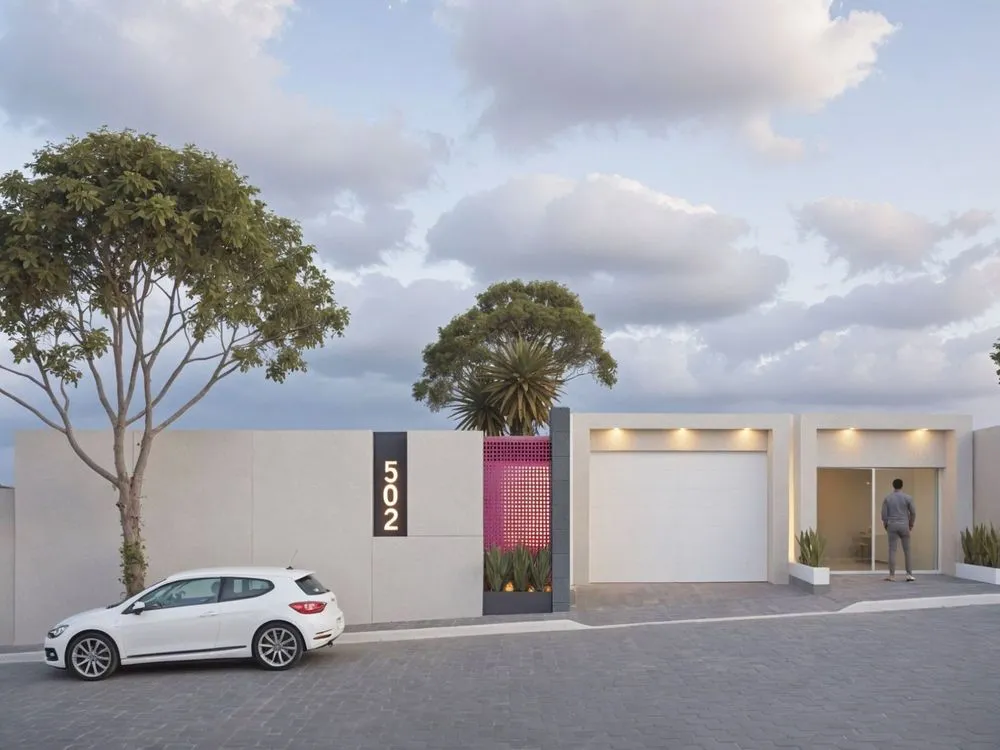
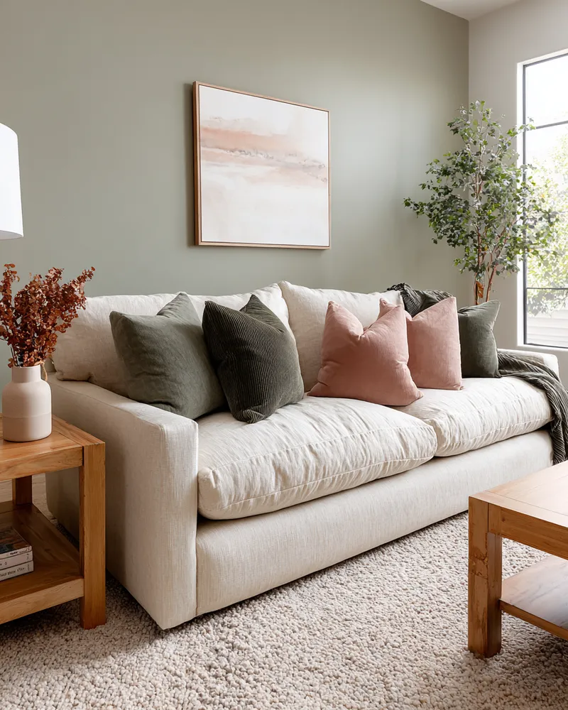
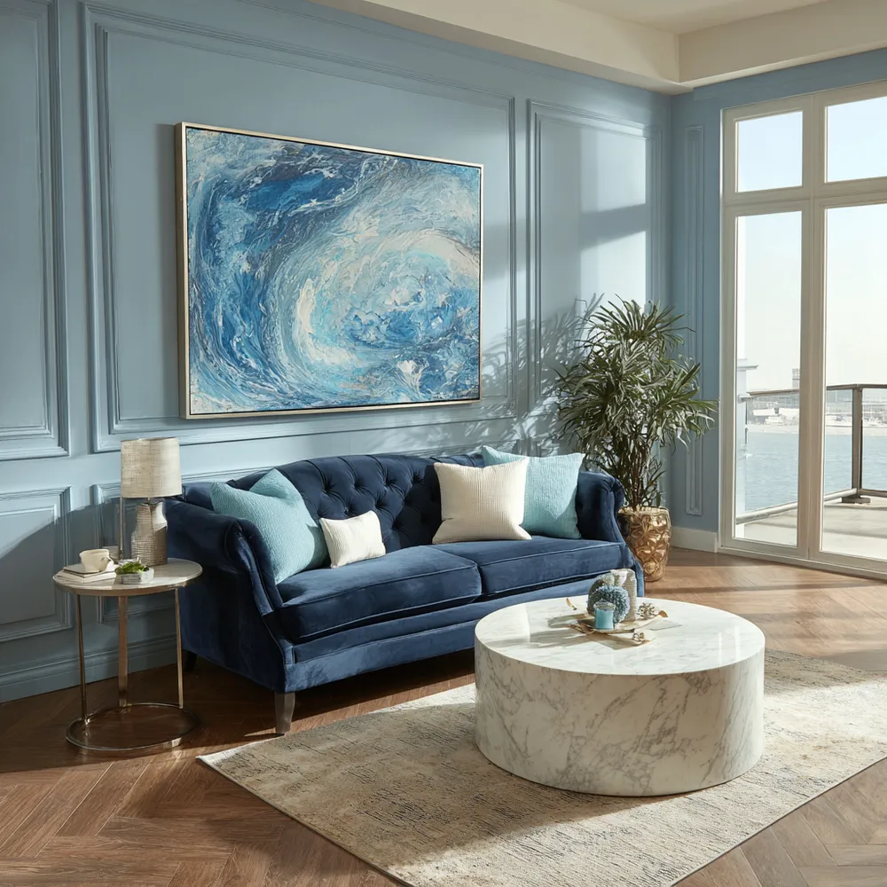
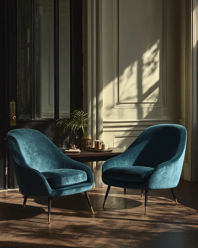
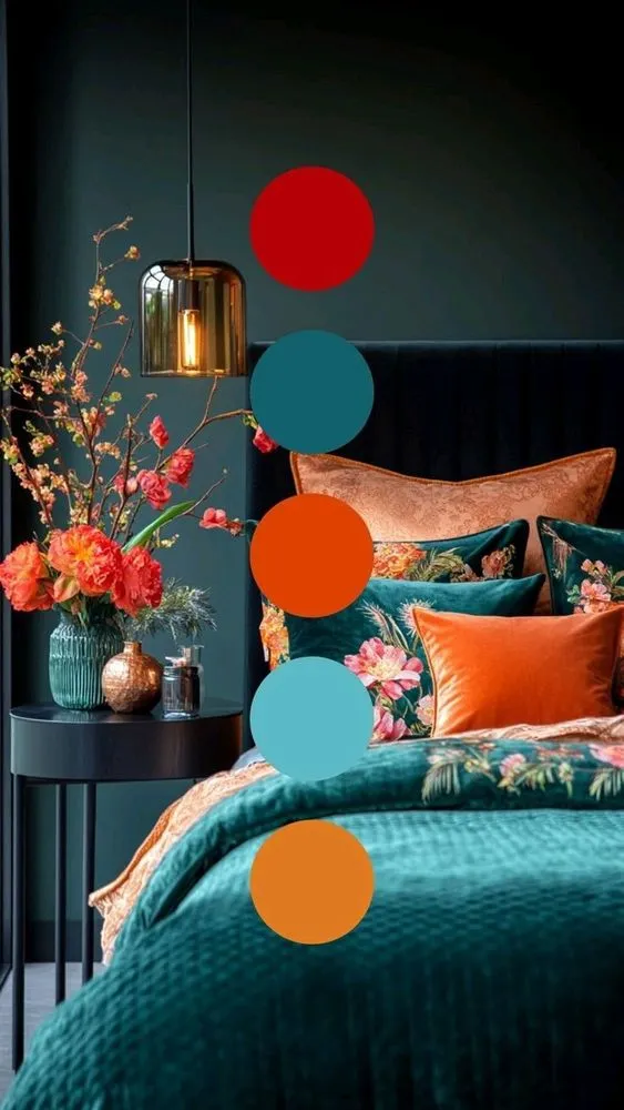
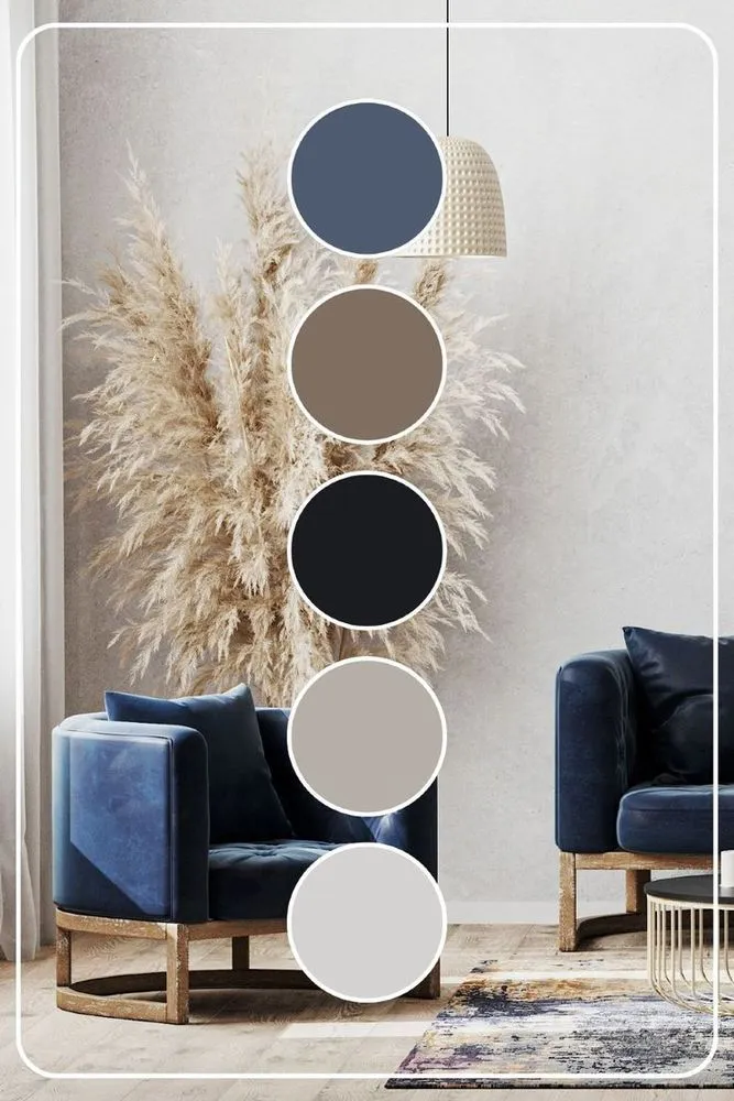
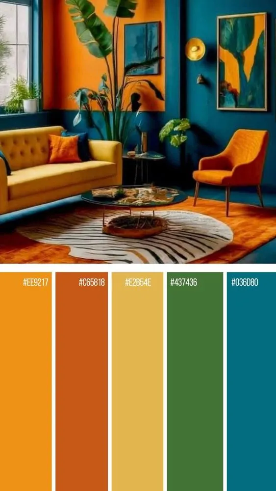
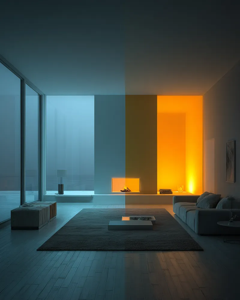
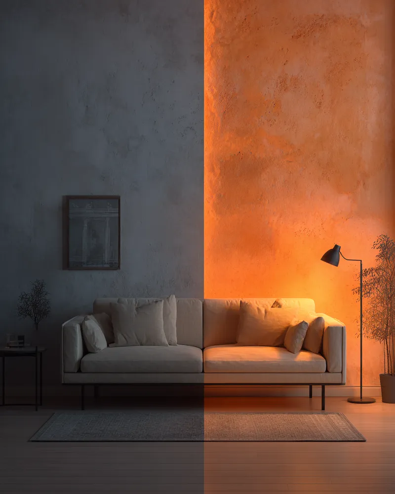
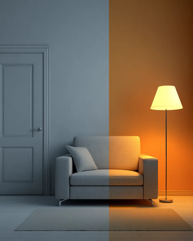
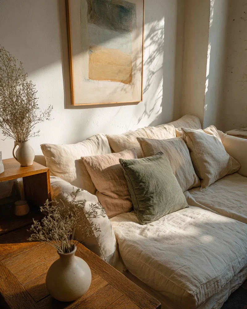
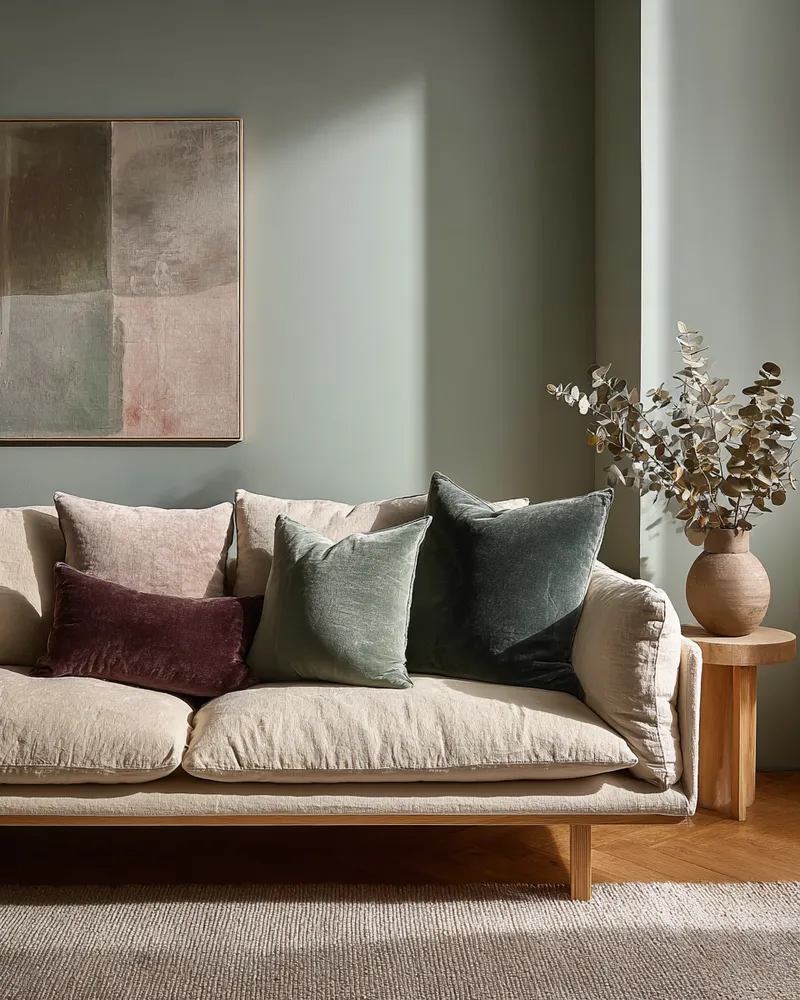
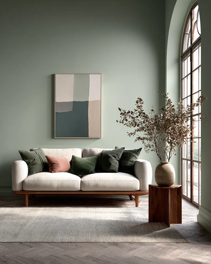
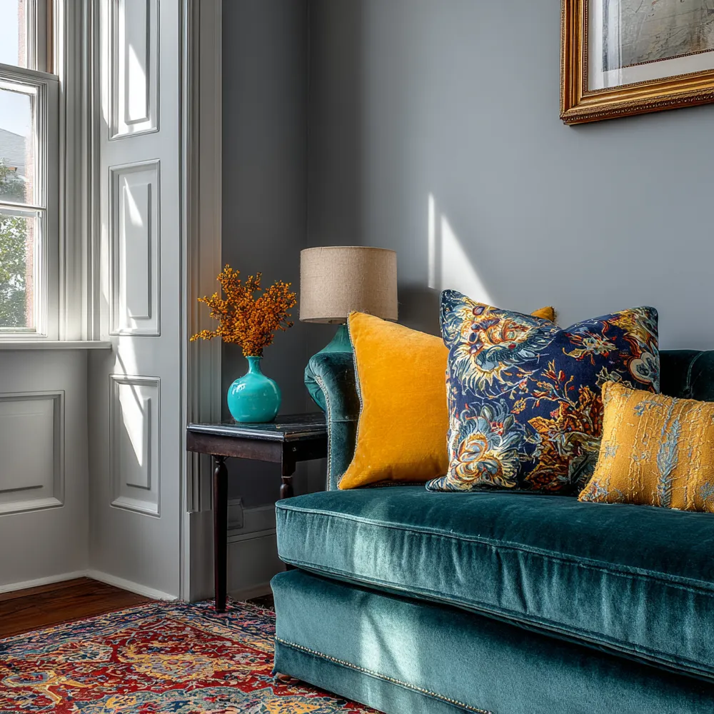
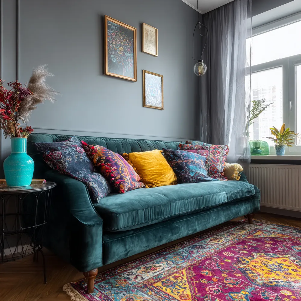
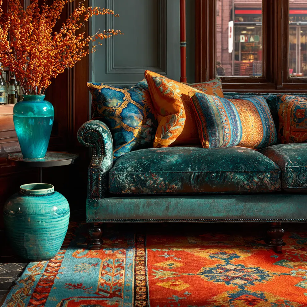
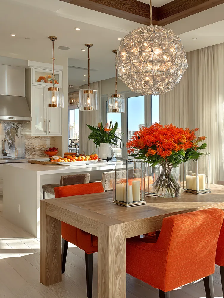
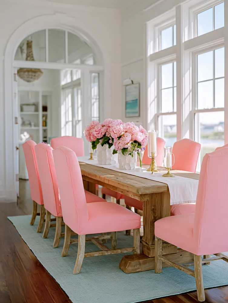
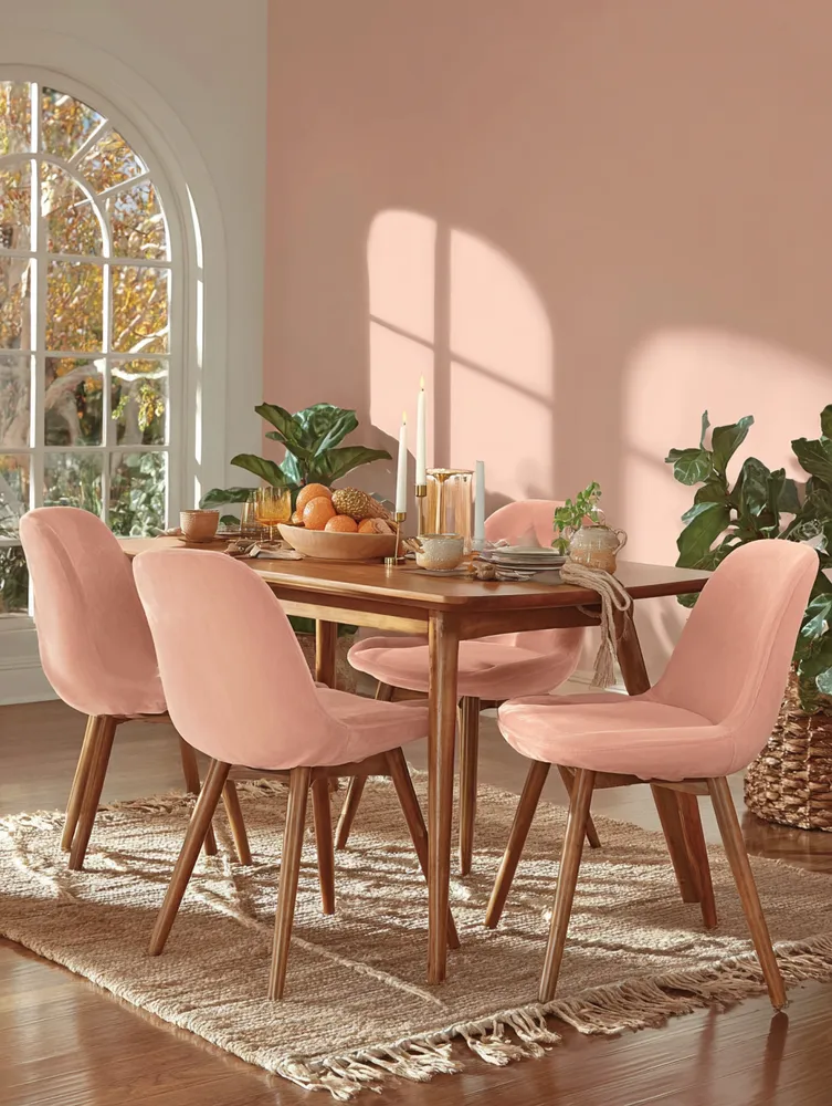
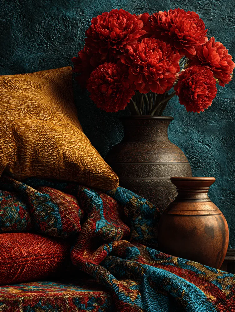
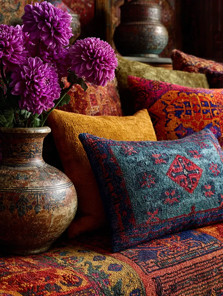
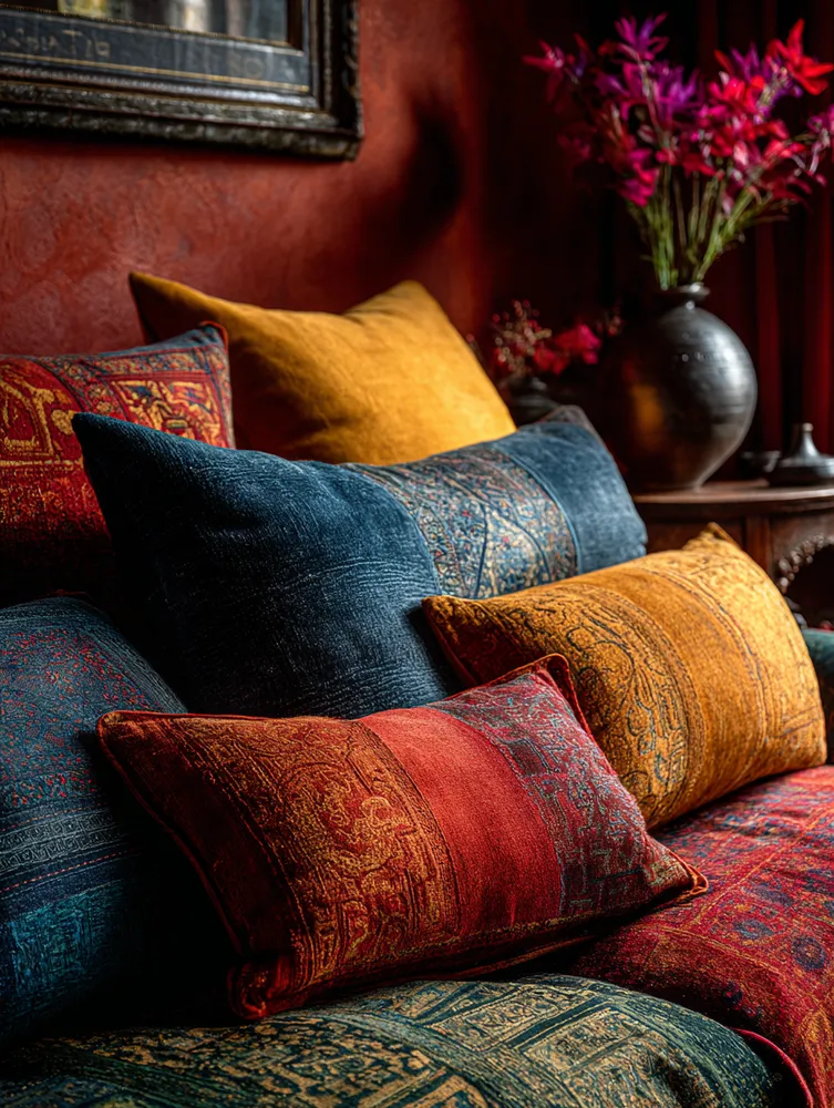
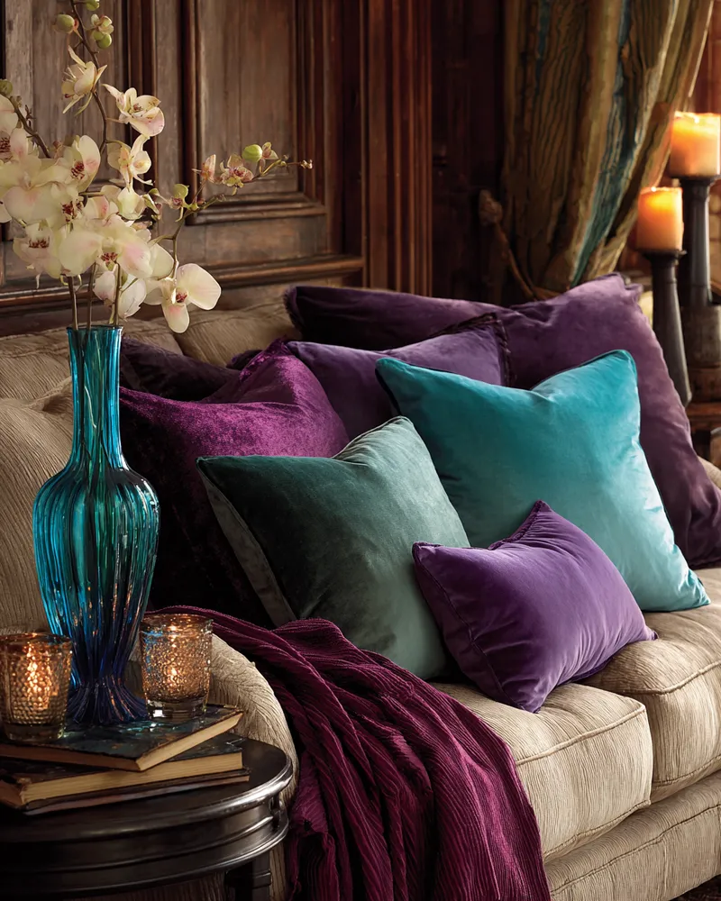
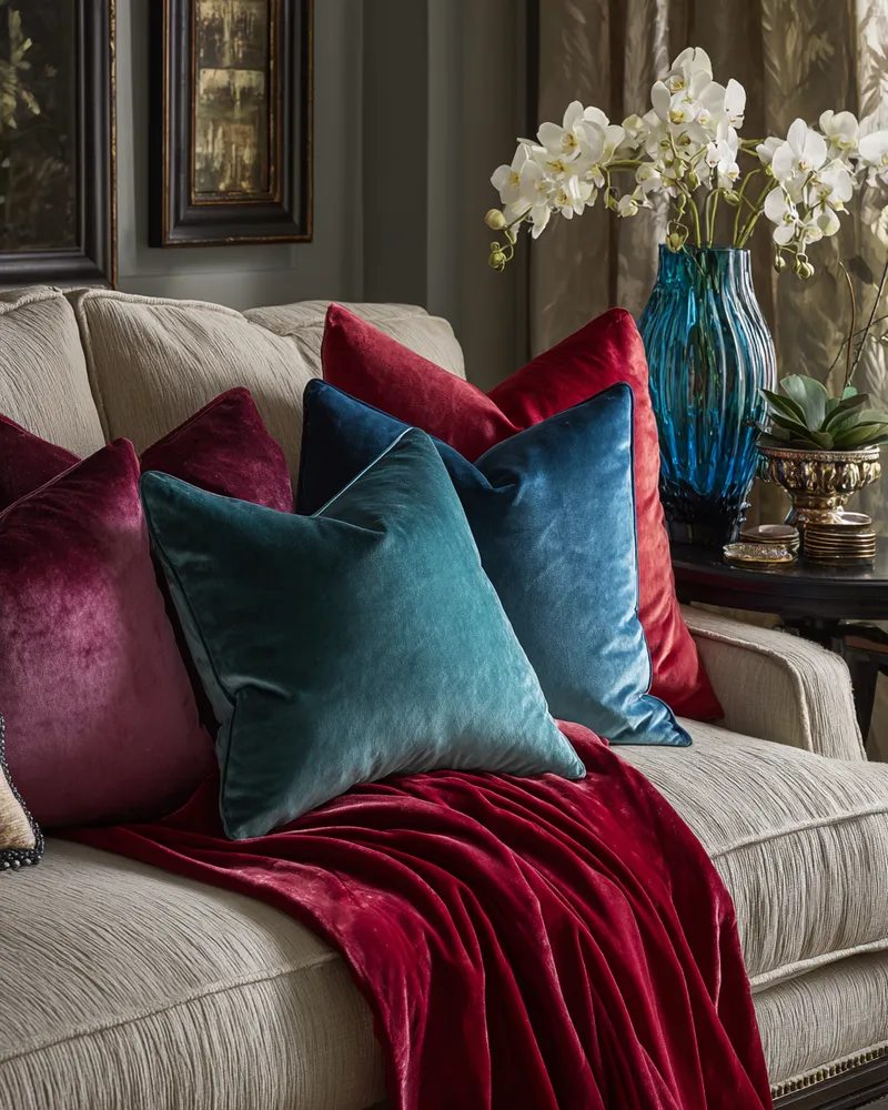
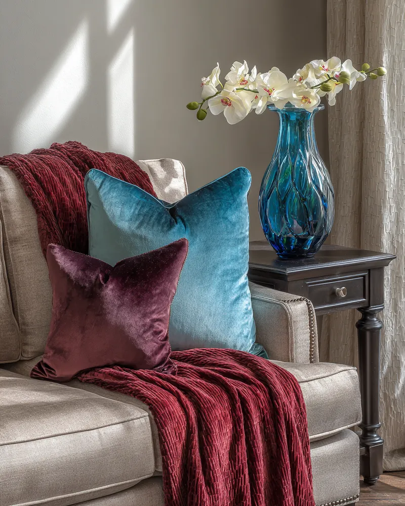
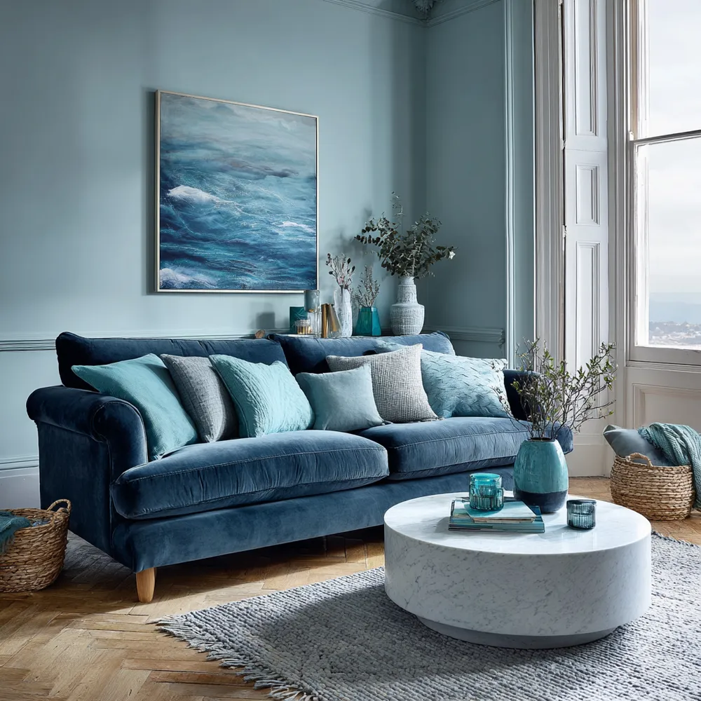
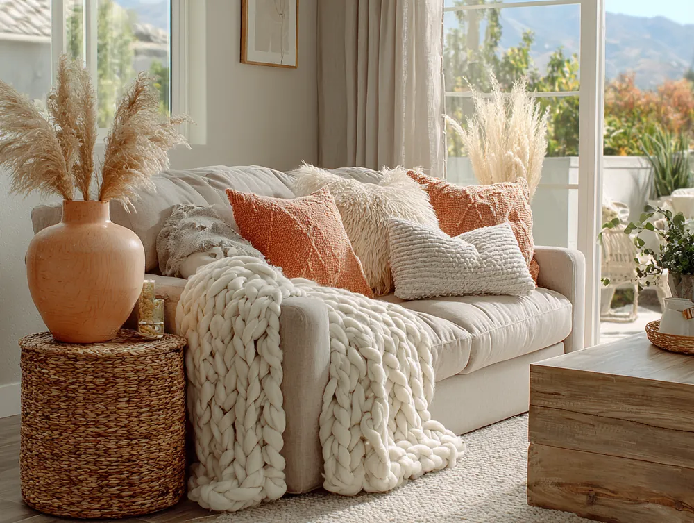
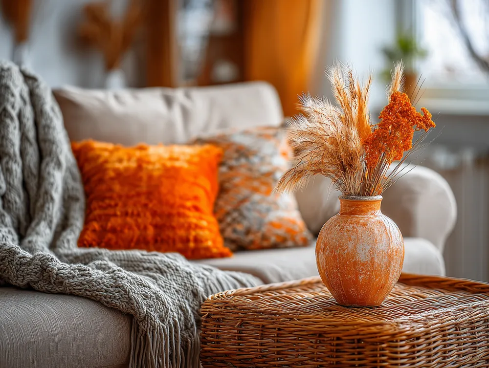
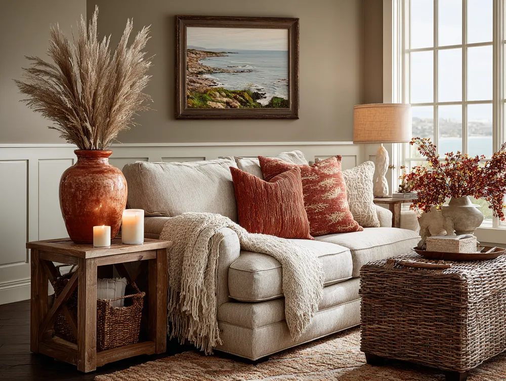
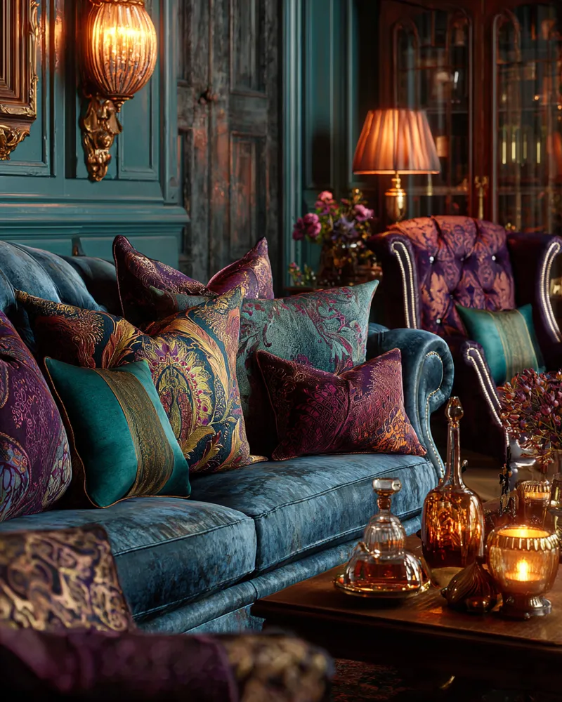
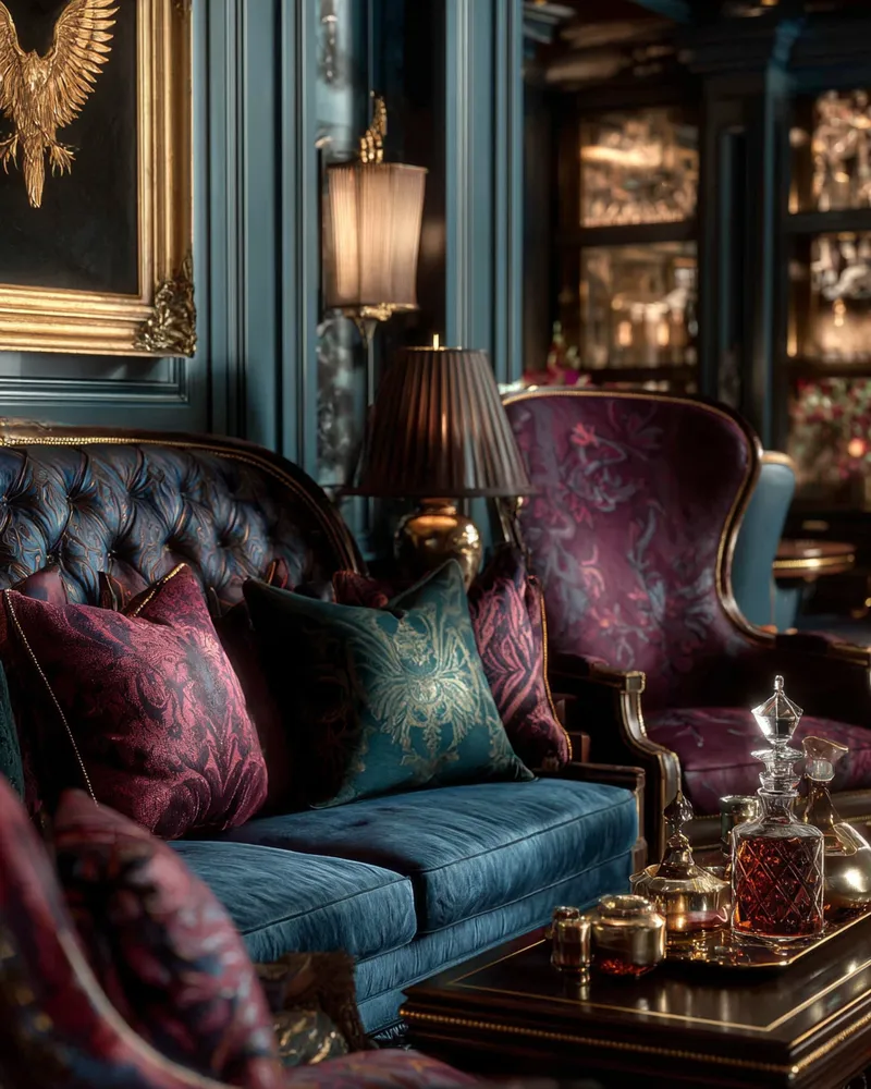
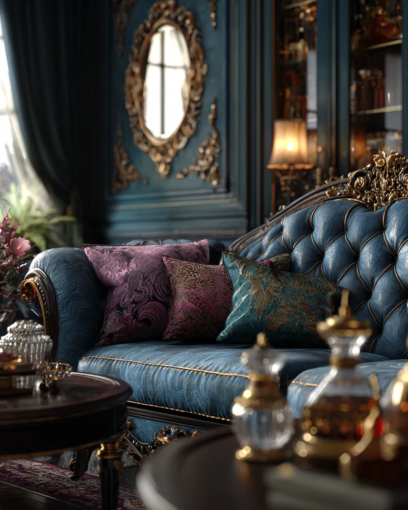
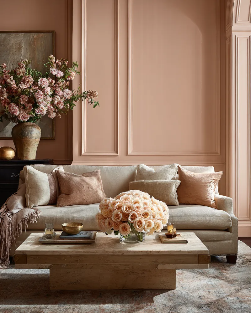
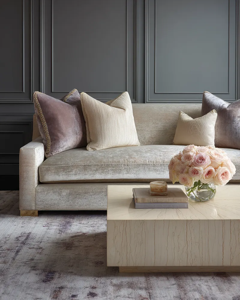
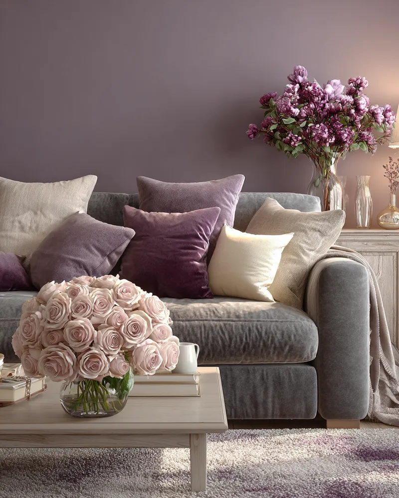
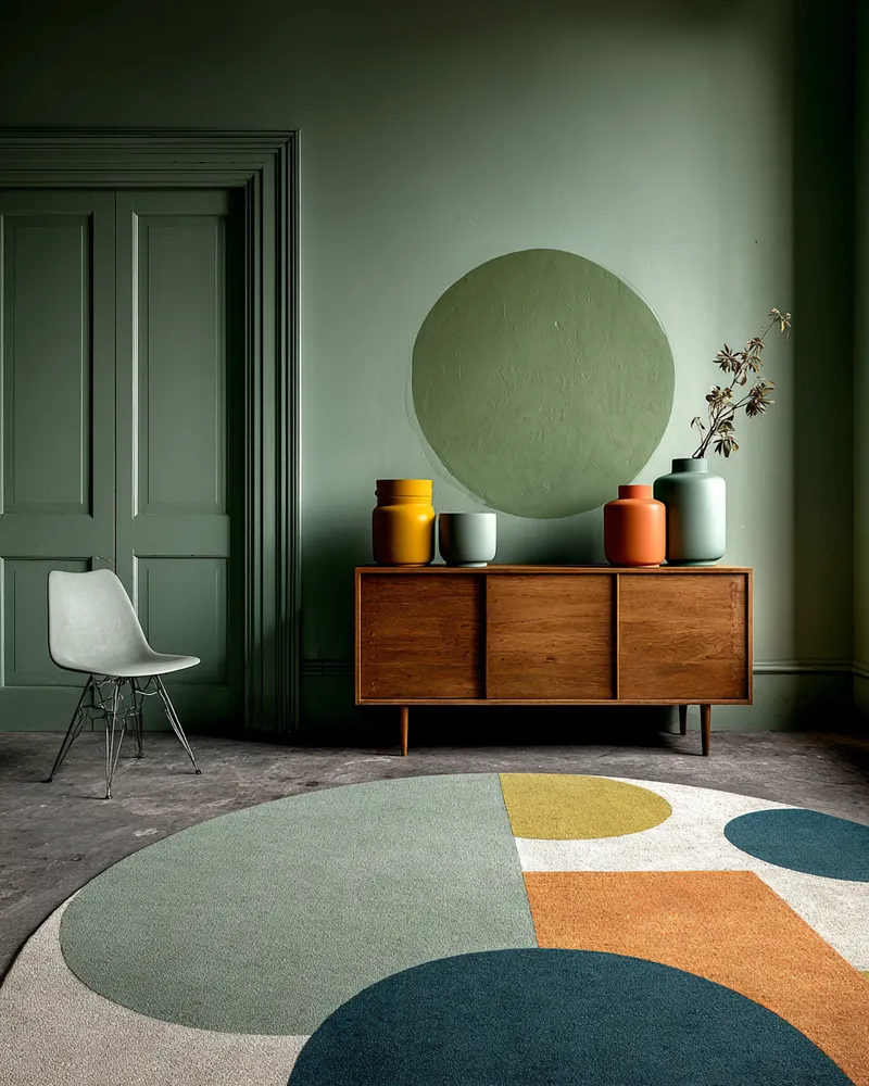
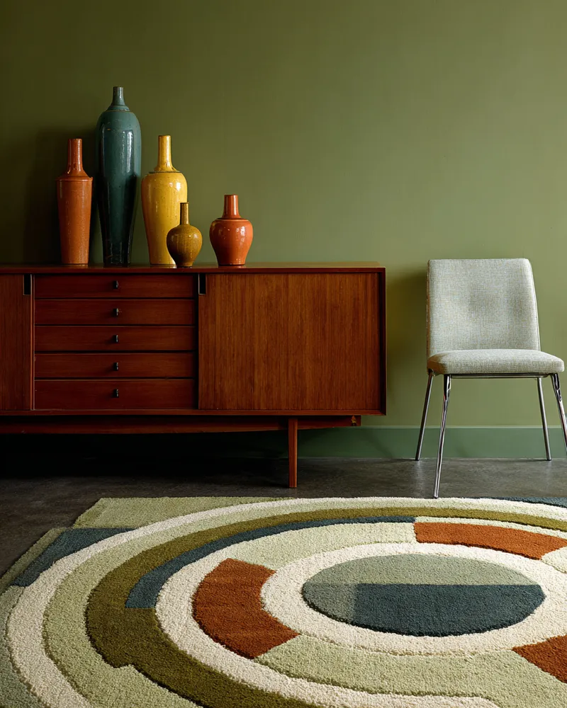
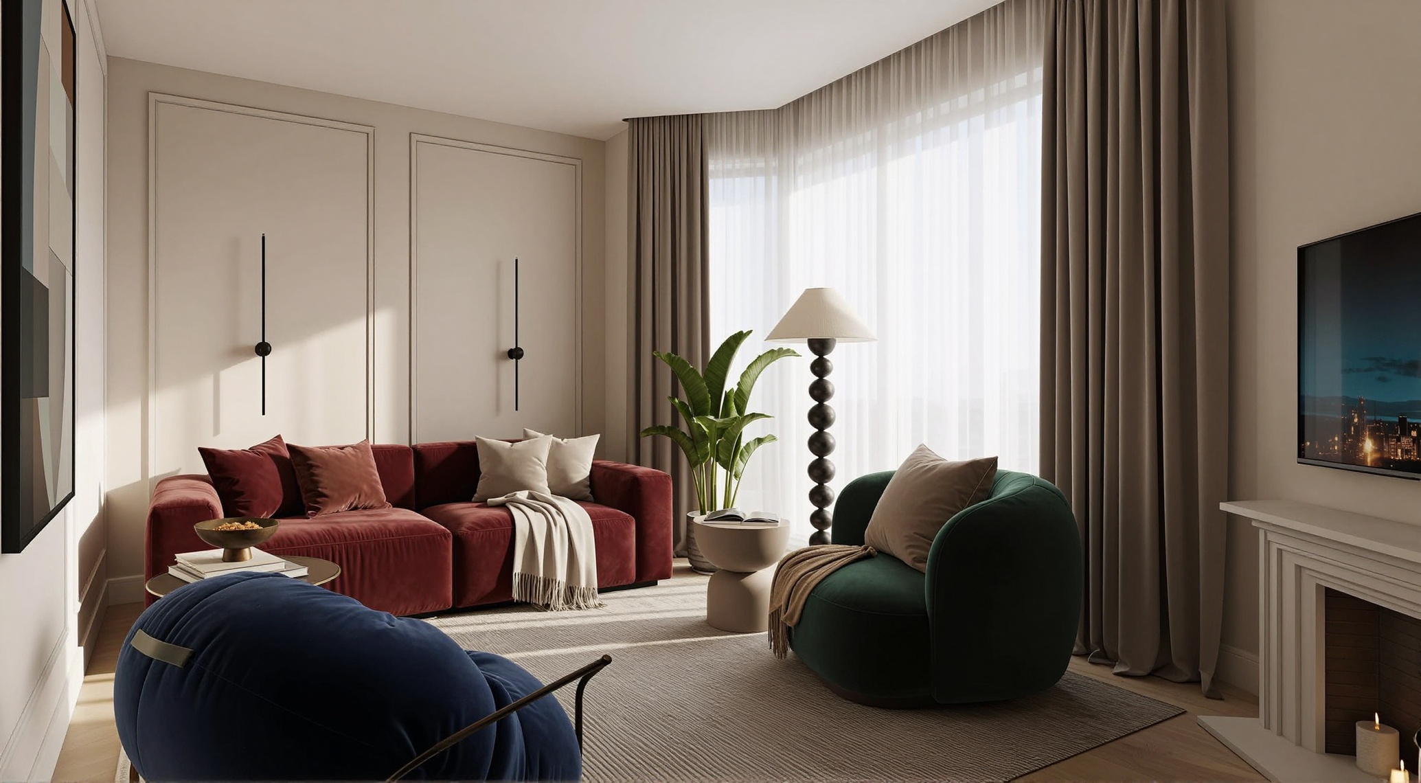
Цвет в интерьере
светлая база и цвет в мягкой мебели
منذ 21 ساعة
0 تعليق إجمالاً

لا توجد تعليقات بعد
قد تعجبك أيضًا
Purple Interior💜
GwenS
4
Adding a Pop of Coral: Vibrant & Cheerful Dining Room Hues 🍊
The Palette Painter
Coral & Comfort: Warmth for Cozy Living Spaces 💖
The Colour Spectrum
The Art of Mid-Century Color Palettes 🎨
Mid-Century Modernist
Color Psychology Meets Interior Design🎨
Russell--D
Curated Color Palettes for a Playful Home 🌈🎨
Whimsical Wonders
Jewel Toned Accents: Adding Richness to Your Space ⚜️
Velvet & Vignettes
Muted Mauve Magic: Sophisticated Living Room Palette! 🌸✨
Color Story Designs
Color Theory 2.0: Dynamic Hues That Respond to Your Environment 🌈
Avant-Garde Visions
Layering Color and Personality in a Small Apartment 💡
Spectrum Style
просто
י
ילנה ירושלמי
1
decorar para sala
S
Silvia
2
Exploring the Power of Color in Interior Design
yuki_zzz
3
Color Story: Designing with Bohemian Hues! 🌈🌸
Boho & Bloom
Jewel-Toned Dreams: Bold Color Palettes for Daring Decor! 💎
Maximalist Manifesto
casa mexicana
J
J ARROYO
3
Unlocking Serenity: A Guide to Mindful Color Palettes 🎨
The Chroma Collector
1
Colors house
A
Arslan Aziz
2
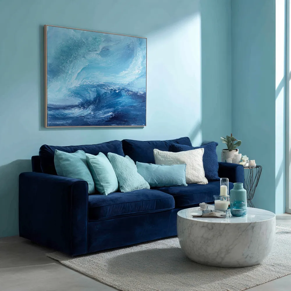
The Power of Blues: Creating Calm Spaces with Color 💙
Color Palette Pioneer
Unveiling the Power of Teal: A Blend of History and Tranquility 💙💚
The Color Historian
+3
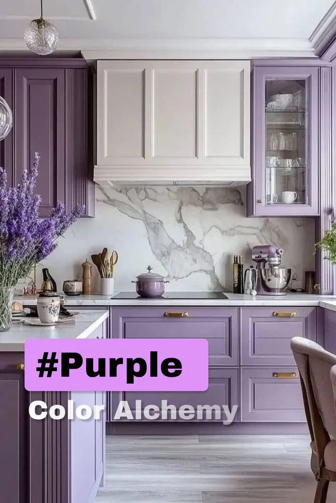
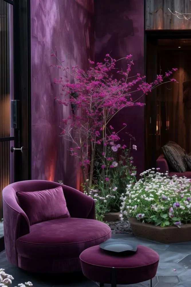
Purple Interior💜
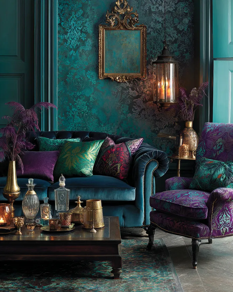
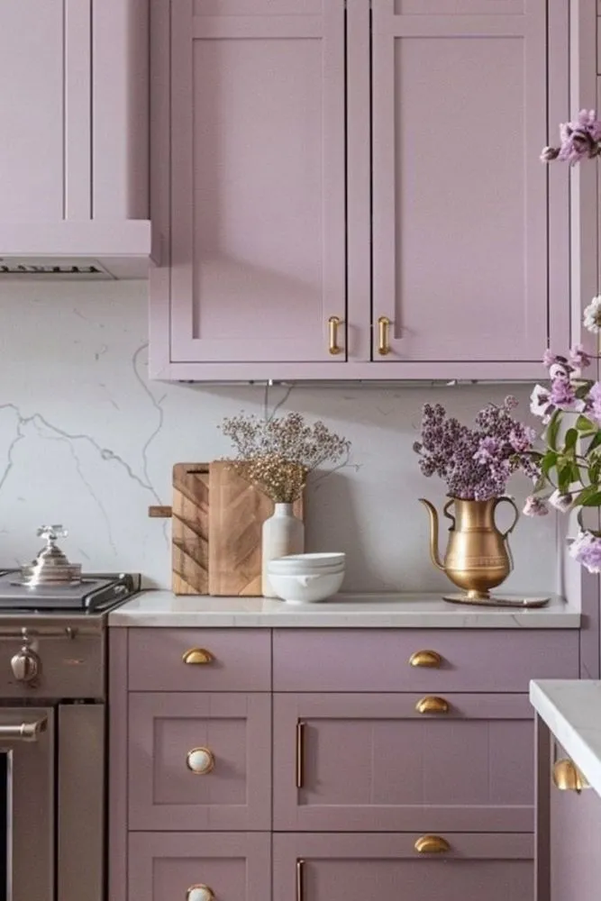
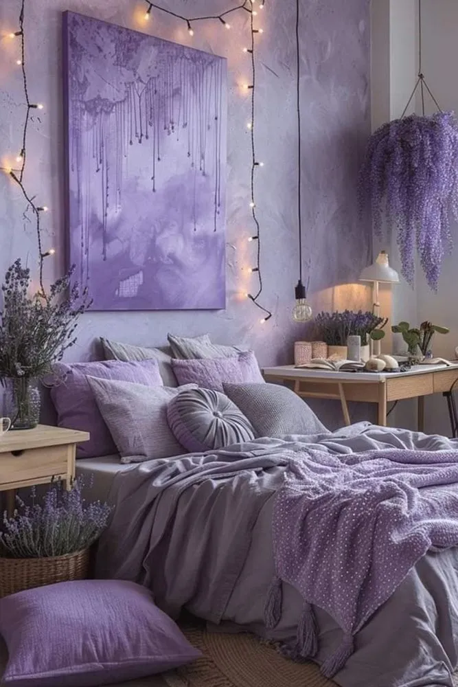
▫️ Tonal Choreography Pair lavender walls with plum velvet accents for depth. Add metallic finishes (gold handles/mirrors) to elevate warmth, as seen in the 60-30-10 color formula . ▫️ Material Poetry Balance regal velvet drapes with raw textures like concrete floors or woven pendants—a clash of elegance and edge . ▫️ Artful Disruption Anchor spaces with abstract purple art or amethyst geodes. Pro tip: Use soft blush tones to neutralize intensity, inspired by millennial pink trends . ▫️ Light Alchemy 2700K warm bulbs transform eggplant cabinets into cozy vignettes. For drama, try LED strip lighting under floating shelves . ▫️ Rule-Breaking Accents Ditch neutrals—emerald greens or citrine yellows create bold contrasts. Warning: Keep accent ratios below 20% to avoid chaos .
#purple
#interior
#colorbalance
GwenS
4
Color Psychology Meets Interior Design🎨
Let's dive into color psychology today! Blue and orange have opposing yet complementary properties. Blue exudes calm, perfect for bedrooms or meditation spaces. Orange, on the other hand, energizes and stimulates appetite – ideal for kitchens or dining areas! The peacock color palette, blending vibrant blues with hints of orange, creates a dynamic yet harmonious atmosphere. It's bold, luxurious, and can transform any room! And let's not forget the subtle elegance of off-white paired with white. This combination adds depth and sophistication without overwhelming the senses. Perfect for creating a clean, airy space. Experiment with these color pairings to elevate your interior design game! 🌟
#InteriorDesignColorSchemes
#ColorPsychology
#BlueOrangeContrast
#PeacockInspiration
#OffWhiteMagic
#DesignTrends
#HomeDecorGoal
Russell--D
Color Theory 2.0: Dynamic Hues That Respond to Your Environment 🌈
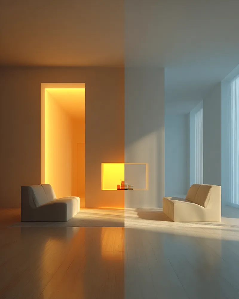
Tired of static wall colors? Let's talk about the future: dynamic hues that respond to your environment and mood! 🌈 Imagine walls that subtly shift color based on ambient light, time of day, or even your chosen playlist. We're looking at smart pigments and responsive materials that can create truly immersive atmospheres. This isn't just about aesthetics; it's about actively enhancing your living experience through adaptive color. Picture a living room that glows with calming blues in the morning and vibrant corals in the evening. What color shift would enhance your space? Save this for a spectrum of design possibilities! ✨
#dynamiccolor
#responsematerials
#colorpsychology
#interiorcolor
#futureofdesign
#innovativedesign
#adaptiveinteriors
#designtechnology
#homeambiance
#cuttingedgeinteriors
Avant-Garde Visions
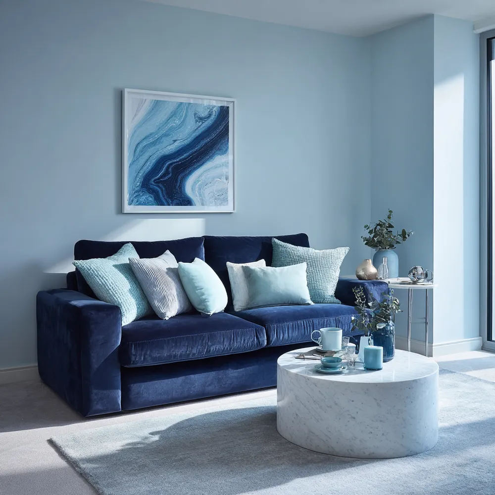
Exploring the Power of Color in Interior Design
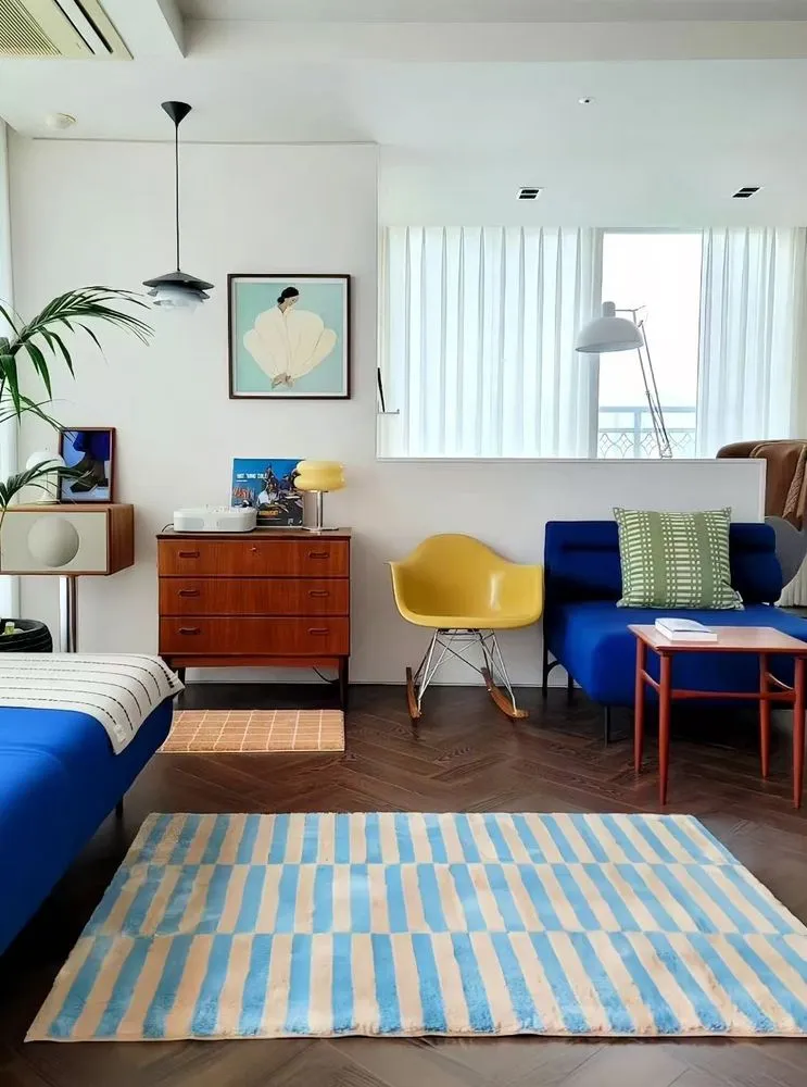
I recently came across this beautiful living space that perfectly showcases how color can transform a room. The vibrant blue sofa and matching rug add a lively touch, while the yellow chair introduces a cheerful pop of color, creating a balanced and inviting atmosphere. The mix of bold and neutral tones enhances the overall aesthetic, demonstrating how thoughtful use of color can elevate interior design. What are your favorite color combinations in home decor? Share your ideas or show us your colorful spaces!
#ColorInInteriorDesign
#HomeDecor
#InteriorDesign
#ColorfulLiving
#DesignInspiration
#LivingRoomDecor
#HomeStyling
#Color
yuki_zzz
3
Unlocking Serenity: A Guide to Mindful Color Palettes 🎨
Ever feel overwhelmed by too much visual 'noise' at home? The secret to a truly tranquil space lies in intentional color. ✨ I'm obsessed with how specific hues can shift our mood and perception. Think soft, muted tones for relaxation and grounding earth colors for connection. 🌿 Let's explore creating calming environments that invite peace. Start by choosing one or two dominant colors that resonate with you, then layer in neutrals to allow them to truly sing. Save this for your next design refresh! 💖
#ColorPaletteIdeas
#HomeDecorIdeas
#InteriorDesignInspo
#MindfulLiving
#CalmSpaces
#ColorTherapy
#InteriorStyling
#DesignTips
#HomeInspiration
#DecorInspo
The Chroma Collector
1
Curated Color Palettes for a Playful Home 🌈🎨
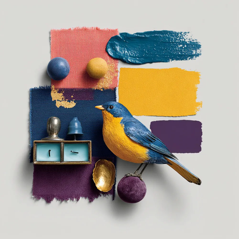
Tired of beige? Let's inject some fun into your home's color story! 🌟 Think beyond the ordinary. Embrace palettes that reflect your personality. Pair unexpected hues like coral and teal, or mustard yellow and deep plum. Want to go whimsical? Consider soft pastels with metallic accents. For a bold statement, experiment with vibrant jewel tones. The key is balance and intentionality. Don't be afraid to let color tell your unique story and create spaces that spark joy and wonder! ✨ Save this for your next paint project!
#ColorPaletteIdeas
#PlayfulColorIdeas
#WhimsicalColorPalette
#HomeColorTrends
#InteriorColorInspo
#DecorPalette
#CreativeColor
#ColorInDesign
#RoomMakeoverIdeas
#DesignInspiration
Whimsical Wonders
Layering Color and Personality in a Small Apartment 💡
Don't let size limit your style! Even in a small apartment, you can create dynamic and expressive living spaces by daring to embrace color and bold patterns. It's all about maximizing personality! 🌈
#SpectrumStyleIdeas
#SmallApartmentIdeas
#ColorLayeringIdeas
#BoldSmallSpaceIdeas
#ApartmentDecorIdeas
#SmallSpaceDecor
#MaximizingSpace
#UrbanLiving
#VibrantInteriors
#DecorOnABudget
Spectrum Style
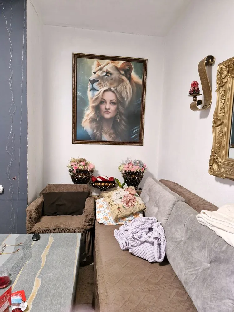
Colors house
Colors and add lion on the top
A
Arslan Aziz
2
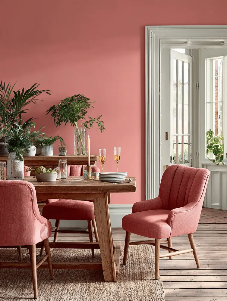
Adding a Pop of Coral: Vibrant & Cheerful Dining Room Hues 🍊
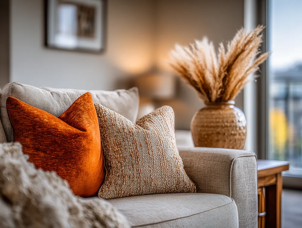
Inject some playful energy into your dining room with a pop of coral! 🍊 This warm, vibrant hue instantly energizes the space and creates a cheerful atmosphere perfect for hosting. It's a beautiful balance of pink and orange, feeling both sophisticated and fun. I love using coral as an accent – think coral dining chairs, statement artwork, or even bold placemats. Pair it with softer neutrals like creamy whites and natural wood to prevent it from feeling overwhelming. This color choice is fantastic for creating a welcoming space that sparks conversation and joy around the table. Save this cheerful color inspo! 🍽️
#DiningRoomIdeas
#CoralDecor
#ColorInspo
#VibrantInteriors
#DiningRoomDesign
#HomeDecorIdeas
#AccentColors
#CheerfulHome
#InteriorStyling
#DiningSpace
The Palette Painter
Color Story: Designing with Bohemian Hues! 🌈🌸
Ready to paint your home with the vibrant hues of bohemian style? It's all about embracing a rich, eclectic color palette! Think jewel tones like emerald green, sapphire blue, and ruby red, mixed with earthy ochres, warm terracotta, and pops of vibrant fuchsia or marigold. Don't shy away from layering these colors through textiles, rugs, and accessories. The goal is to create a space that feels energetic, joyful, and deeply personal. Let your color dreams bloom! 💖
#BohoColorIdeas
#VibrantDecor
#BohoColorIdeas
#VibrantDecorIdeas
#BohemianPalette
#ColorInspo
#EclecticColors
#InteriorColor
#HomeDesign
#DecorStyle
#BoldInteriors
#TextileColors
Boho & Bloom
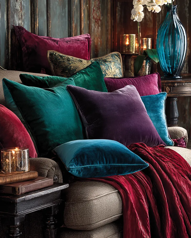
Jewel Toned Accents: Adding Richness to Your Space ⚜️
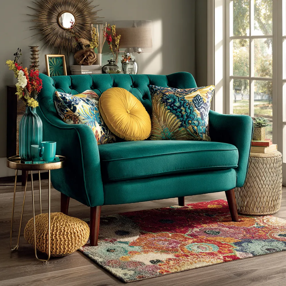
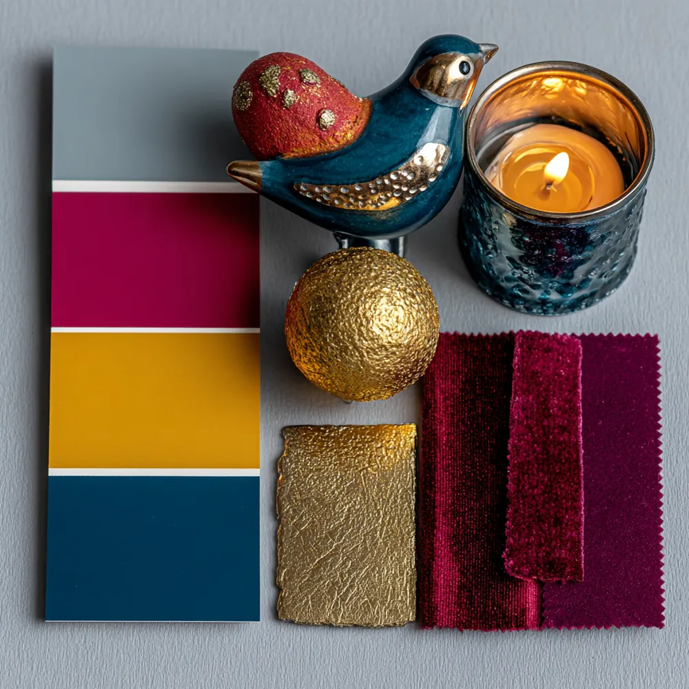
Infuse your home with captivating richness by embracing jewel-toned accents! ✨ Think of sumptuous emerald greens, deep sapphire blues, regal amethyst purples, and vibrant ruby reds. These colors add a layer of opulent sophistication without overwhelming the space. Use them through accent pillows, throws, decorative vases, or even a statement piece of art. They bring a sense of luxury and depth, turning ordinary corners into exquisite vignettes. Combine them with softer neutrals for a balanced yet impactful design. It's a fantastic way to express personality and refined taste. 💖💎
#JewelTonedDecor
#RichColors
#AccentDecor
#OpulentHome
#HomeColorPalette
#InteriorColor
#DecorInspiration
#SophisticatedHues
#StatementPieces
#ColorPopIdeas
Velvet & Vignettes
просто
интерьер
י
ילנה ירושלמי
1
The Power of Blues: Creating Calm Spaces with Color 💙
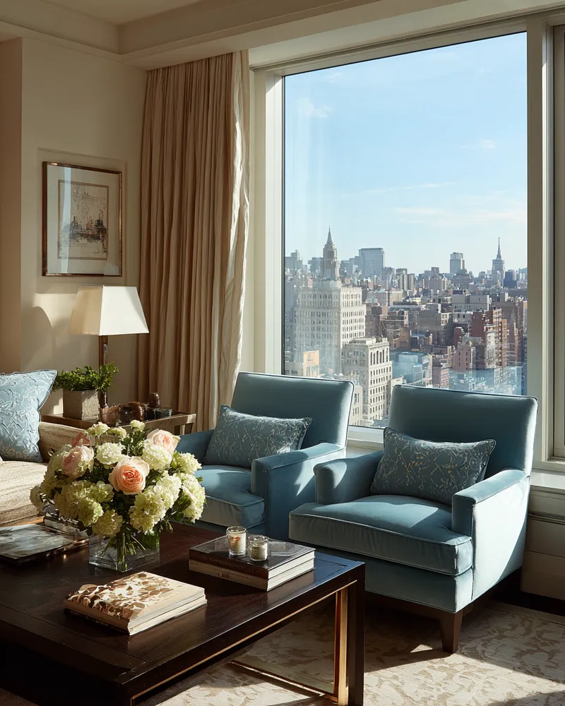
Did you know blue is the most calming color? It's scientifically proven to lower heart rate and blood pressure, making it perfect for spaces where you want to relax and de-stress. Let's explore how to use it effectively! 🌊 **Ocean Blues:** Shades of deep ocean, turquoise, and aqua create a sense of depth and tranquility, like a peaceful coastline. ☁️ **Sky Blues:** Light, airy blues reminiscent of a clear day promote a sense of openness and freedom. 🕊️ **Muted Blues:** Soft, dusty blues offer a sophisticated and calming presence without being overpowering. 🔵 **Accent Blues:** Even a few strategically placed blue accents can bring a calming influence to a room. Save this for your next calming corner design! 🤍
#blueinteriors
#calmspaces
#colorpsychology
#colorpalette
#interiordesignideas
#homedecor
#livingroominspiration
#bedroomdesign
#designcolors
#relaxation
Color Palette Pioneer
Coral & Comfort: Warmth for Cozy Living Spaces 💖
Let's talk about the undeniable warmth and vibrancy that coral brings to a space! This uplifting hue, ranging from soft peach to rich terracotta, is perfect for creating inviting and comforting environments. It’s about adding a touch of sunny optimism without being overpowering. ☀️ I love using coral as an accent color. Think of coral throw pillows on a neutral sofa, a statement vase, or even a piece of art. It pairs beautifully with natural materials like rattan, light wood, and linen, creating a relaxed yet chic atmosphere. It's also a fantastic way to inject personality into smaller spaces. What do you think of coral in interiors? Save this post for some cozy living inspiration! ✨
#CoralIdeas
#CozyHomeIdeas
#LivingRoomIdeas
#InteriorDesign
#HomeDecor
#WarmColours
#AccentColours
#DecorInspiration
#ColourPalette
#NurseryDecor
The Colour Spectrum
Jewel-Toned Dreams: Bold Color Palettes for Daring Decor! 💎
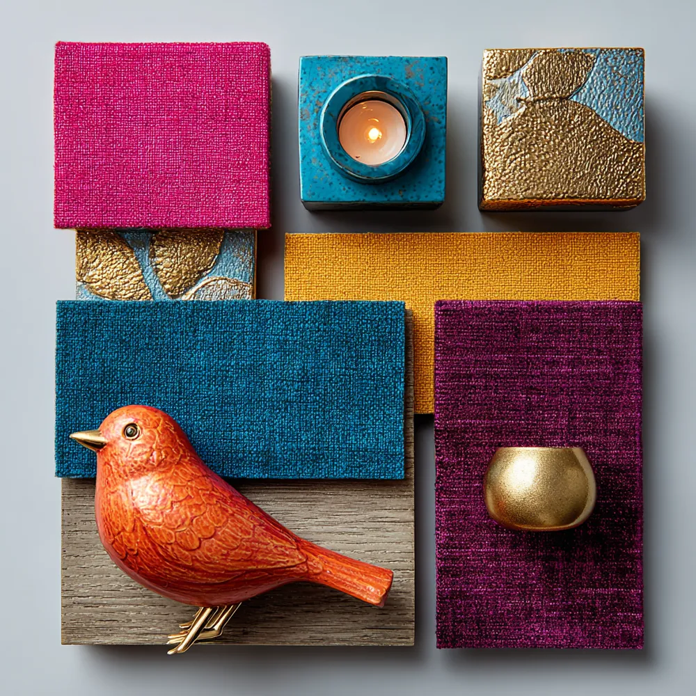
Embrace the richness! 💜 My love for jewel tones in home decor comes from their inherent luxury and depth. Think emerald green, sapphire blue, ruby red, and amethyst purple. These colors instantly elevate a space, creating a sense of opulence and drama. Don't shy away from combining them – the more vibrant, the better! Pair them with metallics like gold or brass for an extra touch of glamour. What's your favorite jewel tone? Tell me below! 👇 Save this for your next daring color adventure! 🌟
#jeweltones
#boldcolors
#maximalistdesign
#luxuryinteriors
#colorpaletteideas
#glamorousdecor
#vibrantinteriors
#designinspo
#homestyling
#interiorcolor
Maximalist Manifesto
decorar para sala
decora uma sala acogedora
S
Silvia
2
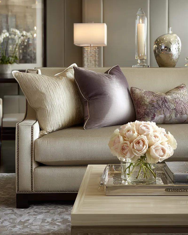
Muted Mauve Magic: Sophisticated Living Room Palette! 🌸✨
Add a touch of subtle elegance and warmth to your living room with a sophisticated muted mauve palette! 💖 This gentle hue is both calming and chic, creating an inviting and stylish atmosphere. Muted mauve is perfect for: * **Accent walls** that offer a soft, romantic touch. * **Upholstered furniture**, like sofas or accent chairs. * **Textiles** such as throw pillows, blankets, and rugs. * **Pairing with grays, creams, and soft whites** for a balanced look. It’s a beautiful way to create a living space that feels refined and incredibly cozy. Save this for your elegant living room design! 💫
#MutedMauveLivingroomIdeas
#SophisticatedColorIdeas
#LivingroomPaletteIdeas
#ElegantHomeIdeas
#CalmingInteriorsIdeas
#InteriorDesign
#HomeDecor
#ColorInspiration
#ChicHome
#HomeDesignInspo
Color Story Designs
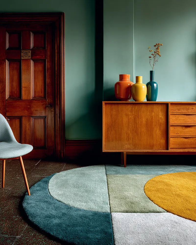
The Art of Mid-Century Color Palettes 🎨
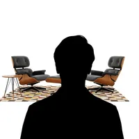
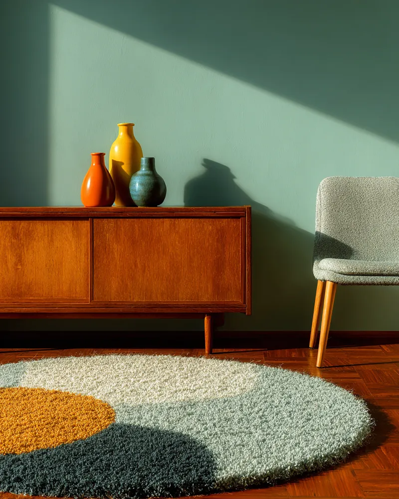
Mid-Century Modern is renowned for its distinctive and timeless color palettes. Learn how to use color to define your MCM space! 🌈 Embrace these signature hues: • **Earthy Neutrals:** Warm whites, beiges, greys, and subtle creams form the perfect backdrop. • **Bold & Saturated:** Pops of mustard yellow, avocado green, teal, and burnt orange add personality. • **Natural Wood Tones:** Walnut, teak, and mahogany provide rich, grounding warmth. • **Retro Accents:** Dusty rose, turquoise, and muted blues evoke a nostalgic feel. Combine these strategically for a balanced and sophisticated look. ✨
#MidCenturyColorIdeas
#MCMpalette
#ColorInspiration
#InteriorColor
#DesignTrends
#HomeDecorTips
#RetroColor
#TimelessDecor
#ColorTheory
#DecoratingIdeas
Mid-Century Modernist
Unveiling the Power of Teal: A Blend of History and Tranquility 💙💚
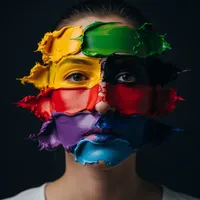
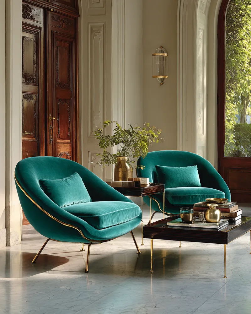
Discover the captivating allure of teal! ✨ This rich blend of blue and green has a fascinating history, often associated with ancient civilizations for its vibrant, jewel-like quality. Teal embodies tranquility, sophistication, and a connection to both the deep sea and lush nature. It's perfect for creating a serene yet luxurious atmosphere. Try it with metallic accents or soft, neutral furnishings for a balanced, elegant look. ✨ Save this for your next serene and sophisticated home refresh! ✨
#tealtdecor
#colorhistory
#interiorcolor
#designinspiration
#jeweltones
#tranquilspaces
#luxuriousinteriors
#blendedcolors
#homedesignideas
#colorhistorian
The Color Historian
casa mexicana
estilo moderno, colorista, iluminación
J
J ARROYO
3