1/6
White vs Cream: designers weigh in on these enduring neutrals
The article explores the perennial debate between white and cream in interior design, providing insights from expert designers on when and where to best utilize these timeless neutrals. It highlights that both colors are classic choices for creating calming and understated backdrops, allowing other decor elements to stand out. However, the subtle differences between them, such as white's potential for starkness and cream's occasional yellow undertones, necessitate careful consideration.
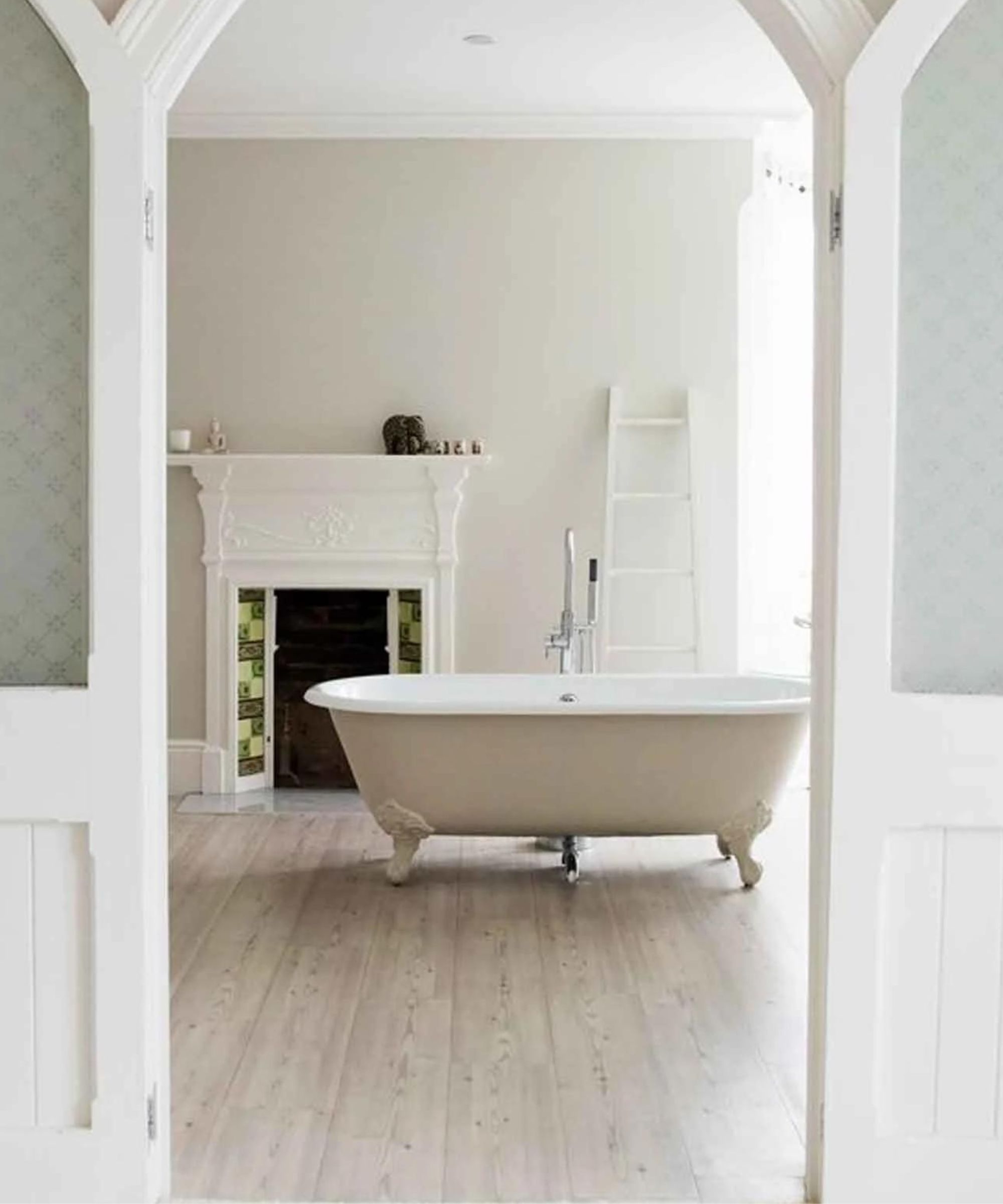
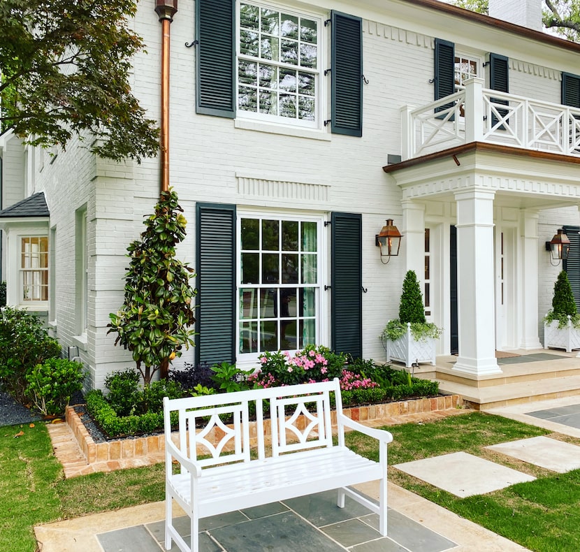
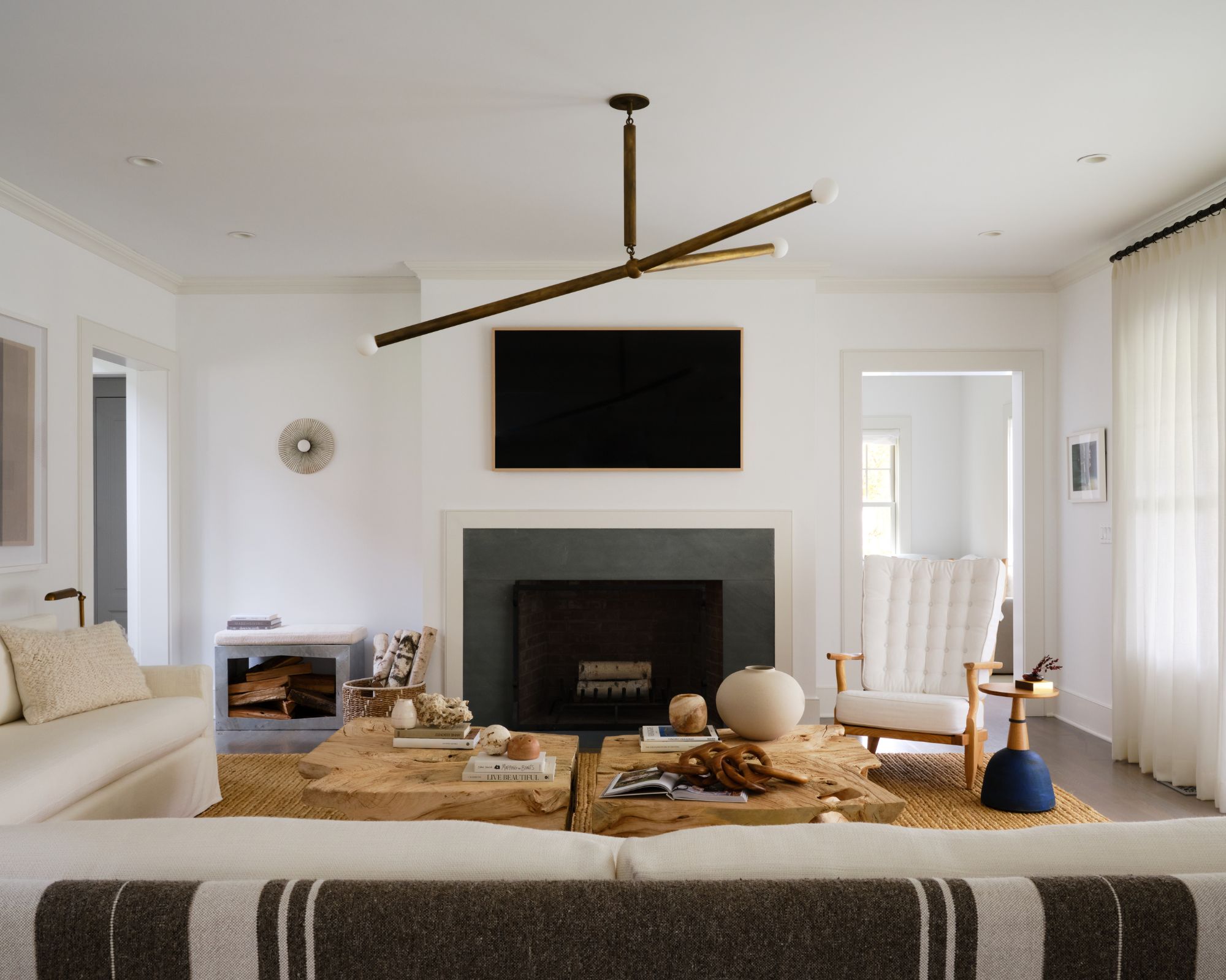
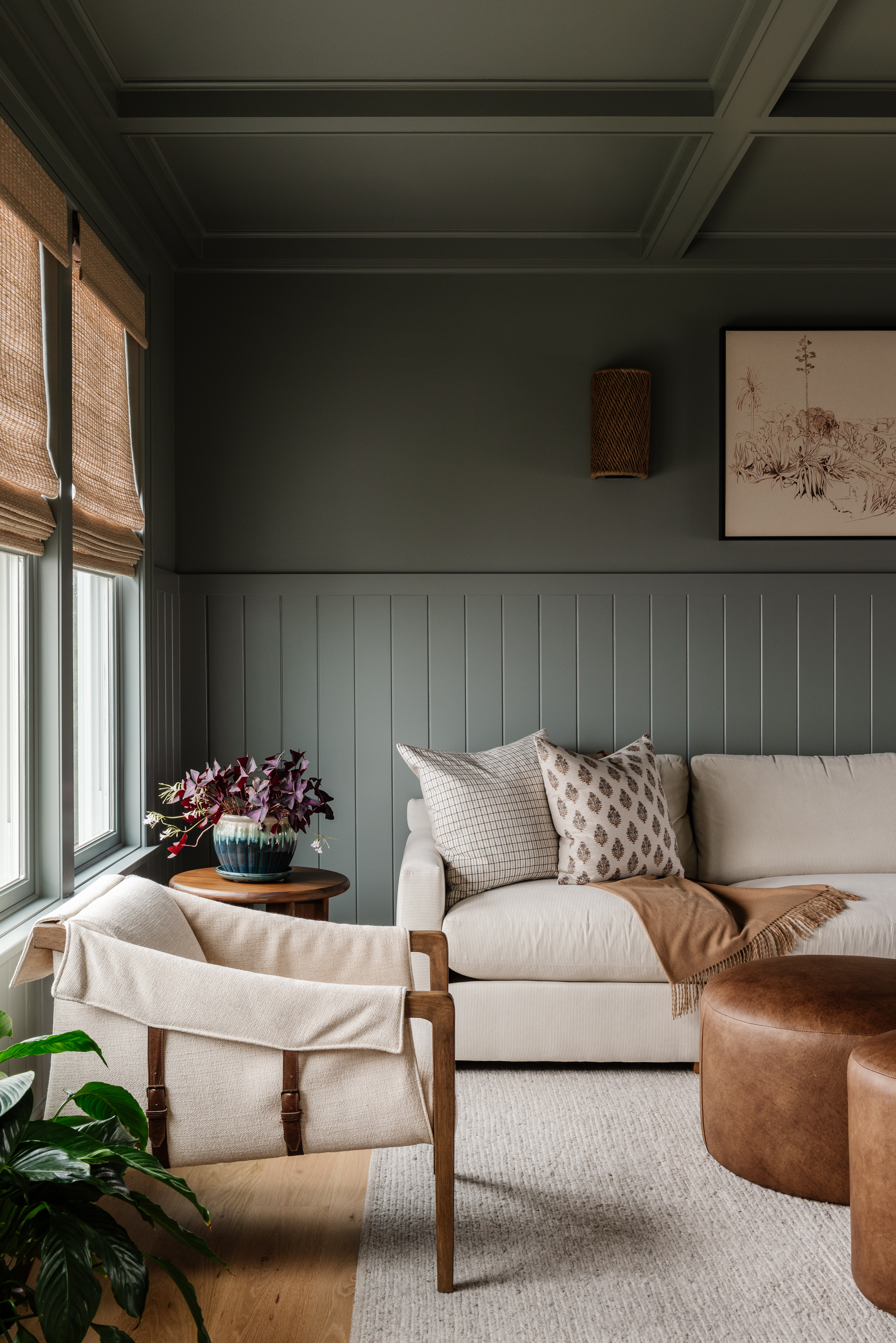
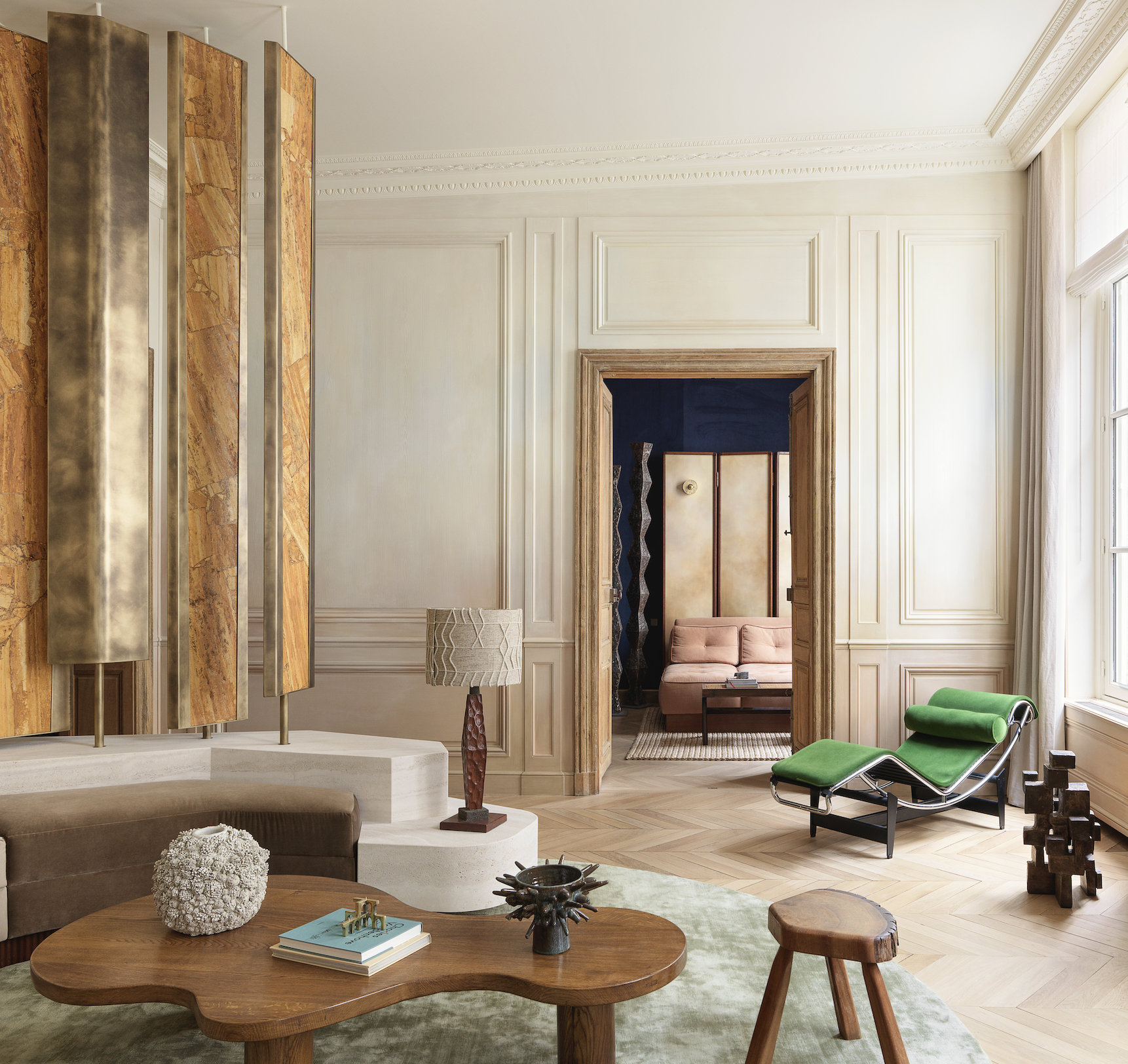
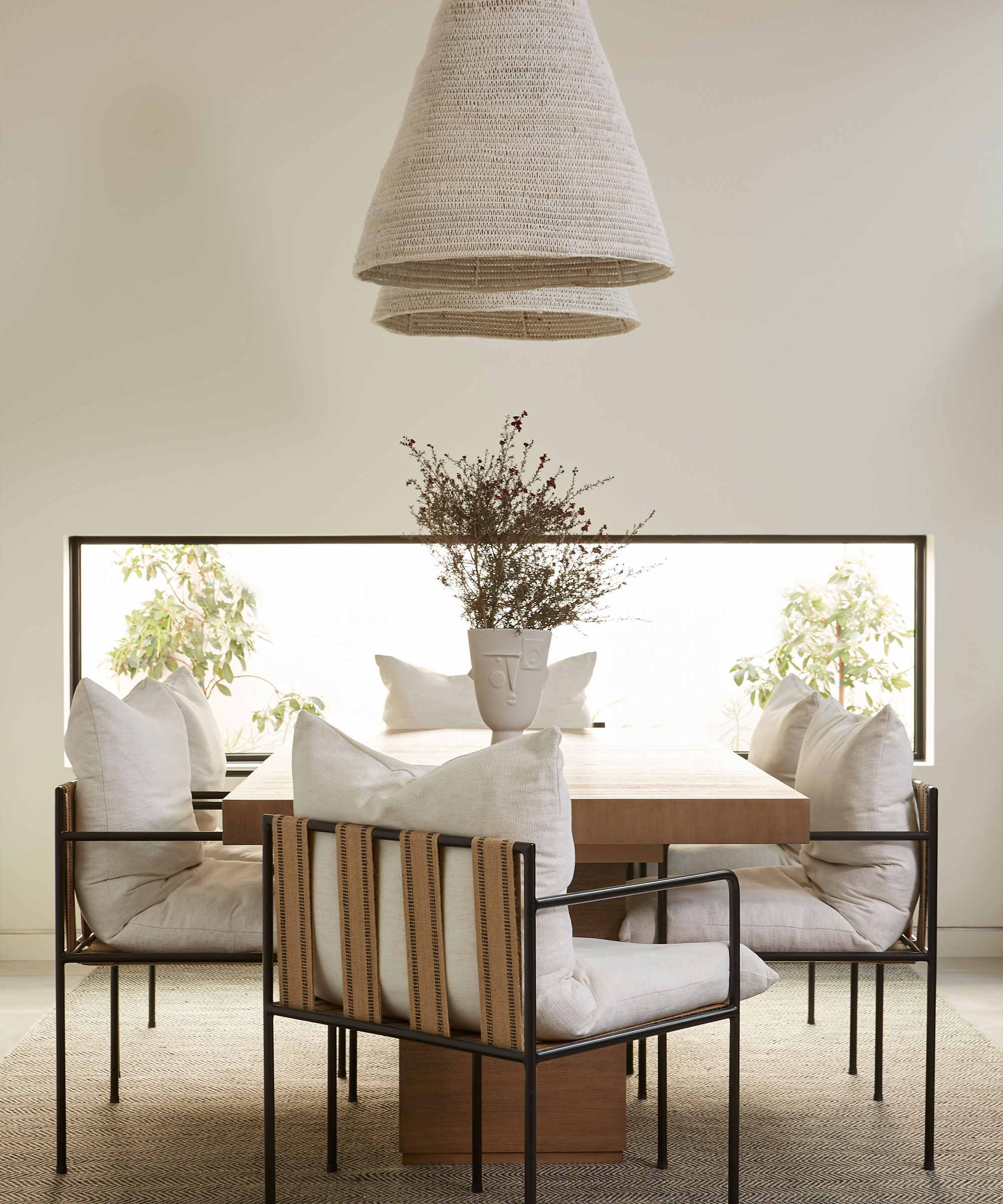
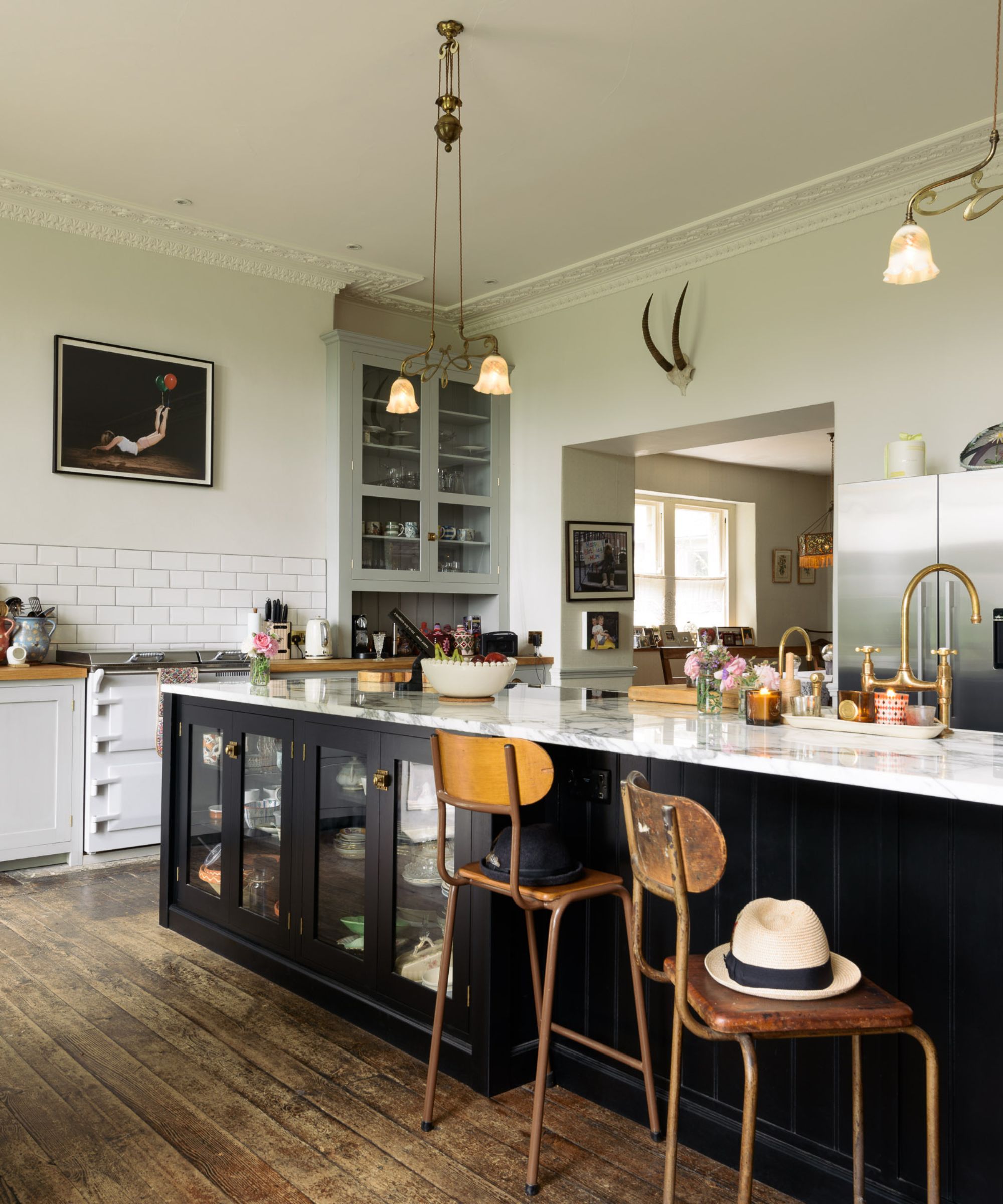
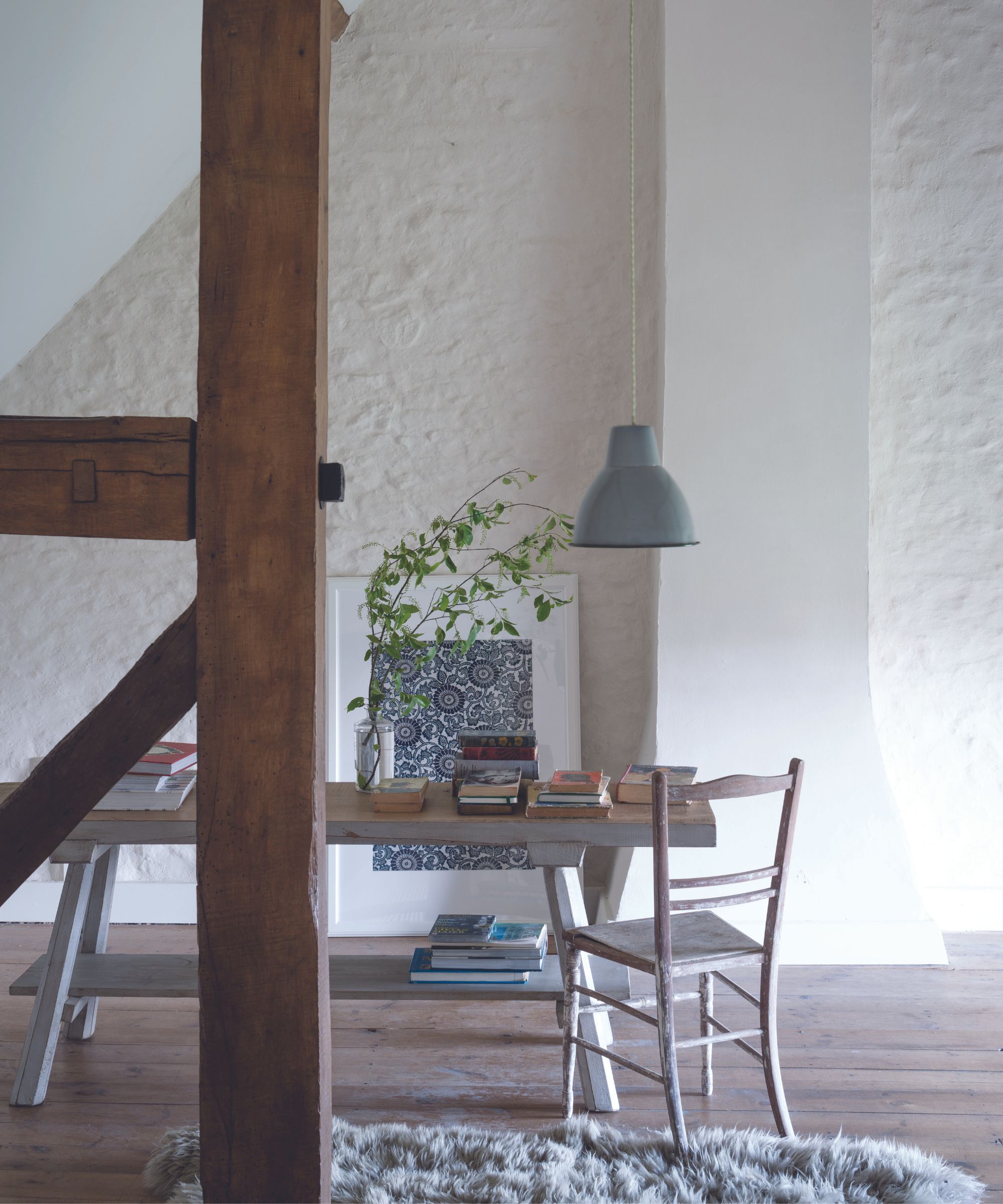
Designers emphasize the importance of natural lighting in a room when choosing between white and cream. For instance, in spaces with abundant natural sunlight, a crisp white can look stunning throughout the day. Conversely, in areas with less natural light or cooler tones, cream is often preferred to introduce warmth and prevent a clinical feel. Annie Sloan, a paint and color expert, advises testing swatches at different times of the day and considering artificial lighting to match the palette's undertones, recommending warmer creams for north-facing rooms and blue-grey whites for south-facing ones.
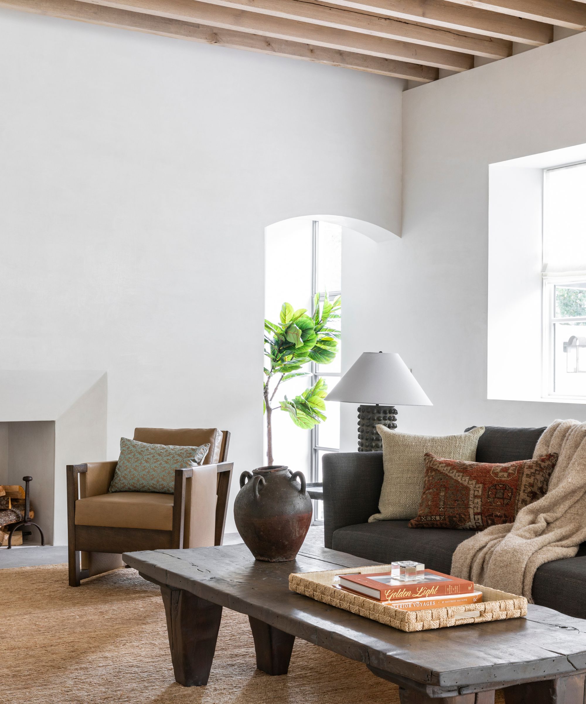
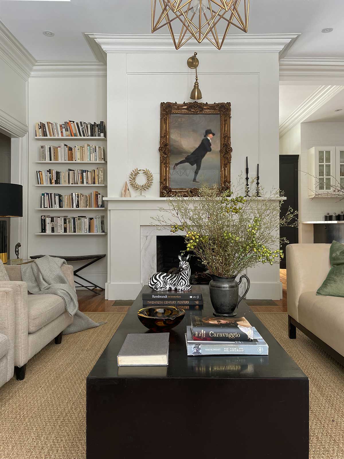
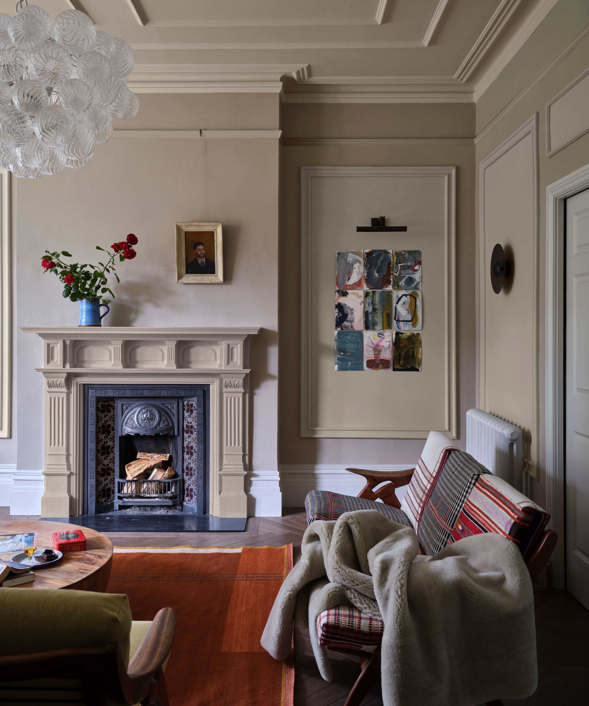
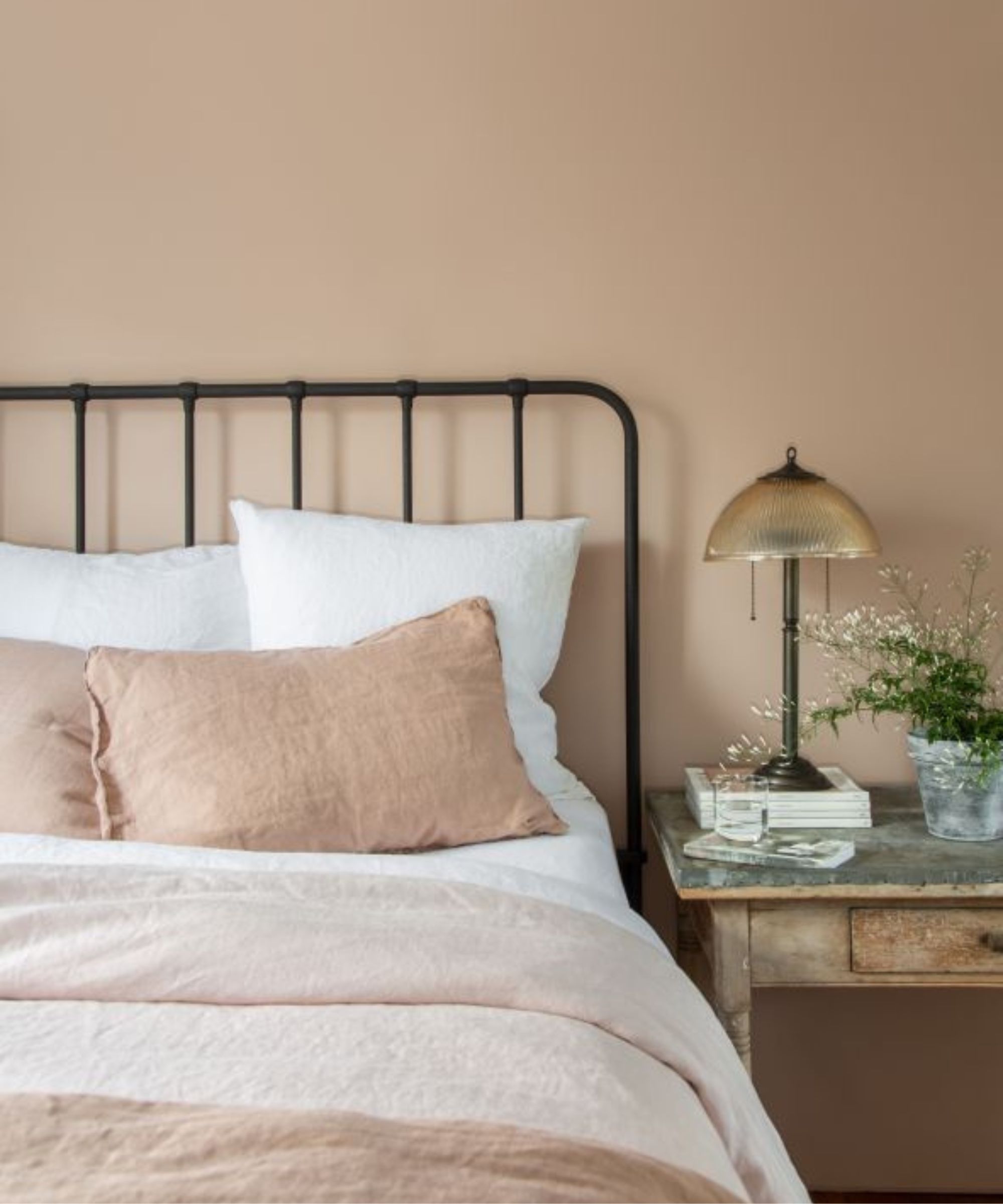
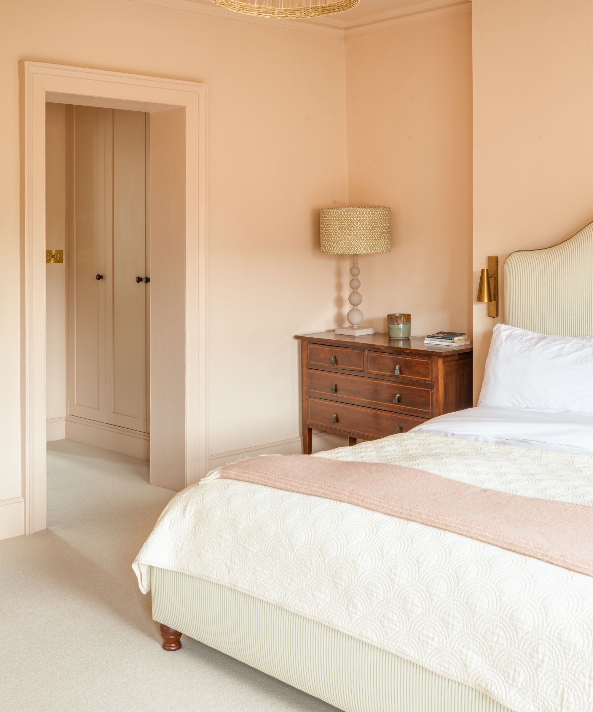
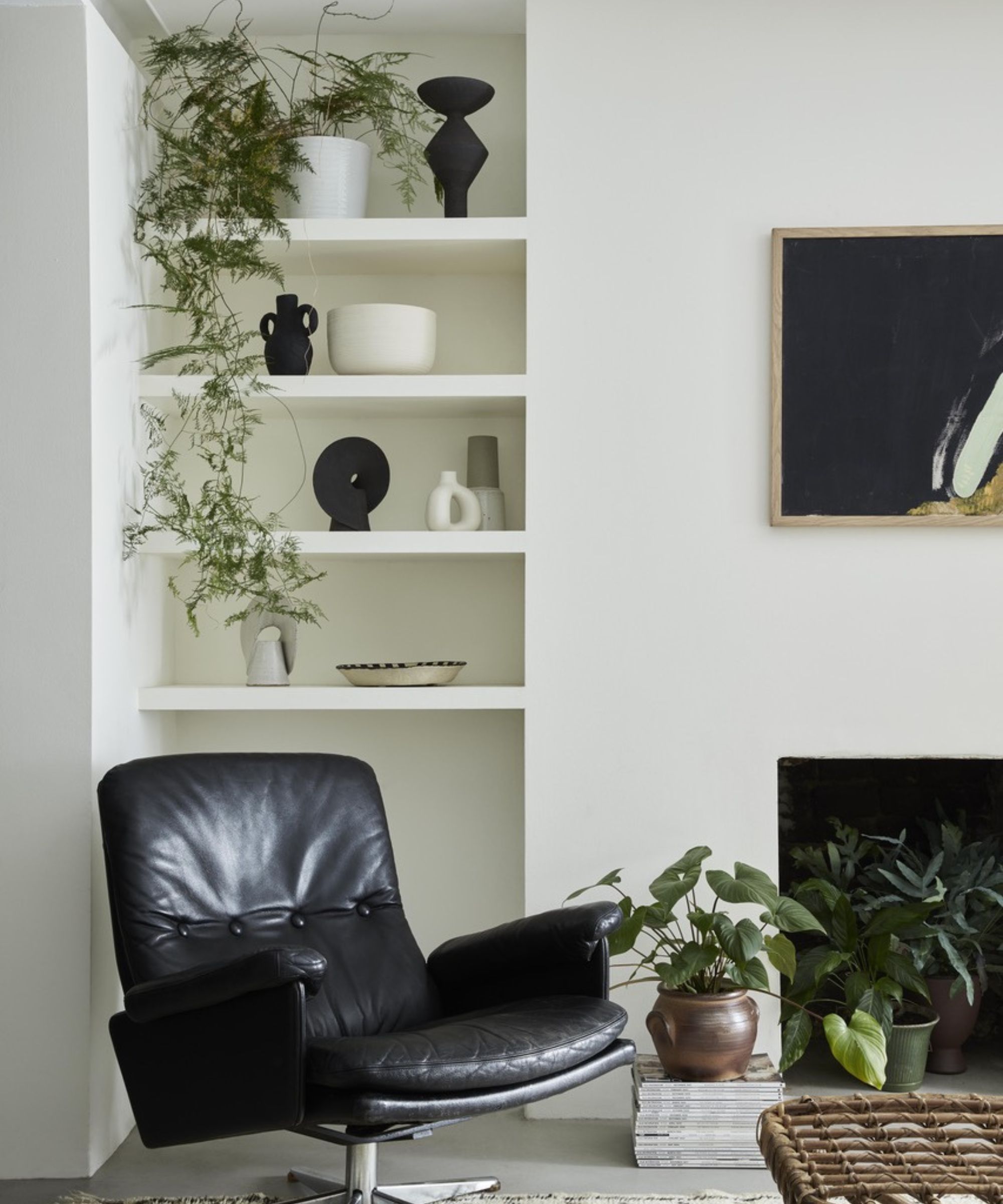
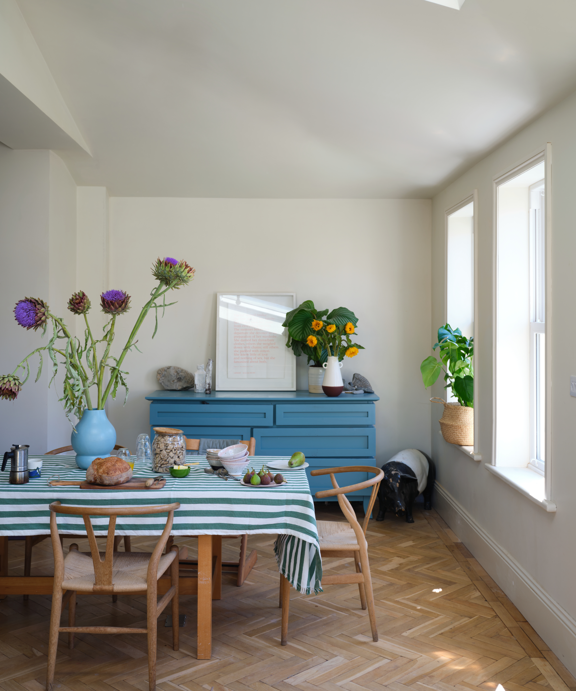
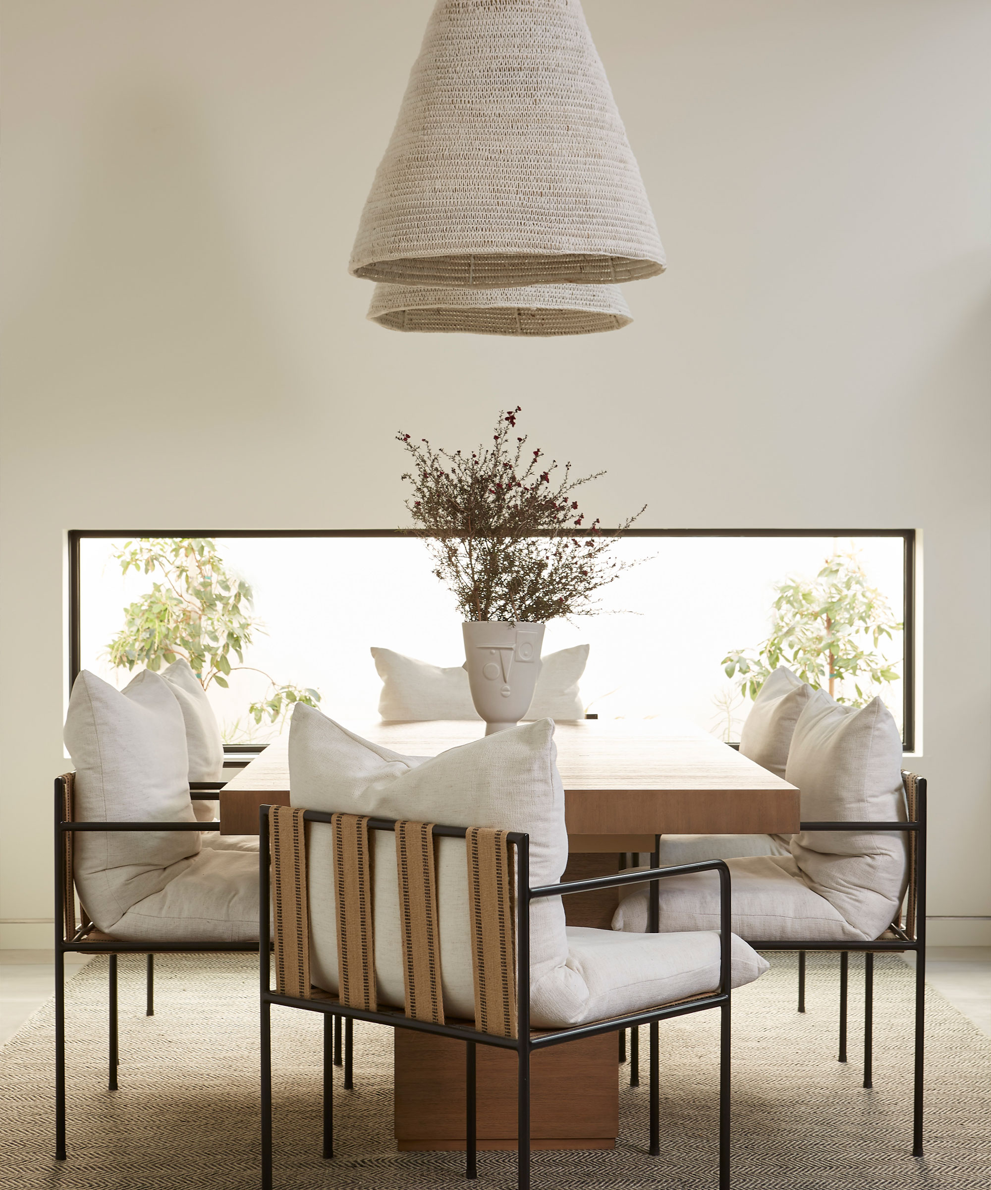
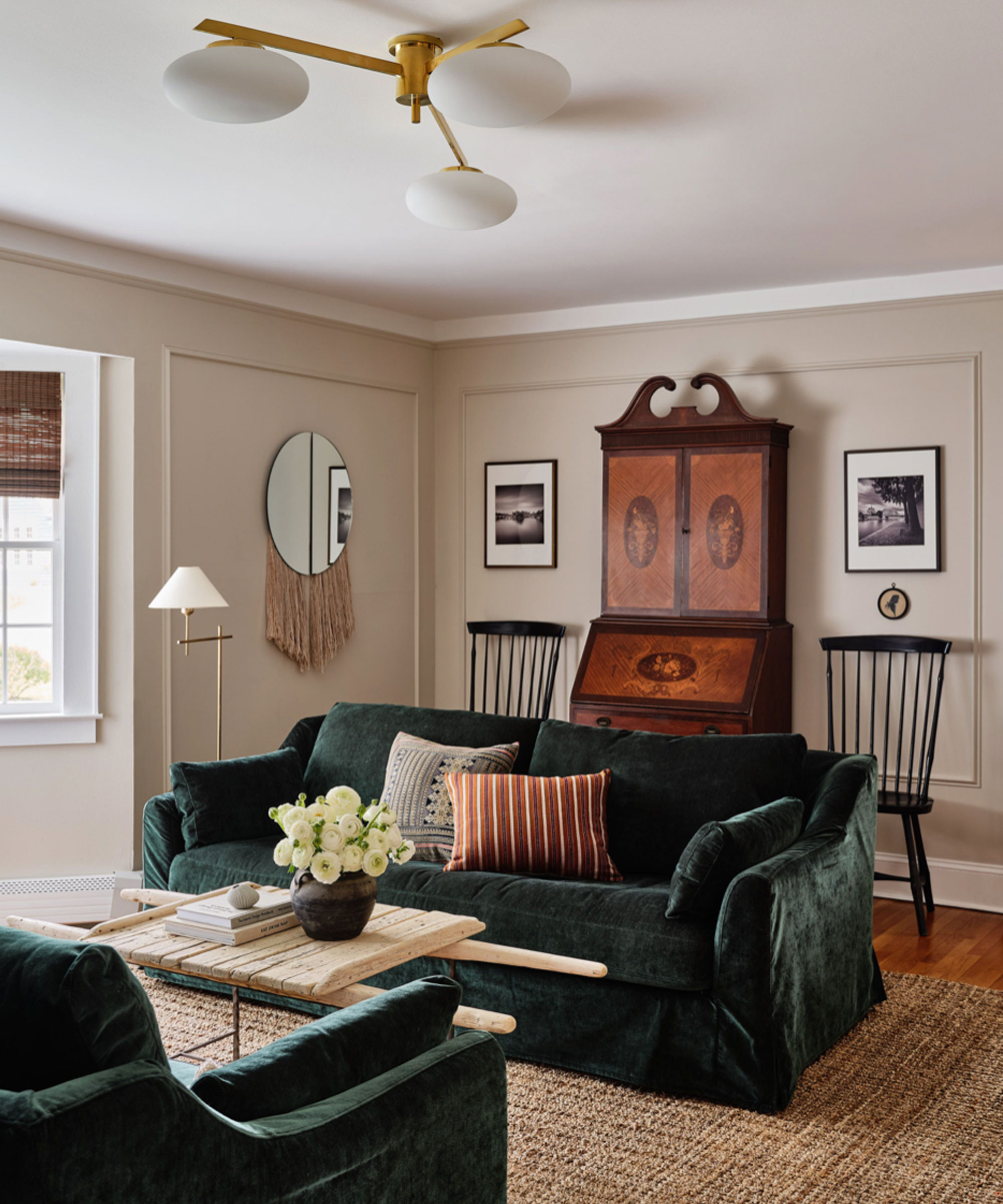
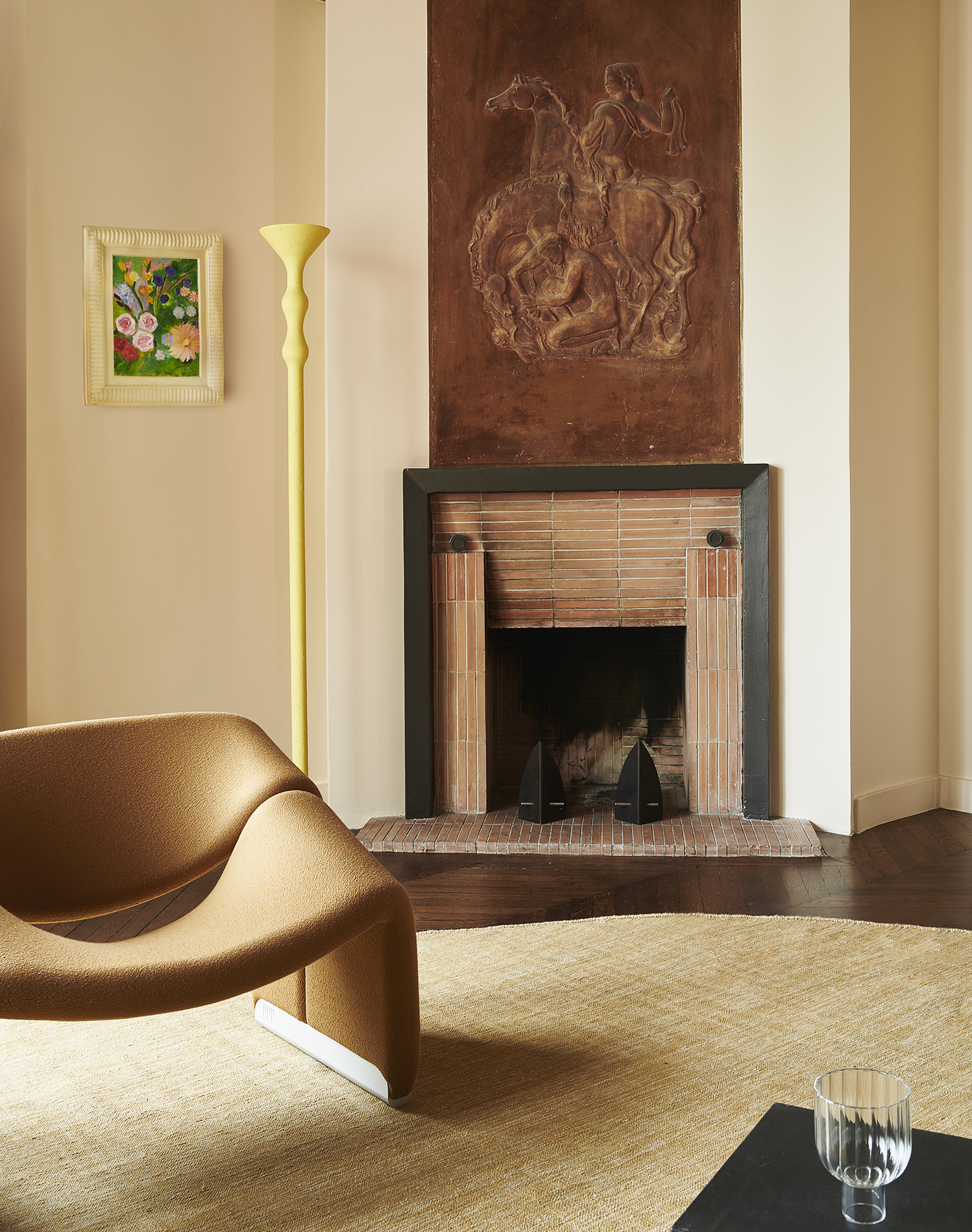
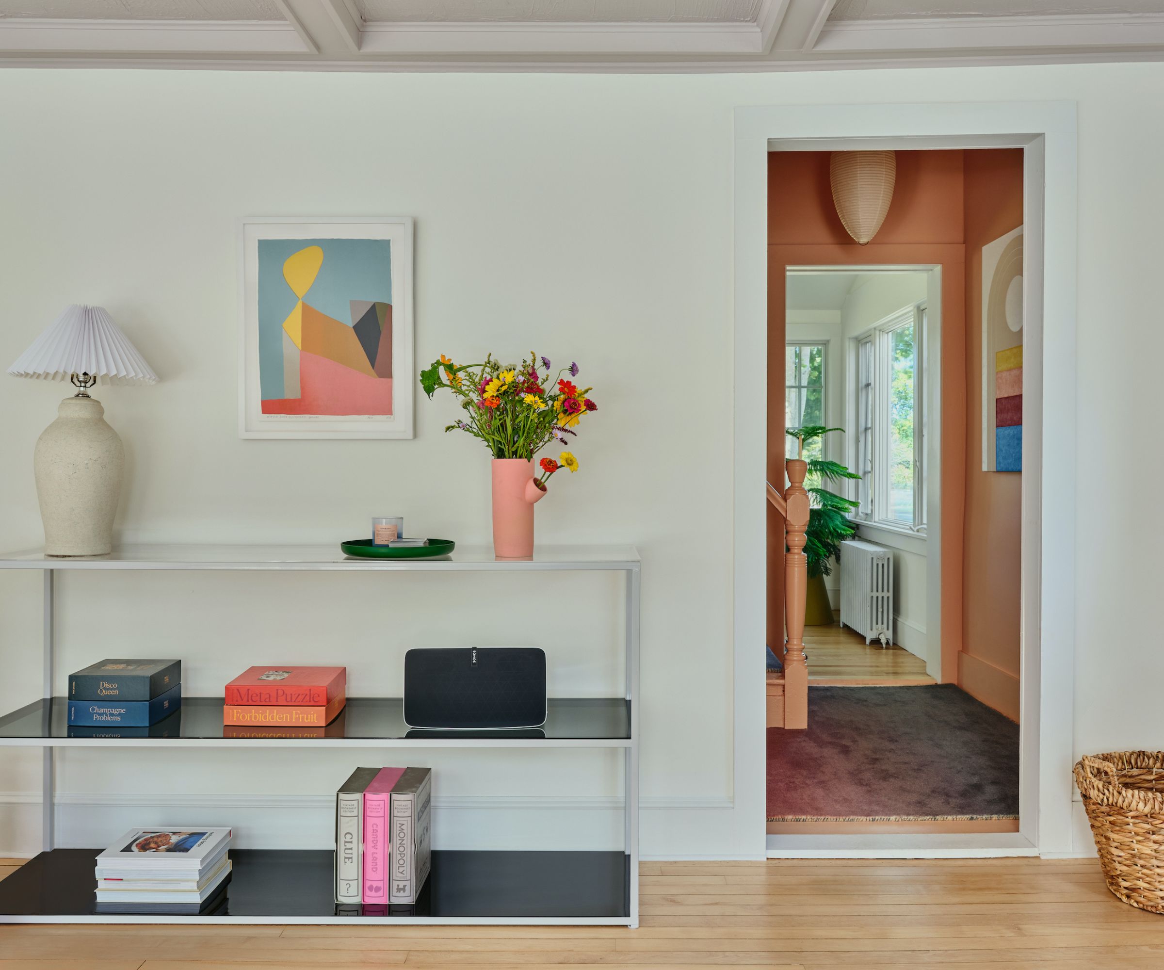
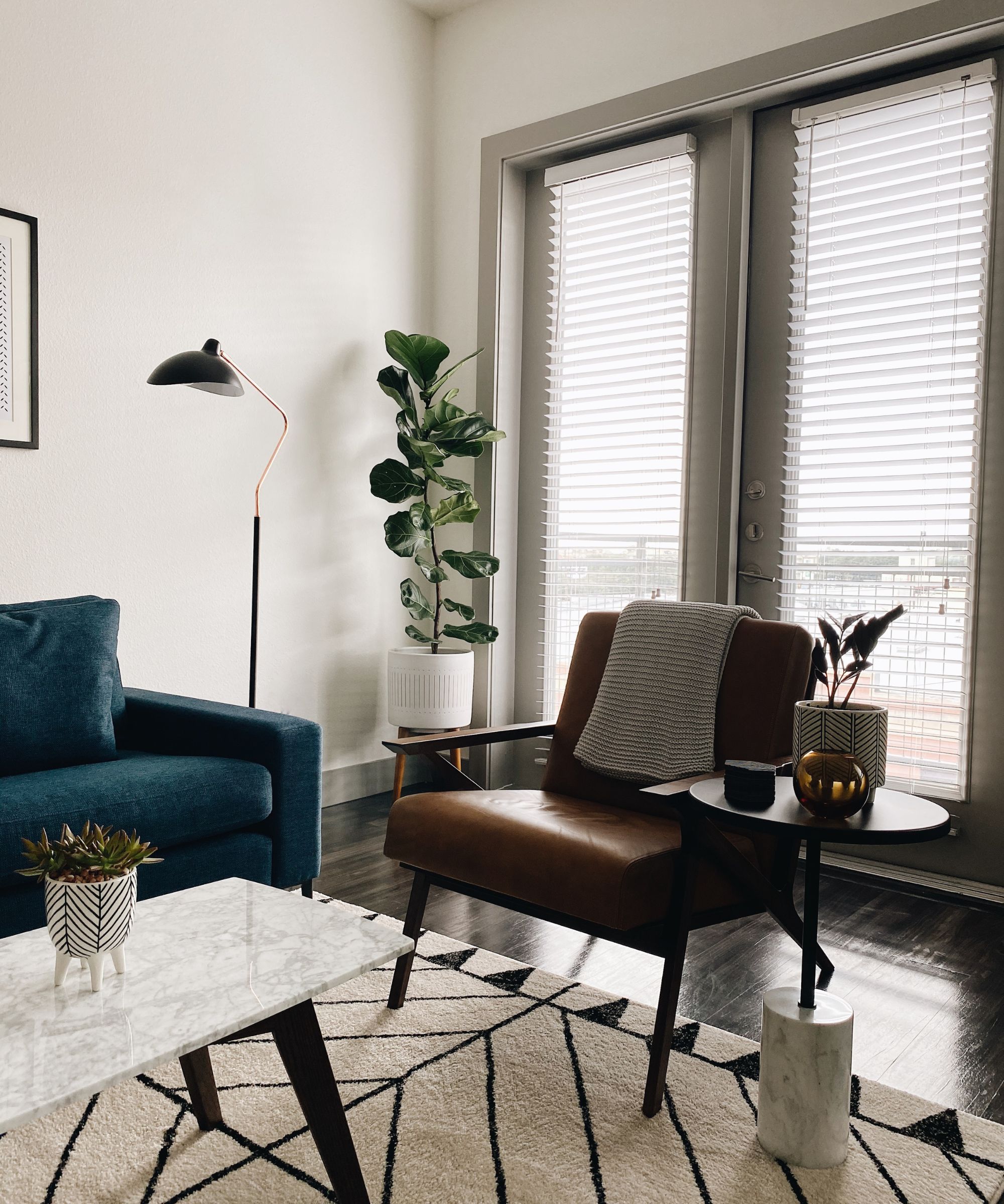
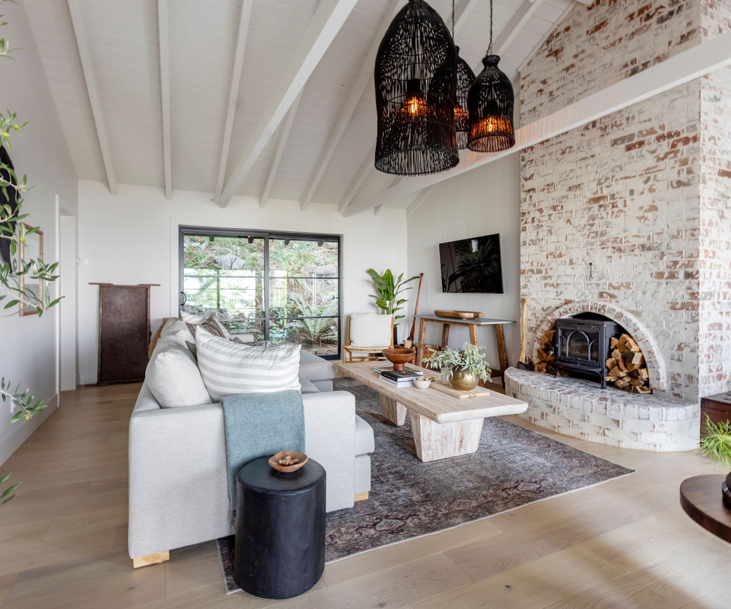
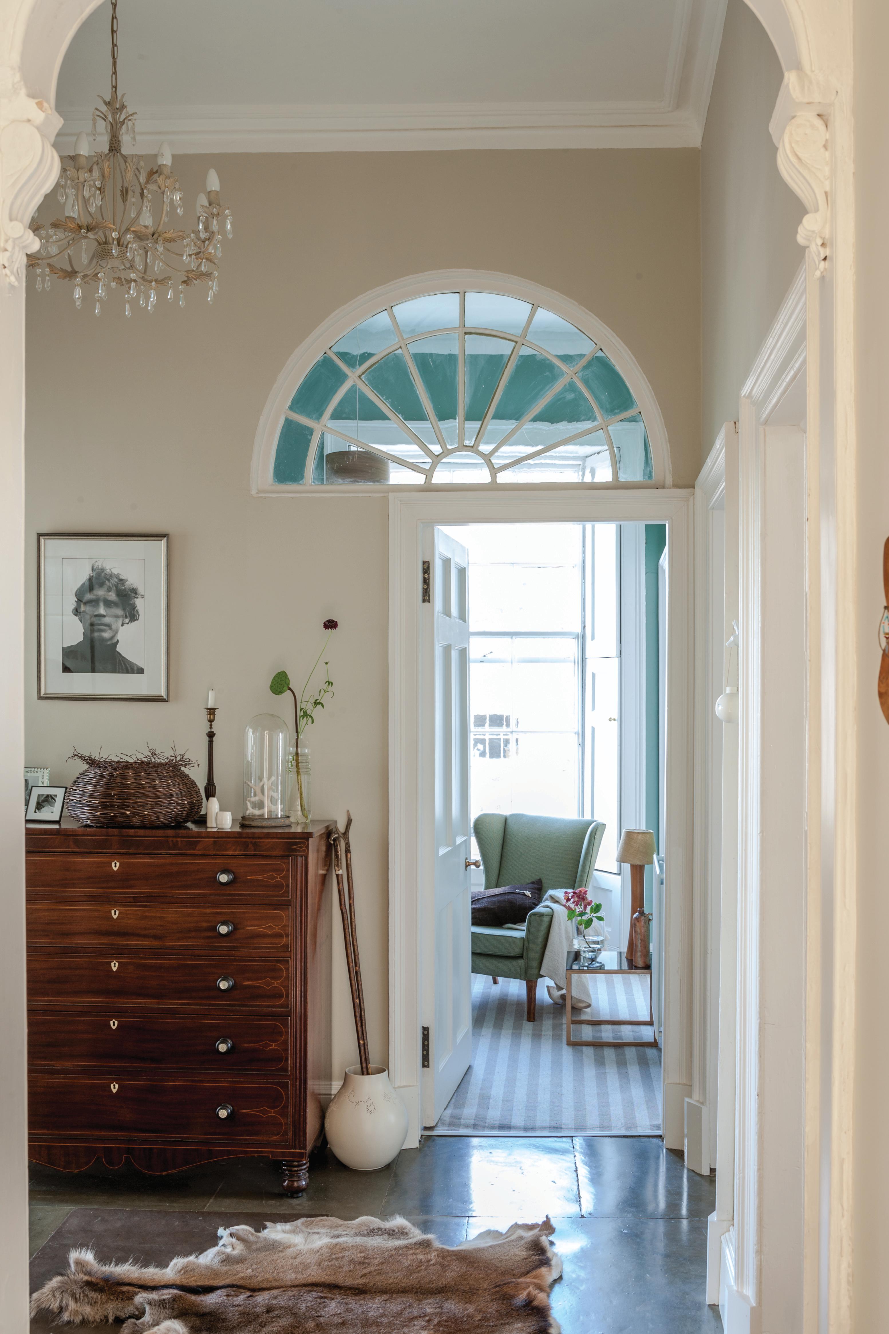
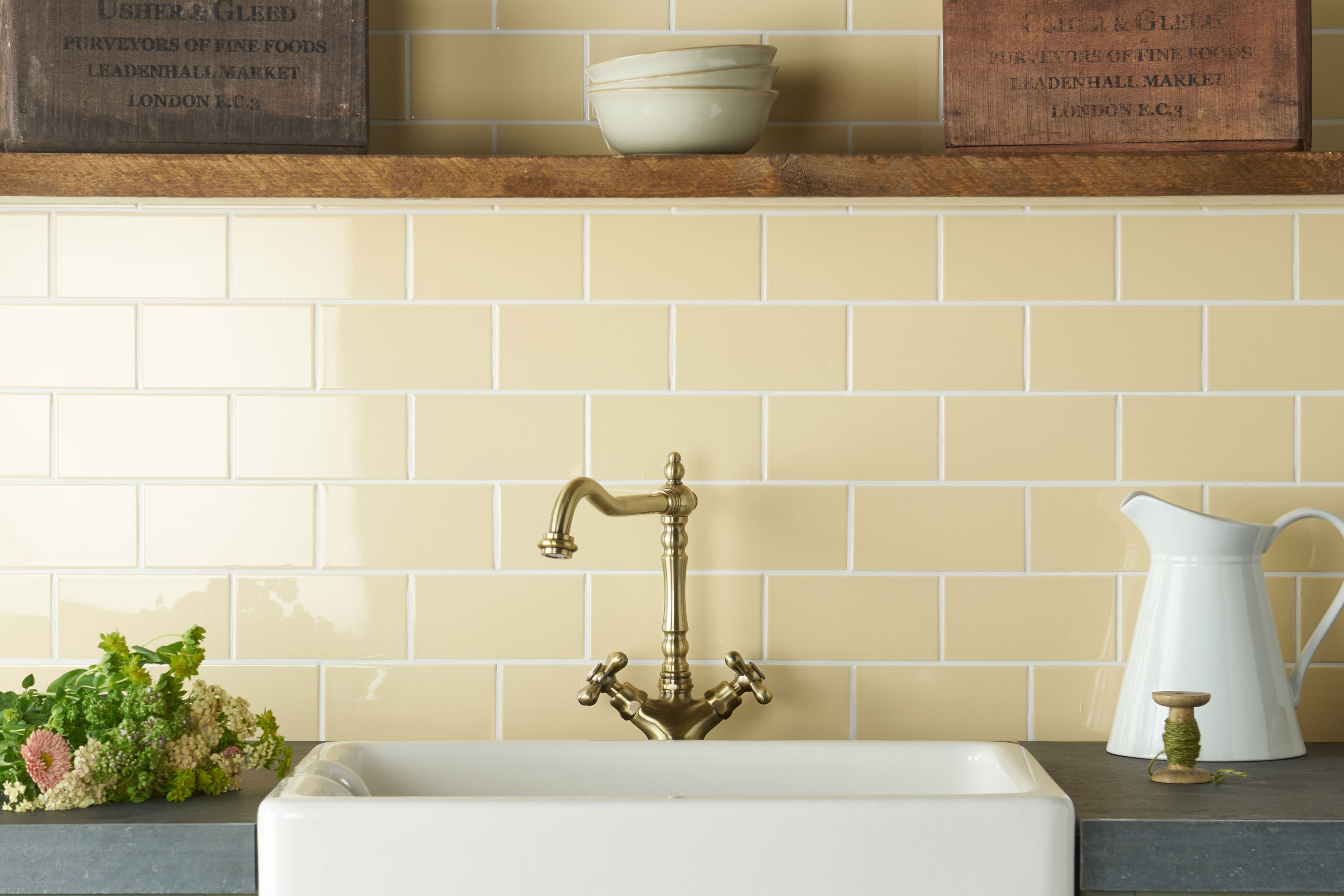
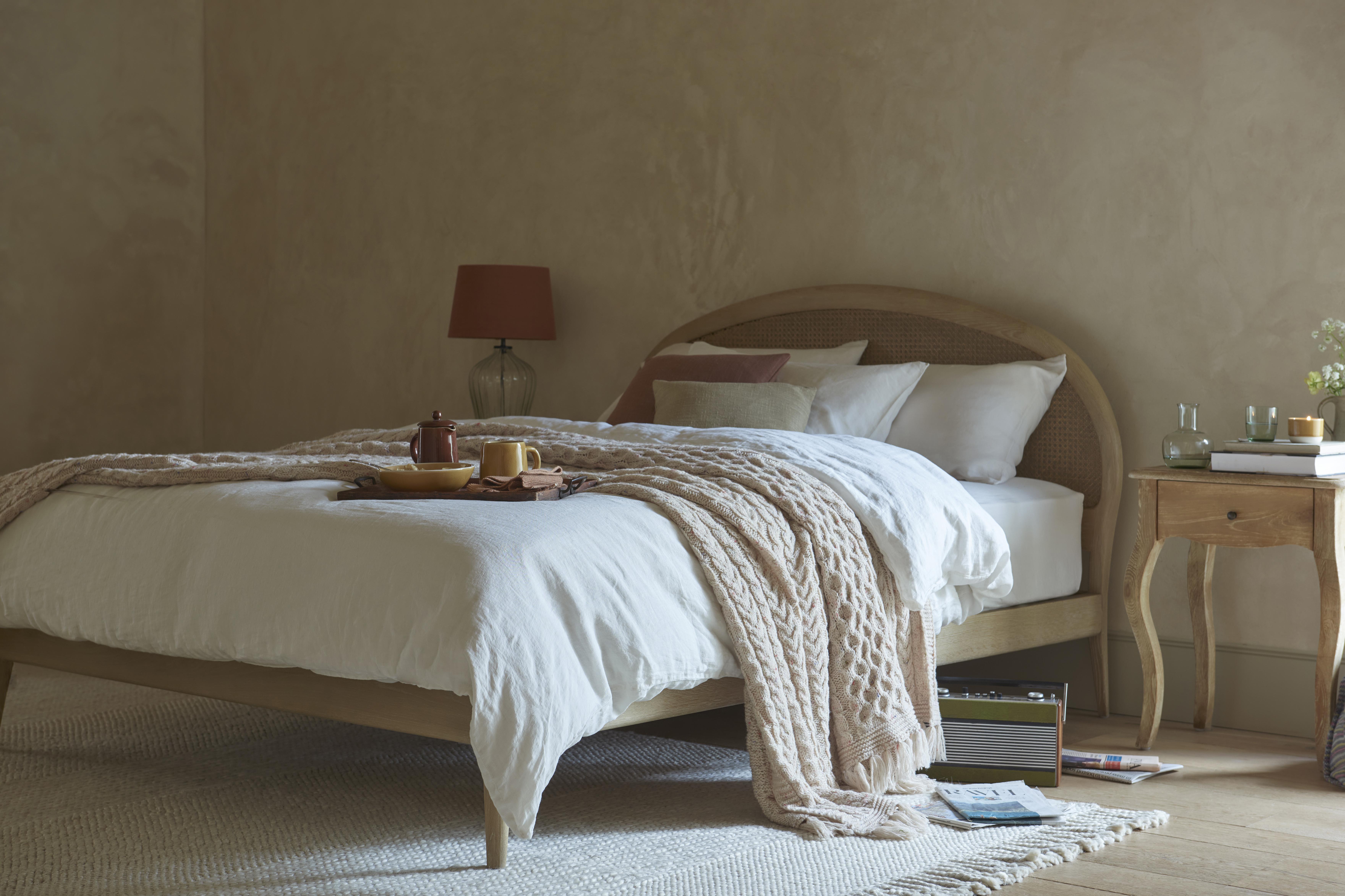
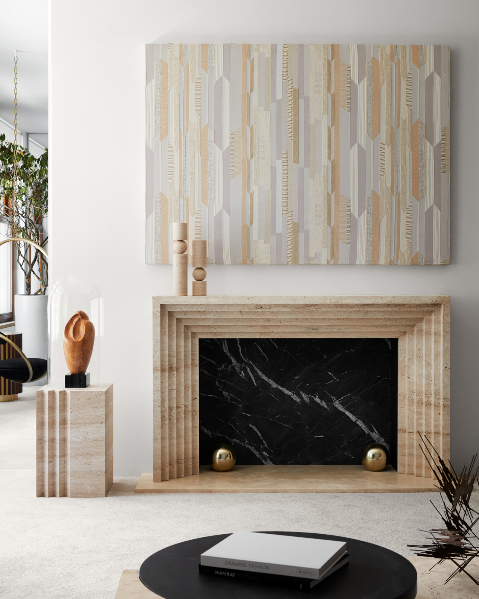
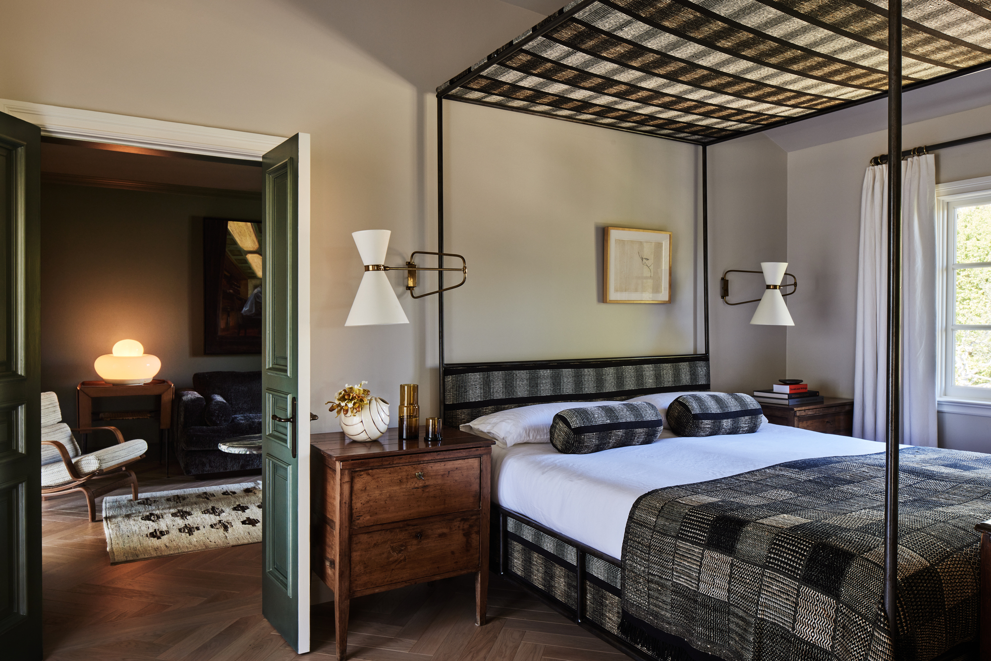
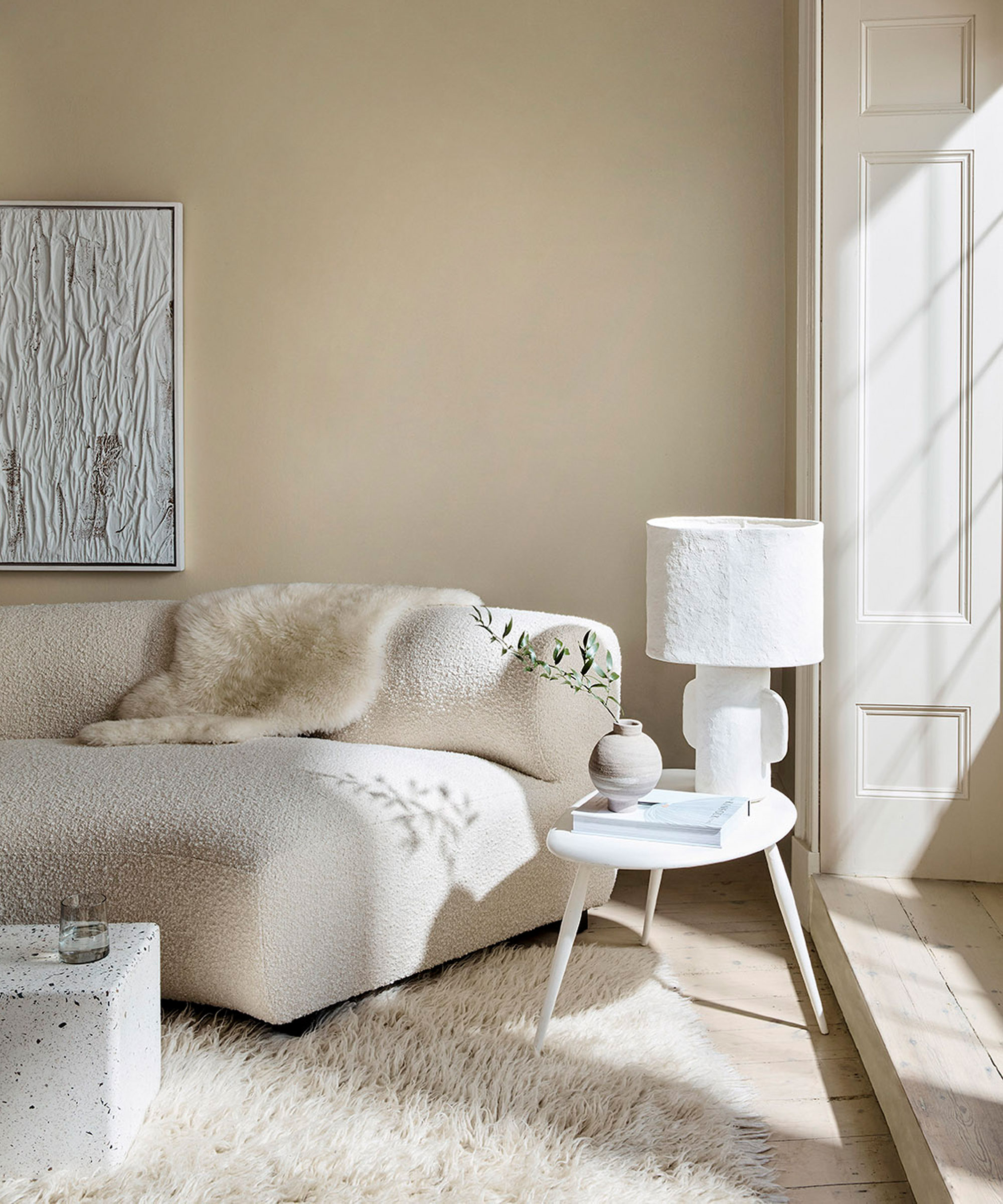
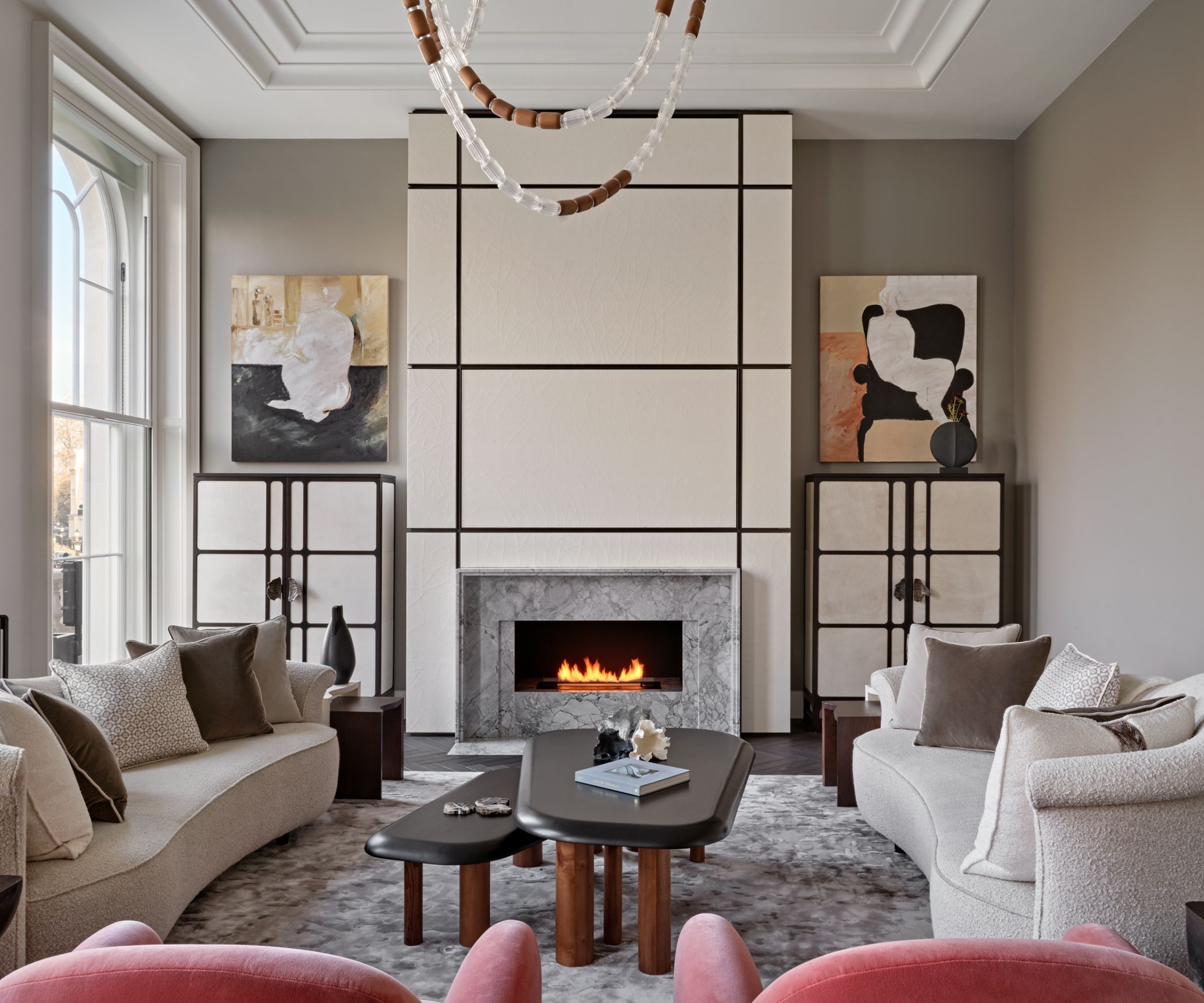
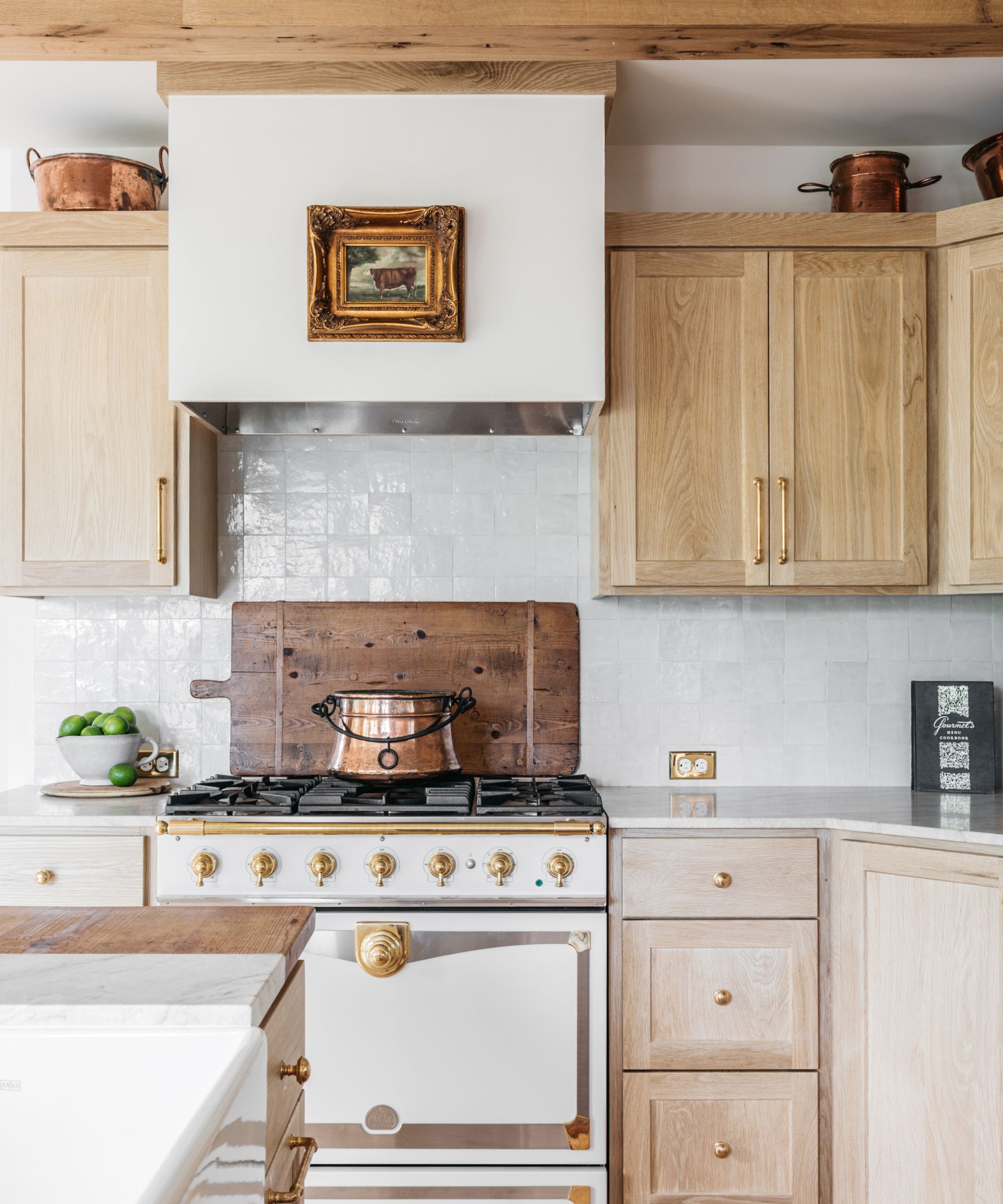
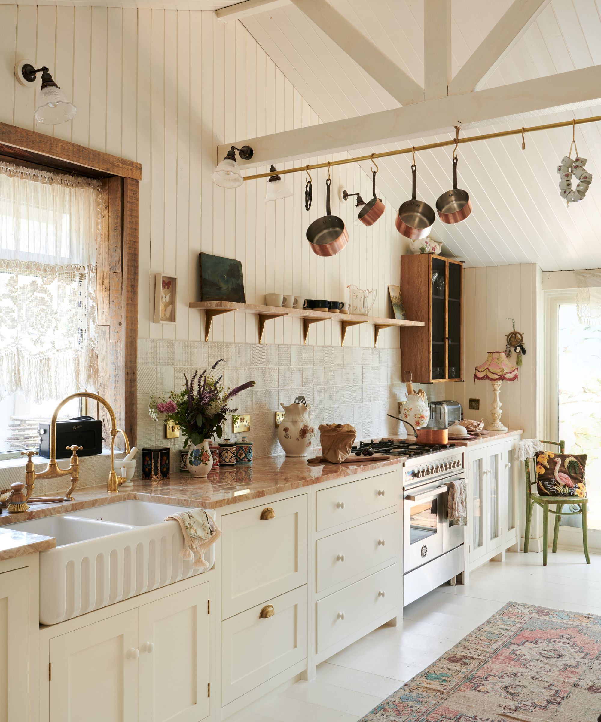
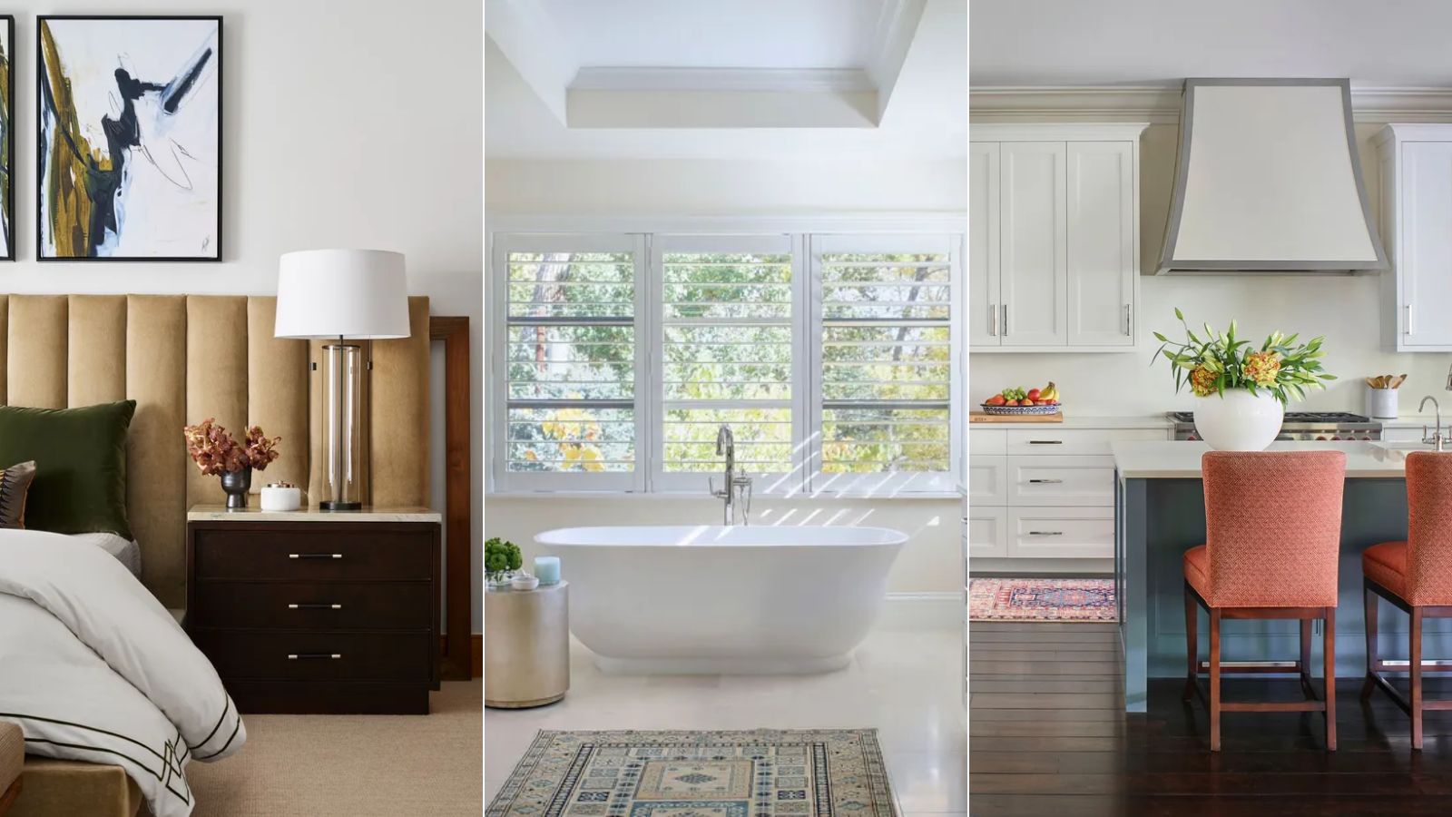
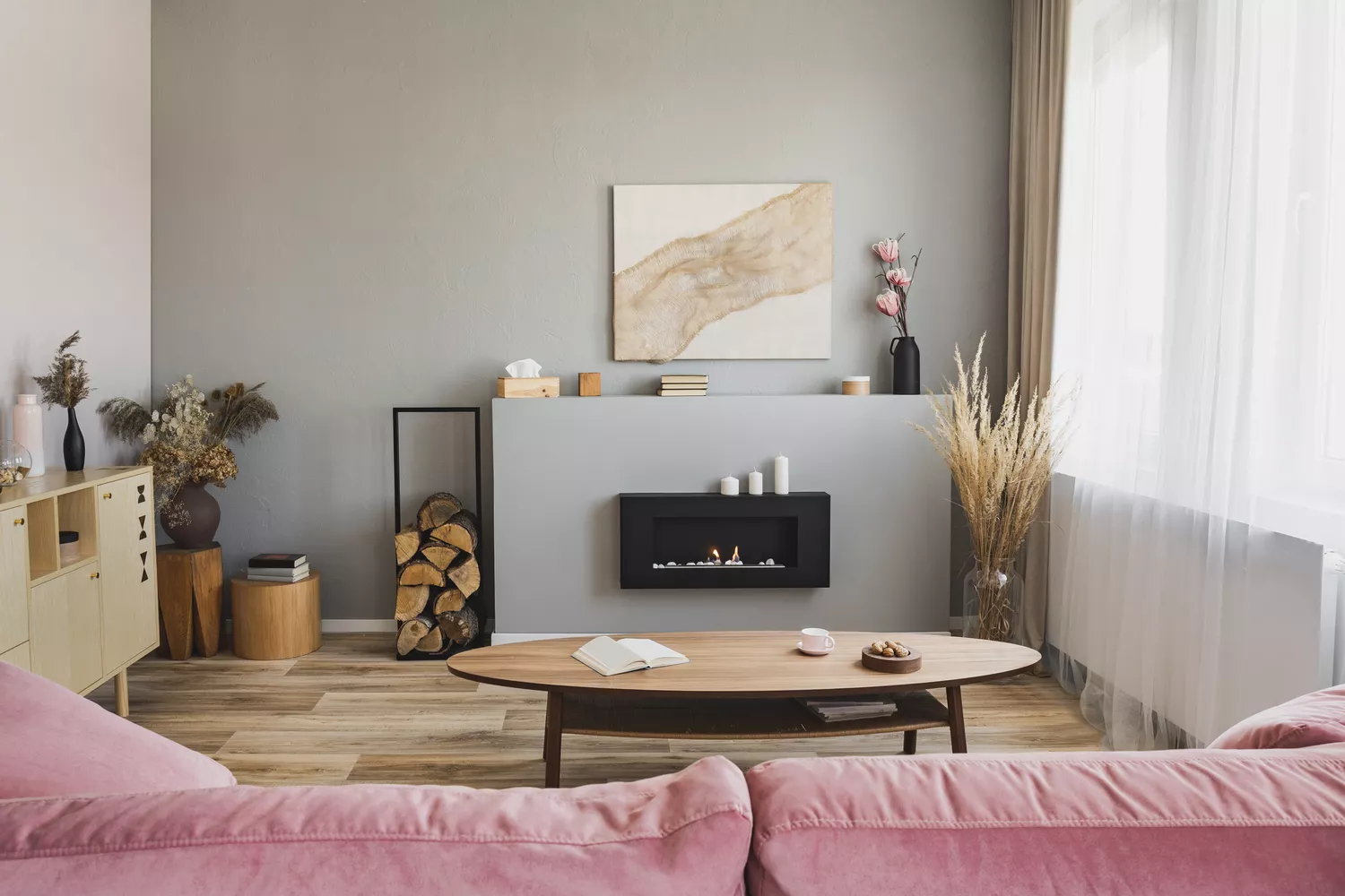
The design style of a space also plays a crucial role in determining the most suitable neutral. White is recommended for contemporary designs, providing a clean contrast that makes artwork and architectural details prominent. Cream, on the other hand, imparts a sense of sophistication and a subtle casualness, fostering an inviting and cozy atmosphere, particularly suitable for living rooms, bedrooms, or dining areas. It pairs well with natural wood tones and rich accents, contributing to a timeless aesthetic.
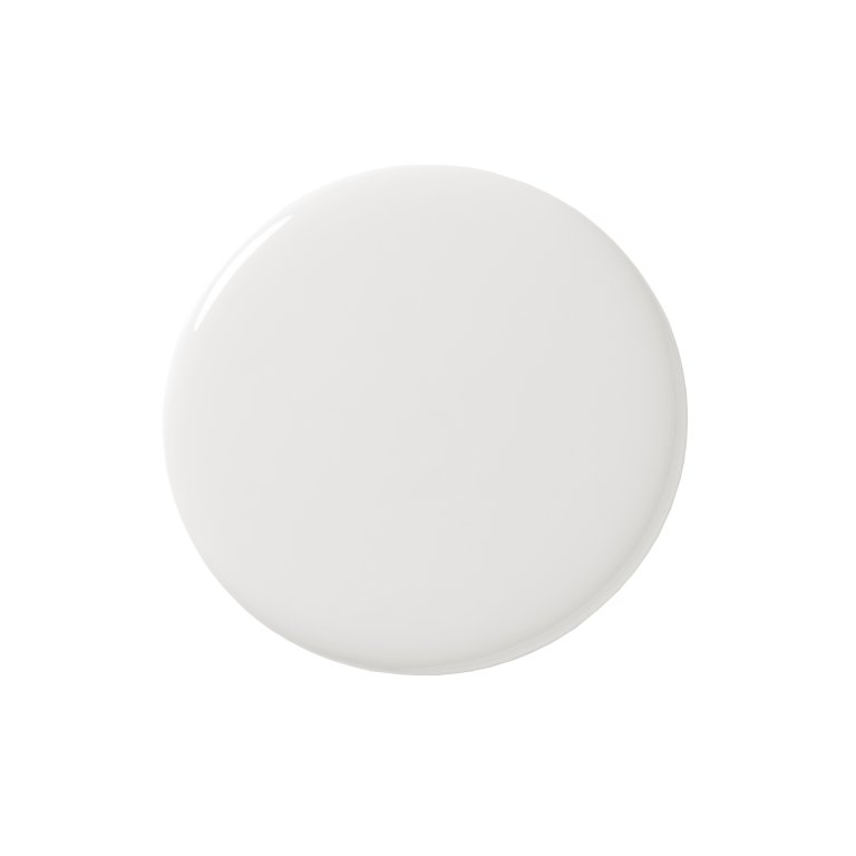
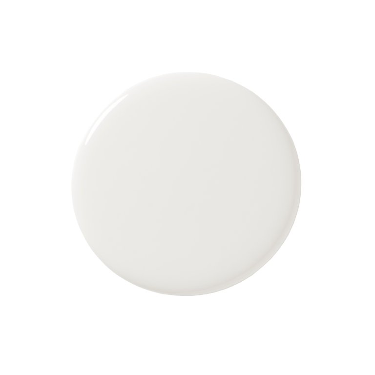
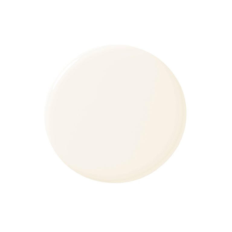
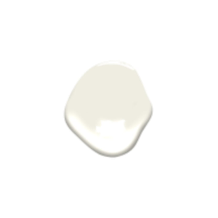
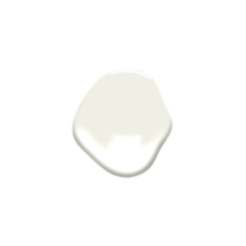
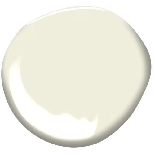
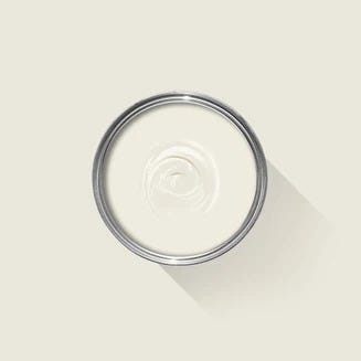
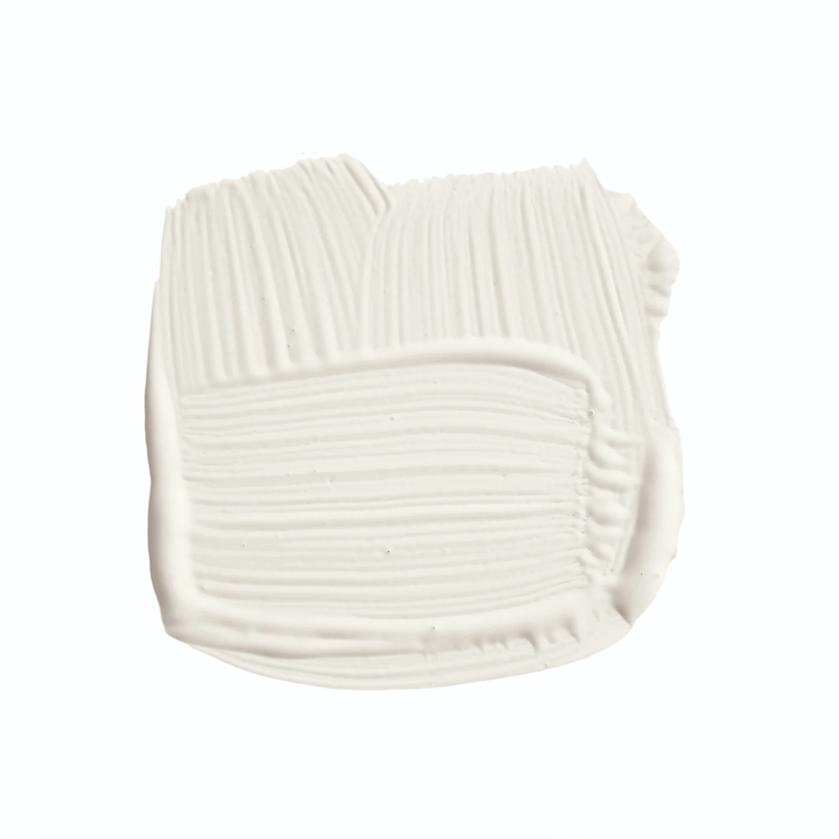
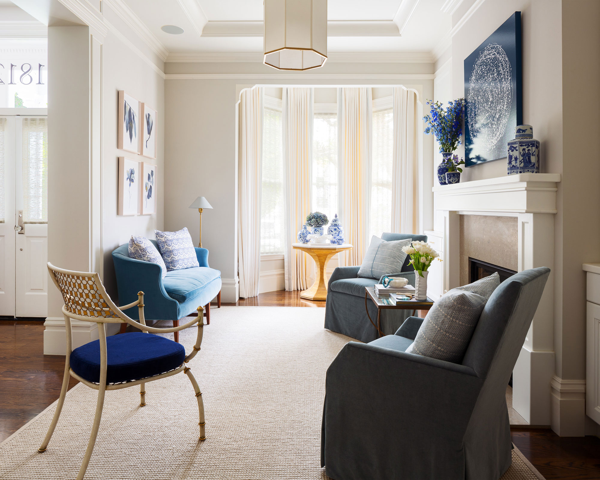
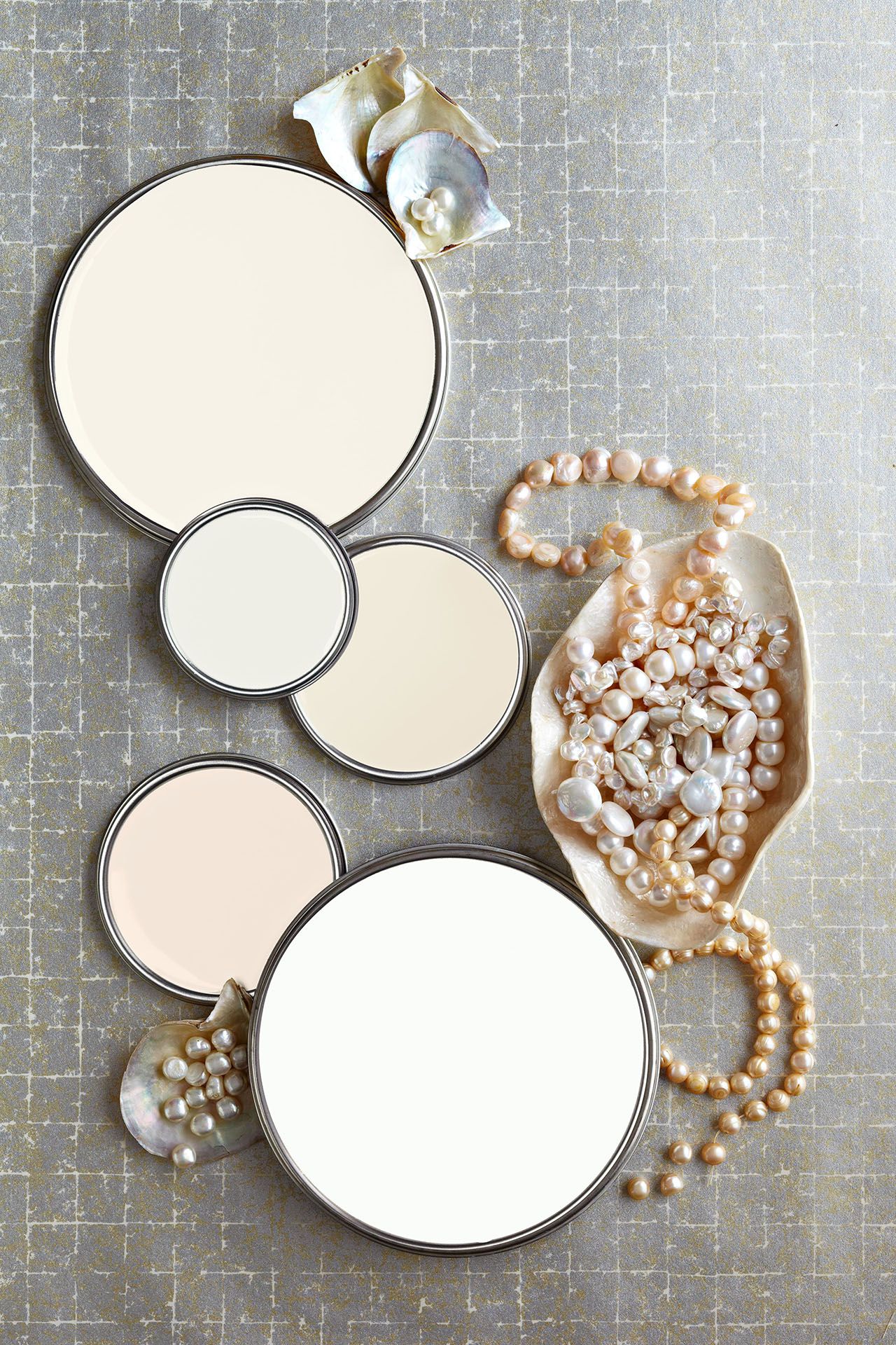
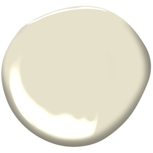
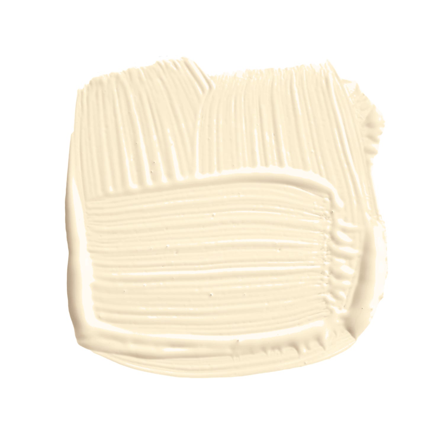
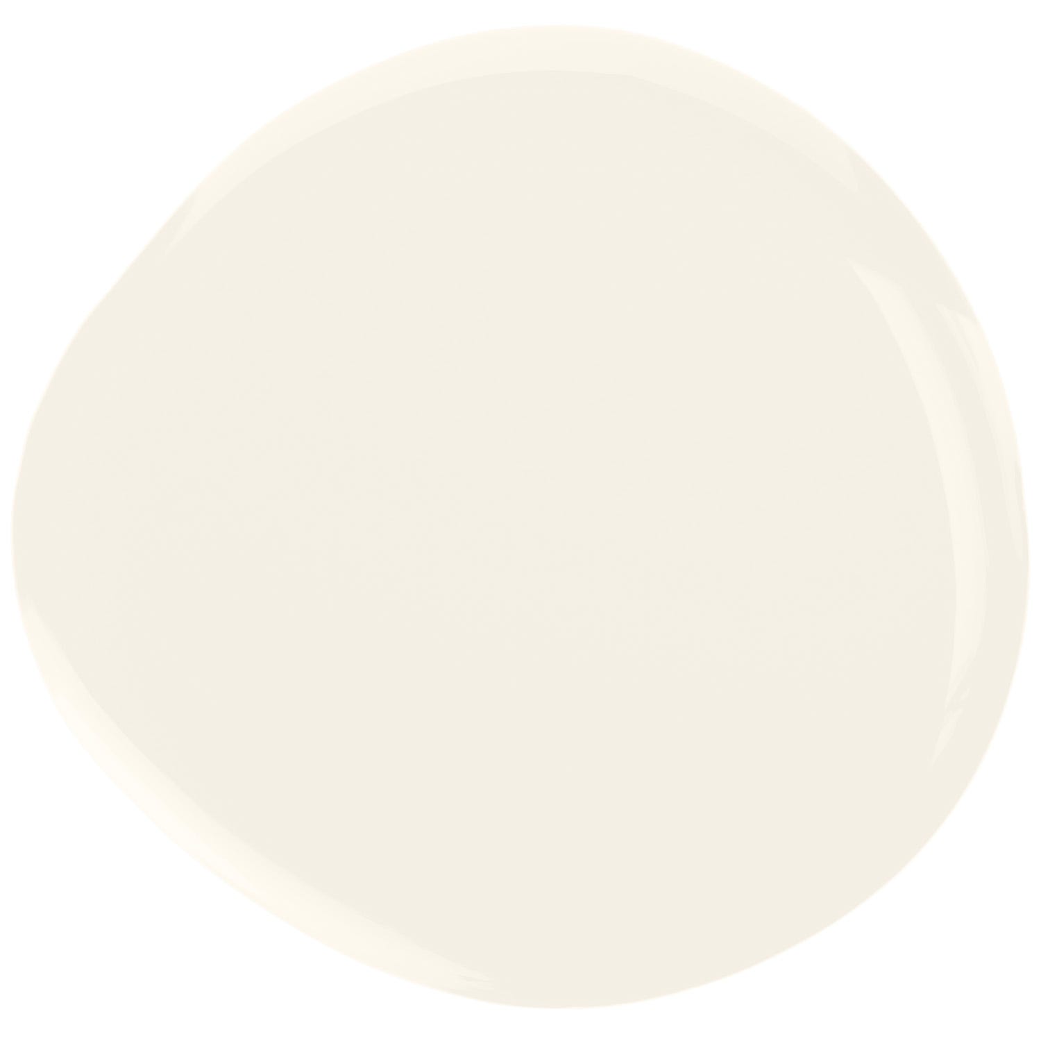
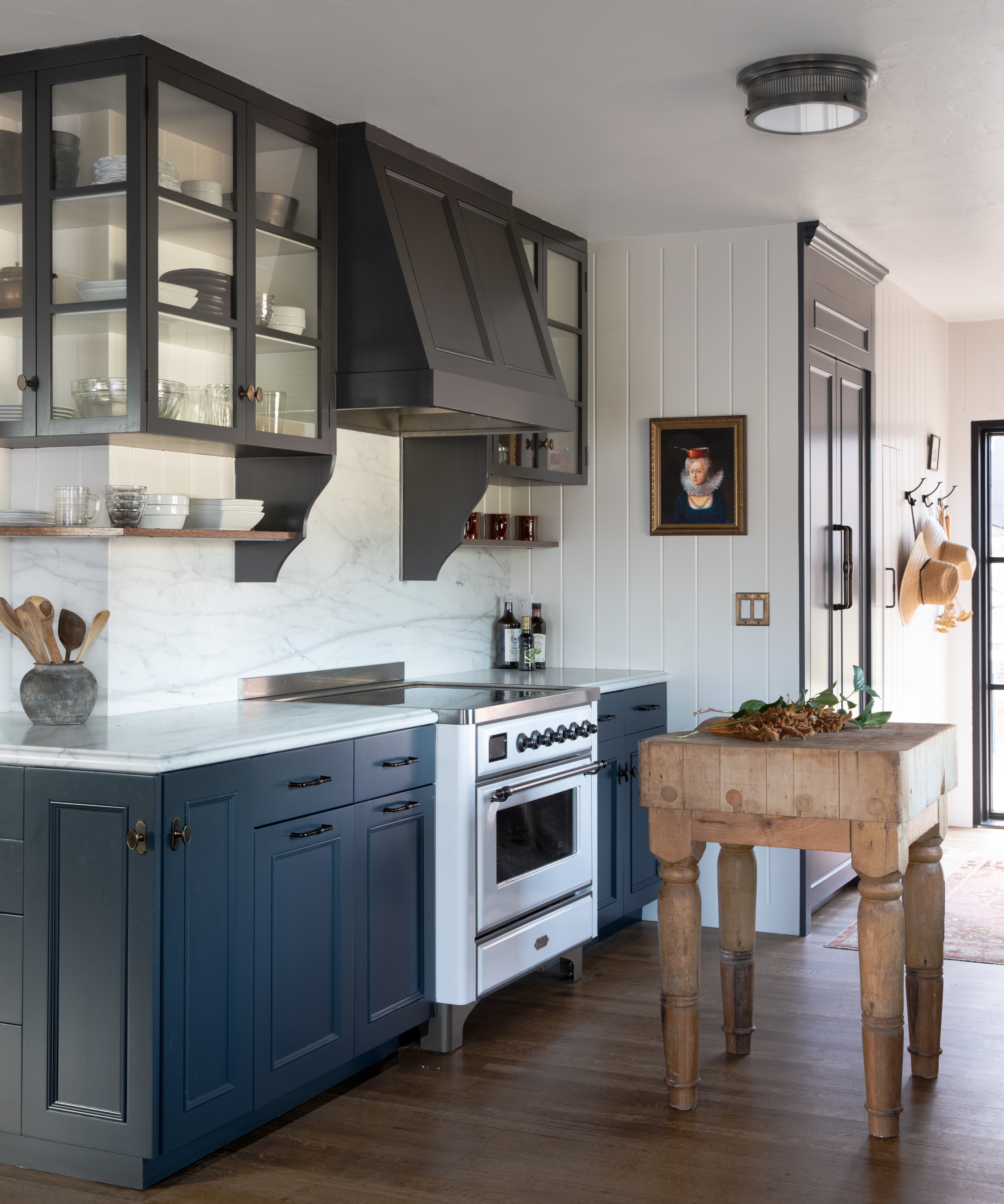
The article also delves into color schemes, suggesting that white is best integrated into cool palettes, such as those featuring blues and grays, to create a crisp contrast. Cream, conversely, harmonizes effectively with warm color schemes, including browns, oranges, and reds, enhancing the overall warmth of a room. Designers offer specific paint recommendations, such as Benjamin Moore's White Dove and Cloud White for whites, and Marble White and Navajo White for creams, noting that warm white paints are generally more flattering and less prone to creating an institutional feel.
Looking ahead to 2025, designers indicate a preference for cream, recognizing its versatility and ability to create cozy, homey spaces. Christine Vroom suggests layering various tones of cream, like champagne, off-white, alabaster, and biscuit, alongside diverse textures such as boucle, velvet, and linen, to add depth. While cream is currently favored, white remains a timeless choice, particularly warm whites that prevent starkness. The article concludes that the ultimate choice between white and cream depends on the specific lighting conditions and desired ambiance of the room, advocating for thoughtful selection to achieve a balanced and appealing interior.
#InteriorDesign #ColorTrends #HomeDecor #NeutralColors #PaintChoices #DesignTips #ResidentialDesign #DecoratingIdeas #InteriorDesign #ColorTrends #HomeDecor #NeutralColors #PaintChoices #DesignTips #ResidentialDesign #DecoratingIdeas
0 تعليق إجمالاً
 لا توجد تعليقات بعد
قد تعجبك أيضًا
Designers’ Favorite White Paints Are Always Changing—We Asked 3 for Their Latest Pick

Is white actually out of style? Interior designers weigh in on this classic color for 2025 decorating

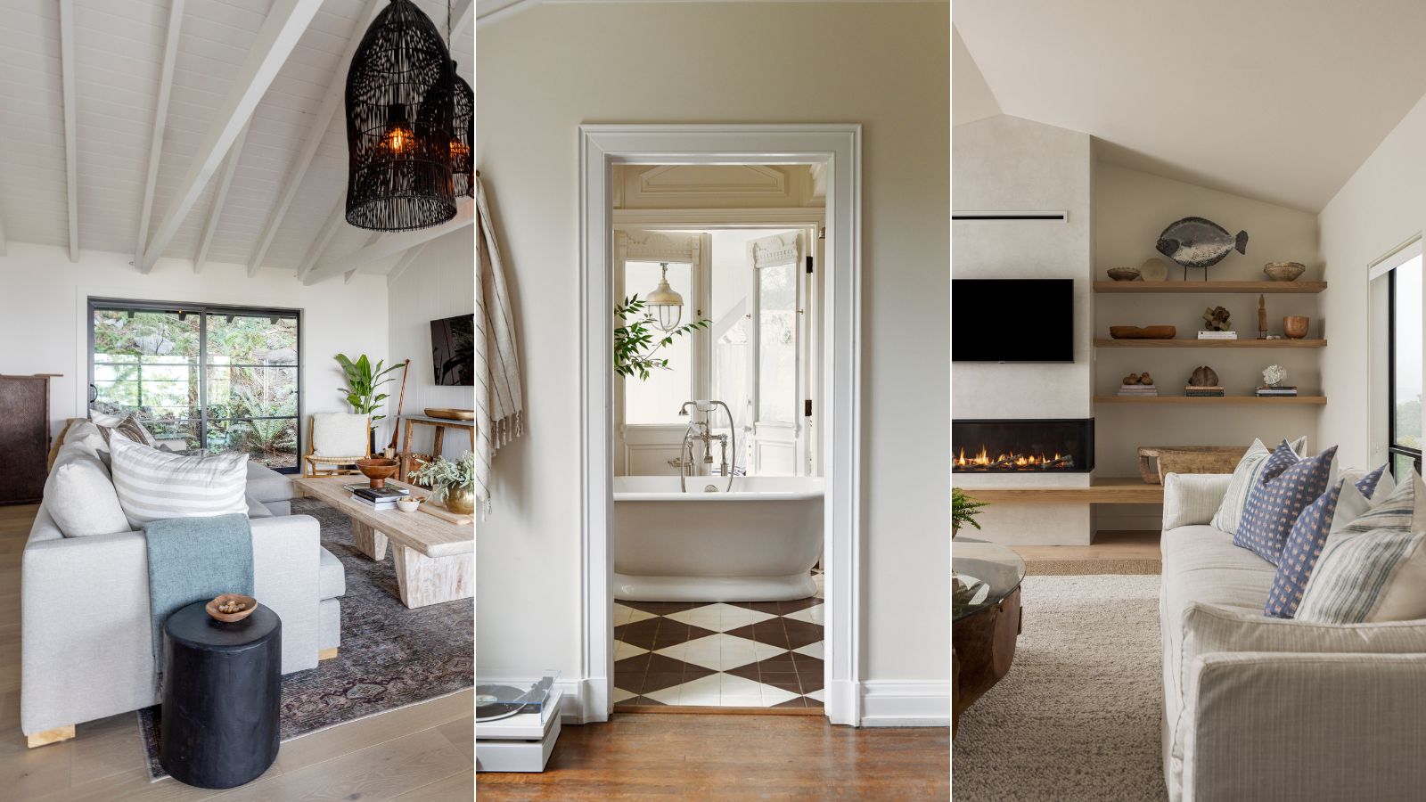
5 best cream paints, as chosen by interior designers
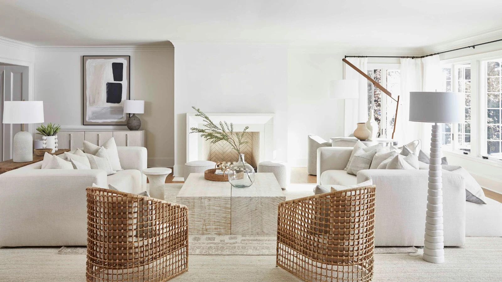
7 of the best cream wall paint colors, as chosen by designers – 'they look modern, and anything but magnolia'

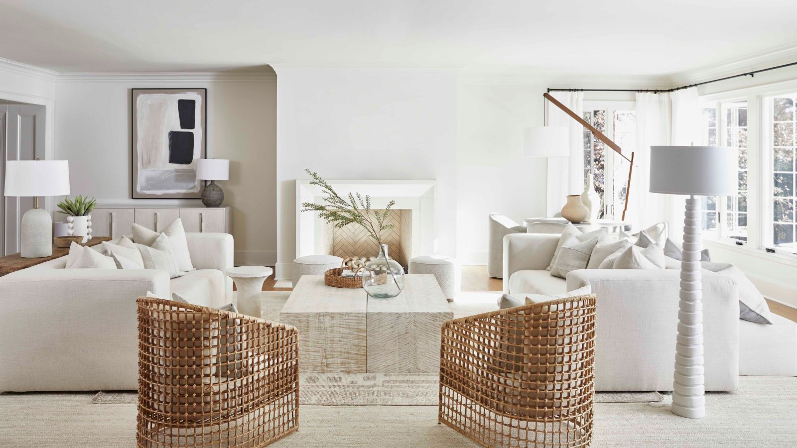
7 of the best cream wall paint colors, as chosen by designers – 'they look modern, and anything but magnolia'

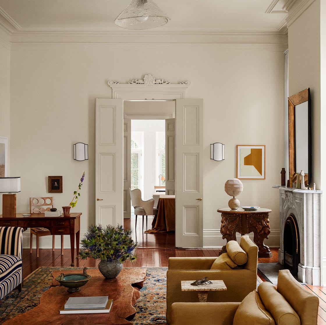
Interior Designers Share Their Favorite Cream Paint Colors
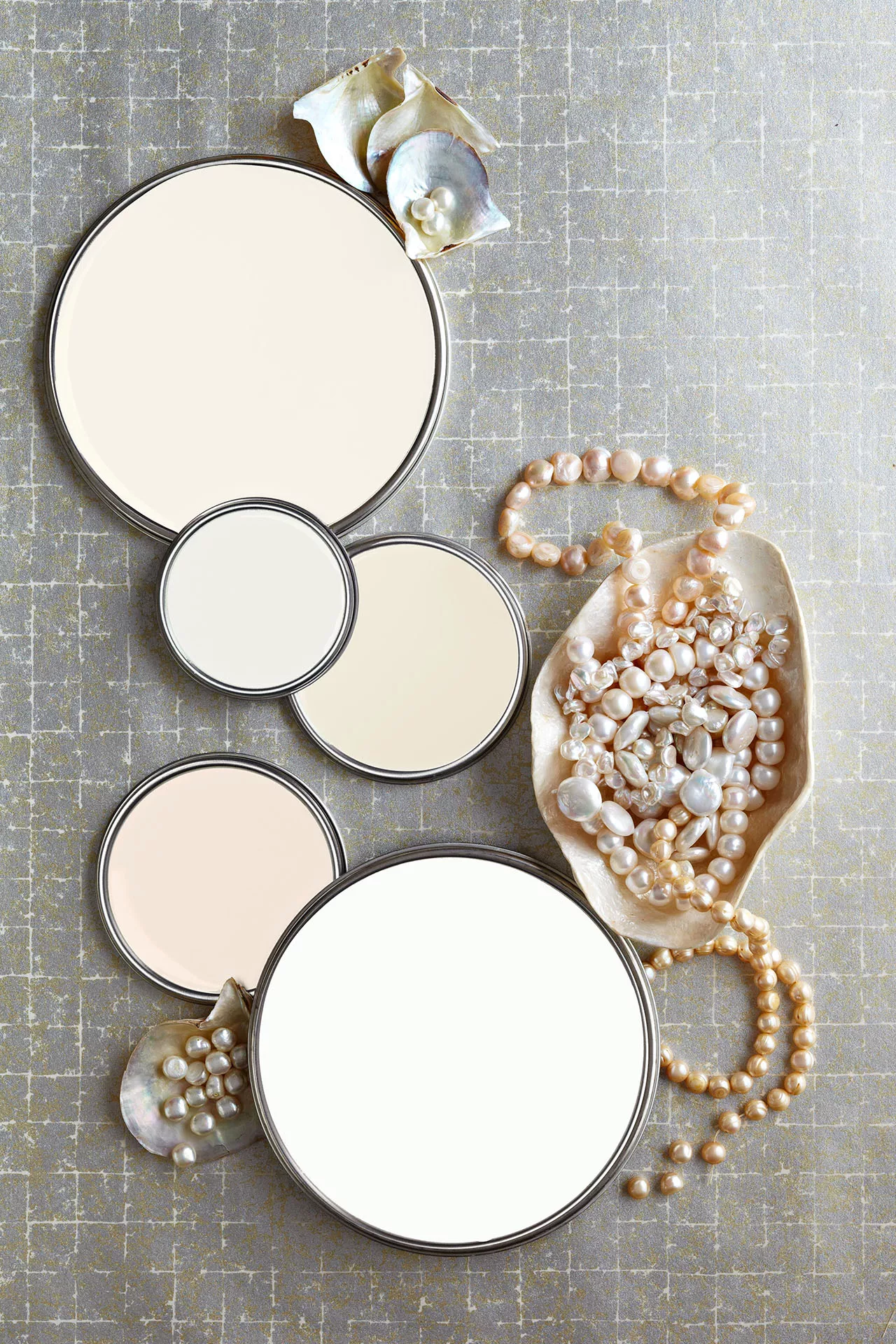
27 Neutral Paint Colors and Tips from Experts On How to Use Them

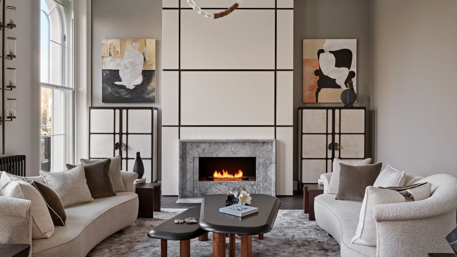
Is cream paint back on trend? 7 ways interior designers use this once shunned shade

Shades of white: Paint color pros reveal their favorite neutral combinations for exteriors
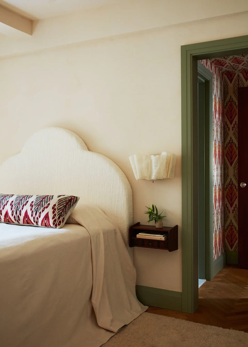
23 Versatile Cream Paint Colors That Will Pair with Basically Anything

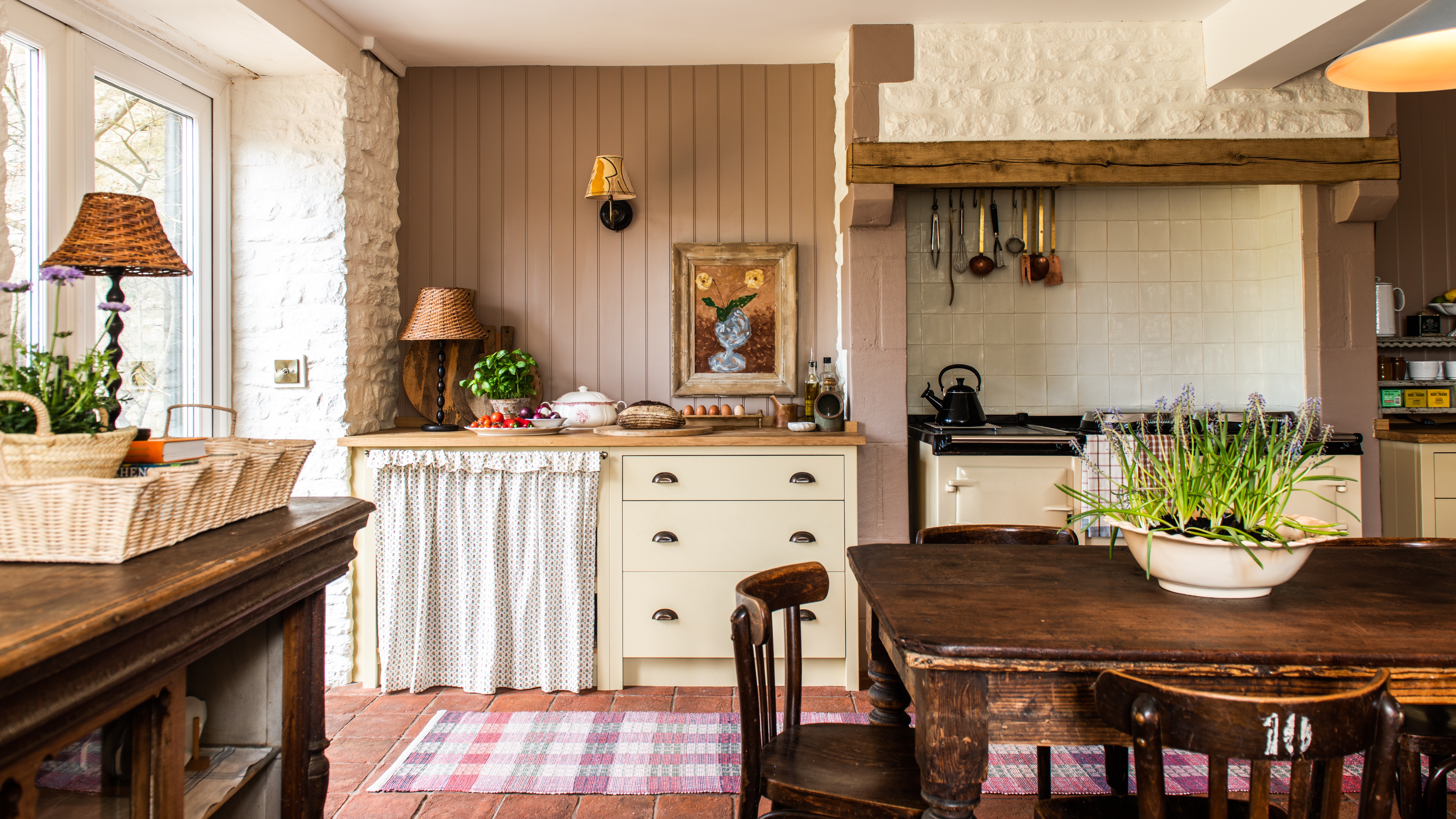
Creamy neutral paint colours are back — just don’t call it magnolia
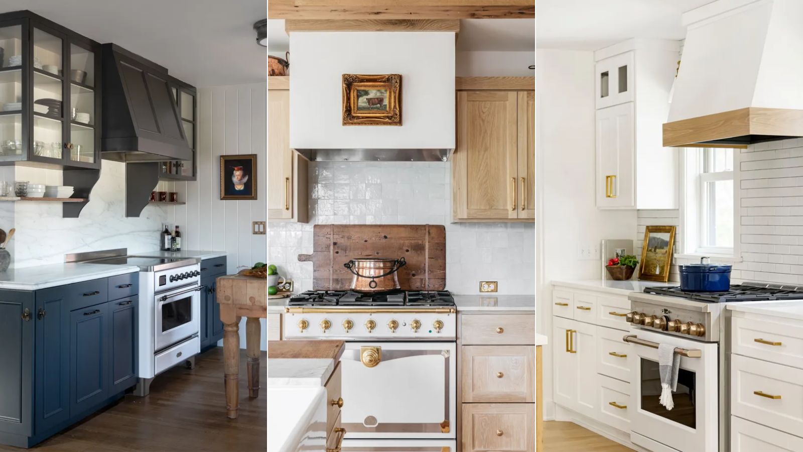
What colors work best in a kitchen with white appliances? Interior designers suggest the most timeless schemes
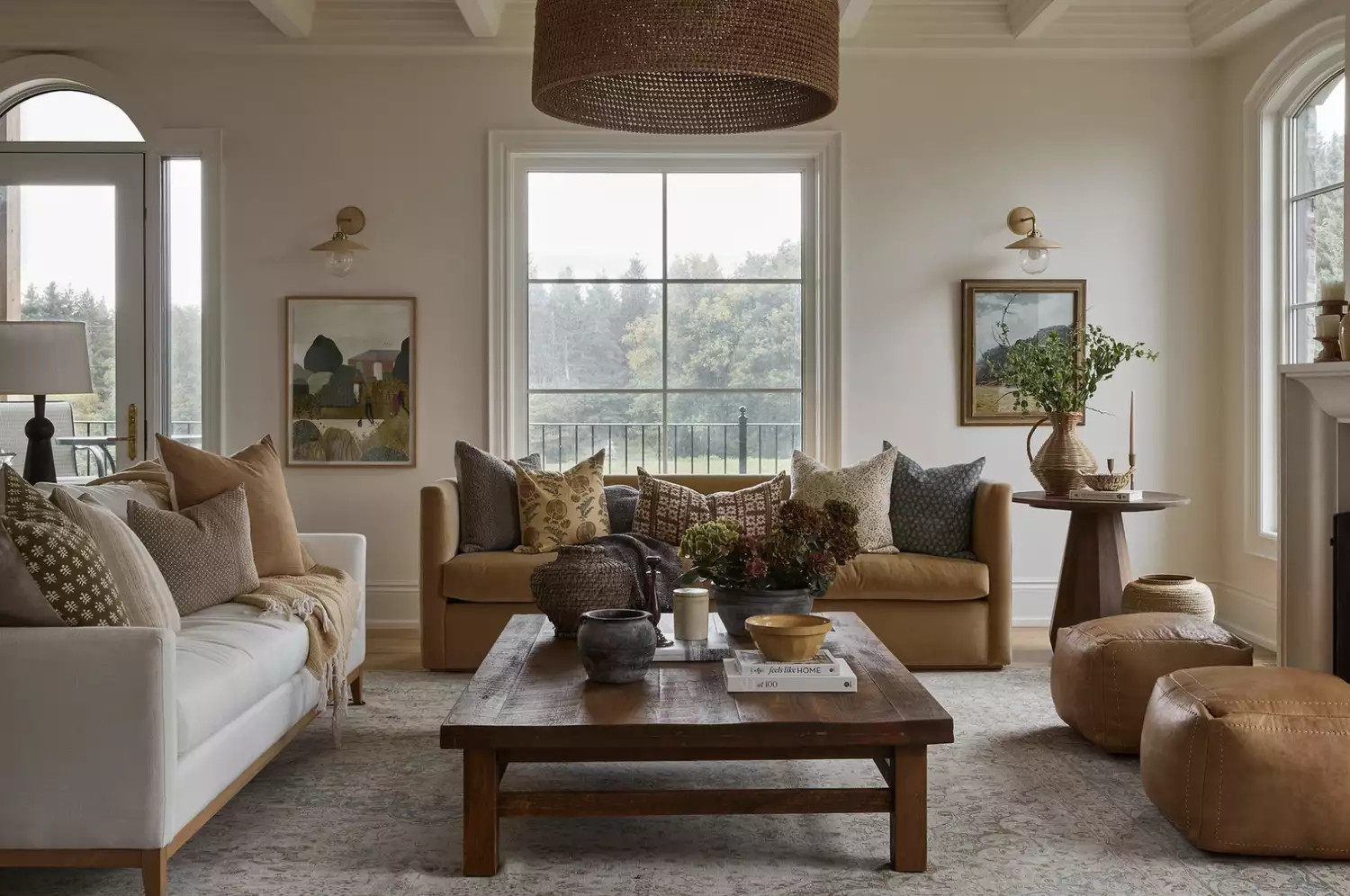
From the Living Room to the Bedroom, These Cream Paint Colors Work Anywhere

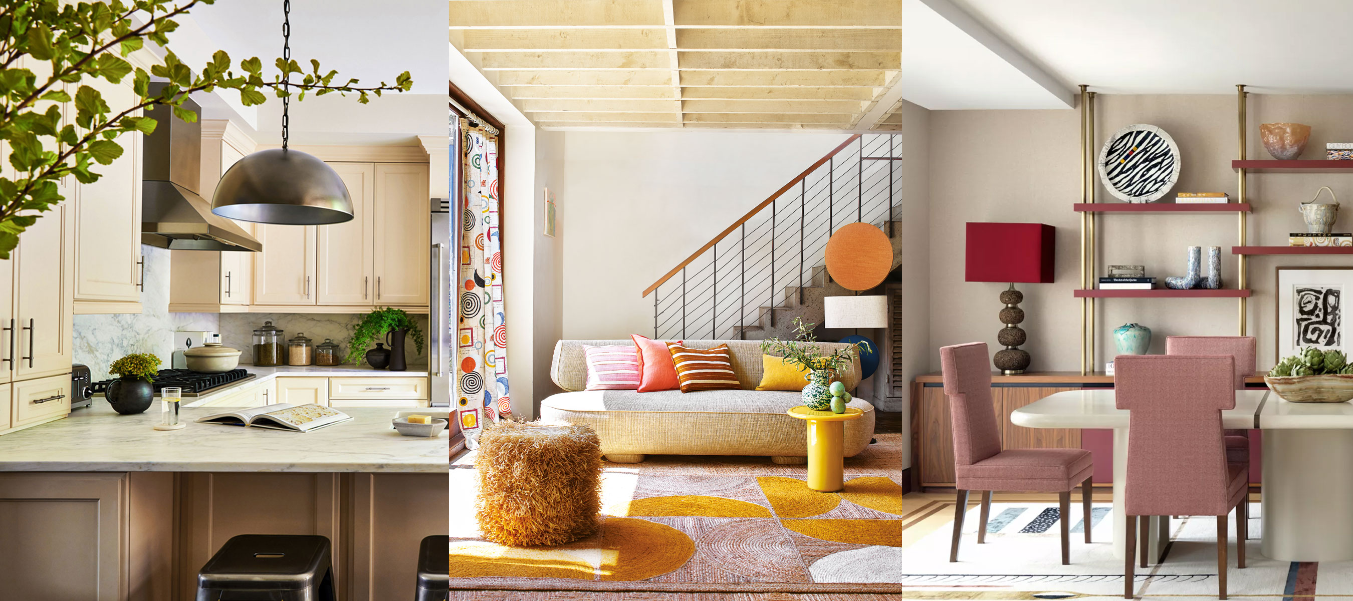
What colors go with cream? 8 complementary colors for this neutral favorite
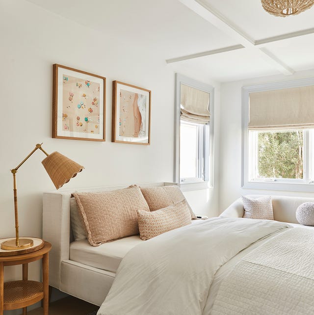
Here Are the Best Cream Paint Colors, According to Design Pros

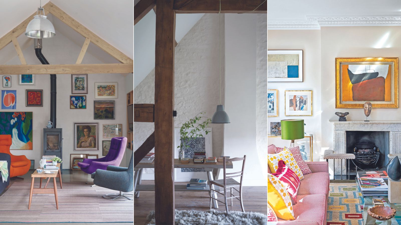
Are white walls still on trend? Designers weigh in on whether this classic shade is on the out
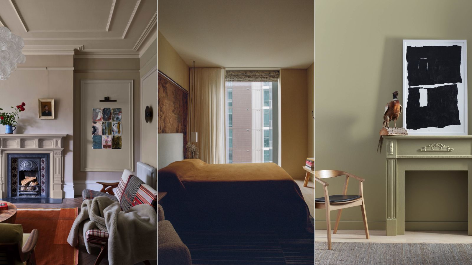
6 earthy neutral paints that designers say are replacing bland white walls
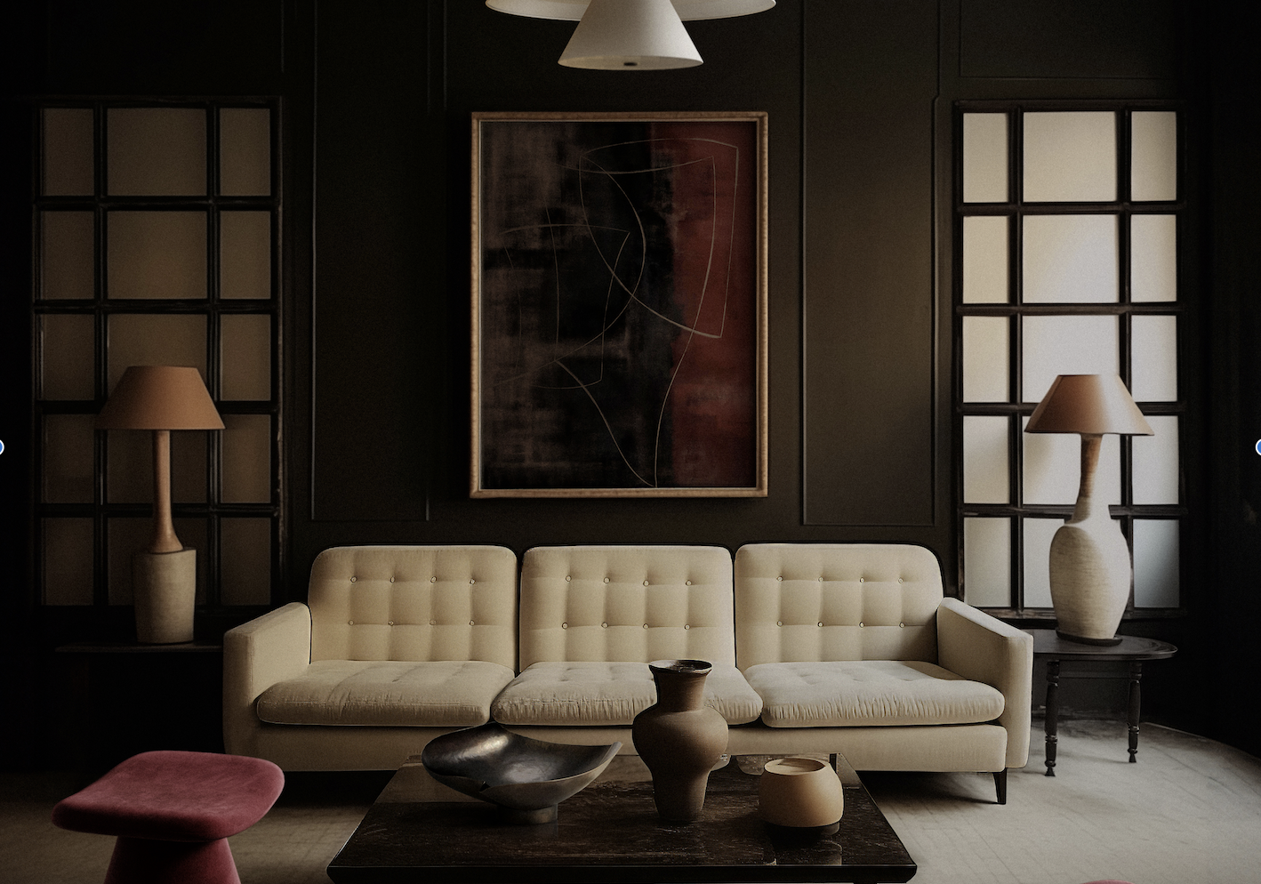
What Colors Go With Cream? 10 Crème de la Crème Pairings That Go Perfectly With the Warm Neutral
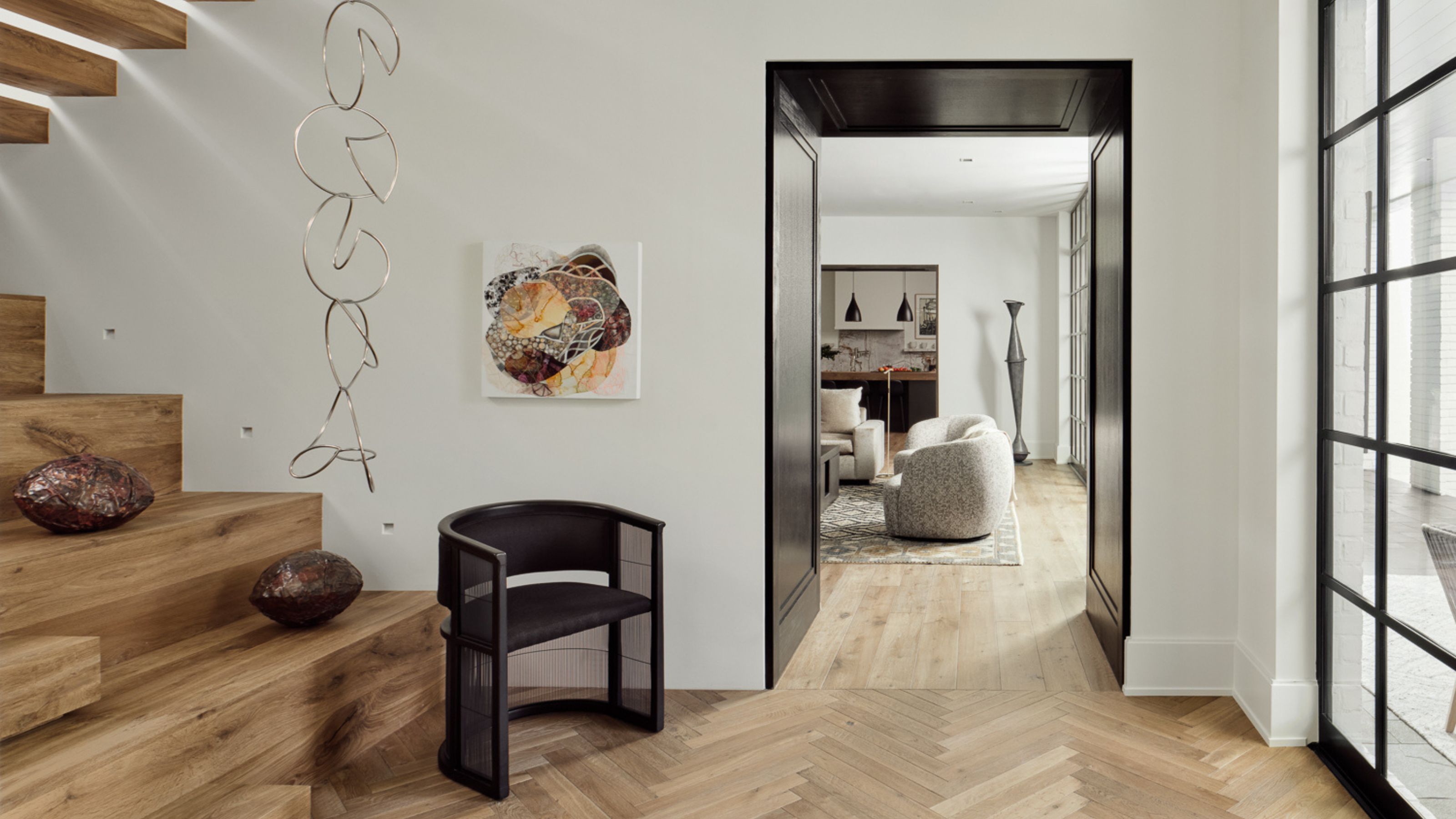
9 Neutral Paint Colors Designers Constantly Reach For — "It's My Tried-and-True"
Bored With White Walls? Try One of These Designer-Recommended Neutral Paints Instead