1/5
Tour Emma Willis' pale pink and charcoal kitchen - it's an unexpected colour combination set to be trendy again
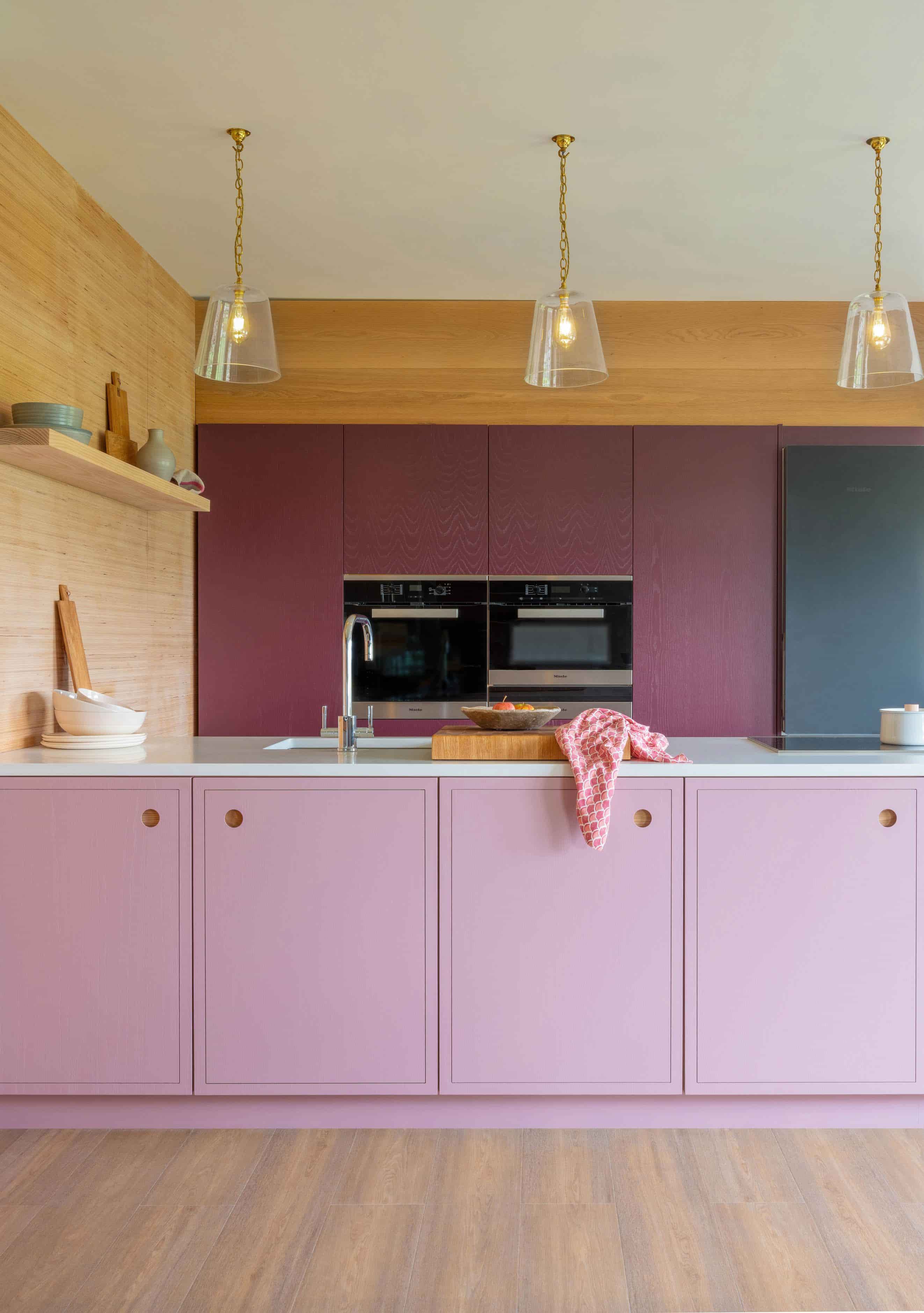
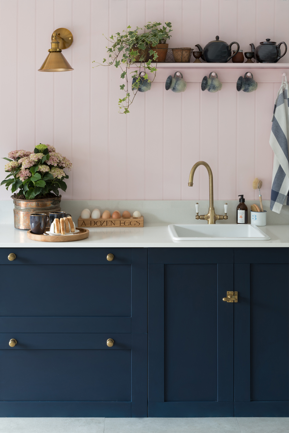
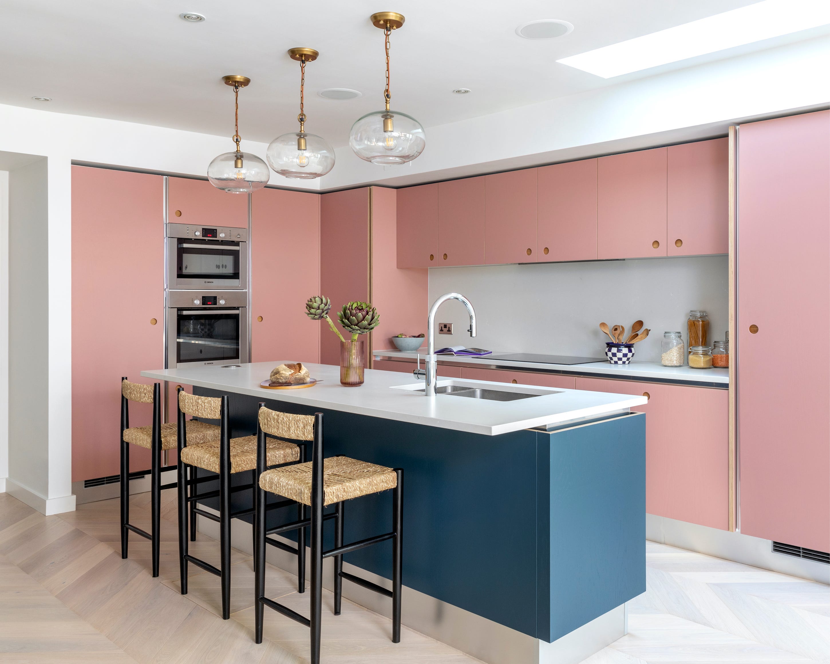
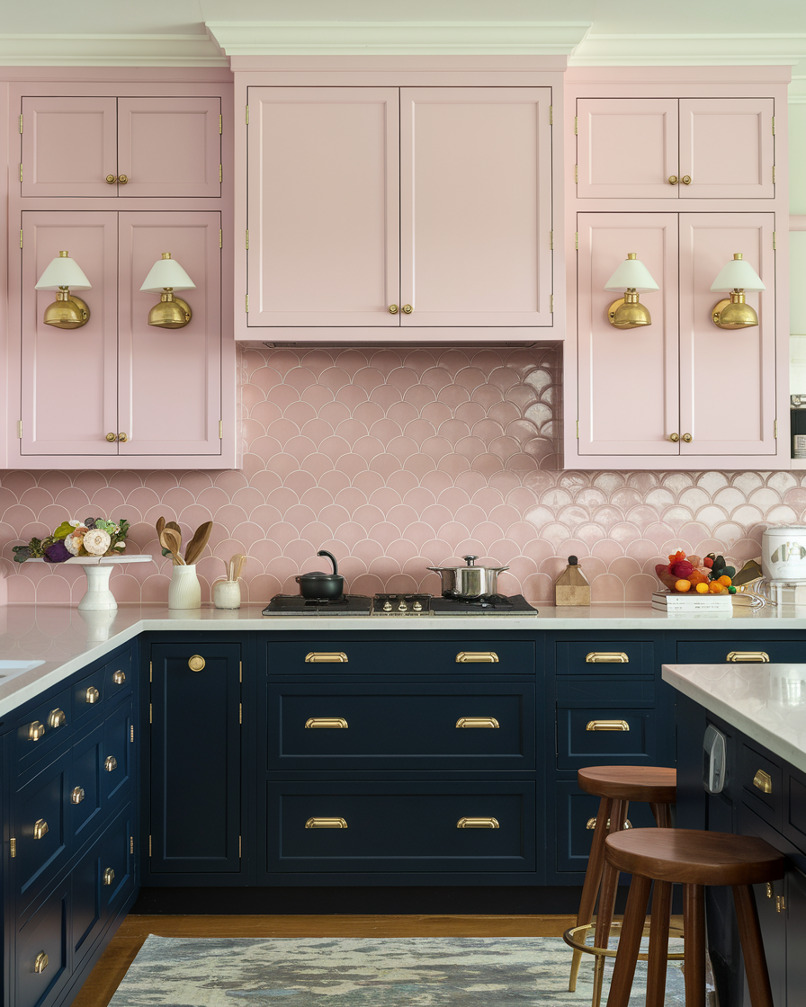
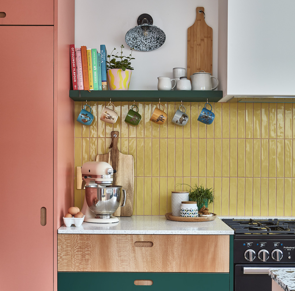
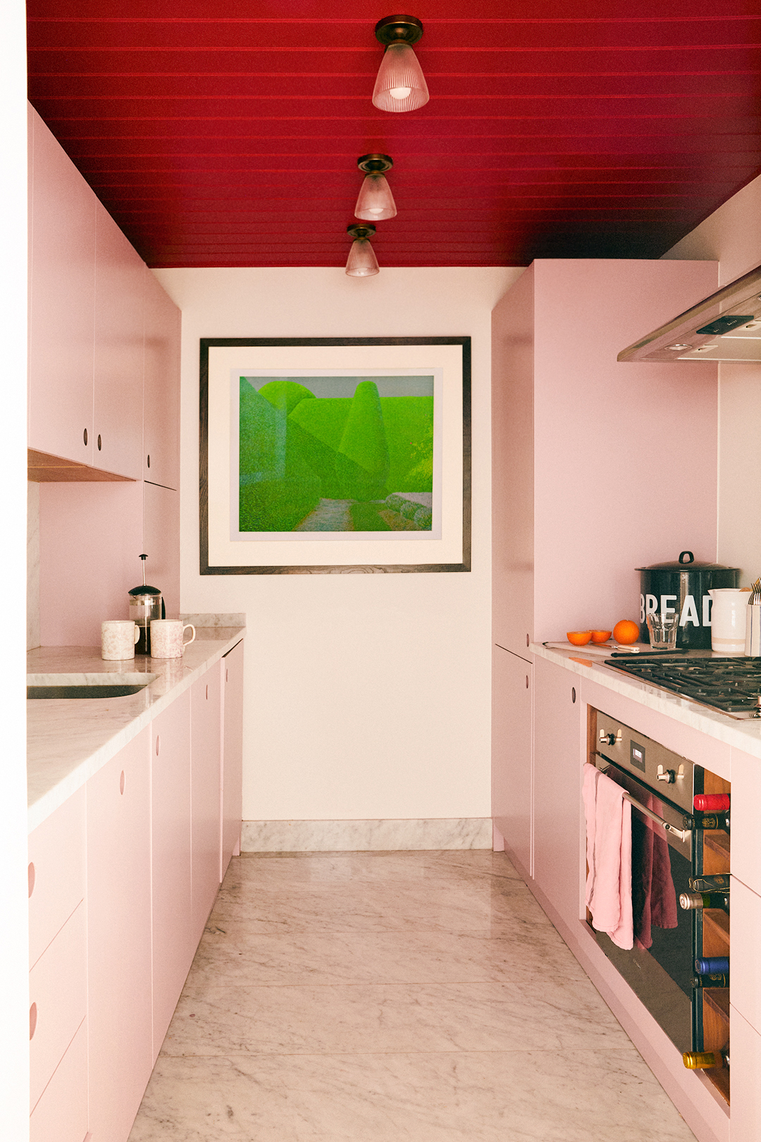
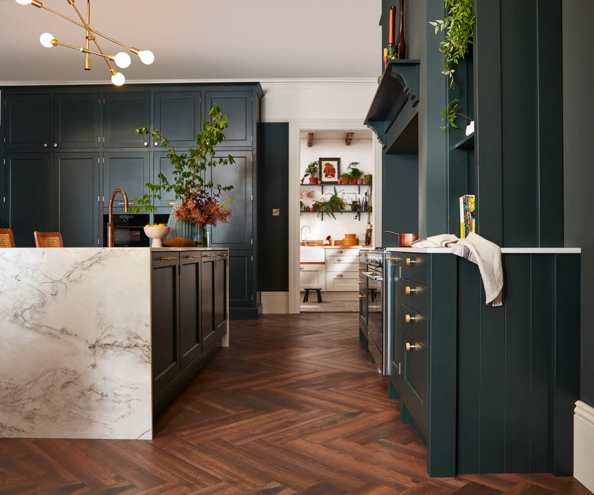
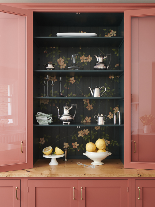
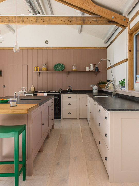
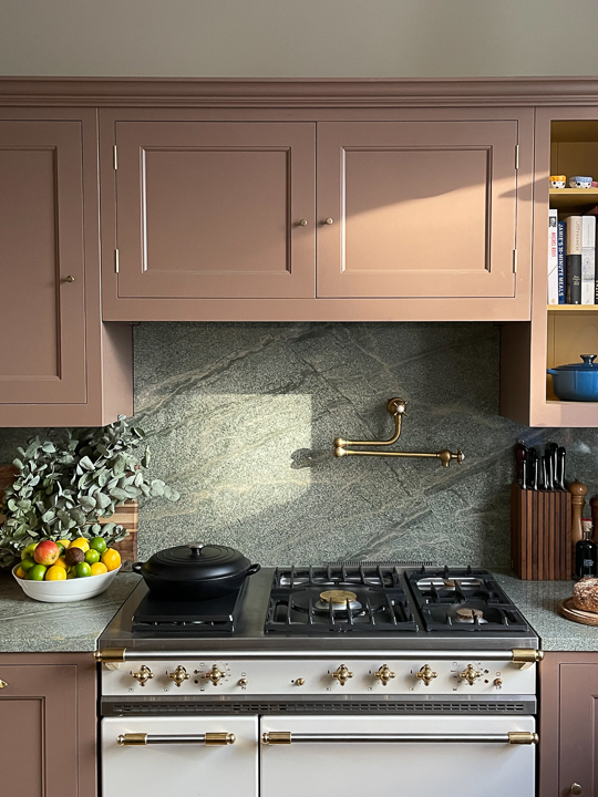
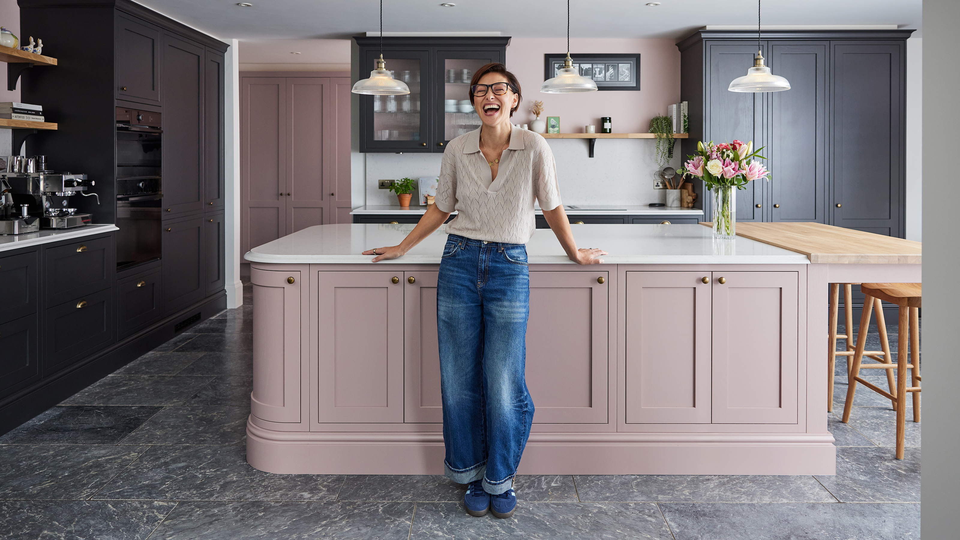
This article discusses Emma Willis' new kitchen design, featuring a pale pink and charcoal two-tone color palette. The combination revitalizes the use of grey tones, which had seen a decline in popularity in recent years in favor of warmer palettes. The kitchen, designed by Howdens, showcases how a soft pastel pink, often considered a 'girly' shade, can be effectively integrated into a functional space like a kitchen as a 'new neutral,' adding character without being overly bold. The dark charcoal acts as an unexpected contrast, providing depth and sophistication to the otherwise saccharine pink.
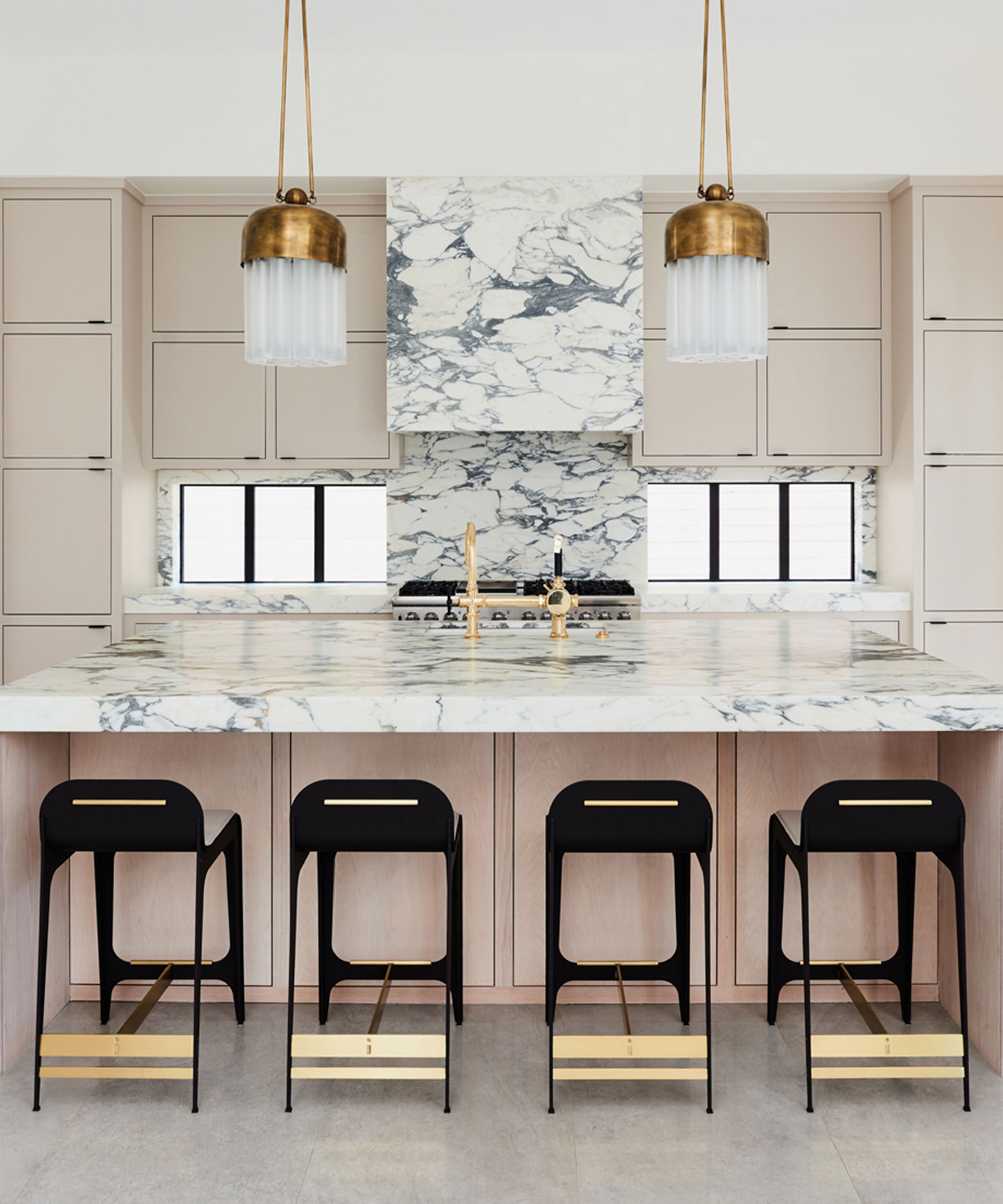
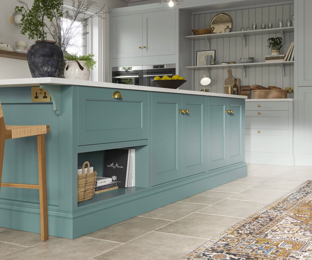
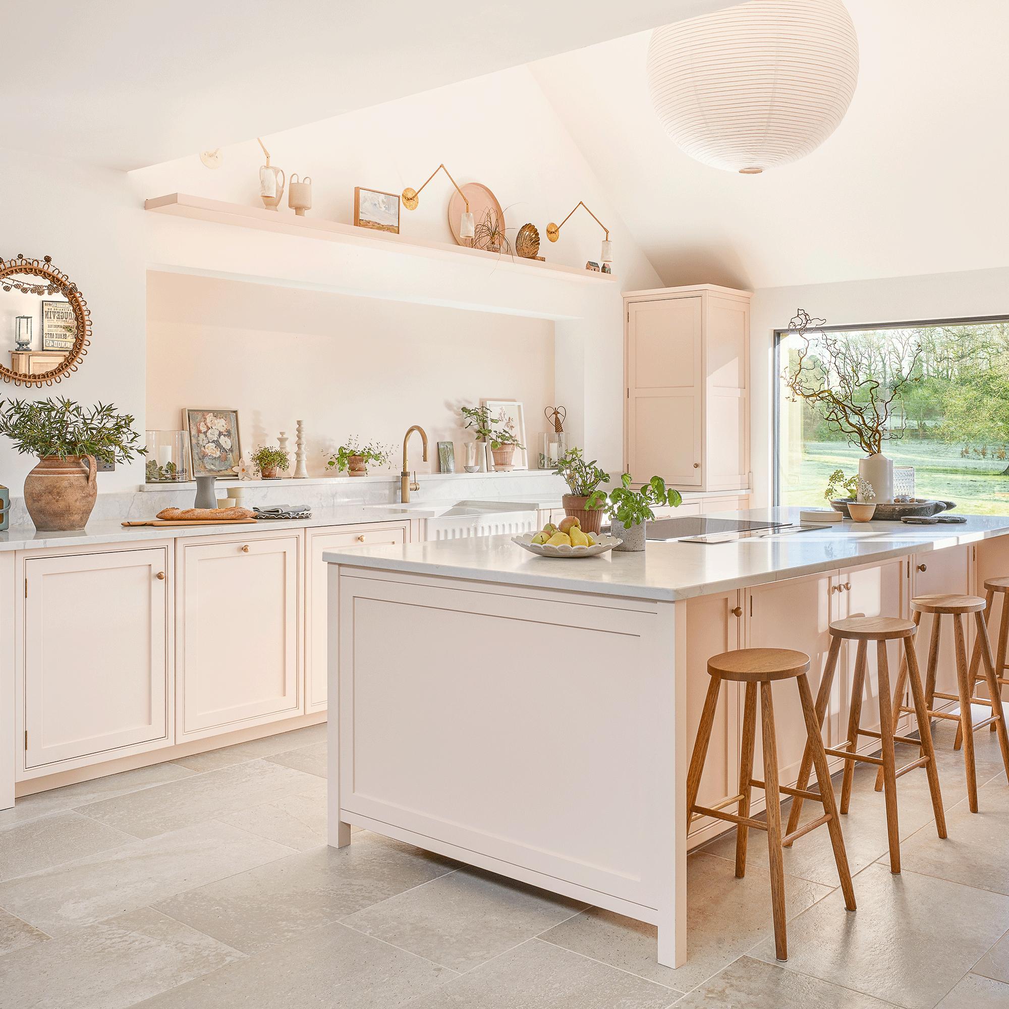
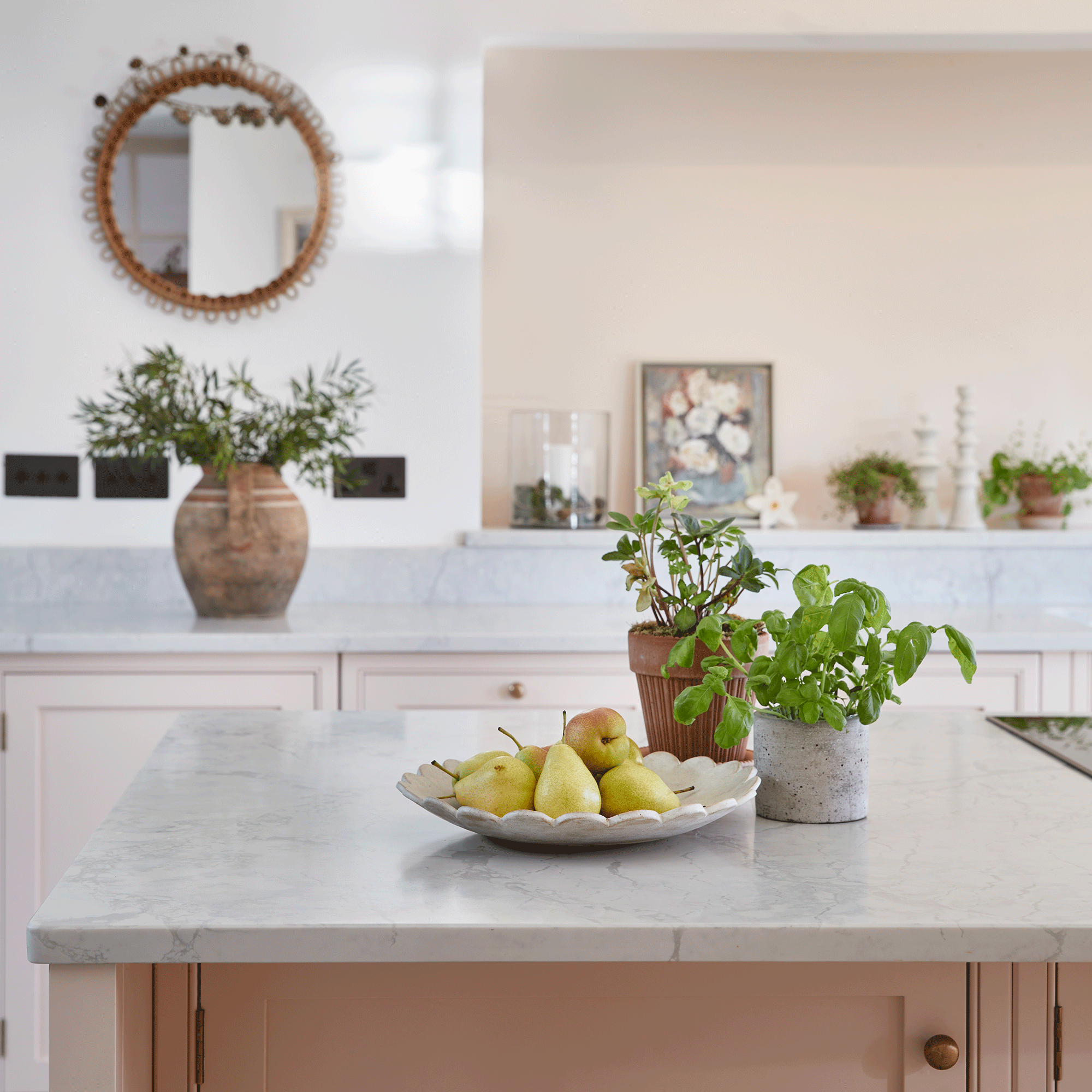
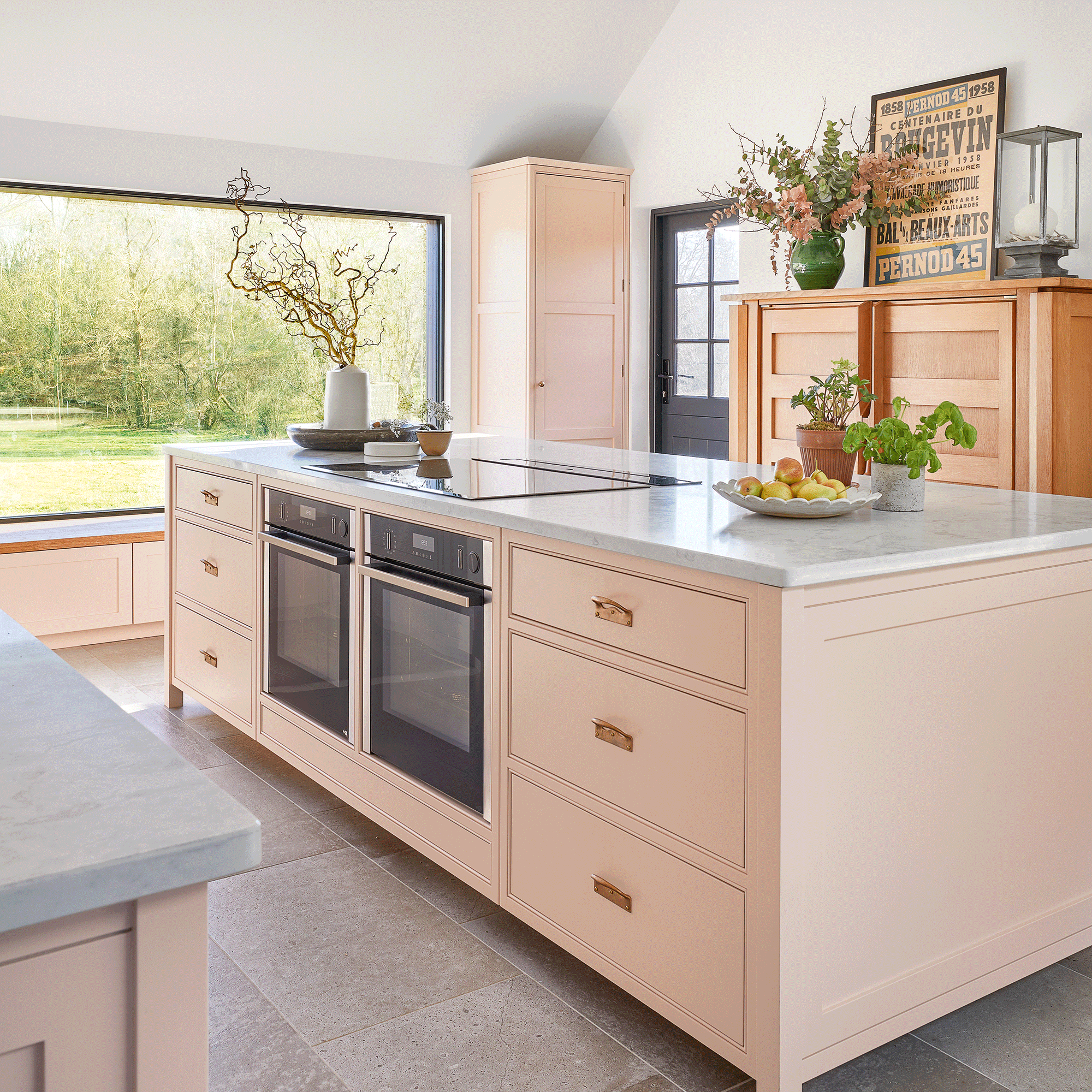
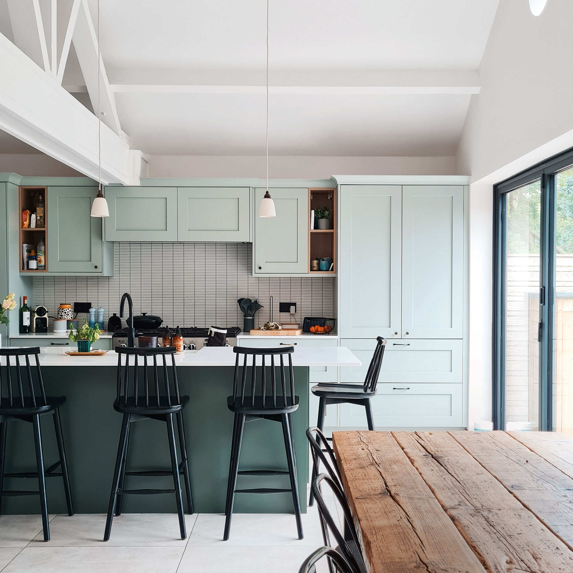
The design strategy specifically highlights the central role of the kitchen island. For an expansive open-plan kitchen, Emma Willis opted to use the Ilfracombe Antique Rose for the island cabinetry. This choice ensures the island remains a bright and inviting focal point, drawing family and guests to gather around it. The selection of a lighter shade for the most prominent and frequently used area contributes to a welcoming ambiance within the large family kitchen, demonstrating a thoughtful approach to zoning and mood creation through color.
The article emphasizes the harmonious balance achieved by using both colors. While pale pink and charcoal might seem individually intimidating for kitchen cabinetry, their combination in Emma Willis' design proves to be successful. The pale pink brings a soft, inviting feel, and the charcoal provides a grounding, dramatic element that prevents the pink from appearing too whimsical. This blend creates a scheme with considerable depth and visual interest, which is particularly relevant given the growing trend of pink in kitchen design.
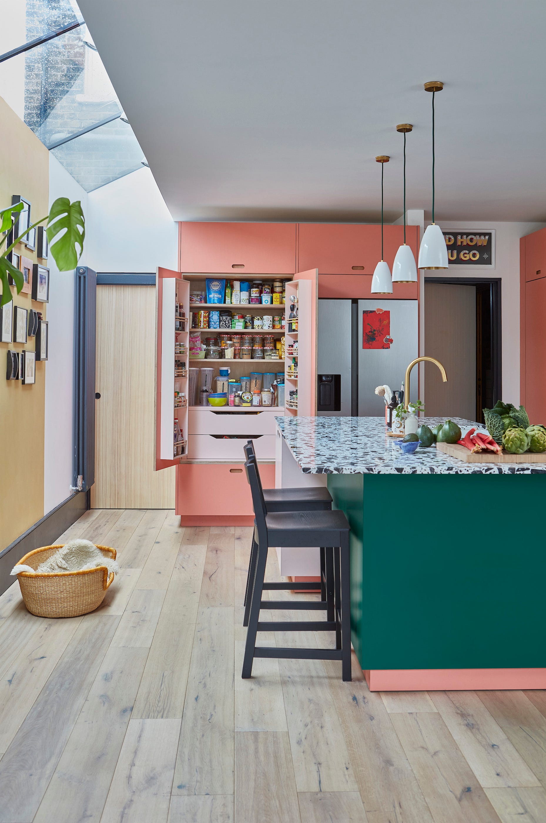
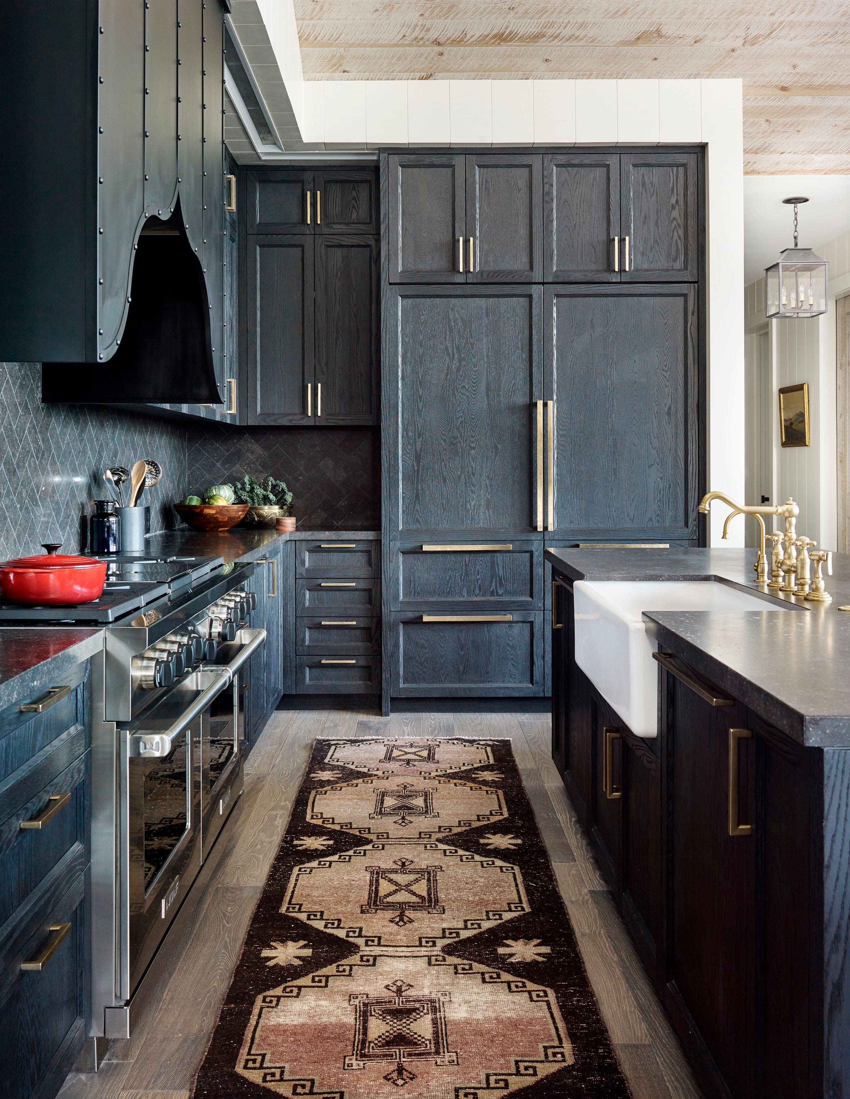
Further details of the design reveal how depth and visual interest are maintained within the charcoal sections. The floor-to-ceiling charcoal cabinetry incorporates elements like reeded glass and open shelving. These features serve to break up the potentially imposing dark surfaces, allowing for decorative displays and preventing the space from feeling too heavy or enclosed. This thoughtful integration of lighter elements within the darker cabinetry ensures a balanced and aesthetically pleasing result.
Emma Willis expressed her satisfaction with the design process, praising Howdens and her kitchen designer. She noted that while she typically plays it safe with colors, she desired to infuse personality into the traditional style of her kitchen, leading her to fall in love with the pink and charcoal combination. The attention to detail, including dovetail drawers and built-in chopping boards, further enhanced the functionality and appeal of the space. The article concludes by encouraging readers to embrace such two-tone color schemes to add dimension and intrigue to their own kitchens, suggesting that this anti-trend approach could make grey popular once more.
#EmmaWillis #KitchenDesign #InteriorColorScheme #HowdensKitchen #PalePink #CharcoalGrey #TwoToneKitchen #HomeDecor #KitchenTrends #EmmaWillis #KitchenDesign #InteriorColorScheme #HowdensKitchen #PalePink #CharcoalGrey #TwoToneKitchen #HomeDecor #KitchenTrends
0 تعليق إجمالاً
 لا توجد تعليقات بعد
قد تعجبك أيضًا
'The renaissance of this color is not surprising' – 11 pink kitchens that are timeless and soothing

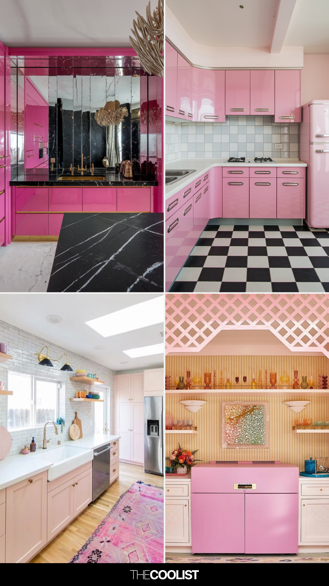
19 Pink Kitchen Ideas That Feel Stylish, Not Over-the-Top

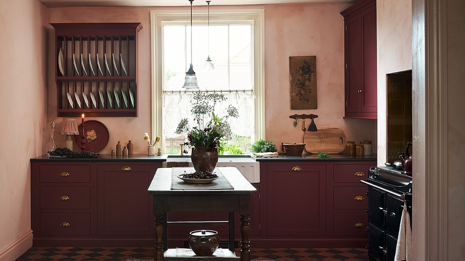
This Unexpected Luxury Color Is Quietly Taking Over Kitchens Everywhere
8 Ways to Bring Color Into Your All-White Kitchen Without Renovating
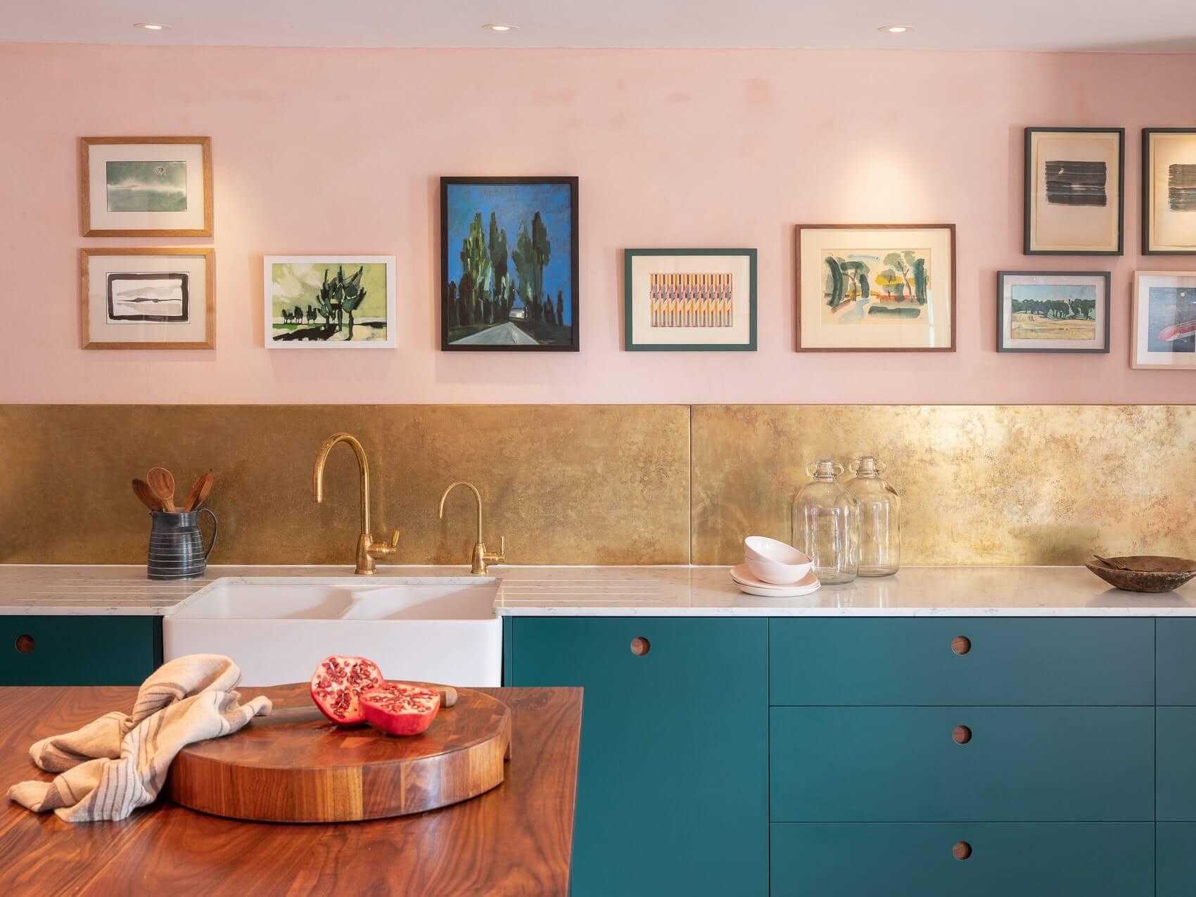
15 pretty pink kitchen ideas that are practically perfect in every way


Ryan Gosling and Eva Mendes's cabinet color is unexpected
Our Place’s New Aura Colorway Will Grace Your Kitchen Like a Periwinkle Dream

An outdated galley kitchen was jettisoned for a design in on-trend plaster pink to create a light-filled family hub
21 Pink Kitchen Ideas: How to get the on-trend kitchen colour right |

Pink Kitchens Are Trending, but Not Because of Barbie—Here’s How to Get the Look

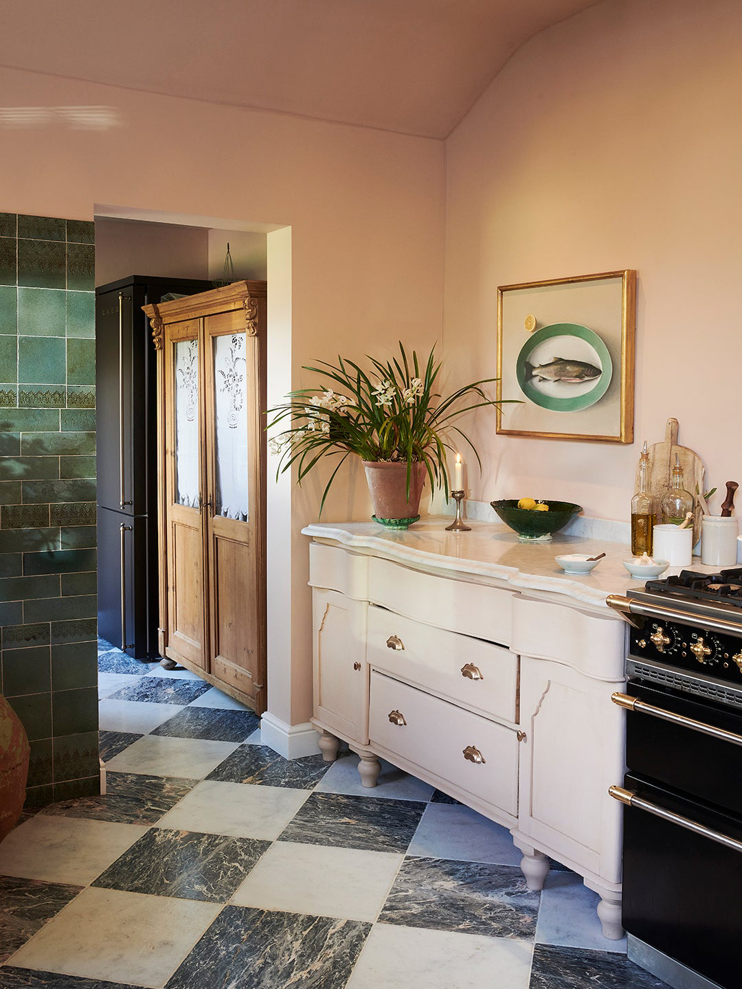
Some People “Can’t” With This Cabinet Color, But There’s No Denying It’s on the Rise

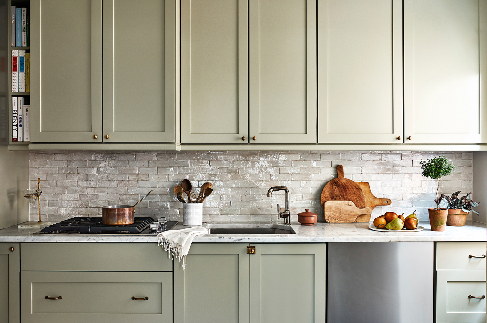
And the Next It Kitchen Cabinet Color Is…
The next butter yellow? I just spotted a vibrant twist on 2025's most beloved color on Emilia Clarke's country kitchen cabinets
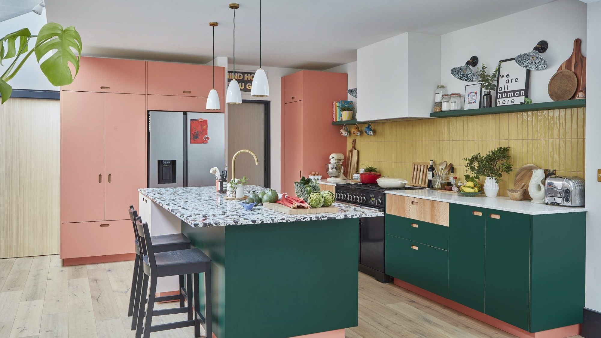
Rainbow colours have transformed a tired kitchen into a vibrant space
Beat the All-White Kitchen Blahs With More Colorful Options
A reconfiguration and fresh colour scheme have brought new life to this once dark and dreary kitchen
So, you want a pink kitchen?


Emma Roberts’ Cozy Vintage Kitchen Shows Why Neutrals Like Beige Can Be Just as Warm, Inviting, and Stylish as Bold Colors
50 Best Kitchen Ideas for a Beautiful Space That Looks as Good as It Cooks
How to Design an Eclectic-Style Kitchen That Has Personality But Will Still Age Well