1/14
Still holding onto summer? These are the 3 summer trends I am taking into fall – and how I am restyling them for the cozy season
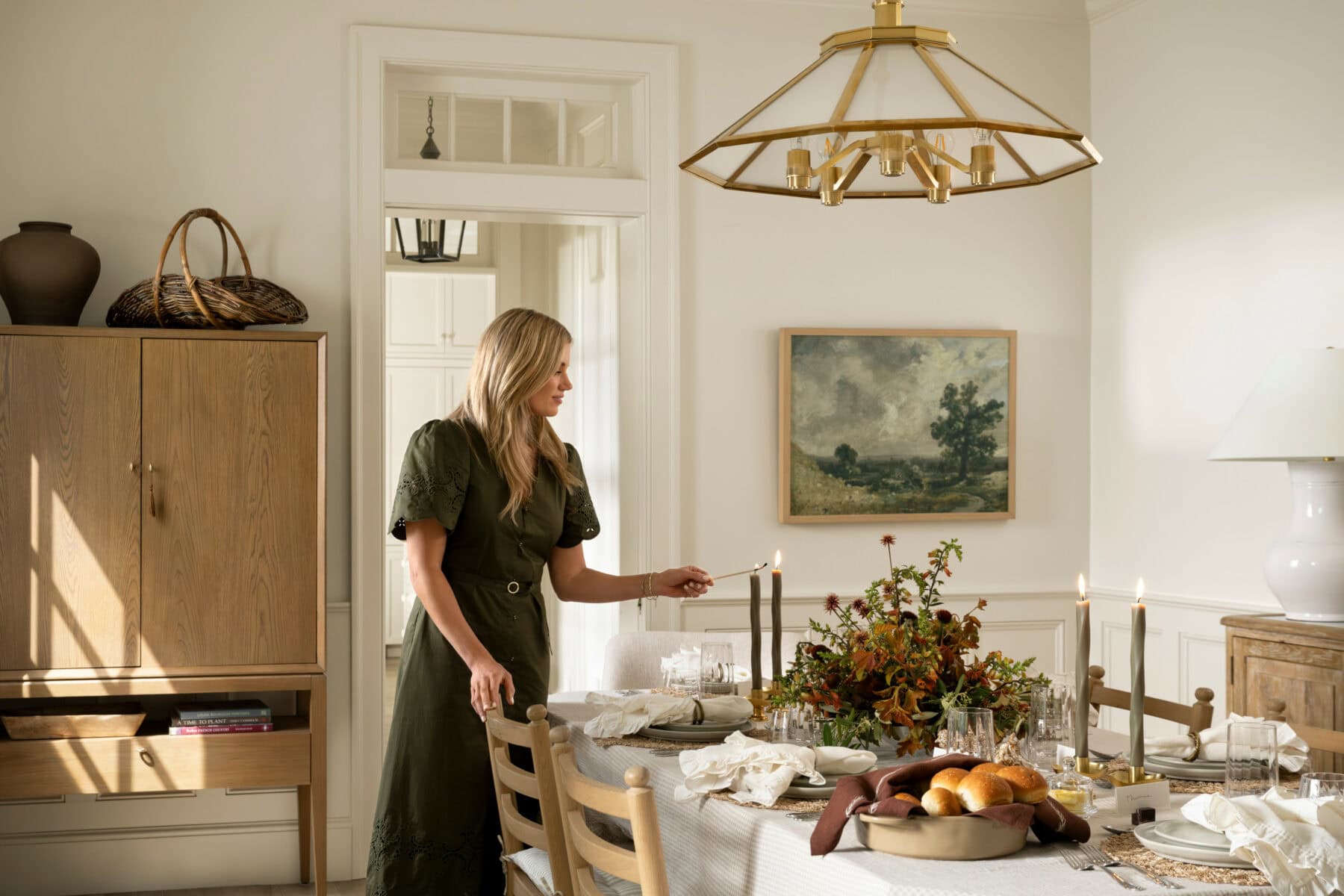
This article explores how to transition three popular summer interior design trends—butter yellow, tiny florals, and gingham print—into the fall season, offering practical advice on restyling them for a cozier aesthetic without completely overhauling home decor. The author, who identifies as a "summer baby in spirit" and struggles with the darker, colder months, aims to combat seasonal affective disorder through thoughtful design adjustments. Instead of replacing beloved summer elements, the approach focuses on layering and reinterpreting these trends with warmer tones and richer textures.
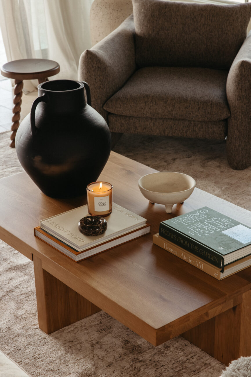
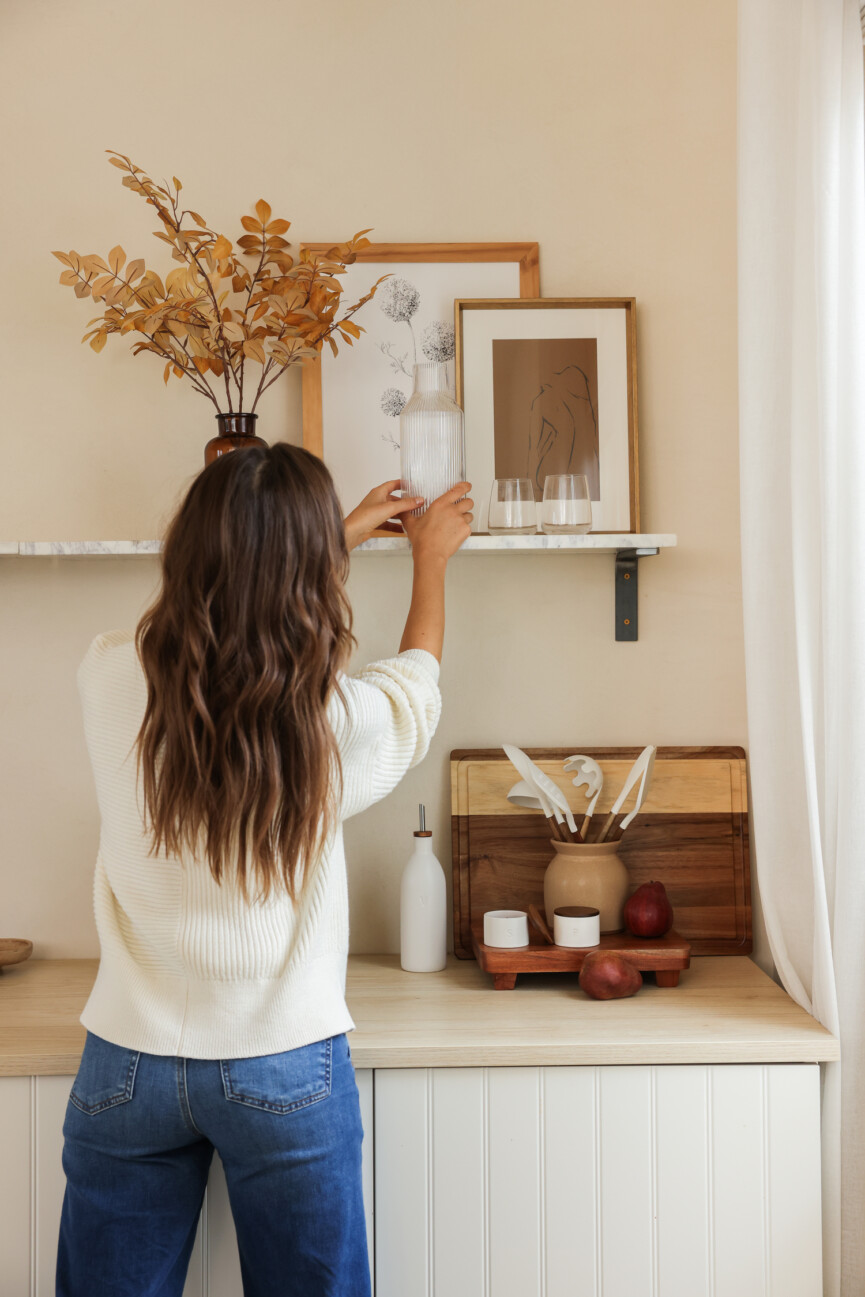
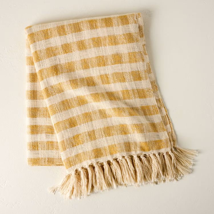
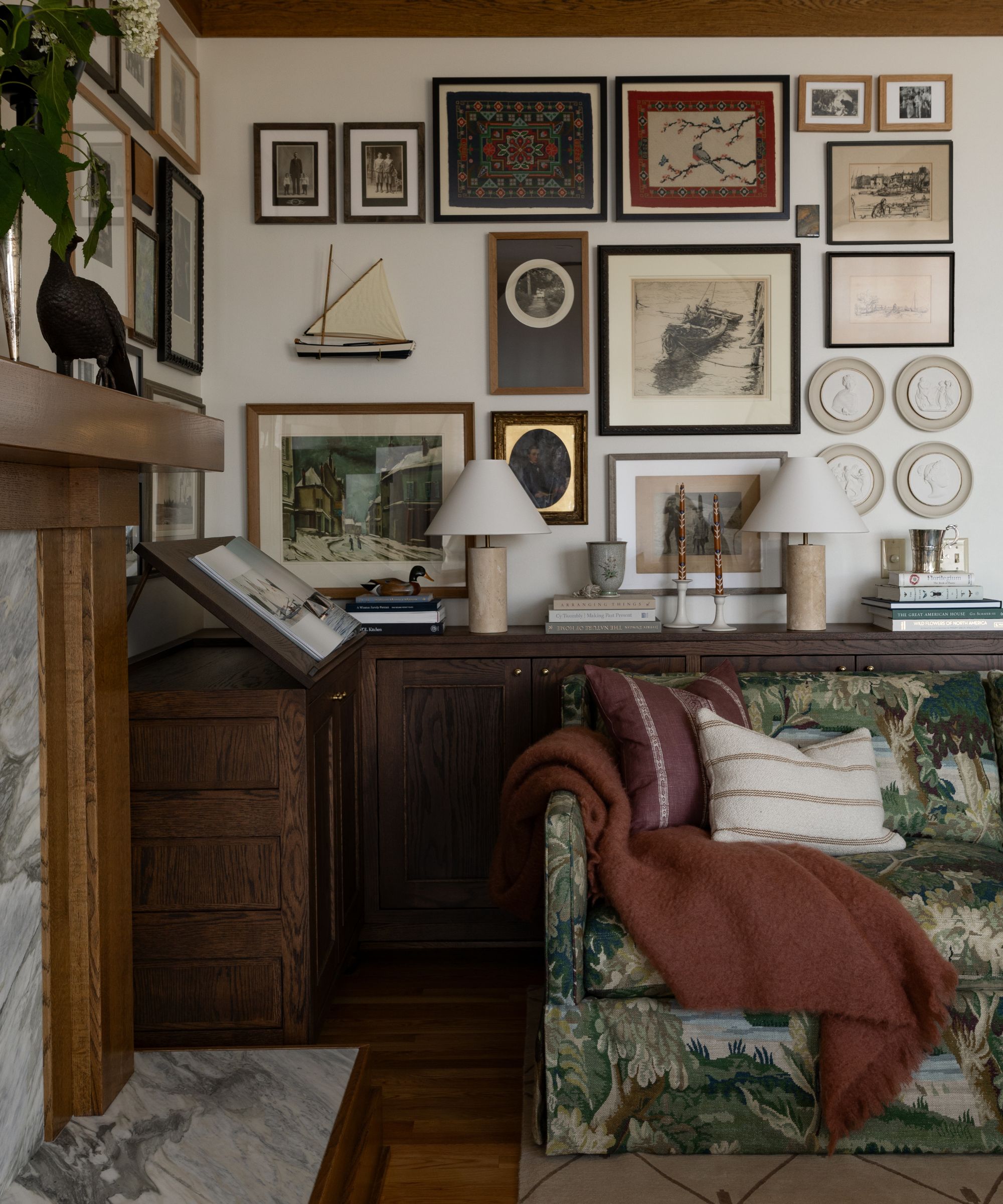
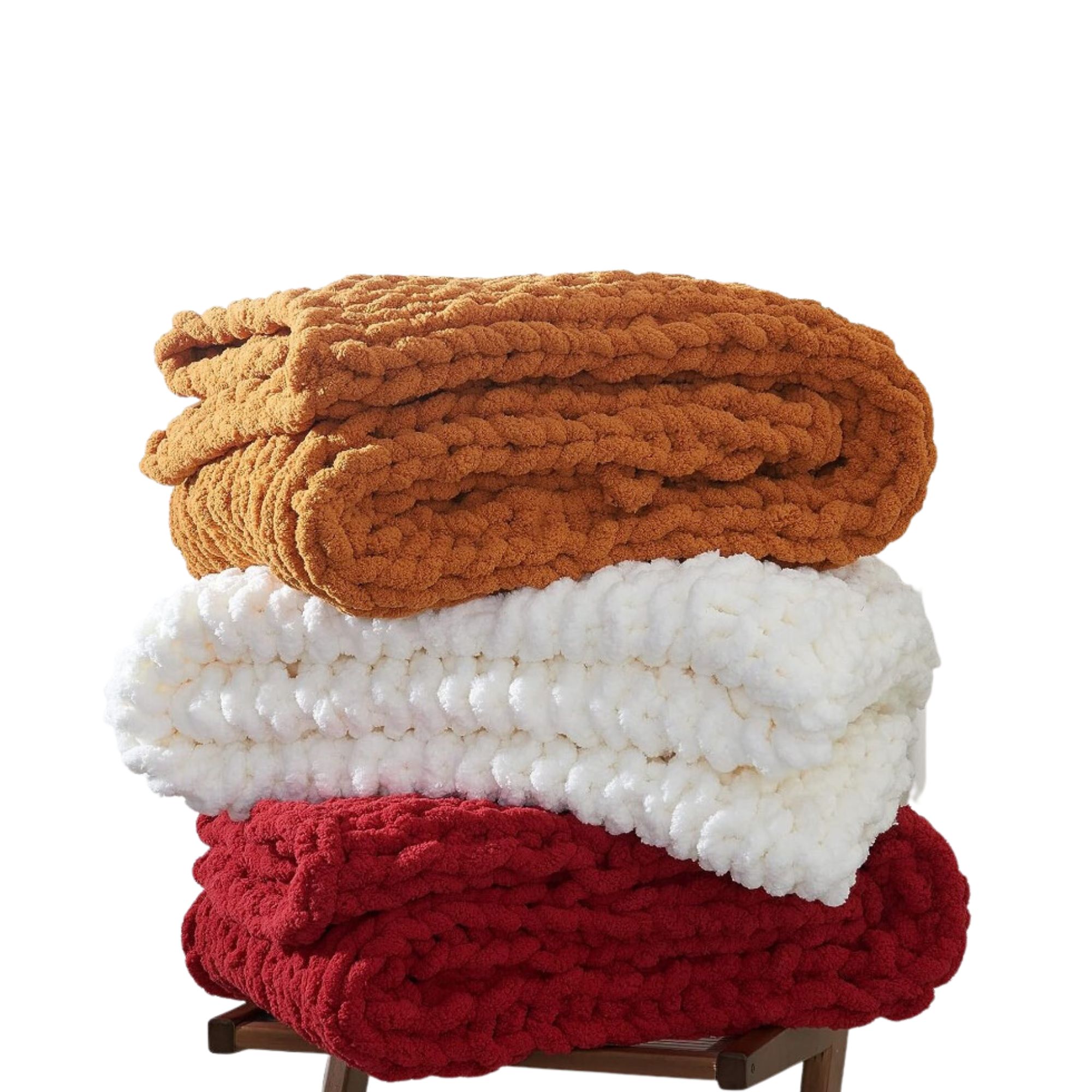
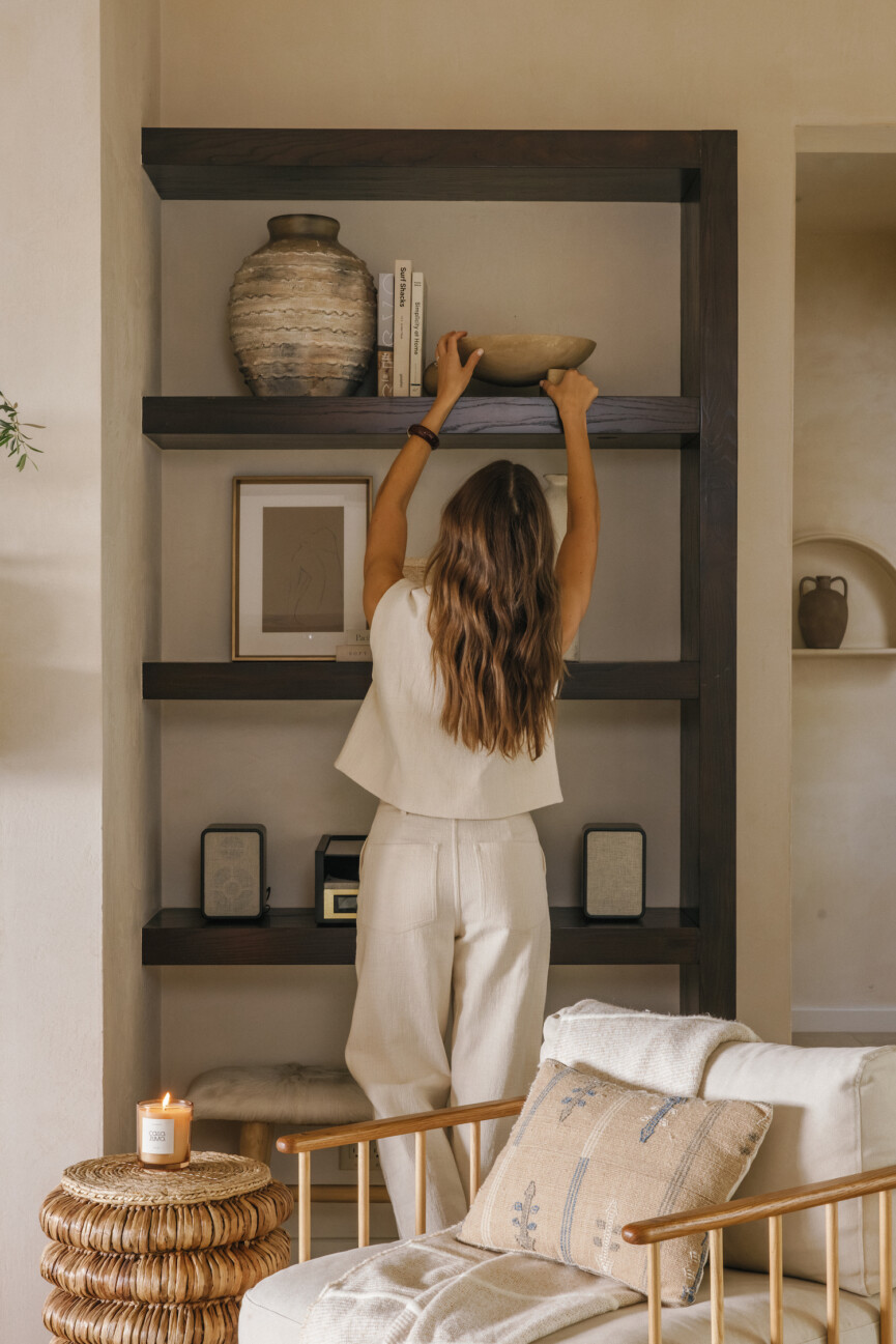
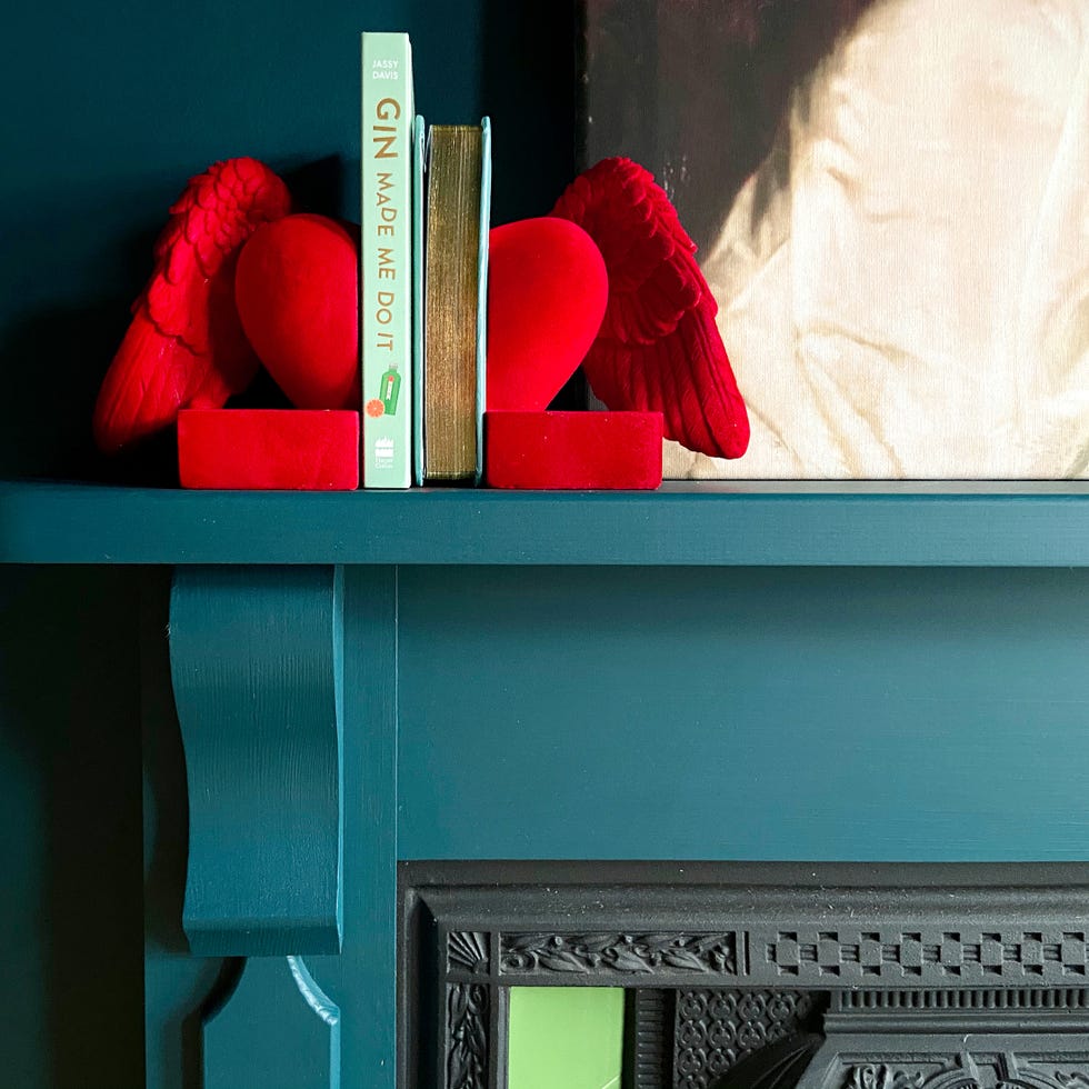
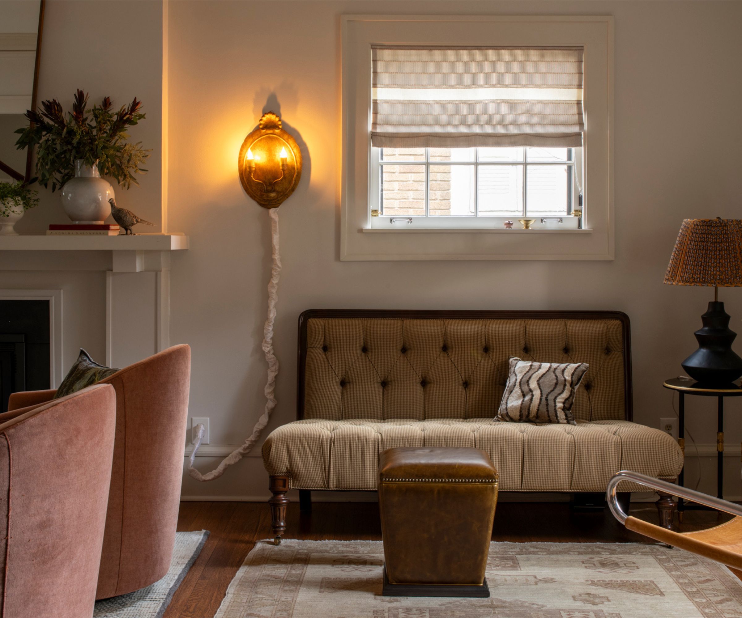
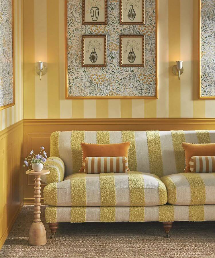
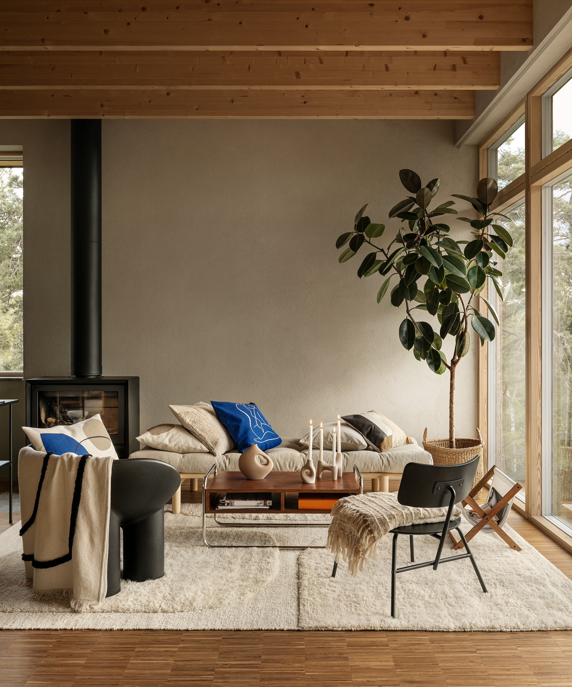
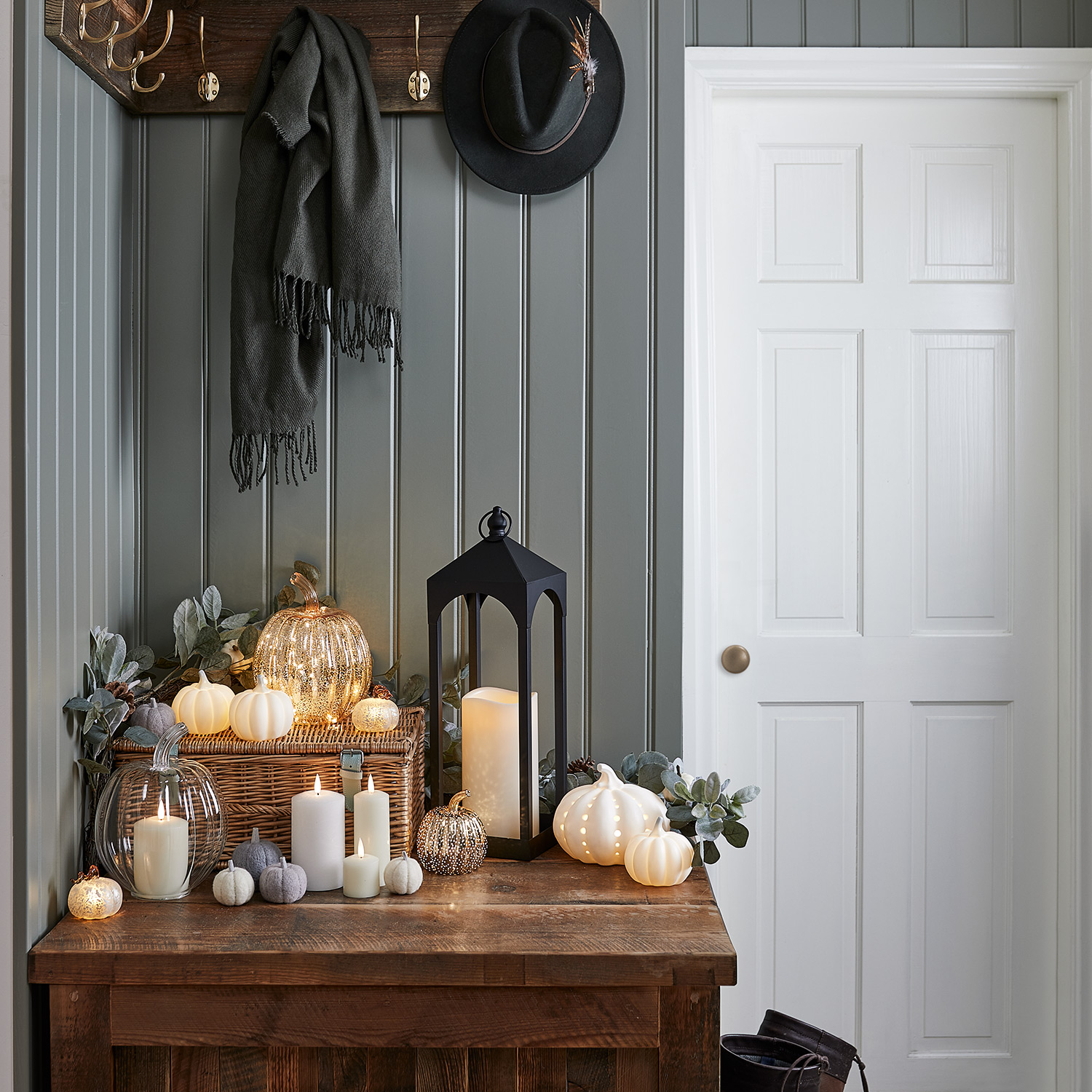
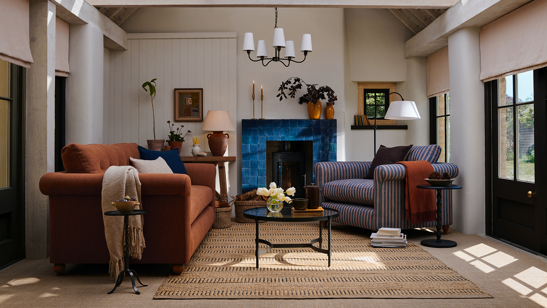
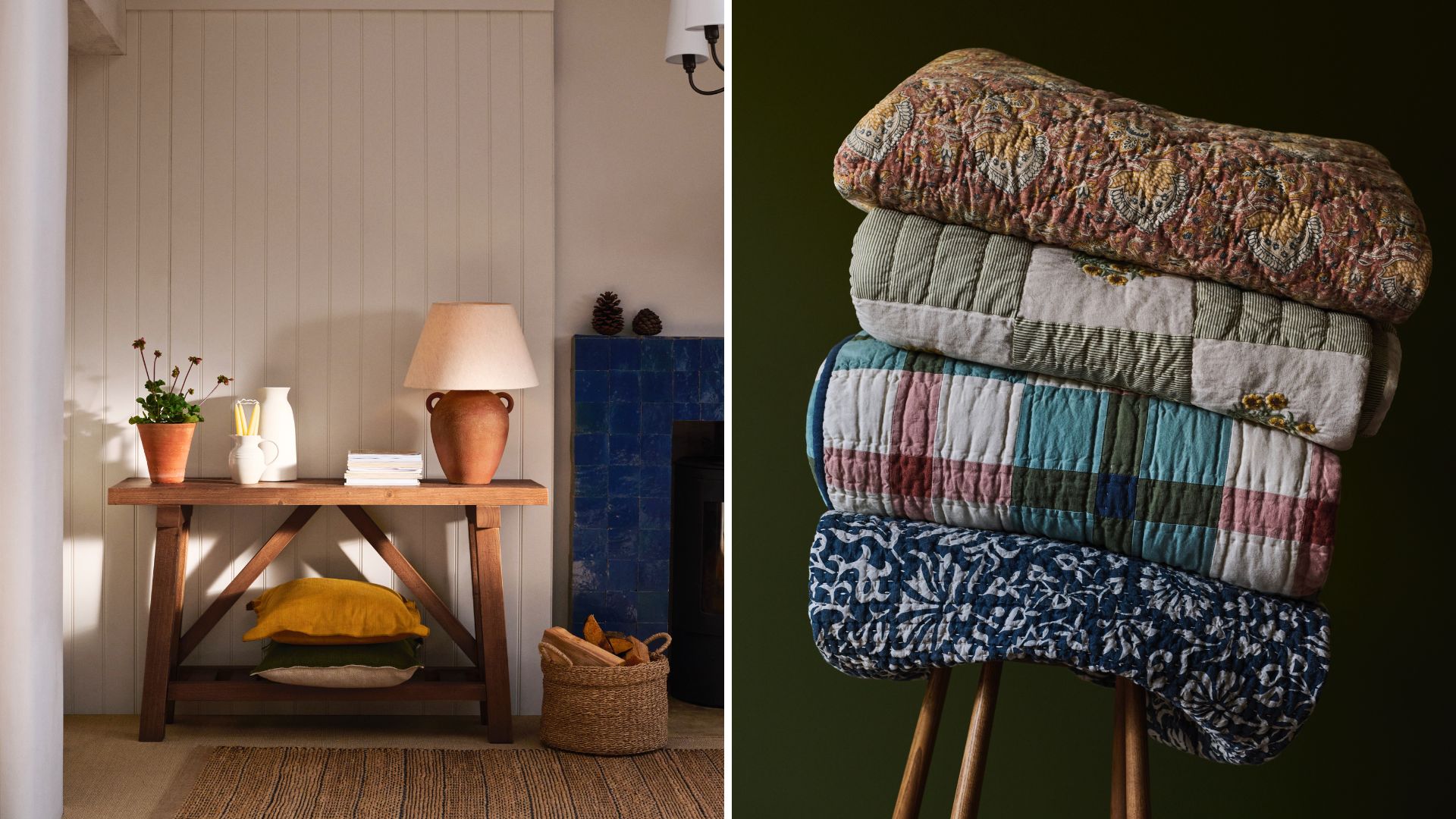
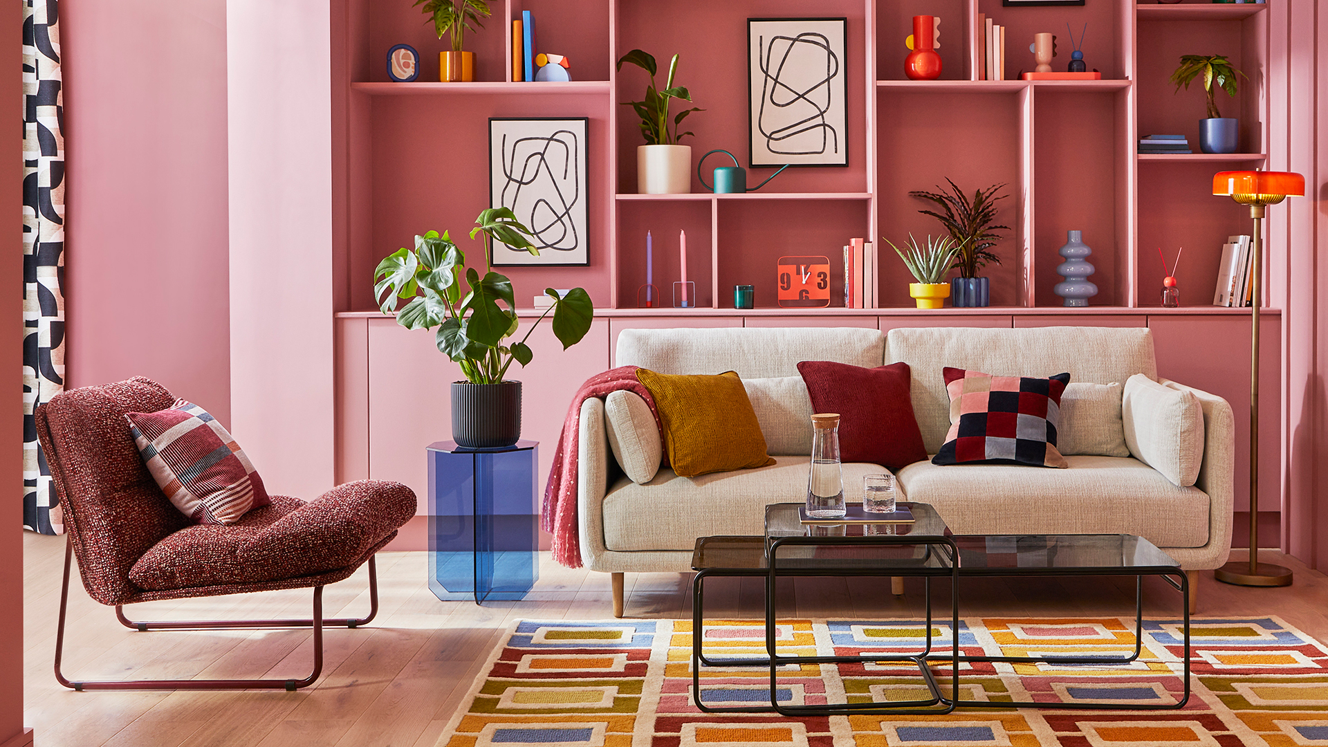
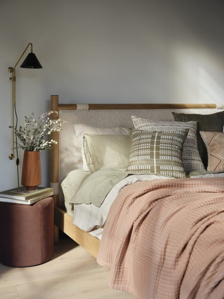
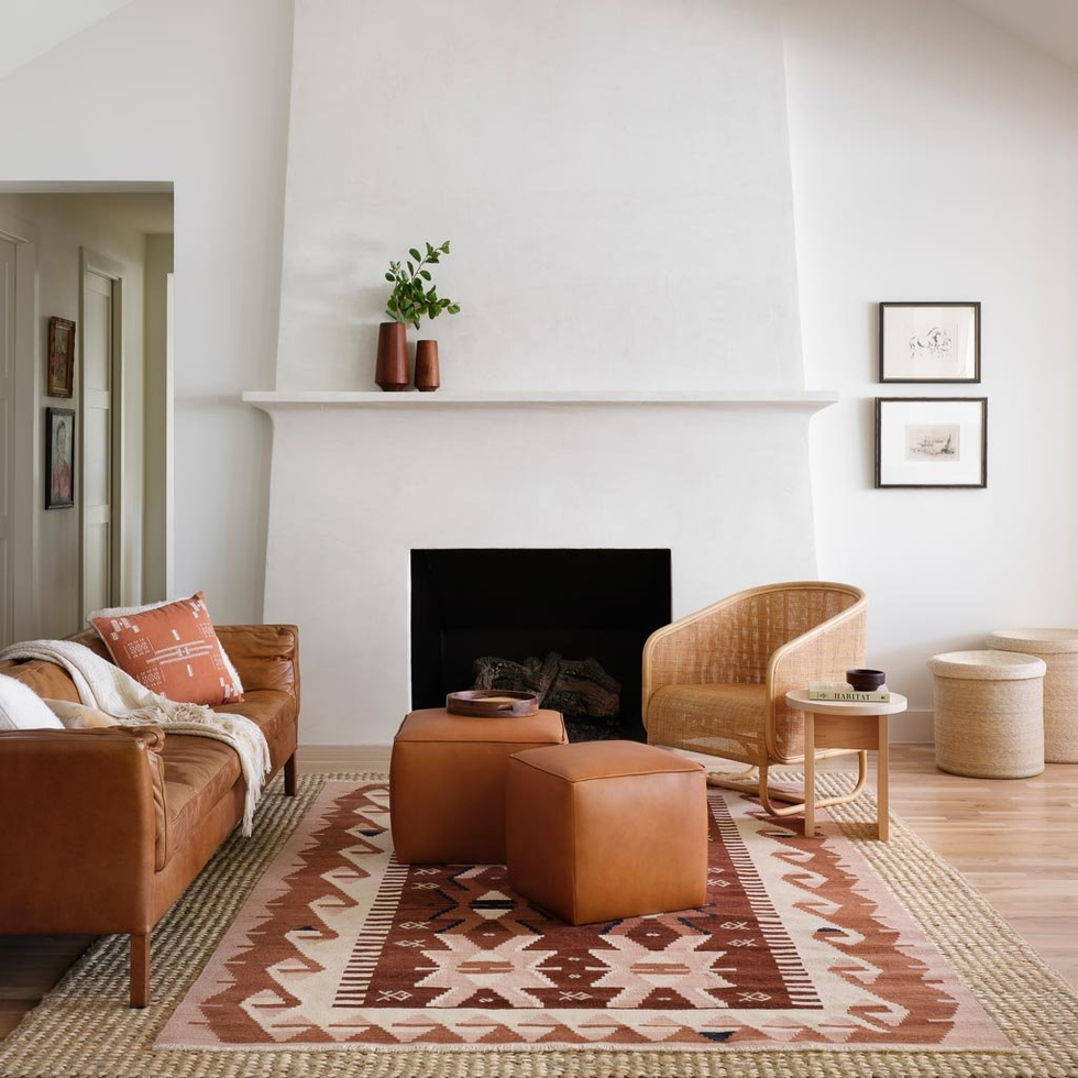
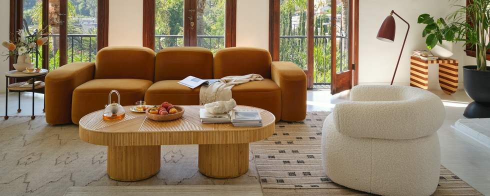
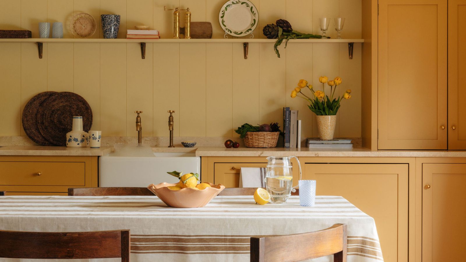
First, the article discusses butter yellow, a cheerful color that dominated summer decor. While it brightens spaces in summer with airy linens and ceramics, the recommendation for fall is to shift towards a richer hue, such as ochre. This involves incorporating cozy ochre textiles, layered gold lighting, and warm-toned mustard accessories. The versatility of butter yellow allows it to pair effectively with autumnal colors like terracotta, olive, or deep chocolate brown, creating a seasonally appropriate palette. The key is to ground the light yellow accents with rustic woods, clay vases, and heavier knit throws, emphasizing layering as a crucial technique for adapting summer trends.
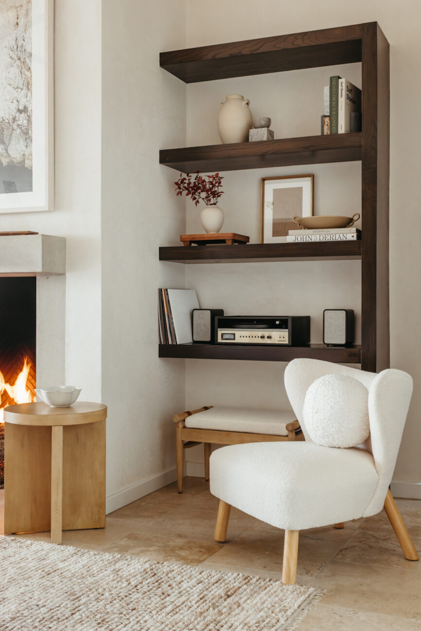
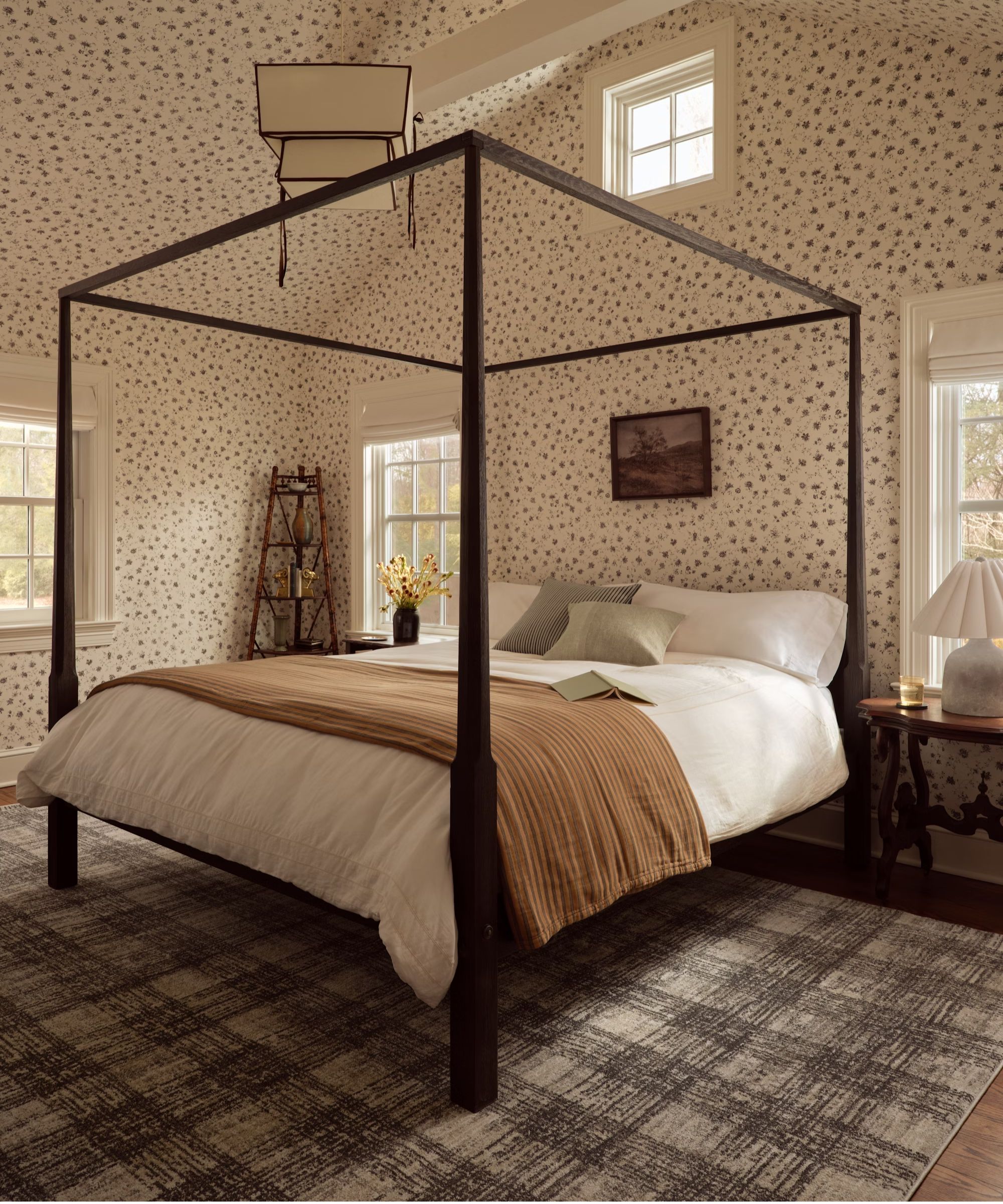
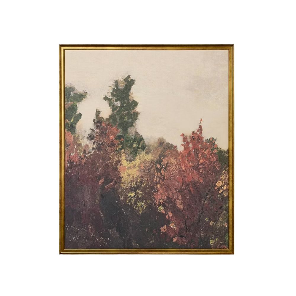
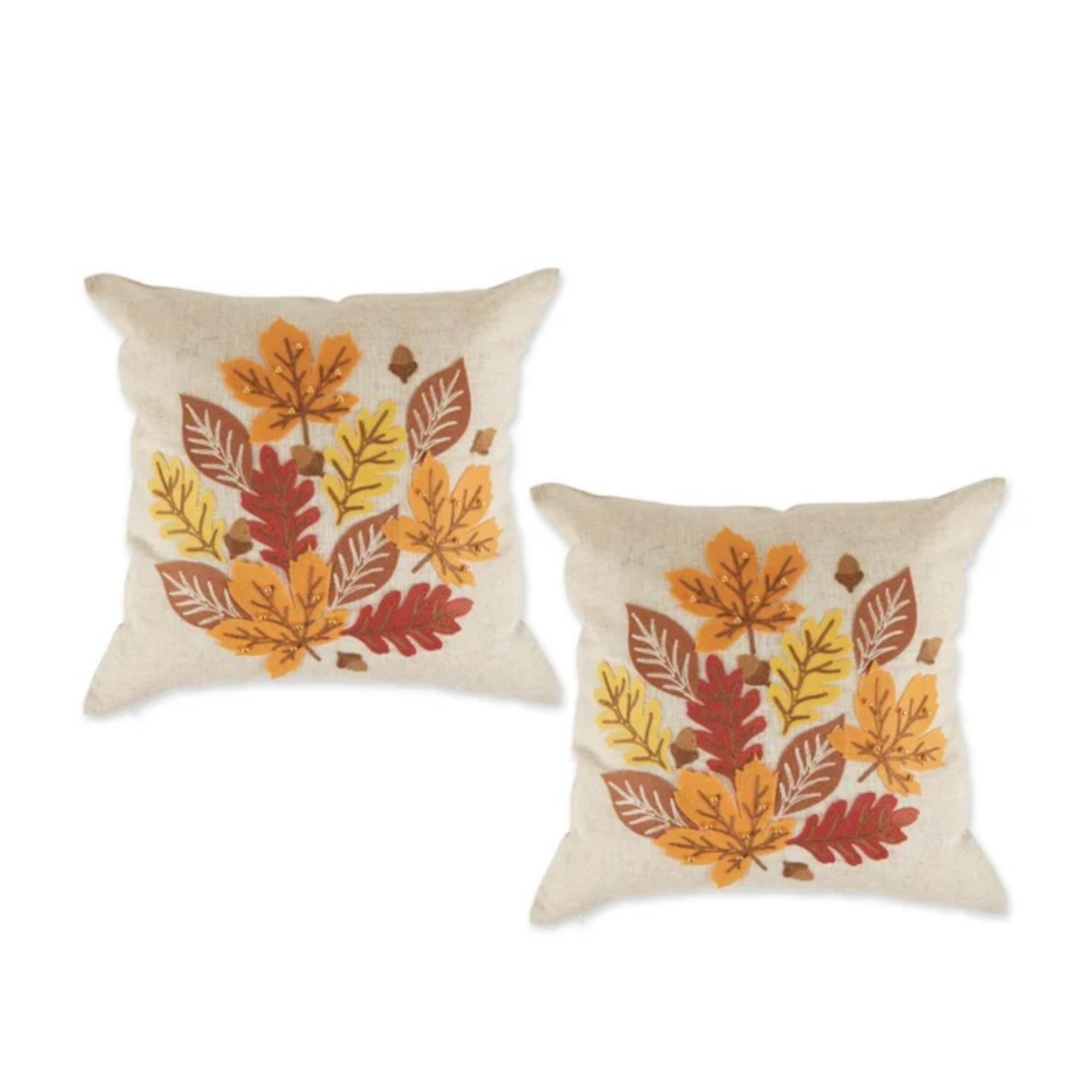
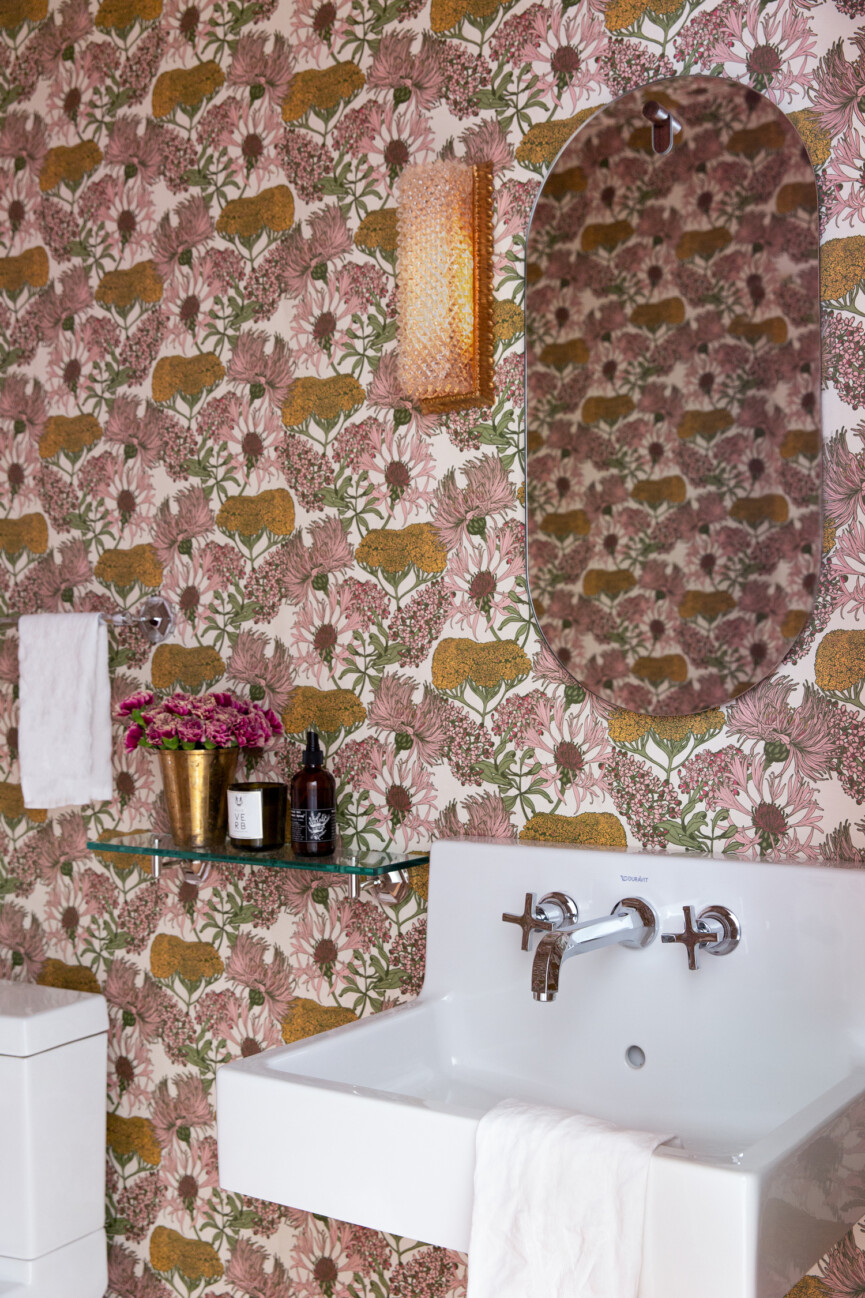
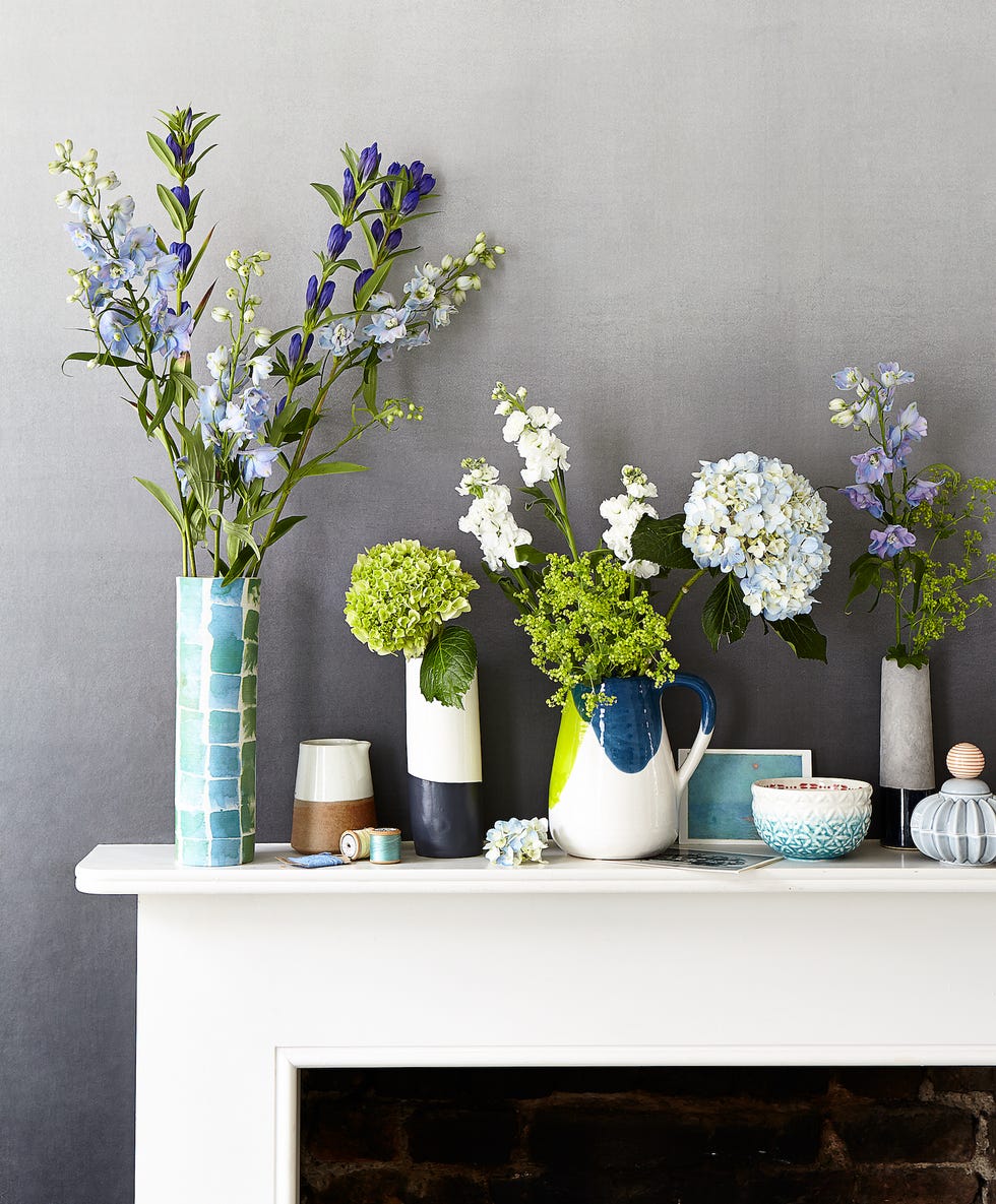
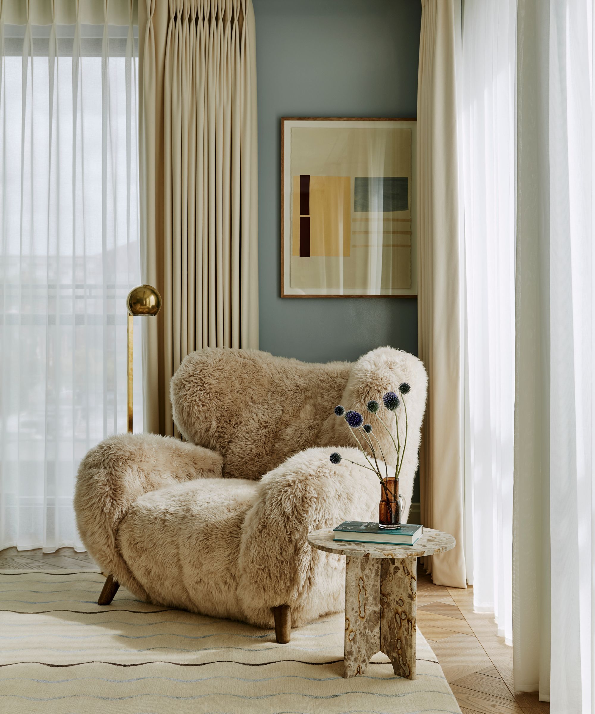
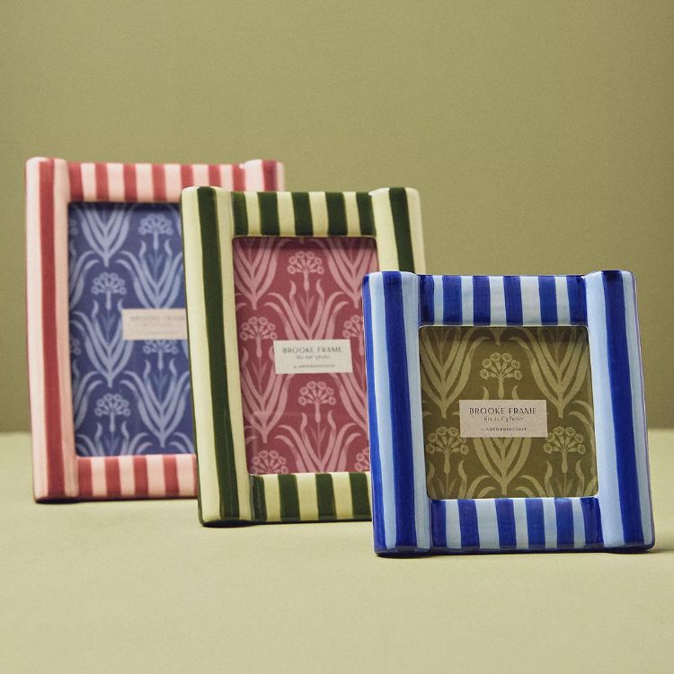
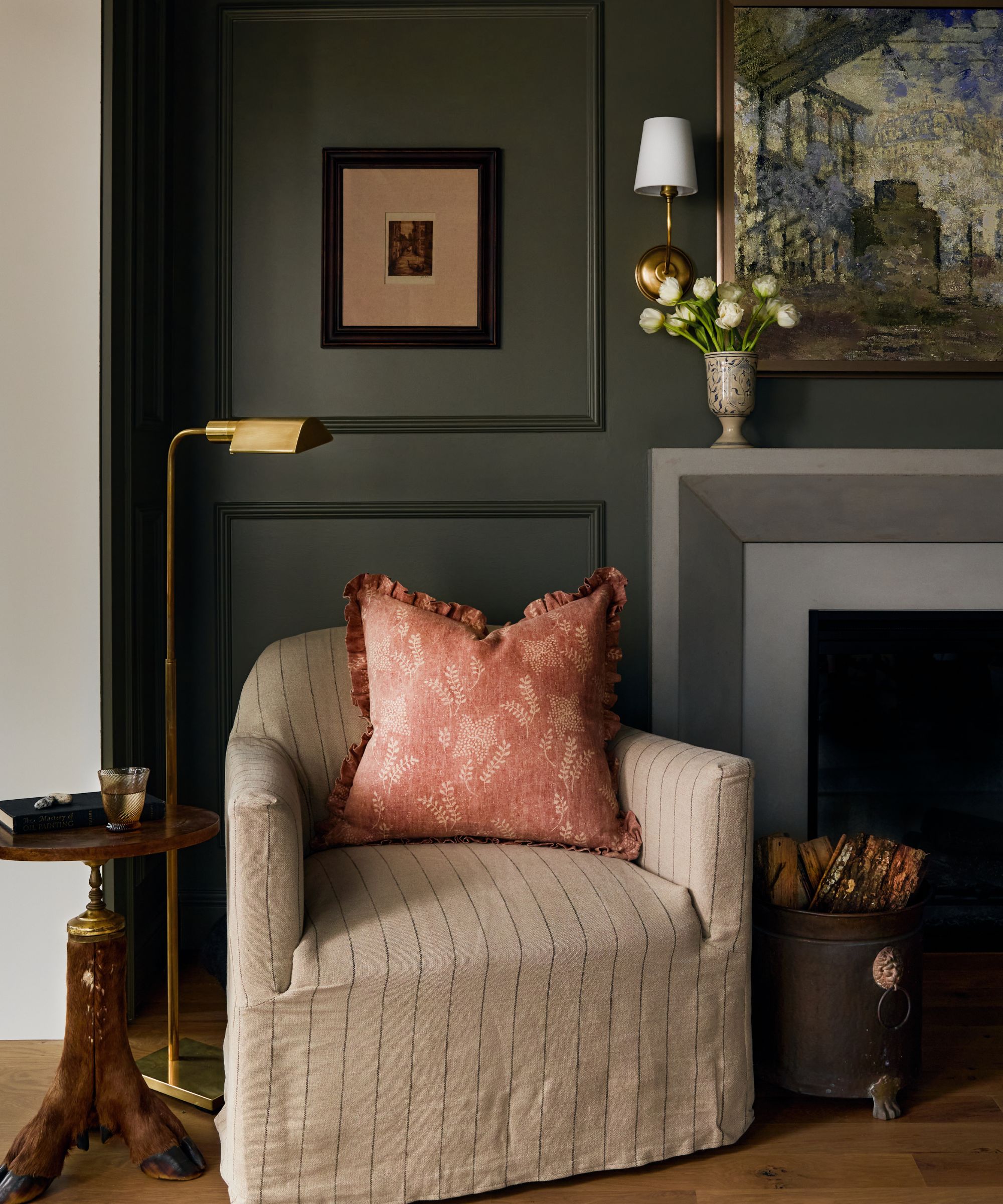
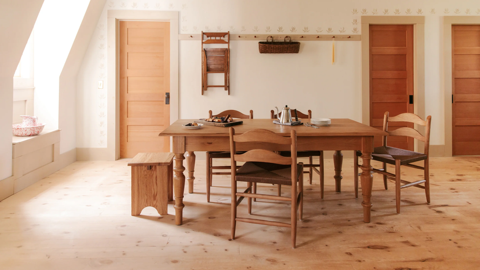
Next, the article addresses tiny florals, a classic print that evokes a countryside cottage feel in summer. The author embraced these scaled-down patterns in table linens, small upholstery, and framed prints. For fall, the strategy is not to abandon them but to layer them differently. This includes pairing ditsy florals with ruddier hues and grounding them with heavier fabrics like velvet and wool in bedrooms. In dining and living areas, floral napkins can be combined with an aubergine tablecloth, or a tiny floral pillow can accent a boucle pillow and a dark wood side table. The objective is to balance the delicate nature of spring-like florals with depth and texture suitable for the autumn.
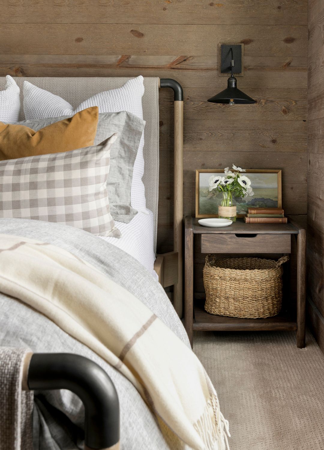
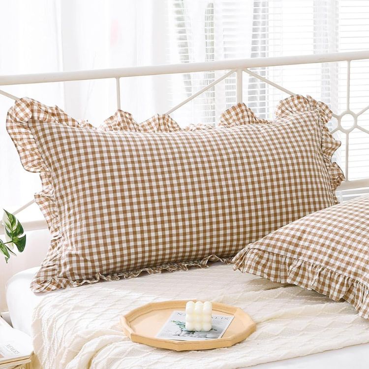
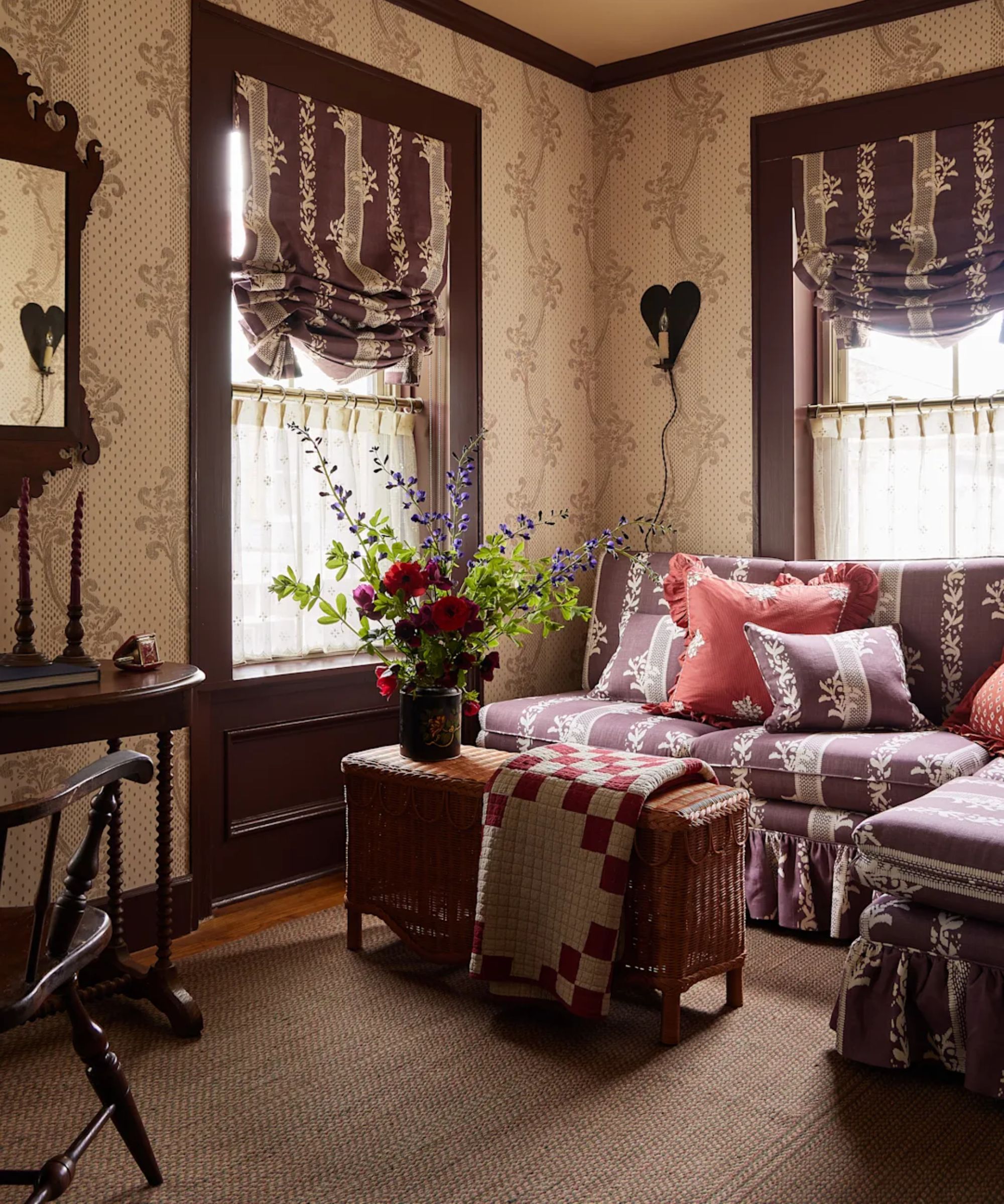
Finally, the article examines gingham print, a pattern traditionally associated with summer and its playful, casual charm. Instead of packing it away, the author suggests adapting gingham for fall by choosing deeper colorways and incorporating heavier plaid alternatives. It is also recommended to layer gingham alongside moodier prints to warm up bright sofascapes or bed styling. The transformation allows gingham to shift from a playful summer staple to a more traditional and preppy look in fall, especially when combined with darker palettes and cozy, layered vignettes reminiscent of the Ralph Lauren aesthetic. The article emphasizes that successful fall decorating does not require a complete reset but rather a creative reimagining of existing elements.
In conclusion, the article advocates for a continuous approach to interior design trends, demonstrating that beloved summer elements can be sustained and reinterpreted for autumn. By focusing on subtle styling tweaks, layering, and integrating richer, warmer tones and textures, homeowners can maintain a sense of lightness and joy from summer while embracing the comfort and warmth characteristic of the fall season. This method allows for longevity in decor choices and avoids the need for entirely new seasonal purchases.
#InteriorDesign #SeasonalDecor #FallDecorating #SummerTrends #HomeStyling #ButterYellow #FloralPrints #Gingham #InteriorDesign #SeasonalDecor #FallDecorating #SummerTrends #HomeStyling #ButterYellow #FloralPrints #Gingham
0 تعليق إجمالاً
 لا توجد تعليقات بعد
قد تعجبك أيضًا
8 Simple Styling Swaps to Take Your Home from Summer to Fall
The 2025 Fall Decor Trends That’ll Be Everywhere This Season
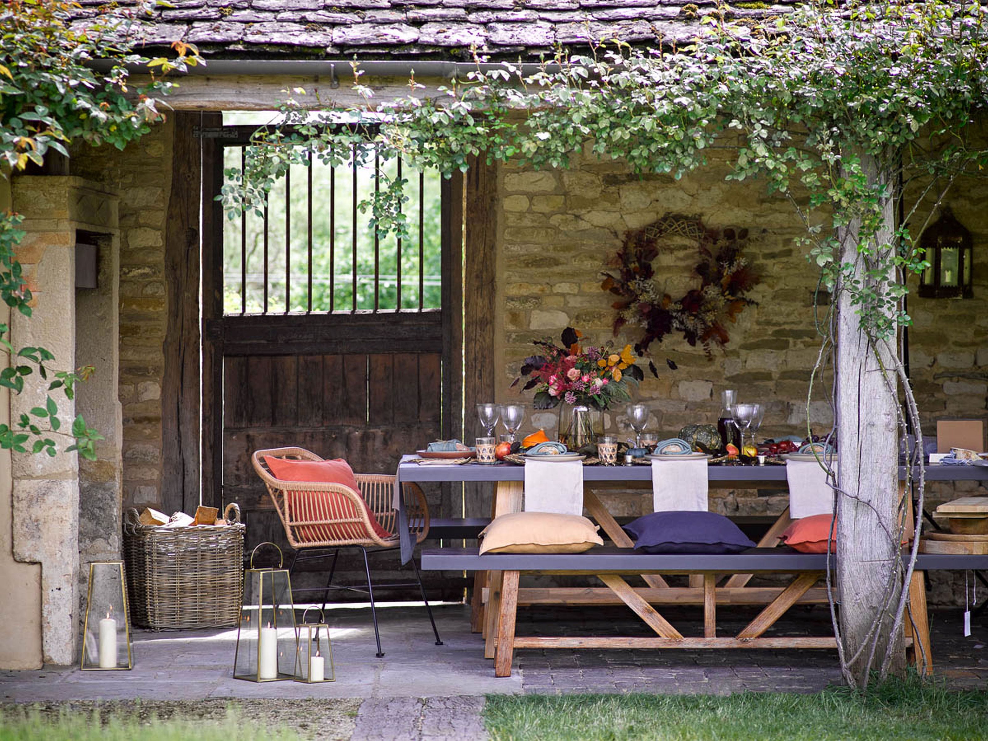
32 fall home ideas to fully embrace the cozy season

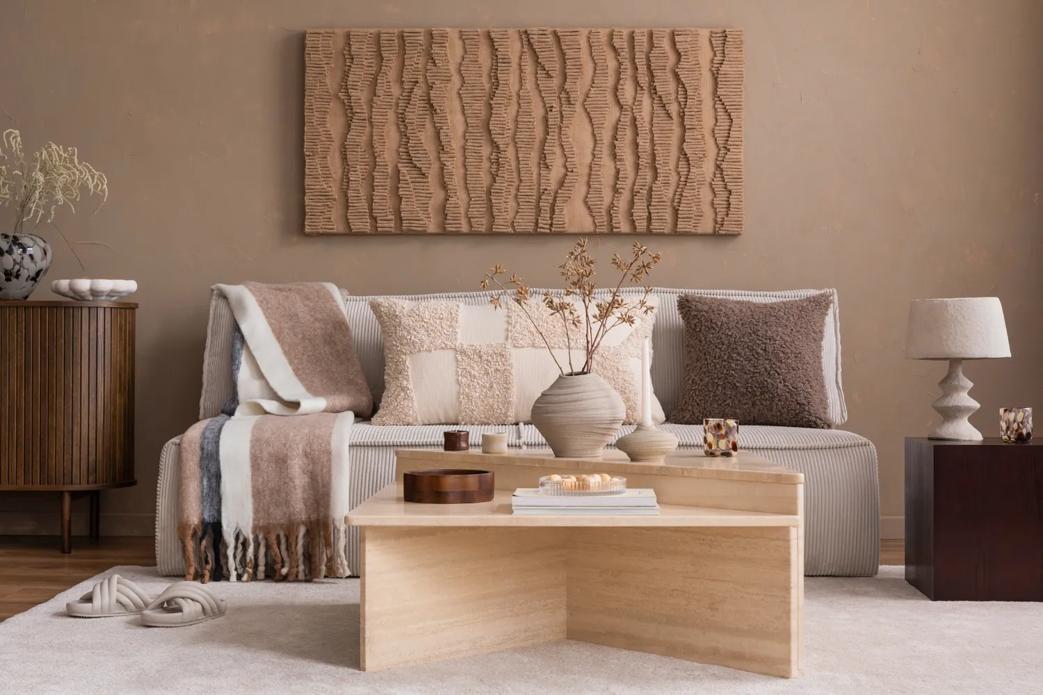
Designers Say These 5 Trends Will Be Everywhere This Fall—But This One Is Officially Out

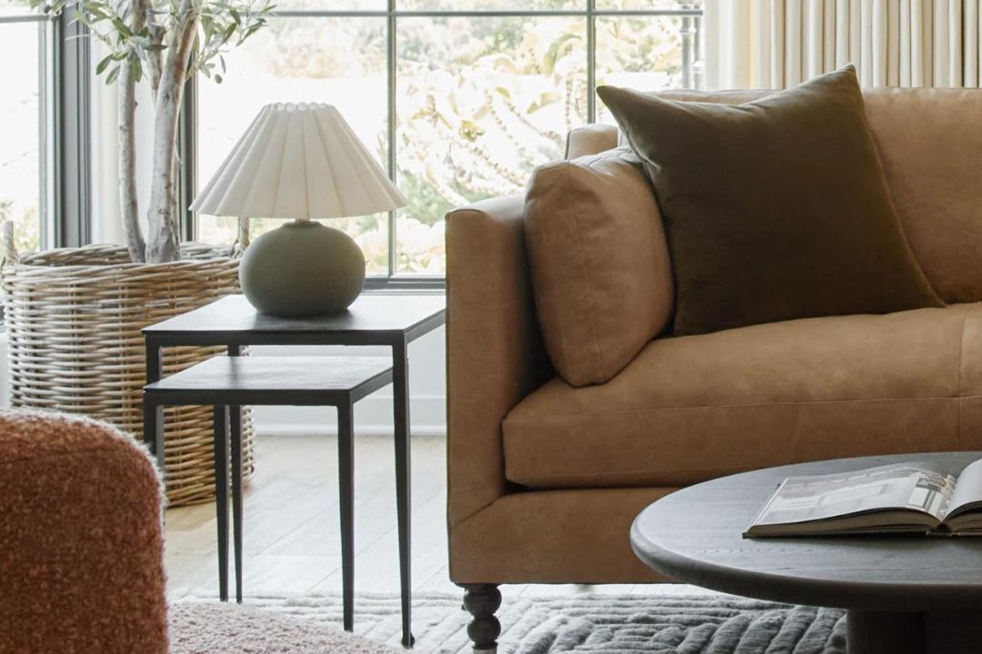
8 Fall Home Trends You’re Going to See Everywhere This Season
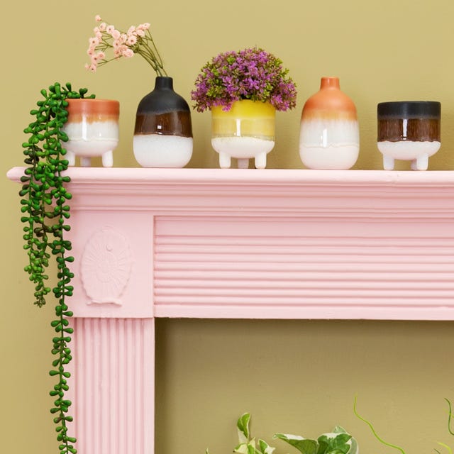
How to nail the mantelscaping trend – and it's not just for summer

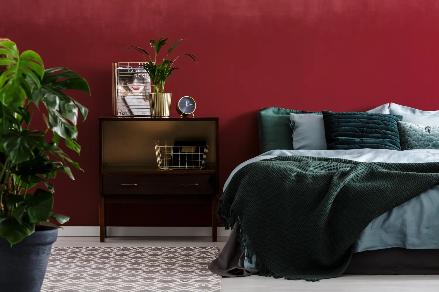
5 Colors Taking Over Home Design This Fall

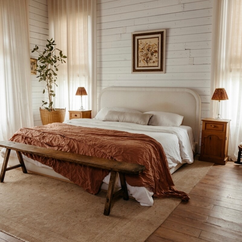
The Fall Home Trends Designers Say Will Be Huge

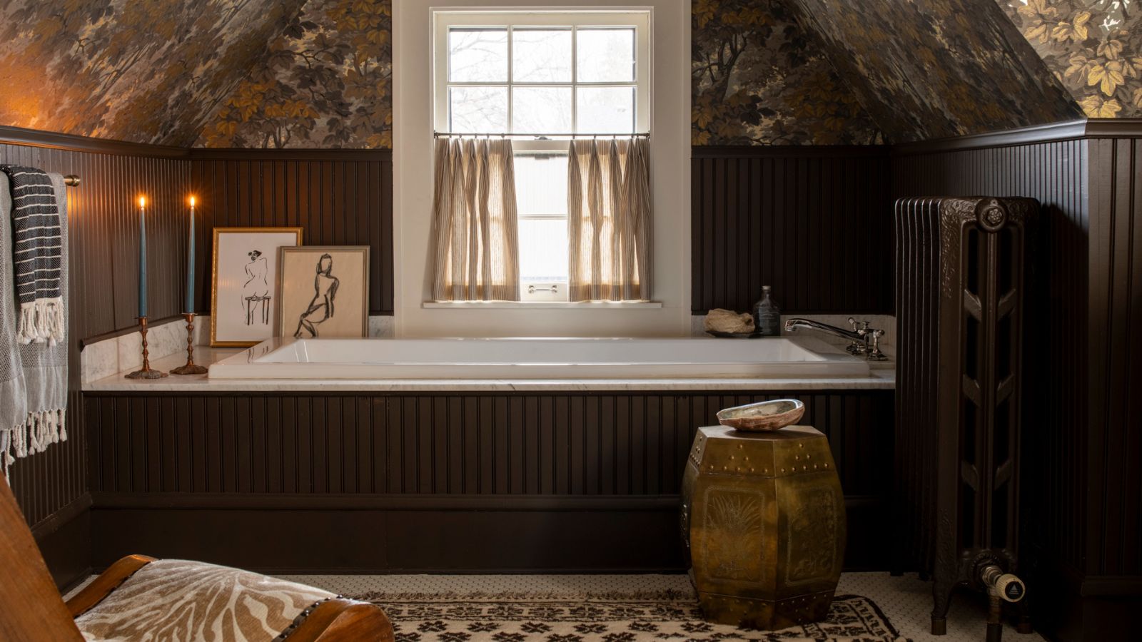
The Cozy Layering Trick Designers Swear By for Fall – It Starts with Just 3 Things

Fearless fall fashion forecast
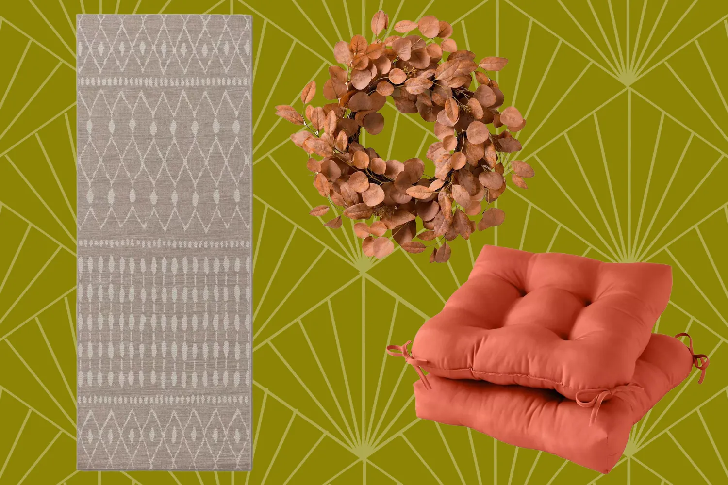
I'm Obsessed With Fall, And These Are The 3 Target Finds That Transformed My Southern Patio Into A Cozy Retreat
6 Fresh Color Trends To Inspire Your Summer 2023 Style

3 Summer Home Decor Trends You’re Probably Seeing Everywhere Right Now

Designer tricks for a cozy, layered look this fall
5 autumn/winter home decor trends we're shopping now, for an effortless style refresh

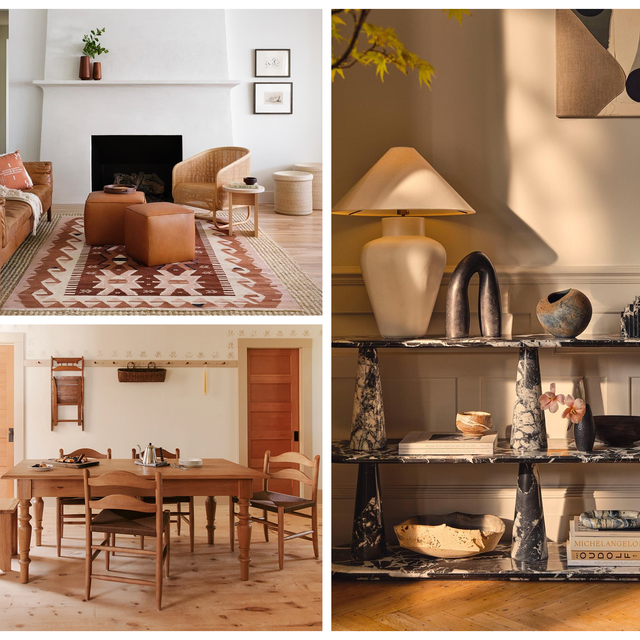
The Fall 2025 Décor Trends Designers Say Are Already Everywhere

Hey! Here’s how to go from hot girl summer to cozy girl fall

This Summer’s Hottest Decor Trend Will Never Go Out of Style
I'm a lazy seasonal decorator, but these are the 6 things I always do to make my home feel a little more cozy come fall
Styling Inspiration For Fall