1/11
11 blue living room ideas to show to how to work with this on trend hue
This article explores the versatility and appeal of blue in living room design, offering numerous ideas and advice for incorporating this popular hue into various home aesthetics. Blue is highlighted as a significant color in decorating palettes, increasingly preferred over neutrals like grey for its ability to create relaxing and mood-enhancing environments. The article emphasizes that blue can evoke feelings of tranquility, calm, and coziness, depending on the specific shade and how it is used.
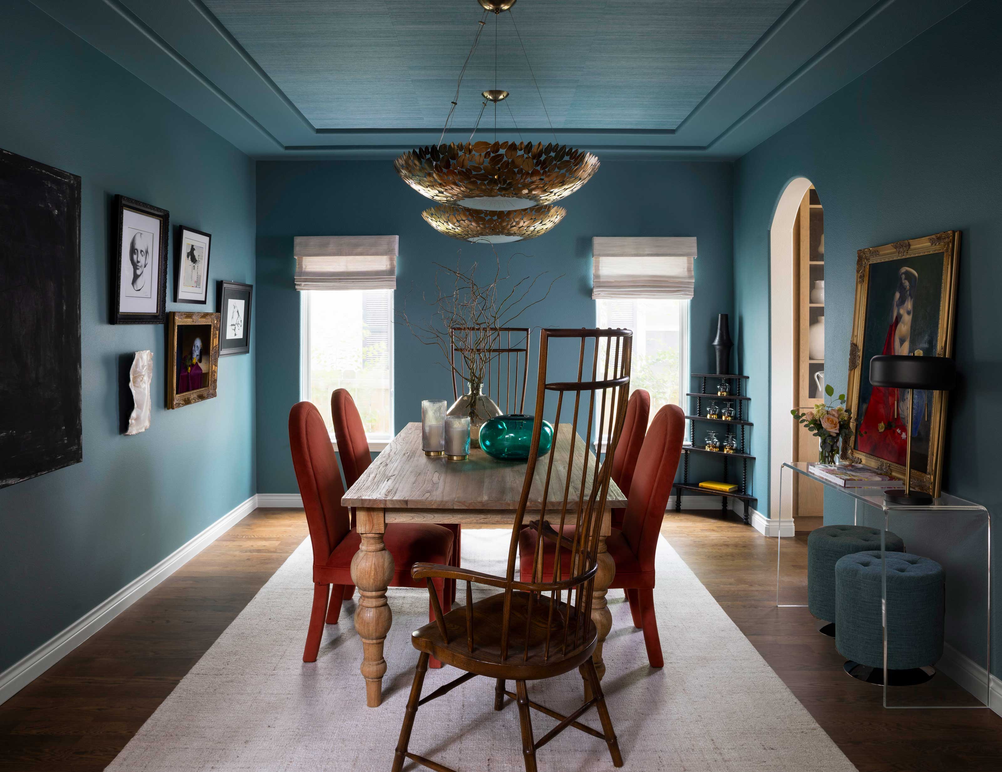
The discussion begins by guiding readers on how to select the appropriate blue shade for their space, considering factors such as room size and natural light. For instance, south-facing rooms can accommodate a wide range of blues, though darker shades might appear flat in direct sunlight. North-facing rooms benefit from lighter, softer blues, or deeper blues with warmer, purple undertones if a more dramatic effect is desired. The core principle revolves around understanding the interaction of light with different blue pigments to achieve the intended atmosphere.
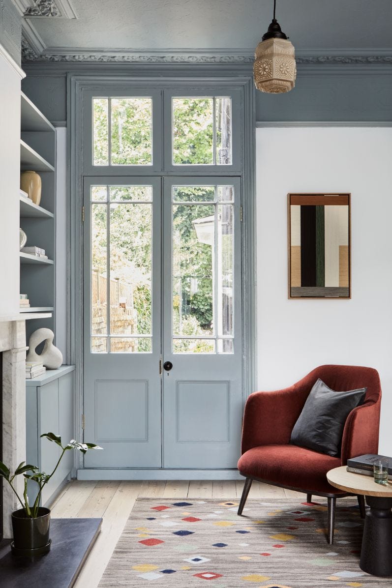
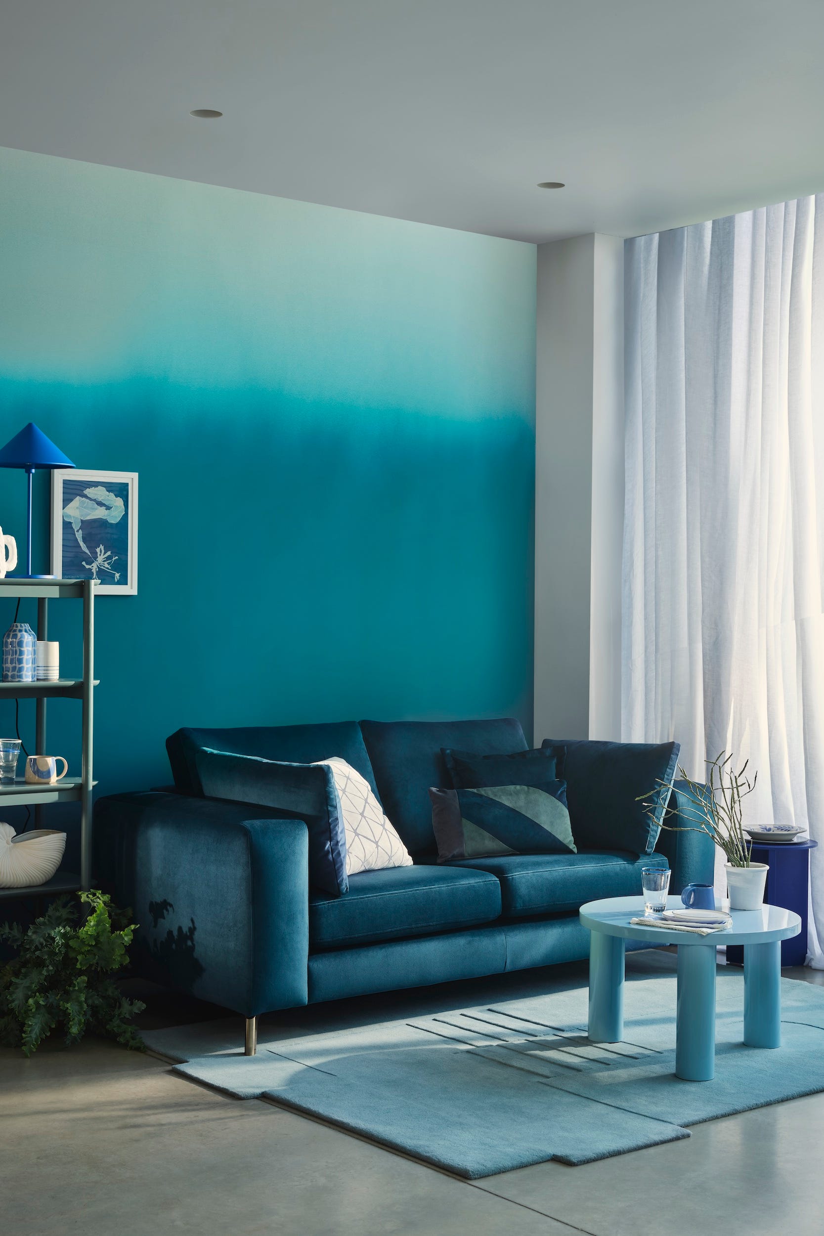
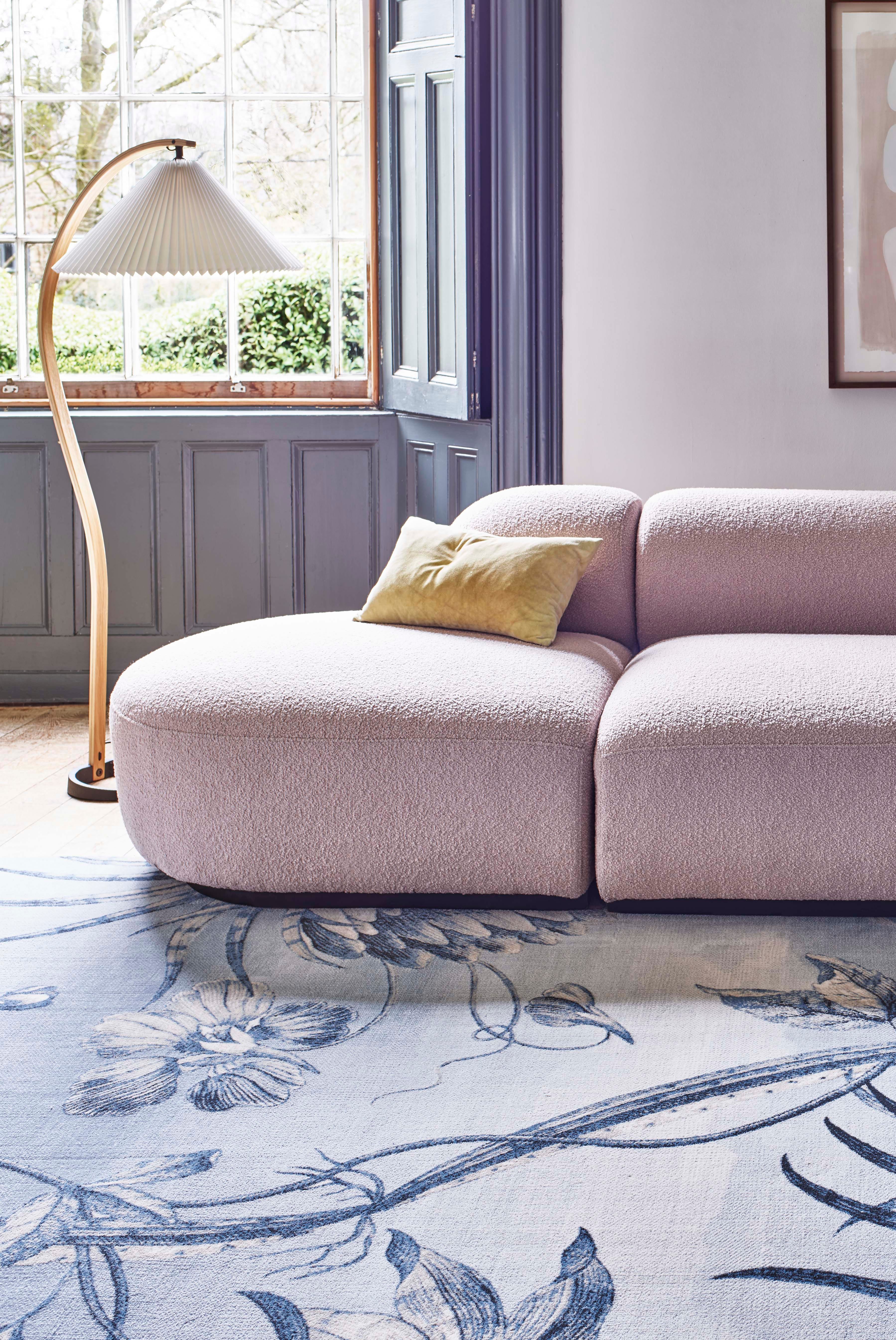
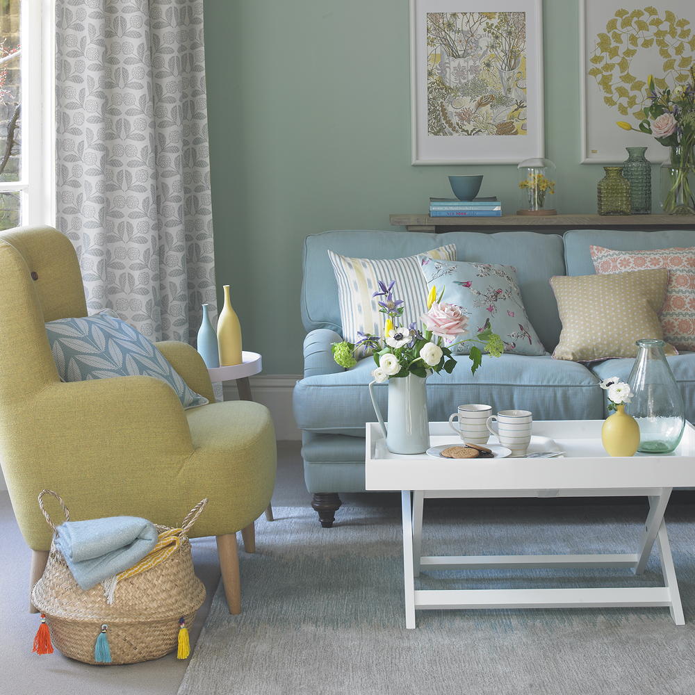
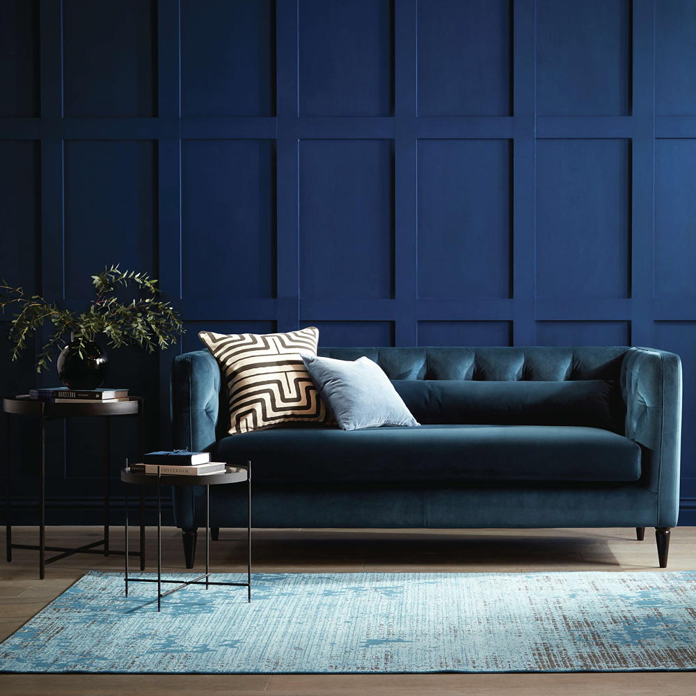
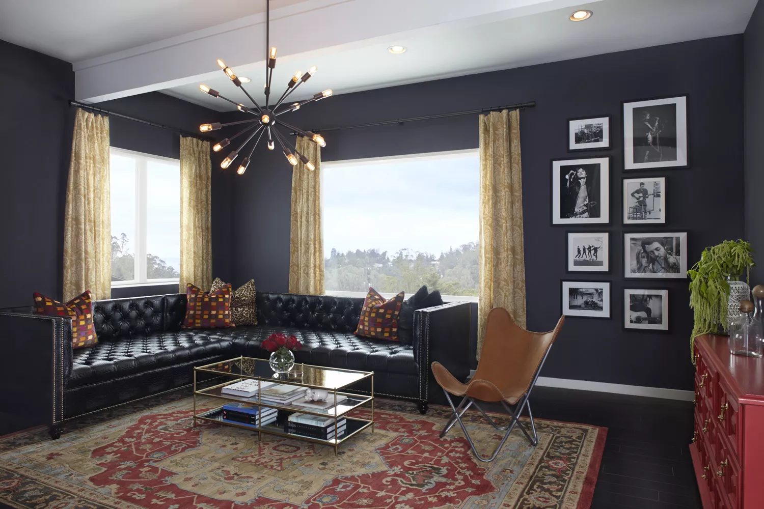
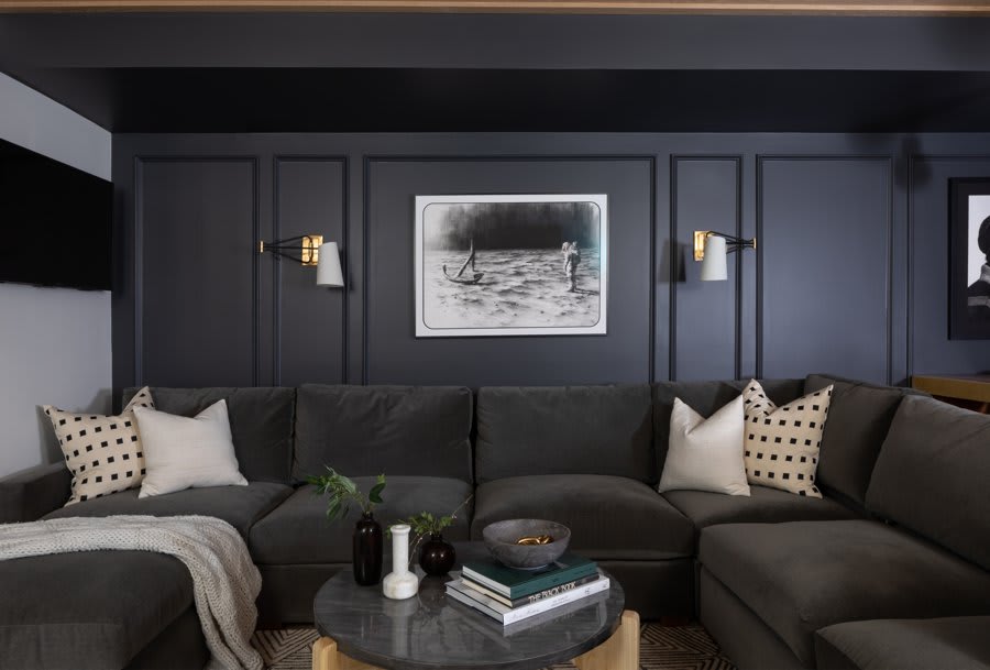
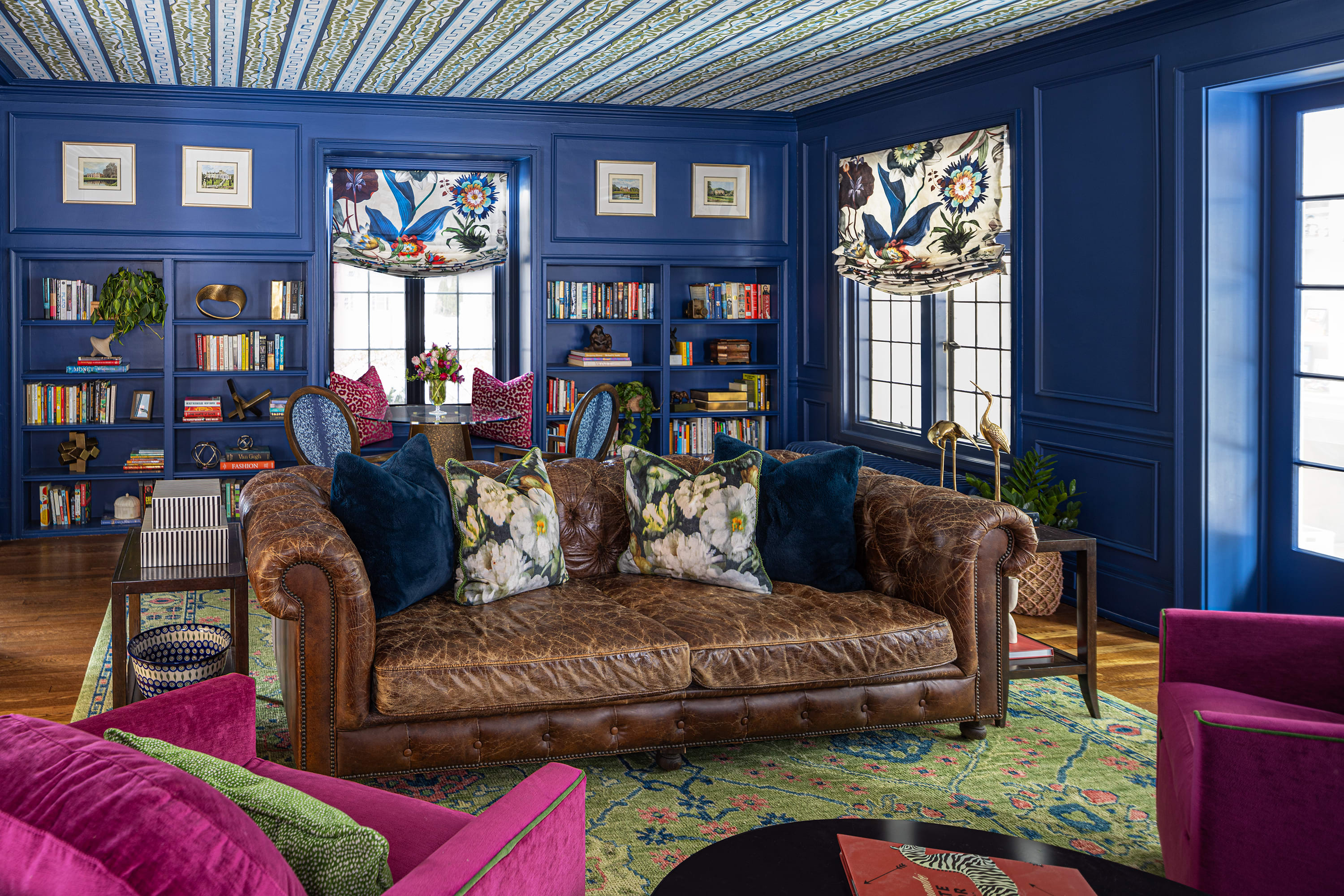
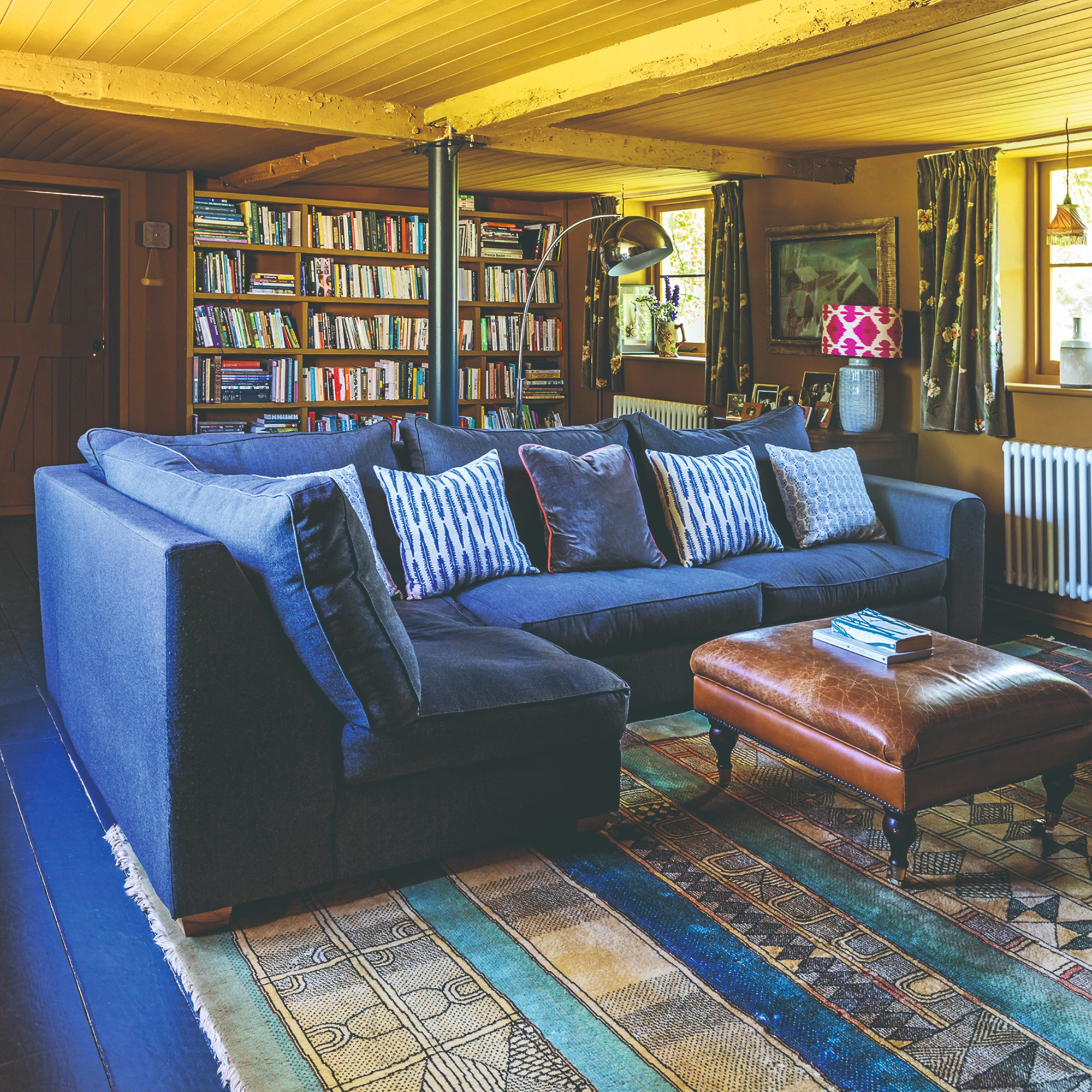
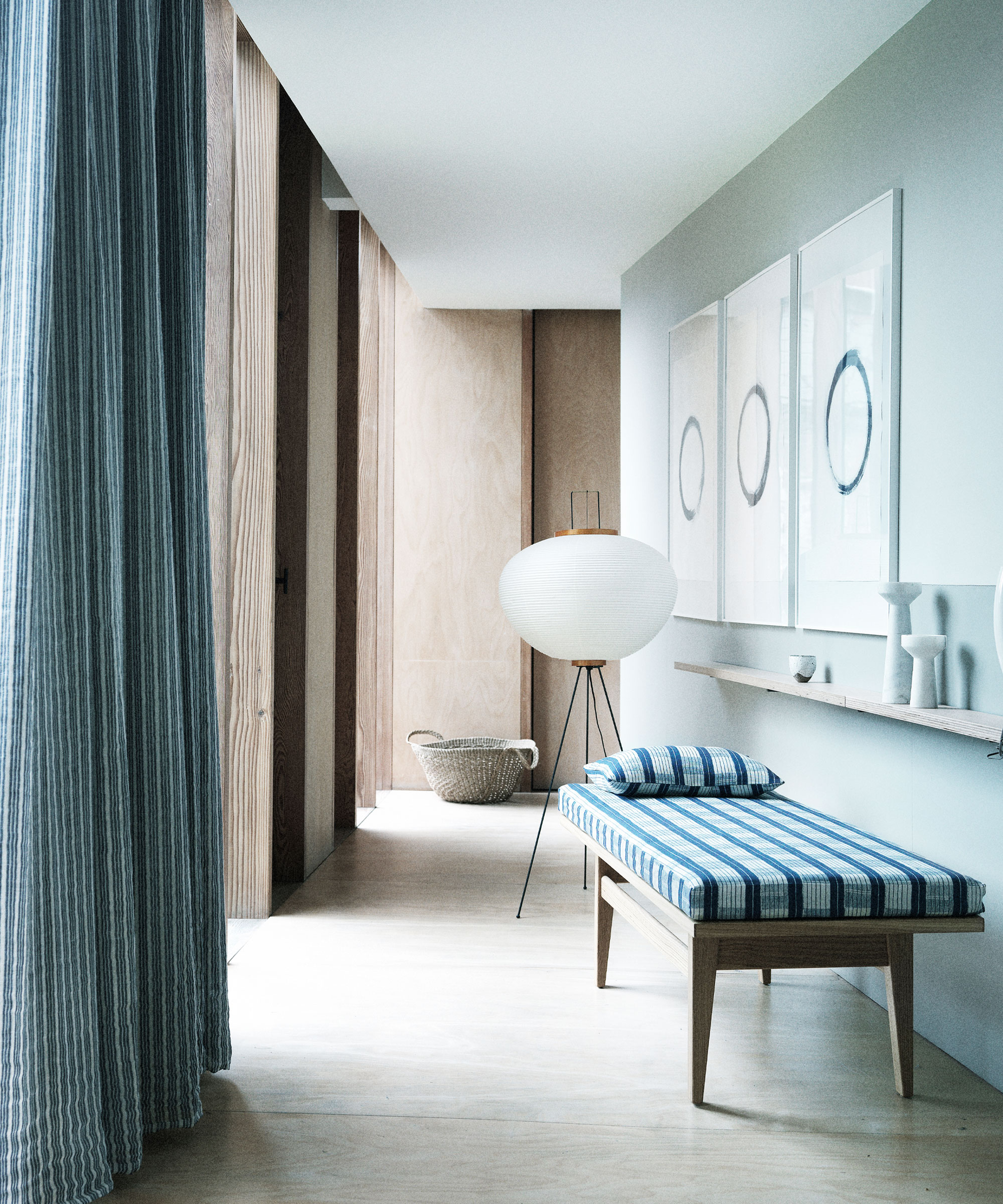
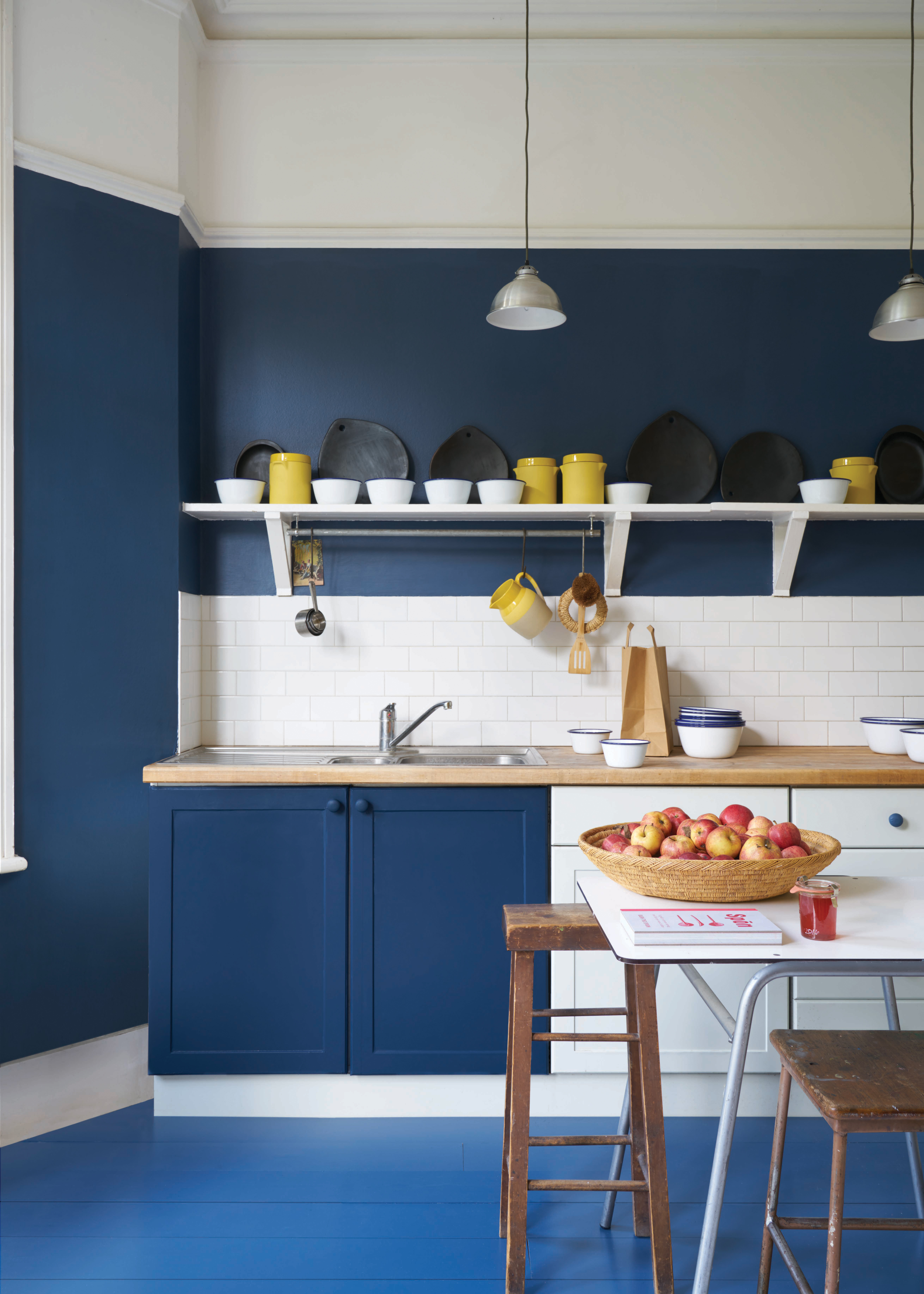
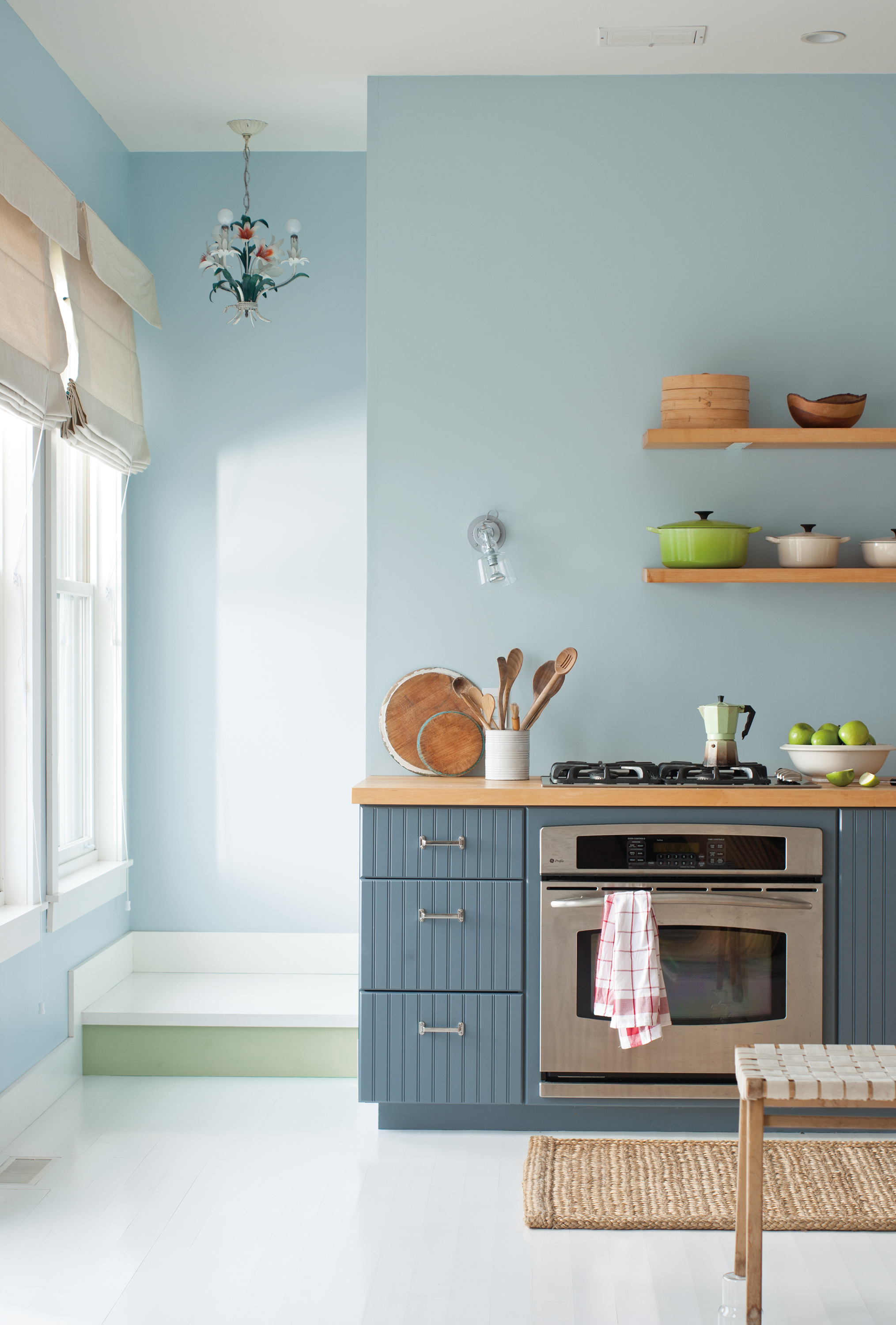
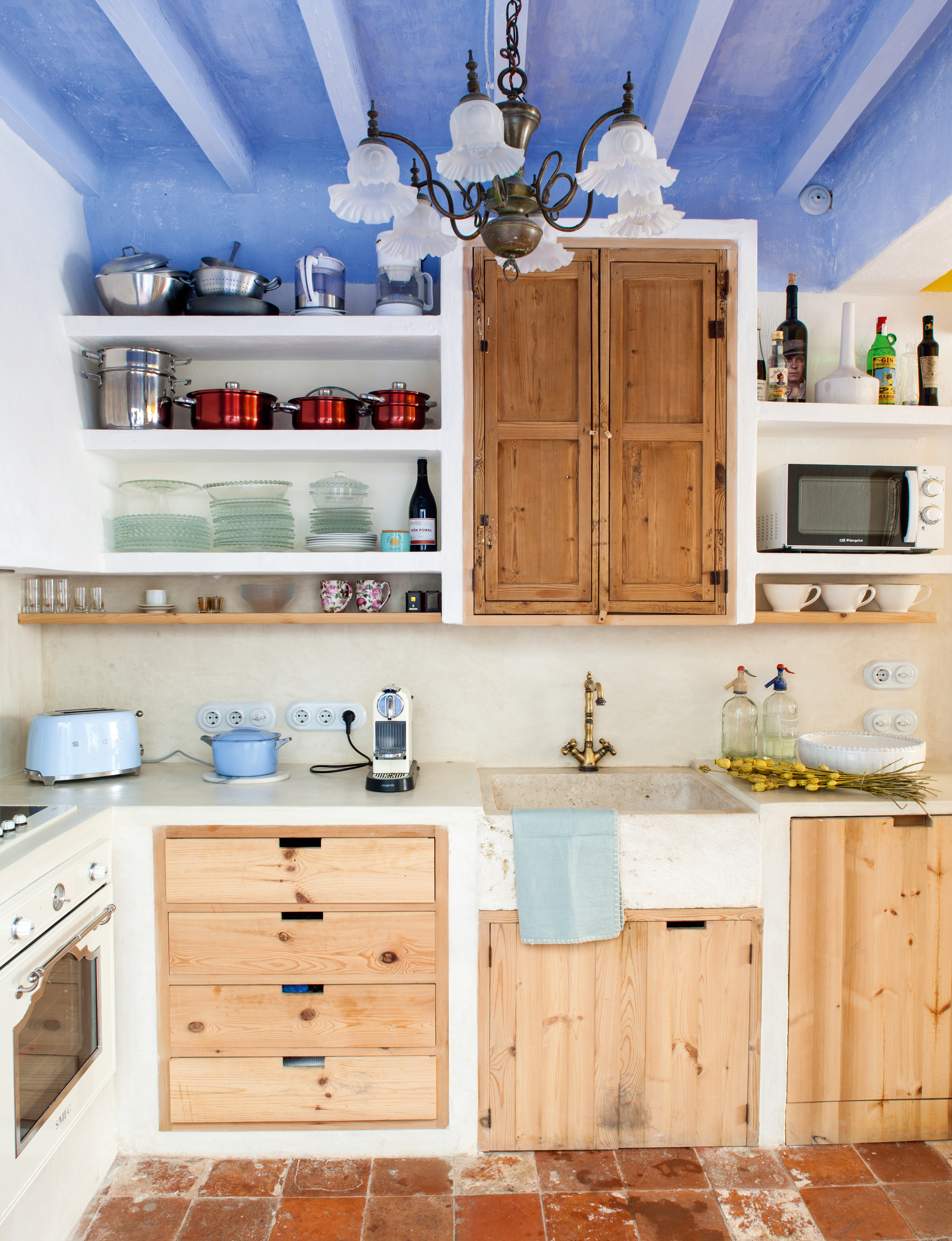
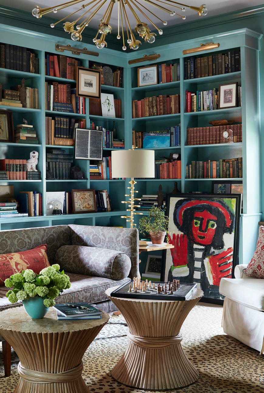
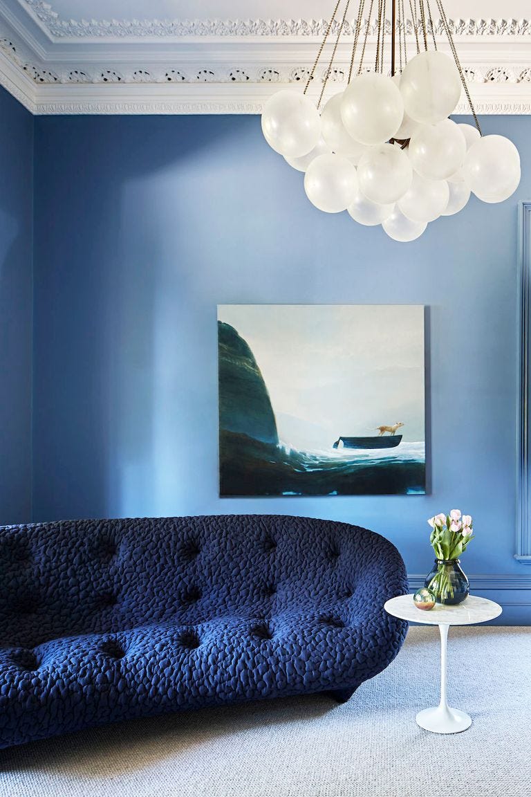
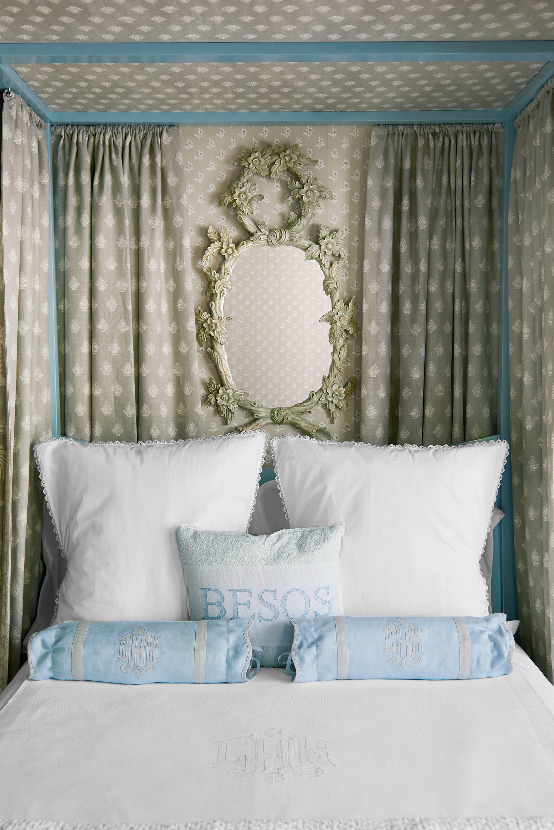
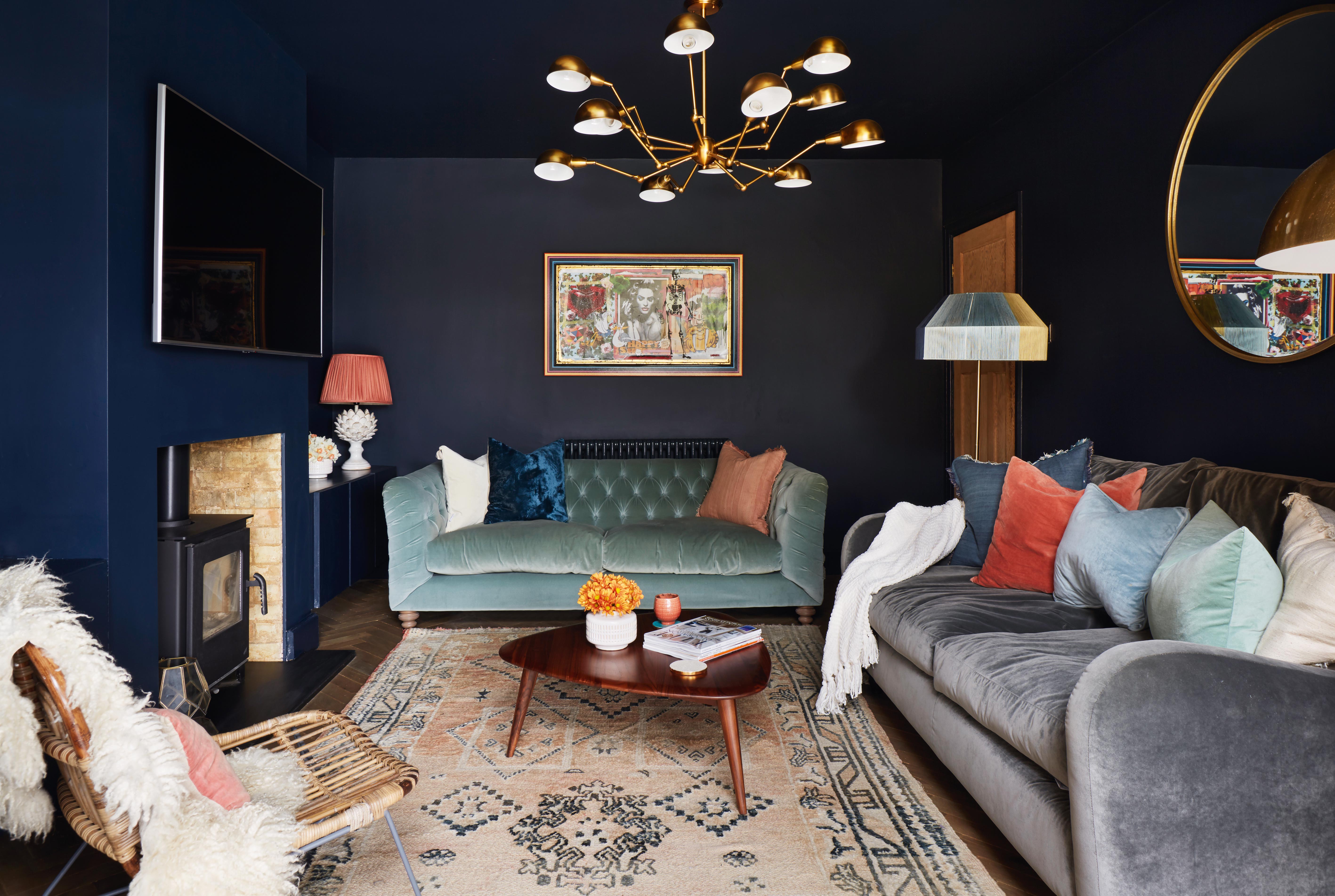
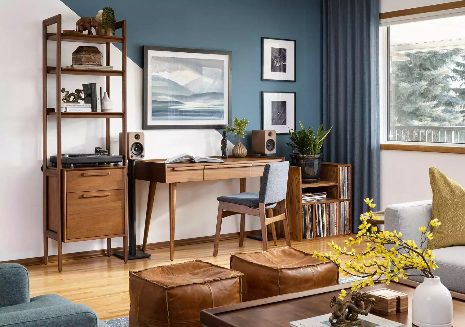
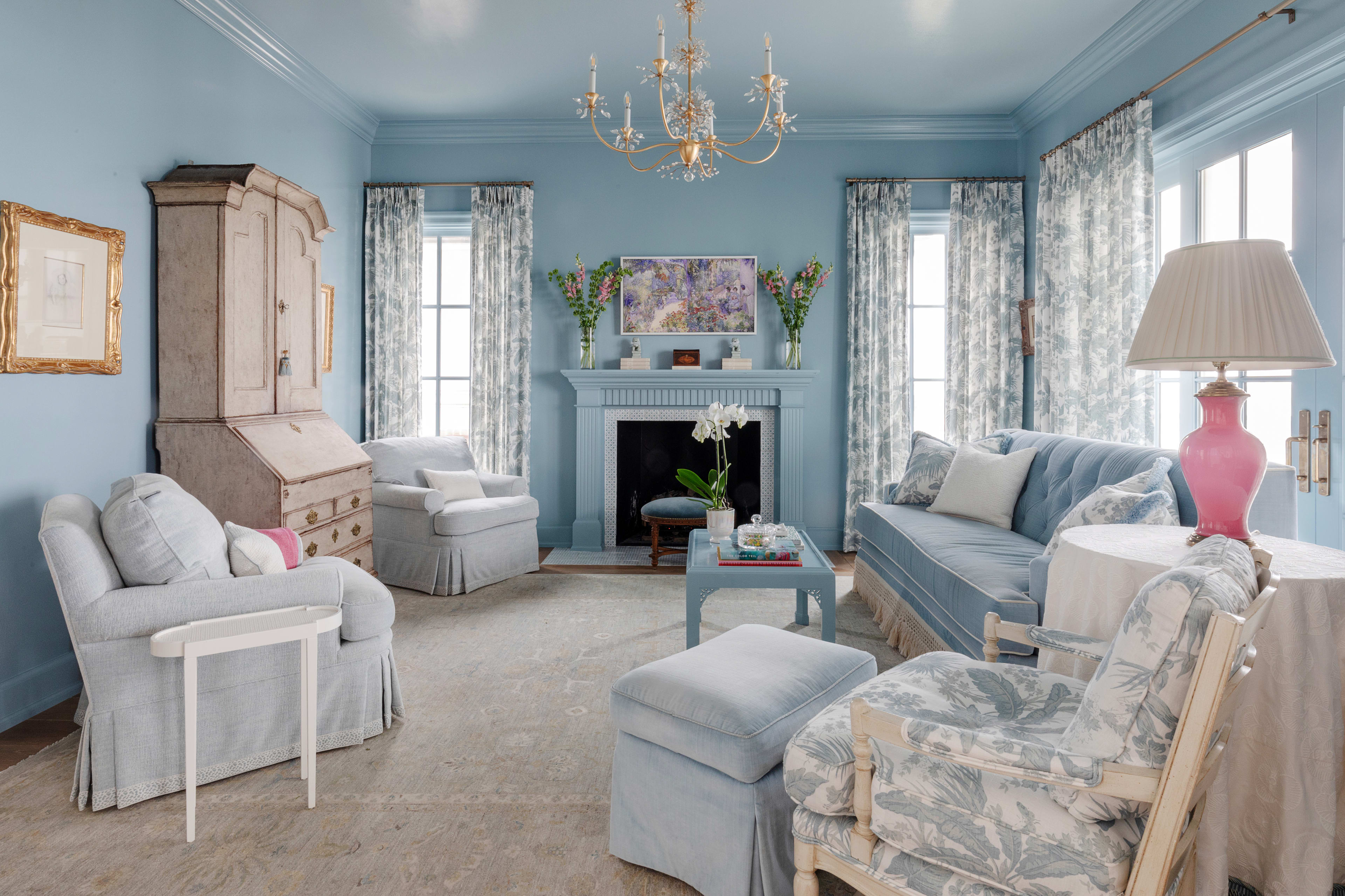
The article then delves into specific design applications, starting with the trend of moody dark blue walls. It suggests using rich midnight blues, such as Farrow & Ball's Hague Blue, to create soft, cocooning spaces that pair well with rustic elements like warm woods, dark leather, and creamy whites. This approach embraces depth and sophistication in a living area. Conversely, for an uplifting and serene ambiance, the article recommends employing muted sky blues across walls and ceilings, anchoring the color with metallic accents and darker touches, such as black furniture lines. Patterned rugs or large prints with varying blue tones can add further interest and depth to these lighter schemes.
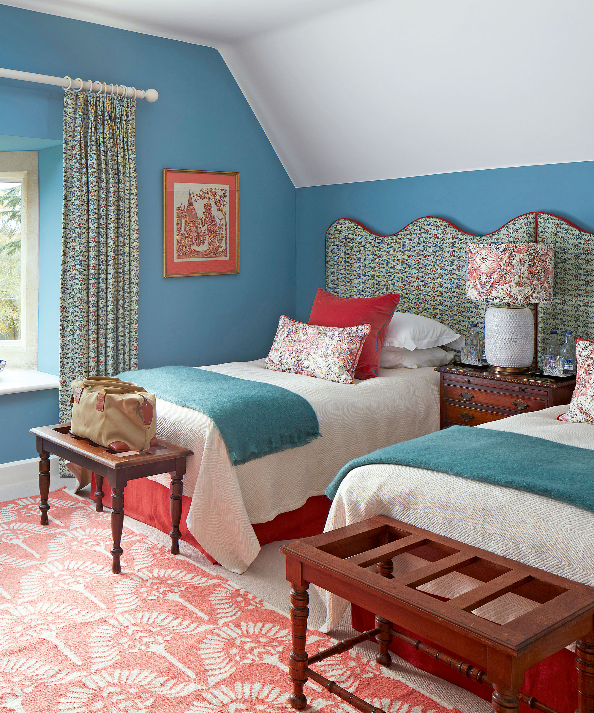
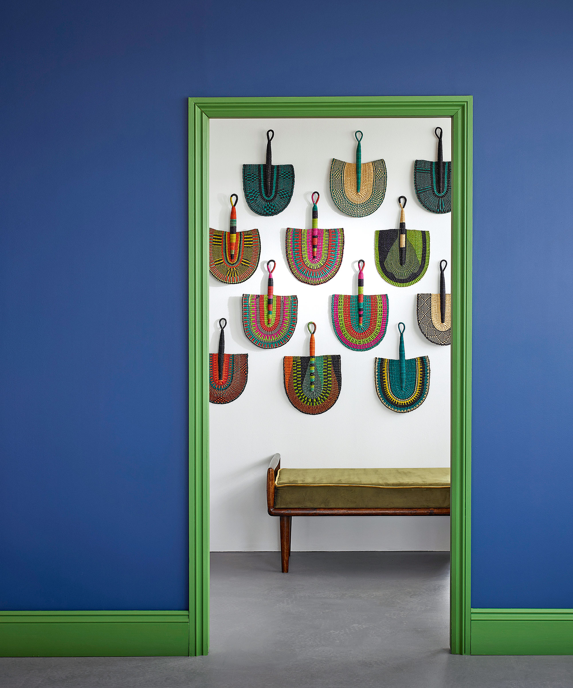
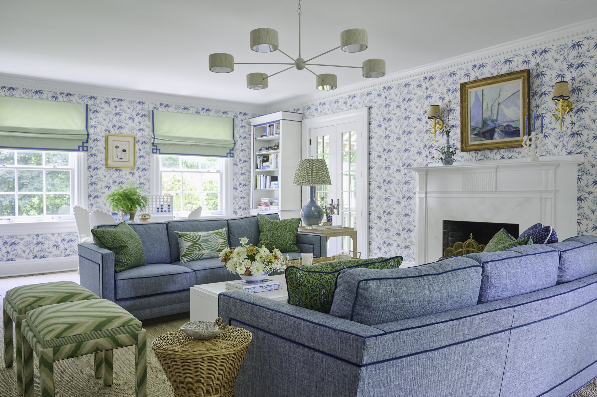
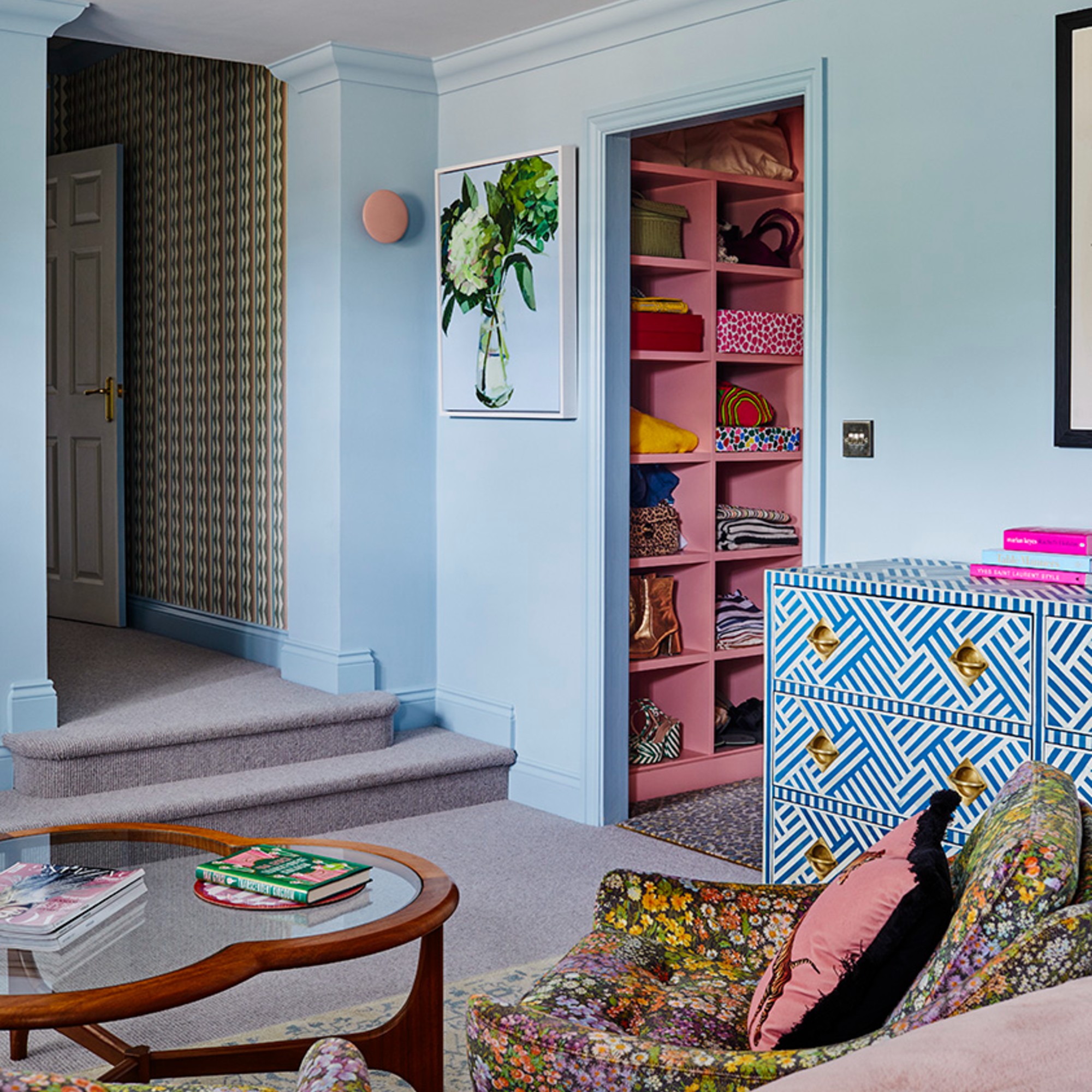
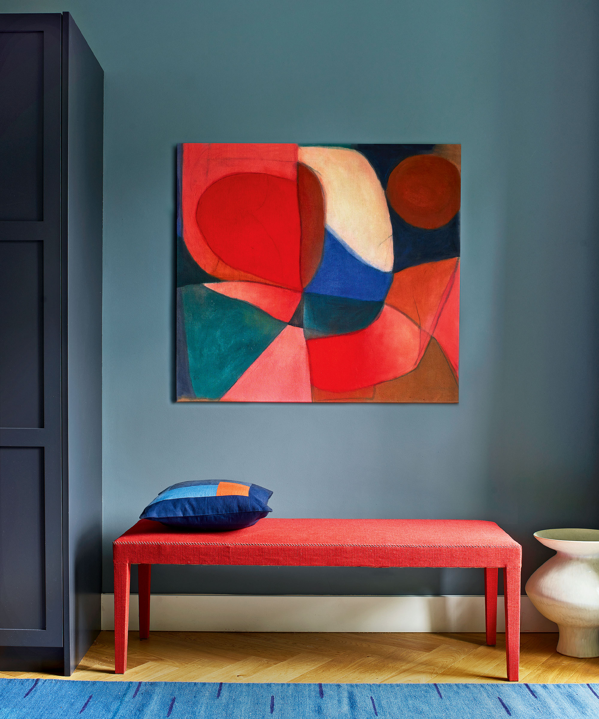
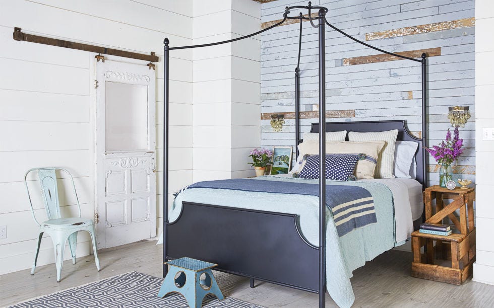
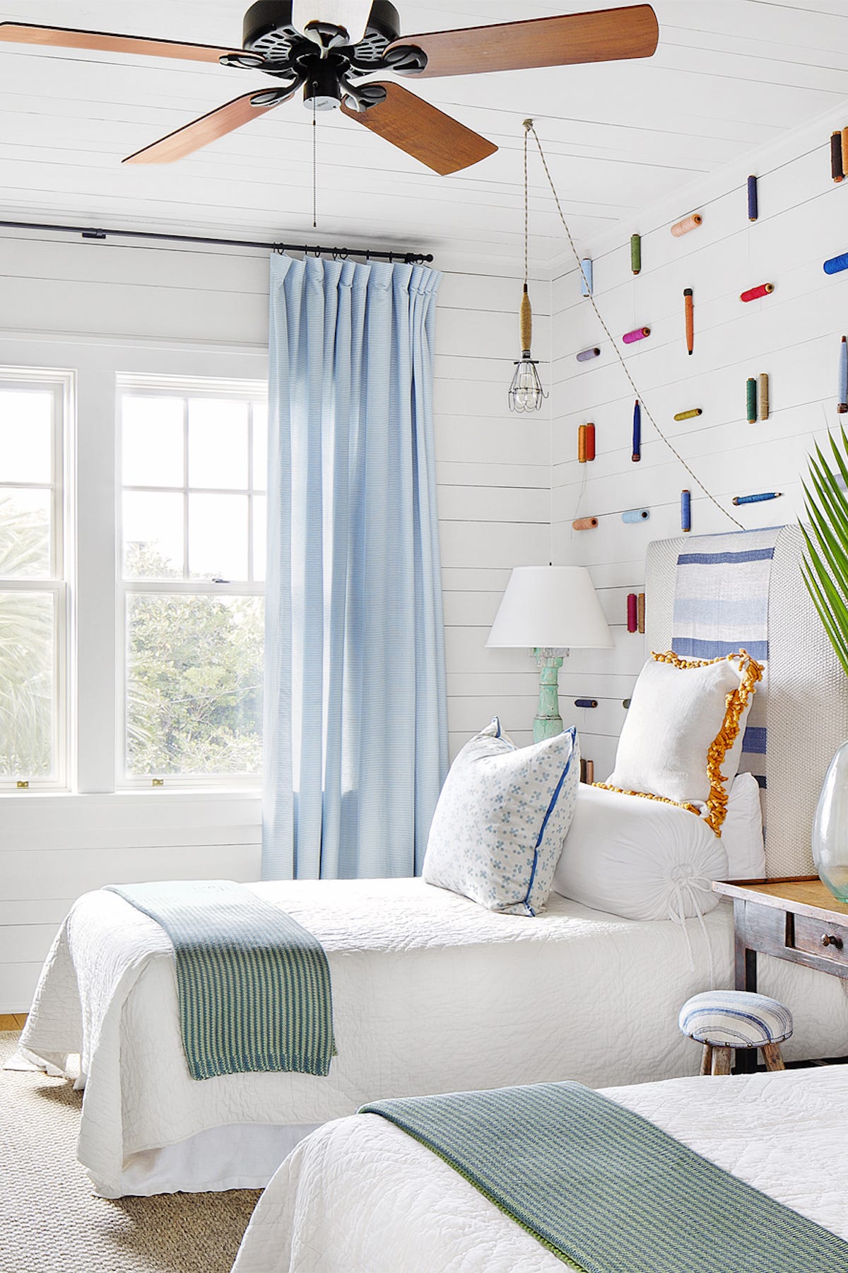
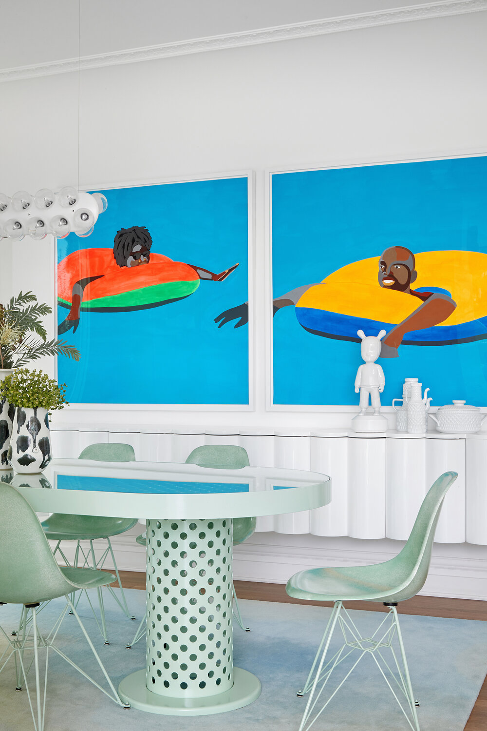
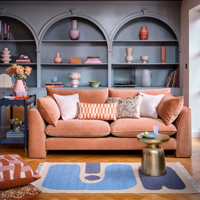
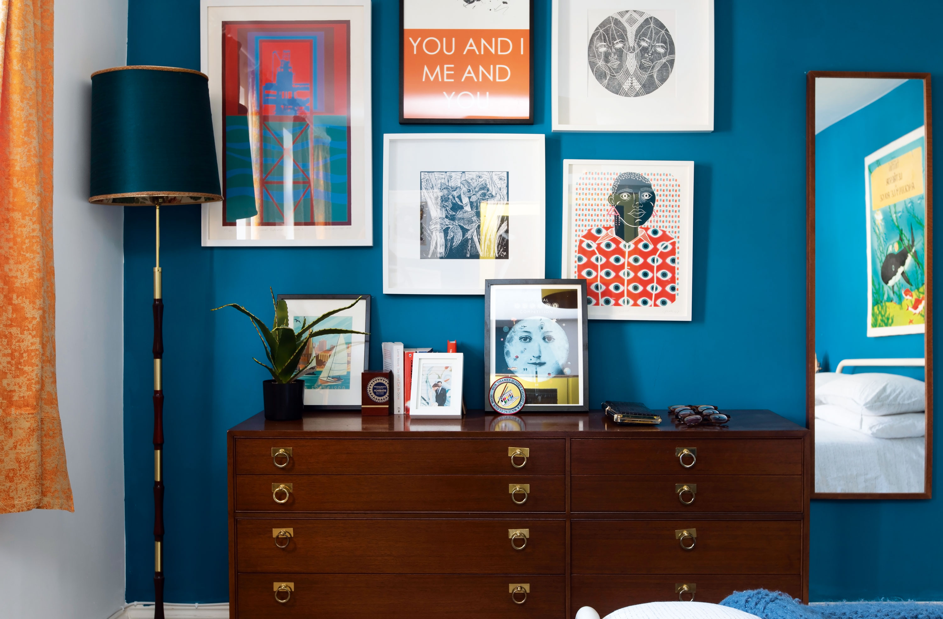
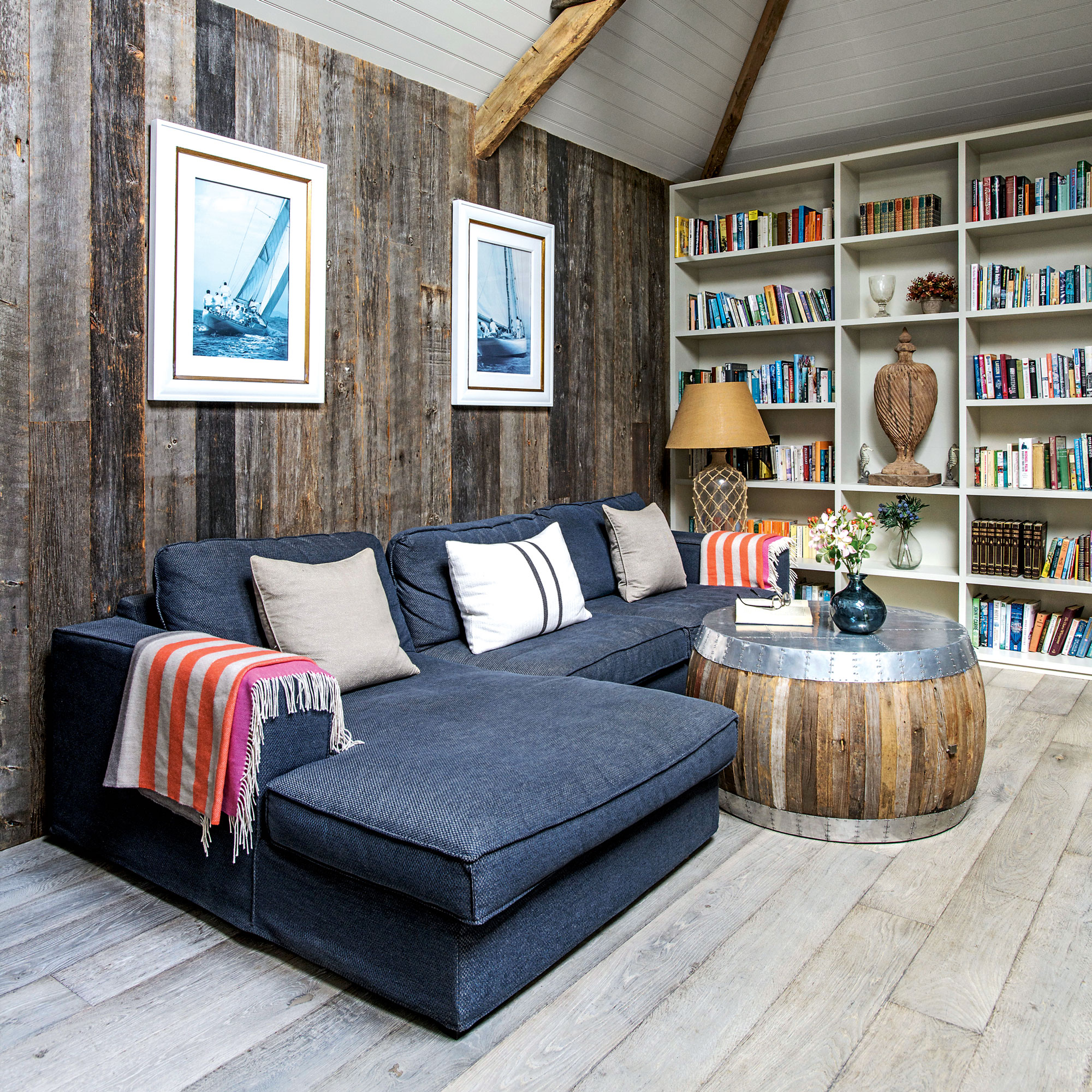
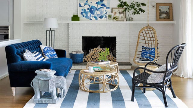
For those seeking a bolder statement, the article presents the idea of integrating bright, vibrant blues. It highlights how a minimalist approach can prevent overwhelming the space, and how contrasting colors like orange and blush pink can soften the intensity of bright blue, bringing the entire color scheme together harmoniously. The coastal aesthetic is also explored, suggesting light blues like Benjamin Moore's Winter Ice, particularly when combined with painted shiplap walls, deeper blues, greens, and neutrals, to create a chic, relaxed beach house feel without overtly nautical themes.
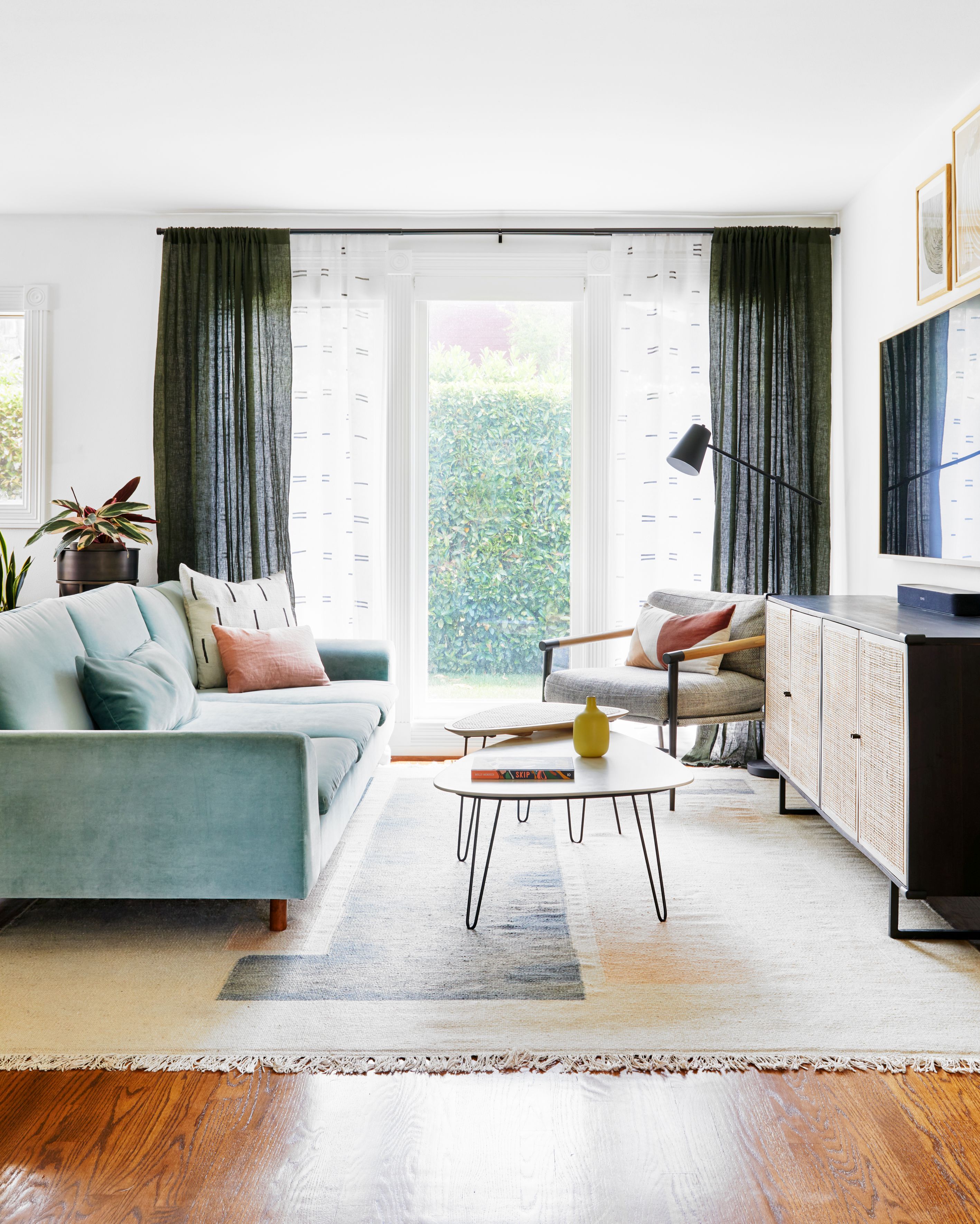
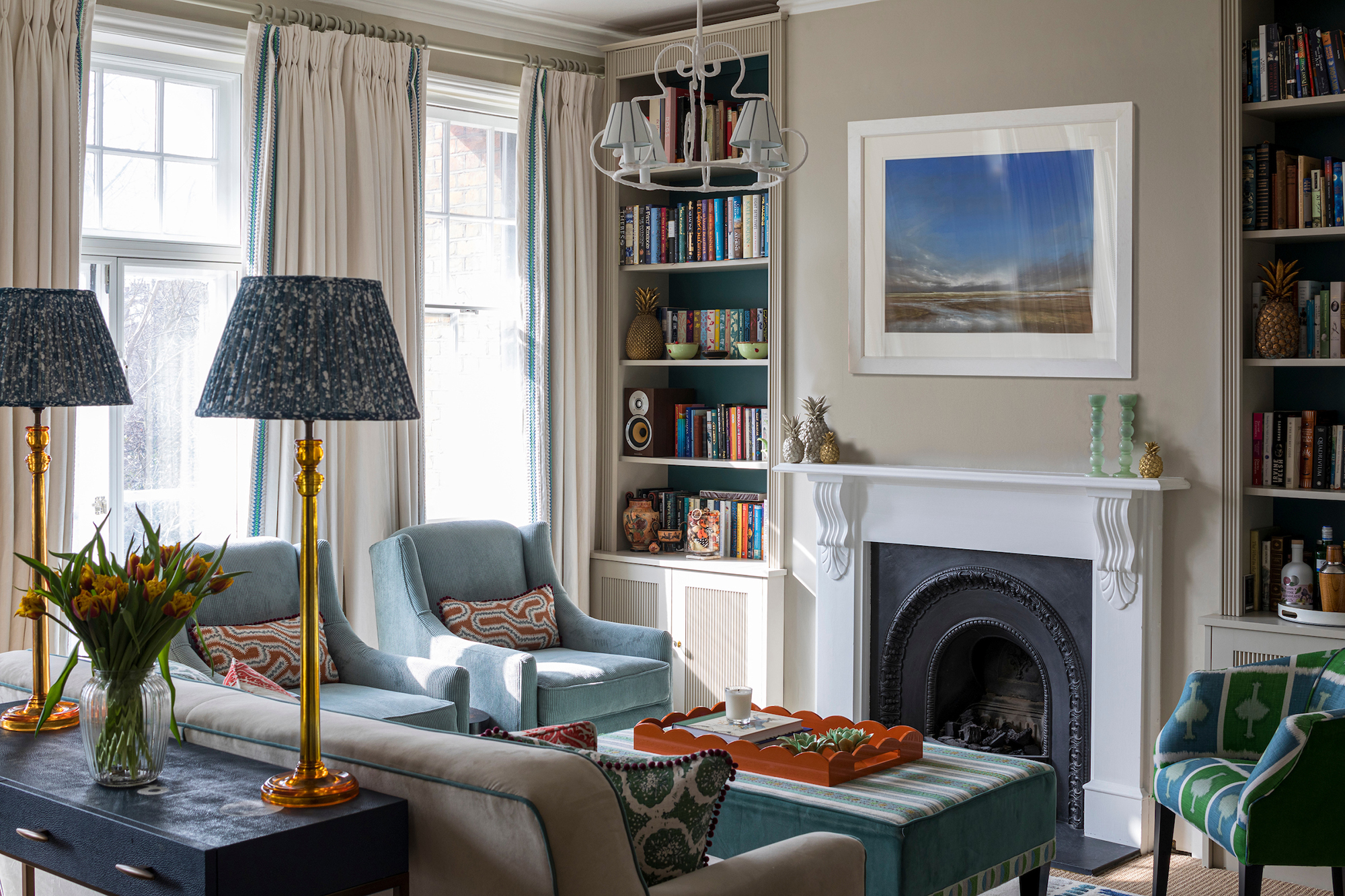
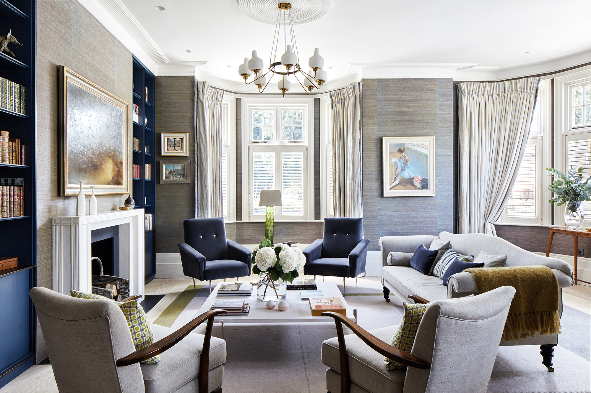
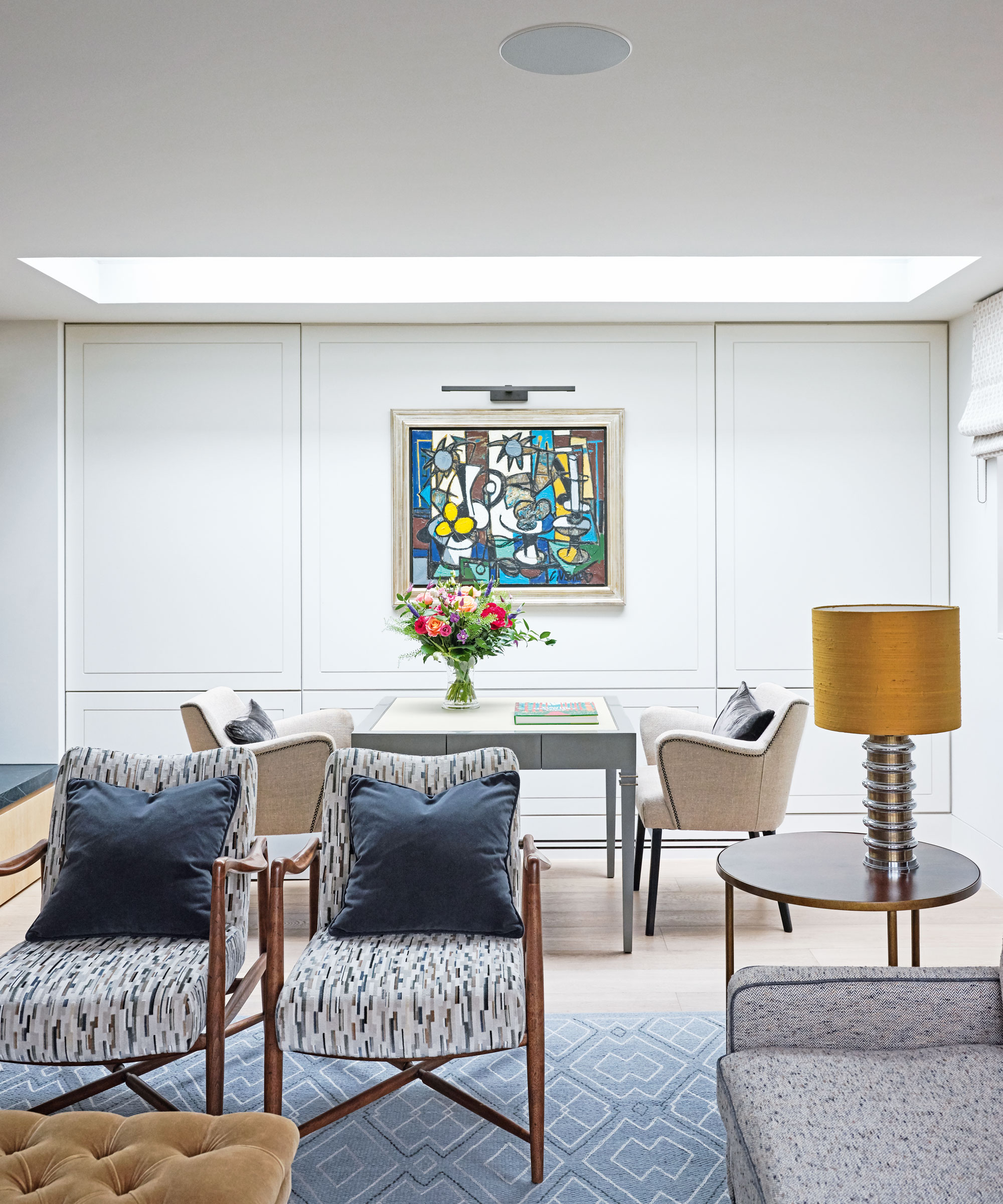

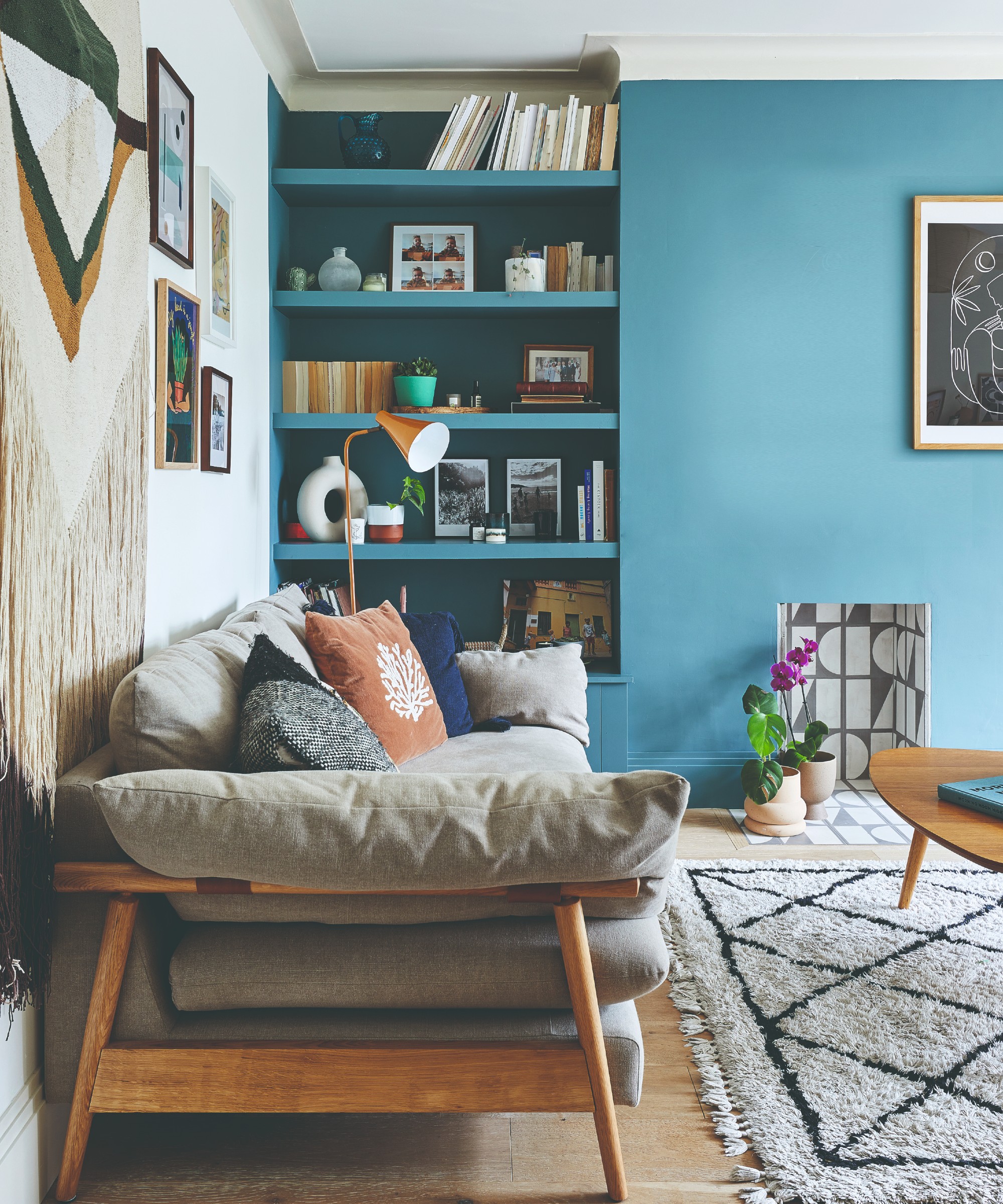
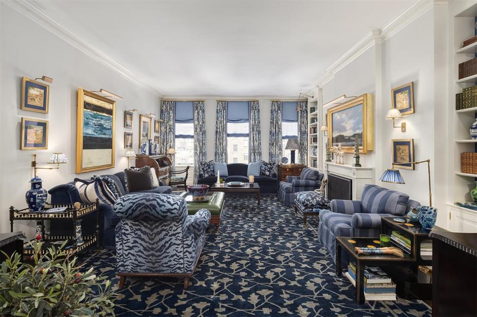
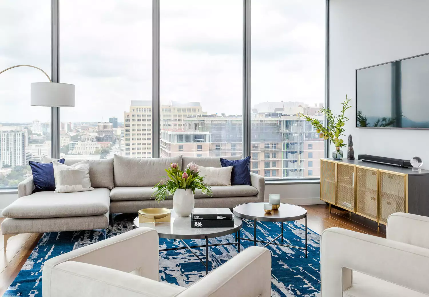
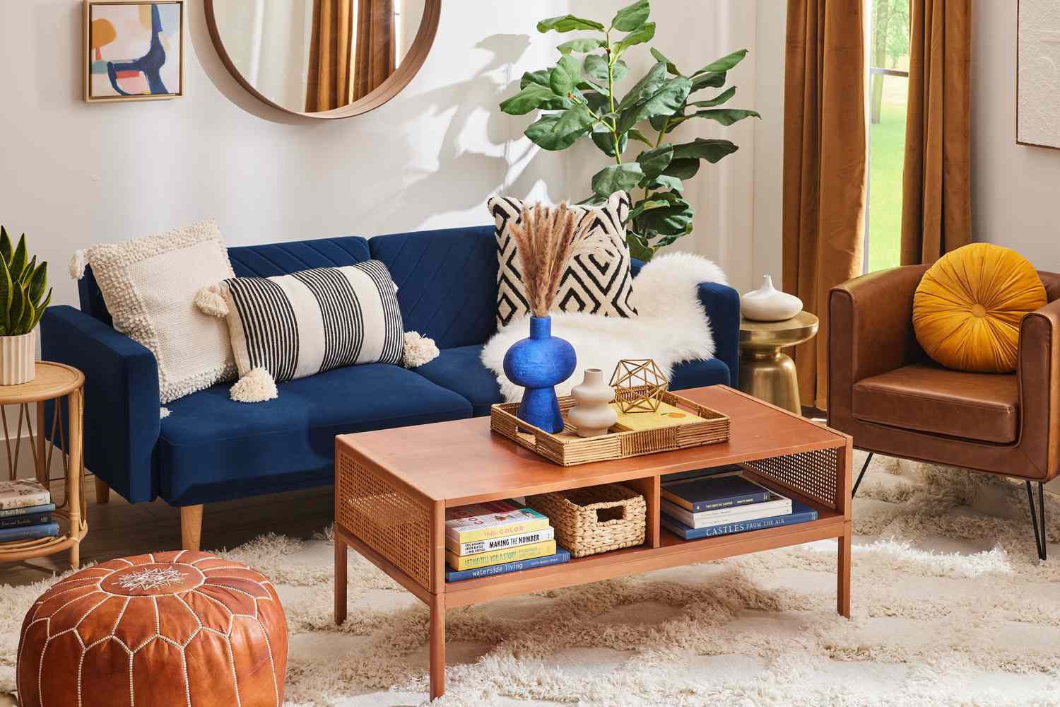
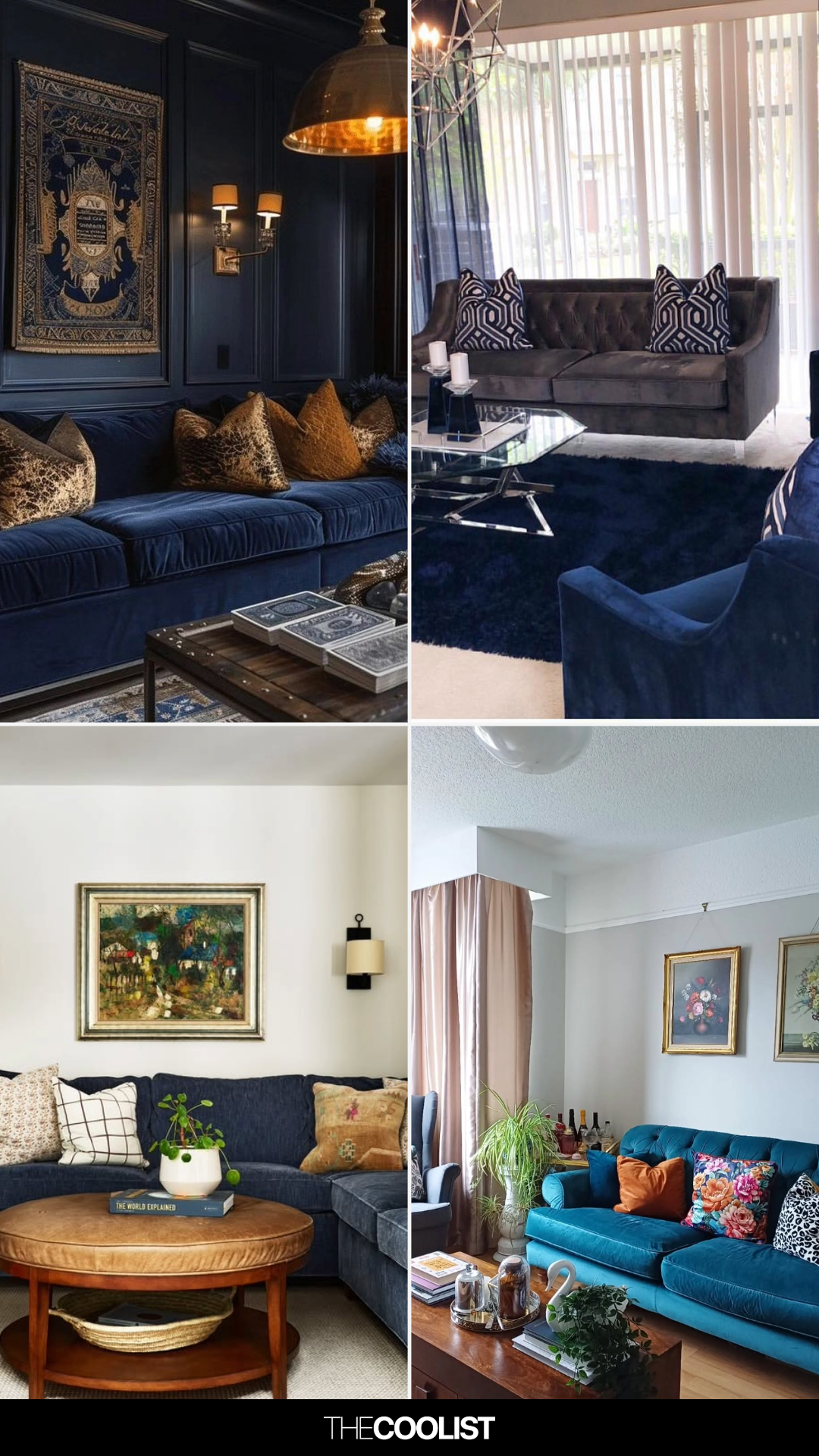
Furthermore, the article discusses how to warm up blue hues using soft neutrals. Combining deep navy with greys, creams, and browns can make a living room feel cozy and inviting, reducing the dramatic impact of darker blues. Breaking up large expanses of blue with prints is also suggested to mitigate intensity. For a more subtle integration of blue, the article proposes using blue furniture or accents in a predominantly neutral room, layering different shades of blue alongside brown sofas, rugs, and wood furniture to create visual interest without a single dominant color. Feature walls are presented as an option for introducing a splash of blue without committing to painting all four walls, serving as an anchor for a simple space and allowing for cohesive accents throughout the room.
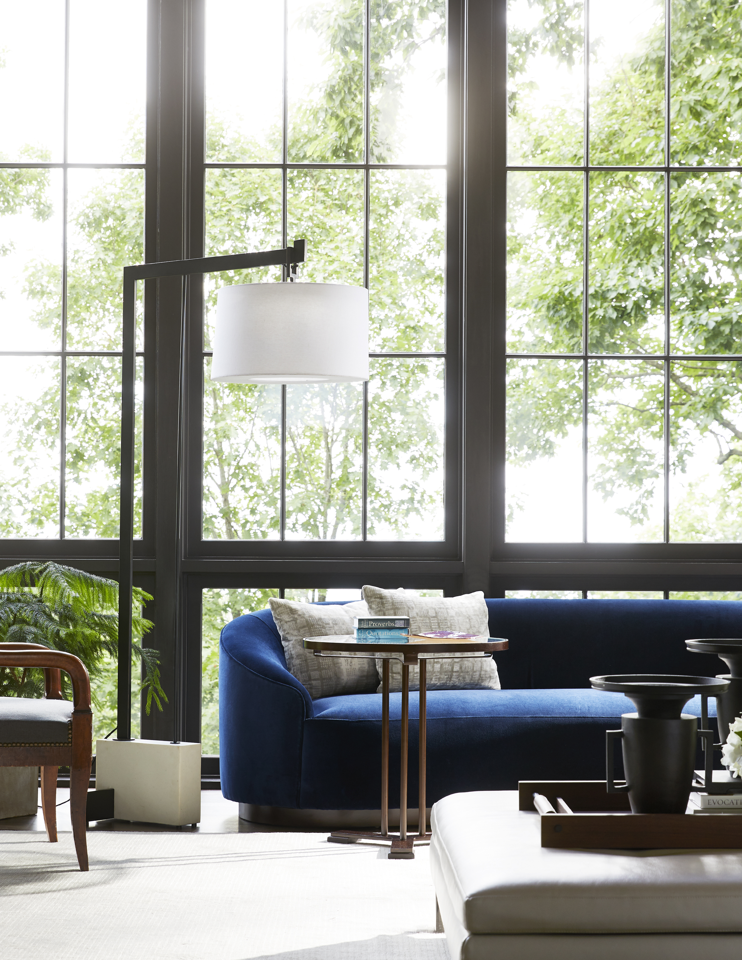
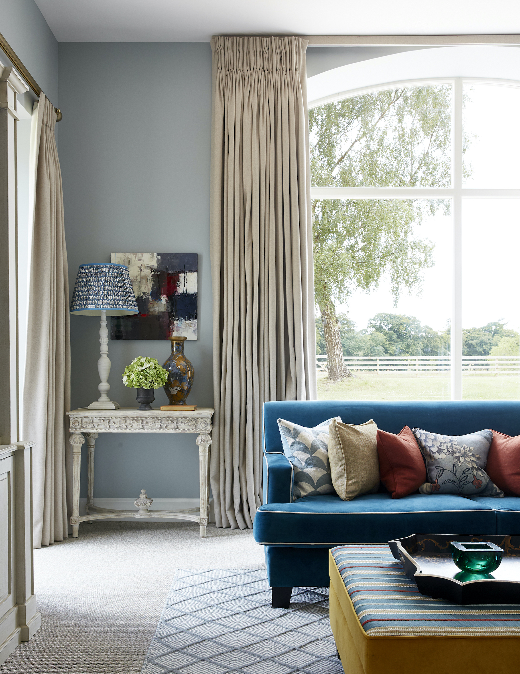
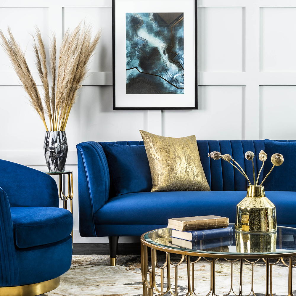
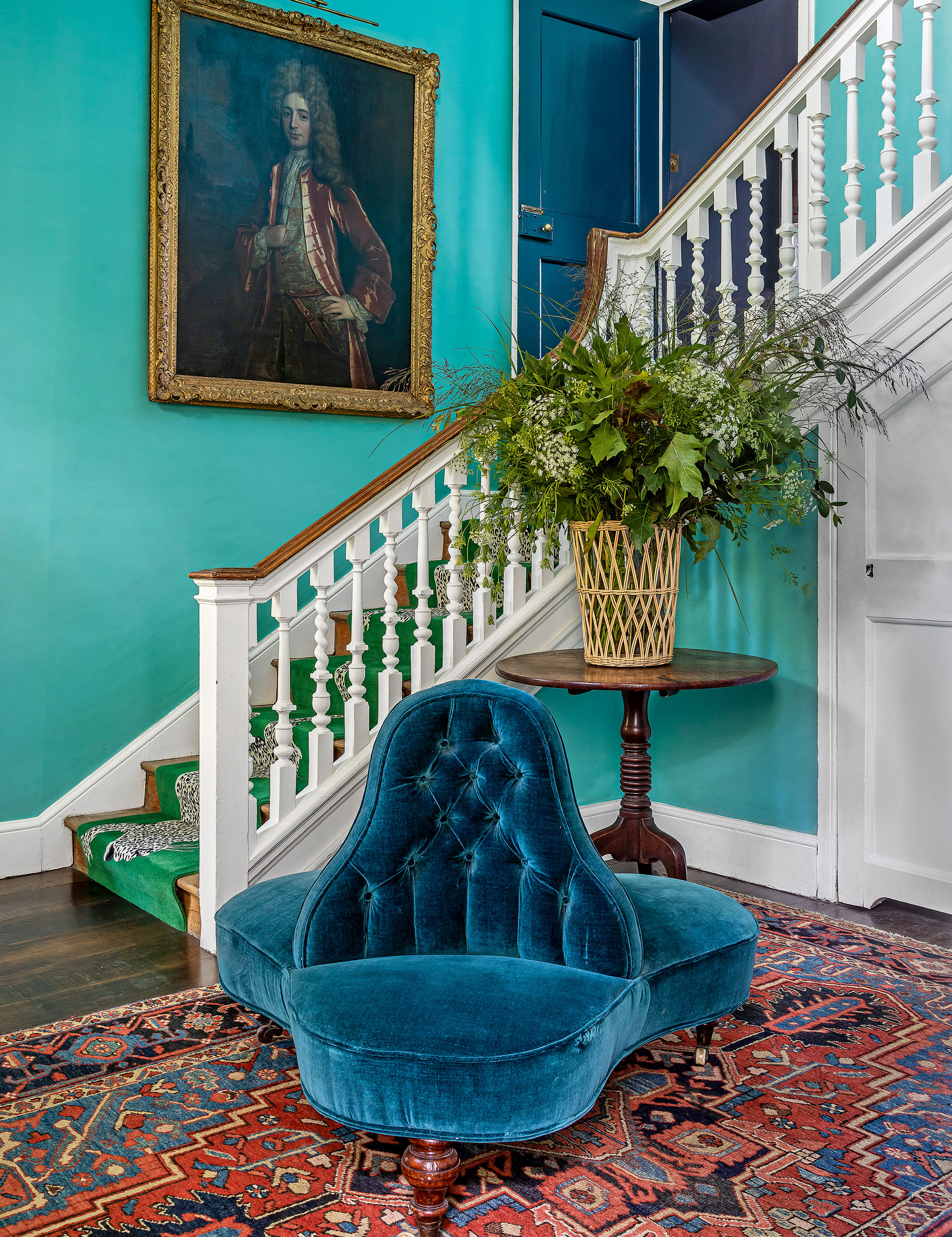
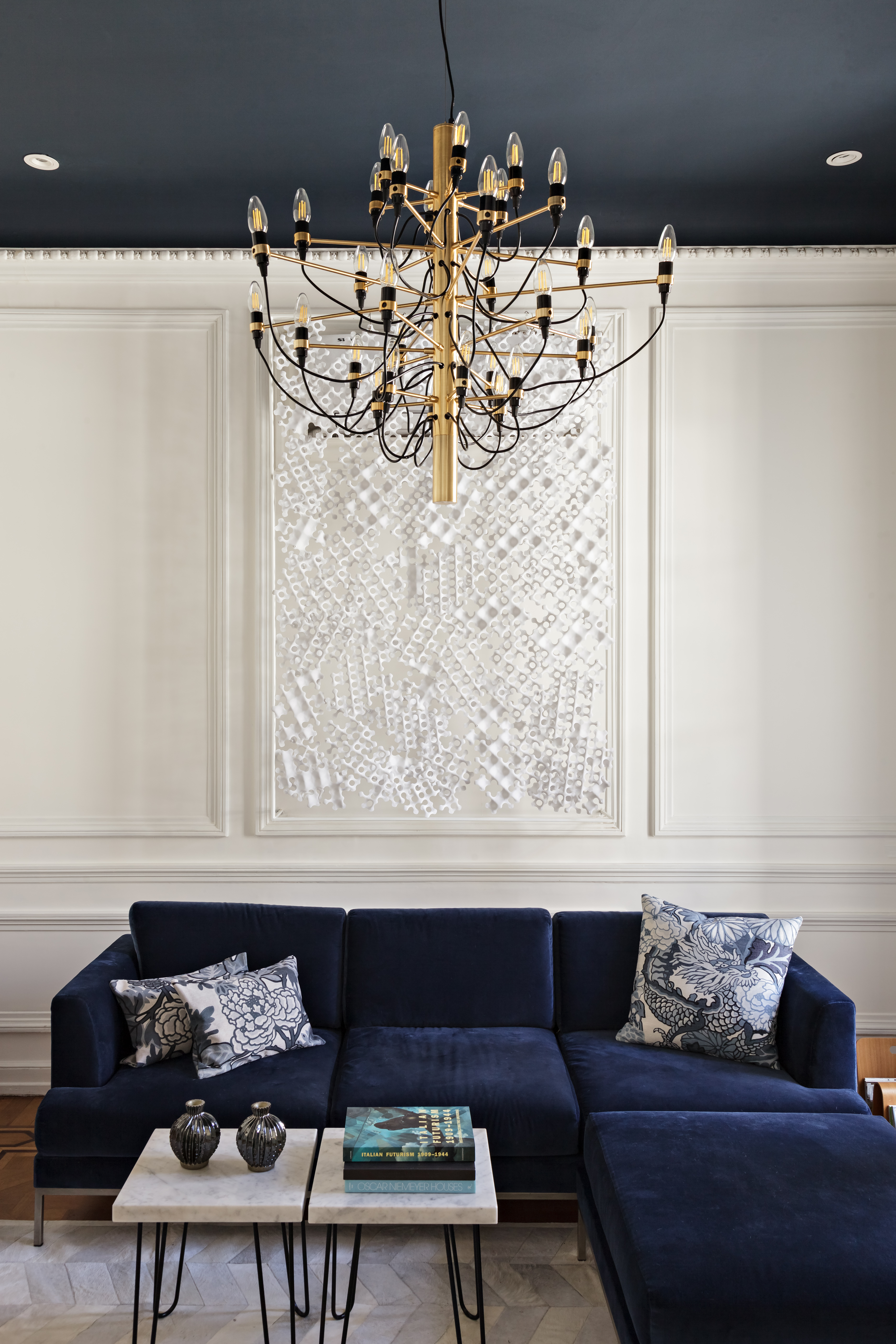
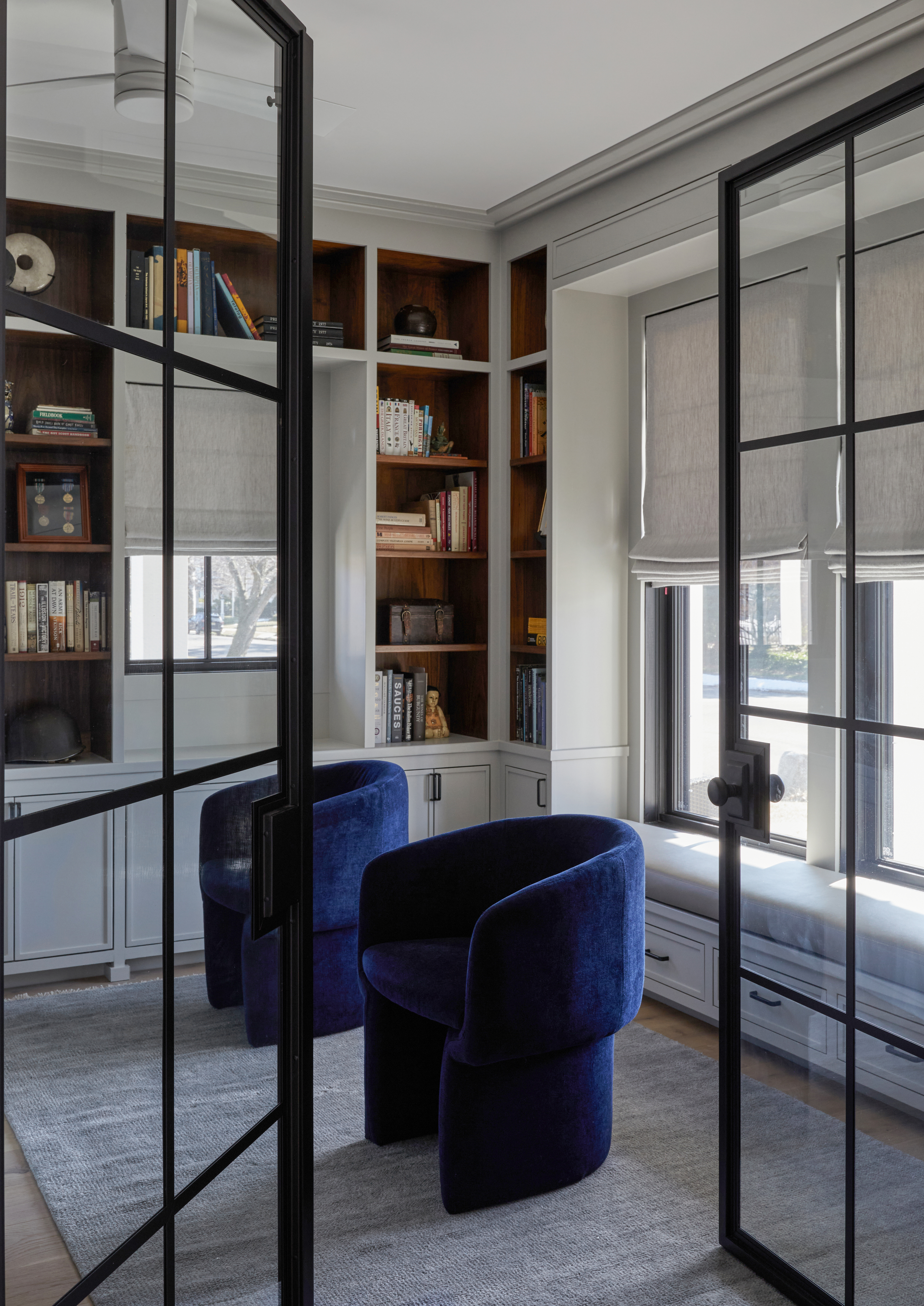
The importance of contrasting blue with crisp white woodwork is emphasized, as it can lift blue walls, balance darker colors, and allow for the introduction of black accents for a contemporary twist. The article also touches upon achieving a boho vibe with denim blues, which, due to their relaxing properties, are ideal for laid-back spaces. Layering cushions, using faded blue shades, and incorporating natural textures with grey accents are key to this style. Finally, the article highlights the luxurious appeal of blue velvet in furniture, noting its ability to add sophistication to diverse styles, from mid-century modern to traditional.
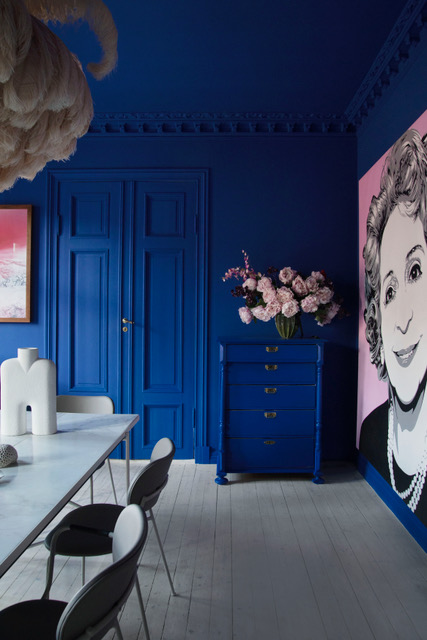
The piece concludes by addressing common questions, confirming blue's suitability as a living room color due to its classic and versatile nature, and recommending experimentation with paint before investing in furniture. It also advises on complementary colors, suggesting creams, whites, and greys for a sophisticated, low-key look, or yellows, oranges, and pinks for a bolder, playful scheme, with rich navy and pink creating a more grown-up feel.
#BlueLivingRoom #InteriorDesign #ColorPalette #HomeDecor #LivingRoomIdeas #PaintColors #DesignTips #Furniture #AccentColors #BlueLivingRoom #InteriorDesign #ColorPalette #HomeDecor #LivingRoomIdeas #PaintColors #DesignTips #Furniture #AccentColors
0 تعليق إجمالاً
 لا توجد تعليقات بعد
قد تعجبك أيضًا
Blue couch living room ideas – 10 ways to complement this standout color

Blue room ideas – 27 timeless and fresh ways to use blue at home
Blue is one of the UK’s most popular living room colours – this is how to elevate your lounge with the timeless hue
These 10 Colors Always Look Beautiful With Blue

Blue living rooms: 26 fabulous ideas to inspire a makeover

17 Blue Living Rooms So Stunning, You’ll Want to Redecorate Tonight
47 Stunning Blue Room Ideas for Every Style
Feeling blue about your current space (figuratively)?

Blue sofa living room ideas – 10 ways to style statement colour
29 Blue Living Room Ideas You Haven’t Seen 100 Times Already
Beautiful blue decorating ideas for every room | loveproperty.com
11 Blue Dining Room Ideas That Prove This Palette Is the Restful Shade You Want for Entertaining

47 Relaxing Blue Living Room Ideas for Every Style
Navy Blue Living Room Ideas — 14 Examples to Help You Dress up This Room in a Sophisticated Way
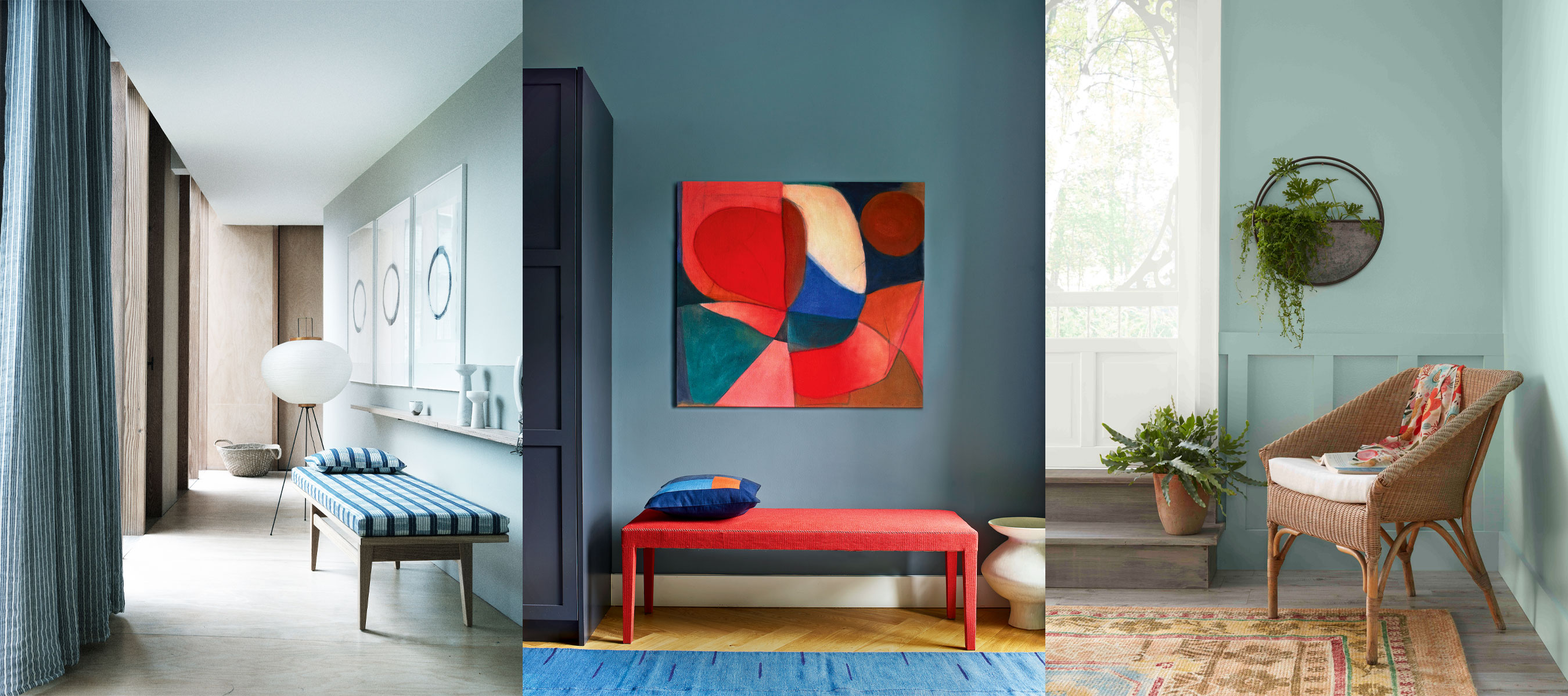
Blue hallway ideas – 10 diverse designs for this classic color
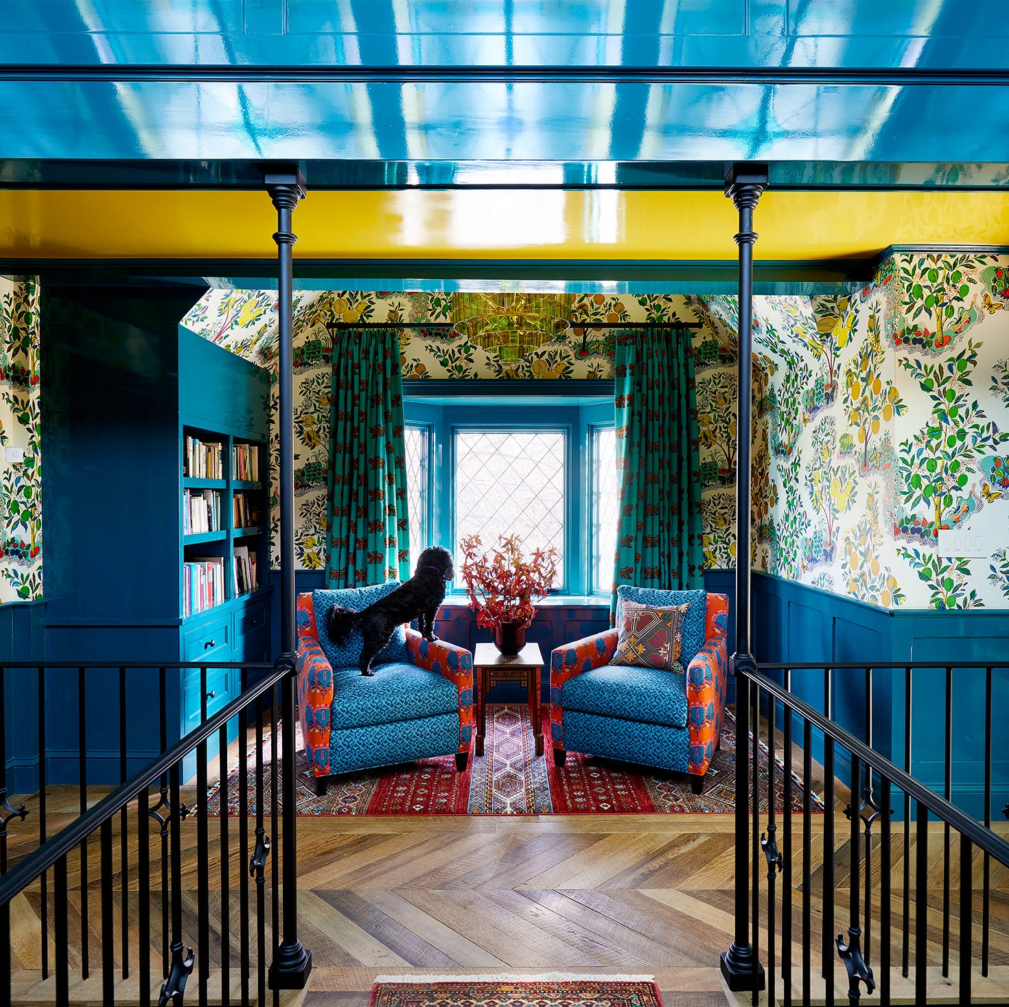
45 Blue Rooms That Prove It's the Most Amazing Color in the Rainbow

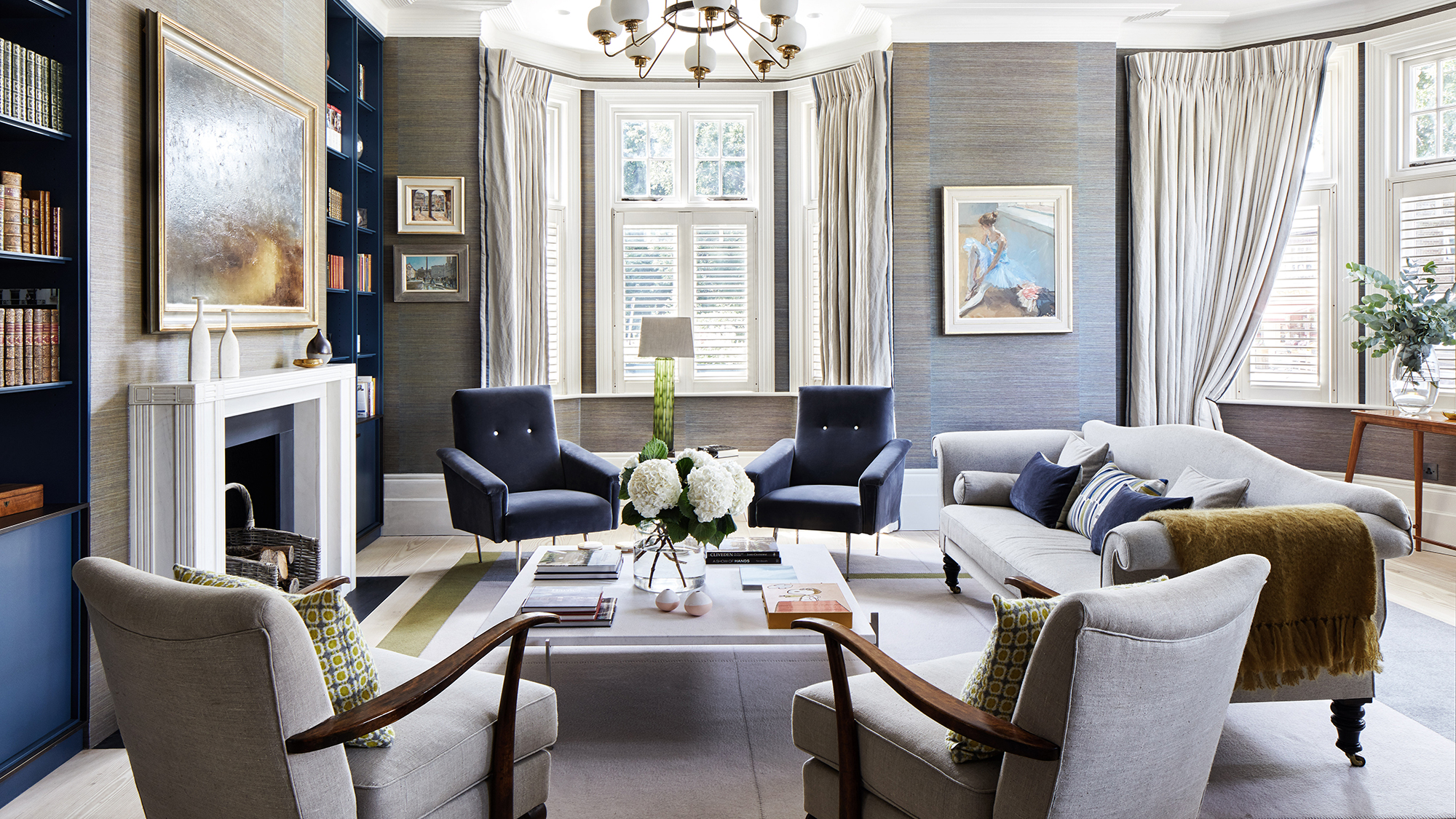
Blue and grey living room ideas – 10 ways to use this versatile pairing
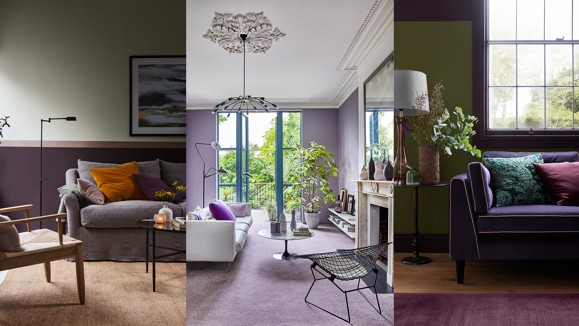
Purple living room ideas – 11 ways to use this on-trend color
25 Reasons Why Blue Is the Best Color for Decorating Your Home
Have a Navy Blue Couch? Keep These 9 Decorating Tips in Mind