


Best Wall Paint Colors 2026: Room-by-Room Guide with AI Visualization
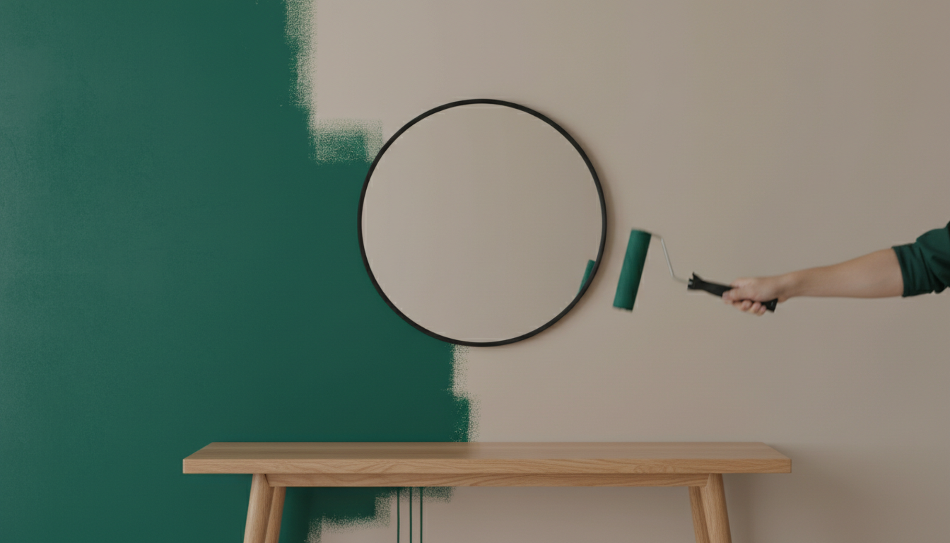
Choosing a new wall paint color is one of the most impactful and budget-friendly ways to transform a room. But the endless swatches and inspiration photos can be overwhelming. What if you could skip the guesswork, avoid costly mistakes, and see exactly how that deep emerald green or soft greige will look in your own space, with your own lighting and furniture? With the power of AI, you can. Before diving into color palettes and painting techniques, it's worth knowing how modern tools can change the game.
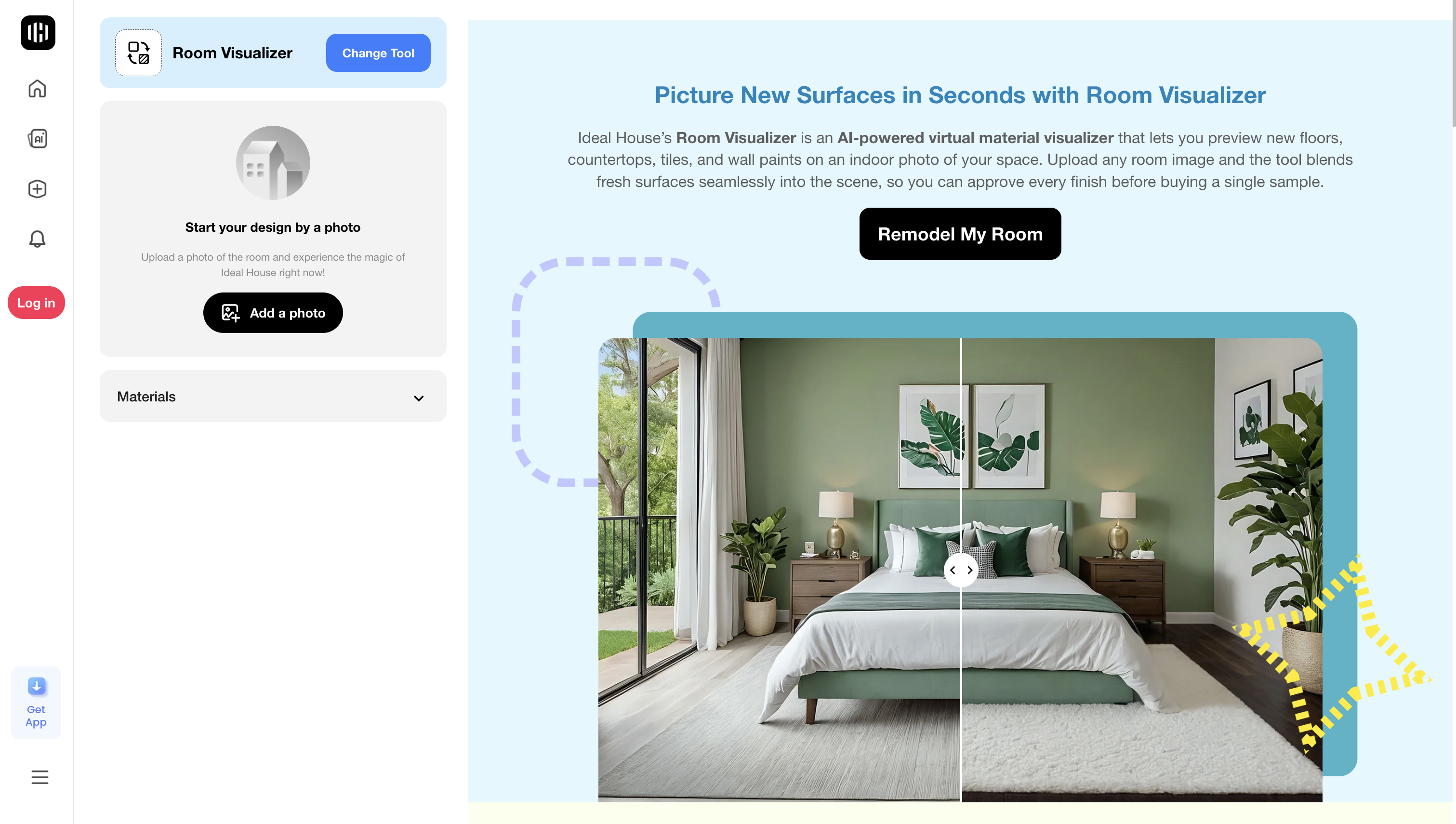
Tools like the Room Visualizer allow you to virtually try on countless paint colors right on a photo of your room. Want to see how a specific color like Benjamin Moore's 'Blue Nova' looks as a feature wall? Or maybe you want to change the color of your trim? With AI-powered editors like Smart Replacer, you can make targeted changes to walls, ceilings, or even cabinets with a simple text prompt. You can even explore complete style overhauls, including new paint, flooring, and decor, using the Interior Remodel tool. And if you're stuck on which direction to go, you can chat with an AI assistant like HouseGPT for personalized color pairing advice and creative prompts. These tools empower you to experiment fearlessly before you ever pick up a paintbrush.
Now, let's explore the ideas that will inspire your next project.
Understanding Color Psychology for Every Room
The color of a room does more than just decorate—it sets the mood and can influence your emotions and productivity. Understanding color psychology is key to choosing a paint that not only looks good but also feels right.
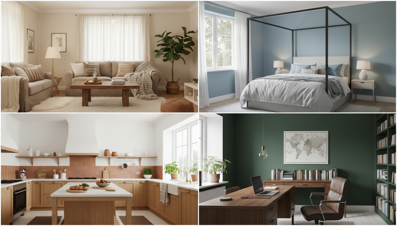
Living Room: Warm and Welcoming
As the social hub of your home, the living room benefits from colors that encourage conversation and relaxation.
- Best Picks: Warm beiges, soft greens (like sage or olive), earthy terracottas, and muted blues. These colors create a calming, inviting atmosphere perfect for gathering.
- What to Avoid: Overly bright reds can increase tension, while pure, stark whites can feel sterile and uninviting.
Bedroom: A Sanctuary for Sleep
Your bedroom should be a peaceful retreat. Research consistently shows that cool, muted tones are best for promoting rest.
- Best Picks: Soft blues are proven to promote longer, more restful sleep. Pale greens and muted lavenders are also excellent choices for creating a tranquil environment.
- What to Avoid: Bright, stimulating colors like orange and red can be too energizing for a space dedicated to rest.
Kitchen: The Hub of Energy and Appetite
The kitchen is a space of activity, and its colors can influence both energy levels and appetite.
- Best Picks: Warm yellows can stimulate appetite and mental activity. Warm whites keep the space feeling clean and bright, while earthy tones like terracotta create a welcoming, appetizing vibe.
- What to Avoid: Certain cool blues may suppress appetite, which might be a pro or a con depending on your goals!
Home Office: The Zone of Productivity
Whether you work from home full-time or just need a space for focus, the right paint color can boost concentration.
- Best Picks: Deep blues and greens are known to enhance cognitive performance and reduce eye strain. A sophisticated warm gray offers a neutral, professional backdrop that minimizes distractions.
- What to Avoid: Highly energetic colors can be distracting, while dark, gloomy shades can sap motivation.
Bathroom: A Spa-Like Escape
Bathrooms are both functional and personal wellness spaces. Colors here should feel clean, calm, and refreshing.
- Best Picks: Pale blues, soft whites, and light grays evoke a sense of cleanliness and serenity, reminiscent of water and spas.
- What to Avoid: Dark, saturated colors can make a small bathroom feel even smaller and more enclosed.
Popular Wall Paint Palettes to Inspire You
Ready to move beyond a single color? A well-curated color palette can bring a cohesive and professionally designed feel to your home. Here are some trending concepts to consider.
Earthy and Grounded Tones
Embrace the calming influence of nature with a palette rooted in the earth. This trend moves away from cool grays toward warmer, more inviting neutrals.
- Key Colors: Terracotta, burnt orange, mustard yellow, rich caramel hues, deep coffee browns, and olive green.
- Why it Works: These colors create a sense of grounding and comfort. They pair beautifully with natural materials like wood, rattan, linen, and stone. Try pairing a deep brown like Sherwin-Williams' Sable with creamy off-whites for a sophisticated, organic look.
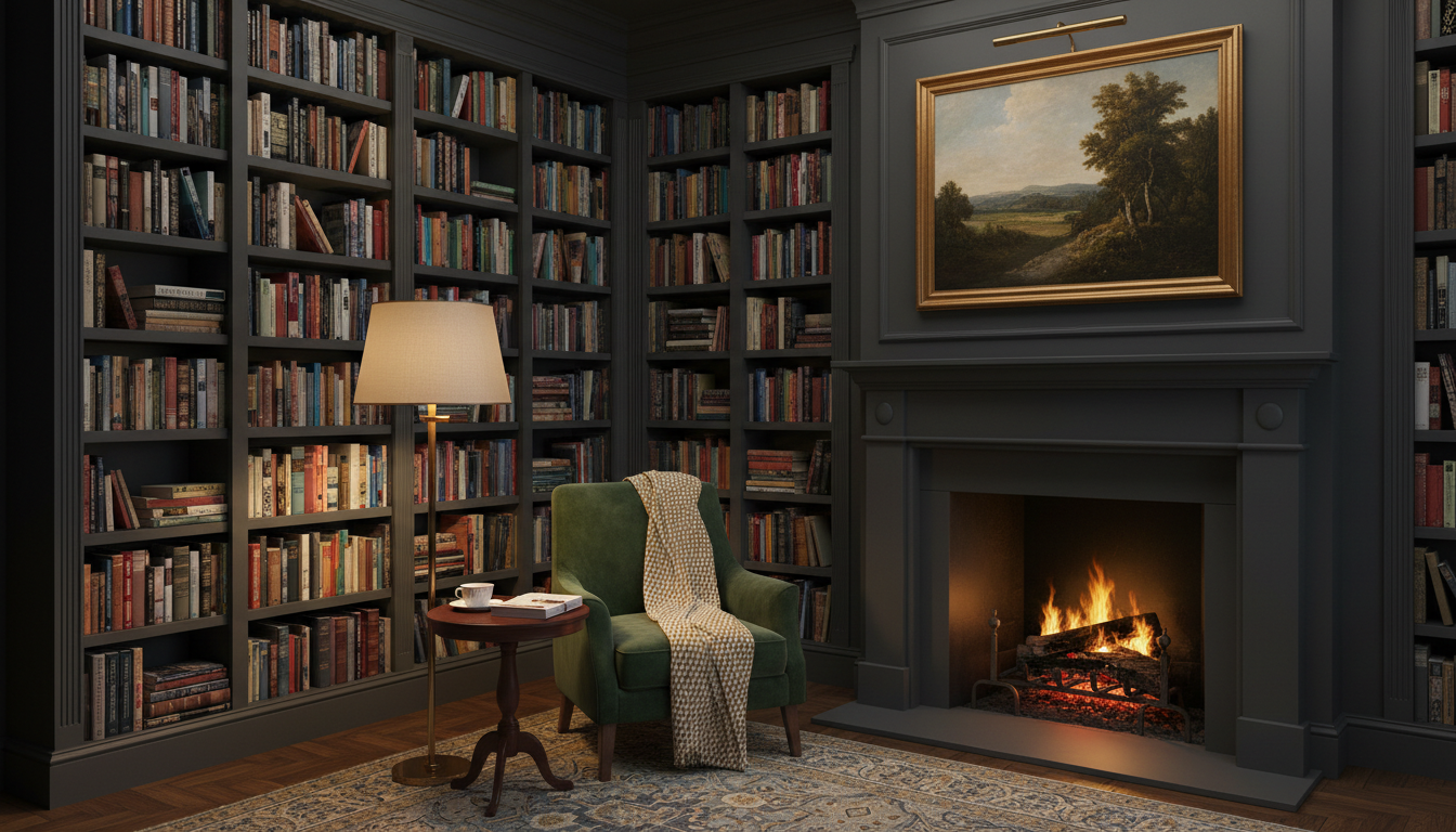
Moody and Dramatic Hues
Bold, dark tones are perfect for creating an intimate, cozy, and sophisticated space. Don’t be afraid to use them in smaller rooms like a powder room, library, or even a bedroom for a cocooning effect.
- Key Colors: Deep blues like Hale Navy, rich emeralds like Regent Green, charcoal grays, and even moody purples like Farrow & Ball's Pelt.
- Designer Tip: To keep moody rooms from feeling too heavy, incorporate pops of vibrant color, metallic accents in brass or gold, and plenty of layered lighting.
Tranquil Blues and Greens
Inspired by the sky and sea, blues create a peaceful, serene ambiance. Nature-inspired greens bring the calming essence of the outdoors inside, which can effectively reduce stress.
- Key Colors for Blue: Powder blue, sky blue, Aegean Teal, and deep navy like Blue Nova.
- Key Colors for Green: Soft sage, dusty olive, forest green, and muted teal.
- How to Use Them: A light blue is perfect for a bedroom to promote sleep. A sage green works wonders in a kitchen or study to encourage focus.
The New Neutrals: Beyond Beige
Neutrals are evolving. While warm beiges and creamy off-whites are making a strong comeback, the concept of a "neutral" is expanding to include soft, complex colors.
- Key Colors: Greige (gray + beige), taupe, mushroom, blush pinks like Farrow & Ball's Setting Plaster, and hazy lilacs.
- Why they Work: These shades offer more depth and personality than a standard white or beige while still providing a versatile backdrop for your furniture and decor.
Creative Wall Painting Techniques and Accent Ideas
Ready to go beyond a simple coat of paint? These creative techniques can add character, dimension, and a unique focal point to any room.
The Modern Accent Wall
An accent wall is a classic for a reason, but the modern approach is about purpose. Choose a wall that already has a focal point, like the one behind your headboard, fireplace, or a beautiful piece of art.
- Go Bold: Use a deep, saturated color to create drama and contrast. A charcoal gray or dark green accent wall can make a living room feel incredibly chic.
- Add Texture: An accent wall doesn't have to be just paint. Consider shiplap, board and batten, or wood panels for a touch of rustic or modern texture.
- Get Geometric: Use painter's tape to create eye-catching geometric patterns. Triangles, hexagons, or a bold herringbone design can turn a plain wall into a work of art.
Two-Tone Walls and Color Blocking
This technique involves painting a wall in two different colors, often with a horizontal divide. It’s a great way to add interest without committing to a bold color on all four walls.
- Half-Painted Walls: Painting the bottom half of a wall a darker color can ground the space and add a traditional feel, similar to wainscoting.
- Color Blocking: Use large, abstract blocks of color to define a specific area, like a desk nook in a larger room or the space behind a console table.
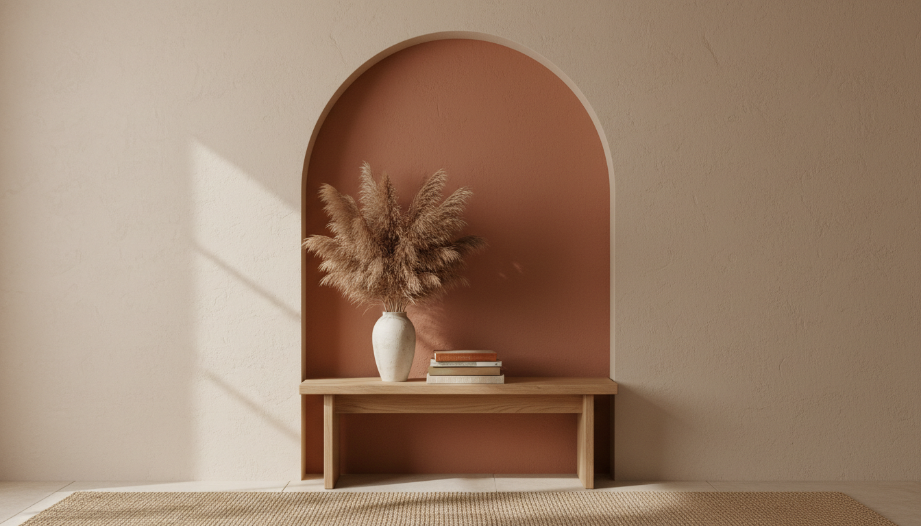
Painted Arches and Murals
A painted arch is a trendy and charming way to frame a piece of furniture, a doorway, or a collection of shelves. It adds architectural interest where there is none.
- How to Create an Arch: Use a pencil, string, and a thumbtack to draw a perfect semi-circle. Carefully paint inside the line with a quality angled brush for a crisp edge.
- DIY Murals: For the more artistically inclined, a wall mural is the ultimate form of personalization. Popular ideas include:
- Mountain Murals: Overlapping peaks in a gradient of colors are perfect for a nursery or playroom.
- Floral and Botanical Murals: Large-scale leaves or flowers can add a whimsical, bohemian touch.
- Abstract Murals: Free-form shapes and lines in a curated color palette create a modern, artistic statement.
Textured Paint Finishes: Limewash & Roman Clay
For a finish with depth and movement, explore artisanal paint techniques that deliver a beautifully imperfect, organic texture.
- Limewash: Made from crushed limestone, limewash paint creates a soft, chalky, suede-like patina with subtle tonal variations. It’s applied with a brush in broad, overlapping strokes to achieve a cloudy, mottled effect that feels both ancient and modern.
- Roman Clay: This is a plaster finish applied with a putty knife or trowel. The result is a smooth-to-the-touch surface that looks like natural stone or aged plaster. It offers a more noticeable texture and depth than limewash. The Texture Replacer by Ideal House can help you visualize these complex finishes before you commit.
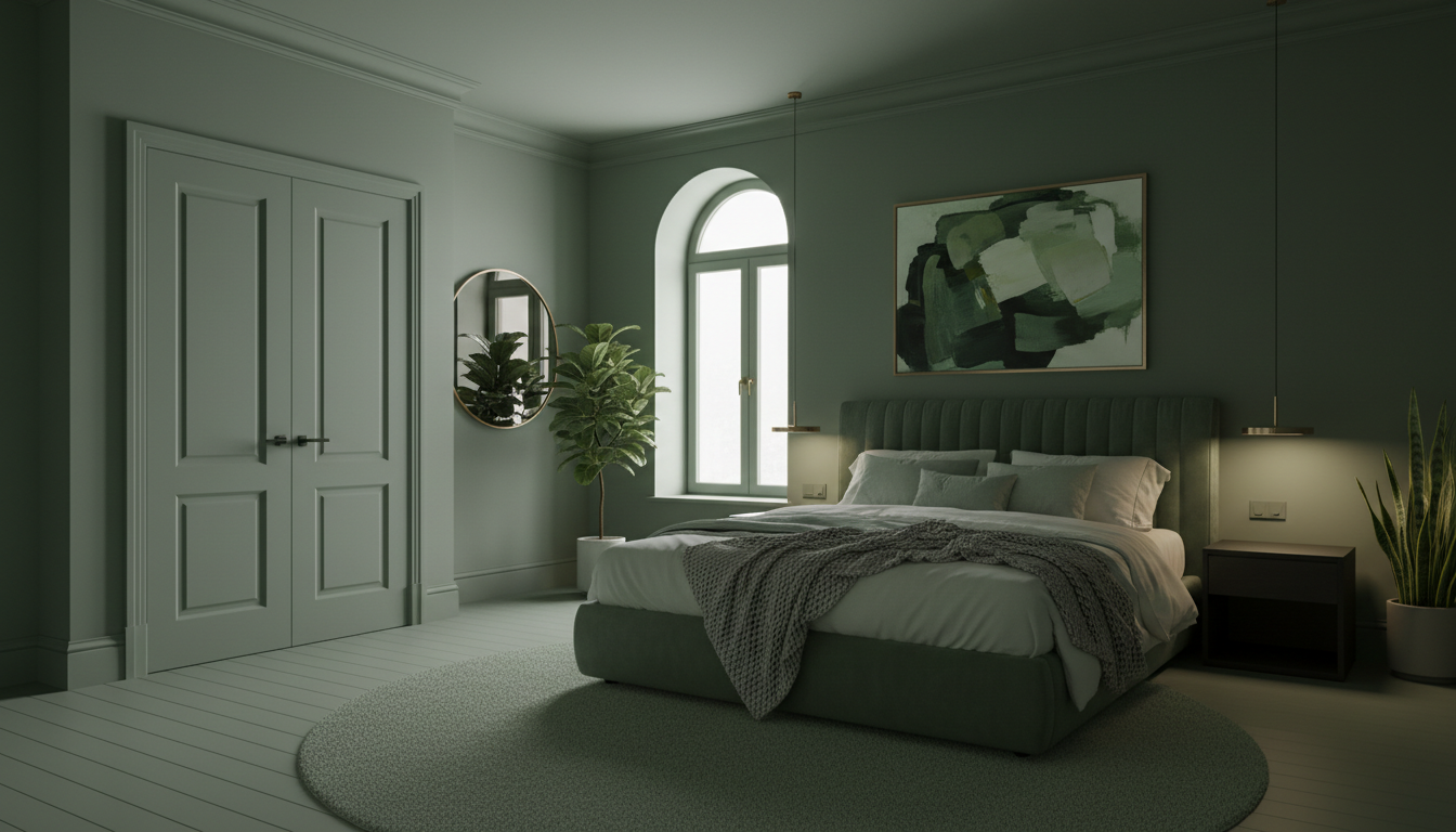
Color Drenching
This immersive technique involves painting the walls, trim, doors, and even the ceiling all in the same color.
- Why it Works: By eliminating visual breaks, color drenching can paradoxically make a small room feel larger and more cohesive. It creates a sophisticated, cocoon-like atmosphere.
- Best for: Powder rooms, bedrooms, dining rooms, or any space where you want to create a strong mood. Using a dark, moody color like Sherwin-Williams' Iron Ore or Farrow & Ball's De Nimes can be stunning.
Don't Forget the Finish: A Guide to Paint Sheen
The sheen of your paint affects its durability, washability, and how it reflects light. Choosing the right one is a crucial final step.
| Sheen Type | Appearance | Best For | Pros & Cons |
|---|---|---|---|
| Flat / Matte | Non-reflective, velvety | Ceilings, low-traffic adult bedrooms | Hides imperfections well but is the least durable and hardest to clean. |
| Eggshell | Low luster, soft glow | Living rooms, hallways, most walls | The most popular choice; offers a good balance of durability and a low-sheen look. |
| Satin | Smooth, pearl-like | High-traffic areas, kitchens, bathrooms | More durable and easier to clean than eggshell; has a noticeable shine. |
| Semi-Gloss | Shiny and reflective | Trim, doors, cabinets, bathrooms | Very durable and easy to wipe down; highlights imperfections. |
| High-Gloss | Very shiny, almost glass-like | Trim, doors, furniture for a statement | The most durable and easiest to clean; its high shine is a bold design choice. |
Pro Tip: To add subtle dimension in a color-drenched room, use the same paint color but vary the sheen. For example, use eggshell on the walls and satin or semi-gloss on the trim and doors.
Your Perfect Room is Just a Click Away
The world of wall paint is vast and exciting. From the psychology of color to trending palettes and creative techniques, you have endless options to express your style. But remember, the most confident design decisions start with visualization. Instead of taping dozens of paint chips to your wall, take a photo and upload it to an AI design tool. Experiment with colors, try out an accent wall, or even preview a full color-drenched look. Your dream room is waiting.