


1/4

Low-VOC Paints: Your Secret Weapon for a Healthy, Beautiful Home! 🎨
Did you know the air in your home can be more polluted than the air outside? One major culprit is volatile organic compounds (VOCs) found in many paints. That’s why I always opt for Low-VOC or Zero-VOC paints!
They significantly improve indoor air quality without compromising on color or finish.
Key benefits:
* **Healthier Air:** Reduced exposure to harmful chemicals.
* **Eco-Friendly:** Lower environmental impact during production and use.
* **Vibrant Colors:** Available in a wide range of beautiful, sustainable hues.
* **Odorless:** Less unpleasant smell during and after painting.
Choosing the right paint is a vital step towards creating a truly sustainable and healthy sanctuary. Save this tip! 💚 #LowVOCPaints #HealthyHome #LowVOCPaints #HealthyHome #SustainablePaints #EcoFriendlyDecor #IndoorAirQuality #GreenLiving #HomeRenovation #ConsciousChoices #PaintColorIdeas #HealthyLiving
10月24日 2025年
复制风格
共0条评论
你可能还喜欢

✨ Low-VOC Paint: Healthy Walls, Beautiful Spaces

Quiet Luxury Living Room: How to Get the Look on a Budget

Monochromatic Magic: Elevate Your Living Space 🤍

Mastering Neo-Classical Color Palettes for Serene Homes 🎨

Eco-Friendly Paint: Color Your Walls Green!

Unlocking Serenity: A Guide to Mindful Color Palettes 🎨

Muted Lavender: Tranquility and Emotional Calm 💜

Creating Calm: Color Palettes for Minimalist Homes 🎨

Framing Peace: Minimalist Art for Serene Walls 🖼️

Creating Calm: The Power of Neutral Palettes in Small Spaces ☁️🤍

Embrace Simplicity: The Power of a Minimalist Color Palette 🌈

✨5 Minimalist Home Decor Hacks for a Cozy Space 🏡
Ross
1

Curated Art for Calm Spaces: Less is More 🖼️

Elevate Your Walls: Minimalist Art for Serene Spaces 🖼️

Living Room Vibes: Biophilic Decor for a Calming Escape 🌿🛋️

✨ Designing for Serenity: The Power of Calm Color Palettes 🕊️

The Power of Palette: Muted Tones for a Serene Home 🎨🌿

Nature's Palette: Calming Colors for Your Home 🌿

🌿 Color Palette Perfection: Earthy Tones for Biophilic Homes

The Art of Restraint: How Negative Space Elevates Your Decor 🧘♀️


✨ Low-VOC Paint: Healthy Walls, Beautiful Spaces
Did you know that conventional paints can off-gas harmful volatile organic compounds (VOCs)? 🏡 Opting for low-VOC or zero-VOC paints is a game-changer for creating a healthier home. These eco-friendly alternatives offer beautiful color palettes without compromising your indoor air quality. I love using them to achieve a clean, modern look that I can feel good about. Transforming your walls is an impactful step towards a more sustainable and healthy living environment. Are you ready for healthier walls? Save this for your next renovation or refresh! 🎨 #LowVOCPaintIdeas #HealthyHomeIdeas #EcoFriendlyPaintIdeas #SustainableRenovationIdeas #HomeColorIdeas #ZeroVOCPaint #NonToxicHome #InteriorPainting #GreenRenovation #HealthyLiving


Eco-Friendly Paint: Color Your Walls Green!
Looking to refresh your walls with beautiful color, but mindful of your health and the planet? 🌎 Opting for eco-friendly paints is the way to go! They're low in VOCs (volatile organic compounds) and made with more sustainable ingredients.
From soothing pastels to vibrant earth tones, there's a natural pigment for every style. 🌱 They offer a healthier indoor environment and reduce harmful emissions.
Choosing conscious paint makes a beautiful statement for your home and the world. ✨
What color palette are you dreaming of? Save this for your next eco-paint project! 🎨
#ecofriendlypaint #lowVOC #sustainablehome #naturalpaint #healthyhomeideas #homedecorideas #greenbuilding #wallcolorinspiration #consciousdecor #paintedwalls


Creating Calm: Color Palettes for Minimalist Homes 🎨
A serene minimalist home thrives on a considered color palette. Embrace neutrals: whites, creams, soft grays, and muted earth tones form the foundation. Add depth with subtle accents of nature-inspired colors like sage green, dusty blue, or warm wood tones. The key is to create a harmonious and calming atmosphere, avoiding overly stimulating hues. What's your go-to neutral shade? 🤍 #MinimalistColorPalette #NeutralInteriors #CalmColor #InteriorDesignIdeas #HomeDecorInspo #JapandiColors #SereneSpaces #ColorTheory #PeacefulHome #DesignInspiration


✨5 Minimalist Home Decor Hacks for a Cozy Space 🏡
Transform your living space into a haven of style and comfort with these easy - to - follow minimalist home decor hacks! 🌟
Less is More 📦
Clear out the clutter! Get rid of items you no longer use or love. A clean slate is the foundation of minimalist decor. Whether it's old magazines or random knick - knacks, a clutter - free space instantly looks more inviting.
Neutral Color Palette 🎨
Stick to whites, grays, beiges, and soft pastels. These colors create a calm and cohesive look. You can add pops of color with small accessories like cushions or vases, but keep the main surfaces neutral for a sleek appearance.
Multi - functional Furniture 🪑
Invest in pieces that serve more than one purpose. A storage ottoman can be used as a footrest, extra seating, and also holds your blankets or books. A fold - out dining table is perfect for small spaces, expanding only when you have guests.
Natural Elements 🌿
Incorporate natural materials like wood, stone, and plants. A wooden coffee table, a marble vase, or a few potted succulents can bring life and warmth to your minimalist space.
Statement Lighting 💡
Choose one or two statement light fixtures. A modern chandelier in the dining area or a unique floor lamp in the living room can add a touch of elegance and become a focal point in the room.
Start implementing these hacks today and watch your home transform into a minimalist paradise! 🏠
#MinimalistHome #HomeDecorHacks #InteriorDesign
1


The Power of Palette: Muted Tones for a Serene Home 🎨🌿
Color psychology plays a huge role in creating a serene home. My personal favorites are muted earth tones and soft pastels. Think warm beiges, gentle greys, muted olives, and soft terracotta. These palettes create a calming foundation that allows textures – like those found in my beloved textiles – to truly shine. They work beautifully with natural light, enhancing that luminous interior feel without feeling sterile. What's your go-to serene color palette? ✨🤍 #LoomAndLightIdeas #MutedTonesIdeas #SereneColorIdeas #PaletteInspirationIdeas #TextileColorIdeas #HomeDecor #InteriorDesign #ColorPsychology #EarthyTones #CalmInteriors


Curated Art for Calm Spaces: Less is More 🖼️
Art can enhance tranquility, but in minimalist design, curation is key. Opt for pieces that evoke peace and simplicity – think abstract nature-inspired works, subtle monochrome prints, or delicate ink drawings. Avoid overly busy or vibrant pieces that might disrupt the calm. A single, impactful artwork can be more powerful than many. What kind of art brings you peace? ✨ #MinimalistArt #ArtForCalmSpaces #HomeDecorIdeas #InteriorDesign #JapandiArt #CuratedArt #SereneHome #AbstractArt #WallArtInspo #DesignDetails


Framing Peace: Minimalist Art for Serene Walls 🖼️
Elevate your walls with minimalist art that fosters a sense of calm and introspection. Less is truly more when it comes to evoking tranquility. 🧘♀️
Choose art with simple forms, muted color palettes, or abstract designs. Think line art, nature-inspired watercolors, or subtle ink wash paintings. The key is to select pieces that evoke a feeling, rather than demand attention.
Framing matters: opt for simple, natural wood or matte black frames that complement the artwork and your interior without being distracting. A single, well-chosen piece can make a powerful statement.
Save for your tranquil wall decor inspo! #MinimalistArtIdeas #ZenZoneDesign #MinimalistArtIdeas #WallArtInspo #SereneDecor #AbstractArt #CalmInteriors #HomeArt #InteriorStyling #MindfulDecor #JapandiArt

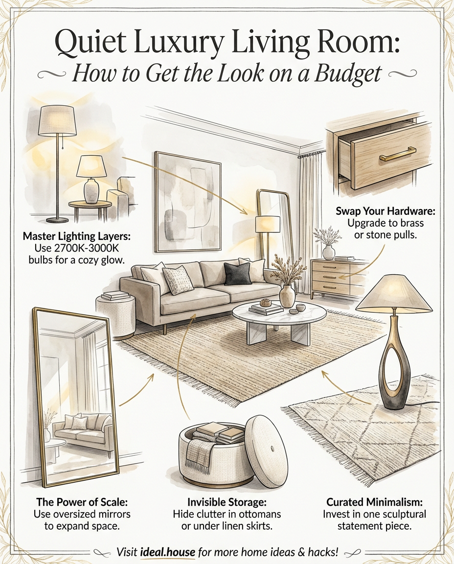
Quiet Luxury Living Room: How to Get the Look on a Budget
Everyone is talking about the Quiet Luxury living room, but you don’t need an Old Money inheritance to achieve this look. It is all about creating an elevated, timeless space through intentional choices rather than expensive price tags.
To get the look on a budget, start with a tonal neutral palette. Think creamy whites, soft beiges, and warm greys. The secret to making neutrals feel "expensive" is investing in texture—mixing bouclé, linen, and velvet adds depth and warmth without the need for clutter.
Expert Home Decor Tips for a High-End Feel:
1. Master Lighting Layers:
Never rely on the "big light." Use a mix of ambient, task, and accent lighting. Choose warm Kelvin bulbs (2700K-3000K) to create a cozy, boutique hotel atmosphere.
2. Swap Your Hardware:
Replace basic plastic or silver drawer pulls with brass or stone. This is a quick "expensive-looking" thrift flip that changes the whole vibe of your furniture.
3. The Power of Scale:
Use oversized mirrors to double the natural light and make small spaces feel grand.
4. Curated Minimalism:
Focus on minimalist styling with high-end impact. A single sculptural floor lamp or a large statement rug often looks better than five small pieces of "fast furniture."
5. Invisible Storage:
Use the invisible storage method by choosing ottomans that double as chests or under-bed bins with linen skirts to keep visual clutter at zero.
Whether you are performing an IKEA hack or upcycling second-hand finds, focus on quality materials like wood, stone, and jute to bring that biophilic, organic feel into your modern interior.
#QuietLuxury #OldMoneyAesthetic #LivingRoomDecor #BudgetInterior #HomeDecorTips #NeutralHome #InteriorDesignTrends #LightingDesign #TexturedHome #MinimalistStyle #IdealHouse #HomeInspiration #InteriorStyling #RoomMakeover #DIYHome #ModernInterior #HomeStyle #DecorInspo #DreamHome #AestheticHome


Nature's Palette: Calming Colors for Your Home 🌿
Bring the tranquility of nature indoors with the right color choices! ☯️ Think of the calming hues found in Zen gardens: soft greens, earthy browns, muted greys, and serene beiges. 🌿 These colors evoke a sense of peace and grounding. Avoid overly bright or saturated tones. Instead, layer various shades of these natural colors to create depth and warmth. This mindful approach to color palettes will transform your home into a restful sanctuary. Save this for your natural color inspo! #colorideas #naturalliving #calmcolors #zenhome #homedecor #interiordesign #earthytoneideas #japandicolor #serenemind #designpalette


Unlocking Serenity: A Guide to Mindful Color Palettes 🎨
Ever feel overwhelmed by too much visual 'noise' at home? The secret to a truly tranquil space lies in intentional color. ✨ I'm obsessed with how specific hues can shift our mood and perception. Think soft, muted tones for relaxation and grounding earth colors for connection. 🌿 Let's explore creating calming environments that invite peace. Start by choosing one or two dominant colors that resonate with you, then layer in neutrals to allow them to truly sing. Save this for your next design refresh! 💖 #ColorPaletteIdeas #HomeDecorIdeas #InteriorDesignInspo #MindfulLiving #CalmSpaces #ColorTherapy #InteriorStyling #DesignTips #HomeInspiration #DecorInspo


Elevate Your Walls: Minimalist Art for Serene Spaces 🖼️
Artwork can transform a room, and in minimalist interiors, less is truly more. Choose art that complements your calm aesthetic – think abstract pieces with simple forms, line drawings, or serene landscapes. 🌿 Opt for natural frames like wood or muted metal. Position art thoughtfully, allowing it space to breathe. This adds a touch of personality and sophistication without overwhelming the senses. ✨
What kind of art speaks to you? #MinimalistArtIdeas #WallArtInspo #SereneSpaces #HomeDecorIdeas #InteriorDesign #ArtForCalm #DecorInspo #GalleryWall #ArtAndDesign #PeacefulInteriors


Creating Calm: The Power of Neutral Palettes in Small Spaces ☁️🤍
Feeling overwhelmed by city life? Your home's color palette can be a powerful tool for creating a tranquil sanctuary. 🕊️
Embrace neutral tones for maximum impact:
* **Whites & Off-Whites:** Reflect light and create an airy, open feel.
* **Soft Greys:** Add sophistication and depth without being heavy.
* **Earthy Beiges & Creams:** Introduce warmth and a connection to nature.
* **Monochromatic Schemes:** Use varying shades of one neutral for a cohesive look.
* **Layering Textures:** Introduce warmth and visual interest through different materials like wood, linen, and wool.
Neutral palettes create a sense of peace and allow your decor to shine. Save this for your serene home inspo! #neutraldecor #smallspaceliving #calmspace #interiordesign #homedecor #neutralpaletteideas #minimalistdecor #designinspiration #urbanretreat #peacefulhome


Monochromatic Magic: Elevate Your Living Space 🤍
Let's talk about the power of a single hue. Monochromatic design isn't just about white walls; it's about creating a sophisticated and serene atmosphere by layering varying shades and textures within one color family. ✨ Think subtle shifts in tone from creamy whites to soft ivories, or deep charcoals to lighter greys. This approach fosters a sense of calm and cohesion, making your space feel intentionally designed and endlessly elegant. It’s perfect for those seeking a refined, uncluttered aesthetic. How do you incorporate monochromatic schemes into your home? Let me know below! 👇 #MonochromaticDesign #NeutralPalette #ColorTheory #SophisticatedInteriors #MinimalistLiving #HomeDecorIdeas #InteriorDesignInspo #WhiteAndGreyDecor #ElegantHomes #DesignInspiration


🌿 Color Palette Perfection: Earthy Tones for Biophilic Homes
Color is a powerful tool in creating biophilic serenity! 🎨 My palette focuses on nature's own hues to evoke calm and connection. These earthy tones are grounding and restorative. 💚
My go-to biophilic colors:
- **Greens**: From soft sage and moss to deep forest green. 🌿
- **Browns & Beiges**: Warm wood tones, earthy clays, sandy neutrals. 🤎
- **Blues**: Muted sky blues or deep ocean blues. 🌊
- **Whites & Creams**: Off-whites and creamy beiges for a soft, natural feel. ☁️
- **Terracotta & Rust**: Warm, earthy accents that add depth.
Create a sanctuary that breathes. Save this for your color inspiration! ✨ #biophilicdesign #earthytone #colorpalette #organicinteriors #naturalcolors #biophiliccolorideas #homedecor #interiordesign #calmcolors #decorstyle


Living Room Vibes: Biophilic Decor for a Calming Escape 🌿🛋️
Want to inject a sense of calm and nature into your living room? Biophilic design is the perfect way to create a serene escape from the everyday hustle.
Key elements to include:
* **Greenery Galore:** Introduce an assortment of houseplants – tall, trailing, and small potted ones.
* **Natural Light:** Maximize it! Keep windows clear and use mirrors to bounce light.
* **Earthy Tones:** Draw inspiration from nature with greens, browns, and soft blues.
* **Organic Textures:** Wood, rattan, jute, stone, and natural fabrics.
* **Nature-Inspired Motifs:** Artwork or decor that reflects natural patterns.
Ready to create your indoor oasis?
Save for your living room inspo! 🍃 #biophilicdesign #livingroomdecor #homedecor #interiordesign #plantlover #naturaldecor #decorideas #calmspace #indoorjungle #homeoasis


Muted Lavender: Tranquility and Emotional Calm 💜
There's a profound sense of peace and emotional depth that muted lavender brings to a space. 🧘♀️ This soft, sophisticated hue is perfect for creating environments that promote relaxation and mindfulness. It’s about quiet serenity.
Muted lavender is fantastic for creating a serene backdrop. Consider it on walls for a calming bedroom or study, or as accent pieces like cushions, rugs, or artwork. It pairs beautifully with soft grays, creamy whites, and touches of natural wood, creating an atmosphere of gentle calm and understated elegance. It’s truly perfect for a peaceful retreat.
How do you use soft colours to create calm? Save this for your tranquil design dreams! ✨ #LavenderIdeas #TranquilSpaces #HomeDecorIdeas #InteriorDesign #CalmingColours #SoftPalette #ColourInspiration #BedroomInspo #MindfulLiving #DecorTips


Mastering Neo-Classical Color Palettes for Serene Homes 🎨
Create an atmosphere of enduring elegance by mastering neo-classical color palettes. Reimagining classical proportions for modern living means using color to evoke tranquility and sophistication.
Key palettes to embrace:
1. **Soft Neutrals:** Think serene creams, gentle ivories, and muted greys as a sophisticated base.
2. **Muted Pastels:** Incorporate delicate shades like blush pink, pale blue, or soft sage for a touch of subtle color.
3. **Rich Jewel Tones:** Deep blues, emerald greens, or regal purples can be used sparingly for dramatic accents, adding depth and luxury.
4. **Metallic Accents:** Introduce subtle glints of brass or gold to highlight architectural details and add warmth.
Save this for your next elegant color scheme! 🏛️ #NeoClassicalColorPaletteIdeas #ColorPaletteIdeas #InteriorDesignIdeas #ElegantHomeIdeas #TimelessDecorIdeas #SophisticatedSpacesIdeas #SereneInteriors #HomeStyling #RefinedLiving #ChicColorSchemes


Embrace Simplicity: The Power of a Minimalist Color Palette 🌈
A minimalist color palette is the foundation of a serene home. We focus on neutrals derived from nature – soft whites, warm greys, earthy beiges, and muted wood tones. These colors create a sense of calm and spaciousness, allowing textures and forms to shine. Accents are kept subtle: think desaturated greens, blues, or terracottas. The aim is to create a cohesive and tranquil visual experience that promotes relaxation and mindful living. 🤍 What's your go-to neutral shade? #minimalistpalette #neutraldecor #homedecorideas #colorinspiration #serenespaces #interiordesign #minimalistdesign #calmcolors #decorideas #naturalliving


The Art of Restraint: How Negative Space Elevates Your Decor 🧘♀️
In a world full of 'more,' let's embrace the power of 'less' in design. Negative space isn't empty; it's deliberate and crucial for creating visually arresting, calm environments. 🗿 It’s where the drama of your carefully chosen pieces truly unfolds.
Think of it as intentional breathing room for your decor. Allowing space around objects prevents a cluttered feel and makes each element more impactful. This principle is key to creating a serene atmosphere, where your furniture and art can truly shine without competing for attention. ✨
Save this for your mindful decorating journey! #interiordesign #negativespace #minimalistdesign #calmspace #sculpturalspaces #decoratingtips #homedecorideas #intentionaldesign #serenehome #artfuldecor


✨ Designing for Serenity: The Power of Calm Color Palettes 🕊️
Creating a tranquil home environment often starts with color. I lean towards calm, muted palettes that soothe the senses and promote a sense of peace. Think soft beiges, gentle greys, muted blues, and earthy tones. 🍃 These colors work beautifully in any style, from Japandi to minimalist, providing a serene backdrop for your life and cherished decorative objects. They allow other elements to shine without overwhelming the space. What's your go-to calming color? #CalmColorsIdeas #ColorPaletteIdeas #SereneHomeIdeas #MinimalistColorIdeas #InteriorDesignIdeas #PeacefulInteriors #MutedTones #EarthyPalettes #SoothingColors #HomeInspiration
