 获取 Ideal House 应用


Loading...

a screenshot of the content section of the dashboard
A screenshot of a dashboard with a purple and white color scheme, featuring various graphs and charts that provide detailed information about the content of a website. The dashboard is designed with a modern and minimalistic design, featuring a clean and professional look with clean lines and a minimalistic layout.
At the top of the dashboard, there is a search bar and a menu bar with various options such as "oawletoud" and "graciesi ilas" which suggests that the user is looking for information about their website. Below the search bar, there are two panels, one showing a bar graph and the other showing a pie chart. The bar graph shows the percentage of people who have been diagnosed with cancer, while the pie chart shows that the majority of the people have received a significant amount of information, with the majority having a significant percentage of them receiving the same information as the rest of the charts. The pie chart also shows the percentages of those who have received the same amount, with percentages ranging from 0% to 100%.
On the right side of the image, on the left side, the dashboard is divided into two sections, each showing a different type of data. The first panel shows a bar chart with different colors, including purple, pink, and white, which is likely used to show the data in detail. The second panel shows the same pie chart as the first panel, but with different percentages, it also shows a percentage that has been received by the same type of information. The third panel has a circular pie chart with percentages that have been described as "poverty," which is also used to describe the severity of the situation.
11 小时前
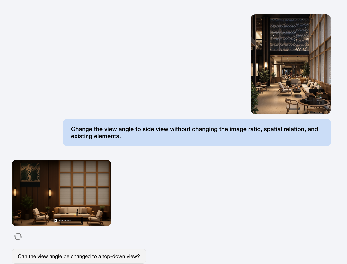
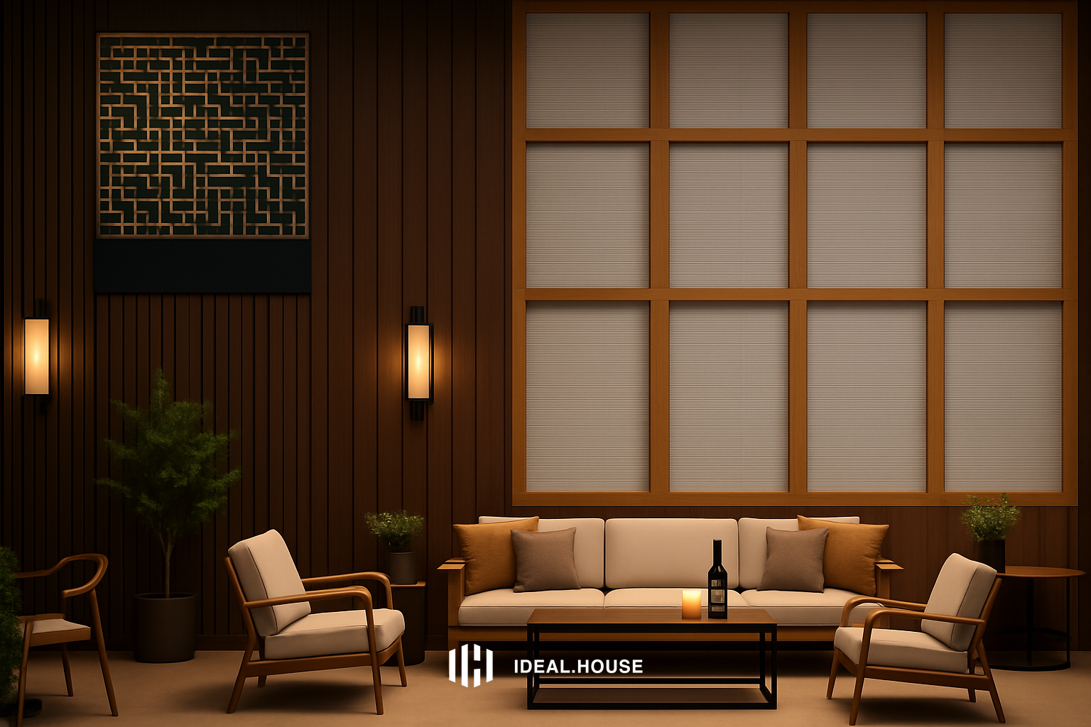
一键同款

Anyone can help me with this?

peluquería