 获取 Ideal House 应用


Loading...

a dashboard with purple and orange graphs and graphs
A screenshot of a dashboard with various graphs and charts displayed on it. The dashboard is designed in a modern, minimalist style with a purple theme and white background. The main focus of the image is on the dashboard, which is divided into three sections.
The first section on the left shows a bar graph with different colors representing different data points. The first section shows the percentage of people who have visited Gardboeln Pils, the second section shows a pie chart showing the number of people visited, and the third section displays the percentage that has been visited. The bar graph shows that the majority of the people have visited the site, with the majority having visited the website.
On the top left corner of the screen, there is a menu bar with various options such as "calcie", "ba", "toes", "revelle", "dashboard", and "dashboards". Below the menu bar, there are several tabs that can be used to view and manage the dashboard. The top right corner has a "Cancel" button, which allows the user to close the dashboard and view the data.
17 小时前
一键同款

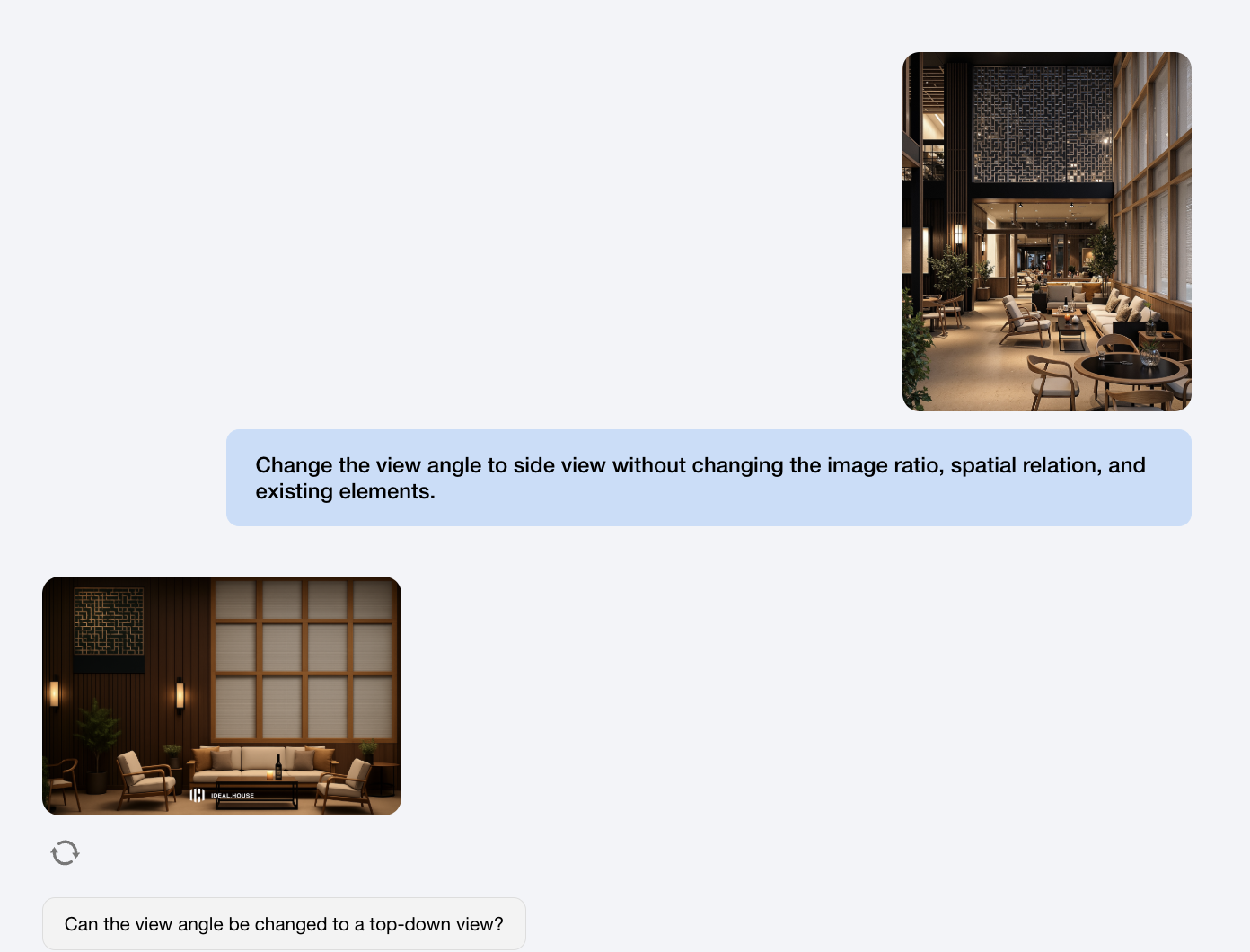
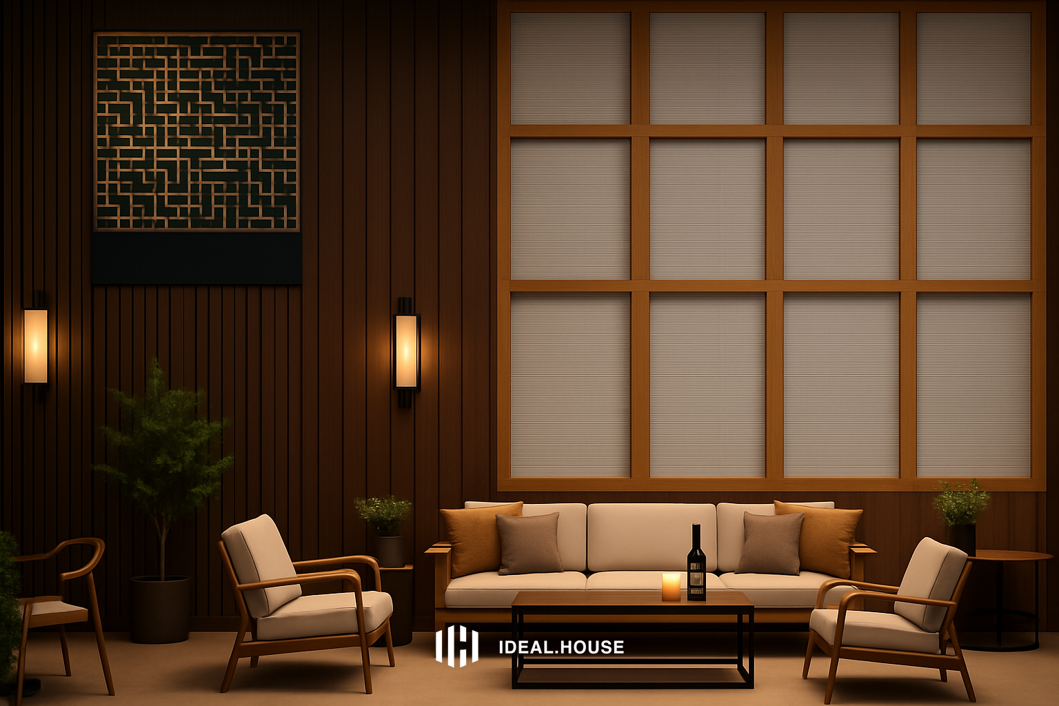
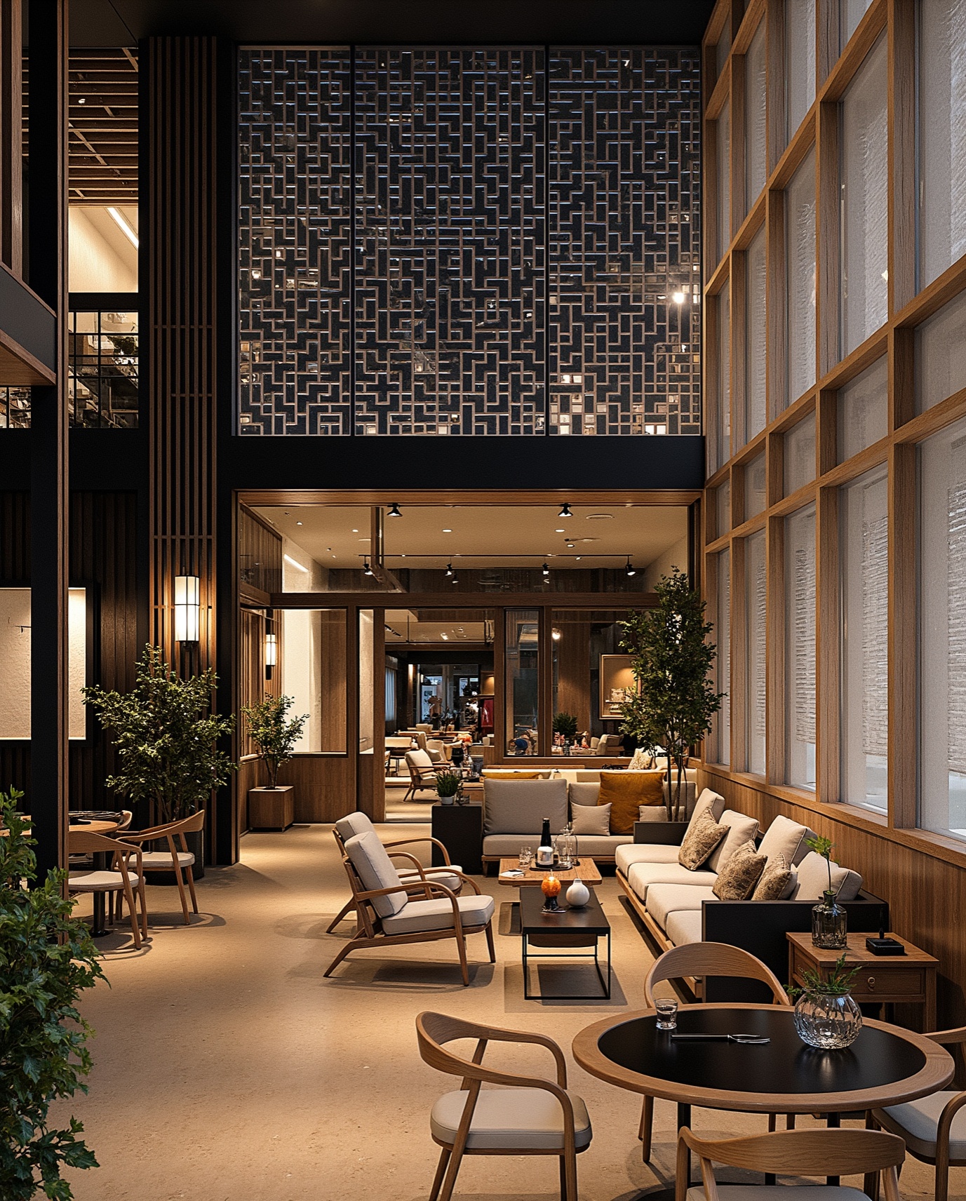
Anyone can help me with this?

peluquería