




1/3
Joanna Gaines shares my biggest design pet peeve – here's why your seemingly unimportant grout choices could be ruining your interiors
The article discusses the critical, yet often overlooked, role of grout in interior design, emphasizing that the choice of grout color significantly impacts the overall aesthetic of tiled spaces. Drawing on personal renovation experiences and insights from designer and TV personality Joanna Gaines, the author highlights how grout acts like the outline of a drawing, capable of either enhancing the geometry and lines of tiles or creating a more unified, tonal effect. Ignoring this detail can undermine the effort put into selecting tiles.
Joanna Gaines, in her "Mini Reni series" sunroom and bathroom makeover, underscores the importance of dedicating time to small details like grout color to ensure design cohesion. She insists that designers and homeowners should personally evaluate grout samples alongside the chosen tiles to achieve the desired outcome. The article recounts Gaines's process of selecting grout for a green and white checkerboard tiled floor, where she rejects a stark white option in favor of a creamy beige that seamlessly integrates with the handmade zellige tiles. This decision prevents the grout from creating an unwelcome contrast, allowing the tiles' character to shine through.
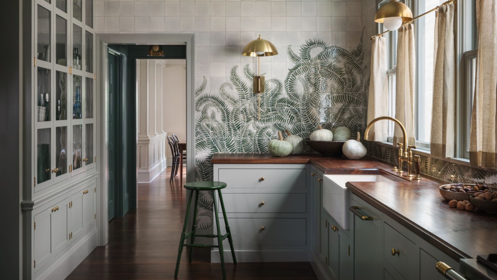
The author further elaborates on the concept of intentional grout selection, using examples from her own home and other design projects. For instance, with rustic terracotta kitchen floor tiles, she opted for a grout shade that blends with the warm, earthy tones, avoiding bold lines that would over-define each tile. Similarly, in a retro river house kitchen designed by Jessica Helgerson, a teal fireplace tile is paired with a nearly identical grout color, resulting in a color-drenched, unifying effect rather than a contrasting one.
The piece also explores using unexpected grout colors to make a statement. Popular choices include dark gray or black grout with white subway tiles, a technique that can be adapted for traditional or rustic settings, as demonstrated by designer Shannon Eddings' checkerboard shower. Vibrant color pairings, such as white and ochre or pink, are suggested as ways to elevate budget tiles or refresh existing ones. This approach turns a practical element into a design feature.
Ultimately, the article concludes that despite being an unglamorous aspect of renovation, grout selection is a make-or-break finishing touch. Both the author and Joanna Gaines advocate for treating grout with the same meticulous care given to choosing paint colors, materials, or layouts. Homeowners are encouraged to obtain color charts and test different shades in natural light to understand how they interact with the tiles and the overall room scheme. This extra effort ensures that the perfectly chosen tiles are not overshadowed or compromised by an unsuitable grout, thereby enhancing the final aesthetic of the space.
#InteriorDesign #JoannaGaines #GroutSelection #TileDesign #HomeRenovation #DesignTips #KitchenDesign #BathroomDesign #InteriorDesign #JoannaGaines #GroutSelection #TileDesign #HomeRenovation #DesignTips #KitchenDesign #BathroomDesign
 暂无评论
暂无评论