1/6
Designer Kelly Wearstler Talks Her New California-Inspired Paint Collection
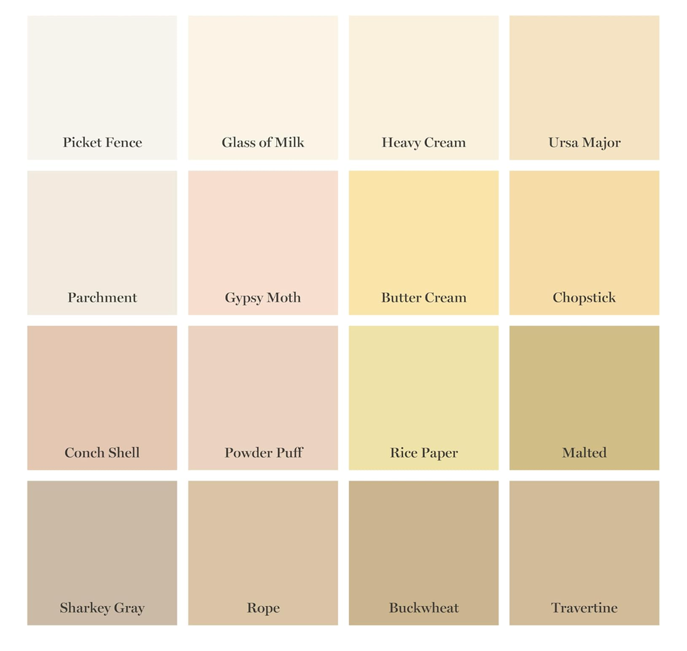
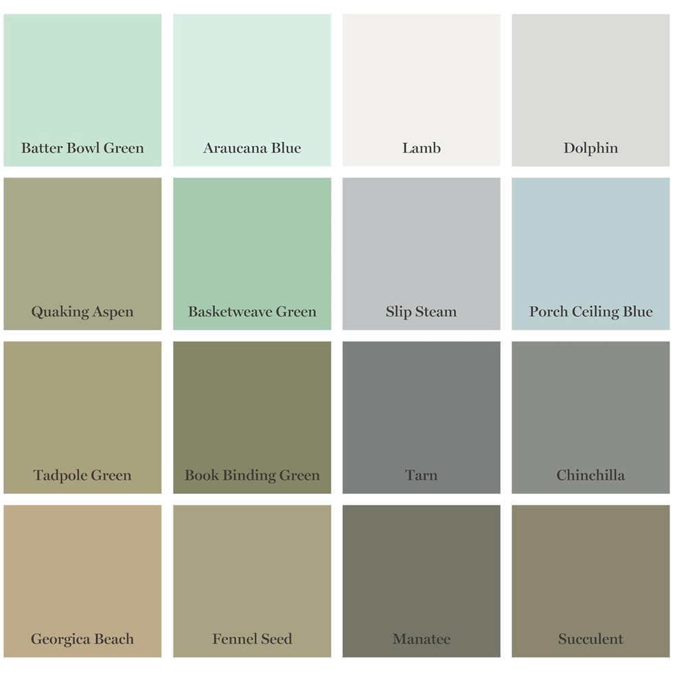
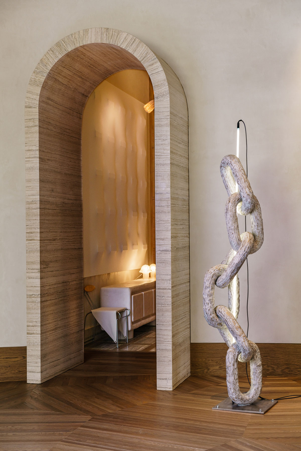
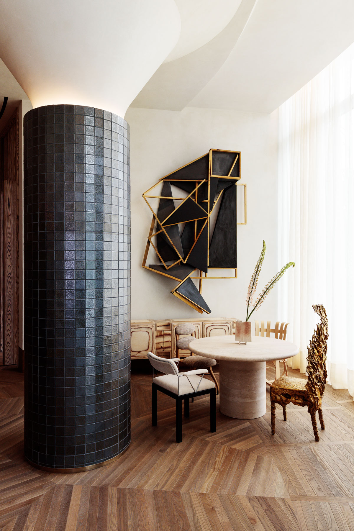
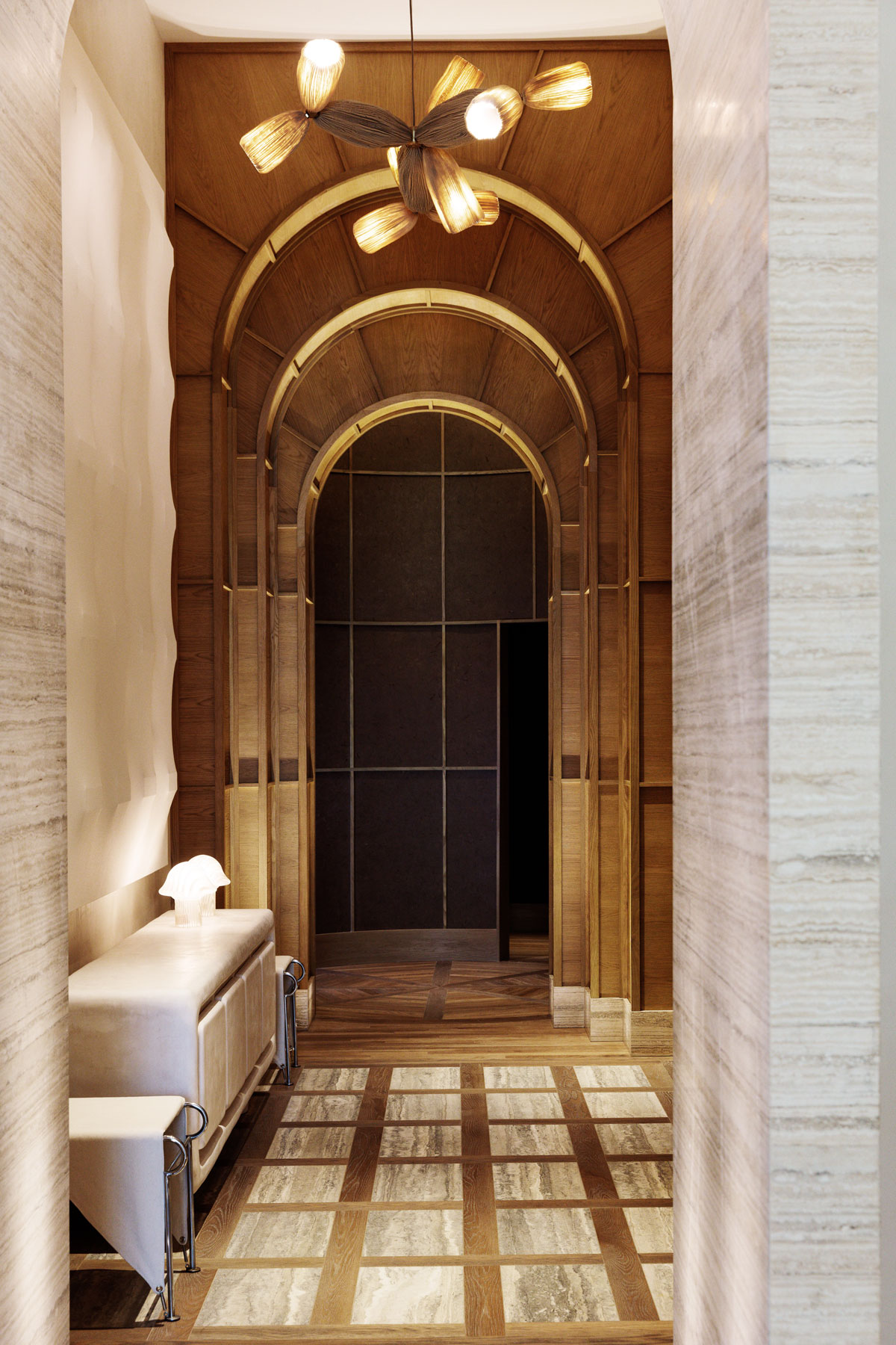
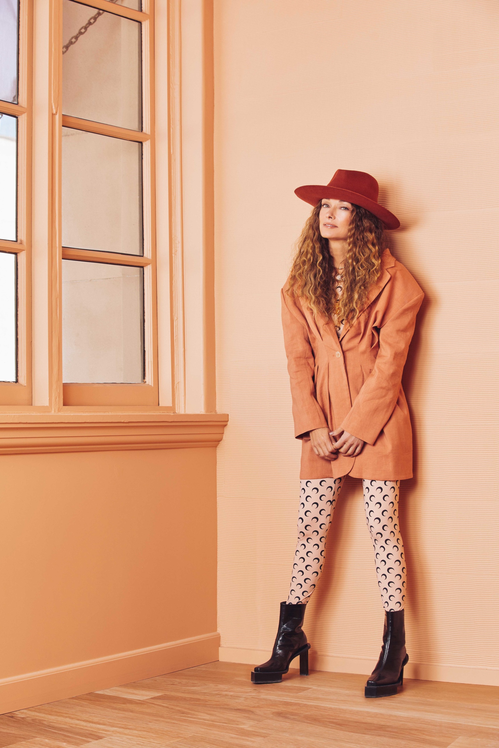
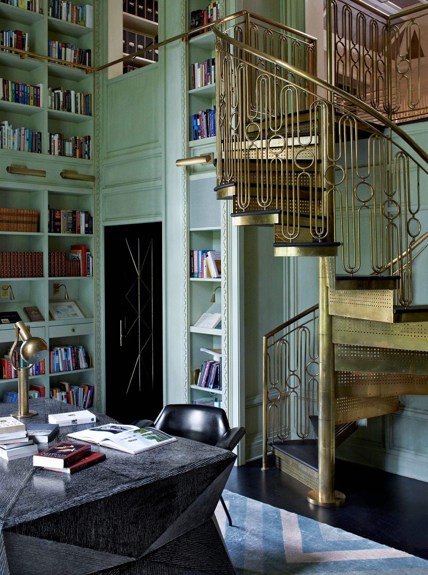
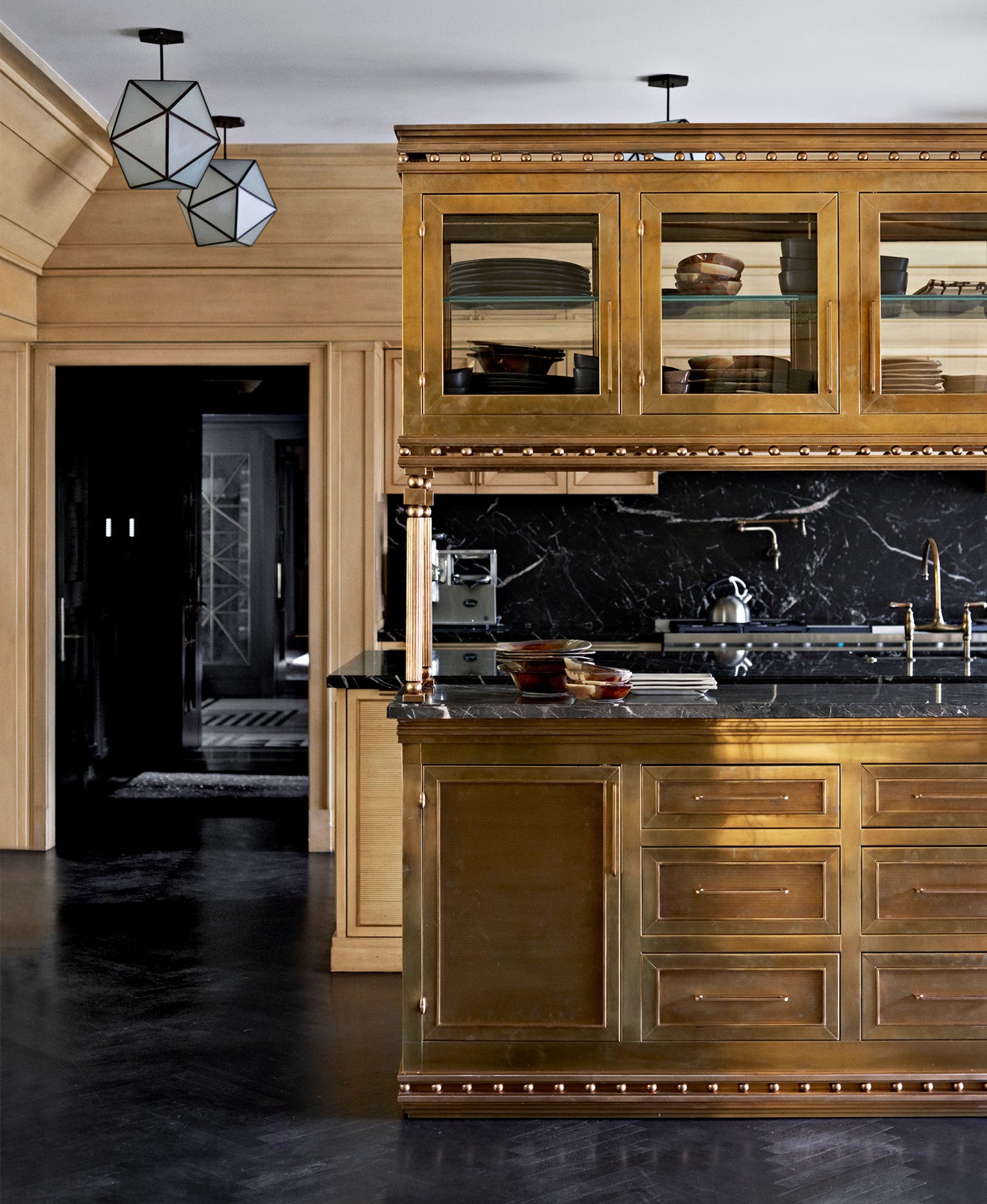
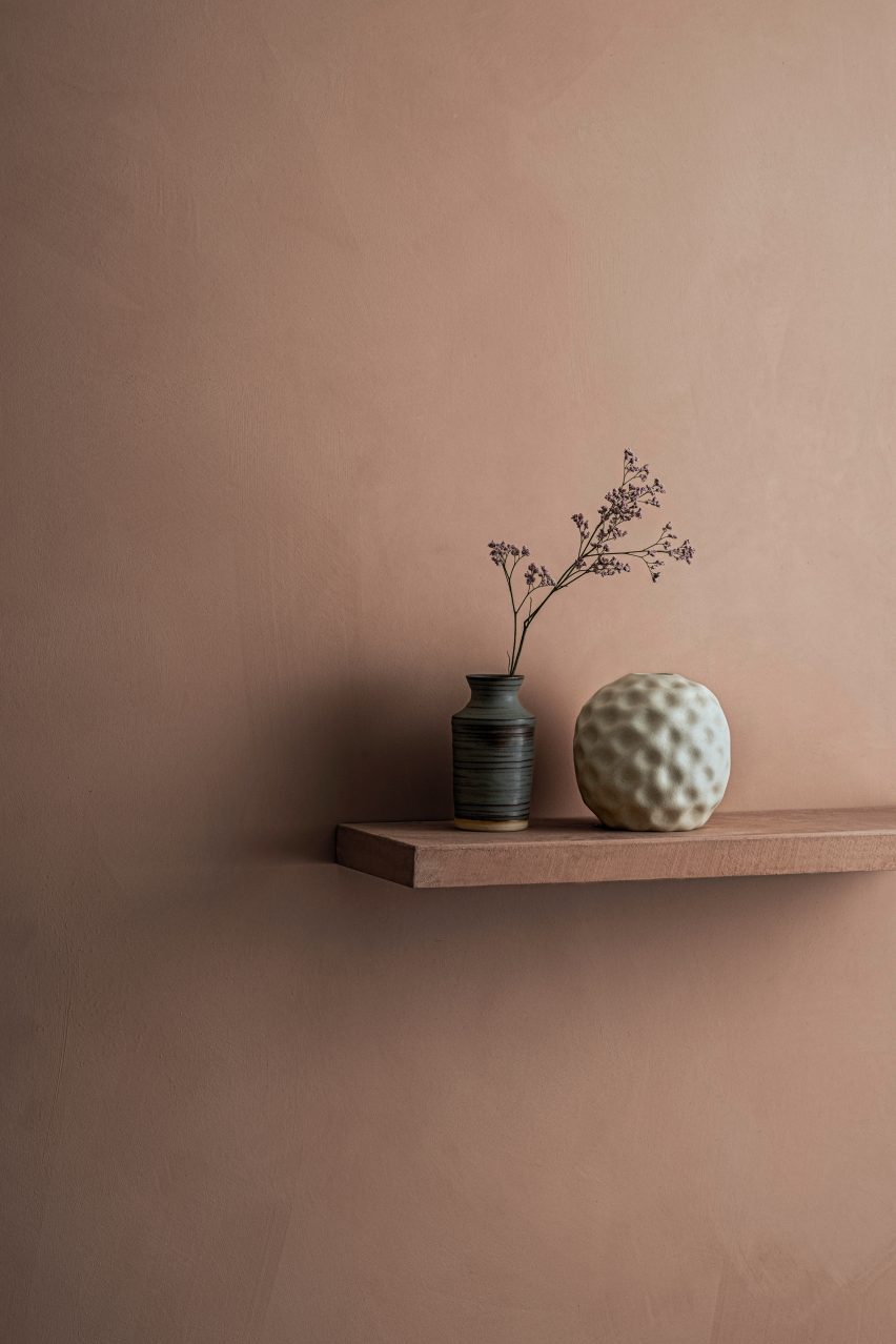
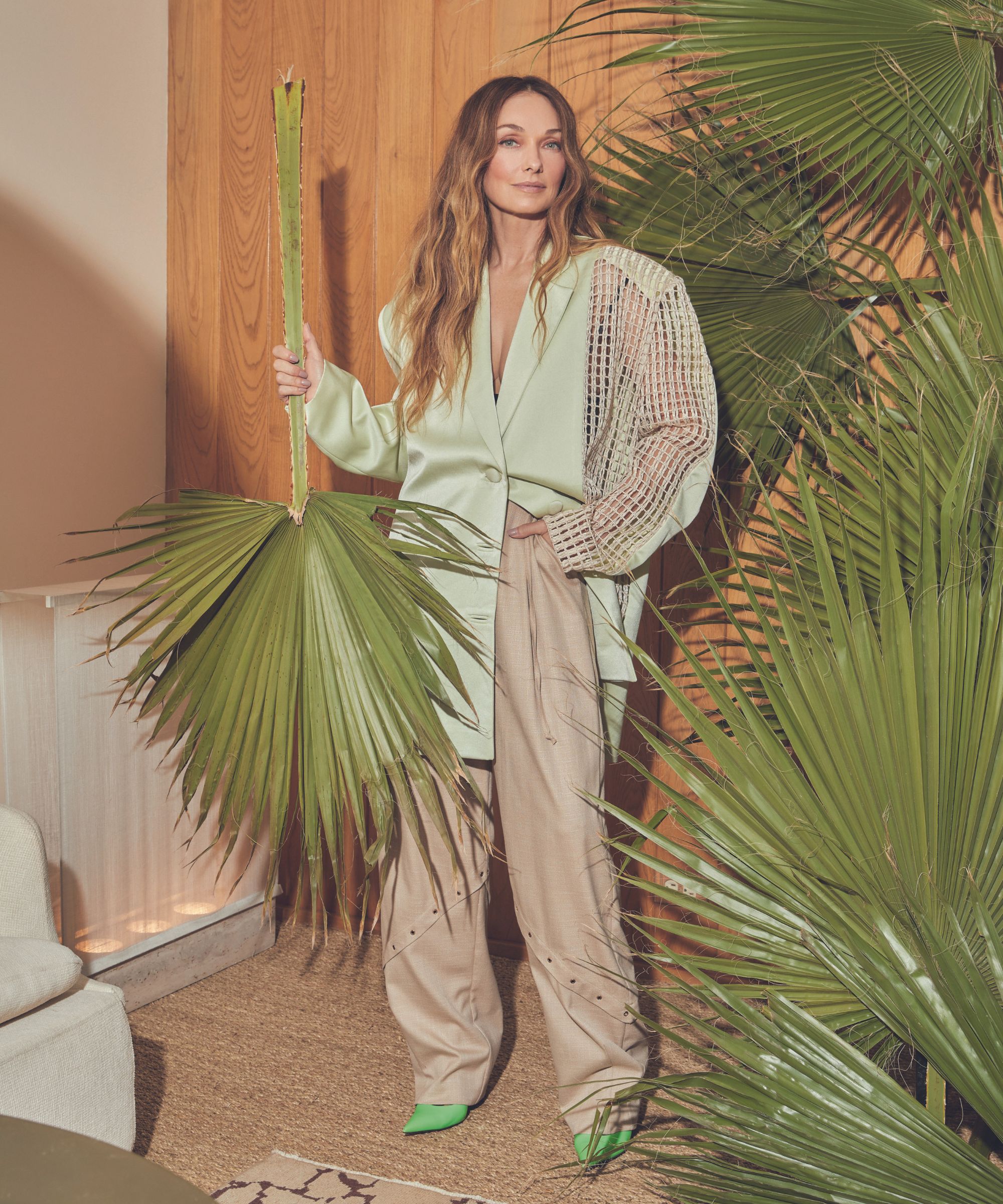
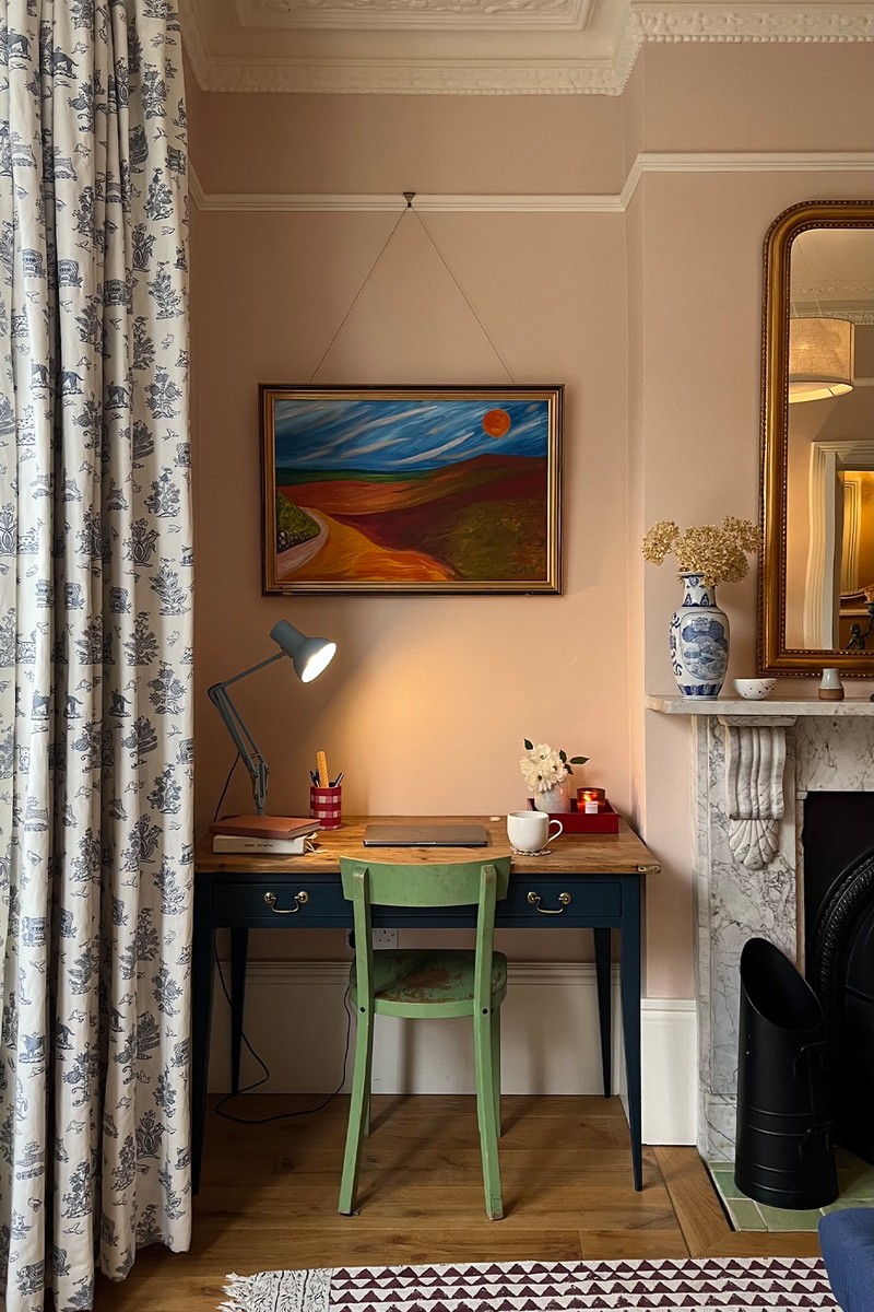
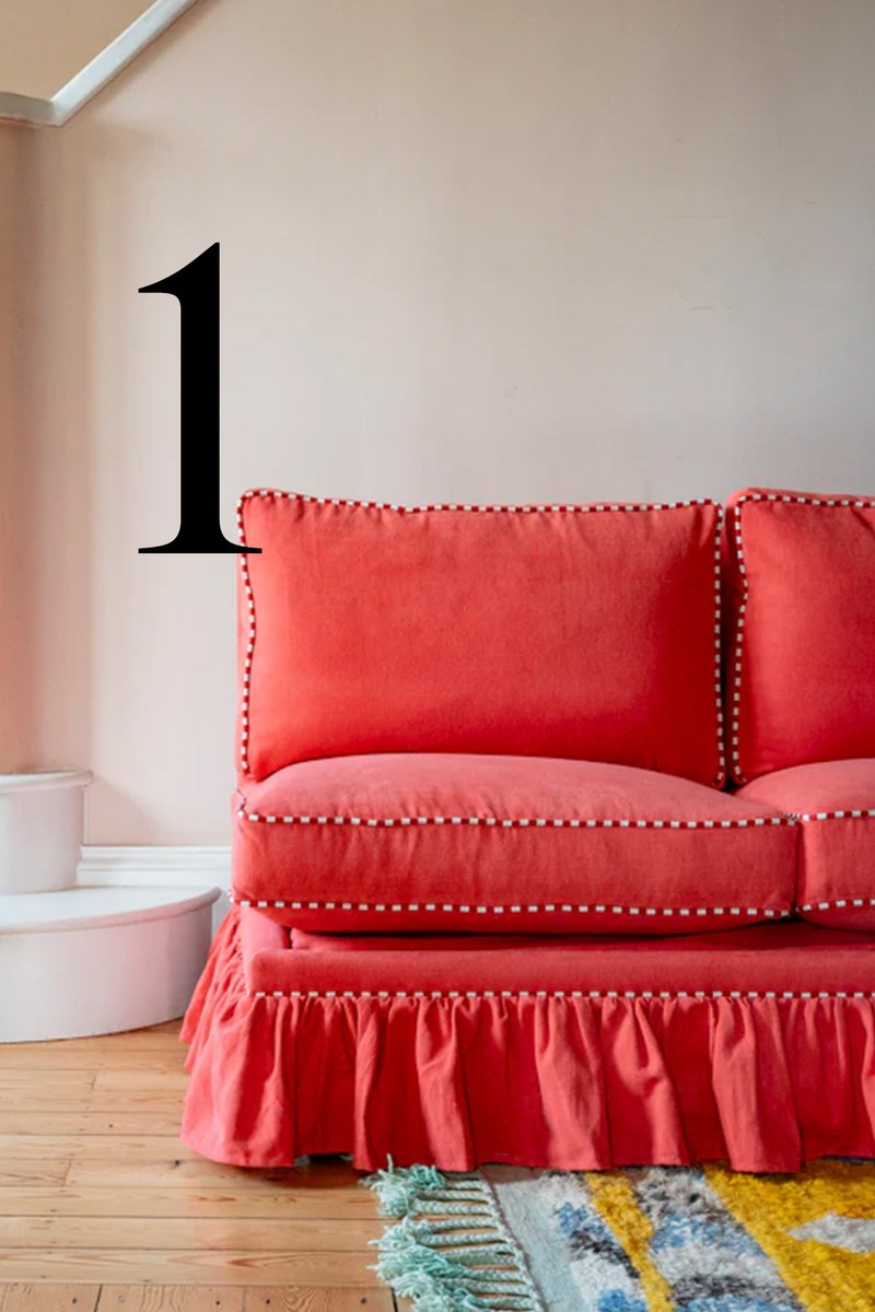
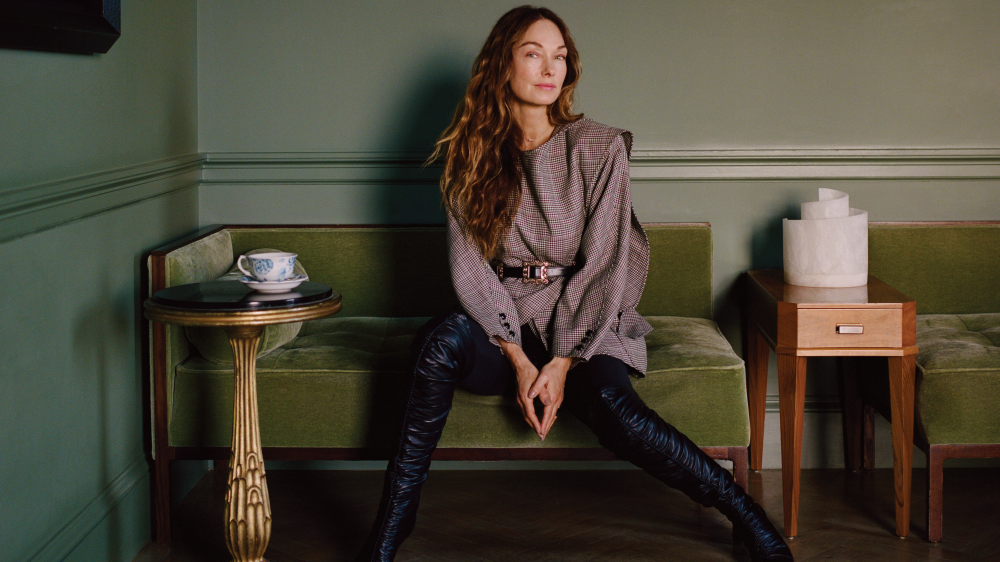
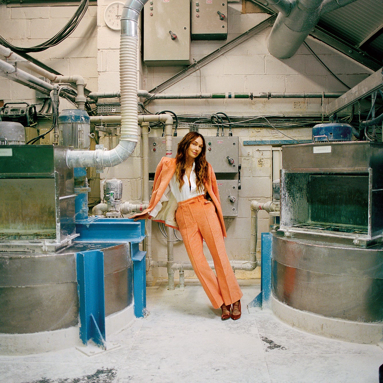
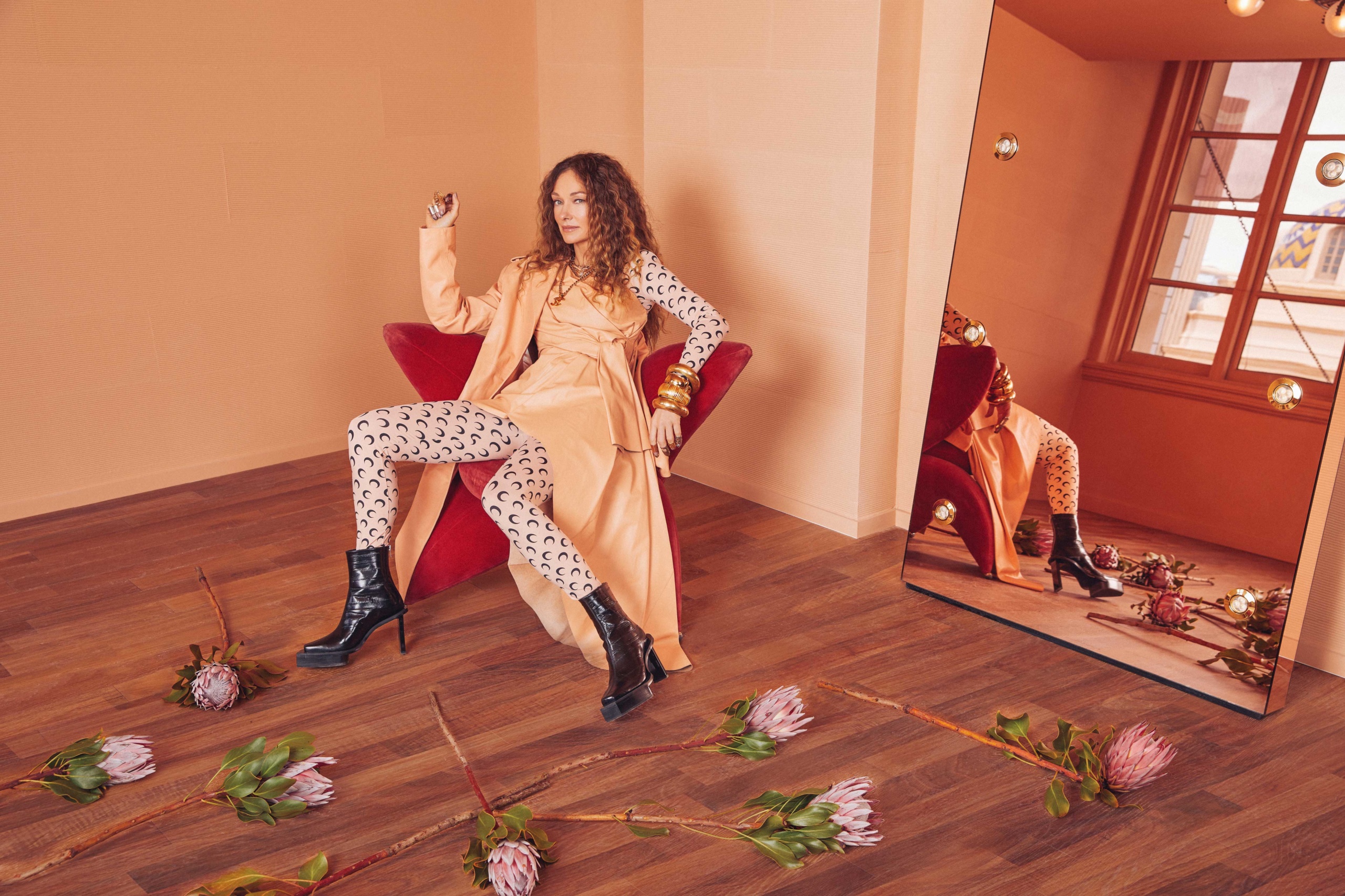
Kelly Wearstler, a renowned designer recognized for her bold, colorful, yet breezy designs, has collaborated with Farrow & Ball to launch a new collection of eight paints, named the California Collection. This collaboration marks Farrow & Ball's first partnership with an outside designer in its 75-year history. The collection is inspired by the natural beauty and architecture of California, aiming to bring the Golden State's sunny energy into living spaces, particularly for those in colder climates.
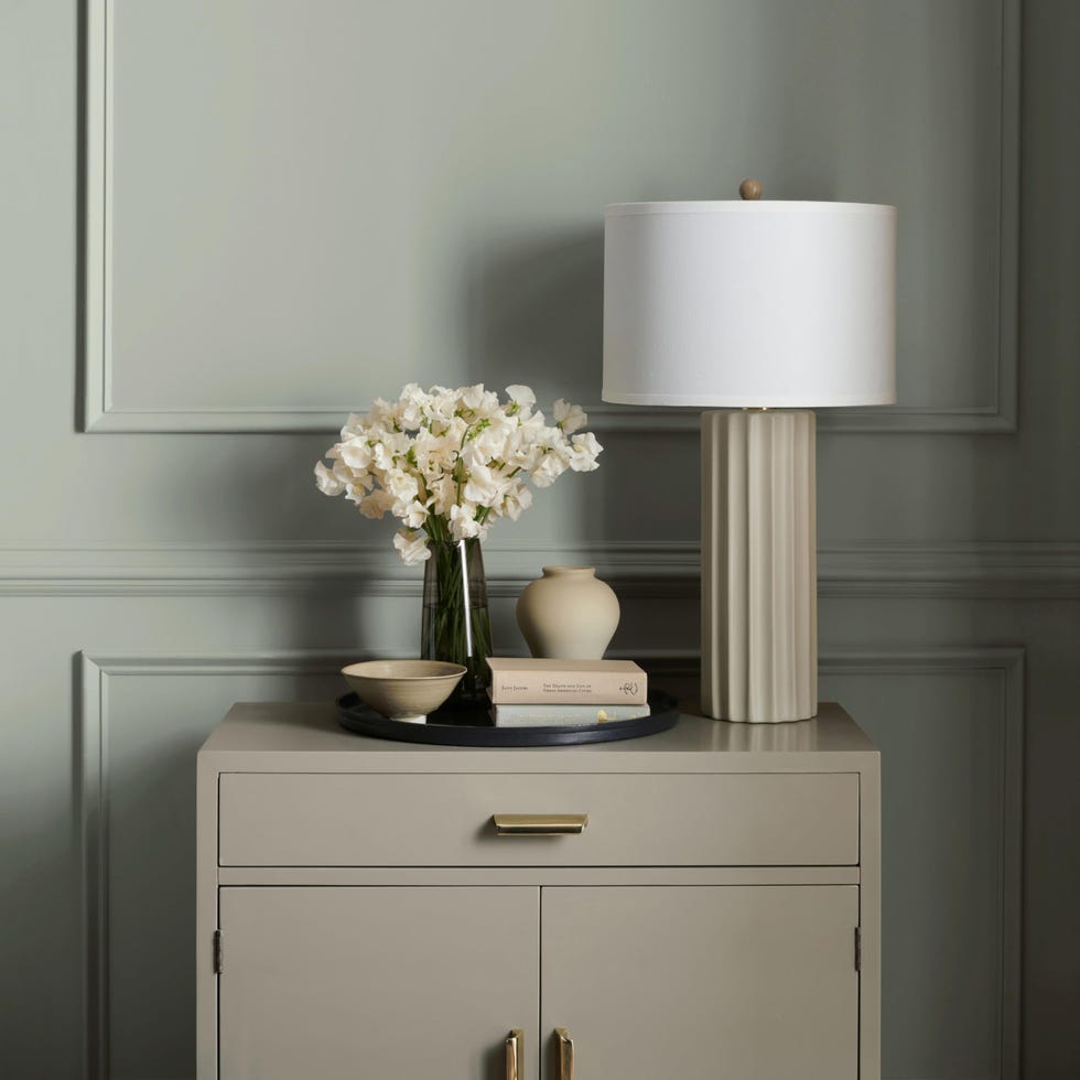
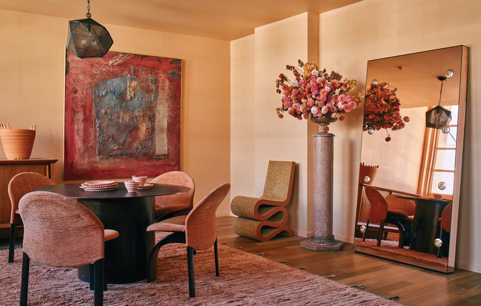
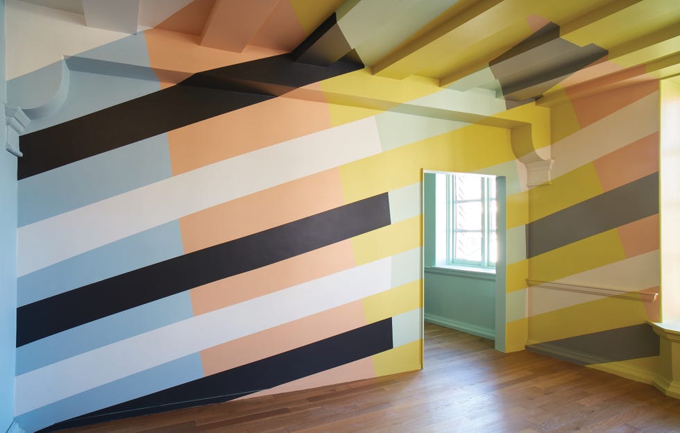
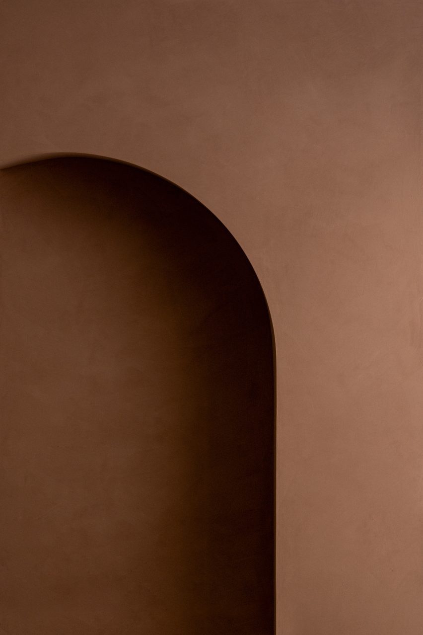
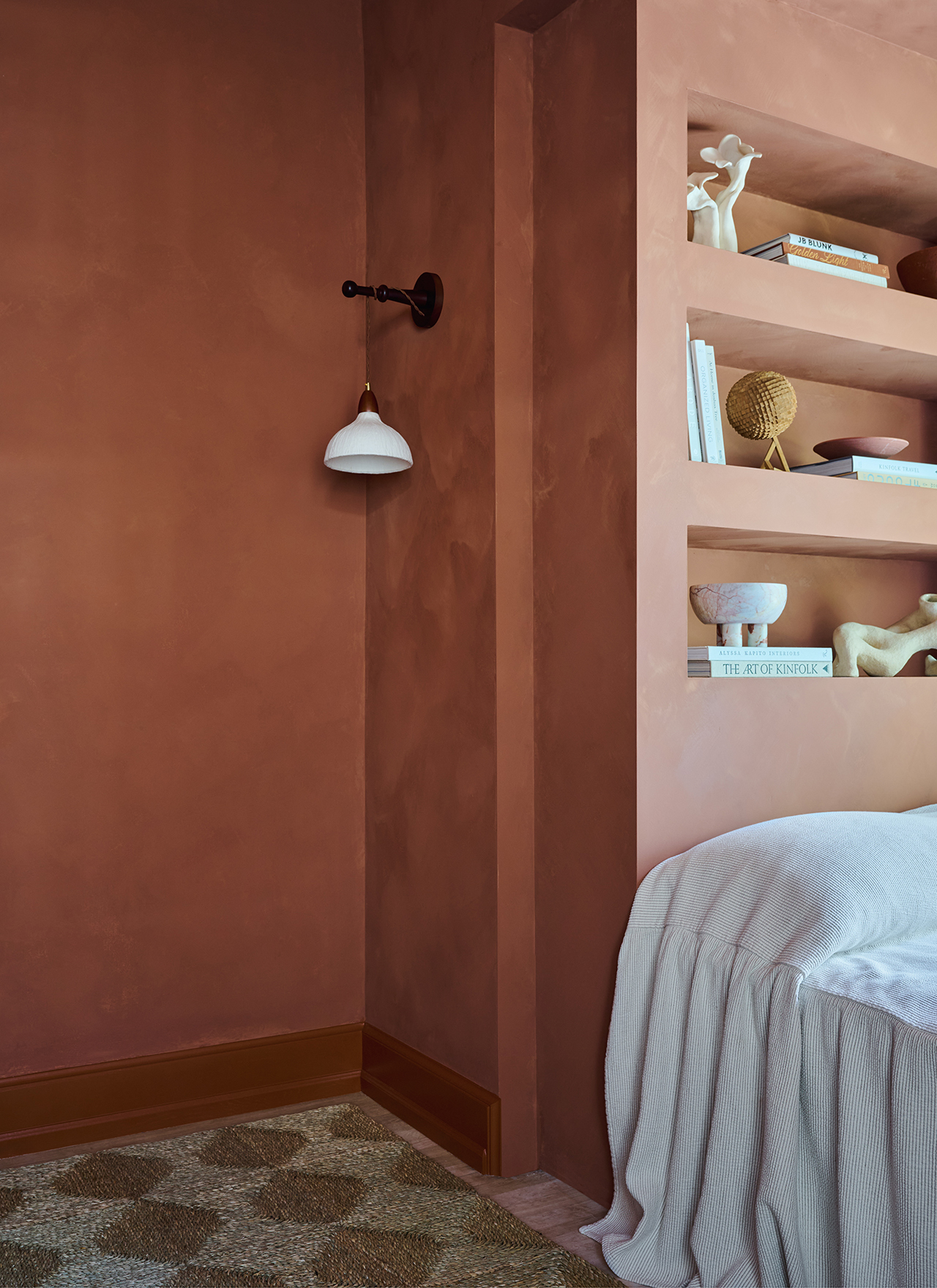
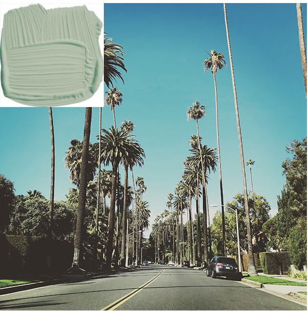
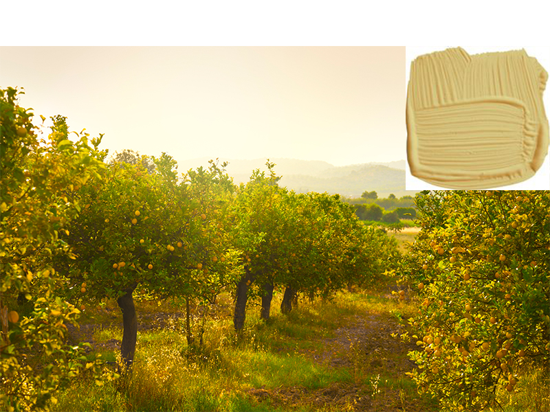
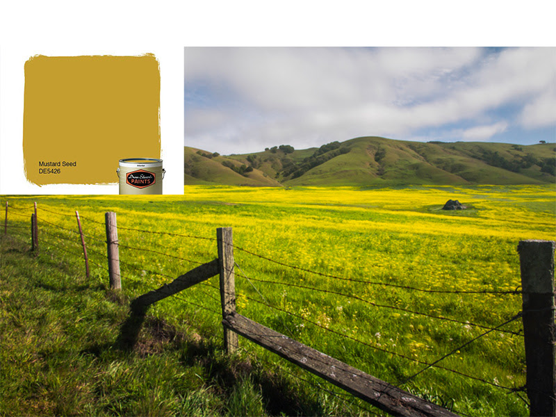
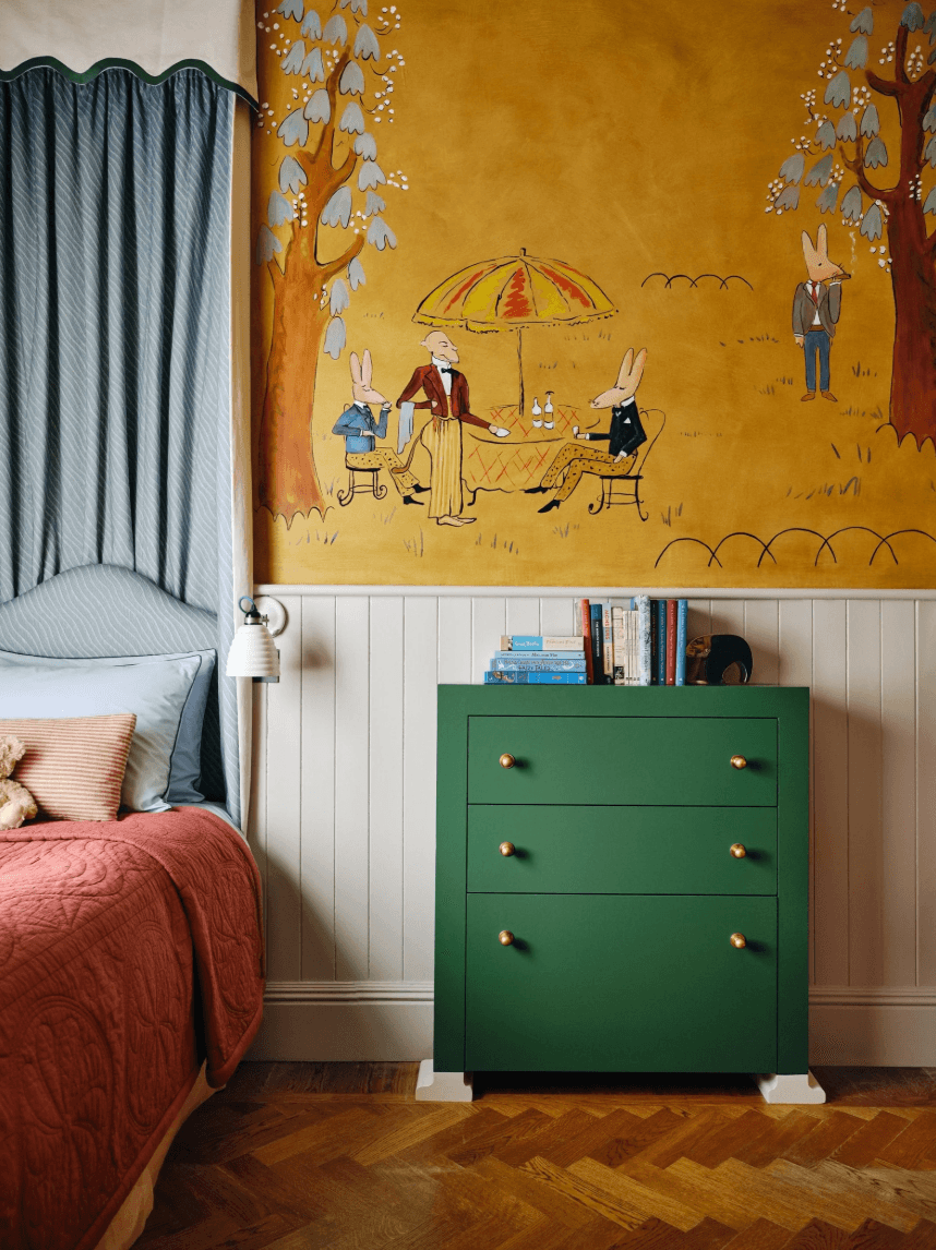
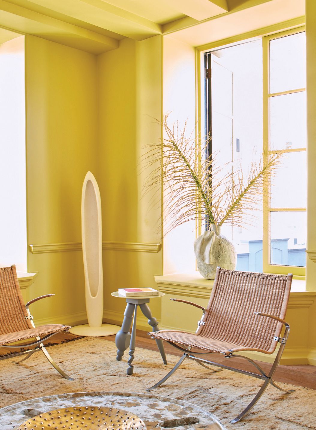
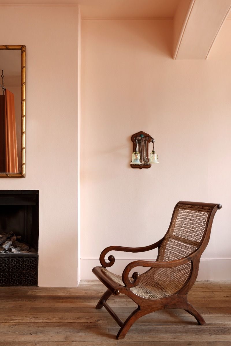
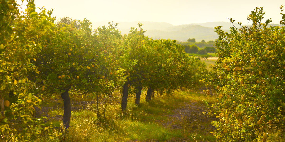
Wearstler's approach to selecting colors for this collection was deeply rooted in the California landscape. She aimed to evoke the natural beauty of the state, bringing the incredible hues found in the environment into the home. The colors are named and inspired by elements of her daily life in California: Citrona reflects the yellow of lemon trees; Palm is inspired by the palm trees in Los Angeles; Hazy, a blue-gray, draws from Malibu’s morning light; Faded Terracotta references Southern California rooftops or sun-drenched pots; Tar is dark like the freeways; and Salt mirrors the misty, salty air at the beach.
Developing paint colors presented unique challenges compared to her previous collaborations on carpets, wallpapers, and fabrics. Wearstler noted the difficulty in narrowing down a vast array of colors into a cohesive collection. The process involved a trial-and-error approach to ensure the chosen hues felt refreshed and relaxed while working together harmoniously and standing effectively on their own.
The partnership with Farrow & Ball felt natural due to their shared love for color and understanding of its impact on creating dynamic spaces. Wearstler has a long-standing practice of using paint to establish mood and feel in her interior design projects, having utilized Farrow & Ball paints throughout her career.
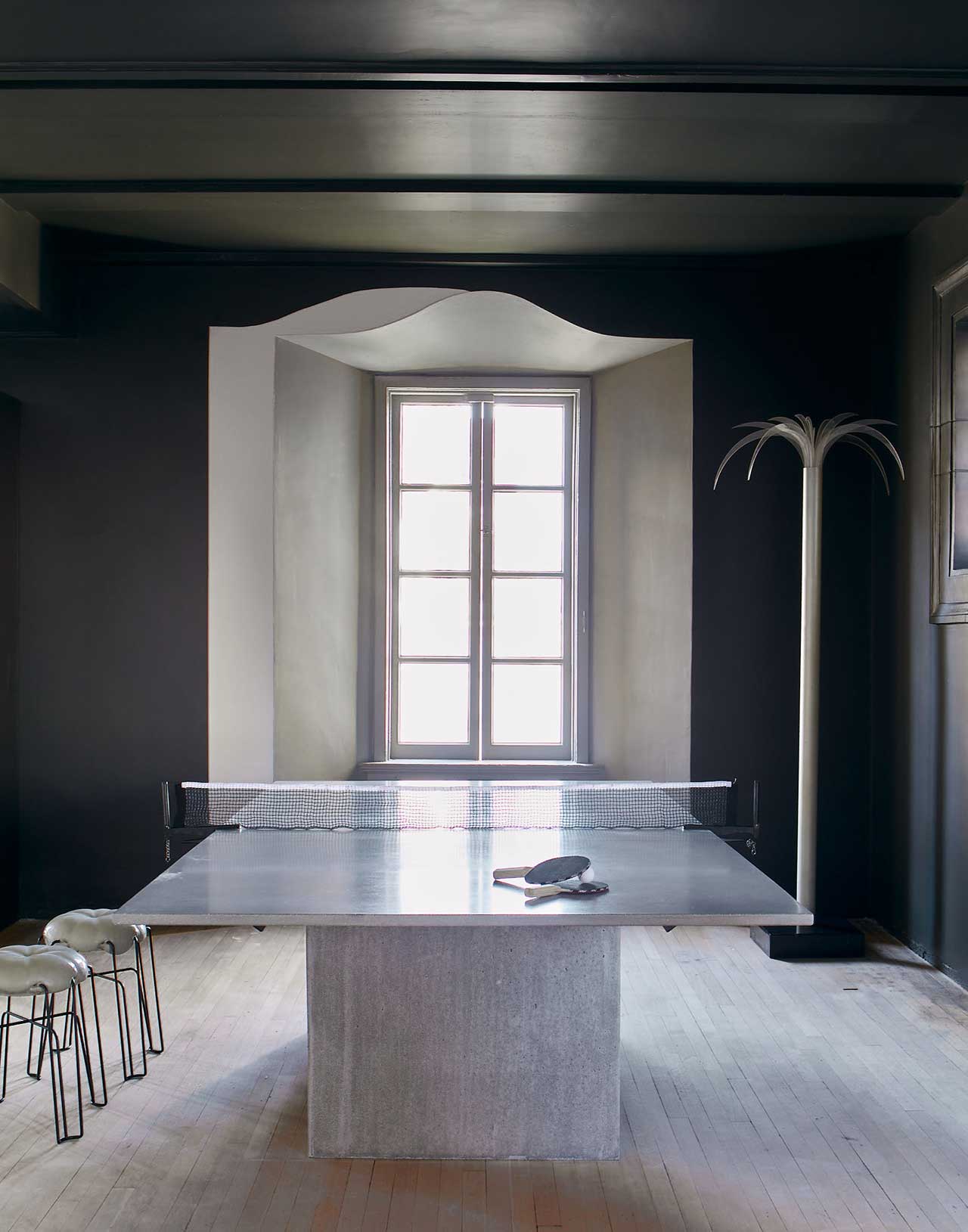
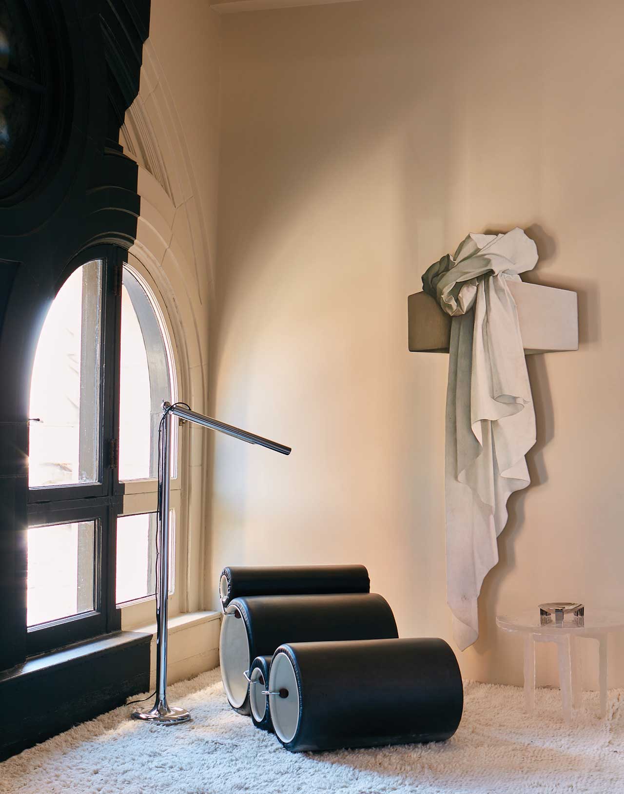
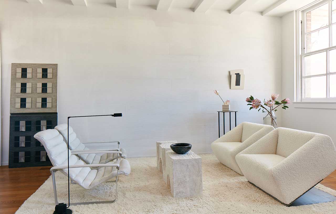
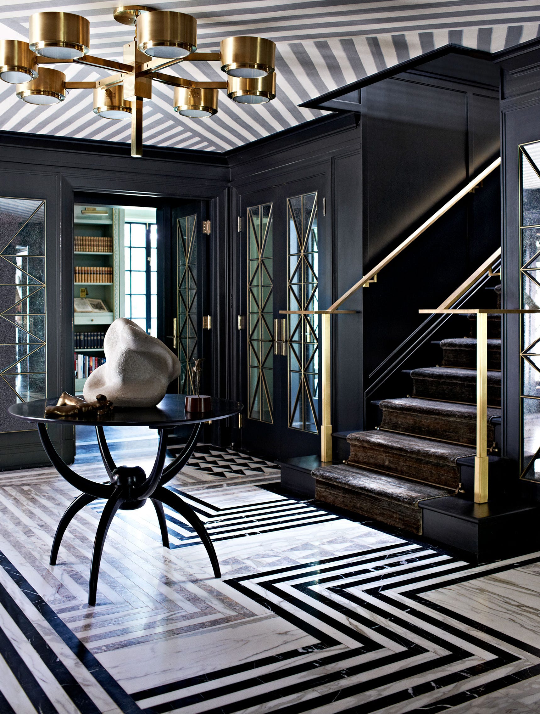
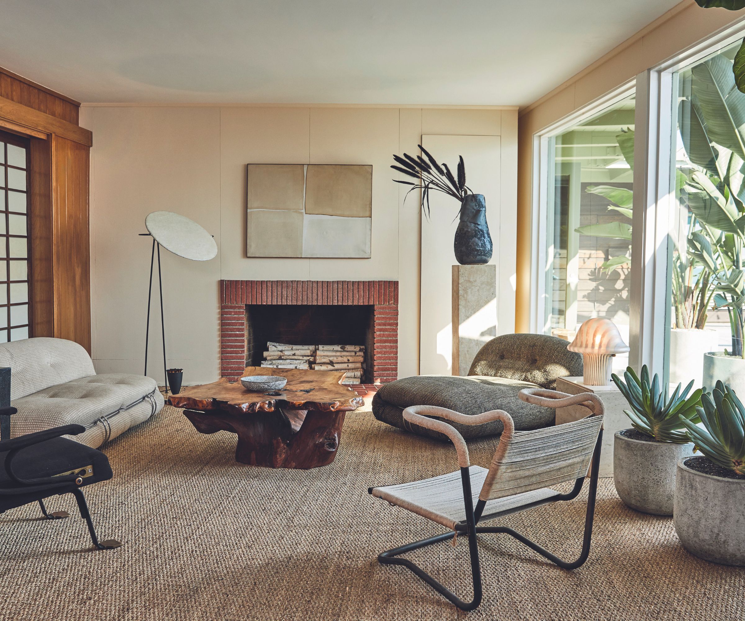
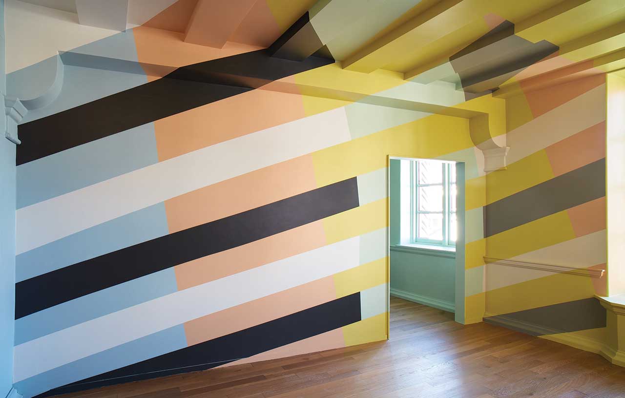
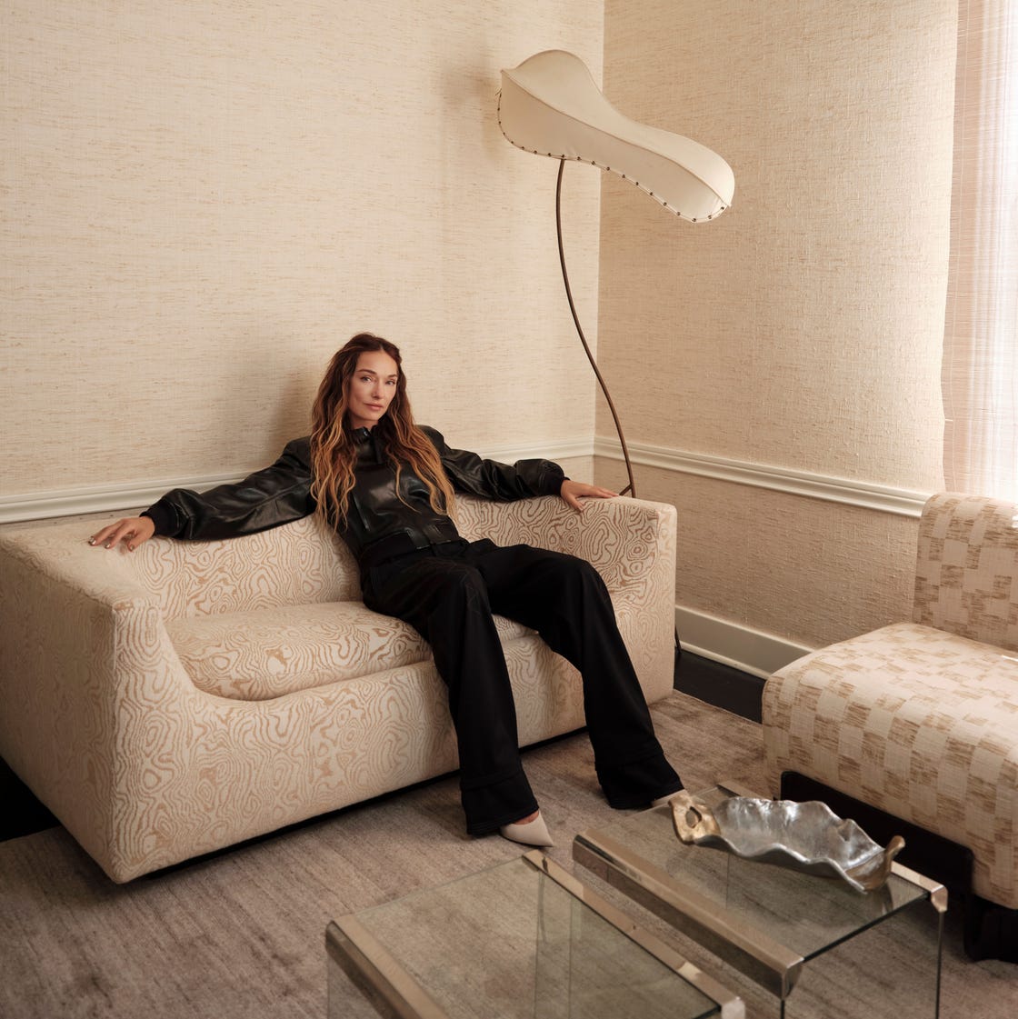
When advising clients on incorporating color, Wearstler suggests starting with a beloved hue already present in their home, perhaps from a vintage chair or artwork, and building a color scheme around it. Another technique is to use a bolder color on wall trim or the ceiling to make a statement without overwhelming the room. She emphasizes the importance of experimenting and taking risks, as color can transform a space's feeling or mood through various elements like artwork, textiles, wall coverings, or objects, allowing for personal expression. A common mistake clients make is not considering natural light, which significantly impacts how a color appears. Additionally, she advises thinking about how a space interacts with bordering areas to ensure seamless transitions between colors. Wearstler highlights black and white as underrated tones that can add depth and drama to a space through neutrals. Her personal style is described as free-spirited, evolving, and inspired, adapting to each project's client and architecture. She considers herself akin to a vintage Mario Botta Quarta chair from the 1980s, embodying an old spirit with daring energy. Wearstler states she loves all colors equally and believes both form and function are essential in design.
#KellyWearstler #FarrowAndBall #CaliforniaCollection #PaintDesign #InteriorDesign #HomeDecor #ColorPalette #DesignCollaboration #CaliforniaInspired #KellyWearstler #FarrowAndBall #CaliforniaCollection #PaintDesign #InteriorDesign #HomeDecor #ColorPalette #DesignCollaboration #CaliforniaInspired
共0条评论
 暂无评论
暂无评论你可能还喜欢
Kelly Wearstler Creates a California-Inspired Paint Palette for Farrow & Ball
Kelly Wearstler Shares How to Create a Color Palette for Your Home

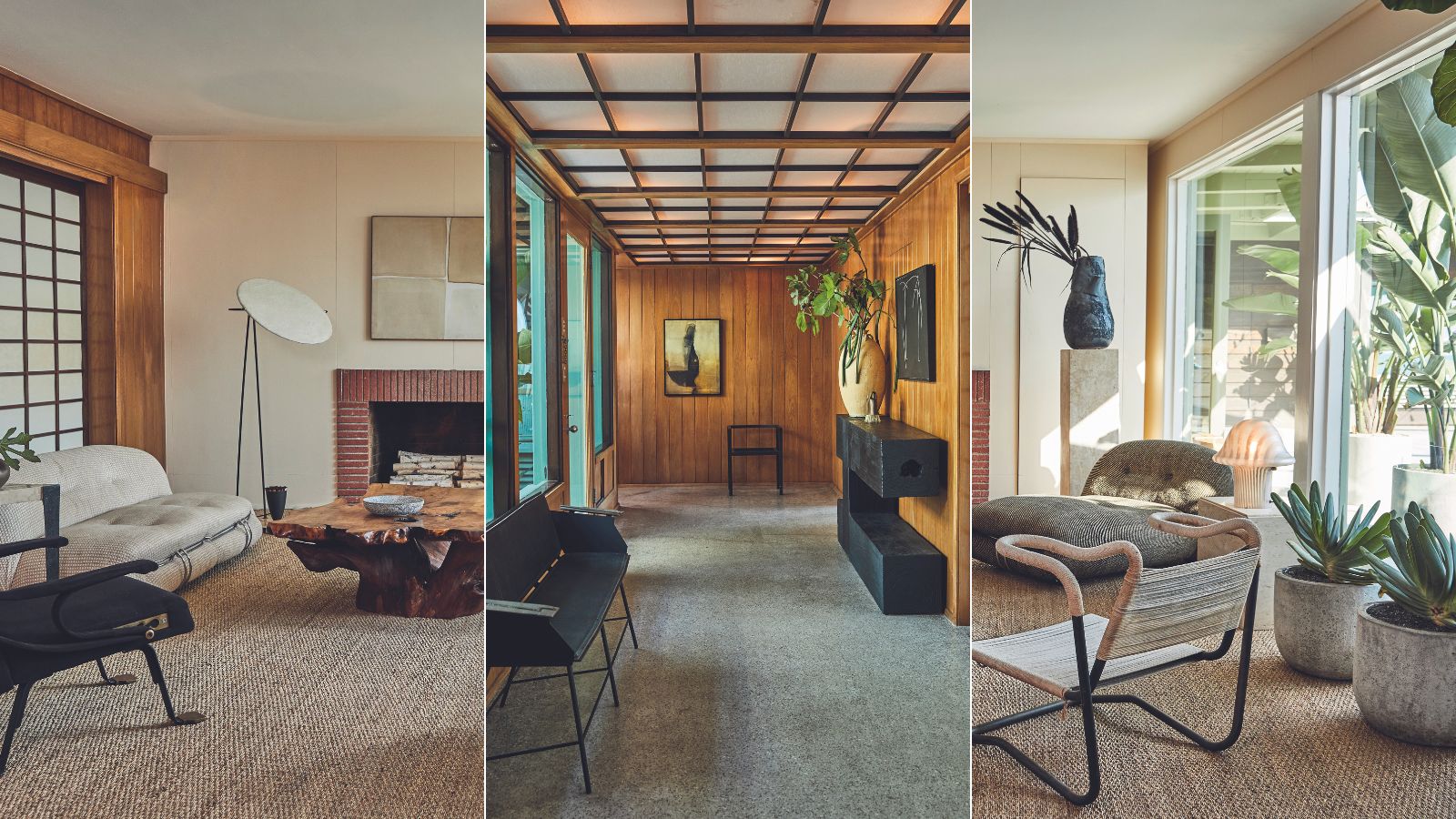
Interior designer Kelly Wearstler reveals how she creates her SoCal beach house vibe

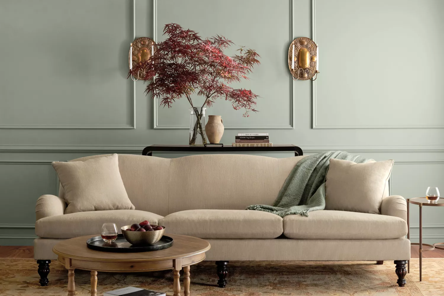
Martha Stewart Just Launched a Paint Line Full of Soothing, Timeless Colors—and It's Available on Amazon

Martha Stewart’s New “Nature Inspired” Paint Collection Is About to Spark a Home Makeover FRENZY

Armourcoat launches Limewash paints for "environmentally conscious" interiors
Behr Paint’s Head of Global Marketing Talks Color of the Year Campaign

All the interior designers with paint collaborations (and our favourite shades)
Kelly Wearstler's Latest Project Is A Celebration Of Curves And Archways |

Believing In Design As Storytelling, Kelly Wearstler Has Revolutionized Modern American Design

8 Perfect Paint Colors That Prove the West Coast Is the Best Coast

Home & Design | Art + Soul
Kelly Wearstler Reveals a Farrow & Ball Paint Palette Inspired by the Golden State

Kelly Wearstler's Curiosity Comes Through In Three New Collaborations
An Interior Designer Talks Style Inspiration, Wish List Items & Her Clever New Launch
Dusen Dusen’s Brooklyn Studio Is a Playground of Color

From the Archive: This Early Kelly Wearstler Project Glimmers with Gilded Finishes and Rich Textures
Color Atelier Unveils New Limewash Collection With Sarah Sherman Samuel
Kelly Wearstler Approves of This Reflective Way To Break Up a Room

Inspired Interiors: Design star modernizes timeless look