


1/5

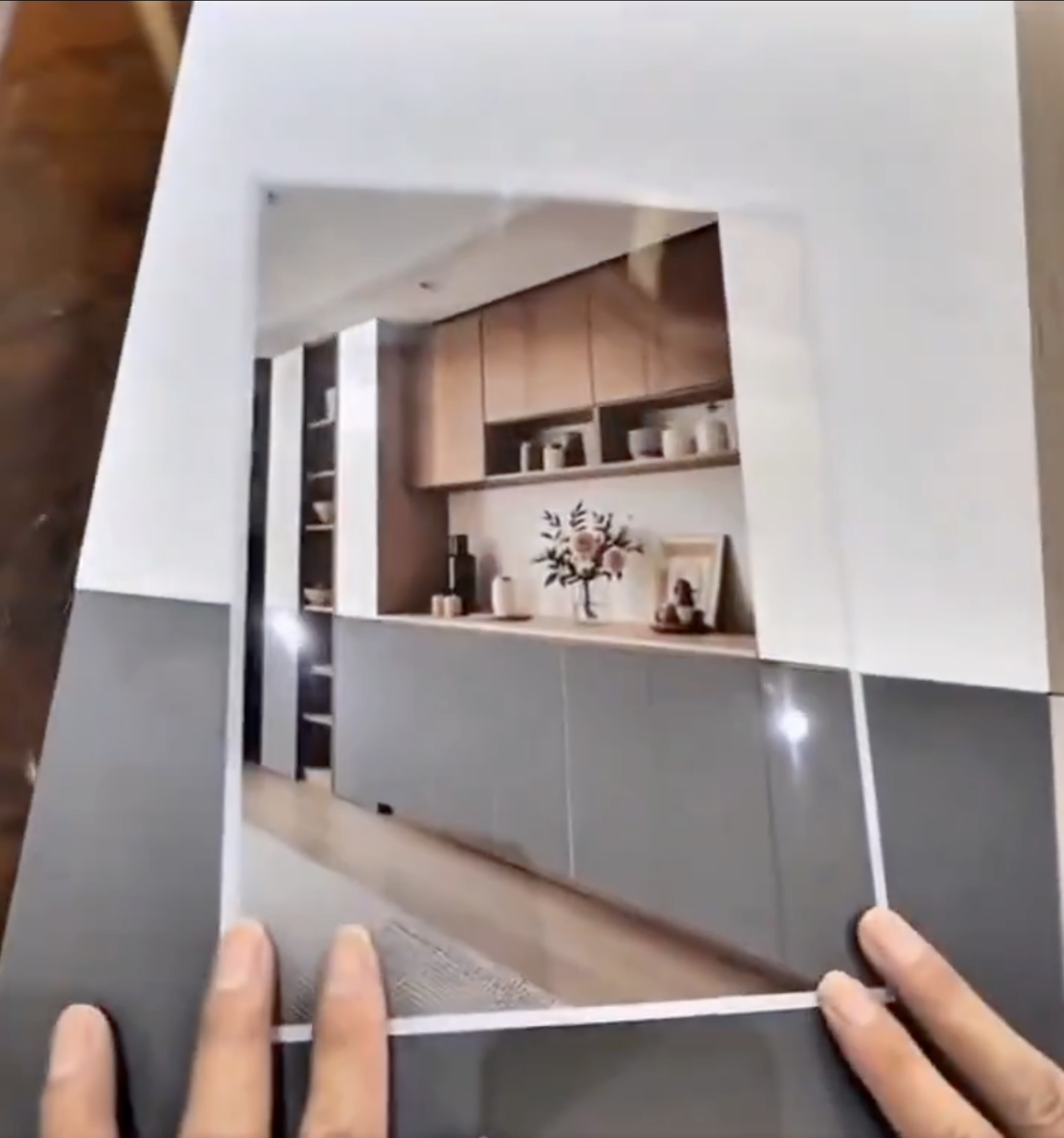
Can Ideal House change the color of those things?
🥹💖 I just saw this super creative idea on X — someone cut out a little frame of their furniture (like a cabinet door) and then placed it over different color swatches 🎨🪄 it’s such a cheap but genius way to see what color matches best without actually painting it!!
Now I’m wondering… does the Ideal House app let you do this with AI?? 👀✨ Like just change the color of your furniture in the app?? That would be sooo cool 🏡💕 If anyone has tried it, pls let me know!! Or maybe you have other hacks for picking the perfect color? 👩🎨💡
Totally obsessed with this vibe rn 🥰
#roomdecor #house #decorhacks #ColorInspo #idealhouseapp #ideas #RoomGlowUp #DIYVibes #changefurniture #colorcontrastdesign #cupboards #cabinetdesign
18 Eyl 2025
Toplam 1 yorum
Hometheorize
smart!
28 Eyl 2025
1
1
Bu da beğenebilirsiniz

Discover even more ways to express your style!

Color Stories: Timeless Palettes for Heritage Homes 🎨🗝️

Color Psychology in Decor: Using Hues to Boost Your Mood! 🌈😊

Unleash Your Inner Maximalist: Bold Color Palettes for a Joyful Home! 🌈✨

Low-VOC Paints: Your Secret Weapon for a Healthy, Beautiful Home! 🎨

A Fresh Start! Give Your Home a Furniture Makeover

Sustainable Materials: Eco-Friendly Choices for Your Home ♻️

The Industrial Color Palette: Earthy Tones & Moody Hues ⚙️

3 Bold Color Combos to Instantly Brighten Your Space! 🌈✨

Curated Color Palettes for a Playful Home 🌈🎨

Unlock Bold Design: 5 Ways to Embrace Color Psychology in Your Home! 🎨

Pop of Color Magic: 3 Ways to Inject Joy into Your Beige Living Room! ✨

Colors house

How important is furniture decoration?
Ross
4

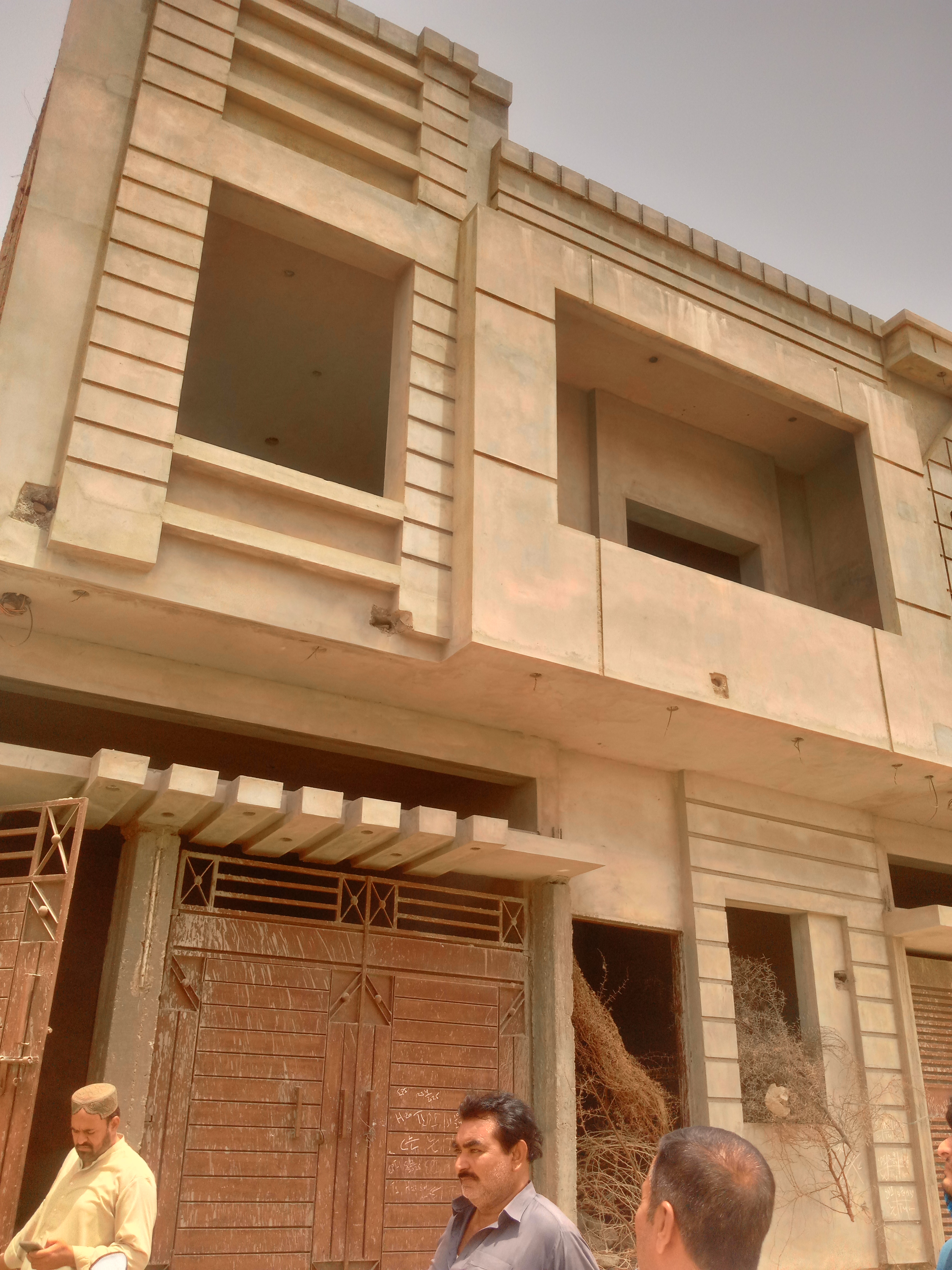
🔄 Transformable Spaces: Homes That Reconfigure with Your Life 🛋️

I want to renovate just first picture

Color Theory 2.0: Dynamic Hues That Respond to Your Environment 🌈

Transforming Furniture with Texture and Color

Transform Your Home with the Power of the Seasons 🏠✨

Exploring the Power of Color in Interior Design


+6
Discover even more ways to express your style!
The latest update for the #idealhouse Interior Remodel tool lets you choose from exclusive new color palettes—including Sophisticated Gray, Healing Forest, Warm Earth, and more. Tap into our palette options or upload your own inspiration—customize every detail to make your space truly yours.
Nuestra actualización más reciente de la herramienta de Reforma Interior te permite elegir entre paletas de colores exclusivas, como gris sofisticado, verde forestal y muchas más. Ya sea que busques un ambiente relajante o un toque audaz, encontrarás la opción perfecta para cualquier espacio de tu hogar. Aprovecha nuestras nuevas paletas o sube tu propia inspiración: personaliza cada detalle para que tu espacio sea verdaderamente único.
#bathroom #bathroomdecorideas #interiordesign #homeremodeling #colorpalette #roommakeover #designtools #modernhomestyle #colorinspiration #homeideas #interiortrends2025 #Palette #diseñointeriores #remodelación #paletadecolores #herramientasdediseño #inspiración #coloresinteriores #baño

4


Low-VOC Paints: Your Secret Weapon for a Healthy, Beautiful Home! 🎨
Did you know the air in your home can be more polluted than the air outside? One major culprit is volatile organic compounds (VOCs) found in many paints. That’s why I always opt for Low-VOC or Zero-VOC paints!
They significantly improve indoor air quality without compromising on color or finish.
Key benefits:
* **Healthier Air:** Reduced exposure to harmful chemicals.
* **Eco-Friendly:** Lower environmental impact during production and use.
* **Vibrant Colors:** Available in a wide range of beautiful, sustainable hues.
* **Odorless:** Less unpleasant smell during and after painting.
Choosing the right paint is a vital step towards creating a truly sustainable and healthy sanctuary. Save this tip! 💚 #LowVOCPaints #HealthyHome #LowVOCPaints #HealthyHome #SustainablePaints #EcoFriendlyDecor #IndoorAirQuality #GreenLiving #HomeRenovation #ConsciousChoices #PaintColorIdeas #HealthyLiving


3 Bold Color Combos to Instantly Brighten Your Space! 🌈✨
Tired of beige? Let's inject some serious JOY into your home! 🎉 I'm obsessed with playing with unexpected color pairings that feel both vibrant and harmonious. My current faves are: 1. Sunshine Yellow + Deep Teal: Think of a golden sunset meeting a tranquil ocean. 🌊 2. Coral Pink + Emerald Green: This is a lively yet sophisticated duo that screams personality. 🌿 3. Electric Blue + Tangerine Orange: Pure, unadulterated energy! 🍊 Don't be afraid to experiment; these combinations are surprisingly easy to style. Save this for your next room refresh! Let's get playful! #ColorCombosIdeas #BoldInteriorsIdeas #VibrantDecorIdeas #PlayfulPaletteIdeas #HomeDecorIdeas #InteriorDesign #ColorInspo #EclecticDecor #JoyfulLiving #HomeRenovation


Color Theory 2.0: Dynamic Hues That Respond to Your Environment 🌈
Tired of static wall colors? Let's talk about the future: dynamic hues that respond to your environment and mood! 🌈 Imagine walls that subtly shift color based on ambient light, time of day, or even your chosen playlist. We're looking at smart pigments and responsive materials that can create truly immersive atmospheres. This isn't just about aesthetics; it's about actively enhancing your living experience through adaptive color. Picture a living room that glows with calming blues in the morning and vibrant corals in the evening. What color shift would enhance your space? Save this for a spectrum of design possibilities! ✨ #dynamiccolor #responsematerials #colorpsychology #interiorcolor #futureofdesign #innovativedesign #adaptiveinteriors #designtechnology #homeambiance #cuttingedgeinteriors


+9
A Fresh Start! Give Your Home a Furniture Makeover
Tired of your old furniture? It’s time to refresh your space! 🛋️ From sofas to beds and dining sets, we offer a one-stop furniture upgrade solution. Eco-friendly removal of old items + exclusive discounts on new pieces—making renewal effortless!
Prioritize airflow—arrange sofa & coffee table in an L-shape with 50% negative space. Wood tones + white base, accented by a single statement plant.
Pair metal-frame sofas with exposed brick, layer leather chairs & iron shelves. Warm floor lamps soften the rawness.
Angle low furniture toward light, place handmade ceramics & linen cushions asymmetrically—embrace ‘flaws’.
Center a velvet sofa, echo marble & brass side tables diagonally. Mirrored accents amplify light.
Layer rugs to zone areas, cluster rattan chairs + floor cushions. Fill walls with tapestries & hanging plants.
Symmetrical layout with facing armchairs & a landscape screen. Open shelves for ‘breathing space’, accented by bonsai & tea sets.
oldable pieces against walls, mirrors fake depth, use vertical storage instead of wardrobes.
#ChangeFurniture #furniture #Ecommerce #color #Furniturecolormatching

2


Curated Color Palettes for a Playful Home 🌈🎨
Tired of beige? Let's inject some fun into your home's color story! 🌟 Think beyond the ordinary. Embrace palettes that reflect your personality. Pair unexpected hues like coral and teal, or mustard yellow and deep plum. Want to go whimsical? Consider soft pastels with metallic accents. For a bold statement, experiment with vibrant jewel tones. The key is balance and intentionality. Don't be afraid to let color tell your unique story and create spaces that spark joy and wonder! ✨
Save this for your next paint project! #ColorPaletteIdeas #PlayfulColorIdeas #WhimsicalColorPalette #HomeColorTrends #InteriorColorInspo #DecorPalette #CreativeColor #ColorInDesign #RoomMakeoverIdeas #DesignInspiration


Transforming Furniture with Texture and Color
Upholstery fabric is the key to transforming the look and feel of your furniture, allowing you to refresh or completely change the style of your home. With countless patterns, colors, and textures available, upholstery fabric offers endless possibilities for customization.
Whether you're reupholstering an old favorite piece or selecting fabric for new furniture, the right choice can set the tone for your room. For high - traffic areas, durable fabrics like performance - grade microfibers or cotton blends are ideal. In more formal settings, velvet or linen can add a touch of luxury.
The process of upholstering not only updates the appearance but can also improve comfort by adding new cushioning. Choosing upholstery fabric is a chance to inject personality into your furniture and create a cohesive interior design.
#UpholsteryFabric #OutdoorTextiles #PatioMakeover #WeatherproofDesign #TactileSpaces


Color Stories: Timeless Palettes for Heritage Homes 🎨🗝️
The right color palette can profoundly influence the atmosphere of a heritage home. 🌟 We draw inspiration from historical paint charts and the home's natural surroundings. Think muted earth tones, deep jewel tones, or classic neutrals that highlight architectural details. 🌱 The goal is to create a sense of depth and warmth that respects the home's history while feeling current. Accent colors are used strategically to draw attention to original features like millwork or fireplaces. It’s about timeless choices that enhance the home's narrative. Save this for your color inspiration! ✨ #HeritageColorIdeas #TimelessColorIdeas #HistoricalPaletteIdeas #InteriorColorIdeas #HomeColorIdeas #ColorPalette #InteriorDesign #HomeDecor #PaintColors #HeritageHomes


+3
How important is furniture decoration?
Take a look at the changes in this room!
#homedecor #furnishingyourhome #furniturearrangement #home #furniture #greenstyle #greenhome
4


Sustainable Materials: Eco-Friendly Choices for Your Home ♻️
Design your dream home with a focus on sustainability and eco-friendly materials. Think reclaimed wood for furniture and flooring, natural cork for insulation and flooring, bamboo for its rapid renewability, and organic cotton or linen for textiles. These choices not only minimize environmental impact but also bring natural beauty and healthy living into your space. Incorporate recycled glass or metal for decorative accents. Creating an eco-conscious home is about making thoughtful decisions that benefit both you and the planet. 🌎 #SustainableHomeIdeas #EcoFriendlyDecorIdeas #GreenLivingIdeas #NaturalMaterialsIdeas #ConsciousHomeIdeas #EcoDesign #SustainableLiving #HomeRenovation #HealthyHome #ThePaletteCurator


Transform Your Home with the Power of the Seasons 🏠✨
The most beautiful homes are those that live in harmony with the natural world. Instead of a total renovation, try the "Seasonal Art Swap." By rotating your gallery wall four times a year, you refresh the energy of your rooms and appreciate your collection on a deeper level.
Get our expert tips on curating your home for Spring, Summer, Autumn, and Winter. Seasonal Art Swaps: How to Rotate Your Home Art Collection – PIPA Fine Art
#IdealHouse #HomeStyling #InteriorInspiration #ArtGallery #decoratingideas #decoratingtipsideas #decoratingwithcolor #decorating #decoratingideasforlivingroom

1


Unlock Bold Design: 5 Ways to Embrace Color Psychology in Your Home! 🎨
Tired of beige? Let's talk COLOR! 🌈 Your home should reflect your vibrant personality. Understanding color psychology is your secret weapon for creating spaces that evoke specific moods and feelings.
💡 Did you know warm colors like reds and oranges can boost energy, perfect for a home office? While cool blues and greens promote tranquility, ideal for bedrooms and relaxation areas.
Here's how to start:
* **Focus on Feelings:** What emotion do you want to cultivate?
* **Strategic Placement:** Use bolder hues as accents.
* **Monochromatic Magic:** Explore varying shades of one color.
Don't shy away from what makes your heart sing! Save this for your next room refresh! ✨ #ColorPsychologyIdeas #BoldColorHomeIdeas #InteriorDesignTips #VibrantDecorIdeas #HomeColorPalette #DecorInspo #LivingRoomMakeover #BedroomDecor #CreativeSpaces #TheColorConnoisseur


Color Psychology in Decor: Using Hues to Boost Your Mood! 🌈😊
Did you know colors can actually affect your mood? 🌈 It's true! For a mood boost, I love incorporating sunny yellows, cheerful oranges, and vibrant pinks into my spaces. These colors are known for their energizing and uplifting properties! ☀️ Think accent pillows, vibrant artwork, or even a colorful vase. You can achieve a joyful atmosphere without a complete overhaul. What color makes you feel happiest at home? Save this for a mood-boosting decor update! 💖 #ColorPsychologyIdeas #MoodBoostingDecorIdeas #VibrantHomeIdeas #HappyHomeIdeas #InteriorColorIdeas #DecorTips #HomeVibes #PositiveDecor #ColorInspiration #ChromaAndCharm


🔄 Transformable Spaces: Homes That Reconfigure with Your Life 🛋️
The concept of 'home' is evolving, and so should its structure. Transformable spaces are designed for maximum adaptability, with elements that can change function and layout to suit changing needs. Think multi-functional furniture, sliding walls, and dynamic room dividers. 💡 This is especially crucial for smaller living areas, maximizing every square inch.
This approach enhances usability and offers a sense of spaciousness and variety within a compact footprint. It’s about creating a home that actively supports your lifestyle, whether it's for working, entertaining, or simply relaxing.
Save this post to get inspired by the future of dynamic living! ✨ #transformablespaces #multifunctionalfurniture #smallspaceliving #dynamicdesign #innovativedesign #smartliving #interiordesign #futurism #apartmenttherapy #efficientliving #smallapartmentideas #designinspiration


Exploring the Power of Color in Interior Design
I recently came across this beautiful living space that perfectly showcases how color can transform a room. The vibrant blue sofa and matching rug add a lively touch, while the yellow chair introduces a cheerful pop of color, creating a balanced and inviting atmosphere. The mix of bold and neutral tones enhances the overall aesthetic, demonstrating how thoughtful use of color can elevate interior design.
What are your favorite color combinations in home decor? Share your ideas or show us your colorful spaces!
#ColorInInteriorDesign #HomeDecor #InteriorDesign #ColorfulLiving #DesignInspiration #LivingRoomDecor #HomeStyling #Color
3


The Industrial Color Palette: Earthy Tones & Moody Hues ⚙️
Forget strictly gray and black! The Industrial Artisan palette embraces rich, earthy tones and sophisticated moody hues. Think deep charcoals, rust browns, olive greens, and deep indigos. 🤎 These colors, when paired with natural materials like wood and metal, create a sense of grounded elegance. You can also introduce hints of aged brass or copper for subtle warmth and luxury. Don’t shy away from adding a vibrant, unexpected pop of color with an accent piece like a bold artwork or cushion. 🎨 This creates depth and visual interest. Save this for your industrial color inspiration! #IndustrialColorIdeas #EarthyToneDecorIdeas #MoodyColorPaletteIdeas #IndustrialHuesIdeas #CharcoalGrayDecor #OliveGreenInteriors #InteriorColorSchemes #DesignPalette #SophisticatedDecor #ArtisticInteriors


Unleash Your Inner Maximalist: Bold Color Palettes for a Joyful Home! 🌈✨
Tired of beige? It's time to embrace COLOR! 🎉 As Spectrum Style, I believe your home should be a vibrant reflection of YOU. Forget boring neutrals; let's dive into daring hues and playful patterns to create spaces that spark joy and express personality.
This trend is all about intentionality:
* **Unexpected Pairings:** Think teal with coral, or deep magenta with mustard yellow.
* **Pattern Play:** Mix florals, geometrics, and abstract designs fearlessly.
* **Balance is Key:** Use pops of bold color against a grounding neutral backdrop or use saturated tones in smaller doses like accent walls or vibrant decor.
Ready to transform your space into a dynamic masterpiece? Save this for your next colorful home refresh! 💖 #ColorPaletteIdeas #MaximalistDecorIdeas #BoldColorsHomeIdeas #InteriorDesignIdeas #SpectrumStyleHome #JoyfulLivingSpaces #PatternMixing #EclecticHome #VibrantInteriors #HomeDecorInspo


Pop of Color Magic: 3 Ways to Inject Joy into Your Beige Living Room! ✨
Tired of a beige-dominated space? You don't need a total reno to add serious charm! Let's play with color! 🎨 My secret? Strategic pops! Think a vibrant velvet throw pillow on a neutral sofa, a gallery wall bursting with quirky art, or even a statement rug that ties everything together. 🌈 These elements add personality without overwhelming your calm. Embrace your inner maximalist, even if it's just for a touch! Which pop would you try first? Save this for a happy home makeover! 💖 #LivingRoomIdeas #ColorInspirationIdeas #EclecticDecorIdeas #JoyfulLivingIdeas #HomeDecorTipsIdeas #BeigeMakeover #VibrantInteriors #ColorfulHome #DesignInspo #ChromaAndCharm
