1/4
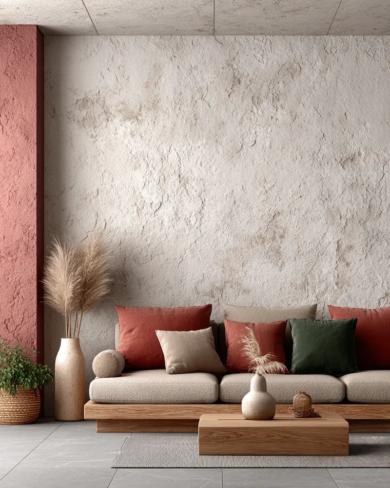
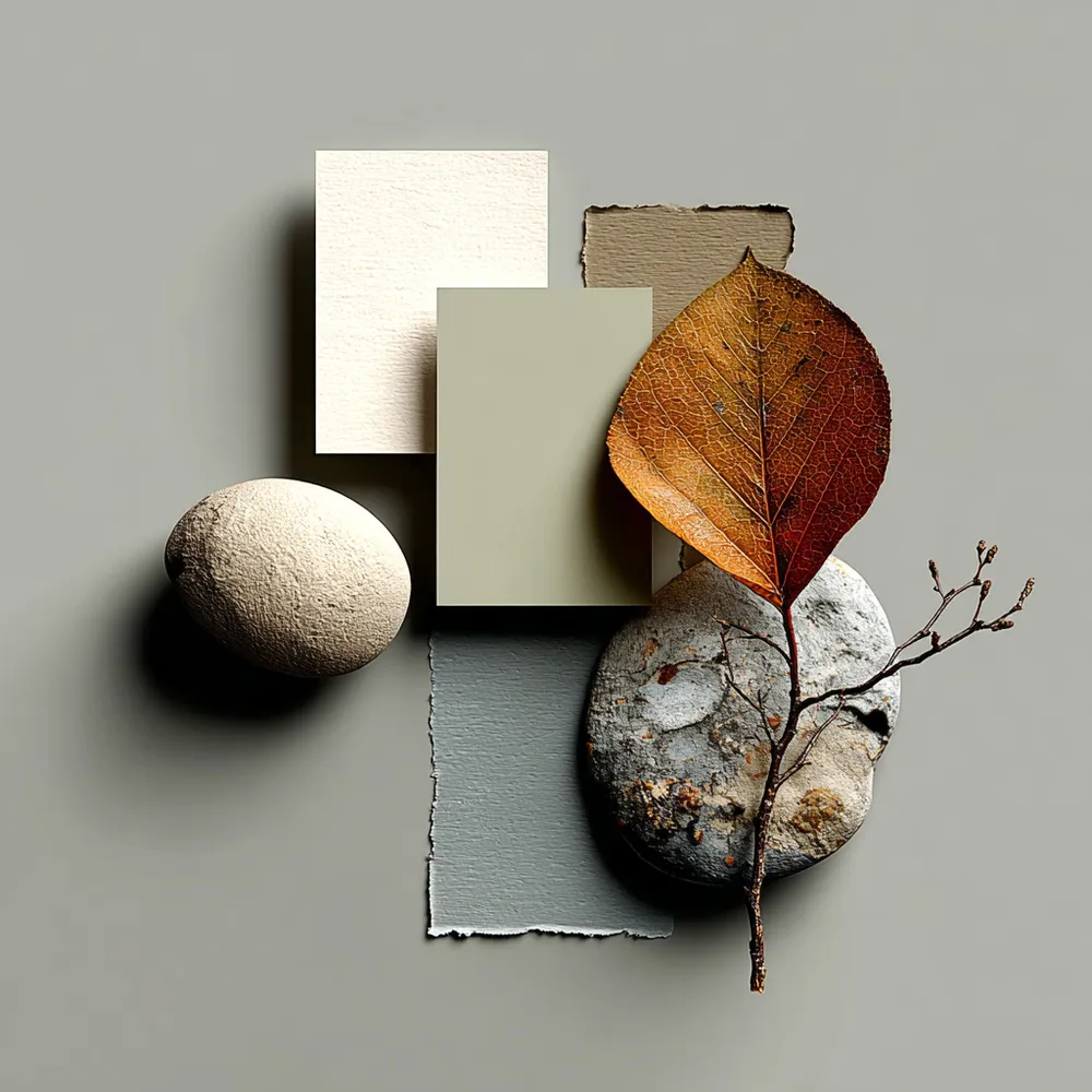
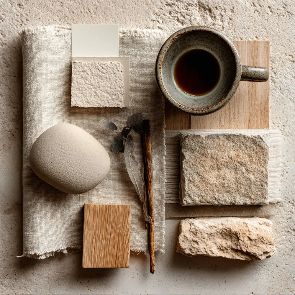
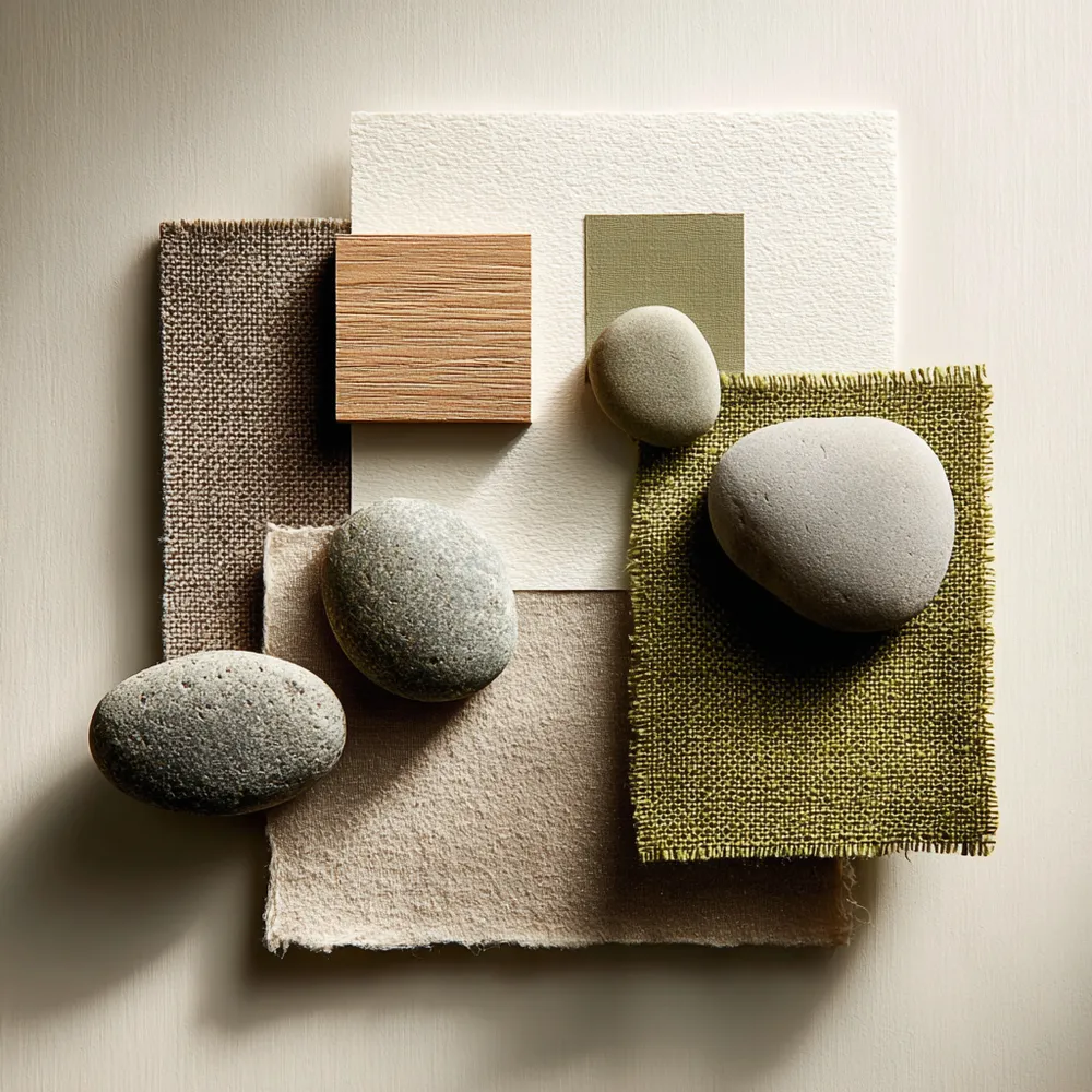
Color Palette Perfection: Japandi Neutral Tones 🤍
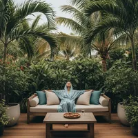
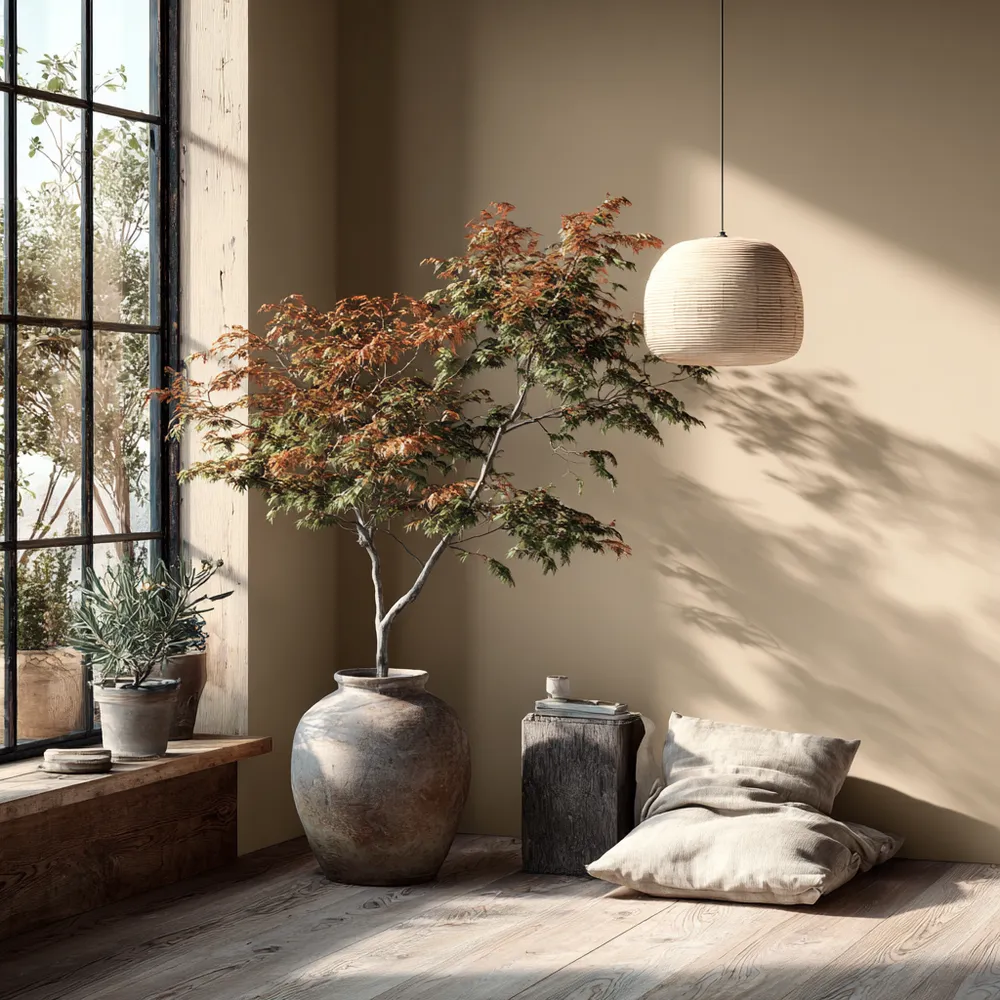
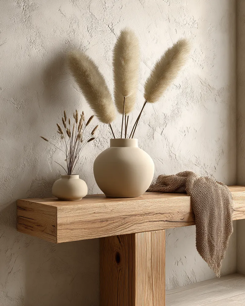
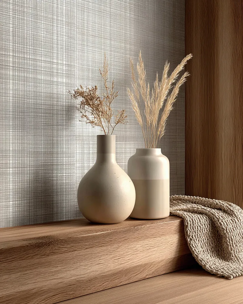
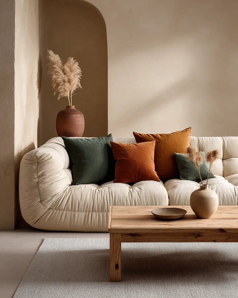
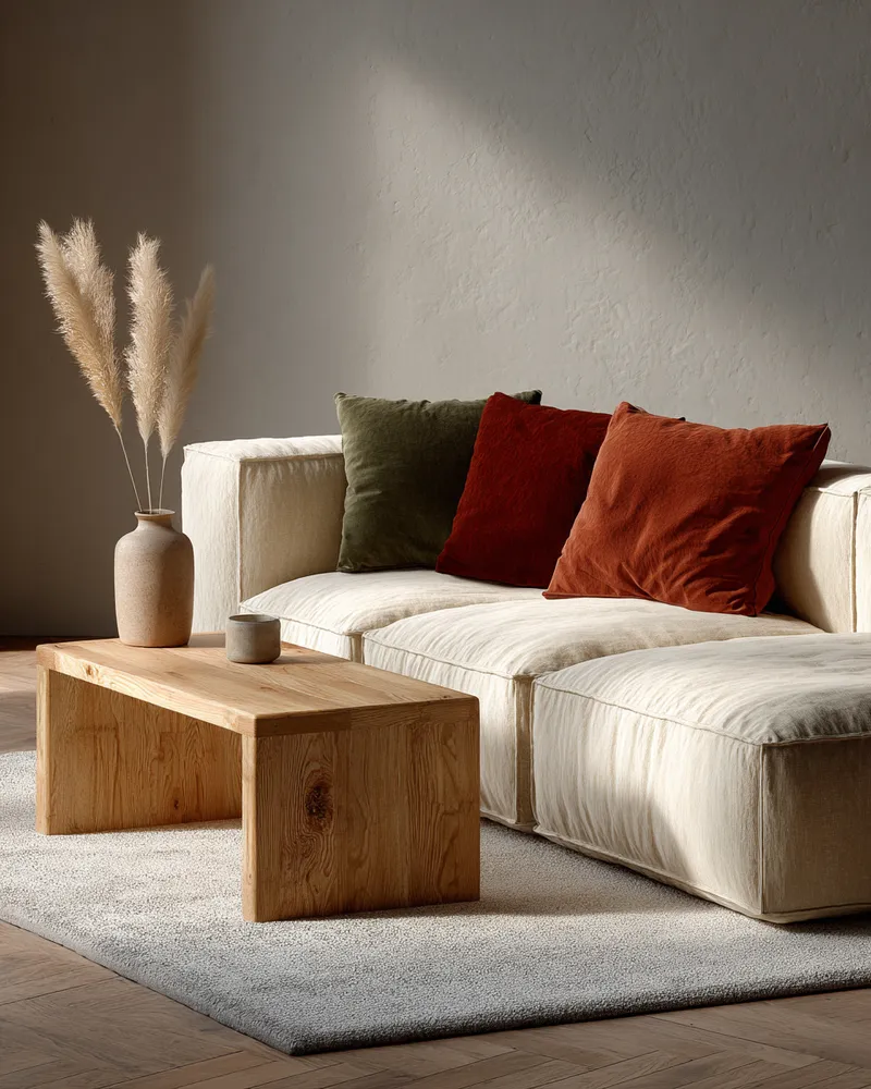
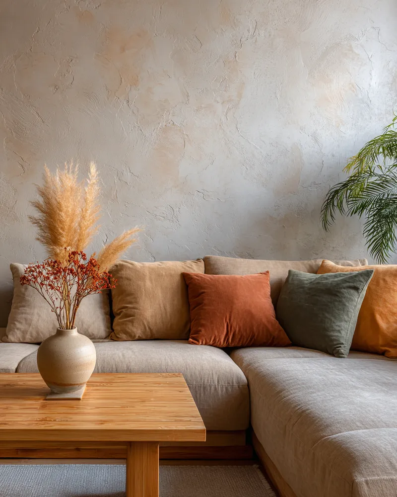
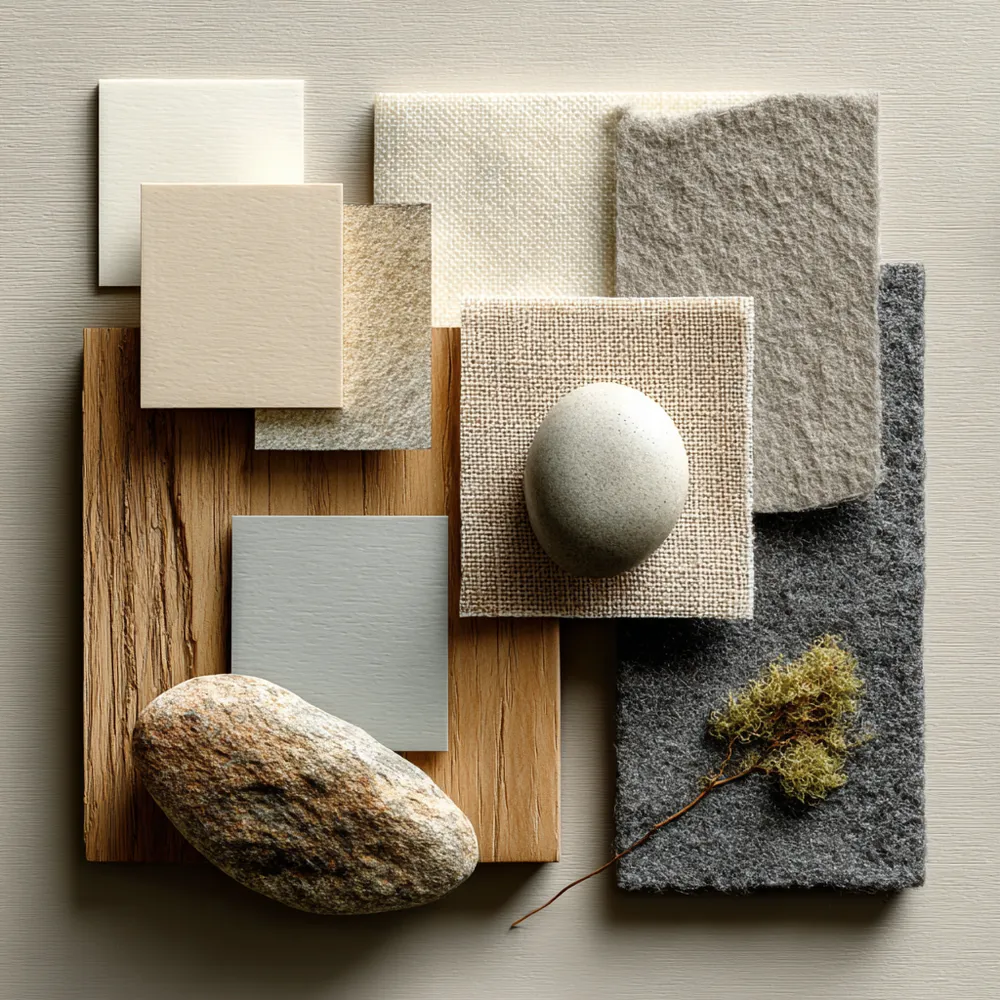
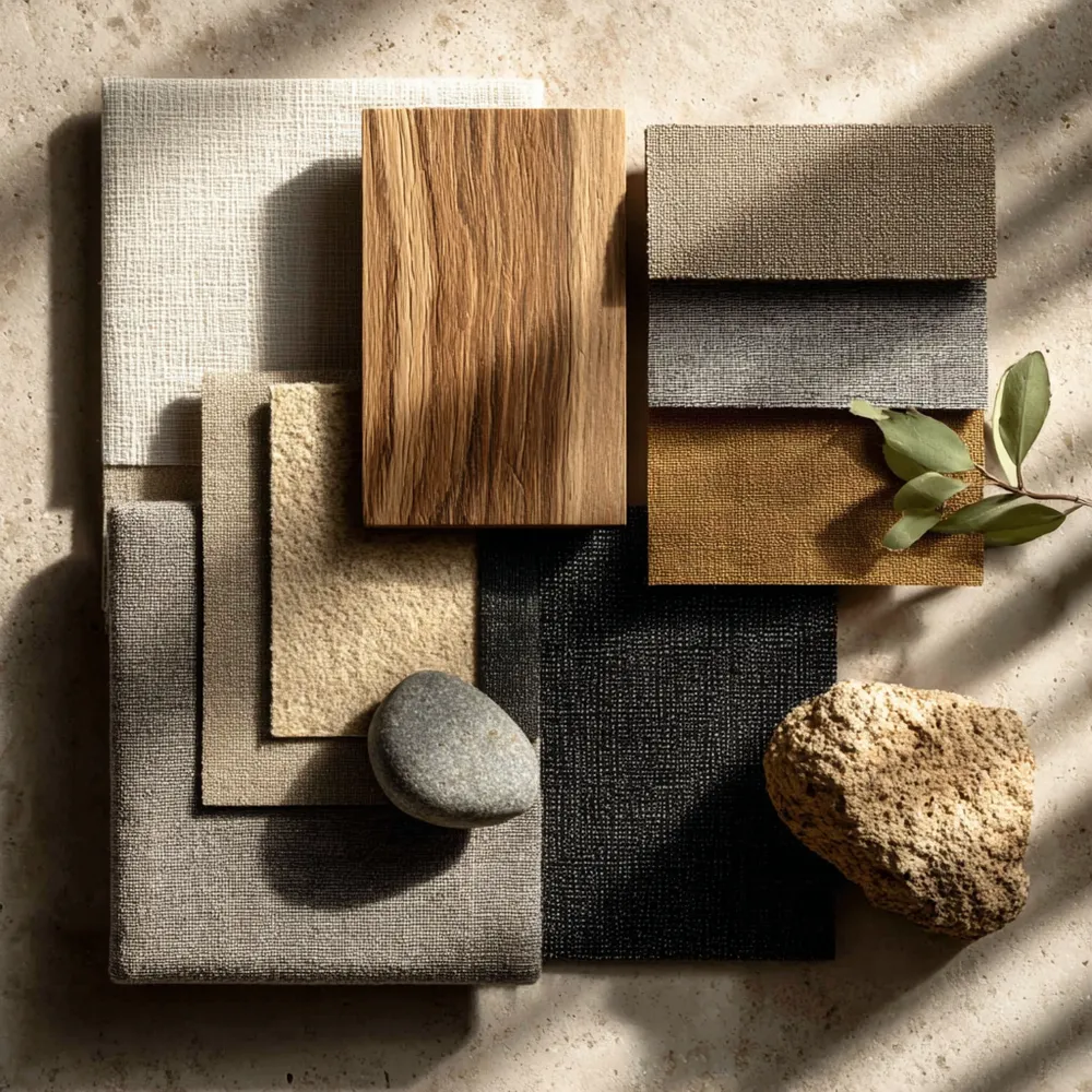
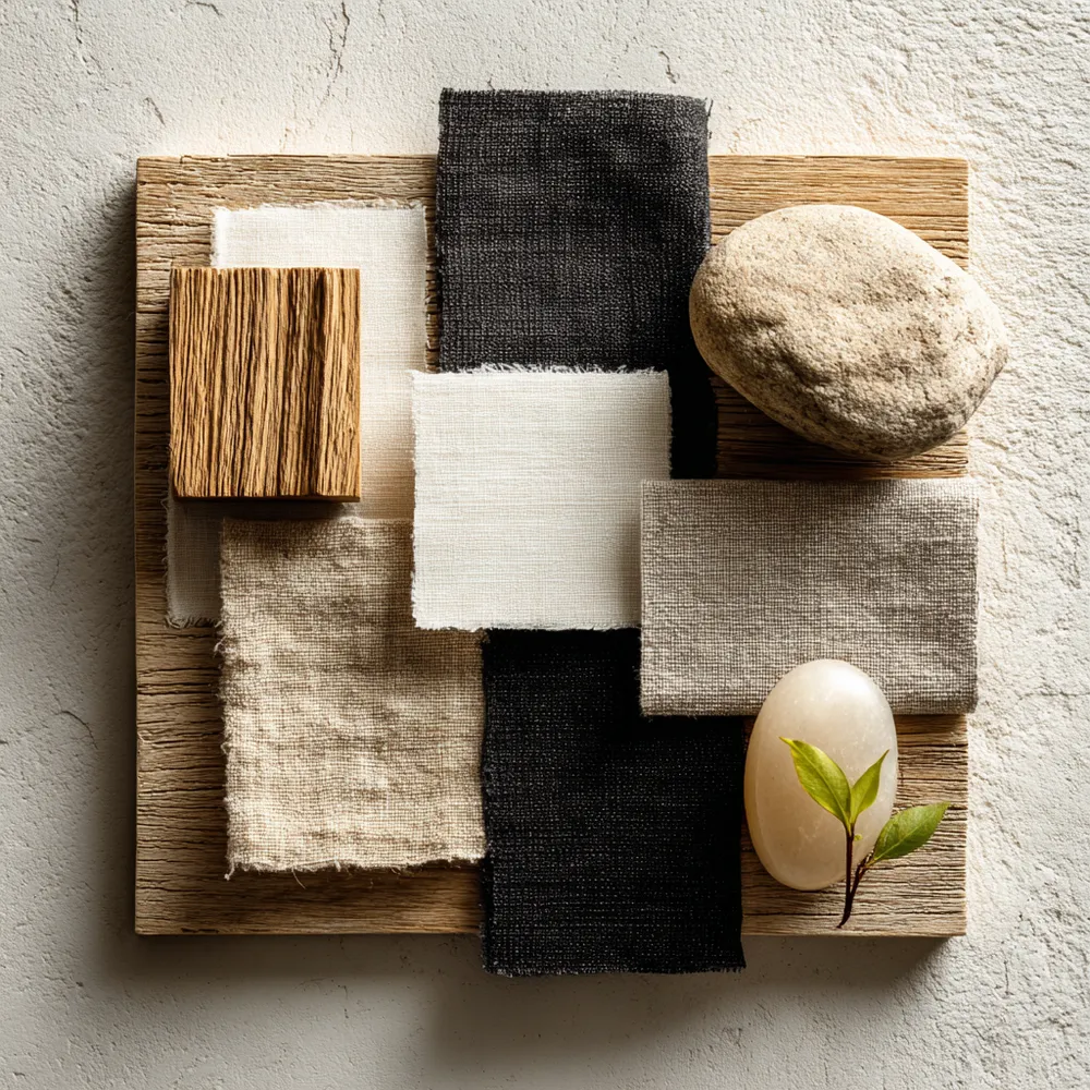
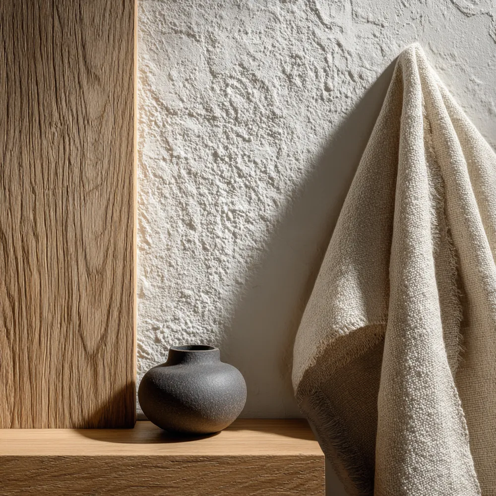
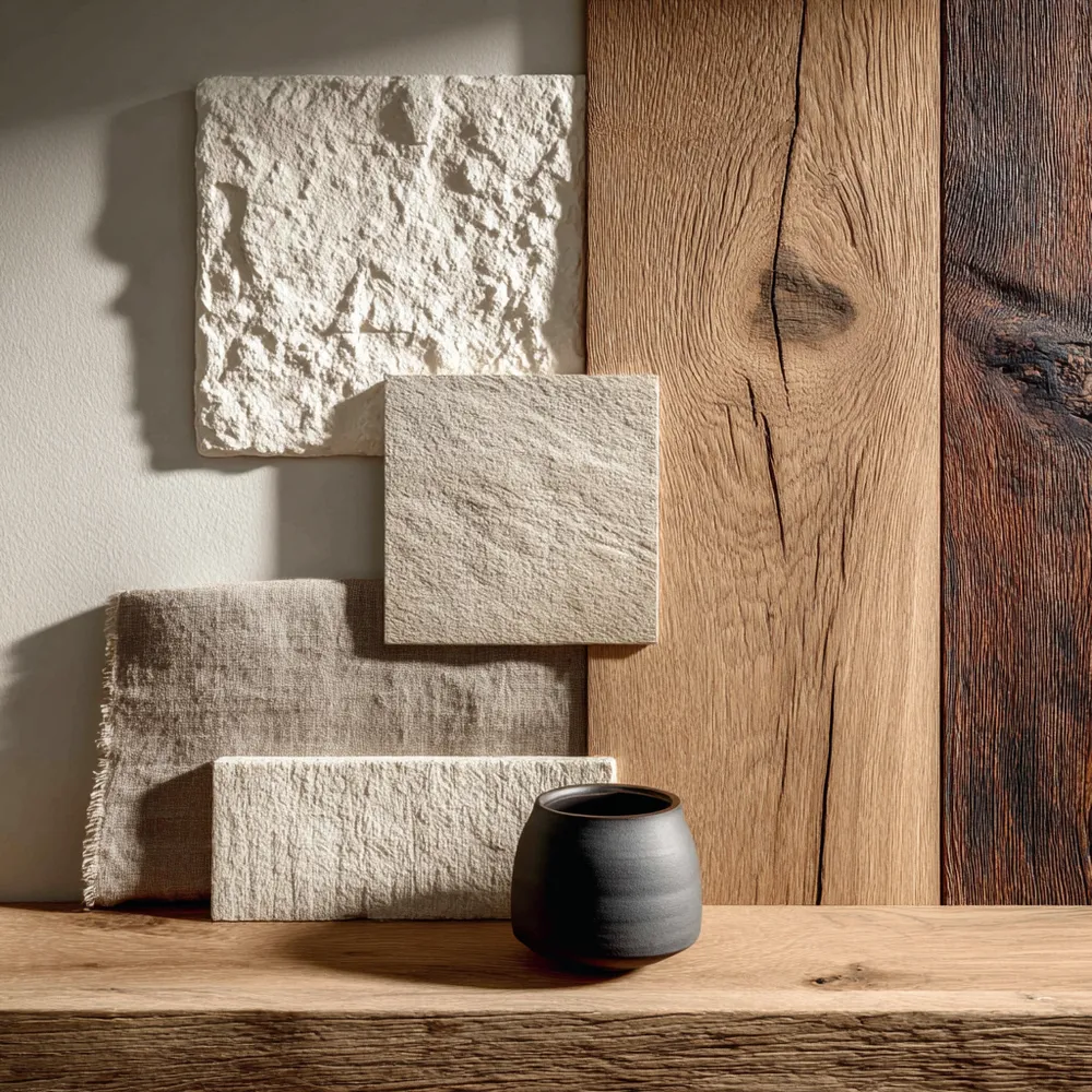
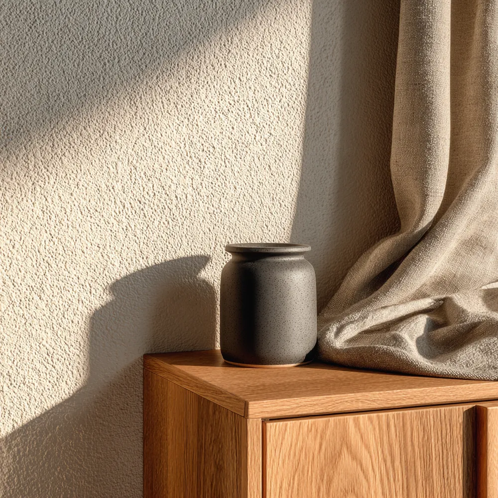
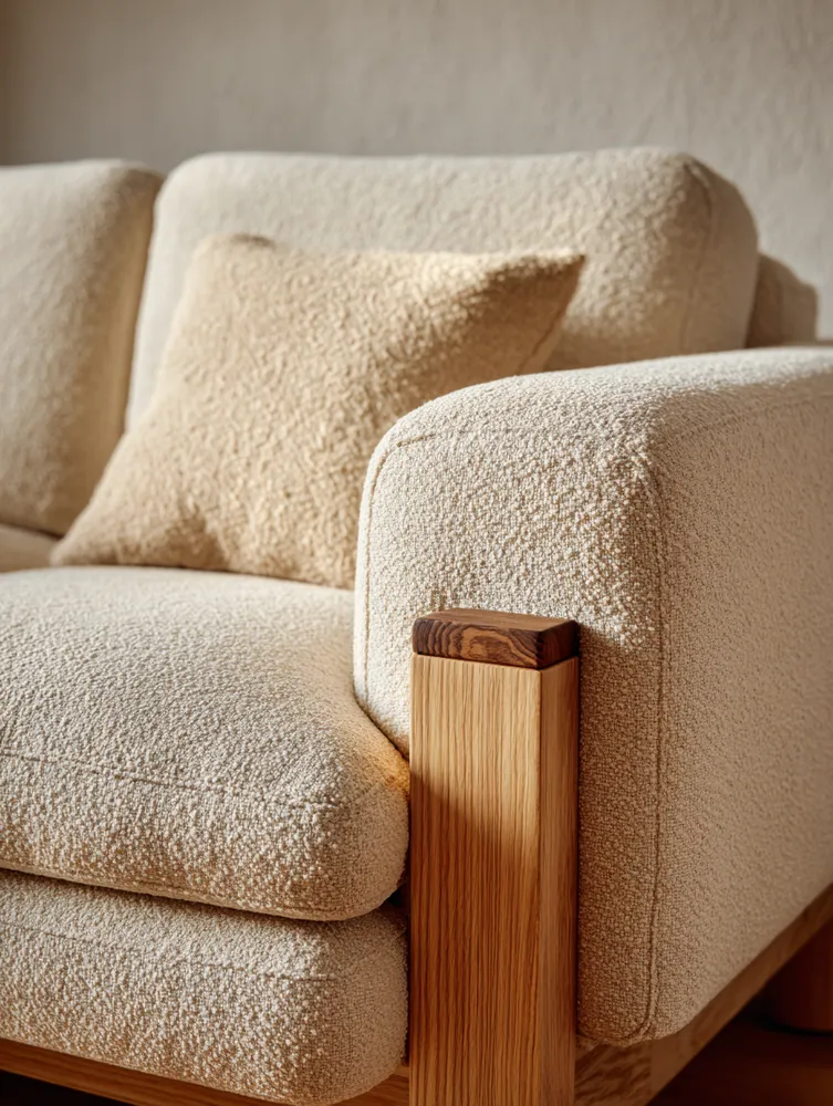
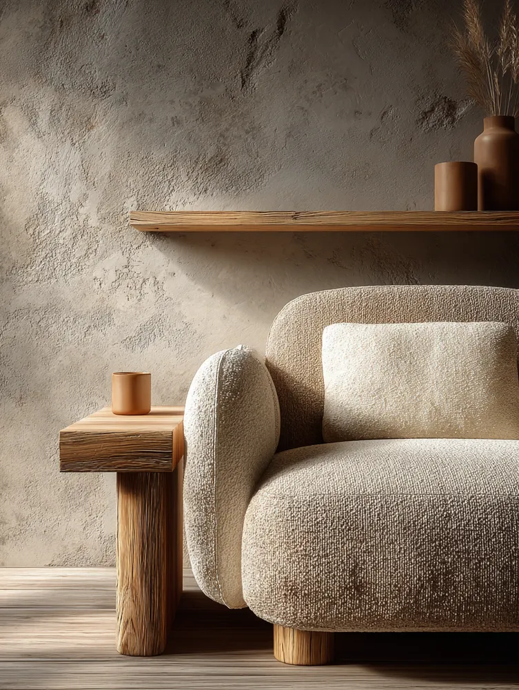
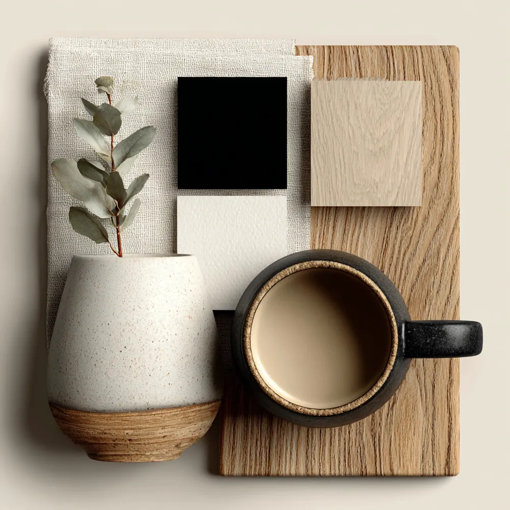
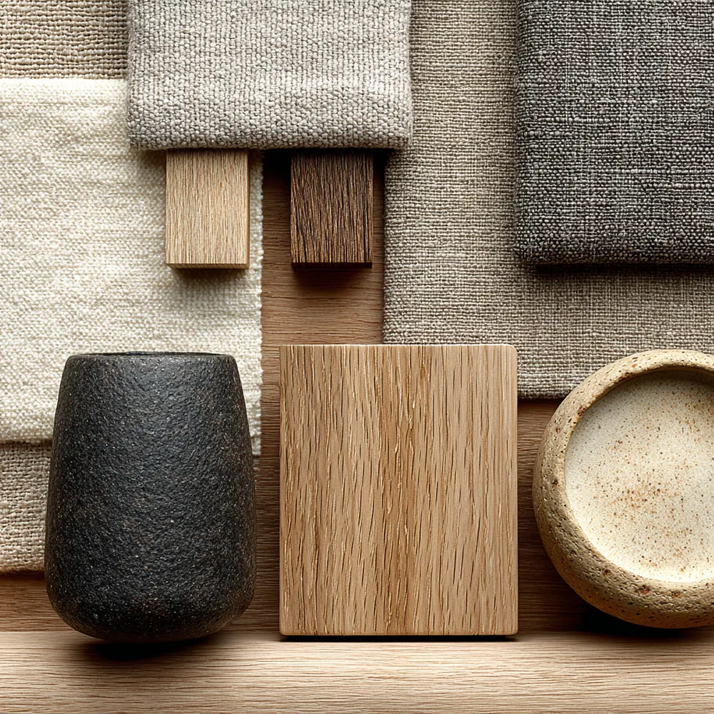
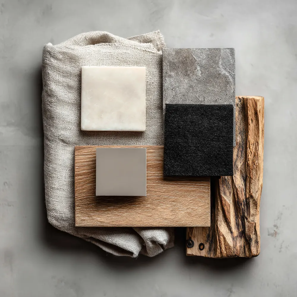
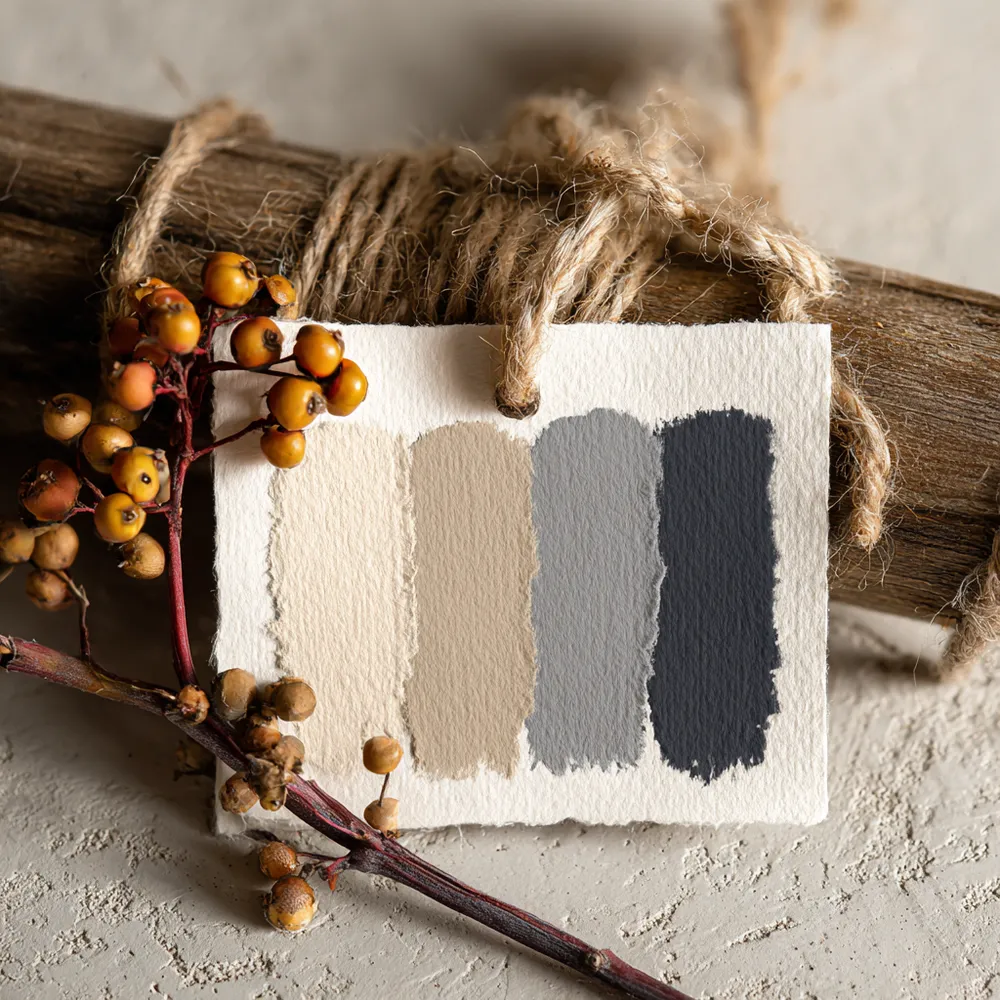
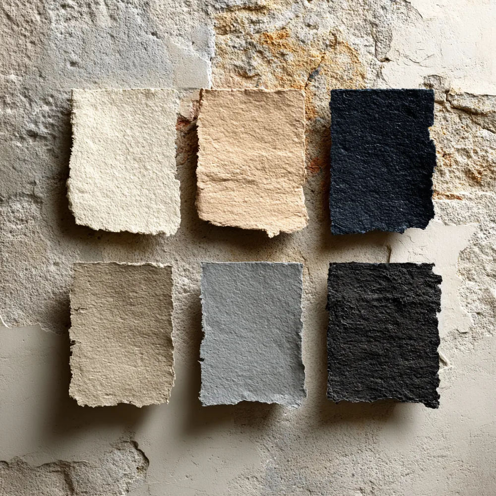
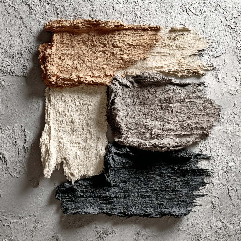
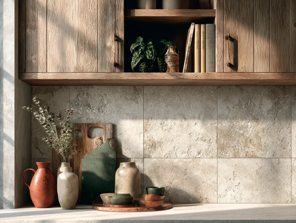
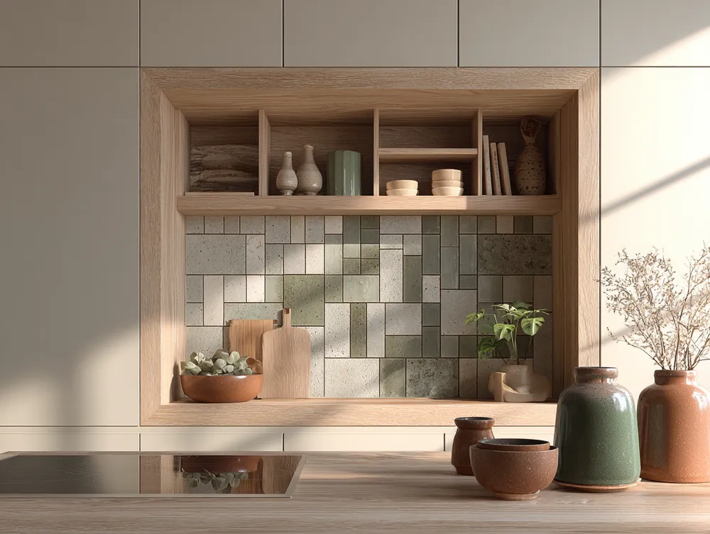
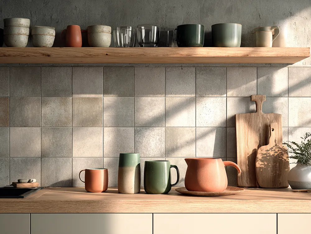
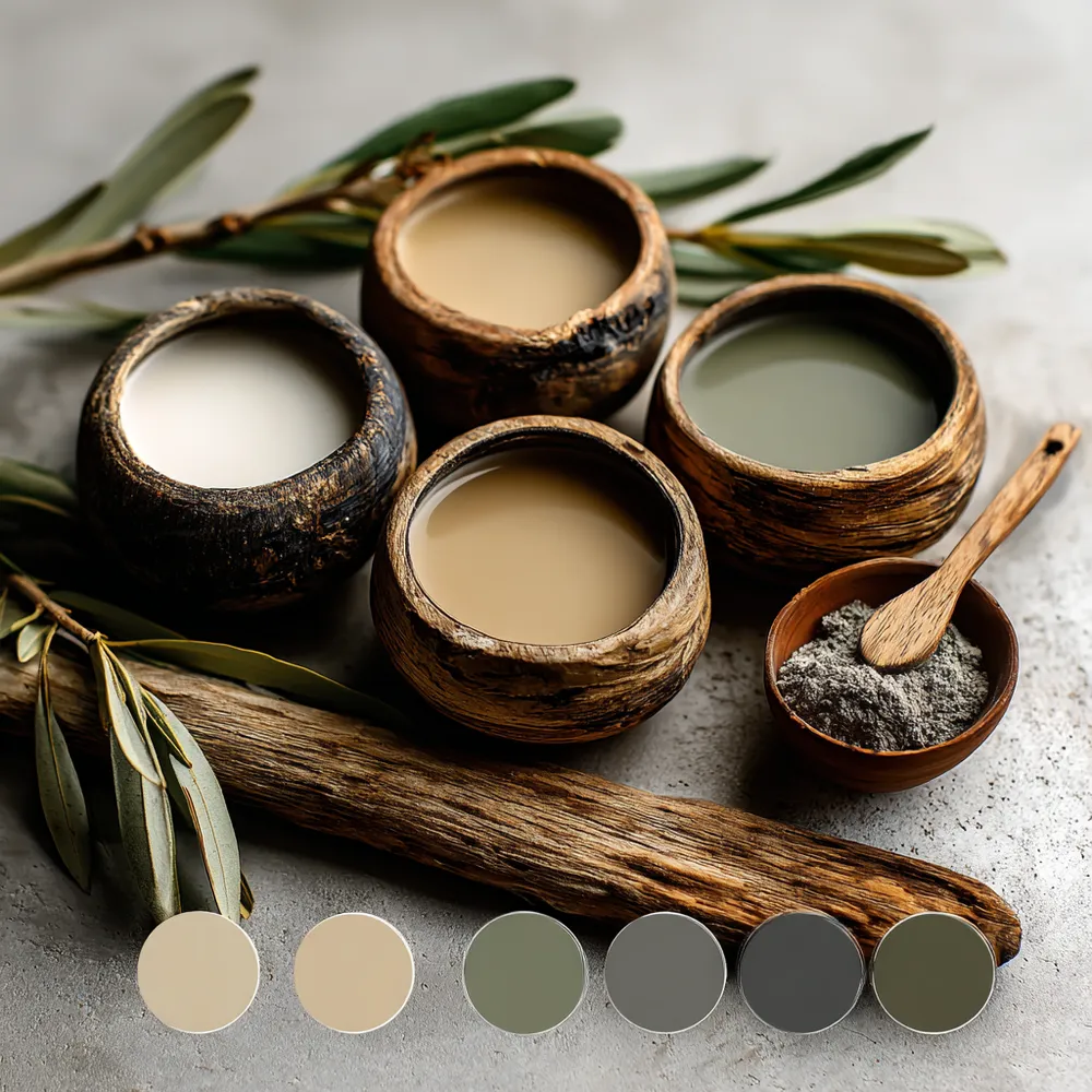
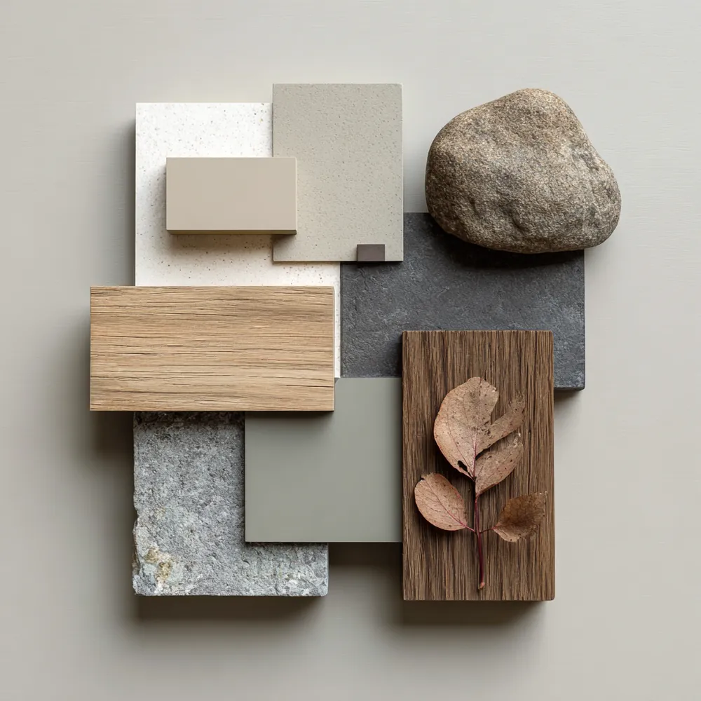
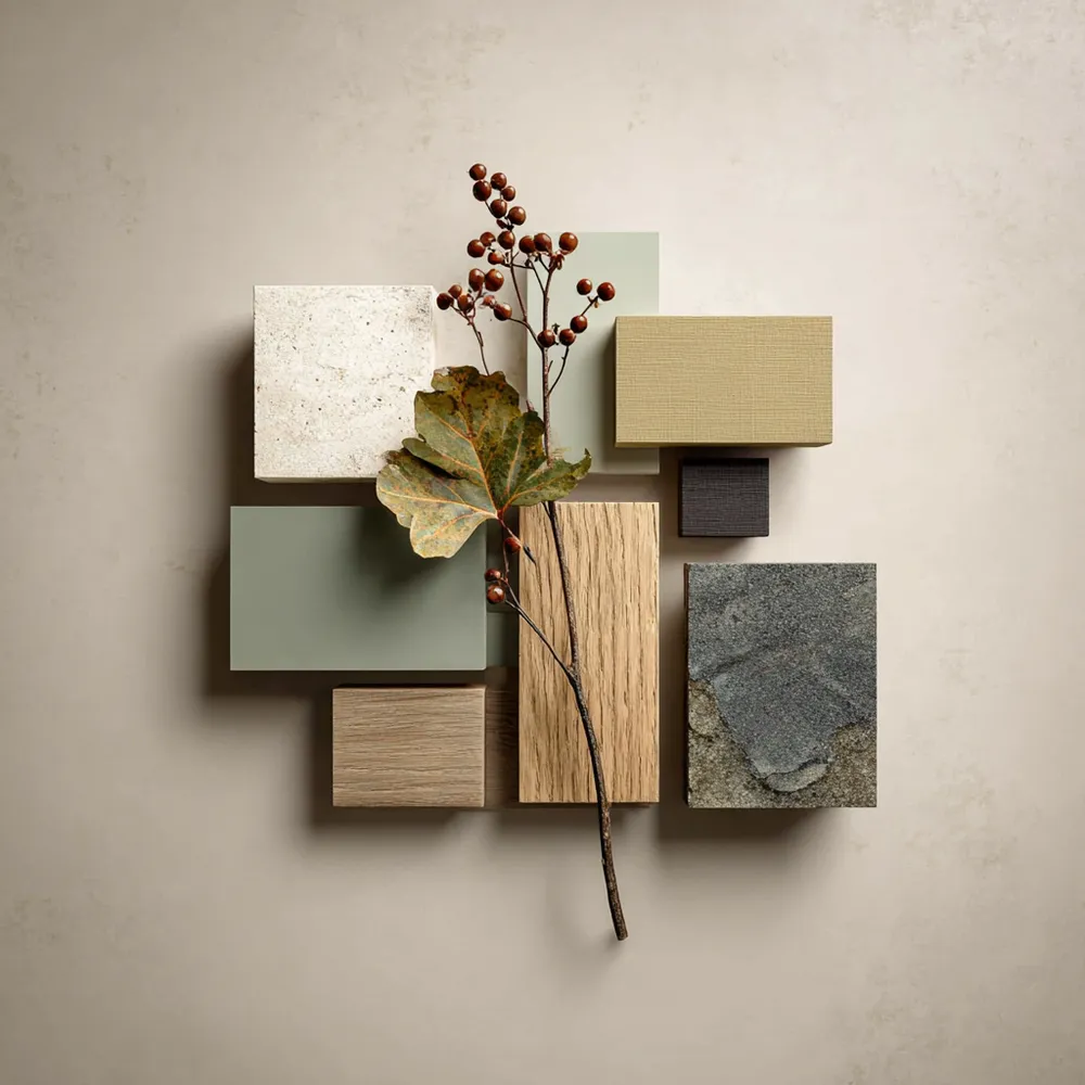
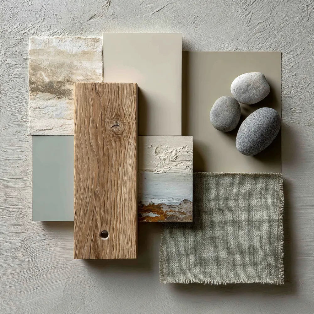
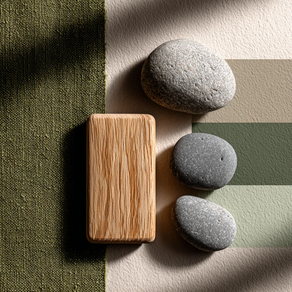
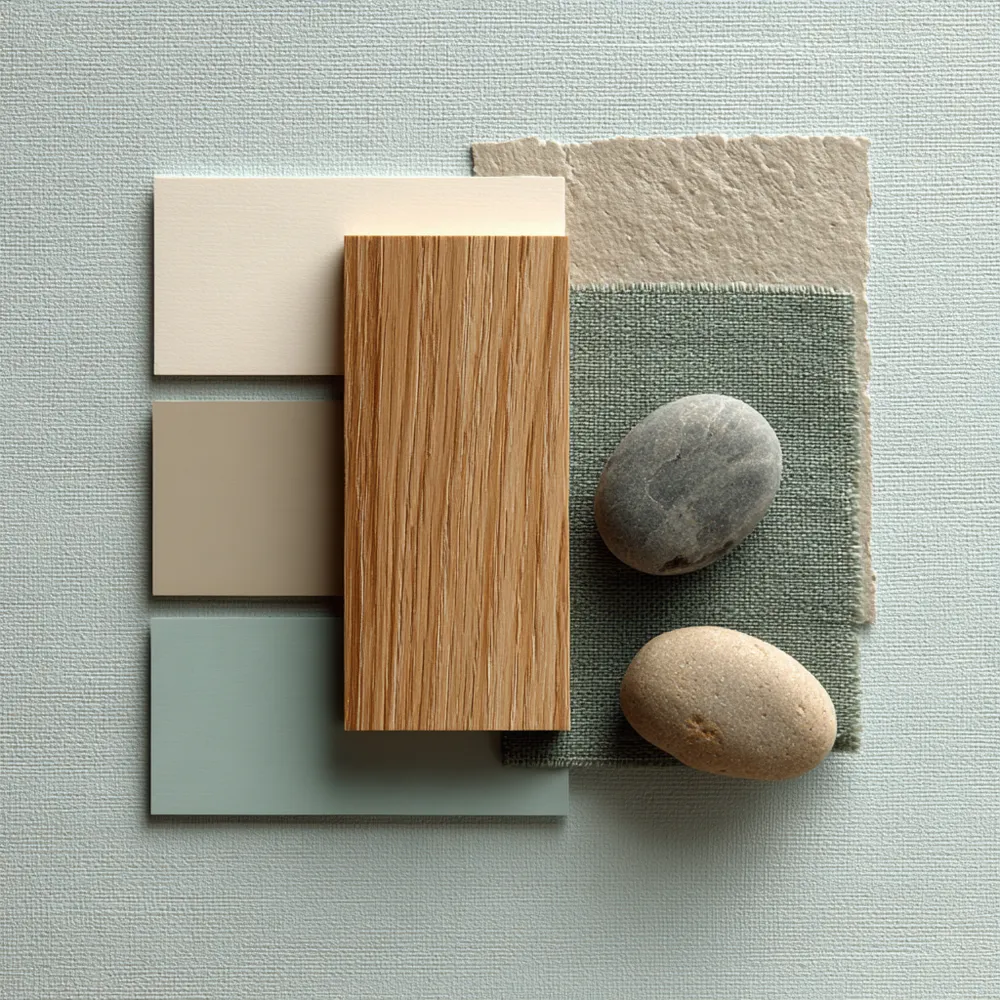
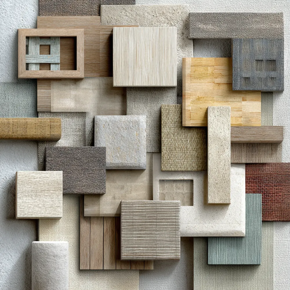
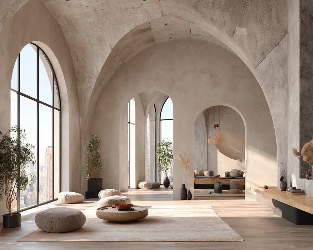
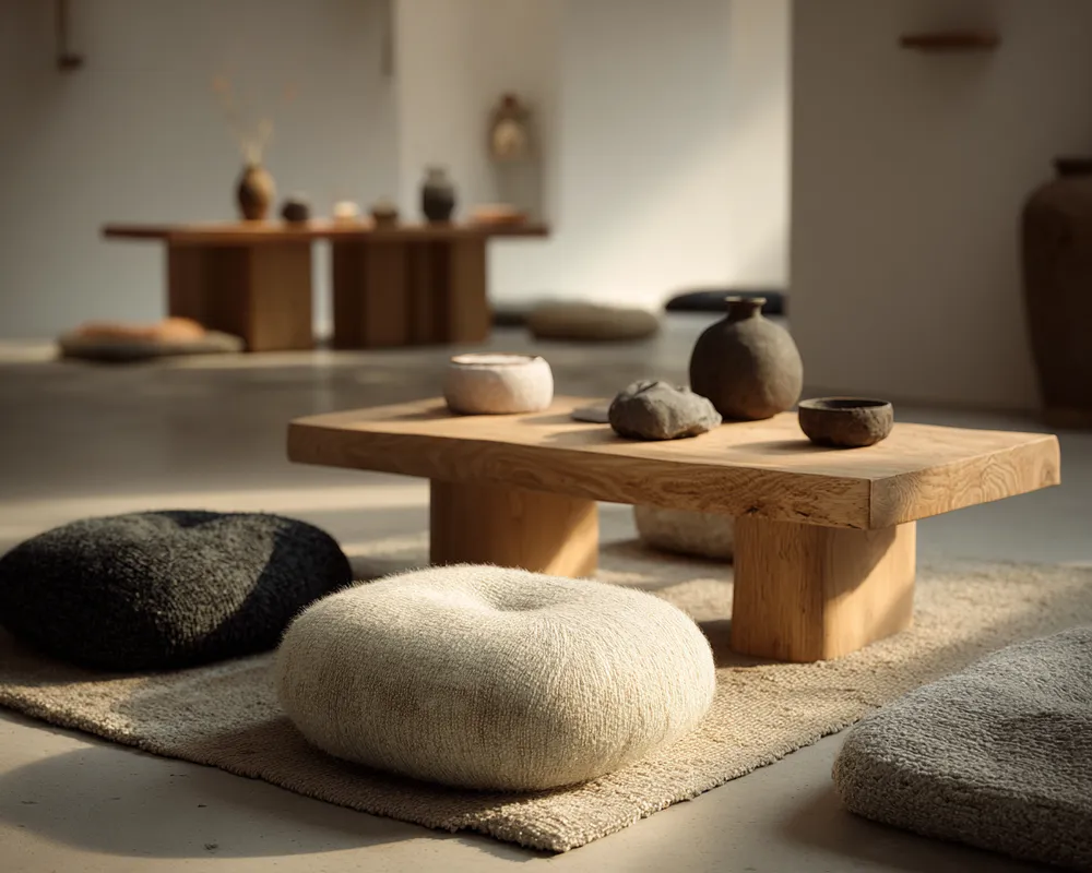
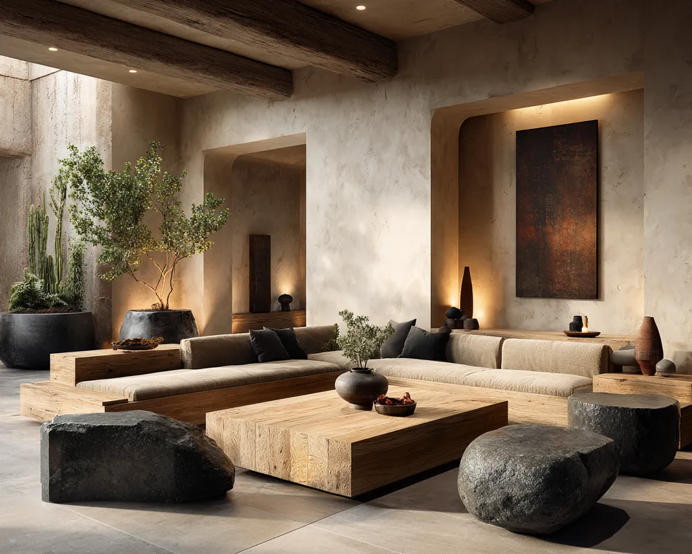
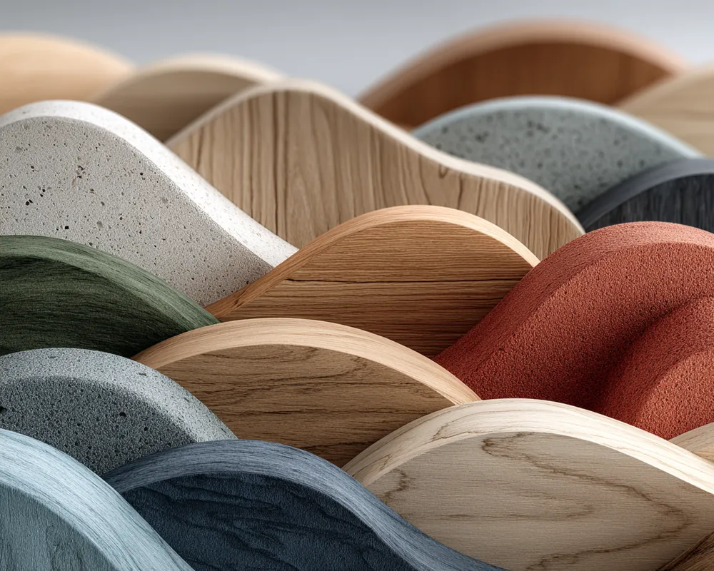
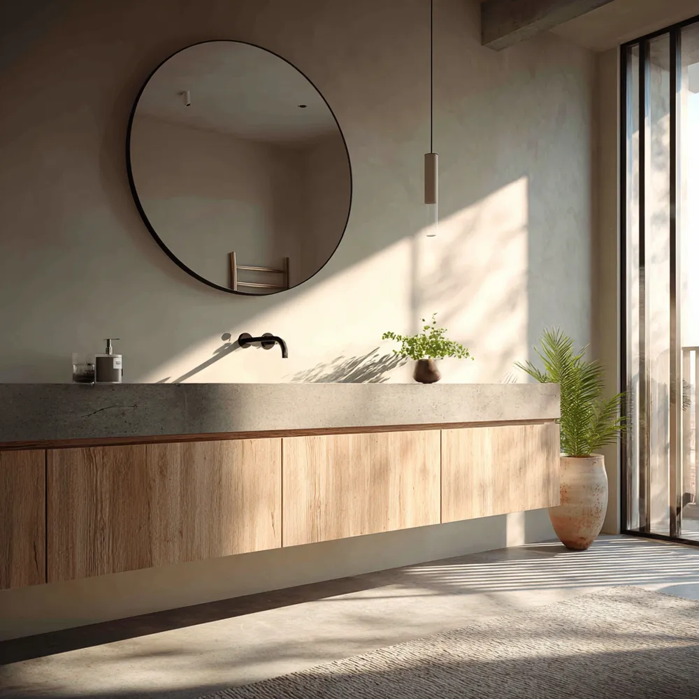
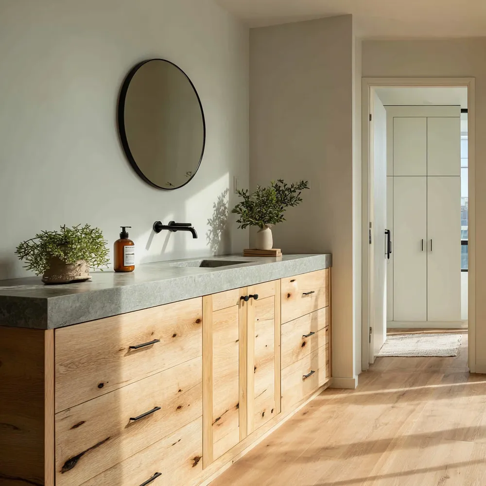
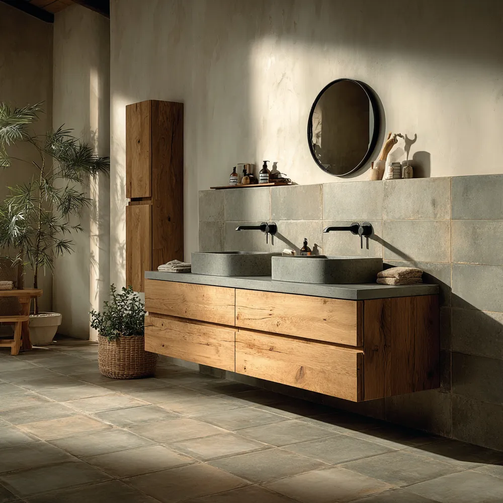
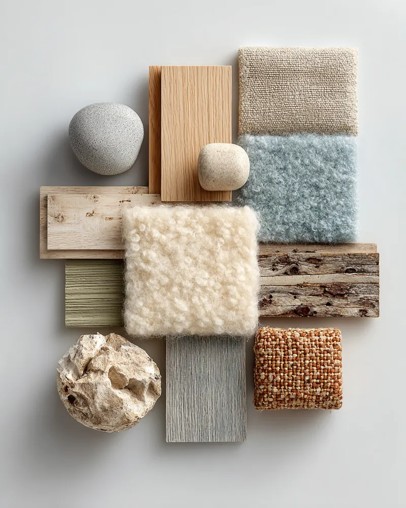
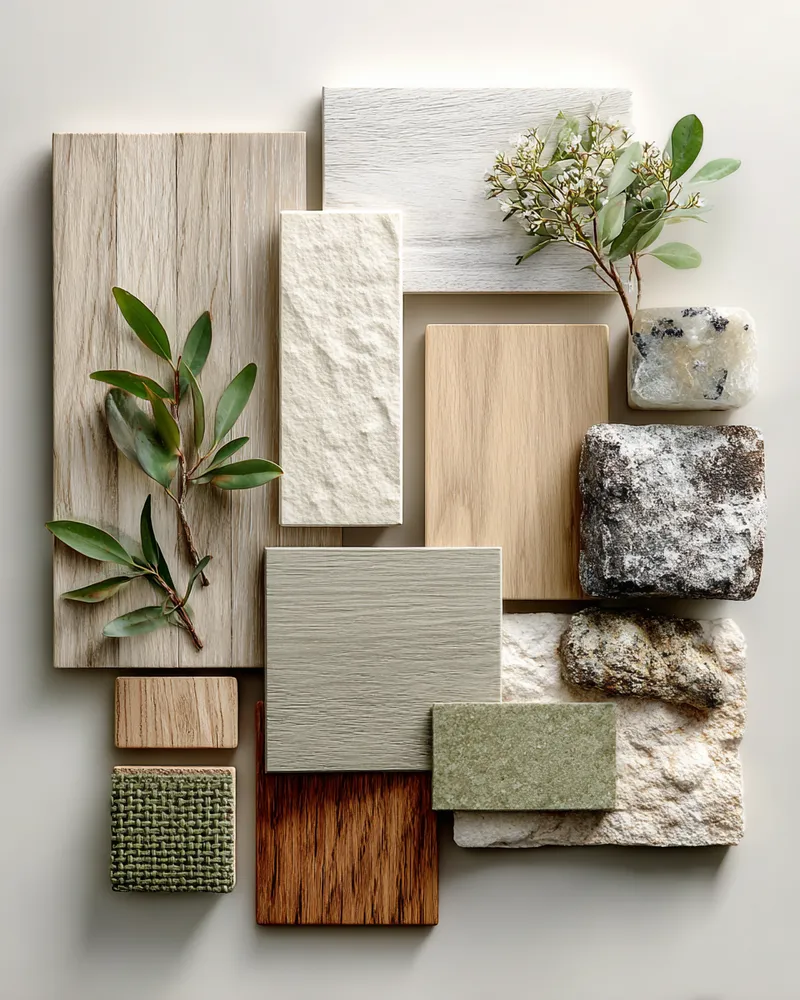
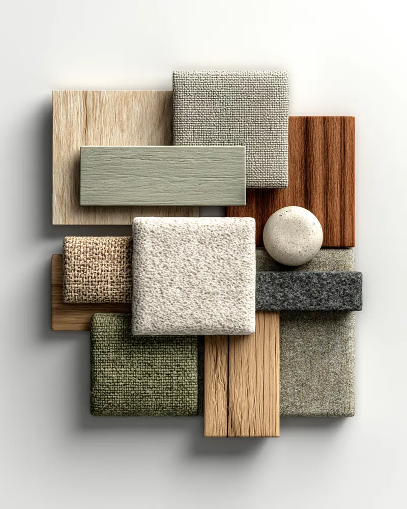
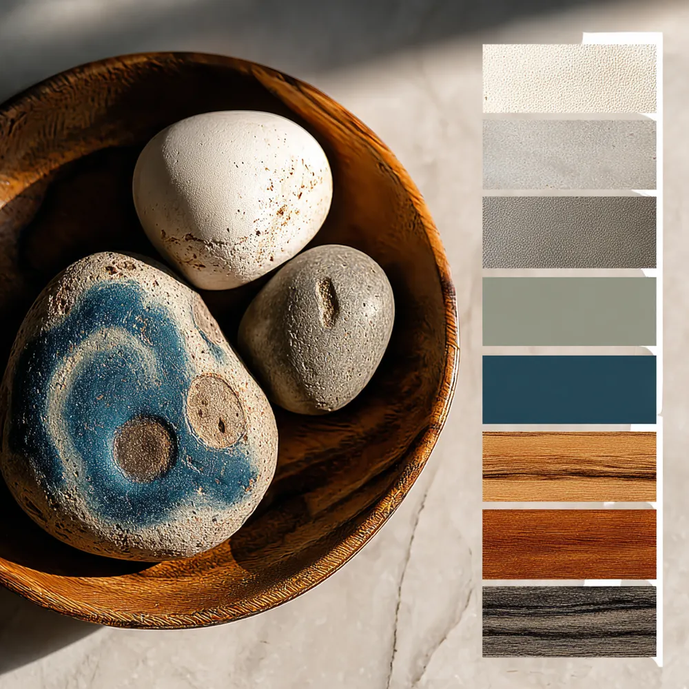
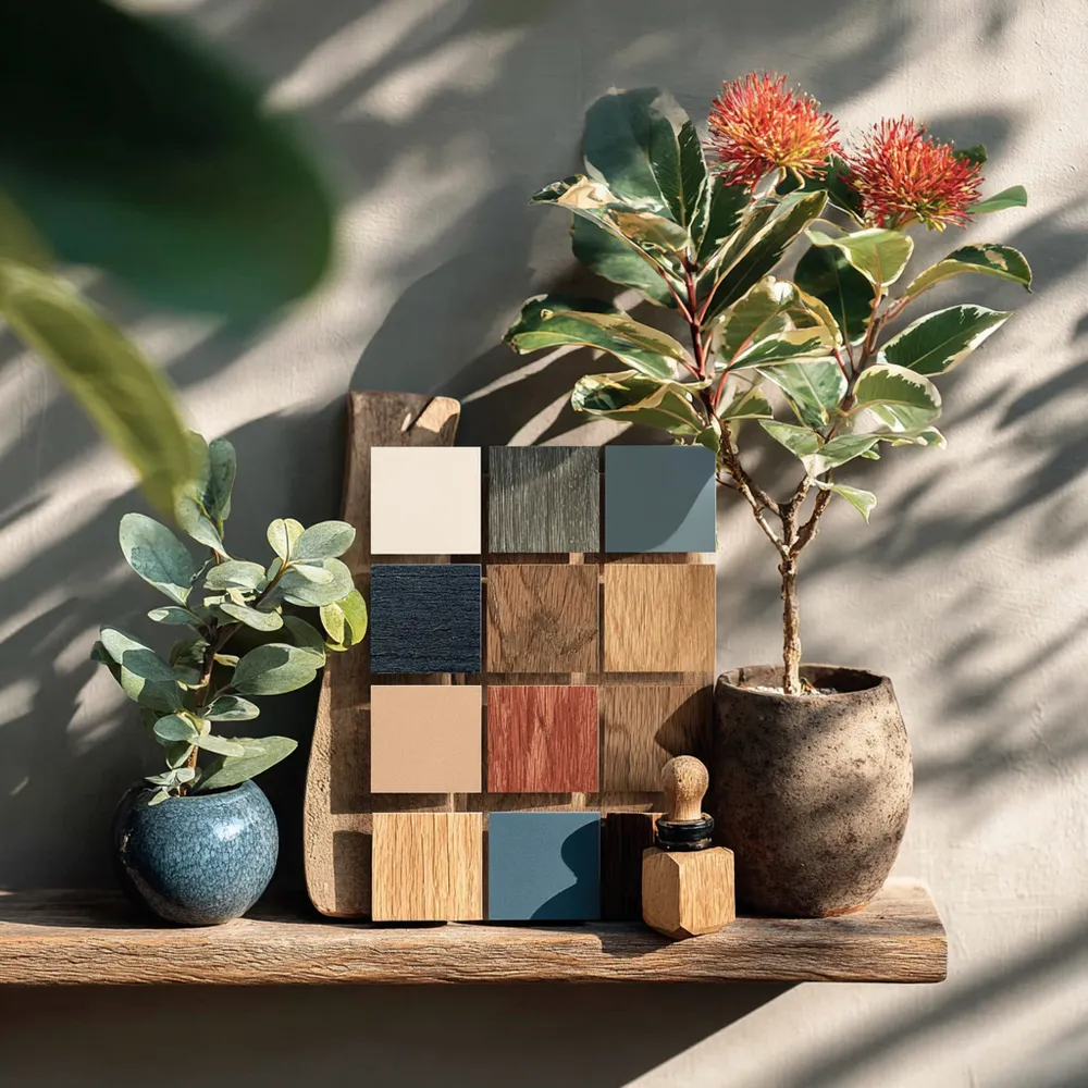
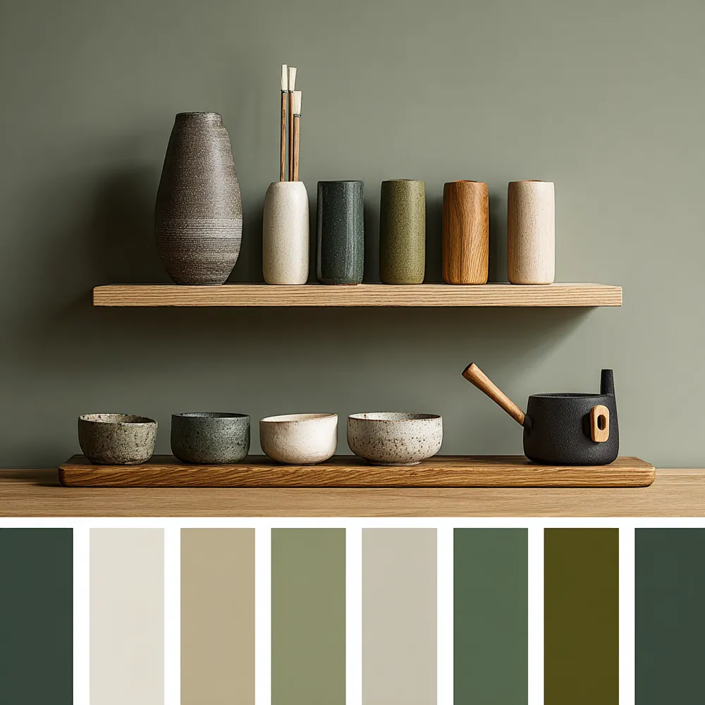
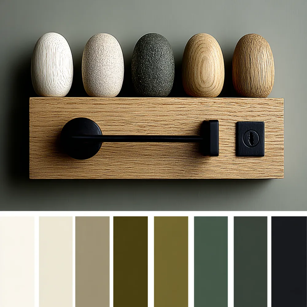
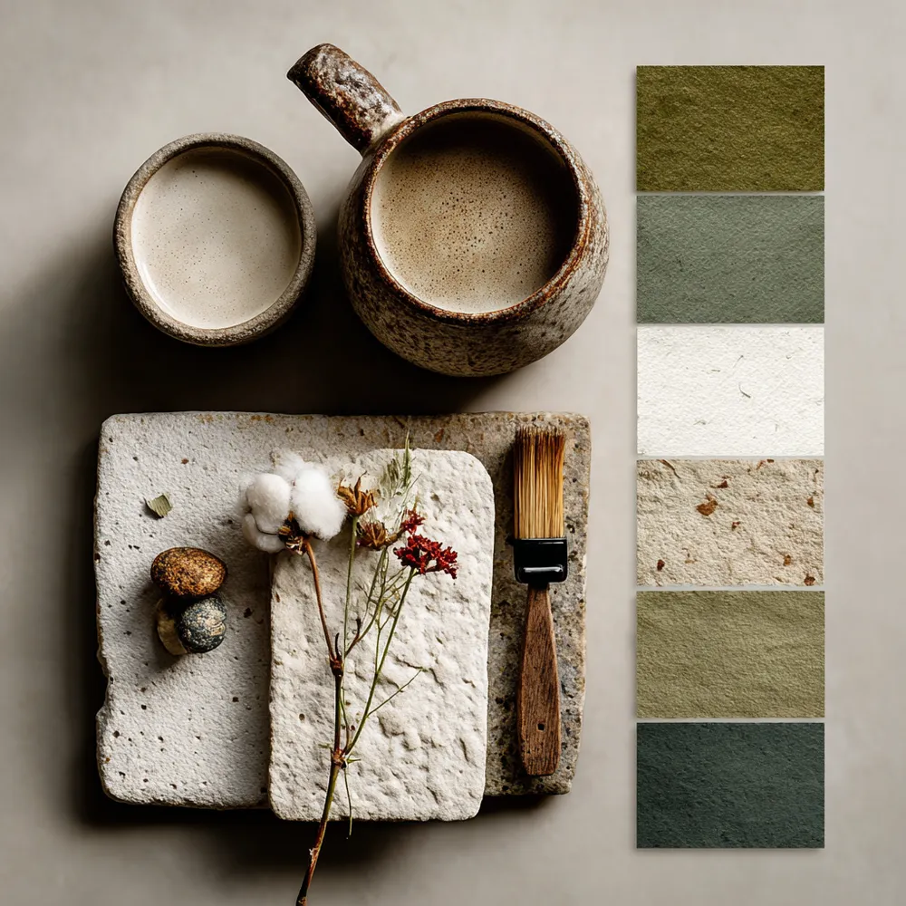
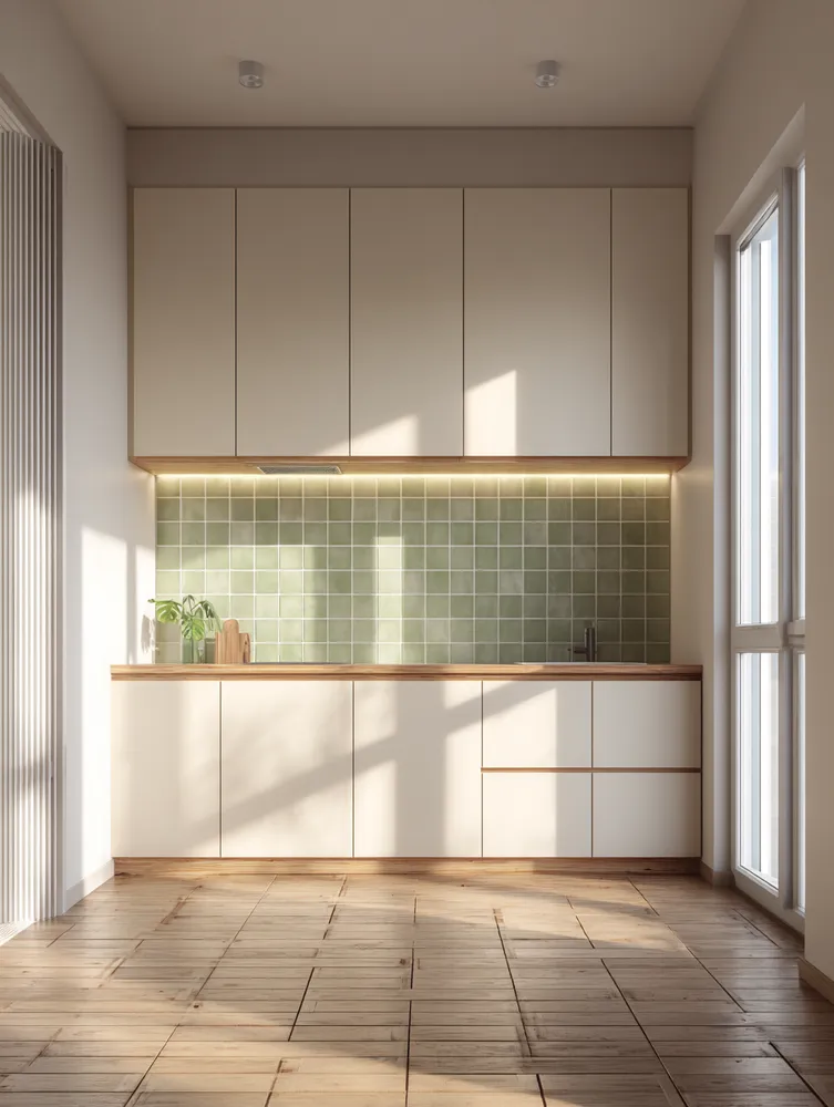
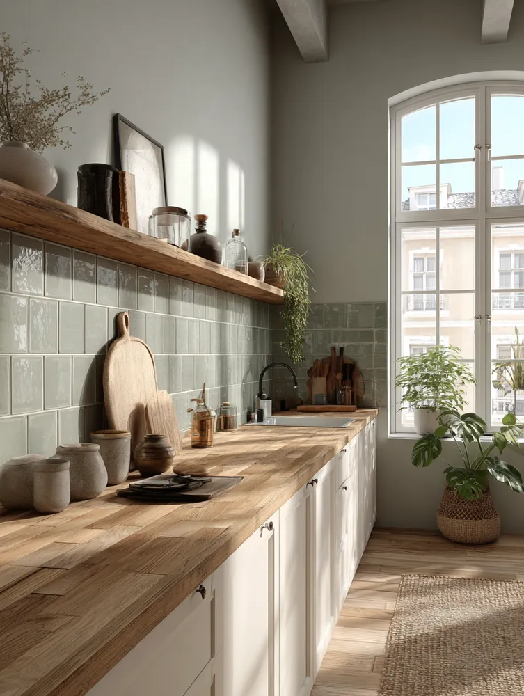
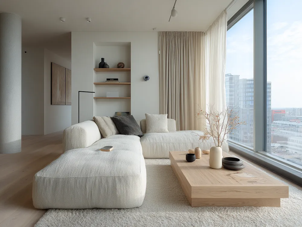
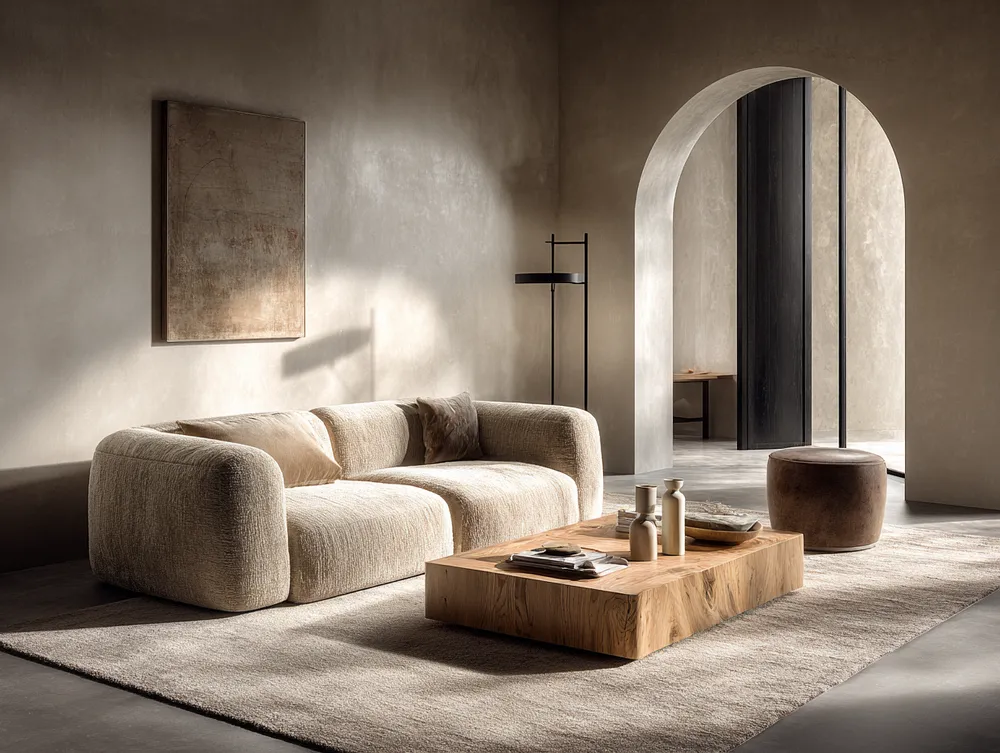
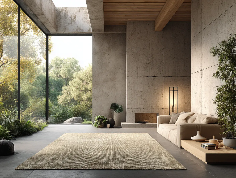
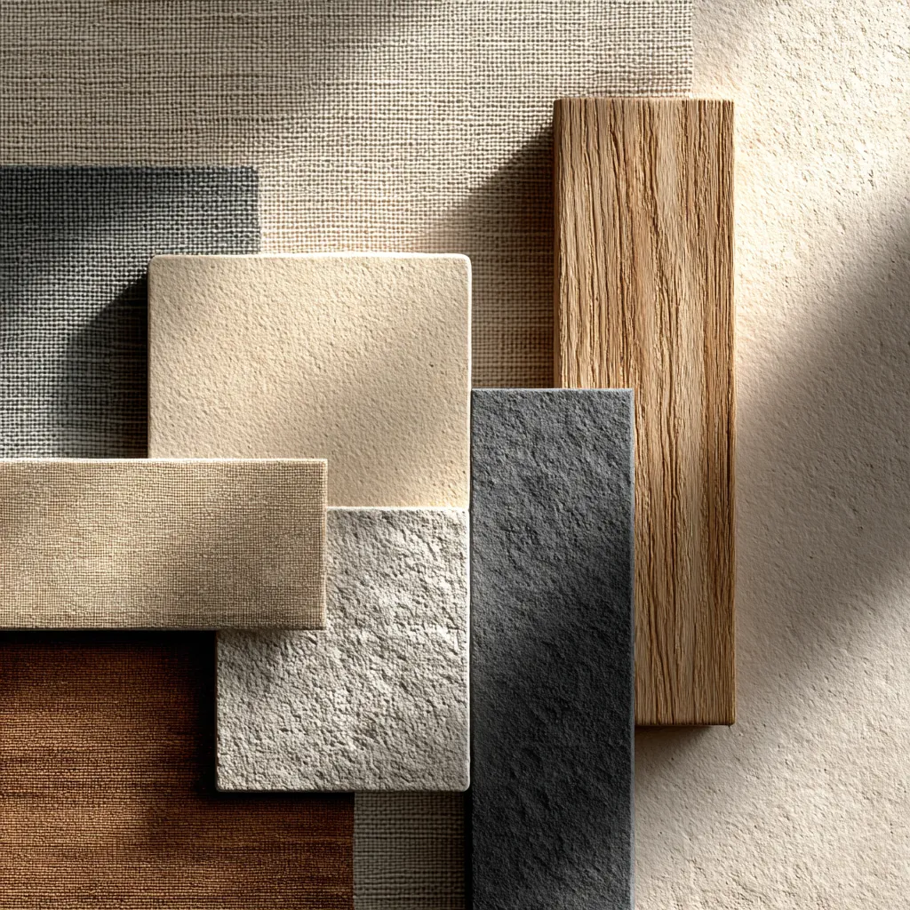
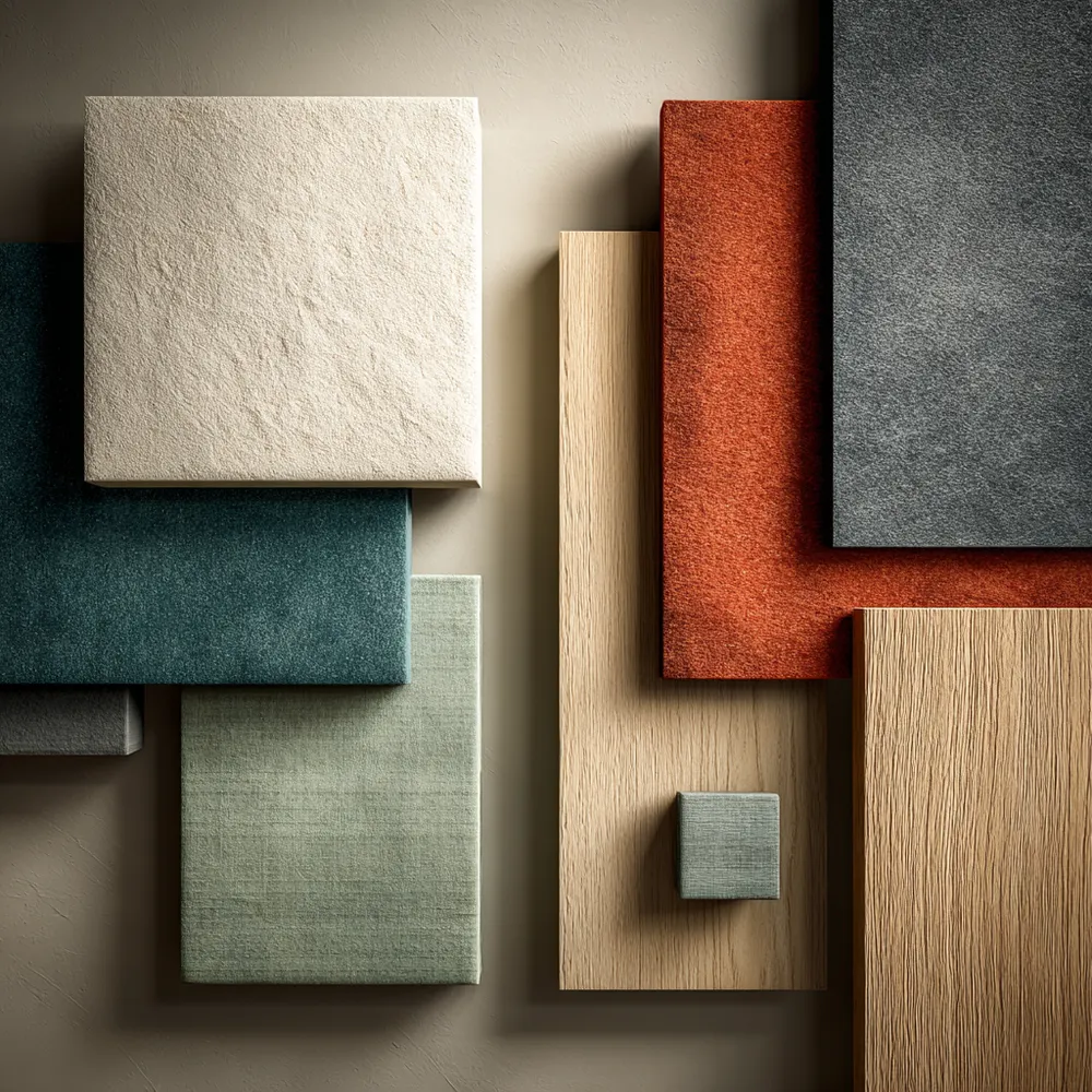
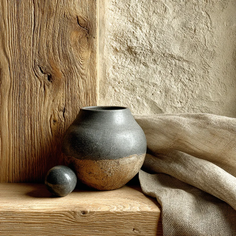
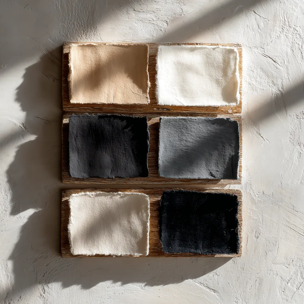
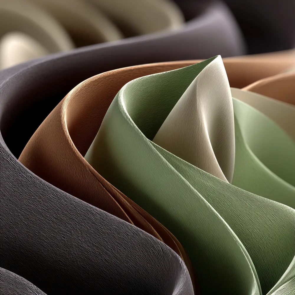
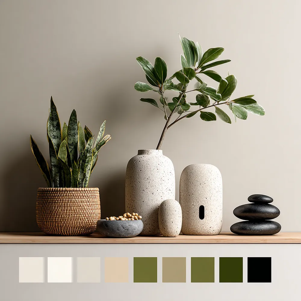
The Japandi color palette is the foundation of its serene aesthetic, relying on a harmonious blend of neutrals. ☯️ Think soft whites, warm creams, earthy beiges, muted grays, and subtle charcoals. These colors evoke a sense of calm and sophistication, creating a backdrop for natural materials. Avoid harsh or overly saturated hues. The subtle variations within these tones add depth and visual interest without creating distraction. This 'Japandi color palette' guide helps you achieve a truly tranquil and cohesive home. Save for your next design project! ✨ #JapandiIdeas #ColorPalette #NeutralTones #HomeDecorInspo #JapandiStyle #InteriorDesignColors #MinimalistColor #CalmInteriors #Wabisabi #HomeInspiration
28 de out. de 2025
Copiar Estilo
Há 0 comentários no total
 Ainda não há comentários
Você também pode gostar
Neutral Palettes: Japandi's Serene Color Scheme 🤍

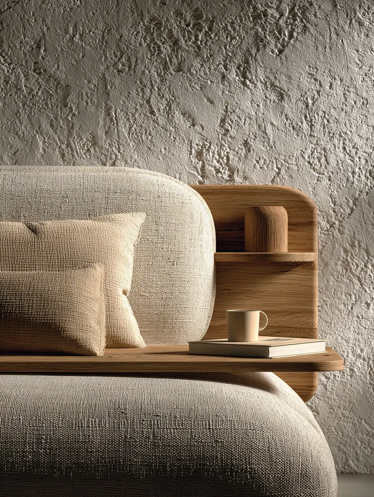
Understated Elegance: The Role of Neutral Palettes in Japandi ☁️

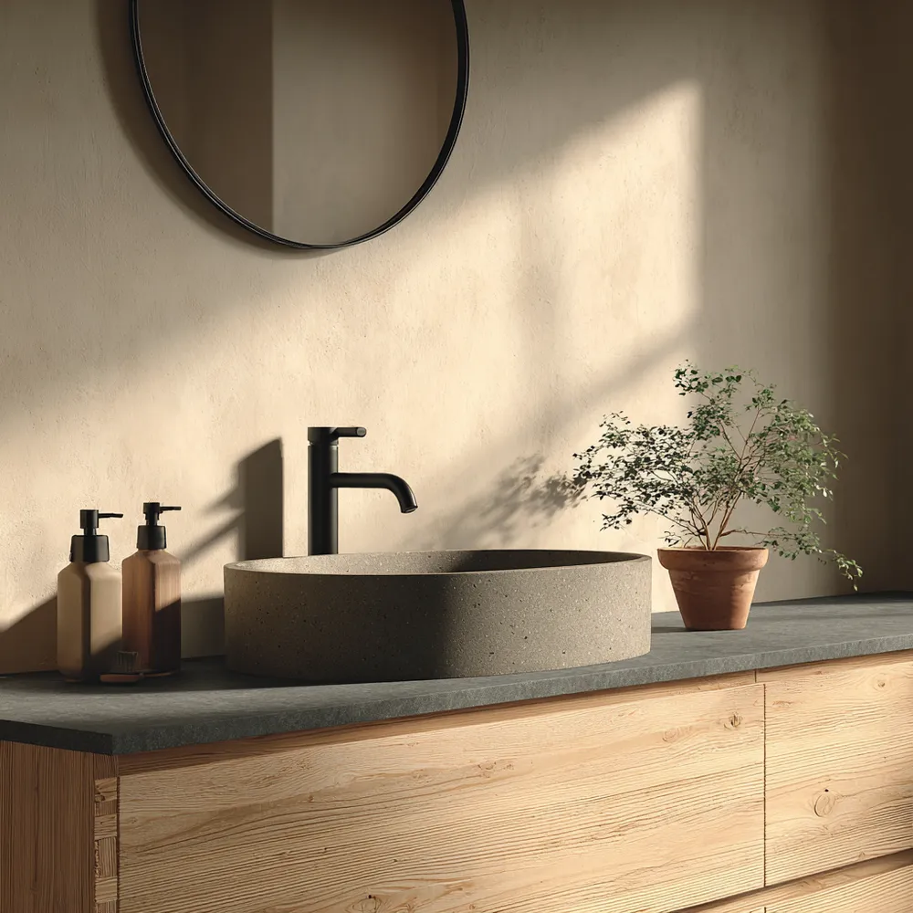
Color Palette Perfection: Japandi Bathroom Hues 🤍

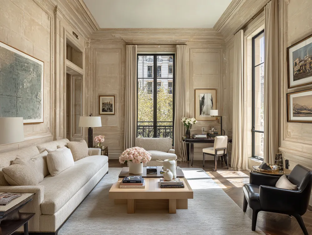
Neutral Palettes with a Twist: Adding Depth and Interest 🤍🖤

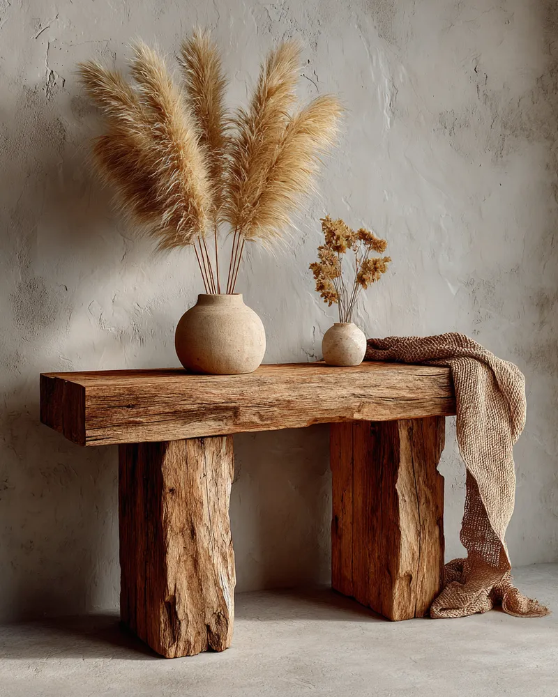
Japandi Color Palettes: The Power of Neutrals 🤍

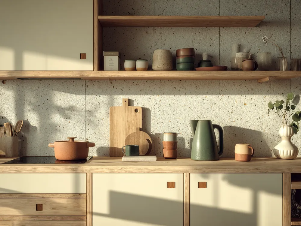
The Japandi Kitchen Palette: Neutrals & Nature Inspired Tones 🍎
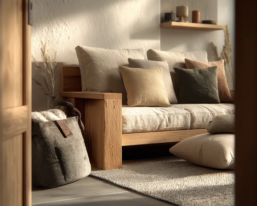
The Power of Neutrality: Japandi Color Schemes 🤍

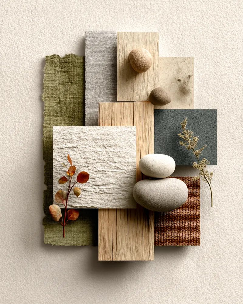
Color Palette: The Serene Neutrals of Japandi Living 🎨
Soft Neutrals & Earthy Tones: The Japandi Color Palette 🤎

The Japandi Color Palette: Serene & Earthy Tones 🎨

My Go-To Palette: Creating Calm with Japandi Color Schemes 🎨
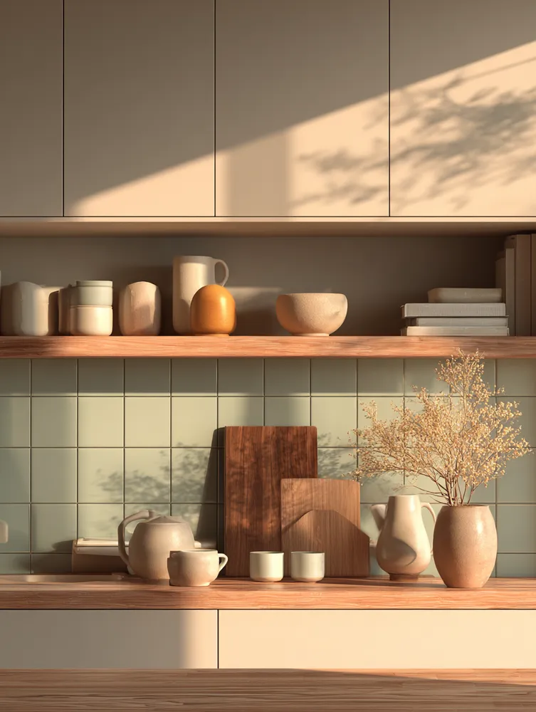
The Joyful Calm of Muted Pastels: A Japandi Kitchen Palette 🌸

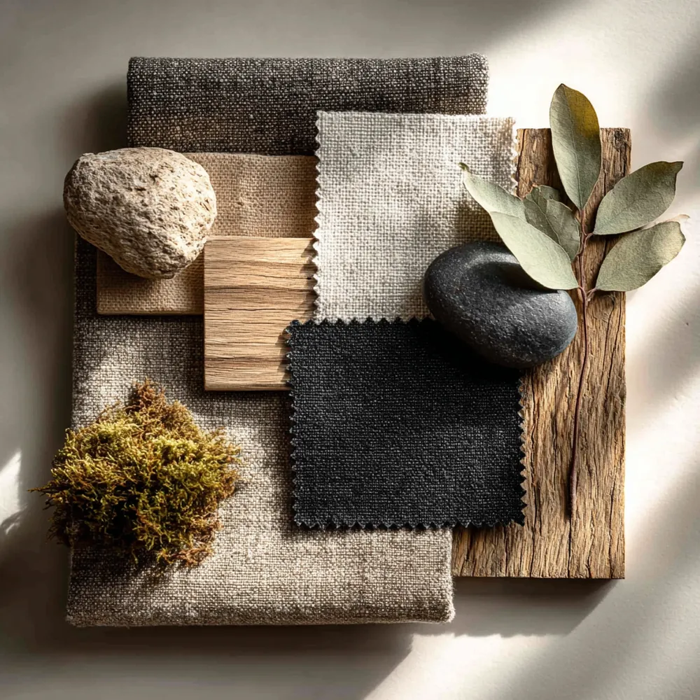
Japandi Color Palette: Soothing Neutrals & Earth Tones 🎨
The Japandi Palette: Embracing Serene, Earthy Tones 🤍
✨ Japandi Color Palette: The Serenity Secret!

Finding Harmony: Japandi Color Palettes for a Tranquil Home ✨
The Neutral Palette: Colors of Japandi Design 🎨
The Japandi Color Palette: Serene Neutrals for a Calm Home 🤍
Harmonious Hues: The Japandi Color Palette 🎨

Balancing Act: Japandi Color Palette Secrets 🎨💚