




1/18
We Ranked 16 Chain Restaurants' Decor From Worst To Best
The ambiance of a restaurant significantly contributes to the overall dining experience, extending beyond the food, service, and drinks. National chain restaurants meticulously plan their aesthetic, incorporating elements like furniture, paint schemes, glassware, and cutlery. This deliberate design often leverages psychological research to influence how food is perceived, affecting taste, quality, and value. For instance, soft, warm lighting can enhance dish presentation and foster intimacy, while bright lights might make a meal feel rushed. Similarly, color psychology plays a role, with earthy tones promoting relaxation and bold shades stimulating appetite.
This analysis evaluates the decor of 16 chain restaurants, each with at least five locations across multiple cities, ranging from fast-food to upscale establishments. Emmy Squared, a Detroit-style pizza chain, presents an industrial-chic and bistro-like aesthetic with low lighting, simple wood and metal furniture, and a neutral color palette. While clean and generally appealing, its decor is noted as somewhat generic, lacking memorable inventiveness.
Uno Pizzeria and Grill, famous for deep-dish pizza, utilizes a signature checkerboard floor tile and a black, green, and red color scheme with Art Deco influences. Its retro charm, featuring large chandeliers and cozy booths, evokes a nostalgic feeling. However, some locations may require modern updates to maintain their appeal.
The Capital Grille, an upscale steakhouse, opts for traditional decor with mahogany panels, white tablecloths, and Art Deco chandeliers, projecting a grown-up yet somewhat dated 1980s elegance. Legal Sea Foods, a Northeast seafood chain, employs a tasteful nautical theme with dark blues and seafaring imagery. While some locations maximize water views, the decor can sometimes feel bland due to its broad appeal.
Shake Shack, a fast-food chain, differentiates itself with understated yet sophisticated decor, including elegant wood paneling, patterned tiles, wooden tables, and gentle lighting. This thoughtful design elevates the fast-food experience, reflecting the quality of its offerings, though it often remains simple and risk-averse.
The Cheesecake Factory is characterized by a grand and opulent, albeit kitschy, aesthetic, blending Egyptian columns with Victorian touches. Designed by Rick McCormack, this maximalist approach, coupled with extensive menus and large portions, creates a distinctive charm. Jack's Wife Freda features an exterior reminiscent of a Parisian bistro, often adorned with flowers. Its interior, with French bistro tables and elegant lighting, is cozy but can appear bland compared to its charming facade.
Five Guys stands out with a bold, consistent red and white checkered color scheme, evoking 1950s Americana. The use of red is intentional, as it is known to stimulate appetite. Restaurants include retro-style soda machines and wooden accents. P.F. Chang's combines food with visual appeal, featuring horse statues at entrances and a red and gold color scheme, though recent updates have incorporated more neutral tones. The dark, moody elegance is maintained through dim lighting and dark woods, while exotic murals add to the atmosphere.
Wagamama, a Japanese-by-way-of-UK chain, embraced open kitchens before they became widespread. Its industrial-chic decor includes exposed brick, high ceilings, and simple wooden and metal furnishings, creating an upscale ambiance. Fogo de Chao, an elegant steakhouse, invests in award-winning design, incorporating natural wood finishes, open dining plans, and statement chandeliers, often with elements referencing its Brazilian heritage and local aesthetics. Snooze, a breakfast and brunch spot, uses bright, energetic colors and retro-modern design elements, creating a vibrant and cheerful dining environment.
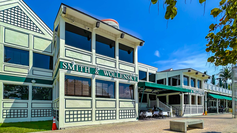
Sugarfish, an omakase-style sushi chain, emphasizes natural elements with extensive wood paneling, smoked lighting, and polished concrete floors. This understated decor mimics high-end Japanese restaurants while maintaining affordability. Smith & Wollensky, known for its old-school aesthetic, features a signature green, black, and white color scheme. While some interiors might appear dated with beige walls and mahogany, other locations leverage natural views, maintaining an inviting, classic atmosphere.
Din Tai Fung, a Taiwanese chain, boasts an upscale New York venue designed by the Rockwell Group, featuring a glass cube entrance, dim lighting, and traditional Chinese garden elements like round wall entrances. Red and gold tones create opulence, and a tapestry-inspired ceiling adds drama. Other locations maintain a modern aesthetic with clean lines and touches like paper lanterns. Daily Provisions, also designed by the Rockwell Group, extensively uses a calming blue, balanced with white marble and brass accents. Its award-winning design focuses on functionality and beauty, adapting to different dining needs throughout the day.
#RestaurantDecor #ChainRestaurants #InteriorDesign #DiningExperience #Ambiance #DecorRanking #RestaurantChains #DesignPsychology #CommercialDesign #RestaurantDecor #ChainRestaurants #InteriorDesign #DiningExperience #Ambiance #DecorRanking #RestaurantChains #DesignPsychology #CommercialDesign
 Ainda não há comentários