




1/9
Summer color trends for 2025 – 8 bang on shades interior designers can't get enough of
Summer 2025 is ushering in a vibrant era for interior design, with a strong emphasis on bold, vivid, and unapologetic colors, moving away from muted tones. Designers are advocating for more saturated hues that reflect the natural world's kaleidoscope of colors during the warmer months. This shift presents numerous opportunities for homeowners to infuse their spaces with energy and personality through strategic color choices, whether through paint or decorative accents.
One prominent trend for summer 2025 is the resurgence of baby blue. This pale, gentle shade, reminiscent of irises and cornflowers, offers a serene yet sophisticated touch. It pairs beautifully with antique brown furniture and can serve as a delicate backdrop to crisp whites, warm neutrals, or bolder accents, enhancing the overall palette without overpowering it. Recommended shades include 'Notting Hill' by Mylands and 'Borrowed Light' by Farrow & Ball, which provide subtle yet impactful blue undertones.
The dynamic pairing of red and yellow is another key color combination gaining traction. This duo creates an energetic and warm statement in interiors, ideal for high-traffic areas like entryways. The combination evokes passion and vibrancy, making spaces feel lively and inviting. Ruth Mottershead, Creative Director at Little Greene, highlights the impact of this pairing, while Ali Johnson of Otta Design notes how Farrow & Ball’s 'India Yellow' can transition a room from a warm, uplifting feel during the day to a cozy, moody ambiance in the evening.
Blue-grays are also experiencing a comeback, distinguishing themselves from the often-criticized flat grays of previous years. The focus is on grays with personality, featuring gentle blue and green undertones that prevent the color from appearing cold or bleak. The challenge lies in selecting a gray that achieves the perfect balance without leaning too icy or too overwhelming. 'Pigeon' by Farrow & Ball and 'Lamb's Ear' by Mylands are cited as examples of grays that offer depth and warmth.
Orange is positioned as the new neutral for summer 2025, evolving from the terracotta trend of 2024. This muted orange, described as terracotta's louder and bubblier sister, brings optimism and a smile-inducing quality to interiors. Interior designers like Leah Harmatz suggest opting for warm, muted, and subtly saturated orange shades with hints of brown and red, which can transform with the light. Jen Bienvenu emphasizes that these colors flatter candlelight and enhance wood tones, making everyone appear more vibrant. 'Crayfish Party' by Mylands and 'Heat' by Little Greene are recommended for achieving this trend.
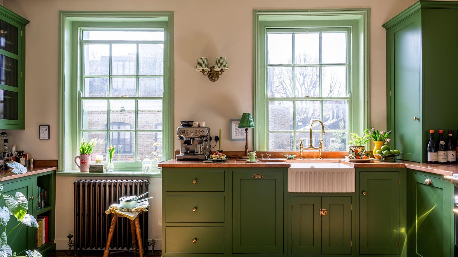
The article also notes a departure from sage green, which has become oversubscribed, in favor of stronger greens like bottle green. This shift seeks to bring a more striking and exciting feel to interiors, aligning with the chlorophyll-rich season. Fiona Duke, a London-based interior designer, emphasizes that a higher pigment content in green shades offers greater impact. 'Pleasure Gardens' by Mylands and 'Hunter Green' by Benjamin Moore are highlighted as exemplary bottle green shades.
Plaster pink is presented as a compelling alternative to beige, offering a warmer and more interesting neutral. Matthew Williamson, an interior designer, considers it his go-to neutral for creating a bright yet inviting summer atmosphere. He suggests using it for 'color drenching' a room to unify surfaces and highlight architectural details. This shade, particularly in linen, offers a soft, laid-back vibe.
Finally, celestial and metallic tones are gaining prominence, adding dimension and excitement without requiring a complete redesign. Interior designer Nadia Watts notes that incorporating metallic accents like cobalt or citrine can deliver a significant 'wow' factor. Layering colors with different finishes is key to creating depth and interest within a space.
Butter yellow remains a strong trend, offering a sophisticated, retro feel that updates traditional creamy shades. Kristina Khersonsky of STUDIO KEETA praises Benjamin Moore's 'Mayonnaise' for its subtle butter yellow tone, which provides warmth and freshness. This monochromatic approach, drenching a room in this warm tone, creates a neutral, palette-cleansing effect without cold undertones. These trends collectively offer diverse ways to refresh home interiors for summer 2025, from bold paint choices to subtle decorative accents.
#SummerColorTrends #InteriorDesign #HomeDecor #PaintColors #BabyBlue #RedAndYellow #BlueGrays #MutedOrange #BottleGreen #PlasterPink #MetallicTones #ButterYellow #SummerColorTrends #InteriorDesign #HomeDecor #PaintColors #BabyBlue #RedAndYellow #BlueGrays #MutedOrange #BottleGreen #PlasterPink #MetallicTones #ButterYellow
 Ainda não há comentários