


8 Kitchen Design Mistakes That Make a Room Feel Unconsidered
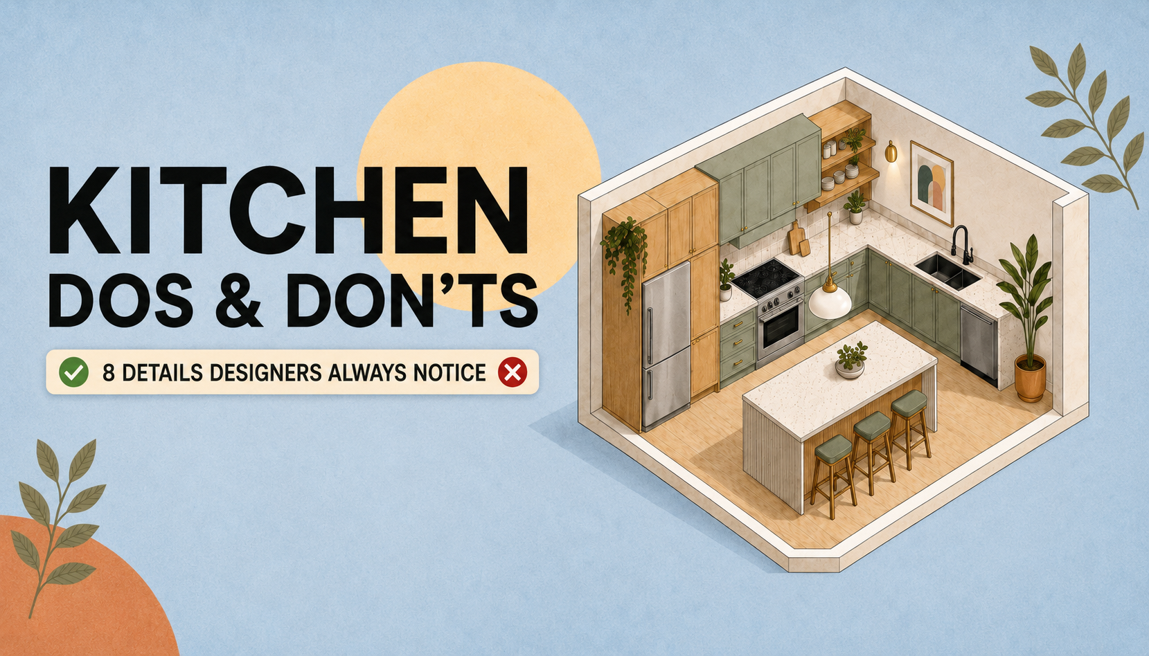
A kitchen can have beautiful cabinets and still feel awkward. These eight checks help you protect movement, work space, storage, and visual order before committing to a renovation.
A kitchen can be expensive, freshly renovated, and still feel strangely difficult to use. The problem is often not one dramatic error. It is a series of smaller decisions: an island that interrupts movement, countertop appliances that consume the only useful prep area, or finishes that compete instead of repeating.
The most important kitchen design mistakes to catch are the ones that affect movement, work space, lighting, storage, and visual order. Review them in that order. A beautiful backsplash cannot rescue a blocked walkway, but a functional plan can usually support more than one successful style.
The quick kitchen plan review
Before choosing cabinet colors or tile, test your plan against these eight questions:
- Can people move around the island without squeezing past open doors or seated stools?
- Can someone cross the room without walking through the main cooking area?
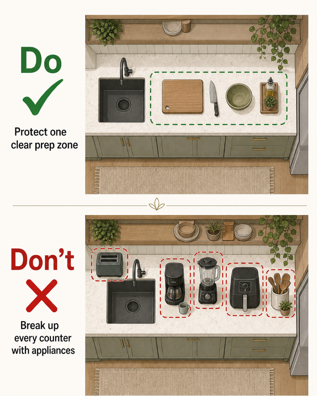
- Is there one genuinely clear counter area for food preparation?
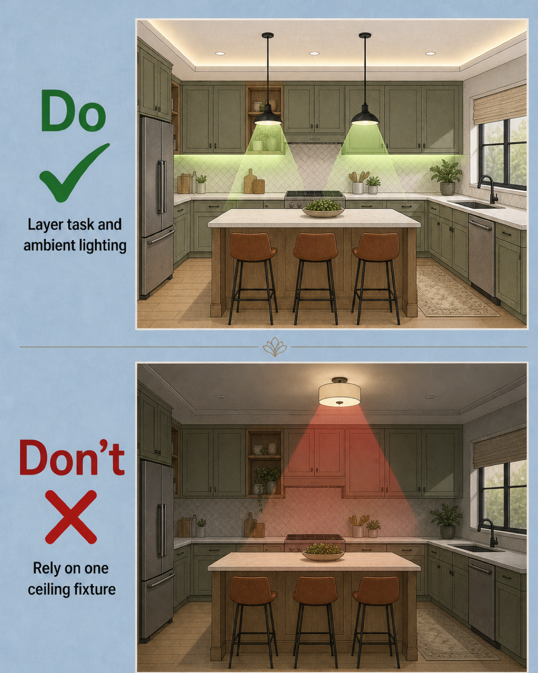
- Does the lighting serve different tasks instead of relying on one central fixture?
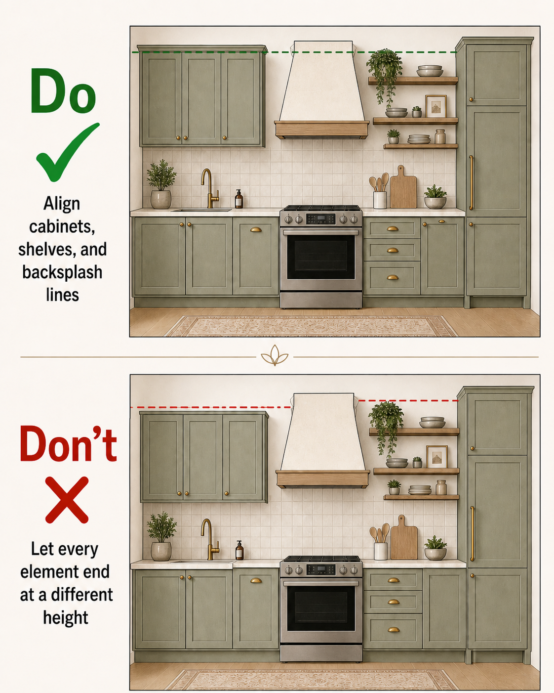
- Do the main cabinet, shelf, and backsplash lines relate to one another?
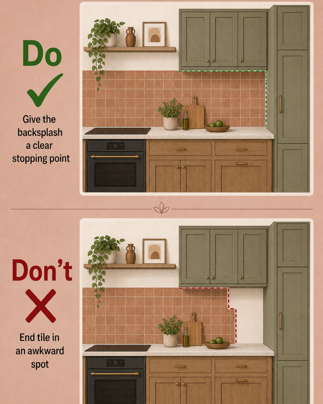
- Does the backsplash stop at a deliberate architectural point?
- Do key finishes repeat enough to make the room feel connected?
- Is there planned storage for bins, small appliances, bulk goods, and cleaning tools?
If several answers are no, pause the finish selections. Those problems are easier to solve on a plan than in a finished kitchen.
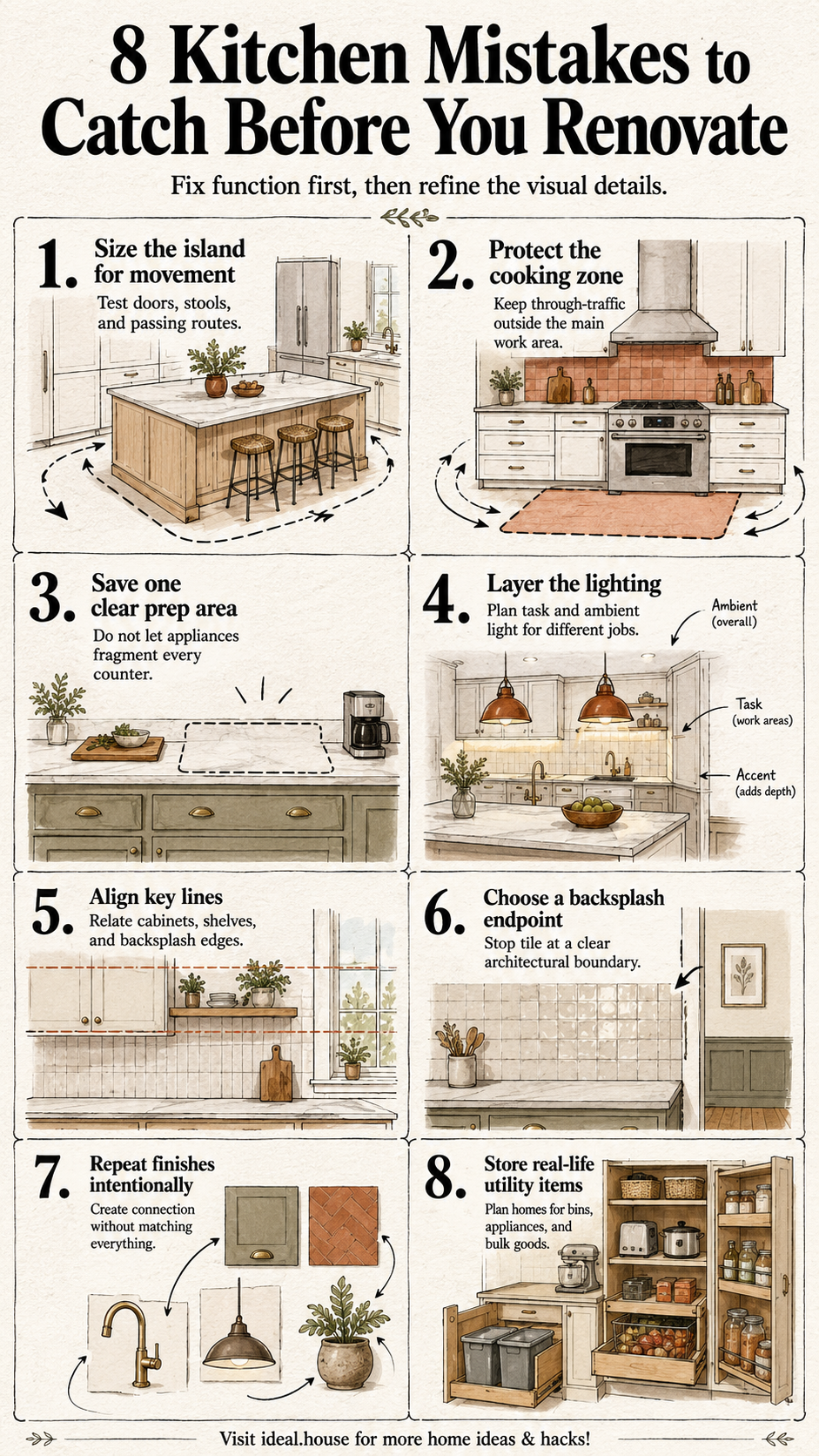
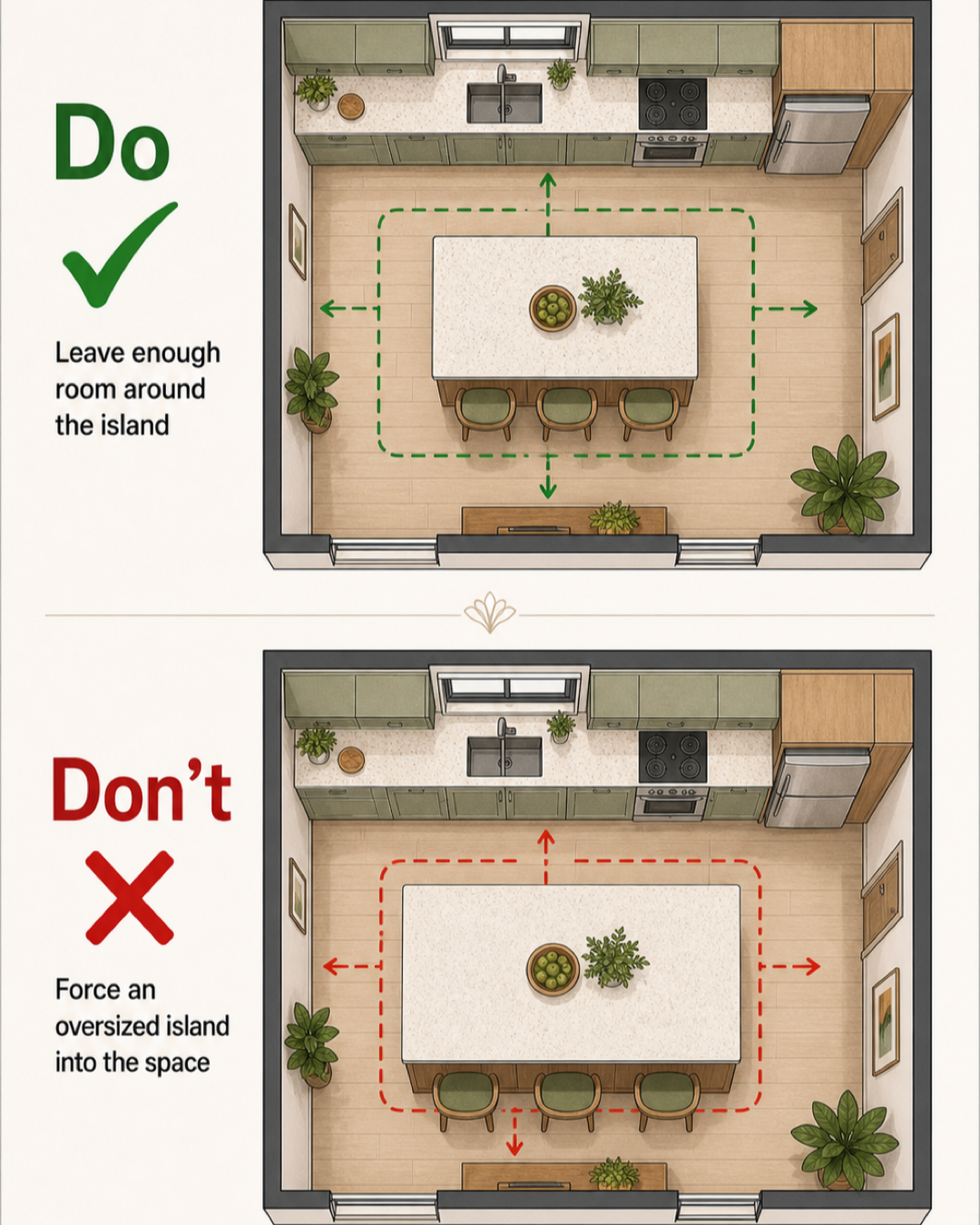
1. Forcing an oversized island into the room
An island is useful only when the space around it remains useful too. A large island can add prep area, seating, and storage, but it can also narrow the route to the refrigerator, trap stools behind a walkway, or make open appliance doors collide with passing people. Do not choose an island by asking, “What is the largest one that fits?” Ask what must happen around all four sides. Mark the swing of doors, the depth of stools when occupied, the route from the kitchen entrance, and the place where two people are most likely to pass.
Published kitchen-planning guidance commonly distinguishes between a general walkway and a working aisle, with more space needed where people are actively cooking or where multiple cooks share the room. Because the right clearance depends on the layout, appliances, household, and local requirements, confirm the final dimensions with the relevant appliance specifications and a qualified kitchen professional.
Small experiment: Tape the proposed island footprint on the floor. Add cardboard or painter's tape for open appliance doors and pulled-out stools, then walk the routes your household uses at breakfast and dinner.
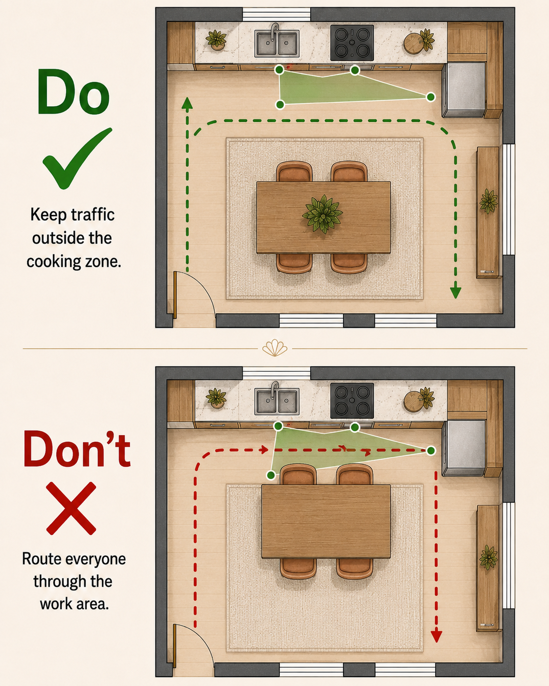
2. Routing household traffic through the cooking zone
The familiar sink-range-refrigerator triangle can help describe a cook's movement, but the more revealing question is what everyone else does. If the route to the backyard, dining table, refrigerator, or snack cabinet cuts through the main work area, the cook and the passerby will repeatedly compete for the same floor space. On the plan, draw two kinds of lines:
- The cook's repeated routes between food storage, washing, prep, and cooking
- Everyone else's routes through the room
The goal is not to create a perfect diagram. It is to reduce unnecessary crossings. In an open kitchen, placing casual seating or the refrigerator at the outer edge of the work area can sometimes let a guest get a drink without stepping behind the cook. In a compact kitchen, the answer may be a smaller table or peninsula rather than an island.
3. Letting every countertop become appliance parking
A kitchen may have many linear feet of counter and still lack one usable place to chop vegetables, assemble lunches, or set down a hot tray. Toasters, coffee makers, air fryers, stand mixers, drying racks, and utensil crocks each seem modest until they divide the counter into fragments.
Protect one clear prep zone before assigning homes to small appliances. A practical prep zone should sit near the tools and ingredients used there, with enough uninterrupted surface to perform the household's common tasks. The best location is not automatically the longest counter; it is the area that remains comfortable when the sink, range, and nearby drawers are in use. Then be honest about habits. An appliance used every morning deserves a convenient place. One used twice a month may belong in an accessible cabinet, appliance garage, or pantry. A beautiful empty-counter plan that requires lifting a heavy machine every day is not a thoughtful plan either.
4. Relying on one ceiling fixture
One bright light in the middle of the ceiling can illuminate the room while leaving the counters in shadow, especially when a person stands between the fixture and the work surface. A more considered kitchen layers light according to the jobs happening in the room.
Think in three layers:
- Task lighting supports preparation, washing, and cooking areas.
- Ambient lighting makes the overall room comfortable to navigate.
- Decorative or accent lighting adds character or emphasizes selected features.
The exact fixtures will depend on the ceiling, cabinet layout, natural light, and electrical plan. What matters at the planning stage is identifying where light is needed and where bodies or cabinets may block it. Changes involving electrical work should be reviewed and completed by qualified local professionals. Small experiment: In the existing kitchen, prepare food after sunset and note where your hands cast shadows. That observation is more useful than selecting fixtures from a bright showroom alone.
5. Letting cabinets, shelves, and tile end at unrelated heights
Visual order often comes from repetition and alignment rather than expensive materials. When the tops and bottoms of cabinets, open shelves, backsplash edges, and architectural features all terminate at different heights, the elevation can look restless. Not every line must match. A range hood may intentionally break the cabinet run, and open shelving may need its own proportion. The mistake is allowing every element to establish a separate line without deciding which ones should lead. Review each wall as a flat elevation, not only as a perspective rendering. Look for a few dominant horizontal lines: the countertop, the upper-cabinet baseline, the top of the tall units, or the edge of the backsplash. Aligning selected elements to those lines can make a mixed arrangement feel deliberate.
6. Ending the backsplash in an awkward spot
A backsplash needs a clear reason to stop. Common stopping points include the end of a cabinet run, a tall cabinet, a window edge, a corner, or another strong architectural boundary. Trouble begins when tile steps around isolated cabinets or ends on an otherwise blank wall without relating to anything nearby. Before ordering tile, draw the exact backsplash outline on an elevation. Pay particular attention to the ends of runs and any change in height. If two stopping points both look plausible, compare them as complete shapes rather than deciding tile by tile during installation. In some kitchens, carrying the same backsplash across the full working wall creates the calmest result. In others, a contained panel behind the range or between cabinets is more appropriate. The right answer depends on the architecture and the prominence you want the material to have.
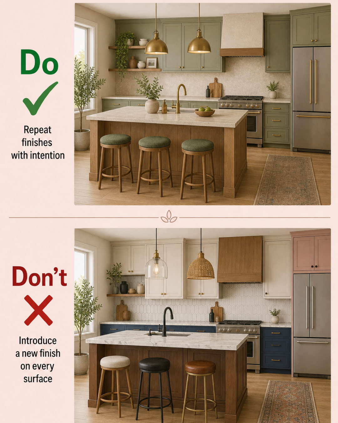
7. Introducing a new finish on every surface
Variety can make a kitchen layered; unchecked variety can make it feel like several sample boards installed in one room. Cabinet colors, countertop veining, tile, flooring, metal finishes, lighting, stools, and wood tones all ask for attention. The simplest route to cohesion is intentional repetition. Repeat a wood tone from the island in the stools or shelving. Let a warm metal appear in a few separated details. Echo one cabinet color in upholstery, art, or a nearby room. Repetition does not mean every finish must match. It means the eye can find a relationship between parts of the room. When mixing finishes, choose which element is the lead and which ones should support it. A strongly patterned countertop may benefit from quieter tile. A colorful backsplash may need simpler cabinet hardware. Give contrast a job instead of adding it wherever there is an available surface.
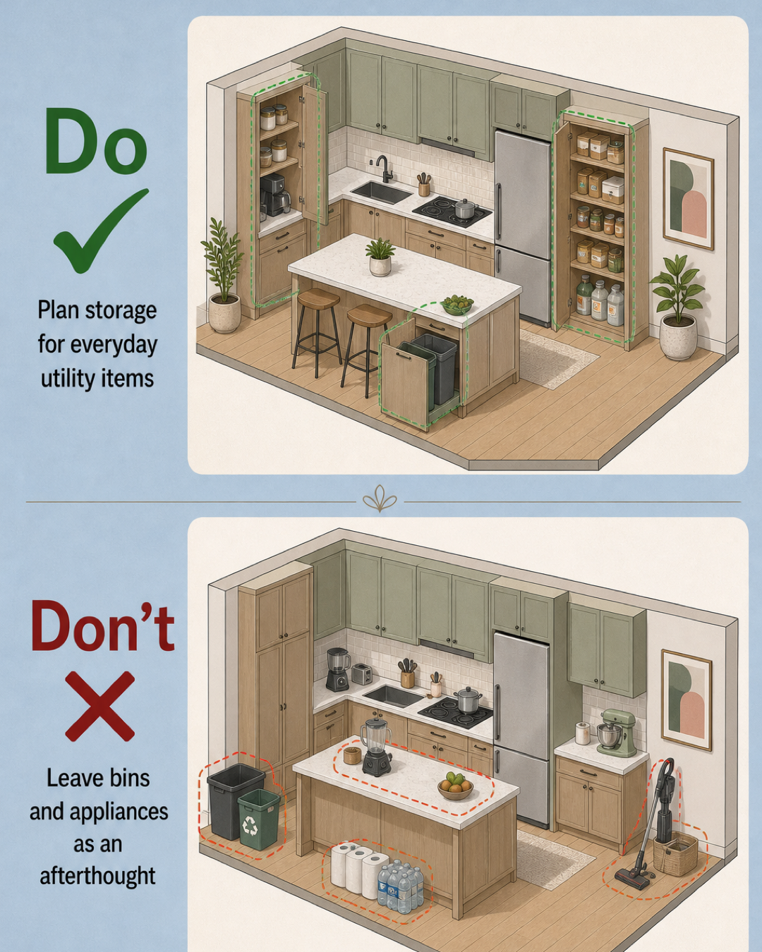
8. Treating everyday utility items as an afterthought
Renderings tend to omit the objects that are hardest to live without: trash and recycling bins, pet food, bulk paper goods, a vacuum, cleaning products, reusable bags, and small appliances. If these items have no planned home, they will occupy the floor, island, or prep counters after the renovation is complete. Make a utility inventory before finalizing storage. Note the dimensions of bulky objects and how often each one is used. Then place them according to behavior:
- Keep waste and recycling accessible from the main cleanup or prep area.
- Store everyday appliances where they can be used without a complicated setup.
- Give bulk goods a home that does not block frequently used items.
- Plan safe, appropriate storage for cleaning products based on the household.
This is where a slightly less symmetrical cabinet plan can outperform a prettier elevation. Storage earns its space by supporting the routine that happens every day.
Review function first, then compare the visual direction
Once movement, work zones, lighting needs, and utility storage have been resolved, visual comparison becomes much more productive. Instead of asking an image tool to invent the plan, use it to test a decision you have already framed: Should the backsplash be quiet or prominent? Does the island feel too visually heavy? Do repeated wood and metal finishes create enough connection?
Ideal House's AI Kitchen Remodel page describes a workflow for uploading a kitchen image and exploring remodeling styles and design directions. The Room Visualizer can also help compare interior styles and elements such as flooring, walls, and backsplashes. Treat these previews as visual studies. They do not confirm measurements, exact material color, code compliance, installation requirements, or construction feasibility.
The strongest final check is simple: can you explain why every major element is where it is? A considered kitchen does not need to be large, perfectly symmetrical, or filled with matching finishes. It needs a plan that protects the work, clears the movement, stores real life, and gives the eye a few confident places to rest.