1/4
Curated Color Palettes for a Playful Home 🌈🎨
Tired of beige? Let's inject some fun into your home's color story! 🌟 Think beyond the ordinary. Embrace palettes that reflect your personality. Pair unexpected hues like coral and teal, or mustard yellow and deep plum. Want to go whimsical? Consider soft pastels with metallic accents. For a bold statement, experiment with vibrant jewel tones. The key is balance and intentionality. Don't be afraid to let color tell your unique story and create spaces that spark joy and wonder! ✨
Save this for your next paint project! #ColorPaletteIdeas #PlayfulColorIdeas #WhimsicalColorPalette #HomeColorTrends #InteriorColorInspo #DecorPalette #CreativeColor #ColorInDesign #RoomMakeoverIdeas #DesignInspiration
28 paź 2025
Skopiuj Styl
0 komentarzy łącznie
Brak komentarzy jeszczeMożesz również polubić
Beyond Beige: Algorithmic Palettes for Your Chic Home 🎨
Tired of predictable color schemes? Algorithmic design offers a new way to think about palettes – generating harmonious and unexpected color combinations inspired by nature, data, and artistic sequences. This approach brings a unique, sophisticated dimension to any interior, moving beyond the expected.
✅ Explore unique color pairings.
✅ Infuse your space with unexpected harmony.
✅ See how math can inspire beauty.
It’s about creating a visual rhythm that feels both natural and thoughtfully curated.
Save this for your next color refresh! #colorpalette #interiordesign #homedecor #design #colorinspiration #algorithmicart #designinspiration #colortherapy #creativeinteriors #paletteideas
Unlocking Serenity: A Guide to Mindful Color Palettes 🎨
Ever feel overwhelmed by too much visual 'noise' at home? The secret to a truly tranquil space lies in intentional color. ✨ I'm obsessed with how specific hues can shift our mood and perception. Think soft, muted tones for relaxation and grounding earth colors for connection. 🌿 Let's explore creating calming environments that invite peace. Start by choosing one or two dominant colors that resonate with you, then layer in neutrals to allow them to truly sing. Save this for your next design refresh! 💖 #ColorPaletteIdeas #HomeDecorIdeas #InteriorDesignInspo #MindfulLiving #CalmSpaces #ColorTherapy #InteriorStyling #DesignTips #HomeInspiration #DecorInspo
3 Bold Color Combos to Instantly Brighten Your Space! 🌈✨
Tired of beige? Let's inject some serious JOY into your home! 🎉 I'm obsessed with playing with unexpected color pairings that feel both vibrant and harmonious. My current faves are: 1. Sunshine Yellow + Deep Teal: Think of a golden sunset meeting a tranquil ocean. 🌊 2. Coral Pink + Emerald Green: This is a lively yet sophisticated duo that screams personality. 🌿 3. Electric Blue + Tangerine Orange: Pure, unadulterated energy! 🍊 Don't be afraid to experiment; these combinations are surprisingly easy to style. Save this for your next room refresh! Let's get playful! #ColorCombosIdeas #BoldInteriorsIdeas #VibrantDecorIdeas #PlayfulPaletteIdeas #HomeDecorIdeas #InteriorDesign #ColorInspo #EclecticDecor #JoyfulLiving #HomeRenovation

Exploring the Power of Color in Interior Design
I recently came across this beautiful living space that perfectly showcases how color can transform a room. The vibrant blue sofa and matching rug add a lively touch, while the yellow chair introduces a cheerful pop of color, creating a balanced and inviting atmosphere. The mix of bold and neutral tones enhances the overall aesthetic, demonstrating how thoughtful use of color can elevate interior design.
What are your favorite color combinations in home decor? Share your ideas or show us your colorful spaces!
#ColorInInteriorDesign #HomeDecor #InteriorDesign #ColorfulLiving #DesignInspiration #LivingRoomDecor #HomeStyling #Color

3
Coral & Comfort: Warmth for Cozy Living Spaces 💖
Let's talk about the undeniable warmth and vibrancy that coral brings to a space! This uplifting hue, ranging from soft peach to rich terracotta, is perfect for creating inviting and comforting environments. It’s about adding a touch of sunny optimism without being overpowering. ☀️
I love using coral as an accent color. Think of coral throw pillows on a neutral sofa, a statement vase, or even a piece of art. It pairs beautifully with natural materials like rattan, light wood, and linen, creating a relaxed yet chic atmosphere. It's also a fantastic way to inject personality into smaller spaces.
What do you think of coral in interiors? Save this post for some cozy living inspiration! ✨ #CoralIdeas #CozyHomeIdeas #LivingRoomIdeas #InteriorDesign #HomeDecor #WarmColours #AccentColours #DecorInspiration #ColourPalette #NurseryDecor
Unleash Your Inner Maximalist: Bold Color Palettes for a Joyful Home! 🌈✨
Tired of beige? It's time to embrace COLOR! 🎉 As Spectrum Style, I believe your home should be a vibrant reflection of YOU. Forget boring neutrals; let's dive into daring hues and playful patterns to create spaces that spark joy and express personality.
This trend is all about intentionality:
* **Unexpected Pairings:** Think teal with coral, or deep magenta with mustard yellow.
* **Pattern Play:** Mix florals, geometrics, and abstract designs fearlessly.
* **Balance is Key:** Use pops of bold color against a grounding neutral backdrop or use saturated tones in smaller doses like accent walls or vibrant decor.
Ready to transform your space into a dynamic masterpiece? Save this for your next colorful home refresh! 💖 #ColorPaletteIdeas #MaximalistDecorIdeas #BoldColorsHomeIdeas #InteriorDesignIdeas #SpectrumStyleHome #JoyfulLivingSpaces #PatternMixing #EclecticHome #VibrantInteriors #HomeDecorInspo
Creating Serene Spaces: The Art of Traditional Color Palettes 🎨🌿
Heritage homes lend themselves beautifully to a timeless, serene color palette. 🎨 At Heritage Home Designs, we often draw inspiration from historical schemes – think muted greens, dusty blues, warm creams, and earthy ochres. These colors honor the architectural era and create a tranquil, sophisticated atmosphere that feels both classic and current. 🌳
What’s your favorite traditional paint color? #TraditionalColorIdeas #HistoricPaletteIdeas #MutedColorIdeas #SereneHomeIdeas #InteriorColorIdeas #HeritageHomeColors #TimelessDecor #CalmInteriors #DesignInspiration #PaintColors
Nature's Palette: Calming Colors for Your Home 🌿
Bring the tranquility of nature indoors with the right color choices! ☯️ Think of the calming hues found in Zen gardens: soft greens, earthy browns, muted greys, and serene beiges. 🌿 These colors evoke a sense of peace and grounding. Avoid overly bright or saturated tones. Instead, layer various shades of these natural colors to create depth and warmth. This mindful approach to color palettes will transform your home into a restful sanctuary. Save this for your natural color inspo! #colorideas #naturalliving #calmcolors #zenhome #homedecor #interiordesign #earthytoneideas #japandicolor #serenemind #designpalette
Color Palette Perfection: MCM Hues for Your Home 🎨🌈
Mid-Century Modern design is known for its distinctive color palettes that are both timeless and inviting. Let's explore the iconic hues that define MCM style! ✨
Embrace these MCM color combinations:
* **Earthy Neutrals:** Think warm creams, deep browns, and subtle greys.
* **Bold Accents:** Mustard yellow, teal, avocado green, and burnt orange bring vibrancy.
* **Pops of Color:** Use these vibrant shades strategically in cushions, art, or accent furniture.
* **Wood Tones:** Always anchor your palette with rich walnut and teak.
* **Subtle Pastels:** Mint green or pale blue can also add a touch of vintage charm.
Add a splash of MCM color to your space. Save this for your next paint project! 💖 #midcenturymodern #mcmdecor #colorpalette #mcmcolorideas #interiordesign #homedecor #paintcolors #designinspiration #walnutfurniture #vintagecolors
✨ Designing for Serenity: The Power of Calm Color Palettes 🕊️
Creating a tranquil home environment often starts with color. I lean towards calm, muted palettes that soothe the senses and promote a sense of peace. Think soft beiges, gentle greys, muted blues, and earthy tones. 🍃 These colors work beautifully in any style, from Japandi to minimalist, providing a serene backdrop for your life and cherished decorative objects. They allow other elements to shine without overwhelming the space. What's your go-to calming color? #CalmColorsIdeas #ColorPaletteIdeas #SereneHomeIdeas #MinimalistColorIdeas #InteriorDesignIdeas #PeacefulInteriors #MutedTones #EarthyPalettes #SoothingColors #HomeInspiration


A Burst of Color for Your Home and Garden🌹
Red geraniums are a vibrant and versatile addition to both outdoor gardens and indoor spaces. Their bright red flowers can instantly liven up any area, from window boxes and balcony planters to indoor shelves and tables.
Geraniums are known for their hardiness and ability to thrive in various conditions, making them a low - maintenance yet high - impact choice for adding color to your environment. They prefer sunny spots but can tolerate some shade, and with regular deadheading, they'll continue to bloom throughout the season.
Whether you're looking to brighten your outdoor patio or bring some natural color indoors, red geraniums are a fantastic choice that will reward you with their cheerful presence.
#RedGeranium #ContainerGardening #CottageCore #PollinatorGarden #BoldBlooms

1
Creating a Cozy Atmosphere: The Magic of Warm Tones 🧡
Unlock the secret to a truly cozy home by embracing warm color tones. Think terracotta, muted oranges, deep yellows, and rich browns. These colors evoke feelings of comfort, warmth, and invitation. Layer them with natural materials like wood and textiles such as wool and linen to enhance the cozy factor. Soft, ambient lighting further amplifies this inviting atmosphere. This palette is perfect for living rooms, bedrooms, and any space you want to feel like a welcoming embrace. 🍁 #WarmTonesDecorIdeas #CozyHomeIdeas #LivingRoomDecorIdeas #InvitingHomeIdeas #ColorPaletteIdeas #WarmDecor #HomeAtmosphere #InteriorDesignInspo #TerracottaDecor #ThePaletteCurator
Color Palettes Inspired by Nature: Muted Tones for Calm Spaces 🍂
Drawing inspiration from the natural world offers an endless palette of soothing and sophisticated colors. Muted, earthy tones create a serene and grounding atmosphere, perfect for a home that feels like a tranquil escape.
Nature-inspired palettes:
* **Forest Floor:** Deep greens, mossy browns, and soft stone greys.
* **Desert Dusk:** Warm sands, muted terracotta, and dusky purples.
* **Coastal Fog:** Soft blues, driftwood greys, and off-white hues.
Let's use these to create depth and serenity.
Save for your next color scheme! 🎨 #NatureInspiredColors #MutedTones #CalmColorPalettes #InteriorDesign #HomeDecorInspo #EarthyTones #ColorInspiration #SereneSpaces #TheArtfulAssemblage #DecorIdeas
Earth-Inspired Color Palettes: Nature's Calm for Your Home 🎨
Colors directly impact our mood. Embrace nature's calming palette for your home! Think soft greens reminiscent of moss and leaves, warm sandy beiges, muted terracotta oranges, and gentle sky blues. These hues create a grounded, serene atmosphere that promotes relaxation and well-being. They're timeless and pair beautifully with natural materials. Which earth tone speaks to you the most? Save this for a harmonious and tranquil color scheme! 🌿 #ColorPaletteIdeas #EarthTonesIdeas #NatureInspiredColorsIdeas #CalmingColorIdeas #NeutralPaletteIdeas #InteriorDesign #HomeDecor #ColorInspiration #PaletteInspo #EarthyHome

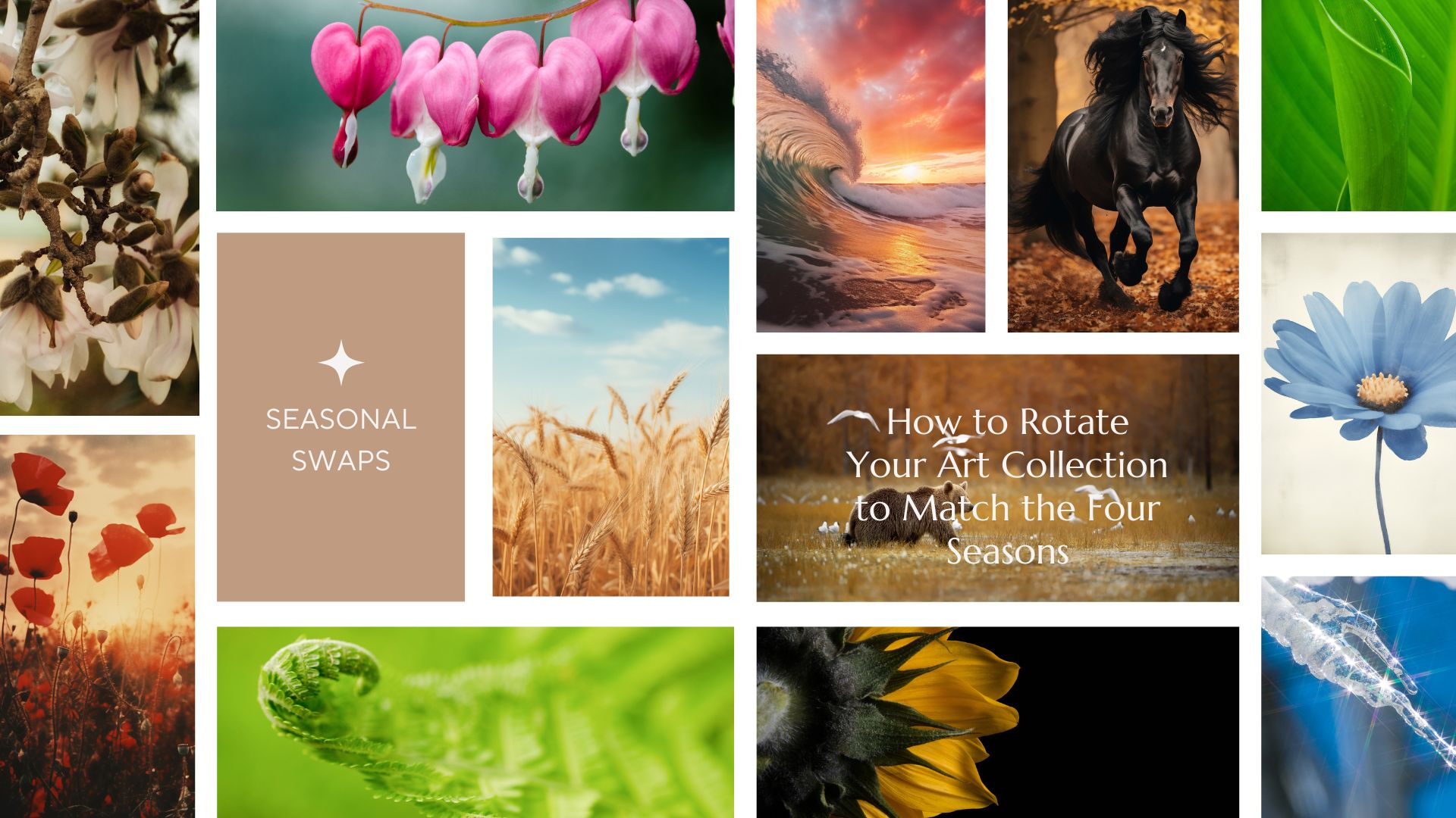
Transform Your Home with the Power of the Seasons 🏠✨
The most beautiful homes are those that live in harmony with the natural world. Instead of a total renovation, try the "Seasonal Art Swap." By rotating your gallery wall four times a year, you refresh the energy of your rooms and appreciate your collection on a deeper level.
Get our expert tips on curating your home for Spring, Summer, Autumn, and Winter. Seasonal Art Swaps: How to Rotate Your Home Art Collection – PIPA Fine Art
#IdealHouse #HomeStyling #InteriorInspiration #ArtGallery #decoratingideas #decoratingtipsideas #decoratingwithcolor #decorating #decoratingideasforlivingroom

1
The Power of Undertones: Mastering Complex Neutrals 🎨
Understanding undertones is crucial for a truly cohesive monochromatic design. Even 'neutrals' have subtle undertones – a grey might lean blue, green, or even purple; a beige can have pink or yellow notes. 🎨 By choosing variations within the same undertone family, you create a layered and sophisticated look that feels intentional and harmonious. It’s the nuance that elevates a palette from flat to fabulous. Pay attention to the subtle shifts! Save this for your color theory journey! ✨ #ColorTheoryTips #NeutralUndertones #MonochromaticDesign #SophisticatedPalettes #InteriorDesignStrategy #ColorInspiration #DesignSecrets #HomeStylingIdeas #ComplexNeutrals #PaletteMastery
The Psychology of Color in Your Home Office 💡
Your home office colors can profoundly impact your productivity and mood! As a color psychologist, I love creating spaces that support focus and creativity. Here’s how:
💙 **Blues:** Known for calmness and focus. Think soft blues or muted teals to promote concentration and reduce stress. Ideal for long work sessions.
💚 **Greens:** Also calming and associated with balance and growth. Sage or mint greens can foster a sense of well-being and renewal.
💛 **Yellows (Muted):** Small touches of soft, sunny yellow can stimulate creativity and positivity without being overwhelming.
☁️ **Neutrals:** Off-whites, light greys, and warm beiges create a clean, uncluttered environment that supports clarity.
Which color inspires your workday? Save for your home office refresh! 🌈 #homeofficeideas #colorpsychology #workfromhome #productivitytips #colorpalette #interiordesign #officedecor #designinspiration #colortherapy #homedecorideas
Unleash Joyful Hues: Your Ultimate Color Palette Guide! 🎨
Tired of beige? Let's dive into the power of color! 🎉 As the Color Pop Curator, I believe vibrant palettes can totally transform a space and uplift your mood. This guide is for you if you're looking to inject personality and energy into your home decor. We'll explore combinations that energize without overwhelming, from bold jewel tones to cheerful pastels. Get ready to experiment and find the perfect spectrum for your sanctuary! Save this for your next home refresh! ✨ #interiordesignideas #homedecorideas #colorpalettedesign #vibrantdecorideas #colorinspiration #interiorstyling #designhacks #decorinspo #energizingcolors #joyfulhome
1
Art Deco's Signature Color Palette: Bold & Beautiful 🎨
The Art Deco era wasn't shy with color! Its iconic palette is as daring and glamorous as the style itself. Mixing rich hues with metallics creates unparalleled opulence. ✨
Embrace these signature color combinations:
* **Deep Jewel Tones:** Emerald green, sapphire blue, ruby red, amethyst purple.
* **Classic Neutrals:** Black, cream, ivory, and deep charcoal grey.
* **Glistening Metallics:** Generous use of gold, brass, chrome, and silver.
* **Rich Earth Tones:** Deep browns, ochres, and burnished oranges for warmth.
* **Bold Contrasts:** High-contrast pairings for maximum impact.
Use these colors to make a dramatic statement in your home. Save this for your next color inspiration! 💫 #ArtDecoColors #ColorPalette #InteriorDesignColors #LuxuryDecor #VintageStyle #HomeDecorIdeas #ColorInspiration #DecoDecor #GlamourHome #InteriorStyling


