1/4
The Power of Neutrality: Japandi Color Schemes 🤍
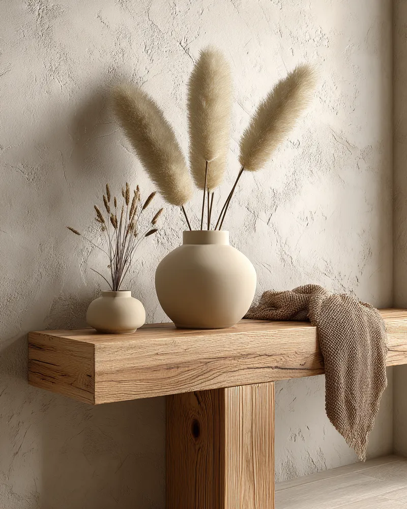
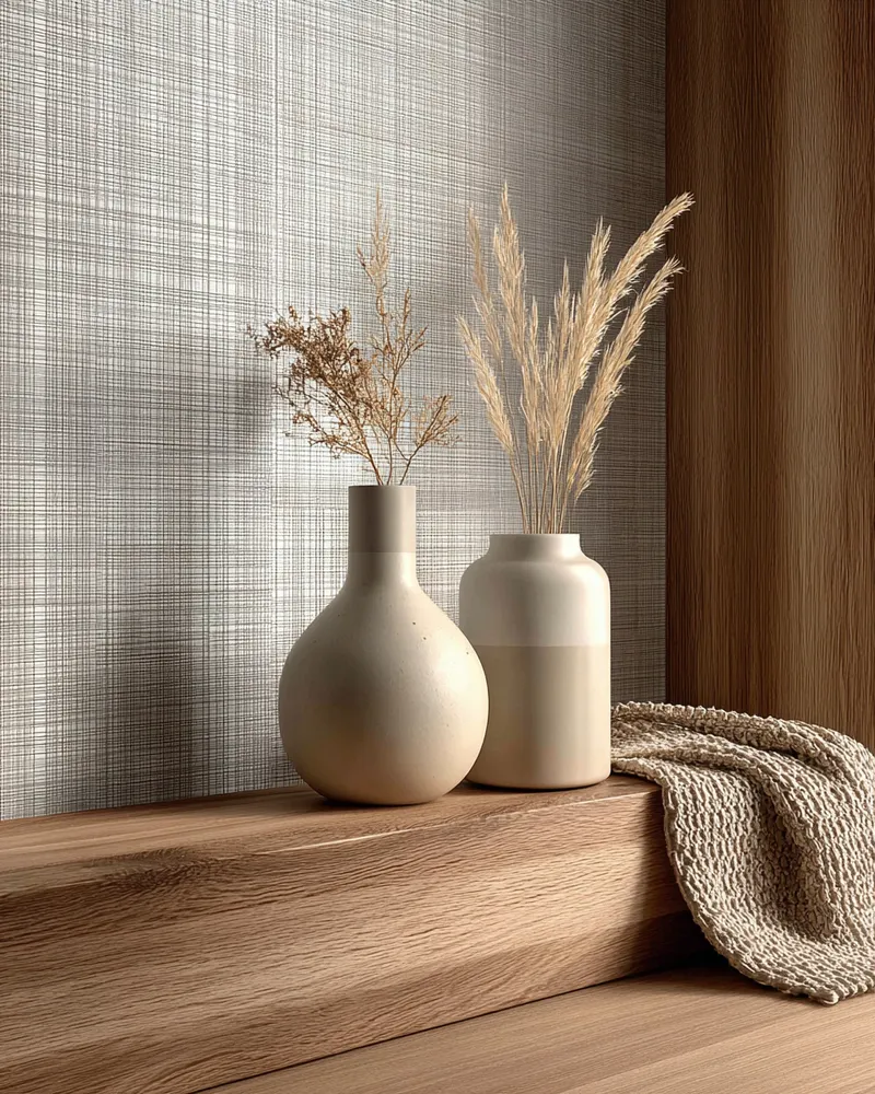
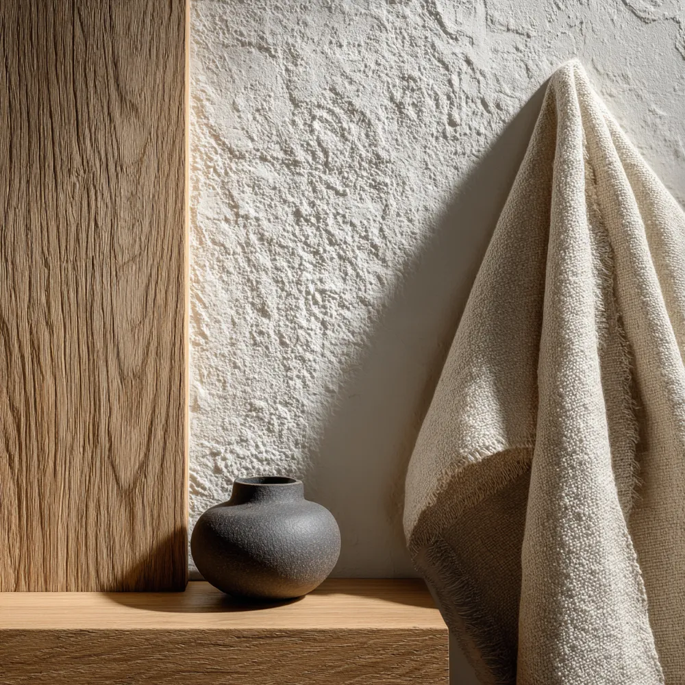
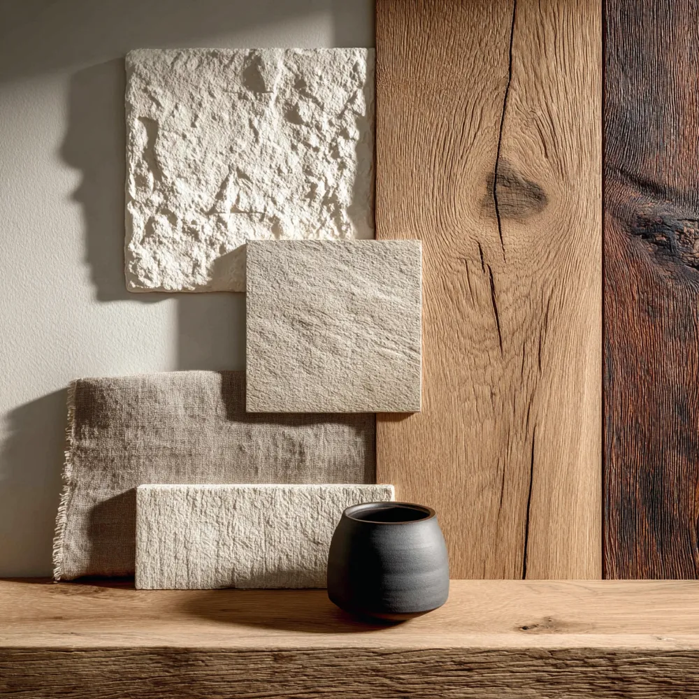
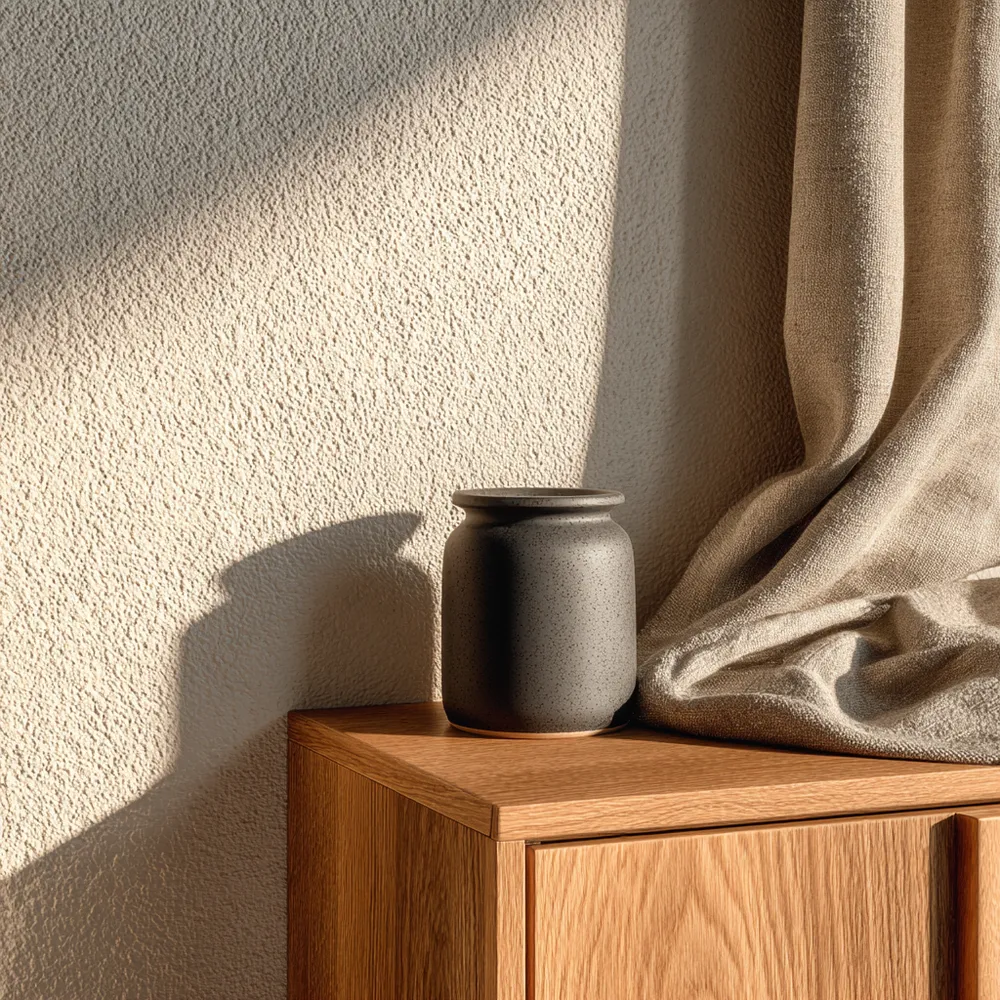
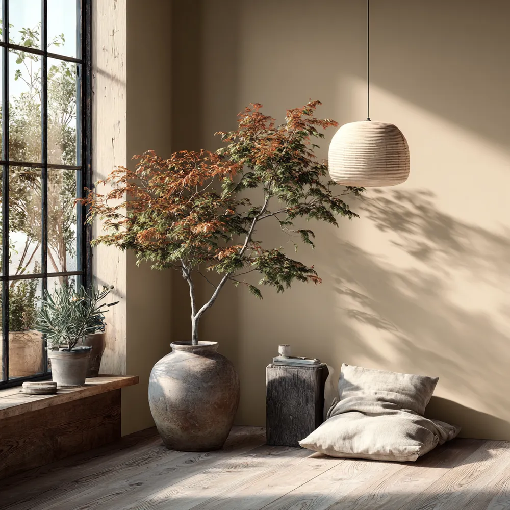
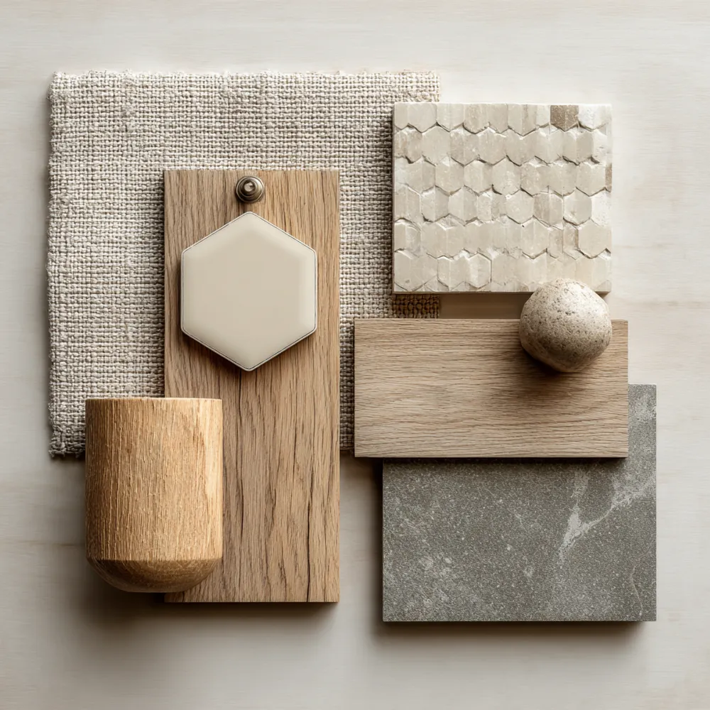
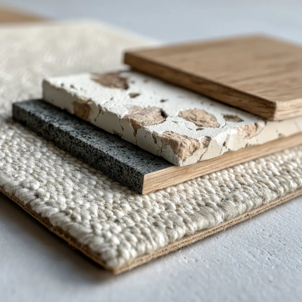
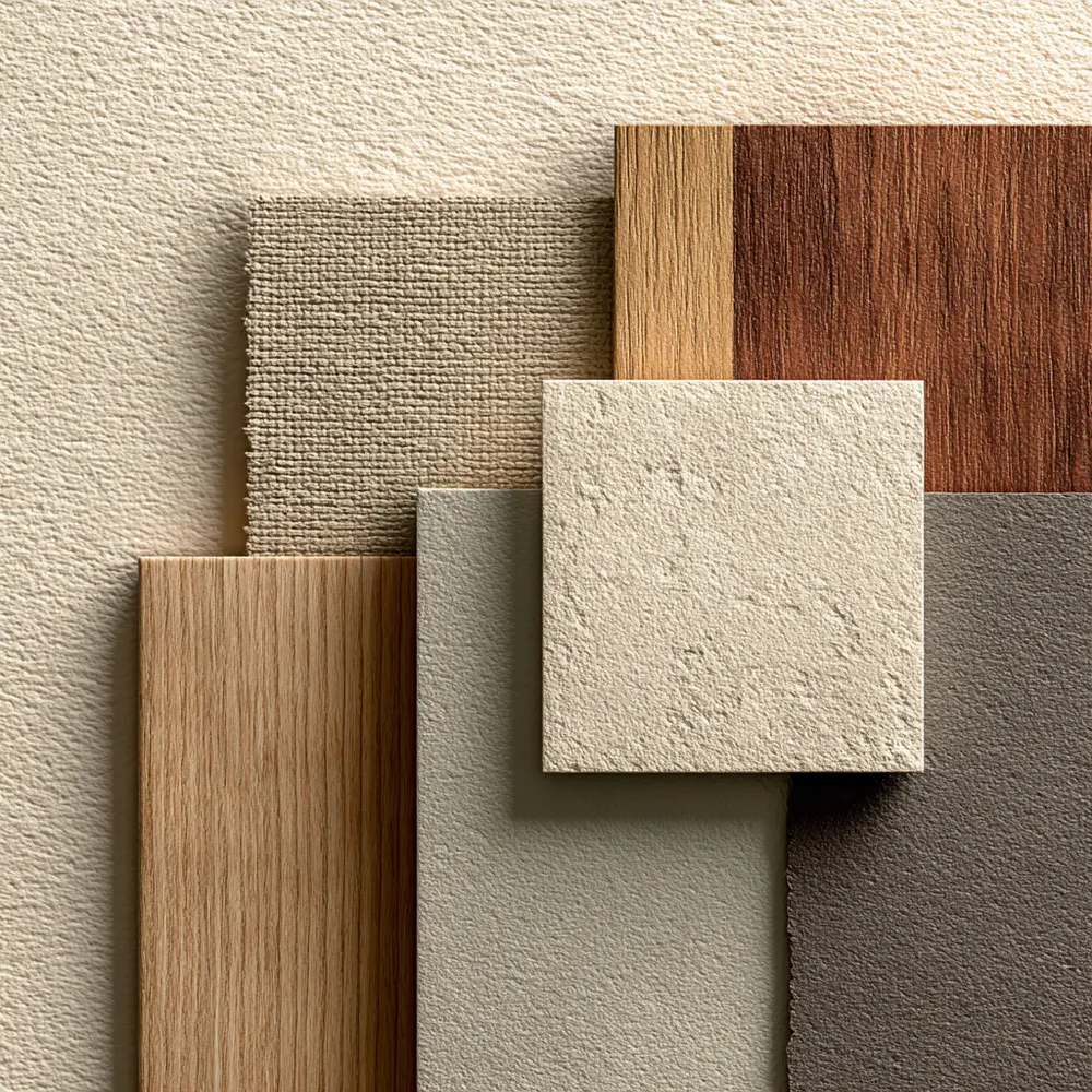
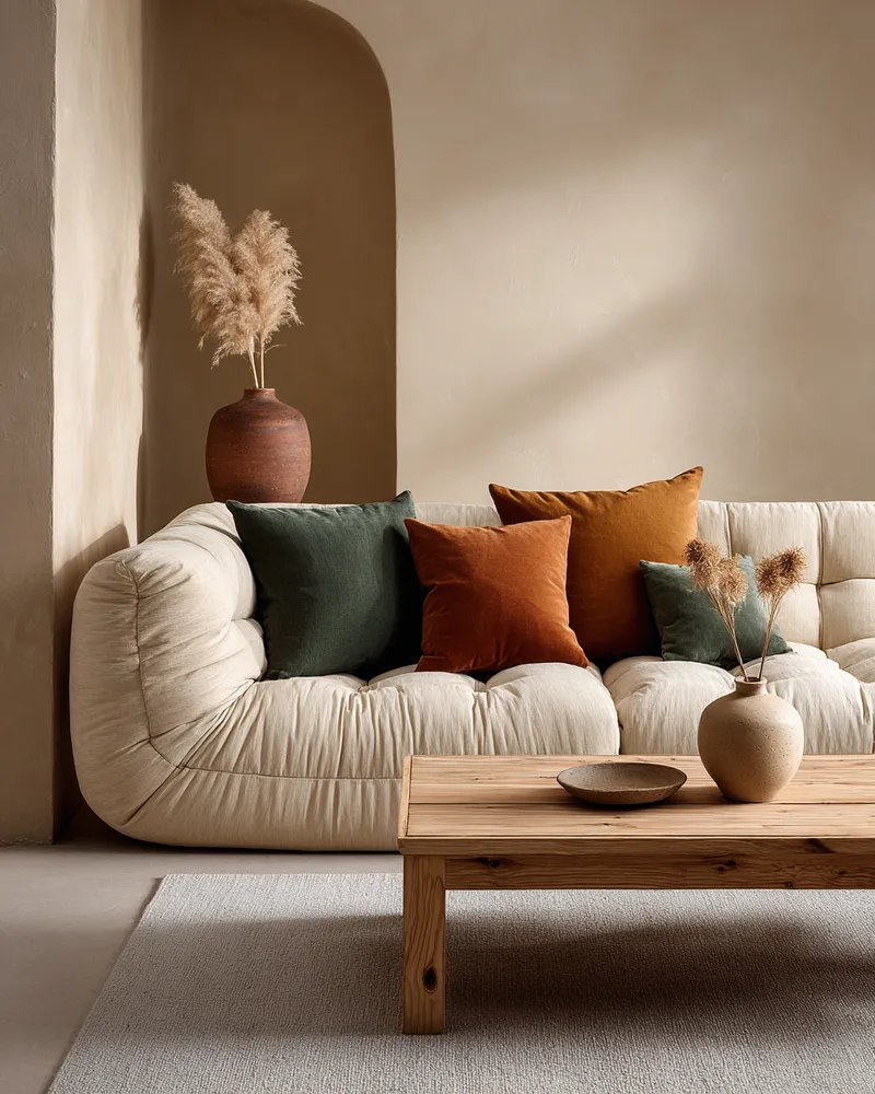
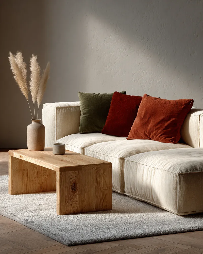
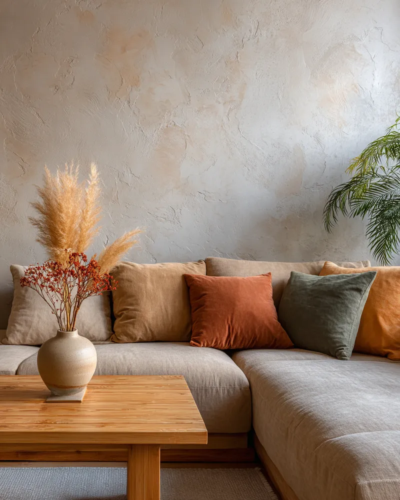
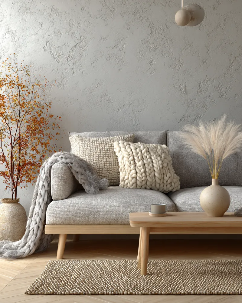
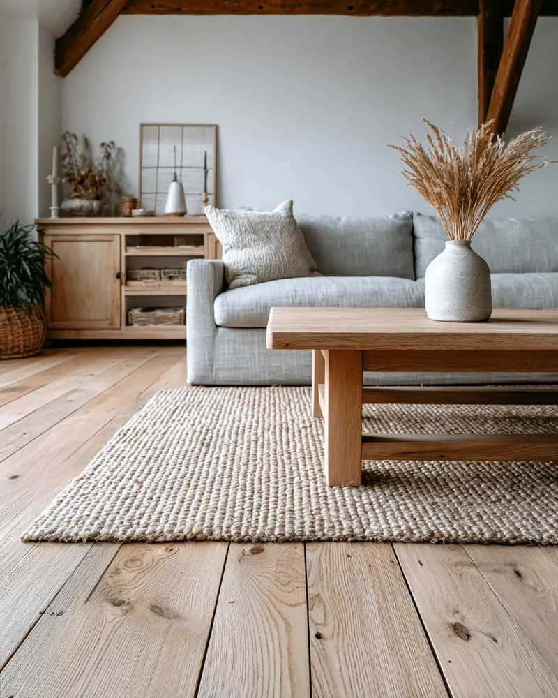
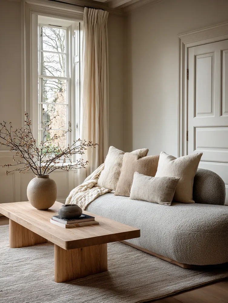
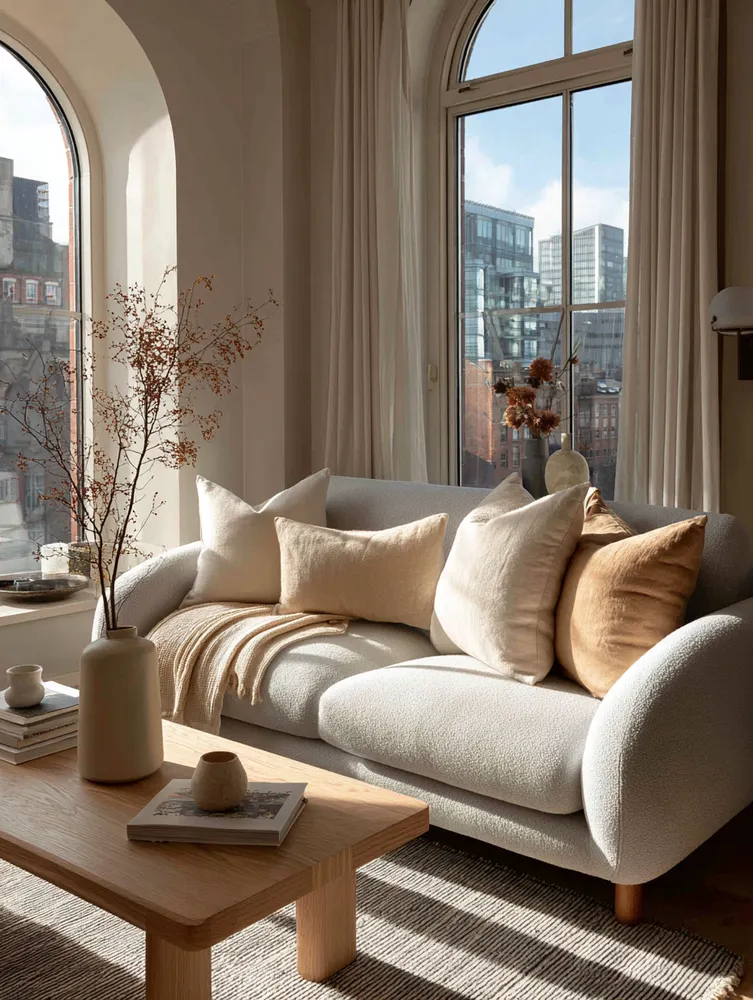
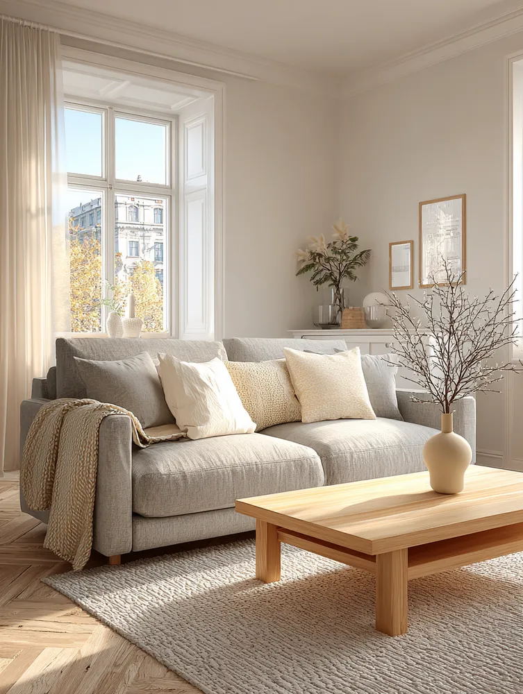
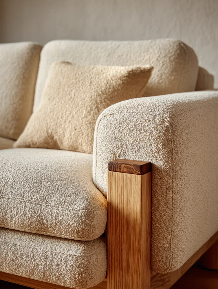
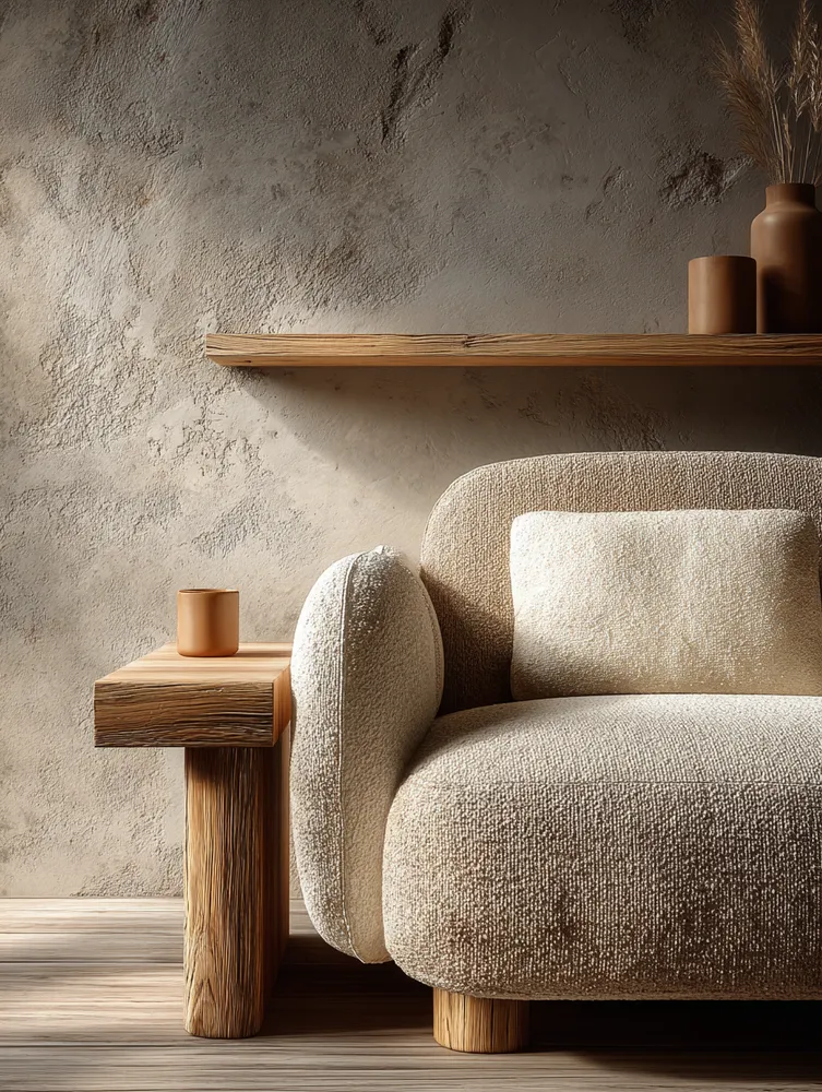
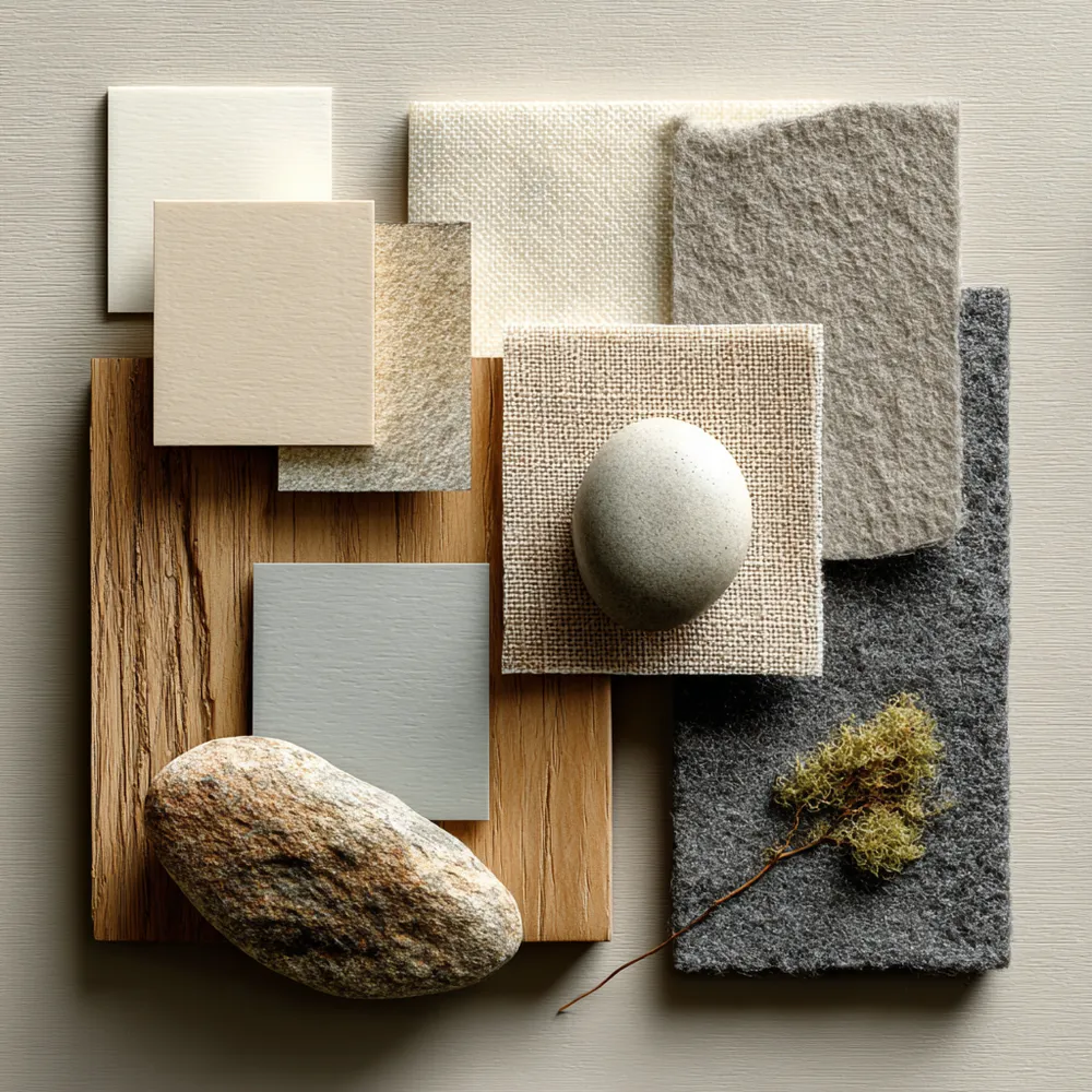
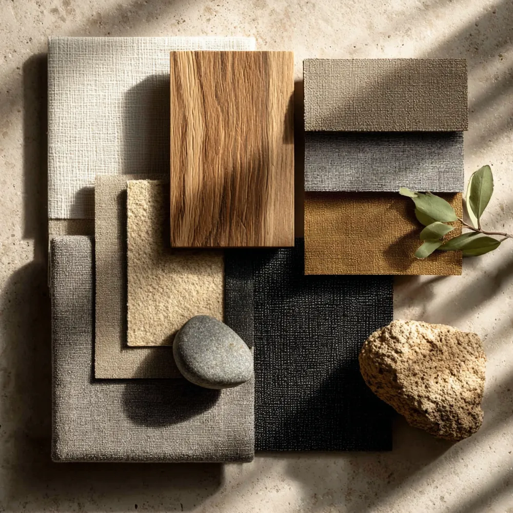
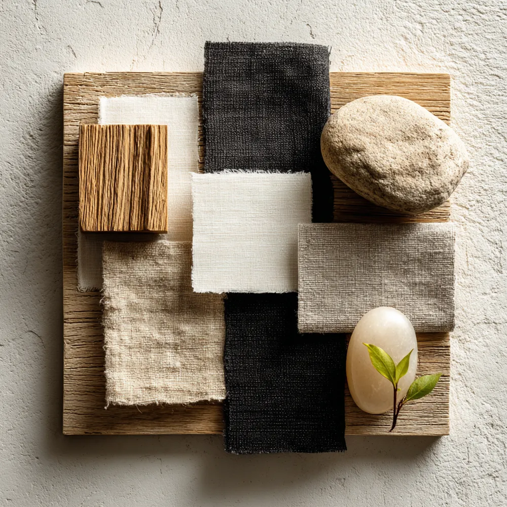
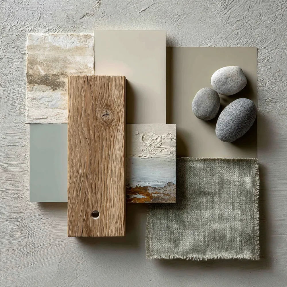
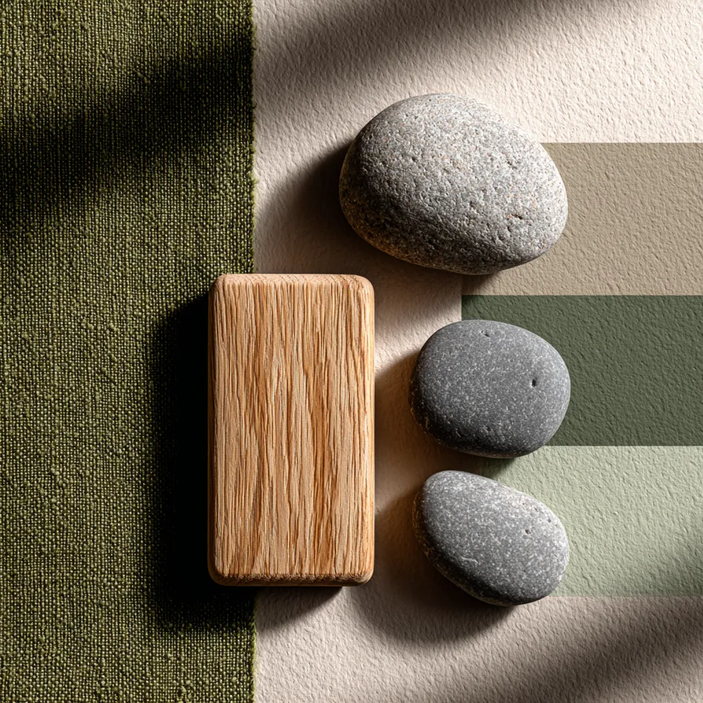
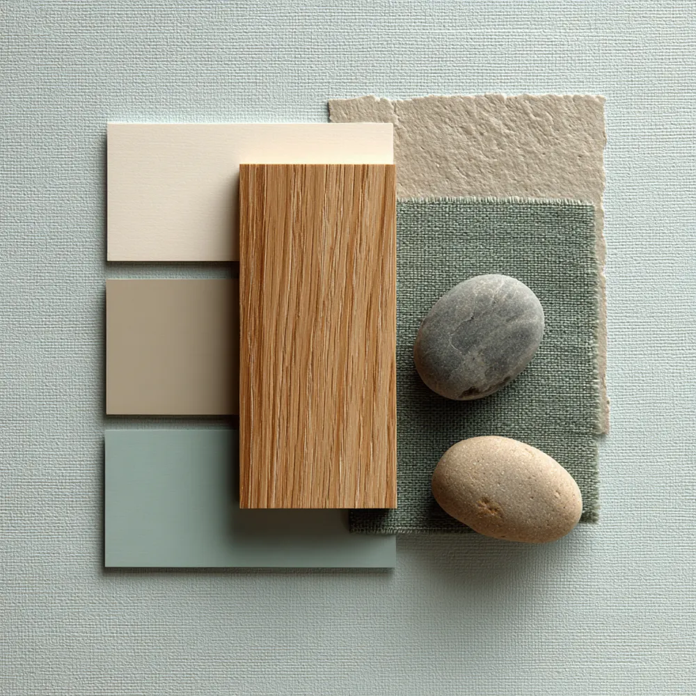
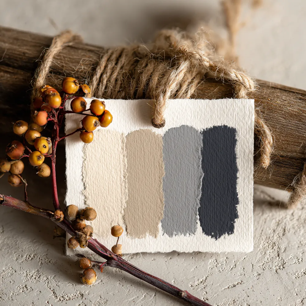
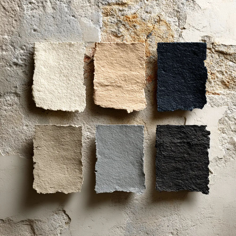
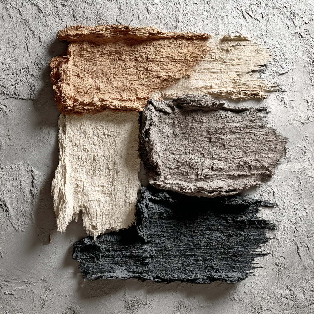
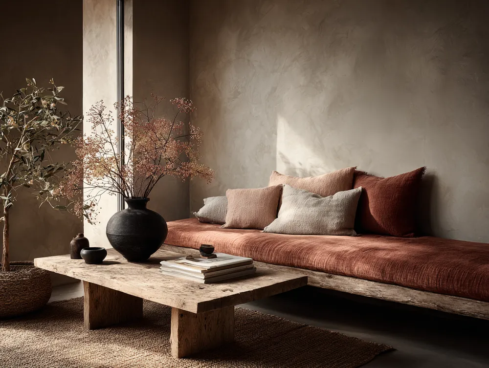
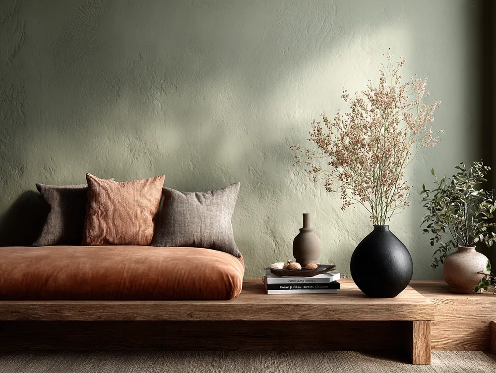
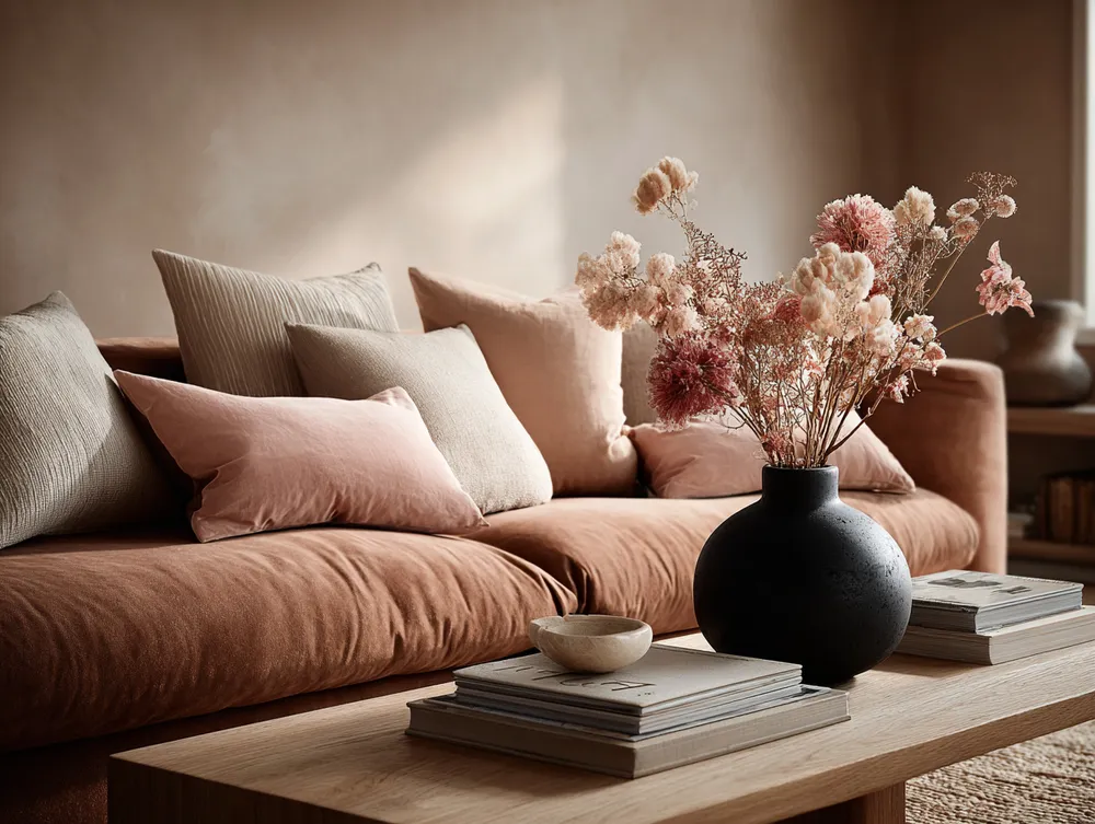
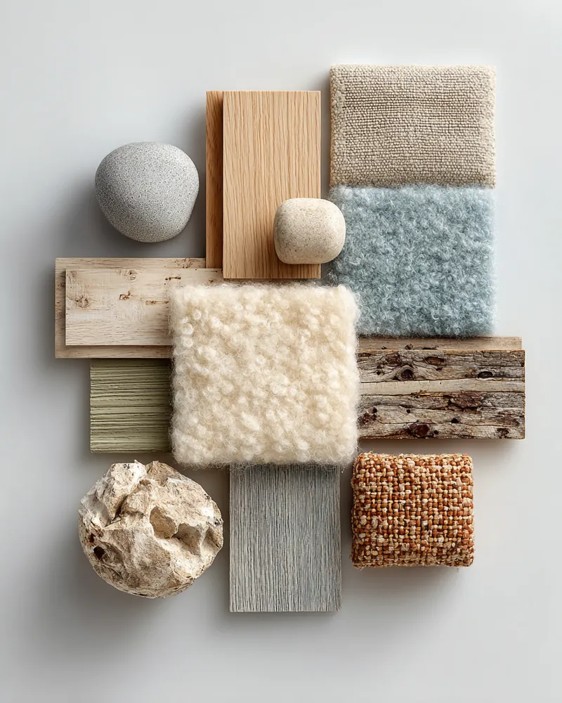
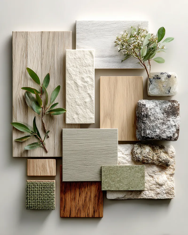
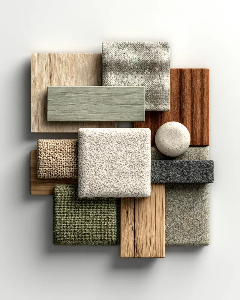
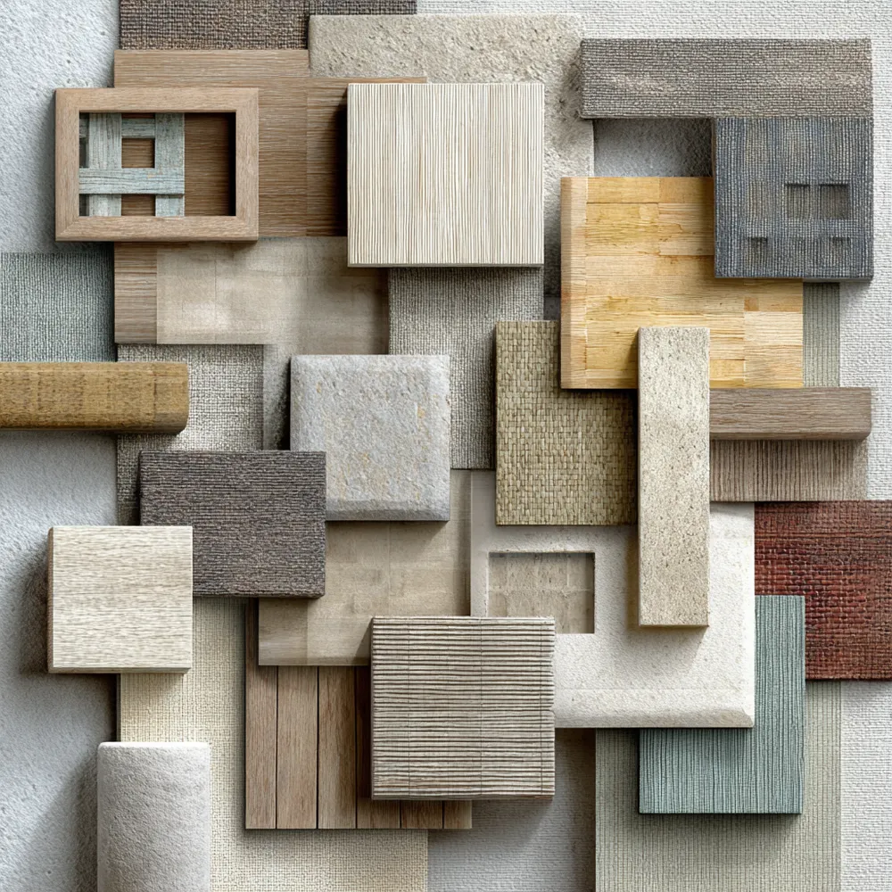
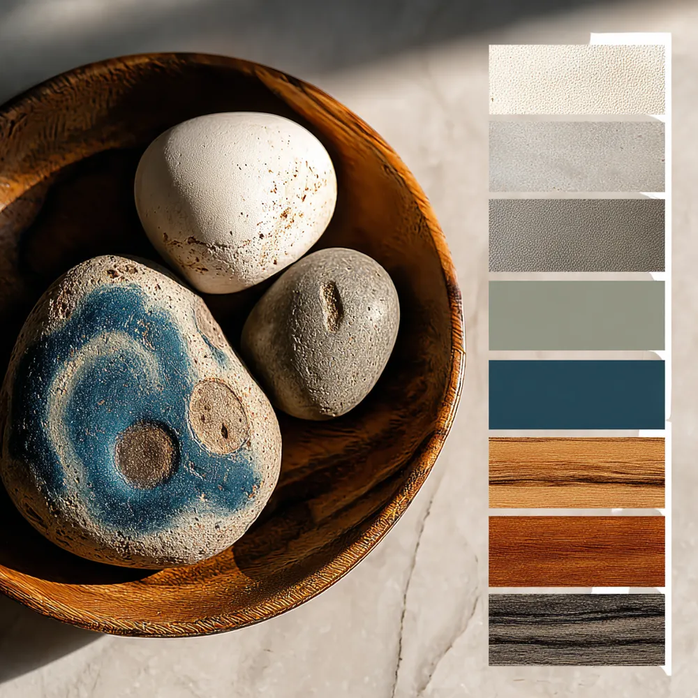
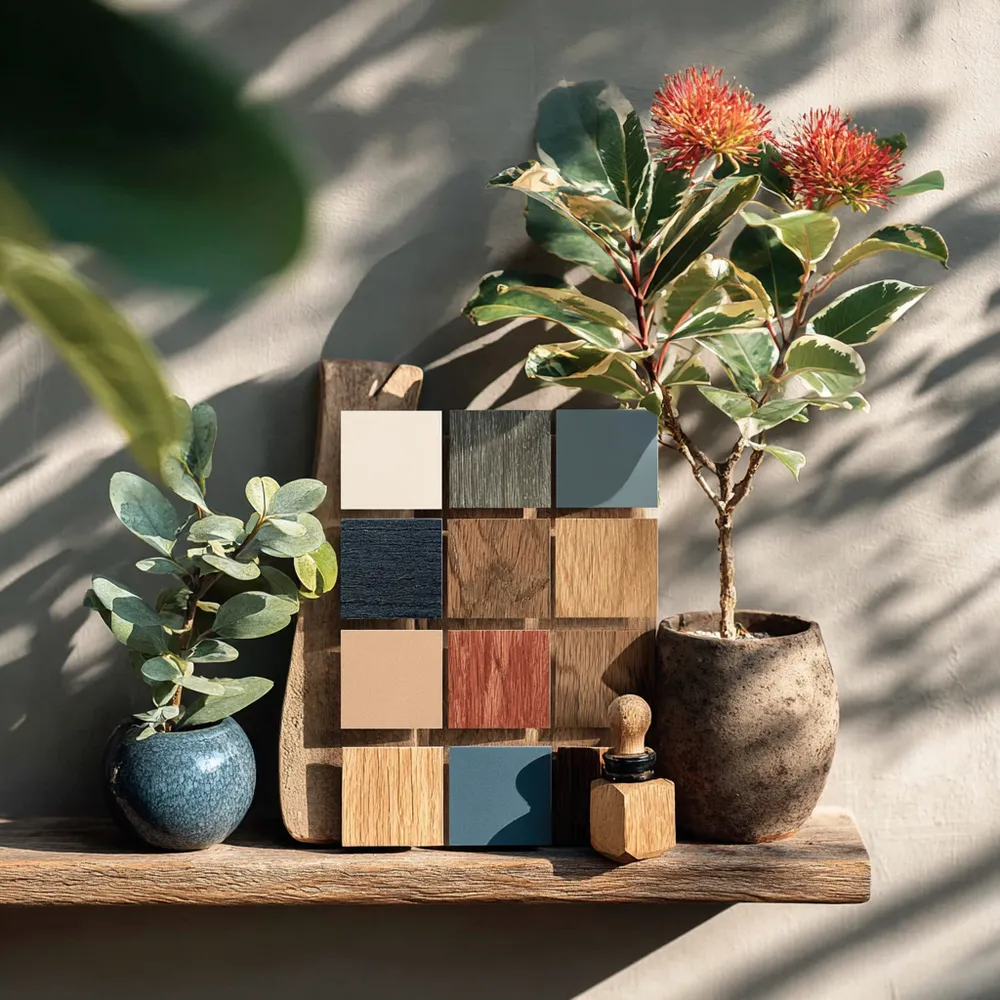
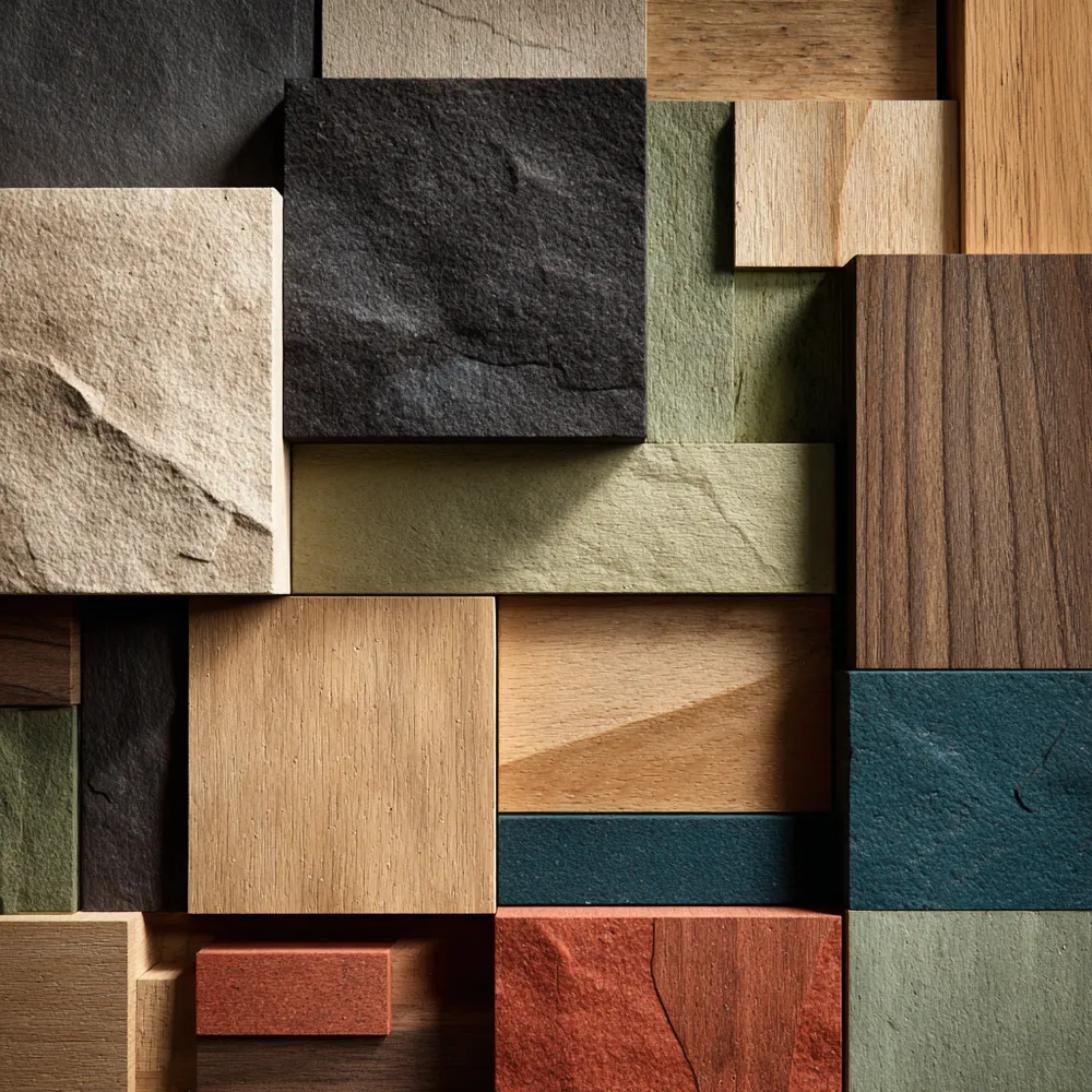
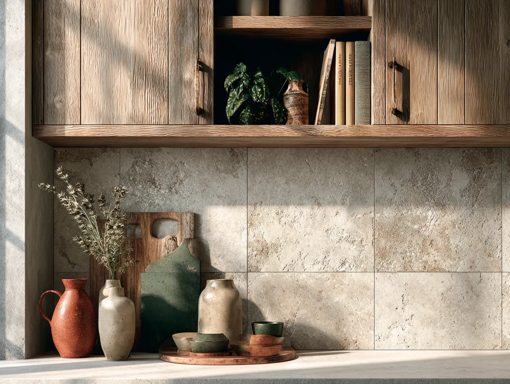
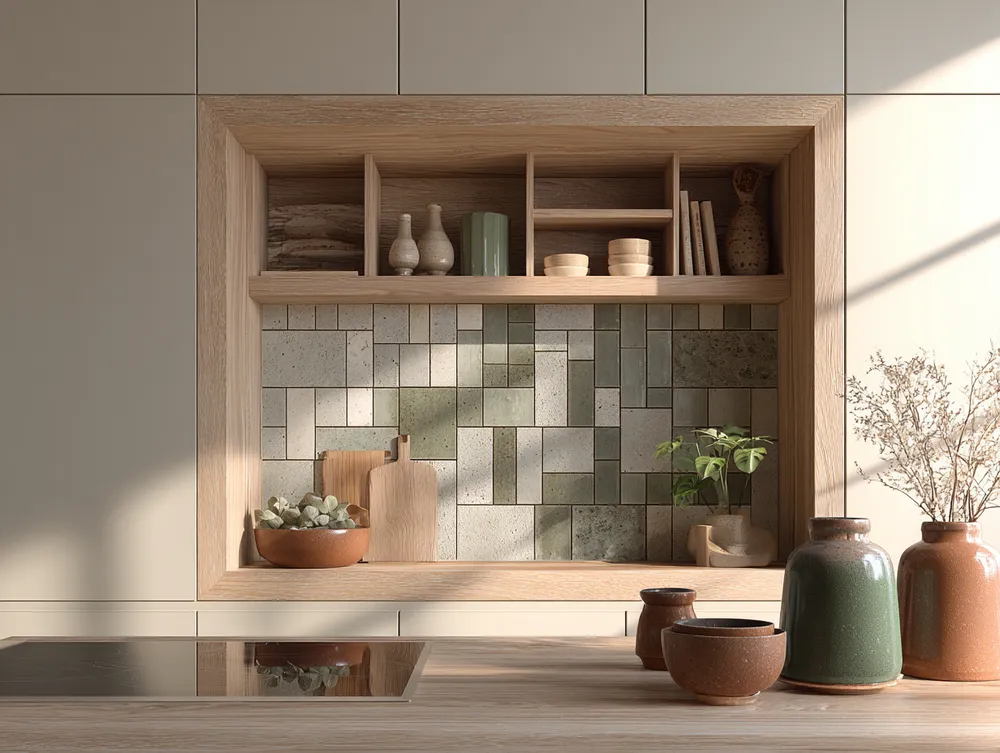
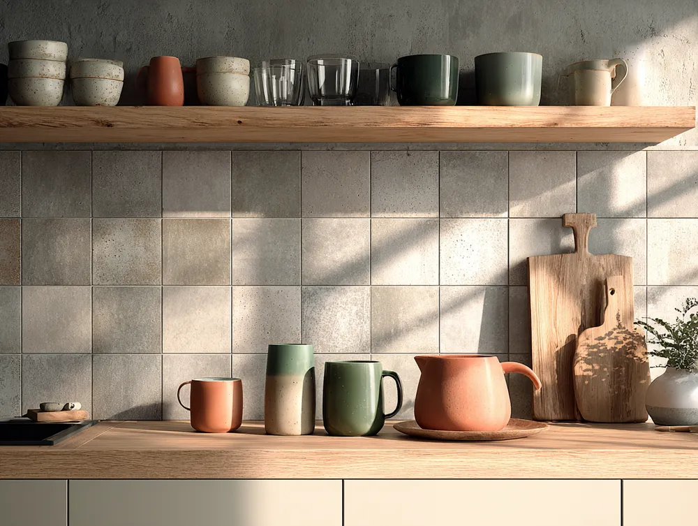
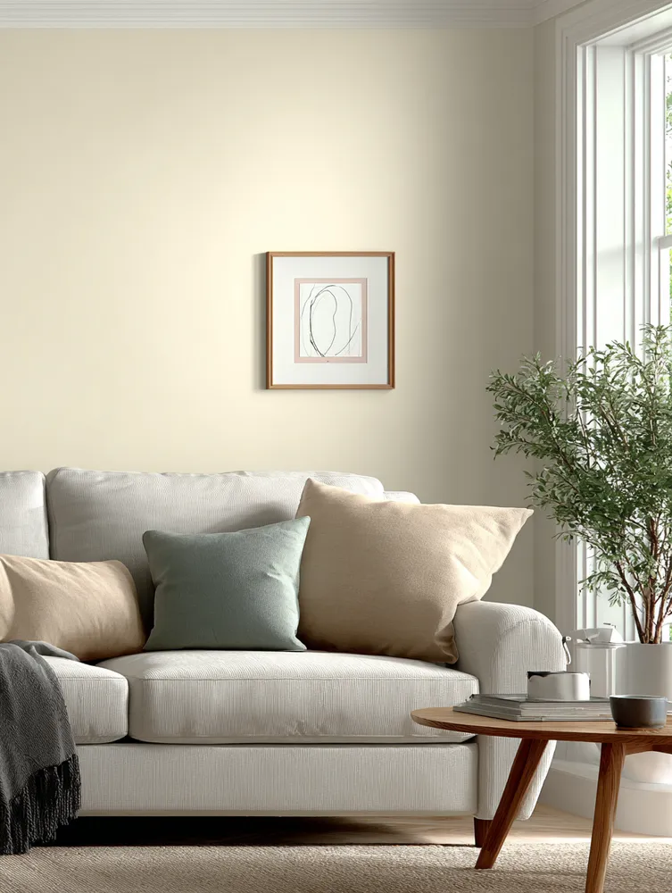
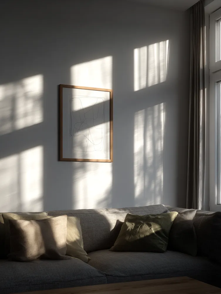
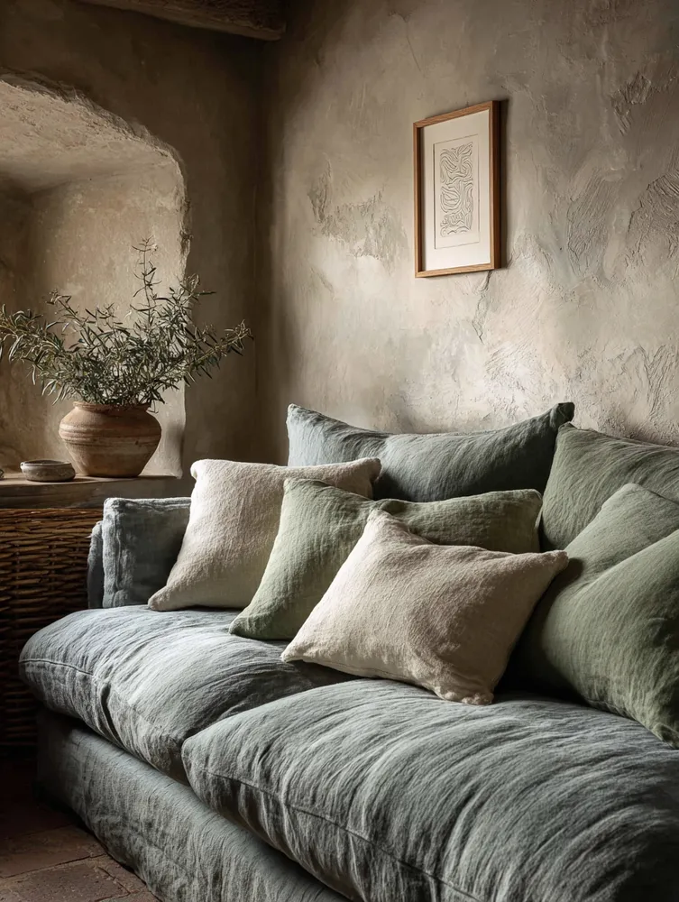
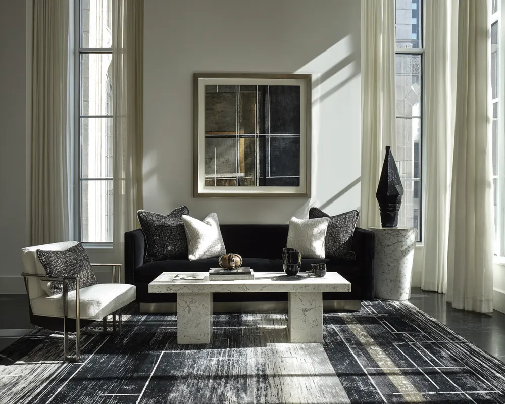
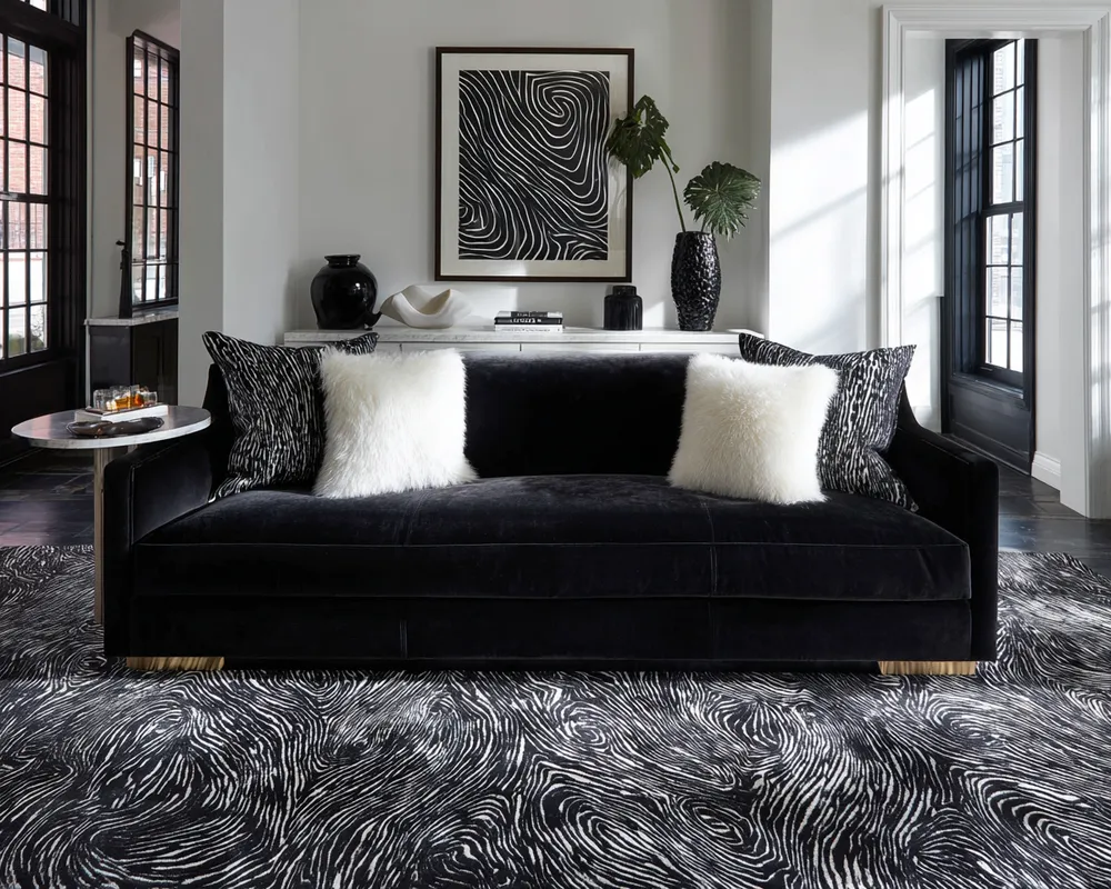
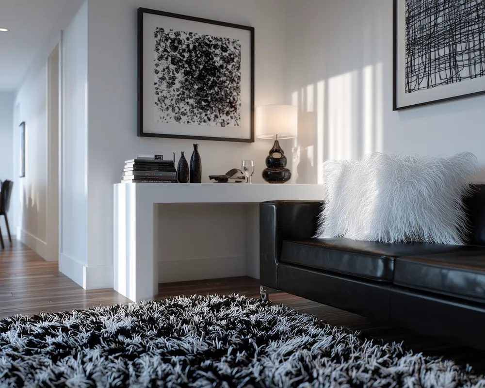
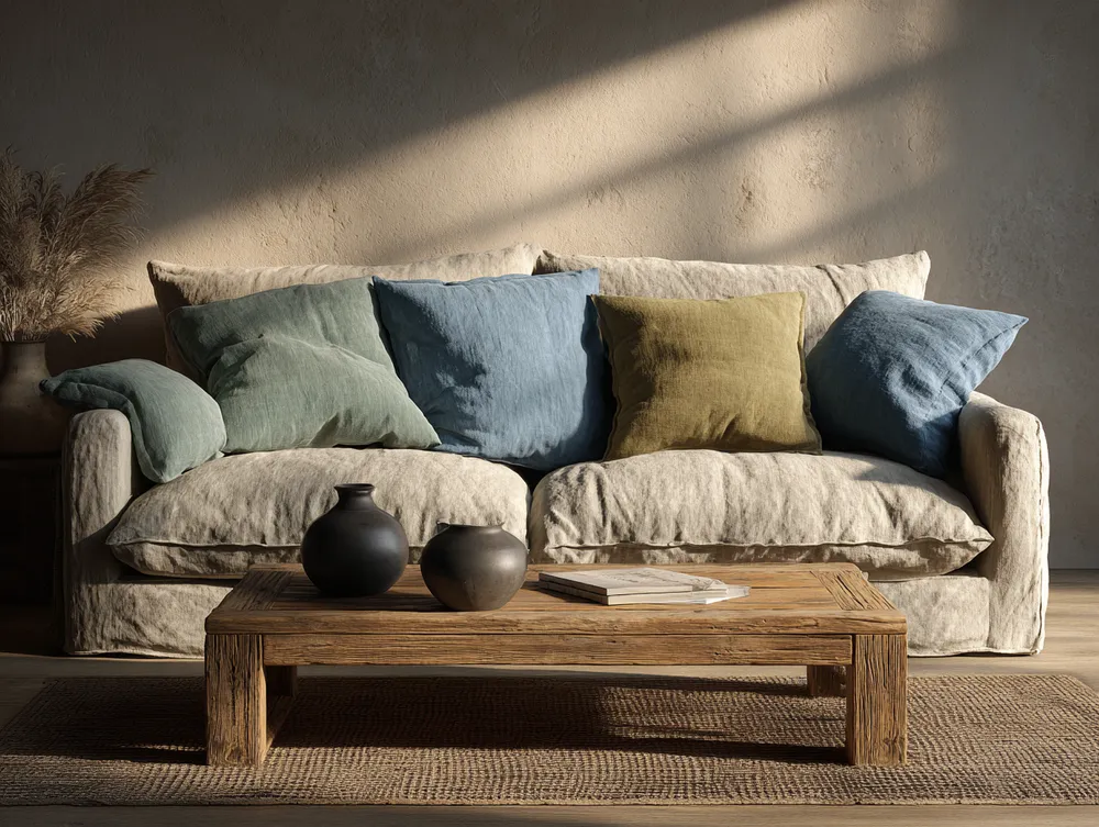
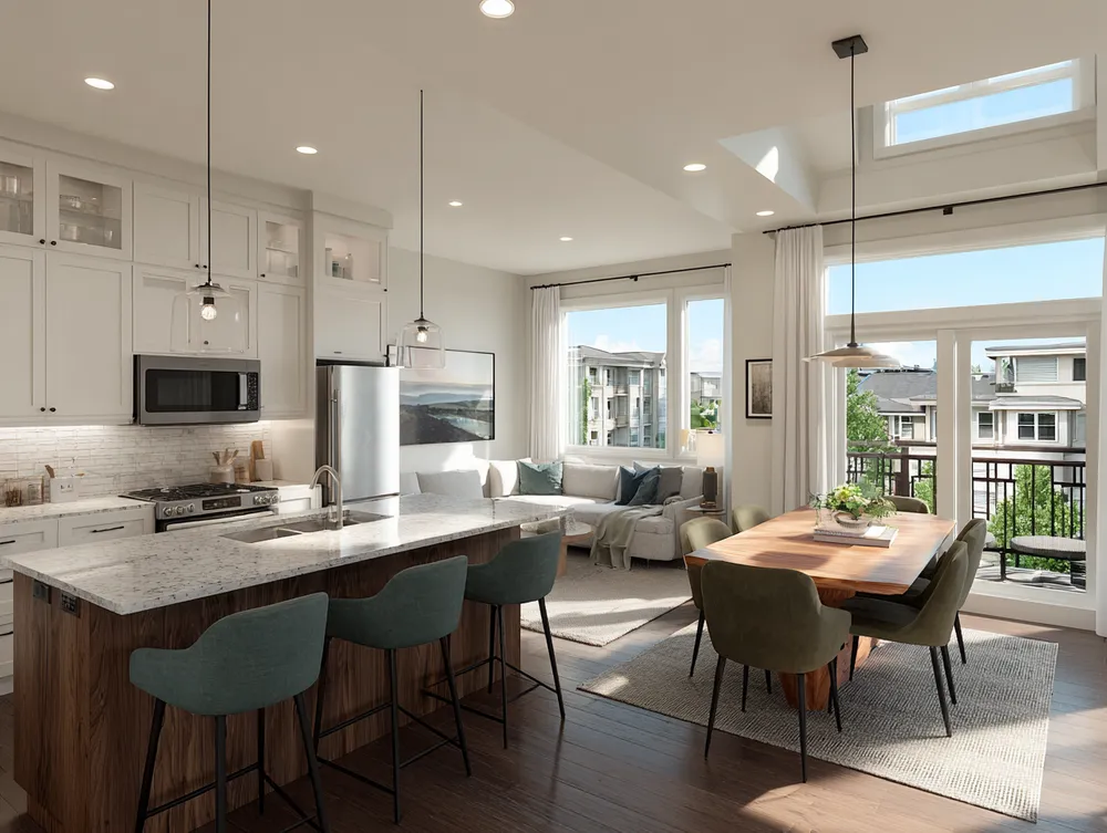
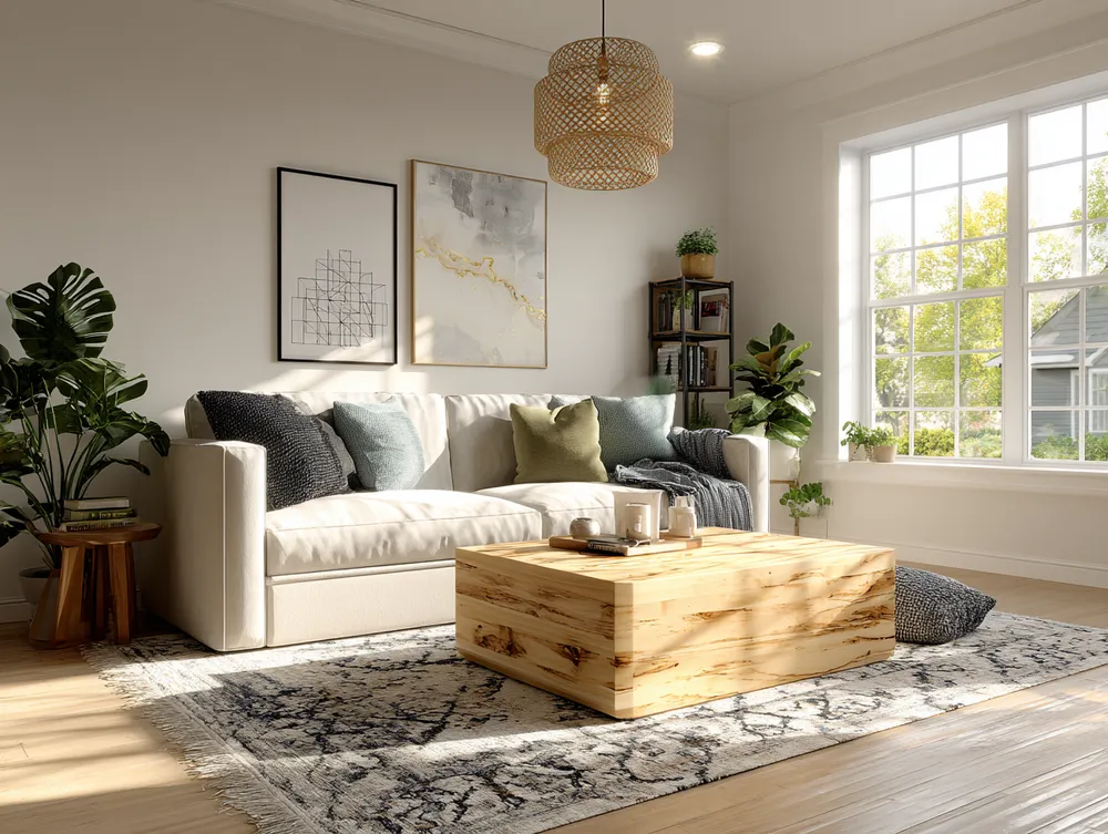
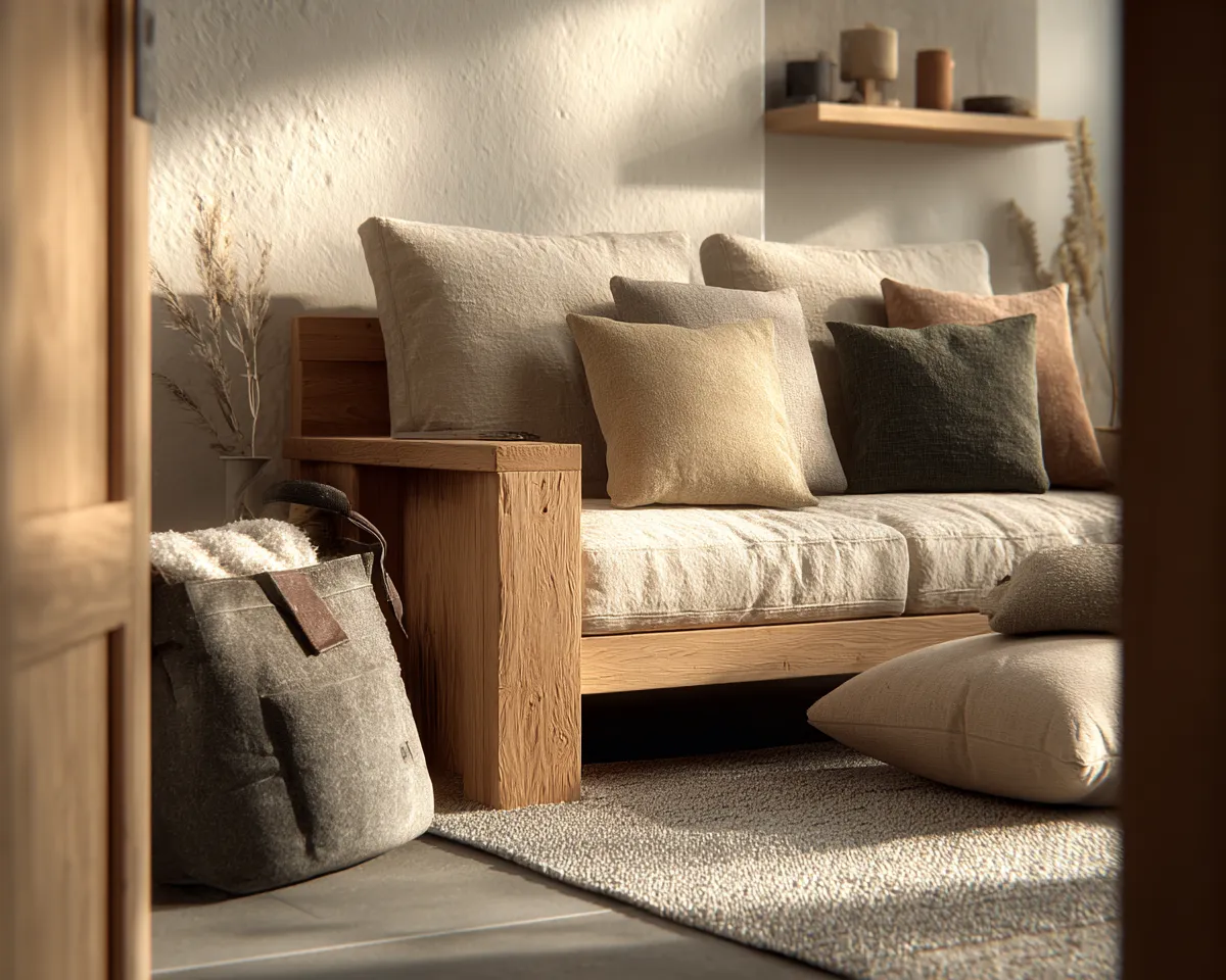
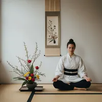
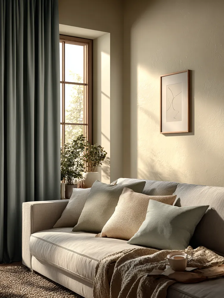
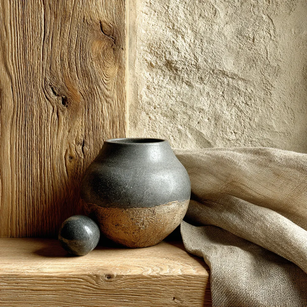
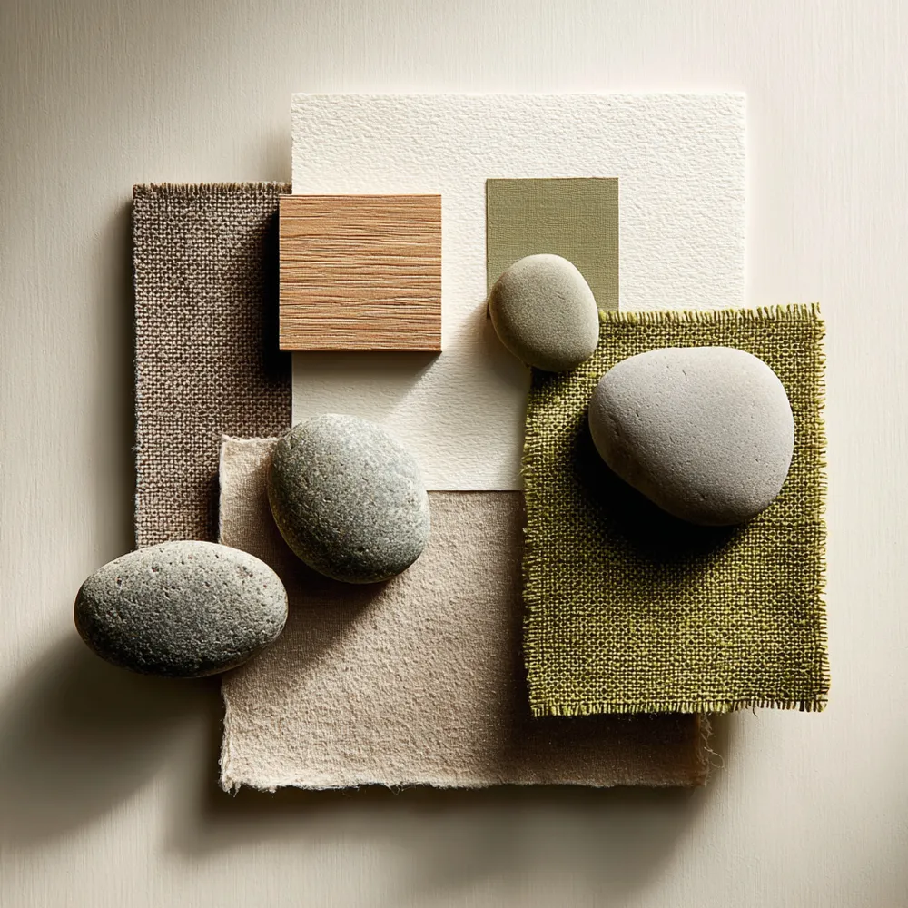
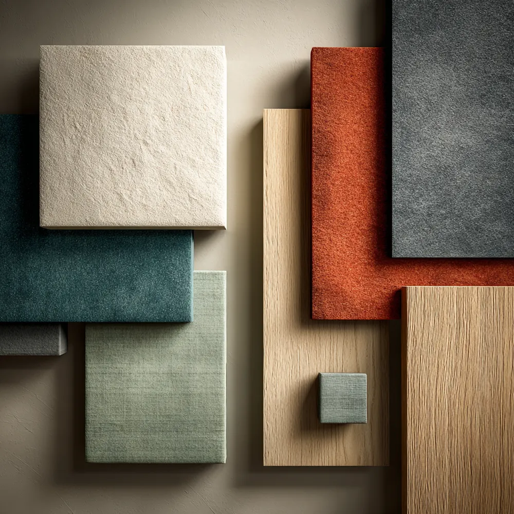
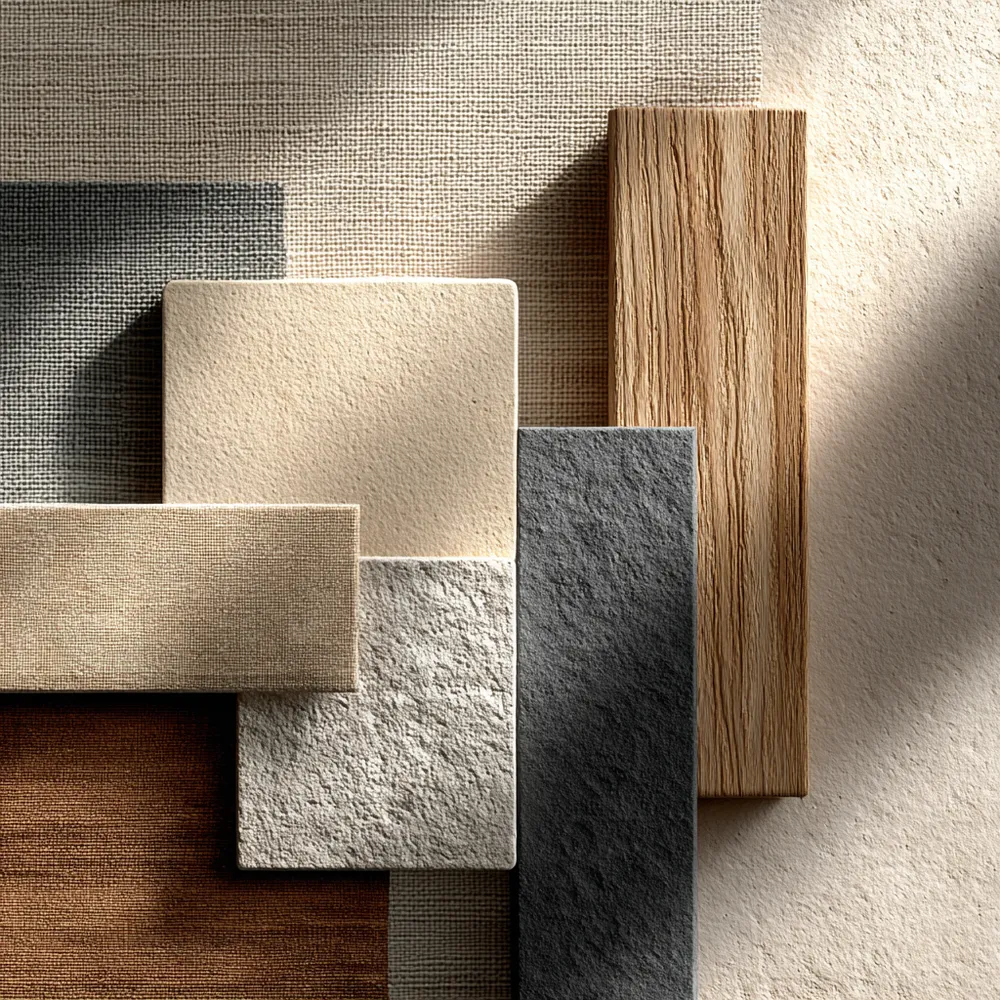
Japandi's color palette is grounded in neutrality, creating a sense of calm and sophistication. Think soft whites, warm beiges, muted grays, and natural wood tones. These colors provide a serene backdrop that allows natural materials and textures to shine. Accents are kept subtle, often in earthy shades or deep charcoals, providing just enough contrast without disrupting the peaceful harmony. This understated palette is timeless and promotes a feeling of tranquility and order in the home. 🌿 What neutral tones do you love most? #NeutralColorIdeas #JapandiIdeas #ColorPalette #HomeDecor #InteriorDesign #MinimalistColor #CalmColors #DesignInspiration #HomeStyling #EarthyTones
2025년 10월 28일
스타일 복사
 아직 댓글이 없습니다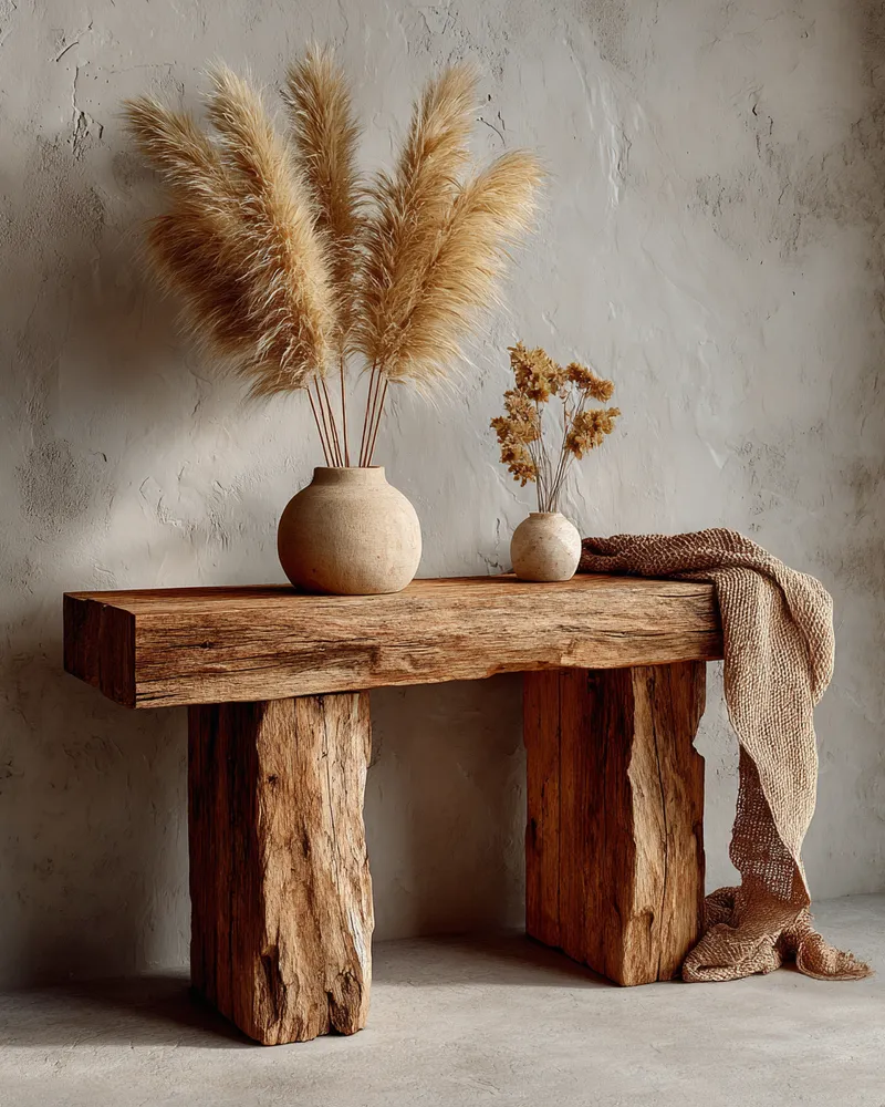
Japandi Color Palettes: The Power of Neutrals 🤍

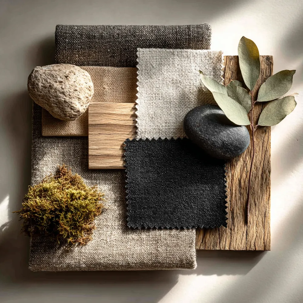
Japandi Color Palette: Soothing Neutrals & Earth Tones 🎨
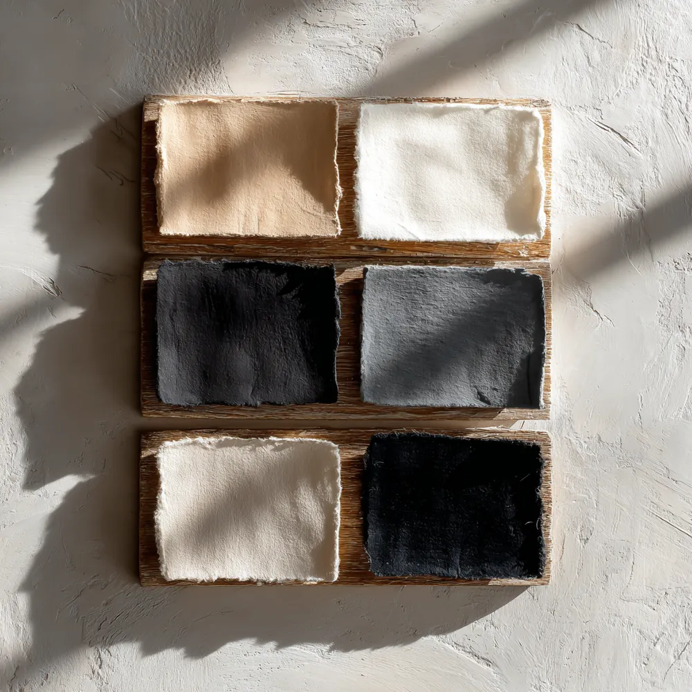
The Japandi Color Palette: Serene Neutrals for a Calm Home 🤍
The Power of Soft Neutrals: Creating a Tranquil Palette 🌲

The Neutral Palette: Colors of Japandi Design 🎨
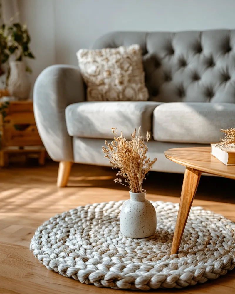
The Golden Ratio of Color: Achieving Scandi Neutrals 🎨☁️
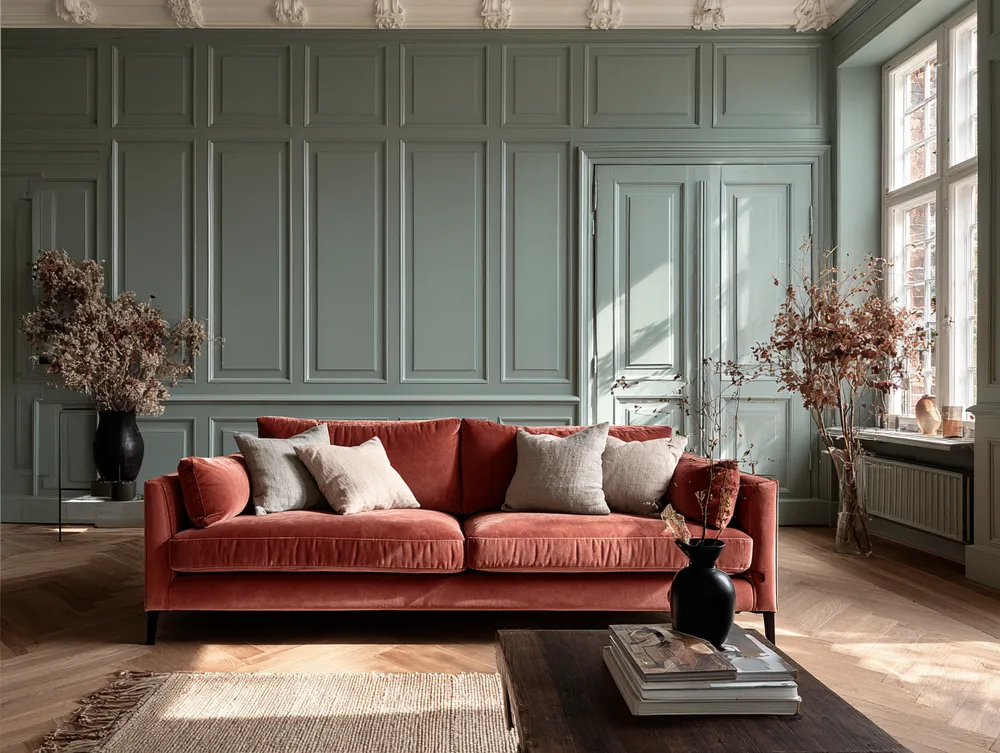
Introducing 'New Neutrals': Beyond Beige!
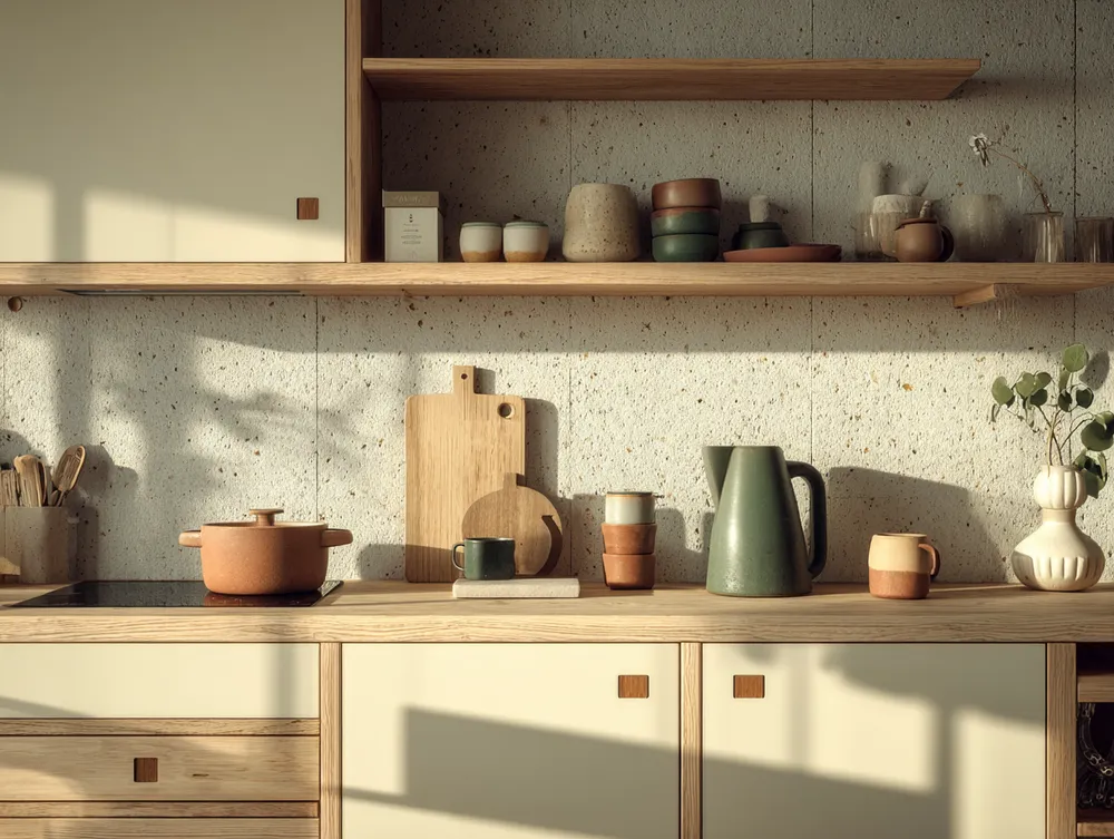
The Japandi Kitchen Palette: Neutrals & Nature Inspired Tones 🍎
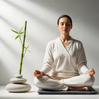
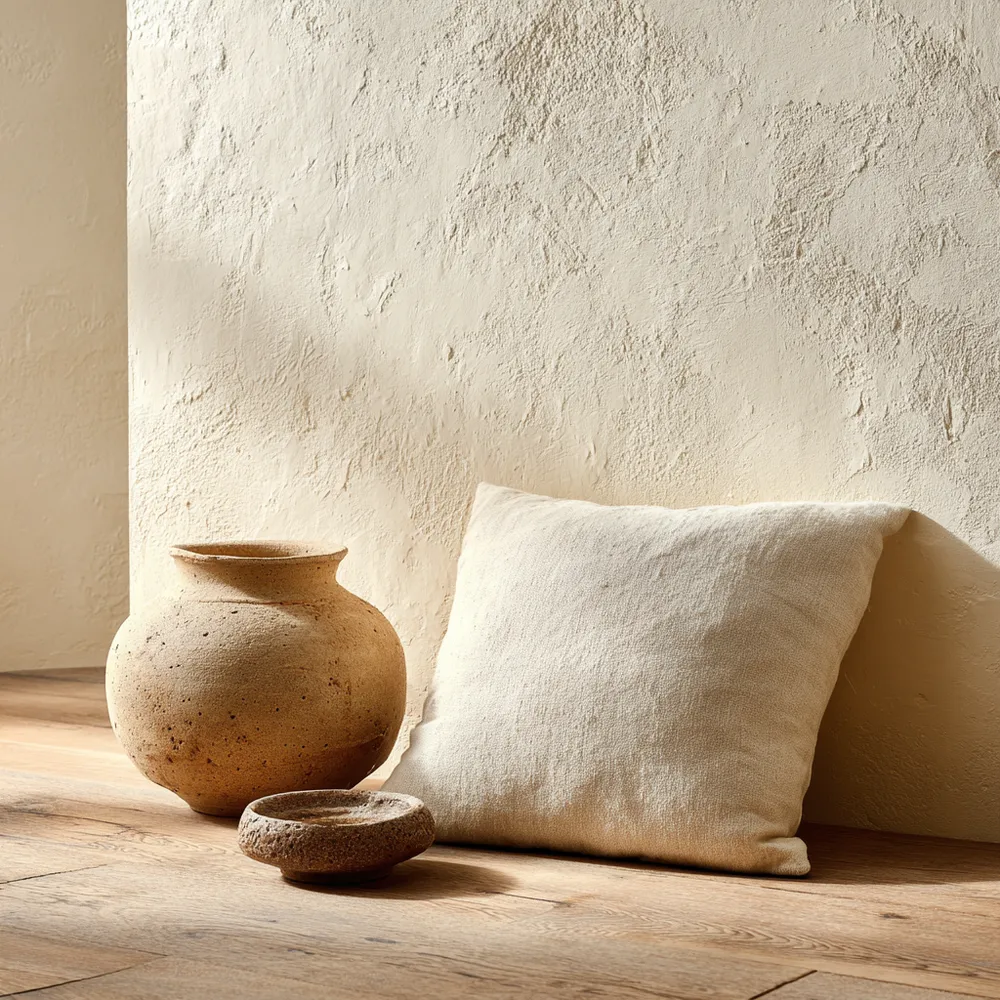
Neutral Palettes: Japandi's Serene Color Scheme 🤍

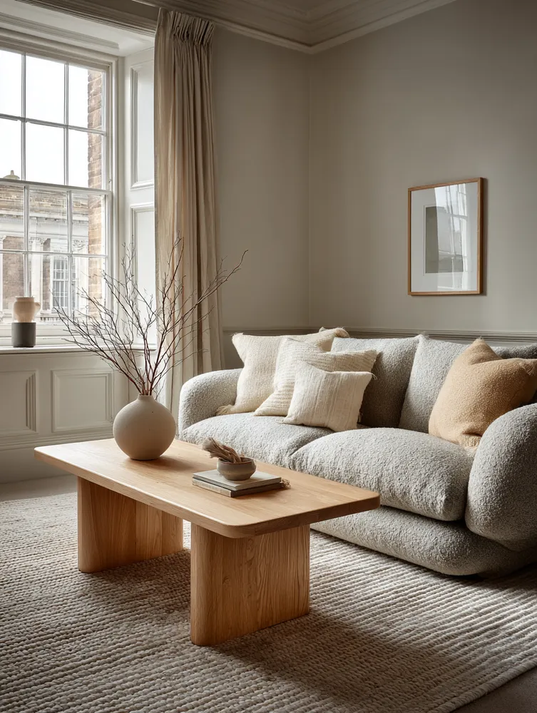
Sophisticated Scandi-Japandi Fusion: Clean Lines & Cozy Neutrals 🤍

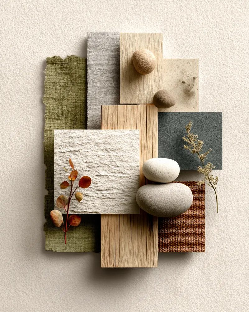
Color Palette: The Serene Neutrals of Japandi Living 🎨
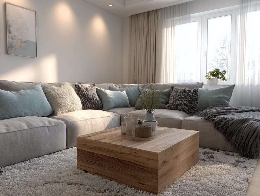
Bringing Balance: Japandi Approach to Color Palettes 🎨


color
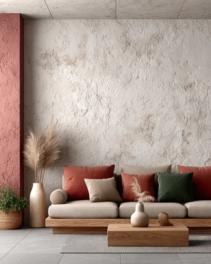
Soft Neutrals & Earthy Tones: The Japandi Color Palette 🤎

✨ Japandi Color Palette: The Serenity Secret!

Finding Harmony: Japandi Color Palettes for a Tranquil Home ✨
Color Palette Perfection: Japandi Neutral Tones 🤍
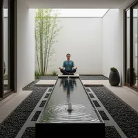
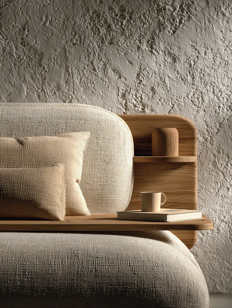
Understated Elegance: The Role of Neutral Palettes in Japandi ☁️

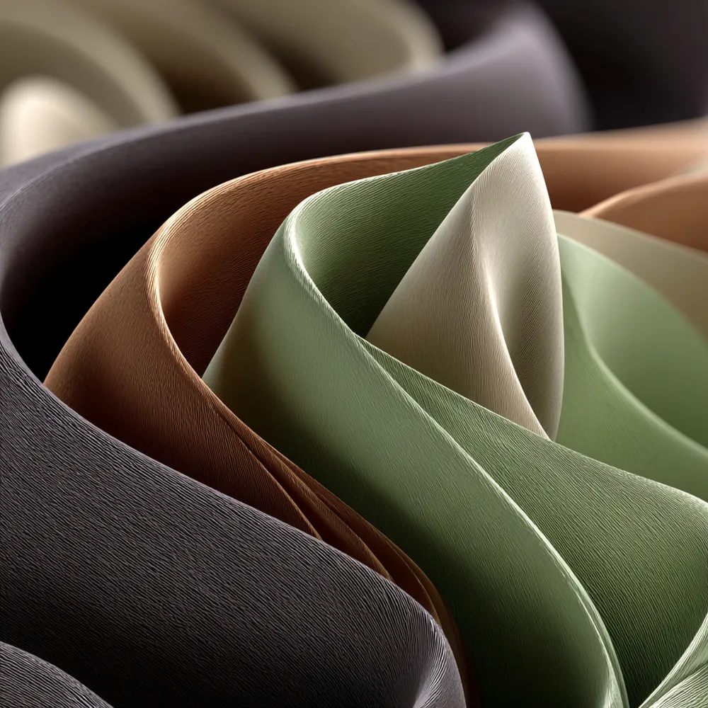
Harmonious Hues: The Japandi Color Palette 🎨

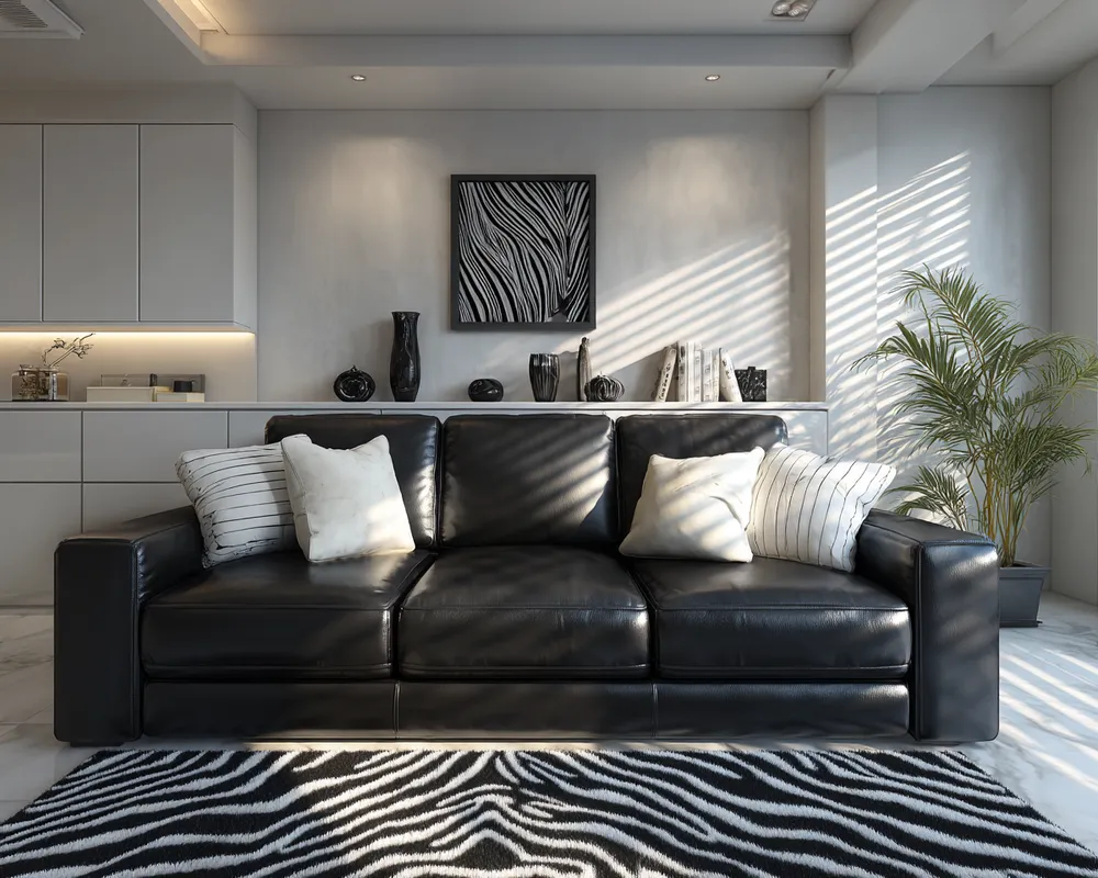
Bold Neutrals: The Art of Black & White Harmony 🖤🤍