



1/4

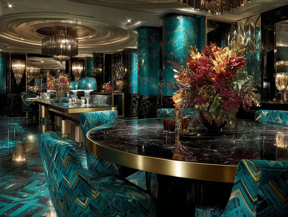
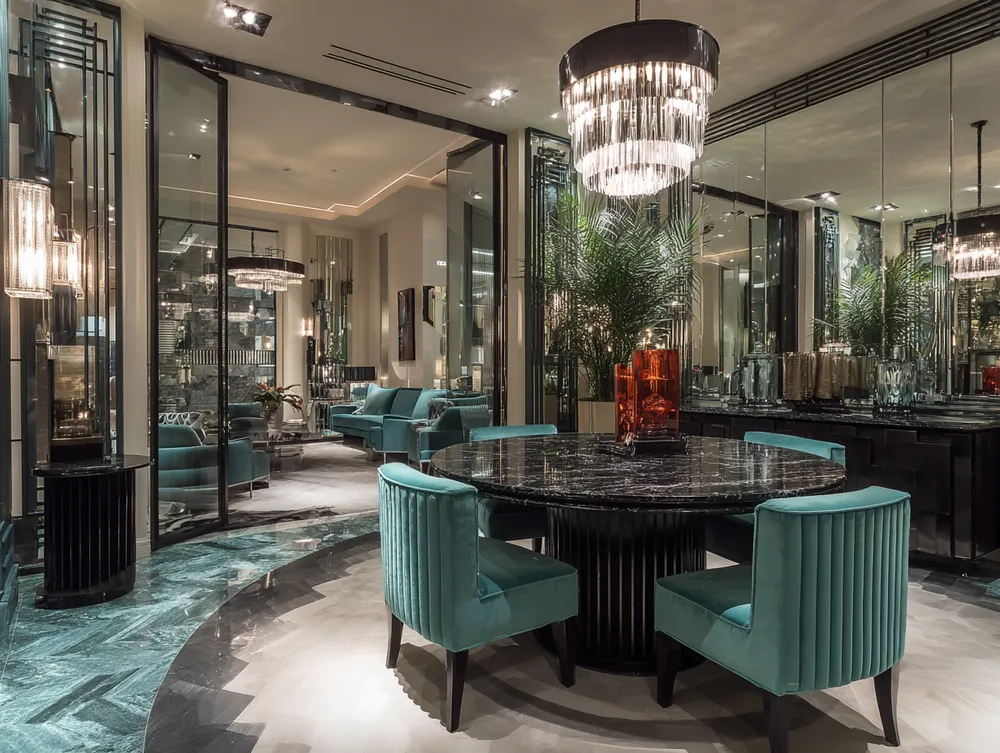
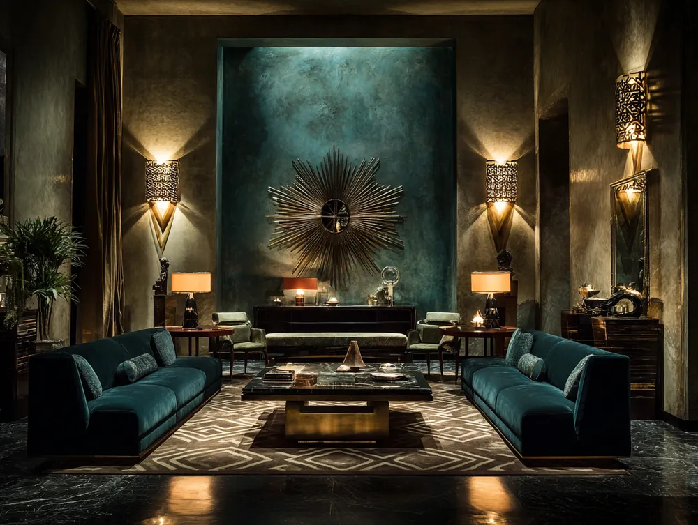
Color Palette Perfection: Art Deco Style 🎨
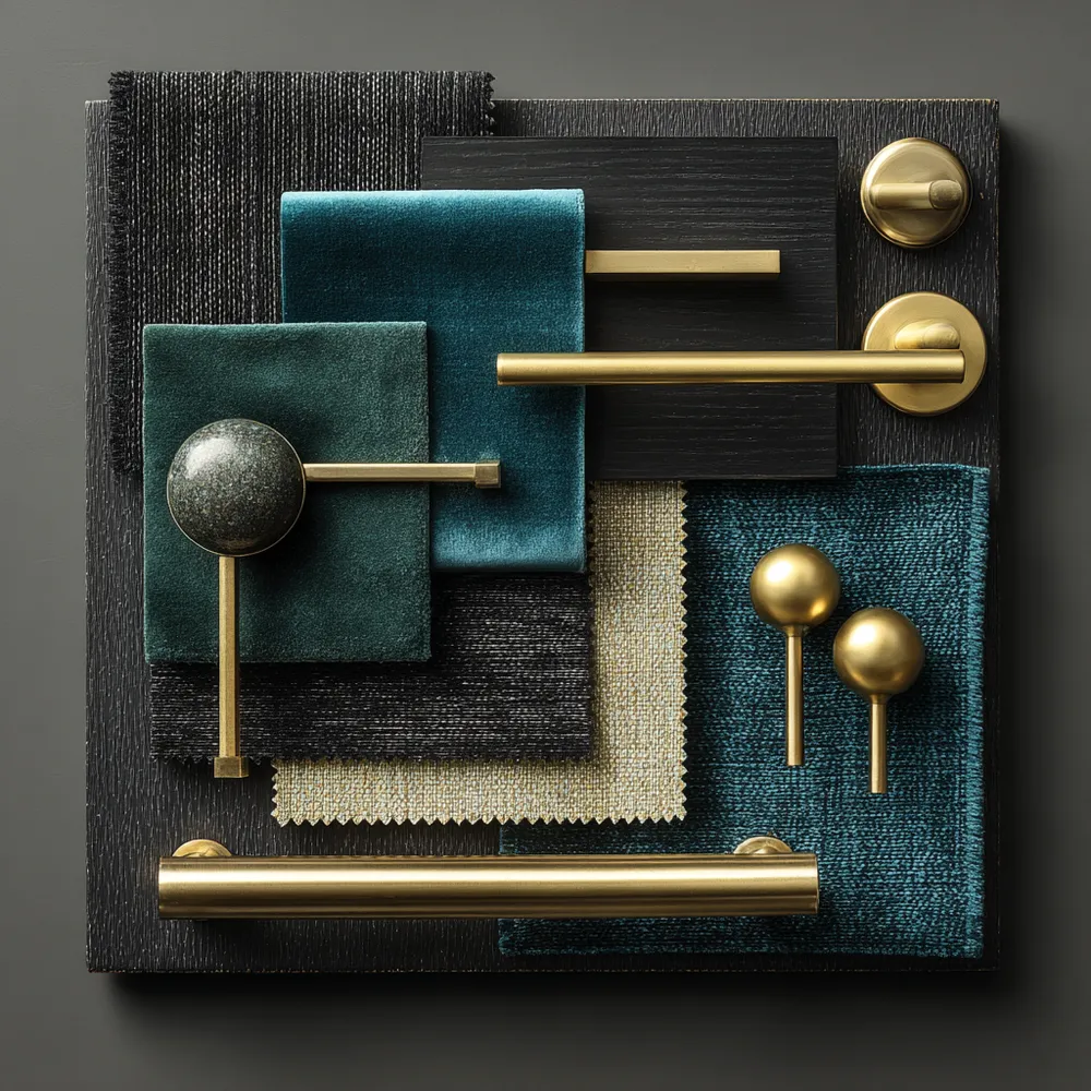
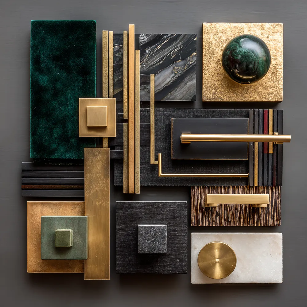
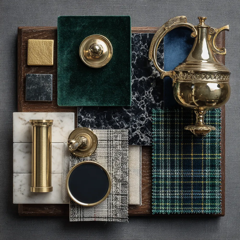
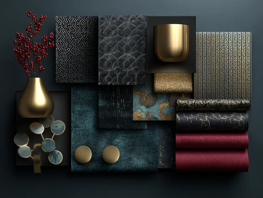
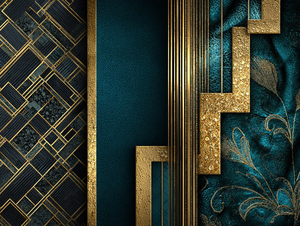
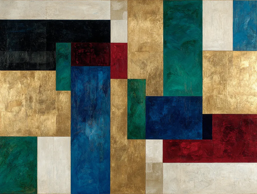
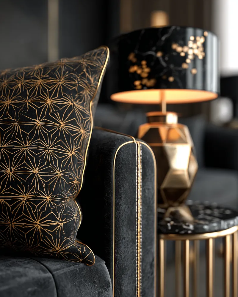
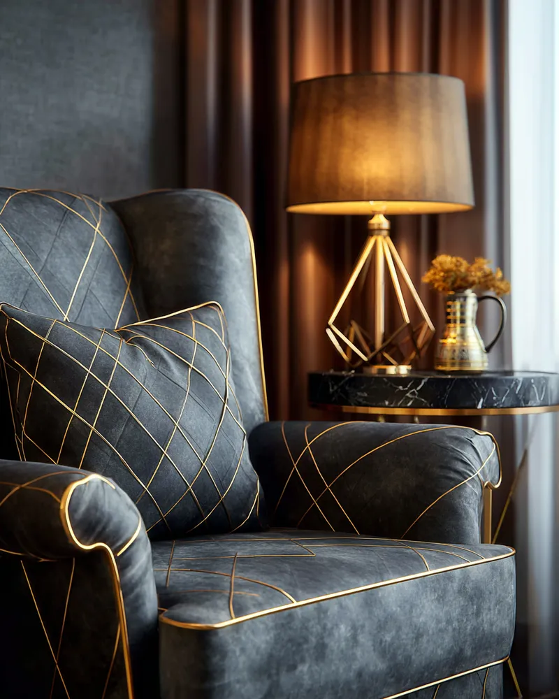
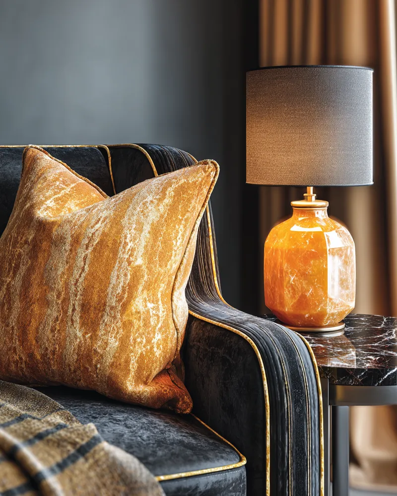
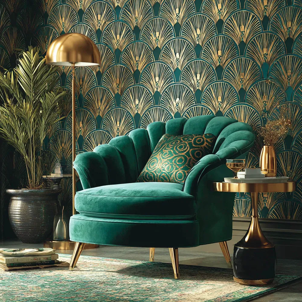
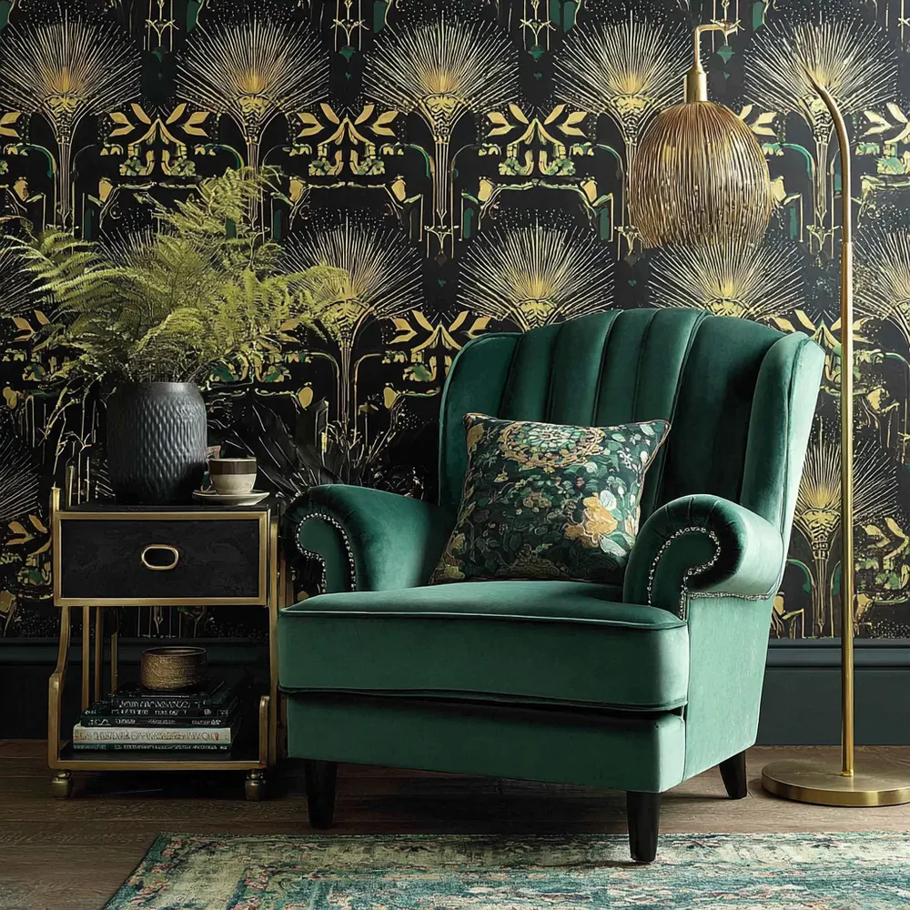
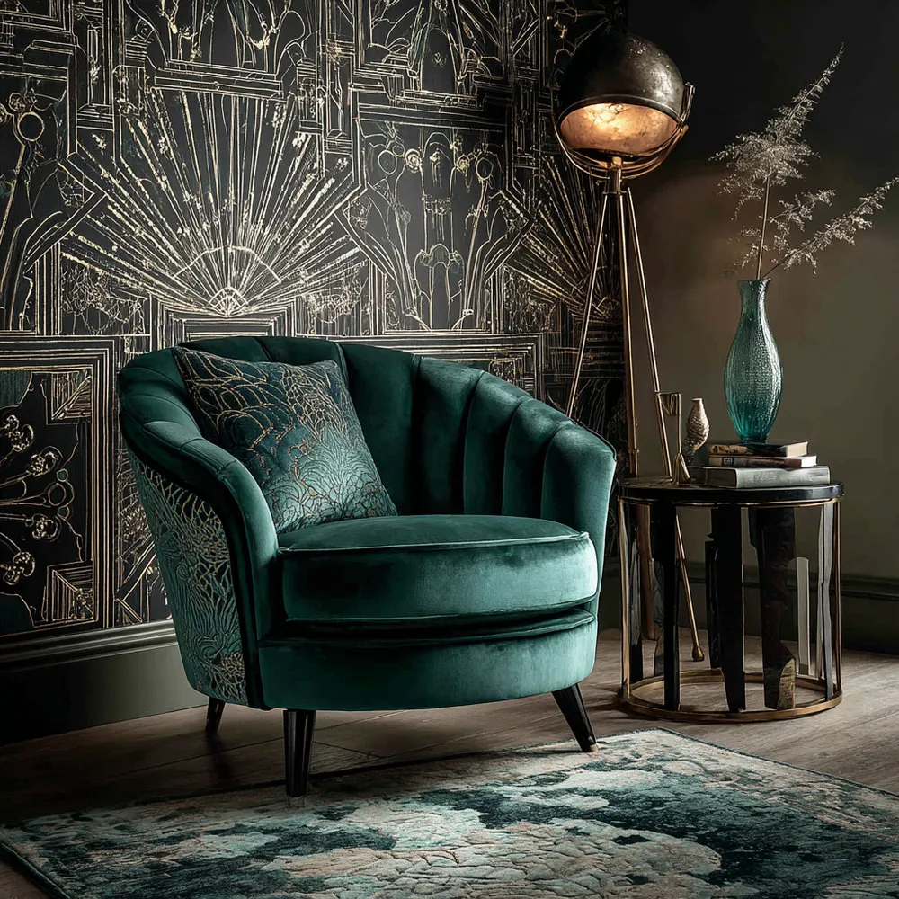
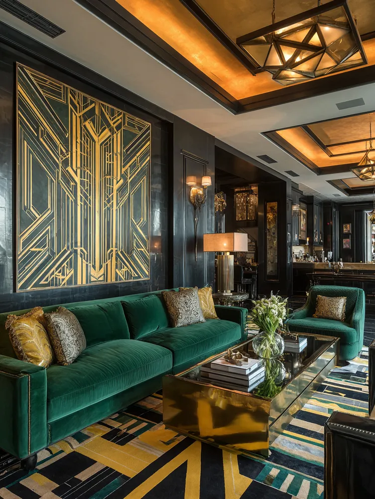
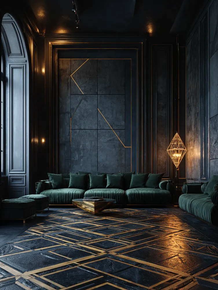
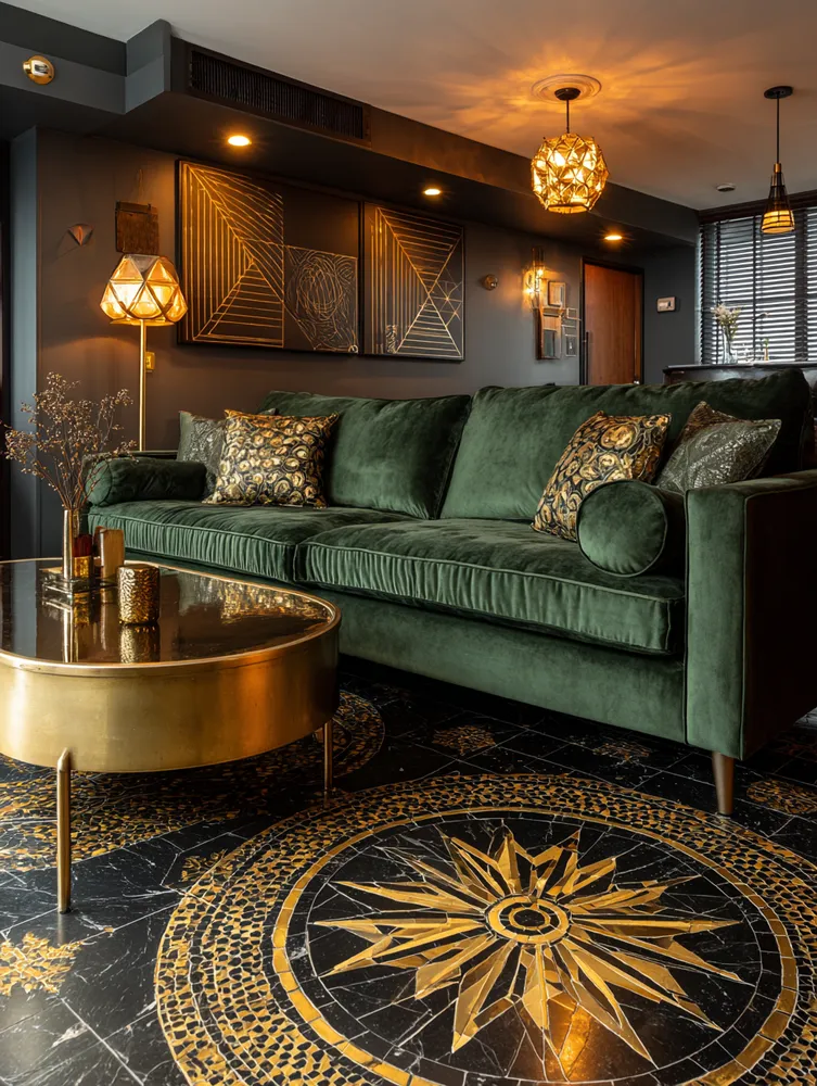
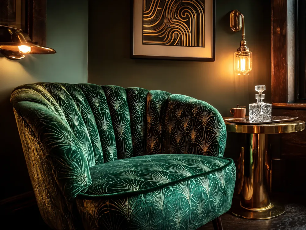
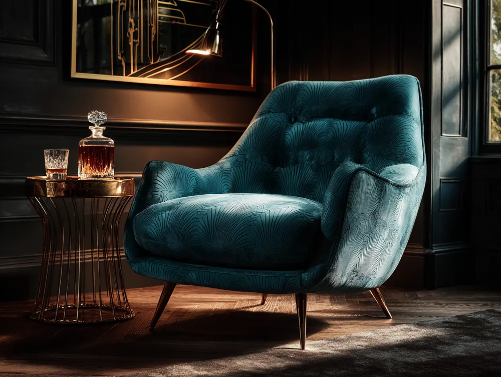
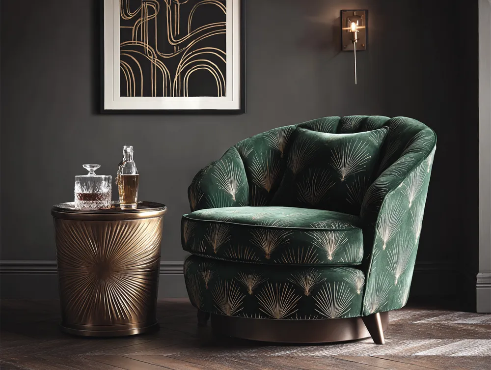
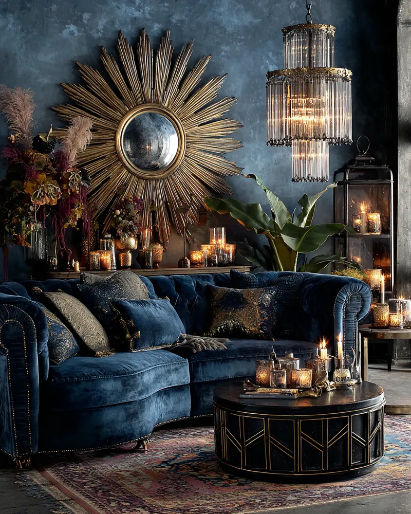
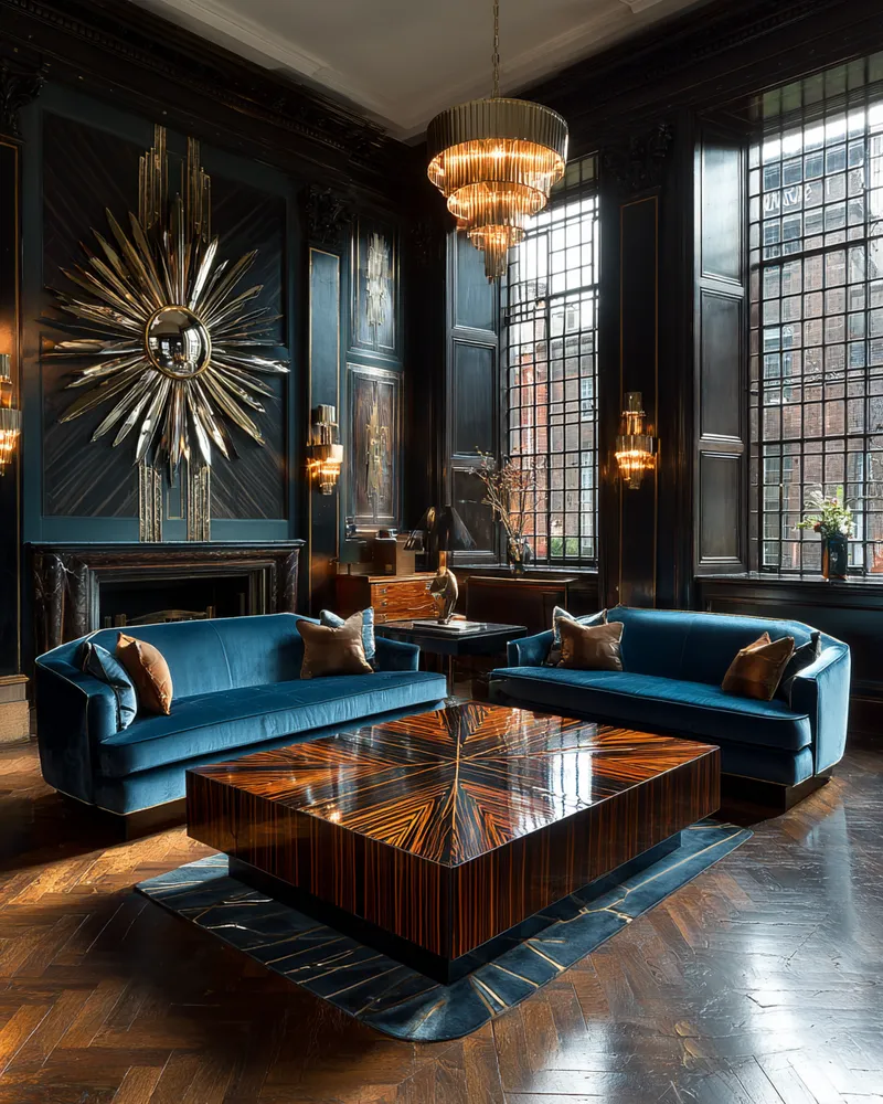
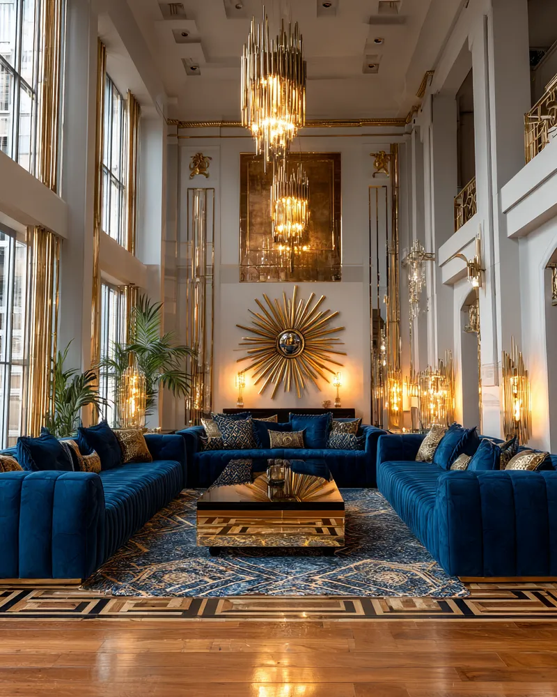
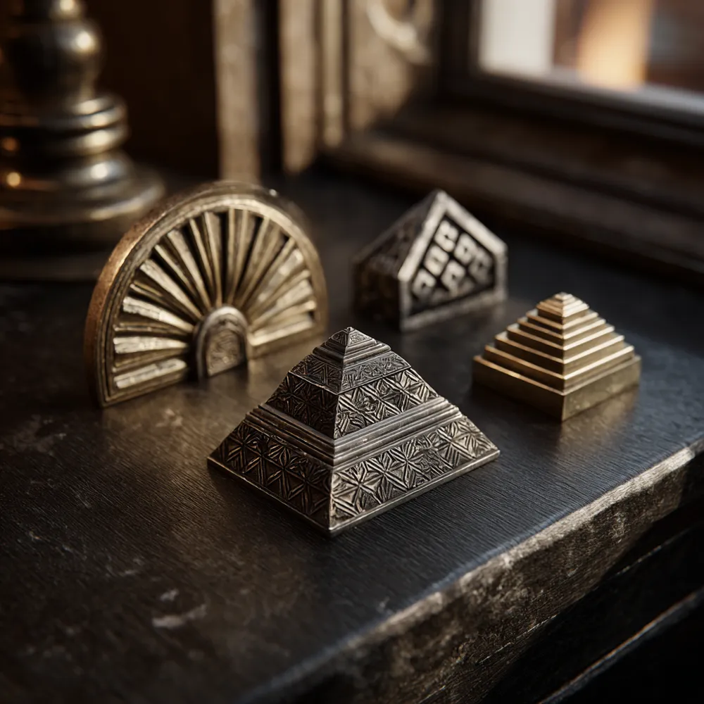
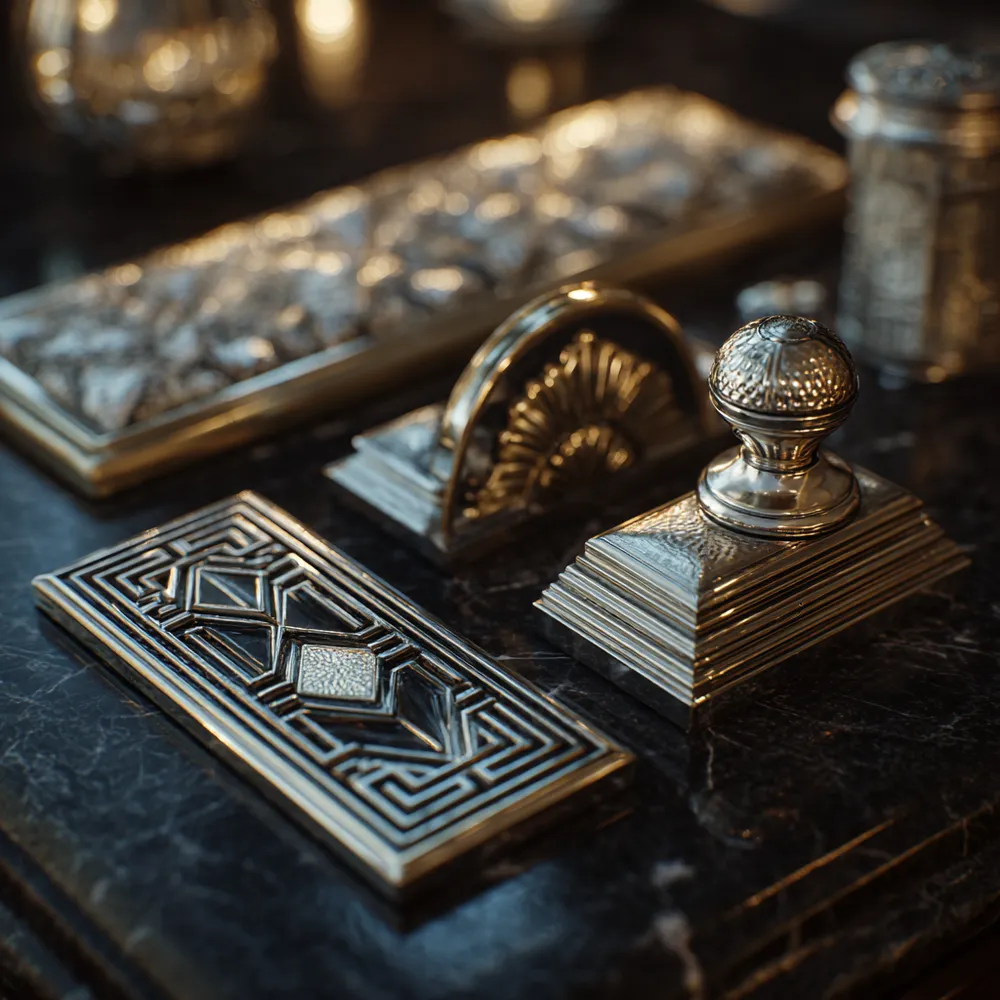
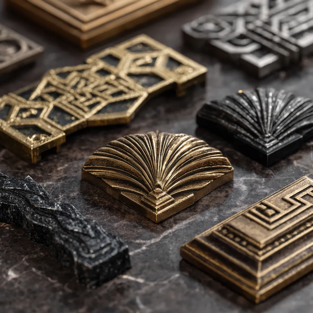
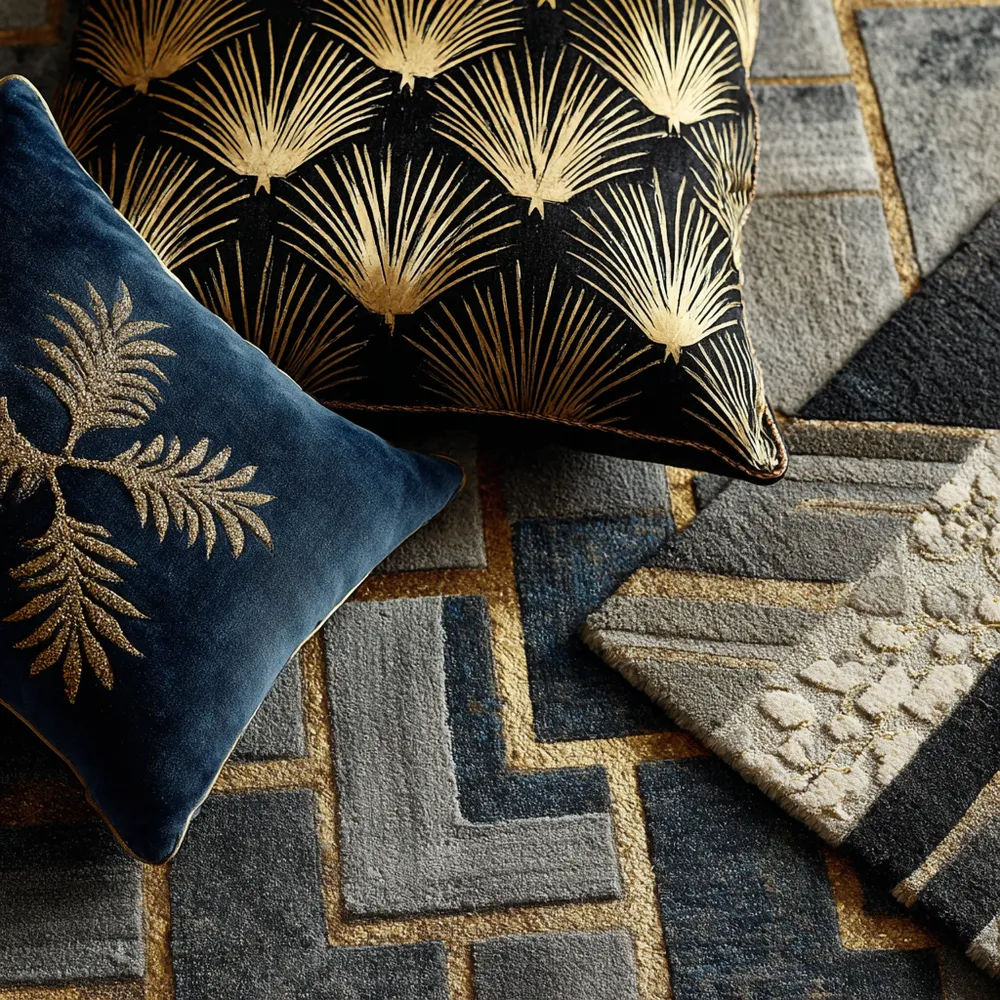
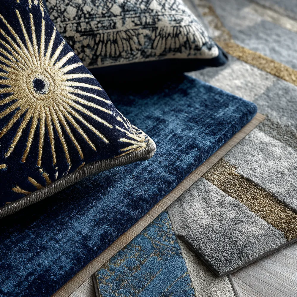
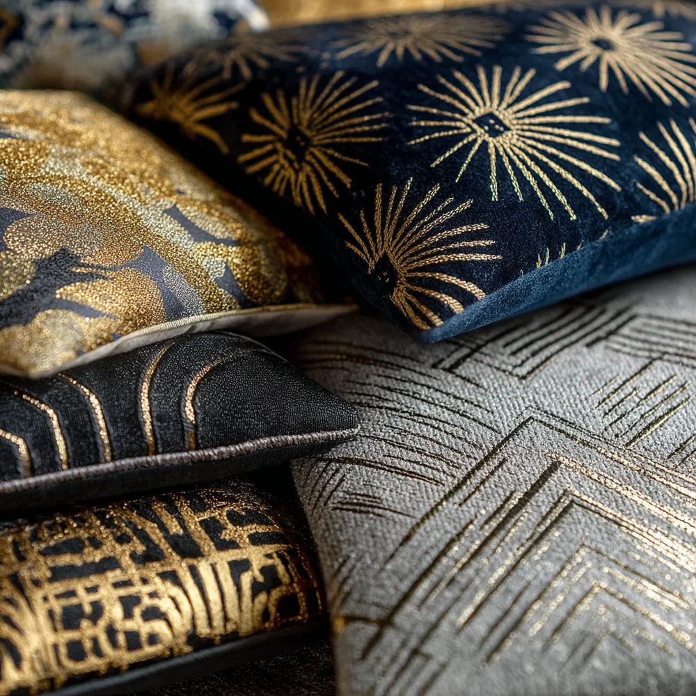
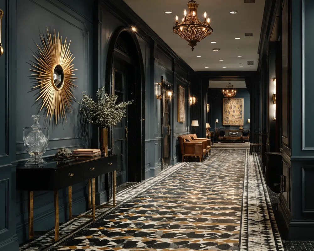
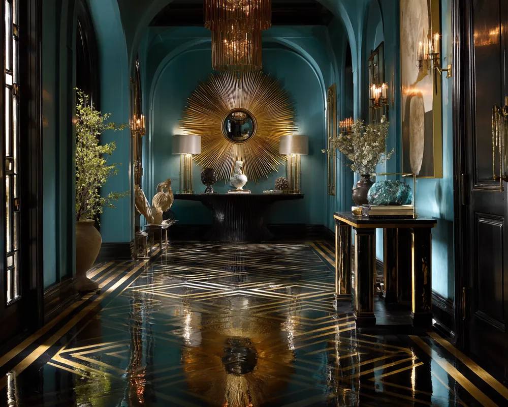
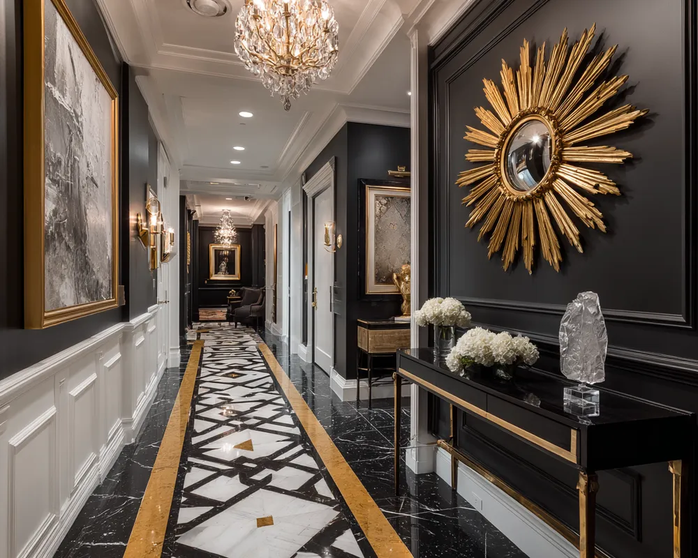
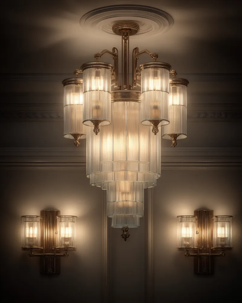
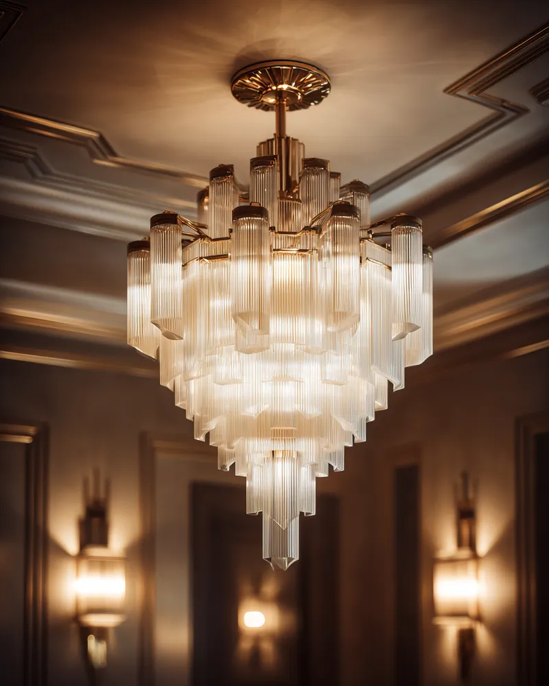
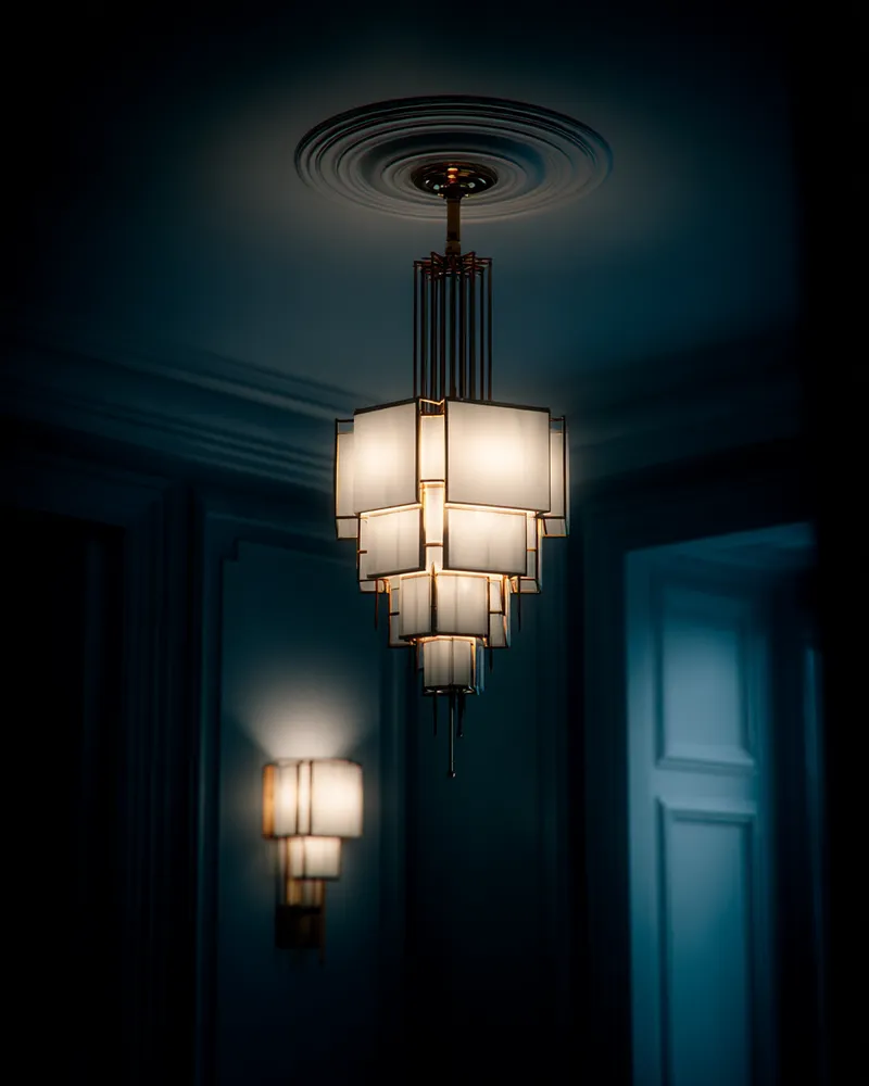
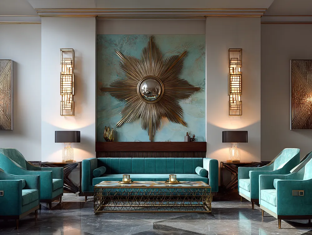
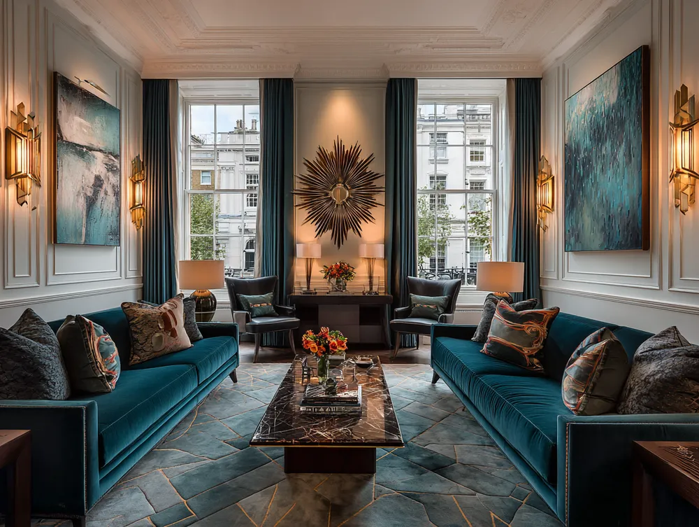
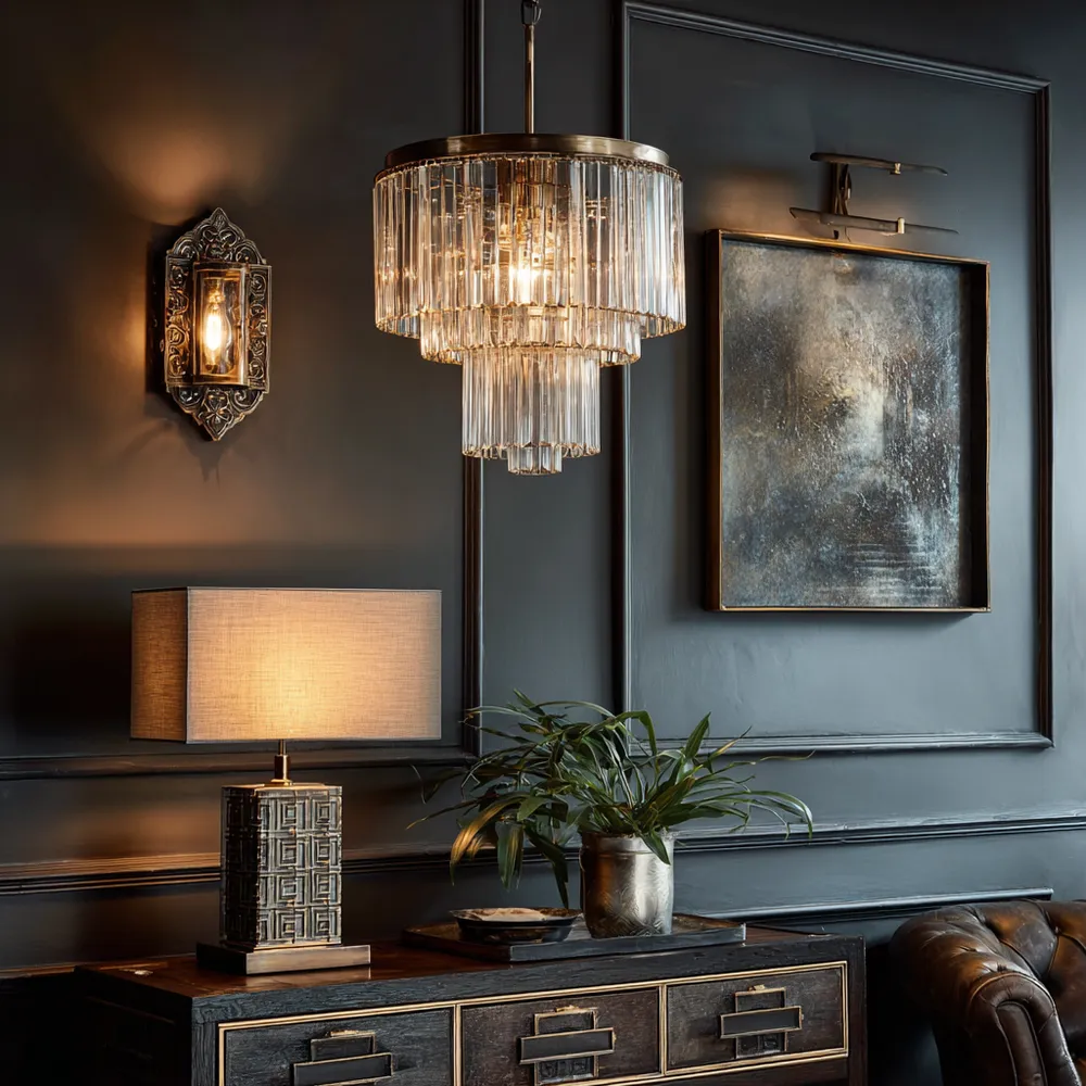
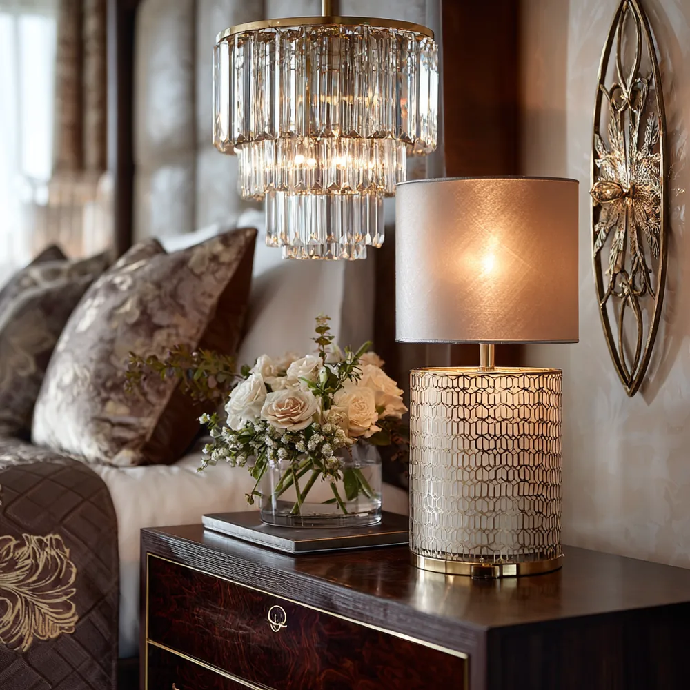
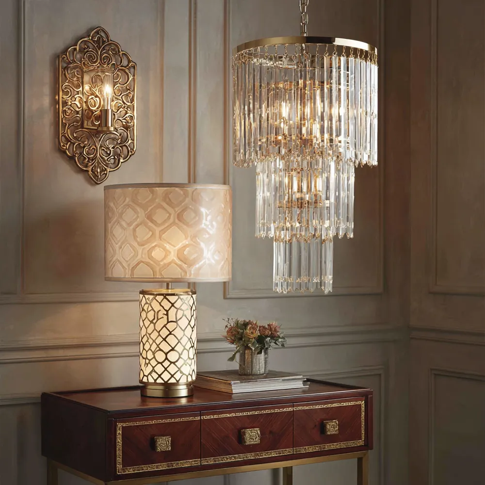
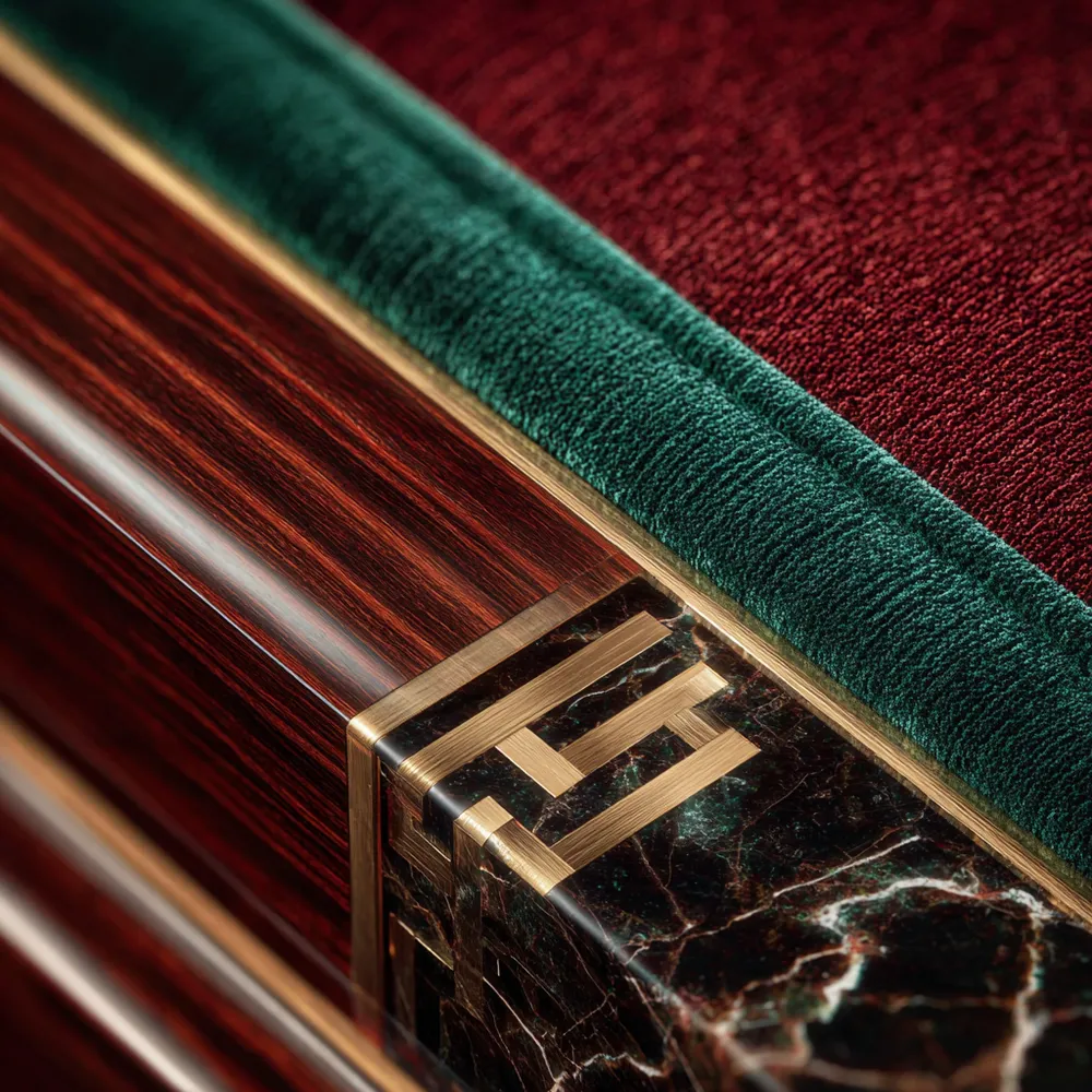
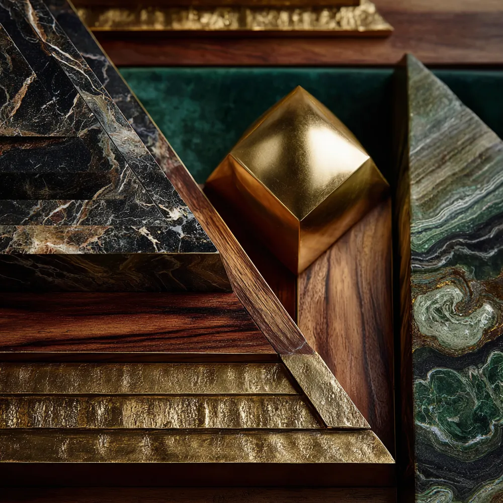
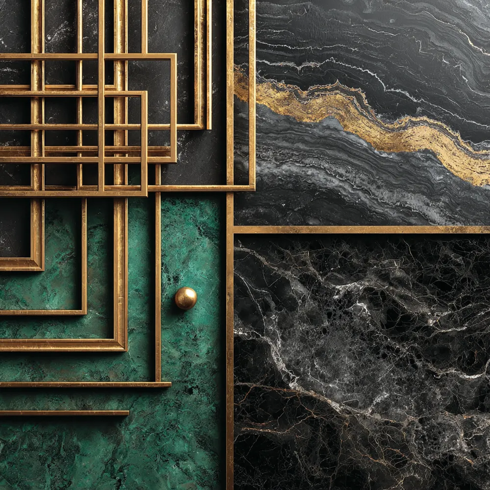
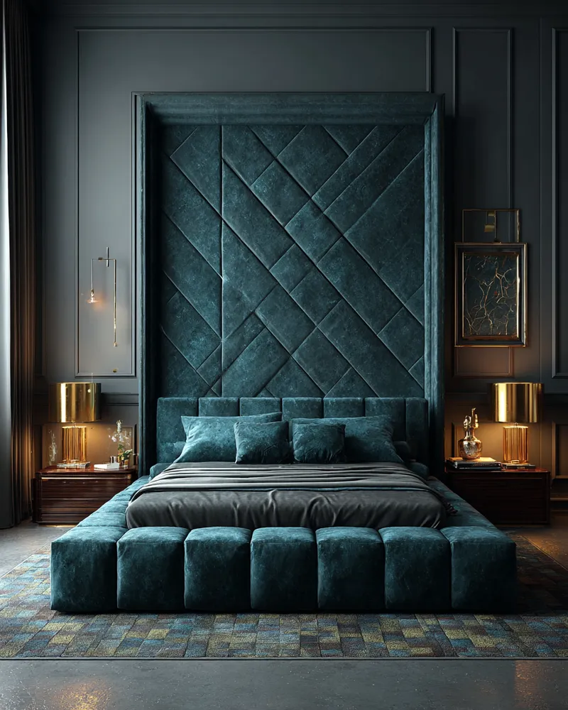
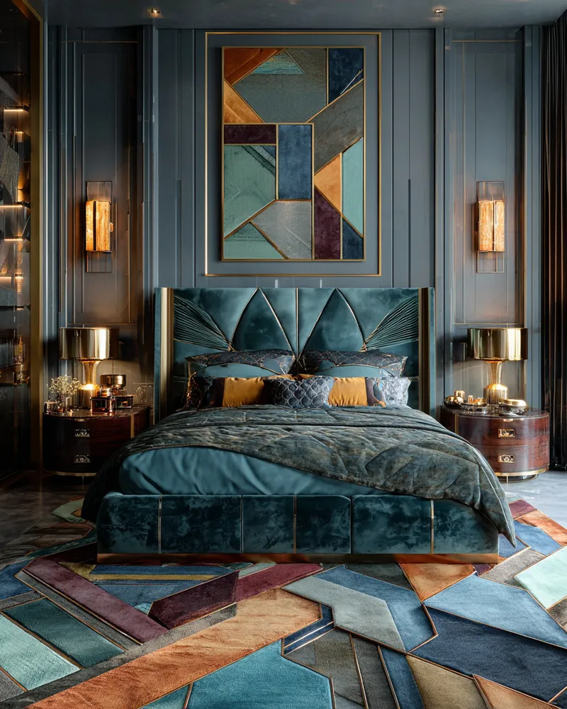
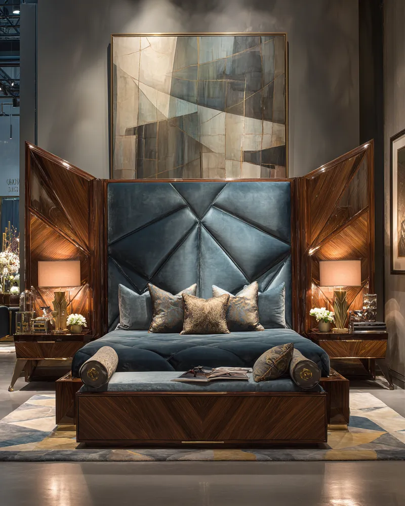
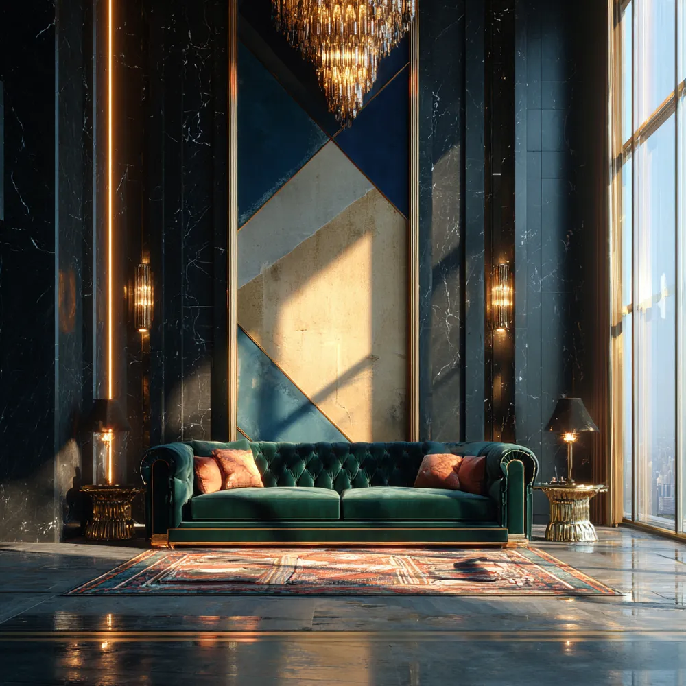
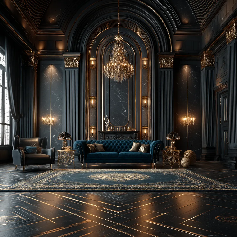
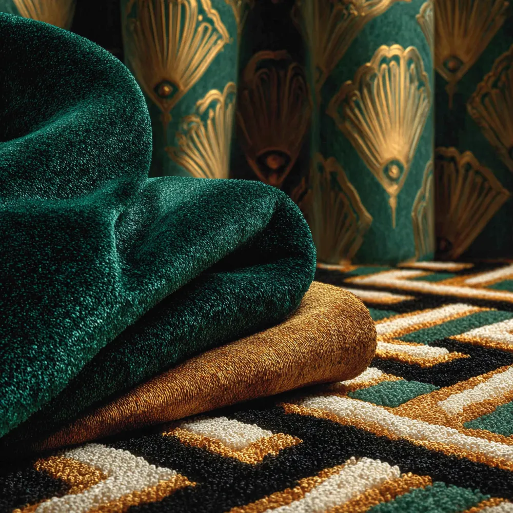
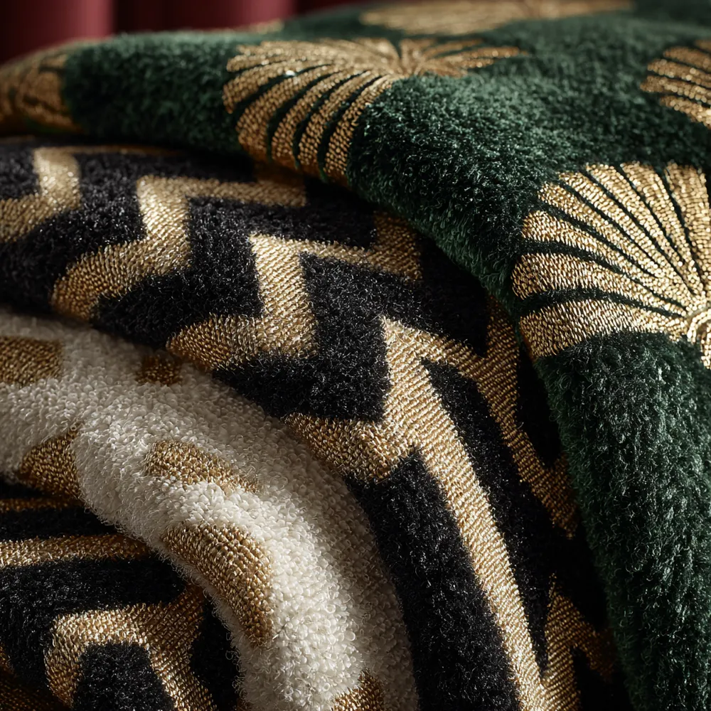
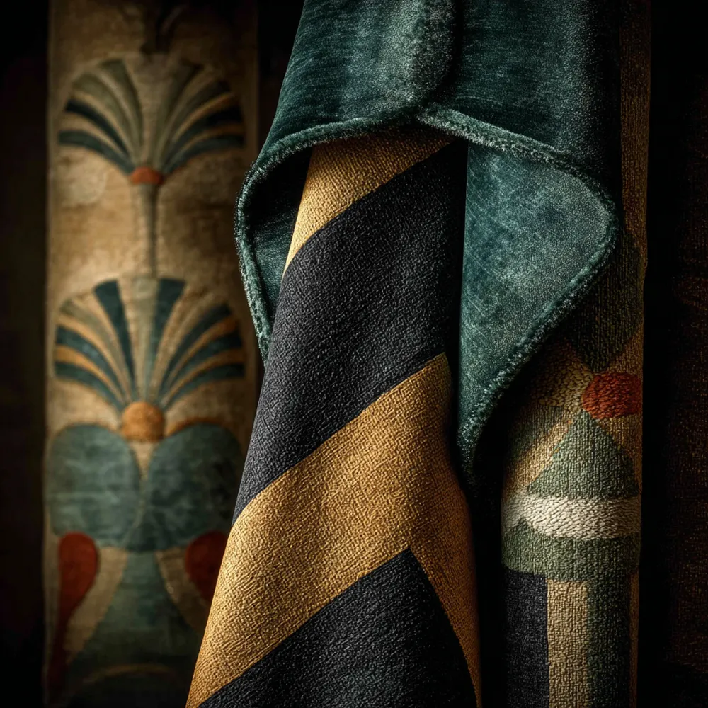
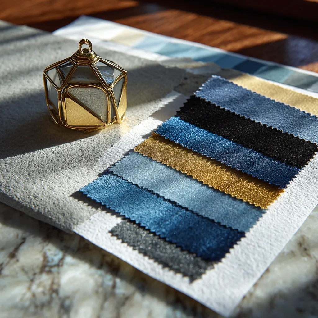
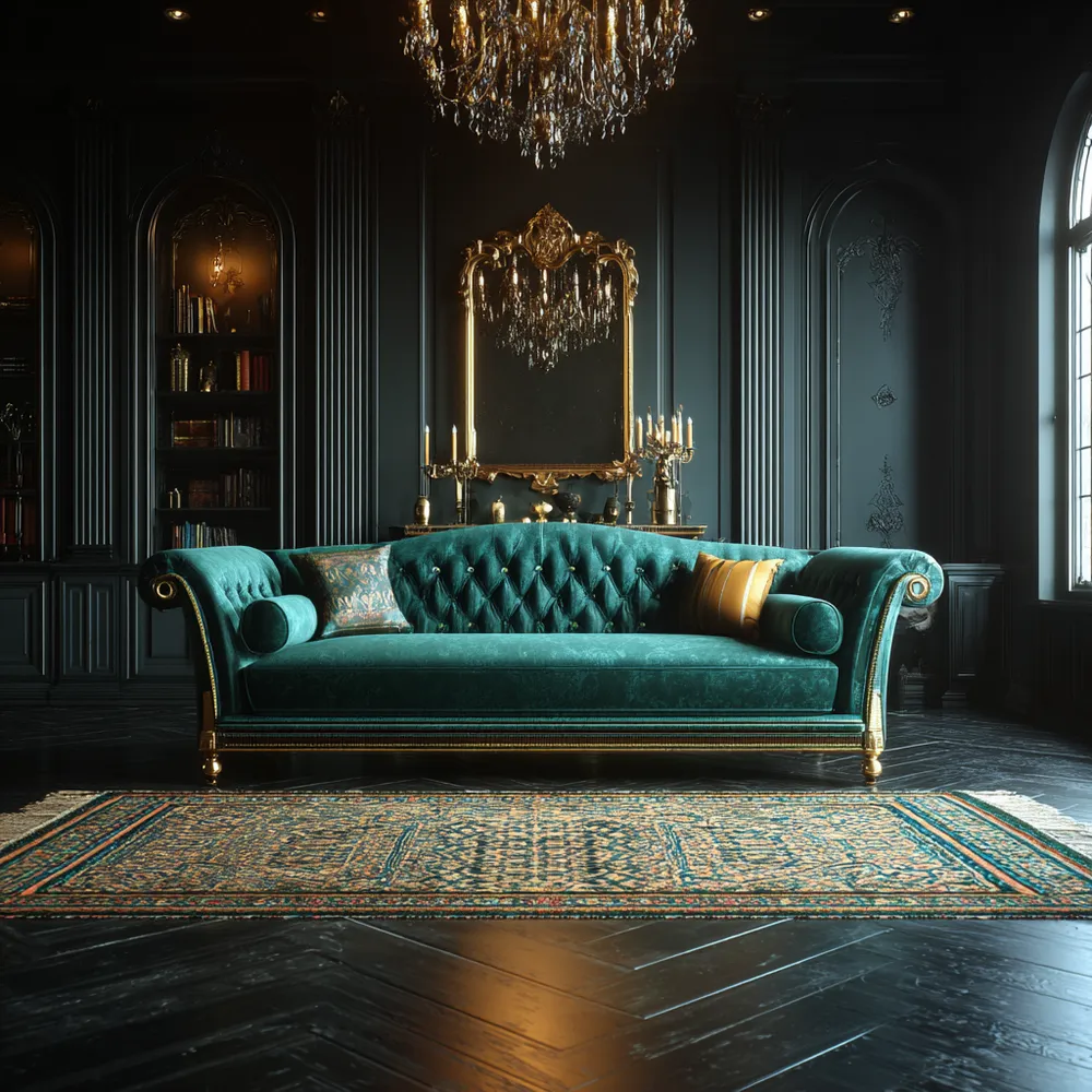
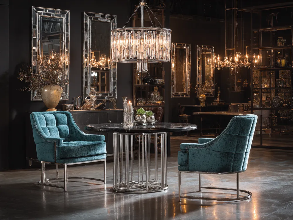
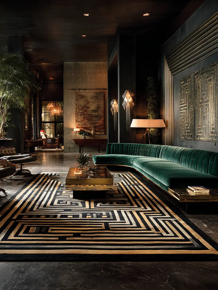
Dive into the sophisticated color stories of Art Deco! This era embraced both bold contrasts and opulent harmonies. Classic pairings include rich blacks and whites, often with striking gold or brass accents. Jewel tones like emerald green, sapphire blue, and ruby red are quintessential for adding depth and luxury. Muted tones like champagne and dove grey can also be used to create a softer, yet still elegant, Art Deco feel. Experiment with metallic sheens and contrasting finishes to achieve that signature opulence. What’s your favorite Art Deco color combination? 🖤 #ColorPaletteIdeas #ArtDecoIdeas #HomeDecorPaletteIdeas #DesignColorIdeas #DecorPaletteIdeas #ArtDecoColors #JewelTones #GoldAccents #LuxuryColors #InteriorPalette
2025년 10월 28일
스타일 복사
 아직 댓글이 없습니다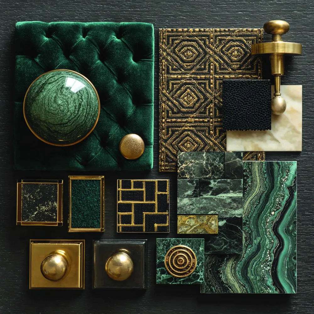
Art Deco's Signature Color Palette: Bold & Beautiful 🎨
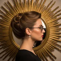
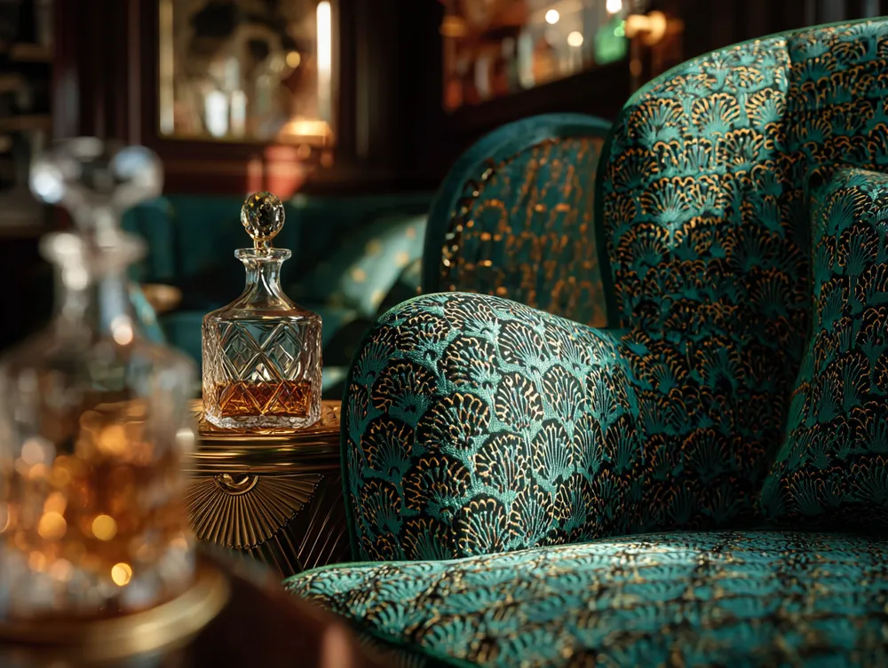
Art Deco Allure: Timeless Patterns for Glamour! ✨
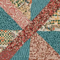
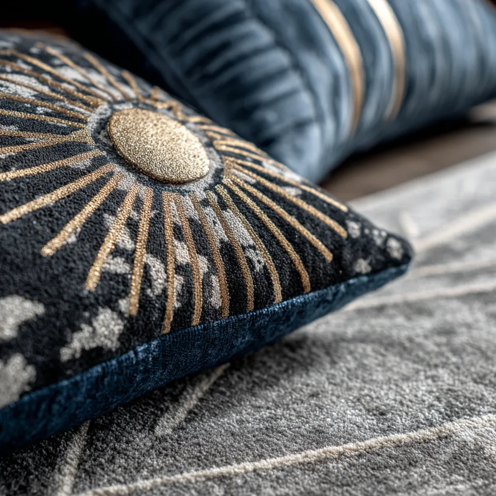
Art Deco Patterns: Infusing Your Home with Glamour 🖼️
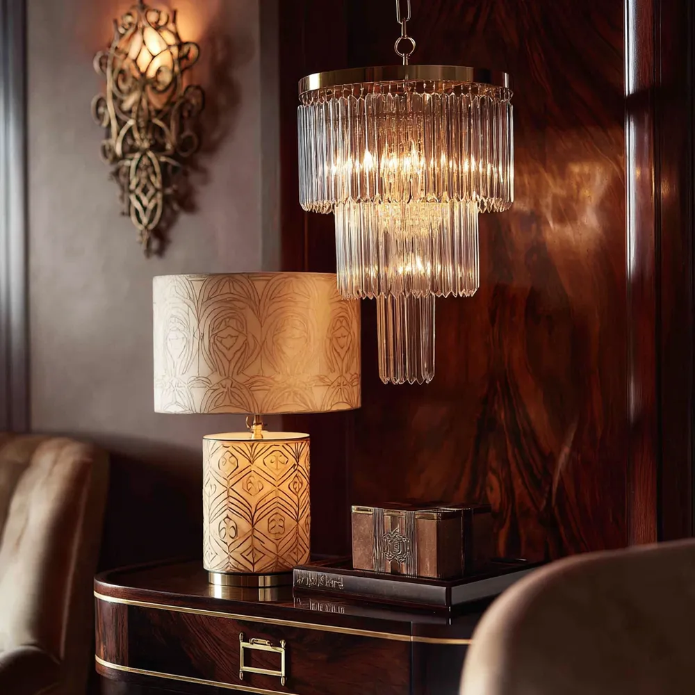
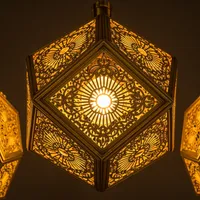
Adding Decadence with Art Deco Lighting 💡
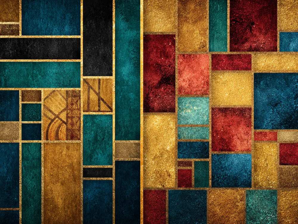
From Black & White to Jewel Tones: Art Deco Color Palettes 🎨

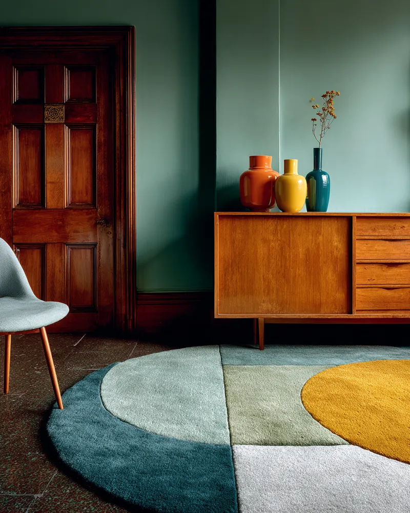
The Art of Mid-Century Color Palettes 🎨
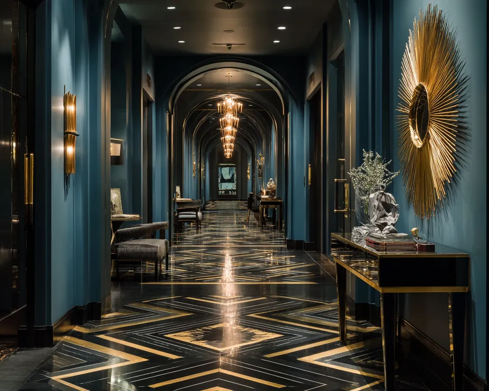
Art Deco Revival: Geometric Lines & Luxurious Finishes! 🖤🌟

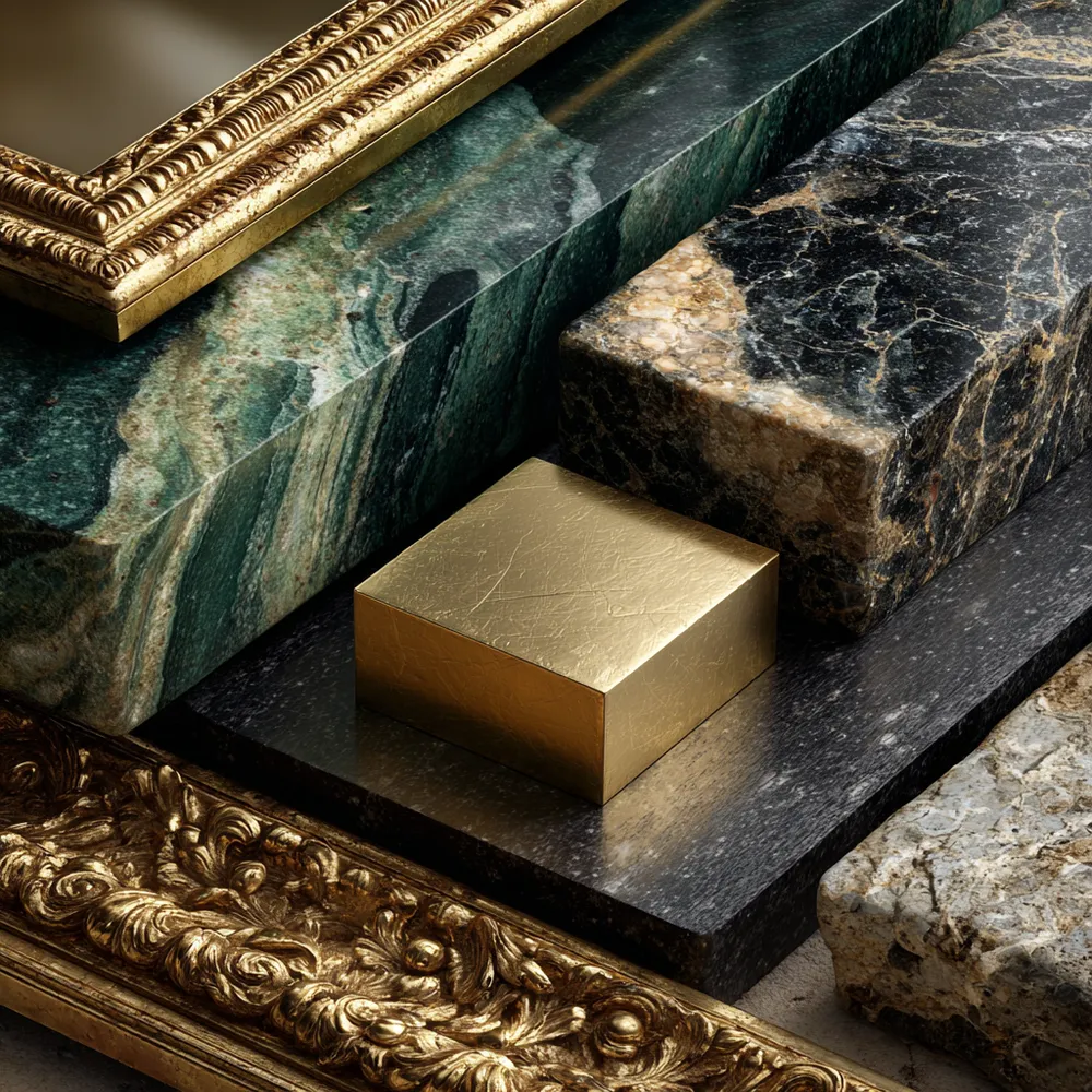
The Allure of Art Deco Materials: Shine & Texture ✨
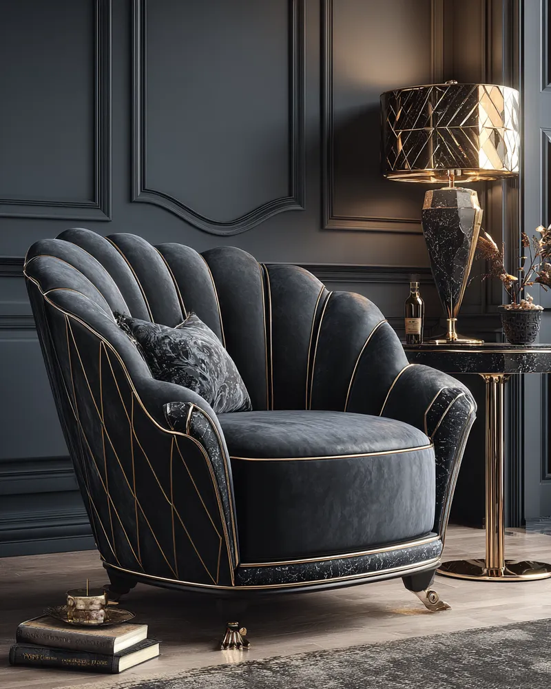
The Allure of Black & Gold: Classic Art Deco Color Palettes 🖤💛

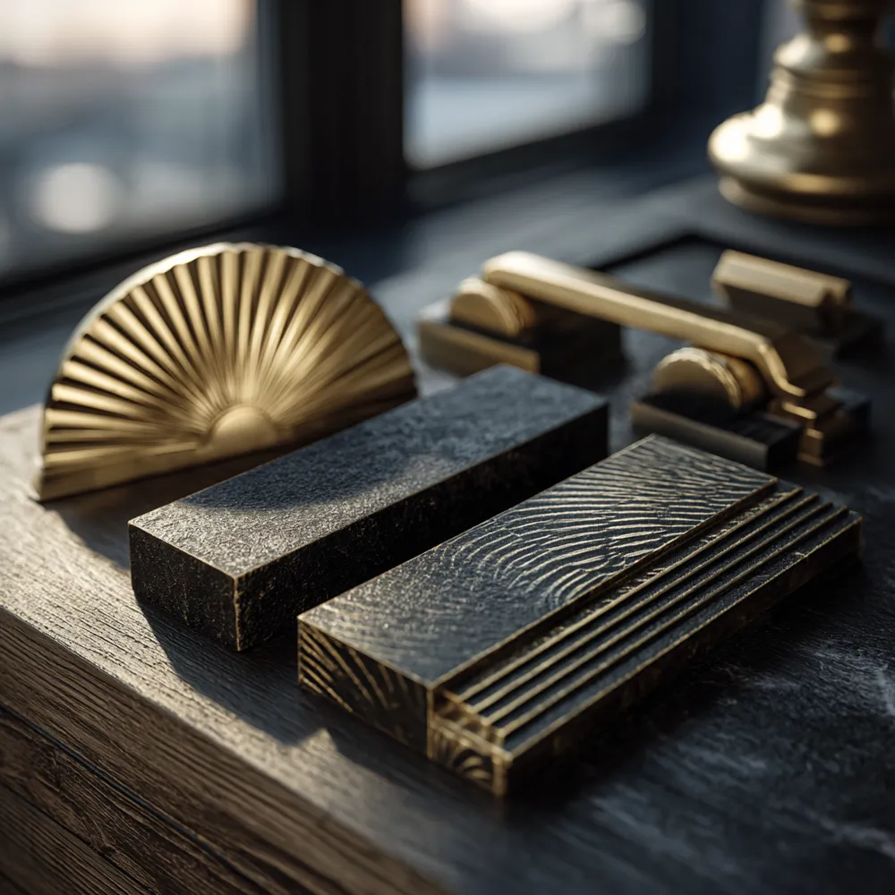
Gleaming & Geometric: Art Deco Hardware & Accents! 🔑✨

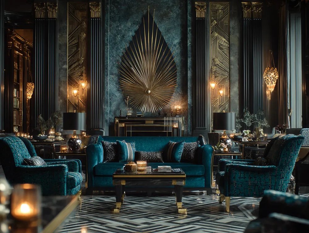
Elevate Your Living Room with Art Deco Panache! ✨🛋️
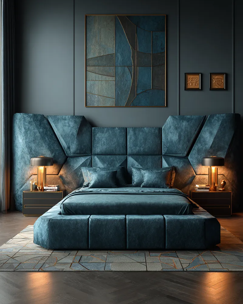
Symmetry & Shine: Crafting a Stunning Art Deco Bedroom Sanctuary 🌙
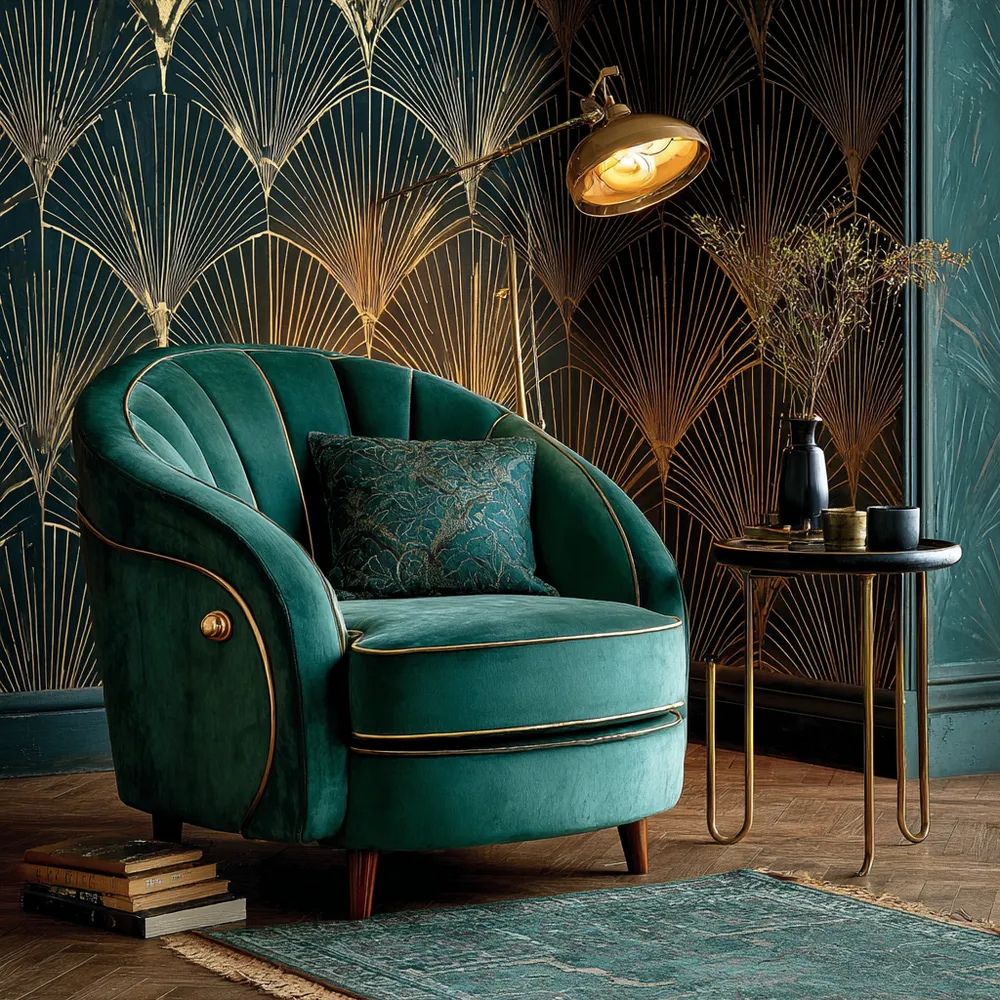
Art Deco Glamour: Bold Patterns & Luxe Materials! 💎✨
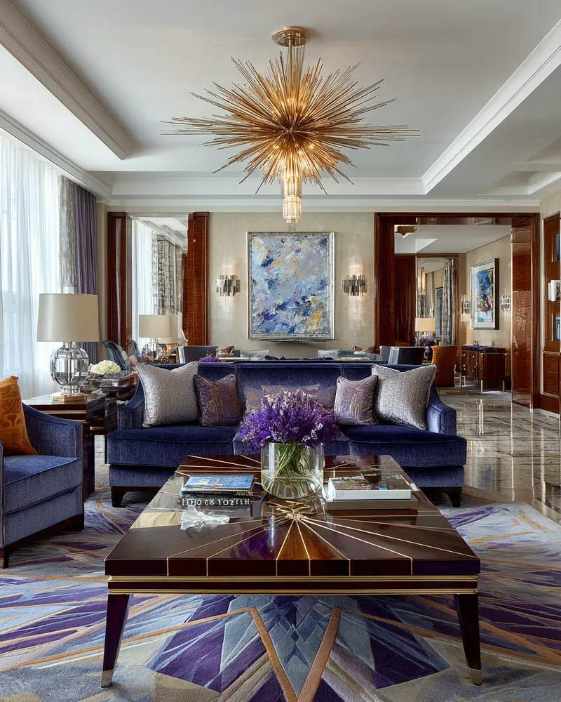
Art Deco Glamour: Injecting Luxury into Your Living Space ✨
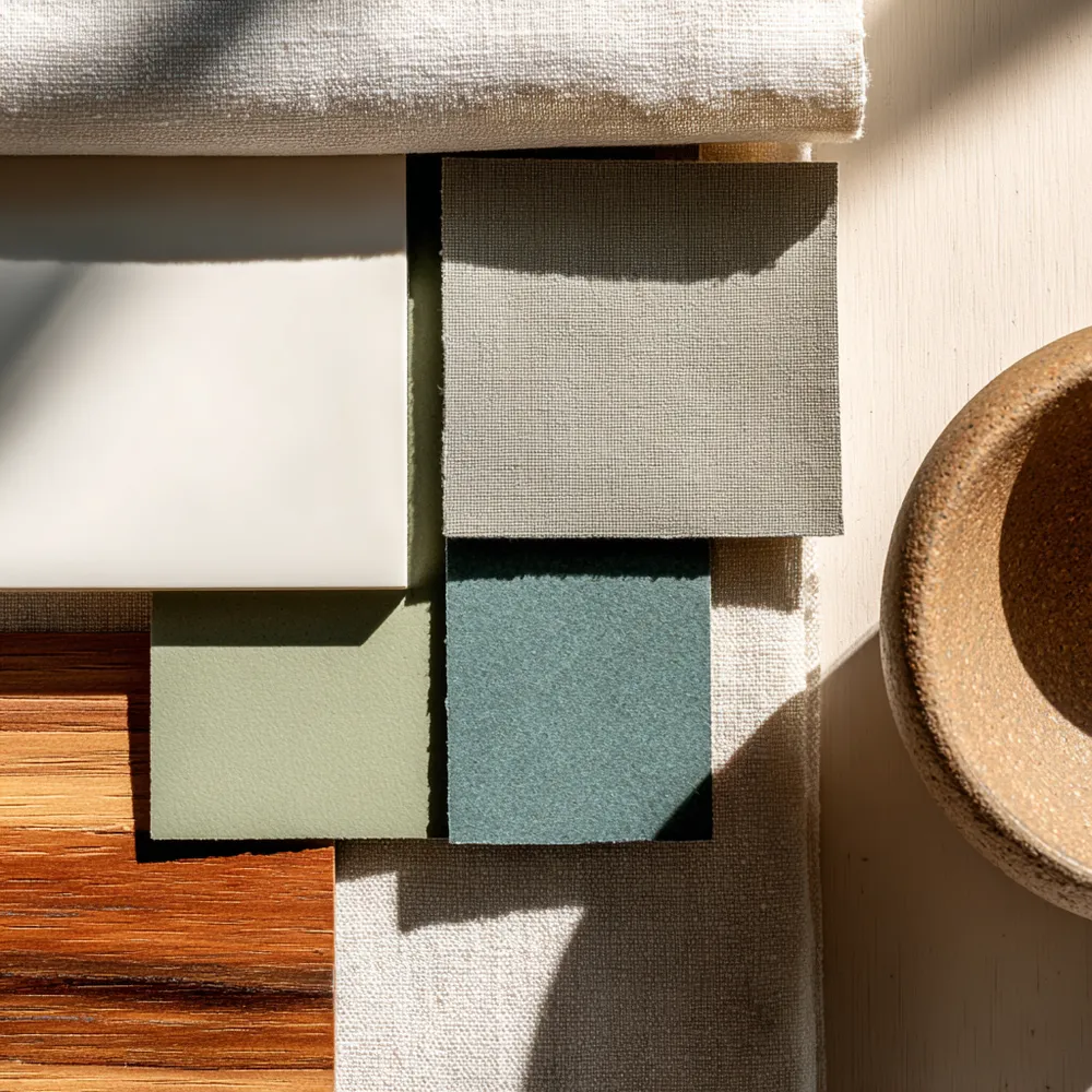
Color Palette Perfection: Muted Tones for Shaker Spaces 🎨

Art Deco Allure: Glamorous & Luxurious Design Inspiration 💎

Art Deco Radiance: Geometric Glamour & Luxe Finishes for a Chic Space ✨

Art Deco Glam: Infuse Your Space with Bold Sophistication! 💫
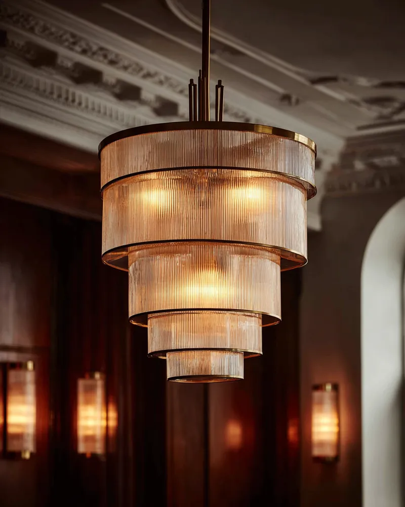
Art Deco Lighting: Illuminate Your Glamour! ✨
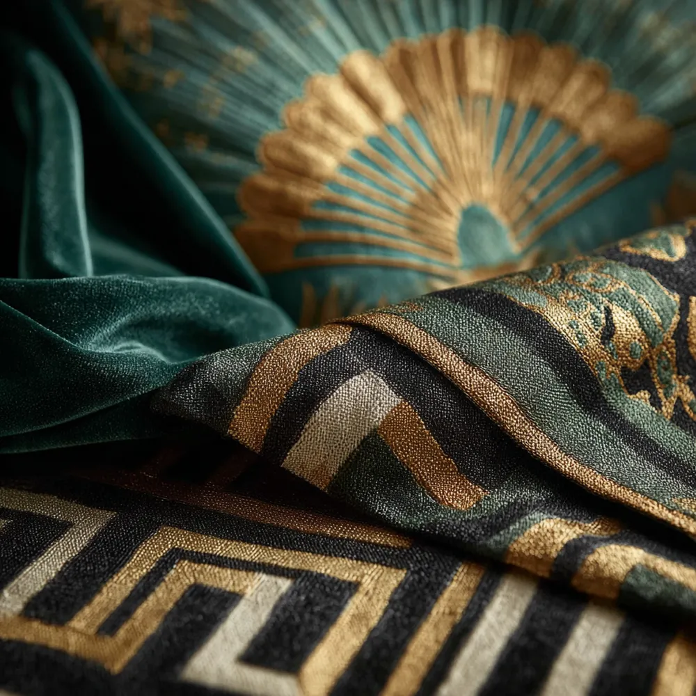
Art Deco Textiles: Rich Fabrics & Bold Patterns 💖