1/4
Bauhaus Color Palettes: Bold Hues and Balanced Neutrals 🎨
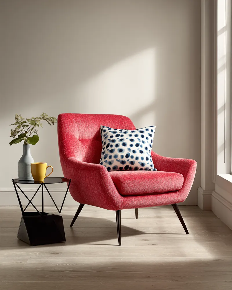
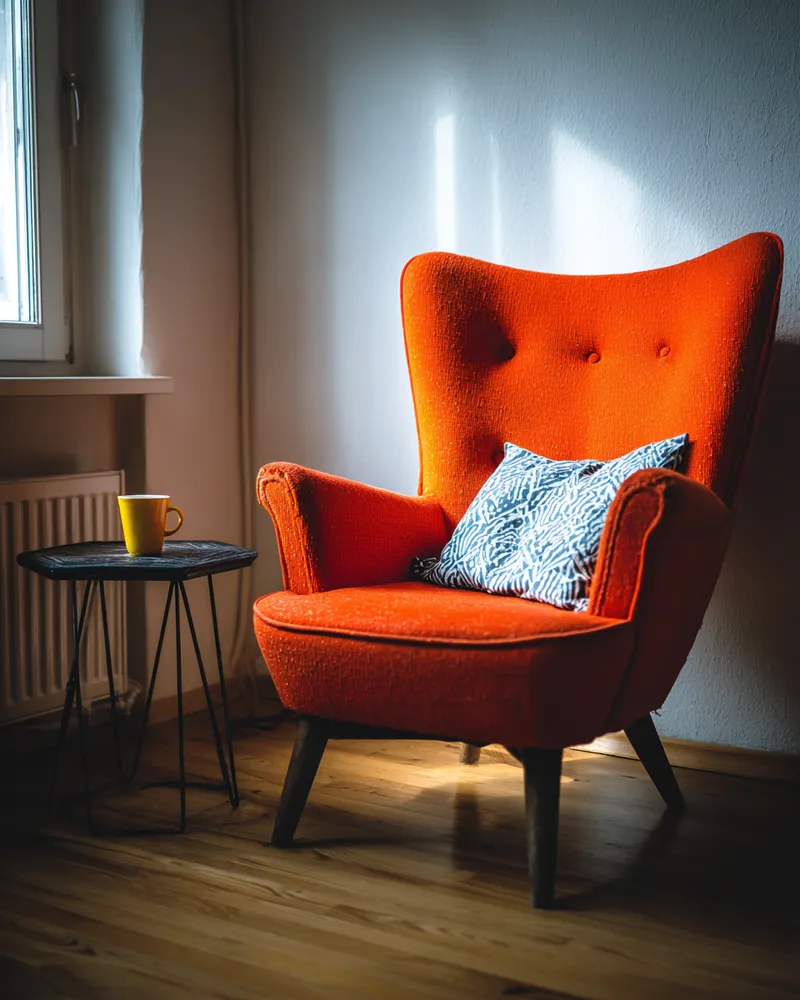
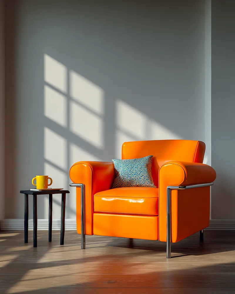
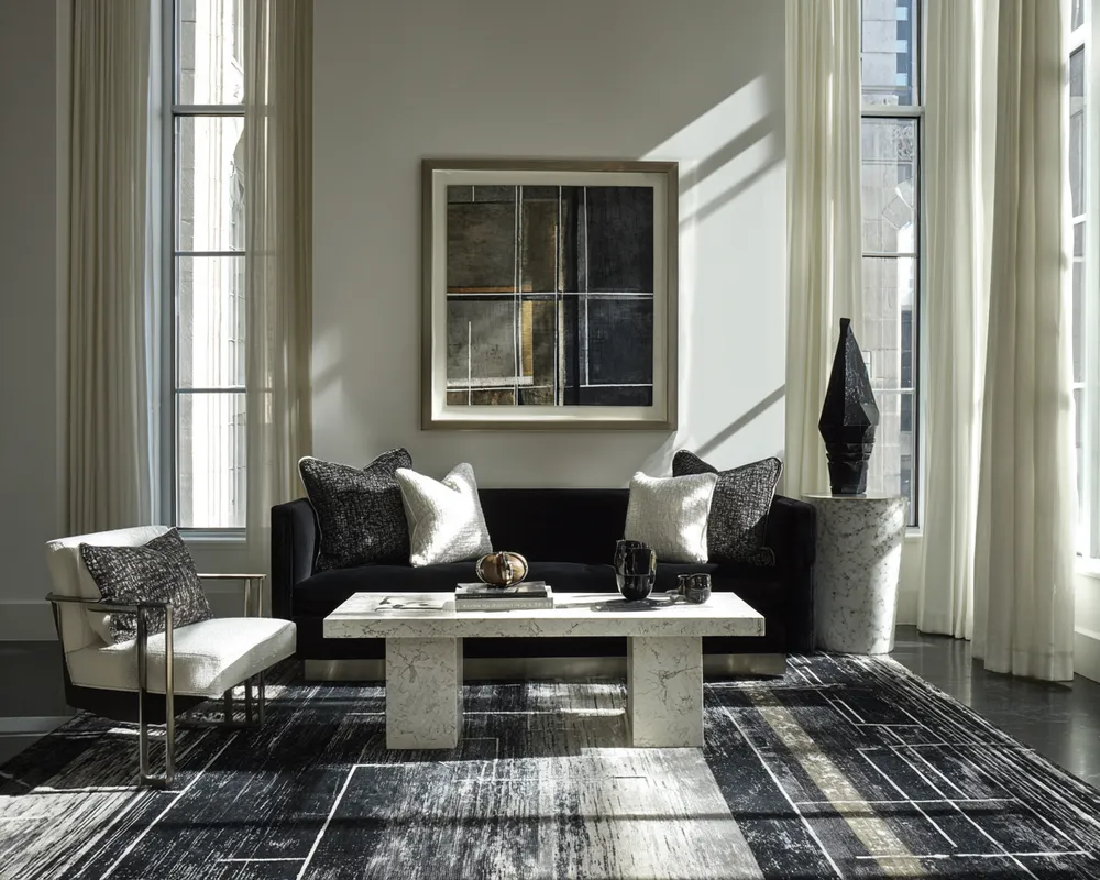
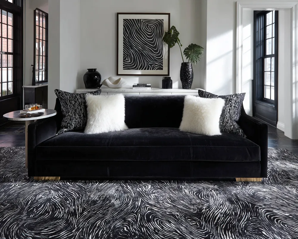
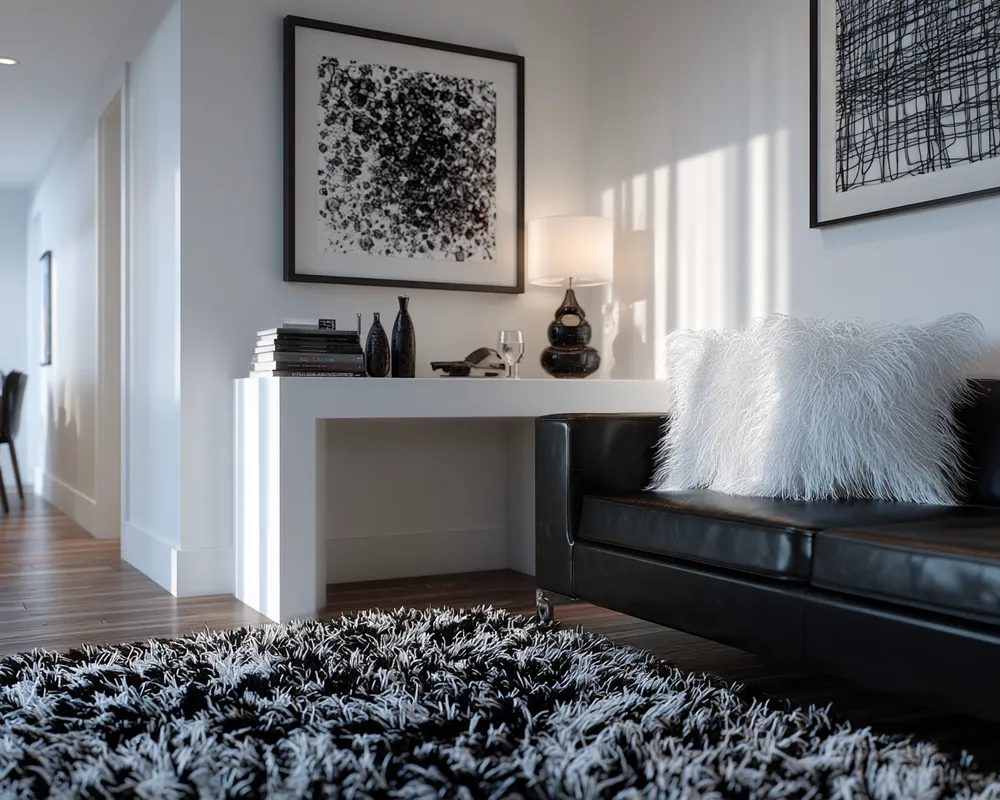
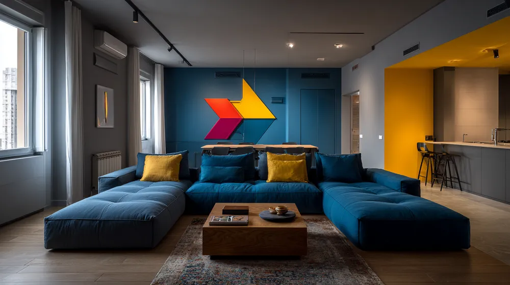
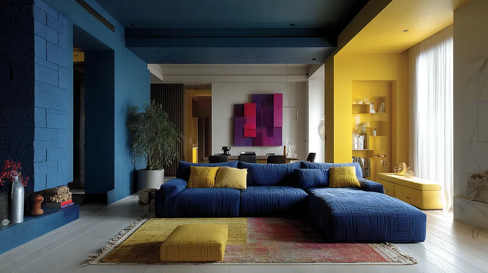
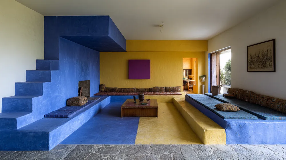
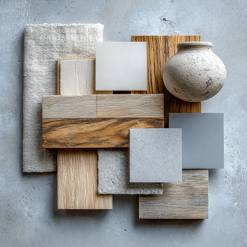
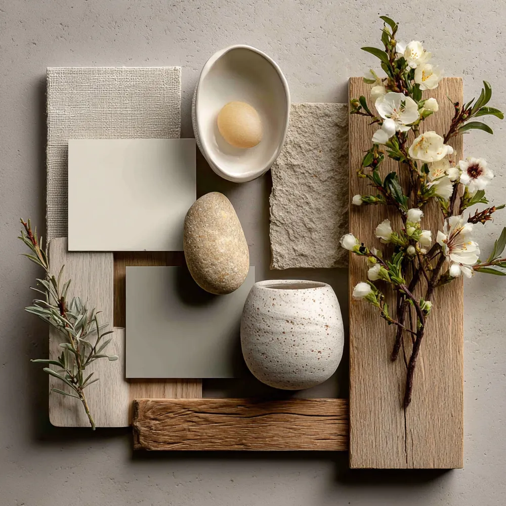
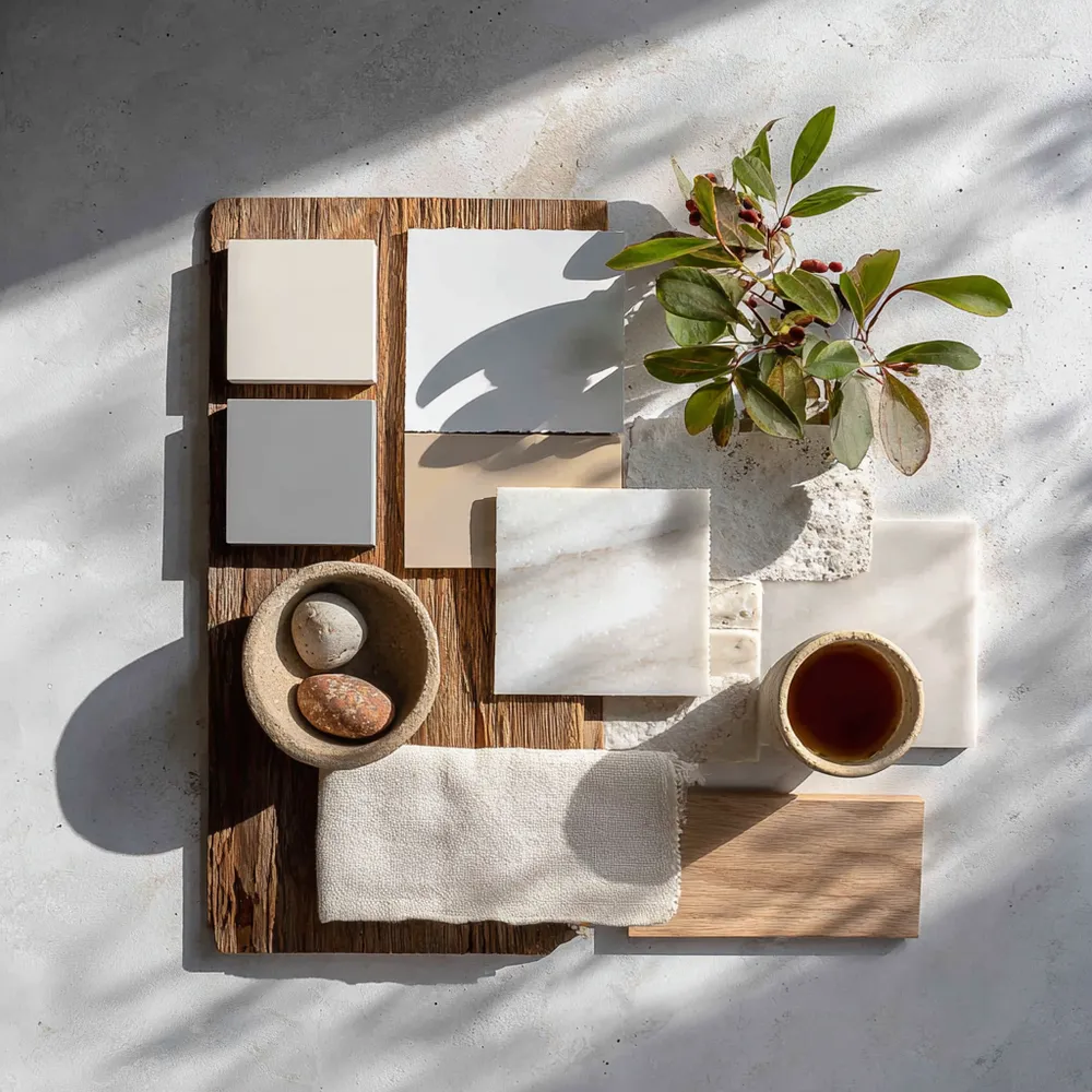
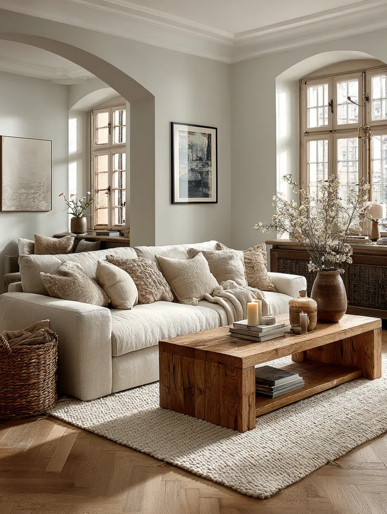
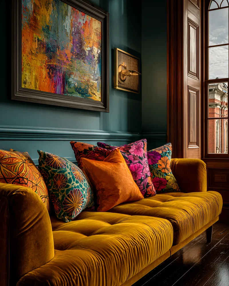
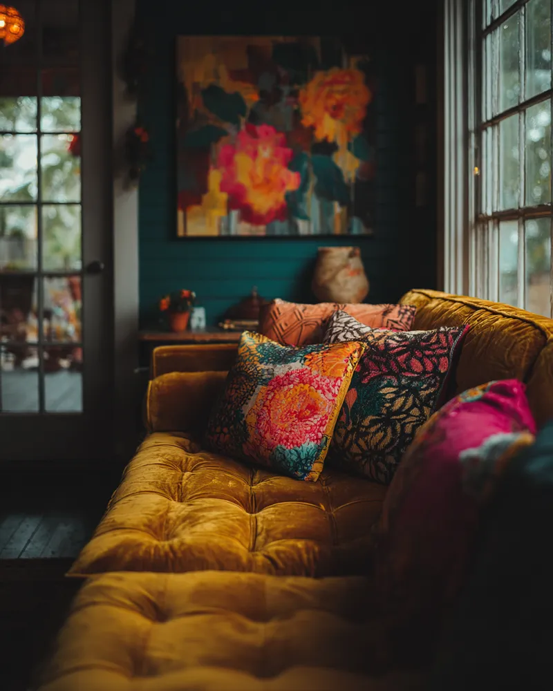
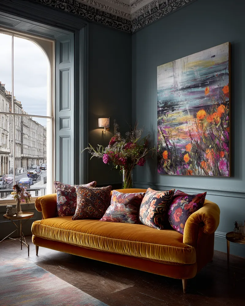
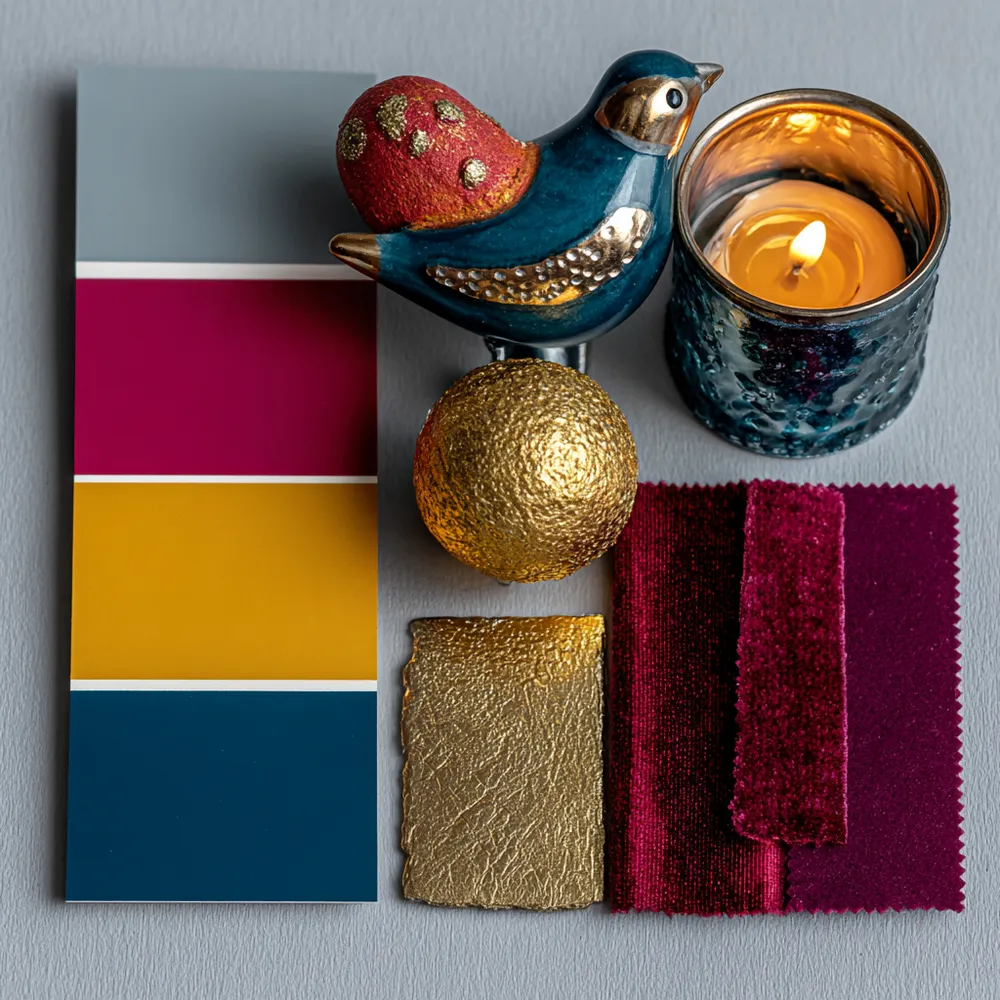
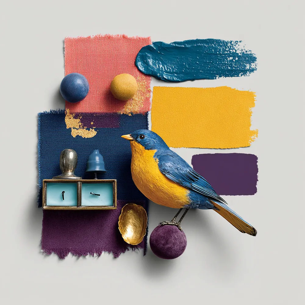
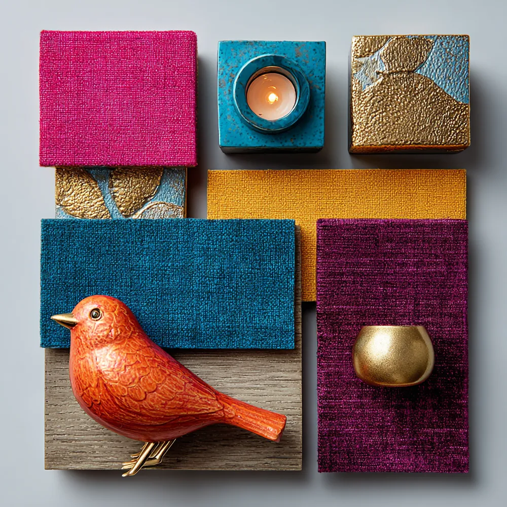
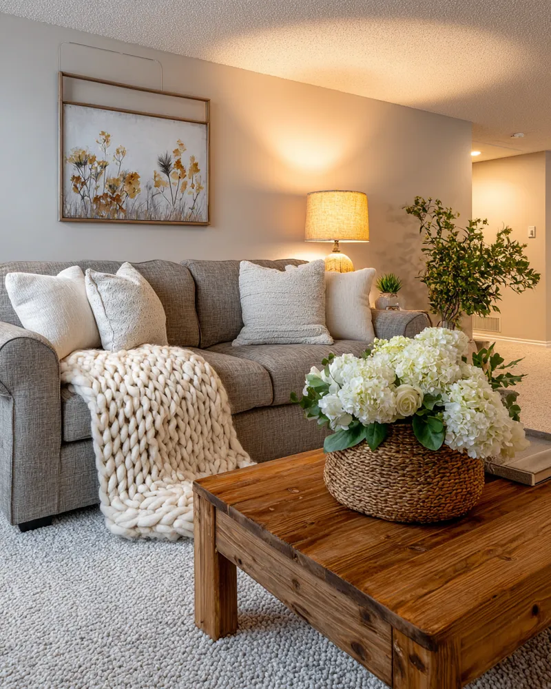
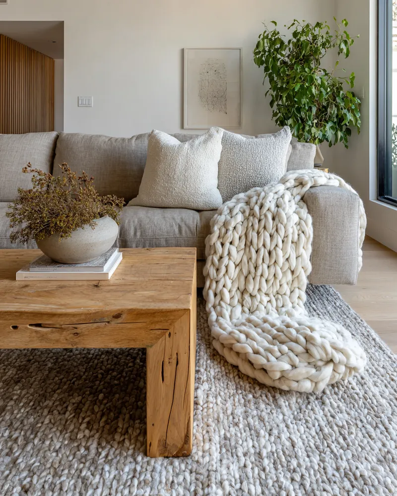
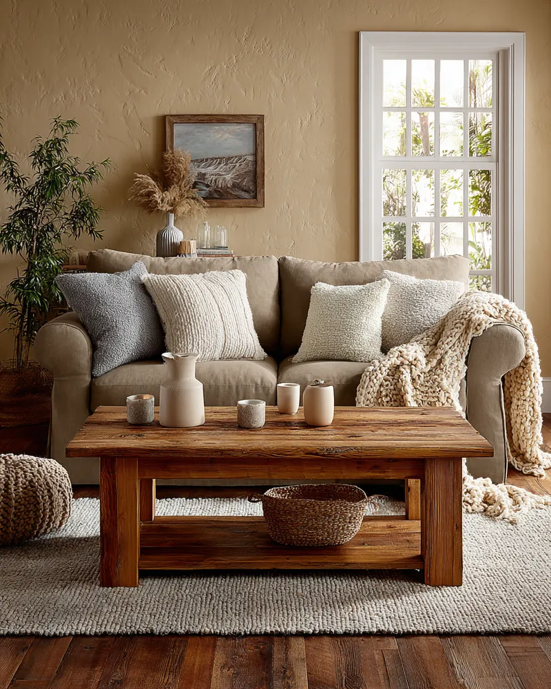
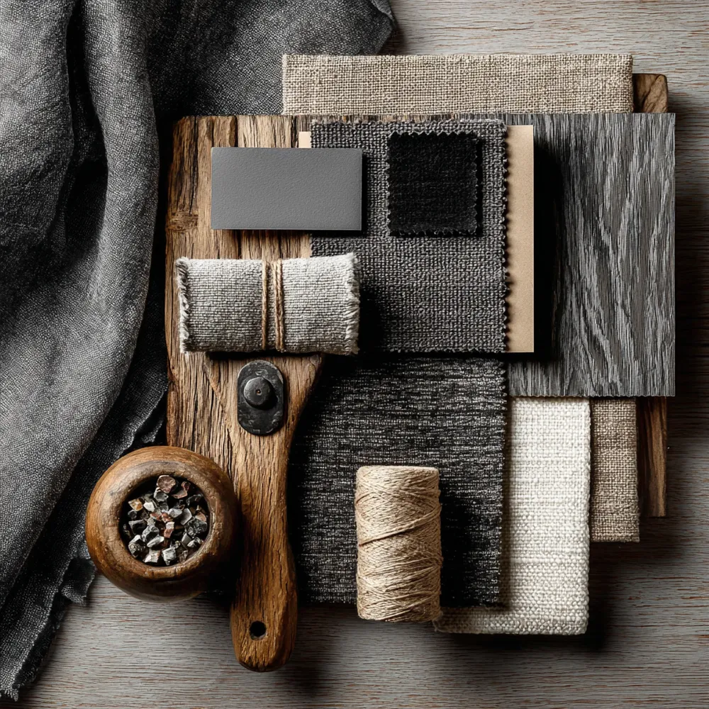
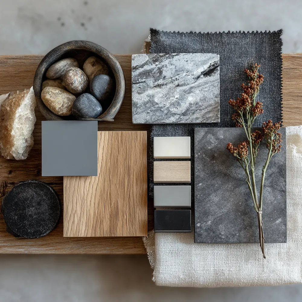
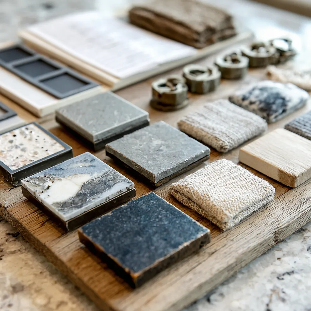
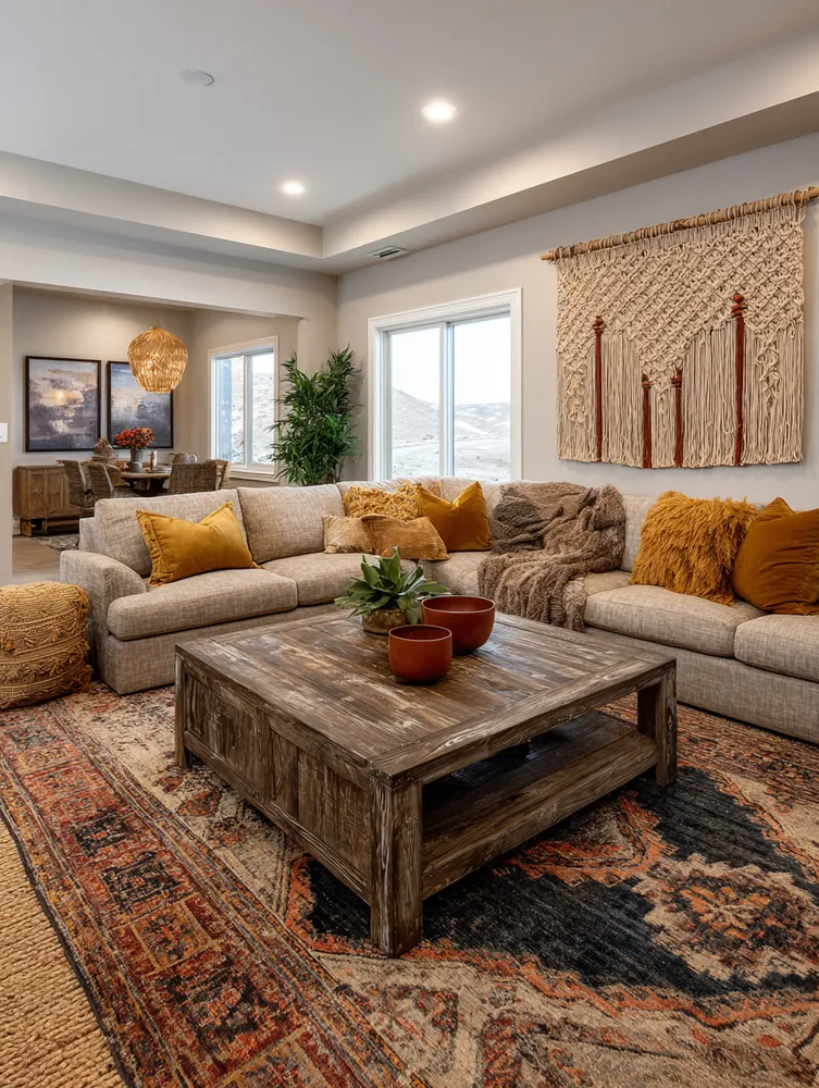
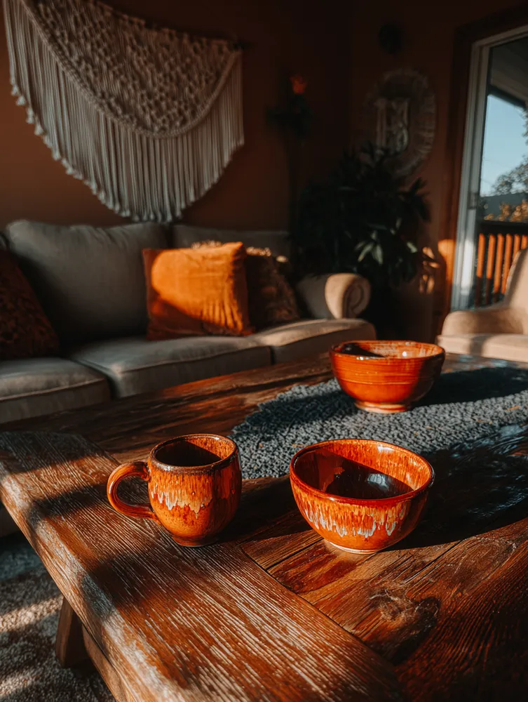
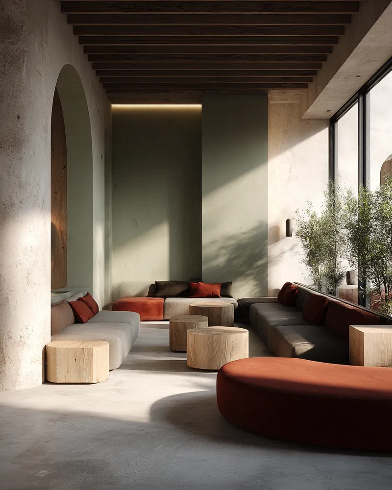
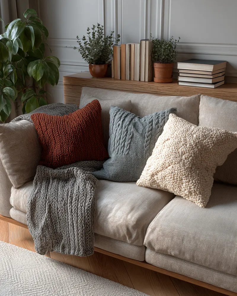
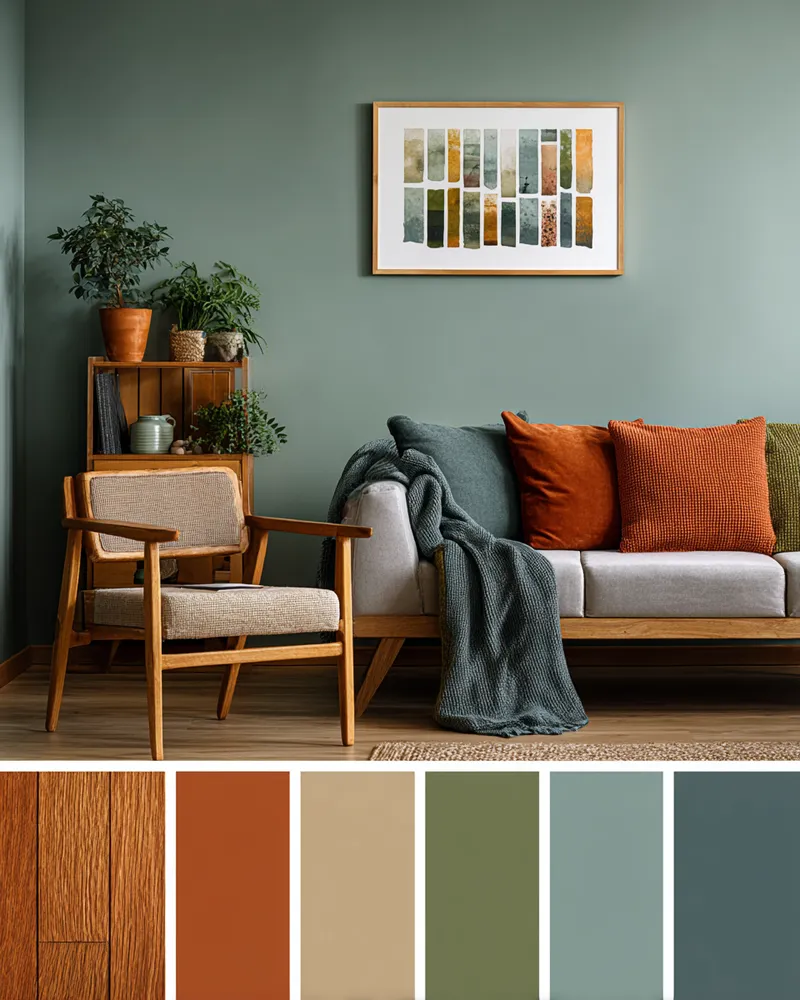
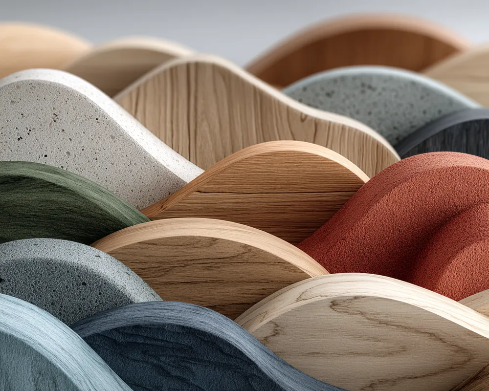
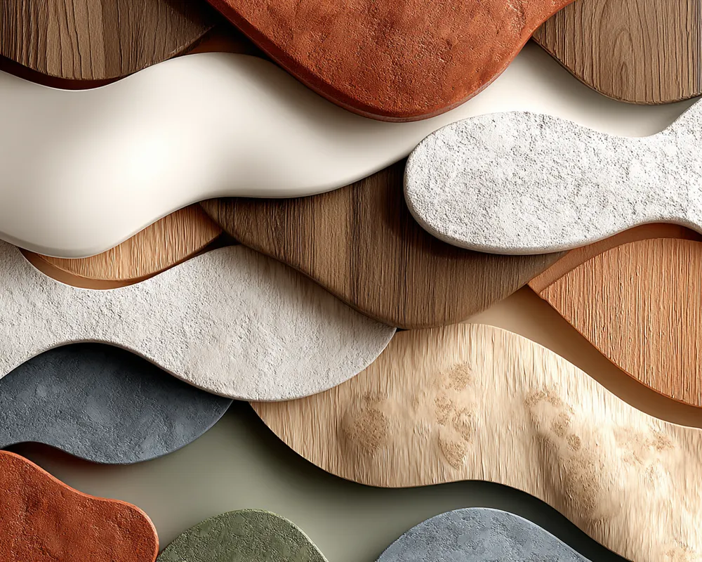
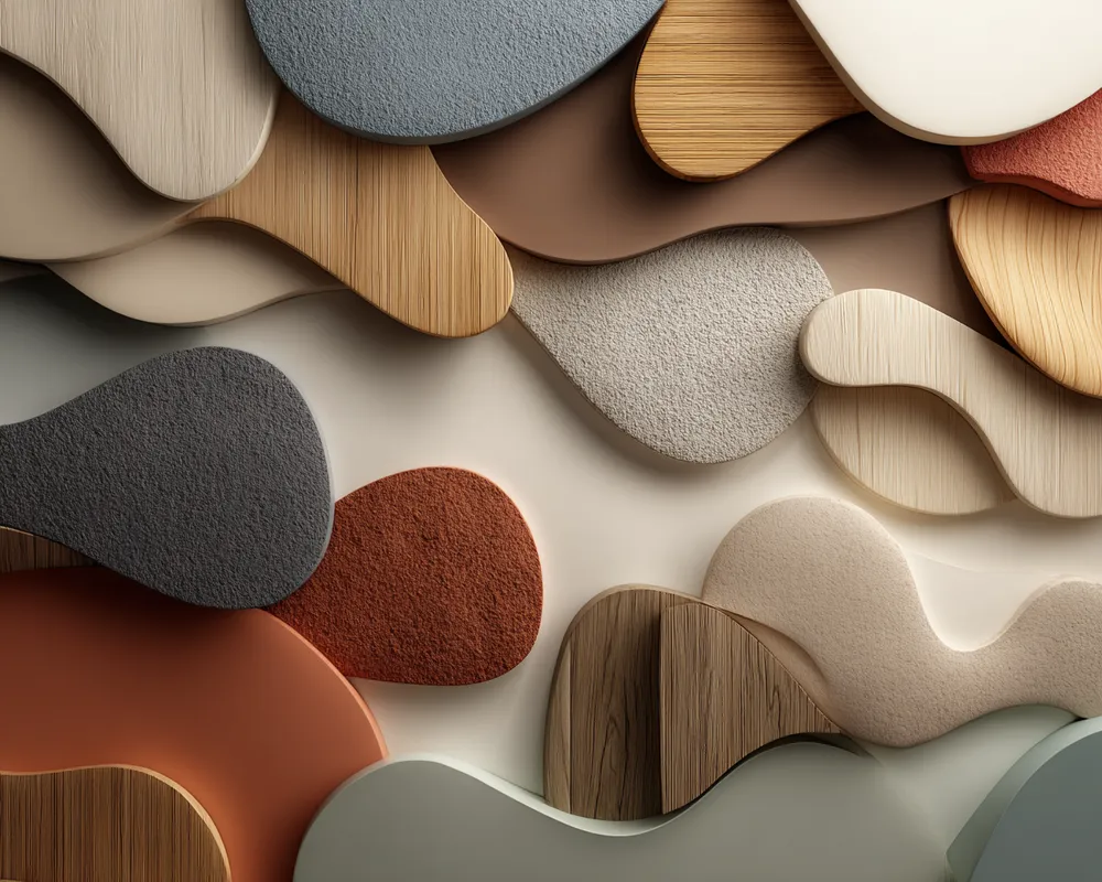
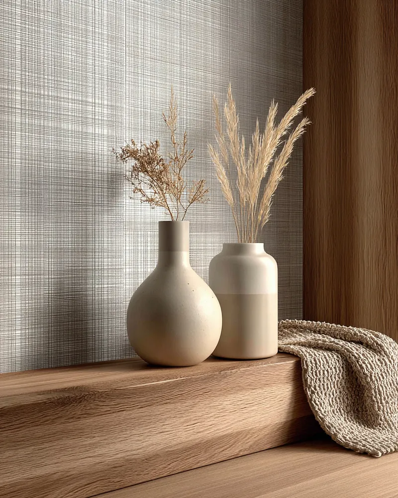
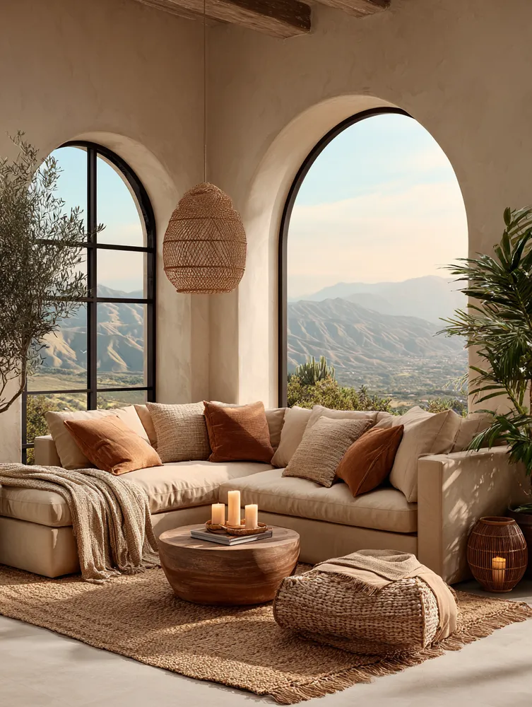
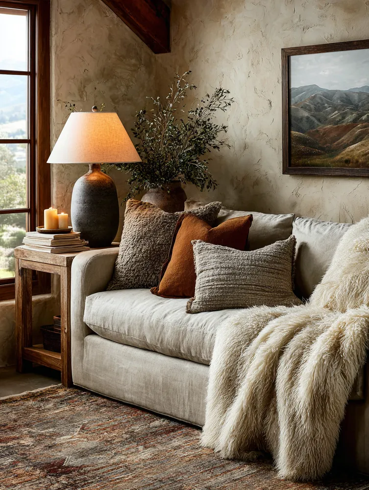
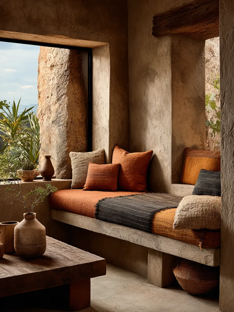
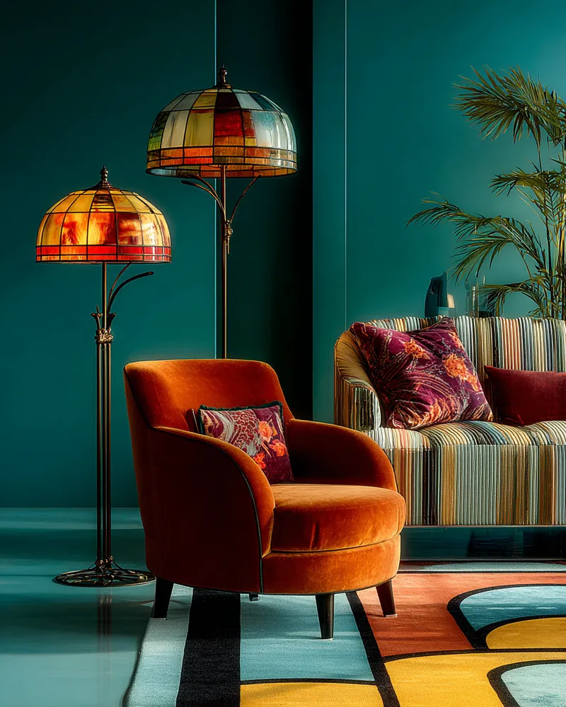
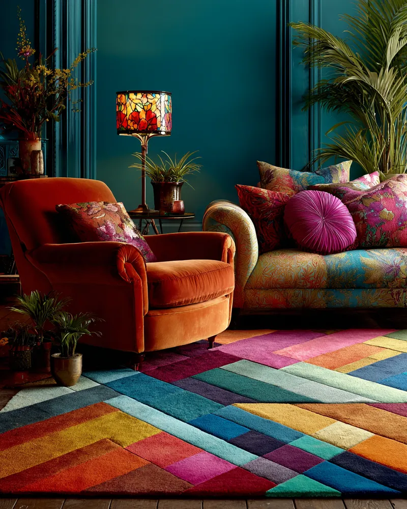
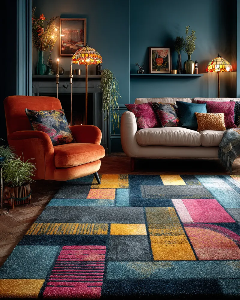
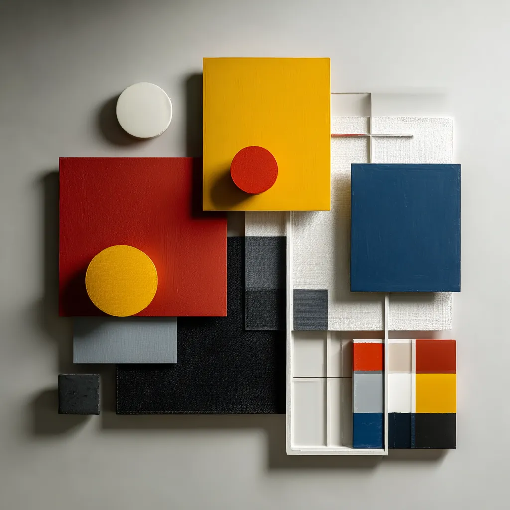
The Bauhaus school wasn't afraid of color, but it used it with intention and balance. Bauhaus color palettes often combine bold primary colors (red, yellow, blue) with strong neutrals like black, white, and grey. 🏗️ This approach creates dynamic yet harmonious compositions, emphasizing functionality and visual clarity. These palettes add energy and a modern feel without being overwhelming.
Consider how these classic combinations can elevate your space.
Experiment with these iconic hues to bring a touch of modernist art into your decor. Save for color inspo! #BauhausColors #ColorPaletteIdeas #InteriorColor #BauhausIdeas #PrimaryColors #NeutralDecor #ModernColor #DesignInspiration #ColorTheory #BoldHues
2025년 10월 28일
스타일 복사
 아직 댓글이 없습니다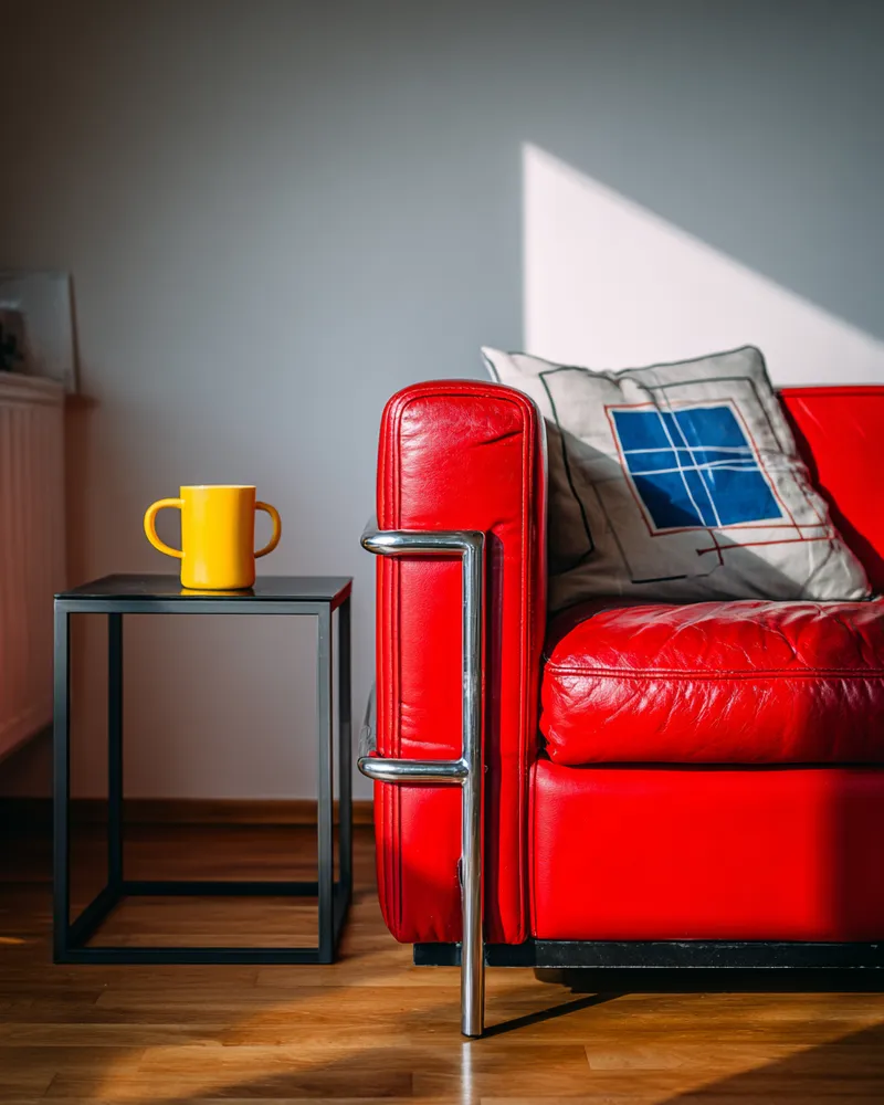
The Power of Primary Colors: Bauhaus Inspired Accents! 🟥🟦🟨
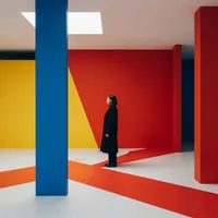

Curated Color Palettes for a Playful Home 🌈🎨

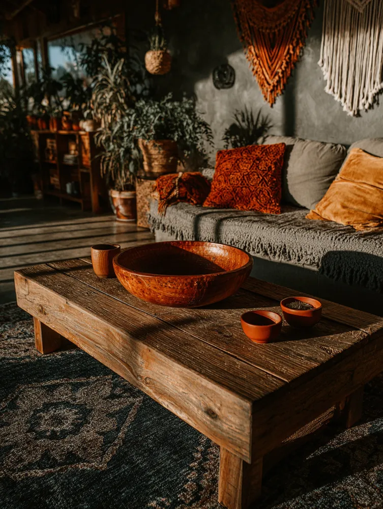
Earthy Tones & Bold Accents: A Boho Color Palette 🤎💛

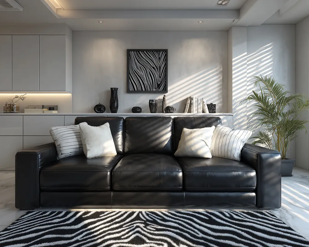
Bold Neutrals: The Art of Black & White Harmony 🖤🤍

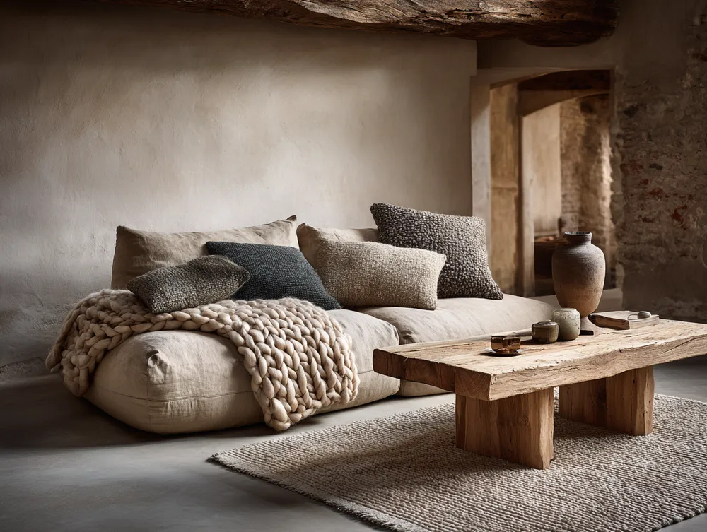
Creating Calm: The Power of Neutral Palettes in Urban Apartments ☁️
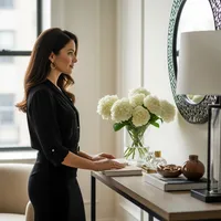
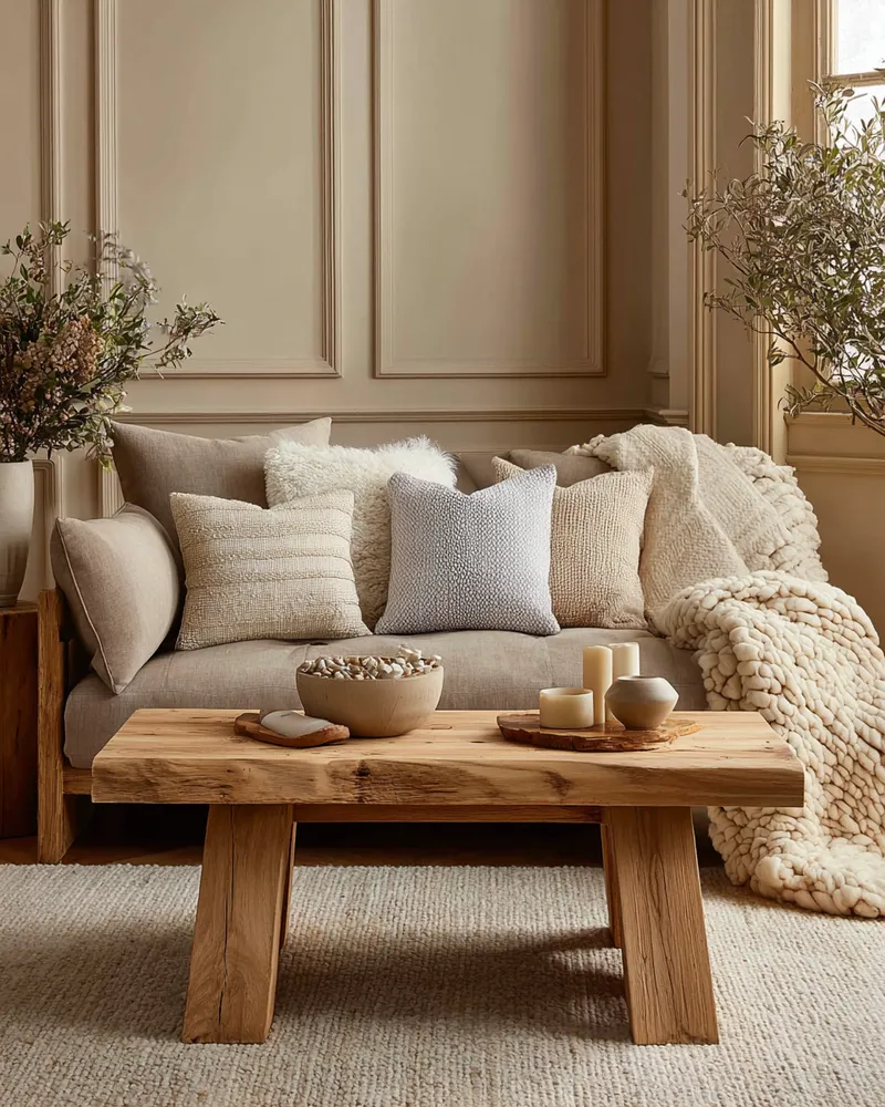
Warm Neutrals for a Timeless Living Room Palette 🤎🤍
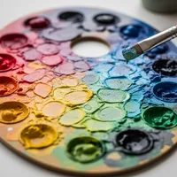
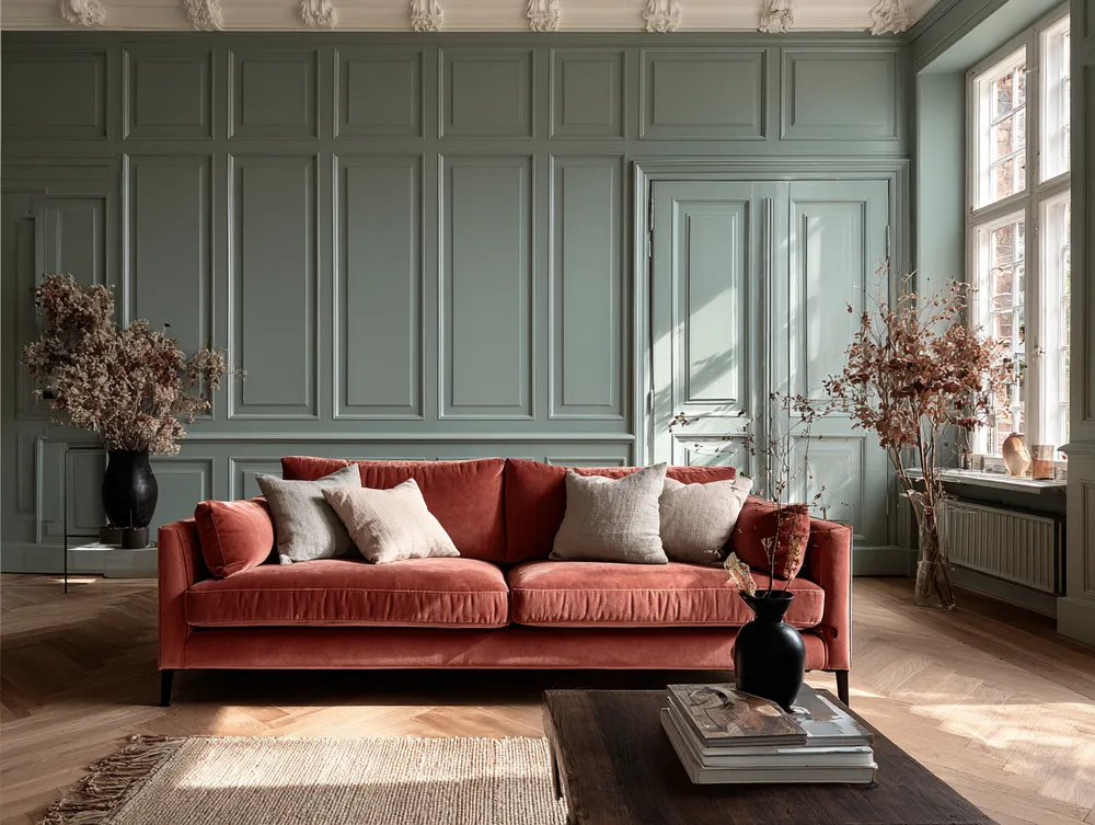
Introducing 'New Neutrals': Beyond Beige!

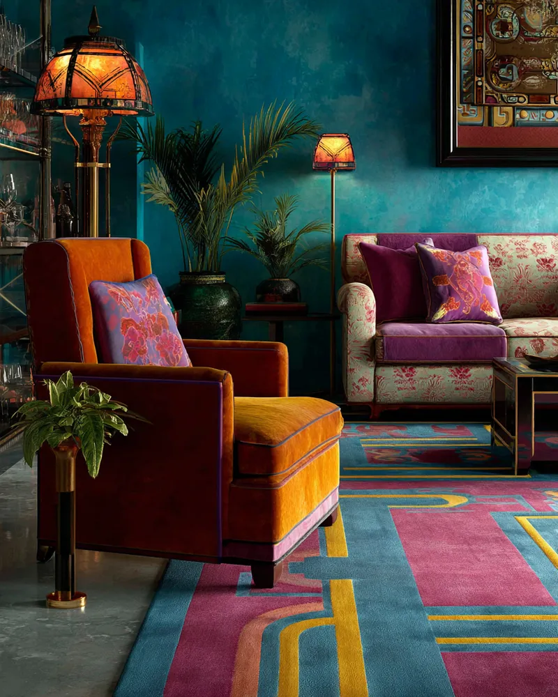
Color Your World: Mastering Bold Hues in Eclectic Home Design 🎨
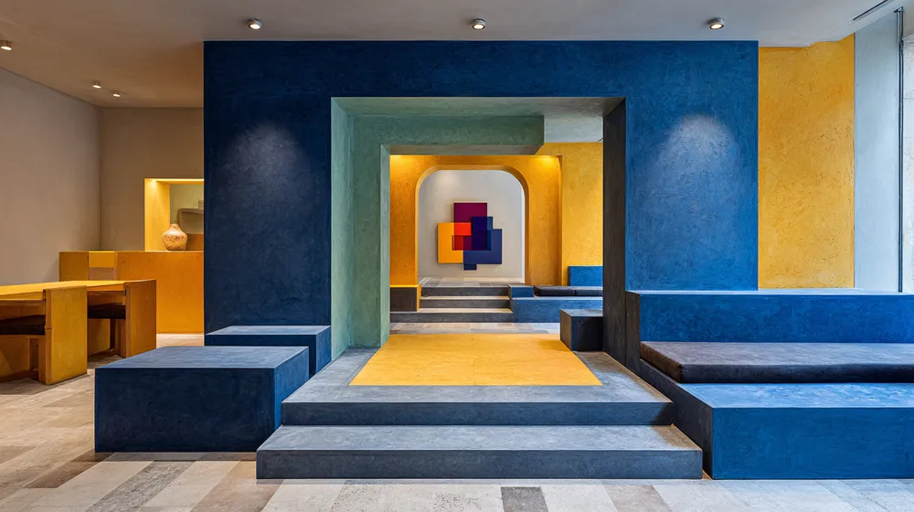
Color as Architecture: Bold Hues as Structural Elements 🧱

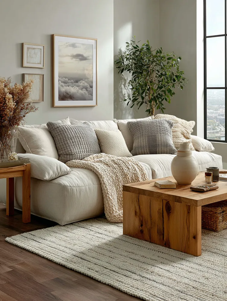
The Neutral Palette: Creating a Serene & Timeless Home ✨

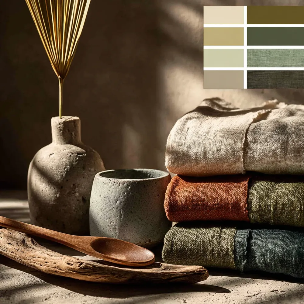
The Power of Palette: Muted Tones for a Serene Home 🎨🌿

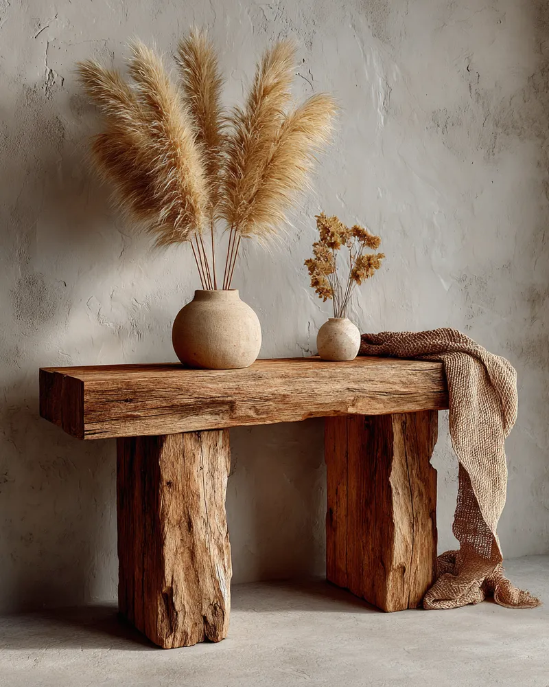
Japandi Color Palettes: The Power of Neutrals 🤍

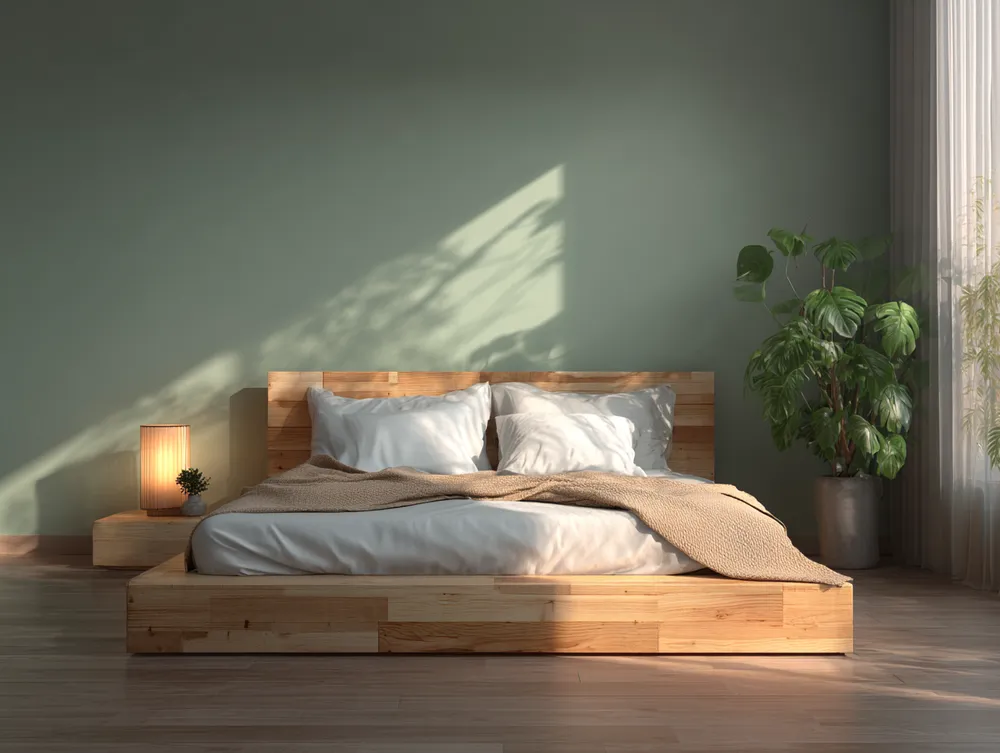
Harmonious Hues: Achieving Balance with a Natural Palette 🌿

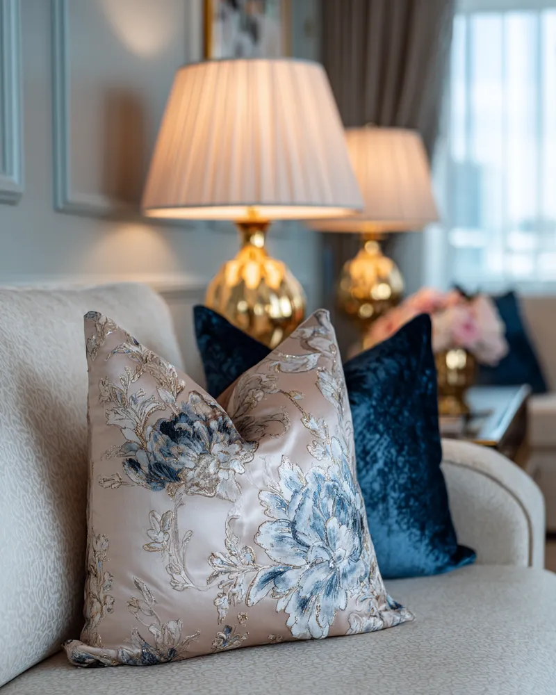
Mastering Neo-Classical Color Palettes for Serene Homes 🎨


The Power of Undertones: Mastering Complex Neutrals 🎨


My Go-To Palette: Creating Calm with Japandi Color Schemes 🎨

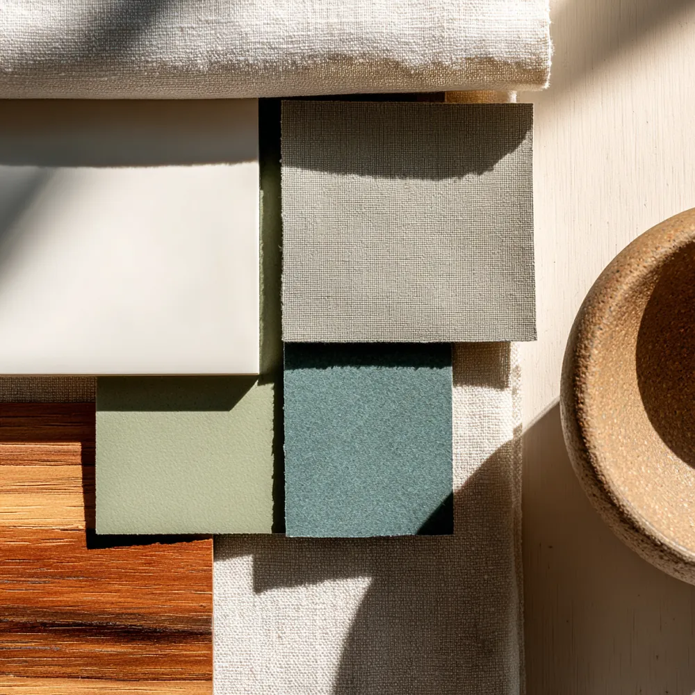
Color Palette Perfection: Muted Tones for Shaker Spaces 🎨

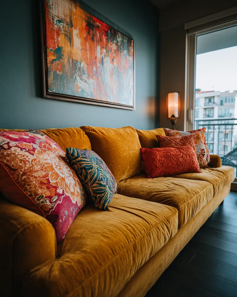
Unleash Your Inner Maximalist: Bold Color Palettes for a Joyful Home! 🌈✨

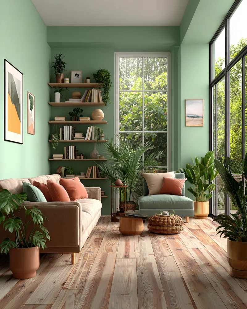
🌿 Color Palette Perfection: Earthy Tones for Biophilic Homes

Earthy Neutrals: Grounding Your Space 🤎🌾